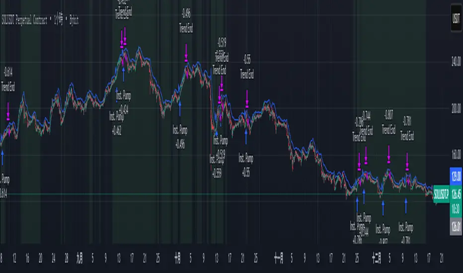
ITAS - Institutional Triggered Alpha SystemConcept & Originality: Standard breakout strategies often fail in the crypto market due to "fakeouts" driven by retail FOMO. ITAS (Institutional Triggered Alpha System) is a specialized quantitative system designed for SOL (Solana). Its core innovation is not the breakout itself, but the "Institutional Confirmation Layer." The script calculates the real-time arbitrage spread (Premium) between Coinbase (USD pair) and Binance (USDT pair). A trade is ONLY executed when this proprietary "Whale Monitor" confirms that US institutions are aggressively accumulating Bitcoin, which historically precedes an "Alpha Run" in high-beta assets like SOL.
Key Features & Logic:
Cross-Exchange Arbitrage Filter: The script runs a background algorithm that smooths the Coinbase-Binance price gap using a proprietary window.
Green Background: Indicates the "Institutional Bullish Zone" (Current Premium > Historical Baseline).
Logic: It filters out retail-driven pumps. We only trade when Smart Money is leading the charge.
Alpha Trigger (Volatility Breakout): Utilizes optimized Keltner Channels (tuned specifically for SOL's volatility profile) to time the entry. The system waits for a volatility expansion inside an Institutional Bullish Zone.
Dynamic Trailing Management: Features a hard-coded, ATR-based trailing stop mechanism designed to capture extended trends while protecting capital against sudden reversals.
Usage:
Target Asset: SOL/USDT (Parameters are strictly locked and optimized for Solana).
Visuals:
Green Background: Institutional Accumulation Zone (Safe to trade).
Blue/Gray Lines: Volatility Bands.
策略核心與原創性: 標準的突破策略常因散戶 FOMO 導致的假突破而虧損。ITAS (機構啟動 Alpha 系統) 是一套專為 SOL (Solana) 設計的量化交易系統。 本策略的核心創新不在於突破本身,而在於內建的**「機構確認層 (Institutional Confirmation Layer)」**。程式會即時計算 Coinbase (USD 交易對) 與 Binance (USDT 交易對) 之間的套利價差(溢價)。只有當獨家的「巨鯨監測算法」確認美國機構正在積極吸籌比特幣時,系統才會允許執行 SOL 的突破交易。
主要功能與邏輯:
跨交易所套利濾網: 程式在背景運作一套獨家演算法,對 Coinbase-Binance 的價差進行平滑處理。
綠色背景: 代表「機構看漲區域」(當前溢價 > 歷史基準線)。
邏輯: 過濾掉散戶推動的虛假拉升,我們只在聰明錢 (Smart Money) 領頭時進場。
Alpha 啟動 (波動率突破): 使用針對 SOL 波動特性優化過的肯特納通道 (Keltner Channels) 作為進場板機。系統僅在「機構看漲區域」內等待波動率爆發。
動態追蹤管理: 內建硬編碼的 ATR 動態追蹤止損機制,旨在抓取 SOL 的長波段趨勢,同時防止利潤回吐。
用法:
適用標的: SOL/USDT (參數已針對 Solana 進行嚴格鎖定與優化)。
視覺呈現:
綠色背景: 機構吸籌區 (適合交易)。
藍/灰線: 波動率通道。
Biến động
SETUP XANDAO ETFEste setap é usado para operar nos futuros, usamos essas métricas para poder achar entradas

BTE/TSS - IB 2.0📊 BTE – IB 2.0 (Initial Balance Framework)
BTE – IB 2.0 is a professional Initial Balance (IB) indicator designed for intraday traders who focus on market structure, auction logic, and contextual decision-making — not signal chasing.
The indicator automatically calculates IB High, IB Low, and IB Mid from a user-defined session (default: NY open) and projects IB-based extensions derived from the actual IB range, not arbitrary multipliers.
This is not a predictive tool.
It is a structural framework for understanding market behavior.
📐 What the indicator displays
• IB High & IB Low – core auction boundaries
• IB Mid (50%) – balance point of the auction
• IB Extensions (1×, 2×, 3×) – range-based projections
• Intermediate 50% levels between all extensions
• Optional IB calculation area (boxed range)
• Clean, readable IB level labels directly on the chart
All elements are fully customizable: colors, line styles, extensions, labels, and visibility.
📊 IB Delta & NY Range Analytics
The indicator includes a 20-day statistical table showing:
• IB Range (IB Delta)
• NY Session Range
• Maximum / Mean / Minimum / Current day values
This helps traders:
• evaluate volatility context
• distinguish rotational vs. expansion days
• avoid trading breakouts when statistics do not support them
👤 Who this indicator is for
• Traders using auction market theory
• Traders working with Initial Balance structure
• Traders focused on context, behavior, and reaction
🚫 Who this indicator is NOT for
• Traders looking for buy/sell signals
• Traders expecting predictions
• Traders ignoring session context and structure
🕒 Recommended use
• ES / NQ / YM / RTY
• Futures & index markets
• NY RTH session
• Best combined with Market Profile, order flow, and price action
⚠️ Important note
This indicator does not predict direction.
It defines auction boundaries — execution and bias are the trader’s responsibility.
If you do not understand how to work with Initial Balance, the issue is not the tool.
📩 Contact
For questions, access, or professional use inquiries:
admin@tradingstrategystore.com

HoneG_MATSU_4GYAKUBARI_MAIN_v3This tool generates counter-trend signals recommended for 3- to 5-minute trades, though it is applied to 1-minute charts.
適用するのは1分チャートですが、取引は3分~5分推奨の逆張りサインツールです。

MARAL Execution WorkflowOverview
MARAL Execution Workflow is a discretionary execution decision-support indicator designed to organize market context into a consistent workflow. It is not an automated trading system, does not place orders, and does not predict outcomes.
Meaning of MARAL: Market Alignment + Risk Awareness + Logic-based execution gating — a structured workflow framework designed to improve clarity and consistency in discretionary execution.
This tool supports discretionary decision-making across three stages: Context → Qualification → Management.
It extends analysis beyond entry by supporting post-entry decisions such as: Should I stay? Should I reduce risk? Should I exit? Or should I wait? These are decision-support questions, not predictions.
Key Features
9-Layer Framework + 3 Boards + EDC
The script uses a 9-layer framework coordinated by a centralized decision-state layer (EDC). Each layer has a defined role:
1. Directional Context (Trend/Bias Layer) — establishes a directional preference using configurable bias filters.
2. Higher-Timeframe Context (HTF Layer) — anchors execution to broader context when enabled.
3. Structure Mapping (Swing/Structure Layer) — identifies structural behavior (highs/lows) to frame decision areas.
4. Location / Proximity Awareness (Obstacle Layer) — evaluates proximity to likely reaction areas for risk awareness.
5. Momentum Quality (Momentum Layer) — distinguishes healthier follow-through vs weakening/choppy conditions.
6. Volatility / Stability Regime (VOL/REGIMI) evaluates volatility using ATR% thresholds and regime support using ADX.
7. Pre-Entry Qualification (Checklist Layer) — confirms whether minimum execution conditions are satisfied before entry.
8. Post-Entry Management Context (Management Layer) — monitors changing conditions after a setup for discretionary management.
9. Liquidity Context (Liquidity Layer) — integrates liquidity-based location context using PDH/PDL proximity, sweep/reclaim behavior, and lookback extreme breaks. When enabled, the script may also plot liquidity reference points for visual mapping.
Liquidity Regime States (Panel Output)
The Liquidity Layer displays a 3-state liquidity regime used for execution risk awareness:
• HIGH — a liquidity event is detected (e.g., sweep/reclaim or lookback extreme break).
• NEUTRAL — no event, but liquidity is nearby (proximity to PDH/PDL within a defined threshold).
• LOW — no event and no nearby liquidity pressure detected.
These are context/risk states used for discretionary gating — not buy/sell signals and not outcome predictions.
Boards
• Context Board — summarizes direction, HTF context, structure, momentum, volatility (ATR%), trend regime (ADX), scores, and liquidity context.
• Qualification Gate — rule-based checklist view to confirm minimum execution conditions before entry.
• Management Desk — post-setup view to monitor risk changes, obstacle proximity, deterioration cues, and management states.
EDC — Execution Decision Core
EDC consolidates outputs from the framework into unified workflow states. It applies rule-based gating to reduce conflict when conditions are mixed.
EDC Unified Output States (Decision-Support Only):
• SETUP: WAIT / LONG / SHORT
• ENTRY PERMISSION: ENTER / WAIT / SKIP
• LIQUIDITY: HIGH / NEUTRAL / LOW
• TRADE STATUS: VALID / RISKY / WEAK / —
• ACTION STATE: HOLD / TIGHT SL / SCALE OUT / EXIT / —
— may appear when a state is not applicable (e.g., no active management window is being tracked).
Panels & Labels (Exact On-Chart Meanings)
1) Context Board (Market Environment Snapshot)
• DIRECTION → Bullish / Bearish / Neutral
• H1 CONTEXT / H4 CONTEXT / DAILY CONTEXT → HTF bias states (when enabled). If HTF is disabled, shows OFF.
• STRUCTURE → Bull Struct / Bear Struct / Neutral Struct
• MOMENTUM → BULL / BEAR / NEUTRAL
• VOLATILITY (ATR%) → ATR as a percentage of price (volatility context)
• TREND STRENGTH → ADX context value
• LONG SCORE / SHORT SCORE → internal workflow alignment scores (0–100) with grade: A++ / A+ / A / B / No-Trade
• ALIGNMENT SCORE → combined alignment score used for gating
• LIQUIDITY CONTEXT → HIGH / NEUTRAL / LOW
Important: Scores are internal workflow scoring for filtering/alignment. They are not performance statistics and do not imply guaranteed probability or outcomes.
2) Qualification Gate (Pre-Entry Checklist)
Gate Legend: OK = passes filter, WARN = mixed/caution, BAD = fails filter (execution gated).
• SETUP → WAIT / LONG / SHORT
• HTF CONTEXT → OK / WARN / BAD / —
• STRUCTURE → OK / WARN / BAD / —
• MOMENTUM → OK / WARN / BAD / —
• VOL/REGIME → OK / WARN / BAD / — (Volatility + regime filter; not volume)
o OK = ATR% within thresholds AND ADX meets regime requirement
o WARN = ATR% within thresholds but regime is mixed (ADX below threshold)
o BAD = ATR% outside thresholds
• LIQUIDITY → HIGH / NEUTRAL / LOW
• ALIGNMENT → shows score vs required minimum threshold
• ENTRY PERMISSION → ENTER / WAIT / SKIP
Purpose: reduce forced entries by requiring minimum execution quality.
3) Management Desk (Post-Setup Decision Support)
The Management Desk operates inside an Active Window measured in bars after the last setup (configurable by input). When the management window is not active, some fields may show —.
• TRADE STATUS → VALID / RISKY / WEAK / —
— appears when no active trade state is being tracked (not applicable).
• MARKET PHASE → RANGE / IMPULSE / PULLBACK / CONTINUATION
Environment classification used for management context (not prediction).
• OBSTACLE AHEAD → YES / NO
Proximity risk context (e.g., near PDH/PDL or near swing levels under the script’s logic).
• EXIT PRESSURE → LOW / RISING / HIGH
Management pressure context based on deterioration cues (not a signal).
• MOMENTUM HEALTH → STRONG / WEAKENING / WEAK / NEUTRAL
Follow-through quality context used for management.
• SCORE TREND → IMPROVING / DETERIORATING / STABLE
Direction of the internal workflow score trend (not P&L, not performance).
• RISK STATE → OVEREXTENDED / NORMAL
Overextension context based on distance from EMA vs ATR.
• TRADE AGE → FRESH / MID / LATE / —
Workflow age based on bars since last setup. — when not applicable.
• SL MODE → BE OK / TIGHT / NORMAL / —
Stop-management context used for discretionary risk control. — when not applicable.
• ACTION STATE → HOLD / TIGHT SL / SCALE OUT / EXIT / —
o HOLD = maintain the current plan under present conditions
o TIGHT SL = discretionary prompt to reduce risk by tightening protection
o SCALE OUT = discretionary prompt to partially reduce exposure (partial exit / trim size), typically when obstacle proximity risk is detected
o EXIT = discretionary prompt that conditions deteriorated and exit may be considered
o — = not applicable
• ACTIVE WINDOW → ON / OFF
Shows whether the post-setup management window is active (bars after the last setup, per the “Active Window” input). When OFF, management/trade states may show —.
Optional Modules (Toggleable)
To keep the chart clean and workflow-focused, optional modules can be enabled/disabled:
A) PDH/PDL Reference (Optional)
• Plots Previous Day High / Previous Day Low as structured reference points (risk awareness only).
B) ATR-Based Planning Guides (Optional)
• Optional visual guides for SL / TP1 / TP2 / TP3 based on ATR.
• Visual planning references only. Does not place orders and does not guarantee outcomes.
C) Visual Color Layer (Optional)
• Optional state-based candle coloring for readability only.
D) State Markers (Optional)
• Optional state markers (e.g., LONG/SHORT confirmations). These are state confirmations only, not trade recommendations.
Display & Layout Options
• Display Mode: Mobile / Medium / Desktop
• Mobile Minimal View: optional minimal mode (EDC-only)
• Panel Positioning: 9 anchor positions
(Top Left / Top Center / Top Right / Middle Left / Middle Center / Middle Right / Bottom Left / Bottom Center / Bottom Right)
Why This Is Not a “Mashup”
This publication is not intended to bundle multiple classic indicators as independent buy/sell tools. While it uses familiar building blocks (trend/bias filtering, volatility/regime context, structure references, liquidity context), each component has a defined role inside a single execution workflow:
• Context Board → Qualification Gate → Management Desk organizes information into a consistent discretionary process.
• EDC consolidates multi-layer conditions into unified states using rule-based gating to reduce conflict and prioritize risk awareness.
This is a decision-support framework designed to improve clarity and consistency in discretionary execution. It does not place orders and does not provide guaranteed outcomes.
How to Use (Recommended Workflow)
1. Set context: Use the Context Board to determine directional preference, volatility/regime stability, and location context.
2. Qualify execution: Use the Qualification Gate as the filter. If alignment is not sufficient, avoid forcing entries.
3. Execute with location awareness: Avoid late entries into nearby obstacles. Treat proximity as increased risk.
4. Manage post-setup: Use the Management Desk to monitor risk changes. If states deteriorate, follow your plan (reduce risk, protect, or exit).
5. Stay consistent: Works best with position sizing rules and disciplined confirmation.
Screenshots / Visual Reference (What each panel shows)
Screenshot 1 — Full Workflow View (Desktop)
Shows the complete workflow layout on one chart: Context Board, Qualification Gate, Management Desk, and the EDC (Execution Decision Core) summary together.
Screenshot 2 — Context Board
Shows directional context, HTF context (if enabled), structure mapping, momentum quality, volatility/stability regime (ATR + ADX), and liquidity context (HIGH/NEUTRAL/LOW). This board is used to understand “market alignment” before considering execution.
Screenshot 3 — Qualification Gate (Pre-Entry)
Shows the rule-based checklist view used for discretionary pre-entry qualification. It summarizes SETUP (WAIT/LONG/SHORT), key confluence checks, liquidity context, and ENTRY PERMISSION (ENTER/WAIT/SKIP). This is a gating view—meant to prevent forced entries when alignment is insufficient.
Screenshot 4 — Management Desk (Post-Entry)
Shows post-entry condition monitoring within the active window after the last setup. It highlights trade status shifts (VALID/RISKY/WEAK), obstacle proximity, exit pressure, momentum health, score trend, risk state, SL mode, and action guidance context.
Screenshot 5 — EDC Panel (Execution Decision Core) — Centralized State
Shows the unified decision-support outputs consolidated from the workflow layers and boards into one compact view:
• SETUP: WAIT / LONG / SHORT
• ENTRY PERMISSION: ENTER / WAIT / SKIP
• LIQUIDITY: HIGH / NEUTRAL / LOW
• TRADE STATUS: VALID / RISKY / WEAK
• ACTION STATE: HOLD / TIGHT SL / SCALE OUT / EXIT
These are rule-based guidance states for discretionary execution and risk awareness — not automated actions.
Screenshot 6 — Example –Execution context
The screenshot shows MARAL Execution Workflow applied to XAUUSD on the 1-hour timeframe. All three boards and the EDC panel are visible:
• Context Board (top-right) – Confirms a fully aligned bullish environment: direction and all HTF contexts are Bullish, structure is “Bull Struct”, momentum is “BULL”, volatility (ATR%) is within normal bounds, and the long-side alignment score is high while the short-side score is in “No-Trade” territory. Liquidity Context is “LOW”, indicating limited immediate liquidity pressure.
• Qualification Gate (top-center) – For the same bar, the checklist produces a LONG setup with HTF CONTEXT, STRUCTURE, MOMENTUM and VOL/REGIME all marked OK. Liquidity is LOW, and ALIGNMENT shows “93 / 65”, meaning the current long-side score (93) is above the user-defined minimum threshold (65). ENTRY PERMISSION = ENTER, signaling that, within this framework, execution conditions are sufficiently aligned to allow a discretionary long entry according to the trader’s own plan.
• Management Desk (left) – Once a trade is active, the post-entry view monitors evolving risk. In this example the trade status is VALID and MARKET PHASE is CONTINUATION, while RISK STATE highlights OVEREXTENDED and TRADE AGE is FRESH. MOMENTUM HEALTH = STRONG, SCORE TREND = STABLE, and ACTION STATE = HOLD. This illustrates how the panel can flag extension or emerging pressure without forcing a decision.
• EDC | Execution Decision Core (bottom-right) – The EDC panel consolidates the key states into one unified view: SETUP = LONG, ENTRY PERMISSION = ENTER, LIQUIDITY = LOW, TRADE STATUS = VALID, ACTION STATE = HOLD. These are rule-based guidelines summarizing the interaction between Context, Qualification, Management and liquidity conditions. They are decision-support outputs only; they do not place orders and do not imply any guaranteed outcome.
Inputs & Customization
Inputs are provided to adapt the workflow to different instruments and timeframes, including:
• bias/trend parameters and smoothing, optional HTF context,
• structure sensitivity and lookback,
• momentum thresholds,
• volatility thresholds (ATR% limits) and regime filter (ADX),
• liquidity sensitivity (lookback / proximity thresholds),
• visuals (show/hide boards, display mode, mobile minimal view, text size, positioning).
Markets & Timeframes
Designed for multiple markets and instruments available on Trading View, including:
• Indices (index charts / index futures where available — not an options-chain or options-pricing tool)
• Crypto
• Forex
• Stocks / ETFs
• Commodities
Timeframe-agnostic: can be applied from lower to higher timeframes based on your trading style. Results vary by instrument, timeframe, and volatility/regime.
Limitations (Important)
• Discretionary analysis tool only; does not place trades.
• Optional markers/labels (if enabled) are state confirmations only, not recommendations.
• HTF values can update as HTF candles develop.
• Structure/obstacle references are informational decision areas and may be exceeded.
• No indicator removes risk; risk management remains essential.
• Provided “as-is.” Outputs may differ across symbols, sessions, spreads, or data feeds.
Risk & Disclaimer
Trading involves risk. Past behavior does not indicate future performance. This script is provided for educational and analytical purposes only. You are responsible for all trading decisions, including entries, exits, position sizing, and risk management. The script does not place trades and does not provide investment advice.


ICT Smart Bias Toolkit FVG, CRT and Multi-Timeframe Market Bias📌 Indicator Description — ICT Smart Bias Toolkit
ICT Smart Bias Toolkit is an advanced price action indicator designed for ICT / Smart Money traders.
It combines Fair Value Gaps (FVG), Candle Range Theory (CRT) logic, and a multi-timeframe (HTF) bias screener to provide clear top-down market context and precise areas of interest.
The indicator does not repaint and is based strictly on closed candles.
🔍 Core Features
🟩 Fair Value Gaps (FVG)
Automatically detects Bullish and Bearish FVGs on the current timeframe
FVG zones:
extend forward in time,
register first touch,
deactivate after full mitigation
User-configurable number of visible FVG zones (default: 2)
📏 CRT – Previous High / Low Levels
When a CRT candle forms, the previous candle’s High and Low are plotted
These levels:
extend until price is reached,
stop automatically on touch
Each level is labeled with its timeframe (W / D / H4)
No arrows or candle markers → clean and uncluttered chart
🧭 HTF Bias Screener (Weekly / Daily / H4)
A compact screener displays:
BIAS for Weekly, Daily, and H4
DIRECTION: Bullish / Bearish
REASON, using a strict priority logic:
If a CRT candle formed on the last closed candle
Otherwise, Close vs Previous Close
This screener is intended for context and directional bias, not trade entries.
🔔 Alerts (Fully Configurable)
Practical, trader-focused alerts are included for:
FVG formation
FVG touch
FVG full mitigation
CRT Previous High / Low hit
Bias change (Weekly / Daily / H4)
Top-down confluence alerts, such as:
Daily CRT bias + H4 FVG touch
Weekly CRT bias + Daily FVG touch
All alerts are designed for real trading scenarios, not signal spam.
🧠 How to Use
Identify directional bias using the HTF screener
Wait for price to return into a relevant FVG zone
Use CRT High/Low levels as liquidity reference points
Execute trades using your own price action confirmation
This indicator provides context, not entries.
⚠️ Disclaimer
This is not a signal indicator.
It is a market structure and bias tool, intended to support an ICT / Smart Money trading framework.

MarketMastery Pivot Matrix by DGTThe MarketMastery Pivot Matrix™ is an advanced pivot point framework designed to provide comprehensive market context, bias assessment, and trend analysis. It integrates multiple pivot calculation methods, central pivot ranges, higher-timeframe references, and a suite of add-on indicators to deliver a complete market structure toolkit. Suitable for intraday, swing, and positional traders, the tool consolidates key support/resistance levels, equilibrium zones, directional flow, and volatility insights into a single, visually intuitive interface.
KEY FEATURES
⯌ Pivot Point Framework
The MarketMastery Pivot Matrix™ offers a complete solution for analyzing pivot points, price equilibrium, trend direction, and volatility. Supporting multiple pivot calculation methods—including Camarilla, Fibonacci, Swing, Traditional, and Woodie—it allows traders to customize analysis according to strategy and timeframe.
⯌ Central Pivot Range (CPR)
CPR is a core component of the Pivot Matrix™, offering a clear view of market structure and key decision zones. Traditionally used for intraday analysis, CPR is equally effective on higher timeframes (daily, weekly, monthly), highlighting support/resistance, market balance, and swing opportunities. Integrated within the Pivot Matrix™, it works seamlessly with other pivot components to provide a comprehensive trading framework across all timeframes.
⯌ Higher-Timeframe OHLC References
Displays previous session Open, High, Low, and Close from user-selected or dynamically calculated higher timeframes. Assists traders in assessing intraday support/resistance and session reactions.
⯌ Pivot High-Low Levels
Identifies key swing highs and lows as well as short-term potential pivot points. Highlights support/resistance zones, helping traders assess market structure, anticipate reversals, and spot trend continuation opportunities.
⯌ Directional Flow State
Combines ADX and DMI to provide clear insight into trend direction, strength, and momentum. Helps distinguish valid trending conditions from weak or ranging periods.
⯌ Mean Proximity State
Measures price deviation from equilibrium to classify balanced, extended, or extreme market states. Assists in evaluating potential reversion pressure and volatility expansion.
⯌ Logistic EMA Trend State (LEMA)
Applies a logistic transformation to price dynamics, smoothed by EMA for adaptive trend detection. Provides responsive trend visualization with reduced noise, helping identify trend direction and momentum.
⯌ Ichimoku Cloud Projection
Extends the Kumo cloud forward to visualize market bias, momentum, and dynamic support/resistance. Helps identify consolidation, trend direction, and equilibrium zones.
⯌ Linear Regression Channel
Fits a least-squares trend line to price, displaying slope and price dispersion. Helps traders identify trend direction, stability, and volatility.
⯌ Market Sentiment State
Evaluates market bias by analyzing price position relative to CPR and pivot levels. Provides a quick visual assessment of bullish, bearish, or neutral conditions.
⯌ Price Range & ATR State
Displays current and previous higher-timeframe ranges alongside ATR-based expected ranges. Helps assess volatility, monitor session expansion/contraction, and identify potential exhaustion zones.
DISCLAIMER
This script is intended for informational and educational purposes only. It does not constitute financial, investment, or trading advice. All trading decisions made based on its output are solely the responsibility of the user.
Tập lệnh trả phí

ORACLE v13: The Gamified Market HUDORACLE v13 is not just an indicator; it is a complete Trading HUD (Heads-Up Display) that translates complex market data into an intuitive, video-game-style interface. It turns abstract concepts like "volatility" and "support/resistance" into actionable game mechanics, allowing you to react faster and trade smarter.
⚔️ Key Features:
🛡️ Boss & Shield Mechanics (Support/Resistance):
Automatic detection of key levels visualized as "Bosses" (Resistance) and "Shields" (Support).
HP System: Watch price "damage" these levels in real-time. When "Boss HP" hits zero, a breakout is imminent.
🔮 The Bestiary (Market Conditions):
Instantly identifies the "Enemy Type" you are fighting:
🟢 SLIME: Squeeze zone (low volatility, prepare for a move).
👺 GOBLIN: Chop/Noise (high risk, avoid trading).
🐉 DRAGON: Strong Trend (ride the momentum).
👹 BERSERKER: Extreme Volatility (proceed with caution).
📈 Live Structure Mapping:
Real-time ZigZag overlays with automatic HH/LL/LH/HL labels.
Breakout Flash: Candles flash WHITE instantly when major structure or Boss levels are broken.
🎮 Combat Stats:
Combo Counter: Tracks consecutive directional candles.
Aggro Meter: Visualizes volume intensity.
Loot Drop Rate: innovative metric calculating the probability of a profitable move based on current ATR.
Momentum Bar: RPG-style health bar for trend strength.
Why use ORACLE? Most indicators just draw lines. ORACLE gives you Context. It tells you exactly what kind of market environment you are in so you never bring a knife to a Dragon fight. Perfect for scalpers and day traders who need instant situational awareness.
Settings: Fully customizable Lookback periods, ZigZag sensitivity, and Visual Themes.

Mizan v7.8-S: Pure PSI ObserverDescription:
1. General Overview The Mizan v7.8-S is a specialized high-precision market observer designed to quantify the "Ontological Stability" of financial assets. Unlike traditional indicators that rely solely on price action, this tool projects market data onto a proprietary "PSI Scale" to measure the potential energy and structural integrity of a trend. It operates on the "Pure Justice" (Mizan) theoretical framework, distinguishing between constructive stability and chaotic degradation.
2. Key Features
Proprietary PSI Scoring: A unique algorithm that converts market momentum into a standardized stability score (0 - 310,000 Scale).
Stability Protocol Visualization: Automatically colors the trend line to indicate the current state of the asset (Green for Stable/Constructive, Red for Unstable/Chaotic).
Cyclic Time Markers: Includes deterministic time-cycle markers ("Pulse" and "Reset" points) to identify theoretical inflection points in the market rhythm.
Axiom Floor & Peak: Visual references for the theoretical limits of the analyzed asset.
3. How to Use
Trend Analysis: Observe the color of the PSI line. A transition from Red to Green indicates that the asset has crossed the critical threshold and entered a stable trend structure.
Cycle Timing: Use the geometric markers (Diamonds and Circles) to anticipate potential shifts in market rhythm or exhaustion points based on the Mizan temporal constants.
Risk Assessment: The distance of the PSI score from the "Axiom Peak" or "Axiom Floor" provides a perspective on the asset's current potential relative to its theoretical limits.
4. Invite-Only Access This script is a closed-source implementation of a proprietary algorithmic kernel ("Mizan Universal Kernel"). It contains protected logic and experimental constants derived from private research.
Access: Access to this indicator is restricted. To request access or learn more about the methodology, please contact me via private message on TradingView.
Note: This tool is intended for advanced cycle analysis and experimental observation.

MFVB - Macro-Filtered Volatility Breakout策略核心與原創性: 山寨幣 (Altcoins) 的走勢與比特幣高度相關,單純的技術突破往往會因為大盤下跌而變成假動作。 MFVB (宏觀濾網波動突破策略) 並非一般的技術指標,而是一套由**「跨資產同步演算引擎」**驅動的趨勢系統。本策略內建了硬編碼的邏輯,會自動抓取並分析比特幣 (BINANCE:BTCUSDT) 的即時趨勢數據。透過這種獨特的跨市場分析,系統能確保僅在宏觀環境有利時才執行小幣的突破交易。
主要功能與邏輯:
宏觀守門機制 (Macro Gating): 程式會在背景處理外部的 BTC 趨勢數據 (EMA 200)。這是一個強制性的市場狀態濾網:如果比特幣處於空頭趨勢,即使小幣出現技術面突破,系統也會強制過濾訊號,避免逆勢操作。
波動率突破: 使用經過參數調教的肯特納通道 (Keltner Channels) 來偵測動能爆發。只有在價格突破上軌且通過宏觀濾網檢測時,才會觸發進場。
動態風控: 內建 ATR 動態追蹤止損演算法(圖表上的紅線),會隨著價格波動自動調整以鎖定獲利;若價格跌回通道中線則視為趨勢破壞,立即離場。
用法:
適用標的: 各類具備趨勢性的山寨幣 (如 SOL, ETH, MNT, DOGE 等)。
圖表說明: 藍線為通道範圍,紅線為追蹤止損點。
Concept & Originality: Trading Altcoins is risky because the crypto market is highly correlated with Bitcoin. Standard technical breakouts often fail ("fakeouts") when the broader market is bearish. MFVB is not a standard indicator but a specialized trend system driven by a proprietary Cross-Asset Synchronization Engine. It automatically fetches and analyzes Bitcoin's real-time trend data (BINANCE:BTCUSDT) to filter signals on Altcoins. This hard-coded inter-market logic ensures that trades are only taken when the macro environment is favorable.
Key Features & Logic:
Macro Gating Mechanism (The Gatekeeper): The script processes external BTC trend data (EMA 200) in the background. It applies a Market Regime Filter that forbids long positions on Altcoins if Bitcoin is in a downtrend. This logic is hard-coded to prevent trading against the tide.
Volatility Breakout: Utilizes tuned Keltner Channels to identify genuine volatility expansions. A signal is triggered only when the price breaches the Upper Band AND the Macro Filter is confirmed bullish.
Dynamic Risk Management: Features a built-in ATR-based trailing stop (visualized as the Red Line) which automatically adjusts to volatility to lock in profits, alongside a trend-invalidation exit at the channel median.
Usage:
Target Assets: Any trending Altcoins (e.g., SOL, ETH, MNT, DOGE, etc.).
Visuals:
Blue Lines: Volatility Channel.
Red Line: Dynamic Trailing Stop.

Quant_DCA**Quant_DCA - Smart Dollar-Cost Averaging with Dynamic Position Sizing**
Designed for SPY,QQQ,BTC
Transform your DCA strategy with intelligent dip-buying. Instead of buying a fixed amount every week, Quant_DCA identifies quality dips and scales position sizes dynamically - buying more during significant corrections.
**✨ KEY FEATURES**
• 4% Minimum Threshold - Quality dips only, eliminates noise
• Volume Confirmation - Requires 2x average volume spike
• Volatility Confirmation - ATR and StdDev elevation required
• 9-Tier Multiplier System - 1x to 20x based on dip severity
• Conservative Risk - Max 20x multiplier, not extreme
• Capital Efficient - Deploys ~60% of DCA capital, not 2-3x more
• Real-Time Comparison - See DCA vs Quant performance live
• Color-Coded Signals - Visual strength indicators
• Smart Alerts - Detailed execution instructions
**💰 POSITION SIZING**
4% dip → 1.0x
7.5% dip → 2.0x
10% dip → 2.8x
17% dip → 5.5x
28% dip → 10.5x
35% dip → 15.0x
Max → 20.0x
**📈 EXPECTED RESULTS (Realistic)**
Based on QQQ 4H, 2022-2024 backtest:
✅ +10-20% share advantage vs DCA
✅ 15-20% better average cost
✅ ~60% capital deployment (similar to DCA)
✅ 30-45 quality signals per year
✅ +15-30% ROI advantage over 5-10 years
**💡 CAPITAL REQUIREMENTS**
**⚙️ QUICK START**
1. Add to QQQ 4H chart (optimized timeframe)
2. Keep default settings (pre-optimized)
3. Backtest from 2022-01-01 to present
4. Verify 10-20% share advantage shown
5. Create alerts for buy signals
6. Start with 50% position size
7. Execute ALL signals for 3 months
8. Scale to 100% after confidence built
**🎯 WHO IS THIS FOR**
✅ Long-term investors (5+ year horizon)
✅ Accounts $25k+ (preferably $50k+)
✅ Those wanting better DCA results
✅ Disciplined traders who execute all signals
✅ Comfortable buying during crashes
✅ SPY/QQQ/GLD/BTC or any Index that always goes up over the long period of time
❌ NOT for: Day traders
**⚠️ IMPORTANT DISCLAIMERS**
• works best in volatile conditions
• Requires 75%+ signal execution to achieve results
• Need liquid reserves (5x max buy) ready at all times
• Some years will lag DCA (wins over full market cycles)
• Past performance does not guarantee future results
• This is NOT financial advice - educational purposes only
• Always do your own research and consult a financial advisor
**🔧 SETTINGS**
Pre-optimized for QQQ 4H timeframe. All settings are customizable:
Dip Detection:
• Min Dip: 4.0% (adjustable 1-10%)
• Lookback: 10 bars
• Fast EMA: 20 / Slow EMA: 50
• Volume: 2.0x threshold
• Volatility: 1.5x threshold
Multipliers:
• 9 customizable tiers
• Conservative 1-20x range
• Exponential scaling
Strategy:
• Base: $1,000 (match your DCA)
• DCA Frequency: Weekly
• Start Date: Any backtest period
**📊 RESULTS TABLE**
Real-time metrics displayed:
• Portfolio values (DCA vs Quant)
• ROI percentages
• Capital deployed (with ratio)
• Share counts (with advantage %)
• Average cost per share
• Buy frequency and averages
• Winner declaration
**💡 PRO TIPS**
1. Execute within 1 hour of signal
2. Keep 5x max buy in liquid reserves
3. Don't skip signals - even small dips matter
4. Track actual vs backtest monthly
5. Think long-term (5-10 years)
6. Accept that some years lag DCA
7. Start conservative (50% size)
8. Build to 100% over time
**🎓 WHY THIS WORKS**
Academic research shows buying dips beats random timing over long periods:
• Price advantage from buying declines
• Psychological edge (buy fear)
• Mean reversion tendency
• Volume spikes mark capitulation
• Volatility premium rewards patience
Quant_DCA systematizes this with objective rules, quality filters, and conservative position sizing.
**📝 VERSION INFO**
Version: 1.0 - Balanced Edition
License: Mozilla Public License 2.0
Author: Sahebson
Optimized For: QQQ 4H timeframe
**💬 FEEDBACK WELCOME**
Share your backtest results or real-world performance in the comments! Questions? Ask below.
Like this indicator? Give it a boost! 👍
Have suggestions? Comment! 💬
---
*Disclaimer: This indicator is for educational purposes only and does not constitute financial advice. Trading involves risk of loss. Past performance does not guarantee future results. Always do your own research and consult with a qualified financial advisor before making investment decisions. The author is not responsible for any trading losses incurred using this indicator.*
---
**Tags:** #DCA #SmartInvesting #DipBuying #QQQ #LongTerm #PositionSizing #RiskManagement #TradingStrategy

XSP 5 DTE Combo: Safe & AggressiveStrategy Document: XSP 5 DTE Trend-Follower
Objective: Systematic capital growth using weekly XSP (Mini-SPX) Options while maintaining a high-interest cash reserve.
1. The Core Philosophy
The strategy is built on three pillars: Directional Trend Following, Volatility Filtering, and Capital Preservation. Unlike "Buy & Hold," this system only risks capital when the market shows clear momentum. By using XSP Options, we gain leveraged exposure with a defined maximum risk (the premium paid).
2. Capital Management (The 70/30 Rule)
70% Safety Reserve: Held in low-risk, interest-bearing instruments (e.g., US Treasury Bills or Money Market Funds). This acts as a collateral base and generates a steady 4–5% yield, offsetting trading costs and providing a psychological "anchor."
30% Active Trading Capital: Used for purchasing XSP Options.
Scaling: Start with 1 contract. Increase position size by 1 contract for every $10,000 of account growth.
3. Execution Rules
Trading Day: Every Thursday.
Entry Time: 15:30 – 16:00 CET (Wall Street Open).
Instrument: XSP Index Options (Standard Delta 50 / At-The-Money).
Expiration: 5 Days to Expiration (DTE) – typically the following Tuesday.
Exit: Hold to expiration (maximum gain) or close manually at +100% ROI.
Technical Script Description: "ATR Pro Trend Combo"
The Pine Script (v6) serves as a binary gatekeeper. It suppresses trades during low-probability environments and highlights entries during high-conviction trends.
Key Indicators & Logic:
Trend Filter (EMA 50): Determines the "Primary Trend." We only buy Calls if the price is above the 50-period EMA, and Puts if it is below. This prevents trading against the institutional flow.
Momentum Switch (SuperTrend): Acts as a trailing volatility-based confirmation. The script requires the SuperTrend to align with the EMA direction (Green for Calls, Red for Puts).
Volatility Threshold (ATR): Filters out "flat" markets. A trade is only signaled if the current Average True Range (ATR) is at least 80–90% of its long-term average. This ensures there is enough "swing" in the market to overcome the Theta (time decay) of the options.
Seasonal Overlay: An automated hard-stop for January and September, months that historically exhibit high randomness and trend reversals.
Multi-Mode Functionality:
Safe Mode: Uses a tighter 2.0 SuperTrend multiplier and 0.9 ATR threshold. Best for accounts under $15,000 to maximize Capital Preservation.
Aggressive Mode: Uses a 2.5 multiplier and 0.8 ATR threshold. Increases trade frequency to accelerate compounding once a capital buffer is established.
How to use this in TradingView:
Copy the latest code provided into the Pine Editor.
Add to Chart and ensure you are on the Daily (1D) or 4-Hour (4H) timeframe for the best signal quality.
Check the Dashboard on the top right for the current Season and Trend status before executing your Thursday trade.

NexTrade Concept NTC Strategy v3.3 BTCNexTrade Concept NTC – Strategy v3.2 BTC
NexTrade Concept NTC – Strategy v3.2 BTC is a rule-based trading strategy developed for educational and analytical purposes, focused on BTC market behavior under structured, volatility-aware conditions.
This strategy is not a signal service and does not guarantee profitability. Its objective is to provide a systematic framework to study how market structure, volatility regimes, and risk-defined execution interact in Bitcoin environments.
Core Concept
The strategy is built around clean structural logic, prioritizing:
Directional bias via recent market structure (BOS / CHoCH logic)
Volatility filtering to avoid low-quality conditions
Risk-controlled execution using ATR-based stop validation
Premium / Discount contextual positioning
Displacement confirmation to avoid weak price movement
All entries are generated only when multiple independent conditions align, reducing noise and over-trading.
Key Components
Market Structure
Swing-based structure detection
Trend direction tracking
Recency filter to avoid outdated breaks
Volatility Regime Control
ATR mean comparison
Optional blocking of low-volatility environments
Cooldown system after position exits
Displacement Validation
Optional requirement of real price expansion
Body-to-ATR proportional confirmation
Risk & Execution Logic
Fixed percentage risk per trade
Dynamic position sizing based on stop distance
Predefined Risk-to-Reward framework
One-position-at-a-time logic (no pyramiding)
Important Notes
This script is intended for backtesting, research, and learning purposes only.
It does not provide financial advice.
Performance results depend on market conditions, execution settings, and user configuration.
Always validate any strategy in a simulated environment before considering real-world use.
Recommended Use
BTC-focused analysis
Intraday to swing timeframes
Study of volatility-adjusted structure-based trading
Strategy optimization and parameter research

SuperBandsThis script combines two of the most powerful trading tools into a single indicator: Supertrend for trend following and Bollinger Bands for volatility analysis. This combo allows you to save your limited indicator slots on TradingView while keeping your chart clean.

VCTOS - Volatility & Candle Transition OscillatorShort Description (one-line summary)
Displays candle and volatility-based trend transitions using EMA relationships and adaptive dynamic thresholds.
Full Description
Overview
This VCTOS (Volatility & Candle Transition Oscillator System) indicator visualizes market structure, volatility, and transition phases using a custom oscillator-based candle model.
Its purpose is to provide contextual insight into pressure, strength, and loss of momentum, not to predict future price movement and not to provide trading signals.
________________________________________
What Makes This Script Distinct
The indicator is designed to make relative market strength observable:
• Taller candles reflect higher volatility
• Shorter candles reflect reduced activity
• Candles extending far beyond the threshold suggest stronger conditions
• Compression toward the threshold suggests weakening pressure
While the base calculations use EMA-derived components, the indicator’s distinguishing feature is its adaptive advanced threshold logic, which frames volatility in a consistent and measurable way across different conditions.
________________________________________
How to Read It
One way to interpret the oscillator candles is by comparing them against price to observe divergence, compression, and loss of momentum.
To support this, candles are labeled with incrementing numbers.
These numbers do not represent signals, probabilities, or trade instructions. They simply indicate how long a sequence has been developing.
The label colors reflect transition phases:
• Blue – early phase
• Orange – transition building
• Green – late phase
A green label indicates that a sequence has matured, not that a transition will occur. Interpreting whether this information is meaningful depends on broader market context.
________________________________________
Oscillator Candle Representation
Price action is transformed into candles plotted around a zero line in oscillator form.
Each candle reflects relative movement and is color-coded based on its current state:
• Green – upward pressure
• Orange – range or transitional behavior
• Red – downward pressure
Because absolute market tops and bottoms cannot be known in advance, the oscillator format focuses on relative extremes and structural behavior, rather than fixed price levels.
________________________________________
Dynamic Candle Threshold Line
A dotted Candle Threshold Line is plotted above and below the oscillator candles.
This line is not a simple average. It dynamically adapts using the most relevant extreme values observed over time, allowing it to adjust automatically to changing volatility conditions.
The threshold line serves as a reference zone where market conditions may become stretched. It is a dynamic indication only and should not be interpreted as a reversal level or predictive boundary.
________________________________________
Volatility Line
The indicator includes a Volatility Line representing directional pressure:
• Above zero – downward pressure
• Below zero – upward pressure
Short colored threshold lines appear on the indicator right areas where pressure threshold was in the past. These segments are contextual references, not triggers.
The slope and magnitude of the volatility line are emphasized, as they reflect increasing or decreasing pressure rather than binary conditions.
________________________________________
Timeframes and Assets
The indicator is designed to work on any asset and any timeframe.
The active timeframe is displayed in the top-right corner of the chart.
Using multiple timeframes can help place short-term structure within broader market context.
________________________________________
Usage Notes
• This indicator does not generate trade entries, exit signals, or financial recommendations.
• This indicator does not predict future price movement
• Colored candles and labels highlight contextual phases within market behavior and should not be interpreted as buy or sell signals.
• Zero-line interactions in the volatility line visually mark potential phase transitions, not confirmed trend changes.
• All visuals are intended for analytical and educational purposes only.
• Users are encouraged to integrate this indicator within their own analytical or confirmation framework.
• Numerical labels are iterative and do not carry standalone predictive meaning.
• The distance between the oscillator candles, the candle threshold line, and the volatility threshold levels can help visualize relative market strength and pressure, but should not be interpreted as a forecast or signal.
The indicator is intended as a market-structure and volatility visualization tool, not as a standalone decision system.
________________________________________
Access
This is an invite-only script.
Access is restricted to users who have been granted permission by the author.
To request access, contact me through vtostrading@gmail.com
Approved users will find the indicator under Invite-only scripts in the TradingView Indicators panel.
________________________________________
Disclaimer
VCTOS is provided strictly for informational and educational purposes.
It does not constitute financial advice, investment guidance, or performance assurance.
All users should conduct independent analysis and manage their own risk responsibly.

Absolute VWAP and EMA9 Difference indicator - TF Pascal
The Absolute VWAP–EMA9 Difference indicator measures the absolute distance between the session’s VWAP and the EMA 9, highlighting the magnitude of separation regardless of direction. A 100-period moving average of this difference shows the typical distance. Low values indicate price near fair value and low momentum, while high values suggest strong momentum or overextension.
built for the M1 chart

The Beast (Adaptive Companion)⚡Quick Start
Shows momentum behind every signal
Histogram view (clearer than lines)
Highlights re-entry preparation
Plots entries and re-entries in the panel
Designed to be used together with "The Beast (Main) indicator.
📊 Overview
This oscillator is a visual companion to the main indicator.
It explains why signals occur, not just when.
It uses the same Z-Score logic and thresholds, giving you a clear view of momentum, pullbacks, and continuation setups.
📈 What You See
Z-Score Histogram
Green → strong bullish momentum
Red → strong bearish momentum
Neutral → low or mixed momentum
Threshold Levels
Zero line
Positive and negative thresholds
These match the exact rules used for entries.
Re-Entry Arming (Background Highlight)
The background subtly highlights when:
A bullish re-entry is being prepared
A bearish re-entry is being prepared
This helps you anticipate continuation trades, not chase them.
Signal Markers (In the Panel)
The oscillator displays:
▲ BUY entries
▼ SELL entries
✕ Re-entries
This keeps the price chart clean while preserving full context.
🔗 How Both Indicators Work Together
Main Indicator → What to do (entries on price)
Oscillator Companion → Why it happens (momentum + structure)
When both use the same input values, they stay perfectly aligned and create a clear, intuitive workflow.
✅ Final Notes
Non-repainting
Rule-based
Designed for clarity, not signal spam
Best used with proper risk management

The Beast (Main)This Indicator combines Trendline Break + Z-Score + Adaptive Re-Entry
🔥 Quick Start
Trade trendline breakouts only
Confirm entries with Z-Score momentum
Optional adaptive re-entries (✕) after pullbacks
Clean signals, no clutter, no repaint
Works best when paired with the Z-Score Oscillator Companion
🚀 Overview
This indicator is a clean, rule-based breakout and continuation system designed to highlight high-quality trend trades while avoiding noise and overtrading.
It combines:
Structural trendline breaks
Statistical momentum (Z-Score)
Adaptive re-entry logic based on timeframe behavior
The result is a disciplined, professional signal framework focused on clarity and confidence rather than signal quantity.
🧠 How It Works
1️⃣ Trendline Break (Structure First)
Signals are only considered after price breaks a dynamically calculated trendline based on swing highs/lows.
This ensures alignment with real market structure.
2️⃣ Z-Score Momentum Confirmation
After a break:
BUY → Z-Score ≥ positive threshold
SELL → Z-Score ≤ negative threshold
This filters out weak moves and confirms statistical momentum, not guesswork.
3️⃣ Controlled Timing Window
Signals are valid only for a limited number of bars after the break.
This avoids late entries and stale setups.
🔁 Adaptive Re-Entries (Optional)
Re-entries allow controlled continuation trades in strong trends.
Marked with a ✕ (cross) for clear distinction
Always occur after a pullback
Printed one bar after confirmation (non-repainting)
Timeframe-aware modes:
Auto (Recommended)
Low / Mid / High TF
Off
A max re-entry limit prevents overexposure.
🔄 Alternate Signal Protection
An optional filter prevents:
BUY → BUY → BUY
SELL → SELL → SELL
This enforces signal discipline and avoids overtrading.
🎨 Visual Design
Primary entries: Arrow or Label (user choice)
Re-entries: ✕ only (always discreet)
Adjustable transparency for clean charts
🛠 Best Use
Trend-focused markets
Crypto, Forex, Indices, Futures
Intraday and Swing trading
Combine with "The Beast (Adaptive Companion)" for maximum clarity.

First Strike ORB Strategy [BlackBelt Futures]My own personal take on the opening range breakout.
2:1RR, 45% win rate. Fully automated. DM for access.

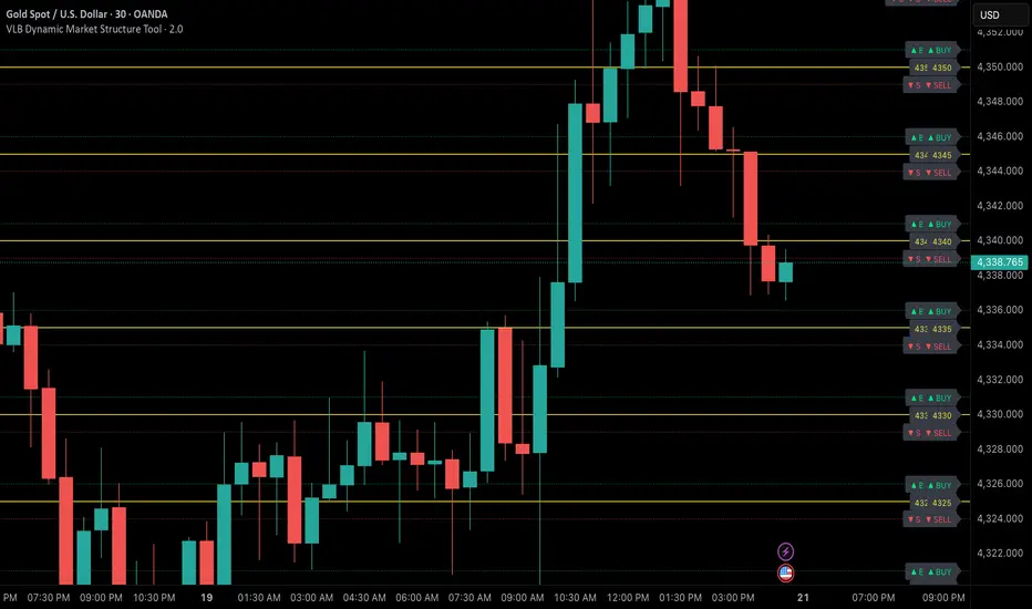
VLB Cycle Market ToolThe VLB Dynamic Levels Tool provides a visual framework for observing price structure on XAUUSD.
It displays automatically generated levels based on a rules-based approach, allowing traders to study how price interacts with important reference areas on the chart.
The tool updates dynamically as market structure evolves, reflecting changes in price movement without requiring manual redrawing.
Its purpose is to offer a clear, consistent layout of structural levels that users can incorporate into their own market analysis.
Features:
Automatically displayed structural reference levels
Dynamic recalculation as new highs and lows form
Neutral, non-predictive visual layout
A consistent framework for studying price behavior
This tool does not generate trading signals or provide predictive information.
It simply organizes price structure into visual reference points that may assist users in their independent chart analysis.
Traders remain fully responsible for their own interpretation, timing, and risk management.
The VLB Dynamic Levels Tool is intended for those who prefer a clean and adaptable way to observe XAUUSD structure throughout changing market conditions.

VLB Dynamic Market Structure ToolAdaptive Structural Continuation Framework for XAUUSD
The VLB Dynamic Market Structure Tool is a proprietary, rules-driven market structure framework designed specifically to analyze price continuation behavior in XAUUSD under live market conditions.
This tool does not plot static support and resistance.
Instead, it provides a continuously adapting structural model that reorganizes itself around current price, allowing traders to observe acceptance, rejection, and expansion behavior between key structural zones.
Core Conceptual Foundation
The framework is built on three integrated components that work together as a single methodology:
1. Dynamic Price-Anchored Structural Range
Unlike traditional indicators that rely on fixed historical levels, this tool anchors its entire structural range to live market price.
As price migrates:
Levels that are no longer relevant are automatically removed
New forward-relevant levels are introduced
The framework re-centers itself around active price action
This ensures that the trader is always viewing current, actionable structure, without manual redrawing or chart repositioning.
2. Evenly Spaced Structural Reference Levels
Within the dynamically anchored range, price is organized into consistent structural intervals that frequently act as transition points in XAUUSD price behavior.
These levels serve as objective reference boundaries, allowing traders to:
Compare reactions across identical structural distances
Observe recurring price behavior in a normalized framework
Maintain consistency across different sessions and market conditions
The levels are contextual, not predictive.
3. Post-Break Acceptance & Expansion Zones
The framework distinguishes between:
Initial structural breaks that fail or retrace
Confirmed acceptance beyond a defined offset from the level
Expansion phases as price transitions toward the next structural interval
By visualizing this sequence, the tool allows traders to study continuation behavior only after confirmation, rather than reacting to first-touch or initial breakouts.
Adaptive Behavior (Why This Is Not Static S&R)
A defining feature of the VLB Dynamic Levels Tool is its continuous recalculation and real-time adaptation:
The visible structure evolves with price
The framework moves up or down as market conditions change
Historical clutter is intentionally removed to preserve clarity
The trader’s focus remains on the active trading environment
This adaptive behavior is integral to the methodology and cannot be replicated through manual drawing or static indicators.
Intended Use
This tool is designed for discretionary traders who:
Study market structure, acceptance, and momentum
Prefer confirmation-based continuation frameworks
Value rule-based consistency over subjective interpretation
Combine structural context with their own execution, fundamentals, and risk management
The indicator does not generate automated buy or sell signals and does not execute trades.
Important Disclosures
No performance or outcome is guaranteed
No predictive claims are made
All trading decisions remain the responsibility of the user
Summary
The VLB Dynamic Levels Tool provides a self-adjusting, structurally consistent framework for observing how XAUUSD price transitions between key zones in real time.
Its proprietary value lies in the integration of dynamic price anchoring, structural normalization, and post-break acceptance visualization, offering a methodical way to study continuation behavior in changing market conditions.
Universal Moving Average🙏🏻 UMA (Universal Moving Average) represents the most natural and prolly ‘the’ final general universal entity for calculating rolling typical value for any type of time-series. Simply via different weighting schemes applied together, it encodes:
Location of each datapoint in corresponding fields (price, time, volume)
Informational relevance of each datapoint via using windowing functions that are fundamental in nature and go beyond DSP inventions & approximations
Innovation in state space (in our case = volatility)
The real beauty of this development: being simply a weighting scheme that can be applied to anything: be it weighted median , weighted quantile regression, or weighted KDE , or a simple weighted mean (like in this script). As long as a method accepts weights, you can harness the power of this entity. It means that final algorithmic complexity will match your initial tool.
As a moving ‘average’ it beats ALMA, KAMA, MAMA, VIDYA and all others because it is a simple and general entity, and all it does is encoding ‘all’ available information. I think that post might anger a lot of people, because lotta things will be realized as legacy and many paywalls gonna be ignored, specially for the followers of DSP cult, the ones who yet don’t understand that aggregated tick data is not a signal omg, it’s a completely different type of time series where your methods simply don’t fit even closely. I am also sorry to inform y’all, that spectral analysis is much closer to state-space methods in spirit than to DSP. But in fact DSP is cool and I love it, well for actual signals xD
...
Weights explained & how to use them: as I already said, the whole thing is based on combining different set of weights, and you can turn them on/off in script settings. Btw I've set em up defaults so you can use the thing on price data out of the box right away.
Price, Time, Volume weights: encode location of every datapoint in Price & TIme & Volume field
Howtouse: u have to disable one weight that corresponds to the field you apply UMA to. E.g if you apply UMA to prices, you turn off price weighting And turn on time and volume weighting. Or if you apply UMA to volume delta, you turn off volume weighting And turn on price and time weighting.
Higher prices are more important, this asymmetry is confirmed and even proved by the fact that prices can’t be negative (don’t even mention that incorrect rollover on CL contract in 2k20...).
Signal weights: encode actuality/importance/relevance of datapoints.
Howtouse: in DSP terms, it provides smoothing, but also compensates for the lag it introduces. This smoothness is useful if you use slope reversals for signal generation aka watching peaks and valleys in a moving average shape. It's also better to perturb smoothed outputs with this , this way you inject high freq content back, But in controlled way!
Signal = information.
The fundamental universal entity behind so-called “smoothing” in DSP has nothing to do with signals and goes eons beyond DSP. This is simply about measuring the relevance of data in time.
First, new datapoints need some time to be “embedded” into the timeline, you can think of it as time proof, kinda stuff needs time to be proved, accepted; while earliest datapoints lose relevance in time.
Second, along with the first notion, at the same time there’s the counter notion that simply weights new data more, acting as a counterweight from the down-weighting of the latest datapoints introduced by the first notion.
The first part can be represented as PDF of beta(2, 2) window (a set of weights in our case). It’s actually well known as the Welch window, that lives in between so called statistical and DSP worlds, emerges in multiple contexts. Mainstream DSP users tho mostly don’t use this one, they use primitive legacy windowing function, you can find all kinds on this wiki page.
Now the second part, where DSP adepts usually stop, is to introduce the second compensating windowing function. Instead they try to reduce window size, or introduce other kinds of volatility weights, do some tricks, but it ain’t provides obviously. The natural step here is to simply use the integral of the initial window; if the initial window is beta(2, 2) then what we simply need is CDF of beta(2, 2), in fact the vertically inverted shape of it aka survival function . That’s it bros. Simply as that.
When both of these are applied you have smth magical, your output becomes smooth and yet not lagging. No arbitrary windowing functions, tricks with data modification etc
Why beta(2, 2)? It naturally arises in many contexts, it’s based on one of the most fundamental functions in the universe: x^2. It has finite support. I can talk more bout it on request, but I am absolutely sure this is it.
^^ impulse response of the resulting weighs together (green) compared with uniform weights aka boxcar (red). Made with this script .
Weighing by state: encodes state-space innovation of each datapoint, basically magnitude of changes, strength of these changes, aka volatility.
Howtouse: this makes your moving average volatility aware in proper math ways. The influence of datapoints will be stronger when changes are stronger. This is weighting by innovations, or weighting by volatility by using squared returns.
Why squared returns? They encode state‑space innovations properly because the innovation of any continuous‑time semimartingale is about its quadratic variation, and quadratic variation is built from squared increments, not absolute increments.
Adaptive length is not the right way to introduce adaptivity by volatility xD. When you weight datapoints by squared returns you’re already dynamically varying ‘effective’ data size, you don’t need anything else.
...
It’s all good, progress happens, that’s how the Universe works, that's how Universal Moving Average works. Time to evolve. I might update other scripts with this complete weighting scheme, either by my own desire or your request.
...
∞
