Altseason Indicator: Liquidity and Cycle Correlation
I’d like to share some observations reflecting the dynamics of the altseason.
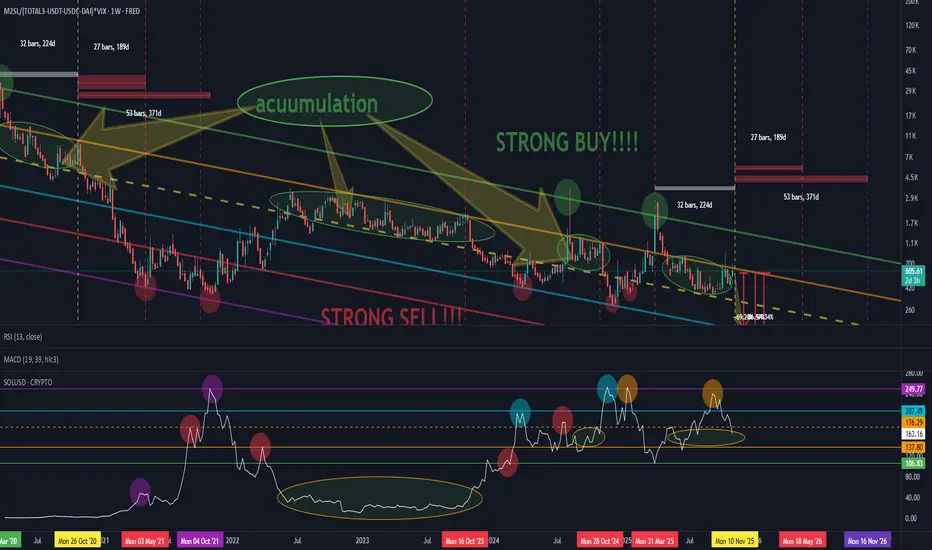
This setup may perform differently on certain assets, but during testing on Solana (SOL) it showed quite interesting results — the project has been around long enough to clearly display cyclical behavior.
The formula is based on the relationship between global money supply (M2) and crypto market capitalization excluding stablecoins, BTC and ETH :(Total3 – USDT – USDC – DAI), combined with market risk sensitivity via the VIX index.
!Observation!
Periods of altcoin accumulation tend to coincide with moments when the “money” (liquidity) metric moves sideways — between the orange dashed and solid yellow lines (shown as ellipses on the chart).
On the coin’s chart, it’s clearly visible when liquidity starts flowing back into the asset — the colored circles mark the points where price bounced off the lower liquidity boundary.
When comparing the current cycle to 2020–2021, an interesting parallel appears:
The absolute market bottom occurred on March 10, 2020.
After 32 weeks, a steady recovery began.
After another 59 weeks, the cycle peak was reached.
What followed was a drop in confidence and a final “overinflation” toward the top of the previous cycle.
In the current cycle, we seem to be in a similar phase:
about 32 weeks after the recent bottom, a move toward new highs may be forming — just like in 2020.
I’d like to share some observations reflecting the dynamics of the altseason.
This setup may perform differently on certain assets, but during testing on Solana (SOL) it showed quite interesting results — the project has been around long enough to clearly display cyclical behavior.
The formula is based on the relationship between global money supply (M2) and crypto market capitalization excluding stablecoins, BTC and ETH :(Total3 – USDT – USDC – DAI), combined with market risk sensitivity via the VIX index.
!Observation!
Periods of altcoin accumulation tend to coincide with moments when the “money” (liquidity) metric moves sideways — between the orange dashed and solid yellow lines (shown as ellipses on the chart).
On the coin’s chart, it’s clearly visible when liquidity starts flowing back into the asset — the colored circles mark the points where price bounced off the lower liquidity boundary.
When comparing the current cycle to 2020–2021, an interesting parallel appears:
The absolute market bottom occurred on March 10, 2020.
After 32 weeks, a steady recovery began.
After another 59 weeks, the cycle peak was reached.
What followed was a drop in confidence and a final “overinflation” toward the top of the previous cycle.
In the current cycle, we seem to be in a similar phase:
about 32 weeks after the recent bottom, a move toward new highs may be forming — just like in 2020.
Bài đăng liên quan
Thông báo miễn trừ trách nhiệm
Thông tin và các ấn phẩm này không nhằm mục đích, và không cấu thành, lời khuyên hoặc khuyến nghị về tài chính, đầu tư, giao dịch hay các loại khác do TradingView cung cấp hoặc xác nhận. Đọc thêm tại Điều khoản Sử dụng.
Bài đăng liên quan
Thông báo miễn trừ trách nhiệm
Thông tin và các ấn phẩm này không nhằm mục đích, và không cấu thành, lời khuyên hoặc khuyến nghị về tài chính, đầu tư, giao dịch hay các loại khác do TradingView cung cấp hoặc xác nhận. Đọc thêm tại Điều khoản Sử dụng.