Some basic tips on discovering trend changes using Point & Figure (PF) charts in conjunction with MACD and trendlines.
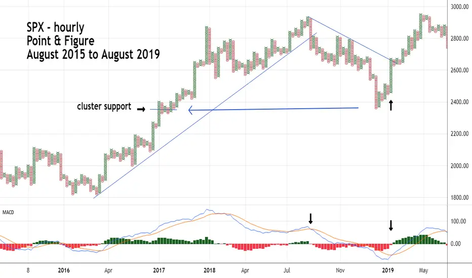
PF charts concentrate on price movements; therefore, the PF chart scale is smaller than when using Bar charts. For example, the SPX chart illustrated covers a period of three years. On a Bar chart weekly scale would be appropriate. With PF charts the scale is hourly in order to see greater detail.
MACD is a good indictor to use with PF charts because its movements are slower than many other price oscillators. This generates less signals, filtering out potential false signals.
Note the break below the multi-year trendline in October 2018 was confirmed by the MACD bearish lines crossover.
Also note that the late 2018 bottom corresponded with a prior PF price cluster of 4 – PF columns. Frequently price clusters can help identify support/resistance zones.
The rally in early 2019 was signaled first by an MACD bullish lines crossover, then confirmed with a trendline break.
Thông báo miễn trừ trách nhiệm
Thông tin và các ấn phẩm này không nhằm mục đích, và không cấu thành, lời khuyên hoặc khuyến nghị về tài chính, đầu tư, giao dịch hay các loại khác do TradingView cung cấp hoặc xác nhận. Đọc thêm tại Điều khoản Sử dụng.
Thông báo miễn trừ trách nhiệm
Thông tin và các ấn phẩm này không nhằm mục đích, và không cấu thành, lời khuyên hoặc khuyến nghị về tài chính, đầu tư, giao dịch hay các loại khác do TradingView cung cấp hoặc xác nhận. Đọc thêm tại Điều khoản Sử dụng.