Trend IntensityThis indicator uses 5 & 65 EMA to gauge intensity of a trend. It is useful for determining a trends newness & strength.
To calculate Trend Intensity, we simply divide the value of the 5 EMA by 65 EMA.
The indicator uses data from previous 500 bars to automatically calculate the minimum bullish and bearish intensity value, individual to each stock.
When a stock's current intensity is above the minimum bullish intensity value determined from its historical data, the indicator will color the area between the 5 & 65 EMA as Green, indicating an environment favoring Longs.
Similarly, when the stock's current intensity is below the minimum bearish intensity value, the indicator will color the area red, indicating an environment favoring shorts.
Lastly, when the stock is not trading above or below the minimum bullish or bearish intensity respectively, the indicator will color the area yellow, indicating slowing down of momentum or intensity, a choppy sideways environment or change of a trend.
Trend Intensity Indicator is inspired & modeled on the same concept by Mr. Pradeep Bonde(Stockbee).
Intensity

Shinohara Intensity Ratio (SIR)Shinohara Intensity Ratio (SIR) - the indicator
This indicator is used to make clear the intensity of the trend. It shows the possible trend of the price. If the price is in an uptrend or in a downtrend, the indicator shows when you can buy or sell or get out. A good example can be seen in the chart with natural gas, a few days earlier it was already seen that a trend reversal was imminent. Shinohara indicator has already indicated it a few days before.
SIR preset
Period: last 26 periods
Strong ratio: green line "GL"
Weak ratio: red line "RL"
What shows you SIR indicator
It has two lines. The strong ratio line is colored in green and the weak ratio line in red.
When the "GL" is above the "RL", this is the indication of price is an uptrend. When the "RL" is above the "GL", it indicates the price in the downtrend.
The increasing of ratio is the sign of trend intensity is increasing. In the high value of the SIR indicator trend reversal may soon.
SIR indicator line is around 100, this indicating the intensity of the price is average.
SIR line is above 120, the intensity of starting a strong trend
SIR line is above 200 or more this indication of the extreme intensity of the trend
Using Strategy
Buy Signal: "GL" is rising above the 120 and the "RL" is below the 100 level
Sell Signal: "RL" is rising above the 120 level and the "GL" is below 100 level
When the "GL" & "RL" (both lines) are rising above 120 or more then you should avoid taking any position
You can take profit or close your position, if the indicator line moving above the 200 level, then you should alert. If the price trend starts reversing, then you can close your position.

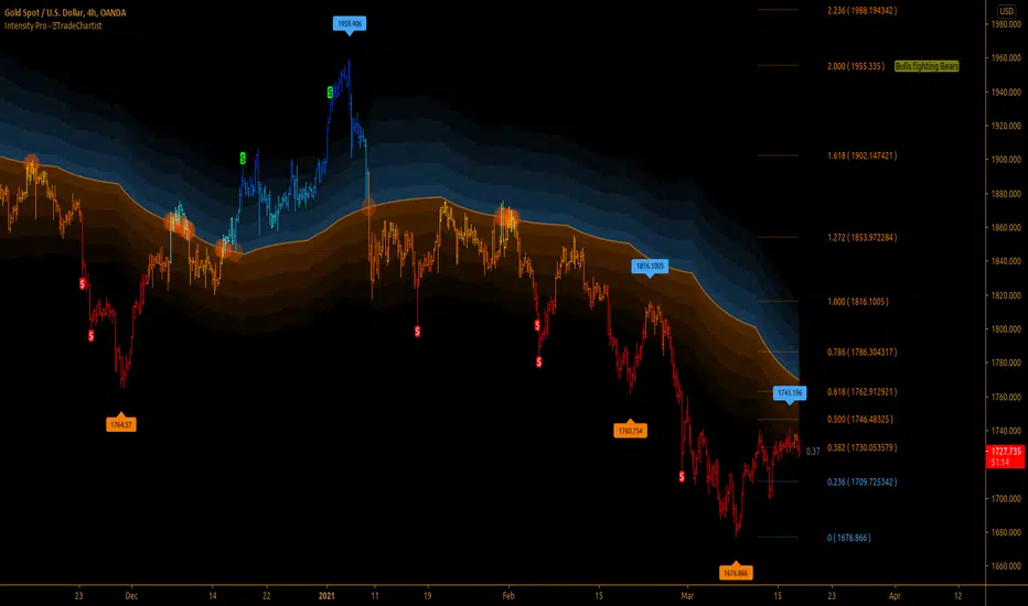
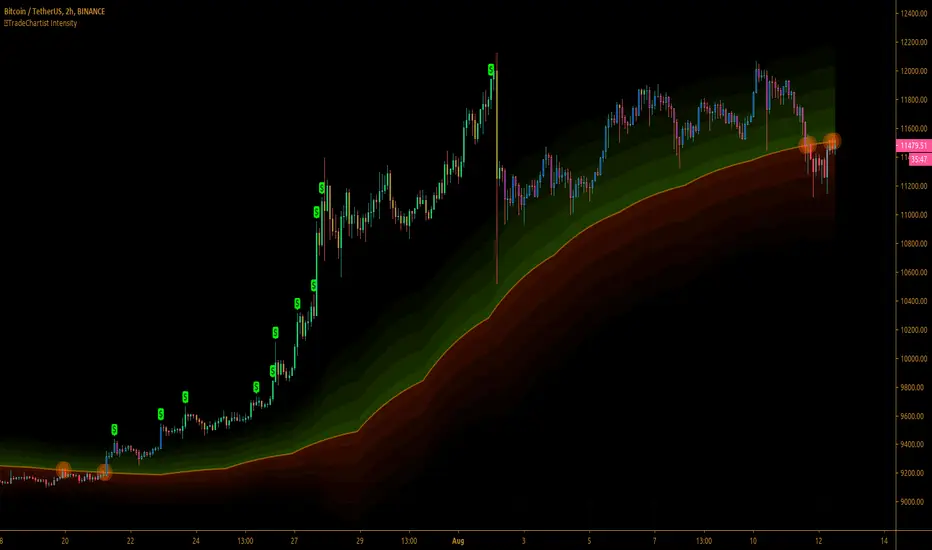
TradeChartist Intensity Pro™TradeChartist Intensity Pro is a visual indicator that comes with 5 Visual Themes and Auto-fibs feature that helps traders with Entry/Exit and levels confirmation based on where the price is, in relation to the Orange Price Equilibrium line and the 5 zones of Bull/Bear limits that fade into the top or bottom outer space.
™TradeChartist Intensity is an original Mean Reversion Model that requires no user input and Intensity Pro incorporates User adjustable Auto-Fibs and manual Fibonacci retracement feature and plots customisable Fib levels along with prices.
======================================================================================
Intensity Pro Features
Orange Mean Equilibrium Line
Bull and Bear Intensity Bands
5 Visual Themes
Trend based Bar Colours
Auto Fibonacci Levels
Custom Auto-Fib Levels
Fibonacci Levels based on Days or Bars Lookback
Current Fib Level label
High and Low Plots
Take Profit Bars
======================================================================================
Example Charts:
1. 4hr BTC-USDT
2. SPX Daily
3. EUR-USD 1hr
======================================================================================
Best Practice: Test with different settings first using Paper Trades before trading with real money
======================================================================================
This is not a free to use indicator. Get in touch with me (PM me directly if you would like trial access to test the indicator)
Premium Scripts - Trial access and Information
Trial access offered on all Premium scripts.
PM me directly to request trial access to the scripts or for more information.
======================================================================================
TradeChartist Tantalizer Pro™TradeChartist Tantalizer Pro is an extensive set of trading Indicators, Signal generators and Utilities all packed into 1 script. The script's visually appealing design and its functionality offers a pleasing experience for the users, thereby complementing their analysis and helps understand asset's price action better.
What does ™TradeChartist Tantalizer Pro do?
1. MA Tantalizer plots Moving Averages Tantalizer (Fishnet or Tantalized) based on user selection from a dropdown of 10 MAs (SMA, EMA, Zero-Lag EMA, SMMA, WMA, DEMA, TEMA, VIDYA (Variable Index DYnamic Average), T3 MA (developed by Tim Tillson featured in his article "Better Moving Averages" in 1998), Modified T3 MA). If length input is 10, Tantalizer plots 20 MA plots ranging from 10 MA to 200 MA. The Tantalized MAs help the traders to visually spot price trends and along with other indicators within the script, helps make an informed trade decision. 20 MA plots can be individually plotted or hidden from the indicator settings.
2. Plots two MAs based on user input length and timeframe which helps detect MA crosses as shown below.
3. Generates Intensity framework based Signals with recommended Stop Loss (trails with Equilibrium Line) along with Intensity Bands plot. (disables MA Tantalizer)
4. Plots Intensity candles to help spot trend and trend changes.
5. Generates TradeChartist's Rubicon framework based signals with recommended Stop Loss (trails and reverses trade when closes below or above, based on trade direction) along with Rubicon Environment plot.
6. Offers RSI color candles, Automatic Levels Generator in the toolkit to help traders visually spot RSI changes and Support/Resistance levels on chart. RSI Color Candles is a very helpful tool especially in spotting price trends on Heikin Ashi charts.
The sheer number of interesting things that can be done with this script from plotting visually engaging MA Tantalizer, detecting MA crosses not just on chart Timeframe, but also crosses between MAs of different timeframes, switching between Rubicon and Intensity environments, switching between RSI and Intensity color candles to plotting Support/Resistance levels using Automatic Levels Generator, makes this script quite versatile and a real Tantalizer.
This is not a free to use indicator. Get in touch with me (PM me directly if you would like trial access to the indicator before deciding to take lifetime access to this script)
Premium Scripts - Trial access and Information
Trial access offered on all Premium scripts.
PM me directly to request trial access to the scripts or for more information.

™TradeChartist Intensity™TradeChartist Intensity is a visual indicator that comes with Intensity color candles and Auto-fibs feature that helps any trader with Entry/Exit and levels confirmation based on where the price is, in relation to the Orange Price Equilibrium line and the 5 zones of Bull/Bear limits that fade into the top or bottom outer space.
™TradeChartist Intensity itself doesn't plot BUY or SELL signals, but when used with ™TradeChartist Rubicon gives a better picture for trade confirmations. It can also be used as a standalone indicator and works equally effective with other traditional and non-traditional indicators.
The indicator comes with simple settings with useful features outlined below.
Intensity Color Candles
Intensity Color Candles when activated from settings paints the candles/bars with colors specific to the Bull/Bear limits or the outer space and is easy to identify the signal strength over time.
Uptrend - The bars/candles move away from the Orange Price Equilibrium line towards the upper Bull limits with bar color fading slowly leading to outer space where the bar color turns neon green.
Downtrend - The bars/candles move away from the Orange Price Equilibrium line towards the lower Bear limits with bar color fading slowly leading to outer space where the bar color turns neon red.
When the price candle wick or body touches the Orange Price Equilibrium line, distinct torchlight circle appears to signal the trader of a potential change in price direction which can be used as a signal confirmation in conjunction with another indicator before taking a trade position.
Show Auto Fib Levels
Auto Fib Levels plot automatic Fib levels based on significant Highs and Lows based on Intensity strategy which mostly are reference prices of recent highest high above Orange Equilibrium price line and recent lowest low below the Orange Equilibrium price line.
15m XBT chart with 'Show Auto Fib Levels' checked and 'Show Fibs from current High/Low' unchecked under indicator settings
These Auto Fib Levels change when the price movement/trend changes direction and will be based on trending price direction.
Show Fibs from current High/Low
When this option is chosen from indicator settings, the auto fib levels are drawn from the highest high of the trending price direction to lowest low of last trend for uptrend or vice-versa for downtrend.
15m XBT chart as above with 'Show Fibs from current High/Low' unchecked under indicator settings
Show Profit Candles
Activating this option from indicator settings will automatically plot $ labels above candle highs that hit important resistance levels during uptrend and candle lows that hit important support levels during downtrend. This will help traders take out profits during trades based on their personal profit goals and realistic trade targets based on momentum/RSI/volatility etc.
Example chart of XAUUSD 1hr Gold chart showing both Long and Short trade Profit candles
Give a thumbs up or leave a comment if you like the script.
Trend Intensity IndexTrend Intensity Index indicator script. This indicator was originally developed by M. H. Pee (06/2002 issue of Stocks and Commodities Magazine)
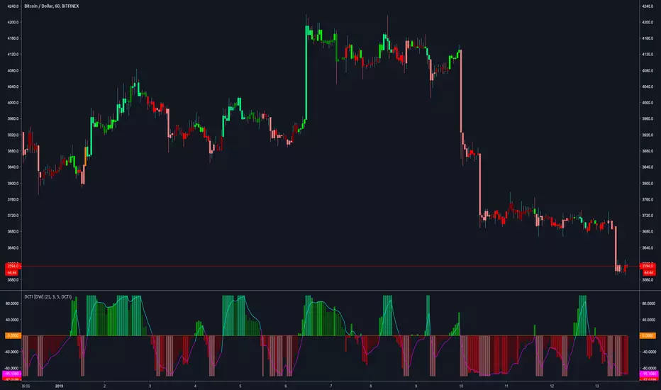
Donchian Channel Trend Intensity [DW]This is an experimental study designed to analyze trend intensity using two Donchian Channels.
The DCTI curve is calculated by comparing the differences between Donchian highs and lows over a major an minor period, and expressing them as a positive and negative percentage.
The curve is then smoothed with an exponential moving average to provide a signal line.
Custom bar colors included with two coloring methods to choose from.
Trend Intensity Index [DW]This study is a simple variation of M. H. Pee's Trend Intensity Index that includes two signal lines rather than one for additional trend confirmation.
