Valuation Multi-Asset [MTF]Description This indicator is a specialized Intermarket Analysis tool designed to determine the relative valuation of an asset by comparing its performance against key global benchmarks (Currency, Commodities, Bonds, and Sector ETFs).
Unlike standard oscillators (like RSI) that only look at the asset's own price, this script calculates a Relative Value Index.
Underlying Concepts & Methodology The script operates on the principle of asset correlation and mean reversion ratios. The calculation logic follows these steps:
Ratio Calculation: It computes the price ratio between the Chart Asset and a Benchmark Asset (e.g., Symbol / DXY).
Smoothing: It applies a double smoothing method using Exponential Moving Averages (EMAs) to filter out short-term noise from the ratio.
Historical Normalization: Based on valuation theories (inspired by concepts like Larry Williams' valuation window), the script normalizes the smoothed ratio over a user-defined lookback period (default is 3 years/156 weeks). This ranks the current relative value between 0 and 100.
Key Features
Multi-Benchmark Comparison: Automatically compares the asset against the Dollar Index (DXY), Gold (GC1!), Bonds (ZB1!), and Sector ETFs.
MTF Dashboard: Includes a Multi-Timeframe table to see valuation status across Daily, Weekly, and Monthly views simultaneously.
ETF Reference: A built-in reference table to help you quickly find the correct Sector ETF for stock correlation.
How to Use
Undervalued Zone (< 15): When the line turns Green (or enters the bottom zone), the asset is historically cheap relative to the benchmark. This often indicates a potential accumulation or reversal point.
Overvalued Zone (> 85): When the line turns Red (or enters the top zone), the asset is historically expensive relative to the benchmark, suggesting potential distribution.
Divergences: Watch for divergences between the asset price and the Valuation Index (e.g., Price makes a new high, but the Valuation Index against Gold makes a lower high).
Settings
You can toggle individual benchmark lines (Asset 1 to 4).
Adjust the "Lookback Period" to change the historical normalization window.
Customize the Overbought/Oversold thresholds.
Dao động

VLinerMarket R1"VLiner Market R1" is our debut volume analysis tool designed to provide traders with comprehensive market insights through basic volume analysis - Delta volume. Inspired by the principles of an Order-Flow Trader.
Further details:
Market R1 features a unique design approach that combines two powerful analytical components, Volume Oscillator and Delta Bubbles (tick-volume).
The VO tracks 15-minute candle momentum using white/orange color coding.
Whilst the Delta Bubbles track 30-minute candle buy/sell pressure.
Documents:
The full User's manual for the use and concepts of this indicator is available on MT Blue's website
: mtblue-nsg.com
R1 uses:
- Tick movement volume (not real data volume)
- A look-back system for *semi-stochastic oscillation (delta toning: white & orange part of the VO's line)
Slight concerns:
- Although it may seem to be an indicator trading tool; it is Not .
This indicator only provides visualization for educational purposes, and is strictly advised Not to be use for trading/investing executions.

Hybrid Confluence (RSI,MFI,StochRSI) Two-Tier Momentum Framework
Many traders explore multi-oscillator hybrid confluence approaches that combine momentum and volume signals—most commonly RSI, Money Flow Index (MFI), and Stochastic RSI—to study stretched market conditions. These hybrid concepts are widely used to analyze potential exhaustion zones, cycle extremes, and periods of sustained buying or selling pressure across different timeframes.
This script does not replicate, reverse-engineer, or replace any paid or closed-source indicator.
Instead, it provides a fully transparent framework built exclusively from standard, well-documented technical indicators. All calculations are explicit and configurable, allowing traders to study hybrid momentum behavior without relying on proprietary logic or black-box tools.
What the Script Does
1. Builds a hybrid momentum confluence model
The script combines three widely used oscillators:
• RSI (Relative Strength Index) — price momentum
• MFI (Money Flow Index) — volume-weighted momentum
• Stochastic RSI — momentum relative to its own recent range
Each component operates on a normalized 0–100 scale, allowing meaningful comparison and aggregation.
2. Implements a clear two-tier signal structure
Instead of producing a single binary buy/sell output, the script separates early pressure from extreme conditions:
2-of-3 Confluence (Setups)
When any two of the three oscillators reach oversold or overbought levels:
• Displayed as semi-transparent circles
• Indicates building pressure or a developing condition
• Designed as a heads-up, not a trade signal
3-of-3 Confluence (Signals)
When all three oscillators reach oversold or overbought levels:
• Displayed as prominent vertical bars spanning the oscillator range
• Represents extreme momentum alignment
• Intended to highlight potential exhaustion zones
3. Visualizes sustained pressure using consecutive signal intensity
When 3-of-3 conditions persist across multiple bars:
• Each consecutive bar becomes progressively darker
• Up to six discrete intensity levels
• Darkness reflects duration and persistence, not prediction
This helps visualize scenarios where markets continue pushing higher or lower before a major turning point, rather than assuming a single signal marks the exact top or bottom.
4. Works across markets and timeframes
Because all inputs rely on standard technical indicators:
• Works on crypto, equities, futures, and FX
• Scales naturally from intraday to higher timeframes
• Can be used on Daily and multi-day charts for macro context
Why This Script Is Useful
Traditional oscillators often produce isolated signals that lack context. This framework adds clarity by:
1. Requiring multi-indicator agreement instead of single-signal triggers
2. Separating early pressure from extreme conditions
3. Showing how momentum can persist before a reversal
4. Avoiding binary “buy now / sell now” outputs
5. Remaining transparent and configurable
This makes the tool especially useful for:
• Swing traders
• Macro and cycle-focused traders
• Crypto traders studying extended momentum phases
• Analysts who prefer contextual signals over rigid rules
How to Use
1. Adjust RSI, MFI, and StochRSI lengths to suit your timeframe
2. Observe 2-of-3 circles as early warnings of building pressure
3. Watch 3-of-3 bars for extreme momentum alignment
4. Note increasing bar intensity as pressure persists
5. Combine with structure, trend, volume, or price action for decisions
This script is best used as a contextual tool, not a standalone trading system.
What This Script Is Not
• Not a recreation of any paid or proprietary indicator
• Not affiliated with any trading educator or platform
• Not intended as a predictive or standalone trading system
• Does not claim to identify exact tops or bottoms
All signals are derived solely from openly documented RSI, MFI, and Stochastic RSI calculations.
Important Notes
• This script is original, with a transparent methodology
• All calculations use standard, well-known technical formulas
• No hidden logic or undisclosed weighting is used
• Signal visuals are descriptive, not predictive
Disclaimer
This tool is provided for educational and analytical purposes only.
It does not constitute financial advice or a recommendation to trade.
Always validate settings, test on multiple assets and timeframes, and use proper risk management before trading live.

RSI Multi-TimeFrame [PACHI]This will show a Table with multiple time frames RSI levels.
> 68 the table cell will be red for given timeframe to indicate overbought
< 35 the table cell will be green for given timeframe to indicate oversold
there are few settings you can play with. if you have any suggestions, let me know.
// Pachi

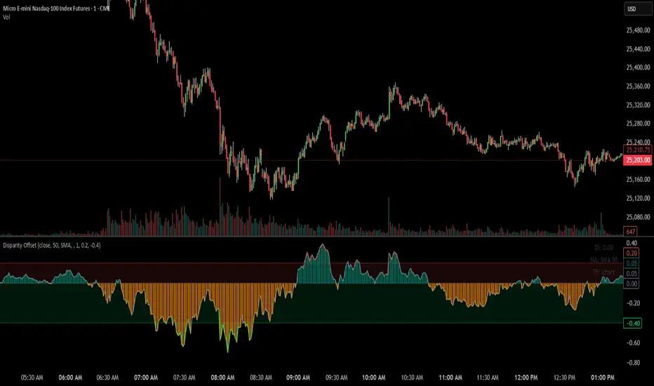
Disparity Offset [WizardTrendsInc]Disparity Offset
Description
Disparity Offset measures how far price is offset from a selected moving average, expressed as a percentage. It shows whether price is trading above or below its average and by how much, helping visualize price extension, balance, and deviation from the mean. The indicator oscillates around a zero line, where zero represents price being aligned with the moving average.
How to Use Disparity Offset
Zero Line (0%)
When the Disparity Offset is near zero, price is close to the moving average, suggesting equilibrium.
Positive Values
Values above zero indicate price is above the moving average. Larger positive readings show stronger upward offset from the average.
Negative Values
Values below zero indicate price is below the moving average. Larger negative readings show stronger downward offset
Upper & Lower Offset Zones
The configurable upper and lower percentage levels highlight when price is relatively far from the moving average. Movement back toward the zero line can be used to study mean-reversion behavior.
Visual Aids
Histogram bars show direction and intensity of the offset
Shaded zones emphasize overextended conditions
Optional markers display crossings of offset levels and the zero line for observation and learning
"Disclaimer: This indicator is intended for educational purposes only and does not constitute financial advice. Trading involves significant risk, and users should perform their own research and consult with a licensed financial advisor before making any trading decisions.
ARDO - Adaptive Regression Deviation Oscillator (v2.4.6)ARDO – Adaptive Regression Deviation Oscillator (v2.4.6)
ARDO (Adaptive Regression Deviation Oscillator) quantifies deviation of price structure from a regression-based equilibrium baseline using adaptive moving-average spreads. It combines percentile-normalized distance, linear-regression slope, and dynamic gradient scaling to reveal trend extension, exhaustion, and regime shifts—offering a structural view of trend integrity and mean-reversion timing beyond traditional momentum oscillators. It is designed to help you answer two questions:
Where are we in the regime? (extended, neutral, or reversal-prone)
Is this a “trade” environment or a “stand aside” environment? (Gate PASS vs Gate BLOCK / drift)
ARDO is best used as a context + timing framework , not a standalone entry/exit system.
What you see in the ARDO pane
1) Spread A (% vs baseline)
Primary “timing” spread (default: stepline). Spread A is colored by a 4-state maColor model:
GREEN : above baseline and strengthening
ORANGE : above baseline but weakening
RED : below baseline and weakening
GRAY : below baseline but improving
2) Spread B (% vs baseline)
Secondary “context” spread (default: columns). Same 4-state color model as above, often used to confirm or filter Spread A behavior.
3) LinReg (slope-gradient)
A LinReg line fit to a selected source (Spread A / Spread B / Spread A+B). ARDO applies a slope-magnitude gradient (opacity/intensity) to visualize regime:
Stronger slope magnitude = stronger directional regime
Fading / low slope magnitude = drift / dead-zone (lower edge, choppy conditions, or end-of-move)
4) Tier zones (Q0–Q2, H2–H4)
ARDO classifies LinReg values into percentile tiers (extremes and mid-tiers). These tiers can be rendered as:
Background regions, or
Zero-line marker circles (“MK …” plots)
Important: Background colors do not export . The “MK Q0 … MK H4” series are emitted so you can reconstruct tier membership in CSV/backtests.
5) Gate PASS / Gate BLOCK
A compact “permission layer” that can require:
Spread A > LinReg
EMA Fast > EMA Slow
Minimum Spread A threshold
Minimum absolute LinReg slope
Use Gate PASS to focus on higher-quality conditions; use Gate BLOCK as a “do nothing / reduce size” warning.
Key settings (what they change)
Tier Mode
Standard: symmetric cut structure (general purpose)
Asymmetric: separate tuning for highs vs lows (often better when upside and downside behavior are not symmetric)
Tier Population
All Bars (LinReg): tiers represent the full LinReg distribution
Pivots Only: tiers are computed from pivot events only (can tighten “extreme” definition and change how frequently zones appear)
Render Mode
Background: easiest to read visually
Zero-line Markers: best for export/backtesting workflows (MK series)
Gating options
Turn on/off each rule independently; adjust thresholds to match symbol volatility and timeframe.
Color overrides
Optional per-state color customization for Spread A, Spread B, and LinReg (4-state).
Alerts included (v2.4.6)
ARDO exposes named alerts you can use for automation or review, including:
Gradient / regime alerts (HIGH vs LOW slope-magnitude regimes; regime shift transitions)
Color-state changes (Spread B → GREEN/ORANGE/RED/GRAY; LinReg state changes)
Tier entry alert s (LinReg entering key tiers such as Q0/Q1/H3/H4)
Structural primitives (Bullish A > B, Bearish A < B, Gate PASS/BLOCK, crosses of 0, etc.)
How to use (practical workflow)
Anchor timeframe (65m or Daily): identify regime (tiers + gradient) and whether you should be aggressive or defensive.
Execution timeframe (5m/1m): time entries using Spread A/B structure and Gate PASS, aligned with the anchor regime.
Avoid forcing trades in drift: fading gradient + mid/low-edge tiers often marks “dead-zone” conditions.
Notes / limitations
ARDO is a context engine: it describes regime and location, not guaranteed direction.
Tier thresholds are distribution-based and will vary by window/timeframe.
Always apply your own risk management; this script is not financial advice.

Adaptive Signal IndicatorAdaptive Signal Indicator
Overview
The Adaptive Signal Indicator is a multi-timeframe confirmation system designed to help traders and investors identify potential entry and exit points. It automatically adjusts its analysis timeframes based on your chart's timeframe, providing consistent signal logic whether you're viewing 15-minute or weekly charts.
How It Works
This indicator combines multiple technical components that must align before generating a signal. However, the signal has a heavier weighting on price action because real investors know that "Only Price Pays." Additionally, rather than relying on a single indicator, it requires confirmation across several dimensions:
Trend Analysis — Evaluates short-term price structure using dual exponential moving averages
Wave Detection — Monitors momentum shifts using smoothed momentum calculations
Flow Tracking — Analyzes volume dynamics to confirm price movements have participation
Pulse Filter — Ensures signals align with the current directional bias of oscillator momentum
Macro Alignment — Checks higher-timeframe trend agreement before triggering signals
Drift Gate — Requires short-term trend confirmation on the daily timeframe
Cross Detection — Identifies key moving average crossovers on the daily timeframe
Range Position — Uses volatility bands to filter signals at extreme price levels
Signal Logic
Buy signals require:
Multiple bullish confirmations across different analysis methods
Macro trend not in bearish alignment
Pulse filter confirming upward momentum
Drift gate showing bullish daily bias
Sell signals require:
Bearish momentum confirmation
Macro trend not in bullish alignment
Pulse filter confirming downward momentum
Dashboard
Two real-time tables display:
Status Panel (Top Right)
Current state of all 8 analysis components
Color-coded for quick visual assessment
Shows conditions count and last signal status with % change since signal
Statistics Panel (Bottom Right)
Total signals generated
Success rate with win/loss breakdown
Average return per signal
Average winning and losing trade percentages
Profit factor
Maximum win and loss percentages
Key Features
✓ Adaptive Timeframes — Automatically selects appropriate analysis timeframes based on your chart
✓ Multiple Confirmations — Reduces false signals by requiring agreement across different analysis methods
✓ Clear Signals — Distinct BUY/SELL markers with no ambiguity
✓ Built-in Statistics — Track historical performance directly on chart
✓ Works on Any Market — Stocks, crypto, forex, indices, commodities
✓ Clean Visual Design — Overlay design keeps your chart readable
Best Practices
Use this indicator as one component of your overall trading plan
Consider your own risk management rules for position sizing and stop losses
Backtest on your preferred markets and timeframes before live trading
Signals work best in trending market conditions (the indicator filters for trend strength)
Who This Is For
Traders who prefer a systematic approach with clearly defined entry conditions. Suitable for swing trading and position trading timeframes. The multi-confirmation requirement means fewer signals, but each signal has passed multiple filters.
Note: Past performance shown in the statistics panel is based on historical data and does not guarantee future results. This indicator provides analysis tools to support your trading decisions—it is not financial advice. Always use proper risk management

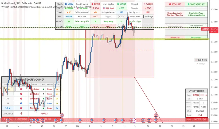
Wyckoff Institutional Decoder [OXE]4 Professional Dashboard Panels
Panel 1: RETAIL VS SMART MONEY INSIGHT (Top-Right)
This is the showstopper - side by side comparison:
🔴 RETAIL SEES🟢 SMART MONEY SEES"Support broke! 📉 SELL!""Spring trap complete ✓ Institutions buying""Breakout! 📈 BUY!""Upthrust trap complete ✓ Institutions selling""Downtrend continuing, Stay short""Accumulation Phase, Institutions loading""Just a pullback, Buy the dip!""Late Distribution, Breakdown approaching"
Plus:
Effort vs Result interpretation
Outcome prediction (Retail: "Gets stopped out 💀" vs Smart Money: "Enters at best price ✓")
Panel 2: MAIN WYCKOFF DASHBOARD (Bottom-Right)
MetricDisplayPhaseACCUMULATION / DISTRIBUTION / MARKUP / MARKDOWNStrength████ 85% (visual progress bar)Sub-PhaseA - Selling Climax, B - Building Cause, C - Spring, etc.Smart MoneySTRONG BUYING / Buying / Neutral / Selling / STRONG SELLINGVolume🔊 EXTREME / 🔉 High / 🔈 Low with ratio (2.3x)Effort/ResultABSORPTION / EASY MOVE / BALANCEDCause Built45 bars (45%) - shows target potentialTarget↑ 2,145.50 (projected price target)◆ ACTIONBUY THE SPRING / SELL THE UPTHRUST / WAIT & OBSERVE
Panel 3: EVENT LOG (Middle-Right)
Real-time chronological log of Wyckoff events:
📋 EVENT LOG
━━━━━━━━━━━━━━━━━
SPRING 🟢 | 3 bars
Test (Spring) | 8 bars
Sign of Strength | 15 bars
Selling Climax | 42 bars
Panel 4: LEGEND (Bottom-Left)
Quick reference for all chart markers:
▲ SPRING = Buy Signal
▼ UTAD = Sell Signal
◆ SOS = Strength Confirmed
◆ SOW = Weakness Confirmed
● SC/BC = Climax Volume
╳ T = Test Event
— — = Creek / Ice levels
📊 Chart Visualizations
Structure Elements
Trading Range Box - Color-coded by phase (blue=accumulation, red=distribution)
Creek Level - Dashed blue line (resistance within accumulation)
Ice Level - Dashed red line (support within distribution)
Target Projection - Arrow showing price target based on "cause"
Event Markers
SPRING ▲ - Green triangle below bar
UTAD (Upthrust) ▼ - Red triangle above bar
SOS ◆ - Green diamond (Sign of Strength)
SOW ◆ - Red diamond (Sign of Weakness)
SC/BC ● - Orange circles (Selling/Buying Climax)
Tests ╳ - Small X markers
LPS/LPSY - Labels for Last Point of Support/Supply
Volume Highlighting
Orange background = Ultra-high volume (institutional activity)
Yellow background = High volume
🧠 Smart Detection Engine
Phase Detection
Automatically identifies:
ACCUMULATION (Smart money buying)
Sub-phases: A (Selling Climax), B (Building Cause), C (Spring), D (SOS), E (Breakout)
DISTRIBUTION (Smart money selling)
Sub-phases: A (Buying Climax), B (Building Cause), C (UTAD), D (SOW), E (Breakdown)
MARKUP (Uptrend)
MARKDOWN (Downtrend)
Event Detection
Selling Climax (SC)
Automatic Rally (AR)
Secondary Test (ST)
Spring
Sign of Strength (SOS)
Last Point of Support (LPS)
Buying Climax (BC)
Upthrust After Distribution (UTAD)
Sign of Weakness (SOW)
Last Point of Supply (LPSY)
Tests (low volume confirmations)
Volume Analysis
Effort vs Result - Detects absorption (high volume, small move)
Stopping Volume - Climax with rejection wicks
No Demand/Supply - Low volume showing lack of interest
Smart Money Score - Composite Operator activity gauge (-10 to +10)
Price Targets
Cause & Effect calculation
Projects targets based on consolidation width
Shows when enough "cause" has built up
⚡ All Alerts Included
Spring detected
Upthrust detected
Sign of Strength
Sign of Weakness
Selling/Buying Climax
Spring/Upthrust Tests
LPS/LPSY
Phase changes (Accumulation → Markup, etc.)
🎨 Optimized for White Backgrounds
All colors carefully selected for:
High contrast on white charts
Easy readability
Professional appearance
No eye strain
Settings You Can Customize
Structure detection length
Pivot sensitivity
Volume spike thresholds
Spring/Upthrust sensitivity
Dashboard size (small/normal/large)
All colors
Toggle each panel on/off
Toggle each visualization element
Combined: Gann HL + Supertrend + Supertrend v6Combined: Gann HL + Supertrend + Supertrend v6
Included Indicators
1. Gann High-Low Activator
A dynamic trend tool that flips direction when price crosses its smoothed high/low average. Gann signals often catch clean directional swings and act as an excellent early trend filter.
2. Standard Supertrend (ATR-based)
The classic trend-following indicator using average true range for volatility-adaptive stop levels. Its direction flips mark trend reversals, especially effective in trending markets.
3. Orekhov Supertrend (GPL Classic)
A robust version of Supertrend that includes wick sensitivity and doji-handling logic. It behaves smoothly on lower timeframes, avoiding false flips and maintaining direction more intelligently.

Squeeze Momentum OscillatorTitle: Squeeze Momentum Oscillator
Description: This indicator is a panel-based oscillator designed to visualize the relationship between market volatility and momentum. Based on the classic TTM Squeeze concept, it helps traders identify periods of consolidation ("The Squeeze") and the subsequent release of energy ("The Breakout").
Originality & Enhancements: Standard squeeze oscillators only show when a squeeze fires (turning from red to green). This enhanced version adds a specific Breakout Validation layer. It changes the center-line dot color to Fuchsia or Blue only if the squeeze release is confirmed by the slope of the 20-period Moving Average, filtering out weak or false fires.
How It Works:
1. The Center Line (Volatility State): The dots along the zero line tell you the current volatility condition:
🔴 Red Dot: Squeeze ON. Bollinger Bands are inside Keltner Channels. Volatility is compressed. The market is charging up.
🟣 Fuchsia Dot: Bullish Breakout. The squeeze has fired upward, and the underlying trend (20 SMA slope) is positive.
🔵 Blue Dot: Bearish Breakout. The squeeze has fired downward, and the underlying trend (20 SMA slope) is negative.
🟢 Green Dot: Squeeze OFF. Normal volatility conditions.
2. The Histogram (Momentum): The bars indicate the strength and direction of the price movement using Linear Regression logic:
Cyan/Green: Bullish momentum. (Darker = weakening).
Red/Maroon: Bearish momentum. (Darker = weakening).
Visual Guide:
Setup: Wait for a series of Red Dots.
Trigger: Look for the first Fuchsia (Bullish) or Blue (Bearish) dot accompanied by an expanding Histogram in the same direction.
Settings:
Feature Toggle: You can turn the "Breakout Colors" (Fuchsia/Blue) on or off if you prefer the classic look.
Sensitivity: Fully customizable lengths and multipliers for Bollinger Bands and Keltner Channels.
Credits: Based on the foundational TTM Squeeze oscillator logic. Linear regression momentum calculation adapted from standard open-source methods. Breakout validation logic added for enhanced reliability.

Trade TableDisplays a trade table for a given account size and risk percentage for long or short trades along with a calculated stop loss and number of shares to purchase. An optional table showing the PSC calculations is also available.

Oscillation filterDescription: This is a customized technical indicator designed to assist traders in analyzing overbought and oversold conditions in volatile or trending markets. It plots overbought and oversold conditions of different colors as distinctions for multiple periods.
Working principle: This indicator calculates the oscillation index value of the given parameter and projects it onto a chart to visualize the fluctuation limit. It helps identify oscillations, trend reversals and manage risks under various market conditions.
Access: This is an invitation-only script. To request access or permission, please refer to X: @Dev0x_AI for communication.
震荡过滤器

Multi Timeframe Signal DashboardShows 10 indicators across 6 timeframes (5M, 15M, 30M, 1H, 4H, 1D):
EMA 50/100 crossover
RSI (with oversold/overbought highlighting)
MACD
DMI (DI+/DI-)
Stochastic (with extremes)
CCI
Bollinger Bands
VWAP
EMA 200 Trend
Momentum
Each cell shows ▲ (bullish/green) or ▼ (bearish/red), with scores per row and column, plus an overall BUY/SELL/HOLD signal.

Trend Change ScannerTrend Change Scanner
Focused on detecting trend reversals:
Shows reversal status: BULL REV, BEAR REV, BULL SETUP, BEAR SETUP, or Neutral
Displays: Trend direction, RSI, ADX, EMA Gap %, Bull/Bear scores
Yellow highlight when EMA gap < 0.5% (EMAs converging - potential cross)
Overall signal with action recommendation

Fusion Reversion Meter LiteFusion Reversion Meter Lite™
Market Energy & Exhaustion Gauge
Fusion Reversion Meter Lite shows whether market conditions support your next trade — not direction, but energy state.
It answers a critical question:
Does price have fuel to continue… or is it running out of steam?
METER STATES
🟢 GO → Energy depleted
→ Reversion behavior favored
🟡 CAUTION → Energy transitioning
→ Expect chop or mixed conditions
🔴 STOP → Energy expanding
→ Continuation behavior favored
HOW TO USE
GO → Favor reversion trades
CAUTION → Reduce size or wait for clarity
STOP → Favor continuation trades; avoid fading price
This allows you to trade with confidence, knowing whether retracements are likely or not.
WHAT THIS MEASURES
A composite of:
Oscillator intensity
Volume energy
Volatility expansion
Combined into a single, real-time energy gauge.
It tells you whether the market has fuel — not which way it’s going.
PAIRS WELL WITH
FusionPredict Lite™ — shows where price may want to go.
Used together:
FusionPredict target + Meter GO → Wait for pullback / reversion
FusionPredict target + Meter STOP → Continuation may run clean
FULL VERSION
The full Fusion Reversion Meter™ includes:
Directional awareness
Multi-timeframe energy analysis
Smart alerts and automation hooks
Available at fusionpredictor.com

FusionPredict LiteFusionPredict Lite
Single-Timeframe Reversion Target Indicator
FusionPredict Lite highlights where price is statistically likely to revert toward equilibrium after momentum displacement.
Rather than chasing candles, this tool helps you see where price may want to go next — allowing for cleaner entries, better patience, and reduced emotional trading.
LINE COLORS
🟢 Green Line → Reversion target above current price (bullish bias)
🔴 Red Line → Reversion target below current price (bearish bias)
WHY THIS MATTERS
Knowing the reversion level helps you:
Avoid entering directly into a pullback
Anticipate where momentum may pause or unwind
Decide whether to wait for price to come to you or trade continuation confidently
This is useful not only for scalping, but also for timing cleaner entries during strong moves.
HOW TO USE
Watch how price approaches and reacts to the reversion line
Use it to plan entries without chasing price
Best on 1–5 minute charts, but works on all timeframes
Compatible with crypto, forex, futures, indices, and metals
WHAT THIS IS
FusionPredict Lite is the single-timeframe version of the FusionPredict engine.
It measures:
Momentum displacement
Oscillator imbalance
Volatility structure
…and projects where price may revert as energy normalizes.
PAIRS WELL WITH
Fusion Reversion Meter Lite™ — helps determine whether market conditions favor:
A clean move toward the target
Or a continuation without retracement
FULL VERSION
The full FusionPredict™ includes:
Multi-timeframe alignment (up to 6 timeframes)
Smart alerts and confluence logic
Advanced energy-aware projections
Available at fusionpredictor.com

Gold Flow Indicator (5-Min Model)MST XAU Hybrid 5M is a confluence-based technical indicator built specifically for XAUUSD on the 5-minute timeframe.
It uses a combination of exponential moving averages (EMA crossovers), RSI trend strength, and MACD momentum direction to filter out weak signals and highlight only the highest-quality setups.
The tool is designed for scalpers and short-term intraday traders who want clarity in fast market conditions.
No repainting, clean visuals, and easy-to-interpret signals make it suitable for both beginners and advanced traders.
Developer: MST (Maa Sharda Trading)

MADD Monkey Pro DMCx Directional Momentum and Confluence EngineMadd Monkey Pro DMCx is a bias and momentum indicator that helps intraday traders read short-term direction and the strength of current moves. It is designed to provide structured context so you can decide when conditions support your ideas and when they do not.
Purpose
DMCx is built to help you answer:
What is the current directional bias on this chart?
Is momentum supporting that direction or fading?
Does the current environment meet the confluence conditions you have defined?
Core components (high-level logic)
DMCx combines several elements:
Directional engine – evaluates recent price behavior to classify conditions as bullish, bearish or neutral.
Momentum and volatility engine – distinguishes between stronger impulsive moves and slower or less convincing movement.
Confluence layer – optional filters requiring agreement between direction, momentum and other conditions before highlighting a setup.
Signal quality tagging – internal tagging that lets you treat some conditions as higher or lower quality, depending on your configuration.
These components are presented through chart markers and a compact status panel summarizing the current bias and momentum state.
Key features
Clear bias / regime read to show whether price is trending up, trending down or in more neutral conditions.
Momentum and volatility context to help distinguish between strong pushes and weaker phases.
Optional confluence filters so only aligned conditions are highlighted.
A status panel that provides a high-level snapshot of bias, momentum and simple tallies based on how you interpret the output.
Modular controls allowing you to toggle key visuals (signals, labels, panel) on or off to match your preferred chart layout.
Suggested usage
Symbols and timeframes: Can be used on XAUUSD, FX pairs, indices and other liquid instruments. Intraday frames like 15m, 5m or 1h are common use cases, but you may explore higher or lower timeframes according to your own testing.
Define your higher timeframe bias and important price levels using your own methods.
Use DMCx to check:
Whether short-term direction is aligned with your idea.
Whether momentum supports that view or suggests caution.
Consider taking trades only when your setup and the DMCx context agree, and you have clear rules for entry, stop loss and target.
Treat the readings as context, not as standalone entry or exit signals.
Notes and limitations
DMCx does not repaint closed bars, but its bias and momentum states update as new data appears. This is normal for any real-time context tool.
Any performance-style interpretation of the output depends completely on how you choose to use it. The script does not guarantee results.
Risk disclaimer
This script is provided for informational and educational purposes only. It does not constitute financial advice, investment advice or a solicitation to buy or sell any financial instrument. Trading and investing in financial markets involve significant risk, and you can lose more than your initial investment. Past performance and historical behavior do not guarantee future results.
By using Madd Monkey Pro DMCx, you accept full responsibility for your own trading decisions and outcomes. The author is not liable for any loss or damage arising from the use of this script.

macd pro本脚本是对经典 MACD 的改良版本,在保留原有趋势与动能结构的基础上,引入收盘确认与非重绘信号输出机制,提升实时使用的一致性与可执行性。通过动能极值过滤、趋势一致性校验与去噪防抖处理,重点捕捉更高质量的拐点与回归机会,减少随意抄底与摸顶带来的低胜率信号。脚本以闭源方式公开发布,用于保护核心算法细节,同时保留必要的参数与可视化以便按品种与周期进行调优。
This script is an enhanced version of the classic MACD, preserving its trend/momentum structure while adding close-confirmed, non-repainting signal logic for more consistent real-time execution. It combines momentum-extreme filtering, trend-alignment validation, and noise-suppression/debouncing to prioritize higher-quality turning points and mean-reversion opportunities, reducing low-conviction “random bottom/top picking.” The script is published as closed-source to protect proprietary logic while keeping essential inputs and visuals for practical tuning across assets and timeframes.

BTC Regime Oscillator (MC + Spread) [1D]ONLY SUPPOSED TO BE USED FOR BTC PERPS, AND SPOT LEVERAGING:
This is a risk oscillator that measures whether Bitcoin’s price is supported by real capital or is running ahead of it, and converts that into a simple risk-regime oscillator.
It's built with market cap, and FDV, and Z-scores compressed to -100 <-> 100
I created this indicator because I got tired of FOMO Twitter and Wall Street games.
DO NOT USE THIS AS A BEGIN-ALL-AND-END-ALL. YOU NEED TO USE THIS AS A CONFIRMATION INDICATOR, AND ON HTF ONLY (1D>) IF YOU USE THIS ON LOWER TIMEFRAMES, YOU ARE FEEDING YOUR MONEY TO A LOW-LIFE DING BAT ON WALL STREET. HERE IS HOW IT WORKS:
This indicator is Split up by
A) Market Cap
--> Represents real money in BTC
--> Ownership capital
--> If MC is rising, money is entering BTC
B) FDV (Fully Diluted Valuation)
--> For BTC: price(21M) (21,000,000)
--> Represents the theoretical valuation
--> Since BTC really has a fixed cap, FDV mostly tracks the price
C) Oscillators
Both MC and FDV are:
--> Logged (to handle scale)
--> Normalized (Z-score)
--> Compressed to -100 <-> 100
HERE ARE THREE THINGS YOU ARE GOING TO SEE ON THE CHART
A) The market cap oscillator (MC OSC)
--> Normalized trend of real capital
RISING: Indicates capital inflow
FALLING: Indicates capital outflow
B) FDV Oscillator
--> Normalized trend of valuation pressure
ABOVE MC: Price is ahead of capital
BELOW MC: Capital is keeping up
!!!! FDV IS CONTEXT NOT SIGNALS !!!!
C) Spread = (FDV - MC)
--> The difference between valuation and capital
(THIS IS THE CORE SIGNAL)
NEGATIVE: Capital is gonna lead price
NEAR 0: Balanced
POSITIVE: Price leads capital
(THIS MEANS STRESS FOR BTC, NOT DILLUTION!)
WHAT DOES -60, 0, 60 MEAN?:
--> These are meant to serve as risk zones, not buy/sell dynamics; this is not the same as an RSI oscillator.
A) 0 level
--> Price and capital are balanced
--> No structural stress
(TRADE WITH NORMAL POSITION SIZE, AND NORMAL EXPECTATIONS)
B) Below -60 (Supportive/Compressed)
--> BTC is relatively cheap to recent history
--> Capital supports price well
(ALWAYS REMEMBER TO CONFIRM THIS WITH WHAT THE CHART IS TELLING YOU)
--> Press trends
--> Use higher ATRs
--> Pullbacks are better here
C) Above 60 (Overextension, or fragile)
--> BTC is expensive relative to recent history
--> Price is ahead of capital
(ALWAYS REMEMBER TO CONFIRM THIS WITH WHAT THE CHART IS TELLING YOU)
--> Reduce leverage, use smaller ATR
--> Use lower ATRs, TP faster
--> Do not chase breakouts
--> Expect volatility and whipsaws
"Can I press trades right now? Or do I need to hog my capital?"
CONDITIONS:
Spread Less than 0 and below -60 = Press trades
Spread near 0 = Normal trading conditions
Spread is Greater than 0 or above 60+ = Capital protection

Beast Mode PRO v3 Oscillator and SignalsConcept and Underlying Logic
This indicator is a "Composite Regime Filter" designed to solve the problem of single-indicator noise. In standard trading, an RSI might signal "Overbought" while a MACD signals "Bullish," leading to conflicting bias. Beast Mode PRO solves this by normalizing multiple momentum and volatility metrics into a single, unified "Regime Score."
Instead of using raw values (which vary wildly between indicators), this script utilizes Z-Score Normalization. It calculates the statistical mean and standard deviation of six distinct inputs (RSI, CCI, Fisher Transform, DMI, Z-Score, and MA Ratio) over a lookback period. This converts all inputs into a standardized scale (Standard Deviations from the mean), allowing them to be compared mathematically "apples-to-apples."
The Clustering Engine
Once normalized, the script employs a custom Clustering algorithm. It analyzes the distribution of the normalized values to determine the statistical "center" of Bullish, Bearish, and Neutral sentiment.
Vote Aggregation: Each of the six components casts a "vote" based on its position relative to the cluster centers.
Composite Scoring: These votes are averaged to create the "Composite Score" (0-100 scale).
Adaptive Thresholds: Rather than using fixed levels (like RSI 70/30), this script uses dynamic Bollinger Band-based thresholds on the Composite Score to identify significant regime shifts based on current market volatility.
Key Features & Components
1. The Composite Oscillator (Bottom Pane)
This is the heartbeat of the system. It visualizes the aggregated score.
Step Line: Represents the smoothed consensus of the underlying six indicators.
Dynamic Bands: The gray bands expand and contract. Signals are only generated when the consensus score breaks out of these volatility bands, reducing fake-outs during consolidation.
2. Signal Filtering (The "Why" behind the Mashup)
A raw signal is rarely enough. This script integrates three specific filters to prevent trading in low-probability environments:
Chop Filter: Uses an ATR-based Chop Index to detect sideways ranging markets. If the market is chopping, signals are suppressed.
Session Filter: Allows the user to exclude low-volume times (e.g., the gap between NY close and Asia open).
Trend Filter: An optional EMA filter ensures that Bullish regime signals are only valid if price is above the trend baseline, aligning momentum with the macro trend.
3. Cycle & Momentum (CyMo) Toggles
To provide secondary confirmation, the script includes toggles for:
STC (Schaff Trend Cycle): A cycle indicator to detect market tops and bottoms.
SMI (Stochastic Momentum Index): For faster entry timing within the established regime.
4. The Dashboard
A customizable table provides a real-time health check of the asset. It displays the raw values of the six inputs, their current "Vote" (Bull/Bear), and the overall system status (Active, Chop, or Low Vol).
How to Use
This tool is intended for trend-following and swing trading.
Trend Entry: Wait for the candles to turn Green (Bullish Regime) or Red (Bearish Regime) and ensure the Dashboard status is "ACTIVE".
Pullbacks: The small triangle shapes indicate "Trend Re-entries." These occur when the internal oscillator reaches an extreme and snaps back in the direction of the main trend.
Exits: The "TP" circles appear when momentum begins to diverge from price, suggesting a potential exhaustion of the current move.
Settings
Heikin Ashi Source: The script calculates based on Heikin Ashi data to smooth out price noise before processing.
Dashboard: Fully customizable size and location to fit your workspace.
Sensitivity: Users can adjust the "Cluster Count" and "Lookback Window" to tune the responsiveness of the regime detection.

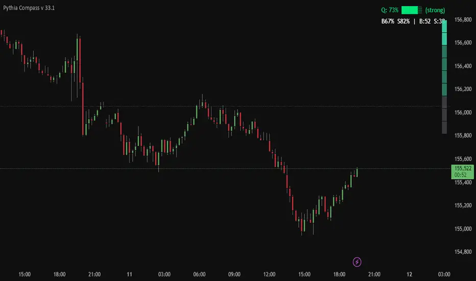
Pythia Compass v 33.1Pythia Compass — Market Energy Direction
Pythia Compass is a minimalist edition of the Pythia project, designed for traders who want a clear and fast view of the market’s internal energy direction.
Despite its simple visual design, Compass runs on the same core algorithmic engine used in the advanced Pythia versions.
It merges the system’s structural and energy signals into a compact visual output:
a vertical market-energy direction scale
a forecast-quality HUD
configurable strength thresholds
early detection of energy shifts before price reacts
Compass does not display Pythia’s full graphical markup — only the final directional energy result, computed from the complete internal signal set.
You can use Pythia Compass:
as a standalone indicator for assessing strength and directional bias
as a filter for any trading strategy
as a lightweight companion to the full Pythia versions
Pythia Compass — simple on the surface, powerful underneath.
Built as an accessible entry point into the Sael Lab ecosystem and the Pythia algorithm family.
RSI Median DeviationRSI Median Deviation – Adaptive Statistical RSI for High-Probability Extremes
The Relative Strength Index (RSI) is a momentum oscillator developed by J. Welles Wilder in 1978 to measure the magnitude of recent price changes and identify potential overbought or oversold conditions. It calculates the ratio of upward to downward price movements over a specified period, scaled to 0-100. However, standard RSI often relies on fixed thresholds like 70/30, which can produce unreliable signals in varying market regimes due to their lack of adaptability to the actual distribution of RSI values.
This indicator was developed because I needed a reliable tool for spotting intermediate high-probability bottoms and tops. Instead of arbitrary horizontal lines, it uses the RSI’s own historical median as a dynamic centerline and measures how far the current RSI deviates from that median over a chosen lookback period. The main signals are triggered only at 2 standard deviation (2σ) extremes — statistically rare events that occur roughly 5 % of the time under a normal distribution. I selected 2σ because it is extreme enough to be meaningful yet frequent enough for practical trading. For oversold signals I further require RSI to be below 42, a filter that significantly improved results in my mean-reversion tests (enter on oversold, exit on the first bar the condition is no longer true).
The combination of percentile median + standard deviation bands is deliberate: the median is far more robust to outliers than a simple average, while the SD bands automatically adjust to the current volatility of the RSI itself, producing adaptive envelopes that work equally well in ranging and trending markets.
Underlying Concepts and Calculations
Base RSI: RSI = 100 − (100 / (1 + RS)), RS = average gain / average loss (default length 10).
Percentile Median: 50th percentile of the last "N" RSI values (default 28 = 4 weeks)
→ dynamic, outlier-resistant centerline.
Standard Deviation Bands: rolling stdev of RSI (default length 27 = = 4 weeks (almost))
→ bands = median ± 1σ / 2σ.
Optional Dynamic MA Envelopes: user-selectable moving average (TEMA, WMA, etc., default WMA length 37) for additional momentum context.
Trend Bias Coloring
Independent of the statistical extremes, the RSI line itself is colored green when above the user-defined Long Threshold (default 60) and red when below the Short Threshold (default 47). This provides an instant bullish/bearish bias overlay similar to classic RSI usage, without interfering with the main 2σ extreme signals.
Extremes are highlighted with background color (green for oversold 2σ + RSI<42, magenta for overbought 2σ) and small diamond markers for ultra-extremes (RSI <25 or >85).
Originality and Development Rationale
The indicator was built and refined through extensive testing on dozens of assets including major cryptocurrencies:
(BTC, ETH, SOL, SUI, BNB, XRP, TRX, DOGE, LINK, PAXG, CVX, HYPE, VIRTUAL and many more),
the Magnificent 7 stocks,, QQQ, SPX, and gold.
Default parameters were chosen to deliver consistent profitability in simple mean-reversion setups while maximizing Sortino ratio and minimizing maximum drawdown across this broad universe — ensuring the settings are robust and not overfitted to any single instrument or timeframe.
How to Use It
Ideal for swing / position trading on the 1h to daily charts (the same defaults work).
Oversold (high-probability long): RSI crosses below lower 2σ band AND RSI < 42
→ green background
→ enter long, exit the first bar the condition disappears.
Overbought (high-probability short): RSI crosses above upper 2σ band
→ magenta background
→ enter short, exit on opposite signal or at median. (Shorts were not tested, it's only an idea)
Use the green/red RSI line coloring for quick trend context and to avoid fighting strong momentum.
Always confirm with price action and manage risk appropriately.
This indicator is not a standalone trading system.
Disclaimer: This is not financial advice. Backtests are based on past results and are not indicative of future performance.
