Chỉ báo và chiến lược

EMA Trend & Stochastic Signal IndicatorThis indicator displays trend-aligned Stochastic crossover signals using EMA structure and swing-based directional filtering for market analysis.

SIDD EMA RSI Supertrend Signal Table🔥 SIDD EMA RSI SuperTrend Multi-Timeframe Signal Table
**SIDD EMA RSI SuperTrend Signal Table** is a **clean, powerful multi-timeframe trend confirmation dashboard** designed for traders who want **clarity, confluence, and speed** — all in one glance.
This indicator **does NOT repaint** and uses **industry-standard trend logic** combining **EMA structure, RSI momentum, and SuperTrend direction** across **6 different timeframes**.
---
## 🧠 Core Logic Behind the Indicator
This script works on **three independent trend engines**, displayed together in a compact table:
### ✅ 1️⃣ EMA Trend (Structure Based)
* Uses **EMA 50 vs EMA 200**
* **Bullish** → EMA 50 above EMA 200
* **Bearish** → EMA 50 below EMA 200
* Captures **primary market structure**
### ✅ 2️⃣ RSI Trend (Momentum Based)
* RSI Length: **14**
* **Bullish** → RSI > **55**
* **Bearish** → RSI ≤ **55**
* Helps confirm **trend strength & momentum**
### ✅ 3️⃣ SuperTrend (Price Action Based)
* ATR Length: **10**
* Factor: **3.0**
* Clearly defines **trend direction & trailing bias**
* Excellent for **entry & exit alignment**
---
## ⏱️ Multi-Timeframe Coverage
The table analyzes trends across **6 configurable timeframes**:
* Intraday → **5m, 15m, 1H**
* Swing → **4H, Daily**
* Positional → **Weekly**
Each timeframe shows:
* 📈 EMA Trend
* 📊 RSI Trend
* 🔁 SuperTrend Direction
Color-coded for instant readability:
* 🟢 Bullish
* 🔴 Bearish
* ⚪ Neutral
---
## 🎯 How to Use This Indicator
✔ **Trend Trading**
Trade only when **EMA + RSI + SuperTrend align** across higher & lower timeframes.
✔ **Intraday Confirmation**
Use higher TF (1H / 4H) bias and take entries on lower TF.
✔ **Avoid Chop & False Signals**
If signals are mixed → market is likely **sideways or risky**.
✔ **Swing & Positional Trades**
Daily + Weekly alignment gives **high-probability setups**.
---
## ⚙️ Customization Options
* Adjustable **timeframes**
* Table **position** (Top/Bottom – Left/Right)
* Table **size** (Extra Small / Small / Normal)
* Custom **colors, borders & text**
* Optimized for **minimal chart clutter**
---
## ⚠️ Disclaimer
This indicator is a **trend confirmation & decision-support tool**.
Always combine with **price action, support/resistance, and proper risk management**.

rj's temu perp pair tradeOverview
rj’s temu perp pair trade is a simple, robust pairs-trading strategy designed for crypto perpetual futures, implemented directly on ratio charts (A / B) in TradingView.
The strategy trades mean reversion in relative price using Bollinger Bands, while keeping sizing, execution logic, and diagnostics intentionally simple and transparent.
This script is designed primarily for signal research and pair selection, not for fully accurate two-leg PnL simulation inside TradingView.
Strategy Concept
The strategy operates on a ratio chart:
Asset A / Asset B
The ratio represents relative performance between two assets.
Core idea
When the ratio deviates significantly from its recent mean, it tends to revert. (if you pick stuff that has very similar drivers and little insider trading flows.
Bollinger Bands provide a simple, robust way to define “too far”.
Entry Logic
Using Bollinger Bands on the ratio price:
Long ratio
Ratio crosses below the lower band
Interpreted as A cheap vs B
Short ratio
Ratio crosses above the upper band
Interpreted as A expensive vs B
Entries are generated on bar close, with fills occurring on the next bar open (TradingView’s internal behavior).
Exit Logic
Positions are closed when any of the following occurs:
Ratio crosses back through the Bollinger midline
Position held longer than maxBarsInTrade (optional)
Fixed % stop based on ratio price (optional)
Each exit is explicitly labeled on the chart:
C → mean reversion
TS → time stop
SL → stop loss
Position sizing and margin
Positions are sized as a percentage of Strategy Tester equity
Default: 10% of equity per trade
This ensures consistent risk within TradingView, even on ratio charts
Mating requirements are set to 1% for long/short to disable margin rejections for research purposes.
What TradingView PnL means (important)
When trading ratio charts, TradingView treats the ratio as a single synthetic instrument.
PnL is reported in the denominator (quote) unit e.g. on UNI / SUSHI, PnL is in SUSHI
Strategy Tester does not simulate two legs
Absolute PnL, Sharpe, and drawdowns are not USDT-accurate
This script intentionally does not attempt to convert PnL into USDT inside TradingView.
Instead:
TradingView is used for signal behavior, regime analysis, and pair comparison
Accurate two-leg USDT PnL should be computed externally
Summary Table
The on-chart summary table reports Strategy Tester-aligned metrics only:
Total PnL (%)
Number of closed trades
Win rate
Average PnL per trade
Sharpe ratio (annualized, based on Strategy Tester equity)
PnL units (syminfo.currency)
These metrics are internally consistent but should be treated as indicative, not execution-accurate.
Recommended workflow
Inside TradingView
Use this script to:
Explore pair behavior
Validate mean-reversion dynamics
Study regime dependence
Compare relative signal quality across pairs
Outside TradingView
Use exported trade data to:
Aggregate daily PnL
Normalize by initial capital
Apply portfolio weights
Vol-target and analyze drawdowns
Add funding, fees, and execution logic
Limitations
This script does not:
Simulate two-leg execution
Account for funding rates
Model fees or slippage per leg
Provide USDT-accurate PnL
It is not a trading system. It is a clean, robust research and signal-generation tool.

Tamil, Buy/Sell Signal for Day Trade and Swing TradeTamil – Buy/Sell Signal for Day Trade and Swing Trade is a price-action style indicator that prints Long and Short signals and automatically projects a full trade plan on the chart: Entry (EP), Stop-Loss (SL), and up to 5 Take-Profit levels (TP1–TP5).
It combines multiple momentum/overextension filters (Keltner Channel bands, CCI, ROC, RSI, Parabolic SAR, and Balance of Power) to detect oversold dips for longs and overbought spikes for shorts. When a signal triggers, the script:
• Draws a signal label showing EP/SL/TP1–TP5 values.
• Plots step lines for EP, SL, and TP levels so you can manage the trade visually.
• Marks TP hits and Stop hits with shapes + background highlights.
• Includes a 200-length DEMA plot for higher-timeframe trend context (optional visual filter).
How signals work (high level):
• Long Signal: price pushes below a deeper Keltner lower band (mean-reversion setup) + bearish momentum extremes (CCI/BOP/ROC) with SAR/median conditions confirming a dip setup.
• Short Signal: price pushes into upper Keltner expansion + bullish momentum extremes (CCI/RSI/ROC) with SAR/median conditions confirming a spike setup.
Best use: intraday scalps or swing entries where you want clear, pre-defined levels for scaling out (TP1→TP5) and strict risk control (SL).
Note: This is an indicator (not a strategy backtest). Always validate on your instrument/timeframe and use risk management

Zero Lag MACD and EMA 200 with SignalsZero Lag MACD with EMA Filter and Smart Signals
This indicator is an enhanced version of the traditional MACD that uses Zero Lag EMA calculations to provide faster and more responsive signals for scalping and day trading.
Key Features:
🎯 Zero Lag Technology - Uses double-smoothed EMA calculations to eliminate lag and provide earlier signals compared to standard MACD
📊 Clean Visualization - Displays histogram with MACD and Signal lines for clear trend analysis
🔍 Smart Signal Logic - Only shows valid trading signals based on strict conditions:
Buy Signal (Green dot at bottom): Triggers when price is above 200 EMA AND MACD crosses Signal line from below AND crossover occurs below zero line
Sell Signal (Red dot at top): Triggers when price is below 200 EMA AND MACD crosses Signal line from above AND crossover occurs above zero line
🔔 Built-in Alerts - Easy alert setup for both buy and sell signals so you never miss a trading opportunity
📈 200 EMA Filter - Incorporates trend filter to avoid counter-trend trades and improve signal quality
⚙️ Fully Customizable - Adjust all parameters:
Fast EMA Length (default: 12)
Slow EMA Length (default: 26)
Signal Length (default: 9)
EMA Filter Length (default: 200)
How to Use:
-Add the indicator to your chart
-Look for green dots (buy signals) when price is in an uptrend above 200 EMA
-Look for red dots (sell signals) when price is in a downtrend below 200 EMA
-Set up alerts by clicking "Create Alert" and selecting "Buy Signal" or "Sell Signal"
-Use signals in conjunction with your trading strategy and risk management
Best Practices:
-Works best on 1-15 minute timeframes for scalping
-Combine with support/resistance levels for confirmation
-Use proper stop-loss and take-profit levels
-Not all signals will be profitable - use proper risk management
-Signals are filtered to reduce noise and false entries
Color Scheme:
Histogram: Red (bearish) / Cyan (bullish)
MACD Line: Fuchsia/Pink
Signal Line: Lime/Green
Buy Signal: Green dot (bottom)
Sell Signal: Red dot (top)
This indicator is perfect for traders who want a cleaner, faster-responding MACD with built-in trend filtering and clear entry signals. Free to use and customize!
A program written by a beginner# TXF Choppy Market Detector (Whipsaw Filter)
## Introduction
This project is a technical indicator developed in **Pine Script v5**, specifically optimized for **Taiwan Index Futures (TXF)** intraday trading.
The TXF market is known for its frequent periods of low-volatility consolidation following sharp moves, often resulting in "whipsaws" (double-loss scenarios for trend followers). This script utilizes **volatility analysis** and **trend efficiency metrics** to filter out noise and detect potential "Stop Hunting" or "Liquidity Sweep" setups within range-bound markets.
## Methodology & Algorithms
The strategy operates on the principle of **Mean Reversion**, combining two core components:
### 1. Market Regime Filter: Choppiness Index (CHOP)
We use the Choppiness Index (originally developed by E.W. Dreiss) to determine if the market is trending or consolidating based on **Fractal Dimension** theory.
* **Logic**:
The index ranges from 0 to 100. Higher values indicate low trend efficiency (consolidation), while lower values indicate strong directional trends.
* **Condition**: `CHOP > Threshold` (Default: 50).
* **Application**: When this condition is met, the background turns **gray**, signaling a "No-Trade Zone" for trend strategies and activating the Mean Reversion logic.
### 2. Whipsaw Detection: Bollinger Bands
Bollinger Bands are used to define the dynamic statistical extremities of price action.
* **Logic**:
We identify **Fakeouts** (False Breakouts) that occur specifically during the choppy regime identified above. This is often where institutional traders hunt for liquidity (stops) before reversing the price.
#### Signal Algorithms (Pseudocode)
**A. Bull Trap (Washout High)**
A false upside breakout designed to trap long traders.
```pine
Condition:
1. Is_Choppy == true (Market is sideways)
2. High > Upper_Bollinger_Band (Price pierces the upper band)
3. Close < Upper_Bollinger_Band (Price fails to hold and closes back inside)

TrentTrades-Options Momentum & ConfidenceThis indicator calculates a confidence score based on RSI momentum, EMA trend slope, price volatility, and trading volume to identify strong potential entries for options trades. Signals are only generated when momentum, trend, and confidence align, providing clear long (green triangle) and short (red triangle) signals directly on the chart. Fully customizable inputs allow traders to adjust sensitivity for different strategies and timeframes. Perfect for options traders looking for structured, high-probability setups while reducing false signals.

Yearly VWAPIn this update, I’ve enhanced the Yearly VWAP script so that it now works reliably on all timeframes starting from the 5-minute chart and higher. Previously, the monthly reset logic caused inconsistencies on lower timeframes. Now, the indicator uses a yearly reset based on the calendar year, ensuring stable and accurate VWAP calculations without issues.
In short, you can confidently apply this Yearly VWAP to any timeframe from 5 minutes upwards and get consistent results.


Colored HMA + Color SARThis is a simple yet effective chart setup that I really like and trade with. I use the Heiken Ashi candlesticks so with this I get three conformations in one. If you like it great. I am not a coder but I do know what works for my brain and thought I would share this, thanks to Chat GBT.
I use it for entry most of the time on the 5 minute chart New York open. I also like the Orb break and retest by Quant Crawler as my second indicator.

EMA/SMA Full color signal candles💡 What It Does:
The indicator calculates and plots the 21-period Exponential Moving Average (EMA) and the 30-period Simple Moving Average (SMA). It then analyzes the closing price of each candle and colors the entire candlestick (body and border) according to pre-defined trend conditions.
This visualization allows traders to identify strong trend environments versus periods of consolidation or indecision at a glance, removing the need to constantly check the price relationship manually.
🎨 Color Conditions and Meaning:
The indicator uses three distinct color states to signal the market's current momentum:
Color,Condition,Market Interpretation
🟢 GREEN,Closing Price is ABOVE both the 21 EMA AND the 30 SMA.,Strong Bullish Trend: Suggests high momentum and confirmation of an uptrend. Ideal for long bias.
🔴 RED,Closing Price is BELOW both the 21 EMA AND the 30 SMA.,Strong Bearish Trend: Suggests high downward pressure and confirmation of a downtrend. Ideal for short bias.
⚫ GRAY,"Closing Price is in any other state (e.g., between the two MAs, or under one and over the other).","Neutral / Consolidation: Indicates uncertainty, low momentum, or potential trend exhaustion/reversal. Caution is advised."
🔧 Customization Options:The indicator is fully customizable, allowing users to fine-tune the periods to match their preferred trading style (e.g., scalping, swing trading).Dĺžka EMA (Length EMA): Allows you to change the period for the Exponential Moving Average (default is 21).Dĺžka SMA (Length SMA): Allows you to change the period for the Simple Moving Average (default is 30).
I added also Extra 4 EMA lines to have extra edge.
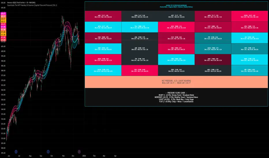
QuantLabs The MTF Nasdaq 30 Scanner [Capital Flow and Pressure]Trading the QQQ (Nasdaq) without knowing what the Generals (Apple, Nvidia, Microsoft) are doing is like driving at night with your headlights off. You might see the road right in front of you, but you'll miss the turn coming up.
The QuantLabs MTF Nasdaq 30 Scanner is not just a trend indicator, it is a professional-grade Market Dashboard that visualizes the heartbeat of the entire Nasdaq 100.
Why You Need This
Standard indicators lag. They tell you what happened after the move. This Heatmap tracks the Real-Time Capital Flow of the Top 30 companies that actually move the index ($Trillions in Market Cap).
Key Features
1. The "Spectacular" Precision Heatmap
Organized by Market Cap Size (AAPL/NVDA first).
Instantly spot divergent behavior. Is the market rallying, or is it just Nvidia holding everything up? The Heatmap reveals the truth instantly.
Colors: Neon Cyan (Bullish) vs Hot Pink (Bearish).
2. Triple Spectrum Technology (3-in-1 Timeframes) Why look at one timeframe when you can see three? Every cell in the dashboard displays the trend distance for:
8h (Fast): For scalping entries.
16h (Mid): For swing trends.
24h (Slow): For the major "Big Picture" bias.
Values denote % distance from the Flux Ribbon.
3. The "Net Pressure" Gauge (The Speedometer) A predictive summary footer that calculates the Weighted Pressure of the entire market.
HEAVY (> 0.5%): Strong Trend / Breakout Mode.
MODERATE (0.2% - 0.5%): Healthy, sustained move.
FLAT: Chop / Noise. Stay out.
It also shows exactly how much Capital ($Trillions) is sitting Bullish vs Bearish.
How to Trade with It
Check the "Net Pressure": If it says MODERATE BULLISH, you are looking for Longs only.
Scan the Top Row: Are the "Big 5" (AAPL, NVDA, MSFT...) aligned with the pressure?
Wait for Alignment: If the 8h, 16h, and 24h metrics all turn Cyan, that is a "Quantum Lock"—a high probability breakout signal.
Simple. Powerful. Neon. Add it to your chart and stop guessing the direction.
Credits: Built with 💜 by David James @ QuantLabs
Jin#10 HMA/OBV Pro Trader System (15m)HMA/OBV Pro Trader System Overview (15m Timeframe)
This system is designed to identify high-probability entry and exit points on the 15-minute chart by integrating multiple indicators for confirmation.
1. Trend and Confirmation
HMA Lines (Solid Lines): These are two Hull Moving Averages (HMA 8 and HMA 15).
Green/Red HMA 8 (Line 1): The faster HMA, showing short-term momentum.
Blue/Red HMA 15 (Line 3): The slower HMA, indicating the medium-term trend direction.
Trend Alignment: A strong trend requires the fast HMA (8) to be above the slow HMA (15) and both to be sloping favorably.
MTF Background Color (Candle Background): This represents the 30-minute trend filter.
Light Green/Teal: The 30-minute trend is upward and strong.
Light Orange/Red: The 30-minute trend is downward and strong.
This acts as a major confirmation filter for entries.
2. Trading Signals (Shapes)
🚀 BUY / 🔻 SELL: These are the Final Confirmation Signals. They appear when all conditions (HMA alignment, Stochastic, MACD, and the 30m MTF filter) are met.
⚠️ Pre-BUY / Pre-SELL: These are Warning/Early Signals indicating that most conditions on the 15m chart are aligned, but the 30m filter has not yet confirmed the trend direction.
🔥 Volatility Spike / 🧊 Volatility Crash (Small Circle): Alerts the user to an unusually large candle (ATR spike), signaling extreme volatility or a potential reversal.
3. Exit and Risk Management
ATR Trailing Stop (Dashed Line): This dynamic line serves as a Soft Exit or Stop-Loss Guide.
❌ Exit Long / Exit Short (X-Cross): This shape appears when the price crosses the ATR Trailing Stop, suggesting the existing position (Long or Short) should be closed immediately.
Dashed TP/SL Lines (Green/Red): These lines mark a calculated Take Profit (TP) and Stop Loss (SL) based on the entry price and the defined Risk-Reward Ratio (e.g., 1:1.5).

Plan Your Trade, Trade Your Plan. Levels. - by TenAMTrader📍 Plan Your Trade, Trade Your Plan. Levels. — by TenAMTrader
Successful trading is rarely about predicting — it’s about preparing.
"Plan Your Trade, Trade Your Plan. Levels" is designed to bridge the gap between analysis and execution by forcing clarity before the trade ever happens. Instead of reacting to price in real time, this tool encourages traders to define their plan, map their key levels, and then simply trade what they already decided.
🧠 Why Planning Matters
Most trading mistakes don’t come from bad analysis — they come from abandoning a plan mid-trade. Emotions take over when levels aren’t clearly defined ahead of time.
This indicator is built around a simple philosophy:
Make the plan first. Trade the plan second.
By writing your thesis directly into the indicator and visually anchoring it to price, you remove ambiguity and hesitation when the market starts moving.
📊 What This Indicator Does
Converts your written trade plan or market outlook into clearly plotted price levels
Automatically identifies:
Pivot level (key decision point)
Resistance levels (above pivot)
Support levels (below pivot)
Displays contextual notes directly on the chart so you always remember why a level matters
Keeps your focus on execution, not interpretation
✍️ How to Use It
Paste your daily or weekly plan into the Input your Plan/Levels box
Let the script extract and plot the levels automatically
Observe how price behaves around predefined zones
Execute only what aligns with your original plan
No guesswork. No moving targets.
🎯 Designed For
Traders who value structure and discipline
Futures, index, and equity traders who trade key levels
Traders focused on process over prediction
⚠️ Important Disclaimer
This indicator is provided for educational and informational purposes only and does not constitute financial advice, investment advice, or a recommendation to buy or sell any security, futures contract, or financial instrument.
Trading involves substantial risk and is not suitable for all investors. Past performance is not indicative of future results. All trading decisions, risk management, and position sizing are the sole responsibility of the user.
By using this indicator, you acknowledge that TenAMTrader assumes no liability for any losses, damages, or decisions made based on its use.
Trade prepared. Trade disciplined.
"Plan Your Trade, Trade Your Plan.
— TenAMTrader

BTC ETF Average Inflow Cost BasisConcept
Since the historic launch of Bitcoin Spot ETFs on January 11, 2024, institutional flows have become a major driver of price action. This indicator aims to visualize the aggregate Cost Basis (average entry price) of the major Bitcoin ETFs relative to the underlying asset.
It serves as an on-chain proxy for institutional positioning, helping traders identify critical support levels where ETF inflows have historically concentrated.
How it Works
The script aggregates daily volume data from the top Bitcoin ETFs (IBIT, FBTC, ARKB, GBTC, BITB) and compares it against the Bitcoin price (BTCUSDT).
ETF Cost Basis (Pink Line):
This is calculated as a Cumulative Volume-Weighted Average Price (VWAP), anchored specifically to the ETF launch date (Jan 11, 2024).
Formula: It accumulates (BTC Price * Total ETF Volume) and divides it by the Cumulative Total ETF Volume.
This creates a dynamic level representing the "breakeven" price for the aggregate volume traded through these funds.
True Market Mean (Gray Line):
This represents the simple cumulative average of the Bitcoin price since the ETF launch date. It acts as a neutral baseline for the post-ETF market era.
How to Use
Institutional Support: The Cost Basis line often acts as a strong dynamic support level during corrections. When price revisits this level, it suggests the market is returning to the average institutional entry price.
Trend Filter:
Price > Cost Basis: The market is in a net profit state relative to ETF flows (Bullish/Trend continuation).
Price < Cost Basis: The market is in a net loss state (Bearish/Capitulation risk).
Confluence: The intersection of the Cost Basis and the True Market Mean can signal pivotal moments of trend reset.
Features
Data Aggregation: Pulls data from 5 major ETFs via request.security without repainting (using closed bars).
Dashboard: Includes a table in the top-right corner displaying real-time values for Price, Cost Basis, and Market Mean.
Customization: You can toggle individual ETF Moving Averages in the settings (disabled by default due to price scale differences between BTC and ETF shares).
Disclaimer
This tool is for educational purposes only and attempts to estimate institutional cost basis using volume proxies. It does not represent financial advice.

ADX Coloreado por AO + DI DifferenceKey ComponentsADX line: Measures overall trend strength (non-directional).
+DI line: Strength of upward movement.
-DI line: Strength of downward movement.
Trend direction is determined by which DI line is dominant:+DI > -DI: Bullish trend (upward pressure).
-DI > +DI: Bearish trend (downward pressure).
Crossovers between +DI and -DI can signal potential trend changes, but they are most reliable when ADX confirms sufficient strength.ADX Trend Strength Levels (Common Interpretations)ADX Value
Trend Strength
Recommendation
0–20
Weak or no trend (ranging/sideways market)
Avoid trend-following strategies; consider range-bound or oscillator-based trades.
20–25
Emerging or moderate trend (gray zone)
Monitor for confirmation; potential start of trend.
25–50
Strong trend
Ideal for trend-following strategies (e.g., moving averages, breakouts).
50–75
Very strong trend
High momentum; good for riding trends, but watch for exhaustion.
75–100
Extremely strong trend (rare)
Often overextended; risk of reversal or correction.
Rising ADX: Trend is strengthening.
Falling ADX: Trend is weakening (even if still high).
History Trading SessionsThis indicator helps visually structure the trading day by highlighting custom time zones on the chart.
It is designed for historical analysis, trading discipline, and clear separation between analysis time, active trading, and no-trade periods.
Recommended to use on 4h and below time frames.

Triple Supertrend + EMA CrossoverCustomized 3 supertrend and EMA crossover which is helpful for identification of the trend.

Tradegrill: Dollar Value TradedTraditional volume shows the number of shares/contracts traded, but it doesn't account for price differences. A $100 stock trading 1 million shares represents far more capital commitment than a $10 stock trading the same amount.

EMA13-EMA21 Difference Indicator# EMA13-EMA21 Difference Indicator
## Description
This indicator calculates the difference between the 13-period Exponential Moving Average (EMA13) and the 21-period Exponential Moving Average (EMA21), helping traders visually assess short-term market momentum.
**Core Logic:**
- When the difference is positive (green), the short-term EMA is above the long-term EMA, indicating a bullish trend
- When the difference is negative (red), the short-term EMA is below the long-term EMA, indicating a bearish trend
- Crossovers of the zero line can serve as potential trend reversal signals
**Use Cases:**
- Trend direction identification
- Momentum strength analysis
- Entry and exit timing assistance
**Disclaimer:**
This indicator is for reference only. It is recommended to combine it with other technical analysis tools for comprehensive judgment. This does not constitute investment advice.

Andres System - SuperTrend DMI EMAAdvanced Multi-Filter Trading System combining SuperTrend, DMI (Directional Movement Index), and EMA crossovers for high-probability trade entries.
**Key Features:**
- Real-time DMI table showing trend strength (Sideways/Mild/Normal/Strong/Very Strong)
- Filter status dashboard - see exactly which conditions are met
- Smart entry logic: signals trigger during entire EMA alignment period, not just at exact crossover
- Clear BUY/SELL signals with exit markers
- One signal per trade - prevents duplicate entries
**Entry Requirements:**
LONG: EMA 7 > 21 + SuperTrend bullish + DI+ > 20
SHORT: EMA 7 < 21 + SuperTrend bearish + DI- > 20
**Exit Conditions:**
Position closes when EMA crosses back or SuperTrend changes direction
**Additional Tools:**
- Previous Day High/Low levels
- Daily VWAP
- Color-coded EMAs (7, 21, 50)
- Customizable thresholds for all filters
**Best Timeframes:** 4H for swing trading, 1D for position trading
All visual elements can be toggled on/off. Alerts available for all signals.

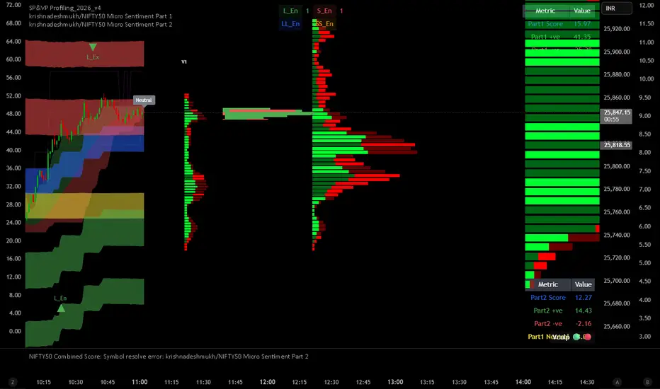
krishnadeshmukh/NIFTY50 Micro Sentiment Part 1📘 Script Description: NIFTY50 Micro Sentiment — Part 1
This indicator tracks real-time micro sentiment across the top 25 weighted stocks of the NIFTY50 index using a volume-based distribution model.
🔍 How it works:
Scans last N bars (configurable) for each stock.
Divides each stock’s price range into equal bins.
Measures bullish vs bearish volume in each bin based on:
Candle Color (Close > Open) or
Close Near High (Close > Midpoint).
Assigns a sentiment value:
+1 → Bullish dominance
-1 → Bearish dominance
0 → Neutral
📊 Each stock's sentiment is weighted by its contribution to the index.
🧮 Displays:
Weighted Sentiment Score
Bullish / Bearish / Neutral Components
Updated every 5 bars with an easy-to-read table.
Use this to gauge underlying micro shifts in sentiment before broader market moves.