Autonomous 5-Minute RobotKey Components of the Strategy:
Trend Detection:
A 50-period simple moving average (SMA) is used to define the market trend. If the current close is above the SMA, the market is considered to be in an uptrend (bullish), and if it's below, it's considered a downtrend (bearish).
The strategy also looks at the trend over the last 30 minutes (6 candles in a 5-minute chart). The strategy compares the previous close with the current close to detect an uptrend or downtrend.
Volume Analysis:
The strategy calculates buyVolume and sellVolume based on price movement within each candle.
The condition for entering a long position is when the market is in an uptrend, and the buy volume is greater than the sell volume.
The condition for entering a short position is when the market is in a downtrend, and the sell volume is greater than the buy volume.
Trade Execution:
The strategy enters a long position when the trend is up and the buy volume is higher than the sell volume.
The strategy enters a short position when the trend is down and the sell volume is higher than the buy volume.
Positions are closed based on stop-loss and take-profit conditions.
Stop-loss is set at 3% below the entry price.
Take-profit is set at 29% above the entry price.
Exit Conditions:
Long trades will be closed if the price falls 3% below the entry price or rises 29% above the entry price.
Short trades will be closed if the price rises 3% above the entry price or falls 29% below the entry price.
Visuals:
The SMA (50-period) is plotted on the chart to show the trend.
Buy and sell signals are marked with labels on the chart for easy identification.
With this being said this algo is still being worked on to be autonomous
Analyze the Market Direction: Determine whether the market is in an uptrend or downtrend over the past 30 minutes (using the last 6 candles in a 5-minute chart).
Use Trend Indicators and Volume: Implement trend-following indicators like moving averages or the SMA/EMA crossover and consider volume to decide when to enter or exit a trade.
Enter and Exit Trades: The robot will enter long positions when the trend is up and short positions when the trend is down. Additionally, it will close positions based on volume signals and price action (e.g., volume spikes, price reversals).
Tìm kiếm tập lệnh với "价格在30元内股票"

Wave Smoother [WS]The Wave Smoother is a unique FIR filter built from the interaction of two trigonometric waves. A cosine carrier wave is modulated by a sine wave at half the carrier's period, creating smooth transitions and controlled undershoot. The Phase parameter (0° to 119°) adjusts the modulating wave's phase, affecting both response time and undershoot characteristics. At 30° phase the impulse response starts at 0.5 and exhibits gentle undershoot, providing balanced smoothing. Higher phase values reduce ramp-up time and increase undershoot - this undershoot in the impulse response creates overshooting behavior in the filter's output, which helps reduce lag and speed up the response. The default 70° phase setting provides maximum speed while maintaining stability, though practical settings can range from 30° to 70°. The filter's impulse response consists entirely of smooth curves, ensuring consistent behavior across all settings. This design offers traders flexible control over the smoothing-speed trade-off while maintaining reliable signal generation.

MA Trend DashboardMA Trend Dashboard - Features
The MA Trend Dashboard is a versatile and user-friendly indicator designed to provide a comprehensive overview of market trends across multiple timeframes using moving averages (MAs). Here's what this script offers:
1. Dashboard Display
A compact and visually appealing dashboard is overlaid on the chart.
The dashboard displays the trend direction and deviation percentages for 30-minute, 1-hour, and 4-hour timeframes.
Users can position the dashboard in different locations (Top Right, Middle Right, or Bottom Right) and customize the text size (Tiny, Small, Normal).
2. Multi-Timeframe Trend Analysis
The script uses the concept of Multi-Timeframe (MTF) analysis to assess trends across:
30-minute (30m)
1-hour (1h)
4-hour (4h)
Each timeframe's trend is evaluated using the selected moving average method.
3. Customizable Moving Average Methods
Users can choose from various moving average calculation methods:
SMA (Simple Moving Average)
EMA (Exponential Moving Average)
SMMA (Smoothed Moving Average or RMA)
WMA (Weighted Moving Average)
VWMA (Volume-Weighted Moving Average)
This flexibility allows for tailored trend analysis based on the user's preferred methodology.
4. Visual Trend Indicators
Clear visual cues indicate the trend direction for each timeframe:
↑ (Up): Bullish trend.
↓ (Down): Bearish trend.
↘ (Weak Up): Mild bullishness.
↗ (Weak Down): Mild bearishness.
The background color of each cell dynamically changes based on the trend:
Green: Uptrend.
Red: Downtrend.
5. Deviation Percentage
The dashboard includes the percentage difference between the current price and the moving average for each timeframe.
Positive percentages are highlighted in green, and negative percentages in red.
6. Customization Options
Text Color: Allows users to adjust the color of the text displayed in the dashboard.
MA Length: Users can set the period for the moving averages (default is 50).
7. Dynamic Requests
Utilizes TradingView's dynamic_requests feature to ensure accurate real-time data across different timeframes without cluttering the chart.
Usage
This indicator is ideal for traders who want a quick and reliable snapshot of market trends across multiple timeframes. It is particularly suited for intraday and swing trading strategies, offering insights into price momentum and potential reversals.

PreMarket_Estimator Portfolio [n_dot]AMEX:SOXL ; NASDAQ:TQQQ ; AMEX:FNGU ; AMEX:SOXS ; NASDAQ:SQQQ ; AMEX:FNGD
Strategy Core Idea:
I focus on stocks that are expected to show significant price movements (gaps) during the premarket, usually due to news or earnings reports. I record the highest price formed during the premarket, and if the price exceeds this level after the market opens, I go LONG. Based on my experience, it’s advisable to exit after a few percentage points of increase, as the premarket boom often corrects itself.
Usage:
The indicator is best used in pairs: Pre_Market_Estimator Single and Pre_Market_Estimator Portfolio.
In this portfolio version, you can set up 6 different instruments, which are displayed stacked vertically on the screen, while the single version monitors only one instrument. The portfolio does not plot charts at the actual price levels but offsets them vertically, displaying the current prices in a label at the end of each chart.
Settings:
Time point 1: Start of the observation period.
Time point 2: End of the observation period / Start of the trading period.
GAP: is used to adjust the distance between the charts displayed in the portfolio view. This allows you to customize the spacing for better readability and visualization of the monitored instruments.
Usage:
Set the timeframe period to "1m".
Set Time point 1 to the start of the premarket session on the current day (e.g., NYSE: 9:00).
Set Time point 2 to the market open (e.g., NYSE: 9:30).
The indicator monitors the highest price during the premarket period, marking it with a blue line.
During the subsequent trading period, if the price exceeds the premarket high, it generates a buy signal marked with a blue plus sign.
Limitations:
The premarket prediction typically provides actionable signals during the first 30 minutes to 1 hour of the trading session. After this, the trend is usually driven by daily market events or news.
To reduce data usage, the portfolio version of the indicator (which monitors 6 instruments simultaneously) only loads the last 24 hours of data (60 * 24 minutes). After this, the chart stops providing signals, and the time points need to be reset.
Additional Use Cases:
This type of breakout monitoring is not only suitable for observing premarket events but can also provide relevant information before major announcements.
For example, in the case of central bank rate hikes:
Set Point 1 to 1 hour before the announcement.
Set Point 2 to the time of the announcement.
I hope this contributes to your success!

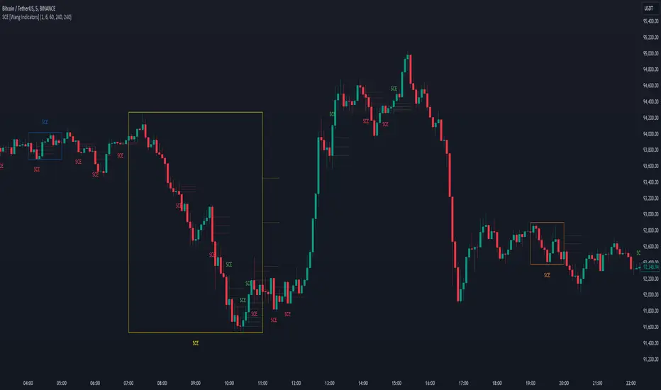
Single Candle Entry with Multi-Timeframe [Wang Indicators]
Single candle entry
Overview : The "Single Candle Entry Model" indicator is designed to help traders through a simple yet effective trading strategy. This indicator automatically detects candles that encompass both the high and low of the previous candle, creating key price zones for potential market entries.
- This indicator was developed with the help of @DaveTeaches -
How does it works ?
Detects when a candle trade above the high and below the low of the previous candle
When it occur, the indicator write "SCE" on the candle
The text will be in different color if its bearish or bullish (customizable by user)
Higher Timeframes
Users can enable up to 3 HTF SCE detection to enhance multi timeframe analysis.
Users can select which timeframe he want to use
Boxes will be displayed around High time frame SCE to highlight the HTF candle.
As regular SCE, the indicator will write "SCE" above or under the box
How does it helps users ?
Once the SCE is created, it can be used as a zone.
Levels (30, 50 and 70%) are displayed
Users can customize their apparence as they see fit
The 30 - 50 - 70 levels are support/resistance that the price tend to bounce of off
You might find some success looking for an entry inside the zone at a level if price gives further confirmations such as a lower time frame flip or using other indicators
Alert can be setup on any timeframe
Rolling Window Geometric Brownian Motion Projections📊 Rolling GBM Projections + EV & Adjustable Confidence Bands
Overview
The Rolling GBM Projections + EV & Adjustable Confidence Bands indicator provides traders with a robust, dynamic tool to model and project future price movements using Geometric Brownian Motion (GBM). By combining GBM-based simulations, expected value (EV) calculations, and customizable confidence bands, this indicator offers valuable insights for decision-making and risk management.
Key Features
Rolling GBM Projections: Simulate potential future price paths based on drift (μμ) and volatility (σσ).
Expected Value (EV) Line: Represents the average projection of simulated price paths.
Confidence Bands: Define ranges where the price is expected to remain, adjustable from 51% to 99%.
Simulation Lines: Visualize individual GBM paths for detailed analysis.
EV of EV Line: A smoothed trend of the EV, offering additional clarity on price dynamics.
Customizable Lookback Periods: Adjust the rolling lookback periods for drift and volatility calculations.
Mathematical Foundation
1. Geometric Brownian Motion (GBM)
GBM is a mathematical model used to simulate the random movement of asset prices, described by the following stochastic differential equation:
dSt=μStdt+σStdWt
dSt=μStdt+σStdWt
Where:
StSt: Price at time tt
μμ: Drift term (expected return)
σσ: Volatility (standard deviation of returns)
dWtdWt: Wiener process (standard Brownian motion)
2. Drift (μμ) and Volatility (σσ)
Drift (μμ): Represents the average logarithmic return of the asset. Calculated using a simple moving average (SMA) over a rolling lookback period.
μ=SMA(ln(St/St−1),Lookback Drift)
μ=SMA(ln(St/St−1),Lookback Drift)
Volatility (σσ): Measures the standard deviation of logarithmic returns over a rolling lookback period.
σ=STD(ln(St/St−1),Lookback Volatility)
σ=STD(ln(St/St−1),Lookback Volatility)
3. Price Simulation Using GBM
The GBM formula for simulating future prices is:
St+Δt=St×e(μ−12σ2)Δt+σϵΔt
St+Δt=St×e(μ−21σ2)Δt+σϵΔt
Where:
ϵϵ: Random variable from a standard normal distribution (N(0,1)N(0,1)).
4. Confidence Bands
Confidence bands are determined using the Z-score corresponding to a user-defined confidence percentage (CC):
Upper Band=EV+Z⋅σ
Upper Band=EV+Z⋅σ
Lower Band=EV−Z⋅σ
Lower Band=EV−Z⋅σ
The Z-score is computed using an inverse normal distribution function, approximating the relationship between confidence and standard deviations.
Methodology
Rolling Drift and Volatility:
Drift and volatility are calculated using logarithmic returns over user-defined rolling lookback periods (default: μ=20μ=20, σ=16σ=16).
Drift defines the overall directional tendency, while volatility determines the randomness and variability of price movements.
Simulations:
Multiple GBM paths (default: 30) are generated for a specified number of projection candles (default: 12).
Each path is influenced by the current drift and volatility, incorporating random shocks to simulate real-world price dynamics.
Expected Value (EV):
The EV is calculated as the average of all simulated paths for each projection step, offering a statistical mean of potential price outcomes.
Confidence Bands:
The upper and lower bounds of the confidence bands are derived using the Z-score corresponding to the selected confidence percentage (e.g., 68%, 95%).
EV of EV:
A running average of the EV values, providing a smoothed perspective of price trends over the projection horizon.
Indicator Functionality
User Inputs:
Drift Lookback (Bars): Define the number of bars for rolling drift calculation (default: 20).
Volatility Lookback (Bars): Define the number of bars for rolling volatility calculation (default: 16).
Projection Candles (Bars): Set the number of bars to project future prices (default: 12).
Number of Simulations: Specify the number of GBM paths to simulate (default: 30).
Confidence Percentage: Input the desired confidence level for bands (default: 68%, adjustable from 51% to 99%).
Visualization Components:
Simulation Lines (Blue): Display individual GBM paths to visualize potential price scenarios.
Expected Value (EV) Line (Orange): Highlight the mean projection of all simulated paths.
Confidence Bands (Green & Red): Show the upper and lower confidence limits.
EV of EV Line (Orange Dashed): Provide a smoothed trendline of the EV values.
Current Price (White): Overlay the real-time price for context.
Display Toggles:
Enable or disable components (e.g., simulation lines, EV line, confidence bands) based on preference.
Practical Applications
Risk Management:
Utilize confidence bands to set stop-loss levels and manage trade risk effectively.
Use narrower confidence intervals (e.g., 50%) for aggressive strategies or wider intervals (e.g., 95%) for conservative approaches.
Trend Analysis:
Observe the EV and EV of EV lines to identify overarching trends and potential reversals.
Scenario Planning:
Analyze simulation lines to explore potential outcomes under varying market conditions.
Statistical Insights:
Leverage confidence bands to understand the statistical likelihood of price movements.
How to Use
Add the Indicator:
Copy the script into the TradingView Pine Editor, save it, and apply it to your chart.
Customize Settings:
Adjust the lookback periods for drift and volatility.
Define the number of projection candles and simulations.
Set the confidence percentage to tailor the bands to your strategy.
Interpret the Visualization:
Use the EV and confidence bands to guide trade entry, exit, and position sizing decisions.
Combine with other indicators for a holistic trading strategy.
Disclaimer
This indicator is a mathematical and statistical tool. It does not guarantee future performance.
Use it in conjunction with other forms of analysis and always trade responsibly.
Happy Trading! 🚀

Nimu Market on DemandNimu Market On Demand is an innovative tool designed to provide a visual representation of market demand levels on a scale of 1 to 100. This scale is displayed at specific intervals , making it easy for users to understand market demand fluctuations in real time.
To enhance analysis, Nimu Market On Demand also incorporates the Relative Strength Index (RSI) with key thresholds at . RSI is a widely-used technical indicator that measures market strength and momentum, offering insights into overbought (excessive buying) or oversold (excessive selling) conditions.
The combination of the Demand graph and RSI enables users to:
Identify the right time to buy when the RSI falls below 30, signaling an oversold condition.
Determine the optimal time to sell when the RSI rises above 70, indicating an overbought condition.
With an integrated visualization, users can effortlessly observe demand patterns and combine them with RSI signals to make smarter and more strategic trading decisions. This tool is designed to help traders and investors maximize opportunities in a dynamic market environment.

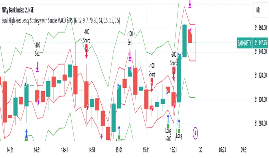
Sunil High-Frequency Strategy with Simple MACD & RSISunil High-Frequency Strategy with Simple MACD & RSI
This high-frequency trading strategy uses a combination of MACD and RSI to identify quick market opportunities. By leveraging these indicators, combined with dynamic risk management using ATR, it aims to capture small but frequent price movements while ensuring tight control over risk.
Key Features:
Indicators Used:
MACD (Moving Average Convergence Divergence): The strategy uses a shorter MACD configuration (Fast Length of 6 and Slow Length of 12) to capture quick price momentum shifts. A MACD crossover above the signal line triggers a buy signal, while a crossover below the signal line triggers a sell signal.
RSI (Relative Strength Index): A shorter RSI length of 7 is used to gauge overbought and oversold market conditions. The strategy looks for RSI confirmation, with a long trade initiated when RSI is below the overbought level (70) and a short trade initiated when RSI is above the oversold level (30).
Risk Management:
Dynamic Stop Loss and Take Profit: The strategy uses ATR (Average True Range) to calculate dynamic stop loss and take profit levels based on market volatility.
Stop Loss is set at 0.5x ATR to limit risk.
Take Profit is set at 1.5x ATR to capture reasonable price moves.
Trailing Stop: As the market moves in the strategy’s favor, the position is protected by a trailing stop set at 0.5x ATR, allowing the strategy to lock in profits as the price moves further.
Entry & Exit Signals:
Long Entry: Triggered when the MACD crosses above the signal line (bullish crossover) and RSI is below the overbought level (70).
Short Entry: Triggered when the MACD crosses below the signal line (bearish crossover) and RSI is above the oversold level (30).
Exit Conditions: The strategy exits long or short positions based on the stop loss, take profit, or trailing stop activation.
Frequent Trades:
This strategy is designed for high-frequency trading, with trade signals occurring frequently as the MACD and RSI indicators react quickly to price movements. It works best on lower timeframes such as 1-minute, 5-minute, or 15-minute charts, but can be adjusted for different timeframes based on the asset’s volatility.
Customizable Parameters:
MACD Settings: Adjust the Fast Length, Slow Length, and Signal Length to tune the MACD’s sensitivity.
RSI Settings: Customize the RSI Length, Overbought, and Oversold levels to better match your trading style.
ATR Settings: Modify the ATR Length and multipliers for Stop Loss, Take Profit, and Trailing Stop to optimize risk management according to market volatility.
Important Notes:
Market Conditions: This strategy is designed to capture smaller, quicker moves in trending markets. It may not perform well during choppy or sideways markets.
Optimizing for Asset Volatility: Adjust the ATR multipliers based on the asset’s volatility to suit the risk-reward profile that fits your trading goals.
Backtesting: It's recommended to backtest the strategy on different assets and timeframes to ensure optimal performance.
Summary:
The Sunil High-Frequency Strategy leverages a simple combination of MACD and RSI with dynamic risk management (using ATR) to trade small but frequent price movements. The strategy ensures tight stop losses and reasonable take profits, with trailing stops to lock in profits as the price moves in favor of the trade. It is ideal for scalping or intraday trading on lower timeframes, aiming for quick entries and exits with controlled risk.
PseudoPlotLibrary "PseudoPlot"
PseudoPlot: behave like plot and fill using polyline
This library enables line plotting by polyline like plot() and fill().
The core of polyline() is array of chart.point array, polyline() is called in its method.
Moreover, plotarea() makes a box in main chart, plotting data within the box is enabled.
It works so slowy to manage array of chart.point, so limit the target to visible area of the chart.
Due to polyline specifications, na and expression can not be used for colors.
1. pseudoplot
pseudoplot() behaves like plot().
//use plot()
plot(close)
//use pseudoplot()
pseudoplot(close)
Pseudoplot has label. Label is enabled when title argument is set.
In the example bellow, "close value" label is shown with line.
The label is shown at right of the line when recent bar is visible.
It is shown at 15% from the left of visible area when recent bar is not visible.
Just set "" if you don't need label.
//use plot()
plot(close,"close value")
//use pseudoplot
pseudoplot(close, "close value")
Arguments are designed in an order as similar as possible to plot.
plot(series, title, color, linewidth, style, trackprice, histbase, offset, join, editable, show_last, display, format, precision, force_overlay) → plot
pseudoplot(series, title, ,linecolor ,linewidth, linestyle, labelbg, labeltext, labelsize, shorttitle, format, xpos_from_left, overlay) → pseudo_plot
2. pseudofill
pseudofill() behaves like fill().
The label is shown(text only) at right of the line when recent bar is visible.
It is shown at 10% from the left of visible area when recent bar is not visible.
Just set "" if you don't need label.
//use plot() and fill()
p1=plot(open)
p2=plot(close)
fill(p1,p2)
//use pseudofill()
pseudofill(open,close)
Arguments are designed in an order as similar as possible to fill.
fill(hline1, hline2, color, title, editable, fillgaps, display) → void
pseudofill(series1, series2, fillcolor, title, linecolor, linewidth, linestyle, labeltext, labelsize, shorttitle, format, xpos_from_left, overlay) → pseudo_plot
3. plotarea and its methods
plotarea() makes a box in main chart. You can set the box position to top or bottom, and
the box height in percentage of the range of visible high and low prices.
x-coordinate of the box is from chart.left_visible_bar_time to chart.right_visible_bar_time,
y-coordinate is highest and lowest price of visible bars.
pseudoplot() and pseudofill() work as method of plotarea(box).
Usage is almost same as the function version, just set min and max value, y-coodinate is remapped automatically.
hline() is also available. The y-coordinate of hline is specified as a percentage from the bottom.
plotarea() and its associated methods are overlay=true as default.
Depending on the drawing order of the objects, plot may become invisible, so the bgcolor of plotarea should be na or tranceparent.
//1. make a plotarea
// bgcolor should be na or transparent color.
area=plotarea("bottom",30,"plotarea",bgcolor=na)
//2. plot in a plotarea
//(min=0, max=100 is omitted as it is the default.)
area.pseudoplot(ta.rsi(close,14))
//3. draw hlines
area.hline(30,linestyle="dotted",linewidth=2)
area.hline(70,linestyle="dotted",linewidth=2)
4. Data structure and sub methods
Array management is most imporant part of using polyline.
I don't know the proper way to handle array, so it is managed by array and array as intermediate data.
(type xy_arrays to manage bar_time and price as independent arrays.)
method cparray() pack arrays to array, when array includes both chart.left_visible_bar_time and chart.right_visible_bar.time.
Calling polyline is implemented as methods of array of chart.point.
Method creates polyline object if array is not empty.
method polyline(linecolor, linewidth, linestyle, overlay) → series polyline
method polyline_fill(fillcolor, linecolor, linewidth, linestyle, overlay) → series polyline
Also calling label is implemented as methods of array of chart.point.
Method creates label ofject if array is not empty.
Label is located at right edge of the chart when recent bar is visible, located at left side when recent bar is invisible.
label(title, labelbg, labeltext, labelsize, format, shorttitle, xpos_from_left, overlay) → series label
label_for_fill(title, labeltext, labelsize, format, shorttitle, xpos_from_left, overlay) → series label
visible_xyInit(series)
make arrays of visible x(bar_time) and y(price/value).
Parameters:
series (float) : (float) series variable
Returns: (xy_arrays)
method remap(this, bottom, top, min, max)
Namespace types: xy_arrays
Parameters:
this (xy_arrays)
bottom (float) : (float) bottom price to ajust.
top (float) : (float) top price to ajust.
min (float) : (float) min of src value.
max (float) : (float) max of src value.
Returns: (xy_arrays)
method polyline(this, linecolor, linewidth, linestyle, overlay)
Namespace types: array
Parameters:
this (array)
linecolor (color) : (color) color of polyline.
linewidth (int) : (int) width of polyline.
linestyle (string) : (string) linestyle of polyline. default is line.style_solid("solid"), others line.style_dashed("dashed"), line.style_dotted("dotted").
overlay (bool) : (bool) force_overlay of polyline. default is false.
Returns: (polyline)
method polyline_fill(this, fillcolor, linecolor, linewidth, linestyle, overlay)
Namespace types: array
Parameters:
this (array)
fillcolor (color)
linecolor (color) : (color) color of polyline.
linewidth (int) : (int) width of polyline.
linestyle (string) : (string) linestyle of polyline. default is line.style_solid("solid"), others line.style_dashed("dashed"), line.style_dotted("dotted").
overlay (bool) : (bool) force_overlay of polyline. default is false.
Returns: (polyline)
method label(this, title, labelbg, labeltext, labelsize, format, shorttitle, xpos_from_left, overlay)
Namespace types: array
Parameters:
this (array)
title (string) : (string) label text.
labelbg (color) : (color) color of label bg.
labeltext (color) : (color) color of label text.
labelsize (int) : (int) size of label.
format (string) : (string) textformat of label. default is text.format_none("none"). others text.format_bold("bold"), text.format_italic("italic"), text.format_bold+text.format_italic("bold+italic").
shorttitle (string) : (string) another label text for recent bar is not visible.
xpos_from_left (int) : (int) another label x-position(percentage from left of chart width), when recent bar is not visible. default is 15%.
overlay (bool) : (bool) force_overlay of label. default is false.
Returns: (label)
method label_for_fill(this, title, labeltext, labelsize, format, shorttitle, xpos_from_left, overlay)
Namespace types: array
Parameters:
this (array)
title (string) : (string) label text.
labeltext (color) : (color) color of label text.
labelsize (int) : (int) size of label.
format (string) : (string) textformat of label. default is text.format_none("none"). others text.format_bold("bold"), text.format_italic("italic"), text.format_bold+text.format_italic("bold+italic").
shorttitle (string) : (string) another label text for recent bar is not visible.
xpos_from_left (int) : (int) another label x-position(percentage from left of chart width), when recent bar is not visible. default is 10%.
overlay (bool) : (bool) force_overlay of label. default is false.
Returns: (label)
pseudoplot(series, title, linecolor, linewidth, linestyle, labelbg, labeltext, labelsize, shorttitle, format, xpos_from_left, overlay)
polyline like plot with label
Parameters:
series (float) : (float) series variable to plot.
title (string) : (string) title if need label. default value is ""(disable label).
linecolor (color) : (color) color of line.
linewidth (int) : (int) width of line.
linestyle (string) : (string) style of plotting line. default is "solid", others "dashed", "dotted".
labelbg (color) : (color) color of label bg.
labeltext (color) : (color) color of label text.
labelsize (int) : (int) size of label text.
shorttitle (string) : (string) another label text for recent bar is not visible.
format (string) : (string) textformat of label. default is text.format_none("none"). others text.format_bold("bold"), text.format_italic("italic"), text.format_bold+text.format_italic("bold+italic").
xpos_from_left (int) : (int) another label x-position(percentage from left of chart width), when recent bar is not visible. default is 15%.
overlay (bool) : (bool) force_overlay of polyline and label.
Returns: (pseudo_plot)
method pseudoplot(this, series, title, linecolor, linewidth, linestyle, labelbg, labeltext, labelsize, shorttitle, format, xpos_from_left, min, max, overlay)
Namespace types: series box
Parameters:
this (box)
series (float) : (float) series variable to plot.
title (string) : (string) title if need label. default value is ""(disable label).
linecolor (color) : (color) color of line.
linewidth (int) : (int) width of line.
linestyle (string) : (string) style of plotting line. default is "solid", others "dashed", "dotted".
labelbg (color) : (color) color of label bg.
labeltext (color) : (color) color of label text.
labelsize (int) : (int) size of label text.
shorttitle (string) : (string) another label text for recent bar is not visible.
format (string) : (string) textformat of label. default is text.format_none("none"). others text.format_bold("bold"), text.format_italic("italic"), text.format_bold+text.format_italic("bold+italic").
xpos_from_left (int) : (int) another label x-position(percentage from left of chart width), when recent bar is not visible. default is 15%.
min (float)
max (float)
overlay (bool) : (bool) force_overlay of polyline and label.
Returns: (pseudo_plot)
pseudofill(series1, series2, fillcolor, title, linecolor, linewidth, linestyle, labeltext, labelsize, shorttitle, format, xpos_from_left, overlay)
fill by polyline
Parameters:
series1 (float) : (float) series variable to plot.
series2 (float) : (float) series variable to plot.
fillcolor (color) : (color) color of fill.
title (string)
linecolor (color) : (color) color of line.
linewidth (int) : (int) width of line.
linestyle (string) : (string) style of plotting line. default is "solid", others "dashed", "dotted".
labeltext (color)
labelsize (int)
shorttitle (string)
format (string) : (string) textformat of label. default is text.format_none("none"). others text.format_bold("bold"), text.format_italic("italic"), text.format_bold+text.format_italic("bold+italic").
xpos_from_left (int) : (int) another label x-position(percentage from left of chart width), when recent bar is not visible. default is 15%.
overlay (bool) : (bool) force_overlay of polyline and label.
Returns: (pseudoplot)
method pseudofill(this, series1, series2, fillcolor, title, linecolor, linewidth, linestyle, labeltext, labelsize, shorttitle, format, xpos_from_left, min, max, overlay)
Namespace types: series box
Parameters:
this (box)
series1 (float) : (float) series variable to plot.
series2 (float) : (float) series variable to plot.
fillcolor (color) : (color) color of fill.
title (string)
linecolor (color) : (color) color of line.
linewidth (int) : (int) width of line.
linestyle (string) : (string) style of plotting line. default is "solid", others "dashed", "dotted".
labeltext (color)
labelsize (int)
shorttitle (string)
format (string) : (string) textformat of label. default is text.format_none("none"). others text.format_bold("bold"), text.format_italic("italic"), text.format_bold+text.format_italic("bold+italic").
xpos_from_left (int) : (int) another label x-position(percentage from left of chart width), when recent bar is not visible. default is 15%.
min (float)
max (float)
overlay (bool) : (bool) force_overlay of polyline and label.
Returns: (pseudo_plot)
plotarea(pos, height, title, bordercolor, borderwidth, bgcolor, textsize, textcolor, format, overlay)
subplot area in main chart
Parameters:
pos (string) : (string) position of subplot area, bottom or top.
height (int) : (float) percentage of visible chart heght.
title (string) : (string) text of area box.
bordercolor (color) : (color) color of border.
borderwidth (int) : (int) width of border.
bgcolor (color) : (string) color of area bg.
textsize (int)
textcolor (color)
format (string)
overlay (bool) : (bool) force_overlay of polyline and label.
Returns: (box)
method hline(this, ypos_from_bottom, linecolor, linestyle, linewidth, overlay)
Namespace types: series box
Parameters:
this (box)
ypos_from_bottom (float) : (float) percentage of box height from the bottom of box.(bottom is 0%, top is 100%).
linecolor (color) : (color) color of line.
linestyle (string) : (string) style of line.
linewidth (int) : (int) width of line.
overlay (bool) : (bool) force_overlay of polyline and label.
Returns: (line)
pseudo_plot
polyline and label.
Fields:
p (series polyline)
l (series label)
xy_arrays
x(bartime) and y(price or value) arrays.
Fields:
t (array)
p (array)

Multi-Feature IndicatorThe Multi-Feature Indicator combines three popular technical analysis tools — RSI, Moving Averages (MA), and MACD — into a single indicator to provide unified buy and sell signals. This script is designed for traders who want to filter out noise and focus on signals confirmed by multiple criteria.
Features:
RSI (Relative Strength Index):
Measures momentum and identifies overbought (70) and oversold (30) conditions.
A signal is triggered when RSI crosses these thresholds.
Moving Averages (MA):
Uses a short-term moving average (default: 9 periods) and a long-term moving average (default: 21 periods).
Buy signals occur when the short-term MA crosses above the long-term MA, indicating an uptrend.
Sell signals occur when the short-term MA crosses below the long-term MA, indicating a downtrend.
MACD (Moving Average Convergence Divergence):
A trend-following momentum indicator that shows the relationship between two moving averages of an asset's price.
Signals are based on the crossover of the MACD line and its signal line.
Unified Buy and Sell Signals:
Buy Signal: Triggered when:
RSI crosses above 30 (leaving oversold territory).
Short-term MA crosses above the long-term MA.
MACD line crosses above the signal line.
Sell Signal: Triggered when:
RSI crosses below 70 (leaving overbought territory).
Short-term MA crosses below the long-term MA.
MACD line crosses below the signal line.
Visualization:
The indicator plots the short-term and long-term moving averages on the price chart.
Green "BUY" labels appear below price bars when all buy conditions are met.
Red "SELL" labels appear above price bars when all sell conditions are met.
Parameters:
RSI Length: Default is 14. This controls the sensitivity of the RSI.
Short MA Length: Default is 9. This determines the short-term trend.
Long MA Length: Default is 21. This determines the long-term trend.
Use Case:
The Multi-Feature Indicator is ideal for traders seeking higher confirmation before entering or exiting trades. By combining momentum (RSI), trend (MA), and momentum shifts (MACD), it reduces false signals and enhances decision-making.
How to Use:
Apply the indicator to your chart in TradingView.
Look for "BUY" or "SELL" signals, which appear when all conditions align.
Use this tool in conjunction with other analysis techniques for best results.
Note:
The default settings are suitable for many assets, but you may need to adjust them for different timeframes or market conditions.
This indicator is meant to assist in trading decisions and should not be used as the sole basis for trading.

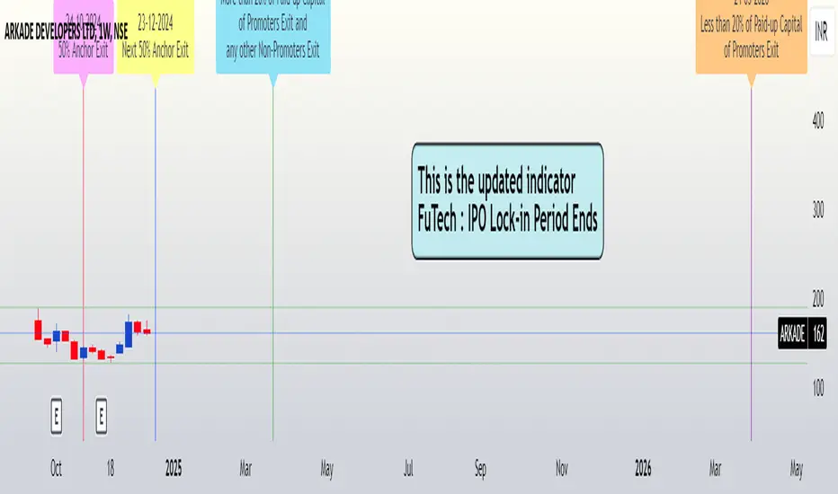
FuTech : IPO Lock-in Ends FuTech: Lock-in Ends - First ever unique Indicator on the TradingView platform
Hello Everyone !
Introducing the first-ever unique indicator on the TradingView platform to track the lock-in period expiry dates for IPOs.
The FuTech Lock-in Ends Indicator is specifically designed to assist traders and investors in identifying the key dates when lock-in periods for IPO shares come to an end.
This provides an edge in preparing for potential market movements driven by buying or selling pressures associated with significant share volumes.
=============================================================
Key Features:
1. Tracks Multiple Lock-in Periods:
- Identifies dates when the 30 days, 90 days, 6 months, and 18 months lock-in periods for IPO shares expire.
- Helps traders anticipate potential market action driven by share releases.
2. IPO Lock-in Ends dates as per Compliance with SEBI Guidelines:
- SEBI (Securities and Exchange Board of India) mandates lock-in periods for IPO shares based on investor categories:
- A) Promoters:
- Lock-in period reduced to 18 months for up to 20% of post-issue paid-up capital (previously 3 years).
- For shareholding exceeding 20%, the lock-in period is further reduced to 6 months (previously 1 year).
- B) Anchor Investors:
- 50% of allotted shares: Lock-in period of 90 days from the date of allotment.
- Remaining 50% of shares: Lock-in period of 30 days from the date of allotment.
- C) Non-promoters:
- Lock-in period reduced to 6 months (previously 1 year).
After these lock-in periods end, investors may buy / sell their shares, which can result in significant market activity.
3. Visual Indicator on Charts:
- The indicator draws vertical lines on the TradingView chart at the respective lock-in expiry dates.
- Alerts users in advance about potential market activity due to the release of locked shares.
- Traders can use these alerts to prepare for positions or adjust their existing holdings accordingly.
4. Customizable Settings:
- Users can modify the color of the labels and width of the lines to suit their preferences and enhance chart visibility.
5. User-defined Allotment Dates:
- If the allotment date is known, users can input this information directly. The indicator will then calculate the lock-in period dates based on the provided allotment date, ensuring precise results.
- If no allotment date is entered, the default calculation assumes the allotment date to be three trading days prior to the listing date .
=============================================================
Important Notes:
- Allotment Date Calculation:
- In the absence of user-defined allotment dates, the indicator estimates the allotment date as three trading days prior to the listing date .
- This approximation may deviate by one to two days from the actual event for certain IPOs.
- Proactive Alerts:
- Most dates are intentionally marked 1-2 days in advance to give traders sufficient time to act, whether for taking new positions or squaring off existing ones to avoid unfavorable losses.
=============================================================
The FuTech Lock-in Ends Indicator is a must-have tool for IPO traders and investors looking to stay ahead of market movements. Use it to track key dates and plan your trading strategy effectively with FuTech : Chart is Art.
=============================================================
Thank you !
Jai Swaminarayan Dasna Das !
He Hari ! Bas Ek Tu Raji Tha !
Custom RSI & MACD Momentum Entry SignalsIndicator Explanation: Custom RSI & MACD Momentum Entry Signals
Introduction
The "Custom RSI & MACD Momentum Entry Signals" indicator combines the Relative Strength Index (RSI) and the Moving Average Convergence Divergence (MACD) to generate precise long and short entry signals. This indicator offers a powerful combination of overbought/oversold zones, momentum analysis, and RSI-EMA crossovers to assist traders in making better decisions.
How the Indicator Works
1. RSI Calculation and EMA
The RSI is calculated based on the closing price with an adjustable period (default: 14).
An Exponential Moving Average (EMA) of the RSI (default: 9) is plotted to identify RSI trend changes.
When the RSI crosses its EMA upwards, it signals a bullish impulse. Conversely, a downward cross indicates a bearish impulse.
2. MACD Calculation and Momentum Shifts
The MACD line is derived from the difference between a fast EMA (default: 12) and a slow EMA (default: 26).
The Signal line is the EMA of the MACD line (default: 9).
The MACD histogram represents the difference between the MACD line and the Signal line.
Momentum shifts are detected as follows:
Weakening Bearish: Histogram is negative but increasing (less bearish pressure).
Strengthening Bullish: Histogram is positive and rising.
Weakening Bullish: Histogram is positive but decreasing.
Strengthening Bearish: Histogram is negative and falling.
Signal Generation
Long Signals
A Long signal is triggered when all of the following conditions are met:
The RSI was previously below 30 (oversold condition).
MACD momentum shifts from "strengthening bearish" to "weakening bearish" or turns bullish.
The RSI crosses its EMA upwards.
A green upward arrow is displayed below the bar, and the background is lightly shaded green for additional visualization.
Short Signals
A Short signal is triggered when all of the following conditions are met:
The RSI was previously above 70 (overbought condition).
MACD momentum shifts from "strengthening bullish" to "weakening bullish" or turns bearish.
The RSI crosses its EMA downwards.
A red downward arrow is displayed above the bar, and the background is lightly shaded red for additional visualization.
Visual Elements
RSI and EMA:
The RSI is shown in purple.
The RSI EMA is shown in blue.
Horizontal lines at 30 (oversold) and 70 (overbought) provide additional context.
MACD:
The MACD line is displayed in blue.
The Signal line is displayed in orange.
The zero line is added for easier interpretation.
Signals:
Green arrows: Long signals.
Red arrows: Short signals.
Background color: Light green for long conditions, light red for short conditions.
Use Cases
This indicator is ideal for:
Trend Followers: Combining RSI and MACD allows traders to identify entry points during impulsive trend shifts.
Swing Traders: Long and short signals can be used at reversal points to capture short-term price movements.
Momentum Traders: By considering MACD momentum, the indicator provides additional confidence in signal generation.
Customizable Settings
The indicator provides flexible input options:
RSI Period (default: 14)
RSI EMA Period (default: 9)
MACD Parameters: Fast, slow, and signal EMAs can be adjusted.
Conclusion
The Custom RSI & MACD Momentum Entry Signals indicator is a powerful tool for traders looking to combine RSI and MACD to identify high-probability entry signals. With clear visualization and precise signal generation, traders can make decisions more efficiently and capitalize on market movements.

Log Regression OscillatorThe Log Regression Oscillator transforms the logarithmic regression curves into an easy-to-interpret oscillator that displays potential cycle tops/bottoms.
🔶 USAGE
Calculating the logarithmic regression of long-term swings can help show future tops/bottoms. The relationship between previous swing points is calculated and projected further. The calculated levels are directly associated with swing points, which means every swing point will change the calculation. Importantly, all levels will be updated through all bars when a new swing is detected.
The "Log Regression Oscillator" transforms the calculated levels, where the top level is regarded as 100 and the bottom level as 0. The price values are displayed in between and calculated as a ratio between the top and bottom, resulting in a clear view of where the price is situated.
The main picture contains the Logarithmic Regression Alternative on the chart to compare with this published script.
Included are the levels 30 and 70. In the example of Bitcoin, previous cycles showed a similar pattern: the bullish parabolic was halfway when the oscillator passed the 30-level, and the top was very near when passing the 70-level.
🔹 Proactive
A "Proactive" option is included, which ensures immediate calculations of tentative unconfirmed swings.
Instead of waiting 300 bars for confirmation, the "Proactive" mode will display a gray-white dot (not confirmed swing) and add the unconfirmed Swing value to the calculation.
The above example shows that the "Calculated Values" of the potential future top and bottom are adjusted, including the provisional swing.
When the swing is confirmed, the calculations are again adjusted, showing a red dot (confirmed top swing) or a green dot (confirmed bottom swing).
🔹 Dashboard
When less than two swings are available (top/bottom), this will be shown in the dashboard.
The user can lower the "Threshold" value or switch to a lower timeframe.
🔹 Notes
Logarithmic regression is typically used to model situations where growth or decay accelerates rapidly at first and then slows over time, meaning some symbols/tickers will fit better than others.
Since the logarithmic regression depends on swing values, each new value will change the calculation. A well-fitted model could not fit anymore in the future.
Users have to check the validity of swings; for example, if the direction of swings is downwards, then the dataset is not fitted for logarithmic regression.
In the example above, the "Threshold" is lowered. However, the calculated levels are unreliable due to the swings, which do not fit the model well.
Here, the combination of downward bottom swings and price accelerates slower at first and faster recently, resulting in a non-fit for the logarithmic regression model.
Note the price value (white line) is bound to a limit of 150 (upwards) and -150 (down)
In short, logarithmic regression is best used when there are enough tops/bottoms, and all tops are around 100, and all bottoms around 0.
Also, note that this indicator has been developed for a daily (or higher) timeframe chart.
🔶 DETAILS
In mathematics, the dot product or scalar product is an algebraic operation that takes two equal-length sequences of numbers (arrays) and returns a single number, the sum of the products of the corresponding entries of the two sequences of numbers.
The usual way is to loop through both arrays and sum the products.
In this case, the two arrays are transformed into a matrix, wherein in one matrix, a single column is filled with the first array values, and in the second matrix, a single row is filled with the second array values.
After this, the function matrix.mult() returns a new matrix resulting from the product between the matrices m1 and m2.
Then, the matrix.eigenvalues() function transforms this matrix into an array, where the array.sum() function finally returns the sum of the array's elements, which is the dot product.
dot(x, y)=>
if x.size() > 1 and y.size() > 1
m1 = matrix.new()
m2 = matrix.new()
m1.add_col(m1.columns(), y)
m2.add_row(m2.rows (), x)
m1.mult (m2)
.eigenvalues()
.sum()
🔶 SETTINGS
Threshold: Period used for the swing detection, with higher values returning longer-term Swing Levels.
Proactive: Tentative Swings are included with this setting enabled.
Style: Color Settings
Dashboard: Toggle, "Location" and "Text Size"

Average Price Range Screener [KFB Quant]Average Price Range Screener
Overview:
The Average Price Range Screener is a technical analysis tool designed to provide insights into the average price volatility across multiple symbols over user-defined time periods. The indicator compares price ranges from different assets and displays them in a visual table and chart for easy reference. This can be especially helpful for traders looking to identify symbols with high or low volatility across various time frames.
Key Features:
Multiple Symbols Supported:
The script allows for analysis of up to 10 symbols, such as major cryptocurrencies and market indices. Symbols can be selected by the user and configured for tracking price volatility.
Dynamic Range Calculation:
The script calculates the average price range of each symbol over three distinct time periods (default are 30, 60, and 90 bars). The price range for each symbol is calculated as a percentage of the bar's high-to-low difference relative to its low value.
Range Visualization:
The results are visually represented using:
- A color-coded table showing the calculated average ranges of each symbol and the current chart symbol.
- A line plot that visually tracks the volatility for each symbol on the chart, with color gradients representing the range intensity from low (red/orange) to high (blue/green).
Customizable Inputs:
- Length Inputs: Users can define the time lengths (default are 30, 60, and 90 bars) for calculating average price ranges for each symbol.
- Symbol Inputs: 10 symbols can be tracked at once, with default values set to popular crypto pairs and indices.
- Color Inputs: Users can customize the color scheme for the range values displayed in the table and chart.
Real-Time Ranking:
The indicator ranks symbols by their average price range, providing a clear view of which assets are exhibiting higher volatility at any given time.
Each symbol's range value is color-coded based on its relative volatility within the selected symbols (using a gradient from low to high range).
Data Table:
The table shows the average range values for each symbol in real-time, allowing users to compare volatility across multiple assets at a glance. The table is dynamically updated as new data comes in.
Interactive Labels:
The indicator adds labels to the chart, showing the average range for each symbol. These labels adjust in real-time as the price range values change, giving users an immediate view of volatility rankings.
How to Use:
Set Time Periods: Adjust the time periods (lengths) to match your trading strategy's timeframe and volatility preference.
Symbol Selection: Add and track the price range for your preferred symbols (cryptocurrencies, stocks, indices).
Monitor Volatility: Use the visual table and plot to identify symbols with higher or lower volatility, and adjust your trading strategy accordingly.
Interpret the Table and Chart: Ranges that are color-coded from red/orange (lower volatility) to blue/green (higher volatility) allow you to quickly gauge which symbols are most volatile.
Disclaimer: This tool is provided for informational and educational purposes only and should not be considered as financial advice. Always conduct your own research and consult with a licensed financial advisor before making any investment decisions.

Daily Single Trade [SMRT Algo]The Daily Single Trade Indicator by SMRT Algo is a powerful yet simple tool designed for traders who value precision, discipline, and a focus on high-quality trade setups. With a unique approach, this indicator identifies just one signal daily, making it ideal for traders who prefer a structured and stress-free trading routine.
Please note that this indicator only works for timeframes below 1H.
Key Features:
Market Open & Pre-Market Analysis: The indicator focuses on the market’s opening range and identifies breakout opportunities based on price action during these critical periods.
Customizable Risk-Reward Ratio: Plan your trades with precision by setting your desired RR, ensuring that your take-profit (TP) levels are multiples of your stop-loss (SL). Stop loss is not shown with this indicator.
Price Offset for SL: Add a customizable buffer to your SL and TP levels. This offset accounts for market volatility, reducing the chances of premature stop-outs while maintaining alignment with your trading plan.
Increasing this value will lead to a greater invisible stop loss, which will increase the TP size. The opposite is occurs when decreasing this value (less than 0). If you set it as 2.5 for example for TSLA: price is 340 and SL is 330 for example, SL becomes 327.5. This calculation will then be applied to calculate the TP.
In simple terms, if the offset is positive, SL becomes larger, TP becomes larger as well.
Exit Point Visibility: Display exit points on your chart to better visualize trade targets and stop levels.
Adjustable Market Open Time: Easily modify the market open hour and minute to suit your asset’s trading session. For example, U.S. stock traders can set the market open time to 9:30 AM EST (UTC-5).
By providing a single signal each day, the indicator minimizes overtrading and keeps your focus on the best opportunities.
With predefined SL, TP, and RR settings, the indicator fosters disciplined trading, reducing the influence of emotional decision-making. Whether you’re trading stocks, indices, or forex, the customizable market open time and RR ratio make this indicator versatile and adaptable.
The combination of precise SL and TP calculations with offset pip adjustments helps protect your trades from market noise while maintaining a favorable RR.
Perfect for those who can’t monitor markets all day, the single-signal approach allows you to execute a high-quality trade and move on with your day.
How to Use:
Set the Market Open Time: Adjust the open time to align with your asset’s session. For example, set 9:30 AM EST for U.S. stocks.
Define Your Risk-Reward Ratio: Choose an RR multiple (e.g., 1:2 or 1:3) that aligns with your risk tolerance and trading goals.
Apply Pip Offset: Add a buffer to your SL and TP to account for market volatility and reduce false stops.
The Daily Single Trade Indicator simplifies trading by focusing on one high-probability setup per day. It’s perfect for traders looking to maintain consistency, improve risk management, and reduce the stress of overanalyzing the markets.
How Alerts Work:
Individual Alerts: Set separate notifications for specific actions, such as breakout signals, take-profit levels, or stop-loss activations.
Master Alert: Manage all notifications with one streamlined setting, ensuring you never miss an opportunity while keeping your setup simple and efficient.
Take control of your trading with a strategy built for clarity, precision, and success!

Relative Momentum StrengthThe Relative Momentum Strength (RMS) indicator is designed to help traders and investors identify tokens with the strongest momentum over two customizable timeframes. It calculates and plots the percentage price change over 30-day and 90-day periods (or user-defined periods) to evaluate a token's relative performance.
30-Day Momentum (Green Line): Short-term price momentum, highlighting recent trends and movements.
90-Day Momentum (Blue Line): Medium-term price momentum, providing insights into broader trends.
This tool is ideal for comparing multiple tokens or assets to identify those showing consistent strength or weakness. Use it to spot outperformers and potential reversals in a competitive universe of assets.
How to Use:
Apply this indicator to your TradingView chart for any token or asset.
Look for tokens with consistently high positive momentum for potential strength.
Use the plotted values to compare relative performance across your watchlist.
Customization:
Adjust the momentum periods to suit your trading strategy.
Overlay it with other indicators like RSI or volume for deeper analysis.
