MACD, backtest 2015+ only, cut in half and doubledThis is only a slight modification to the existing "MACD Strategy" strategy plugin!
found the default MACD strategy to be lacking, although impressive for its simplicity. I added "year>2014" to the IF buy/sell conditions so it will only backtest from 2015 and beyond ** .
I also had a problem with the standard MACD trading late, per se. To that end I modified the inputs for fast/slow/signal to double. Example: my defaults are 10, 21, 10 so I put 20, 42, 20 in. This has the effect of making a 30min interval the same as 1 hour at 10,21,10. So if you want to backtest at 4hr, you would set your time interval to 2hr on the main chart. This is a handy way to make shorter time periods more useful even regardless of strategy/testing, since you can view 15min with alot less noise but a better response.
Used on BTCCNY OKcoin, with the chart set at 45 min (so really 90min in the strategy) this gave me a percent profitable of 42% and a profit factor of 1.998 on 189 trades.
Personally, I like to set the length/signals to 30,63,30. Meaning you need to triple the time, it allows for much better use of shorter time periods and the backtests are remarkably profitable. (i.e. 15min chart view = 45min on script, 30min= 1.5hr on script)
** If you want more specific time periods you need to try plugging in different bar values: replace "year" with "n" and "2014" with "5500". The bars are based on unix time I believe so you will need to play around with the number for n, with n being the numbers of bars.
Tìm kiếm tập lệnh với "选10只股票,统计十大股东中间基金的持股变化,结合消息与股票价格运动,看看有什么规律?"

Smart Flow Tracker [The_lurker]
Smart Flow Tracker (SFT): Advanced Order Flow Tracking Indicator
Overview
Smart Flow Tracker (SFT) is an advanced indicator designed for real-time tracking and analysis of order flows. It focuses on detecting institutional patterns, massive orders, and potential reversals through analysis of lower timeframes (Lower Timeframe) or live ticks. It provides deep insights into market behavior using a multi-layered intelligent detection system and a clear visual interface, giving traders a competitive edge.
SFT focuses on trade volumes, directions, and frequencies to uncover unusual activity that may indicate institutional intervention, massive orders, or manipulation attempts (traps).
Indicator Operation Levels
SFT operates on three main levels:
1. Microscopic Monitoring: Tracks every trade at precise timeframes (down to one second), providing visibility not available in standard timeframes.
2. Advanced Statistical Analysis: Calculates averages, deviations, patterns, and anomalies using precise mathematical algorithms.
3. Behavioral Artificial Intelligence: Recognizes behavioral patterns such as hidden institutional accumulation, manipulation attempts and traps, and potential reversal points.
Key Features
SFT features a set of advanced functions to enhance the trader's experience:
1. Intelligent Order Classification System: Classifies orders into six categories based on size and pattern:
- Standard: Normal orders with typical size.
- Significant 💎: Orders larger than average by 1.5 times.
- Major 🔥: Orders larger than average by 2.5 times.
- Massive 🐋: Orders larger than average by 3 times.
- Institutional 🏛️: Consistent patterns indicating institutional activity.
- Reversal 🔄: Large orders indicating direction change.
- Trap ⚠️: Patterns that may be price traps.
2. Institutional Patterns Detection: Tracks sequences of similar-sized orders, detects organized institutional activity, and is customizable (number of trades, variance ratio).
3. Reversals Detection: Compares recent flows with previous ones, detects direction shifts from up to down or vice versa, and operates only on large orders (Major/Massive/Institutional).
4. Traps Detection: Identifies sequences of large orders in one direction, followed by an institutional order in the opposite direction, with early alerts for false moves.
5. Flow Delta Bar: Displays the difference between buy and sell volumes as a percentage for balance, with instant updates per trade.
6. Dynamic Statistics Panel: Displays overall buy and sell ratios with real-time updates and interactive colors.
How It Works and Understanding
SFT relies on logical sequential stages for data processing:
A. Data Collection: Uses the `request.security_lower_tf()` function to extract data from a lower timeframe (like 1S) even on a higher timeframe (like 5D). For each time unit, it calculates:
- Adjusted Volume: Either normal volume or "price-weighted volume" (hlc3 * volume) based on user choice.
- Trade Direction: Compared to previous close (rise → buy, fall → sell).
B. Building Temporary Memory: Maintains a dynamic list (sizeHistory) of the last 100 trade sizes, continuously calculating the moving average (meanSize).
C. Intelligent Classification: Compares each new trade to the average:
- > 1.5 × average → Significant.
- > 2.5 × average → Major.
- > 3.0 × average → Massive.
- Institutional Patterns Check: A certain number of trades (e.g., 5) with a specified variance ratio (±5%) → Institutional.
D. Advanced Detection:
- Reversal: Compares buy/sell totals in two consecutive periods.
- Trap: Sequence of large trades in one direction followed by an opposite institutional trade.
E. Display and Alerts: Results displayed in an automatically updated table, with option to enable alerts for notable events.
Settings (Fully Customizable)
SFT offers extensive options to adapt to the trader's needs:
A. Display Settings:
- Language: English / Arabic.
- Table Position: 9 options (e.g., Top Right, Middle Right, Bottom Left).
- Display Size: Tiny / Small / Normal / Large.
- Max Rows: 10–100.
- Enable Flow Delta Bar: Yes / No.
- Enable Statistics Panel: Yes / No (displays buy/sell % ratio).
B.- Technical Settings:
- Data Source: Lower Timeframe / Live Tick (simulation).
- Timeframe: Optional (e.g., 1S, 5S, 1).
- Calculation Type: Volume / Price Volume.
C. Intelligent Detection System:
- Enable Institutional Patterns Detection.
- Pattern Length: 3–20 trades.
- Allowed Variance Ratio: 1%–20%.
- Massive Orders Detection Factor: 2.0–10.0.
D. Classification Criteria:
- Significant Orders Factor: 1.2–3.0.
- Major Orders Factor: 2.0–5.0.
E. **Advanced Detection**:
- Enable Reversals Detection (with review period).
- Enable Traps Detection (with minimum sequence limit).
F. Alerts System:
- Enable for each type: Massive orders, institutional patterns, reversals, traps, severe imbalance (60%–90%).
G. Color System: Manual customization for each category:
- Standard Buy 🟢: Dark gray green.
- Standard Sell 🔴: Dark gray red.
- Significant Buy 🟢: Medium green.
- Significant Sell 🔴: Medium red.
- Major Orders 🟣: Purple.
- Massive Orders 🟠: Orange.
- Institutional 🟦: Sky blue.
- Reversal 🔵: Blue.
- Trap 🟣: Pink-purple.
Target Audiences
SFT benefits a wide range of traders and investors:
1. Scalpers: Instant detection of large orders, liquidity points identification, avoiding traps in critical moments.
2. Day Traders: Tracking smart money footprint, determining real session direction, early reversals detection.
3. Swing Traders: Confirming trend strength, detecting institutional accumulation/distribution, identifying optimal entry points.
4. Investors: Understanding true market sentiments, avoiding entry at false peaks, identifying real value zones.
⚠️ Disclaimer:
This indicator is for educational and analytical purposes only. It does not constitute financial, investment, or trading advice. Use it in conjunction with your own strategy and risk management. Neither TradingView nor the developer is liable for any financial decisions or losses.
Smart Flow Tracker (SFT): مؤشر متقدم لتتبع تدفقات الأوامر
نظرة عامة
Smart Flow Tracker (SFT) مؤشر متقدم مصمم لتتبع وتحليل تدفقات الأوامر في الوقت الفعلي. يركز على كشف الأنماط المؤسسية، الأوامر الضخمة، والانعكاسات المحتملة من خلال تحليل الأطر الزمنية الأقل (Lower Timeframe) أو التيك الحي. يوفر رؤية عميقة لسلوك السوق باستخدام نظام كشف ذكي متعدد الطبقات وواجهة مرئية واضحة، مما يمنح المتداولين ميزة تنافسية.
يركز SFT على حجم الصفقات، اتجاهها، وتكرارها لكشف النشاط غير العادي الذي قد يشير إلى تدخل مؤسسات، أوامر ضخمة، أو محاولات تلاعب (فخاخ).
مستويات عمل المؤشر
يعمل SFT على ثلاثة مستويات رئيسية:
1. المراقبة المجهرية: يتتبع كل صفقة على مستوى الأطر الزمنية الدقيقة (حتى الثانية الواحدة)، مما يوفر رؤية غير متوفرة في الأطر الزمنية العادية.
2. التحليل الإحصائي المتقدم: يحسب المتوسطات، الانحرافات، الأنماط، والشذوذات باستخدام خوارزميات رياضية دقيقة.
3. الذكاء الاصطناعي السلوكي: يتعرف على أنماط سلوكية مثل التراكم المؤسسي المخفي، محاولات التلاعب والفخاخ، ونقاط الانعكاس المحتملة.
الميزات الرئيسية
يتميز SFT بمجموعة من الوظائف المتقدمة لتحسين تجربة المتداول:
1. نظام تصنيف الأوامر الذكي: يصنف الأوامر إلى ست فئات بناءً على الحجم والنمط:
- Standard (قياسي)**: أوامر عادية بحجم طبيعي.
- Significant 💎 (مهم)**: أوامر أكبر من المتوسط بـ1.5 ضعف.
- Major 🔥 (كبير)**: أوامر أكبر من المتوسط بـ2.5 ضعف.
- Massive 🐋 (ضخم)**: أوامر أكبر من المتوسط بـ3 أضعاف.
- Institutional 🏛️ (مؤسسي)**: أنماط متسقة تشير إلى نشاط مؤسسي.
- Reversal 🔄 (انعكاس)**: أوامر كبيرة تشير إلى تغيير اتجاه.
- Trap ⚠️ (فخ)**: أنماط قد تكون فخاخًا سعرية.
2. كشف الأنماط المؤسسية: يتتبع تسلسل الأوامر المتشابهة في الحجم، يكشف النشاط المؤسسي المنظم، وقابل للتخصيص (عدد الصفقات، نسبة التباين).
3. كشف الانعكاسات: يقارن التدفقات الأخيرة بالسابقة، يكشف تحول الاتجاه من صعود إلى هبوط أو العكس، ويعمل فقط على الأوامر الكبيرة (Major/Massive/Institutional).
4. كشف الفخاخ: يحدد تسلسل أوامر كبيرة في اتجاه واحد، يليها أمر مؤسسي في الاتجاه المعاكس، مع تنبيه مبكر للحركات الكاذبة.
5. شريط دلتا التدفق: يعرض الفرق بين حجم الشراء والبيع كنسبة مئوية للتوازن، مع تحديث فوري لكل صفقة.
6. لوحة إحصائيات ديناميكية: تعرض نسبة الشراء والبيع الإجمالية مع تحديث لحظي وألوان تفاعلية.
طريقة العمل والفهم
يعتمد SFT على مراحل منطقية متسلسلة لمعالجة البيانات:
أ. جمع البيانات: يستخدم دالة `request.security_lower_tf()` لاستخراج بيانات من إطار زمني أدنى (مثل 1S) حتى على إطار زمني أعلى (مثل 5D). لكل وحدة زمنية، يحسب:
- الحجم المعدّل: إما الحجم العادي (volume) أو "الحجم المرجّح بالسعر" (hlc3 * volume) حسب الاختيار.
- اتجاه الصفقة: مقارنة الإغلاق الحالي بالسابق (ارتفاع → شراء، انخفاض → بيع).
ب. بناء الذاكرة المؤقتة: يحتفظ بقائمة ديناميكية (sizeHistory) لآخر 100 حجم صفقة، ويحسب المتوسط المتحرك (meanSize) باستمرار.
ج. التصنيف الذكي: يقارن كل صفقة جديدة بالمتوسط:
- > 1.5 × المتوسط → Significant.
- > 2.5 × المتوسط → Major.
- > 3.0 × المتوسط → Massive.
- فحص الأنماط المؤسسية: عدد معين من الصفقات (مثل 5) بنسبة تباين محددة (±5%) → Institutional.
د. الكشف المتقدم:
- الانعكاس: مقارنة مجموع الشراء/البيع في فترتين متتاليتين.
- الفخ: تسلسل صفقات كبيرة في اتجاه واحد يتبعها صفقة مؤسسية معاكسة.
هـ. العرض والتنبيه: عرض النتائج في جدول محدّث تلقائيًا، مع إمكانية تفعيل تنبيهات للأحداث المميزة.
لإعدادات (قابلة للتخصيص بالكامل)
يوفر SFT خيارات واسعة للتكييف مع احتياجات المتداول:
أ. إعدادات العرض:
- اللغة: English / العربية.
- موقع الجدول: 9 خيارات (مثل Top Right, Middle Right, Bottom Left).
- حجم العرض: Tiny / Small / Normal / Large.
- الحد الأقصى للصفوف: 10–100.
- تفعيل شريط دلتا التدفق: نعم / لا.
- تفعيل لوحة الإحصائيات: نعم / لا (تعرض نسبة الشراء/البيع %).
ب. الإعدادات التقنية:
- مصدر البيانات: Lower Timeframe / Live Tick (محاكاة).
- الإطار الزمني: اختياري (مثل 1S, 5S, 1).
- نوع الحساب: Volume / Price Volume.
ج. نظام الكشف الذكي:
- تفعيل كشف الأنماط المؤسسية.
- طول النمط: 3–20 صفقة.
- نسبة التباين: 1%–20%.
- عامل كشف الأوامر الضخمة: 2.0–10.0.
د. معايير التصنيف:
- عامل الأوامر المهمة: 1.2–3.0.
- عامل الأوامر الكبرى: 2.0–5.0.
هـ. الكشف المتقدم:
- تفعيل كشف الانعكاسات (مع فترة مراجعة).
- تفعيل كشف الفخاخ (مع حد أدنى للتسلسل).
و. نظام التنبيهات:
- تفعيل لكل نوع: أوامر ضخمة، أنماط مؤسسية، انعكاسات، فخاخ، عدم توازن شديد (60%–90%).
ز. نظام الألوان**: تخصيص يدوي لكل فئة:
- شراء قياسي 🟢: أخضر رمادي داكن.
- بيع قياسي 🔴: أحمر رمادي داكن.
- شراء مهم 🟢: أخضر متوسط.
- بيع مهم 🔴: أحمر متوسط.
- أوامر كبرى 🟣: بنفسجي.
- أوامر ضخمة 🟠: برتقالي.
- مؤسسي 🟦: أزرق سماوي.
- انعكاس 🔵: أزرق.
- فخ 🟣: وردي-أرجواني.
الفئات المستهدفة
يستفيد من SFT مجموعة واسعة من المتداولين والمستثمرين:
1. السكالبرز (Scalpers): كشف لحظي للأوامر الكبيرة، تحديد نقاط السيولة، تجنب الفخاخ في اللحظات الحرجة.
2. المتداولون اليوميون (Day Traders): تتبع بصمة الأموال الذكية، تحديد اتجاه الجلسة الحقيقي، كشف الانعكاسات المبكرة.
3. المتداولون المتأرجحون (Swing Traders): تأكيد قوة الاتجاه، كشف التراكم/التوزيع المؤسسي، تحديد نقاط الدخول المثلى.
4. المستثمرون: فهم معنويات السوق الحقيقية، تجنب الدخول في قمم كاذبة، تحديد مناطق القيمة الحقيقية.
⚠️ إخلاء مسؤولية:
هذا المؤشر لأغراض تعليمية وتحليلية فقط. لا يُمثل نصيحة مالية أو استثمارية أو تداولية. استخدمه بالتزامن مع استراتيجيتك الخاصة وإدارة المخاطر. لا يتحمل TradingView ولا المطور مسؤولية أي قرارات مالية أو خسائر.

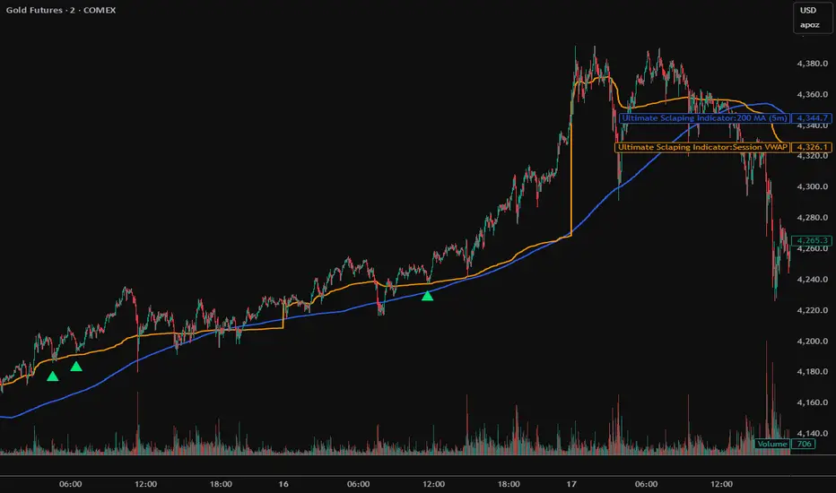
Ultimate Sclaping IndicatorOverview
The Confluence Signal Indicator is a precision-built scalping tool designed to identify high-probability reversal points in the market.
It combines three core technical elements:
Trend
Mean reversion
Momentum
into a single, efficient system.
By filtering out weak RSI signals and focusing only on setups that align with trend direction and recent momentum shifts, this indicator delivers cleaner and more accurate short-term trade signals.
Core Components
200-Period Moving Average (MA200, 5-Minute Timeframe)
The MA200 is always calculated from the 5-minute chart, regardless of your current timeframe. It defines the macro trend direction and ensures that all trades align with the prevailing momentum.
Session VWAP (Volume-Weighted Average Price)
The VWAP tracks the real-time average price weighted by volume for the current trading session. It acts as a dynamic mean-reversion level and helps identify key areas of institutional activity and short-term balance.
RSI (Relative Strength Index)
The indicator uses a standard 14-period RSI to detect overbought and oversold market conditions.
A “recency filter” is added to ensure signals only appear when RSI has recently transitioned from strength to weakness or vice versa, reducing false signals in trending markets.
Signal Logic
Bullish Signal (Green Arrow)
A bullish reversal signal is plotted below a candle when:
Price is above both the 5-minute MA200 and the Session VWAP.
RSI is oversold (below 30).
The last time RSI was above 50 occurred within the last 10 candles before going oversold.
This ensures that the dip is a fresh pullback within an uptrend, not a prolonged oversold condition.
Bearish Signal (Red Arrow)
A bearish reversal signal is plotted above a candle when:
Price is below both the 5-minute MA200 and the Session VWAP.
RSI is overbought (above 70).
The last time RSI was below 50 occurred within the last 10 candles before going overbought.
This ensures that the overbought reading follows a recent move from weakness, identifying potential short entries in a downtrend.
Recommended Usage
This is a scalping-focused indicator, intended for use on timeframes of 5 minutes or lower. Therefore I would highly recommend to use it on Equity futures trading, such as NQ!, ES!, GC! and so on.
It performs best when combined with additional tools such as support and resistance zones, order blocks, or liquidity levels for context.
Avoid counter-trend signals unless confirmed by price structure or volume behavior.
LevelsLevels is a powerful technical analysis tool that automatically identifies and displays key support and resistance levels on the chart. The indicator analyzes historical price data, detecting significant price levels where multiple reversals or price stops have occurred.
How the Indicator Works?
1. Identification of Reversal Points:
- The indicator tracks price extremes using an algorithm to identify local highs and lows
- A reversal point is recorded when:
- Uptrend: price reaches a new low for the last 10 bars
- Downtrend: price reaches a new high for the last 10 bars
2. Level Grouping:
- All found reversal points are analyzed and grouped into key levels
- Levels are combined if they fall within the specified percentage tolerance
3. Filtering Significant Levels:
- Only levels that have been tested the minimum number of times (set in settings) are preserved
- This ensures only statistically significant levels are displayed
How to Use the Indicator?
Trading Scenarios:
1. Bounce from Level:
- When price approaches an identified level, a bounce can be expected
- Opening positions on the bounce with protective stop-loss beyond the level
2. Level Breakout:
- Breaking through a key level may signal trend continuation
- Support level becomes resistance and vice versa
3. Consolidation near Level:
- Prolonged price presence near a level indicates its significance
- Strong movement can be expected after exiting consolidation
Advantages:
- Automatic level identification eliminates subjectivity
- Sensitivity customization for different timeframes and instruments
- Visual simplicity - only significant levels
Indicator Settings
Main Parameters:
- Show Key Levels - enable/disable level display
- Level Tolerance (%) - percentage tolerance for level grouping
- Smaller values: more levels, more precise
- Larger values: fewer levels, more significant
- Minimum Touches - minimum number of touches to form a level
Visual Settings:
- Level Color - level display color
- Level Style - line style (solid, dashed, dotted)
Limitations
- Levels are built only on available historical data
- Does not account for trading volumes
- Parameter adjustment may be required during high volatility periods
The indicator is particularly effective when combined with other analysis tools for signal confirmation.

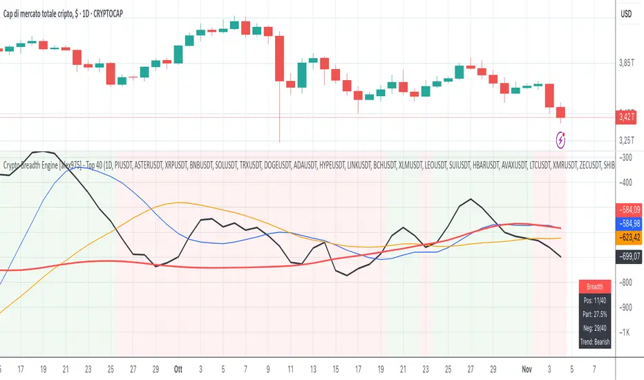
Crypto Breadth Engine [alex975]
A normalized crypto market breadth indicator with a customizable 40 coin input panel — revealing whether rallies are broad and healthy across major coins and altcoins or led by only a few.
📊 Overview
The Crypto Breadth Engine measures the real participation strength of the crypto market by analyzing the direction of the 40 largest cryptocurrencies by market capitalization.
⚙️ How It Works
Unlike standard breadth tools that only count assets above a moving average, this indicator measures actual price direction:
+1 if a coin closes higher, –1 if lower, 0 if unchanged.
The total forms a Breadth Line, statistically normalized using standard deviation to maintain consistent readings across timeframes and volatility conditions.
🧩 Dynamic Input Mask
All 40 cryptocurrencies are fully editable via the input panel, allowing users to easily replace or customize the basket (Top 40, Layer-1s, DeFi, Meme Coins, AI Tokens, etc.) without touching the code.
This flexibility keeps the indicator aligned with the evolving crypto market.
🧭 Trend Bias
The indicator classifies market structure as Bullish, Neutral, or Bearish, based on how the Breadth Line aligns with its moving averages (10, 20, 50).
💡 Dashboard
A compact on-chart table displays in real time:
• Positive and negative coins
• Participation percentage
• Current trend bias
🔍 Interpretation
• Rising breadth → broad, healthy market expansion
• Falling breadth → narrowing participation and structural weakness
Ideal for TOTAL, TOTAL3, or custom crypto baskets on 1D,1W.
Developed by alex975 – Version 1.0 (2025).
-------------------------------------------------------------------------------------
🇮🇹 Versione Italiana
📊 Panoramica
Il Crypto Breadth Engine misura la partecipazione reale del mercato crypto, analizzando la direzione delle 40 principali criptovalute per capitalizzazione.
Non si limita a contare quante coin sono sopra una media mobile, ma calcola la variazione effettiva del prezzo:
+1 se sale, –1 se scende, 0 se invariato.
La somma genera una Breadth Line normalizzata statisticamente, garantendo letture coerenti su diversi timeframe e fasi di volatilità.
🧩 Mascherina dinamica
L’indicatore include una mascherina d’input interattiva che consente di modificare o sostituire liberamente i 40 ticker analizzati (Top 40, Layer-1, DeFi, Meme Coin, ecc.) senza intervenire nel codice.
Questo lo rende sempre aggiornato e adattabile all’evoluzione del mercato crypto.
⚙️ Funzionamento e Trend Bias
Classifica automaticamente il mercato come Bullish, Neutral o Bearish in base alla relazione tra la breadth e le medie mobili (10, 20, 50 periodi).
💡 Dashboard
Una tabella compatta mostra in tempo reale:
• Numero di coin positive e negative
• Percentuale di partecipazione
• Stato attuale del trend
🔍 Interpretazione
• Breadth in crescita → mercato ampio e trend sano
• Breadth in calo → partecipazione ridotta e concentrazione su pochi asset
Ideale per analizzare TOTAL, TOTAL3 o panieri personalizzati di crypto.
Funziona su timeframe 1D, 4H, 1W.
Sviluppato da alex975 – Versione 1.0 (2025).
Crash Stats 15m (ETH) — X% | prev RTH min(VWAP, Close)# Crash Stats 15m (ETH) — X% Drawdown Event Analyzer
A 15-minute indicator that scans up to the last 5 years to find **crash events** where the close falls by at least **X%** relative to the **lower of** the prior day’s **RTH VWAP** and **RTH close**. It then measures recovery and follow-through behavior, tags the market regime around each event, and summarizes everything in a table.
---
## What the script detects
**Crash event (trigger):**
* On a 15-minute bar, `close <= refPrice * (1 - X%)`.
* `refPrice = min(previous RTH VWAP, previous RTH close)`.
* First touch only: subsequent bars below the threshold on the same trading day are ignored.
* Extended hours (ETH) are supported; if ETH is off, the script safely infers the previous RTH reference.
**Per-event measurements**
1. **Time to “turn up”** – first close **above the event-anchored AVWAP** (AVWAP cumulated from the trigger bar onward).
2. **Time to recover the reference price** – first close ≥ `refPrice`.
3. **Time to recover Y% above the crash-day average price** – first close ≥ `crashDayVWAP * (1+Y%)`.
4. **Post-crash lowest price & timing** – the lowest low and how long after the event it occurs, within a user-defined horizon (default 10 trading days, approximated in calendar days).
5. **Intraday RTH low timing** – on the crash day’s RTH session, when did the day’s intraday low occur, and **was it on the first 15-minute bar**?
6. **First 15-minute low of the RTH day** – recorded for context.
All durations are shown as **D days H hours M minutes**.
---
## Regime tagging (A / B)
For each event the script classifies the surrounding trend using daily closes:
* Let `r6m = (prevClose – close_6mAgo) / close_6mAgo`,
`r12m = (prevClose – close_12mAgo) / close_12mAgo`.
* **A**: both `r6m > 0` and `r12m > 0` (uptrend across 6m & 12m).
* **B**: one positive, one negative, and `r6m + r12m ≥ 0` (mixed but net non-negative).
* Otherwise: **—**.
This helps separate selloffs in strong uptrends (A) from mixed regimes (B) and others.
---
## Inputs
* **X — Crash threshold (%)**: default 5.
* **Y — Recovery above crash-day average (%)**: default 5.
* **Lookback years**: default 5 (bounded by data availability).
* **Horizon for post-crash lowest (trading days)**: default 10 (approximated as calendar days).
* **RTH session**: default `09:30–16:00` (exchange timezone).
* **Show markers**: plot labels on triggers.
* **Rows to display**: last N events in the table.
---
## Table columns
* Index, **Trigger time**, **Drop %**, **Ref price**, **Regime (A/B/—)**
* **Time to turn up** (above anchored AVWAP)
* **Time to ref price**, **Time to day VWAP + Y%**
* **Window lowest price**, **Time to window low**
* **RTH first-15m low**, **RTH lowest time**, **Was RTH low on first 15m?**
* **Crash-day VWAP**
---
## How to use
1. **Set chart to 15-minute** and **enable extended hours** for equities (recommended).
2. Keep defaults (**X=5%, Y=5%**) to start; tighten to 3–4% for more frequent events on less volatile symbols.
3. For non-US symbols or futures, adjust the **RTH session** if needed.
4. Read the table (top-right) for per-event diagnostics and aggregate averages (bottom row).
---
## Notes & implementation details
* Works whether ETH is on or off. If ETH is off, the script back-fills “previous RTH” references at the next RTH open and uses the prior daily close as a fallback.
* The “turn up” definition uses **event-anchored AVWAP**, a robust, price–volume anchor widely used for post-shock mean reversion analysis.
* Events are **de-duplicated**: only one event per trading day (per target RTH cycle).
* Lookback is limited by your plan and the data vendor. The script requests deep history (`max_bars_back=50000`), but availability varies by symbol.
* Durations use minute precision and are rendered as **days–hours–minutes** for readability.
---
## Quick troubleshooting
* **No events found**: lower **X%**, enable **ETH**, or ensure sufficient history is loaded (scroll back, or briefly switch to a higher timeframe to force deeper backfill, then return to 15m).
* **RTH boundaries off**: check the **RTH session** input matches the venue.
* **Few rows in table**: increase **Rows to display**.
---
## Typical use cases
* Back-test how fast different symbols tend to stabilize after a sharp gap-down or intraday shock.
* Compare recovery behavior across regimes **A / B** for sizing and risk timing.
* Build playbooks: e.g., if the RTH low occurs on the first 15m bar X% of the time, plan entries accordingly.
---
## Changelog
* **v1.0**: Initial public release with crash detection, anchored-AVWAP reversal, reference & VWAP+Y recovery timers, regime tagging, window-low timing, RTH low timing, and first-15m low capture.
RSI مع 5 متوسطات و5 مستوياتRSI with 5 Moving Averages and 5 Levels
This indicator combines the Relative Strength Index (RSI) with five customizable moving averages and five horizontal levels to help identify momentum, overbought/oversold zones, and trend strength.
• RSI: Measures the speed and change of price movements.
• Levels (10, 20, 50, 80, 90):
• 10 & 20 → Oversold zones (potential buy areas)
• 80 & 90 → Overbought zones (potential sell areas)
• 50 → Neutral midpoint (trend balance line)
• Moving Averages (5, 8, 13, 21, 200):
Smooth the RSI line to reveal short- and long-term momentum trends.
You can choose the type (SMA, EMA, WMA), color, and line thickness.
Optional alert signals can be triggered when the RSI crosses specific levels (e.g., above 80 or below 20).

DTC Killzones ICT🕐 DTC Killzones ICT — Visualize Market Sessions Like a Pro
The DTC Killzones ICT indicator is a clean and intuitive tool designed for traders who want to analyze and visualize institutional trading sessions directly on their charts.
Inspired by ICT’s Killzone concept , this script makes it easy to identify overlapping market sessions — such as London, New York, and Asian — and track how price behaves within each zone.
💡 What It Does
This indicator automatically highlights key market sessions (Killzones) on your chart with fully customizable colors, labels, and transparency.
Each zone dynamically updates to reflect real-time highs and lows, helping you identify:
Session ranges and liquidity zones
Volatility windows and breakout areas
Institutional footprints across sessions
Whether you trade Forex, Indices, or Crypto , this script gives you visual clarity on when and where smart money is likely to move.
⚙️ Main Features
✅ Up to four customizable sessions (New York, London, Asian, and London Close)
✅ Adjustable timeframes and timezone options — sync with your exchange or custom UTC offset
✅ Dynamic high/low range tracking for each session
✅ Toggle range outlines, session labels , and transparency levels
✅ Optional daily dividers and session transition markers
✅ Works on any timeframe and any symbol
🧠 How Traders Use It
ICT-based traders can easily mark Killzones to align with setups like FVGs, liquidity grabs, or Silver Bullet entries.
Intraday traders can visualize session volatility and overlap periods for potential entries.
Swing traders can identify daily structure shifts by tracking range-to-range behavior.
🛠️ Customization
You can fully rename, recolor, or disable each session block.
Adjust the range transparency for visual comfort, and toggle session or daily dividers to fit your workflow.
Everything is designed to be clean, light, and modular — no clutter, no confusion.
⚡ Recommended Settings
For ICT-style analysis:
London Session: 02:00–05:00
New York Session: 07:00–10:00
Asian Session: 19:30–24:00
London Close Session: 10:00–12:00
These time windows are fully editable to suit your timezone or strategy.
🧩 Compatibility
Works seamlessly with TradingView’s built-in timezone tools
Compatible with all instruments and timeframes
Designed to overlay directly on your price chart
🏁 Final Notes
The DTC Killzones ICT indicator focuses purely on market session visualization — no alerts, entries, or trading signals.
It’s designed to complement your existing strategies and enhance clarity when analyzing market behavior across global sessions.
📈 Built for traders who value precision, structure, and timing.

MTC – Multi-Timeframe Trend ConfirmatorMTC – Multi-Timeframe Trend Confirmator
The Ultimate Multi-Timeframe Trend Analysis Tool
MTC v6 is a comprehensive trend confirmation indicator that analyzes market conditions across multiple timeframes simultaneously. It combines six powerful technical indicators to give you a clear, visual representation of trend strength and direction.
🎯 Key Features
Visual Trend Gauge
Real-time trend strength display for 3 customizable timeframes
Progressive bar visualization (fills from left to right)
Color-coded signals: 🟢 Green (Bullish) | 🔴 Red (Bearish) | 🟡 Yellow (Ranging)
Score range: -10 to +10 for precise trend measurement
Multi-Indicator Analysis
The indicator combines 6 proven technical tools:
EMA 200 – Long-term trend direction
SMA 50/200 – Golden/Death cross signals
RSI 14 – Momentum confirmation
MACD – Trend strength validation
ADX (>25) – Trend intensity measurement (2x weight)
Supertrend – Dynamic support/resistance (2x weight)
⚙️ Customization Options
Flexible Timeframes: Set any timeframes you prefer (default: 15M, 1H, 4H)
Adjustable Gauge Size: Small, Medium, or Large display
Toggle Indicators: Enable/disable any of the 6 technical indicators
Supertrend Settings: Customize factor and ATR period
Built-in Alerts: Get notified when trends confirm
📈 How to Use
Score Interpretation:
Score > +2 = Bullish trend
Score < -2 = Bearish trend
Score between -2 and +2 = Ranging/Neutral
Multi-Timeframe Confirmation:
Look for alignment across timeframes for strongest signals
Higher timeframes confirm the overall trend direction
Lower timeframes help with precise entry timing
Visual Background:
Green background = Confirmed uptrend (Higher + Mid TF aligned)
Red background = Confirmed downtrend (Higher + Mid TF aligned)
💡 Perfect For
Swing traders seeking trend confirmation
Day traders analyzing multiple timeframes
Position traders validating long-term trends
Anyone who wants clear, visual trend analysis
Trade with confidence. Trade with confirmation. Trade with MTC
-Natantia

Ulcer Index (UI) by CoryP1990 – Quant ToolkitThe Ulcer Index measures downside volatility, i.e. how deep and persistent drawdowns are from recent highs. Unlike standard deviation, which treats upside and downside equally, the Ulcer Index focuses purely on pain . It’s a favorite of risk-adjusted performance metrics like the Martin Ratio.
How it works
Computes the RMS (root-mean-square) of drawdowns over a look-back window.
Rising UI → drawdowns worsening (stress increasing).
Falling UI → drawdowns shrinking (recovery phase).
Red line = Ulcer Index rising.
Lime line = Ulcer Index falling.
Red background = High-risk regime (above threshold).
Green background = Low-risk regime (below threshold).
Use cases
Gauge portfolio stress levels and timing of recovery phases.
Identify “calm vs storm” periods for position sizing.
Combine with volatility or sentiment measures for regime classification.
Defaults
Length = 14
High-risk threshold = 10
Low-risk threshold = 5
Example — NVIDIA (NVDA, 1D)
During the sharp decline through 2022, the Ulcer Index repeatedly spiked above 10 while the background turned red, highlighting an extended high-stress drawdown phase. As NVDA began recovering in early 2023, the UI line switched to lime and drifted below 5, marking a transition into a low-risk regime. Throughout 2024–2025, the index stayed mostly sub-5 with brief red pulses on minor corrections, which is clear evidence that downside volatility has remained contained during the broader uptrend.
Part of the Quant Toolkit - a series of transparent, open-source indicators designed for professional-grade analytics and education. Built by CoryP1990.

Monthly Color Marker V4
## 📊 Monthly Color Marker - Historical Month Highlighting
### Overview
A unique indicator that allows rapid identification of all monthly candles from a specific month across multiple years. The indicator marks candles with different colors based on their direction (bullish/bearish), enabling quick analysis of seasonal patterns and cyclical behavior of stocks or assets.
### 🎯 Purpose
- **Identify Seasonal Patterns (Seasonality)** - Discover recurring trends in specific months
- **Quick Historical Analysis** - Visual representation of monthly performance over the years
- **Direction Recognition** - Instant understanding of whether a month tends to be bullish or bearish
- **Seasonal Trading Planning** - Build strategies based on cyclical patterns
### ⚙️ Adjustable Parameters
1. **Month to Mark (1-12)**
- Select the desired month for analysis
- 1 = January, 2 = February... 12 = December
- Default: 11 (November)
2. **Years Back (1-50)**
- Determines how many years back to scan
- Recommended: 10-25 years for statistically reliable data
- Default: 25 years
3. **Bullish Candle Color**
- Color for marking bullish candles (close > open)
- Default: Green
- Customizable to your personal color scheme
4. **Bearish Candle Color**
- Color for marking bearish candles (close < open)
- Default: Red
- Customizable to your personal color scheme
5. **Show Current Year**
- Whether to include the current month in the marking
- Useful when the month hasn't finished yet
- Default: Yes
### 📈 How to Use the Indicator
#### Step 1: Adding to Chart
1. Switch to **Monthly timeframe** - Required!
2. Add the indicator to your chart
3. Select the month you want to analyze
#### Step 2: Initial Analysis
- **Count green vs red candles** - What's the ratio?
- **Look for patterns** - Are there years where the month always rises/falls?
- **Identify outliers** - Years where behavior was different
#### Step 3: Making Decisions
- **Mostly green** → Statistically, the month tends to rise
- **Mostly red** → Statistically, the month tends to fall
- **Mixed** → No clear seasonal pattern
### 💡 Usage Examples
**Example 1: "Santa Claus Rally"**
- Select month 12 (December)
- Check if there are mostly green candles
- If yes, this confirms the well-known year-end rally effect
**Example 2: "September Effect"**
- Select month 9 (September)
- Historically, September is considered a weak month
- Do the data support this for this stock?
**Example 3: Quarterly Earnings**
- Identify which month earnings are released
- Check the historical response
- Plan entry/exit accordingly
### 🔍 Combining with Other Indicators
This indicator works excellently with:
- **Historical Monthly Levels** (the first indicator) - Identify nearby price levels
- **Volume Profile** - Check volume during those months
- **RSI/MACD** - Identify momentum strength in specific months
### ⚠️ Important Notes
1. **Must use Monthly timeframe!** The indicator won't work correctly on other timeframes
2. **Statistical Sample** - More years = more reliable analysis
3. **Not a Guarantee** - Past performance doesn't guarantee future results, use additional analysis
4. **Adjust Colors** - If hard to see, change colors in settings
### 🎨 Tips for Optimal Experience
- **Zoom Out** - See more years at a glance
- **Clean Chart** - Remove unnecessary indicators for clear analysis
- **Compare Stocks** - Check multiple stocks for the same month
- **Document Findings** - Take screenshots and save insights for future reference
### 📊 Recommended Statistics
After identifying an interesting month:
- Calculate success rate (green / total candles)
- Check average volatility
- Identify outlier years and investigate what happened
- Plan entry/exit strategy
### 🚀 Who Is This Indicator For?
✅ **Swing Traders** - Plan medium-term trades
✅ **Seasonal Investors** - Exploit cyclical patterns
✅ **Technical Analysts** - Understand historical behavior
✅ **Portfolio Managers** - Time entries and exits
---
### 📝 Summary
The Monthly Color Marker indicator is a powerful and easy-to-use tool for identifying seasonal patterns. The combination of clear visualization with flexible parameters makes it an essential tool for any trader seeking a statistical edge in the market.
**Recommendation:** Start with 25 years back, analyze 2-3 key months, and build a data-driven strategy.
---
**Version:** 4.0
**Compatibility:** Pine Script v5
**Timeframe:** Monthly only
**Author:** 954
## 📊 Monthly Color Marker - סימון חודשים היסטוריים
### תיאור כללי
אינדיקטור ייחודי המאפשר לזהות במהירות את כל הנרות החודשיים מחודש ספציפי לאורך השנים. האינדיקטור מסמן את הנרות בצבעים שונים בהתאם לכיוון התנועה (עלייה/ירידה), ומאפשר ניתוח מהיר של דפוסים עונתיים והתנהגות מחזורית של המניה או הנכס.
### 🎯 מטרת האינדיקטור
- **זיהוי דפוסים עונתיים (Seasonality)** - מציאת מגמות חוזרות בחודשים מסוימים
- **ניתוח היסטורי מהיר** - ראייה ויזואלית של ביצועי החודש לאורך השנים
- **זיהוי כיווניות** - הבנה מיידית האם החודש נוטה להיות שורי או דובי
- **תכנון מסחר עונתי** - בניית אסטרטגיות מבוססות מחזוריות
### ⚙️ פרמטרים מתכווננים
1. **חודש לסימון (1-12)**
- בחירת החודש הרצוי לניתוח
- 1 = ינואר, 2 = פברואר... 12 = דצמבר
- ברירת מחדל: 11 (נובמבר)
2. **שנים אחורה (1-50)**
- קובע כמה שנים אחורה לסרוק
- מומלץ: 10-25 שנים לקבלת תמונה סטטיסטית מהימנה
- ברירת מחדל: 25 שנים
3. **צבע נר עולה**
- צבע לסימון נרות שורים (close > open)
- ברירת מחדל: ירוק
- ניתן להתאים לסכמת הצבעים האישית
4. **צבע נר יורד**
- צבע לסימון נרות דוביים (close < open)
- ברירת מחדל: אדום
- ניתן להתאים לסכמת הצבעים האישית
5. **צבע את השנה הנוכחית**
- האם לכלול את החודש הנוכחי בסימון
- שימושי כאשר החודש טרם הסתיים
- ברירת מחדל: כן
### 📈 איך להשתמש באינדיקטור
#### שלב 1: הוספה לגרף
1. עבור לטיימפריים **חודשי (Monthly)** - חובה!
2. הוסף את האינדיקטור לגרף
3. בחר את החודש שאתה רוצה לנתח
#### שלב 2: ניתוח ראשוני
- **ספור נרות ירוקים מול אדומים** - מה היחס?
- **חפש דפוסים** - האם יש שנים שבהן החודש תמיד עולה/יורד?
- **זהה חריגים** - שנים שבהן ההתנהגות הייתה שונה
#### שלב 3: קבלת החלטות
- **רוב ירוקים** → סטטיסטית החודש נוטה לעלות
- **רוב אדומים** → סטטיסטית החודש נוטה לרדת
- **מעורב** → אין דפוס עונתי ברור
### 💡 דוגמאות שימוש
**דוגמה 1: "Santa Claus Rally"**
- בחר חודש 12 (דצמבר)
- בדוק אם יש רוב נרות ירוקים
- אם כן, זה מאשר את האפקט הידוע של עליות בסוף השנה
**דוגמה 2: "September Effect"**
- בחר חודש 9 (ספטמבר)
- היסטורית, ספטמבר נחשב לחודש חלש
- האם הנתונים תומכים בכך במניה זו?
**דוגמה 3: דיווחים רבעוניים**
- זהה בחודש אילו נפרסמים דיווחים
- בדוק את התגובה ההיסטורית
- תכנן כניסה/יציאה בהתאם
### 🔍 שילוב עם אינדיקטורים אחרים
האינדיקטור עובד מצוין בשילוב עם:
- **Historical Monthly Levels** (האינדיקטור הראשון) - זיהוי רמות מחיר קרובות
- **Volume Profile** - בדיקת ווליום באותם חודשים
- **RSI/MACD** - זיהוי כוח המומנטום בחודשים ספציפיים
### ⚠️ הערות חשובות
1. **חובה להשתמש בטיימפריים חודשי!** האינדיקטור לא יעבוד נכון בטיימפריים אחרים
2. **מדגם סטטיסטי** - ככל שיש יותר שנים, הניתוח מהימן יותר
3. **לא ערובה** - עבר לא מבטיח עתיד, השתמש בניתוח נוסף
4. **התאם צבעים** - אם קשה לראות, שנה את הצבעים בהגדרות
### 🎨 טיפים לחוויית שימוש מיטבית
- **זום אאוט** - ראה יותר שנים במבט אחד
- **נקה גרף** - הסר אינדיקטורים מיותרים לניתוח ברור
- **השווה מניות** - בדוק מספר מניות לאותו חודש
- **תעד ממצאים** - צלם מסך ושמור תובנות לעתיד
### 📊 סטטיסטיקה מומלצת
לאחר שזיהית חודש מעניין:
- חשב אחוז הצלחה (ירוקים / כל הנרות)
- בדוק תנודתיות ממוצעת
- זהה שנים חריגות ובדוק מה קרה אז
- תכנן אסטרטגיית כניסה/יציאה
### 🚀 למי מתאים האינדיקטור?
✅ **סווינג טריידרים** - תכנון עסקאות לטווח בינוני
✅ **משקיעים עונתיים** - ניצול דפוסים מחזוריים
✅ **אנליסטים טכניים** - הבנת התנהגות היסטורית
✅ **מנהלי תיקים** - תזמון כניסות ויציאות
---
### 📝 סיכום
אינדיקטור Monthly Color Marker הוא כלי חזק וקל לשימוש לזיהוי דפוסים עונתיים. השילוב של ויזואליזציה ברורה עם פרמטרים גמישים הופך אותו לכלי חיוני לכל טריידר המחפש יתרון סטטיסטי בשוק.
**המלצה:** התחל עם 25 שנים אחורה, נתח 2-3 חודשים מרכזיים, ובנה אסטרטגיה מבוססת נתונים.
---
**גרסה:** 4.0
**תאימות:** Pine Script v5
**טיימפריים:** חודשי בלבד
**מחבר:** [954
---

3D Institutional Battlefield [SurgeGuru]Professional Presentation: 3D Institutional Flow Terrain Indicator
Overview
The 3D Institutional Flow Terrain is an advanced trading visualization tool that transforms complex market structure into an intuitive 3D landscape. This indicator synthesizes multiple institutional data points—volume profiles, order blocks, liquidity zones, and voids—into a single comprehensive view, helping you identify high-probability trading opportunities.
Key Features
🎥 Camera & Projection Controls
Yaw & Pitch: Adjust viewing angles (0-90°) for optimal perspective
Scale Controls: Fine-tune X (width), Y (depth), and Z (height) dimensions
Pro Tip: Increase Z-scale to amplify terrain features for better visibility
🌐 Grid & Surface Configuration
Resolution: Adjust X (16-64) and Y (12-48) grid density
Visual Elements: Toggle surface fill, wireframe, and node markers
Optimization: Higher resolution provides more detail but requires more processing power
📊 Data Integration
Lookback Period: 50-500 bars of historical analysis
Multi-Source Data: Combine volume profile, order blocks, liquidity zones, and voids
Weighted Analysis: Each data source contributes proportionally to the terrain height
How to Use the Frontend
💛 Price Line Tracking (Your Primary Focus)
The yellow price line is your most important guide:
Monitor Price Movement: Track how the yellow line interacts with the 3D terrain
Identify Key Levels: Watch for these critical interactions:
Order Blocks (Green/Red Zones):
When yellow price line enters green zones = Bullish order block
When yellow price line enters red zones = Bearish order block
These represent institutional accumulation/distribution areas
Liquidity Voids (Yellow Zones):
When yellow price line enters yellow void areas = Potential acceleration zones
Voids indicate price gaps where minimal trading occurred
Price often moves rapidly through voids toward next liquidity pool
Terrain Reading:
High Terrain Peaks: High volume/interest areas (support/resistance)
Low Terrain Valleys: Low volume areas (potential breakout zones)
Color Coding:
Green terrain = Bullish volume dominance
Red terrain = Bearish volume dominance
Purple = Neutral/transition areas
📈 Volume Profile Integration
POC (Point of Control): Automatically marks highest volume level
Volume Bins: Adjust granularity (10-50 bins)
Height Weight: Control how much volume affects terrain elevation
🏛️ Order Block Detection
Detection Length: 5-50 bar lookback for block identification
Strength Weighting: Recent blocks have greater impact on terrain
Candle Body Option: Use full candles or body-only for block definition
💧 Liquidity Zone Tracking
Multiple Levels: Track 3-10 key liquidity zones
Buy/Sell Side: Different colors for bid/ask liquidity
Strength Decay: Older zones have diminishing terrain impact
🌊 Liquidity Void Identification
Threshold Multiplier: Adjust sensitivity (0.5-2.0)
Height Amplification: Voids create significant terrain depressions
Acceleration Zones: Price typically moves quickly through void areas
Practical Trading Application
Bullish Scenario:
Yellow price line approaches green order block terrain
Price finds support in elevated bullish volume areas
Terrain shows consistent elevation through key levels
Bearish Scenario:
Yellow price line struggles at red order block resistance
Price falls through liquidity voids toward lower terrain
Bearish volume peaks dominate the landscape
Breakout Setup:
Yellow price line consolidates in flat terrain
Minimal resistance (low terrain) in projected direction
Clear path toward distant liquidity zones
Pro Tips
Start Simple: Begin with default settings, then gradually customize
Focus on Yellow Line: Your primary indicator of current price position
Combine Timeframes: Use the same terrain across multiple timeframes for confluence
Volume Confirmation: Ensure terrain peaks align with actual volume spikes
Void Anticipation: When price enters voids, prepare for potential rapid movement
Order Blocks & Voids Architecture
Order Blocks Calculation
Trigger: Price breaks fractal swing points
Bullish OB: When close > swing high → find lowest low in lookback period
Bearish OB: When close < swing low → find highest high in lookback period
Strength: Based on price distance from block extremes
Storage: Global array maintains last 50 blocks with FIFO management
Liquidity Voids Detection
Trigger: Price gaps exceeding ATR threshold
Bull Void: Low - high > (ATR200 × multiplier)
Bear Void: Low - high > (ATR200 × multiplier)
Validation: Close confirms gap direction
Storage: Global array maintains last 30 voids
Key Design Features
Real-time Updates: Calculated every bar, not just on last bar
Global Persistence: Arrays maintain state across executions
FIFO Management: Automatic cleanup of oldest entries
Configurable Sensitivity: Adjustable lookback periods and thresholds
Scientific Testing Framework
Hypothesis Testing
Primary Hypothesis: 3D terrain visualization improves detection of institutional order flow vs traditional 2D charts
Testable Metrics:
Prediction Accuracy: Does terrain structure predict future support/resistance?
Reaction Time: Faster identification of key levels vs conventional methods
False Positive Reduction: Lower rate of failed breakouts/breakdowns
Control Variables
Market Regime: Trending vs ranging conditions
Asset Classes: Forex, equities, cryptocurrencies
Timeframes: M5 to H4 for intraday, D1 for swing
Volume Conditions: High vs low volume environments
Data Collection Protocol
Terrain Features to Quantify:
Slope gradient changes at price inflection points
Volume peak clustering density
Order block terrain elevation vs subsequent price action
Void depth correlation with momentum acceleration
Control Group: Traditional support/resistance + volume profile
Experimental Group: 3D Institutional Flow Terrain
Statistical Measures
Signal-to-Noise Ratio: Terrain features vs random price movements
Lead Time: Terrain formation ahead of price confirmation
Effect Size: Performance difference between groups (Cohen's d)
Statistical Power: Sample size requirements for significance
Validation Methodology
Blind Testing:
Remove price labels from terrain screenshots
Have traders identify key levels from terrain alone
Measure accuracy vs actual price action
Backtesting Framework:
Automated terrain feature extraction
Correlation with future price reversals/breakouts
Monte Carlo simulation for significance testing
Expected Outcomes
If hypothesis valid:
Significant improvement in level prediction accuracy (p < 0.05)
Reduced latency in institutional level identification
Higher risk-reward ratios on terrain-confirmed trades
Research Questions:
Does terrain elevation reliably indicate institutional interest zones?
Are liquidity voids statistically significant momentum predictors?
Does multi-timeframe terrain analysis improve signal quality?
How does terrain persistence correlate with level strength?
LuxAlgo BigBeluga hapharmonic

Multi-Day SMAmade this script due to the frustration of not having the 5 day SMA added with the 10 20 and 50. I need the 5 SMA for my type of trading to determine when to sell with stocks showing exponential growth.
so heres this: Multi SMA
5 day SMA pink
10 day SMA white
20 day SMA blue
50 day SMA red
200 day SMA green

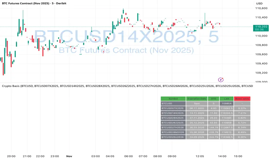
Crypto Futures Basis Tracker (Annualized)🧩 What is Basis Arbitrage
Basis arbitrage is a market-neutral trading strategy that exploits the price difference between a cryptocurrency’s spot and its futures markets.
When futures trade above spot (called contango), traders can buy spot and short futures, locking in a potential yield.
When futures trade below spot (backwardation), the reverse applies — short spot and go long futures.
The yield earned (or cost paid) by holding this position until expiry is called the basis. Expressing it as an annualized percentage allows comparison across different contract maturities.
⚙️ How the Indicator Works
This tool calculates the annualized basis for up to 10 cryptocurrency futures against a chosen spot price.
You select one spot symbol (e.g., BITSTAMP:BTCUSD) and up to 10 futures symbols (e.g., DERIBIT:BTCUSD07X2025, DERIBIT:BTCUSD14X2025, etc.).
The script automatically computes the days-to-expiry (DTE) and the annualized basis for each future.
A table displays for each contract: symbol, expiry date, DTE, last price, and annualized basis (%) — making it easy to compare the forward curve across maturities.
⚠️ Risks and Limitations
While basis arbitrage is often considered low-risk, it’s not risk-free:
Funding and financing costs can erode returns, especially when borrowing or using leverage.
Exchange or counterparty risk — if one leg of the trade fails (e.g., exchange default, margin liquidation), the hedge breaks.
Execution and timing risk — the basis can tighten or invert before both legs are opened.
Liquidity differences — thin futures may have large bid-ask spreads or slippage.
Use this indicator for analysis and monitoring, not as an automated trading signal.
Disclaimer: Please remember that past performance may not be indicative of future results. Due to various factors, including changing market conditions, the strategy may no longer perform as well as in historical backtesting. This post and the script don't provide any financial advice.
VWMA Series (Dynamic) mtf - Dual Gradient Colored"VWMA Series (Dynamic) mtf - Dual Gradient Colored" is a multi-timeframe (MTF) Volume-Weighted Moving Average (VWMA) ribbon indicator that plots up to 60 sequential VWMAs with arithmetic progression periods (e.g., 1, 4, 7, 10…). Each VWMA line is dual-gradient colored: Base hue = Greenish (#2dd204) if close > VWMA (bullish), Magenta (#ff00c8) if close < VWMA (bearish)
Brightness gradient = fades from base → white as period increases (short → long-term)
Uses daily resolution by default (timeframe="D"), making it ideal for higher-timeframe trend filtering on lower charts.Key FeaturesFeature
Description
Dynamic Periods
Start + i × Increment → e.g., 1, 4, 7, 10… up to 60 terms
Dual Coloring
Bull/Bear + Gradient (short = vivid, long = pale)
MTF Ready
Plots daily VWMAs on any lower timeframe (1H, 15M, etc.)
No Lag on Long Sets
Predefined "best setups" eliminate repainting/lag
Transparency Control
Adjustable line opacity for clean visuals
Scalable
Up to 60 VWMAs (max iterations)
Recommended Setups (No Lag)Type
Example Sequence (Start, Inc, Iter)
Long-Term Trend
1, 3, 30 → 1, 4, 7 … 88
93, 3, 30 → 93, 96 … 180
372, 6, 30 → 372, 378 … 546
Short-Term Momentum
1, 1, 30 → 1, 2, 3 … 30
94, 2, 30 → 94, 96 … 152
1272, 5, 30 → 1272, 1277 … 1417
Key Use CasesUse Case
How to Use
1. Multi-Timeframe Trend Alignment
On 1H chart, use 1, 3, 30 daily VWMAs → price above all green lines = strong uptrend
2. Dynamic Support/Resistance
Cluster of long-term pale VWMAs = major S/R zone
3. Early Trend Change Detection
Short-term vivid lines flip from red → green before longer ones = early bullish signal
4. Ribbon Compression/Expansion
Tight bundle → consolidation; fanning out → trend acceleration
5. Mean Reversion Entries
Price far from long-term VWMA cluster + short-term reversal = pullback trade
6. Volume-Weighted Fair Value
Long-period VWMAs reflect true average price paid over weeks/months
Visual Summary
Price ↑
████ ← Short VWMA (vivid green = close > VWMA)
███
██
█
. . . fading to white
█
██
███
████ ← Long VWMA (pale = institutional average)
Green lines = price above VWMA (bullish bias)
Magenta lines = price below VWMA (bearish bias)
Gradient = shorter (left) → brighter; longer (right) → whiter
Ribbon thickness = trend strength (wide = strong, narrow = weak)
Best For Swing traders using daily trend on intraday charts
Volume-based strategies (VWMA > SMA)
Clean, colorful trend visualization without clutter
Institutional fair value anchoring via long-period VWMAs
Pro Tip:
Use Start=1, Increment=3, Iterations=30 on a 4H chart with timeframe="D" → perfect daily trend filter with zero lag and beautiful gradient flow.

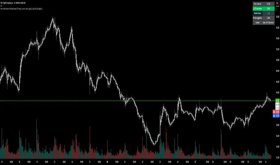
Prev 1-Min Volume • 5% Max Shares (TTP-ready)💡 Overview
This tool was built to help Trade The Pool (TTP) traders comply with the new “5% per minute volume” rule — without needing to calculate anything manually.
It automatically tracks the previous 1-minute volume, calculates 5% of it, and compares that to your planned order size.
If your planned size is within the limit, it shows green ✅.
If you’re above, it flashes red 🚫.
And when liquidity spikes allow for more size, you’ll see a green glow and 🔔 alert — so you can size up confidently without breaking the rule.
⚙️ Features
✅ Auto-calculates 5% volume cap from the previous 1-min candle
✅ Displays previous volume, max allowed shares, and your planned size
✅ TTP “different volume” scaling option (e.g. 0.69 for 45M vs 65M real volume)
✅ Per-bar slice suggestion for 10s scalpers
✅ Corner selector (top-left, top-right, bottom-left, bottom-right)
✅ Visual glow and 🔔 alert when liquidity window opens
✅ Compact and real-time responsive on 10s charts
Order Blocks Zones with Signals█ OVERVIEW
“Order Blocks Zones with Signals” is a technical analysis tool that automatically identifies Order Blocks (OB) and optionally Fair Value Gaps (FVG) on the chart.
The script visualizes these zones as colored rectangles, offering full customization of style, transparency, and signal display.
It also generates entry and exit signals (Break & Exit) that can serve as confirmations in strategies based on price action and market structure.
Thanks to flexible candle size filters and rich visual options, the indicator maintains chart clarity and readability.
█ CONCEPTS
Order Blocks (OB) are key zones on the chart where significant price movements previously occurred — areas where large market participants (institutions, so-called smart money) initiated or closed positions.
An OB is the last candle that followed the prior trend before the market reversed (e.g., for a Bullish OB: the last bearish candle before a pivot low and a strong upward impulse).
The script detects these levels using local price pivots, analyzing candle direction to filter out less significant movements.
FVG (Fair Value Gaps) represent areas of imbalance between buyers and sellers — price gaps formed by a sharp impulse where full trading did not occur due to one-sided order dominance (e.g., excess buy or sell orders).
Why combine OB and FVG in one indicator?
Combining OB and FVG analysis is essential because these phenomena often occur sequentially in the institutional market cycle:
1. Order Block — institutions enter the market in the OB zone, absorbing orders and building positions.
2. Strong impulse — after smart money entry, a rapid price move creates an FVG (imbalance gap).
3. Retest — price naturally returns to these zones (OB or FVG), drawn by unfilled orders and the search for equilibrium.
Such areas strongly attract price, as they represent not only historical institutional levels but also open “holes” in the order book. Retests of OB and FVG are ideal entry opportunities with high reaction probability (rebound or breakout). The indicator combines these two interconnected elements, enabling comprehensive market structure analysis in a single tool.
Order Blocks are labeled as:
Bullish OB – demand zones, often accumulation areas before an upmove.
Bearish OB – supply zones, signaling potential impulse end or correction start.
█ FEATURES
Order Block Detection (OB Detection):
- Automatic identification of demand and supply zones based on pivots.
- OB is the last candle aligned with the prior trend, just before the market reversal — precisely identified through candle sequence analysis around the pivot.
- OB zones appear with a delay equal to Pivot Length (default 10 bars).
- Break signals trigger when a candle’s body (close) fully pierces the zone, causing the zone to disappear immediately (e.g., close < low of Bullish OB → Break Down and zone deletion).
- Minimum size filtering via OB Size Multiplier.
- Option to create OB without wicks (Include Wicks in OB): when disabled, OB zones are based solely on candle bodies (open/close), ignoring wicks (high/low).
Fair Value Gap Detection (FVG Detection):
- Optional, with enable/disable capability.
- FVG are detected without delay — immediately upon gap occurrence.
- Size filtering via Candle Size Period and FVG Size Multiplier.
Customizable Styling:
- Separate colors and border styles (Solid / Dashed / Dotted) for each zone type.
- Adjustable transparency and border thickness.
- Unified color for box, border, and signal of the same type.
Breakout and Exit Signals:
- Break Up – triggered when a candle’s close breaks above a Bearish OB, causing the zone to disappear.
- Break Down – triggered when a candle’s close breaks below a Bullish OB, causing the zone to disappear.
- Exit Up / Exit Down – temporary exit from the zone without full breakout (price leaves the zone but doesn’t close beyond it). Signal type selection: Break, Exit, or Both.
- Alerts: built-in alerts for all signal types — triggered automatically on candle close confirming breakout or exit from OB.
█ HOW TO USE
Adding to chart: import the code into Pine Editor and run the script on TradingView.
Settings configuration:
- Pivot Length: controls swing detection sensitivity and OB display delay (default 10).
- Include Wicks in OB: enabled (default) – OB includes wicks; disabled – OB uses bodies only.
- Size Filter: adjust Candle Size Period and OB/FVG Size Multiplier to filter out small zones.
- Colors & Styles: set colors, styles, and transparency for each zone type.
- Signal Type: choose which signals to display (Break, Exit, or Both).
Signal interpretation:
- OB Break Up: price closes above Bearish OB → zone disappears → potential bullish continuation.
- OB Break Down: price closes below Bullish OB → zone disappears → potential bearish continuation.
- Exit Signals: price leaves the zone temporarily without breakout — often signals impending reversal or pullback.
Tips:
- Use OB signals alongside other indicators like RSI, MACD, SMI, or trend filters.
- Order Blocks from higher timeframes (e.g., 4H, 1D) carry greater significance and reaction strength.
- Remember: FVG are detected immediately, OB with delay — a complementary approach!
█ APPLICATIONS
- Smart Money Concepts (SMC): use OB zones as dynamic support and resistance levels. In an uptrend, look for buy opportunities in bullish OBs, which price often retests before further gains. Combining with RSI, MACD, or Fibonacci levels enhances zone significance, confirming institutional demand.
- Breakout Trading: trade based on OB breakout signals. A buy signal after breaking a bearish OB may indicate a strong upward impulse, especially if supported by rising MACD or RSI above 50. Similarly for sell signals after Break Down.
- Reversal Zones: Exit signals may indicate the end of a move or correction. Safest to use in alignment with higher-timeframe trend and confirmed by another indicator (e.g., RSI divergence, Fibonacci levels).
- Confluence Analysis: combine OB and FVG for deeper market structure and equilibrium insight. When an Order Block overlaps or borders an FVG, we get confluence of two institutional phenomena — OB (smart money entry) + FVG (imbalance) — making these areas particularly strong price magnets, increasing retest and reaction probability.
█ NOTES
- FVG can be fully disabled for a cleaner chart view.
- In consolidation periods, signals may appear more frequently — always confirm with additional trend filters.
- Works on all markets and timeframes (crypto, forex, indices, stocks).

Serenity Model VIPI — by yuu_iuHere’s a concise, practical English guide for Serenity Model VIPI (Author: yuu_iu). It covers what it is, how to set it up for daily trading, how to tune it, and how we guarantee non-repainting.
Serenity Model VIPI — User Guide (Daily Close, Non‑Repainting)
Credits
- Author: yuu_iu
- Producer: yuu_iu
- Platform: TradingView (Pine Script v5)
1) What it is
Serenity Model VIPI is a multi‑module, context‑aware trading model that fuses signals from:
- Entry modules: VCP, Flow, Momentum, Mean Reversion, Breakout
- Exit/risk modules: Contrarian, Breakout Sell, Volume Delta Sell, Peak Detector, Overbought Exit, Profit‑Take
- Context/memory: Learns per Ticker/Sector/Market Regime and adjusts weights/aggression
- Learning engine: Runs short “fake trades” to learn safely before scaling real trades
It produces a weighted, context‑adjusted score and a final decision: BUY, SELL, TAKE_PROFIT, or WAIT.
2) How it works (high level)
- Each module computes a score per bar.
- A fusion layer combines module scores using accuracy and base weights, then adjusts by:
- Market regime (Bull/Bear/Sideways) and optional higher‑timeframe (HTF) bias
- Risk control neuron
- Context memory (ticker/sector/regime)
- Optional LLM mode can override marginal cases if context supports it.
- Final decision is taken at bar close only (no intrabar repaint).
3) Non‑repainting guarantee (Daily)
- Close‑only execution: All key actions use barstate.isconfirmed, so signals/entries/exits only finalize after the daily candle closes.
- No lookahead on HTF data: request.security() reads prior‑bar values (series ) for HTF close/EMA/RSI.
- Alerts at bar close: Alerts are fired once per bar close to prevent mid‑bar changes.
What this means: Once the daily bar closes, the decision and alert won’t be repainted.
4) Setup (TradingView)
- Paste the Pine v5 code into Pine Editor, click Add to chart.
- Timeframe: 1D (Daily).
- Optional: enable a date window for training/backtest
- Enable Custom Date Filter: ON
- Set Start Date / End Date
- Create alert (non‑repainting)
- Condition: AI TRADE Signal
- Options: Once Per Bar Close
- Webhook (optional): Paste your URL into “System Webhook URL (for AI events)”
- Watch the UI
- On‑chart markers: AI BUY / AI SELL / AI TAKE PROFIT
- Right‑side table: Trades, Win Rate, Avg Profit, module accuracies, memory source, HTF trend, etc.
- “AI Thoughts” label: brief reasoning and debug lines.
5) Daily trading workflow
- The model evaluates at daily close and may:
- Enter long (BUY) when buy votes + total score exceed thresholds, after context/risk checks
- Exit via trailing stop, hard stop, TAKE_PROFIT, or SELL decision
- Learning mode:
- Triggers short “fake trades” every N bars (default 3) and measures outcome after 5 bars
- Improves module accuracies and adjusts aggression once stable (min fake win% threshold)
- Memory application:
- When you change tickers, the model tries to apply Ticker or Sector memory for the current market regime to pre‑bias module weights/aggression.
6) Tuning (what to adjust and why)
Core controls
- Base Aggression Level (default 1.0): Higher = more trades and stronger decisions; start conservative on Daily (1.0–1.2).
- Learning Speed Multiplier (default 3): Faster adaptation after fake/real trades; too high can overreact.
- Min Fake Win Rate to Exit Learning (%) (default 10–20%): Raises the bar before trusting more real trades.
- Fake Trade Every N Bars (default 3): Frequency of learning attempts.
- Learning Threshold Win Rate (default 0.4): Governs when the learner should keep learning.
- Hard Stop Loss (%) (default 5–8%): Global emergency stop.
Multi‑Timeframe (MTF)
- Enable Multi‑Timeframe Confirmation: ON (recommended for Daily)
- HTF Trend Source: HOSE:VNINDEX for VN equities (or CURRENT_SYMBOL if you prefer)
- HTF Timeframe: D or 240 (for a strong bias)
- MTF Weight Adjustment: 0.2–0.4 (0.3 default is balanced)
Module toggles and base weights
- In strong uptrends: increase VCP, Momentum, Breakout (0.2–0.3 typical)
- In sideways low‑vol regimes: raise MeanRev (0.2–0.3)
- For exits/defense: Contrarian, Peak, Overbought Exit, Profit‑Take (0.1–0.2 each)
- Keep Flow on as a volume‑quality filter (≈0.2)
Memory and control
- Enable Shared Memory Across Tickers: ON to share learning
- Enable Sector‑Based Knowledge Transfer: ON to inherit sector tendencies
- Manual Reset Learning: Use sparingly to reset module accuracies if regime changes drastically
Risk management
- Hard Stop Loss (%): 5–8% typical on Daily
- Trailing Stop: ATR‑ and volatility‑adaptive; tightens faster in Bear/High‑Vol regimes
- Max hold bars: Shorter in Bear or Sideways High‑Vol to cut risk
Alerts and webhook
- Use AI TRADE Signal with Once Per Bar Close
- Webhook payload is JSON, including event type, symbol, time, win rates, equity, aggression, etc.
7) Recommended Daily preset (VN equities)
- MTF: Enable, Source: HOSE:VNINDEX, TF: D, Weight Adj: 0.3
- Aggression: 1.1
- Learning Speed: 3
- Min Fake Win Rate to Exit Learning: 15%
- Hard SL: 6%
- Base Weights:
- VCP 0.25, Momentum 0.25, Breakout 0.15, Flow 0.20
- MeanRev 0.20 (raise in sideways)
- Contrarian/Peak/Overbought/Profit‑Take: 0.10–0.20
- Leave other defaults as is, then fine‑tune by symbol/sector.
8) Reading the UI
- Table highlights: Real Trades, Win Rate, Avg Profit, Fake Actions/Win%, VCP Acc, Aggression, Equity, Score, Status (LEARNING/TRADING/REFLECTION), Last Real, Consec Loss, Best/Worst Trade, Pattern Score, Memory Source, Current Sector, AI Health, HTF Trend, Scheduler, Memory Loaded, Fake Active.
- Shapes: AI BUY (below bar), AI SELL/TAKE PROFIT (above bar)
- “AI Thoughts”: module contributions, context notes, debug lines
9) Troubleshooting
- No trades?
- Ensure timeframe is 1D and the date filter covers the chart range
- Check Scheduler Cooldown (3 bars default) and that barstate.isconfirmed (only at close)
- If MTF is ON and HTF is bearish, buy bias is reduced; relax MTF Weight Adjustment or module weights
- Too many/too few trades?
- Lower/raise Base Aggression Level
- Adjust base weights on key modules (raise entry modules to be more active; raise exit/defense modules to be more selective)
- Learning doesn’t end?
- Increase Min Fake Win Rate to Exit Learning only after it’s consistently stable; otherwise lower it or reduce Fake Trade Every N Bars
10) Important notes
- The strategy is non‑repainting at bar close by design (confirmed bars + HTF series + close‑only alerts).
- Backtest fills may differ from live fills due to slippage and broker rules; this is normal for all TradingView strategies.
- Always validate settings across multiple symbols and regimes before going live.
If you want, I can bundle this guide into a README section in your Pine code and add a small on‑chart signature (Author/Producer: yuu_iu) in the top‑right corner.

チャットGPTimport yfinance as yf
import pandas as pd
import requests
from bs4 import BeautifulSoup
# 株たんのスクリーニング結果URL(例:200日線以下)
url = "https://kabutan.jp/warning/?mode=3_1"
r = requests.get(url)
soup = BeautifulSoup(r.text, "html.parser")
# 銘柄コードと企業名を抽出
stocks =
for link in soup.select("td a "):
code = link .split('=')
name = link.text.strip()
if code.isdigit():
stocks.append({"code": code, "name": name})
results =
for stock in stocks : # ←テスト用に10銘柄まで
ticker = f"{stock }.T"
df = yf.download(ticker, period="1y", interval="1d")
# EMA200
df = df .ewm(span=200, adjust=False).mean()
below_ema200 = df .iloc < df .iloc
# 株たんの個別ページからPER・成長率を取得
stock_url = f"https://kabutan.jp/stock/?code={stock }"
res = requests.get(stock_url)
s = BeautifulSoup(res.text, "html.parser")
try:
per = s.find(text="PER").find_next("td").text
growth = s.find(text="売上高増減率").find_next("td").text
except:
per, growth = "N/A", "N/A"
results.append({
"銘柄コード": stock ,
"企業名": stock ,
"200EMA以下": below_ema200,
"PER": per,
"売上成長率": growth
})
# 結果をCSV出力
df_result = pd.DataFrame(results)
df_result.to_csv("割安EMA200以下銘柄.csv", index=False, encoding="utf-8-sig")
print(df_result)

Vwap Daily By SamsungTitle
Daily VWAP with Historical Lookback (Logic Fix)
Description
This script calculates and plots the daily Volume-Weighted Average Price (VWAP), an essential tool for intraday traders.
What makes this indicator special is its robust plotting logic. Unlike many simple VWAP scripts that struggle to show data for previous days, this version includes a crucial fix that allows you to reliably display historical VWAP lines for as many days back as you need. This allows for more comprehensive backtesting and analysis of how price has interacted with the VWAP on previous trading days.
This is an indispensable tool for traders who use VWAP as a dynamic level of support/resistance, a benchmark for trade execution quality, or a gauge of the day's trend.
Key Features
Historical VWAP Display: Easily plot VWAP for multiple past days on your chart. Simply set the number of lookback days in the settings.
Accurate Daily Calculation: The VWAP calculation correctly resets at the beginning of each new trading session (00:00 server time).
Fully Customizable: You have full control over the appearance of the VWAP line, including its color, width, and style (Solid or Stepped).
Robust Plotting Engine: This script solves the common Pine Script issue where conditionally plotted historical lines fail to render. It works reliably on all intraday timeframes.
Built-in Debug Mode: For advanced users or those curious about the inner workings, a comprehensive debug mode can be enabled to display raw VWAP values, cumulative volume, and timeframe warnings.
How to Use
Add the "Daily VWAP with Historical Lookback" indicator to your chart.
IMPORTANT: Make sure you are on an intraday timeframe (e.g., 1H, 30M, 15M, 5M, 1M). This indicator is designed for intraday analysis and will display a warning if used on a daily or higher timeframe.
Open the indicator's settings.
In the "VWAP Settings" tab, adjust the "Lookback Days to Display" to set how many previous days of VWAP you want to see. (e.g., 0 for today only, 1 for today and yesterday, 10 for the last 10 days).
Customize the line's appearance in the "Line Style" tab.
The "Logic Fix" Explained (For Developers)
A common challenge in Pine Script is conditionally plotting data for historical bars. Many scripts attempt this by dynamically changing the plot color to na (transparent) for bars that shouldn't be displayed. This method is often unreliable and can result in the entire plot failing to render.
This script employs a more robust and standard approach: manipulating the data series itself.
The Problem: plot(vwap, color = shouldPlot ? color.red : na) can be buggy.
The Solution: plot(shouldPlot ? vwap : na, color = color.red) is reliable.
Instead of changing the color, we create a new data series (plotVwap). This series contains the vwapValue only on the bars that meet our date criteria. On all other bars, its value is na (Not a Number). The plot() function is designed to handle na values by simply "lifting the pen," creating a clean break in the line. This ensures that the VWAP is drawn only for the selected days, with 100% reliability across all historical data.
Settings Explained
Lookback Days to Display: Sets the number of past days (from the last visible bar) for which to display the VWAP.
Line Color, Width, and Style: Standard cosmetic settings for the VWAP line.
Enable Debug Mode (Master Switch): Toggles all debugging features on or off. It is enabled by default to help new users.
Display Debug: Cumulative Volume: When enabled, it shows the daily cumulative volume in a gray area on a separate pane.
Display Debug: Raw VWAP Value: When enabled, it plots the raw, unfiltered VWAP calculation for all days on the chart, helping to verify the core logic.
This script is provided for educational and informational purposes. Trading involves significant risk. Always conduct your own research and analysis before making any trading decisions.
If you find this script useful, a 'Like' is always appreciated! Happy trading
MACD HTF Hardcoded (A/B Presets) + Regimes [CHE] MACD HTF Hardcoded (A/B Presets) + Regimes — Higher-timeframe MACD emulation with acceptance-based regime filter and on-chart diagnostics
Summary
This indicator emulates a higher-timeframe MACD directly on the current chart using two hardcoded preset families and a time-bucket mapping, avoiding cross-timeframe requests. It classifies four MACD regimes and applies an acceptance filter that requires several consecutive bars before a state is considered valid. A small dead-band around zero reduces noise near the axis. An on-chart table reports the active preset, the inferred time bucket, the resolved lengths, and the current regime.
Pine version: v6
Overlay: false
Primary outputs: MACD line, Signal line, Histogram columns, zero line, regime-change alert, info table
Motivation: Why this design?
Cross-timeframe indicators often rely on external timeframe requests, which can introduce repaint paths and added latency. This design provides a deterministic alternative: it maps the current chart’s timeframe to coarse higher-timeframe buckets and uses fixed EMA lengths that approximate those views. The dead-band suppresses flip-flops around zero, and the acceptance counter reduces whipsaw by requiring sustained agreement across bars before acknowledging a regime.
What’s different vs. standard approaches?
Baseline: Classical MACD with user-selected lengths on the same timeframe, or higher-timeframe MACD via cross-timeframe requests.
Architecture differences:
Hardcoded A and B length families with a bucket map derived from the chart timeframe.
No `request.security`; all calculations occur on the current series.
Regime classification from MACD and Histogram sign, gated by an acceptance count and a small zero dead-band.
Diagnostics table for transparency.
Practical effect: The MACD behaves like a slower, higher-timeframe variant without external requests. Regimes switch less often due to the dead-band and acceptance logic, which can improve stability in choppy sessions.
How it works (technical)
The script derives a coarse bucket from the chart timeframe using `timeframe.in_seconds` and maps it to preset-specific EMA lengths. EMAs of the source build MACD and Signal; their difference is the Histogram. Signs of MACD and Histogram define four regimes: strong bull, weak bull, strong bear, and weak bear. A small, user-defined band around zero treats values near the axis as neutral. An acceptance counter checks whether the same regime persisted for a given number of consecutive bars before it is emitted as the filtered regime. A single alert condition fires when the filtered regime changes. The histogram columns change shade based on position relative to zero and whether they are rising or falling. A persistent table object shows preset, bucket tag, resolved lengths, and the filtered regime. No cross-timeframe requests are used, so repaint risk is limited to normal live-bar movement; values stabilize on close.
Parameter Guide
Source — Input series for MACD — Default: Close — Using a smoother source increases stability but adds lag.
Preset — A or B length family — Default: “3,10,16” — Switch to “12,26,9” for the classic family mapped to buckets.
Table Position — Anchor for the info table — Default: Top right — Choose a corner that avoids covering price action.
Table Size — Table text size — Default: Normal — Use small on dense charts, large for presentations.
Dark Mode — Table theme — Default: Enabled — Match your chart background for readability.
Show Table — Toggle diagnostics table — Default: Enabled — Disable for a cleaner pane.
Zero dead-band (epsilon) — Noise gate around zero — Default: Zero — Increase slightly when you see frequent flips near zero.
Acceptance bars (n) — Bars required to confirm a regime — Default: Three — Raise to reduce whipsaw; lower to react faster.
Reading & Interpretation
Histogram columns: Above zero indicates bullish pressure; below zero indicates bearish pressure. Darker shade implies the histogram increased compared with the prior bar; lighter shade implies it decreased.
MACD vs. Signal lines: The spread corresponds to histogram height.
Regimes:
Strong bull: MACD above zero and Histogram above zero.
Weak bull: MACD above zero and Histogram below zero.
Strong bear: MACD below zero and Histogram below zero.
Weak bear: MACD below zero and Histogram above zero.
Table: Inspect active preset, bucket tag, resolved lengths, and the filtered regime number with its description.
Practical Workflows & Combinations
Trend following: Use strong bull to favor long exposure and strong bear to favor short exposure. Use weak states as pullback or transition context. Combine with structure tools such as swing highs and lows or a baseline moving average for confirmation.
Exits and risk: In strong trends, consider exiting partial size on a regime downgrade to a weak state. In choppy sessions, increase the acceptance bars to reduce churn.
Multi-asset / Multi-timeframe: Works on time-based charts across liquid futures, indices, currencies, and large-cap equities. Bucket mapping helps retain a consistent feel when moving from lower to higher timeframes.
Behavior, Constraints & Performance
Repaint/confirmation: No cross-timeframe requests; values can evolve intrabar and settle on close. Alerts follow your TradingView alert timing settings.
Resources: `max_bars_back` is set to five thousand. Very large resolved lengths require sufficient history to seed EMAs; expect a warm-up period on first load or after switching symbols.
Known limits: Dead-band and acceptance can delay recognition at sharp turns. Extremely thin markets or large gaps may still cause brief regime reversals.
Sensible Defaults & Quick Tuning
Start with preset “3,10,16”, dead-band near zero, and acceptance of three bars.
Too many flips near zero: increase the dead-band slightly or raise the acceptance bars.
Too sluggish in clean trends: reduce the acceptance bars by one.
Too sensitive on fast lower timeframes: switch to the “12,26,9” preset family or raise the acceptance bars.
Want less clutter: hide the table and keep the alert.
What this indicator is—and isn’t
This is a visualization and regime layer for MACD using higher-timeframe emulation and stability gates. It is not a complete trading system and does not generate position sizing or risk management. Use it with market structure, execution rules, and protective stops.
Disclaimer
The content provided, including all code and materials, is strictly for educational and informational purposes only. It is not intended as, and should not be interpreted as, financial advice, a recommendation to buy or sell any financial instrument, or an offer of any financial product or service. All strategies, tools, and examples discussed are provided for illustrative purposes to demonstrate coding techniques and the functionality of Pine Script within a trading context.
Any results from strategies or tools provided are hypothetical, and past performance is not indicative of future results. Trading and investing involve high risk, including the potential loss of principal, and may not be suitable for all individuals. Before making any trading decisions, please consult with a qualified financial professional to understand the risks involved.
By using this script, you acknowledge and agree that any trading decisions are made solely at your discretion and risk.
Do not use this indicator on Heikin-Ashi, Renko, Kagi, Point-and-Figure, or Range charts, as these chart types can produce unrealistic results for signal markers and alerts.
Best regards and happy trading
Chervolino

OPADA//@version=5
indicator("Buy/Sell Zones – TV Style", overlay=true, timeframe="", timeframe_gaps=true)
//=====================
// الإعدادات
//=====================
len = input.int(100, "Length", minval=10)
useATR = input.bool(true, "Use ATR (بدل الانحراف المعياري)")
mult = input.float(2.0, "Band Multiplier", step=0.1)
useRSI = input.bool(true, "تفعيل فلتر RSI")
rsiOB = input.int(70, "RSI Overbought", minval=50, maxval=90)
rsiOS = input.int(30, "RSI Oversold", minval=10, maxval=50)
//=====================
// القناة: أساس + انحراف
//=====================
basis = ta.linreg(close, len, 0)
off = useATR ? ta.atr(len) * mult : ta.stdev(close, len) * mult
upper = basis + off
lower = basis - off
// نطاق علوي/سفلي بعيد لعمل تعبئة المناطق
lookback = math.min(bar_index, 500)
topBand = ta.highest(high, lookback) + 50 * syminfo.mintick
bottomBand = ta.lowest(low, lookback) - 50 * syminfo.mintick
//=====================
// الرسم
//=====================
pUpper = plot(upper, "Upper", color=color.new(color.blue, 0), linewidth=1)
pLower = plot(lower, "Lower", color=color.new(color.red, 0), linewidth=1)
pBasis = plot(basis, "Basis", color=color.new(color.gray, 60), linewidth=2)
// تعبئة المناطق: فوق القناة (أزرق)، تحت القناة (أحمر)
pTop = plot(topBand, display=display.none)
pBottom = plot(bottomBand, display=display.none)
fill(pUpper, pTop, color=color.new(color.blue, 80)) // منطقة مقاومة/بيع
fill(pBottom, pLower, color=color.new(color.red, 80)) // منطقة دعم/شراء
//=====================
// خط أفقي من قمّة قريبة (يمثل مقاومة) – قريب من الخط المنقّط في الصورة
//=====================
resLen = math.round(len * 0.6)
dynRes = ta.highest(high, resLen)
plot(dynRes, "Recent Resistance", color=color.new(color.white, 0), linewidth=1)
//=====================
// إشارات BUY / SELL + فلتر RSI (اختياري)
//=====================
rsi = ta.rsi(close, 14)
touchLower = ta.crossover(close, lower) or close <= lower
touchUpper = ta.crossunder(close, upper) or close >= upper
buyOK = useRSI ? (touchLower and rsi <= rsiOS) : touchLower
sellOK = useRSI ? (touchUpper and rsi >= rsiOB) : touchUpper
plotshape(buyOK, title="BUY", location=location.belowbar, style=shape.labelup,
text="BUY", color=color.new(color.green, 0), textcolor=color.white, size=size.tiny, offset=0)
plotshape(sellOK, title="SELL", location=location.abovebar, style=shape.labeldown,
text="SELL", color=color.new(color.red, 0), textcolor=color.white, size=size.tiny, offset=0)
// تنبيهات
alertcondition(buyOK, title="BUY", message="BUY signal: price touched/closed below lower band (RSI filter may apply).")
alertcondition(sellOK, title="SELL", message="SELL signal: price touched/closed above upper band (RSI filter may apply).")

Buy/Sell Zones – TV Style//@version=5
indicator("Buy/Sell Zones – TV Style", overlay=true, timeframe="", timeframe_gaps=true)
//=====================
// الإعدادات
//=====================
len = input.int(100, "Length", minval=10)
useATR = input.bool(true, "Use ATR (بدل الانحراف المعياري)")
mult = input.float(2.0, "Band Multiplier", step=0.1)
useRSI = input.bool(true, "تفعيل فلتر RSI")
rsiOB = input.int(70, "RSI Overbought", minval=50, maxval=90)
rsiOS = input.int(30, "RSI Oversold", minval=10, maxval=50)
//=====================
// القناة: أساس + انحراف
//=====================
basis = ta.linreg(close, len, 0)
off = useATR ? ta.atr(len) * mult : ta.stdev(close, len) * mult
upper = basis + off
lower = basis - off
// نطاق علوي/سفلي بعيد لعمل تعبئة المناطق
lookback = math.min(bar_index, 500)
topBand = ta.highest(high, lookback) + 50 * syminfo.mintick
bottomBand = ta.lowest(low, lookback) - 50 * syminfo.mintick
//=====================
// الرسم
//=====================
pUpper = plot(upper, "Upper", color=color.new(color.blue, 0), linewidth=1)
pLower = plot(lower, "Lower", color=color.new(color.red, 0), linewidth=1)
pBasis = plot(basis, "Basis", color=color.new(color.gray, 60), linewidth=2)
// تعبئة المناطق: فوق القناة (أزرق)، تحت القناة (أحمر)
pTop = plot(topBand, display=display.none)
pBottom = plot(bottomBand, display=display.none)
fill(pUpper, pTop, color=color.new(color.blue, 80)) // منطقة مقاومة/بيع
fill(pBottom, pLower, color=color.new(color.red, 80)) // منطقة دعم/شراء
//=====================
// خط أفقي من قمّة قريبة (يمثل مقاومة) – قريب من الخط المنقّط في الصورة
//=====================
resLen = math.round(len * 0.6)
dynRes = ta.highest(high, resLen)
plot(dynRes, "Recent Resistance", color=color.new(color.white, 0), linewidth=1)
//=====================
// إشارات BUY / SELL + فلتر RSI (اختياري)
//=====================
rsi = ta.rsi(close, 14)
touchLower = ta.crossover(close, lower) or close <= lower
touchUpper = ta.crossunder(close, upper) or close >= upper
buyOK = useRSI ? (touchLower and rsi <= rsiOS) : touchLower
sellOK = useRSI ? (touchUpper and rsi >= rsiOB) : touchUpper
plotshape(buyOK, title="BUY", location=location.belowbar, style=shape.labelup,
text="BUY", color=color.new(color.green, 0), textcolor=color.white, size=size.tiny, offset=0)
plotshape(sellOK, title="SELL", location=location.abovebar, style=shape.labeldown,
text="SELL", color=color.new(color.red, 0), textcolor=color.white, size=size.tiny, offset=0)
// تنبيهات
alertcondition(buyOK, title="BUY", message="BUY signal: price touched/closed below lower band (RSI filter may apply).")
alertcondition(sellOK, title="SELL", message="SELL signal: price touched/closed above upper band (RSI filter may apply).")
