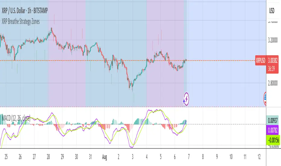
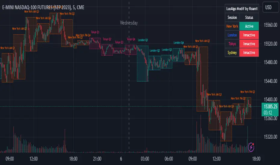
Gann Square of 144 (Master Price & Time)🔹 What this tool does
Draws a 144-unit square in price & time (0 → 144)
Plots all key horizontal & vertical levels:
0, 18, 36, 48, 54, 72, 90, 96, 108, 126, 144
Highlights the main 1/2 level (72) as thick midline
Marks 1/3 and 2/3 (48 & 96) as special harmonic levels
Draws internal diagonals (0–144, 144–0 and sub-squares)
Plots an 8-ray Gann fan from the 0-point (0 → 36 / 72 / 108 / 144 etc.)
Keeps price–time ratio consistent inside the box:
the 1×1 angle has a fixed slope = price_per_bar
The idea: once the square is calibrated to a major swing, you can study how price respects these angles and harmonic zones over time.
🔧 Inputs & how to set it up correctly
Choose your timeframe
Works best on Daily and Weekly charts.
Use one timeframe consistently when calibrating the square.
Start offset (bars back)
Start offset (bars back) shifts the whole square left/right.
Increase the value to move the square further into the past, decrease it to move it closer to the current bars.
Box width (bars)
Box width (bars) = how many bars the square spans horizontally.
Bigger value = projects the structure further into the future.
Example: 288 bars ≈ 2×144 units in time, 720 bars for longer-term projection, etc.
Bottom price
Bottom price is your 0-level in price.
Usually set this to a major swing low (cycle low, bear market low, important pivot).
The bottom-left corner of the square conceptually sits at:
(start_offset_bar, bottom_price)
Price per bar (slope 1×1) (if your version has this input)
This defines the slope of the 1×1 angle (main Gann angle).
Recommended way to set it:
Pick a major impulsive move from Swing Low → Swing High.
Measure:
Price range = High − Low
Number of bars between them.
Compute:
price_per_bar = price_range / number_of_bars
Use that as your 1×1 value in the input.
Now the main diagonal from 0 to 144 represents the true Gann 1×1 for that swing.
Important: The 1×1 angle is mathematically correct (price-per-bar), even if it does not always look like a perfect 45° line visually in TradingView due to chart scaling.
📖 How to read the Square of 144
Horizontal levels
0 = anchor price (bottom)
18, 36, 48, 54, 72, 90, 96, 108, 126, 144 = key price harmonics
72 (1/2) often acts as major support/resistance
48 & 96 (1/3 and 2/3) are strong “vibration” levels
Vertical levels
Same units but in time (bars).
When important pivots in price occur near these verticals, you get time–price confluence.
Midlines (1/2)
The thick horizontal and vertical lines at 72 mark the center of the square.
Crossings around these often signal important cycle turns.
1/3 & 2/3 zones (48–54 and 90–96)
These narrow bands are powerful reversal / decision zones.
Price often reacts strongly there or accelerates if they break.
Gann fan from 0-point
These rays represent major trends:
1×1 equivalent (main diagonal)
Faster & slower angles (e.g. 2×1, 1×2, etc depending on configuration)
If price breaks one fan angle cleanly, it often “falls” or “climbs” toward the next one.
🎯 Practical use cases
Project future support/resistance zones based on a major low.
See where price is in the square: early in the cycle (0–36), mid (around 72), or late (108–144).
Watch how price respects:
midlines (72),
1/3 and 2/3 bands (48–54, 90–96),
and the fan angles from 0.
Combine with your own price action / Fibonacci / trend tools – this is not a signal generator, but a time–price map.
⚠️ Notes & limitations
This tool is for educational & analytical purposes only.
It does not generate buy/sell signals.
Visual 45° angles in TradingView can change when you zoom or rescale the chart.
→ The script keeps the internal price-per-bar logic stable, even if the drawing looks steeper/flatter when zooming.
Always confirm zones with price action, volume, and higher timeframe context.
Tìm kiếm tập lệnh với "Cycle"
Puell Multiple Variants [OperationHeadLessChicken]Overview
This script contains three different, but related indicators to visualise Bitcoin miner revenue.
The classical Puell Multiple : historically, it has been good at signaling Bitcoin cycle tops and bottoms, but due to the diminishing rewards miners get after each halving, it is not clear how you determine overvalued and undervalued territories on it. Here is how the other two modified versions come into play:
Halving-Corrected Puell Multiple : The idea is to multiply the miner revenue after each halving with a correction factor, so overvalued levels are made comparable by a horizontal line across cycles. After experimentation, this correction factor turned out to be around 1.63. This brings cycle tops close to each other, but we lose the ability to see undervalued territories as a horizontal region. The third variant aims to fix this:
Miner Revenue Relative Strength Index (Miner Revenue RSI) : It uses RSI to map miner revenue into the 0-100 range, making it easy to visualise over/undervalued territories. With correct parameter settings, it eliminates the diminishing nature of the original Puell Multiple, and shows both over- and undervalued revenues correctly.
Example usage
The goal is to determine cycle tops and bottoms. I recommend using it on high timeframes, like monthly or weekly . Lower than that, you will see a lot of noise, but it could still be used. Here I use monthly as the example.
The classical Puell Multiple is included for reference. It is calculated as Miner Revenue divided by the 365-day Moving Average of the Miner Revenue . As you can see in the picture below, it has been good at signaling tops at 1,3,5,7.
The problems:
- I have to switch the Puell Multiple to a logarithmic scale
- Still, I cannot use a horizontal oversold territory
- 5 didn't touch the trendline, despite being a cycle top
- 9 touched the trendline despite not being a cycle top
Halving-Corrected Puell Multiple (yellow): Multiplies the Puell Multiple by 1.63 (a number determined via experimentation) after each halving. In the picture below, you can see how the Classical (white) and Corrected (yellow) Puell Multiples compare:
Advantages:
- Now you can set a constant overvalued level (12.49 in my case)
- 1,3,7 are signaled correctly as cycle tops
- 9 is correctly not signaled as a cycle top
Caveats:
- Now you don't have bottom signals anymore
- 5 is still not signaled as cycle top
Let's see if we can further improve this:
Miner Revenue RSI (blue):
On the monthly, you can see that an RSI period of 6, an overvalued threshold of 90, and an undervalued threshold of 35 have given historically pretty good signals.
Advantages:
- Uses two simple and clear horizontal levels for undervalued and overvalued levels
- Signaling 1,3,5,7 correctly as cycle tops
- Correctly does not signal 9 as a cycle top
- Signaling 4,6,8 correctly as cycle bottoms
Caveats:
- Misses two as a cycle bottom, although it was a long time ago when the Bitcoin market was much less mature
- In the past, gave some early overvalued signals
Usage
Using the example above, you can apply these indicators to any timeframe you like and tweak their parameters to obtain signals for overvalued/undervalued BTC prices
You can show or hide any of the three indicators individually
Set overvalued/undervalued thresholds for each => the background will highlight in green (undervalued) or red (overvalued)
Set special parameters for the given indicators: correction factor for the Corrected Puell and RSI period for Revenue RSI
Show or hide halving events on the indicator panel
All parameters and colours are adjustable
Fractal Market Model [BLAZ]Version 1.0 – Published August 2025: Initial release
1. Overview & Purpose
1.1. What This Indicator Does
The Fractal Market Model is an original multi-timeframe technical analysis tool that bridges the critical gap between macro-level market structure and micro-level price execution. Designed to work across all financial markets including Forex, Stocks, Crypto, Futures, and Commodities. While traditional Smart Money Concepts indicators exist, this implementation analyses multi-timeframe liquidity zones and price action shifts, marking potential reversal points where Higher Timeframe (HTF) liquidity sweeps coincide with Low Timeframe (LTF) price action dynamics changes.
Snapshot details: NASDAQ:GOOG , 1W Timeframe, Year 2025
1.2. What Sets This Indicator Apart
The Fractal Market Model analyses multi-timeframe correlations between HTF structural events and LTF price action. This creates a dynamic framework that reveals patterns observed historically in price behaviour that are believed to reflect institutional activity across multiple time dimensions.
The indicator recognizes that markets move in fractal cycles following the AMDX pattern (Accumulation, Manipulation, Distribution, Continuation/Reversal). By tracking this pattern across timeframes, it flags zones where price action dynamics characteristics have historically shown shifts. In the LTF, the indicator monitors for price closing through the open of an opposing candle near HTF swing highs or lows, marking this as a Change in State of Delivery (CISD), a threshold event where price action historically transitions direction.
Practical Value:
Multi-Timeframe Integration: Connects HTF structural events with LTF execution patterns.
Fractal Pattern Recognition: Identifies AMDX cycles across different time dimensions.
Price Behavior Analysis: Tracks CISD patterns that may reflect historical shifts in order flow commonly associated with institutional activity.
Range-Based Context: Analyses price action within established HTF liquidity zones.
1.3. How It Works
The indicator employs a systematic 5-candle HTF tracking methodology:
Candles 0-1: Accumulation phase identification.
Candle 2: Manipulation detection (raids previous highs/lows).
Candle 3: Distribution phase recognition.
Candle 4: Continuation/reversal toward opposite liquidity.
The system monitors for CISD patterns on the LTF when HTF manipulation candles close with confirmed sweeps, highlighting zones where order flow dynamics historically shifted within the established HTF range.
Snapshot details: FOREXCOM:AUDUSD , 1H Timeframe, 17 to 28 July 2025
Note: The Candle 0-5 and AMDX labels shown in the accompanying image are for demonstration purposes only and are not part of the indicator’s actual functionality.
2. Visual Elements & Components
2.1. Complete FMM Setup Overview
A fully developed Fractal Market Model setup displays multiple analytical components that work together to provide comprehensive market structure analysis. Each visual element serves a specific purpose in identifying and tracking the AMDX cycle across timeframes.
2.2. Core Visual Components
Snapshot details: FOREXCOM:EURUSD , 5 Minutes Timeframe, 27 May 2025.
Note: The numbering labels 1 to 14 shown in the accompanying image are for demonstration purposes only and are not part of the indicator’s actual functionality.
2.2.1. HTF Structure Elements
(1) HTF Candle Visualization: Displays the 5-candle sequence being tracked (configurable quantity up to 10).
(2) HTF Candle Labels (C2-C4): Numbered identification for each candle in the AMDX cycle.
(3) HTF Resolution Label: Shows the higher timeframe being analysed.
(4) Time Remaining Indicator: Countdown to HTF candle closure.
(5) Vertical Separation Lines: Clearly delineates each HTF candle period.
2.2.2. Key Price Levels
(6) Liquidity Levels: High/low levels from HTF candles 0 and 1 representing potential target zones.
(7) Sweep Detection Lines: Marks where previous HTF candle extremes have been breached on both HTF and LTF.
(8) HTF Candle Mid-Levels: 50% retracement levels of previous HTF candles displayed on current timeframe.
(9) Open Level Marker: Shows the opening price of the most recent HTF candle.
2.2.3. Institutional Analysis Tools
(10) CISD Line: Marks the Change in State of Delivery pattern identification point.
(11) Consequent Encroachment (CE): Mid-level of identified institutional order blocks.
(12) Potential Reversal Area (PRA): Zone extending from previous candle close to the mid-level.
(13) Fair Value Gap (FVG): Identifies imbalance areas requiring potential price revisits.
(14) HTF Time Labels: Individual time period labels for each HTF candle.
2.3. Interactive Features
All visual elements update dynamically as new price data confirms or invalidates the tracked patterns, providing real-time market structure analysis across the selected timeframe combination.
3. Input Parameters and Settings
3.1. Alert Configuration
Setup Notifications: Users can configure alerts to receive notifications when new FMM setups form based on their selected bias, timeframes, and filters. Enable this feature by:
Configure the bias, timeframes and filters and other settings as desired.
Toggle the "Alerts?" checkbox to ON in indicator settings.
On the chart, click the three dots menu beside the indicator's name or press Alt + A.
Select "Add Alert" and click “Create” to activate the alert.
3.2. Display Control Settings
3.2.1. Historical Setup Quantity
Setup Display Control: Customize how many historical setups appear on the chart, with support for up to 50 combined entries. The indicator displays both bullish and bearish FMM setups within the selected limit, including invalidated scenarios. For example, selecting "3 setups" will display the most recent combination of bullish and bearish patterns based on the model's detection logic.
Snapshot details: BINANCE:BTCUSD , 1H Timeframe, 27-Feb to 11-Mar 2025
Note: The labels “Setup 1, 2 & 3: Bullish or Bearish” shown in the accompanying image are for demonstration purposes only and are not part of the indicator’s actual functionality.
3.2.2. Directional Bias Filter
Bias Filter: Control which setups are displayed based on directional preference:
Bullish Only: Shows exclusively upward bias setups.
Bearish Only: Shows exclusively downward bias setups.
Balanced Mode: Displays both directional setups.
This flexibility helps align the indicator's output with broader market analysis or trading framework preferences. The chart below illustrates the same chart in 3.2.1. but when filtered to show only bullish setups.
Snapshot details: BINANCE:BTCUSD , 1H Timeframe, 27-Feb to 11-Mar 2025
Note: The labels “Setup 1, 2 & 3: Bullish” shown in the accompanying image are for demonstration purposes only and are not part of the indicator’s actual functionality.
3.2.3. Invalidated Setup Display
Invalidation Visibility: A setup becomes invalidated when price moves beyond the extreme high or low of the Manipulation candle (C2), indicating that the expected fractal pattern has been disrupted. Choose whether to display or hide setups that have been invalidated by subsequent price action. This feature helps maintain chart clarity while preserving analytical context:
Amber Labels: Setups invalidated at Candle 3 (C3).
Red Labels: Setups invalidated at Candle 4 (C4).
Count Preservation: Invalidated setups remain part of the total setup count regardless of visibility setting.
Below image illustrates balanced setups:
Left side: 1 bearish valid setup, with 2 invalidated setups visible.
Right side: 1 bearish valid setup, with 2 invalidated setups hidden for chart clarity.
Snapshot details: FOREXCOM:GBPJPY , 5M Timeframe, 30 July 2025
3.3. Timeframe Configuration
3.3.1. Multi-Timeframe Alignment
Custom Timeframe Selection: Configure preferred combinations of Higher Timeframe (HTF) and Lower Timeframe (LTF) for setup generation. While the indicator includes optimized default alignments (1Y –1Q, 1Q –1M, 1M –1W, 1M –1D, 1W–4H, 1D–1H, 4H-30m, 4H –15m, 1H –5m, 30m –3m, 15m –1m), users can define custom HTF-LTF configurations to suit their analysis preferences and market focus.
The image below illustrates two different HTF – LTF configuration, both on the 5 minutes chart:
Right side: Automatic multi-timeframe alignment, where the indicator autonomously sets the HTF pairing to 1H when the current chart timeframe is the 5 minutes.
Left side: Custom Timeframe enabled, where HTF is manually set to 4H, and LTF is manually set to 15 minutes, while being on the 5 minutes chart.
Snapshot details: FOREXCOM:GBPJPY , 5 minutes timeframe, 30 July 2025
3.3.2. Session-Based Filtering
Visibility Filters: Control when FMM setups appear using multiple filtering options:
Time-Based Controls:
Show Below: Limit setup visibility to timeframes below the selected threshold.
Use Session Filter: Enable session-based time window restrictions.
Session 1, 2, 3: Configure up to three custom time sessions with start and end times.
These filtering capabilities help concentrate analysis on specific market periods or timeframe contexts.
The image below illustrates the application of session filters:
Left side: The session filter is disabled, resulting in four setups being displayed throughout the day—two during the London session and two during the New York session.
Right side: The session filter is enabled to display setups exclusively within the New York session (8:00 AM – 12:00 PM). Setups outside this time window are hidden. Since the total number of setups is limited to four, the indicator backfills by identifying and displaying two qualifying setups from earlier price action that occurred within the specified New York session window.
Snapshot details: COMEX:GC1! , 5 minutes Timeframe, 29 July 2025
3.4. Annotation Systems
3.4.1. Higher Timeframe (HTF) Annotations
HTF Display Control: Enable HTF visualization using the "HTF candles" checkbox with quantity selector (default: 5 candles, expandable to 10). This displays all HTF elements detailed in the Visual Components section 2.2. above.
Customisation Categories:
Dimensions: Adjust candle offset, gap spacing, and width for optimal chart fit.
Colours: Customize body, border, and wick colours for bullish/bearish candle differentiation.
Style Options: Control line styles for HTF opens, sweep lines, and equilibrium levels.
Feature Toggles: Enable/disable Fair Value Gaps, countdown labels, and individual candle labelling.
All HTF annotation elements support individual styling controls to maintain visual clarity while preserving analytical depth. The image below shows two examples: the left side has customized styling applied, while the right side shows the default appearance.
Snapshot details: CME_MINI:NQ1! , 5 minutes Timeframe, 29 July 2025
3.4.2. Lower Timeframe (LTF) Annotations
LTF Display Control: Comprehensive annotation system for detailed execution analysis, displaying all LTF elements outlined in the Visual Components section 2.2. above.
Customization Categories:
Core Elements: Control HTF separation lines, sweep markers, CISD levels, and candle phase toggles (C2, C3, C4) to selectively show or hide the LTF annotations for each of these specific HTF candle phases.
Reference Levels: Adjust previous equilibrium lines, CISD consequent encroachment, and HTF liquidity levels.
Analysis Tools: Enable potential holding area (PHA) markers.
Styling Options: Individual visibility toggles, colour schemes, line styles, and thickness controls for each element.
All LTF components support full customization to maintain chart clarity while providing precise execution context. The image below shows two examples: the left side has customized styling applied, while the right side shows the default appearance.
Snapshot details: TVC:DXY , 5 minutes Timeframe, 28 July 2025
3.5. Performance Considerations
Higher setup counts and extended HTF displays may impact chart loading times. Adjust settings based on device performance and analysis requirements.
4. Closed-Source Protection Justification
4.1. Why This Indicator Requires Protected Source Code
The Fractal Market Model is the result of original research, development, and practical application of advanced price action frameworks. The indicator leverages proprietary algorithmic systems designed to interpret complex market behavior across multiple timeframes. To preserve the integrity of these innovations and prevent unauthorized replication, the source code is protected.
4.1.1. Key Proprietary Innovations
Real-Time Multi-Timeframe Correlation Engine: A dynamic logic system that synchronizes higher timeframe structural behaviour with lower timeframe execution shifts using custom correlation algorithms, adaptive thresholds, and time-sensitive conditions, supporting seamless fractal analysis across nested timeframes.
CISD Detection Framework: A dedicated mechanism for identifying Change in State of Delivery (CISD), where price closes through the open of an opposing candle at or near HTF swing highs or lows after liquidity has been swept. This is used to highlight potential zones of directional change based on historical order flow dynamics.
Fractal AMDX Cycle Recognition: An engineered structure that detects and classifies phases of Accumulation, Manipulation, Distribution, and Continuation/Reversal (AMDX) across configurable candle sequences, allowing traders to visualize market intent within a repeatable cycle model.
Dynamic Invalidation Logic: An automated monitoring system that continually evaluates the validity of active setups. Setups are invalidated in real time when price breaches the extreme of the manipulation phase (C2), ensuring analytical consistency and contextual alignment.
4.1.2. Community Value
The closed-source nature of this tool protects the author’s original intellectual property while still delivering value to the TradingView community. The indicator offers a complete, real-time visual framework, educational annotations, and intuitive controls for analysing price action structure and historically observed patterns commonly attributed to institutional behaviour across timeframes.
5. Disclaimer & Terms of Use
This indicator, titled Fractal Market Model , has been independently developed by the author based on their own study, interpretation, and practical application of the smart money concepts. The code and structure of this indicator are original and were written entirely from scratch to reflect the author's unique understanding and experience. This indicator is an invite-only script. It is closed-source to protect proprietary algorithms and research methodologies.
This tool is provided solely for educational and informational purposes. It is not intended—and must not be interpreted—as financial advice, investment guidance, or a recommendation to buy or sell any financial instrument. The indicator is designed to assist with technical analysis based on market structure theory but does not guarantee accuracy, profitability, or specific results.
Trading financial markets involves significant risk, including the possibility of loss of capital. By using this indicator, you acknowledge and accept that you are solely responsible for any decisions you make while using the tool, including all trading or investment outcomes. No part of this script or its features should be considered a signal or assurance of success in the market.
By subscribing to or using the indicator, you agree to the following:
You fully assume all responsibility and liability for the use of this product.
You release the author from any and all liability, including losses or damages arising from its use.
You acknowledge that past performance—real or hypothetical—does not guarantee future outcomes.
You understand that this indicator does not offer personalised advice, and no content associated with it constitutes a solicitation of financial action.
You agree that all purchases are final. Once access is granted, no refunds, reimbursements, or chargebacks will be issued under any circumstance.
You agree to not redistribute, resell, or reverse engineer the script or any part of its logic.
Users are expected to abide by all platform guidelines while using or interacting with this tool. For access instructions, please refer to the Author's Instructions section or access the tool through the verified vendor platform.
Quarterly Theory ICT 05 [TradingFinder] Doubling Theory Signals🔵 Introduction
Doubling Theory is an advanced approach to price action and market structure analysis that uniquely combines time-based analysis with key Smart Money concepts such as SMT (Smart Money Technique), SSMT (Sequential SMT), Liquidity Sweep, and the Quarterly Theory ICT.
By leveraging fractal time structures and precisely identifying liquidity zones, this method aims to reveal institutional activity specifically smart money entry and exit points hidden within price movements.
At its core, the market is divided into two structural phases: Doubling 1 and Doubling 2. Each phase contains four quarters (Q1 through Q4), which follow the logic of the Quarterly Theory: Accumulation, Manipulation (Judas Swing), Distribution, and Continuation/Reversal.
These segments are anchored by the True Open, allowing for precise alignment with cyclical market behavior and providing a deeper structural interpretation of price action.
During Doubling 1, a Sequential SMT (SSMT) Divergence typically forms between two correlated assets. This time-structured divergence occurs between two swing points positioned in separate quarters (e.g., Q1 and Q2), where one asset breaks a significant low or high, while the second asset fails to confirm it. This lack of confirmation—especially when aligned with the Manipulation and Accumulation phases—often signals early smart money involvement.
Following this, the highest and lowest price points from Doubling 1 are designated as liquidity zones. As the market transitions into Doubling 2, it commonly returns to these zones in a calculated move known as a Liquidity Sweep—a sharp, engineered spike intended to trigger stop orders and pending positions. This sweep, often orchestrated by institutional players, facilitates entry into large positions with minimal slippage.
Bullish :
Bearish :
🔵 How to Use
Applying Doubling Theory requires a simultaneous understanding of temporal structure and inter-asset behavioral divergence. The method unfolds over two main phases—Doubling 1 and Doubling 2—each divided into four quarters (Q1 to Q4).
The first phase focuses on identifying a Sequential SMT (SSMT) divergence, which forms when two correlated assets (e.g., EURUSD and GBPUSD, or NQ and ES) react differently to key price levels across distinct quarters. For example, one asset may break a previous low while the other maintains structure. This misalignment—especially in Q2, the Manipulation phase—often indicates early smart money accumulation or distribution.
Once this divergence is observed, the extreme highs and lows of Doubling 1 are marked as liquidity zones. In Doubling 2, the market gravitates back toward these zones, executing a Liquidity Sweep.
This move is deliberate—designed to activate clustered stop-loss and pending orders and to exploit pockets of resting liquidity. These sweeps are typically driven by institutional forces looking to absorb liquidity and position themselves ahead of the next major price move.
The key to execution lies in the fact that, during the sweep in Doubling 2, a classic SMT divergence should also appear between the two assets. This indicates a weakening of the previous trend and adds an extra layer of confirmation.
🟣 Bullish Doubling Theory
In the bullish scenario, Doubling 1 begins with a bullish SSMT divergence, where one asset forms a lower low while the other maintains its structure. This divergence signals weakening bearish momentum and possible smart money accumulation. In Doubling 2, the market returns to the previous low and sweeps the liquidity zone—breaking below it on one asset, while the second fails to confirm, forming a bullish SMT divergence.
f this move is followed by a bullish PSP and a clear market structure break (MSB), a long entry is triggered. The stop-loss is placed just below the swept liquidity zone, while the target is set in the premium zone, anticipating a move driven by institutional buyers.
🟣 Bearish Doubling Theory
The bearish scenario follows the same structure in reverse. In Doubling 1, a bearish SSMT divergence occurs when one asset prints a higher high while the other fails to do so. This suggests distribution and weakening buying pressure. Then, in Doubling 2, the market returns to the previous high and executes a liquidity sweep, targeting trapped buyers.
A bearish SMT divergence appears, confirming the move, followed by a bearish PSP on the lower timeframe. A short position is initiated after a confirmed MSB, with the stop-loss placed
🔵 Settings
⚙️ Logical Settings
Quarterly Cycles Type : Select the time segmentation method for SMT analysis.
Available modes include : Yearly, Monthly, Weekly, Daily, 90 Minute, and Micro.
These define how the indicator divides market time into Q1–Q4 cycles.
Symbol : Choose the secondary asset to compare with the main chart asset (e.g., XAUUSD, US100, GBPUSD).
Pivot Period : Sets the sensitivity of the pivot detection algorithm. A smaller value increases responsiveness to price swings.
Pivot Sync Threshold : The maximum allowed difference (in bars) between pivots of the two assets for them to be compared.
Validity Pivot Length : Defines the time window (in bars) during which a divergence remains valid before it's considered outdated.
🎨 Display Settings
Show Cycle :Toggles the visual display of the current Quarter (Q1 to Q4) based on the selected time segmentation
Show Cycle Label : Shows the name (e.g., "Q2") of each detected Quarter on the chart.
Show Labels : Displays dynamic labels (e.g., “Q2”, “Bullish SMT”, “Sweep”) at relevant points.
Show Lines : Draws connection lines between key pivot or divergence points.
Color Settings : Allows customization of colors for bullish and bearish elements (lines, labels, and shapes)
🔔 Alert Settings
Alert Name : Custom name for the alert messages (used in TradingView’s alert system).
Message Frequenc y:
All : Every signal triggers an alert.
Once Per Bar : Alerts once per bar regardless of how many signals occur.
Per Bar Close : Only triggers when the bar closes and the signal still exists.
Time Zone Display : Choose the time zone in which alert timestamps are displayed (e.g., UTC).
Bullish SMT Divergence Alert : Enable/disable alerts specifically for bullish signals.
Bearish SMT Divergence Alert : Enable/disable alerts specifically for bearish signals
🔵 Conclusion
Doubling Theory is a powerful and structured framework within the realm of Smart Money Concepts and ICT methodology, enabling traders to detect high-probability reversal points with precision. By integrating SSMT, SMT, Liquidity Sweeps, and the Quarterly Theory into a unified system, this approach shifts the focus from reactive trading to anticipatory analysis—anchored in time, structure, and liquidity.
What makes Doubling Theory stand out is its logical synergy of time cycles, behavioral divergence, liquidity targeting, and institutional confirmation. In both bullish and bearish scenarios, it provides clearly defined entry and exit strategies, allowing traders to engage the market with confidence, controlled risk, and deeper insight into the mechanics of price manipulation and smart money footprints.
Great Pyramid Master Architecture [GPM] PyraTimeThe Wisdom of the Ancients
The Great Pyramid of Giza is not just a tomb; it is a monument to mathematical perfection, aligned with celestial mechanics and constructed using precise harmonic ratios. The Great Pyramid Master (GPM) Architecture applies these same ancient geometric laws to modern financial markets.
While standard analysis treats time as linear (a straight line), GPM treats time as geometric (a spiral). By anchoring this tool to a significant "Origin Pivot," the script projects a sequence of vertical time markers derived from the sacred number 30 and its harmonic multiples (e.g., 72, 144, 360).
Why It Works: The Physics of Time
Markets do not move randomly; they vibrate. Just as a musical string vibrates at specific frequencies, market trends exhaust their energy at specific time intervals.
* Price tells you where the market is.
* GPM tells you when the market will turn.
This indicator visualizes the invisible "Time Lattice" that underpins price action. When price arrives at a GPM Vertical Line, it has hit a geometric wall where the previous energy vector is mathematically likely to terminate.
The Full PyraTime Ecosystem
The GPM Architecture is the "Map" of the system. To trade it successfully, you must pair it with our two dedicated companion indicators found in our library:
1. The Map (This Indicator): Identifies the Time Window. Wait for price to touch a vertical line.
2. The Trigger (Search for "PyraFish"): Use the Harmonic Sniper Trigger to confirm momentum is flipping exactly when the GPM line hits or click below
3. The Exit (Search for "PyraTD"): Use the Sequential Exhaustion to identify price exhaustion (9/13 count) and signal when to close the trade or click below
How to Use (Step-by-Step)
1. Identify the Origin: Find a major "Scam Wick" or structural pivot (High/Low) on your chart.
2. Set the Anchor: Open Settings and input the exact Date and Time of that pivot. The geometric web will instantly project into the future.
3. Monitor the Clusters: Watch for areas where multiple cycle lines (Standard and Esoteric) converge. These "Super Pivots" often mark significant trend reversals.
Features
Esoteric & Standard Cycles: Tracks both conventional market hours and the hidden harmonic sequence simultaneously.
Smart Dashboard: Displays a countdown to the next major energy shift.
Clean Visuals: All lines are rendered at 50% opacity to keep your chart professional and readable.
Disclaimer: This tool is for technical analysis and educational purposes only. It projects potential geometric time pivots, not guaranteed price movements. Always manage your risk.
SwingArm High Pressure V6.7.3SwingArm High Pressure V6.7.3 - User Guide
Overview
SwingArm High Pressure is a multi-timeframe trading indicator designed to identify high-probability entry zones and profit targets. This indicator works best when combined with the standard SwingArm indicator to display 8-hour and higher timeframes for complete market analysis.
Key Features
1. Multi-Timeframe Analysis
Chart Timeframe (CT): Your primary entry timeframe
Higher Timeframe 1 (HTF1): Secondary confirmation and targets
Higher Timeframe 2 (HTF2): Extended swing targets
2. Trading Type Selection
Choose between two preset configurations:
CT/15m/1H: For day trading and scalping
CT/2H/4H: For swing trading (recommended to pair with standard SwingArm for 8H+ timeframes)
3. Entry Zones
Optimal Entry Boxes (High-Pressure Zones)
BLUE boxes: Bullish optimal entry zones (high-pressure buying opportunity)
YELLOW boxes: Bearish optimal entry zones (high-pressure selling opportunity)
These represent the highest probability entries when price reaches these levels
Fresh SwingArm Zones
GREEN zones: Freshly created bullish swingarm areas
RED zones: Freshly created bearish swingarm areas
Deeper entries into zones (78.6%-88.6%) provide better risk/reward ratios
4. Fibonacci Levels
Each swingarm zone contains three Fibonacci retracement levels:
Fib. 61.8%: Early entry (consider waiting for deeper levels)
Fib. 78.6%: Good entry opportunity
Fib. 88.6%: Deep entry with excellent risk/reward
5. Zone Labels
The indicator automatically labels zones based on their function:
Internal Zones (shorter timeframes):
Display as "INTERNAL - Buy/Sell Zones"
May cycle multiple times before reaching targets
Best for scalping and quick trades
External Zones (higher timeframes):
Display as "EXTERNAL TARGET - Take Profit"
Primary profit-taking areas
Use for swing trade exits
Trading Strategy
Entry Setup
Wait for fresh zone creation (green/red zones appear)
Identify optimal entry boxes (blue/yellow high-pressure areas)
Enter at Fibonacci levels:
Best entries: 78.6%-88.6% (deeper is better)
Acceptable: 61.8% (but watch for deeper retracements)
Trade Management
Stop Loss: Place below swingarm low (long) or above swingarm high (short)
Targets: Use higher timeframe zones for profit objectives
Internal vs External: Internal zones may flip multiple times; external zones are swing targets
Timeframe Hierarchy
Lower timeframe zones = Entry areas
Higher timeframe zones = Target/profit areas
Example: Enter at 15M zones, target 2H/4H zones for exits
Alert System
Available Alerts
Fresh SwingArm Zone Alerts: Notifies when new green/red zones are created
Fib. 88.6% Break Alerts: Deepest entry level touched
Fib. 78.6% Break Alerts: Good entry level touched
Fib. 61.8% Break Alerts: Early entry level touched
Pressure ON / Optimal Alerts: High-pressure zones activated
Circle Alerts: Pressure signal confirmations
Probability Alerts: Set threshold for long/short probability notifications
Alert Messages Include:
Entry quality rating (DEEPEST, DEEP, GOOD, EARLY)
Current price level
Risk/reward guidance
Target zone information
Probability System
The indicator calculates buying and selling pressure across multiple timeframes:
Long Probability: Bullish pressure percentage
Short Probability: Bearish pressure percentage
Set custom thresholds (default 50%) to receive alerts only when probability exceeds your criteria
Customization Options
Visual Settings
RSI Candle Colors: Enable/disable and customize overbought (blue) and oversold (red) candle colors
Label Display: Toggle individual Fibonacci level labels (61.8%, 78.6%, 88.6%)
Label Colors: Customize colors for long and short labels
Label Size: Adjust label size (Tiny to Huge)
Swingarm Pressure Labels: Show/hide zone break labels
Table Display
Probability Status Table: Shows current pressure analysis
Swingarm Status: Displays current swingarm states across timeframes
Position & Size: Customize table location and text size
Statistics Table
Break Statistics: Track swingarm breaks over time
Performance Metrics: View historical break data per timeframe
Best Practices
Combine with Standard SwingArm: Use the regular SwingArm indicator to display 8-hour and higher timeframes for complete market structure
Respect Timeframe Hierarchy: Always enter on lower timeframes and target higher timeframes
Wait for Deep Entries: The 78.6% and 88.6% levels offer the best risk/reward ratios
Watch Internal Cycles: Shorter timeframe zones may reverse multiple times - don't expect straight-line moves to targets
Use Optimal Entry Boxes: Blue and yellow high-pressure zones provide the highest probability setups
Confirm with Multiple Timeframes: Look for alignment across all three selected timeframes for strongest signals
Notes
This indicator is optimized for 1m, 15m, 1H, 2H, and 4H timeframes
For best results, use in conjunction with proper risk management
Entry opportunities include both optimal entry boxes AND fresh swingarm zones
Deeper zone entries consistently provide better risk/reward ratios
Support
For questions or assistance, refer to the indicator settings tooltips or contact the developer through x.
Disclaimer:
This indicator is for educational purposes. Always practice proper risk management and never risk more than you can afford to lose.
Alt Coin Season Indicator v2Trend Core Strategy with Alt Season Filter
This script is a comprehensive trend-following strategy designed to identify high-probability long entries for altcoins. It combines a core mean-reversion setup with a powerful, two-layer "Alt Season" filter to ensure trades are only considered when macro conditions are most favorable.
The primary goal is to enter a trade during a short-term dip (oversold RSI) but only when the broader market structure (Halving Cycle and BTC Dominance) confirms that capital is flowing into altcoins.
How It Works: The Logic
The strategy is built on two distinct layers that must align for a signal to be valid.
1. The Core Trading Setup
A potential LONG ENTRY signal is identified when a specific set of trend and momentum conditions are met:
Long-Term Trend: The price must be trading above the 200-period Slow Moving Average.
Mean Reversion Entry: The RSI must be in an oversold state (below 35).
Favorable Dominance: BTC.D must be trending down, and ETH.D must be trending up, indicating a "risk-on" environment.
2. The "Alt Season" Master Filter
This is the master switch that confirms the macro environment. A trade setup is only considered valid if the "Alt Season" filter is active. This filter has two sub-layers:
Bitcoin Halving Cycle: The script tracks the 4-year cycle and only allows signals during the two most bullish phases:
Post-Halving Accumulation (Yellow Background): The period immediately following a halving.
Parabolic Uptrend (Green Background): The primary bull market phase.
Signals are automatically disabled during the "Distribution" (Red) and "Bear Market" (Dark Red) phases.
BTC Dominance State: This defines the precise start and end of an alt season based on capital flows.
START (🚀): Alt Season becomes active when BTC.D crosses below 60%.
RESET (⚠️): The state is temporarily disabled if BTC.D reclaims 60%, acting as a warning signal.
END (🛑): The season is officially over when BTC.D crosses back above 40% from below.
On-Chart Visuals
The script provides a rich visual interface for at-a-glance analysis:
Background Colors: The chart background changes color to reflect the current Halving Cycle phase. A bright cyan overlay indicates when the "Alt Season" filter is fully active.
Dynamic Shapes:
🚀 (Rocket): Signals the start of a confirmed Alt Season. The size is dynamic—a larger rocket appears if the RSI is more deeply oversold, indicating a higher-conviction setup.
⚠️ (Warning Sign): Appears if BTC.D reclaims the 60% start level, indicating a temporary pause or "reset" of the alt season.
🛑 (Stop Sign): Marks the official end of the Alt Season.
On-Screen Table: A real-time dashboard in the top-right corner shows the status of every single condition, providing full transparency into the script's logic.
How to Use
Wait for the "Alt Season Active" (cyan) background to appear. This is your primary confirmation that macro conditions are favorable.
Look for LONG ENTRY labels. These appear when the core trading setup aligns with an active Alt Season.
Use the on-screen table to understand why a signal is or is not firing.
Set Alerts: The script includes three distinct alerts for "Alt Season Activated," "Alt Season Warning," and "Alt Season Officially Over" to keep you updated on the macro environment.
Disclaimer: This tool is for educational purposes only and should not be considered financial advice. All trading involves risk. Always conduct your own research and backtesting before making any trading decisions.
Detrended Rhythm Oscillator (DRO)How to detect the current "market beat" or market cycle?
A common way to capture the current dominant cycle length is to detrend the price and look for common rhythms in the detrended series. A common approach is to use a Detrended Price Oscillator (DPO). This is done in order to identify and isolate short-term cycles.
A basic DPO description can be found here:
www.tradingview.com
Improvements to the standard DPO
The main purpose of the standard DPO is to analyze historical data in order to observe cycle's in a market's movement. DPO can give the technical analyst a better sense of a cycle's typical high/low range as well as its duration. However, you need to manually try to "see" tops and bottoms on the detrended price and measure manually the distance from low-low or high-high in order to derive a possible cycle length.
Therefore, I added the following improvements:
1) Using a DPO to detrend the price
2) Indicate the turns of the detrended price with a ZigZag lines to better see the tops/bottoms
3) Detrend the ZigZag to remove price amplitude between turns to even better see the cyclic turns ("rhythm")
4) Measure the distance from last detrended zigzag pivot (high-high / low-low) and plot the distance in bars above/below the turn
Now, you can clearly see the rhythm of the dataset indicated by the Detrended Rhythm Oscillator including the exact length between the turns. This makes the procedure to "spot" turns and "measure" distance more simple for the trader.
How to use this information
The purpose is to check if there is a common rhythm or beat in the underlying dataset. To check that, look for recurring pattern in the numbers. E.g. if you often see the same measured distance, you can conclude that there is a major dominant cycle in this market. Also watch for harmonic relations between the numbers. So in the example above you see the highlighted cluster of detected length of around 40,80 and 120. There three numbers all have a harmonic relation to 40.
Once you have this cyclic information, you can use this number to optimize or tune technical indicators based on the current dominant cycle length. E.g. set the length parameter of a technical indicator to the detected harmonic length with the DRO indicator.
Example Use-Case
You can use this information to set the input for the following free public open-source script:
Disclaimer
This is not meant to be a technical indicator on its own and the derived cyclic length should not be used to forecast the next turn per se. The indicator should give you an indication of the current market beat or dominant beats which can be use to further optimize other oscillator or trading related settings.
Options & settings
The indicator allows to plot different versions. It allows to plot the original DPO, the DRO with ZigZag lines, the DRO with detrended ZigZag lines and length labels on/off. You can turn on or off these version in the indicator settings. So you can tweak it visually to your own needs.
Gann Dynamic Levels [SmartFoxy]# 🌌 Gann Dynamic Levels
Gann Dynamic Levels is a dynamic Gann-based framework that calculates proportional and exponential levels using customizable methods — including planetary ratios.
Perfect for traders focused on cycles , ratios , and harmonic structures .
Inspired by the geometric and harmonic principles of W.D. Gann , this multifunctional tool automatically plots time–price projection levels based on user-defined anchor points.
It combines multiple calculation techniques to capture both linear and exponentia l market symmetries.
The indicator adapts dynamically to price movement, helping traders identify potential reversal zones , time clusters , and harmonic expansions derived from proportional and planetary relationships.
---
## ⚙️ Core Features
Five Calculation Methods — Linear, ratio-based, geometric, and exponential spacing for multi-perspective analysis.
Planetary Scaling Mode — Optional mode based on astronomical distances (Titius–Bode Law), adding an astronomical dimension to level spacing.
Adaptive Offset Control — Shifts all projected levels left or right proportionally without changing their internal spacing.
Automatic Label Management — Dynamically updates or reuses labels for better clarity and improved chart performance.
Custom Styling — Full control over colors, widths, label positions, and line styles for each method.
---
## 🌐 Purpose
Designed for traders who combine Gann theory , harmonic ratios , and cyclical timing to visualize equilibrium zones and future market symmetry.
Whether used for short-term timing or long-term structural projections, Gann Dynamic Levels provides an adaptive, geometry-based framework for interpreting market behavior.
---
## 📘 How to Use
When first applied, the indicator prompts you to place two points on the chart — for example, at the start and end of a significant price range.
The indicator calculates the number of bars between these two points, known as Delta .
Delta serves as the base unit for all calculations in Methods #1–#5 .
The computed results are displayed in Table 1 , which can be toggled using the parameter “📱 Show Gann Levels Table”.
You can reset or reposition the initial points in two ways:
Drag the existing points to new positions on the chart.
Hover over the indicator name, click ⦁⦁⦁ (More) → select “ Reset Points ”, then set new reference points.
---
## ⚙️ Method Logic
Classic – Evenly spaced levels based on the base Delta value. Ideal for identifying key support and resistance zones.
Coefficient (Coeff) – Scales Delta by fractional or whole-number coefficients for proportional level spacing.
Rounded – Rounds each calculated level to the nearest significant price value to align with major zones.
Subtractive – Generates levels by subtracting multiples of Delta from a reference point, emphasizing retracement-type structures.
Exponential – Applies an exponential growth model (10a = 4 + 3×2ⁿ) to project dynamic, non-linear level expansion.
Planetary – Uses the average distances of planets from the Sun (in Astronomical Units, AU ) as ratio multipliers to create harmonic projections.
Planetary distances can be customized in the user settings.
Data for Method #6 (Planetary) is displayed in Table 2 , toggled via “ 🪐 Show Planetary Table. ”
---
## ➡️ Additional Feature
Offset – Shifts all Gann levels horizontally (left or right) without changing their spacing.
Useful for visually aligning levels with key market structures.
---
### 🧭 Summary
A multi-method Gann framework combining geometric, harmonic, and planetary ratios for dynamic level projection and cycle analysis.
r - g Oscillator | Norm + Sigma-BandsThe r–g Oscillator measures the macro-liquidity regime by tracking the gap between real interest rates (r) and nominal GDP growth (g).
It approximates real rate pressure using the 10-Year Treasury yield minus the 5-Year/5-Year forward inflation expectation, and compares that to either Real or Nominal U.S. GDP YoY growth.
Green (g > r): Expansionary backdrop — growth outpaces real yields; liquidity tailwinds.
Red (r > g): Contractionary backdrop — real rates restrictive; liquidity headwinds.
The σ-bands (standard-deviation envelopes) highlight statistically extreme expansions or contractions in the r–g spread.
The “sweet-spot” shading marks moments when r–g breaks strongly above/below zero — early-cycle thrusts or late-cycle stress.
Optional normalization rescales r–g between –1 and +1 to compare across cycles.
Use:
Track shifts in the macro tide rather than short-term waves. Sustained green phases typically align with bull-market environments; red phases often coincide with tightening cycles or recessions. Combine with faster liquidity or breadth measures (e.g., WRESBAL ROC) for tactical confirmation.
Gabriel's Global Market CapGabriel's Global Market Cap is a comprehensive financial indicator designed to track and analyze the total market capitalization across multiple asset classes. It incorporates various financial markets, including stocks, bonds, real estate, cryptocurrencies, commodities, derivatives, private equity, insurance, OTC markets, and natural resources, to provide a holistic view of global market dynamics.
This indicator integrates Ehlers' Adaptive Dominant Cycle Detection and a custom VIX formula to adjust market values based on volatility and volume fluctuations, allowing for a more refined understanding of market conditions.
Key Features
✅ Multi-Market Analysis – Tracks 10+ global financial sectors, each represented by a key ETF or index.
✅ Normalization & Readability – Converts market cap values into an easy-to-read format (Millions, Billions, Trillions, Quadrillions).
✅ Volatility & Volume Adjustments – Optional VIX-based smoothing and relative volume adjustment for more dynamic readings.
✅ Ehlers’ Cycle Detection – Utilizes dominant cycle length detection to uncover market rhythms and cyclic behavior.
✅ Risk Thresholds & Background Coloring – Identifies overbought and oversold conditions with cyclic bands and background shading.
✅ Customizable Inputs – Users can toggle different market categories on/off for focused analysis.
✅ Interactive Data Table – Displays real-time values for each asset class in a structured table format.
Market Categories & Data Sources
📈 Global Stock Market – iShares MSCI ACWI ETF (ACWI)
💰 Global Bond Market – Vanguard Total World Bond ETF (BNDW)
🏡 Real Estate Market – iShares Global REIT ETF (REET)
₿ Cryptocurrency Market – Total Crypto Market Cap (CRYPTOCAP:TOTAL)
🌾 Commodities Market – Invesco DB Commodity Index Fund (DBC)
📊 Derivatives Market – CME Group (CME)
🏦 Private Equity & VC – ProShares Global Listed Private Equity ETF (PEX)
🛡️ Insurance Market – SPDR S&P Insurance ETF (KIE)
💹 OTC Markets – OTC Markets Group (OTCM)
⛽ Natural Resources – iShares Global Energy ETF (IXC)
Technical Enhancements
1️⃣ Custom Volatility Index (VIX) Calculation (Work In Progress)
Adjusts asset values based on volatility conditions using Ehlers' Cycle Detection.
Higher VIX reduces market cap, while lower VIX stabilizes it.
2️⃣ Adaptive Market Normalization
Converts absolute market values into a relative strength scale (0-100) for better visual analysis.
Uses historical min/max values to adjust dynamically.
3️⃣ Cyclic Analysis & Overbought/Oversold Levels
Detects hidden market rhythms & time cycles.
Calculates upper and lower risk bands based on dominant cycle length.
Applies background shading for visualizing low or high risk periods.
Customization Options
🔧 Enable/Disable Market Categories – Select which asset classes to track.
📊 Toggle VIX & Volume Smoothing – Adjust how market cap reacts to volatility & volume.
🎨 Cyclic Risk Bands – Highlight overbought/oversold conditions with dynamic background colors.
Visual Elements
📉 Market Cap Trends – Each category is plotted with a unique color.
🌎 Total Global Value (TGV) – A combined index representing all selected markets.
🎨 Background Coloring – Indicates high/low risk periods.
📋 Real-Time Data Table – Displays normalized & raw market cap values in an easy-to-read format.
Practical Applications
📊 Macroeconomic Analysis – Track global liquidity and investment shifts across asset classes.
💹 Volatility & Risk Assessment – Identify high-risk market conditions based on cyclic behavior.
📈 Cross-Market Comparisons – See which sectors are leading or lagging in value growth.
🔍 Crypto & Stock Market Trends – Analyze how traditional and digital assets correlate.
Regime Classifier Oscillator (AiBitcoinTrend)The Regime Classifier Oscillator (AiBitcoinTrend) is an advanced tool for understanding market structure and detecting dynamic price regimes. By combining filtered price trends, clustering algorithms, and an adaptive oscillator, it provides traders with detailed insights into market phases, including accumulation, distribution, advancement, and decline.
This innovative tool simplifies market regime classification, enabling traders to align their strategies with evolving market conditions effectively.
👽 What is a Regime Classifier, and Why is it Useful?
A Regime Classifier is a concept in financial analysis that identifies distinct market conditions or "regimes" based on price behavior and volatility. These regimes often correspond to specific phases of the market, such as trends, consolidations, or periods of high or low volatility. By classifying these regimes, traders and analysts can better understand the underlying market dynamics, allowing them to adapt their strategies to suit prevailing conditions.
👽 Common Uses in Finance
Risk Management: Identifying high-volatility regimes helps traders adjust position sizes or hedge risks.
Strategy Optimization: Traders tailor their approaches—trend-following strategies in trending regimes, mean-reversion strategies in consolidations.
Forecasting: Understanding the current regime aids in predicting potential transitions, such as a shift from accumulation to an upward breakout.
Portfolio Allocation: Investors allocate assets differently based on market regimes, such as increasing cash positions in high-volatility environments.
👽 Why It’s Important
Markets behave differently under varying conditions. A regime classifier provides a structured way to analyze these changes, offering a systematic approach to decision-making. This improves both accuracy and confidence in navigating diverse market scenarios.
👽 How We Implemented the Regime Classifier in This Indicator
The Regime Classifier Oscillator takes the foundational concept of market regime classification and enhances it with advanced computational techniques, making it highly adaptive.
👾 Median Filtering: We smooth price data using a custom median filter to identify significant trends while eliminating noise. This establishes a baseline for price movement analysis.
👾 Clustering Model: Using clustering techniques, the indicator classifies volatility and price trends into distinct regimes:
Advance: Strong upward trends with low volatility.
Decline: Downward trends marked by high volatility.
Accumulation: Consolidation phases with subdued volatility.
Distribution: Topping or bottoming patterns with elevated volatility.
This classification leverages historical price data to refine cluster boundaries dynamically, ensuring adaptive and accurate detection of market states.
Volatility Classification: Price volatility is analyzed through rolling windows, separating data into high and low volatility clusters using distance-based assignments.
Price Trends: The interaction of price levels with the filtered trendline and volatility clusters determines whether the market is advancing, declining, accumulating, or distributing.
👽 Dynamic Cycle Oscillator (DCO):
Captures cyclic behavior and overlays it with smoothed oscillations, providing real-time feedback on price momentum and potential reversals.
Regime Visualization:
Regimes are displayed with intuitive labels and background colors, offering clear, actionable insights directly on the chart.
👽 Why This Implementation Stands Out
Dynamic and Adaptive: The clustering and refit mechanisms adapt to changing market conditions, ensuring relevance across different asset classes and timeframes.
Comprehensive Insights: By combining price trends, volatility, and cyclic behaviors, the indicator provides a holistic view of the market.
This implementation bridges the gap between theoretical regime classification and practical trading needs, making it a powerful tool for both novice and experienced traders.
👽 Applications
👾 Regime-Based Trading Strategies
Traders can use the regime classifications to adapt their strategies effectively:
Advance & Accumulation: Favorable for entering or holding long positions.
Decline & Distribution: Opportunities for short positions or risk management.
👾 Oscillator Insights for Trend Analysis
Overbought/oversold conditions: Early warning of potential reversals.
Dynamic trends: Highlights the strength of price momentum.
👽 Indicator Settings
👾 Filter and Classification Settings
Filter Window Size: Controls trend detection sensitivity.
ATR Lookback: Adjusts the threshold for regime classification.
Clustering Window & Refit Interval: Fine-tunes regime accuracy.
👾 Oscillator Settings
Dynamic Cycle Oscillator Lookback: Defines the sensitivity of cycle detection.
Smoothing Factor: Balances responsiveness and stability.
Disclaimer: This information is for entertainment purposes only and does not constitute financial advice. Please consult with a qualified financial advisor before making any investment decisions.
Wall Street Cheat Sheet IndicatorThe Wall Street Cheat Sheet Indicator is a unique tool designed to help traders identify the psychological stages of the market cycle based on the well-known Wall Street Cheat Sheet. This indicator integrates moving averages and RSI to dynamically label market stages, providing clear visual cues on the chart.
Key Features:
Dynamic Stage Identification: The indicator automatically detects and labels market stages such as Disbelief, Hope, Optimism, Belief, Thrill, Euphoria, Complacency, Anxiety, Denial, Panic, Capitulation, Anger, and Depression. These stages are derived from the emotional phases of market participants, helping traders anticipate market movements.
Technical Indicators: The script uses two key technical indicators:
200-day Simple Moving Average (SMA): Helps identify long-term market trends.
50-day Simple Moving Average (SMA): Aids in recognizing medium-term trends.
Relative Strength Index (RSI): Assesses the momentum and potential reversal points based on overbought and oversold conditions.
Clear Visual Labels: The current market stage is displayed directly on the chart, making it easy to spot trends and potential turning points.
Usefulness:
This indicator is not just a simple mashup of existing tools. It uniquely combines the concept of market psychology with practical technical analysis tools (moving averages and RSI). By labeling the psychological stages of the market cycle, it provides traders with a deeper understanding of market sentiment and potential future movements.
How It Works:
Disbelief: Detected when the price is below the 200-day SMA and RSI is in the oversold territory, indicating a potential bottom.
Hope: Triggered when the price crosses above the 50-day SMA, with RSI starting to rise but still below 50, suggesting an early uptrend.
Optimism: Occurs when the price is above the 50-day SMA and RSI is between 50 and 70, indicating a strengthening trend.
Belief: When the price is well above the 50-day SMA and RSI is between 70 and 80, showing strong bullish momentum.
Thrill and Euphoria: Identified when RSI exceeds 80, indicating overbought conditions and potential for a peak.
Complacency to Depression: These stages are identified based on price corrections and drops relative to moving averages and declining RSI values.
Best Practices:
High-Time Frame Focus: This indicator works best on high-time frame charts, specifically the 1-week Bitcoin (BTCUSDT) chart. The longer time frame provides a clearer picture of the overall market cycle and reduces noise.
Trend Confirmation: Use in conjunction with other technical analysis tools such as trendlines, Fibonacci retracement levels, and support/resistance zones for more robust trading strategies.
How to Use:
Add the Indicator: Apply the Wall Street Cheat Sheet Indicator to your TradingView chart.
Analyze Market Stages: Observe the dynamic labels indicating the current stage of the market cycle.
Make Informed Decisions: Use the insights from the indicator to time your entries and exits, aligning your trades with the market sentiment.
This indicator is a valuable tool for traders looking to understand market psychology and make informed trading decisions based on the stages of the market cycle.
Market HackThis indicator is intended to only be used in any timeframe between the 1 minute and the 15 minute. If greater than 15 minute, or less than 1 minute, then the table will disappear!
Furthermore, this is a very simple table containing 4 varying emojis:
🔱- This is a gold crossing, indicative of bullish momentum.
💀 - This is a death crossing, indicative of bearish momentum.
🟩 - This represents a bullish cycle, which reinforces the currently active bullish momentum.
🟥 - This represents a bearish cycle, which supports an active bearish momentum.
In summary, 🔱🟩 is perfect confirmation for CALL entry, but even better when at minimum the 1m and 3m care confirmed. Similarly, 💀🟥 confirms an upcoming entry for a PUT. Bear in mind, this indicator is not meant for any financial advice and is only meant to present market direction, or at least a few specific tickers' direction with the market.
BTC - FRIC: Friction & Realized Intensity CompositeTitle: BTC - FRIC: Friction & Realized Intensity Composite
Data: IntoTheBlock
Overview & Philosophy
FRIC (Friction & Realized Intensity Composite) is a specialized on-chain oscillator designed to visualize the "psychological battlegrounds" of the Bitcoin network.
Most indicators focus on Price or Momentum. FRIC focuses on Cost Basis. It operates on the thesis that the market experiences maximum "Friction" when the price revisits the cost basis of a large number of holders. These are the zones where investors are emotionally triggered to react—either to exit "at breakeven" after a loss (creating resistance) or to defend their entry (creating support).
This indicator answers two questions simultaneously:
Intensity: Is the market hitting a Wall (High Friction) or a Vacuum (Low Friction)?
Valuation: Is this happening at a market bottom or a top?
The "Alpha" (Wall vs. Vacuum)
Why we visualize both extremes: This indicator filters out the "Noise" (the middle range) to show you only the statistically significant anomalies.
1. The "Wall" (Positive Z-Score Bars)
What it is : A statistically high number of addresses are at breakeven.
The Implication : Expect a grind. Price action often slows down or reverses here because "Bag Holders" are selling into strength to get out flat, or new buyers are establishing a floor.
2. The "Vacuum" (Negative Z-Score Bars)
What it is : A statistically low number of addresses are at breakeven.
The Implication : Expect acceleration. The price is moving through a zone where very few people have a cost basis. With no natural "breakeven supply" to block the path, price often enters Price Discovery or Free Fall.
Methodology
The indicator constructs a composite view using two premium metrics from IntoTheBlock:
1. The "Activity" (Friction Z-Score): We utilize the Breakeven Addresses Percentage. This measures the % of all addresses where the current price equals the average cost basis.
- Normalization: We apply a rolling Z-Score (Standard Deviation) to this data.
- The Filter: We hide the "Noise" (e.g., Z-Scores between -2.0 and +2.0) to isolate only the events where market structure is truly stretched.
2. The "Context" (Valuation Heatmap): We utilize the MVRV Ratio to color-code the friction.
Deep Value (< 1.0): Price is below the average "Fair Value" of the network.
Overheated (> 3.0): Price is significantly extended above the "Fair Value."
Credit: The MVRV Ratio was originally conceptualized by Murad Mahmudov and David Puell. It remains one of the gold standards for detecting Bitcoin's fair value deviations.
How to Read the Indicator
The chart is visualized as a Noise-Filtered Heatmap.
1. The Bars (Intensity)
Bars Above Zero: High Friction (Congestion). The market is fighting through a supply wall.
Bars Below Zero: Low Friction (Vacuum). The market is accelerating through thin air.
Gray/Ghosted: Noise. Routine market activity; no significant signal.
2. The Colors (Valuation Context) The color tells you why the friction is happening:
🟦 Deep Blue (The "Capitulation Buy"):
Signal: High Friction + Low MVRV.
Meaning : Investors are panic-selling at breakeven/loss, but the asset is fundamentally undervalued. Historically, these are high-conviction cycle bottoms.
🟥 Dark Red (The "FOMO Sell"):
Signal: High Friction + High MVRV.
Meaning : Investors are churning at high valuations. Smart money is often distributing to late retail arrivers. Historically marks cycle tops.
🟨 Yellow/Orange (The "Trend Battle"):
Signal: High Friction + Neutral MVRV.
Meaning : The market is contesting a level within a trend (e.g., a mid-cycle correction).
Visual Guide & Features
10-Zone Heatmap: A granular color gradient that shifts from Dark Blue (Deep Value) → Sky Blue → Grey (Neutral) → Orange → Dark Red (Top).
Noise Filter
A unique feature that "ghosts out" insignificant data, leaving only the statistically relevant signals visible.
Data Check Monitor
A diagnostic table in the bottom-right corner that confirms the live connection to IntoTheBlock data streams and displays the current regime in real-time.
Settings
Lookback Period (Default: 90): The rolling window used for the Z-Score calculation. Shortening this (e.g., to 30) makes the indicator more sensitive to local volatility; lengthening it (e.g., to 365) aligns it with macro cycles.
Noise Threshold (Default: 2.0): The strictness of the filter. Only friction events exceeding this Z-Score will be highlighted in full color.
Show Status Table : Toggles the on-screen dashboard.
Disclaimer
This script is for research and educational purposes only. It relies on third-party on-chain data which may be subject to latency or revision. Past performance of on-chain metrics does not guarantee future price action.
Tags
bitcoin, btc, on-chain, mvrv, intotheblock, friction, z-score, fundamental, valuation, cycle
Bitcoin Relative Macro StrengthBTC Relative Macro Strength
Overview
The BTC Relative Macro Strength indicator measures Bitcoin's price strength relative to the global macro environment. By tracking deviations from the macro trend, it identifies potentially overvalued and undervalued market phases.
The global macro trend is derived by multiplying the ISM PMI (a widely-used proxy for the business cycle) by a simplified measure of global liquidity.
Calculations
Global Liquidity = Fed Balance Sheet − Reverse Repo − Treasury General Account + U.S. M2 + China M2
Global Macro Trend = ISM PMI × Global Liquidity
Understanding the Global Macro Trend
The global macro trend plot combines the ebb and flow of global liquidity with the cyclical patterns of the business cycle. The resulting composite exhibits strong directional correlation with Bitcoin—or more precisely, Bitcoin appears to move in lockstep with liquidity conditions and business cycle phases.
This relationship has strengthened notably since COVID, likely because Bitcoin's growing market capitalization has increased its exposure to macro forces.
The takeaway is that Bitcoin is acutely sensitive to growth in the money supply (it trends with liquidity expansion) and oscillates with the phases of the business cycle.
Indicator Components
📊 Histogram: BTC/Macro Change
Displays the rolling percentage change of Bitcoin's price relative to the global macro trend.
High values: Bitcoin is outpacing macro conditions (potentially overvalued)
Low values: Bitcoin is underperforming macro conditions (potentially undervalued)
Color scheme:
🟢 Green = Positive deviation
🔴 Red = Negative deviation
📈 Macro Slope Line
Plots the scaled percentage change of the global macro trend itself.
Color scheme:
🔵 Teal = BULLISH (slope positive and rising)
⚪ Gray = NEUTRAL (slope and trend disagree)
🟣 Pink = BEARISH (slope negative and falling)
FieldDescription
BTC/Macro Change : Percentage change of Bitcoin's price vs. the Global Macro Trend (default: 21-bar average)
Macro Trend : Composite assessment combining slope direction and trend momentum. Reads BULLISH when both align upward, BEARISH when both align downward, NEUTRAL when they disagree
Macro Slope : The global macro trend's average slope expressed as a percentage
BTC Valuation : Relative valuation category based on BTC/Macro deviation (Extreme Premium → Extreme Discount)
BTC Price : Current Bitcoin price
How to Use
This indicator is primarily useful for identifying market phases where Bitcoin's price has diverged from the global macro trend.
Identify extremes : Look for periods when the histogram reaches elevated positive or negative levels
Assess valuation : Use the BTC Valuation reading to gauge relative over/undervaluation
Confirm with trend : Check whether macro conditions support or contradict the current price level
Mean reversion : Consider that significant deviations from trend historically tend to revert
Note: This indicator identifies relative valuation based on macro conditions—it does not predict price direction or timing.
Settings
Lookback Period - 21 bars - Number of bars for calculating rolling averages
Macro Slope Scale - 3.0 - Multiplier for macro slope line visibility
Quarterly Theory True Opens by Mr. ConsistentQuarterly Theory True Opens (MTF)
This indicator plots key institutional price levels known as "True Opens" based on the principles of Quarterly Theory, as taught by Trader Daye. It is designed to identify the start of Q2 manipulation cycles across yearly, monthly, weekly, daily, and intra-day session timeframes.
The levels are drawn as clean horizontal rays and are anchored to the 1-minute timeframe, ensuring they are perfectly accurate and consistent on ANY chart timeframe you view.
🎯 Core Concepts
Each line represents the "True Open" at the start of a new Q2 cycle:
📅 Yearly True Open: The open of the first trading day of April.
🗓️ Monthly True Open: The open of the second Monday of each month.
Weekly True Open: The open of the Monday 6:00 PM EST session.
🏙️ Daily True Open: The open at Midnight EST.
⏰ Session True Opens: The open at the start of the second 90-minute quarter of each session (1:30 AM, 7:30 AM, 1:30 PM, 7:30 PM EST).
✨ Key Features
Multi-Timeframe (MTF) Accuracy: Lines are anchored to the 1-minute open price, ensuring they remain perfectly consistent on any chart timeframe (e.g., the 7:30 AM open is the same on the 5min, 1-hour, and Daily charts).
Clean Horizontal Rays: Plots clean horizontal rays that extend forward, avoiding chart clutter. Old lines are automatically removed as new ones form.
Right-Aligned Labels: Text labels are positioned on the right edge of your screen, so they are always visible and never covered by price action.
Fully Customizable: Toggle the visibility of each True Open line (Yearly, Monthly, etc.) and their labels individually in the settings. You can also customize colors and line width.
New York (EST) Timezone: All calculations are hard-coded to the America/New_York timezone for consistency.
⚙️ How to Use
Use these levels as key points of interest for potential support, resistance, or areas where price may show a significant reaction.
Observe how price interacts with these levels after they are established.
Customize the indicator in the settings (⚙️ icon) to show only the levels relevant to your trading style.
⚠️ Troubleshooting: Lines Not Showing Correctly?
If the indicator lines don't seem to plot at the correct price levels when you first add it to your chart, it's almost always a scaling issue.
Hover over the indicator's name on your chart and click the three dots (...) for "More".
Scroll down to "Pin to Scale".
Select "Pin to Right Scale" (or whichever scale your price is on). The indicator levels must be pinned to the same scale as the price to display accurately.
If it is set to "No Scale," the levels will not reflect their true price values.
This tool was developed based on the public teachings of Trader Daye. All credit for the underlying concepts of Quarterly Theory belongs to him. This indicator is for educational and analytical purposes only.
Bitcoin Power Law Clock [LuxAlgo]The Bitcoin Power Law Clock is a unique representation of Bitcoin prices proposed by famous Bitcoin analyst and modeler Giovanni Santostasi.
It displays a clock-like figure with the Bitcoin price and average lines as spirals, as well as the 12, 3, 6, and 9 hour marks as key points in the cycle.
🔶 USAGE
Giovanni Santostasi, Ph.D., is the creator and discoverer of the Bitcoin Power Law Theory. He is passionate about Bitcoin and has 12 years of experience analyzing it and creating price models.
As we can see in the above chart, the tool is super intuitive. It displays a clock-like figure with the current Bitcoin price at 10:20 on a 12-hour scale.
This tool only works on the 1D INDEX:BTCUSD chart. The ticker and timeframe must be exact to ensure proper functionality.
According to the Bitcoin Power Law Theory, the key cycle points are marked at the extremes of the clock: 12, 3, 6, and 9 hours. According to the theory, the current Bitcoin prices are in a frenzied bull market on their way to the top of the cycle.
🔹 Enable/Disable Elements
All of the elements on the clock can be disabled. If you disable them all, only an empty space will remain.
The different charts above show various combinations. Traders can customize the tool to their needs.
🔹 Auto scale
The clock has an auto-scale feature that is enabled by default. Traders can adjust the size of the clock by disabling this feature and setting the size in the settings panel.
The image above shows different configurations of this feature.
🔶 SETTINGS
🔹 Price
Price: Enable/disable price spiral, select color, and enable/disable curved mode
Average: Enable/disable average spiral, select color, and enable/disable curved mode
🔹 Style
Auto scale: Enable/disable automatic scaling or set manual fixed scaling for the spirals
Lines width: Width of each spiral line
Text Size: Select text size for date tags and price scales
Prices: Enable/disable price scales on the x-axis
Handle: Enable/disable clock handle
Halvings: Enable/disable Halvings
Hours: Enable/disable hours and key cycle points
🔹 Time & Price Dashboard
Show Time & Price: Enable/disable time & price dashboard
Location: Dashboard location
Size: Dashboard size
MeanRevert Matrix [StabTrading]MeanRevert Matrix is a sophisticated trading tool designed to detect when prices significantly deviate from their historical averages, signalling potential market trends and reversals.
Leveraging complex algorithms that incorporate human emotions and mean reversion theory, this indicator is the first stage in a comprehensive system for identifying market entry points. Its versatility allows it to be applied across all charts and timeframes, providing traders with clear visual cues for trend analysis and decision-making.
This indicator is purposefully straightforward, allowing traders to observe how the different algorithms work in confluence. The MeanRevert Matrix can be customized to fit individual trading styles, particularly in terms of aggressiveness, making it adaptable to various market conditions. Working in tandem with the FloWave Oscillator, it offers an additional layer of confluence, ensuring that trading signals are more reliable.
💡 Features
Reversal Zones - These zones are integral to the MeanRevert Matrix, highlighting areas where trader emotions and money flow suggest potential longer-term reversals. The lighter shaded zones indicate early-stage reversals, while darker shades signal stronger reversal potential. This feature is designed to help traders anticipate market shifts and prepare for them accordingly.
Localized Mean Reversion Signals - These signals are triggered when the price deviates significantly from the mean, unaffected by longer-term price movements. This localized algorithm helps traders focus on short-term market fluctuations without being influenced by broader trends.
Yellow Signals - These signals identify isolated overbought or oversold conditions. While they often indicate reversal points, they can also signal the beginning of accelerated buying or selling, giving traders early warning of potential market shifts.
Trading Style Customization - The MeanRevert Matrix allows traders to tailor their strategy by adjusting the indicator’s aggressiveness. A more aggressive setting will produce more frequent reversal signals, offering flexibility based on the trader’s risk tolerance and market outlook.
Noise Eliminator - This feature helps traders filter out market noise or manipulation by increasing the noise value. By removing unwanted or misleading signals, it ensures that traders are acting on the most reliable data.
📈 Implementing the System
Step 1 - Begin by observing the localized blue trend to identify reversal points below the mean. Green or red signals within this trend indicate that the price remains within the current market parameters, suggesting that a reversal may occur more quickly. Yellow signals, however, indicate that the trend is likely to continue, so it’s advisable to wait for clearer reversal zones to develop. To avoid misleading signals, consider using higher noise values.
Step 2 - Wait for the reversal zone algorithm to indicate a potential market reversal by showing either light or dark red/green colour. A lighter zone suggests that the overall trend is beginning to reverse, while a darker zone indicates a higher likelihood of reversal.
Step 3 - Once a reversal zone is identified, monitor the trend line for signals that the price is moving significantly away from the mean. This indicates a strong localized price movement that is poised for a reversal. At this stage, you can reduce the noise value and increase the aggressiveness of the trading style to capture more reversal signals.
🛠️ Usage/Practice
In the example above, the indicator is set with neutral aggression for buy signals and lower aggression for sell signals, reflecting the current bull market cycle
Red Reversal Zone - A bearish reversal zone emerges, followed by a darker bearish zone, indicating an increased probability of a trend reversal. The red signals show price reversion from the localized mean, but the absence of yellow signals suggests the reversion isn't abnormally aggressive, making this a good area to consider a short position.
Strong Reversal Opportunity - Similar to point 1, but this time a green signal appears within the bullish dark green zone, highlighting a strong reversal potential. Subsequent red signals suggest opportunities to take profits as the trend faces resistance.
Opportunity to Strengthen Long Position - Once again, the indicator shows a bullish reversal zone without yellow signals. This suggests an area of increased resistance at this price point, offering traders another chance to increase their long positions before the market enters the long bull cycle.
Excessive Buying Pressure - The price has deviated significantly from the mean, triggering a yellow signal. This indicates excessive buying pressure, suggesting the trend is likely to continue upward. Although not an immediate bearish area, the red sell signals suggest it could be a time to conservatively take partial profits.
Trend Weakening - As the trend slows down, bearish zones appear, indicating potential reversal points. As the market shows signs of losing upward momentum, this suggests an opportunity to reduce their long exposure or enter a short trade and take advantage of the correction in the bull cycle.
Potential for Additional Long Position - Despite the earlier sell signals, the overall uptrend remains strong. This presents an opportunity either to add to the long position or to take profits from a previous sell position. The strength of the upward trend suggests that the market may continue higher.
Abnormal Upward Momentum - Similar to points 4 and 5, the yellow signals indicate abnormal price action with aggressive upward momentum. As the trend corrects to a normal range, the price hitting a resistance level is confirmed by the appearance of red reversal zones, suggesting a potential pullback.
Sideways Market Signals - In a sideways market, the indicator shows signals that remain within the normal mean reversion range. These signals are not abnormal and suggest potential entry points for trades within a sideways market, indicating periods where the market lacks strong directional momentum.
🔶 Conclusion
With its seamless integration into various charts and timeframes, the MeanRevert Matrix stands as a reliable and adaptable tool, essential for navigating the complexities of modern markets. By following the implementation guidelines and leveraging its features, traders have the potential to effectively anticipate market movements and optimize their entry and exit points.
We developed this indicator to help traders enhance their understanding of market trends and achieve their trading objectives with greater precision.
TASC 2022.11 Phasor Analysis█ OVERVIEW
TASC's November 2022 edition Traders' Tips includes an article by John Ehlers titled "Recurring Phase Of Cycle Analysis". This is the code that implements the phasor analysis indicator presented in this publication.
█ CONCEPTS
The article explores the use of phasor analysis to identify market trends.
An ordinary rotating phasor diagram is a two-dimensional vector, anchored to the origin, whose rotation rate corresponds to the cycle period in the price data stream. Similarly, Ehlers' phasor is a representation of angular phase rotation along the course of time. Its angle reflects the current phase of the cycle. Angles -180, -90, +90 and +180 degrees correspond to the beginning, valley, peak and end of the cycle, respectively.
If the observed cycle is very long, the market can be considered trending . In his article, John Ehlers defined trending behavior to occur when the derived instantaneous cycle period value is greater that 60 bars. The author also introduced guidelines for long and short entries in a trending state. Depending on the tuning of the indicator period input, a long entry position may occur when the phasor angle is around the approximate vicinity of −90 degrees, while a short entry position may occur when the phasor angle will be around the approximate vicinity of +90 degrees. Applying these definitive guidelines, the author proposed a state variable that is indicated by +1 for a trending long position, 0 for cycling, and −1 for a trending short position (or out).
The phasor angle, the cycle period, and the state variable are made available with three selectable display modes provided for this TradingView indicator.
█ CALCULATIONS
The calculations are carried out as follows.
First, the price data stream is correlated with cosine and sine of a fixed cycle period. This produces two new data streams that correspond to the projections of the frequency domain phasor diagram to the horizontal (so-called real ) and vertical (so-called imaginary ) axis respectively. The wavelength of the cycle period input should be set for the midrange vicinities of the phasor to coincide with the peaks and valleys of the charted price data.
Secondly, the phase angle of the phasor is easily computed as the arctangent of the ratio of the imaginary component to the real component. The difference between the current phasor values and its last is then employed to calculate a derived instantaneous period and market state. This computation is then repeated successively for each individual bar over the entire duration of the data set.
SectorRotationRadar ProThe Sector Rotation Radar is a powerful visual analysis tool designed to track the relative strength and momentum of a stock compared to a benchmark index and its associated sector ETF. It helps traders and investors identify where an asset stands within the broader market cycle and spot rotation patterns across sectors and timeframes.
🔧 Key Features:
Benchmark Comparison: Measures the relative performance (strength and momentum) of the current symbol against a chosen benchmark (default: SPX), highlighting over- or underperformance.
Automatic Sector Detection: Automatically links stocks to their relevant sector ETFs (e.g., XLK, XLF, XLU), based on an extensive internal symbol map.
Multi-Timeframe Analysis: Supports simultaneous comparison across the current, next, and even third-higher timeframes (e.g., Daily → Weekly → Monthly), providing a bigger-picture perspective of trend shifts.
Tail Visualization: Displays a "trail" of price behavior over time, visualizing how the asset has moved in terms of relative strength and momentum across a user-defined period.
Quadrant-Based Layout: The chart is divided into four dynamic main zones, each representing a phase in the strength/momentum cycle:
🔄 Improving: Gaining strength and momentum
🚀 Leading: High strength and high momentum — top performers
💤 Weakening: Losing momentum while still strong
🐢 Lagging: Low strength and low momentum — underperformers
Clean Chart Visualization:
Background grid with axis labels
Dynamic tails and data points for each symbol
Option to include the associated sector ETF for context
Descriptive labels showing exact strength/momentum values per point
⚙️ Customization Options:
Benchmark Selector: Choose any symbol to compare against (e.g., SPX, Nasdaq, custom index)
Start Date Control: Option to fix a historical start point or use the current data range
Trail Length: Set the number of previous data points to display
Additional Timeframes: Enable analysis of one or two higher timeframes beyond the current
Sector ETF Display: Toggle to show or hide the related sector ETF alongside the asset
📚 Technical Architecture:
The indicator relies on external modules for:
Statistical modeling
Relative strength and momentum calculations
Chart rendering and label drawing
These components work together to compute and display a dynamic, real-time map of asset performance over time.
🧠 Use Case:
Sector Rotation Radar is ideal for traders looking to:
Spot stocks or sectors rotating into strength or weakness
Confirm alignment across multiple timeframes
Identify sector leaders and laggards
Understand how a symbol is positioned relative to the broader market and its peers
This tool is especially valuable for swing traders, sector rotation strategies, and macro-aware investors who want a visual edge in decision-making.
BTC - ALSI: Altcoin Season Index (Dynamic Eras)Title: BTC - ALSI: Altcoin Season Index (Dynamic Eras)
Overview & Philosophy
The Altcoin Season Index (ALSI) is a quantitative tool designed to answer the most critical question in crypto capital rotation: "Is it time to hold Bitcoin, or is it time to take risks on Altcoins?"
Most "Altseason" indicators suffer from Survivor Bias or Obsolescence. They either track a static list of coins that includes "dead" assets from previous cycles (ghosts of 2017), or they break completely when major tokens collapse (like LUNA or FTT).
This indicator solves this by using a Time-Varying Basket. The indicator automatically adjusts its reference list of Top 20 coins based on historical eras. This ensures the index tracks the winners of the moment—capturing the DeFi summer of 2020, the NFT craze of 2021, and the AI/Meme narratives of 2024/2025.
Methodology
The indicator calculates the percentage of the Top 20 Altcoins that are outperforming Bitcoin over a rolling window (Default: 90 Days).
The "Win" Count: For every major Altcoin performing better than BTC, the index adds a point.
Dynamic Eras: The basket of coins changes depending on the date:
2020 Era (DeFi Summer): Tracks the "Blue Chips" of the DeFi revolution like UNI, LINK, DOT, and early movers like VET and FIL.
2021 Era (Layer 1 Wars): Tracks the explosion of alternative smart contract platforms, adding winners like SOL, AVAX, MATIC, and ALGO.
2022 Era (The Survivors): Filters for resilience during the Bear Market, solidifying the status of established assets like SHIB and ATOM.
2023 Era (Infrastructure & Scale): Captures the rise of "Next-Gen" tech leading into the pre-halving year, introducing TON, APT (Aptos), and ARB (Arbitrum).
2024/25 Era (AI & Speed): Tracks the current Super-Cycle leaders, focusing on the AI narrative (TAO, RNDR), High-Performance L1s (SUI), and modern Memes (PEPE).
Chart Analysis & Strategy ( The "Alpha" )
As seen in the chart above, there is a strong correlation between ALSI Peaks and local tops in TOTAL3 (The Crypto Market Cap excluding BTC & ETH).
The Entry (Rotation): When the indicator rises above the neutral 50 line, it signals that capital is beginning to rotate out of Bitcoin and into Altcoins. This has historically been a strong confirmation signal to increase exposure to high-beta assets.
The Exit (Saturation): When the indicator hits 100 (or sustains in the Red Zone > 75), it means every single Altcoin is beating Bitcoin. Historically, this extreme exuberance often marks a local top in the TOTAL3 chart. This is the zone where smart money typically sells into strength, rather than opening new positions.
How to Read the Visuals
🚀 Altcoin Season (Red Zone > 75): Strong Altcoin dominance. The market is "Risk On."
🛡️ Bitcoin Season (Blue Zone < 25): Bitcoin dominance. Alts are bleeding against BTC. Historically, this is a defensive zone to hold BTC or Stablecoins.
Data Dashboard: A status table in the bottom-right corner displays the live Index Value, current Regime, and a System Check to ensure all 20 data feeds are active.
Settings
Lookback Period: Default 90 Days. Lowering this (e.g., to 30) makes the index faster but noisier.
Thresholds: Adjustable zones for Altcoin Season (Default: 75) and Bitcoin Season (Default: 25).
Credits & Attribution
This open-source indicator is built on the shoulders of giants. I acknowledge the original creators of the concept and the pioneers of its implementation on TradingView:
Original Concept: BlockchainCenter.net. - They established the industry standard definition: 75% of the Top 50 coins outperforming Bitcoin over 90 days = Altseason..
TradingView Implementation: Adam_Nguyen - He implemented the "Dynamic Era" logic (updating the coin list annually) on TradingView. Our code structure for the time-based switching is inspired by his methodology. See also his implementation in the chart. ( Altcoin Season Index - Adam) .
Comparison: Why use ALSI | RM?
While inspired by the above, ALSI introduces three key improvements:
Open Source: Unlike other popular TradingView versions (which are closed-source), this script is fully transparent. You can see exactly which coins are triggering the signal.
Sanitized History (Anti-Fragile): Historical Top 20 snapshots are not blindly used. "Dead" coins (like LUNA and FTT) from previous eras are manually filtered out. A raw index would crash during the Terra/FTX collapses, giving a false "Bitcoin Season" signal purely due to bad actors. The curated list preserves the integrity of the market structure signal.
Narrative Relevance: The 2024/25 basket was updated to include TAO (Bittensor) and RNDR, ensuring the index captures the dominant AI narrative, rather than tracking fading assets from the previous cycle.
You can compare the ALSI indicator with other available tradingview indicators in the chart: Different indicators for the same idea are shown in the 3 Pane window below the BTC and Total3 chart, whereas ALSI is the top pane indicator.
Important Note on Coin Selection Baskets are highly curated: Dead/irrelevant coins (FTT, LUNA, BSV) are excluded for clean signals. This prevents historical breaks and ensures Era T5 captures current narratives (AI, Memes) via TAO/RNDR. See above. Users are free to adjust the source code to test their own baskets.
Disclaimer
This script is for research and educational purposes only. Past correlations between ALSI and TOTAL3 do not guarantee future results. Market regimes can change, and "Altseasons" can be cut short by macro events.
Tags
bitcoin, btc, altseason, dominance, total3, rotation, cycle, index, alsi, Rob Maths
BTC Regime Phase [HY|YC|GLI]The correlation between global liquidity and INDEX:BTCUSD has attracted a lot of attention. Building on this insight, I developed an indicator that not only tracks global liquidity but also integrates the high‑yield spread and yield‑curve slope to capture credit risk and growth expectations.
Essence and Logic
At its core, the Risk‑On Composite Z‑Score converts three macro factors global liquidity momentum, the US high‑yield spread and the slope of the US yield curve into standardized Z‑scores, weights them, and tracks moving‑average crossovers. Each factor has a rationale: high‑yield spreads are powerful business‑cycle indicators and often outperform other financial variables (Gertler & Lown, 2000). Yield‑curve steepness reflects investor optimism and prompts shifts toward riskier assets global liquidity drives cross‑border flows and risk sentiment (Goldberg, 2023; Lee, 2024). Combining these measures gives a composite signal that has historically aligned well with Bitcoin’s tops and bottoms. Usable also for other crypto coins: INDEX:ETHUSD CRYPTO:SOLUSD CRYPTO:LINKUSD
Limitations and My Current Model Outlook
I want to be transparent: the three model sections are highly correlated. Currently, the high‑yield spread and yield curve data come only from the US; I may add Euro or Japanese spreads later. I’m also aware that macro dynamics are evolving. Fiscal policy and political choices could shorten bear markets and make the current sell signals less relevant. In a stagflationary world, inflation‑adjusted liquidity may swing more violently and require an asset‑inflation adjustment. Yet, the model has captured Bitcoin’s tops and bottoms almost to the week—future patterns may rhyme, not repeat.
Questions and Ideas:
Do you think this model will still be useful as fiscal and monetary regimes shift?
Should I add a stagnation modulation perhaps real yields or inflation‑adjusted liquidity—to better capture a stagflation scenario?
Are there high‑yield spreads on TV beyond the US that I should include? (Euro and Japan indices do exist.)
Would it make sense to incorporate Bitcoin halving events or a stock‑to‑flow module?
The indicator is free to use. If it brings you value, you’re welcome to follow for updates. I appreciate your support and feedback. When you are interested in the source code, feel free to contact me for more details. When you feel like supporting me with some sats, contact me and I will give you a Lightning address. I am a student and that would help a lot – but please only if you can afford it!
♡ Thanks to everyone who contributes insight on TradingView ♡
© Robinhodl21
Features: Users can enable or disable each component, adjust weights and choose a short‑tenor (1‑year or 2‑year) for the yield curve. The script automatically scales lookback windows based on the chart timeframe (daily, weekly or monthly). It offers visual plots of each Z‑score, the composite score, and smoothed moving averages, with background colours highlighting regimes and markers for entries and exits. Trade logic includes optional dip‑buy triggers when the composite falls below a threshold, Friday‑only execution on daily charts to reduce whipsaws. A trend table summarises current Z‑scores and their trends. Settings are tuned for BTC weekly data but should be adjusted for other assets or timeframes. Because some inputs (e.g., GLI weights) have limited historical data, long backtests may be less reliable when using on other Risk On Assets like NASDAQ:NDX NCDEX:COPPER
‼ Disclaimer: This indicator is for educational purposes and does not constitute investment advice. Markets involve risk; past performance is not indicative of future results. Users should not rely solely on this script for trading decisions. Always test and adapt settings to your asset, timeframe and risk tolerance. The author assumes no liability for any trading losses.
Literature:
Gertler, M., & Lown, C. S. (2000). The information in the high yield bond spread for the business cycle: Evidence and some implications. NBER Working Paper 7549.
Lee, B. (2024). Staying ahead of the yield curve. CME Group.
McCauley, R. N. (2012). Risk‑on/risk‑off, capital flows, leverage and safe assets. BIS Working Paper 382.
Goldberg, L. (2023). Global liquidity: Drivers, volatility and toolkits. Federal Reserve Bank of New York Staff Report 1064.
FRED (2025). ICE BofA Euro High Yield Index Option‑Adjusted Spread (BAMLHE00EHYIOAS). St. Louis Fed Data.
Office of Financial Research (2025). Financial Stress Index sources: High yield indices..
Tashev, T. (2025). The Bitcoin Stock‑to‑Flow Model: A comprehensive guide. Webopedia.


