Hurst Cycle Channel Clone %BA %B of lazy bears Hurst Cycle Channel Clone Remember to thank him for his great scripts. With this you can easily see when the close is above,below or in the short or medium cycle channel.Chỉ báo Pine Script®của SnekTradeCập nhật 22162
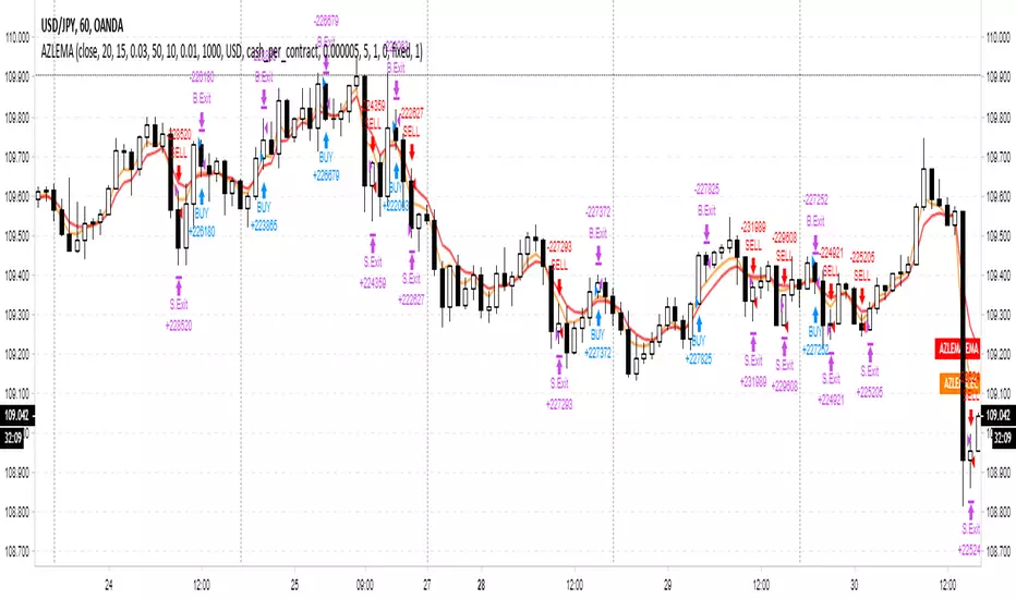
Adaptive Zero Lag EMA Strategy [Ehlers + Ric]Behold! A strategy that makes use of Ehlers research into the field of signal processing and wins so consistently, on multiple time frames AND on multiple currency pairs. The Adaptive Zero Lag EMA (AZLEMA) is based on an informative report by Ehlers and Ric . I've modified it by using Cosine IFM, a method by Ehlers on determining the dominant cycle period without using fast-Fourier transforms Instead, we use some basic differential equations that are simplified to approximate the cycle period over a 100 bar sample size. The settings for this strategy allow you to scalp or swing trade! High versatility! Since this strategy is frequency based, you can run it on any timeframe (M1 is untested) and even have the option of using adaptive settings for a best-fit. >Settings Source : Choose the value for calculations (close, open, high + low / 2, etc...) Period : Choose the dominant cycle for the ZLEMA (typically under 100) Adaptive? : Allow the strategy to continuously update the Period for you (disables Period setting) Gain Limit : Higher = faster response. Lower = smoother response. See for more information. Threshold : Provides a bit more control over entering a trade. Lower = less selective. Higher = More selective. (range from 0 to 1) SL Points : Stop Poss level in points (10 points = 1 pip) TP Points : Take Profit level in points Risk : Percent of current balance to risk on each trade (0.01 = 1%) www.mesasoftware.com www.jamesgoulding.com(Measuring%20Cycles).doc Chiến lược Pine Script®của DasanC55316
In-Phase & Quadrature IFMThis indicator provides a continuous measurement of a securities' dominant cycle period, based on Ehlers ever-impressive reports and analysis tools. This method uses in-phase and quadrature analysis, making use of the imaginary domain. This method is prone to favor longer periods and can allow noise to greatly affect the end result. >What does that even mean? Essentially, you get a real-time (low lag) plot of the cycle period in bars. If the I-Q IFM reads "16" then you can expect the distance between swing highs and swing lows to be approx. 16 bars. >How is this useful? When you throw an RSI or MACD on your chart, you can now set the "Period" or "Length" value with confidence. Knowing the dominant cycle period tells you that price reversal will occur around these intervals. >Extending. The better way to use this tool is by extending the script into any indicators that use a length or period that is set manually. Simply use the "len" variable in your custom script to replace your input values. Now you have a way to adaptively set the period value, using signal processing theory instead of just intuition ;) PM if you have questions.Chỉ báo Pine Script®của DasanC1184
Cosine IFM [Ehlers]This indicator provides a continuous measurement of a securities' dominant cycle period, based on Ehlers ever-impressive reports and analysis tools. >What does that even mean? Essentially, you get a real-time (low lag) plot of the cycle period in bars. If the COS IFM reads "16" then you can expect the distance between swing highs and swing lows to be approx. 16 bars. >How is this useful? When you throw an RSI or MACD on your chart, you can now set the "Period" or "Length" value with confidence. Knowing the dominant cycle period tells you that price reversal will occur around these intervals. >Extending. The better way to use this tool is by extending the script into any indicators that use a length or period that is set manually. Simply use the "len" variable in your custom script to replace your input values. Now you have a way to adaptively set the period value, using signal processing theory instead of just intuition ;) PM if you have questions.Chỉ báo Pine Script®của DasanC2284
PoW Floor OscillatorThis model was proposed by @paulewaulpaul as an attempt to model the cost of BTC production using Difficulty (input) and Issuance (output) as the key parameters. The following is paraphrased from the original research piece: Difficulty D is taken as the estimated number of hashes required to mine a block (denoted in raw hashes). This is proportional to the energy consumption and the energy efficiency and reflects the demand. We use difficulty to estimate production costs. As mining becomes more efficient over time, hash rate becomes cheaper. Therefore we add a damping coefficient k and a scaling factor a (the cost per unit of adjusted difficulty). To get the value per coin, we divide by the issuance I. We get the values for a and k by fitting the function to price. For this we use the lows of the last two halving cycles, deep in the bear market when only the most efficient mining was profitable. The PoW Floor Model is thus calculated as follows: PoW Floor Pricing Model = 2/3 * (sma(D,180)^0.41 / sum(I,180)) The damping coefficient is k = 0.41 and scaling factor a = 2/3. Statistically, this means that doubling the difficulty increases the estimated production cost by ~33%. We use a moving average for the difficulty and look at a 180 day period. For the upper bands we use the 1.41 and 2 multiples where the factor of 2 estimates the cost of production after the next halving event (assuming constant difficulty). Coined By kuntah in Bitcoin: Difficulty per Issuance - A PoW Pricing Model, Oct 2022Chỉ báo Pine Script®của M483845
PoW Floor Pricing ModelThis model was proposed by @paulewaulpaul as an attempt to model the cost of BTC production using Difficulty (input) and Issuance (output) as the key parameters. The following is paraphrased from the original research piece: Difficulty D is taken as the estimated number of hashes required to mine a block (denoted in raw hashes). This is proportional to the energy consumption and the energy efficiency and reflects the demand. We use difficulty to estimate production costs. As mining becomes more efficient over time, hash rate becomes cheaper. Therefore we add a damping coefficient k and a scaling factor a (the cost per unit of adjusted difficulty). To get the value per coin, we divide by the issuance I. We get the values for a and k by fitting the function to price. For this we use the lows of the last two halving cycles, deep in the bear market when only the most efficient mining was profitable. The PoW Floor Model is thus calculated as follows: PoW Floor Pricing Model = 2/3 * (sma(D,180)^0.41 / sum(I,180)) The damping coefficient is k = 0.41 and scaling factor a = 2/3. Statistically, this means that doubling the difficulty increases the estimated production cost by ~33%. We use a moving average for the difficulty and look at a 180 day period. For the upper bands we use the 1.41 and 2 multiples where the factor of 2 estimates the cost of production after the next halving event (assuming constant difficulty). Coined By kuntah in Bitcoin: Difficulty per Issuance - A PoW Pricing Model, Oct 2022Chỉ báo Pine Script®của M4838416
Forex Visual Market ClockWhat it is The Forex Visual Market Clock is a professional-grade session dashboard designed to help traders identify global liquidity cycles at a glance. Inspired by classic 24-hour market clocks, this indicator renders a persistent, high-contrast table on your chart that tracks market opens, closes, and the high-volume overlaps between the world's major financial hubs. How it works • Local Time Synchronization: The indicator translates global UTC market hours into your specific local timezone using IANA identifiers. This ensures that your "You Are Here" highlight (the white box) stays perfectly aligned with your actual wall clock. • Automatic DST Management: The script natively handles Daylight Savings Time transitions for the selected local timezone, eliminating the need for manual GMT offset adjustments. • Liquidity Visualization: o Color-Coded Tracks: Each city is represented by a unique color-coded bar (Green for London, Orange for New York, Blue for Sydney, Yellow for Tokyo). o Volume Peak Logic: A dedicated "VOLUME" row turns red during the London/New York overlap, signaling the period of highest historical volatility and liquidity. • Engineered for Efficiency: Wrapped in barstate.islast logic, the script updates tick-by-tick without degrading chart performance, making it ideal for fast-paced M5 trading. Inputs • Local Timezone: A dropdown menu to select your region (e.g., America/Los_Angeles). This defines which hour the white "current time" box highlights. • Display Corner: A layout setting to anchor the dashboard to any corner of your screen (Upper Left, Upper Right, Lower Left, or Lower Right). • Visual Controls: Users can customize the opacity of the session bars and the thickness of the grey frame to suit their specific chart theme. Chỉ báo Pine Script®của cechapman3
Wx Gann WindowsWx Gann Windows — Seasonal Time Windows & Forward Markers Wx Gann Windows highlights the handful of Gann-style seasonal dates that matter most, without cluttering your chart. It draws subtle “time windows” around key dates each year and optionally projects the next 12 months of dates into the future so you can keep them in mind when planning trades or options spreads. What it shows 1. Seasonal Windows (background bands) • Equinox / Solstice windows (Spring, Summer, Autumn, Winter). • Optional midpoint (cross-quarter) windows: early Feb / May / Aug / Nov. • Each window is a small number of days (default 3) centered on the approximate calendar date, with a soft background band so price action remains in focus. 2. On-Chart Labels (optional) • Small labels like “Spring Eq.”, “Winter Sol.”, “Feb Mid” printed just above the current chart’s price range. • One label per window, on the first bar of the window. 3. Future Projections (next 12 months) • For each key date, the script projects the next occurrence into the future. • Draws a vertical dotted line from near the chart low to above the chart high, plus a label such as “Spring Eq. (next)” or “Aug Mid (next)”. • This gives you a 12-month “time roadmap” for cycles-sensitive planning (e.g., options, swing trades) without manual date marking. Inputs Window Settings • Equinox / Solstice Window (days) – size of the seasonal bands (default 3 days). • Midpoint Window (days) – size of the mid-Feb / May / Aug / Nov bands. Visibility • Show Equinox & Solstice Windows – toggle main seasonal bands on/off. • Show Midpoint Windows (Feb/May/Aug/Nov) – toggle cross-quarter bands. • Show Labels (on windows) – show/hide the on-chart labels above price. Future Projections • Project Next 12 Months (future markers) – toggle the forward vertical lines + “(next)” labels. How to use it • Treat these dates as awareness windows, not prediction signals. • Use them to: • Be extra alert for potential turns, accelerations, or exhaustion. • Tighten risk or avoid opening new positions right into a window if your system suggests caution. • Plan options expiries or swing entries with time structure in mind. Always confirm decisions with your own system (trend, structure, volume, breadth, macro), not the dates alone. Notes & Disclaimer • Dates are approximate calendar anchors inspired by Gann’s seasonal and cross-quarter work, using simple ±N-day windows. • Works on any symbol and timeframe; windows are based on calendar dates, not bar count. • This tool is educational and informational only. It does not place orders and is not financial advice. Always test and integrate with your own strategy and risk management.Chỉ báo Pine Script®của WesPX6
NY Session Bar Counter & Bar painterThe NY Session Bar Counter is a high-visibility technical utility that provides an automated, sequential count of every candle during the New York session (09:30 to 16:00 EST). Unlike standard session highlighters, this tool numbers each bar starting from the market open, allowing traders to identify specific "time-of-day" windows with surgical precision. This script is specifically engineered for traders who follow setups based on specific bar numbers (e.g., the Bar 17 reversal, the Bar 36 lunch-power-hour, or the final EOD flush). 🚀 Key Features Precision Timing: Automatically resets every day at 09:30 AM New York time, regardless of your local timezone settings. Multi-Timeframe Logic: Optimized to work seamlessly on 1m, 5m, 15m, and 30m charts without breaking the daily count. Historical & Replay Compatibility: Unlike many session tools, this script is fully compatible with Bar Replay and displays historical data across several days (up to 500 labels). Special Bar Highlighting: Includes a "Paint Bar" feature that allows you to choose a specific bar number (e.g., Bar 17) and automatically color the candle body for instant visual recognition. Customizable Display: Filter for Odd/Even numbers to reduce chart clutter and adjust font size, color, and position (Above/Below bar). 💡 Why It Is Useful In the modern trading environment, the market moves in cycles of liquidity and volatility that are often tied to specific times. This script is useful because: Standardization: It provides a common language for traders. Instead of saying "the 10:50 AM candle," traders can refer to "Bar 17" (on a 5m chart), which is faster and more consistent. Backtesting Accuracy: When reviewing past days or using Bar Replay, you can easily identify if your strategy triggers at the same relative time every day. Visual Discipline: By highlighting a "Target Bar," you can train your eyes to wait for specific time windows before looking for a setup, helping to prevent overtrading during low-probability hours. Operational Efficiency: It removes the manual work of counting bars from the open, allowing you to focus entirely on price action and order flow. How to Use Install the script on any intraday timeframe (best on 5m or 15m). Adjust Lookback: Use the settings to determine how many historical days you want to view. Identify Patterns: Use the "Special Bar Highlight" to mark the bar where your strategy most frequently triggers.Chỉ báo Pine Script®của farimanga87Cập nhật 2
Trend & Pullback Cycle How to use. Trend Identification: Green Columns: The cycle is above 50. Look for Longs. Red Columns: The cycle is below 50. Look for Shorts. Pullback Detection: I added a Colour Change feature. If the Green bars turn Dark Green, it means momentum is fading (a pullback is happening). This is your signal to get ready to enter or add to a position once it turns Bright Green again. The Yellow Line: This is your trigger. In the screenshot, you see the bars cross the yellow line. Entry Signal: When the Histogram crosses above the Yellow line (while generally green) or crosses below it (while generally red).Chỉ báo Pine Script®của geoff62035
NIFTY, SENSEX AND BANKNIFTY Options Expiry MarkerNSE Options Expiry Background Marker Category: Date/Time Indicators Timeframe: Daily Markets: NSE (India) / Any Exchange Description Automatically highlights weekly and monthly options expiry days for NIFTY, BANKNIFTY, and SENSEX using color-coded background shading. Works across entire chart history with customizable transparency levels. Key Features ✅ Background Highlighting - Non-intrusive color shading on expiry days ✅ Multi-Index Support - NIFTY, BANKNIFTY, and SENSEX simultaneously ✅ Weekly & Monthly Expiry - Different transparency levels for easy distinction ✅ Customizable Expiry Days - Set any weekday (Mon-Fri) as expiry day ✅ Adjustable Transparency - Separate controls for weekly and monthly expiries ✅ Full Historical Data - Works on all visible bars across years ✅ Smart Monthly Detection - Automatically identifies last occurrence in month ✅ Color Coded - Blue (NIFTY), Red (BANKNIFTY), Green (SENSEX) Use Cases Options trading strategy planning Identify expiry day volatility patterns Visual reference for monthly vs weekly cycles Backtest strategies around expiry days Track multiple index expiries on single chart Technical Details Uses India timezone (GMT+5:30) for accurate date calculations Handles leap years automatically Smart algorithm identifies last weekday occurrence per month Works seamlessly on any chart timeframe (optimized for Daily) No performance impact - simple background coloring Chỉ báo Pine Script®của shreyasss119
Systemic Net Liquidity (Macro Fuel for Crypto & Stocks)This indicator tracks Systemic Net Liquidity, the single most important macro factor for determining the long-term trend of risk assets like Bitcoin (BTC) and major indices (S&P 500). It measures the amount of actual cash available in the financial system to chase speculative assets, distinguishing between money that is circulating and money that is locked up at the Federal Reserve. Mechanism (What It Measures) The script uses direct data from the FRED (Federal Reserve Economic Data) to calculate the true state of market funding: \text{Net Liquidity} = \text{Fed Assets (WALCL)} - \text{Treasury General Account (TGA)} - \text{Reverse Repo (RRP)} 1. Fed Assets (WALCL): The total balance sheet of the Fed (The overall supply of money). 2. Treasury General Account (TGA): Funds the US Treasury collects via bond issuance. When the TGA rises, liquidity is actively drained from the banking system (A major bearish pressure). 3. Overnight Reverse Repo (RRP): Cash parked by banks and money market funds at the Fed, effectively frozen and not contributing to market activity. How to Interpret Signals Treat the Net Liquidity line as the market's "Fuel Gauge": 📈 BULLISH SIGNAL (Liquidity Injection): When the Net Liquidity line is rising, money is flowing back into the system, signalling a tailwind for risk assets. 📉 BEARISH SIGNAL (Liquidity Drain): When the line is falling (often due to high TGA balances), cash is being removed. This signals major friction and pressure on price action. ⚠️ DIVERGENCE WARNING: A strong signal is generated when Price (e.g., BTC) rises, but Net Liquidity falls. This macro divergence strongly suggests a major trend reversal or correction is imminent. Important Notes Data Source: Data is directly sourced from FRED and updates daily/weekly. This tool is best used for macro analysis and identifying high-level cycles, not short-term scalping. Disclaimer: Use this indicator as a confirmation tool within your broader strategy. It is not a standalone trading signal.Chỉ báo Pine Script®của PlanCco18
DRACO Tomas Delta (Custom/Monthly)🐉 DRACO Delta SessionBox (Custom / Monthly) Overview The DRACO Delta SessionBox is an advanced visual and analytical tool designed to measure and display cumulative buying and selling pressure (Δ — delta) within a user-defined time window, such as a specific custom date range, a recurring monthly period, or the entire current month. It visually represents market accumulation or distribution phases by calculating an approximate delta — the imbalance between bullish and bearish volume — and then aggregates it inside a dynamic “box” that spans only the selected time window. Core Concept Delta in this context is an approximation of the real order-flow delta (buy vs sell volume difference). Since TradingView doesn’t provide raw tick-by-tick trade direction data, this indicator uses a proxy formula based on OHLC and volume data: Δ per bar = Volume × ( Close − Open ) max ( High − Low , Tick Size ) Δ per bar=Volume× max(High−Low,Tick Size) (Close−Open) This gives a very effective approximation of intrabar directional pressure — whether volume was dominated by buyers (Δ > 0) or sellers (Δ < 0). Modes The indicator can operate in three distinct modes: 🕒 Custom DateTime The user manually sets an exact date & time range (From – To). The box only measures delta and volume accumulation within this window. Ideal for analyzing specific events, like FOMC weeks, quarterly earnings, or macro periods. 📆 Monthly Window The user selects start and end days of the month (e.g. 5–20). The same window repeats automatically every month. Useful for identifying recurring accumulation or distribution cycles within months. 🧭 Whole Month Automatically measures and visualizes delta for the entire current calendar month. The box resets when a new month begins. Provides a macro-level view of monthly directional bias.Chỉ báo Pine Script®của tomasgudanavicius3
Indian Gold Festival Dates HistoricalIndian Gold Festival Dates (1975-2025) Marks 8 major Indian festivals associated with gold buying over 50 years of historical data. Essential for analyzing seasonal patterns and cultural demand cycles in gold markets. Festivals Included: Dhanteras (Gold) - Most auspicious gold buying day Diwali (Orange) - Festival of Lights Akshaya Tritiya (Green) - "Never-ending" prosperity Dussehra (Red) - Victory and success Makar Sankranti (Cyan) - Solar new year Gudi Padwa (Magenta) - Hindu New Year (Maharashtra) Ugadi (Purple) - Hindu New Year (South India) Navratri (Yellow) - 9-day festival Features: ✓ 408 exact historical dates (1975-2025) ✓ Color-coded vertical lines for easy identification ✓ Toggle individual festivals on/off ✓ Adjustable line width and labels ✓ Works on all timeframes (best on daily/weekly) Perfect for traders analyzing gold seasonality, Indian market sentiment, and cultural demand patterns. Use on XAUUSD, GC1!, or Indian gold futures.Chỉ báo Pine Script®của firstlast6940
US30 Quarter Levels (125-point grid) by FxMogul🟦 US30 Quarter Levels — Trade the Index Like the Banks Discover the Dow’s hidden rhythm. This indicator reveals the institutional quarter levels that govern US30 — spaced every 125 points, e.g. 45125, 45250, 45375, 45500, 45625, 45750, 45875, 46000, and so on. These are the liquidity magnets and reaction zones where smart money executes — now visualized directly on your chart. 💼 Why You Need It See institutional precision: The Dow respects 125-point cycles — this tool exposes them. Catch reversals before retail sees them: Every impulse and retracement begins at one of these zones. Build confluence instantly: Perfectly aligns with your FVGs, OBs, and session highs/lows. Trade like a professional: Turn chaos into structure, and randomness into rhythm. ⚙️ Key Features Automatically plots US30 quarter levels (…125 / …250 / …375 / …500 / …625 / …750 / …875 / …000). Color-coded hierarchy: 🟨 xx000 / xx500 → major institutional levels ⚪ xx250 / xx750 → medium-impact levels ⚫ xx125 / xx375 / xx625 / xx875 → intraday liquidity pockets Customizable window size, label spacing, and line extensions. Works across all timeframes — from 1-minute scalps to 4-hour macro swings. Optimized for clean visualization with no clutter. 🎯 How to Use It Identify liquidity sweeps: Smart money hunts stops at these quarter zones. Align structure: Combine with session opens, order blocks, or FVGs. Set precision entries & exits: Trade reaction-to-reaction with tight risk. Plan daily bias: Watch how New York respects these 125-point increments. 🧭 Designed For Scalpers, day traders, and swing traders who understand that US30 doesn’t move randomly — it moves rhythmically. Perfect for traders using ICT, SMC, or liquidity-based frameworks. ⚡ Creator’s Note “Every 125 points, the Dow breathes. Every 1000, it shifts direction. Once you see the rhythm, you’ll never unsee it.” — FxMogulChỉ báo Pine Script®của leonelndam40027
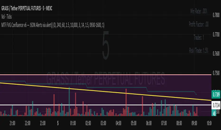
MTF FVG Confluence v6 — JSON Alerts via alert()This strategy combines multi-timeframe confluence with candlestick analysis and fair value gaps (FVGs) to generate structured long/short entries. It aligns Daily and 4H EMA trends with 1H MACD momentum, then confirms with engulfing candles and FVG zones for precision entries. Risk management is built-in, featuring stop-loss, 3R take-profit targets, and optional break-even logic, with dynamic JSON alerts for webhook automation. Categories: Candlestick analysis Chart patterns CyclesChiến lược Pine Script®của billjimmyjdsde10
PnL Bubble [%] | Fractalyst1. What's the indicator purpose? The PnL Bubble indicator transforms your strategy's trade PnL percentages into an interactive bubble chart with professional-grade statistics and performance analytics. It helps traders quickly assess system profitability, understand win/loss distribution patterns, identify outliers, and make data-driven strategy improvements. How does it work? Think of this indicator as a visual report card for your trading performance. Here's what it does: What You See Colorful Bubbles: Each bubble represents one of your trades Blue/Cyan bubbles = Winning trades (you made money) Red bubbles = Losing trades (you lost money) Bigger bubbles = Bigger wins or losses Smaller bubbles = Smaller wins or losses How It Organizes Your Trades: Like a Photo Album: Instead of showing all your trades at once (which would be messy), it shows them in "pages" of 500 trades each: Page 1: Your first 500 trades Page 2: Trades 501-1000 Page 3: Trades 1001-1500, etc. What the Numbers Tell You: Average Win: How much money you typically make on winning trades Average Loss: How much money you typically lose on losing trades Expected Value (EV): Whether your trading system makes money over time Positive EV = Your system is profitable long-term Negative EV = Your system loses money long-term Payoff Ratio (R): How your average win compares to your average loss R > 1 = Your wins are bigger than your losses R < 1 = Your losses are bigger than your wins Why This Matters: At a Glance: You can instantly see if you're a profitable trader or not Pattern Recognition: Spot if you have more big wins than big losses Performance Tracking: Watch how your trading improves over time Realistic Expectations: Understand what "average" performance looks like for your system The Cool Visual Effects: Animation: The bubbles glow and shimmer to make the chart more engaging Highlighting: Your biggest wins and losses get extra attention with special effects Tooltips: hover any bubble to see details about that specific trade. What are the underlying calculations? The indicator processes trade PnL data using a dual-matrix architecture for optimal performance: Dual-Matrix System: • Display Matrix (display_matrix): Bounded to 500 trades for rendering performance • Statistics Matrix (stats_matrix): Unbounded storage for complete statistical accuracy Trade Classification & Aggregation: // Separate wins, losses, and break-even trades if val > 0.0 pos_sum += val // Sum winning trades pos_count += 1 // Count winning trades else if val < 0.0 neg_sum += val // Sum losing trades neg_count += 1 // Count losing trades else zero_count += 1 // Count break-even trades Statistical Averages: avg_win = pos_count > 0 ? pos_sum / pos_count : na avg_loss = neg_count > 0 ? math.abs(neg_sum) / neg_count : na Win/Loss Rates: total_obs = pos_count + neg_count + zero_count win_rate = pos_count / total_obs loss_rate = neg_count / total_obs Expected Value (EV): ev_value = (avg_win × win_rate) - (avg_loss × loss_rate) Payoff Ratio (R): R = avg_win ÷ |avg_loss| Contribution Analysis: ev_pos_contrib = avg_win × win_rate // Positive EV contribution ev_neg_contrib = avg_loss × loss_rate // Negative EV contribution How to integrate with any trading strategy? Equity Change Tracking Method: //@version=6 strategy("Your Strategy with Equity Change Export", overlay=true) float prev_trade_equity = na float equity_change_pct = na if barstate.isconfirmed and na(prev_trade_equity) prev_trade_equity := strategy.equity trade_just_closed = strategy.closedtrades != strategy.closedtrades if trade_just_closed and not na(prev_trade_equity) current_equity = strategy.equity equity_change_pct := ((current_equity - prev_trade_equity) / prev_trade_equity) * 100 prev_trade_equity := current_equity else equity_change_pct := na plot(equity_change_pct, "Equity Change %", display=display.data_window) Integration Steps: 1. Add equity tracking code to your strategy 2. Load both strategy and PnL Bubble indicator on the same chart 3. In bubble indicator settings, select your strategy's equity tracking output as data source 4. Configure visualization preferences (colors, effects, page navigation) How does the pagination system work? The indicator uses an intelligent pagination system to handle large trade datasets efficiently: Page Organization: • Page 1: Trades 1-500 (most recent) • Page 2: Trades 501-1000 • Page 3: Trades 1001-1500 • Page N: Trades to Example: With 1,500 trades total (3 pages available): • User selects Page 1: Shows trades 1-500 • User selects Page 4: Automatically falls back to Page 3 (trades 1001-1500) 5. Understanding the Visual Elements Bubble Visualization: • Color Coding: Cyan/blue gradients for wins, red gradients for losses • Size Mapping: Bubble size proportional to trade magnitude (larger = bigger P&L) • Priority Rendering: Largest trades displayed first to ensure visibility • Gradient Effects: Color intensity increases with trade magnitude within each category Interactive Tooltips: Each bubble displays quantitative trade information: tooltip_text = outcome + " | PnL: " + pnl_str + "\nDate: " + date_str + " " + time_str + "\nTrade #" + str.tostring(trade_number) + " (Page " + str.tostring(active_page) + ")" + "\nRank: " + str.tostring(rank) + " of " + str.tostring(n_display_rows) + "\nPercentile: " + str.tostring(percentile, "#.#") + "%" + "\nMagnitude: " + str.tostring(magnitude_pct, "#.#") + "%" Example Tooltip: Win | PnL: +2.45% Date: 2024.03.15 14:30 Trade #1,247 (Page 3) Rank: 5 of 347 Percentile: 98.6% Magnitude: 85.2% Reference Lines & Statistics: • Average Win Line: Horizontal reference showing typical winning trade size • Average Loss Line: Horizontal reference showing typical losing trade size • Zero Line: Threshold separating wins from losses • Statistical Labels: EV, R-Ratio, and contribution analysis displayed on chart What do the statistical metrics mean? Expected Value (EV): Represents the mathematical expectation per trade in percentage terms EV = (Average Win × Win Rate) - (Average Loss × Loss Rate) Interpretation: • EV > 0: Profitable system with positive mathematical expectation • EV = 0: Break-even system, profitability depends on execution • EV < 0: Unprofitable system with negative mathematical expectation Example: EV = +0.34% means you expect +0.34% profit per trade on average Payoff Ratio (R): Quantifies the risk-reward relationship of your trading system R = Average Win ÷ |Average Loss| Interpretation: • R > 1.0: Wins are larger than losses on average (favorable risk-reward) • R = 1.0: Wins and losses are equal in magnitude • R < 1.0: Losses are larger than wins on average (unfavorable risk-reward) Example: R = 1.5 means your average win is 50% larger than your average loss Contribution Analysis (Σ): Breaks down the components of expected value Positive Contribution (Σ+) = Average Win × Win Rate Negative Contribution (Σ-) = Average Loss × Loss Rate Purpose: • Shows how much wins contribute to overall expectancy • Shows how much losses detract from overall expectancy • Net EV = Σ+ - Σ- (Expected Value per trade) Example: Σ+: 1.23% means wins contribute +1.23% to expectancy Example: Σ-: -0.89% means losses drag expectancy by -0.89% Win/Loss Rates: Win Rate = Count(Wins) ÷ Total Trades Loss Rate = Count(Losses) ÷ Total Trades Shows the probability of winning vs losing trades Higher win rates don't guarantee profitability if average losses exceed average wins 7. Demo Mode & Synthetic Data Generation When using built-in sources (close, open, etc.), the indicator generates realistic demo trades for testing: if isBuiltInSource(source_data) // Generate random trade outcomes with realistic distribution u_sign = prand(float(time), float(bar_index)) if u_sign < 0.5 v_push := -1.0 // Loss trade else // Skewed distribution favoring smaller wins (realistic) u_mag = prand(float(time) + 9876.543, float(bar_index) + 321.0) k = 8.0 // Skewness factor t = math.pow(u_mag, k) v_push := 2.5 + t * 8.0 // Win trade Demo Characteristics: • Realistic win/loss distribution mimicking actual trading patterns • Skewed distribution favoring smaller wins over large wins • Deterministic randomness for consistent demo results • Includes jitter effects to prevent visual overlap 8. Performance Limitations & Optimizations Display Constraints: points_count = 500 // Maximum 500 dots per page for optimal performance Pine Script v6 Limits: • Label Count: Maximum 500 labels per indicator • Line Count: Maximum 100 lines per indicator • Box Count: Maximum 50 boxes per indicator • Matrix Size: Efficient memory management with dual-matrix system Optimization Strategies: • Pagination System: Handle unlimited trades through 500-trade pages • Priority Rendering: Largest trades displayed first for maximum visibility • Dual-Matrix Architecture: Separate display (bounded) from statistics (unbounded) • Smart Fallback: Automatic page clamping prevents empty displays Impact & Workarounds: • Visual Limitation: Only 500 trades visible per page • Statistical Accuracy: Complete dataset used for all calculations • Navigation: Use page input to browse through entire trade history • Performance: Smooth operation even with thousands of trades 9. Statistical Accuracy Guarantees Data Integrity: • Complete Dataset: Statistics matrix stores ALL trades without limit • Proper Aggregation: Separate tracking of wins, losses, and break-even trades • Mathematical Precision: Pine Script v6's enhanced floating-point calculations • Dual-Matrix System: Display limitations don't affect statistical accuracy Calculation Validation: // Verified formulas match standard trading mathematics avg_win = pos_sum / pos_count // Standard average calculation win_rate = pos_count / total_obs // Standard probability calculation ev_value = (avg_win * win_rate) - (avg_loss * loss_rate) // Standard EV formula Accuracy Features: • Mathematical Correctness: Formulas follow established trading statistics • Data Preservation: Complete dataset maintained for all calculations • Precision Handling: Proper rounding and boundary condition management • Real-Time Updates: Statistics recalculated on every new trade 10. Advanced Technical Features Real-Time Animation Engine: // Shimmer effects with sine wave modulation offset = math.sin(shimmer_t + phase) * amp // Dynamic transparency with organic flicker new_transp = math.min(flicker_limit, math.max(-flicker_limit, cur_transp + dir * flicker_step)) • Sine Wave Shimmer: Dynamic glowing effects on bubbles • Organic Flicker: Random transparency variations for natural feel • Extreme Value Highlighting: Special visual treatment for outliers • Smooth Animations: Tick-based updates for fluid motion Magnitude-Based Priority Rendering: // Sort trades by magnitude for optimal visual hierarchy sort_indices_by_magnitude(values_mat) • Largest First: Most important trades always visible • Intelligent Sorting: Custom bubble sort algorithm for trade prioritization • Performance Optimized: Efficient sorting for real-time updates • Visual Hierarchy: Ensures critical trades never get hidden Professional Tooltip System: • Quantitative Data: Pure numerical information without interpretative language • Contextual Ranking: Shows trade position within page dataset • Percentile Analysis: Performance ranking as percentage • Magnitude Scaling: Relative size compared to page maximum • Professional Format: Clean, data-focused presentation 11. Quick Start Guide Step 1: Add Indicator • Search for "PnL Bubble | Fractalyst" in TradingView indicators • Add to your chart (works on any timeframe) Step 2: Configure Data Source • Demo Mode: Leave source as "close" to see synthetic trading data • Strategy Mode: Select your strategy's PnL% output as data source Step 3: Customize Visualization • Colors: Set positive (cyan), negative (red), and neutral colors • Page Navigation: Use "Trade Page" input to browse trade history • Visual Effects: Built-in shimmer and animation effects are enabled by default Step 4: Analyze Performance • Study bubble patterns for win/loss distribution • Review statistical metrics: EV, R-Ratio, Win Rate • Use tooltips for detailed trade analysis • Navigate pages to explore full trade history Step 5: Optimize Strategy • Identify outlier trades (largest bubbles) • Analyze risk-reward profile through R-Ratio • Monitor Expected Value for system profitability • Use contribution analysis to understand win/loss impact 12. Why Choose PnL Bubble Indicator? Unique Advantages: • Advanced Pagination: Handle unlimited trades with smart fallback system • Dual-Matrix Architecture: Perfect balance of performance and accuracy • Professional Statistics: Institution-grade metrics with complete data integrity • Real-Time Animation: Dynamic visual effects for engaging analysis • Quantitative Tooltips: Pure numerical data without subjective interpretations • Priority Rendering: Intelligent magnitude-based display ensures critical trades are always visible Technical Excellence: • Built with Pine Script v6 for maximum performance and modern features • Optimized algorithms for smooth operation with large datasets • Complete statistical accuracy despite display optimizations • Professional-grade calculations matching institutional trading analytics Practical Benefits: • Instantly identify system profitability through visual patterns • Spot outlier trades and risk management issues • Understand true risk-reward profile of your strategies • Make data-driven decisions for strategy optimization • Professional presentation suitable for performance reporting Disclaimer & Risk Considerations: Important: Historical performance metrics, including positive Expected Value (EV), do not guarantee future trading success. Statistical measures are derived from finite sample data and subject to inherent limitations: • Sample Bias: Historical data may not represent future market conditions or regime changes • Ergodicity Assumption: Markets are non-stationary; past statistical relationships may break down • Survivorship Bias: Strategies showing positive historical EV may fail during different market cycles • Parameter Instability: Optimal parameters identified in backtesting often degrade in forward testing • Transaction Cost Evolution: Slippage, spreads, and commission structures change over time • Behavioral Factors: Live trading introduces psychological elements absent in backtesting • Black Swan Events: Extreme market events can invalidate statistical assumptions instantaneouslyChỉ báo Pine Script®của FractalystCập nhật 2218
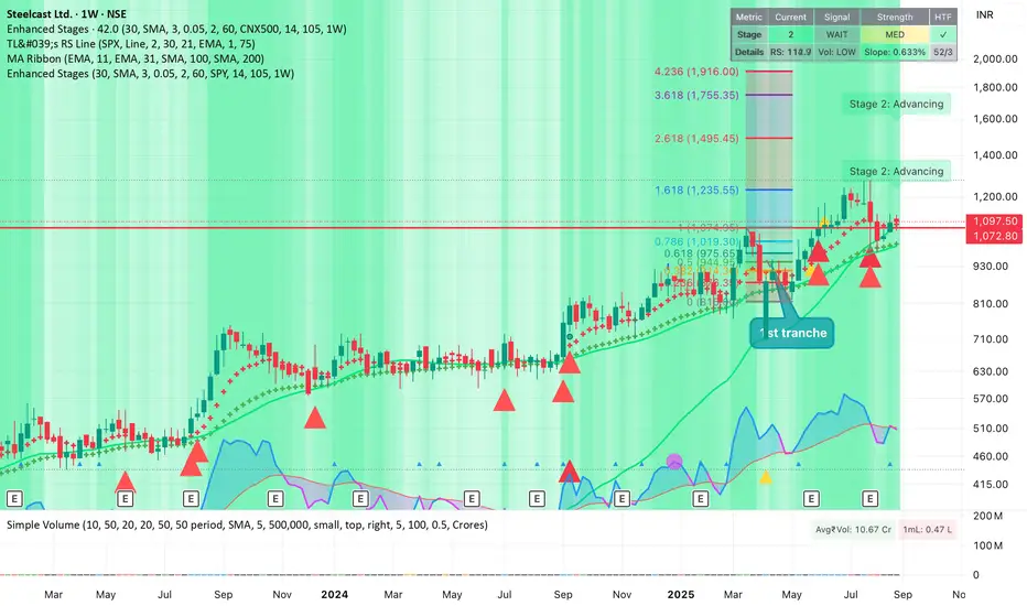
Improved Weinstein Stage AnalysisThe code provides an actionable, disciplined, and visually informative implementation of the “Stage Analysis” approach pioneered by Stan Weinstein, with enhancements to modernize, automate, and clarify the methodology for today’s traders using TradingView. It faithfully follows the workflow recommended: identify long-term cycles, confirm with volume and relative strength, and only engage aggressively with the market during the advancing (bullish) stage with all “clues” aligned.Chỉ báo Pine Script®của bkpawar91242Cập nhật 99144
Alternate Hourly HighlightAlternate Hourly Highlight This indicator automatically highlights every alternate one-hour window on your chart, making it easy to visually identify and separate each trading hour. The background alternates color every hour, helping traders spot hourly cycles, session changes, or develop time-based trading strategies. Works on any timeframe. No inputs required—just add to your chart and go! Especially useful for intraday traders who analyze price action, volatility, or volume by the hour. For custom colors or session windows, feel free to modify the script!Chỉ báo Pine Script®của ratheeshinv14
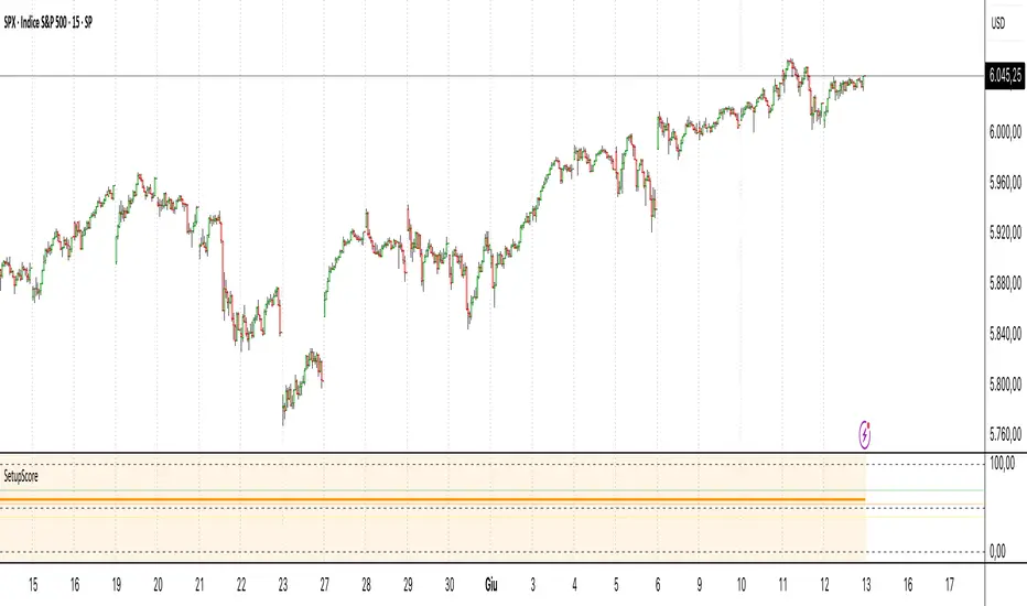
Setup Score OscillatorSetup Score Oscillator – Full Description 🎯 Purpose of the Script This script is a manual trading setup scoring tool, designed to help traders quantify the quality of a trade setup by combining multiple technical, cyclical, and contextual signals. Instead of relying on a single indicator, the trader manually selects which signals are present, and the script calculates a total score (0–100%), displayed as an oscillator in a separate panel (like RSI or MACD). 🔧 How it works in practice 1. Manual signal inputs The script presents a set of checkboxes in the settings, where the trader can enable/disable the following signals: ✅ Confirmed Support/Resistance ✅ Aligned Volume Profile ✅ Favorable Cyclic Timing ✅ Valid Trend Line ✅ Aligned Cyclical Moving Averages ✅ Relevant Fibonacci Level ✅ Classic Volume Signal (spike, dry-up, etc.) ✅ Oscillator confirmation (e.g., divergences) ✅ Extreme Sentiment ✅ Relevant or incoming News Each selected signal contributes to the total score based on its weight. 2. Scoring system Each signal has a default weight (e.g., 20% for support/resistance, 15% for cycles, etc.). Optionally, the trader can enable the “custom weights” checkbox and adjust each signal’s weight directly in the settings. 3. Score visualization The final score (sum of all active weights) is plotted as an oscillator ranging from 0 to 100%, with dynamic coloring: Range Color Meaning 0–39% Red No valid setup 40–54% Yellow Watchlist only 55–69% Orange Good setup 70–100% Green Strong setup Several horizontal threshold lines are displayed: 50% → neutral threshold 40%, 55%, 70% → operational levels 4. Optional background coloring When the score exceeds 55% or 70%, the oscillator background lightly changes color to highlight stronger setups (non-intrusive). 📌 Practical benefits Objectifies subjective analysis: each decision becomes a number. Prevents overtrading: no entries if the score is too low. Adaptable to any trading style: swing, intraday, positional. User-friendly: no coding needed – just tick boxes. Italiano: Setup Score Oscillator – Descrizione completa 🎯 Obiettivo dello script Lo script è uno strumento manuale di valutazione dei setup di trading, pensato per aiutare il trader a quantificare la qualità di un'opportunità operativa basandosi su più segnali tecnici, ciclici e contestuali. Invece di affidarsi a un solo indicatore, il trader seleziona manualmente quali segnali sono presenti, e lo script calcola un punteggio complessivo percentuale (0–100%), rappresentato come oscillatore in una finestra separata (tipo RSI, MACD, ecc.). 🔧 Come funziona operativamente 1. Input manuale dei segnali Lo script mostra una serie di checkbox nelle impostazioni, dove il trader può attivare o disattivare i seguenti segnali: ✅ Supporto/Resistenza confermata ✅ Volume Profile allineato ✅ Cicli o timing favorevole ✅ Trend line valida ✅ Medie mobili cicliche allineate ✅ Livello di Fibonacci rilevante ✅ Volume classico significativo (spike, dry-up) ✅ Conferme da oscillatori (es. divergenze) ✅ Sentiment estremo (es. euforia o panico) ✅ News importanti imminenti o appena uscite Ogni casella attiva contribuisce al punteggio totale, con un peso specifico. 2. Sistema di punteggio Ogni segnale ha un peso predefinito (es. 20% per supporti/resistenze, 15% per cicli, ecc.). Facoltativamente, il trader può attivare la funzione “Enable custom weights” per personalizzare i pesi di ciascun segnale direttamente da input. 3. Visualizzazione del punteggio Il punteggio complessivo (somma dei pesi attivati) viene tracciato come oscillatore da 0 a 100%, con colori dinamici: Range Colore Significato 0–39% Rosso Nessun setup valido 40–54% Giallo Osservazione 55–69% Arancione Setup buono 70–1005 Verde Setup forte Sono tracciate anche delle linee guida orizzontali a: 50% → soglia neutra 40%, 55%, 70% → soglie operative 4. Colorazione dello sfondo (facoltativa) Quando il punteggio supera 55% o 70%, lo sfondo dell’oscillatore cambia leggermente colore per evidenziare il segnale (non invasivo). 📌 Vantaggi pratici Oggettivizza l’analisi soggettiva: ogni decisione manuale si trasforma in un numero. Evita overtrading: se il punteggio è troppo basso, non si entra. Adattabile a ogni stile: swing, intraday, position. Facile da usare anche senza codice: basta spuntare le caselle. Chỉ báo Pine Script®của JoMerende227
S&P 500 Estimated PE (Sampled Every 4)📊 **S&P 500 Estimated PE Ratio (from CSV)** This indicator visualizes the forward-looking estimated PE ratio of the S&P 500 index, imported from external CSV data. 🔹 **Features:** - Real historical daily data from 2008 onward - Automatically aligns PE values to closest available trading date - Useful for macro valuation trends and long-term entry signals 📌 **Best for:** - Investors interested in forward-looking valuation - Analysts tracking over/undervaluation trends - Long-term timing overlay on price action Category: `Breadth indicators`, `Cycles` Chỉ báo Pine Script®của tctctc99917
Bollinger Volatility AnalyzerThe Bollinger Volatility Analyzer (BVA) is a powerful enhancement of the traditional Bollinger Bands indicator, tailored to help traders identify volatility cycles and catch potential breakouts with better precision and timing. It builds upon the foundational concept of Bollinger Bands—using a moving average and standard deviation bands—but adds crucial insights into market contraction and expansion, which can be instrumental in timing entries and exits. Here's how it works and why it's useful At its core, the indicator calculates a moving average (called the "basis") and plots two bands—one above and one below—based on a multiple of standard deviation. These bands expand during volatile periods and contract during quiet ones. The width between these bands, normalized as a percentage of the basis, gives us a sense of how compressed or expanded the market currently is. When the band width drops below a user-defined threshold (like 2%), the script highlights this with an orange triangle below the bar. This is the "squeeze" condition, signaling a potential buildup of market energy—a kind of calm before the storm. What makes this version of Bollinger Bands particularly powerful is that it not only detects squeezes, but also tells you when price breaks out of that squeeze range. If price closes above the upper band after a squeeze, a green "Breakout ↑" label is shown; if it closes below the lower band, a red "Breakout ↓" appears. These breakout labels act as entry signals, suggesting that volatility is returning and a directional move has begun. This indicator is especially useful in markets that tend to alternate between consolidation and breakout phases, such as forex, crypto, and even individual stocks. Traders who look for early signs of momentum—whether for swing trading, scalping, or position building—can benefit from this tool. During a quiet market phase, the indicator warns you that a move might be coming; when the move starts, it tells you the direction. In fast-moving markets, BVA helps filter out noise by focusing only on high-probability conditions: quiet consolidation followed by a strong breakout. It’s not a complete system by itself—it works best when paired with volume confirmation or oscillators like RSI—but as a volatility trigger and directional guide, it’s a reliable component of a trading workflow. Chỉ báo Pine Script®của SupertradeOfficial19
Mercury Venus Conjunction Sextiles 2019-2026How to Use It and What It Means Astrologically How to Use the Script in TradingView This Pine Script, called "Mercury Venus Aspects 2019–2026," is made to highlight the dates of Mercury-Venus conjunctions (0°) and sextiles (60°) from 2019 to 2026 on TradingView charts. Here's how to use it: click “Add to Chart.” It will apply to any chart you have open—stocks, forex, crypto, etc. Customize the Display You can turn on/off the visibility of conjunctions and sextiles using checkboxes under "Inputs" in the settings. You can also adjust the label size (small, normal, large, or huge) for better readability on your chart. What You’ll See on the Chart Conjunctions appear as blue shaded zones with labels like “C1,” “C2,” etc. These mark dates when Mercury and Venus are at the same degree. Sextiles show up in orange with labels like “S1,” “S2,” marking when they’re about 60° apart. Each event spans a 2-day window (one day before and after the exact aspect). How to Use It Practically You can overlay the script on market charts to look for any patterns between these planetary aspects and price movements. You can also use it to plan personal or financial activities, since these aspects often affect communication, money, and relationships. What to Keep in Mind Dates are approximate and based on average planetary cycles (Mercury: ~88 days, Venus: ~225 days). For exact timing, use an ephemeris. Only conjunctions and sextiles are shown. Oppositions, squares, and trines aren’t included because Mercury and Venus never get far enough apart (more than 75°). This script is great for astrologers, traders, and enthusiasts who want to see Mercury-Venus aspects directly on their charts and explore their possible effects. Astrological Meaning of Mercury-Venus Aspects What Mercury and Venus Represent Mercury rules communication, thinking, technology, travel, and trade. In global events (mundane astrology), it affects media, markets, and movement of information. Venus is about love, beauty, money, and pleasure. It influences relationships, aesthetics, and finance. In the world stage, it’s linked to luxury, art, fashion, and economic balance. When Mercury and Venus form aspects (like conjunctions or sextiles), their energies mix in helpful ways that can affect people and events. Conjunction (0°) – Mercury and Venus Together These two planets are in the same sign and degree, so their qualities merge. For people: Positive: Smooth communication, charm, creativity, and better relationships. Great for romance, art, and social interaction. Negative: Too much focus on appearances, sweet talk, or pleasure can cloud judgment. Decisions may lack depth. For the economy: Positive: Boosts in media, entertainment, fashion, and tech. Good for trade, deals, and optimism in financial markets. Negative: Risk of overspending or unrealistic expectations. May cause small market bubbles or misleading hype. Sextile (60°) – Mercury and Venus in Harmony These two planets are two signs apart, creating a smooth, supportive energy. For people: Positive: Easy conversations, creative teamwork, small financial wins, and pleasant social experiences. Negative: Energy is mild, so opportunities might be missed if not acted on. People may avoid hard decisions. For the economy: Positive: Gradual improvements in areas like marketing, social media, hospitality, and design. Good for diplomacy. Negative: Lack of strong initiative could limit bigger gains. Minor missteps are possible due to a laid-back attitude. General Effects These aspects are mostly beneficial. They support creativity, financial thinking, and social harmony. Downsides: Conjunctions may lead to overindulgence or shallow choices, while sextiles may cause missed chances due to low energy. These aspects rarely cause major economic shifts on their own but can amplify trends depending on other planetary influences (like Saturn or Uranus). Zodiac Sign Influence Fire signs (Aries, Leo, Sagittarius): Bold communication, energetic spending, gains in media or entertainment. Earth signs (Taurus, Virgo, Capricorn): Practical results, stable finances, growth in real-world assets like property or food. Air signs (Gemini, Libra, Aquarius): Intellectual growth, tech innovation, and social ideas flourish. Water signs (Cancer, Scorpio, Pisces): Emotional depth in conversations, artistic growth, and financial sensitivity. Mercury-Venus aspects are gentle but helpful. They combine logic (Mercury) with emotion and value (Venus). They’re good times for love, communication, and money—but their benefits depend on how we use the energy. This script lets you easily track these moments on a chart and explore how they might align with real-life trends or decisions. Disclaimer: This script and its interpretations are for informational and educational purposes only. They do not constitute financial, trading, or professional astrological advice. Always conduct your own research and consult qualified professionals before making any financial or personal decisions. Use at your own discretion.Chỉ báo Pine Script®của Dshergill43