PyraTime Liquidity & TimeThe Problem:
Why Most Traders Get Trapped Most trading indicators fail because they only look at half the picture: Price. Traders draw support and resistance lines, wait for the price to hit them, and then get stopped out by a wick that instantly reverses. This is a "Liquidity Sweep," and it is how institutional algorithms trap retail traders.
Furthermore, free indicators often suffer from the "Floating Indicator" bug—where lines detach from price during zooming—making them unreliable for precision trading.
The Solution: PyraTime Liquidity & Time PyraTime L&T solves this by filtering every price move through Time. It does not just ask "Is price at support?" It asks "Is price at support at the exact right time?"
This tool combines three institutional concepts into one dashboard:
Geometric Liquidity Traps: Identifies when a swing point is swept (false breakout) exactly during a Fibonacci Time Cluster.
Institutional Time Cycles: Projects future volatility windows (Gold Lines) based on the geometry of past pivots.
Silver Bullet Zones: Automatically highlights the specific hours where algorithms are most active (London, NY, Tokyo sessions).
How to Use This Indicator
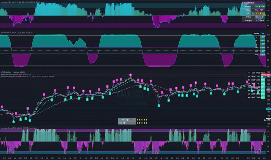
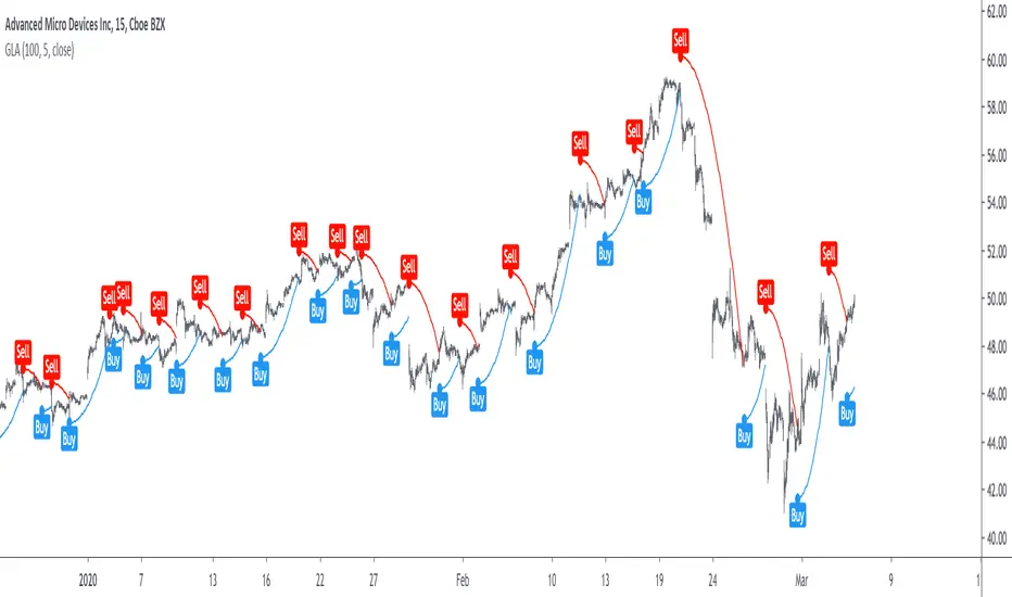
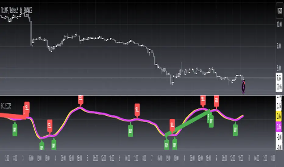
1. The "Trap" Signal (Your Entry Trigger) The core function of this tool is to identify "Time-Price Traps."
Wait for a Signal: A "TRAP" or "SWEEP" label will appear when price breaks a previous high/low but closes back inside the range AND this happens inside a Fibonacci Time Cluster.
The Logic: This confirms that Time and Price have squared. It is a high-probability reversal signal.
Cyan Label: Bullish Trap (Look for Longs)
Pink Label: Bearish Trap (Look for Shorts)
2. The Golden Time Lines (Your Filter) The vertical Gold lines are future time projections.
Cluster Confirmation: If you see multiple Gold lines grouped closely together, expect high volatility or a reversal at that specific time.
Trade Filter: Do not take a trade just because a line appears. Use it to time your entry at a key price level.
3. Silver Bullet Zones (Session Awareness) The indicator highlights the three most powerful 60-minute windows in the market (New York Time).
London SB (03:00 - 04:00): Often sets the high or low of the London session.
New York SB (10:00 - 11:00): The classic "Silver Bullet" continuation or reversal window.
Tokyo SB (22:00 - 23:00): Key for crypto and Asian forex pairs.
PRO TIP: Managing the Noise
For High Timeframes (4H, Daily): Go to Settings and uncheck "Silver Bullet Zones." These zones are designed for intraday "zoning in" (1m to 15m charts) and will look cluttered on a Daily chart.
For Precision (1m - 15m): Turn the Silver Bullet Zones ON to see exactly when the algorithmic windows open.
Technical Features & Compliance
Zero Repainting: Signals are confirmed on candle close. History is never altered.
Floating Fix: Built with xloc.bar_time to ensure all drawings stay locked to their exact historical moment, regardless of chart scaling.
Memory Optimized: Automatically cleans up old lines to maintain maximum performance on all devices.
Chỉ báo Pine Script®