Volume Spike Scanner█ OVERVIEW
This script adds a volume spike scanner table to the top-right of the chart space. Table cells light up with colored signals when volume spikes occur on the associated tickers on a low timeframe. The colored signals correspond to different levels of volume spike intensity and the table columns are continuously sorted so that the tickers with the most intense volume spikes are always at the top. One table can have up to 40 tickers (this is a pine script limitation) and the indicator comes with 7 pre-load ticker lists. (6 stock lists and 1 crypto list) Add the indicator several times and use all the pre-load lists to scan 280 stocks and 40 cryptocurrencies simultaneously.
By monitoring so many tickers simultaneously for volume spikes you will have early awareness of tickers that are reacting to catalysts/news. In some cases there may be no known catalyst, but the ticker is still making a significant move with high volume. Getting to these charts early in the move can provide trade-able opportunities.
█ SIGNALS
There are 6 signals for increasing levels of volume spike intensity
Orange - Most Intense
Yellow
Green
Light Green
Blue
Pink - Least Intense
█ USER INPUTS
Alerts
Check the boxes in the Alerts section next to the color signals you want alerts for. Then after closing the user inputs pane right-click on the table and select "Add Alert on ..."
Filters
Currently the only filter available is the Minimum Volume Filter. More filters may be added on future updates.
When this filter is turned on any signals that are generated by a spike that has volume below the set value will be filtered out and will not show up on the scanner.
The default value of 10,000 is recommended for stocks. There is no recommendation for crypto.
Positioning
• Compact Mode - Reduces the table width to about half size to conserve screen space.
• Table Number - Table number 1 is the farthest right position. Each increase in this value by 1 will move the table roughly one table space inward from the right side of the chart.
• Move Down - Each increment of 1 will move the table downward roughly the height of one table row.
Usually the lowest rows of the table are insignificant so it's okay to move the table down and have these rows offscreen.
• Left/Right Spacing - Each increment of 1 or -1 will move the table slightly left and right respectively. This is for fine tuning the left/right positioning if you like all your tables equally spaced.
Ticker Lists
• Pre-Built List # - The first release of this script contains seven pre-built lists each containing 40 tickers. Lists 1 thru 6 are all stocks. List 7 is all crypto.
For day trading stocks and options add the indicator 6 times to the chart, set the tables side by side, and set a different pre-built list number for each table.
• Symbol Lists - The pre-built lists can all be customized to your preference. Remove tickers you don't like and replace with ones you like. Save your lists as the new default.
Also not every table has to contain 40 tickers. You can uncheck the boxes next to the tickers to shorten the list.
█ TIPS
General
1 — Use news alert/notification services to add context to volume spikes and resulting price movements.
2 — When a ticker goes straight to the highest two signals (Orange and Yellow) that is usually noteworthy
and worth looking at the ticker's chart to see how the volume inflow is affecting price.
3 — When the lowest signals (Pink and Blue) appear for a ticker that is often not noteworthy except in the most liquid tickers
4 — It is best to use a multi-chart layout with one chart in the layout dedicated to the scanner.
This will allow you to switch tickers on the other charts without re-rendering the tables each time.
Set the chart dedicated to the scanner to the 3m timeframe or lower due to an issue mentioned lower down.
To make the scanner easier to see you can turn off visibility of all chart features on this chart.
Stocks
1 — Very liquid stocks such as AAPL, AMZN, MSFT, TSLA, NVDA, NFLX, BA, GOOGL, META, etc. rarely have volume spikes that give the highest signals (Orange and Yellow).
For these tickers the lower signals are significant. To prevent them from getting lost at the bottom of a 40 ticker table you can give them their own dedicated table
along with other favorite stocks to ensure they are always easily visible. You can set alerts for the lower level signals on this table.
2 — To use all 6 pre-loaded stock lists and scan 240 stocks simultaneously add the indicator 6 times.
Each time you add the indicator customize the user incrementing the Table Number and Pre-Load List #. This will give you 6 tables side-by-side with 40 tickers each.
3 — The Minimum Volume Filter is recommended to be set on and at the default value for the stock pre-load lists.
Crypto
1 — The Minimum Volume Filter is recommended to be set off for the crypto list.
2 — Use mobile app notifications to get 24/7 crypto volume spike alerts to your phone.
█ KNOWN ISSUES
Alerts are sometimes given more than once for the same volume spike signal.
The table does not display when using higher timeframes. It is recommended to use a split chart layout and dedicate one section of the layout to this indicator. Set the timeframe on this section to 3m or lower.
If fixes are found for the above issues they will be included in future updates.
█ SPECIAL THANKS
With permission this script utilizes some of the logic from the open-source script "Screener for 40+ instruments" by QuantNomad.
Tìm kiếm tập lệnh với "Table"

Streamer WatermarkThis unique indicator doesn’t help you trade but it makes your charts look super clean and professional in images and live streams! This indicator works by displaying two tables. The first table has day of the week, date, and free form text. The second table has ticker symbol and timeframe of the current chart.
Everything about the tables and the cells is completely controllable by the user! Here is a breakdown of how customizable the user can make this indicator:
Table:
Toggle each table to be displayed on or off
Move each table into 9 different locations around the chart
Move each table separately
Table background color and transparency
Table border color and transparency
Table border width
Table frame width
Cells:
Each cell can be individually toggled on or off (the table will resize dynamically)
Cell text color and transparency
Text size with 6 different options
Date format with 12 different formats
Input Text:
Text
Emoji
Text & emojis
ASCII characters
Symbols
Anything that can by copied and pasted
Any combination of the above
Notes
Use text size “Auto” if viewing the same chart on desktop and on smart phone (Auto makes the text scale based upon screen size)
Gallery
Disclaimer
Please read the TradingView House Rules carefully before using this indicator to add text, symbols, characters, or anything else to your charts and posting on TradingView Ideas or Scripts. This indicator and the author are not responsible for users not reading, fully understanding, and abiding by TradingView’s House Rules. Please watermark responsibly.

Stocks Multi-Indicator Alerts (cryptodaddy)//@version=6
// Multi-Indicator Alerts
// --------------------------------------------
// This script combines technical indicators and basic analyst data
// to produce composite buy and sell signals. Each block is heavily
// commented so future modifications are straightforward.
indicator("Multi-Indicator Alerts", overlay=true, max_labels_count=500)
//// === Daily momentum indicators ===
// Relative Strength Index measures price momentum.
rsiLength = input.int(14, "RSI Length")
rsi = ta.rsi(close, rsiLength)
// Money Flow Index incorporates volume to track capital movement.
// In Pine Script v6 the function only requires a price source and length;
// volume is taken from the built-in `volume` series automatically.
mfLength = input.int(14, "Money Flow Length")
mf = ta.mfi(hlc3, mfLength)
// `mfUp`/`mfDown` flag a turn in money flow over the last two bars.
mfUp = ta.rising(mf, 2)
mfDown = ta.falling(mf, 2)
//// === WaveTrend oscillator ===
// A simplified WaveTrend model produces "dots" indicating potential
// exhaustion points. Values beyond +/-53 are treated as oversold/overbought.
n1 = input.int(10, "WT Channel Length")
n2 = input.int(21, "WT Average Length")
ap = hlc3 // typical price
esa = ta.ema(ap, n1) // smoothed price
d = ta.ema(math.abs(ap - esa), n1) // smoothed deviation
ci = (ap - esa) / (0.015 * d) // channel index
tci = ta.ema(ci, n2) // trend channel index
wt1 = tci // main line
wt2 = ta.sma(wt1, 4) // signal line
greenDot = ta.crossover(wt1, wt2) and wt1 < -53
redDot = ta.crossunder(wt1, wt2) and wt1 > 53
plotshape(greenDot, title="Green Dot", style=shape.circle, color=color.green, location=location.belowbar, size=size.tiny)
plotshape(redDot, title="Red Dot", style=shape.circle, color=color.red, location=location.abovebar, size=size.tiny)
//// === Analyst fundamentals ===
// Fundamental values from TradingView's database. If a ticker lacks data
// these will return `na` and the related conditions simply evaluate false.
rating = request.financial(syminfo.tickerid, "rating", period="FY")
targetHigh = request.financial(syminfo.tickerid, "target_high_price", period="FY")
targetLow = request.financial(syminfo.tickerid, "target_low_price", period="FY")
upsidePct = (targetHigh - close) / close * 100
downsidePct = (close - targetLow) / close * 100
// `rating` comes back as a numeric value (1 strong sell -> 5 strong buy). Use
// thresholds instead of string comparisons so the script compiles even when
// the broker only supplies numeric ratings.
ratingBuy = rating >= 4 // buy or strong buy
ratingNeutralOrBuy = rating >= 3 // neutral or better
upsideCondition = upsidePct >= 2 * downsidePct // upside at least twice downside
downsideCondition = downsidePct >= upsidePct // downside greater or equal
//// === Daily moving-average context ===
// 50 EMA represents short-term trend; 200 EMA long-term bias.
ema50 = ta.ema(close, 50)
ema200 = ta.ema(close, 200)
longBias = close > ema200 // price above 200-day = long bias
momentumFavorable = close > ema50 // price above 50-day = positive momentum
//// === Weekly trend filter ===
// Higher timeframe confirmation to reduce noise.
weeklyClose = request.security(syminfo.tickerid, "W", close)
weeklyEMA20 = request.security(syminfo.tickerid, "W", ta.ema(close, 20))
weeklyRSI = request.security(syminfo.tickerid, "W", ta.rsi(close, rsiLength))
// Weekly Money Flow uses the same two-argument `ta.mfi()` inside `request.security`.
weeklyMF = request.security(syminfo.tickerid, "W", ta.mfi(hlc3, mfLength))
weeklyFilter = weeklyClose > weeklyEMA20
//// === Buy evaluation ===
// Each true condition contributes one point to `buyScore`.
c1_buy = rsi < 50 // RSI below midpoint
c2_buy = mfUp // Money Flow turning up
c3_buy = greenDot // WaveTrend oversold bounce
c4_buy = ratingBuy // Analyst rating Buy/Strong Buy
c5_buy = upsideCondition // Forecast upside twice downside
buyScore = (c1_buy?1:0) + (c2_buy?1:0) + (c3_buy?1:0) + (c4_buy?1:0) + (c5_buy?1:0)
// Require all five conditions plus trend filters and persistence for two bars.
buyCond = c1_buy and c2_buy and c3_buy and c4_buy and c5_buy and longBias and momentumFavorable and weeklyFilter and weeklyRSI > 50 and weeklyMF > 50
buySignal = buyCond and buyCond
//// === Sell evaluation ===
// Similar logic as buy side but inverted.
c1_sell = rsi > 70 // RSI above overbought threshold
c2_sell = mfDown // Money Flow turning down
c3_sell = redDot // WaveTrend overbought reversal
c4_sell = ratingNeutralOrBuy // Analysts neutral or still buy
c5_sell = downsideCondition // Downside at least equal to upside
sellScore = (c1_sell?1:0) + (c2_sell?1:0) + (c3_sell?1:0) + (c4_sell?1:0) + (c5_sell?1:0)
// For exits require weekly filters to fail or long bias lost.
sellCond = c1_sell and c2_sell and c3_sell and c4_sell and c5_sell and (not longBias or not weeklyFilter or weeklyRSI < 50)
sellSignal = sellCond and sellCond
// Plot composite scores for quick reference.
plot(buyScore, "Buy Score", color=color.green)
plot(sellScore, "Sell Score", color=color.red)
//// === Confidence table ===
// Shows which of the five buy/sell checks are currently met.
var table status = table.new(position.top_right, 5, 2, border_width=1)
if barstate.islast
table.cell(status, 0, 0, "RSI", bgcolor=c1_buy?color.new(color.green,0):color.new(color.red,0))
table.cell(status, 1, 0, "MF", bgcolor=c2_buy?color.new(color.green,0):color.new(color.red,0))
table.cell(status, 2, 0, "Dot", bgcolor=c3_buy?color.new(color.green,0):color.new(color.red,0))
table.cell(status, 3, 0, "Rating", bgcolor=c4_buy?color.new(color.green,0):color.new(color.red,0))
table.cell(status, 4, 0, "Target", bgcolor=c5_buy?color.new(color.green,0):color.new(color.red,0))
table.cell(status, 0, 1, "RSI>70", bgcolor=c1_sell?color.new(color.red,0):color.new(color.green,0))
table.cell(status, 1, 1, "MF down",bgcolor=c2_sell?color.new(color.red,0):color.new(color.green,0))
table.cell(status, 2, 1, "Red dot", bgcolor=c3_sell?color.new(color.red,0):color.new(color.green,0))
table.cell(status, 3, 1, "Rating", bgcolor=c4_sell?color.new(color.red,0):color.new(color.green,0))
table.cell(status, 4, 1, "Target", bgcolor=c5_sell?color.new(color.red,0):color.new(color.green,0))
//// === Alert text ===
// Include key metrics in alerts so the chart doesn't need to be opened.
buyMsg = "BUY: RSI " + str.tostring(rsi, "#.##") +
", MF " + str.tostring(mf, "#.##") +
", Upside " + str.tostring(upsidePct, "#.##") + "%" +
", Downside " + str.tostring(downsidePct, "#.##") + "%" +
", Rating " + str.tostring(rating, "#.##")
sellMsg = "SELL: RSI " + str.tostring(rsi, "#.##") +
", MF " + str.tostring(mf, "#.##") +
", Upside " + str.tostring(upsidePct, "#.##") + "%" +
", Downside " + str.tostring(downsidePct, "#.##") + "%" +
", Rating " + str.tostring(rating, "#.##")
// Alert conditions use static messages; dynamic data is sent via `alert()`
alertcondition(buySignal, title="Buy Signal", message="Buy conditions met")
alertcondition(sellSignal, title="Sell Signal", message="Sell conditions met")
if buySignal
alert(buyMsg, alert.freq_once_per_bar_close)
if sellSignal
alert(sellMsg, alert.freq_once_per_bar_close)
//// === Watch-out flags ===
// Gentle warnings when trends weaken but before full sell signals.
warnRSI = rsi > 65 and rsi <= 65
warnAnalyst = upsidePct < 2 * downsidePct and upsidePct > downsidePct
alertcondition(warnRSI, title="RSI Watch", message="RSI creeping above 65")
alertcondition(warnAnalyst, title="Analyst Watch", message="Analyst upside shrinking")
if warnRSI
alert("RSI creeping above 65: " + str.tostring(rsi, "#.##"), alert.freq_once_per_bar_close)
if warnAnalyst
alert("Analyst upside shrinking: up " + str.tostring(upsidePct, "#.##") + "% vs down " + str.tostring(downsidePct, "#.##") + "%", alert.freq_once_per_bar_close)
//// === Plot bias moving averages ===
plot(ema50, color=color.orange, title="EMA50")
plot(ema200, color=color.blue, title="EMA200")
//// === Cross alerts for context ===
goldenCross = ta.crossover(ema50, ema200)
deathCross = ta.crossunder(ema50, ema200)
alertcondition(goldenCross, title="Golden Cross", message="50 EMA crossed above 200 EMA")
alertcondition(deathCross, title="Death Cross", message="50 EMA crossed below 200 EMA")
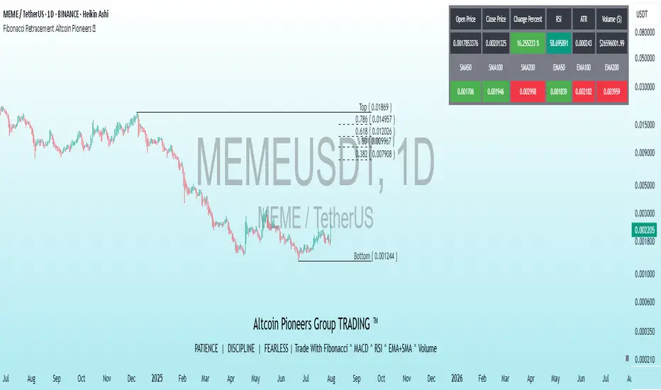
Fibonacci Retracement Altcoin Pioneers ™This powerful indicator combines Fibonacci Retracement levels with a suite of technical indicators to assist traders in analyzing price movements and making informed decisions. Designed for flexibility and ease of use, it offers a customizable interface for displaying data on charts and in tables, making it suitable for both novice and experienced traders.
Key Features:
Fibonacci Retracement: Automatically draws Fibonacci levels (0.382, 0.5, 0.618, 0.786) with customizable lines and labels based on recent price highs and lows. Includes alerts for price touching key levels (Top and Bottom) with adjustable tolerance.
Technical Indicators: Includes RSI, ATR, Momentum, ADX, MACD, Parabolic SAR, Bollinger Bands, and Ichimoku Cloud, all customizable for periods and colors.
Moving Averages: Displays EMA and SMA (50, 100, 200) with options to enable or disable them as needed.
Informative Tables: Provides customizable tables for desktop and mobile, showing open price, close price, percentage change, RSI, ATR, and volume in dollars.
Dual Language Support: Labels and descriptions can be displayed in English or Turkish.
Watermark: Displays symbol information and date in a customizable position for an organized view.
Customization Settings:Fibonacci: Enable/disable levels, choose distance and color.
Table: Select position (Top Right, Bottom Left, etc.) and size (Small, Medium, Large).
Language: Choose between English for labels.
Indicators: Customize periods and colors for each technical indicator.
Screener - Moving Average / ATR Breakout Signal [ARTech]Screener - Moving Average / ATR Breakout Signal
This indicator features a powerful multi-symbol screener that scans up to 40 user-defined symbols in real time for Moving Average (MA) and ATR breakout signals. Users can customize the list of symbols, select the asset class (e.g., Crypto, Stocks, Forex). The screener detects trend-following signals based on price crossing a chosen MA type and length, enhanced by optional ATR-based volatility filters and breakout thresholds to improve signal accuracy. Signals can be displayed on the chart via labels, tooltips, or a compact signal table, allowing traders to monitor multiple markets simultaneously without switching charts. The list of symbols generating signals can also be tracked with customizable alerts, enabling traders to receive real-time notifications for long and short breakout signals directly via TradingView alerts.
This indicator is developed based on the concept of Moving Average / ATR Breakout Signal script on TradingView, with enhancements to support multi-symbol scanning.
Key Features
• Multi-Symbol Screener: Scans up to 40 user-defined symbols simultaneously, with automatic separator detection and symbol validation.
• Repaint Prevention: Carefully designed to avoid repaint issues. The script structure and signal logic have been built to ensure reliable behavior, even across multiple symbols and varying chart conditions.
• Flexible Signal Display: Offers chart labels, tooltips, or a compact table to show signals, enabling multi-market monitoring without switching charts.
• Customizable Alerts: Supports alerts for both long and short signals, sending a list of symbols generating signals as real-time notifications.
• Multi-Type Moving Average Support: Choose from several MA types including EMA, SMA, Hull MA, VWMA, RMA, and TEMA, with customizable source and length settings.
• Flexible Signal Logic: Generates signals when price breaks above or below the selected MA, with options for confirmation candles and wick or close based breakout detection.
• ATR-Based Filtering: Utilizes ATR to create dynamic breakout bands around the MA, reducing noise and improving breakout validation.
• Breakout Threshold Filtering: Adds an optional minimum percentage price move before a new opposite signal is allowed, preventing rapid reversals.
Why use this indicator?
• Scans up to 40 symbols at the same time.
• Users can define the symbol list, asset class, and automatically detects the symbol separator; warns if any symbols are invalid
• Detected signals are shown directly on the chart as labels, tooltips, or in a compact table.
• The list of signal-generating symbols can be tracked with alerts — no need to watch the chart constantly.
How to Use
███████ Alerts ███████
🔸 Long / Short
To enable Custom Alerts, select the desired alert type (Long or Short) from the indicator's settings under the "Alerts" section, you can customize messages and enable notifications for Long and Short signals. Then, you need to activate the fx alert() function call option in TradingView’s alert creation dialog.
Alert messages include your custom message followed by a list of symbols currently giving signals, each shown on a new line. For example, if your input message is set to “🟢 Long Signal” and BTCUSD and ETHUSD are signaling, the alert will look like this:
🟢 Long Signal
BTCUSD
ETHUSD
This format helps you clearly see the type of signal and each symbol individually, making real-time monitoring easier.
🔸 Alert Delay (seconds)
This setting adds a delay before alerts are triggered. It helps ensure that signals are based on confirmed bar closures for slight timing differences between symbol data feeds (especially in multi-symbol mode). For example, setting a 30-second delay allows all symbols to finish processing before the alert fires, avoiding early or incomplete signal lists.
For best results, try different delay values to see what works best with your selected timeframe.
███████ Display / Signal ███████
🔸 Display Mode
Choose how the indicator presents signals on your chart. Focus on a single symbol (Chart mode), Scan and display multiple symbols at once (Screener mode), or hide visuals and use only tables or alerts (No mode).
• Chart Mode: Displays signals only for the current chart symbol. Useful for testing and optimizing signal conditions before scanning multiple assets.
• Screener Mode: Activates the screener functionality, showing results for all valid symbols in your list. Signals appear as labels on the chart and are also listed in the signal table for easy tracking.
• No (Table Only): Hides all on-chart visuals (labels, markers). Signals are still processed and can be viewed in tables or used with alerts. This mode is ideal when you're using multiple screeners at once and want to avoid overlapping visuals. Each screener can display its results in separate table positions (e.g., bottom right, top left, etc.), so turning off chart visuals helps keep your workspace clean while still tracking multiple symbol groups efficiently. This way, you can also track more than 40 symbols by using multiple screener instances with different symbol groups and table positions.
🔸 Long
You can independently turn ON or OFF the display of Long signals using the toggle.
🔸 Short
You can independently turn ON or OFF the display of Short signals using the toggle.
███████ Symbols ███████
🔸 Symbols
You can enter up to 40 symbols. Symbols must be written in full format. For example: BINANCE:BTCUSDT, NASDAQ:AAPL, or OANDA:EURUSD. TradingView requires this full format to correctly recognize each symbol. Due to TradingView’s limitations, only the first 40 symbols in your list will be processed
- Separator Rules: Letters (A–Z), numbers (0–9), underscore (_), dot (.), and exclamation mark (!) are allowed within symbol names (e.g., BINANCE:BTCUSDT.P). Therefore, avoid using them as separators. Instead, use comma (,) , semicolon (;) , space , or newline to separate multiple symbols.
- Auto Detection: The indicator automatically detects the separator used in your list. If the format is incorrect or a symbol is invalid, a warning will appear to help you fix it.
🔸 Symbol Filter
When scanning multiple symbols, it's important that they belong to the same market type (Crypto, Stocks, Forex, etc.). Different markets have different trading hours, and mixing them may cause issues.
For example, if your chart is using a stock symbol (like NASDAQ:AAPL) and your symbol list includes crypto symbols (like BINANCE:BTCUSDT), the screener may not work correctly. Since stock markets are not open 24/7, the chart time may fall outside of crypto trading hours — causing crypto signals to fail or not update properly.
To avoid this issue, the indicator includes a Symbol Filter. This lets you filter your symbol list to include only the correct asset type (e.g., only Crypto or only Stocks). By using this filter, you make sure the screener runs under the correct market conditions and avoids signal mismatches.
If you set the filter to None , no filtering will be applied. In this case, you are responsible for making sure all listed symbols match your chart’s market type.
For best results, always use symbols from the same market type as your chart symbol. This ensures that candle open/close times align across all symbols, avoiding timing mismatches. Symbols and the chart must follow the same market hours for accurate and consistent signal generation.
🔸 Show Symbols on Table
This feature helps you quickly review the symbols you've entered. When enabled, a table appears in the bottom-right corner of the chart displaying all symbols from your list along with their market types and statuses
- Green background: Symbol is valid and matches the selected Symbol Filter. It can generate signals.
- Gray background: Symbol is valid but does not match the selected filter. It will not generate signals.
- Red background: Symbol is invalid (e.g., due to incorrect names, delisting, or unsupported by broker).
You don’t need to remove invalid or mismatched symbols, but no signals will be generated for them. This visual check makes it easier to catch symbol issues before relying on the screener output.
███████ Signal Display Style ███████
🔸 Display Method
Choose how signals will be shown visually
• Label: The signal appears as a label on the candle. The label includes all triggering symbols as text.
• Tooltip: An icon (such as 🟢 or 🔴) is shown instead of full text. Hold your mouse pointer on the icon on chart for a few seconds to see a tooltip listing the triggered symbols. This method keeps your chart cleaner and less cluttered.
• None: No visual markers appear on candles. Signals are only visible in the signal table — ideal if you're using multiple indicators and want to avoid chart clutter.
🔸 Symbol Display Format
This setting affects the labels, tooltips, signal table, and alert messages, ensuring consistency across all displays. Select whether you want symbols to appear as:
• EXCHANGE:SYMBOL: BINANCE:BTCUSDT
• SYMBOL: BTCUSDT
🔸 Long Signal Icon
Used only in Tooltip mode, these icons (e.g., 🟢 for Long) appear on bars where signals are detected. Customize it freely to match your style or strategy.
🔸 Short Signal Icon
Used only in Tooltip mode, these icons (e.g., 🔴 for Short) appear on bars where signals are detected. Customize it freely to match your style or strategy.
🔸 Size
Adjust the visual size of labels or tooltips. Smaller sizes help reduce clutter when many signals trigger in close proximity.
███████ Signal Table ███████
This section controls the appearance and behavior of the signal table that displays last detected Long and Short signals for your symbols.
🔸 Show
Enable or disable the signal table display on the chart.
🔸 Highlight Signal Duration (Bars)
When a signal occurs, the corresponding cell in the table is highlighted using the selected Long or Short color for this many bars. This helps visually track recent signals over time. The bar where the signal icon appears is counted as 1.
🔸 Table Size
Choose the size of the table to fit your chart layout and readability preferences.
🔸 Table Position
Select where the table appears on your chart (e.g., top right, middle right, bottom left).
🔸 Title
Customize the table header text. The default is “Recent Signals”.
🔸 Background Color
Set the table’s background color and transparency to match your chart’s theme.
🔸 Long Signal Color
Choose the highlight color used to mark Long signals within the table.
🔸 Short Signal Color
Choose the highlight color used to mark Short signals within the table.
🔸 Text Color
Customize the text color inside the table for better contrast and readability.
🔸 Show Bars Since Signal
Optionally display how many bars have passed since each signal appeared. The bar where the signal occurs counts as 1.
███████ Signal ███████
This is the core component of the signal system. You can customize:
🔸 Moving Average Type
Choose from SMA, EMA, WMA, Hull MA, VWMA, RMA, or TEMA
🔸 Length
Adjust the length to suit your strategy.
🔸 Source
Select which price data (e.g., Close, Open, HL2) is used to calculate the MA.
🔸 Confirm Candles
Defines the number of consecutive candles that must break the selected level to confirm a signal.
– If ATR filter is enabled, this level is the ATR bands.
– If ATR is disabled, the Moving Average line is used.
This helps filter out noise and avoid premature signals.
🔸 Break Type
Specifies how the candle must break the level:
– Close: The candle must close beyond the level.
– Wick: A wick touching or exceeding the level is enough.
Both options generate signals only after the candle has closed.
🔸 Filter
This section provides optional filters to improve signal accuracy.
ATR
When the ATR filter is enabled, signals are generated only if the price breaks above the upper ATR line or below the lower ATR line—calculated by adding or subtracting the ATR multiplied threshold from the moving average—and the breakout must occur for the number of consecutive confirmation candles specified by the user input . This helps reduce false signals during low volatility periods.
• Multiplier: Adjusts the width of ATR bands by multiplying the ATR value.
• Length: Sets the period for ATR calculation.
• Smoothing: Selects the smoothing method applied to the ATR (RMA, SMA, EMA, WMA).
Breakout
When enabled, breakout confirmation requires the price to cross above the upper breakout line or below the lower breakout line by a specified percentage from the last signal price.
• Threshold (%): Defines the minimum percentage price movement required to validate a breakout.
• Show Breakout Levels: Toggle to display or hide breakout threshold area on the chart.

ZenAlgo - UltimateThe ZenAlgo - Ultimate Indicator is a premium trading tool that integrates advanced sub-indicators into a single framework, combining volume analysis, divergence detection, and market sentiment visualization. Designed for traders seeking deeper insights, it addresses the limitations of standalone free indicators by delivering a cohesive system that enhances accuracy, adaptability, and decision-making.
Why Multiple Sub-Indicators?
The integration of sub-indicators into one tool provides unique benefits not achievable with individual free indicators:
Improved Accuracy: Combining volume trends, delta volume, and divergence detection creates a multi-dimensional view of market behavior, reducing the chance of false signals.
Synergistic Insights: Free indicators like MAs or divergences work independently, while this tool integrates them into a unified framework that highlights actionable patterns, improving signal reliability.
Actionable Combinations: The tool visually aligns multi-timeframe trends, divergences, and volume states, enabling traders to confirm trades using multiple metrics in one glance, saving time and enhancing precision.
Features
This indicator introduces several customizations and integrations that distinguish it from free alternatives:
Dynamic Volume Classification: It calculates and categorizes volume states into clear signals like "Mega Buy" or "Big Sell," providing instant clarity about unusual activity levels.
Enhanced Delta Volume Analysis: Tracks delta volume trends with adjustable sensitivity, identifying subtle shifts in market pressure that standalone delta indicators might miss.
Customizable Multi-Timeframe Volume Tables: Displays volume and delta metrics across multiple timeframes, offering a holistic view of market activity that helps align short- and long-term strategies.
Real-Time Alerts: Provides instant notifications for confirmed and unconfirmed delta volume crosses, helping users stay ahead of market movements.
Divergence Detection Across Metrics: Identifies regular and hidden bullish or bearish divergences using up, down, and delta volumes, integrating price fractals for added precision.
How It Works
1. Volume and Delta Volume Integration
The indicator calculates and categorizes volume activity into specific states, such as "Mega Buy" or "Big Sell," by comparing the current volume with its 20-period average. For delta volume, it tracks the difference between buying and selling pressure, identifying shifts in market sentiment. These calculations are dynamically updated across multiple timeframes, with delta trends smoothed using user-selected moving averages (e.g., SMA, EMA, WMA, HMA) to highlight sustained market pressure changes.
2. Multi-Timeframe Volume Tables
The tool aggregates and displays volume and delta volume data across various timeframes in a visual table. Each timeframe's data includes total volume, categorized buying and selling volumes, and the net delta volume. Colors within the table provide immediate insights into the prevailing market sentiment for each timeframe, with bullish or bearish conditions emphasized using pre-defined thresholds.
3. Divergence Detection Across Metrics
Divergences are identified using fractal patterns in up volume, down volume, and delta volume. Regular and hidden bullish or bearish divergences are detected by comparing historical volume peaks and troughs with corresponding price movements. This allows the tool to highlight potential reversals or trend continuations before they are visually apparent on the chart.
4. Market State Labels
The indicator synthesizes multiple metrics, such as volume trends, delta volume movements, and histogram direction, to generate actionable market state labels. These labels, such as "Bullish," "Bearish," or "Reversal," offer a high-level summary of current market conditions, helping traders quickly adapt their strategies.
5. Real-Time Alerts
To ensure traders stay informed, the tool includes alerts for confirmed and unconfirmed delta volume crosses. These alerts consider not only the delta volume's movement relative to its average but also whether the broader buying or selling pressure supports the signal, enhancing the reliability of the alerts.
Specific Scenarios Where This Indicator Excels
Trend Confirmation: Align rising delta volume with bullish divergences across timeframes for high-confidence entries.
Reversal Identification: Use divergence labels to anticipate trend reversals before they occur.
Market Sentiment Analysis: Dynamic candle coloring helps visualize whether the market is dominated by bullish or bearish forces.
Volume Breakout Detection: Track spikes in cumulative volume and delta volume to identify breakouts with higher accuracy.
When to Be Cautious
Low-Volume Markets: In thinly traded markets, signals like divergences or delta volume shifts may produce noise due to insufficient data.
Highly Volatile Conditions: Sudden volume spikes can result in false positives for breakouts or reversals.
Session Overlaps or Data Misalignment: Variations in session timings or data discrepancies can temporarily impact cumulative volume metrics.
Overfitting Sensitivity Settings: Excessively high sensitivity settings may overfit the indicator to specific market conditions, leading to unreliable signals in broader contexts.
Why Pay for This Indicator?
This tool stands out because it doesn’t merely replicate free indicators; it integrates and enhances them into a uniquely actionable framework:
Tailored for Precision: Adjustable parameters for sensitivity, divergence detection, and timeframe analysis allow traders to adapt the indicator to their strategies.
Time-Saving Synergy: Combines the functionality of multiple tools into a single interface, eliminating the need to juggle multiple scripts.
Comprehensive Insights: Delivers a broader perspective by linking volume trends, delta volume, and divergences, ensuring more informed decisions.
Real-Time Notifications: Alerts for key events ensure you never miss a critical market movement.
Usage Examples
Volume State Monitoring: Instantly identify states like "Big Buy" or "Mega Sell" to act on significant volume surges.
Multi-Timeframe Alignment: Combine bullish divergences on a 15-minute chart with a rising daily delta volume trend for high-probability trades.
Scalping Opportunities: Use delta volume crosses and short-term trends for quick entries and exits.
Breakout Validation: Confirm volume breakouts with delta volume spikes to avoid false signals.
Settings
Volume MA Length: Adjusts the moving average period for volume trends.
Divergence Sensitivity: Fine-tunes the thresholds for divergence detection to suit different market conditions.
Multi-Timeframe Visibility: Customizes the number of timeframes displayed in the cumulative volume table.
Conclusion
The Ultimate Indicator is more than a collection of sub-indicators—it’s a fully integrated system designed to address the limitations of standalone tools. By offering deeper insights into volume trends, market sentiment, and divergence analysis, it empowers traders to make better-informed decisions with enhanced confidence.

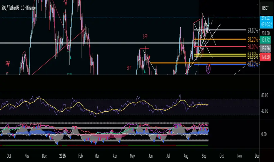
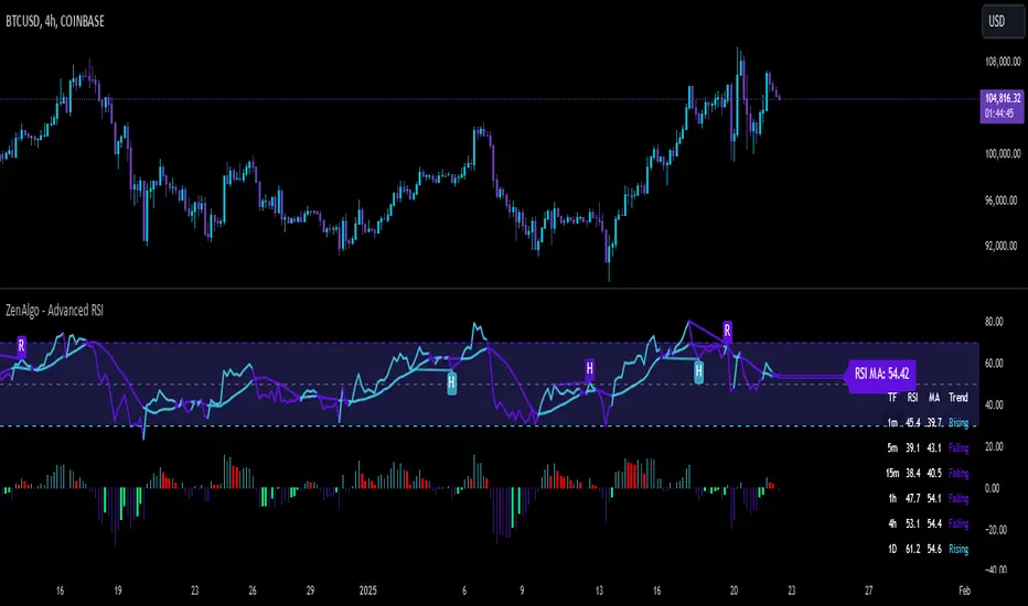
ZenAlgo - Advanced RSIZenAlgo - Advanced RSI is a technical indicator that combines the classic Relative Strength Index (RSI) with advanced tools, such as moving averages, histograms, divergence detection, and trend analysis. This integration provides traders with deeper insights into market dynamics, helping them identify critical entry and exit points. The indicator is designed to synergistically merge these features, delivering a comprehensive analytical tool that simplifies market analysis while providing actionable insights.
Additionally, it includes a Multi TimeFrame table, allowing traders to monitor RSI values and trends across six different timeframes in one view. This enhancement provides a broader perspective on market dynamics and helps traders identify consistent or diverging trends across multiple timeframes, enabling more precise decision-making.
Features
RSI with Moving Averages:
Offers five types of moving averages (SMA, EMA, WMA, SMMA, VWMA) to suit various trading styles and market conditions.
Moving averages are overlaid on RSI, allowing traders to detect support/resistance levels and momentum shifts directly on the RSI panel.
RSI Histogram:
Displays the difference between RSI and its moving average.
Positive histogram values indicate rising momentum, while negative values show declining momentum.
Automatically detects and highlights divergences with color-coded bars (red for bearish, green for bullish).
Bollinger Bands for RSI:
Adds upper and lower bands to RSI, visualizing volatility and overbought/oversold conditions.
Divergence Detection:
Identifies and visualizes both regular and hidden divergences, marking key reversal or trend continuation points.
Labels divergences with R (regular) or H (hidden) to provide clarity on their implications.
Bollinger Bands for RSI:
Adds upper and lower bands to RSI, visualizing volatility and overbought/oversold conditions.
Diamond Signals:
Marks crossovers of RSI and its moving average in overbought (RSI > 70) or oversold (RSI < 30) zones with diamond symbols, highlighting potential reversals.
Multi TimeFrame Table:
Displays RSI values for six different timeframes in a clear and intuitive table.
Calculates the trend on each timeframe based on the average direction of the last three candles. Trends are categorized as "rising" (increasing), "falling" (decreasing), or "neutral" (stable).
Provides easily interpretable insights across timeframes, allowing traders to focus on the current chart without switching timeframes manually.
Added Value: Why Is This Indicator Original/Why Shall You Pay for This Indicator?
ZenAlgo - Advanced RSI is a cohesive system where each component enhances the others. The originality and added value of the indicator come from:
1. Synergy Between Components:
Unlike standalone indicators, which can provide isolated or incomplete insights, ZenAlgo - Advanced RSI combines RSI, moving averages, and divergence detection into a unified system. For instance:
The RSI histogram integrates momentum and trend strength in a single visualization, eliminating the need for multiple separate tools.
Divergences are calculated using both price action and histogram trends, providing more reliable signals compared to divergence detection using only RSI.
2. Customization for Traders:
The ability to select from various moving averages (e.g., EMA for fast responses, SMA for smoother trends) allows users to tailor the indicator to different trading environments and strategies.
3. Actionable Visual Cues:
Diamond signals, histogram bars, and divergence markings make complex market patterns easier to interpret, reducing the cognitive load for traders.
4. Enhanced Divergence Analysis:
Built-in detection of regular and hidden divergences offers clarity and saves traders the effort of manually analyzing charts.
5. Bollinger Bands Integration:
Adding Bollinger Bands to RSI provides insights into volatility and momentum that go beyond what traditional Bollinger Bands or RSI can deliver individually.
6. Multi TimeFrame Table:
The Multi Time Frame table adds a new layer of analytical depth by consolidating RSI values and trends from multiple timeframes into a single tool. This helps traders identify consistent or diverging trends across timeframes, which is crucial for adjusting trading strategies to suit specific market conditions.
7. All-in-One Efficiency:
Instead of juggling multiple indicators, traders gain a streamlined tool that consolidates trend, momentum, and volatility analysis into a single, easy-to-read panel.
How It Works
1. RSI Calculation:
RSI is calculated using the standard formula to determine the relative strength of upward and downward price movements over a specified period.
2. Moving Averages:
Users choose from SMA, EMA, WMA, SMMA, or VWMA. The selected moving average is computed using RSI values, not price data, to better align with the indicator's momentum focus.
3. Histogram:
The histogram shows the difference between RSI and its moving average. Positive values indicate RSI is above its moving average, signaling increasing momentum; negative values indicate the opposite.
4. Divergence Detection:
Regular divergences are identified when price forms higher highs or lower lows, while RSI trends in the opposite direction.
Hidden divergences are marked when price forms higher lows or lower highs, but RSI trends differently.
Divergence is validated using both histogram and price trends for enhanced reliability.
5. Bollinger Bands for RSI:
The upper and lower bands are based on the RSI and a configurable standard deviation, highlighting moments of high volatility and overbought/oversold conditions.
6. Trend Analysis:
The indicator computes an average RSI value over last few candles to detect trend strength and direction, helping traders identify when trends are gaining or losing momentum.
7. Diamond Signals:
Signals are triggered when RSI crosses its moving average within overbought or oversold zones. These events are plotted as diamonds for quick visualization.
Please note that this indicator does not trigger any alerts or direct buy/sell signals.
8. Multi TimeFrame Table:
RSI values are calculated for six separate time frames chosen by the user (e.g., 1-minute, 5-minute, 1-hour).
The trend is determined by averaging the direction of the last three candles on each timeframe. Results are displayed as "rising," "falling," or "neutral" in the table.
The table serves as a quick-reference tool for analyzing trends and RSI values across multiple market perspectives.
Usage Examples
Tracking Trends: Use the histogram to monitor momentum: positive values indicate strengthening trends, while negative values suggest weakening trends.
Spotting Divergences: Look for regular divergences (R) to anticipate reversals and hidden divergences (H) to confirm trend continuation.
Utilizing Diamond Signals: When diamonds appear in overbought or oversold zones, they signal potential market reversals, allowing traders to act quickly.
Analyzing Volatility: Bollinger Bands on RSI highlight moments of high volatility, providing additional confirmation for potential trend changes.
Quick Assessment of RSI values: Use the Multi TimeFrame table to quickly assess RSI values and trends on different timeframes. Consistent trends (e.g., "rising" RSI on most timeframes) suggest market alignment, while diverging trends may indicate potential reversals or conflicting market signals. Use this insight to refine entries and exits.
Settings
RSI Length: Number of candles used for RSI calculation.
RSI Source: Data source for RSI calculation.
MA Type: Type of moving average (SMA, EMA, RMA, WMA, VWMA).
MA Length: Number of RSI values used for moving average calculation.
BB StdDev: Standard deviation length for Bollinger Bands calculation.
Disable / enable display of: Bullish, Bearish, Hidden Bullish and Hidden Bearish divergences.
Show table RSI & MA: display or hide Multi TimeFrame RSI table.
Table position / size: set MultiTimeFrame table position to suit your needs and keep it from obstructing other indicator views
Important Notes
This indicator is a technical analysis tool and does not guarantee trading success.
Use it in conjunction with other indicators and fundamental analysis for a more comprehensive trading strategy.
In strong trends, divergences may become less reliable as price action overrides momentum indicators.
The Adaptive Pairwise Momentum System [QuantraSystems]The Adaptive Pairwise Momentum System
QuantraSystems guarantees that the information created and published within this document and on the Tradingview platform is fully compliant with applicable regulations, does not constitute investment advice, and is not exclusively intended for qualified investors.
Important Note!
The system equity curve presented here has been generated as part of the process of testing and verifying the methodology behind this script.
Crucially, it was developed after the system was conceptualized, designed, and created, which helps to mitigate the risk of overfitting to historical data. In other words, the system was built for robustness, not for simply optimizing past performance.
This ensures that the system is less likely to degrade in performance over time, compared to hyper-optimized systems that are tailored to past data. No tweaks or optimizations were made to this system post-backtest.
Even More Important Note!!
The nature of markets is that they change quickly and unpredictably. Past performance does not guarantee future results - this is a fundamental rule in trading and investing.
While this system is designed with broad, flexible conditions to adapt quickly to a range of market environments, it is essential to understand that no assumptions should be made about future returns based on historical data. Markets are inherently uncertain, and this system - like all trading systems - cannot predict future outcomes.
Introduction
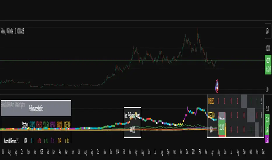
The Adaptive Pairwise Momentum System is not just an indicator but a comprehensive asset rotation and trend-following system. In short, it aims to find the highest performing asset from the provided range.
The system dynamically optimizes capital allocation across up to four high-performing assets, ensuring that the portfolio adapts swiftly to changing market conditions. The system logic consists of sophisticated quantitative methods, rapid momentum analysis, and robust trend filtering. The overarching goal is to ensure that the portfolio is always invested in the highest-performing asset based on dynamic market conditions, while at the same time managing risk through broader market filters and internal mechanisms like volatility and beta analysis.
Legend
System Equity Curve:
The equity curve displayed in the chart is dynamically colored based on the asset allocation at any given time. This color-coded approach allows traders to immediately identify transitions between assets and the corresponding impact on portfolio performance.
Highlighting of Current Highest Performer:
The current bar in the chart is highlighted based on the confirmed highest performing asset. This is designed to give traders advanced notice of potential shifts in allocation even before a formal position change occurs. The highlighting enables traders to prepare in real time, making it easier to manage positions without lag, particularly in fast-moving markets.
Highlighted Symbols in the Asset Table:
In the table displayed on the right hand side of the screen, the current top-performing symbol is highlighted. This clear signal at a glance provides immediate insight into which asset is currently being favored by the system. This feature enhances clarity and helps traders make informed decisions quickly, without needing to analyze the underlying data manually.
Performance Overview in Tables:
The left table provides insight into both daily and overall system performance from inception, offering traders a detailed view of short-term fluctuations and long-term growth. The right-hand table breaks down essential metrics such as Sharpe ratio, Sortino ratio, Omega ratio, and maximum drawdown for each asset, as well as for the overall system and HODL strategy.
Asset-Specific Signals:
The signals column in the table indicates whether an asset is currently held or being considered for holding based on the system's dynamic rankings. This is a critical visual aid for asset reallocation decisions, signaling when it may be appropriate to either maintain or change the asset of the portfolio.
Core Features and Methodologies
Flexibility in Asset Selection
One of the major advantages of this system is its flexibility. Users can easily modify the number and type of assets included for comparison. You can quickly input different assets and backtest their performance, allowing you to verify how well this system might fit different tokens or market conditions. This flexibility empowers users to adapt the system to a wide range of market environments and tailor it to their unique preferences.
Whole System Risk Mitigation - Macro Trend Filter
One of the features of this script is its integration of a Macro-level Trend Filter for the entire portfolio. The purpose of this filter is to ensure no capital is allocated to any token in the rotation system unless Bitcoin itself is in a positive trend. The logic here is that Bitcoin, as the cryptocurrency market leader, often sets the tone for the entire cryptocurrency market. By using Bitcoins trend direction as a barometer for overall market conditions, we create a system where capital is not allocated during unfavorable or bearish market conditions - significantly reducing exposure to downside risk.
Users have the ability to toggle this filter on and off in the input menu, with five customizable options for the trend filter, including the option to use no filter. These options are:
Nova QSM - a trend aggregate combining the Rolling VWAP, Wave Pendulum Trend, KRO Overlay, and the Pulse Profiler provides the market trend signal confirmation.
Kilonova QSM - a versatile aggregate combining the Rolling VWAP, KRO Overlay, the KRO Base, RSI Volatility Bands, NNTRSI, Regression Smoothed RSI and the RoC Suite.
Quasar QSM - an enhanced version of the original RSI Pulsar. The Quasar QSM refines the trend following approach by utilizing an aggregated methodology.
Pairwise Momentum and Strength Ranking
The backbone of this system is its ability to identify the strongest-performing asset in the selected pool, ensuring that the portfolio is always exposed to the asset showing the highest relative momentum. The system continually ranks these assets against each other and determines the highest performer by measure of past and coincident outperformance. This process occurs rapidly, allowing for swift responses to shifts in market momentum, which ensures capital is always working in the most efficient manner. The speed and precision of this reallocation strategy make the script particularly well-suited for active, momentum-driven portfolios.
Beta-Adjusted Asset Selection as a Tiebreaker
In the circumstance where two (or more) assets exhibit the same relative momentum score, the system introduces another layer of analysis. In the event of a strength ‘tie’ the system will preference maintaining the current position - that is, if the previously strongest asset is now tied, the system will still allocate to the same asset. If this is not the case, the asset with the higher beta is selected. Beta is a measure of an asset’s volatility relative to Bitcoin (BTC).
This ensures that in bullish conditions, the system favors assets with a higher potential for outsized gains due to their inherent volatility. Beta is calculated based on the Average Daily Return of each asset compared to BTC. By doing this, the system ensures that it is dynamically adjusting to risk and reward, allocating to assets with higher risk in favorable conditions and lower risk in less favorable conditions.
Dynamic Asset Reallocation - Opposed to Multi-Asset Fixed Intervals
One of the standout features of this system is its ability to dynamically reallocate capital. Unlike traditional portfolio allocation strategies that may rebalance between a basket of assets monthly or quarterly, this system recalculates and reallocates capital on the next bar close (if required). As soon as a new asset exhibits superior performance relative to others, the system immediately adjusts, closing the previous position and reallocating funds to the top-ranked asset.
This approach is particularly powerful in volatile markets like cryptocurrencies, where trends can shift quickly. By reallocating swiftly, the system maximizes exposure to high-performing assets while minimizing time spent in underperforming ones. Moreover, this process is entirely automated, freeing the trader from manually tracking and measuring individual token strength.
Our research has demonstrated that, from a risk-adjusted return perspective, concentration into the top-performing asset consistently outperforms broad diversification across longer time horizons. By focusing capital on the highest-performing asset, the system captures outsized returns that are not achievable through traditional diversification. However, a more risk-averse investor, or one seeking to reduce drawdowns, may prefer to move the portfolio further left along the theoretical Capital Allocation Line by incorporating a blend of cash, treasury bonds, or other yield-generating assets or even include market neutral strategies alongside the rotation system. This hybrid approach would effectively lower the overall volatility of the portfolio while still maintaining exposure to the system’s outsized returns. In theory, such an investor can reduce risk without sacrificing too much potential upside, creating a more balanced risk-return profile.
Position Changes and Fees/Slippage
Another critical and often overlooked element of this system is its ability to account for fees and slippage. Given the increased speed and frequency of allocation logic compared to the buy-and-hold strategy, it is of vital importance that the system recognises that switching between assets may incur slippage, especially in highly volatile markets. To account for this, the system integrates realistic slippage and fee estimates directly into the equity curve, simulating expected execution costs under typical market conditions and gives users a more realistic view of expected performance.
Number of Position Changes
Understanding the number of position changes in a strategy is critical to assessing its feasibility in real world trading. Frequent position changes can lead to increased costs due to slippage and fees. Monitoring the number of position changes provides insight into the system’s behavior - helping to evaluate how active the strategy is and whether it aligns with the trader's desired time input for position management.
Equity Curve and Performance Calculations
To provide a benchmark, the script also generates a Buy-and-Hold (or "HODL") equity curve that represents an equal split across the four selected assets. This allows users to easily compare the performance of the dynamic rotation system with that of a more traditional investment strategy.
The script tracks key performance metrics for both the dynamic portfolio and the HODL strategy, including:
Sharpe Ratio
The Sharpe Ratio is a key metric that evaluates a portfolio’s risk-adjusted return by comparing its ‘excess’ return to its volatility. Traditionally, the Sharpe Ratio measures returns relative to a risk-free rate. However, in our system’s calculation, we omit the risk-free rate and instead measure returns above a benchmark of 0%. This adjustment provides a more universal comparison, especially in the context of highly volatile assets like cryptocurrencies, where a traditional risk-free benchmark, such as the usual 3-month T-bills, is often irrelevant or too distant from the realities of the crypto market.
By using 0% as the baseline, we focus purely on the strategy's ability to generate raw returns in the face of market risk, which makes it easier to compare performance across different strategies or asset classes. In an environment like cryptocurrency, where volatility can be extreme, the importance of relative return against a highly volatile backdrop outweighs comparisons to a risk-free rate that bears little resemblance to the risk profile of digital assets.
Sortino Ratio
The Sortino Ratio improves upon the Sharpe Ratio by specifically targeting downside risk and leaves the upside potential untouched. In contrast to the Sharpe Ratio (which penalizes both upside and downside volatility), the Sortino Ratio focuses only on negative return deviations. This makes it a more suitable metric for evaluating strategies like the Adaptive Pairwise Momentum Strategy - that aim to minimize drawdowns without restricting upside capture. By measuring returns relative to a 0% baseline, the Sortino ratio provides a clearer assessment of how well the system generates gains while avoiding substantial losses in highly volatile markets like crypto.
Omega Ratio
The Omega Ratio is calculated as the ratio of gains to losses across all return thresholds, providing a more complete view of how the system balances upside and downside risk even compared to the Sortino Ratio. While it achieves a similar outcome to the Sortino Ratio by emphasizing the system's ability to capture gains while limiting losses, it is technically a mathematically superior method. However, we include both the Omega and Sortino ratios in our metric table, as the Sortino Ratio remains more widely recognized and commonly understood by traders and investors of all levels.
Case Study
Notes
For the sake of brevity, the Important Notes section found in the header of this text will not be rewritten. Instead, it will be highlighted that now is the perfect time to reread these notes. Reading this case study in the context of what has been mentioned above is of key importance.
As a second note, it is worth mentioning that certain market periods are referred to as either “Bull” or “Bear” markets - terms I personally find to be vague and undefinable - and therefore unfavorable. They will be used nevertheless, due to their familiarity and ease of understanding in this context. Substitute phrases could be “Macro Uptrend” or “Macro Downtrend.”
Overview
This case study provides an in-depth performance analysis of the Adaptive Pairwise Momentum System , a long-only system that dynamically allocates to outperforming assets and moves into cash during unfavorable conditions.
This backtest includes realistic assumptions for slippage and fees, applying a 0.5% cost for every position change, which includes both asset reallocation and moving to a cash position. Additionally, the system was tested using the top four cryptocurrencies by market capitalization as of the test start date of 01/01/2022 in order to minimize selection bias.
The top tokens on this date (excluding Stablecoins) were:
Bitcoin
Ethereum
Solana
BNB
This decision was made in order to avoid cherry picking assets that might have exhibited exceptional historical performance - minimizing skew in the back test. Furthermore, although this backtest focuses on these specific assets, the system is built to be flexible and adaptable, capable of being applied to a wide range of assets beyond those initially tested.
Any potential lookahead bias or repainting in the calculations has been addressed by implementing the lookback modifier for all repainting sensitive data, including asset ratios, asset scoring, and beta values. This ensures that no future information is inadvertently used in the asset allocation process.
Additionally, a fixed lookback period of one bar is used for the trend filter during allocations - meaning that the trend filter from the prior bar must be positive for an allocation to occur on the current bar. It is also important to note that all the data displayed by the indicator is based on the last confirmed (closed) bar, ensuring that the entire system is repaint-proof.
The study spans the 2022 cryptocurrency bear market through the subsequent bull market of 2023 and 2024. The stress test highlights how the system reacted to one of the most challenging market downturns in crypto history - which includes events such as:
Luna and TerraUSD crash
Three Arrows Capital liquidation
Celsius bankruptcy
Voyager Digital bankruptcy
FTX collapse
Silicon Valley + Signature + Silvergate banking collapses
Subsequent USDC deppegging
And arguably more important, 2022 was characterized by a tightening of monetary policy after the unprecedented monetary easing in response to the Covid pandemic of 2020/2021. This shift undeniably puts downward pressure on asset prices, most probably to the extent that this had a causal role to many of the above events.
By incorporating these real-world challenges, the backtest provides a more accurate and robust performance evaluation that avoids overfitting or excessive optimization for one specific market condition.
The Bear Market of 2022: Stress Test and System Resilience
During the 2022 bear market, where the overall crypto market experienced deep and consistent corrections, the Adaptive Pairwise Momentum System demonstrated its ability to mitigate downside risk effectively.
Dynamic Allocation and Cash Exposure:
The system rotated in and out of cash, as indicated by the gray period on the system equity curve. This allocation to cash during downtrending periods, specifically in late 2022, acted as the systems ‘risk-off’ exposure - the purest form of such an exposure. This prevented the system from experiencing the magnitude of drawdown suffered by the ‘Buy-and-Hold (HODL) investors.
In contrast, a passive HODL strategy would have suffered a staggering 75.32% drawdown, as it remained fully allocated to chosen assets during the market's decline. The active Pairwise Momentum system’s smaller drawdown of 54.35% demonstrates its more effective capital preservation mechanisms.
The Bull Market of 2023 and 2024: Capturing Market Upside
Following the crypto bear market, the system effectively capitalized on the recovery and subsequent bull market of 2023 and 2024.
Maximizing Market Gains:
As trends began turning bullish in early 2023, the system caught the momentum and promptly allocated capital to only the quantified highest performing asset of the time - resulting in a parabolic rise in the system's equity curve. Notably, the curve transitions from gray to purple during this period, indicating that Solana (SOL) was the top-performing asset selected by the system.
This allocation to Solana is particularly striking because, at the time, it was an asset many in the market shunned due to its association with the FTX collapse just months prior. However, this highlights a key advantage of quantitative systems like the one presented here: decisions are driven purely from objective data - free from emotional or subjective biases. Unlike human traders, who are inclined (whether consciously or subconsciously) to avoid assets that are ‘out of favor,’ this system focuses purely on price performance, often uncovering opportunities that are overlooked by discretionary based investors. This ability to make data-driven decisions ensures that the strategy is always positioned to capture the best risk-adjusted returns, even in scenarios where judgment might fail.
Minimizing Volatility and Drawdown in Uptrends
While the system captured substantial returns during the bull market it also did so with lower volatility compared to HODL. The sharpe ratio of 4.05 (versus HODL’s 3.31) reflects the system's superior risk-adjusted performance. The allocation shifts, combined with tactical periods of cash holding during minor corrections, ensured a smoother equity curve growth compared to the buy-and-hold approach.
Final Summary
The percentage returns are mentioned last for a reason - it is important to emphasize that risk-adjusted performance is paramount. In this backtest, the Pairwise Momentum system consistently outperforms due to its ability to dynamically manage risk (as seen in the superior Sharpe, Sortino and Omega ratios). With a smaller drawdown of 54.35% compared to HODL’s 75.32%, the system demonstrates its resilience during market downturns, while also capturing the highest beta on the upside during bullish phases.
The system delivered 266.26% return since the backtest start date of January 1st 2022, compared to HODL’s 10.24%, resulting in a performance delta of 256.02%
While this backtest goes some of the way to verifying the system’s feasibility, it’s important to note that past performance is not indicative of future results - especially in volatile and evolving markets like cryptocurrencies. Market behavior can shift, and in particular, if the market experiences prolonged sideways action, trend following systems such as the Adaptive Pairwise Momentum Strategy WILL face significant challenges.

Enhanced Volume Trend Indicator with BB SqueezeEnhanced Volume Trend Indicator with BB Squeeze: Comprehensive Explanation
The visualization system allows traders to quickly scan multiple securities to identify high-probability setups without detailed analysis of each chart. The progression from squeeze to breakout, supported by volume trend confirmation, offers a systematic approach to identifying trading opportunities.
The script combines multiple technical analysis approaches into a comprehensive dashboard that helps traders make informed decisions by identifying high-probability setups while filtering out noise through its sophisticated confirmation requirements. It combines multiple technical analysis approaches into an integrated visual system that helps traders identify potential trading opportunities while filtering out false signals.
Core Features
1. Volume Analysis Dashboard
The indicator displays various volume-related metrics in customizable tables:
AVOL (After Hours + Pre-Market Volume): Shows extended hours volume as a percentage of the 21-day average volume with color coding for buying/selling pressure. Green indicates buying pressure and red indicates selling pressure.
Volume Metrics: Includes regular volume (VOL), dollar volume ($VOL), relative volume compared to 21-day average (RVOL), and relative volume compared to 90-day average (RVOL90D).
Pre-Market Data: Optional display of pre-market volume (PVOL), pre-market dollar volume (P$VOL), pre-market relative volume (PRVOL), and pre-market price change percentage (PCHG%).
2. Enhanced Volume Trend (VTR) Analysis
The Volume Trend indicator uses adaptive analysis to evaluate buying and selling pressure, combining multiple factors:
MACD (Moving Average Convergence Divergence) components
Volume-to-SMA (Simple Moving Average) ratio
Price direction and market conditions
Volume change rates and momentum
EMA (Exponential Moving Average) alignment and crossovers
Volatility filtering
VTR Visual Indicators
The VTR score ranges from 0-100, with values above 50 indicating bullish conditions and below 50 indicating bearish conditions. This is visually represented by colored circles:
"●" (Filled Circle):
Green: Strong bullish trend (VTR ≥ 80)
Red: Strong bearish trend (VTR ≤ 20)
"◯" (Hollow Circle):
Green: Moderate bullish trend (VTR 65-79)
Red: Moderate bearish trend (VTR 21-35)
"·" (Small Dot):
Green: Weak bullish trend (VTR 55-64)
Red: Weak bearish trend (VTR 36-45)
"○" (Medium Hollow Circle): Neutral conditions (VTR 46-54), shown in gray
In "Both" display mode, the VTR shows both the numerical score (0-100) alongside the appropriate circle symbol.
Enhanced VTR Settings
The Enhanced Volume Trend component offers several advanced customization options:
Adaptive Volume Analysis (volTrendAdaptive):
When enabled, dynamically adjusts volume thresholds based on recent market volatility
Higher volatility periods require proportionally higher volume to generate significant signals
Helps prevent false signals during highly volatile markets
Keep enabled for most trading conditions, especially in volatile markets
Speed of Change Weight (volTrendSpeedWeight, range 0-1):
Controls emphasis on volume acceleration/deceleration rather than absolute levels
Higher values (0.7-1.0): More responsive to new volume trends, better for momentum trading
Lower values (0.2-0.5): Less responsive, better for trend following
Helps identify early volume trends before they fully develop
Momentum Period (volTrendMomentumPeriod, range 2-10):
Defines lookback period for volume change rate calculations
Lower values (2-3): More responsive to recent changes, better for short timeframes
Higher values (7-10): Smoother, better for daily/weekly charts
Directly affects how quickly the indicator responds to new volume patterns
Volatility Filter (volTrendVolatilityFilter):
Adjusts significance of volume by factoring in current price volatility
High volume during high volatility receives less weight
High volume during low volatility receives more weight
Helps distinguish between genuine volume-driven moves and volatility-driven moves
EMA Alignment Weight (volTrendEmaWeight, range 0-1):
Controls importance of EMA alignments in final VTR calculation
Analyzes multiple EMA relationships (5, 10, 21 period)
Higher values (0.7-1.0): Greater emphasis on trend structure
Lower values (0.2-0.5): More focus on pure volume patterns
Display Mode (volTrendDisplayMode):
"Value": Shows only numerical score (0-100)
"Strength": Shows only symbolic representation
"Both": Shows numerical score and symbol together
3. Bollinger Band Squeeze Detection (SQZ)
The BB Squeeze indicator identifies periods of low volatility when Bollinger Bands contract inside Keltner Channels, often preceding significant price movements.
SQZ Visual Indicators
"●" (Filled Circle): Strong squeeze - high probability setup for an impending breakout
Green: Strong squeeze with bullish bias (likely upward breakout)
Red: Strong squeeze with bearish bias (likely downward breakout)
Orange: Strong squeeze with unclear direction
"◯" (Hollow Circle): Moderate squeeze - medium probability setup
Green: With bullish EMA alignment
Red: With bearish EMA alignment
Orange: Without clear directional bias
"-" (Dash): Gray dash indicates no squeeze condition (normal volatility)
The script identifies squeeze conditions through multiple methods:
Bollinger Bands contracting inside Keltner Channels
BB width falling to bottom 20% of recent range (BB width percentile)
Very narrow Keltner Channel (less than 5% of basis price)
Tracking squeeze duration in consecutive bars
Different squeeze strengths are detected:
Strong Squeeze: BB inside KC with tight BB width and narrow KC
Moderate Squeeze: BB inside KC with either tight BB width or narrow KC
No Squeeze: Normal market conditions
4. Breakout Detection System
The script includes two breakout indicators working in sequence:
4.1 Pre-Breakout (PBK) Indicator
Detects potential upcoming breakouts by analyzing multiple factors:
Squeeze conditions lasting 2-3 bars or more
Significant price ranges
Strong volume confirmation
EMA/MACD crossovers
Consistent price direction
PBK Visual Indicators
"●" (Filled Circle): Detected pre-breakout condition
Green: Likely upward breakout (bullish)
Red: Likely downward breakout (bearish)
Orange: Direction not yet clear, but breakout likely
"-" (Dash): Gray dash indicates no pre-breakout condition
The PBK uses sophisticated conditions to reduce false signals including minimum squeeze length, significant price movement, and technical confirmations.
4.2 Breakout (BK) Indicator
Confirms actual breakouts in progress by identifying:
End of squeeze or strong expansion of Bollinger Bands
Volume expansion
Price moving outside Bollinger Bands
EMA crossovers with volume confirmation
MACD crossovers with significant price range
BK Visual Indicators
"●" (Filled Circle): Confirmed breakout in progress
Green: Upward breakout (bullish)
Red: Downward breakout (bearish)
Orange: Unusual breakout pattern without clear direction
"◆" (Diamond): Special breakout conditions (meets some but not all criteria)
"-" (Dash): Gray dash indicates no breakout detected
The BK indicator uses advanced filters for confirmation:
Requires consecutive breakout signals to reduce false positives
Strong volume confirmation requirements (40% above average)
Significant price movement thresholds
Consistency checks between price action and indicators
5. Market Metrics and Analysis
Price Change Percentage (CHG%)
Displays the current percentage change relative to the previous day's close, color-coded green for positive changes and red for negative changes.
Average Daily Range (ADR%)
Calculates the average daily percentage range over a specified period (default 20 days), helping traders gauge volatility and set appropriate price targets.
Average True Range (ATR)
Shows the Average True Range value, a volatility indicator developed by J. Welles Wilder that measures market volatility by decomposing the entire range of an asset price for that period.
Relative Strength Index (RSI)
Displays the standard 14-period RSI, a momentum oscillator that measures the speed and change of price movements on a scale from 0 to 100.
6. External Market Indicators
QQQ Change
Shows the percentage change in the Invesco QQQ Trust (tracking the Nasdaq-100 Index), useful for understanding broader tech market trends.
UVIX Change
Displays the percentage change in UVIX, a volatility index, providing insight into market fear and potential hedging activity.
BTC-USD
Shows the current Bitcoin price from Coinbase, useful for traders monitoring crypto correlation with equities.
Market Breadth (BRD)
Calculates the percentage difference between ATHI.US and ATLO.US (high vs. low securities), indicating overall market direction and strength.
7. Session Analysis and Volume Direction
Session Detection
The script accurately identifies different market sessions:
Pre-market: 4:00 AM to 9:30 AM
Regular market: 9:30 AM to 4:00 PM
After-hours: 4:00 PM to 8:00 PM
Closed: Outside trading hours
This detection works on any timeframe through careful calculation of current time in seconds.
Buy/Sell Volume Direction
The script analyzes buying and selling pressure by:
Counting up volume when close > open
Counting down volume when close < open
Tracking accumulated volume within the day
Calculating intraday pressure (up volume minus down volume)
Enhanced AVOL Calculation
The improved AVOL calculation works in all timeframes by:
Estimating typical pre-market and after-hours volume percentages
Combining yesterday's after-hours with today's pre-market volume
Calculating this as a percentage of the 21-day average volume
Determining buying/selling pressure by analyzing after-hours and pre-market price changes
Color-coding results: green for buying pressure, red for selling pressure
This calculation is particularly valuable because it works consistently across any timeframe.
Customization Options
Display Settings
The dashboard has two customizable tables: Volume Table and Metrics Table, with positions selectable as bottom_left or bottom_right.
All metrics can be individually toggled on/off:
Pre-market data (PVOL, P$VOL, PRVOL, PCHG%)
Volume data (AVOL, RVOL Day, RVOL 90D, Volume, SEED_YASHALGO_NSE_BREADTH:VOLUME )
Price metrics (ADR%, ATR, RSI, Price Change%)
Market indicators (QQQ, UVIX, Breadth, BTC-USD)
Analysis indicators (Volume Trend, BB Squeeze, Pre-Breakout, Breakout)
These toggle options allow traders to customize the dashboard to show only the metrics they find most valuable for their trading style.
Table and Text Customization
The dashboard's appearance can be customized:
Table background color via tableBgColor
Text color (White or Black) via textColorOption
The indicator uses smart formatting for volume and price values, automatically adding appropriate suffixes (K, M, B) for readability.
MACD Configuration for VTR
The Volume Trend calculation incorporates MACD with customizable parameters:
Fast Length: Controls the period for the fast EMA (default 3)
Slow Length: Controls the period for the slow EMA (default 9)
Signal Length: Controls the period for the signal line EMA (default 5)
MACD Weight: Controls how much influence MACD has on the volume trend score (default 0.3)
These settings allow traders to fine-tune how momentum is factored into the volume trend analysis.
Bollinger Bands and Keltner Channel Settings
The Bollinger Bands and Keltner Channels used for squeeze detection have preset (hidden) parameters:
BB Length: 20 periods
BB Multiplier: 2.0 standard deviations
Keltner Length: 20 periods
Keltner Multiplier: 1.5 ATR
These settings follow standard practice for squeeze detection while maintaining simplicity in the user interface.
Practical Trading Applications
Complete Trading Strategies
1. Squeeze Breakout Strategy
This strategy combines multiple components of the indicator:
Wait for a strong squeeze (SQZ showing ●)
Look for pre-breakout confirmation (PBK showing ● in green or red)
Enter when breakout is confirmed (BK showing ● in same direction)
Use VTR to confirm volume supports the move (VTR ≥ 65 for bullish or ≤ 35 for bearish)
Set profit targets based on ADR (Average Daily Range)
Exit when VTR begins to weaken or changes direction
2. Volume Divergence Strategy
This strategy focuses on the volume trend relative to price:
Identify when price makes a new high but VTR fails to confirm (divergence)
Look for VTR to show weakening trend (● changing to ◯ or ·)
Prepare for potential reversal when SQZ begins to form
Enter counter-trend position when PBK confirms reversal direction
Use external indicators (QQQ, BTC, Breadth) to confirm broader market support
3. Pre-Market Edge Strategy
This strategy leverages pre-market data:
Monitor AVOL for unusual pre-market activity (significantly above 100%)
Check pre-market price change direction (PCHG%)
Enter position at market open if VTR confirms direction
Use SQZ to determine if volatility is likely to expand
Exit based on RVOL declining or price reaching +/- ADR for the day
Market Context Integration
The indicator provides valuable context for trading decisions:
QQQ change shows tech market direction
BTC price shows crypto market correlation
UVIX change indicates volatility expectations
Breadth measurement shows market internals
This context helps traders avoid fighting the broader market and align trades with overall market direction.
Timeframe Optimization
The indicator is designed to work across different timeframes:
For day trading: Focus on AVOL, VTR, PBK/BK, and use shorter momentum periods
For swing trading: Focus on SQZ duration, VTR strength, and broader market indicators
For position trading: Focus on larger VTR trends and use EMA alignment weight
Advanced Analytical Components
Enhanced Volume Trend Score Calculation
The VTR score calculation is sophisticated, with the base score starting at 50 and adjusting for:
Price direction (up/down)
Volume relative to average (high/normal/low)
Volume acceleration/deceleration
Market conditions (bull/bear)
Additional factors are then applied, including:
MACD influence weighted by strength and direction
Volume change rate influence (speed)
Price/volume divergence effects
EMA alignment scores
Volatility adjustments
Breakout strength factors
Price action confirmations
The final score is clamped between 0-100, with values above 50 indicating bullish conditions and below 50 indicating bearish conditions.
Anti-False Signal Filters
The indicator employs multiple techniques to reduce false signals:
Requiring significant price range (minimum percentage movement)
Demanding strong volume confirmation (significantly above average)
Checking for consistent direction across multiple indicators
Requiring prior bar consistency (consecutive bars moving in same direction)
Counting consecutive signals to filter out noise
These filters help eliminate noise and focus on high-probability setups.
MACD Enhancement and Integration
The indicator enhances standard MACD analysis:
Calculating MACD relative strength compared to recent history
Normalizing MACD slope relative to volatility
Detecting MACD acceleration for stronger signals
Integrating MACD crossovers with other confirmation factors
EMA Analysis System
The indicator uses a comprehensive EMA analysis system:
Calculating multiple EMAs (5, 10, 21 periods)
Detecting golden cross (10 EMA crosses above 21 EMA)
Detecting death cross (10 EMA crosses below 21 EMA)
Assessing price position relative to EMAs
Measuring EMA separation percentage
Recent Enhancements and Evolution
Version 5.2 includes several improvements:
Enhanced AVOL to show buying/selling direction through color coding
Improved VTR with adaptive analysis based on market conditions
AVOL display now works in all timeframes through sophisticated estimation
Removed animal symbols and streamlined code with bright colors for better visibility
Improved anti-false signal filters throughout the system
Optimizing Indicator Settings
For Different Market Types
Range-Bound Markets:
Lower EMA Alignment Weight (0.2-0.4)
Higher Speed of Change Weight (0.8-1.0)
Focus on SQZ and PBK signals for breakout potential
Trending Markets:
Higher EMA Alignment Weight (0.7-1.0)
Moderate Speed of Change Weight (0.4-0.6)
Focus on VTR strength and BK confirmations
Volatile Markets:
Enable Volatility Filter
Enable Adaptive Volume Analysis
Lower Momentum Period (2-3)
Focus on strong volume confirmation (VTR ≥ 80 or ≤ 20)
For Different Asset Classes
Equities:
Standard settings work well
Pay attention to AVOL for gap potential
Monitor QQQ correlation
Futures:
Consider higher Volume/RVOL weight
Reduce MACD weight slightly
Pay close attention to SQZ duration
Crypto:
Higher volatility thresholds may be needed
Monitor BTC price for correlation
Focus on stronger confirmation signals
Integrated Visual System for Trading Decisions
The colored circle indicators create an intuitive visual system for quick market assessment:
Progression Sequence: SQZ (Squeeze) → PBK (Pre-Breakout) → BK (Breakout)
This sequence often occurs in order, with the squeeze leading to pre-breakout conditions, followed by an actual breakout.
VTR (Volume Trend): Provides context about the volume supporting these movements.
Color Coding: Green for bullish conditions, red for bearish conditions, and orange/gray for neutral or undefined conditions.

YinYang RSIYinYang RSI is a Momentum Oscillator. It is loosely based on the standard RSI but uses our Custom True Value Zone Algorithm. Essentially it is a stronger, more accurate RSI that isn't manipulated by consolidation. YinYang RSI moves slightly slower than the standard RSI but when it does move it is much more accurate.
Why do we deem YinYang RSI to be a more accurate RSI? Well, let's discuss some of the underlying logic behind it. YinYang RSI is derived from the High and Low data from multiple Security Requests, we send that data into a modified Donchian Channel to calculate its Basis. That basis is then taken and averaged between multiple different VWMA calculations to ‘Smooth’ it out before we send it into an RSI calculation and display the final results.
This may sound a little confusing and you may be wondering, why bother doing this? The main reason we created the YinYang RSI is to remove the fact that consolidation causes Regular RSI to go down in index value. In our opinion RSI shouldn’t go down due to consolidation. By removing consolidation from RSI it innately made the RSI more smooth and since it became more smooth there were less times it crossed the RSI Moving Average (MA). In turn, since it crosses the RSI MA less, it means when it does cross the RSI MA, it is a much stronger more accurate signal; but don’t just take our word for it! Let’s get into some examples to show you exactly how it works:
Our RSI is very smooth, because of the way we apply VWMA to it, it keeps it from being a jagged line like the regular RSI is:
Our Indicator features 3 RSI’s in it: YinYangRSI, Regular RSI and YinYang Stoch RSI. The reason there are 3 is not only for the Information Tables (we will talk about this later), but also for the fact that you can overlay them on top of each other.
Here is the same dates but with Regular RSI:
Hopefully you can see how different they are and how smooth ours is, but if not, lets overlay them so you get a better idea:
When the YinYang RSI and Regular RSI are overlaid on top of each other, the Regular RSI’s colors change for easier readability. The Regular RSI turns Pink and the Regular RSI MA turns Orange. As you can see here, they function much differently and it is quite clear that the YinYang RSI holds itself during consolidation and is more smooth.
You may be asking yourself, this is great and all, but how does it help me trade?
Well, now that you understand the difference between YinYang and Regular RSI let's discuss exactly that!
So as you can see in the image above, when the RSI crosses the RSI MA it represents a strong movement in price is likely about to occur. When the RSI is very low (20 or less) and it crosses ABOVE the RSI MA, this represents a BUY/LONG signal. When the RSI is very high (80 or above) and it crosses BELOW the RSI MA, this represents a SELL/SHORT signal.
There are times where it is a good time to buy or sell, but the RSI may not be in the right place. This is rare but it does happen. We marked a location that did exactly that with an Orange circle in the picture above. These things happen, however we don’t recommend you act on them. The main reason is that they are much more risky. Nothing will ever be 100% accurate, but the key is making decisions that are more in your favor than not. When the RSI and RSI MA cross and the RSI is near 50, it's much less accurate, however, not impossible for it to be a good signal.
Now you may be wondering, how come I see 2 SELL or 2 BUY signals before the RSI moves a lot? This is quite normal. Based on the picture above, all of the BUY and SELL signals are accurate, but not all of them have insane price movements. However, they all did feature SOME price movements. Just because a BUY or SELL (RSI and RSI MA crossing) happens, doesn’t mean the RSI is going to move all the way from 80 to 20, sometimes the price only moves a bit and then corrects back. This is completely normal.
The part that is up to you is knowing when to exit these trades. You can use the YinYang RSI to see entry locations for Long/Short, but it can be risky to assume that you can go from a BUY right to a SELL and vice versa.
Don’t fret, there is a reason we have our YinYang Stoch RSI within this indicator and its not just because we felt like it! When you overlay the YinYang RSI and YinYang Stoch RSI on top of each other, you can get a very good idea of when a signal may be over and likely it’s a good time to get out. However, first, just so you understand what our YinYang Stoch RSI does, let's take a quick look at it.
At first glance, the YinYang Stoch RSI can look pretty strange and even overwhelming, this is completely normal. It features drastic movements, but only when there is good reason to! When the blue line (K) crosses the orange line (D) it represents momentum in price. So when the blue line crosses above the orange line it means BUY and when the blue line crosses below the orange line it means SELL.
How it works with the YinYang RSI is simple, lets toggle the two of them on together in the settings:
It may look a little confusing at first, and we don’t necessarily recommend you do it for your entry as it can be a little too much and sometimes confusing, but it can be very helpful for understanding your exit and if the momentum has changed/died down. Here's an example based on our initial BUY/SELL image above:
So since we’re talking about the double SELL signal and how to know if its momentum is ending we’ve zoomed in on this example. Here we can see where the pink circle is, that the YinYang Stoch RSI has gained buy momentum and the sell momentum has likely ended here. This is canceled out however, by the fact that shortly after we see another SELL signal combined with the Stoch RSI crossing under and also showing SELL momentum. The blue Vertical lines are to show visually where the stoch crossed over/under as they can be a little hard to see visually. Also, based on this example, you can see where the orange circle is that was clearly a very good buy location and also has the stoch crossover in that location too. So even though the RSI isn’t very low, there is still a decent amount of bullish momentum in that location. Is this enough for you to make a purchase on? In our opinion, it’s still a little too risky, but maybe it fits your trading style, or maybe you decide its a good time to Dollar Cost Average / purchase just a small amount.
Now, you may be wondering, as we mentioned it early, what are those Information Tables that have been sitting on the right of every example?
These Information Tables are there to display very important Time Frame data for you. Not only can you see 6 Different Time Frames, which you can customize within your Settings. You also get to see the level of RSI and RSI MA for YinYang, Regular and YinYang Stoch RSI. Being able to see this data on multiple different Time Frames without having to change the Time Frame you are on can be very helpful, especially if you’re trading on a lower Time Frame like 15 minutes. The color of the box is based on if the RSI has crossed the MA or not. When the box is Green, the RSI is greater than the MA (Bullish). When the box is Red, the RSI is less than the MA (Bearish).
This concludes our Tutorial on how to use YinYang RSI, below you will see all of our current Settings, what they all mean and how you can customize them.
Settings:
1. Show Signals:
Signals are when the RSI crosses the RSI MA (for any RSI TYPE active). When these crosses happen, it will make a plot on the chart that represents Buy and Sell Signals. These signals have alerts that correspond with them, but you will manually need to set up these alerts yourself through the indicator. Please refer to TradingView for how to set up alerts.
2. RSI Type:
We have 3 types of RSI’s within this Indicator:
YinYang RSI
Regular RSI
YinYang Stoch RSI
These RSI’s can be used individually or overlaid on top of each other for easier comparison. It can be useful to go back and forth between indicators or have them overlaid to get a better understanding of what's going on.
2.1. YinYang RSI:
Our YinYang RSI is our custom RSI that is based on our True Value Zone Algorithm. It is the main purpose of this Indicator but can be used in conjunction with Regular RSI and YinYang Stoch RSI. YinYang RSI is a much more smooth, slow moving form of RSI that doesn’t go down from consolidation and therefore makes the RSI and RSI MA crosses much more accurate.
2.2. Regular RSI:
This is a regular RSI that is within our indicator so you can make comparisons and also overlay on top of our YinYang RSI and/or YinYang Stoch.
2.3. YinYang Stoch RSI:
This is a Stoch RSI that is calculated with our YinYang RSI’s values to create a very unique Stoch RSI. Our YinYang Stoch RSI moves very drastically and quickly when there is true momentum swings but it never really hovers in the middle. It makes its way from 0-100 and 100-0 within 2-3 candles usually and if it makes it all the way, you know there is momentum backing this price movement.
3. Information Tables:
3.1. Show Information Tables:
Our Information tables display 6 different Time Frame resolutions to give you the data of YinYang RSI/MA, Regular RSI/MA and Stoch RSI/MA over multiple different Time Frames so you don’t constantly have to keep changing yours and can focus on the trade at hand.
You can choose to display:
‘All’,
‘None’,
‘YinYang RSI’,
‘Regular RSI’,
‘YinYang Stoch RSI’
and/or any combination of the three so you can see all the data you want to your liking.
3.2. Display Tables Direction:
Since there are 6 different Time Frames shown, and you have the ability to display all 3 RSI and MA values, this table can get pretty big. If you have a large monitor and not too many indicators active it's no big deal and a vertical display is likely what you’ll want. However, if you have a smaller monitor or many Indicators active, it will scrunch this Indicator and make it difficult to see all of your Time Frames in the tables. For this reason, we have the option to display them ‘Horizontally’.
3.3. Res1 / Res2/ Res3 / Res4 / Res5 / Res6:
These represent the different resolutions (Time Frames) being used in your information tables and can be modified to display whatever resolution works best for your trading style. By default they are:
Res1: Current Timeframe
Res2: 15 Minute
Res3: 1 Hour
Res4: 4 Hour
Res5: 1 Day
Res6: 1 Week
Backup Res (not changeable): 5 Minute (this is only used if your Current Timeframe in Res1 is a duplicate of one of the other resolutions)
Alerts are available and customizable within the Indicator. You can set up an alert for any of the RSI crossing Signals.
If you have any Questions or Concerns, don’t hesitate to contact us.
HAPPY TRADING!

Financial Data Spreadsheet [By MUQWISHI]The Financial Data Spreadsheet indicator displays tables in the form of a spreadsheet containing a set of selected financial performances of a company within the most recent reported period. Analyzing Financial data is one of the classic methods to evaluate whether the company’s stock price is overvalued or undervalued based on its income statement, balance sheet, and cash flow statement. This indicator might be practical to investors to collect needed data of a company to analyze and compare it with other companies on a TradingView chart or print it in spreadsheet form.
█ OVERVIEW
█ BEST PRACTICES
Due to strict limitations on calling request.financial() function, I tried to develop the table with the best ways to be more dynamic to move and the ability to join multiple tables into a spreadsheet. Users can add up to 20 instruments and 2 financial metrics per table. However, it’s possible to add many tables with other financial metrics, then connect them to the main table.
Credits: The idea of joining multiple tables inspired by @QuantNomad Screener for 40+ instruments
█ INDICATOR SETTINGS
1- Moving Table toward right-left up-down from its origin.
2- Hiding Column Title checkmark. Useful for adding a joined table underneath with additional instruments.
3- Hiding Instruments Title checkmark. Useful for adding a joined table on the right with other financial metrics.
4- Shade Alternate Rows checkmark. I believe it’ll make the table easier to read.
5- Selecting Financial Period. (Year, Quarter).
6- Entering a currency.
7- Choosing a financial ID for each column. There’re over 200 financial IDs. Source: What financial data is available in Pine? — TradingView
8- Optional to highlight values in between.
9- Entering the ticker’s symbol with the ability to activate/deactivate.
█ TIP
For best technical performance, use the indicator in a 1D timeframe.
Please let me know if you have any questions.
Thank you.
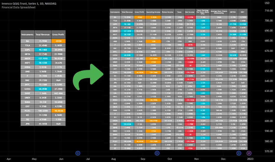
ACE FVG & IFVG Trading System1. What the Script Does
The "ACE FVG & IFVG Trading System " is a TradingView Pine Script (version 5) that identifies and trades Fair Value Gaps (FVGs) and Inverse Fair Value Gaps (IFVGs). It offers:
Detection of bullish/bearish FVGs and IFVGs with customizable parameters.
Multiple entry types: regular FVG retracement, Break of Structure (BOS), breakaway gaps, and Immediate/Retrace IFVG entries.
A pending setup system showing potential trades before they trigger.
Risk management with configurable stop loss (SL) and take profit (TP) based on FVG levels, swing points, or risk-reward ratios.
Market structure analysis using swing highs/lows, BOS, and Market Structure Shifts (MSS).
Time filters to restrict trading to specific sessions.
Visualizations including FVG boxes, trade boxes, pivot lines, and labels.
Entry and performance tables displaying trade details and metrics like win rates and P&L by entry type.
2. How It Works
The script is organized into modular sections for efficient execution:
Inputs: Extensive customization options (e.g., FVG size, entry types, SL/TP modes, time filters) grouped for clarity.
Data Structures: Custom types (FVGData, SwingPoint, EntryData) store FVG, pivot, and trade data in arrays.
Utility Functions: Handle calculations like risk-reward ratios, time validation, and trade size filtering.
Swing Point Detection: Uses ta.pivothigh/ta.pivotlow to identify pivots, supporting BOS/MSS and SL/TP calculations.
FVG Detection: Identifies regular FVGs (low > high or high < low ) and IFVGs (mitigated FVGs with immediate or retrace signals).
Entry Logic: Triggers trades based on user-enabled conditions (e.g., retracement, BOS, breakaway gaps) with dynamic SL/TP.
Trade Management: Tracks active/pending trades, updates visualizations (boxes, lines, labels), and handles cancellations/invalidations.
Main Logic: Executes on each bar to detect FVGs, process entries, update trades, and manage visualizations.
Tables: Displays recent trades and performance stats (e.g., win rates by entry type) on the last bar.
Pivot Visualization: Plots swing points with dynamic extensions and mitigation status (solid/dotted lines).
3. How to Use It
Add to TradingView:
Open Pine Editor, paste the script, save it, and add to chart.
Configure Inputs:
Access settings via chart (right-click indicator > Settings).
Adjust:
fvgMinSize for market volatility (e.g., 5 for forex).
Entry types (e.g., enable IFVG, disable breakaway gaps).
SL/TP modes and minimum R:R (e.g., 2.0 for 1:2).
Time filters for active sessions (e.g., 09:30-16:00).
Visual settings (box transparency, table positions).
Interpret Output:
FVG Boxes: Green (bullish), red (bearish), purple (IFVG/mitigated).
Trade Boxes: Gray-green/red-gray (pending), green/red (active), updated for win/loss.
Pivot Lines: Solid (unmitigated), dotted (mitigated).
Tables: Entry table shows trade details; performance table shows win rates/P&L.
Trading:
Monitor pending setups for entry signals.
Enter manually at active trade levels, following SL/TP.
Use performance stats to refine settings.
Test on demo charts and adjust for market/timeframe.
Best Practices:
Use higher timeframes (e.g., 1H, 4H) for less noise.
Combine with other analysis (e.g., support/resistance).
Backtest using TradingView’s replay feature.
Originality
The script is original due to its unique combination of features:
Enhanced IFVG Strategy: Dual Immediate/Retrace IFVG modes with a novel “Immediate Then Retrace” preference.
Pending Setup System: Proactive visualization of potential trades with auto-cancellation.
Granular Performance Tracking: Detailed breakdown of win rates/P&L by entry type (regular FVG, IFVG, breakaway).
Dynamic Pivot Visualization: Real-time mitigation updates (solid to dotted lines).
Modular Design: Custom types and organized logic for extensibility. It builds on general FVG concepts (e.g., from ICT) but implements unique logic and features not found in standard
TradingView FVG scripts, distinguishing it from both open-source and premium indicators.
Credit of Concepts to ICT
Collaborations with JMAC and Timeless

MMTools - Screener❖ Overview
Screener expands your market insights and provides an efficient way to monitor real-time signals from Catcher across hundreds of charts on a single screen.
Each cell in the table displays the number of indicator signals. For instance, a value of "1" in the row labeled ‘BTCUSDT.P’ and column ‘30’ indicates one long signal on the 30-minute Bitcoin chart within the selected lookback period. “0” means no signal in the lookback.
❖ Multi-Table Construction
Screener supports flexible layouts and overlays. To build a multi-table interface, simply add multiple instances of the script to your chart. For optimal usability, it is recommended to allocate a dedicated panel or tab.
⚙️ Key Parameters to Customize Initially
Indicator Lookback: Defines how far back Screener checks for signals.
Symbols: Choose up to 20 symbols. Use additional tables to expand coverage.
Size: Adjusts the overall dimensions of the table.
Display Settings: Customize colors, opacity, and symbol visibility. For dark theme charts, set color opacity to 100% and transparency to 0%.
⚙️ Per-Table Adjustable Parameters
Timeframe: This defines the interval for signal collection across all symbols displayed in the top row of the table. It must be equal to or greater than the chart’s timeframe, otherwise the script will deliberately trigger an error. For multiple tables, use a lower chart timeframe (e.g., 1 minute) to meet this requirement.
Table Positioning: Use either the “Position” (predefined screen locations) or “Block” (stacked layout) parameters. The “Block” method enables a greater number of tables by aligning them side-by-side efficiently.
-- Multi-table example demonstrating the use of the ’Position’ parameter --
-- Multi-table example demonstrating the use of the ’Block’ parameter --
❖ Access
Please refer to the Author's Instructions field to request access to the script.
-----------------------------------------------------------
Disclaimer
The information provided by my scripts is for informational purposes only and does not constitute financial advice. Past performance is not indicative of future results. Always do your own research before making financial decisions.
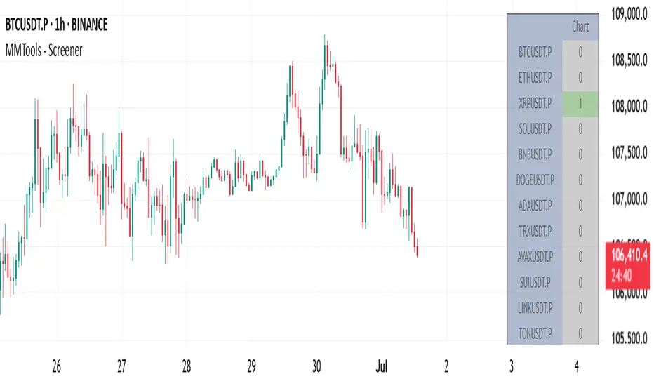
Portfolio Monitor - DolphinTradeBot1️⃣ Overview
▪️This indicator unifies the value of all your investments—whether stocks, currencies, or cryptocurrencies—in your chosen currency. This tool not only provides a clear snapshot of your overall portfolio performance but also highlights the individual growth of each asset with intuitive visualizations and an easy-to-understand performance report.
2️⃣ What sets this indicator apart
▪️is its ability to convert values from various currency pairs into any currency you choose. This means you can monitor your portfolio's performance against any currency pair you prefer, offering a flexible and comprehensive view of your investments.
3️⃣ How Is It Work ?
🔍The indicator can be analyzed under two main categories: visual representations and tables.
1- Visual representations ;
The indicator includes three different types of lines:
1. 1 - Reference Line → This represents the cost of all assets we hold, based on the selected date.
1. 2 - Total Assets Line → Displays the real-time value of all assets in our possession, including cash value, in the selected trading pair.
The area between the reference line is filled with green and red. The section above the reference line is represented in green, while the section below is shown in red.
1. 3 - Performance Lines → These visualize the performance of the assets, starting from the reference line and taking into account their weights in the portfolio. (Note: The lines are scaled for visualization purposes, so their absolute values should not be considered.)
"The names of the lines are shown in the image below."⤵️
2- Tables
The indicator includes three different types of tables:
2. 1 - Analysis Table : It provides a superficial overview of wallet statistics and values.
▪️TOTAL ASSETS → The current equivalent of all assets in the target currency
▪️CASH VALUE → The current value of the amount "Cash Value", in the target currency.
▪️PORTFOLIO VALUE → The total value of assets excluding Cash, in the target currency.
▪️POSTFOLIO COST → The cost of assets excluding Cash, in the target currency.
▪️PORTFOLIO ABSOLUTE RETURN → It shows the profit or loss relative to the cost of assets
▪️PORTFOLIO RETURN % →It shows the profit or loss relative to the cost of assets on a percentage basis
2. 2 - Performance Table : It displays the names of assets excluding Cash and their profit amounts, sorted from highest to lowest profit. If "Show as Percentage" is selected in the settings, it shows the percentage profit or loss relative to the cost. Profits are represented in green, while losses are represented in red.
"You can see the visual showing the tables below"⤵️
4️⃣How to Use ?
1- Choose the date on which the visualization will begin (📌The start date only affects the exchange rate used for calculating the reference line in the target currency.)
2- If you have cash holdings, enter the amount and specify the currency.
3- Select the currency in which your portfolio value will be displayed.(Default value is USD)
4- To set up your portfolio;
SYMBOLS - QUANTITY - PURCHASE PRICE
Enter the symbols of your assets - the number of units you hold - and their cost levels.
5- If you have cash, be sure to include your cash balance. If you also hold other currencies, enter them as separate assets with their corresponding quantities and purchase prices.
6- If you want to see the percentage returns of the assets in the performance table relative to their cost, select the "Show as Percent" option.
7- If you want to see the performance visuals of the assets, click on the "Show Asset Performance" option.
You can find an image of the settings section where the numbers above are used as references below.⤵️
📌 NOTE → By default, a few assets and their values have been pre-added in the initial settings. This is to ensure that you don’t see an empty screen when adding the indicator to the chart. Please remember to enter your own assets and values. The default settings are only provided as an example.
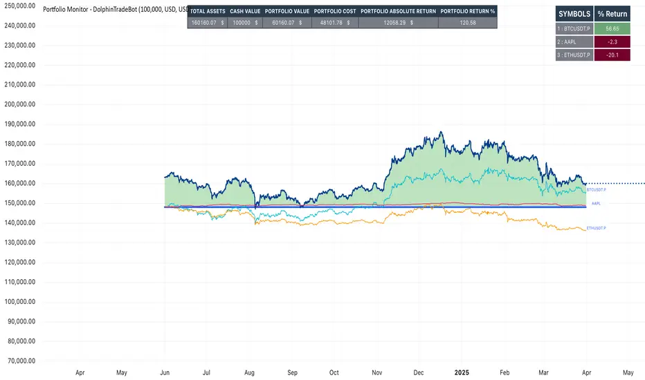
ATR Combined IndicatorHow to Use and Adjust the ATR Stop-Loss & Risk Manager Indicator in TradingView
The ATR Stop-Loss & Risk Manager indicator is designed to help traders visualize Average True Range (ATR)-based stop-loss levels and assess risk. Here's a step-by-step guide on how to use it and adjust its settings.
Adding the Indicator to Your Chart
Open TradingView and select your desired chart and time frame.
Click on the Pine Editor at the bottom of the screen.
Paste the provided script into the editor and click Add to Chart.
Once added, the indicator will appear on your chart with ATR values, stop-loss levels, and a risk table.
Indicator Outputs
ATR Line: A line representing the Average True Range (ATR) value, providing a measure of market volatility.
Stop-Loss Levels:
Stop Loss High: A green line above the current price, representing the suggested stop-loss level for long positions.
Stop Loss Low: A red line below the current price, representing the suggested stop-loss level for short positions.
Risk Table:
Displays the ATR value multiplied by a user-defined risk multiplier in a table on the chart.
Configuring the Settings
To customize the indicator for your trading strategy, click the gear icon next to the indicator’s name in the Indicators pane.
1. ATR Settings
ATR Period: Adjust the number of bars used to calculate the ATR. Common values include 14 (default) or 20. Shorter periods respond faster to price changes, while longer periods smooth volatility.
Smoothing Method:
Choose between RMA, SMA, EMA, or WMA for the ATR calculation:
RMA (default): A variation of the moving average commonly used in ATR.
SMA: Simple Moving Average, giving equal weight to all bars in the calculation.
EMA: Exponential Moving Average, which gives more weight to recent bars.
WMA: Weighted Moving Average, emphasizing recent prices linearly.
2. Multipliers
ATR Multiplier for Table: Adjust this to scale the ATR value displayed in the table. For example:
Set it to 1.0 to display the exact ATR.
Increase or decrease it to align with your risk tolerance.
Stop Loss Multiplier: Adjust this to change how far the stop-loss levels are plotted from the current price. For example:
Use 1.5 (default) for moderate levels.
Increase for wider stops or decrease for tighter stops.
3. Table Customization
Table Position: Select where the table appears on the chart:
Top Right (default), Top Left, Bottom Right, Bottom Left, Middle Right, or Middle Left.
Border Color: Choose the border color for the table.
Background Color: Set the table's background color.
Text Color: Customize the table text color for better visibility.
4. Visualization
Stop-Loss High and Low Lines:
Use these lines to determine potential stop-loss levels for your trades based on the ATR and stop-loss multiplier.
Green for Stop Loss High (long positions).
Red for Stop Loss Low (short positions).
Practical Use Cases
Volatility-Based Stop Losses:
Use the stop-loss lines to set dynamic stop-loss levels based on market volatility.
Adjust the multipliers to match your trading style:
Tight stops for scalping or day trading.
Wider stops for swing or position trading.
Risk Assessment:
Use the ATR value in the table to gauge market volatility before entering trades.
Higher ATR values indicate more volatile markets, requiring wider stops.
Position Sizing:
Incorporate the ATR value into your position-sizing strategy. For example:
Divide your account risk (e.g., 1% of equity) by the ATR to calculate position size.

Historical High/Lows Statistical Analysis(More Timeframe interval options coming in the future)
Indicator Description
The Hourly and Weekly High/Low (H/L) Analysis indicator provides a powerful tool for tracking the most frequent high and low points during different periods, specifically on an hourly basis and a weekly basis, broken down by the days of the week (DOTW). This indicator is particularly useful for traders seeking to understand historical behavior and patterns of high/low occurrences across both hourly intervals and weekly days, helping them make more informed decisions based on historical data.
With its customizable options, this indicator is versatile and applicable to a variety of trading strategies, ranging from intraday to swing trading. It is designed to meet the needs of both novice and experienced traders.
Key Features
Hourly High/Low Analysis:
Tracks and displays the frequency of hourly high and low occurrences across a user-defined date range.
Enables traders to identify which hours of the day are historically more likely to set highs or lows, offering valuable insights into intraday price action.
Customizable options for:
Hourly session start and end times.
22-hour session support for futures traders.
Hourly label formatting (e.g., 12-hour or 24-hour format).
Table position, size, and design flexibility.
Weekly High/Low Analysis by Day of the Week (DOTW):
Captures weekly high and low occurrences for each day of the week.
Allows traders to evaluate which days are most likely to produce highs or lows during the week, providing insights into weekly price movement tendencies.
Displays the aggregated counts of highs and lows for each day in a clean, customizable table format.
Options for hiding specific days (e.g., weekends) and customizing table appearance.
User-Friendly Table Display:
Both hourly and weekly data are displayed in separate tables, ensuring clarity and non-interference.
Tables can be positioned on the chart according to user preferences and are designed to be visually appealing yet highly informative.
Customizable Date Range:
Users can specify a start and end date for the analysis, allowing them to focus on specific periods of interest.
Possible Uses
Intraday Traders (Hourly Analysis):
Analyze hourly price action to determine which hours are more likely to produce highs or lows.
Identify intraday trading opportunities during statistically significant time intervals.
Use hourly insights to time entries and exits more effectively.
Swing Traders (Weekly DOTW Analysis):
Evaluate weekly price patterns by identifying which days of the week are more likely to set highs or lows.
Plan trades around days that historically exhibit strong movements or price reversals.
Futures and Forex Traders:
Use the 22-hour session feature to exclude the CME break or other session-specific gaps from analysis.
Combine hourly and DOTW insights to optimize strategies for continuous markets.
Data-Driven Trading Strategies:
Use historical high/low data to test and refine trading strategies.
Quantify market tendencies and evaluate whether observed patterns align with your strategy's assumptions.
How the Indicator Works
Hourly H/L Analysis:
The indicator calculates the highest and lowest prices for each hour in the specified date range.
Each hourly high and low occurrence is recorded and aggregated into a table, with counts displayed for all 24 hours.
Users can toggle the visibility of empty cells (hours with no high/low occurrences) and adjust the table's design to suit their preferences.
Supports both 12-hour (AM/PM) and 24-hour formats.
Weekly H/L DOTW Analysis:
The indicator tracks the highest and lowest prices for each day of the week during the user-specified date range.
Highs and lows are identified for the entire week, and the specific days when they occur are recorded.
Counts for each day are aggregated and displayed in a table, with a "Totals" column summarizing the overall occurrences.
The analysis resets weekly, ensuring accurate tracking of high/low days.
Code Breakdown:
Data Aggregation:
The script uses arrays to store counts of high/low occurrences for both hourly and weekly intervals.
Daily data is fetched using the request.security() function, ensuring consistent results regardless of the chart's timeframe.
Weekly Reset Mechanism:
Weekly high/low values are reset at the start of a new week (Monday) to ensure accurate weekly tracking.
A processing flag ensures that weekly data is counted only once at the end of the week (Sunday).
Table Visualization:
Tables are created using the table.new() function, with customizable styles and positions.
Header rows, data rows, and totals are dynamically populated based on the aggregated data.
User Inputs:
Customization options include text colors, background colors, table positioning, label formatting, and date ranges.
Code Explanation
The script is structured into two main sections:
Hourly H/L Analysis:
This section captures and aggregates high/low occurrences for each hour of the day.
The logic is session-aware, allowing users to define custom session times (e.g., 22-hour futures sessions).
Data is displayed in a clean table format with hourly labels.
Weekly H/L DOTW Analysis:
This section tracks weekly highs and lows by day of the week.
Highs and lows are identified for each week, and counts are updated only once per week to prevent duplication.
A user-friendly table displays the counts for each day of the week, along with totals.
Both sections are completely independent of each other to avoid interference. This ensures that enabling or disabling one section does not impact the functionality of the other.
Customization Options
For Hourly Analysis:
Toggle hourly table visibility.
Choose session start and end times.
Select hourly label format (12-hour or 24-hour).
Customize table appearance (colors, position, text size).
For Weekly DOTW Analysis:
Toggle DOTW table visibility.
Choose which days to include (e.g., hide weekends).
Customize table appearance (colors, position, text size).
Select values format (percentages or occurrences).
Conclusion
The Hourly and Weekly H/L Analysis indicator is a versatile tool designed to empower traders with data-driven insights into intraday and weekly market tendencies. Its highly customizable design ensures compatibility with various trading styles and instruments, making it an essential addition to any trader's toolkit.
With its focus on accuracy, clarity, and customization, this indicator adheres to TradingView's guidelines, ensuring a robust and valuable user experience.

Volume Spike Alert & Overlay"Volume Spike Alert & Overlay" highlights unusually high trading volume on a chart. It calculates whether the current volume exceeds a user-defined percentage above the historical average and triggers an alert if it does. The information is also displayed in a customizable on-screen table.
What It Does
Monitors volume for each bar and compares it to an average over a user-defined lookback period.
Supports multiple smoothing methods (SMA, EMA, WMA, RMA) for calculating the average volume.
Triggers an alert when current volume exceeds the threshold percentage above the average.
Displays a table on the chart with:
Current Volume
Average Volume
Threshold Percentage
Optional empty row for spacing/formatting
How It Works
User Inputs:
lookbackPeriods: Number of bars used to calculate the average volume.
thresholdPercent: % above the average that triggers a volume spike alert.
smoothingType: Type of moving average used for volume calculation.
textColor, bgColor: Formatting for the display table.
tablePositionInput: Where the table appears on the chart (e.g., Bottom Right).
Toggles for showing/hiding parts of the table.
Volume Calculations:
Calculates current bar's volume.
Calculates average volume using the selected smoothing method.
Computes the threshold: avgVol * (1 + thresholdPercent / 100).
Compares current volume to threshold.
Table Display:
Dynamically creates a table with volume stats.
Adds rows based on user preferences.
Alerts:
alertcondition fires when currentVol crosses above the calculated threshold.
Message: "Volume Threshold Exceeded"
Usage Examples
Example 1: Spotting High Activity
Apply the script to a stock like AAPL on a 5-minute chart.
Set lookbackPeriods to 20 and thresholdPercent to 30.
Use EMA for more reactive volume tracking.
When volume spikes more than 30% above the 20-period EMA, an alert triggers.
Example 2: Day Trading Filter
For scalpers, apply it to a 1-minute crypto chart (e.g., BTC/USDT).
Set thresholdPercent to 50 to catch only strong surges.
Position the table at the top left and reduce visible info for a clean layout.
Example 3: Long-Term Context
On a daily chart, use SMA and set lookbackPeriods to 50.
Helps identify breakout moves supported by strong volume.
How this is different from Trading View's Volume indicator:
The standard volume plot from trading view allows users to set a alert when the average line is crossed, but it does not allow you to set a custom percentage at which to trigger an alert. This indicator will allow you to set any percentage you wish to monitor and above that percentage threshold will trigger your alert.
===== ORIGINAL DESCRIPTION =====
Volume Spike Alert & Overlay
This indicator will display the following as an overlay on your chart:
Current volume
Average Volume
Threshold for Alert
Description:
This indicator will display the current bar volume based on the chart time frame,
display the average volume based on selected conditions,
allow user selectable threshold over the average volume to trigger an alert.
Options:
Average lookback period
Smoothing type
Alert Threshold %
Enable / Disable Each Value
Change Text Color
Change Background Color
Change Table location
Add/Remove extra row for placement in top corner
Usage Example:
I use this indicator to alert when the current volume exceeds the average volume by a specified percentage to alert to volume spikes.
Set the threshold to 25% in the settings
Create an alert by clicking on the 3 dots on the right of the indicator title on the chart
When the threshold is exceeded the alert will trigger
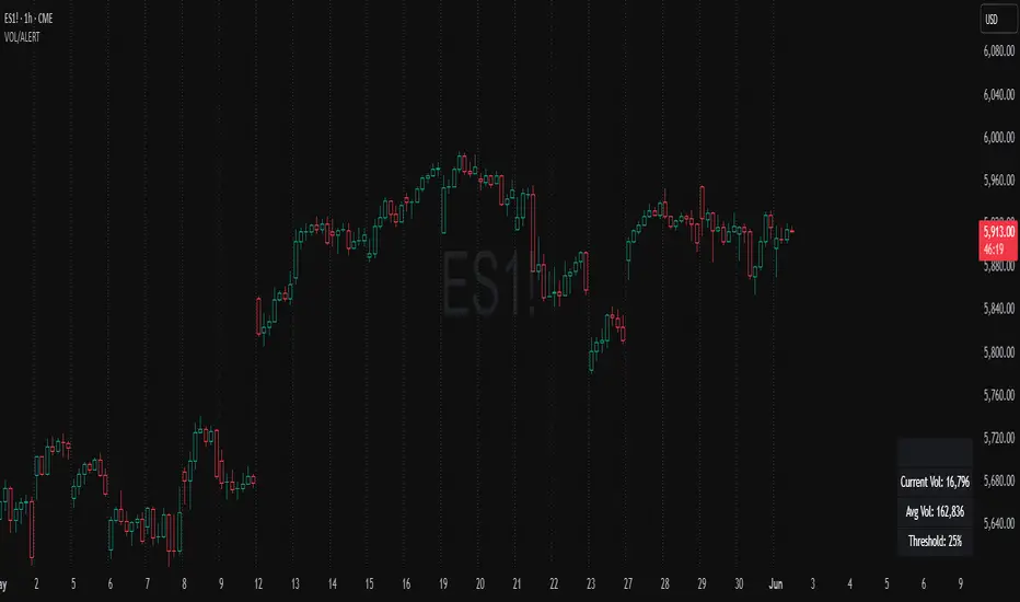
NY Reversal Pattern StatsThe NY Reversal Pattern Stats indicator is a tool for identifying and analyzing specific price action patterns that occur during the New York trading session. Its goal is to highlight potential reversal or continuation opportunities that may arise from market manipulation or shifts in volatility within this key market window. Beyond simply identifying patterns, the indicator provides valuable historical statistics on their performance, helping traders evaluate their effectiveness.
Key Features
New York Session Highlighting: Clearly visualizes the defined New York trading session directly on your chart.
Automated Pattern Detection: Automatically detects two types of patterns within the New York session:
Manipulation Wick: Identifies instances where price attempts to push significantly beyond a recent session extreme but is rejected, resulting in a wick with the close returning to the original side.
Low Volatility Reversal: Detects price interaction with a recent session extreme where the resulting candle shows lower-than-average volatility, suggesting potential exhaustion or a reversal point.
Pattern Confirmation Tracking: Tracks whether a detected pattern leads to a follow-through move based on a defined confirmation rule (currently, price returning to the session midpoint).
Comprehensive Statistics Table: Displays a detailed table on the chart summarizing:
Total patterns observed.
Number of patterns that were confirmed.
Success and failure rates.
Maximum losing streak.
Statistical relevance metrics (Sigma, Z-Score, P-value) to help assess if the observed success rate is likely due to chance.
A clear description interpreting the statistical relevance and pattern performance (more often right/wrong).
Customizable Visuals: Allows users to control the appearance of the session background and pattern labels.
Alerts: Provides options to set alerts when a new pattern is detected or when a detected pattern is confirmed.
How to Use the Indicator
Add to Chart: Apply the "NY Reversal Pattern Stats" indicator to your desired chart in TradingView.
Configure Inputs: Open the indicator's settings to customize the parameters:
Session Time Definition: Set the exact start hour, minute, and duration (in hours) for the New York session you wish to analyze. Use the "NY Time" inputs (e.g., 6:00 AM - 10:00 AM for Indices, 5:00 AM - 9:00 AM for Forex). The indicator uses the "America/New_York" timezone to handle Daylight Saving Time.
NY Session Visuals: Choose whether to display the session background and pattern labels, and customize their colors.
Pattern Detection: Adjust the sensitivity of the Manipulation Wick threshold and configure the settings for the Low Volatility Reversal pattern detection (enable/disable, ATR length, volatility factor).
Confirmation: Enable or disable the session midpoint confirmation criterion.
Show Statistics Table: Toggle the visibility of the statistics table.
Interpret the Chart: Observe the highlighted New York session windows and the labels indicating detected and confirmed patterns.
Analyze the Statistics Table: Refer to the statistics table for historical performance data.
Total Patterns: Indicates the sample size. More patterns generally lead to more statistically reliable results.
Confirmed/Failed: Shows the raw counts of successful and unsuccessful patterns based on the confirmation rule.
Success/Fail Rate (%): Provides the percentage of patterns that met or did not meet the confirmation criterion.
Statistical Relevance: Read the description provided in the table. It interprets the Z-Score and sample size to tell you if the observed success rate is statistically significant (i.e., unlikely to be just random chance).
Pattern Performance: Read the description indicating whether the pattern has historically been "More often right than wrong" or "More often wrong than right" based on the success rate.
Sigma / Z-Score / P-value: These are standard statistical measures. A higher absolute Z-Score and a lower P-value (especially below 0.05 or 0.01) suggest stronger statistical evidence that the pattern's success rate is different from a random 50/50 outcome.
Set Alerts: If desired, configure alerts to be notified when patterns are detected or confirmed, allowing you to potentially take action in real-time.
Interpretation of Results
High Success Rate + High Statistical Relevance: This combination suggests the detected pattern, as defined and confirmed by the indicator, has historically shown a consistent edge within the specified New York session window, and this performance is unlikely due to random chance.
High Success Rate + Low Statistical Relevance: The pattern has performed well in the observed data, but the sample size might be too small for high confidence that this performance will continue.
Low Success Rate + High Statistical Relevance: The pattern, as defined, has historically shown a tendency to fail more often than succeed, and this underperformance is statistically significant.
Low Statistical Relevance (Regardless of Success Rate): The sample size is insufficient to draw strong conclusions about the pattern's effectiveness. More historical data is needed.
Remember that past performance is not indicative of future results. Statistical analysis provides insights into historical tendencies, but trading decisions should always involve a comprehensive analysis and risk management plan.
Limitations
Timeframe Dependency: The pattern detection and session high/low accumulation operate on the chart's current timeframe. It does not specifically analyze only the 4-hour candles as might be implied by "4H Candle Profiling Patterns".
Confirmation Criterion: The confirmation rule is fixed to price returning to the session midpoint. If your strategy uses a different confirmation or target, this indicator's statistics may not directly reflect its performance.
No London/Asia Filter: The indicator does not check the performance or characteristics of the London or Asia sessions to filter for instances where "London and Asia Fail".
Potential Timezone Compiler Issues: While the code uses standard v6 timezone handling, some specific TradingView environments may exhibit unexpected behavior with timezone strings, potentially affecting the precise timing of the session boundaries.
This indicator is a powerful tool for analyzing specific price action patterns during the New York session. By understanding its inputs, outputs, and limitations, traders can gain valuable insights into potential trading opportunities.
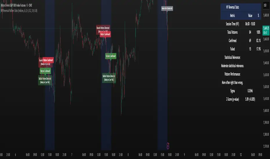
Financial Statement Indicator by zdmreKnowing how to work with the datas in a company's financial statements is an essential skill for stock investors. The meaningful interpretation and analysis of balance sheets, income statements, and cash flow statements to discern a company's investment qualities is the basis for smart investment choices.
You can access to the financials tables of the companies as a summary with this indicator.
3 Tables;
Income Statement Table:
Revenue
Net Profit
EPS
EPS-D
P/E
Balance Sheet Table:
Current Asset
Total Asset
Total Equity
Book Value per Share
Total Debt
Debt/Equity
Statistics & Cash Flow Table:
Return On Equity
Return On Asset
Return On Invested Capital
Quick Ratio
Free Cash Flow
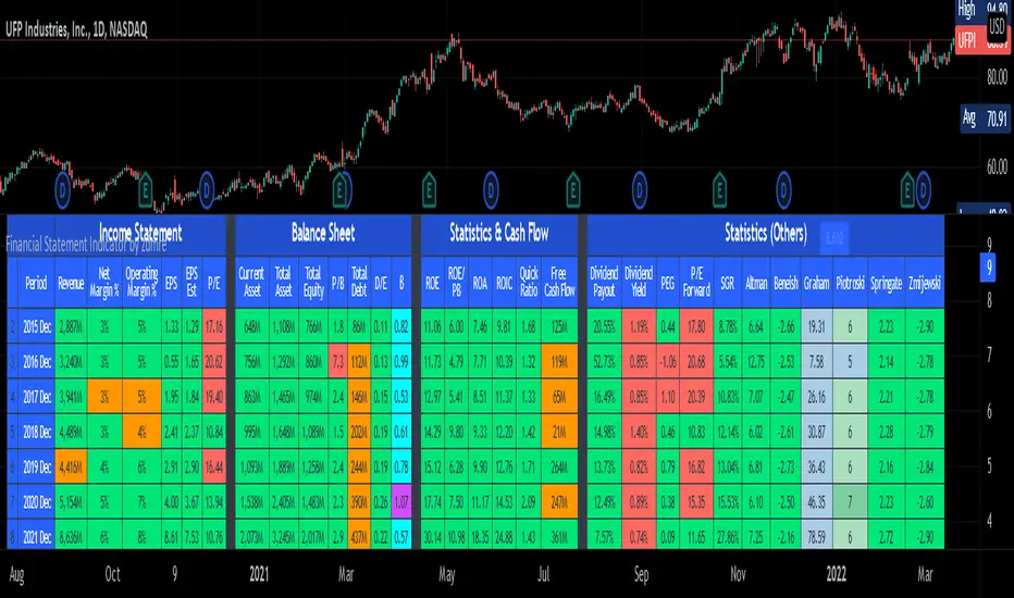
Staccked SMA - Regime Switching & Persistance StatisticsThis indicator is designed to identify the prevailing market regime by analyzing the behavior of a "stack" of Simple Moving Averages (SMAs). It helps you understand whether the market is currently trending, mean-reverting, or moving randomly.
Core Concept: SMA Correlation
At its heart, the indicator examines the relationship between a set of nine SMAs with different lengths (3, 5, 8, 13, 21, 34, 55, 89, 144) and the lengths themselves.
In a strong trending market (either up or down), the SMAs will be neatly "stacked" in order of their length. The shortest SMA will be furthest from the longest SMA, creating a strong, almost linear visual pattern. When we measure the statistical correlation between the SMA values and their corresponding lengths, we get a value close to +1 (perfect uptrend stack) or -1 (perfect downtrend stack). The absolute value of this correlation will be very high (close to 1).
In a mean-reverting or sideways market, the SMAs will be tangled and crisscrossing each other. There is no clear order, and the relationship between an SMA's length and its price value is weak. The correlation will be close to 0.
This indicator calculates this Pearson correlation on every bar, giving a continuous measure of how ordered or "trendy" the SMAs are. An absolute correlation above 0.8 is considered strongly trending, while a value between 0.4 and 0.8 suggests a mean-reverting character. Below 0.4, the market is likely random or choppy.
Regime Classification and Statistics
The indicator doesn't just look at the current correlation; it analyzes its behavior over a user-defined lookback window (default is 252 bars) to classify the overall market "regime."
It presents its findings in a clear table:
📊 |SMA Correlation| Regime Table: This main table provides a snapshot of the current market character.
Median: Shows the median absolute correlation over the lookback period, giving a central tendency of the market's behavior.
% > 0.80: The percentage of time the market was in a strong trend during the lookback period.
% < 0.80 & > 0.40: The percentage of time the market showed mean-reverting characteristics.
🧠 Regime: The final classification. It's labeled "📈 Trend-Dominant" if the median correlation is high and it has spent a significant portion of the time trending. It's labeled "🔄 Mean-Reverting" if the median is in the middle range and it has spent significant time in that state. Otherwise, it's considered "⚖️ Random/ Choppy".
📐 Regime Significance: This tells you how statistically confident you can be in the current regime classification, using a Z-score to compare its occurrence against random chance. ⭐⭐⭐ indicates high confidence (99%), while "❌ Not Significant" means the pattern could be random.
Regime Transition Probabilities
Optionally, a second table can be displayed that shows the historical probability of the market transitioning from one regime to another over different time horizons (t+5, t+10, t+15, and t+20 bars).
📈 → 🔄 → ⚖️ Transition Table: This table answers questions like, "If the market is trending now (From: 📈), what is the probability it will be mean-reverting (→ 🔄) in 10 bars?"
This provides powerful insights into the market's cyclical nature, helping you anticipate future behavior based on past patterns. For example, you might find that after a period of strong trending, a transition to a choppy state is more likely than a direct switch to a mean-reverting
Indicator Settings
Lookback Window for Regime Classification: This sets the number of recent bars (default is 252) the script analyzes to determine the current market regime (Trending, Mean-Reverting, or Random). A larger number provides a more stable, long-term view, while a smaller number makes the classification more sensitive to recent price action.
Show Regime Transition Table: A simple toggle (on/off) to show or hide the table that displays the probabilities of the market switching from one regime to another.
Lookback Offset for Starting Regime: This determines the "starting point" in the past for calculating regime transitions. The default is 20 bars ago. The script looks at the regime at this point and then checks what it became at later points.
Step 1, 2, 3, 4 Offset (bars): These define the future time intervals (5, 10, 15, and 20 bars by default) for the transition probability table. For example, the script checks the regime at the "Lookback Offset" and then sees what it transitioned to 5, 10, 15, and 20 bars later.
Significance Filter Settings
Use Regime Significance Filter: When enabled, this filter ensures that the regime transition statistics only count transitions that were "statistically significant." This helps to filter out noise and focus on more reliable patterns.
Min Stars Required (1=90%, 2=95%, 3=99%): This sets the minimum confidence level required for a regime to be included in the transition statistics when the significance filter is on.
1 ⭐: Requires at least 90% confidence.
2 ⭐⭐: Requires at least 95% confidence (default).
3 ⭐⭐⭐: Requires at least 99% confidence.

LotSize CalculatorLotSize Calculator Documentation
Overview
The LotSize Calculator is a powerful TradingView indicator designed to help traders calculate optimal position sizes based on risk management principles. It provides a visual representation of trade setups, including entry points, stop losses, and take profits, while calculating the appropriate lot size based on your risk preferences.
Key Features
Automatic lot size calculation based on risk amount
Support for multiple asset classes (forex, commodities, indices, etc.)
Visual R-multiple levels (1R to 5R)
Real-time position tracking with drawdown and run-up statistics
Customizable visual elements and display options
Input Parameters
Risk Management Settings
Risk Amount Type: Choose between risking a fixed amount in dollars ($) or a specific lot size.
Risk Amount: The amount you want to risk on the trade (in dollars if Risk Amount Type is set to $, or in lots if set to Lots).
Overwrite TP: Optional setting to automatically set take profit at a specific R-multiple (1R, 2R, 3R, 4R, or 5R).
Table Comments: Optional field to add personal notes to the position table.
Trade Setup Levels
Trigger Price: The price at which your trade will be entered.
Stop Loss: Your predetermined exit price to limit losses.
Take Profit: Your target price to secure profits.
Time Of Setup Start Bar: The starting time for your trade setup window.
Display Settings
Plot Position Labels: Toggle to show/hide position information labels on the chart.
Plot Position Table: Toggle to show/hide the position information table.
Show Money: Toggle to display monetary values ($) in the labels and table.
Show Points: Toggle to display point values in the labels and table.
Show Ticks: Toggle to display tick values in the labels and table.
Visual Appearance
Entry Color: Color for entry level line and labels.
Take Profit Color: Color for take profit level line and labels.
Stop Loss Color: Color for stop loss level line and labels.
Label Text Color: Color for text in the position labels.
Table Background: Background color for the position information table.
Table Text: Text color for the position information table.
R Labels: Color for the R-multiple level labels.
Table Position: Position of the information table on the chart (options: Bottom Right, Bottom Left, Bottom Middle, Top Right, Top Middle).
How to Use
Basic Setup
Set your entry price in the "Trigger Price" field.
Set your stop loss level in the "Stop Loss" field.
Set your take profit level in the "Take Profit" field.
Choose your risk amount type ($ or Lots) and enter the risk amount.
Optionally, select an R-multiple for automatic take profit calculation.
Understanding the Display
The indicator will show:
Horizontal lines for entry, stop loss, and take profit levels
Colored zones between entry and take profit (potential profit zone) and between entry and stop loss (potential loss zone)
R-multiple levels based on your risk (1R, 2R, 3R, 4R, 5R)
A table displaying:
Position type (long/short) and size
Original risk and reward figures
Maximum run-up and drawdown during the trade
Trade Monitoring
Once a trade is triggered (either by price crossing a stop entry or reaching a limit entry), the indicator tracks:
Current position value
Maximum run-up (highest profit seen)
Maximum drawdown (largest loss seen)
Trade outcome when take profit or stop loss is hit
Advanced Features
Asset Type Detection
The LotSize Calculator automatically detects the type of asset being traded (forex, commodity, index, etc.) and adjusts calculations accordingly to ensure accurate position sizing.
R-Multiple Visualization
R-multiples help visualize potential reward relative to risk. For example, 2R means the potential reward is twice the amount risked. The indicator displays these levels directly on your chart for easy reference.
Adaptive Position Labels
Position labels adjust their display based on trade direction (long or short) and include relevant information about risk, reward, and current position status.
Best Practices
Always confirm your risk is appropriate for your account size (typically 1-2% of account per trade).
Use the R-multiple visualization to ensure your trades offer favorable risk-to-reward ratios.
The indicator works best when used alongside your existing strategy for entry and exit signals.
Customize the visual appearance to match your chart theme for better visibility.
Troubleshooting
If position calculations seem incorrect, verify that the indicator is detecting the correct instrument type.
For forex pairs, ensure your broker's lot size conventions match those used by the indicator.
The indicator may need adjustment for certain exotic instruments or markets with unusual tick sizes.
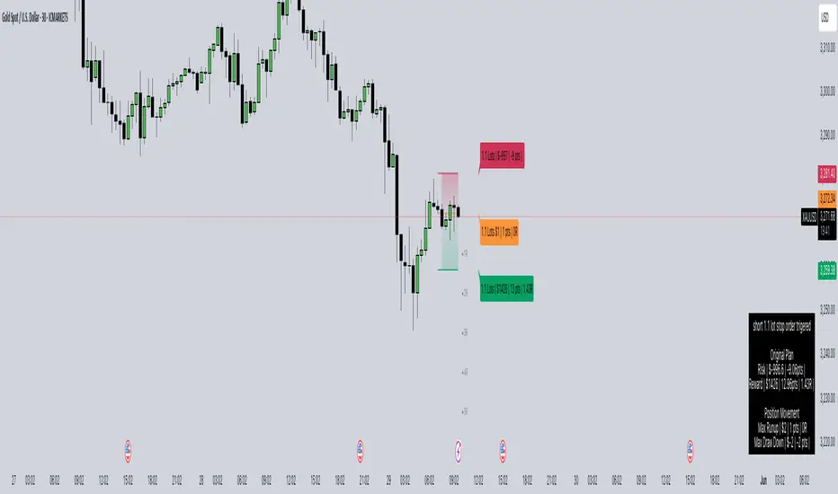
RunRox - Harmonic Patterns📐 RunRox - Harmonic Pattern indicator , we are pleased to present our new, built upon sophisticated logic for identifying and plotting harmonic formations directly on your charts. Significant effort and research have been invested into the development of this indicator, and now it is ready to be included in our premium indicator package.
In this post, we will provide a comprehensive overview of our indicator, describing all its key features, capabilities, and possible use cases. We strongly recommend reading the entire post thoroughly to fully understand the logic and operation behind our new Harmonic Pattern indicator.
📜 A BRIEF HISTORY
Harmonic patterns are specialized chart formations based on Fibonacci ratios, used by traders to identify potential reversal points in financial markets. Originally introduced by H.M. Gartley in the 1930s and later refined by Scott Carney, harmonic patterns became widely recognized for their effectiveness in forecasting precise turning points and market reversals. Over the years, these patterns have become an essential tool for traders employing technical analysis.
📌 INDICATOR FEATURES
Identification of 3 pattern sets:
✅ 5 Classic Chart Patterns:
Head and Shoulders, Triangle, Wedge, Flag, Double Top/Bottom
✅ 11 Harmonic Patterns:
Bat, Alternate Bat, Butterfly, Crab, Deep Crab, Gartley, Shark, Cypher, 5-0 Pattern, AB=CD, 3-Drive
✅ 10 Non-standard Harmonic Patterns:
Nen Star, White Swan, Black Swan, Anti-Bat, Anti-Butterfly, Anti-Crab, Anti-Gartley, Anti-Shark, Anti-Cypher, Anti-Nen Star
Additional features:
Built-in backtesting system
Pattern win-rate calculation
Flexible Stop Loss settings
Flexible Take Profit settings
Customizable pattern detection parameters
Advanced trailing stop functionality
Flexible notification system
And much more.
Below is a screenshot visually illustrating all the classic chart patterns that our indicator identifies on the chart.
This is how the 11 harmonic patterns visually appear on the chart.
10 Non-standard harmonic patterns visually represented on the chart.
🔸 XABCD are standard letters representing specific points used in forming harmonic patterns. The sequence always begins with the point X as the initial reference point, followed by points ABCD, which together complete the harmonic pattern.
These points are identified using a specialized method, scanning through thousands of potential points on the chart simultaneously. The indicator analyzes numerous potential formations, selecting and displaying only those patterns that meet specific validation criteria. This meticulous process ensures that only valid and accurate patterns appear on your chart, as illustrated in the screenshot below.
🔸 Ratio: Between the points XABCD, you’ll notice the “Ratio,” indicating the proportional relationships required between these points to correctly form harmonic patterns. The indicator displays a pattern on the chart only when these ratio conditions are precisely met, thereby maximizing accuracy and ensuring the validity of identified patterns. This aspect is clearly demonstrated in the screenshot below.
🔸 TP and SL levels: For each identified pattern, we also display recommended Take Profit (TP) and Stop Loss (SL) levels directly on the chart. Additionally, we provide a suggested entry price (Entry Level). It is important to note that entering a trade requires the price to retrace into the specified Entry Level zone. Therefore, you must wait until the price returns to this zone for the pattern to be considered fully formed and ready for entry.
Using the Butterfly pattern as an example, we’ve illustrated all the key components of a pattern. Our indicator offers extensive customization, allowing you to finely adjust everything from the acceptable Ratio ranges to Stop Loss and Take Profit levels, among many other parameters. Below, we’ll discuss the indicator’s capabilities and its customizable settings in detail.
📶 ACTIVE PATTERNS PANEL
In the screenshot above, you can see the panel displaying all active patterns currently formed on the chart, including the pattern direction, entry price, two take profit levels, and the stop loss level. This provides a quick and clear overview of the available patterns on your chart, significantly speeding up your trading process.
Additionally, you can fully customize this panel, adjusting its position, size, or even completely removing it if you prefer.
📊 PATTERN STATISTICS
The Pattern Statistics Panel displays historical performance results for all patterns. The indicator automatically performs backtesting for each pattern based on historical data, taking into account all user-defined settings. Results are conveniently presented in this panel.
This feature is highly practical as it allows you to quickly evaluate the effectiveness of each pattern directly on your chart. As a result, you can easily identify which patterns are performing best and which patterns might be less effective and therefore unsuitable for trading on the current instrument.
Furthermore, the panel organizes patterns into specific categories Classical, Harmonic, and Anti-Harmonic and separates results by trade direction (Long or Short). This helps you quickly determine the optimal trading direction for each pattern category.
⚙️ INDICATOR SETTINGS
Now, it’s time to discuss the indicator settings in detail and describe all the available options and features that you can customize according to your preferences.
🔶 Detection Settings
In the screenshot above, you see the first settings block with the following options:
FastMode – When activated, only patterns are displayed on the chart, without the results table. This significantly speeds up the pattern rendering process and makes the script run faster.
Error % – Allows you to specify a permissible deviation from the ideal XABCD parameters. By increasing this percentage, the indicator will detect more patterns, but they will deviate from the ideal ratio proportions by the percentage you’ve set.
Search Priority – Choose between “Large First” or “Small First” pattern prioritization. With “Large First,” the indicator prioritizes detecting larger patterns first; smaller patterns are only displayed if no suitable large patterns are available, and vice versa.
ZigZag Period – Determines the period for the ZigZag structure used as a foundation for pattern detection. It’s an essential parameter that directly affects the number and quality of detected patterns.
Pattern Size – Specify the desired size of patterns in terms of the number of bars on the chart.
Remove patterns older than, bars – Allows you to remove old patterns from the chart and prevent their display if they formed more than a set number of bars ago (default is 200 bars).
🔶 Entry / Target / StopLoss Settings
In the screenshot above, you can see the settings related to configuring your preferred entry points, target levels, and stop-loss strategies. Below is a detailed explanation of each option:
Trade Direction – Both / Long / Short - Choose the direction in which you want to trade. Selecting “Both” will search for patterns in both directions, while “Long” or “Short” will filter the patterns to show only those that align with the selected direction.
Entry % - This sets the entry level as a percentage of the pattern’s total size. It determines how far from the pattern’s starting point the entry will be placed.
Target 1 - Also defined as a percentage of the pattern size. This represents the distance from the entry point to the first take profit level.
Target 2 - Optionally, you can enable a second take profit level and set the percentage distance for it.
Stop-Loss Type - Choose from six different stop-loss types: Invalidation Price, Last Pivot, %, % of pattern size, Pips, or Risk/Reward ratio. Each provides flexibility depending on your trading style.
Stop-Loss SL Value - This is the specific value related to the chosen stop-loss type. For example, if you choose the “%” type, this setting will define the percentage used to place the Stop Loss level.
Using the Shark pattern as an example, let’s demonstrate how the entry, target, and stop-loss levels function. Based on the overall size of the pattern, you can input the desired percentage values for your trade entry, target, and stop-loss levels, and the indicator will automatically calculate their exact placement relative to the pattern’s structure.
You can also choose alternative stop-loss methods, such as Risk/Reward, in which case the stop-loss will be dynamically calculated based on the risk-to-reward ratio you define.
It’s also important to note that for harmonic patterns, the height of the pattern is calculated based on the segment from point C to point D. However, for the Black Swan pattern, the measurement is taken from point A to point D. This distinction should be kept in mind when configuring your stop-loss levels.
Additionally, classic patterns each have their own unique method for calculating pattern height, depending on the specific structure.
🔶 Trailing Stop Settings
These settings are designed to help improve your strategy’s results, especially if you use break-even stop-loss adjustments after reaching specific targets, which can help increase your win rate.
Move SL to Break-even after reaching Target 1 - Enabling this option will automatically move the stop-loss to the entry level (break-even) once the price hits the first target (Target 1).
Trailing Stop Type - Choose from three trailing stop types: Percentage (%), % of pattern size, Pips
Trailing Stop Value - Enter the desired value for the chosen trailing stop type. For example, if you selected %, the number entered will be treated as a percentage. If you chose Pips, it will be the number of pips for the trailing stop.
Enable Trailing Stop at reaching - This setting defines when the trailing stop should be activated. You can choose from four options: Target 1, %, % of pattern size, Pips
Trailing After Value - This works in combination with the previous setting. If you choose one of the three non-Target options, this field lets you enter the specific value that will trigger the trailing stop.
🔶 Display Settings
In the screenshot above, you can see the Display Settings section, which allows you to fully customize the visual appearance of patterns on your chart according to your preferences.
You can choose to show or hide pattern labels (XABCD), ratio values, entry/TP/SL levels, and pattern fill for better visual clarity.
Additionally, you can set the maximum number of active patterns displayed on the chart, as well as view the historical formations of any specific pattern to analyze how it appeared in past price action.
🔶 Dashboard | Pattern Table
In the screenshot above, you can see the settings for two tables: one displaying the results of each pattern , and the other showing active patterns currently on the chart. Both tables offer flexible customization options, allowing you to adjust their color schemes, sizes, and on-screen positions to best fit your workflow.
🔶 Patterns Setting
For each individual pattern, you can customize its appearance by selecting your preferred color , adjusting its transparency , or even hiding it entirely from the chart if you don’t wish to display it.
🔶 Notifications
You can easily configure notifications for various events, such as the appearance of a new pattern or when the price reaches the entry level of a trade.
Additionally, a dedicated panel allows you to use macros for advanced customization of your alerts, so you can tailor the notifications exactly to your needs and trading style.
List of Supported Placeholders:
{{event}} - Event name ('New Pattern', 'Target 1', etc.)
{{pattern}} - Pattern name ('Bat', 'Crab', etc.)
{{event_price}} - Event Price (entry price for entry event, sl price for sl event, etc.)
{{sl}} - Stop-loss price
{{entry}} - Entry Price
{{target1}}, {{target2}} - Target Prices
{{invalidation}} - Invalidation Price
{{exchange}} - Exchange ('Binance')
{{ticker}} - Ticker ('BTCUSD')
{{interval}} - Timeframe ('1s', '1', 'D')
{{open}}-{{close}}-{{high}}-{{low}} - Candle price values
{{volume}} - Candle volume
{{time}} - Candle open time in UTC timezone
{{timenow}} - Signal time in UTC timezone
{{syminfo.currency}} - 'USD' for BTCUSD pair
{{syminfo.basecurrency}} - 'BTC' for BTCUSD pair
✅ USAGE METHODS
The indicator and its patterns can be used as a standalone trading strategy, providing clear entry points, stop-loss levels, and take-profit targets - without the need for any additional tools or indicators.
However, for optimal results, we recommend integrating the indicator with your existing trading strategy. Using it as a confluence tool - alongside other technical indicators or as a complement to your fundamental analysis - can significantly enhance your decision-making and improve overall performance!
🟠 Disclaimer
Past performance is not indicative of future results. To trade successfully, it is crucial to have a thorough understanding of the market context and the specific situation at hand. Always conduct your own research and analysis before making any trading decisions.

Gabriel's Asset Rotation System📈 Gabriel's Asset Rotation System
Overview
Gabriel’s Asset Rotation System is an advanced multi-asset trend-following tool that dynamically ranks and rotates up to 6 assets (plus USD) based on a customizable trend scoring matrix. Using enhanced signal detection techniques like Cauchy-weighted Supertrend, Jurík RSX, Fisherized CCI, Kalman-filtered PSAR, and Dynamic DMI Smoothing, the system identifies the most dominant asset and simulates strategy equity performance compared to buy-and-hold benchmarks.
🔍 Key Features
✅ Multi-Asset Rotation: Analyze up to 6 symbols and USD simultaneously.
✅ Relative Strength Matrix: Compares every asset against each other to find outperformers.
✅ Custom Trend Engine:
Jurik RSX with advanced RSX logic
Fisherized CCI for momentum confirmation
Kalman-smoothed PSAR for trend bias
SuperTrend using a Cauchy Moving Average
Smoothed DMI signal across looped periods (10–17)
✅ Dynamic Best Asset Detection: Identifies and tracks the asset with the highest trend score over time.
✅ Performance Table: Displays Sharpe, Sortino, and Omega Ratios along with drawdowns and means for both strategy and each asset.
✅ Visual Trend Matrix: Tabular view of asset strength comparisons against each other + final scoring.
✅ Realistic Strategy Equity Curve: Tracks performance assuming full capital rotation into the best asset.
✅ Alerts: Get notified when the top-performing asset changes.
⚙️ Inputs
🔹 Assets: Customize 6 tickers (crypto, stocks, ETFs, etc.)
🔹 Trend Classification Method:
RSI
CCI
SuperTrend
DMI
PSAR
or use all together
🔹 Jurik RSX Length
🔹 Fisherized CCI Length
🔹 Cauchy MA Gamma and ATR Settings
🔹 DMI Range and MA Type (SMA, EMA, HMA, etc.)
🔹 PSAR Parameters with Kalman smoothing
🔹 Custom Backtest Start Date
📊 Outputs
Plot 1: Best Asset Equity (colored dynamically)
Plot 2–7: Buy & Hold Curves for each asset (with labels)
Tables:
Rotation Matrix (bottom-right)
Best Performing Asset (bottom-center)
Performance Metrics Table (optional toggle)
🧠 Use Case Ideas
🔁 Dynamic Portfolio Rebalancing
⚖️ Compare Risk-Adjusted Returns Across Crypto or Stocks
🧪 Backtest Rotation Hypotheses
🚀 Identify Strongest Breakout Assets in Trend Environments
📉 Avoid Weakening Assets with Rising Drawdowns
🚨 Alerts
🔔 "New Optimal Asset": Triggers when a new top-ranking asset replaces the current one.