Quarterly Theory ICT 02 [TradingFinder] True Open Session 90 Min🔵 Introduction
The Quarterly Theory ICT indicator is an advanced analytical system built on ICT (Inner Circle Trader) concepts and fractal time. It divides time into four quarters (Q1, Q2, Q3, Q4), and is designed based on the consistent repetition of these phases across all trading timeframes (annual, monthly, weekly, daily, and even shorter trading sessions).
Each cycle consists of four distinct phases: the first phase (Q1) is the Accumulation phase, characterized by price consolidation; the second phase (Q2), known as Manipulation or Judas Swing, is marked by initial false movements indicating a potential shift; the third phase (Q3) is Distribution, where price volatility peaks; and the fourth phase (Q4) is Continuation/Reversal, determining whether the previous trend continues or reverses.
🔵 How to Use
The central concept of this strategy is the "True Open," which refers to the actual starting point of each time cycle. The True Open is typically defined at the beginning of the second phase (Q2) of each cycle. Prices trading above or below the True Open serve as a benchmark for predicting the market's potential direction and guiding trading decisions.
The practical application of the Quarterly Theory strategy relies on accurately identifying True Open points across various timeframes.
True Open points are defined as follows :
Yearly Cycle :
Q1: January, February, March
Q2: April, May, June (True Open: April Monthly Open)
Q3: July, August, September
Q4: October, November, December
Monthly Cycle :
Q1: First Monday of the month
Q2: Second Monday of the month (True Open: Daily Candle Open price on the second Monday)
Q3: Third Monday of the month
Q4: Fourth Monday of the month
Weekly Cycle :
Q1: Monday
Q2: Tuesday (True Open: Daily Candle Open Price on Tuesday)
Q3: Wednesday
Q4: Thursday
Daily Cycle :
Q1: 18:00 - 00:00 (Asian session)
Q2: 00:00 - 06:00 (True Open: Start of London Session)
Q3: 06:00 - 12:00 (NY AM)
Q4: 12:00 - 18:00 (NY PM)
90 Min Asian Session :
Q1: 18:00 - 19:30
Q2: 19:30 - 21:00 (True Open at 19:30)
Q3: 21:00 - 22:30
Q4: 22:30 - 00:00
90 Min London Session :
Q1: 00:00 - 01:30
Q2: 01:30 - 03:00 (True Open at 01:30)
Q3: 03:00 - 04:30
Q4: 04:30 - 06:00
90 Min New York AM Session :
Q1: 06:00 - 07:30
Q2: 07:30 - 09:00 (True Open at 07:30)
Q3: 09:00 - 10:30
Q4: 10:30 - 12:00
90 Min New York PM Session :
Q1: 12:00 - 13:30
Q2: 13:30 - 15:00 (True Open at 13:30)
Q3: 15:00 - 16:30
Q4: 16:30 - 18:00
Micro Cycle (22.5-Minute Quarters) : Each 90-minute quarter is further divided into four 22.5-minute sub-segments (Micro Sessions).
True Opens in these sessions are defined as follows :
Asian Micro Session :
True Session Open : 19:30 - 19:52:30
London Micro Session :
T rue Session Open : 01:30 - 01:52:30
New York AM Micro Session :
True Session Open : 07:30 - 07:52:30
New York PM Micro Session :
True Session Open : 13:30 - 13:52:30
By accurately identifying these True Open points across various timeframes, traders can effectively forecast the market direction, analyze price movements in detail, and optimize their trading positions. Prices trading above or below these key levels serve as critical benchmarks for determining market direction and making informed trading decisions.
🔵 Setting
Show True Range : Enable or disable the display of the True Range on the chart, including the option to customize the color.
Extend True Range Line : Choose how to extend the True Range line on the chart, with the following options:
None: No line extension
Right: Extend the line to the right
Left: Extend the line to the left
Both: Extend the line in both directions (left and right)
Show Table : Determines whether the table—which summarizes the phases (Q1 to Q4)—is displayed.
Show More Info : Adds additional details to the table, such as the name of the phase (Accumulation, Manipulation, Distribution, or Continuation/Reversal) or further specifics about each cycle.
🔵 Conclusion
The Quarterly Theory ICT, by dividing time into four distinct quarters (Q1, Q2, Q3, and Q4) and emphasizing the concept of the True Open, provides a structured and repeatable framework for analyzing price action across multiple time frames.
The consistent repetition of phases—Accumulation, Manipulation (Judas Swing), Distribution, and Continuation/Reversal—allows traders to effectively identify recurring price patterns and critical market turning points. Utilizing the True Open as a benchmark, traders can more accurately determine potential directional bias, optimize trade entries and exits, and manage risk effectively.
By incorporating principles of ICT (Inner Circle Trader) and fractal time, this strategy enhances market forecasting accuracy across annual, monthly, weekly, daily, and shorter trading sessions. This systematic approach helps traders gain deeper insight into market structure and confidently execute informed trading decisions.
Tìm kiếm tập lệnh với "ict"

[TehThomas] - ICT Liquidity sweepsThe ICT Liquidity Sweeps Indicator is designed to track liquidity zones in the market areas where stop-losses and pending orders are typically clustered. This indicator marks buyside liquidity (resistance) and sellside liquidity (support), helping traders identify areas where price is likely to manipulate liquidity before making a significant move.
This tool is based on Inner Circle Trader (ICT) Smart Money Concepts, which emphasize how institutional traders, or “Smart Money,” manipulate liquidity to fuel price movements. By identifying these zones, traders can anticipate liquidity sweeps and position themselves accordingly.
⚙️ How It Works
1️⃣ Detects Key Liquidity Zones
The script automatically identifies significant swing highs and swing lows in price action using a pivot-based method.
A swing high (buyside liquidity) is a peak where price struggles to break higher, forming a resistance level.
A swing low (sellside liquidity) is a valley where price struggles to go lower, creating a support level.
These liquidity points are prime targets for liquidity sweeps before a true trend direction is confirmed.
2️⃣ Draws Liquidity Lines
Once a swing high or low is identified, a horizontal line is drawn at that level.
The lines extend to the right, serving as future liquidity targets until they are broken.
The indicator allows customization in terms of color, line width, and maximum number of liquidity lines displayed at once.
3️⃣ Handles Liquidity Sweeps
When price breaks a liquidity level, the indicator reacts based on the chosen action setting:
Dotted/Dashed: The line remains visible but changes style to indicate a sweep.
Delete: The line is completely removed once price has interacted with it.
This feature ensures that traders can easily spot where liquidity has been taken and determine whether a reversal or continuation is likely.
4️⃣ Prevents Chart Clutter
To maintain a clean chart, the script limits the number of liquidity lines displayed at any given time.
When new liquidity zones are formed, the oldest lines are automatically removed, keeping the focus on the most relevant liquidity zones.
🎯 How to Use the ICT Liquidity Sweeps Indicator
🔍 Identifying Liquidity Grabs
This indicator helps you identify areas where Smart Money is targeting liquidity before making a move.
Buyside Liquidity (BSL) Sweeps:
Occur when price spikes above a resistance level before reversing downward.
Indicate that Smart Money has hunted stop-losses and buy stops before driving price lower.
Sellside Liquidity (SSL) Sweeps:
Occur when price drops below a support level before reversing upward.
Indicate that Smart Money has collected liquidity from stop-losses and sell stops before pushing price higher.
📈 Combining with Market Structure Shifts (MSS)
One of the best ways to use this indicator is in conjunction with our Market Structure Shifts Indicator.
Liquidity sweeps + MSS Confirmation give strong high-probability trade setups:
Wait for a liquidity sweep (price takes out a liquidity level).
Look for an MSS in the opposite direction (e.g., price sweeps a high, then breaks a recent low).
Enter the trade in the new direction with stop-loss above/below the liquidity sweep.
📊 Entry & Exit Strategies
Long Trade Example:
Price sweeps a key sellside liquidity level (SSL) → creates a false breakdown.
MSS confirms a reversal (price breaks structure upwards).
Enter long position after confirmation.
Stop-loss below the liquidity grab to minimize risk.
Short Trade Example:
Price sweeps a key buyside liquidity level (BSL) → takes liquidity above resistance.
MSS confirms a bearish move (price breaks a key support level).
Enter short position after confirmation.
Stop-loss above the liquidity grab.
🚀 Why This Indicator is a Game-Changer
✅ Helps Identify Smart Money Manipulation – Understand where institutions are likely to grab liquidity before the real move happens.
✅ Enhances Market Structure Analysis – When paired with MSS, liquidity sweeps become powerful signals for trend reversals.
✅ Filters Out False Breakouts – Many traders get caught in liquidity grabs. This indicator helps avoid bad entries.
✅ Keeps Your Chart Clean – The auto-limiting feature ensures that only the most relevant liquidity levels remain visible.
✅ Works on Any Timeframe – Whether you’re a scalper, day trader, or swing trader, liquidity concepts apply universally.
📌 Final Thoughts
The ICT Liquidity Sweeps Indicator is a must-have tool for traders who follow Smart Money Concepts. By tracking liquidity levels and highlighting sweeps, it allows traders to enter trades with precision while avoiding false breakouts.
When combined with Market Structure Shifts (MSS), this strategy becomes even more powerful, offering traders an edge in spotting reversals and timing entries effectively.
__________________________________________
Thanks for your support!
If you found this idea helpful or learned something new, drop a like 👍 and leave a comment—I’d love to hear your thoughts! 🚀
Make sure to follow me for more price action insights, free indicators, and trading strategies. Let’s grow and trade smarter together! 📈✨

ICT Kill Zone [KTY]ICT Kill Zone Indicator
This indicator displays ICT Kill Zones, which are high-liquidity trading periods during major exchange opening hours.
Smart money tends to make significant moves during these times, resulting in increased volatility and trading volume.
Four Kill Zones
- AS KZ (Asian): Lower volatility, range formation period
- LDN KZ (London): European session start, liquidity surge
- NY KZ (New York): Europe + US overlap, strongest moves
- LDN CL KZ (London Close): London closing, position unwinding period
Market Hours Display
- Shows actual trading hours for Asian, London, and New York markets
- High/low lines for each session
Session Indicators
- Visual markers at the bottom of chart showing active kill zones
- Labels when each kill zone begins
1. Identify which kill zone is currently active
2. Signals during kill zones (CHoCH/BOS, OB, FVG) have higher significance
3. Watch for Asian range breakout in London/New York sessions
4. Be cautious of false moves outside kill zone hours
Pro Tips:
- New York kill zone typically has the strongest moves
- London open often sets the daily direction
- Asian session forms the range that gets broken later
- Combine kill zones with other ICT concepts for best results
Show Kill Zones: Toggle kill zone display on/off
Show Market Hours: Toggle market hours lines on/off
Show Latest Data Only: Display only the most recent kill zone
Daylight Saving Time: Apply DST adjustment (On/Off)
Asian Kill Zone Started
London Kill Zone Started
New York Kill Zone Started
London Close Kill Zone Started
This indicator is designed for educational purposes.
Kill zones only display on 15-minute or lower timeframes.
Always combine with proper risk management.
If you find this indicator helpful, please leave a like and follow for more ICT-based tools!

ICT Premium & Discount [KTY]ICT Premium & Discount Indicator
This indicator automatically displays Premium and Discount Zones based on ICT (Inner Circle Trader) methodology.
Premium & Discount zones divide the current price range into upper and lower areas based on swing highs and lows. This helps traders understand where price sits within the broader range.
Three-Zone Structure
- Premium Zone (Red): Upper portion of the range
- Equilibrium (Gray Dashed): Middle 50% line, fair value reference point
- Discount Zone (Green): Lower portion of the range
Multi-Timeframe Support
- Display zones from two different timeframes simultaneously (LTF & HTF)
- HTF zones carry more significance than LTF zones
Dynamic Range Calculation
- Automatically identifies swing high and low for the selected timeframe
- Zones update as new highs/lows form
1. Identify the current zone - Is price in Premium, Equilibrium, or Discount?
2. Combine with Market Structure - Use CHoCH/BOS to confirm directional bias
3. Look for confluence - OB, FVG, or Liquidity zones within Premium/Discount add significance
4. Use Equilibrium as reference - Price often reacts around the 50% level
Pro Tips:
- HTF zones (4H, 1D) are more significant than LTF zones
- Most effective when combined with other ICT concepts
- Ranging markets may see price oscillate between zones without clear direction
Show Premium & Discount Zones: Toggle zone display on/off
LTF: Enable and select lower timeframe for zone calculation
HTF: Enable and select higher timeframe for zone calculation
Price Entered Premium Zone
Price Entered Discount Zone
This indicator is designed for educational purposes.
Always combine with proper risk management.
If you find this indicator helpful, please leave a like and follow for more ICT-based tools!

ICT Market Structure [KTY]ICT Market Structure Indicator
Overview
This indicator automatically detects and displays Market Structure based on ICT (Inner Circle Trader) methodology.
Market structure analysis identifies trend direction and potential reversal points by tracking swing highs and lows. Understanding structure is fundamental to ICT trading concepts.
Key Features
Internal & External Structure
Internal Structure: Short-term swings for quick trend detection (displayed with dashed lines)
External Structure: Long-term swings for major trend identification (displayed with solid lines)
Choose to display Internal, External, Both, or None
CHoCH & BOS Detection
CHoCH (Change of Character): First sign of potential trend reversal
BOS (Break of Structure): Confirmation of trend continuation
Internal labels: lowercase (choch/bos)
External labels: uppercase (CHOCH/BOS)
Equal Highs & Equal Lows
EQH: Multiple highs at similar price levels — liquidity pool above
EQL: Multiple lows at similar price levels — liquidity pool below
Smart money often sweeps these levels before reversing
Swing Point Labels
HH (Higher High): Uptrend continuation
HL (Higher Low): Uptrend confirmation
LH (Lower High): Downtrend continuation
LL (Lower Low): Downtrend confirmation
How to Use
Identify the trend using HH/HL (bullish) or LH/LL (bearish) patterns
Wait for CHoCH as the first signal of potential reversal
Confirm with BOS in the new direction
Watch EQH/EQL levels for potential liquidity sweeps
Combine with OB, FVG, Liquidity zones for higher probability setups
Pro Tips:
External structure is more reliable than internal structure
CHoCH after liquidity sweep = high probability reversal
Multiple timeframe analysis increases accuracy
Internal CHoCH can provide early entries, but with higher risk
Settings
SettingDescriptionStructure TypeSelect INTERNAL, EXTERNAL, ALL, or NONEInternal Structure ColorsCustomize bullish/bearish colors for internal structureExternal Structure ColorsCustomize bullish/bearish colors for external structureEQL & EQHToggle equal highs/lows display with custom colorsSwing PointsToggle HH/HL/LH/LL labels with custom color
Alerts
Structure Alerts:
🟢 Bullish CHoCH (Internal)
🔴 Bearish CHoCH (Internal)
🟢 Bullish CHOCH (External)
🔴 Bearish CHOCH (External)
🟢 Bullish BOS (Internal)
🔴 Bearish BOS (Internal)
🟢 Bullish BOS (External)
🔴 Bearish BOS (External)
Equal Levels Alerts:
🔴 Equal Highs (EQH)
🟢 Equal Lows (EQL)
Swing Point Alerts:
📈 Higher High (HH)
📈 Higher Low (HL)
📉 Lower High (LH)
📉 Lower Low (LL)
Notes
This indicator is designed for educational purposes
Internal structure provides faster signals but more noise
External structure is slower but more reliable
Always combine with proper risk management
If you find this indicator helpful, please leave a like and follow for more ICT-based tools!

ICT Candle Reading PROICT Candle Reading – Visual Clean
This indicator is designed to provide a clean and precise price reading, based on ICT and Smart Money Concepts, without cluttering the chart.
Its purpose is to help traders identify real institutional zones, understand market intention, and improve entry timing, using pure price action.
🔹 What does this indicator show?
🟢 Fair Value Gaps (FVG / Imbalances)
Detects market inefficiencies created by impulsive moves.
Displayed as clean and minimal boxes extended into the future.
Useful as mitigation, reaction, or continuation zones.
🟠 Liquidity Sweeps
Highlights liquidity grabs above recent highs or below recent lows.
Drawn using dashed horizontal lines.
Helps identify market manipulation before the true move.
🔵 Displacement Candles
Identifies candles with dominant bodies, showing institutional momentum.
Marked with small symbols to keep the chart clean.
Useful to confirm impulse starts or shifts in market intent.
🎯 Indicator Philosophy
❌ No lagging indicators
❌ No chart clutter
✅ Real ICT concepts
✅ Clean candle reading
✅ Suitable for scalping, intraday, and swing trading
⚙️ Customization
Each concept can be enabled or disabled individually.
Zone extension length is adjustable.
Optimized for 15M, 1H, and 4H timeframes.
📈 How to use
This indicator does not provide automatic buy/sell signals.
It is best used with:
Higher timeframe bias
Market structure
Session timing (London / New York)
Proper risk management
🧠 Final Notes
ICT Candle Reading – Visual Clean helps you see the market from an institutional perspective, focusing only on what truly matters: price, liquidity, and intent.

Market Structure ICT Screener [TradingFinder] BoS ChoCh🔵 Introduction
Market Structure is the foundation of every Smart Money and ICT based trading model. It describes how price moves through a sequence of highs and lows, forming clear phases of expansion, retracement and reversal. Understanding this structure allows traders to read institutional order flow and align their positions with the true direction of liquidity.
Two of the most critical components in Market Structure are the Break of Structure (BOS) and Change of Character (CHOCH). A BOS represents trend continuation, confirming strength within the current direction. In contrast, CHOCH also known as a Market Structure Shift (MSS) signals the first sign of a trend reversal or liquidity shift where order flow begins to change from bullish to bearish or vice versa.
Because the market is fractal, structure can exist at multiple levels known as Major (External) and Minor (Internal). Major structure defines the overall trend on higher timeframes while minor or internal structure reveals short term swings and early reversals within that larger move.
🔵 How to Use
Understanding Market Structure starts with identifying how price interacts with previous swing highs and swing lows. Every trend in the market, whether bullish or bearish, is built from a sequence of impulsive and corrective moves. Impulsive legs show strong displacement in the direction of liquidity flow, while corrective legs represent temporary pullbacks as the market rebalances before the next expansion. Recognizing these sequences is essential for reading the story of price and anticipating what may happen next.
A Break of Structure (BOS) occurs when price decisively moves beyond a previous structural point by breaking above the last high in an uptrend or falling below the last low in a downtrend. This event confirms that the current trend remains intact and that liquidity has been successfully taken from one side of the market. A BOS acts as confirmation of continuation and reflects strength within the existing directional bias.
A Change of Character (CHOCH) appears when price violates structure in the opposite direction of the prevailing trend. This is the first signal that market sentiment and order flow may be shifting. For example, during a downtrend if price breaks above a previous high, it indicates that sellers are losing control and a potential bullish reversal may be developing. In an uptrend, when price drops below a recent low, it suggests a possible bearish transition.
Because the market is fractal, structure exists across multiple layers. Major structure reflects the dominant movement visible on higher timeframes and defines the broader directional bias. Minor or internal structure represents smaller swings within that move and helps identify early transitions before they appear on the higher timeframe. When internal and external structures align, they offer a high probability signal for trend continuation or reversal.
By observing BOS and CHOCH across both internal and external structures, traders can clearly visualize when the market is expanding, contracting or preparing to shift direction. This structured understanding of price movement forms the foundation for precise trend analysis and high quality decision making in any Smart Money or ICT based trading approach.
🔵 Settings
🟣 Display Settings
Table on Chart : Allows users to choose the position of the signal dashboard either directly on the chart or below it, depending on their layout preference.
Number of Symbols : Enables users to control how many symbols are displayed in the screener table, from 10 to 20, adjustable in increments of 2 symbols for flexible screening depth.
Table Mode : This setting offers two layout styles for the signal table :
Basic : Mode displays symbols in a single column, using more vertical space.
Extended : Mode arranges symbols in pairs side-by-side, optimizing screen space with a more compact view.
Table Size : Lets you adjust the table’s visual size with options such as: auto, tiny, small, normal, large, huge.
Table Position : Sets the screen location of the table. Choose from 9 possible positions, combining vertical (top, middle, bottom) and horizontal (left, center, right) alignments.
🟣 Symbol Settings
Each of the 20 symbol slots comes with a full set of customizable parameters :
Symbol : Define or select the asset (e.g., XAUUSD, BTCUSD, EURUSD, etc.).
Timeframe : Set your desired timeframe for each symbol (e.g., 15, 60, 240, 1D).
Pivot Period : Set the length used to detect swing highs and lows. Shorter values increase sensitivity, longer ones focus on major structures.
🔵 Conclusion
Mastering Market Structure and understanding the relationship between BOS and CHOCH allows traders to see the market with greater clarity and confidence. These two elements reveal how liquidity moves through different phases of expansion and retracement and how institutional order flow shifts between accumulation and distribution.
By analyzing both internal and external structures, traders can align short term and long term perspectives and anticipate where price is most likely to react. The ability to read these structural shifts helps identify continuation points, reversals and areas where liquidity is engineered or collected.
Incorporating Market Structure into a consistent trading process transforms the way a trader views the chart. Instead of reacting to random movements, each swing, break and shift becomes part of a logical framework that reflects the true behavior of the market. Understanding BOS and CHOCH is not just a concept but a complete language of price that guides every professional decision in Smart Money and ICT based trading.

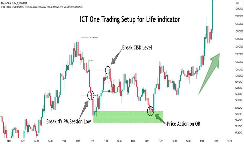
One Trading Setup for Life ICT [TradingFinder] Sweep Session FVG🔵 Introduction
ICT One Trading Setup for Life is a trading strategy based on liquidity and market structure shifts, utilizing the PM Session Sweep to determine price direction. In this strategy, the market first forms a price range during the PM Session (from 13:30 to 16:00 EST), which includes the highest high (PM Session High) and lowest low (PM Session Low).
In the next session, the price first touches one of these levels to trigger a Liquidity Hunt before confirming its trend by breaking the Change in State of Delivery (CISD) Level. After this confirmation, the price retraces toward a Fair Value Gap (FVG) or Order Block (OB), which serve as the best entry points in alignment with liquidity.
In financial markets, liquidity is the primary driver of price movement, and major market participants such as institutional investors and banks are constantly seeking liquidity at key levels. This process, known as Liquidity Hunt or Liquidity Sweep, occurs when the price reaches an area with a high concentration of orders, absorbs liquidity, and then reverses direction.
In this setup, the PM Session range acts as a trading framework, where its highs and lows function as key liquidity zones that influence the next session’s price movement. After the New York market opens at 9:30 EST, the price initially breaks one of these levels to capture liquidity.
However, for a trend shift to be confirmed, the CISD Level must be broken.
Once the CISD Level is breached, the price retraces toward an FVG or OB, which serve as optimal trade entry points.
Bullish Setup :
Bearish Setup :
🔵 How to Use
In this strategy, the PM Session range is first identified, which includes the highest high (PM Session High) and lowest low (PM Session Low) between 13:30 and 16:00 EST. In the following session, the price touches one of these levels for a Liquidity Hunt, followed by a break of the Change in State of Delivery (CISD) Level. The price then retraces toward a Fair Value Gap (FVG) or Order Block (OB), creating a trading opportunity.
This process can occur in two scenarios : bearish and bullish setups.
🟣 Bullish Setup
In a bullish scenario, the PM Session High and PM Session Low are identified. In the following session, the price first breaks the PM Session Low, absorbing liquidity. This process results in a Fake Breakout to the downside, misleading retail traders into taking short positions.
After the Liquidity Hunt, the CISD Level is broken, confirming a trend reversal. The price then retraces toward an FVG or OB, offering an optimal long entry opportunity.
The initial take-profit target is the PM Session High, but if higher timeframe liquidity levels exist, extended targets can be set.
The stop-loss should be placed below the Fake Breakout low or the first candle of the FVG.
🟣 Bearish Setup
In a bearish scenario, the market first defines its PM Session High and PM Session Low. In the next session, the price initially breaks the PM Session High, triggering a Liquidity Hunt. This movement often causes a Fake Breakout, misleading retail traders into taking incorrect positions.
After absorbing liquidity, the CISD Level breaks, indicating a shift in market structure. The price then retraces toward an FVG or OB, offering the best short entry opportunity.
The initial take-profit target is the PM Session Low, but if additional liquidity exists on higher timeframes, lower targets can be considered.
The stop-loss should be placed above the Fake Breakout high or the first candle of the FVG.
🔵 Setting
CISD Bar Back Check : The Bar Back Check option enables traders to specify the number of past candles checked for identifying the CISD Level, enhancing CISD Level accuracy on the chart.
Order Block Validity : The number of candles that determine the validity of an Order Block.
FVG Validity : The duration for which a Fair Value Gap remains valid.
CISD Level Validity : The duration for which a CISD Level remains valid after being broken.
New York PM Session : Defines the PM Session range from 13:30 to 16:00 EST.
New York AM Session : Defines the AM Session range from 9:30 to 16:00 EST.
Refine Order Block : Enables finer adjustments to Order Block levels for more accurate price responses.
Mitigation Level OB : Allows users to set specific reaction points within an Order Block, including: Proximal: Closest level to the current price. 50% OB: Midpoint of the Order Block. Distal: Farthest level from the current price.
FVG Filter : The Judas Swing indicator includes a filter for Fair Value Gap (FVG), allowing different filtering based on FVG width: FVG Filter Type: Can be set to "Very Aggressive," "Aggressive," "Defensive," or "Very Defensive." Higher defensiveness narrows the FVG width, focusing on narrower gaps.
Mitigation Level FVG : Like the Order Block, you can set price reaction levels for FVG with options such as Proximal, 50% OB, and Distal.
Demand Order Block : Enables or disables bullish Order Block.
Supply Order Block : Enables or disables bearish Order Blocks.
Demand FVG : Enables or disables bullish FVG.
Supply FVG : Enables or disables bearish FVGs.
Show All CISD : Enables or disables the display of all CISD Levels.
Show High CISD : Enables or disables high CISD levels.
Show Low CISD : Enables or disables low CISD levels.
🔵 Conclusion
The ICT One Trading Setup for Life is a liquidity-based strategy that leverages market structure shifts and precise entry points to identify high-probability trade opportunities. By focusing on PM Session High and PM Session Low, this setup first captures liquidity at these levels and then confirms trend shifts with a break of the Change in State of Delivery (CISD) Level.
Entering a trade after a retracement to an FVG or OB allows traders to position themselves at optimal liquidity levels, ensuring high reward-to-risk trades. When used in conjunction with higher timeframe bias, order flow, and liquidity analysis, this strategy can become one of the most effective trading methods within the ICT Concept framework.
Successful execution of this setup requires risk management, patience, and a deep understanding of liquidity dynamics. Traders can enhance their confidence in this strategy by conducting extensive backtesting and analyzing past market data to optimize their approach for different assets.
Implied Fair Value Gap (IFVG) ICT [TradingFinder] Hidden FVG OTE🔵 Introduction
The Implied Fair Value Gap (IFVG) is distinctive due to its unique three-candlestick formation, which differentiates it from conventional Fair Value Gaps.
Implied fair value represents an estimated worth of an asset—often a business or its goodwill—based on the price likely to be received in a structured transaction between market participants at a specific point in time.
In the ever-evolving world of technical analysis, pinpointing price reversal points and market anomalies can significantly enhance trading strategies and decision-making for traders and investors. Among the advanced concepts gaining traction in this field is the Implied Fair Value Gap (IFVG), introduced by the renowned analyst Inner Circle Trader (ICT).
This tool has proven to be an effective method for identifying hidden supply and demand zones in financial markets, offering a unique edge to traders looking for high-probability setups.
Unlike traditional gaps that are visible on price charts, IFVG is a hidden gap that doesn’t appear explicitly on the chart and thus requires specialized technical analysis tools for accurate identification.
This hidden gap can signal potential price reversals and offers traders insight into high-liquidity areas where price is likely to react. This article will guide you through using the ICT Implied Fair Value Gap Indicator effectively, covering its settings, usage strategies, and key features to help you make informed decisions in the market.
🟣 Bullish Implied FVG
🟣 Bearish Implied FVG
🔵 How to Use
The IFVG indicator is designed to assist traders in recognizing hidden support and resistance zones by identifying Bullish and Bearish IFVG patterns. With this tool, traders can make better-informed decisions about suitable entry and exit points for their trades based on these patterns.
🟣 Bullish Implied Fair Value Gap
This pattern occurs in an uptrend when a large bullish candlestick forms, with the wicks of the previous and following candles overlapping the body of the central candlestick.
This overlap creates a demand zone or a hidden support level, which can act as an ideal entry point for buy trades. Often, when the price returns to this area, it is likely to resume its upward trend, presenting a profitable buying opportunity.
🟣 Bearish Implied Fair Value Gap
This pattern is similar but forms in downtrends. Here, a large bearish candlestick appears on the chart, with the wicks of adjacent candles overlapping its body. This overlap defines a supply zone or a hidden resistance level and serves as a signal for potential sell trades.
When the price returns to this zone, it often continues its downward trend, providing an optimal point for entering sell trades.
The IFVG indicator also includes various filters that traders can use to refine their analysis based on market conditions. These filters, including Very Aggressive, Aggressive, Defensive, and Very Defensive, allow users to customize the IFVG zones' width, offering flexibility according to the trader’s risk tolerance and trading style.
🟣 Example Trading Scenarios
Suppose you’re in a strong uptrend and the IFVG indicator identifies a Bullish IFVG zone. In this scenario, you could consider entering a buy trade when the price retraces to this zone, expecting the uptrend to resume. Conversely, in a downtrend, a Bearish IFVG zone can signal a favorable entry point for short trades when the price revisits this area.
🔵 Settings
Implied Block Validity Period: This parameter specifies the validity period of each identified block, taking into account the number of bars that have passed since its formation. Proper adjustment of this period helps traders focus only on relevant zones, increasing the accuracy of the analysis.
Mitigation Level OB : This option defines the mitigation level for supply and demand blocks (Order Blocks), with settings including Proximal, 50% OB, and Distal.
Depending on the selected level, the indicator will focus on closer, mid-range, or farther points for block identification, allowing traders to adjust for the level of precision required.
Implied Filter : Activating this filter allows traders to apply conditions based on the width of the IFVG zones. With options like Very Aggressive and Very Defensive, traders can control the width of IFVG zones to suit their risk management strategy—whether they prefer high-risk setups or low-risk setups.
Display and Color Settings : This section enables users to customize the appearance of the IFVG zones on their charts. Traders can set different colors for Bullish and Bearish zones, allowing for easier distinction and improved visualization.
Alert Settings : One of the standout features of the IFVG indicator is the alert system. By setting up alerts, users can be notified whenever the price approaches a demand or supply zone.
Alerts can be customized to trigger Once Per Bar (one alert per bar) or Per Bar Close (alert at the close of each bar), ensuring that traders stay updated on critical price movements without needing to monitor the chart continuously.
🔵 Conclusion
The ICT Implied Fair Value Gap (IFVG) indicator is a powerful and sophisticated tool in technical analysis, allowing professional traders to identify hidden supply and demand zones and use them as entry and exit points for buy and sell trades.
This indicator’s automatic detection of IFVG zones helps traders uncover hidden trading opportunities that can enhance their analysis.
While the IFVG indicator offers numerous advantages, it is important to use it in conjunction with other technical analysis tools and sound risk management practices.
IFVG alone does not guarantee profitability in trading; it works best when combined with other indicators such as volume analysis and trend-following indicators for a comprehensive trading strategy.

Simple ICT Market Structure by toodegreesThis Simple ICT Market Structure is based on the teachings of ICT, specifically in his episode 12 of the Public 2022 Mentorship.
The only omission here is the peculiar calculation of Intermediate Term points, for which I am not using the concept of repricing imbalances – this can be added later!
Feel free to use this tool, however it is quite simple and market structure is something we all know very well how to spot. In my opinion it is helpful to display the long term swing points to identify more mature pools of liquidity.
The reason for coding this tool is to help new coders understand PineScript (I have a video tutorial where I code this from start to finish), as well as fostering some algorithmic thinking in your trading of ICT Concepts and Algorithmic Delivery.
If you have any questions about the code, shoot me a message!
Hope you learn something and GLGT!

ICT Trend Candles [KTY]ICT Trend Candles Indicator
This indicator colors candles based on market structure direction.
Candle colors change when BOS (Break of Structure) or CHoCH (Change of Character) occurs, allowing you to quickly identify the current trend direction.
Structure-Based Coloring
- Bullish structure break → Candles turn bullish color
- Bearish structure break → Candles turn bearish color
- Color changes at trend shift points
Two Structure Options
- INTERNAL: Short-term structure based, faster color changes
- EXTERNAL: Long-term structure based, slower but more reliable
1. Select structure type (INTERNAL or EXTERNAL)
2. Watch for candle color changes to identify trend shifts
3. Combine with other ICT concepts (OB, FVG, Liquidity) for confluence
Pro Tips:
- Use INTERNAL for scalping and short-term trading
- Use EXTERNAL for swing trading and position trading
- Color change after liquidity sweep = high probability reversal signal
Show Trend Candles: Toggle candle coloring on/off
Structure Type: Select INTERNAL or EXTERNAL
Bullish Color: Color when in bullish structure
Bearish Color: Color when in bearish structure
This indicator is designed for educational purposes.
Color change does not guarantee trend reversal.
Always combine with proper risk management.
If you find this indicator helpful, please leave a like and follow for more ICT-based tools!

ICT Rejection Block [KTY]ICT Rejection Block Indicator
This indicator automatically detects and displays Rejection Blocks based on ICT (Inner Circle Trader) methodology.
Rejection Blocks are price zones formed by candles with long wicks, indicating strong buying or selling rejection at that level.
Automatic Detection
- Identifies candles with significant wick-to-body ratio
- Rejection High (Red): Long upper wick showing buying pressure rejected
- Rejection Low (Green): Long lower wick showing selling pressure rejected
Multi-Timeframe Support
- Display rejection blocks from two different timeframes simultaneously (LTF & HTF)
- HTF rejection blocks carry more significance
1. Identify rejection blocks on your chart
2. Watch for price reaction when re-entering the rejection zone
3. Combine with Order Block, FVG, or Market Structure for confluence
4. Use rejection block levels as reference for stop-loss placement
Pro Tips:
- HTF rejection blocks (1H+) are more reliable
- Rejection block aligned with OB or FVG increases significance
- Multiple rejection blocks at similar levels indicate strong S/R zone
LTF: Enable and select lower timeframe
HTF: Enable and select higher timeframe
Rejection Block Count: Number of rejection blocks to display per type
Colors: Customize colors for rejection high and low
Show Mitigated Rejection Blocks: Display broken zones in gray
Rejection High Detected
Rejection Low Detected
Rejection High Mitigated
Rejection Low Mitigated
This indicator is designed for educational purposes.
Rejection blocks do not guarantee price reversal.
Always combine with proper risk management.
If you find this indicator helpful, please leave a like and follow for more ICT-based tools!

ICT BPR [KTY]ICT BPR (Balanced Price Range) Indicator
This indicator automatically detects and displays Balanced Price Range (BPR) zones based on ICT (Inner Circle Trader) methodology.
BPR forms when a bullish FVG and bearish FVG overlap, creating a zone where buying and selling pressure are balanced.
Automatic BPR Detection
- Identifies areas where opposing FVGs overlap
- Bullish BPR: Bullish FVG overlaps above bearish FVG
- Bearish BPR: Bearish FVG overlaps above bullish FVG
Visual Display
- Clear box zones showing BPR areas
- Customizable colors for bullish and bearish BPR
- Option to show mitigated (broken) BPR zones in gray
Dynamic Updates
- BPR zones extend automatically
- Zones are removed when price breaks through (unless mitigated display is enabled)
1. Identify BPR zones on your chart
2. Watch for price reaction when re-entering the BPR zone
3. Combine with OB, OTE, or Market Structure for confluence
4. Use BPR levels as reference points for stop-loss or targets
Pro Tips:
- BPR aligned with Order Block increases significance
- Larger overlapping FVGs create more important BPR zones
- Most effective in trending markets with clear FVG formations
Show BPR: Toggle BPR display on/off
Bullish BPR Count: Number of bullish BPR zones to display
Bearish BPR Count: Number of bearish BPR zones to display
Show Mitigated BPR: Display broken BPR zones in gray
Label Color: Customize text color inside BPR boxes
Bullish BPR Detected
Bearish BPR Detected
Bullish BPR Retest
Bearish BPR Retest
This indicator is designed for educational purposes.
BPR zones do not guarantee price reversal.
Always combine with proper risk management.
If you find this indicator helpful, please leave a like and follow for more ICT-based tools!

ICT OTE [KTY]ICT OTE (Optimal Trade Entry) Indicator
This indicator automatically displays the OTE (Optimal Trade Entry) level based on ICT (Inner Circle Trader) methodology.
OTE is the 70.5% Fibonacci retracement level, which is considered a key level where price often reacts during pullbacks.
70.5% Fibonacci Level
- Automatically calculates and displays the OTE level
- Green line with ⬆ indicates uptrend retracement
- Red line with ⬇ indicates downtrend retracement
Multi-Timeframe Support
- Display OTE from two different timeframes simultaneously (LTF & HTF)
- HTF OTE levels carry more significance
Dynamic Calculation
- Automatically identifies swing high and low for the selected timeframe
- OTE level updates as new highs/lows form
1. Identify the OTE level on your chart
2. Watch for price reaction when approaching the OTE line
3. Combine with Market Structure (CHoCH/BOS) for directional bias
4. Look for confluence with OB, FVG, or Liquidity zones at OTE level
Pro Tips:
- HTF OTE (4H, 1D) is more reliable than LTF
- OTE aligned with Order Block increases significance
- Most effective in trending markets, less reliable in ranging conditions
Show OTE: Toggle OTE display on/off
LTF: Enable and select lower timeframe for OTE calculation
HTF: Enable and select higher timeframe for OTE calculation
Price Touched OTE Level
OTE Direction Changed to Bullish
OTE Direction Changed to Bearish
This indicator is designed for educational purposes.
OTE level touch does not guarantee price reversal.
Always combine with proper risk management.
If you find this indicator helpful, please leave a like and follow for more ICT-based tools!

ICT Liquidity Zone [KTY]ICT Liquidity Zone Indicator
Overview
This indicator automatically detects and displays Liquidity Zones based on ICT (Inner Circle Trader) methodology.
Liquidity zones are areas where stop-loss orders cluster around swing highs and lows. Smart money targets these zones to grab liquidity before reversing price direction.
Key Features
Multi-Timeframe Support
Display liquidity zones from two different timeframes simultaneously (LTF & HTF)
HTF liquidity zones represent more significant levels
Buyside & Sellside Liquidity
Buyside Liquidity: Areas above swing highs where short sellers' stops accumulate → Smart money sweeps these before selling
Sellside Liquidity: Areas below swing lows where long buyers' stops accumulate → Smart money sweeps these before buying
Volume Analysis
Displays relative volume percentage at liquidity formation
Higher percentage indicates stronger liquidity concentration
Mitigation Tracking
Liquidity zones are automatically removed when price sweeps through
Option to display swept zones for reference
How to Use
Identify liquidity pools above recent highs or below recent lows
Wait for a sweep — price breaks the level then quickly reverses
Look for confirmation using CHoCH, Order Blocks, or FVGs
Enter on the reversal, set stop beyond the swept level
Pro Tips:
Multiple equal highs/lows create stronger liquidity pools
Liquidity sweep + immediate reversal = high probability setup
Combine with Order Blocks and FVGs for confluence
HTF liquidity is more significant than LTF liquidity
Asian session highs/lows often become liquidity targets
Settings
SettingDescriptionLTF / HTFEnable and select timeframes for liquidity detectionBuyside Liquidity CountNumber of buyside zones to displaySellside Liquidity CountNumber of sellside zones to displayShow Mitigated LiquidityRemove or Show swept liquidity zonesLabel ColorCustomize text color inside liquidity boxes
Alerts
🔴 Buyside Liquidity Detected
🟢 Sellside Liquidity Detected
🔴 Buyside Liquidity Break
🟢 Sellside Liquidity Break
🔴 Buyside Liquidity Touched
🟢 Sellside Liquidity Touched
Notes
This indicator is designed for educational purposes
Distinguish between genuine breakouts and liquidity sweeps
Always combine with proper risk management
If you find this indicator helpful, please leave a like and follow for more ICT-based tools!

ICT Fair Value Gap [KTY]ICT Fair Value Gap Indicator
Overview
This indicator automatically detects and displays Fair Value Gaps (FVG) based on ICT (Inner Circle Trader) methodology.
Fair Value Gaps are imbalances created when price moves rapidly across three candles, leaving a gap where no trading occurred. Price tends to return to these zones, making them valuable areas for potential entries.
Key Features
Multi-Timeframe Support
Display FVGs from two different timeframes simultaneously (LTF & HTF)
HTF Fair Value Gaps provide stronger, more reliable levels
Bullish & Bearish FVG
Bullish FVG: Forms during sharp up moves → Acts as support on pullbacks
Bearish FVG: Forms during sharp down moves → Acts as resistance on bounces
Centerline (CE)
Dashed line marking the 50% level of each FVG
Key reaction level for precise entries
Mitigation Tracking
FVGs are automatically removed when price fills the gap
Option to display mitigated FVGs for reference
Volume Analysis
Displays relative volume percentage at FVG formation
Higher percentage indicates stronger momentum behind the gap
How to Use
Identify the trend on higher timeframes
Wait for price to retrace into an FVG zone
Look for reaction at the FVG, especially at the centerline (CE)
Enter within the FVG, set stop loss beyond the FVG boundary
Pro Tips:
FVGs that overlap with Order Blocks have higher probability
Fresh (untested) FVGs tend to produce stronger reactions
The middle candle being the largest of the three increases reliability
HTF FVGs are more significant than LTF FVGs
Settings
SettingDescriptionLTF / HTFEnable and select timeframes for FVG detectionBullish FVG CountNumber of Bullish FVGs to displayBearish FVG CountNumber of Bearish FVGs to displayShow Mitigated FVGToggle display of filled/mitigated FVGsLabel ColorCustomize text color inside FVG boxes
Alerts
🟢 Bullish FVG Detected
🔴 Bearish FVG Detected
🟢 Bullish FVG Touched
🔴 Bearish FVG Touched
🟢 Bullish FVG Mitigated
🔴 Bearish FVG Mitigated
Notes
This indicator is designed for educational purposes
Always combine with proper risk management
Past performance does not guarantee future results
If you find this indicator helpful, please leave a like and follow for more ICT-based tools!

ICT Order Block [KTY]ICT Order Block Indicator
Overview
This indicator automatically detects and displays Order Blocks (OB) based on ICT (Inner Circle Trader) methodology.
Order Blocks are price zones where Smart Money (institutions, banks) executed large buy/sell orders. These zones often act as strong support and resistance levels, making them valuable for identifying high-probability entry points.
Key Features
Multi-Timeframe Support
Display OBs from two different timeframes simultaneously (LTF & HTF)
HTF Order Blocks provide stronger, more reliable levels
Bullish & Bearish Order Blocks
Bullish OB: Last bearish candle before a significant up move → Acts as support
Bearish OB: Last bullish candle before a significant down move → Acts as resistance
Breaker Block Detection
When an OB is broken, it converts to a Breaker Block (BB)
Role reverses: Former support becomes resistance, and vice versa
Volume Analysis
Displays volume at OB formation
Shows upper/lower volume balance ratio (%)
Lower percentage = stronger one-sided order flow = more significant zone
OB Body Lines
Dotted lines showing the candle body (open/close) within the OB
Useful for precise entry points
How to Use
Identify the trend on higher timeframes
Wait for price to re-enter an Order Block zone
Look for confirmation (candlestick patterns, lower timeframe structure break)
Enter within the OB, set stop loss below/above the OB
Pro Tips:
OBs that overlap with FVG (Fair Value Gap) or OTE (Optimal Trade Entry) have higher probability
HTF Order Blocks are more reliable than LTF
Fresh (untested) OBs tend to have stronger reactions
Settings
SettingDescriptionLTF / HTFEnable and select timeframes for Order Block detectionBullish OB CountNumber of Bullish Order Blocks to display (1-10)Bearish OB CountNumber of Bearish Order Blocks to display (1-10)Show Breaker BlocksToggle Breaker Block displayShow OB Body LinesToggle candle body lines within OBLabel ColorCustomize text color inside OB boxes
Alerts
🟢 Bullish OB Detected
🔴 Bearish OB Detected
🟢 Bullish OB Touched
🔴 Bearish OB Touched
🟢 Bullish BB Touched
🔴 Bearish BB Touched
💥 Bullish OB → BB Conversion
💥 Bearish OB → BB Conversion
Notes
This indicator is designed for educational purposes
Always combine with proper risk management
Past performance does not guarantee future results
If you find this indicator helpful, please leave a like and follow for more ICT-based tools!

[LJ] RSIM + ICT KillzonesIndicator Summary
This Pine Script indicator is a comprehensive, all-in-one toolkit designed for traders utilizing Inner Circle Trader (ICT) concepts. It visually maps out crucial time-based trading sessions, killzones, and key opening price levels directly on the chart. Alongside the time and price tools, it features a real-time "RSIM" (MTF RSI Monitor) dashboard to track market momentum across multiple timeframes, all while maintaining a lag-free chart through automated drawing cleanup.
Core Functionalities
ICT Killzones & Silver Bullets:
Visually demarcates specific high-probability trading windows—including the Asian, London, and New York (AM & PM) killzones, as well as the UK and US "Silver Bullet" times—using vertical lines and colored background highlights.
Key Opening Price Levels:
Automatically plots horizontal lines for significant opening prices, such as the New York Midnight Open (often used as true day open), CME Open, and NY AM/PM Opens. It also includes Higher Time Frame (HTF) levels for Weekly and Monthly opens.
Session High/Low Tracking:
Actively tracks and draws horizontal price levels for the High and Low of the current day, previous day, and individual Globex, Asian, London, and NY sessions.
Multi-Timeframe RSI Dashboard (RSIM):
An on-chart table that displays the current Relative Strength Index (RSI) values and a live countdown timer ("time to close") for the 5-minute, 15-minute, 1-hour, 4-hour, Daily, and Weekly timeframes.
Lunch "No-Trade-Zone":
Specifically highlights the New York Lunch period, visually warning traders of potential low-volume or erratic price action.
Automated Housekeeping:
A built-in memory management system that automatically deletes drawings (lines and labels) older than a user-defined number of days to prevent chart clutter and performance lag.
Built-in Debug Logger:
An optional on-chart logging table that tracks session triggers and script events, helping traders verify that times and levels are plotting correctly for their selected asset.

ICT Liquidity + BOS + FVG + Entries (NY)ICT Liquidity + BOS + FVG + Entries (NY Session)
This indicator is designed for ICT / Smart Money Concepts traders, focusing on high-probability New York session setups, especially for Gold (XAUUSD) on lower timeframes like M5.
It automates the classic ICT execution model:
Liquidity → Break of Structure → Fair Value Gap → Entry

ICT Macro Time WindowsICT Macro Time Windows - Master institutional market timing with automated 'Macro' trading session tracking.
What are 'Macros'?
In ICT terminology, 'Macros' refer to the key institutional trading windows throughout the day where major banks and liquidity providers are most active. These specific time frames see heightened volatility, liquidity, and strategic positioning.
Perfect Timing Automation:
• 8 Critical Macro Sessions:
London 1: 02:33-03:00 EST
London 2: 04:03-04:30 EST
NY AM1: 08:50-09:10 EST
NY AM2: 09:50-10:10 EST
NY AM3: 10:50-11:10 EST
Lunch: 11:50-12:10 EST
PM: 13:10-13:40 EST
Close: 15:15-15:45 EST
• Fully customizable time zones and session times
• Real-time session detection with visual zones & labels
• Automatic High/Low range tracking within each window
• Boxes, lines, and labels for clear visual reference
• Never miss optimal entry/exit timing again
Trade when institutions trade - stop guessing and start timing your setups with precision during these key liquidity windows! All session times are easily adjustable in settings to match your preferred trading hours.
Perfect for Forex, Futures, and Index traders following ICT concepts and institutional flow analysis.

ICT 00:00, 08:30, 09:30 & 13:30 Opens (NY) — Prior-Day HistoryICT 00:00, 08:30, 09:30 & 13:30 Opens (NY)
This is a derivative of ALPHAICTRADER’s open-source script, republished under the MPL-2.0 with clear attribution and documented changes. It plots four New-York–anchored intraday reference levels—0000, 0830, 0930, 1330—as short, right-padded stubs with clean side labels. Use these time anchors (ICT-style midnight + key US windows) to frame bias, volatility pockets, and intraday trade locations.
What’s original in this version (changes)
Right-padded stubs instead of chart-wide rays — each level ends N bars past the latest candle (configurable).
Side labels at the line tip — text-only labels (0000, 0830, 0930, 1330) that sit at the right end of each stub and update every bar.
Optional prior-day history — show Today only or Today + Prior Day; older lines/labels auto-pruned.
Per-anchor controls — Display, Style, Color, Width, and Show Label for each time.
What it plots (and why)
0000 (NY Midnight): daily session anchor for bias/liquidity context.
0830 (NY): macro data window (CPI/NFP/claims) where volatility often concentrates.
0930 (NY): US cash equity market open; opening-drive structure/acceptance tests.
1330 (NY): early-afternoon anchor for continuation vs. fade.
How it works (under the hood)
Session detection: time("1", session, "America/New_York"); first bar flagged via not na(ts) and na(ts ).
Anchor price: open of that first bar per session/day.
Rendering: lines drawn with xloc=bar_index from start bar to bar_index + Right Pad; x2 updates every bar (no extend.right).
Labels: placed at line.get_x2(line) + Label Pad, soft color variant; updated per bar to stay on the tip.
History: arrays keep either today only or today + yesterday and delete anything older immediately.
How to use
Add to any intraday chart (futures/FX/indices). Anchors are always NY-time; TradingView handles DST.
Inputs
00:00 / 08:30 / 09:30 / 13:30 (NY): Display, Line Style, Color, Width, Show Label
Right Edge: Right Pad (bars) · Label Pad (bars)
History: Show Prior Day (History) — off = today only; on = today + yesterday
Suggested pads: Right Pad 2–5 bars; Label Pad 0–2.
These are context anchors, not signals. Combine with your execution model (market structure, liquidity, FVG/OBs, etc.).
Attribution & License (MPL-2.0)
Original work: “ICT NEW YORK MIDNIGHT OPEN AND 8.30 AM OPEN” by ALPHAICTRADER (MPL-2.0).
This derivative: modifications listed above; source published and kept under MPL-2.0 per license terms.
If you distribute a modified version of this Pine file, you must keep MPL-2.0, retain the copyright/licensing header, publish your modified source, and document your changes.
Notes: Pine v5. Minimalist (no day dividers). Educational tool; not financial advice.
Copyright: © ALPHAICTRADER 2022 · © Funk 2025
License: MPL-2.0

SMT Divergence ICT 02 [TradingFinder] Smart Money Technique SMC🔵 Introduction
SMT Divergence (Smart Money Technique Divergence) is a price action-based trading concept that detects discrepancies in market behavior between two assets that are generally expected to move in the same direction. Rooted in ICT (Inner Circle Trader) methodology, this approach helps traders recognize subtle signs of market manipulation or imbalance, often ahead of traditional indicators.
The core idea behind SMT divergence is simple: when two correlated instruments—such as currency pairs, indices, or assets from the same sector—start forming different swing points (highs or lows), this can reveal a lack of confirmation in the trend. Such divergence is often a precursor to a price reversal or pause in momentum.
This technique works effectively across various markets including Forex, stocks, and cryptocurrencies. It’s particularly valuable when used alongside concepts like liquidity sweeps, market structure breaks (MSBs), or order block identification.
In advanced use cases, Sequential SMT helps uncover patterns of alternating divergences across sessions, often signaling engineered liquidity traps before price reacts.
When combined with the Quarterly Theory—which segments market behavior into Accumulation, Manipulation, Distribution, and Continuation/Reversal phases—traders gain insight not only into where divergence happens, but when it's most likely to be significant within the market cycle.
Bullish SMT :
Bullish SMT Divergence occurs when one asset prints a higher low while the correlated asset forms a lower low. This asymmetry often suggests that the downside move is losing strength, hinting at a potential bullish shift.
Bearish SMT :
Bearish SMT Divergence is formed when one asset creates a higher high, while the second asset fails to confirm by printing a lower high. This typically signals weakening bullish pressure and the possibility of a reversal to the downside.
🔵 How to Use
The SMT Divergence indicator is designed to detect imbalances between two positively correlated assets—such as major currency pairs, indices, or commodities. These divergences often indicate early signs of market inefficiency or smart money manipulation and can help traders anticipate trend shifts with higher precision.
Unlike traditional divergence indicators or earlier versions of this script, this upgraded version does not rely solely on consecutive pivot comparisons. Instead, it dynamically scans all available pivots within the chart to identify divergences at any structural level—major or minor—across the price action. This broader detection method increases the reliability and frequency of meaningful SMT signals.
Moreover, when integrated with Sequential SMT logic, the indicator is capable of identifying multiple divergence sequences across sessions. These sequences often signal engineered liquidity traps and can be mapped within the Quarterly Theory framework, allowing traders to pinpoint not just the presence of divergence but also the phase of the market cycle it appears in (Accumulation, Manipulation, Distribution, or Continuation).
🟣 Bullish SMT Divergence
This signal occurs when the primary asset forms a higher low, while the correlated asset forms a lower low. This pattern implies weakening bearish momentum and a potential shift to the upside.
If the correlated asset breaks its previous low but the primary asset does not, this divergence suggests absorption of selling pressure and possible accumulation by smart money—making it a strong bullish signal, especially when aligned with a favorable market phase (e.g., the end of a manipulation phase in Q2).
🟣 Bearish SMT Divergence
This signal occurs when the primary asset creates a higher high, while the correlated asset forms a lower high. This mismatch indicates fading bullish momentum and a potential reversal to the downside.
If the correlated asset fails to confirm a breakout made by the main asset, the divergence may point to distribution or exhaustion. When seen within Q3 or Q4 phases of the Quarterly Theory, this pattern often precedes sharp declines or fake-outs engineered by smart money
🔵 Settings
⚙️ Logical Settings
Symbol : Choose the secondary asset to compare with the main chart asset (e.g., XAUUSD, US100, GBPUSD).
Pivot Period : Sets the sensitivity of the pivot detection algorithm. A smaller value increases responsiveness to price swings.
Activate Max Pivot Back : When enabled, limits the maximum number of past pivots to be considered for divergence detection.
Max Pivot Back Length : Defines how many past pivots can be used (if the above toggle is active).
Pivot Sync Threshold : The maximum allowed difference (in bars) between pivots of the two assets for them to be compared.
Validity Pivot Length : Defines the time window (in bars) during which a divergence remains valid before it's considered outdated.
🎨 Display Settings
Show Bullish SMT Line : Draws a line connecting the bullish divergence points.
Show Bullish SMT Label : Displays a label on the chart when a bullish divergence is detected.
Bullish Color : Sets the color for bullish SMT markers (label, shape, and line).
Show Bearish SMT Line : Draws a line for bearish divergence.
Show Bearish SMT Label : Displays a label when a bearish SMT divergence is found.
Bearish Color : Sets the color for bearish SMT visual elements.
🔔 Alert Settings
Alert Name : Custom name for the alert messages (used in TradingView’s alert system).
Message Frequency :
All : Every signal triggers an alert.
Once Per Bar : Alerts once per bar regardless of how many signals occur.
Per Bar Close : Only triggers when the bar closes and the signal still exists.
Time Zone Display : Choose the time zone in which alert timestamps are displayed (e.g., UTC).
Bullish SMT Divergence Alert : Enable/disable alerts specifically for bullish signals.
Bearish SMT Divergence Alert : Enable/disable alerts specifically for bearish signals
🔵Conclusion
The SMT Plus indicator offers a refined and powerful approach to detecting smart money behavior through divergence analysis between correlated assets. By removing the limitations of consecutive pivot comparisons and allowing for broader structural detection, it captures more accurate and timely signals that often precede major market moves.
When paired with frameworks like Sequential SMT and the Quarterly Theory, the indicator not only highlights where divergence occurs, but also when in the market cycle it's most likely to matter. Its flexible settings, customizable visuals, and integrated alert system make it suitable for intraday scalpers, swing traders, and even long-term macro analysts.
Whether you're using it as a standalone decision-making tool or combining it with other ICT concepts, SMT Plus gives you an edge in recognizing manipulation, timing reversals, and staying in sync with the real market narrative—not just the chart.

ICT & RTM Price Action IndicatorICT & RTM Price Action Indicator
Unlock the power of precision trading with this cutting-edge indicator blending ICT (Inner Circle Trader) concepts and RTM (Reversal Trend Momentum) strategies. Designed for traders who demand clarity in chaotic markets, this tool pinpoints high-probability buy and sell signals with surgical accuracy.
What It Offers:
Smart Supply & Demand Zones: Instantly spot key levels where the market is likely to reverse or consolidate, derived from a 50-period high/low analysis.
Filtered Reversal Signals: Say goodbye to fakeouts! Signals are confirmed with volume spikes (1.5x average) and a follow-through candle, ensuring you trade only the strongest moves.
Trend-Aware Logic: Built on a customizable SMA (default 14), it aligns reversals with momentum for trades that stick.
One-Signal Discipline: No clutter—only the first valid signal appears until an opposing setup triggers, keeping your chart clean and your focus sharp.
Combined Power: A unique "TRADE" signal merges ICT zones with RTM reversals for setups with double the conviction.
Why You’ll Love It:
Whether you’re scalping intraday or hunting swing trades, this indicator adapts to your style. It’s not just another tool—it’s your edge in decoding price action like a pro. Test it, tweak it, and watch your trading transform.
