Tìm kiếm tập lệnh với "momentum"


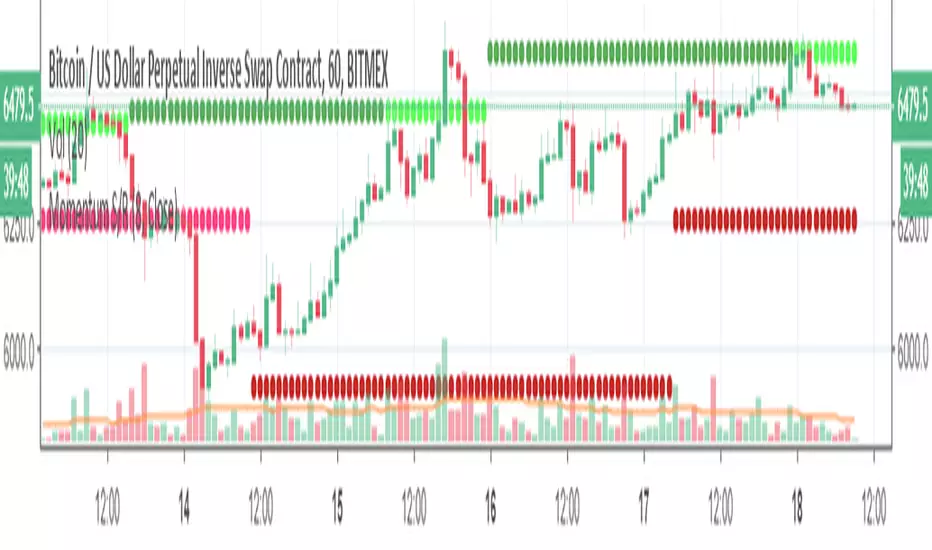
Next Candle HA MomentumVery simple script that updates realtime and shows possible next candle outcome and difference between current HA candle and current regular candle.
It's intended to use on Heikin Ashi and shows actual price on them, while on regular candles shows difference.
Idea was suggested by my husband and we decided to develop and publish it together.
Enjoy and check other scripts on my profile!
Momentum Regression @CosmonautCCustom momentum oscillators combined with a custom type of regression to find entries and exits.
Green arrow = long entry/buy
green circle = long exit/hedge into USD
vice versa for red arrows and circles
No risk management/strategy/backtesting done yet. Purely indicator form so far.
Enjoy!

Momentum Strategy Indicator by ZekisA very powerful strategy with great results that combine a multitude of indicators like Anchored Momentum, Stochastic Momentum Index, Bollinger Bands, Stochastic RSI, a formation of 3 trend indicators that forms a cloud , combinations of EMAs and a lot of condition to met for entries, TP, SL ....
Statistics for March 2019:
*320 long signals for all Binances coins paired with BTC
*208 (65%) winning trades
*108 (33.75%) losing trades
*4 (1.25%) trades still active
*total profit - 486%
*compound profit - 8750%
Time frame recommended: 4h
Conditions for Long entries:
AMOM in bullish cross/side
SMI in bullisih cross/side
Price above BB middle line
SRSI below 50 and heading upward
3x trend cloud must be green/bullish and the price needs to be above the cloud
Price must to be above EMA 400
EMA 100 must to go in an upward direction
The candle must not exceed 10% in height
(all values are preset)
SL line is calculated based on previous structure low (lowest low) from 10 candles in the past(the value can be changed)
TP line is calculated at 1:1 ratio, so at the same distance like SL is from signal, but mirrored
The background is changing when it enters in bull or bear side
Candles are colored for entries for a better view
Alerts are added for entries, TP and SL
Max candle high can be adjusted, according to the market (lower value for a market with low volatility and vice versa)
TP and SL lines calculation(previous structure low) can be adjusted, according to market conditions
(all values are preset, the strategy is ready to go)
Don't go blind with any indicator, do your research before involving real money
Enjoy!
@Zekis


Momentum Exhaustion + Swing Points ComboCombination of @Zeenobit's Swing Points and Momentum Exhaustion indicators; RSX instead of RSI from @jaggedsoft/@everget's RSX Divergences script(s).

Momentum and Trend Strength Entry Exit Pivot StudyUpdated version of previous Momentum Strength Entry Exit Pivot Study:
//************************
// @TheGeeBee - Credit where used
//
//Notes:
//
// Use 1,2,3,5 minute timeframes
// EMA Cross line and offset allows user to alter the sell characteristics where the candle low is above the EMA line and indicates a possible pre-pivot reversal
// Adjust Min and Max pivots based on risk profile
// Single Candle drawdown value represents the maximum size of a single red candle before an Exit Pivot is generated
// ADX Threshold inhibits Pivots when trending signal is below the threshold value
// Percentage Max drawdown since Entry Pivot allows the system to generate an Exit Pivot if the security has dropped X percent from the most recent Entry Pivot point
// Use Bars, Candles (preferred) or Heikin-Ashi
// Multiple Green Bars = BTFD
// Multiple Red bars = If you didn't already get out, do it now!
//
//************************
Allows for Alerts to be set for Entry and Exit Pivots.
Momentum Oscillators [CP]This is collection of 3 Momentum Oscillators:
*RSI
*Stochastic
*SRSI
You can filter each one with the following options:
*SMA
*EMA
*Hull MA
*Linear Regression
*Laguerre
*SuperSmoother
*SuperSmoother

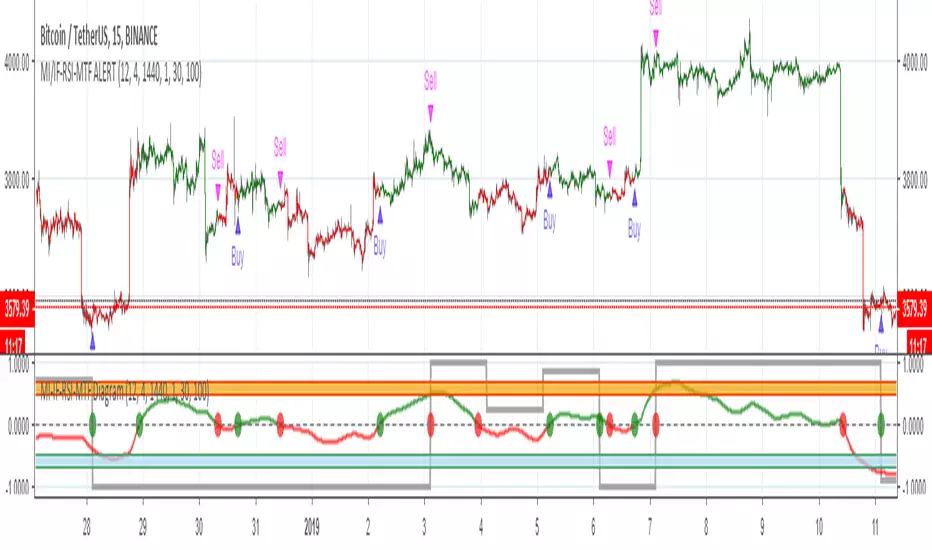
MOMENTUM INDICATOR / INVERS FISHER / RSI / MTF / ALERT// Alerts based on Momentum indicator and Inverse Fisher transform with Multi Time Frame function on Relative Strength Index (RSI)
// Greatest effect on 15M+ time frame
// Created and based on Binance chart
// Working with comission
// No repaints
Momentum Indicator Alerts 15m// Alerts based on Momentum Indicator Strategy
// Greatest effect on 15M time frame
// Created and based on Binance chart
// Working with comission
// No repaints

Momentum VisualizerA colorful indicator that visually shows momentum, fast-moving average on the outside and the slower moving averages in the core. The outer moving average is to see where the outer momentum breaks below again.

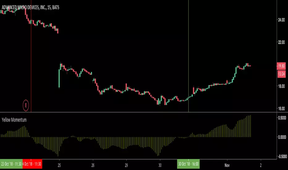
Yellow MomentumMomentum indicator that uses multiple time frame data to detect reversals and trend strength.
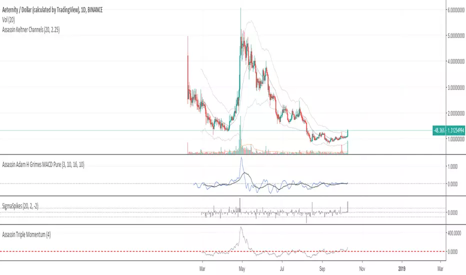
Assassin Triple MomentumThere are a red base line on chart.
If crossunder the base line , we can treat it as bear market. If crossover baseline , we can treat it as bull market.
you can setting the base line number yourself for some special case.
NeoIchi
The idea of this oscillator / indicator came from Ichimoku , how it draws and how it calculates different averages in different scales.
The formula used for this indicator is totally different from Ichimoku , as you can compare the left and right charts, with same setting between my indicator and ichimoku , different results show up.
The inputs that you can use for this indicator/oscillator :
1- HLC3 (better to through it on the chart just like ichimoku
2- acceleration - deceleration (set the first parameter to 5 and the second to 34 for standard calculations)
3- pure volume
4- OBV ( On Balance Volume )
5- Bill Williams MFI ( Market Facilitation Index )
6- Momentum : This one can have different options : set with Barry Burn's formula and bar scale for when the charts are 1 to 3 ratio (B 3) or when they are not 1 to 3 (B), Bill William standard (W), Hybrid with barry's input (Would be bar close but I replaced it with HLC3, better results) but Bill William time scale for calculations (H), and finally, use Bill Williams MFI as input but use Barry Burn's time scales in formula (H M)
If you have any specific input in mind that you think would be nice to have in this system, through a comment bellow and I will add it to the system.
This oscillator / indicator is for sale, you can buy a life long licence that would include all updates with 0.01 BTC. Send the BTC + transaction fee to the wallet address bellow :
12EDAYA52DzcXdh9aLC9Pqqfhm1jNMjxNo
after sending the BTC , contact me in pm and send the transaction ID with your trading view's ID and I will give you access to this oscillator / indicator

momentum strategy Trades assets based on momentum, good for any market on intermediate timeframes, will post a buy or sell signal when certain conditions are met. Will update with more information as strategy progresses.
Momentum IndexTo be Used with MACD HISTOGRAM
what to look for ?
normal divergences as well as cross divergences aka HIDDEN
when both stars align then its extra strong
flip the K&D settings for more dramatic results .
message me for access.
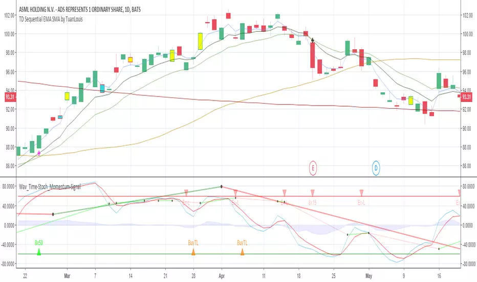
Momentum MultiTimeFrame + EMA SMA SignalsThis combines multiple ideas and indicators into one script.
This can be used for all time frames minutely, daily, weekly etc.
Relies heavily on EMA(8) and EMA(15) and looks at SMA(50) and SMA(200) levels at times.
It also gives an indication of next higher level momentum (Custom Time Frame - Ideally should be next level than selected time fractal.) momentum with thick Lines and Daily (21) trend with thin lines.
There's an option to Hide/Display Exit Short labels (hidden by default). Also, an option to display/Hide Weaker Buy Signal (Enabled by default).
Exit Long (Ex-L) can't be configured to hide as each Ex-L indicator is important and will help in exiting the trade.
Roadmap:
Include Ex-L signal below EMA(3) when gap is more between EMA(8) and EMA(3)
Include Candle stick lower wicks to indicate strong Buy Signals.
Momentum S/R (w/ confirmations)A momentum based approach to finding support/resistance, with the S/R lines changing color if price action confirms it as support or resistance.
These lines only track the most recent significant support or resistance, so the price can end up above or below both lines. In that case there is an option to "Plot Higher High" or "Plot Lower Low", which will attempt to find a previous weekly top/bottom that is above/below the current price.