Trend Momentum v6Features
- Trend EMAs: plots Fast EMA and Slow EMA to visualize direction and strength.
- RSI Filter (optional): gates signals by RSI thresholds to reduce whipsaws.
- Multi-Timeframe (MTF): computes EMAs/RSI on a selected timeframe via request.security.
- Signals: triangle markers for Long/Short when fast EMA crosses slow EMA with optional RSI gating.
- Bar Coloring: green for up-trend, red for down-trend, neutral otherwise.
- Alerts: built-in alertcondition for Long Signal and Short Signal.
Inputs
- Signal timeframe: timeframe for EMAs/RSI; empty uses chart timeframe.
- Fast/Slow EMA length: trend speed vs smoothness (21/50 default).
- RSI length and thresholds: default RSI(14), thresholds at 50 for symmetry.
- Confirm signals on bar close: requires bar close confirmation to avoid intrabar flips.
- Show signal markers: enable/disable triangles.
- Color bars by trend: enable/disable bar coloring.
Signals
- Long: Fast EMA crosses above Slow EMA, optionally with RSI >= bull threshold.
- Short: Fast EMA crosses below Slow EMA, optionally with RSI <= bear threshold.
- Trend coloring: independent of cross signals; reflects current EMA relation plus optional RSI gating.
Tutorial
- Add to chart:
- Open TradingView → Pine Editor → paste the script → Save → Add to chart.
- Configure:
- Leave Signal timeframe empty for chart timeframe or choose higher TF (e.g., 1h while viewing 5m).
- Start with Fast EMA=21, Slow EMA=50; adjust for your market’s volatility.
- Keep RSI filter on with thresholds at 50 for balanced gating.
- Enable “Confirm signals on bar close” for stable, non-repainting entries.
- Interpret:
- Long triangle appears after a bullish EMA cross that meets RSI criteria (if enabled).
- Bars turn green when trendUp; red when trendDown; neutral when neither condition holds.
- Alerts:
- Add the indicator → Create Alert → Source: this indicator → Condition: Long Signal or Short Signal.
- Configure frequency (Once per bar close recommended when confirm is enabled).
- MTF guidance:
- For intraday, set Signal timeframe to a higher TF (15m–1h) to align entries with dominant trend.
- Using lookahead=barmerge.lookahead_off prevents future-data repainting; signals appear only when confirmed.
Customization
- Faster entries: lower Fast EMA (e.g., 13) or raise RSI bull threshold above 50 for stronger momentum.
- Smoother trend: raise Slow EMA (e.g., 100) to reduce choppiness.
- Stricter shorts: set RSI bear threshold below 50 (e.g., 45 or 40).
- Intrabar signals: disable “Confirm signals on bar close” to see crosses mid-bar (more responsive, more noise).
- Fixed indicator timeframe: if you want chart to render with gaps per fixed TF, set timeframe on indicator itself (e.g., timeframe="60") and optionally enable timeframe_gaps.
Best Practices
- Use with structure: apply on liquid instruments; combine with session/volatility filters if needed.
- Risk management: consider ATR-based stops and position sizing; signals are entries, not guarantees.
- Avoid overfitting: keep lengths and thresholds simple; validate across symbols and regimes.
Limitations
- Cross-based entries can lag at reversals and whipsaw in ranges; RSI gating helps but doesn’t eliminate noise.
- MTF aggregation can delay signals compared to the chart’s timeframe; this is expected behavior.
Tìm kiếm tập lệnh với "mtf"

Bands and Channels Laboratory [DAFE]Bands and Channels Laboratory : The Ultimate Volatility & Envelope Engine
40+ Unique Algorithms. The Revolutionary MTF Horizon Display. Smart Kill Zones & Pattern Recognition. This is not just a band indicator; it is the definitive toolkit for mastering market volatility.
█ PHILOSOPHY: BEYOND THE BAND, INTO THE LABORATORY
Standard band indicators like Bollinger Bands or Keltner Channels are built on a simple, powerful idea: price tends to revert to a mean, and its deviation from that mean is a measure of volatility. However, their core calculations are primitive. A simple moving average for the basis and a simple standard deviation for the width are blunt instruments in a market that demands surgical precision and adaptability.
The Bands and Channels Laboratory was not created to be another band indicator. It was engineered to be the final word on volatility and envelope analysis. This is not just an indicator; it is a powerful, interactive research environment. It is a laboratory where you, the trader, can move beyond the static "one-size-fits-all" approach and forge a volatility system that is perfectly synchronized with the unique physics of your market.
We have deconstructed the very concept of a "band," separating it into its three core components— The Basis (Center Line) , The Deviation (Width) , and The Band Type (Envelope Logic) —and rebuilt each one with a library of dozens of advanced algorithms. This modular approach provides an almost infinite number of unique combinations, allowing you to construct a tool that is truly your own.
█ WHAT MAKES THIS THE "ULTIMATE" LABORATORY? THE CORE INNOVATIONS
This tool stands in a class of its own, offering a suite of proprietary features that collectively create an unparalleled analytical experience.
The 40+ Algorithm Core (Modular Engine): This is the heart of the Laboratory. You have independent control over the mathematical engine for each part of the band:
22 Basis Algorithms: Choose anything from a classic SMA to a zero-lag Hull MA, an adaptive KAMA, or a proprietary DAFE engine for your center line.
16 Deviation Algorithms: Move beyond simple standard deviation. Use statistically robust measures like Parkinson Volatility, advanced concepts like the Ulcer Index, or proprietary DAFE engines like "DAFE Dark Matter" to calculate your band width.
14 Band Types: Select the fundamental logic, from Bollinger and Keltner to unique DAFE models like "DAFE Quantum Bands."
The MTF Horizon Display: A revolutionary leap in data visualization. The Horizon projects up to three "holographic" displays of higher-timeframe band metrics (like Bandwidth % or Squeeze State) directly onto your main price chart. You can now see the "Macro Volatility" of the 1-Hour, 4-Hour, and Daily charts without ever leaving your 5-minute screen.
The Smart Kill Zone Engine: The indicator automatically identifies, plots, and tracks high-probability reversal zones. These are not based on simple price pivots. They are generated by identifying price levels where price interacted with the bands on high volume and with significant momentum, marking a true, institutionally defended level.
The Pattern Recognition Engine: The Laboratory isn't just reactive; it's proactive. It automatically detects and labels critical band patterns, including multiple types of Squeezes (Coiling, Compression), strong Walking Bands trends, and subtle Band Divergences that often precede major reversals.
The Visualization Core: Data should be intuitive and beautiful. Choose from 11 distinct, animated, and theme-aware rendering modes . From the glowing "Quantum Field" and flowing "Plasma Storm" to the abstract "Neural Network," you can transform the simple band into interactive data art.
█ A GUIDED TOUR OF THE ALGORITHMIC CORE
This is your library of mathematical DNA. Understanding your tools is the first step to mastery.
THE ENGINE FAMILIES
The Basis Algorithms (Center Line): You have over 22 choices. Replace the lagging SMA with a Hull MA for zero lag, a KAMA for adaptivity, or the DAFE Tensor Cloud for a 4D average of OHLC data. Your center line is now as intelligent as you want it to be.
The Deviation Algorithms (Band Width): You have over 16 choices. Go beyond simple standard deviation. Use advanced statistical measures like Garman-Klass or Yang-Zhang for a more efficient estimate of volatility. Or, deploy proprietary DAFE engines like DAFE Entropy , which widens the bands in chaotic markets, or DAFE Elastic , which resists extreme expansion.
The Band Types: Choose from 14 fundamental logics, including classics like Bollinger Bands, Keltner Channels , and Donchian Channels , as well as proprietary DAFE models like the DAFE Quantum Bands , which use a noise-canceling step function for their width.
█ ACTIONABLE INTELLIGENCE: THE SIGNAL & PATTERN ENGINES
The Laboratory transforms bands from a simple contextual tool into a complete trading framework.
The Signal Engine: You are not limited to one strategy. Choose from eight distinct signal modes, from classic Mean Reversion on a band touch to aggressive Squeeze Breakouts or robust Trend Following signals. The "Smart Composite" mode uses a multi-factor scoring system to identify only the highest quality setups.
The Pattern Engine: This is your early warning system.
Squeeze Classification: It doesn't just tell you there's a squeeze; it classifies its type ("Coiling," "Compression"), giving you insight into the potential energy being stored.
Walking the Bands: It automatically detects when price is "walking" or "riding" the upper or lower band—the signature of an extremely powerful trend.
Band Divergence: It alerts you to subtle but powerful divergences between the trend of the price and the trend of the bandwidth, often signaling trend exhaustion before it's visible in price action.
█ THE MASTER DASHBOARD: YOUR "AT-A-GLANCE" COMMAND CENTER
The professional-grade dashboard provides a comprehensive, real-time summary of the entire volatility system's state.
Position & State: Instantly see the price's position relative to the bands (%B), the current Bandwidth percentage, and the overall Volatility Regime (HIGH, LOW, NORMAL).
Pattern Readout: Get a real-time display of the currently detected band pattern (e.g., "SQUEEZE: COILING," "WALKING UPPER").
Signal Status: Confirms the most recent signal generated by your chosen signal mode and displays its calculated "Strength."
Optimizer Data: When enabled, shows the backtest results of your current settings, including Win Rate, Profit Factor, and a proprietary Robustness Score.
█ DEVELOPMENT PHILOSOPHY
Bands Laboratory Ultra was born from a fascination with the physics of the market: the constant ebb and flow between equilibrium and chaos, compression and expansion. We believe that volatility is not just a risk metric; it is the very energy that drives all market movement. This tool was designed for the serious trader who seeks to understand and harness that energy. It is for the analyst who wants to deconstruct, test, and build a volatility tool that is a perfect extension of their own mind.
This Laboratory is designed to help you be wrong less often by providing a crystal-clear, multi-dimensional view of market volatility, allowing you to filter out low-probability trades and act with precision when the odds are stacked in your favor.
█ DISCLAIMER AND BEST PRACTICES
THIS IS AN ADVANCED ANALYTICAL TOOL: This indicator provides a sophisticated volatility and signal framework. It must be integrated into a complete trading plan that includes your own analysis and risk management.
TEST, DON'T GUESS: The power of this tool is its adaptability. Use the built-in Optimizer Engine to rigorously test different algorithm combinations and settings on your chosen asset and timeframe.
START WITH A ROBUST BASE: A classic "Bollinger Bands" type with a "Hull MA" basis and "Standard Deviation" is an excellent, low-lag starting point. From there, begin experimenting with more advanced deviation methods or basis algorithms.
USE CONFLUENCE: The highest probability signals come from confluence. A "Squeeze Breakout" buy signal that is confirmed by high volume, a bullish ADX, and alignment with the MTF Horizon is an A++ setup.
"In the business of trading, the winner is not the person who is never wrong, but the person who is wrong the least."
— William Eckhardt, Market Wizard
Taking you to school. - Dskyz, Trade with Bands. Trade with Channels. Trade with Bands and Channels Laboratory

FVG Candle - Auto Threshold + MitigationFVG Candle (MTF) is a clean and lightweight Fair Value Gap indicator designed for traders who want a structured and non-repainting view of imbalance zones across timeframes.
This script focuses on clarity, mitigation logic, and multi-timeframe consistency, making it suitable for discretionary trading and market structure analysis.
🔹 Key Features
Detects Bullish and Bearish Fair Value Gaps
Multi-Timeframe (MTF) FVG detection
Automatic volatility-based threshold
Split-box visualization for clearer imbalance structure
Automatic mitigation detection and cleanup
Optional bar-based extension
Built-in alerts for new FVG formation
Non-repainting by default
🔹 What Makes This Script Different
Uses a controlled MTF workflow to avoid unnecessary repainting
Automatically removes mitigated gaps to keep the chart clean
Visual split of FVG zones improves precision when interacting with price
Designed to be lightweight and readable, avoiding chart clutter
🔹 Repainting Notice
By default, this script does NOT repaint.
An optional repainting mode is available for study and visualization purposes only.
When enabled, historical FVGs may adjust as higher timeframe candles complete.
🔹 How to Use
Use FVGs as reaction zones, not direct entry signals
Combine with market structure, liquidity, or volume
Bullish FVGs may act as demand zones
Bearish FVGs may act as supply zones
Mitigated FVGs are automatically removed
🔹 Credits
The Fair Value Gap concept and core detection logic are inspired by
Smart Money Concepts .
This script is distributed under the CC BY-NC-SA 4.0 license, with proper attribution.

Volume Weighted LR Z ScoreThis indicator calculates the Volume Weighted Linear Regression
Z-Score (VWLRZS). Unlike a standard Z-Score which measures
deviation from a static mean, this oscillator measures the
statistical distance of price from a dynamic Volume-Weighted
Linear Regression Line (Analysis of Residuals).
Key Features:
1. **Volatility Decomposition:** The indicator separates volatility
based on the 'Estimate Bar Statistics' option.
- **Standard Mode (`Estimate Bar Statistics` = OFF):** Calculates
standard Regression Residuals using the selected `Source`
for both the regression line (baseline) and the signal.
- **Decomposition Mode (`Estimate Bar Statistics` = ON):**
Uses a hybrid statistical approach:
a) **The Model (Baseline):** Uses an estimator to calculate
the 'within-bar' mean and fits the Linear Regression
through these statistical centers. This creates a
stable, trend-following expectation model.
b) **The Signal (Observation):** Compares the actual `Source`
(e.g., Close) against this regression line.
(Result: A Z-Score that measures deviations from the current
trend slope rather than a flat average).
2. **Visual Decomposition Logic:** Total Standard Deviation (of
Residuals) is the primary metric displayed. Since Standard
Deviations are not linearly additive (sqrt(a+b) != sqrt(a)+sqrt(b)),
this indicator calculates the *exact* Total Z-Score and partitions
the area underneath based on the Variance Ratio. This ensures the
displayed total volatility remains mathematically accurate while
showing relative composition.
3. **Normalization (Exponential Regression):** Includes an optional
'Normalize' mode. When enabled, the indicator calculates the
Linear Regression on logarithmic data. Mathematically, this
transforms the baseline into an **Exponential Regression Curve**,
making it ideal for analyzing assets with compounding growth
characteristics (constant percentage trend).
4. **Full Divergence Suite (Class A, B, C):** The indicator's
primary feature is its integrated divergence engine. It
automatically detects and plots all three major divergence
classes between price and the Z-Score:
- Regular (A): Signals potential trend exhaustion and reversals.
- Hidden (B): Signals potential trend continuations during pullbacks.
- Exaggerated (C): Signals weakness at double tops/bottoms.
5. **Divergence Filtering and Visualization:**
- **Price Tolerance Filter:** Divergence detection is enhanced
with a percentage-based price tolerance (`pivPrcTol`) to
filter out insignificant market noise, leading to more
robust signals.
- **Persistent Visualization:** Divergence markers are plotted
for the entire duration of the signal and are visually
anchored to the oscillator level of the confirming pivot.
- **Flexible Pivot Algorithms:** Supports various underlying
mathematical models for pivot detection provided by the
core library
6. **Note on Confirmation (Lag):** Divergence signals rely on a
pivot confirmation method to ensure they do not repaint.
- The **Start** of a divergence is only detected *after* the
confirming pivot is fully formed (a delay based on
`Pivot Right Bars`).
- The **End** of a divergence is detected either instantly
(if the signal is invalidated by price action) or with
a delay (when a new, non-divergent pivot is confirmed).
7. **Multi-Timeframe (MTF) Capability:**
- **MTF Calculation:** The Z-Score line *itself* can be calculated on a
higher timeframe, with standard options to handle gaps
(`Fill Gaps`) and prevent repainting (`Wait for...`).
- **Limitation:** The Divergence detection engine (`pivDiv`)
is designed for the active timeframe. Using it in MTF mode
is not recommended as step-data can lead to inaccurate
pivot detection.
8. **Integrated Alerts:** Includes a comprehensive set of built-in
alerts for the Z-Score crossing the neutral line, the configured
Threshold levels, and the start/end of all divergence types.
---
**DISCLAIMER**
1. **For Informational/Educational Use Only:** This indicator is
provided for informational and educational purposes only. It does
not constitute financial, investment, or trading advice, nor is
it a recommendation to buy or sell any asset.
2. **Use at Your Own Risk:** All trading decisions you make based on
the information or signals generated by this indicator are made
solely at your own risk.
3. **No Guarantee of Performance:** Past performance is not an
indicator of future results. The author makes no guarantee
regarding the accuracy of the signals or future profitability.
4. **No Liability:** The author shall not be held liable for any
financial losses or damages incurred directly or indirectly from
the use of this indicator.
5. **Signals Are Not Recommendations:** The alerts and visual signals
(e.g., crossovers) generated by this tool are not direct
recommendations to buy or sell. They are technical observations
for your own analysis and consideration.

Volume Weighted Z ScoreThis indicator calculates the Volume Weighted Z-Score (VWZS), a
statistical oscillator that measures the number of standard deviations
the price is removed from its mean. It combines robust volatility
decomposition with advanced divergence detection.
Key Features:
1. **Volatility Decomposition:** The indicator separates volatility
based on the 'Estimate Bar Statistics' option.
- **Standard Mode (`Estimate Bar Statistics` = OFF):** Calculates
a simple (Volume-Weighted) Standard Deviation using the
selected `Source` for both the baseline and the signal.
- **Decomposition Mode (`Estimate Bar Statistics` = ON):**
Uses a hybrid statistical approach:
a) **The Model (Baseline):** Uses an estimator to calculate
the 'within-bar' mean and volatility. This creates a
stable, mathematically idealized expectation value (mu).
b) **The Signal (Observation):** Compares the actual `Source`
(e.g., Close) against this statistical baseline.
(Result: A Z-Score that combines a noise-filtered trend
baseline with a highly reactive price signal).
2. **Visual Decomposition Logic:** Total Standard Deviation is the
primary metric displayed. Since Standard Deviations are not
linearly additive (sqrt(a+b) != sqrt(a)+sqrt(b)), this indicator
plots the *exact* Total StdDev and partitions the area underneath
based on the Variance Ratio. This ensures the displayed total
volatility remains mathematically accurate while showing relative
composition.
3. **Normalization (Geometric Average):** Includes an optional
'Normalize' mode. When enabled, the indicator uses a
Geometric Moving Average (GMA) as its baseline and applies a
statistical correction for the log-normal distribution
ensuring symmetry between upside and downside movements.
4. **Full Divergence Suite (Class A, B, C):** The indicator's
primary feature is its integrated divergence engine. It
automatically detects and plots all three major divergence
classes between price and the Z-Score:
- Regular (A): Signals potential trend exhaustion and reversals.
- Hidden (B): Signals potential trend continuations during pullbacks.
- Exaggerated (C): Signals weakness at double tops/bottoms.
5. **Divergence Filtering and Visualization:**
- **Price Tolerance Filter:** Divergence detection is enhanced
with a percentage-based price tolerance (`pivPrcTol`) to
filter out insignificant market noise, leading to more
robust signals.
- **Persistent Visualization:** Divergence markers are plotted
for the entire duration of the signal and are visually
anchored to the oscillator level of the confirming pivot.
- **Flexible Pivot Algorithms:** Supports various underlying
mathematical models for pivot detection provided by the
core library
6. **Note on Confirmation (Lag):** Divergence signals rely on a
pivot confirmation method to ensure they do not repaint.
- The **Start** of a divergence is only detected *after* the
confirming pivot is fully formed (a delay based on
`Pivot Right Bars`).
- The **End** of a divergence is detected either instantly
(if the signal is invalidated by price action) or with
a delay (when a new, non-divergent pivot is confirmed).
7. **Multi-Timeframe (MTF) Capability:**
- **MTF Calculation:** The Z-Score line *itself* can be calculated on a
higher timeframe, with standard options to handle gaps
(`Fill Gaps`) and prevent repainting (`Wait for...`).
- **Limitation:** The Divergence detection engine (`pivDiv`)
is designed for the active timeframe. Using it in MTF mode
is not recommended as step-data can lead to inaccurate
pivot detection.
8. **Integrated Alerts:** Includes a comprehensive set of built-in
alerts for the Z-Score crossing the neutral line, the configured
Threshold levels, and the start/end of all divergence types.
---
**DISCLAIMER**
1. **For Informational/Educational Use Only:** This indicator is
provided for informational and educational purposes only. It does
not constitute financial, investment, or trading advice, nor is
it a recommendation to buy or sell any asset.
2. **Use at Your Own Risk:** All trading decisions you make based on
the information or signals generated by this indicator are made
solely at your own risk.
3. **No Guarantee of Performance:** Past performance is not an
indicator of future results. The author makes no guarantee
regarding the accuracy of the signals or future profitability.
4. **No Liability:** The author shall not be held liable for any
financial losses or damages incurred directly or indirectly from
the use of this indicator.
5. **Signals Are Not Recommendations:** The alerts and visual signals
(e.g., crossovers) generated by this tool are not direct
recommendations to buy or sell. They are technical observations
for your own analysis and consideration.

Trader HQ - Multi Time Frame EMA🔷 Indicator Title
MTF 200 EMA Pro — Triple Timeframe Trend Filter
🔷 Short Description (Tagline)
A professional multi-timeframe 200 EMA framework that overlays up to three higher and lower timeframe trend filters on a single chart for superior market alignment and trade confirmation.
🔷 Full Description (Paste This in TradingView)
📈 MTF 200 EMA Pro — Triple Timeframe Trend Filter
MTF 200 EMA Pro is a professional-grade multi-timeframe trend analysis tool designed to help traders identify high-probability directional bias across multiple timeframes.
This indicator allows you to overlay up to three independent 200-period Exponential Moving Averages from different timeframes onto one chart, providing instant insight into higher, medium, and lower timeframe trend alignment.
By stacking multiple 200 EMAs, traders can eliminate low-quality setups, avoid countertrend trades, and operate in harmony with dominant market structure.
🔧 Key Features
✅ Up to 3 independent 200 EMAs
✅ Individual timeframe selection per EMA
✅ Clean overlay on any chart
✅ Adjustable display per line
✅ Real-time multi-timeframe calculations
✅ Works on all markets and sessions
🎯 How to Use
This indicator is designed as a primary trend filter.
Example configuration:
• EMA 1 → Lower timeframe (Execution)
• EMA 2 → Medium timeframe (Momentum)
• EMA 3 → Higher timeframe (Structure)
Bullish Bias Example
Price above all 200 EMAs
Lower EMA above higher EMA
Pullbacks hold above structure
Bearish Bias Example
Price below all 200 EMAs
Lower EMA below higher EMA
Rejections at structure
When EMAs are aligned, trend probability increases.
📊 Best Use Cases
✔ Futures Trading
✔ Options & Equity Trading
✔ Forex & Crypto
✔ Prop Firm Evaluations
✔ Trend-Following Systems
✔ Momentum Strategies
⚠️ Risk Disclaimer
This indicator is a trend visualization and filtering tool only. It does not provide financial advice. Always apply proper risk management and confirm signals with your own strategy.

ARPAKET_FLOW_CRYPTOArpaket_FLOW - TradingView Script
---
## 📝 Short Description (for subtitle)
```
Advanced Money Flow Indicator with Multi-Asset Support, Whale Detection & Multi-Timeframe Analysis
```
---
## 📄 Full Description (copy below this line)
---
### 🌊 ARPAKET_FLOW - Smart Money Flow Indicator
**Arpaket_FLOW** is a comprehensive money flow indicator designed to help traders visualize whether smart money is flowing INTO or OUT of the market, along with the intensity of that flow. This indicator combines multiple proven technical analysis methods into a single, easy-to-read tool for making informed buy/sell decisions.
---
### 🎯 What Does This Indicator Do?
This indicator answers the most critical question in trading: **"Is money flowing into or out of this asset?"**
By combining volume analysis with price action, Arpaket_FLOW calculates a **Flow Score (0-100)** that tells you:
- **Above 70**: Strong money inflow → Bullish bias
- **50-70**: Moderate inflow → Cautiously bullish
- **30-50**: Neutral zone → Wait for confirmation
- **Below 30**: Strong money outflow → Bearish bias
---
### 🔬 How It Works
Arpaket_FLOW combines **6 powerful indicators** into one unified score:
| Component | Weight | Purpose |
|-----------|--------|---------|
| **Volume Ratio** | 25% | Detects unusual volume activity |
| **Money Flow Index (MFI)** | 20% | Measures buying/selling pressure with volume |
| **Chaikin Money Flow (CMF)** | 20% | Identifies accumulation/distribution |
| **On-Balance Volume (OBV)** | 15% | Tracks volume flow direction |
| **RSI Momentum** | 10% | Confirms price momentum |
| **VWAP Deviation** | 10% | Institutional price reference |
---
### ✨ Key Features
#### 🎛️ Multi-Asset Adaptation
- **Crypto Mode**: Higher volatility thresholds + Whale detection
- **Low Liquidity Stocks**: Adjusted sensitivity for thin markets (SET Index, Small Caps)
- **High Liquidity Markets**: Standard settings for Forex, Major Indices
#### ⏱️ Multiple Trading Styles
- **Scalping** (1-5 min): Ultra-fast signals with noise filtering
- **Day Trading** (15min-1H): Balanced speed and reliability
- **Swing Trading** (4H-Daily): Multi-timeframe confirmation
- **Position Trading** (Weekly+): Long-term flow analysis
#### 🐋 Whale Detection (Crypto)
Automatically detects unusual large-volume activity that may indicate whale accumulation or distribution. When volume exceeds 3x the average, a whale marker (🐋) appears on the chart.
#### 📊 Multi-Timeframe Panel
For Swing and Position traders, view flow direction across 4 timeframes (1H, 4H, Daily, Weekly) simultaneously to ensure alignment before entering trades.
#### 📋 Real-Time Dashboard
A clean dashboard displaying:
- Flow Direction (Inflow/Outflow/Neutral)
- Flow Score (0-100)
- Flow Strength (Weak/Moderate/Strong/Extreme)
- Volume Status (Normal/Surge/Whale)
- MFI & CMF readings
- Overall Signal (Buy/Sell/Neutral)
#### ⚠️ Divergence Detection
Automatically identifies bullish and bearish divergences between price and money flow, providing early reversal warnings.
---
### 📖 How To Use
#### Basic Usage:
1. **Select your Market Type** in settings (Crypto/Low Liquidity/High Liquidity)
2. **Select your Trading Style** (Scalping/Day Trading/Swing/Position)
3. **Watch the histogram**:
- Green bars = Money flowing IN (bullish)
- Red bars = Money flowing OUT (bearish)
- Bar height = Flow intensity
#### Signal Interpretation:
| Signal | Meaning | Suggested Action |
|--------|---------|------------------|
| 🟢 Green Triangle | Strong buy signal | Consider long entry |
| 🔴 Red Triangle | Strong sell signal | Consider short/exit |
| 🐋 Whale Icon | Large player activity | Watch for direction |
| DIV Label | Divergence detected | Potential reversal |
#### Best Practices:
- Use **higher timeframes** for trend direction
- Use **lower timeframes** for entry timing
- Wait for **MTF alignment** (3+ timeframes agreeing) for higher probability trades
- Combine with support/resistance levels for optimal entries
---
### ⚙️ Settings Guide
#### General Settings
- **Market Type**: Match to your traded asset
- **Trading Style**: Match to your timeframe
- **Sensitivity**: Conservative (fewer signals) → Aggressive (more signals)
#### Period Settings
- **Fast Period**: Short-term calculation (default: 7)
- **Slow Period**: Long-term calculation (default: 21)
- **Signal Smoothing**: Reduces noise (default: 5)
#### Alert Settings
- **Buy Threshold**: Score level for buy signals (default: 70)
- **Sell Threshold**: Score level for sell signals (default: 30)
- **Volume Surge Multiplier**: Volume spike detection (default: 2.0x)
- **Whale Multiplier**: Whale detection threshold (default: 3.0x)
---
### 🔔 Available Alerts
1. **Strong Buy/Sell Signal** - When confirmed signals trigger
2. **Enter Buy/Sell Zone** - When score crosses thresholds
3. **Whale Activity** - Accumulation or distribution detected
4. **Bullish/Bearish Divergence** - Price/flow divergence
5. **Volume Surge** - Unusual volume spike
6. **MTF Alignment** - Multiple timeframes agree
7. **Extreme Conditions** - Score above 90 or below 10
8. **Flow Reversal** - Direction change confirmed
---
### 📈 Recommended Combinations
This indicator works best when combined with:
- **Support/Resistance levels** for entry points
- **Trend lines** for direction confirmation
- **Moving Averages** (EMA 20/50/200) for trend context
- **Price Action patterns** for timing
---
### ⚠️ Disclaimer
This indicator is a tool to assist in trading decisions, not a guarantee of profits. Always:
- Use proper risk management
- Never risk more than you can afford to lose
- Backtest before live trading
- Consider multiple factors before entering trades
Past performance does not guarantee future results. Trading involves substantial risk of loss.
---
### 🙏 Credits & Acknowledgments
This indicator combines concepts from:
- Money Flow Index (Gene Quong & Avrum Soudack)
- Chaikin Money Flow (Marc Chaikin)
- On-Balance Volume (Joe Granville)
- Volume-Weighted Average Price (Institutional standard)
---
### 💬 Feedback
If you find this indicator helpful, please leave a comment or like! Your feedback helps improve future updates.
For questions or suggestions, feel free to comment below.
**Happy Trading!** 🚀
---
## 🏷️ Suggested Tags (for TradingView)
```
moneyflow, volume, smartmoney, whaledetection, crypto, stocks, forex, mfi, cmf, obv, vwap, multitimeframe, buysellindicator, flowanalysis, accumulation, distribution
```
---
## 📸 Suggested Screenshots to Include
1. **Main Chart View** - Show the indicator with histogram and dashboard
2. **Buy Signal Example** - Zoom in on a successful buy signal
3. **Whale Detection** - Show crypto chart with whale markers
4. **MTF Panel** - Display multi-timeframe alignment
5. **Settings Panel** - Show available customization options

[GYTS] VolatilityToolkit LibraryVolatilityToolkit Library
🌸 Part of GoemonYae Trading System (GYTS) 🌸
🌸 --------- INTRODUCTION --------- 🌸
💮 What Does This Library Contain?
VolatilityToolkit provides a comprehensive suite of volatility estimation functions derived from academic research in financial econometrics. Rather than relying on simplistic measures, this library implements range-based estimators that extract maximum information from OHLC data — delivering estimates that are 5–14× more efficient than traditional close-to-close methods.
The library spans the full volatility workflow: estimation, smoothing, and regime detection.
💮 Key Categories
• Range-Based Estimators — Parkinson, Garman-Klass, Rogers-Satchell, Yang-Zhang (academically-grounded variance estimators)
• Classical Measures — Close-to-Close, ATR, Chaikin Volatility (baseline and price-unit measures)
• Smoothing & Post-Processing — Asymmetric EWMA for differential decay rates
• Aggregation & Regime Detection — Multi-horizon blending, MTF aggregation, Volatility Burst Ratio
💮 Originality
To the best of our knowledge, no other TradingView script combines range-based estimators (Parkinson, Garman-Klass, Rogers-Satchell, Yang-Zhang), classical measures, and regime detection tools in a single package. Unlike typical volatility implementations that offer only a single method, this library:
• Implements four academically-grounded range-based estimators with proper mathematical foundations
• Handles drift bias and overnight gaps, issues that plague simpler estimators in trending markets
• Integrates with GYTS FiltersToolkit for advanced smoothing (10 filter types vs. typical SMA-only)
• Provides regime detection tools (Burst Ratio, MTF aggregation) for systematic strategy integration
• Standardises output units for seamless estimator comparison and swapping
🌸 --------- ADDED VALUE --------- 🌸
💮 Academic Rigour
Each estimator implements peer-reviewed methodologies with proper mathematical foundations. The library handles aspects that are easily missed, e.g. drift independence, overnight gap adjustment, and optimal weighting factors. All functions include guards against edge cases (division by zero, negative variance floors, warmup handling).
💮 Statistical Efficiency
Range-based estimators extract more information from the same data. Yang-Zhang achieves up to 14× the efficiency of close-to-close variance, meaning you can achieve the same estimation accuracy with far fewer bars — critical for adapting quickly to changing market conditions.
💮 Flexible Smoothing
All estimators support configurable smoothing via the GYTS FiltersToolkit integration. Choose from 10 filter types to balance responsiveness against noise reduction:
• Ultimate Smoother (2-Pole / 3-Pole) — Near-zero lag; the 3-pole variant is a GYTS design with tunable overshoot
• Super Smoother (2-Pole / 3-Pole) — Excellent noise reduction with minimal lag
• BiQuad — Second-order IIR filter with quality factor control
• ADXvma — Adaptive smoothing based on directional volatility
• MAMA — Cycle-adaptive moving average
• A2RMA — Adaptive autonomous recursive moving average
• SMA / EMA — Classical averages (SMA is default for most estimators)
Using Infinite Impulse Response (IIR) filters (e.g. Super Smoother, Ultimate Smoother) instead of SMA avoids the "drop-off artefact" where volatility readings crash when old spikes exit the window.
💮 Plug-and-Play Integration
Standardised output units (per-bar log-return volatility) make it trivial to swap estimators. The annualize() helper converts to yearly volatility with a single call. All functions work seamlessly with other GYTS components.
🌸 --------- RANGE-BASED ESTIMATORS --------- 🌸
These estimators utilise High, Low, Open, and Close prices to extract significantly more information about the underlying diffusion process than close-only methods.
💮 parkinson()
The Extreme Value Method -- approximately 5× more efficient than close-to-close, requiring about 80% less data for equivalent accuracy. Uses only the High-Low range, making it simple and robust.
• Assumption: Zero drift (random walk). May be biased in strongly trending markets.
• Best for: Quick volatility reads when drift is minimal.
• Parameters: smoothing_length (default 14), filter_type (default SMA), smoothing_factor (default 0.7)
Source: Parkinson, M. (1980). The Extreme Value Method for Estimating the Variance of the Rate of Return. Journal of Business, 53 (1), 61–65. DOI
💮 garman_klass()
Extends Parkinson by incorporating Open and Close prices, achieving approximately 7.4× efficiency over close-to-close. Implements the "practical" analytic estimator (σ̂²₅) which avoids cross-product terms whilst maintaining near-optimal efficiency.
• Assumption: Zero drift, continuous trading (no gaps).
• Best for: Markets with minimal overnight gaps and ranging conditions.
• Parameters: smoothing_length (default 14), filter_type (default SMA), smoothing_factor (default 0.7)
Source: Garman, M.B. & Klass, M.J. (1980). On the Estimation of Security Price Volatilities from Historical Data. Journal of Business, 53 (1), 67–78. DOI
💮 rogers_satchell()
The drift-independent estimator correctly isolates variance even in strongly trending markets where Parkinson and Garman-Klass become significantly biased. Uses the formula: ln(H/C)·ln(H/O) + ln(L/C)·ln(L/O).
• Key advantage: Unbiased regardless of trend direction or magnitude.
• Best for: Trending markets, crypto (24/7 trading with minimal gaps), general-purpose use.
• Parameters: smoothing_length (default 14), filter_type (default SMA), smoothing_factor (default 0.7)
Source: Rogers, L.C.G. & Satchell, S.E. (1991). Estimating Variance from High, Low and Closing Prices. Annals of Applied Probability, 1 (4), 504–512. DOI
💮 yang_zhang()
The minimum-variance composite estimator — both drift-independent AND gap-aware. Combines overnight returns, open-to-close returns, and the Rogers-Satchell component with optimal weighting to minimise estimator variance. Up to 14× more efficient than close-to-close.
• Parameters: lookback (default 14, minimum 2), alpha (default 1.34, optimised for equities).
• Best for: Equity markets with significant overnight gaps, highest-quality volatility estimation.
• Note: Unlike other estimators, Yang-Zhang does not support custom filter types — it uses rolling sample variance internally.
Source: Yang, D. & Zhang, Q. (2000). Drift-Independent Volatility Estimation Based on High, Low, Open, and Close Prices. Journal of Business, 73 (3), 477–491. DOI
🌸 --------- CLASSICAL MEASURES --------- 🌸
💮 close_to_close()
Classical sample variance of logarithmic returns. Provided primarily as a baseline benchmark — it is approximately 5–8× less efficient than range-based estimators, requiring proportionally more data for the same accuracy.
• Parameters: lookback (default 14), filter_type (default SMA), smoothing_factor (default 0.7)
• Use case: Comparison baseline, situations requiring strict methodological consistency with academic literature.
💮 atr()
Average True Range -- measures volatility in price units rather than log-returns. Directly interpretable for stop-loss placement (e.g., "2× ATR trailing stop") and handles gaps naturally via the True Range formula.
• Output: Price units (not comparable across different price levels).
• Parameters: smoothing_length (default 14), filter_type (default SMA), smoothing_factor (default 0.7)
• Best for: Position sizing, trailing stops, any application requiring volatility in currency terms.
Source: Wilder, J.W. (1978). New Concepts in Technical Trading Systems . Trend Research.
💮 chaikin_volatility()
Rate of Change of the smoothed trading range. Unlike level-based measures, Chaikin Volatility shows whether volatility is expanding or contracting relative to recent history.
• Output: Percentage change (oscillates around zero).
• Parameters: length (default 10), roc_length (default 10), filter_type (default EMA), smoothing_factor (default 0.7)
• Interpretation: High values suggest nervous, wide-ranging markets; low values indicate compression.
• Best for: Detecting volatility regime shifts, breakout anticipation.
🌸 --------- SMOOTHING & POST-PROCESSING --------- 🌸
💮 asymmetric_ewma()
Differential smoothing with separate alphas for rising versus falling volatility. Allows volatility to spike quickly (fast reaction to shocks) whilst decaying slowly (stability). Essential for trailing stops that should widen rapidly during turbulence but narrow gradually.
• Parameters: alpha_up (default 0.1), alpha_down (default 0.02).
• Note: Stateful function — call exactly once per bar.
💮 annualize()
Converts per-bar volatility to annualised volatility using the square-root-of-time rule: σ_annual = σ_bar × √(periods_per_year).
• Parameters: vol (series float), periods (default 252 for daily equity bars).
• Common values: 365 (crypto), 52 (weekly), 12 (monthly).
🌸 --------- AGGREGATION & REGIME DETECTION --------- 🌸
💮 weighted_horizon_volatility()
Blends volatility readings across short, medium, and long lookback horizons. Inspired by the Heterogeneous Autoregressive (HAR-RV) model's recognition that market participants operate on different time scales.
• Default horizons: 1-bar (short), 5-bar (medium), 22-bar (long).
• Default weights: 0.5, 0.3, 0.2.
• Note: This is a weighted trailing average, not a forecasting regression. For true HAR-RV forecasting, it would be required to fit regression coefficients.
Inspired by: Corsi, F. (2009). A Simple Approximate Long-Memory Model of Realized Volatility. Journal of Financial Econometrics .
💮 volatility_mtf()
Multi-timeframe aggregation for intraday charts. Combines base volatility with higher-timeframe (Daily, Weekly, Monthly) readings, automatically scaling HTF volatilities down to the current timeframe's magnitude using the square-root-of-time rule.
• Usage: Calculate HTF volatilities via request.security() externally, then pass to this function.
• Behaviour: Returns base volatility unchanged on Daily+ timeframes (MTF aggregation not applicable).
💮 volatility_burst_ratio()
Regime shift detector comparing short-term to long-term volatility.
• Parameters: short_period (default 8), long_period (default 50), filter_type (default Super Smoother 2-Pole), smoothing_factor (default 0.7)
• Interpretation: Ratio > 1.0 indicates expanding volatility; values > 1.5 often precede or accompany explosive breakouts.
• Best for: Filtering entries (e.g., "only enter if volatility is expanding"), dynamic risk adjustment, breakout confirmation.
🌸 --------- PRACTICAL USAGE NOTES --------- 🌸
💮 Choosing an Estimator
• Trending equities with gaps: yang_zhang() — handles both drift and overnight gaps optimally.
• Crypto (24/7 trading): rogers_satchell() — drift-independent without the lag of Yang-Zhang's multi-period window.
• Ranging markets: garman_klass() or parkinson() — simpler, no drift adjustment needed.
• Price-based stops: atr() — output in price units, directly usable for stop distances.
• Regime detection: Combine any estimator with volatility_burst_ratio().
💮 Output Units
All range-based estimators output per-bar volatility in log-return units (standard deviation). To convert to annualised percentage volatility (the convention in options and risk management), use:
vol_annual = annualize(yang_zhang(14), 252) // For daily bars
vol_percent = vol_annual * 100 // Express as percentage
💮 Smoothing Selection
The library integrates with FiltersToolkit for flexible smoothing. General guidance:
• SMA: Classical, statistically valid, but suffers from "drop-off" artefacts when spikes exit the window.
• Super Smoother / Ultimate Smoother / BiQuad: Natural decay, reduced lag — preferred for trading applications.
• MAMA / ADXvma / A2RMA: Adaptive smoothing, sometimes interesting for highly dynamic environments.
💮 Edge Cases and Limitations
• Flat candles: Guards prevent log(0) errors, but single-tick bars produce near-zero variance readings.
• Illiquid assets: Discretisation bias causes underestimation when ticks-per-bar is small. Use higher timeframes for more reliable estimates.
• Yang-Zhang minimum: Requires lookback ≥ 2 (enforced internally). Cannot produce instantaneous readings.
• Drift in Parkinson/GK: These estimators overestimate variance in trending conditions — switch to Rogers-Satchell or Yang-Zhang.
Note: This library is actively maintained. Suggestions for additional estimators or improvements are welcome.

BO Rule: Full Suite (Auto-Clean)** **
**BO Rule: Ultimate Breakout & Retest Suite (Body Only + Strict Sequence)**
This is a comprehensive Price Action indicator designed for traders who focus on **Structure Break & Retest** setups. Unlike standard fractal indicators, this script employs a strict "New Price Rule" and "Body-Only" logic to filter out noise, combined with a Multi-Timeframe (MTF) Dashboard and Mobile Alerts.
**Key Logic & Unique Features:**
1. **Classic Levels (Body Only):**
* **Logic:** Resistance is defined by a Green candle followed by a Red candle. Support is Red followed by Green.
* **Precision:** The script strictly uses Candle **Bodies** (Open/Close) to define levels and confirm breakouts. Wicks are ignored to avoid volatility fakeouts.
2. **Strict Sequence (New Price Rule):**
* **Reset Logic:** Once a breakout signal is confirmed, all previous structure levels are immediately invalidated.
* The script only scans for *new* structure levels formed *after* the latest confirmed signal. This ensures you are always trading the most current market structure.
3. **Smart Visualization (Auto-Clean):**
* **Queue System:** To keep your chart clean, the script includes a "Display Limit" feature. It only keeps the most recent N signals (e.g., 20) and automatically deletes the oldest ones.
4. **MTF Dashboard & Conflicts:**
* Includes a bottom-right dashboard showing trend directions across 5 user-defined timeframes.
* Displays "Conflict" lines if different timeframes show opposing signals on the same bar.
5. **Filter Duplicates:**
* Option to show only **Trend Reversals** (Buy -> Sell -> Buy) by hiding consecutive signals in the same direction.
6. **Mobile Notifications:**
* Supports custom alerts for specific timeframe reversals, designed to push notifications directly to the TradingView App.
**How to Trade:**
* **Green Dashed Line:** Bullish Confirmation (Body Breakout + Retest).
* **Red Dashed Line:** Bearish Confirmation (Body Breakdown + Retest).
* **Dashboard:** ▲ = Bullish Trend, ▼ = Bearish Trend.
-------------------------------------------------------
** **
**BO Rule: 經典水平突破回踩策略 (實體判斷 + 嚴格序列 + 自動清理)**
這是一個專為裸K交易者 (Price Action) 設計的完整突破回踩系統。它採用了嚴格的「新價格規則」與「僅看實體」邏輯,並整合了多週期儀表板與手機通知功能。
**核心邏輯與獨特功能:**
1. **經典水平 (僅看實體 Body Only):**
* **定義:** 阻力位由「綠K接紅K」形成;支撐位由「紅K接綠K」形成。
* **過濾:** 系統僅使用 K棒實體 (收盤/開盤) 來定義水平與判斷突破,完全忽略影線 (Wicks),有效避免假突破。
2. **新價格規則 (嚴格序列):**
* **重置機制:** 採用「最新優先」原則。一旦當前訊號確認,之前所有的舊結構水平立即作廢。系統只會尋找在「最新訊號之後」形成的新水平,確保交易邏輯符合當下的市場結構。
3. **智能顯示 (自動清理):**
* **佇列系統:** 為了保持圖表整潔,您可以設定「保留最近 N 個訊號」。系統會自動刪除最舊的線段,避免圖表充滿歷史線條。
4. **多週期 (MTF) 儀表板:**
* 右下角面板可同時監控 5 個不同時間級別的趨勢狀態。
* 若不同週期在同一根 K 棒出現相反訊號,會標記為「衝突」。
5. **過濾重複訊號:**
* 可勾選「只顯示反轉」。若當前是多頭,系統會隱藏後續的多頭訊號,直到出現空頭訊號為止 (呈現:多 -> 空 -> 多)。
6. **手機 App 通知:**
* 支援針對特定週期的反轉訊號發送推播通知。
**使用說明:**
* **綠色虛線**:多頭確認 (實體突破 + 回踩)。
* **紅色虛線**:空頭確認 (實體跌破 + 回踩)。
* **儀表板**:▲ = 多頭趨勢,▼ = 空頭趨勢。

Rate Trail IndicatorRate Trail Indicator Precision Trailing Stop & Multi-Timeframe Highs
Description The Rate Trail Indicator V2 is a professional-grade risk management tool designed to declutter your charts while providing precise, dynamic stop-loss levels. Unlike traditional indicators that paint a continuous "trail" or history across the chart, this script utilizes a Single Line visual approach. It draws only the currently active stop-loss level as a distinct horizontal line, keeping your workspace clean and focused on current price action.
This updated version now includes extensive Multi-Timeframe (MTF) Support, allowing you to overlay key Intraday and Higher Timeframe (HTF) highs directly on your chart.
Key Features Clean "Single Line" Visuals: Removes historical noise by plotting only the active stop-loss level and a dedicated price label. Dual Logic Modes: Percentage Mode: Classic trailing stop based on a percentage drop from the high. Renko Mode: Volatility-based stop that counts exact "Bricks" (supports decimals like 1.5 bricks). Dynamic Reset: The stop trails the "Lifetime High" of the current trend. If the stop is breached, it automatically resets to the current price to begin a new trail immediately. MTF High Breakout Levels: Optional toggles to display previous Intraday Highs (2H, 4H, 6H, 12H) and Historical Highs (1W, 2W, 1M, 3M). Rolling 3-Month Logic: The 3M level now uses a "Rolling" lookback (Highest of the last 3 monthly candles) rather than a fixed calendar quarter, ensuring the data is always recent and relevant. Full Customization: Control line styles (Solid, Dashed, Dotted), colors, and widths for every level independently via the inputs.
How to Use & Settings
1. Main Trailing Stop Setup Configure your primary risk line (Red Line) in the "Main Trailing Stop" group. Stop-Loss Mode: Select Percentage for standard equity/crypto trading (e.g., 2% trail) or Renko Boxes for Renko charts. Renko Boxes Down: Enter the number of bricks to trail. You can use decimals (e.g., 1.5) for fine-tuning. Use Fixed Lookback?: Unchecked (Default): The script tracks the "Infinite High" since the last reset. This is ideal for catching long trends. Checked: The script only looks at the highest price of the last X bars. This creates a more "rolling" stop-loss.
2. Intraday & Historical Highs (Resistance/Breakout) Enable up to eight additional lines to see where the price peaked on other timeframes. These act as strong breakout or resistance levels. Intraday Highs: Show the high of the previous 2H, 4H, 6H, or 12H session. 1W / 1M Highs: The highest price of the previous Week or Month. 2W High: The highest price of the last 2 Weeks . 3M High (Updated): The highest price of the last 3 Months (Rolling). This updates monthly, ensuring you aren't looking at data that is 6 months old.
3. Alerts You can set specific alerts to automate your trading or get notified instantly. Main Stop Breached: Fires when price closes below your trailing stop line. MTF High Cross: Fires when price crosses under any of the enabled Intraday or HTF High levels (2H, 4H, 1W, 3M, etc.).

OCC Strategy Optimized (MA 5 + Delayed TSL)# OCC Strategy Optimized (MA 5 + Delayed TSL) - User Guide
## Introduction
The **OCC Strategy Optimized** is an enhanced version of the classic **Open Close Cross (OCC)** strategy. This strategy is designed for high-precision trend following, utilizing the crossover logic of Open and Close moving averages to identify market shifts. This optimized version incorporates advanced risk management, multi-timeframe analysis, and a variety of moving average types to provide a robust trading solution for modern markets.
>
> **Special Thanks:** This strategy is based on the original work of **JustUncleL**, a renowned Pine Script developer. You can find their work and profile on TradingView here: (in.tradingview.com).
---
## Key Features
### 1. Optimized Core Logic
- **MA Period (Default: 5):** The strategy is tuned with a shorter MA length to reduce lag and capture trends earlier.
- **Crossing Logic:** Signals are generated when the Moving Average of the **Close** crosses the Moving Average of the **Open**.
### 2. Multi-Timeframe (MTF) Analysis
- **Alternate Resolution:** Use a higher timeframe (Resolution Multiplier) to filter out noise. By default, it uses $3 \times$ your current chart timeframe to confirm the trend.
- **Non-Repainting:** Includes an optional delay offset to ensure signals are confirmed and do not disappear (repaint) after the bar closes.
### 3. Advanced Risk Management
This script features a hierarchical exit system to protect your capital and lock in profits:
- **Fixed Stop Loss (Initial):** Protects against sudden market reversals immediately after entry.
- **Delayed Trailing Stop Loss (TSL):**
- **Activation Delay:** The TSL only activates after the trade reaches a specific profit threshold (e.g., 1%). This prevents being stopped out too early in the trade's development.
- **Ratchet Trail:** Once activated, the stop loss "ratchets" up/down, never moving backward, ensuring you lock in profits as the trend continues.
- **Take Profit (TP):** A fixed percentage target to exit the trade at a pre-defined profit level.
### 4. Versatility
- **12 MA Types:** Choose from SMA, EMA, DEMA, TEMA, WMA, VWMA, SMMA, HullMA, LSMA, ALMA, SSMA, and TMA.
- **Trade Direction:** Toggle between Long-only, Short-only, or Both.
- **Visuals:** Optional bar coloring to visualize the trend directly on the candlesticks.
---
## User Input Guide
### Core Settings
- **Use Alternate Resolution?:** Enable this to use the MTF logic.
- **Multiplier for Alternate Resolution:** How many charts higher the "filter" timeframe should be.
- **MA Type:** Select your preferred moving average smoothing method.
- **MA Period:** The length of the Open/Close averages.
- **Delay Open/Close MA:** Use `1` or higher to force non-repainting behavior.
### Risk Management Settings
- **Use Trailing Stop Loss?:** Enables the TSL system.
- **Trailing Stop %:** The distance the stop follows behind the price (Optimized Default: 1.5%).
- **TSL Activation % (Delay):** The profit % required before the TSL starts moving. (Optimized Default: 2.0% to ensure 0.5% profit is locked immediately).
- **Initial Fixed Stop Loss %:** Your hard stop if the trade immediately goes against you.
- **Take Profit %:** Your ultimate profit target for the trade.
---
## How to Trade with This Strategy
1. **Identify the Trend:** Look for the Moving Average lines (Close vs Open) to cross.
2. **Wait for Confirmation:** If using MTF, ensure the higher timeframe also shows a trend change.
3. **Manage the Trade:** Let the TSL work. With the default **2.0% Activation** and **1.5% Trail**, the strategy will automatically lock in **0.5% profit** the moment the threshold is hit, then follow the price higher.
4. **Position Sizing:** Adjust the `Properties` tab in the script settings to match your desired capital allocation (Default is 10% of equity).
---
## Recommended Settings
1. Trialing < Activation
2. Check ranging
## Credits
Original Strategy by: **JustUncleL**
Optimized and Enhanced by: **Antigravity AI**

Composite Fear & Greed IndexComposite Fear & Greed Index
This is an advanced, professional-grade sentiment analysis engine designed to quantify market psychology. Unlike standard oscillators that rely on a single metric, this script uses a weighted composite of four distinct technical components to generate a holistic "Fear & Greed" score.
It includes Multi-Timeframe (MTF) capabilities, proprietary FOMO/Panic detection logic, and Zero-Lag trend analysis.
1. Unique Mathematical Methodology
This script is not a simple overlay of existing indicators. It uses a Composite Normalization Engine to blend four distinct metrics into a single, bounded 0-100 oscillator.
The "Mashup" Problem Solved: Standard indicators like MACD are "unbounded" (they can go to infinity), while RSI is "bounded" (0-100). You cannot simply average them.
Our Solution: This script calculates the Z-Score of the MACD histogram relative to its historical deviation and normalizes it into a 0-100 percentile. This allows for a mathematically valid combination with RSI and Bollinger Bands.
The Component Logic:
Momentum (RSI): (Weight: 30%) Pure price velocity.
Volatility (Bollinger %B): (Weight: 25%) Relative position within volatility bands.
Trend Strength (Normalized MACD): (Weight: 25%) Uses the custom Z-Score logic described above.
Trend Integrity (ZLEMA): (Weight: 20%) We replaced the standard SMA with a custom Zero-Lag Exponential Moving Average (ZLEMA) algorithm. This removes the "lag" associated with traditional sentiment analysis, allowing the index to react to crypto volatility in real-time.
The Calculation: These raw values are weighted and smoothed to produce the final Index Value.
Greater than 80: Extreme Greed (High risk of reversal)
Less than 20: Extreme Fear (Potential accumulation zone)
2. Unique Features
A. FOMO & Panic Event Detection The script does not just track price; it tracks behavior.
FOMO (Fear Of Missing Out): Triggered when Price breaks the Upper Bollinger Band + RSI is Overbought + Volume spikes > 2.5x the average. This often marks local tops.
PANIC: Triggered when Price drops significantly in one bar + Volume spikes > 3.0x the average + RSI is Oversold. This often marks capitulation bottoms.
B. Divergence Detection The script automatically detects and plots Regular Bullish and Bearish divergences between Price and the Sentiment Index.
Bullish Divergence: Price makes a Lower Low, but Sentiment makes a Higher Low (indicating waning selling pressure).
Bearish Divergence: Price makes a Higher High, but Sentiment makes a Lower High (indicating waning buying pressure). Note: The script plots these signals precisely on the indicator line corresponding to the pivot point.
C. Multi-Timeframe (MTF) Engine Users can view the "Daily" sentiment score while trading on a 5-minute or 15-minute chart. This allows scalpers to align their trades with the higher-timeframe market psychology.
3. Usage Guide
Step 1: Trend Alignment Look at the dashboard or the main line color. Green indicates Greed/Uptrend, Red indicates Fear/Downtrend.
Step 2: Extremes
Sell/Take Profit: When the Index crosses 80 (Extreme Greed) or a "FOMO" triangle appears.
Buy/Long: When the Index crosses 20 (Extreme Fear) or a "PANIC" triangle appears.
Step 3: Confirmation Use the Divergence Dots as confirmation. A "Panic" signal followed by a "Bullish Divergence" dot is a high-probability reversal setup.
Settings
Timeframe: Select the MTF resolution (default is Chart).
Weights: You can adjust the influence of RSI, MACD, BB, or Trend to fit your specific asset class.
Visuals: Fully customizable colors, table position, and toggle switches for shapes/backgrounds.
Disclaimer: This script is for informational purposes only and does not constitute financial advice.

Antigravity OCC Strategy (MA 5 + Delayed TSL)# OCC Strategy Optimized (MA 5 + Delayed TSL) - User Guide
## Introduction
The **OCC Strategy Optimized** is an enhanced version of the classic **Open Close Cross (OCC)** strategy. This strategy is designed for high-precision trend following, utilizing the crossover logic of Open and Close moving averages to identify market shifts. This optimized version incorporates advanced risk management, multi-timeframe analysis, and a variety of moving average types to provide a robust trading solution for modern markets.
>
> **Special Thanks:** This strategy is based on the original work of **JustUncleL**, a renowned Pine Script developer. You can find their work and profile on TradingView here: (in.tradingview.com).
---
## Key Features
### 1. Optimized Core Logic
- **MA Period (Default: 5):** The strategy is tuned with a shorter MA length to reduce lag and capture trends earlier.
- **Crossing Logic:** Signals are generated when the Moving Average of the **Close** crosses the Moving Average of the **Open**.
### 2. Multi-Timeframe (MTF) Analysis
- **Alternate Resolution:** Use a higher timeframe (Resolution Multiplier) to filter out noise. By default, it uses $3 \times$ your current chart timeframe to confirm the trend.
- **Non-Repainting:** Includes an optional delay offset to ensure signals are confirmed and do not disappear (repaint) after the bar closes.
### 3. Advanced Risk Management
This script features a hierarchical exit system to protect your capital and lock in profits:
- **Fixed Stop Loss (Initial):** Protects against sudden market reversals immediately after entry.
- **Delayed Trailing Stop Loss (TSL):**
- **Activation Delay:** The TSL only activates after the trade reaches a specific profit threshold (e.g., 1%). This prevents being stopped out too early in the trade's development.
- **Ratchet Trail:** Once activated, the stop loss "ratchets" up/down, never moving backward, ensuring you lock in profits as the trend continues.
- **Take Profit (TP):** A fixed percentage target to exit the trade at a pre-defined profit level.
### 4. Versatility
- **12 MA Types:** Choose from SMA, EMA, DEMA, TEMA, WMA, VWMA, SMMA, HullMA, LSMA, ALMA, SSMA, and TMA.
- **Trade Direction:** Toggle between Long-only, Short-only, or Both.
- **Visuals:** Optional bar coloring to visualize the trend directly on the candlesticks.
---
## User Input Guide
### Core Settings
- **Use Alternate Resolution?:** Enable this to use the MTF logic.
- **Multiplier for Alternate Resolution:** How many charts higher the "filter" timeframe should be.
- **MA Type:** Select your preferred moving average smoothing method.
- **MA Period:** The length of the Open/Close averages.
- **Delay Open/Close MA:** Use `1` or higher to force non-repainting behavior.
### Risk Management Settings
- **Use Trailing Stop Loss?:** Enables the TSL system.
- **Trailing Stop %:** The distance the stop follows behind the price.
- **TSL Activation % (Delay):** The profit % required before the TSL starts moving.
- **Initial Fixed Stop Loss %:** Your hard stop if the trade immediately goes against you.
- **Take Profit %:** Your ultimate profit target for the trade.
---
## How to Trade with This Strategy
1. **Identify the Trend:** Look for the Moving Average lines (Close vs Open) to cross.
2. **Wait for Confirmation:** If using MTF, ensure the higher timeframe also shows a trend change.
3. **Manage the Trade:** Let the TSL work. Once the trade hits the activation threshold, the TSL will take over, protecting your runner.
4. **Position Sizing:** Adjust the `Properties` tab in the script settings to match your desired capital allocation (Default is 10% of equity).
---
## Credits
Original Strategy by: **JustUncleL**
Optimized and Enhanced by: **Antigravity AI**

MACD + Divergence Indicator [Dynamic Filter]Title: MACD + Divergence
Description: This is an enhanced momentum analysis suite based on the classic Moving Average Convergence Divergence (MACD). It addresses the common weakness of the standard MACD—false signals during low-volatility consolidation—by integrating a Dynamic Volatility Filter and a Multi-Timeframe (MTF) Dashboard.
The Problem It Solves: Standard MACD indicators often generate "whipsaw" crossovers when the market is ranging (moving sideways). Traders often struggle to identify these consolidation zones until it is too late. This script solves this by calculating a dynamic "Consolidation Zone" based on Standard Deviation, visually warning traders when momentum is too weak to be reliable.
Key Features:
1. Dynamic Consolidation Filter (The Grey Zone)
The script calculates Upper and Lower bands around the MACD line using Standard Deviation (Volatility).
Grey Fill: When the MACD line is inside the grey bands, the market is in a "Squeeze" or low-volatility consolidation. Crossovers in this zone are often lower probability.
Breakout: When the MACD line exits the bands, it indicates a volatility expansion and a potentially stronger trend.
2. Automated Divergence Detection
Automatically scans for both Regular (Reversal) and Hidden (Continuation) divergences between Price and Momentum.
Bullish: Marked with Green lines/labels.
Bearish: Marked with Red lines/labels.
Customization: You can choose to calculate divergence based on the MACD Line or the Histogram via settings.
3. Multi-Timeframe (MTF) Dashboard
A customizable information table (optional) displays the MACD state across 4 different timeframes (e.g., 15m, 1H, 4H, Daily).
It checks for Trend Alignment (e.g., are all timeframes Bullish?) to help you trade in the direction of the higher timeframes.
4. Enhanced Visuals
4-Color Histogram: Visualizes momentum growing (bright) vs. momentum fading (pale) for both bullish and bearish phases.
Line Highlights: The MACD and Signal lines are clearly distinct, with configurable smoothing options (EMA/SMA).
Settings Guide:
Consolidation Filter: Increase the Dynamic Filter Multiplier (Default: 0.5) to widen the grey zone if you want to filter out more noise.
Oscillator Source: Switch between "MACD Line" or "Histogram" for divergence detection depending on your strategy.
Table: You can toggle the dashboard on/off or change its position to fit your chart layout.
Credits: Base MACD logic derived from standard technical analysis concepts. Dynamic filtering logic adapted from volatility band theories.

DarkPool's Gann High Low Activator DarkPool's Gann High-Low Activator.
It enhances the traditional trend-following logic by integrating Heikin Ashi smoothing, Multi-Timeframe (MTF) analysis, and volatility filtering. It is designed to filter out market noise and provide clearer trend signals during volatile conditions.
Underlying Concepts
Heikin Ashi Smoothing: Standard price candles can produce erratic signals due to wicks and short-term volatility. This script includes a "Calculation Mode" setting that allows the Gann logic to run on Heikin Ashi average prices. This smoothes out price data, helping traders stay in trends longer by ignoring temporary pullbacks.
Gann High-Low Logic: The core algorithm tracks the Simple Moving Average (SMA) of Highs and Lows over a user-defined period.
Bullish Trend: Price closes above the trailing SMA of Highs.
Bearish Trend: Price closes below the trailing SMA of Lows.
Volatility & Trend Filtering: To reduce false signals during sideways markets, this tool employs two filters:
ADX Filter (Choppiness): Uses the Average Directional Index to detect low-volatility environments. If the ADX is below the defined threshold (default 20), the indicator identifies the market as "choppy" and suppresses signals to preserve capital.
EMA Filter (Baseline): An optional Exponential Moving Average filter ensures trades are only taken in the direction of the longer-term trend (e.g., Longs only above the 200 EMA).
Features
Dual Calculation Modes: Switch between Standard price logic and Heikin Ashi smoothing logic.
Multi-Timeframe (MTF): Calculate the trend based on a higher timeframe (e.g., 4-Hour) while viewing a lower timeframe chart (e.g., 15-Minute).
Automated JSON Alerts: Generates machine-readable JSON alert payloads compatible with external trading bots and webhooks.
Live Dashboard: A data table displaying the current Trend State, Calculation Mode, ADX Value, and risk percentage.
How to Use
Buy Signal: Generated when the trend flips Bullish, provided the ADX indicates sufficient momentum and the price satisfies the EMA filter (if enabled).
Sell Signal: Generated when the trend flips Bearish, subject to the same momentum and trend filters.
Neutral State (Gray Cloud): When the cloud fill turns gray, the market is in consolidation. It is recommended to avoid entering new positions during this state.
Trailing Stop: The Gann Line serves as a dynamic trailing stop-loss level. A close beyond this line invalidates the current trend.
Settings Configuration
Calculation Mode: Select "Standard" for raw price action or "Heikin Ashi" for smoothed trend following.
Gann Length: Lower values (3-5) are suitable for short-term scalping; higher values (10+) are better for swing trading.
MTF Mode: Enable to lock the calculation to a specific higher timeframe.
ADX Threshold: Adjust based on asset volatility. Recommended: 20-25 for Crypto, 15-20 for Forex/Indices.
Disclaimer
This source code and the information presented here are for educational purposes only. This script does not constitute financial advice, trading recommendations, or a solicitation to buy or sell any financial instruments. Trading in financial markets involves a high degree of risk and may not be suitable for all investors. Past performance is not indicative of future results. The author assumes no responsibility for any losses incurred while using this indicator. Use this tool at your own discretion and risk.

Smart MACD Divergence ScannerOriginal Base Indicator: "CM_MacD_Ult_MTF" by ChrisMoody
This indicator builds upon ChrisMoody's excellent multi-timeframe MACD foundation and transforms it into a professional divergence scanner with advanced quality assessment and filtering capabilities. The original MACD visualization and MTF functionality have been preserved while adding completely new divergence detection, scoring, and filtering systems.
🎯 What Makes This Indicator Unique:
Smart MACD Divergence Scanner is a professional tool for detecting MACD-based divergences with an advanced filtering system and signal quality assessment. Unlike standard divergence indicators, this version includes innovative features:
Adaptive Quality Scoring System — each signal receives a score from 0 to 100 based on multiple factors
Volatility Filter — automatic signal suppression during low market volatility periods
Multi-Timeframe Confirmation — divergence verification on higher timeframe for increased reliability
Divergence Strength Analysis — calculation of percentage difference between price and indicator movement
Information Dashboard — detailed real-time signal statistics
Cooldown System — prevention of multiple consecutive signals
💡 How It Works:
The indicator uses the classic divergence concept — the divergence between price movement and the MACD oscillator. However, instead of simple pivot detection, the algorithm:
Scans the market for local extremes (pivots) on price and MACD histogram
Searches for divergences — when price updates low/high while MACD shows opposite movement
Assesses quality — analyzes divergence strength, volatility, higher timeframe confirmation
Filters noise — eliminates weak signals through threshold system and cooldown
Generates signal — only when all quality criteria are met
🔧 Key Parameters:
MACD Settings: Fast Length (12), Slow Length (26), Signal Length (9)
Divergence Detection: Pivot Lookback (5), Max Lookback Range (60), Min Divergence Strength (15%)
Quality Filters: Min Quality Score (60), Volatility Filter, MTF Confirmation, Signal Cooldown (5)
📊 How to Use:
Add indicator to chart — it will automatically start scanning
Configure filters — start with default settings, then adapt to your trading style
Watch for signals: 🟢 Green "BUY" label = bullish divergence, 🔴 Red "SELL" label = bearish divergence
Check quality score on labels (Q: XX)
Use information panel to monitor statistics and current market conditions
⚙️ Settings Guide:
For swing trading (4H-Daily): Increase Pivot Lookback to 7-10, set Min Quality Score to 70+
For day trading (15m-1H): Keep default settings, enable all filters
For scalping (1m-5m): Decrease Min Quality Score to 50, disable MTF Confirmation
For volatile markets (crypto): Increase Min Divergence Strength to 20-25%, enable Volatility Filter
⚠️ Important Notes:
Divergences are probabilistic signals, not guaranteed reversals
Use additional confirmation (support/resistance levels, volume, price action)
Adjust parameters for specific asset and timeframe
Signals appear with Pivot Lookback bars delay (retrospective confirmation)
On volatile markets, increase Min Quality Score to reduce false signals

Momentum Divergence Oscillator by JJMomentum Divergence Oscillator by JJ
A powerful, all-in-one momentum tool designed to streamline trade confluence, combining multi-timeframe trend analysis with automatic divergence spotting and classic MACD signals.
How to Use This Indicator
This oscillator is designed to be used in the lower pane of your chart, beneath your primary price chart. It provides three main types of signals:
1. Multi-Timeframe (MTF) Trend Confirmation
The background shading is your primary trend filter. It looks at the MACD trend on two higher timeframes (30m and 60m by default) to confirm the market's overarching direction.
Green Shading: Indicates that both higher timeframes are in a bullish trend (MACD above signal line). Focus on looking for BUY signals during this time.
Red Shading: Indicates that both higher timeframes are in a bearish trend. Focus on looking for SELL signals during this time.
Grey/No Shading: The higher timeframes are not in agreement or are consolidating. Exercise caution or stick to standard price action rules.
2. Automatic Divergence Signals
Divergence is a powerful early warning system where the indicator moves in the opposite direction of the price. The indicator automatically flags these occurrences:
"Bull RSI Div" (Green Label-Up): Bullish divergence identified using the RSI oscillator. This suggests a potential reversal to the upside after a downtrend.
"Bear RSI Div" (Red Label-Down): Bearish divergence identified using the RSI oscillator. This suggests a potential reversal to the downside after an uptrend.
Tip: These signals are often most reliable when they occur within the corresponding MTF background colour (e.g., a "Bull RSI Div" during a Green MTF background).
3. Momentum Shifts and Crossovers
The standard plots provide immediate insight into market momentum:
Blue/Orange Lines: The traditional MACD line (Blue) and Signal line (Orange).
Histogram (Green/Red Bars): Represents the momentum difference between the MACD and Signal lines.
Zero-Line Crosses (Triangles): Tiny triangles appear when the MACD line crosses the zero line, indicating a shift in long-term momentum.
Peaks & Troughs (X-Crosses): The 'X' markers identify local peaks and troughs in the histogram, sometimes indicating short-term exhaustion of the current move.
Disclaimer: Trading involves significant risk and is not suitable for every investor. This indicator is for educational purposes only and should not be considered financial advice. Always use appropriate risk management.

LibTmFrLibrary "LibTmFr"
This is a utility library for handling timeframes and
multi-timeframe (MTF) analysis in Pine Script. It provides a
collection of functions designed to handle common tasks related
to period detection, session alignment, timeframe construction,
and time calculations, forming a foundation for
MTF indicators.
Key Capabilities:
1. **MTF Period Engine:** The library includes functions for
managing higher-timeframe (HTF) periods.
- **Period Detection (`isNewPeriod`):** Detects the first bar
of a given timeframe. It includes custom logic to handle
multi-month and multi-year intervals where
`timeframe.change()` may not be sufficient.
- **Bar Counting (`sinceNewPeriod`):** Counts the number of
bars that have passed in the current HTF period or
returns the final count for a completed historical period.
2. **Automatic Timeframe Selection:** Offers functions for building
a top-down analysis framework:
- **Automatic HTF (`autoHTF`):** Suggests a higher timeframe
(HTF) for broader context based on the current timeframe.
- **Automatic LTF (`autoLTF`):** Suggests an appropriate lower
timeframe (LTF) for granular intra-bar analysis.
3. **Timeframe Manipulation and Comparison:** Includes tools for
working with timeframe strings:
- **Build & Split (`buildTF`, `splitTF`):** Functions to
programmatically construct valid Pine Script timeframe
strings (e.g., "4H") and parse them back into their
numeric and unit components.
- **Comparison (`isHigherTF`, `isActiveTF`, `isLowerTF`):**
A set of functions to check if a given timeframe is
higher, lower, or the same as the script's active timeframe.
- **Multiple Validation (`isMultipleTF`):** Checks if a
higher timeframe is a practical multiple of the current
timeframe. This is based on the assumption that checking
if recent, completed HTF periods contained more than one
bar is a valid proxy for preventing data gaps.
4. **Timestamp Interpolation:** Contains an `interpTimestamp()`
function that calculates an absolute timestamp by
interpolating at a given percentage across a specified
range of bars (e.g., 50% of the way through the last
20 bars), enabling time calculations at a resolution
finer than the chart's native bars.
---
**DISCLAIMER**
This library is provided "AS IS" and for informational and
educational purposes only. It does not constitute financial,
investment, or trading advice.
The author assumes no liability for any errors, inaccuracies,
or omissions in the code. Using this library to build
trading indicators or strategies is entirely at your own risk.
As a developer using this library, you are solely responsible
for the rigorous testing, validation, and performance of any
scripts you create based on these functions. The author shall
not be held liable for any financial losses incurred directly
or indirectly from the use of this library or any scripts
derived from it.
buildTF(quantity, unit)
Builds a Pine Script timeframe string from a numeric quantity and a unit enum.
The resulting string can be used with `request.security()` or `input.timeframe`.
Parameters:
quantity (int) : series int Number to specifie how many `unit` the timeframe spans.
unit (series TFUnit) : series TFUnit The size category for the bars.
Returns: series string A Pine-style timeframe identifier, e.g.
"5S" → 5-seconds bars
"30" → 30-minute bars
"120" → 2-hour bars
"1D" → daily bars
"3M" → 3-month bars
"24M" → 2-year bars
splitTF(tf)
Splits a Pine‑timeframe identifier into numeric quantity and unit (TFUnit).
Parameters:
tf (string) : series string Timeframe string, e.g.
"5S", "30", "120", "1D", "3M", "24M".
Returns:
quantity series int The numeric value of the timeframe (e.g., 15 for "15", 3 for "3M").
unit series TFUnit The unit of the timeframe (e.g., TFUnit.minutes, TFUnit.months).
Notes on strings without a suffix:
• Pure digits are minutes; if divisible by 60, they are treated as hours.
• An "M" suffix is months; if divisible by 12, it is converted to years.
autoHTF(tf)
Picks an appropriate **higher timeframe (HTF)** relative to the selected timeframe.
It steps up along a coarse ladder to produce sensible jumps for top‑down analysis.
Mapping → chosen HTF:
≤ 1 min → 60 (1h) ≈ ×60
≤ 3 min → 180 (3h) ≈ ×60
≤ 5 min → 240 (4h) ≈ ×48
≤ 15 min → D (1 day) ≈ ×26–×32 (regular session 6.5–8 h)
> 15 min → W (1 week) ≈ ×64–×80 for 30m; varies with input
≤ 1 h → W (1 week) ≈ ×32–×40
≤ 4 h → M (1 month) ≈ ×36–×44 (~22 trading days / month)
> 4 h → 3M (3 months) ≈ ×36–×66 (e.g., 12h→×36–×44; 8h→×53–×66)
≤ 1 day → 3M (3 months) ≈ ×60–×66 (~20–22 trading days / month)
> 1 day → 12M (1 year) ≈ ×(252–264)/quantity
≤ 1 week → 12M (1 year) ≈ ×52
> 1 week → 48M (4 years) ≈ ×(208)/quantity
= 1 M → 48M (4 years) ≈ ×48
> 1 M → error ("HTF too big")
any → error ("HTF too big")
Notes:
• Inputs in months or years are restricted: only 1M is allowed; larger months/any years throw.
• Returns a Pine timeframe string usable in `request.security()` and `input.timeframe`.
Parameters:
tf (string) : series string Selected timeframe (e.g., "D", "240", or `timeframe.period`).
Returns: series string Suggested higher timeframe.
autoLTF(tf)
Selects an appropriate **lower timeframe LTF)** for intra‑bar evaluation
based on the selected timeframe. The goal is to keep intra‑bar
loops performant while providing enough granularity.
Mapping → chosen LTF:
≤ 1 min → 1S ≈ ×60
≤ 5 min → 5S ≈ ×60
≤ 15 min → 15S ≈ ×60
≤ 30 min → 30S ≈ ×60
> 30 min → 60S (1m) ≈ ×31–×59 (for 31–59 minute charts)
≤ 1 h → 1 (1m) ≈ ×60
≤ 2 h → 2 (2m) ≈ ×60
≤ 4 h → 5 (5m) ≈ ×48
> 4 h → 15 (15m) ≈ ×24–×48 (e.g., 6h→×24, 8h→×32, 12h→×48)
≤ 1 day → 15 (15m) ≈ ×26–×32 (regular sessions ~6.5–8h)
> 1 day → 60 (60m) ≈ ×(26–32) per day × quantity
≤ 1 week → 60 (60m) ≈ ×32–×40 (≈5 sessions of ~6.5–8h)
> 1 week → 240 (4h) ≈ ×(8–10) per week × quantity
≤ 1 M → 240 (4h) ≈ ×33–×44 (~20–22 sessions × 6.5–8h / 4h)
≤ 3 M → D (1d) ≈ ×(20–22) per month × quantity
> 3 M → W (1w) ≈ ×(4–5) per month × quantity
≤ 1 Y → W (1w) ≈ ×52
> 1 Y → M (1M) ≈ ×12 per year × quantity
Notes:
• Ratios for D/W/M are given as ranges because they depend on
**regular session length** (typically ~6.5–8h, not 24h).
• Returned strings can be used with `request.security()` and `input.timeframe`.
Parameters:
tf (string) : series string Selected timeframe (e.g., "D", "240", or timeframe.period).
Returns: series string Suggested lower TF to use for intra‑bar work.
isNewPeriod(tf, offset)
Returns `true` when a new session-aligned period begins, or on the Nth bar of that period.
Parameters:
tf (string) : series string Target higher timeframe (e.g., "D", "W", "M").
offset (simple int) : simple int 0 → checks for the first bar of the new period.
1+ → checks for the N-th bar of the period.
Returns: series bool `true` if the condition is met.
sinceNewPeriod(tf, offset)
Counts how many bars have passed within a higher timeframe (HTF) period.
For daily, weekly, and monthly resolutions, the period is aligned with the trading session.
Parameters:
tf (string) : series string Target parent timeframe (e.g., "60", "D").
offset (simple int) : simple int 0 → Running count for the current period.
1+ → Finalized count for the Nth most recent *completed* period.
Returns: series int Number of bars.
isHigherTF(tf, main)
Returns `true` when the selected timeframe represents a
higher resolution than the active timeframe.
Parameters:
tf (string) : series string Selected timeframe.
main (bool) : series bool When `true`, the comparison is made against the chart's main timeframe
instead of the script's active timeframe. Optional. Defaults to `false`.
Returns: series bool `true` if `tf` > active TF; otherwise `false`.
isActiveTF(tf, main)
Returns `true` when the selected timeframe represents the
exact resolution of the active timeframe.
Parameters:
tf (string) : series string Selected timeframe.
main (bool) : series bool When `true`, the comparison is made against the chart's main timeframe
instead of the script's active timeframe. Optional. Defaults to `false`.
Returns: series bool `true` if `tf` == active TF; otherwise `false`.
isLowerTF(tf, main)
Returns `true` when the selected timeframe represents a
lower resolution than the active timeframe.
Parameters:
tf (string) : series string Selected timeframe.
main (bool) : series bool When `true`, the comparison is made against the chart's main timeframe
instead of the script's active timeframe. Optional. Defaults to `false`.
Returns: series bool `true` if `tf` < active TF; otherwise `false`.
isMultipleTF(tf)
Returns `true` if the selected timeframe (`tf`) is a practical multiple
of the active skript's timeframe. It verifies this by checking if `tf` is a higher timeframe
that has consistently contained more than one bar of the skript's timeframe in recent periods.
The period detection is session-aware.
Parameters:
tf (string) : series string The higher timeframe to check.
Returns: series bool `true` if `tf` is a practical multiple; otherwise `false`.
interpTimestamp(offStart, offEnd, pct)
Calculates a precise absolute timestamp by interpolating within a bar range based on a percentage.
This version works with RELATIVE bar offsets from the current bar.
Parameters:
offStart (int) : series int The relative offset of the starting bar (e.g., 10 for 10 bars ago).
offEnd (int) : series int The relative offset of the ending bar (e.g., 1 for 1 bar ago). Must be <= offStart.
pct (float) : series float The percentage of the bar range to measure (e.g., 50.5 for 50.5%).
Values are clamped to the range.
Returns: series int The calculated, interpolated absolute Unix timestamp in milliseconds.

Advanced Multi-Timeframe Trend & Signal System═══════════════════════════════════════════════════════════════
ADVANCED MULTI-TIMEFRAME TREND & SIGNAL SYSTEM v1.0
═══════════════════════════════════════════════════════════════
Created by: Zakaria Safri
License: Mozilla Public License 2.0
A comprehensive technical analysis tool designed for traders seeking
multi-dimensional market insights. This indicator combines proven
technical analysis methods with modern visualization techniques.
═══════════════════════════════════════════════════════════════
KEY FEATURES
═══════════════════════════════════════════════════════════════
✓ SUPERTREND SIGNAL GENERATION
- Customizable sensitivity settings
- Clear long/short entry signals
- Automatic trend direction detection
- ATR-based dynamic calculations
✓ MULTI-TIMEFRAME DASHBOARD
- Real-time trend analysis across 6 timeframes
- Synchronized trend confirmation
- Customizable table position and size
- Current: 1M, 5M, 15M, 1H, 1D coverage
✓ QQE REVERSAL DETECTION
- Quantitative Qualitative Estimation algorithm
- Early reversal signal identification
- Adjustable RSI and smoothing parameters
- Confirmation-based plotting
✓ DYNAMIC SUPPORT & RESISTANCE
- Pivot-based level calculation
- Quick and standard pivot detection
- Color-coded zones (8 levels)
- Automatic level updates
✓ MOMENTUM BREAKOUT SIGNALS
- Ichimoku-inspired calculations
- Bullish and bearish breakout detection
- Visual zone highlighting
- Trend confirmation filters
✓ RISK MANAGEMENT SYSTEM
- ATR-based stop loss calculation
- Multiple take profit targets (TP1, TP2, TP3)
- Customizable risk-to-reward ratios
- Dynamic price level tracking
- Hit detection markers
✓ VOLATILITY BANDS
- Keltner Channel implementation
- Multiple band layers (3 levels)
- EMA-based calculations
- Adaptive to market conditions
✓ TREND CLOUD VISUALIZATION
- Dual moving average cloud
- Clear trend direction indication
- Customizable color scheme
- Trend bar coloring
═══════════════════════════════════════════════════════════════
HOW TO USE
═══════════════════════════════════════════════════════════════
SETUP:
1. Add indicator to your chart
2. Configure sensitivity in Core Signals section
3. Enable desired features (signals, reversals, breakouts)
4. Set up risk management levels if trading
5. Position MTF dashboard to preference
SIGNAL INTERPRETATION:
• LONG Signal: Price crosses above Supertrend
• SHORT Signal: Price crosses below Supertrend
• REV (Reversal): QQE indicates potential trend change
• Diamond Breakouts: Momentum shift confirmation
• T1/T2/T3: Take profit level hits
MULTI-TIMEFRAME ANALYSIS:
• Green (BULL): Higher timeframe supports uptrend
• Red (BEAR): Higher timeframe supports downtrend
• Use for trend alignment and confirmation
• Best results when multiple timeframes align
RISK MANAGEMENT:
• Enable Stop Loss for automatic SL calculation
• Activate TP levels based on trading style
• Adjust Risk-to-Reward ratio (1:1 to 1:10)
• Monitor hit detection circles for exits
═══════════════════════════════════════════════════════════════
TECHNICAL SPECIFICATIONS
═══════════════════════════════════════════════════════════════
CALCULATIONS:
• Supertrend: ATR-based with customizable multiplier
• QQE: Modified RSI with Wilders smoothing
• Keltner Channels: EMA basis with ATR bands
• Pivots: Standard left/right bar methodology
• Support/Resistance: Multi-level pivot analysis
PARAMETERS:
• Supertrend Sensitivity: 0.5 to 10.0 (default: 2.0)
• RSI Period: 5 to 50 (default: 14)
• QQE Multiplier: 1.0 to 10.0 (default: 4.238)
• Risk-to-Reward: 1 to 10 (default: 4)
TIMEFRAMES:
Compatible with all timeframes. MTF dashboard displays:
• 1 Minute (1M)
• 5 Minutes (5M)
• 15 Minutes (15M)
• 1 Hour (1H)
• 1 Day (1D)
• Current chart timeframe
═══════════════════════════════════════════════════════════════
CUSTOMIZATION OPTIONS
═══════════════════════════════════════════════════════════════
VISUAL:
• Professional color scheme (Cyan/Orange)
• Adjustable table position (9 positions)
• Table size options (tiny/small/normal/large)
• Transparent zone highlighting
• Clean, modern label design
TOGGLES:
• Enable/disable any feature independently
• Show/hide signals, reversals, breakouts
• Toggle S/R levels and zones
• Control trend cloud and bands
• Master trend line optional
ALERTS:
The indicator provides visual signals that can be used with
TradingView's alert system by setting alerts on the indicator.
═══════════════════════════════════════════════════════════════
BEST PRACTICES
═══════════════════════════════════════════════════════════════
✓ Combine signals for higher probability setups
✓ Use MTF dashboard for trend confirmation
✓ Respect S/R levels for entry/exit planning
✓ Monitor QQE reversals at key price levels
✓ Adjust sensitivity based on asset volatility
✓ Test on demo/paper trading first
✓ Use proper risk management always
═══════════════════════════════════════════════════════════════
IMPORTANT DISCLAIMER
═══════════════════════════════════════════════════════════════
This indicator is a technical analysis tool and does NOT:
• Guarantee profitable trades
• Provide financial advice
• Predict future price movements with certainty
• Replace proper risk management
• Substitute for personal due diligence
Past performance does not indicate future results. All trading
involves risk. Users should:
- Understand the indicator's logic
- Test thoroughly before live trading
- Use appropriate position sizing
- Never risk more than they can afford to lose
- Consult financial advisors if needed
═══════════════════════════════════════════════════════════════
CODING STANDARDS
═══════════════════════════════════════════════════════════════
This indicator follows PineCoders Coding Conventions:
✓ Proper variable naming (prefixes: i_, f_, c_)
✓ Clear function documentation
✓ Organized code structure
✓ Type declarations
✓ Efficient calculations
✓ No repainting (confirmed signals)
✓ Proper use of request.security
═══════════════════════════════════════════════════════════════
SUPPORT & UPDATES
═══════════════════════════════════════════════════════════════
Version: 1.0
Author: Zakaria Safri
License: MPL 2.0
Last Updated: 2024
For questions, feedback, or suggestions, please comment below.
═══════════════════════════════════════════════════════════════
#trading #signals #supertrend #multiTimeframe #QQE #reversals
#supportResistance #riskManagement #trendAnalysis #momentum

Volume-Weighted RSI & Multi-Normalized MACD### Description for Publishing: Volume-Weighted RSI & Multi-Normalized MACD
**Overview**
The "Volume-Weighted RSI & Multi-Normalized MACD" indicator is a powerful and versatile tool designed for traders seeking enhanced momentum and trend analysis. Combining a volume-weighted Relative Strength Index (VW-RSI) with a customizable Moving Average Convergence Divergence (MACD) featuring multiple normalization methods, this indicator provides deep insights into market dynamics. It supports multi-timeframe (MTF) analysis and includes an optional stepped plotting mode for discrete signal visualization, making it ideal for both trend-following and mean-reversion strategies across various markets (stocks, forex, crypto, etc.).
**Key Features**
1. **Volume-Weighted RSI (VW-RSI)**:
- A modified RSI that incorporates trading volume for greater sensitivity to market activity.
- Normalized to a user-defined range (default: -50 to +50) for consistent analysis.
- Optional smoothing with multiple moving average types (SMA, EMA, WMA, VWMA, SMMA, or SMA with Bollinger Bands) to reduce noise and highlight trends.
- Overbought (+20) and oversold (-20) levels for quick reference.
2. **Multi-Normalized MACD**:
- Offers six normalization methods for MACD, allowing traders to tailor the output to their strategy:
- Normalized Volume Weighted MACD (unbounded).
- Min-Max Normalization (bounded).
- Volatility Normalization (unbounded, volatility-adjusted).
- Volatility Normalization with Min-Max (bounded).
- Hyperbolic Tangent Normalization (bounded).
- Arctangent Normalization (bounded).
- Min-Max with Smoothing (bounded).
- All bounded methods scale to the user-defined range (default: -50 to +50), ensuring comparability with VW-RSI.
- Dynamic color changes for MACD line (lime/red) and histogram (aqua/blue/red/maroon) based on momentum and signal line crosses.
3. **Stepped Plotting Mode**:
- Optional mode to plot RSI and MACD as discrete, stepped lines, reducing noise by only updating when values change significantly (configurable thresholds).
- Ideal for traders focusing on clear, actionable signal changes.
4. **Multi-Timeframe Support**:
- Configurable timeframe input (default: chart timeframe) for analyzing RSI and MACD on higher or lower timeframes, enhancing cross-timeframe strategies.
5. **Customizable Display**:
- Toggle options to show/hide MACD line, signal line, histogram, and cross dots.
- Bollinger Bands for RSI smoothing (optional) with adjustable standard deviation multiplier.
- Clear visual cues with horizontal lines for overbought/oversold levels, midline, and MACD bounds.
**Usage Instructions**
1. **Add to Chart**: Apply the indicator to any symbol (e.g., BTCUSD, SPY) on any timeframe (1H, 1D, etc.).
2. **Configure Settings**:
- **General**: Adjust `Lower Bound` (-50 default) and `Upper Bound` (+50 default) for the output range. Set `Timeframe` for MTF analysis. Enable `Stepped?` for discrete plotting.
- **RSI**: Choose `Price Source` (default: ohlc4), `RSI Length` (default: 9), and smoothing options (e.g., EMA, Bollinger Bands). Adjust `RSI Diff Threshold` for stepped mode.
- **MACD**: Select `Price Source`, `Fast Length` (9), `Slow Length` (21), `Signal Length` (9), and a normalization method (default: Volatility Min-Max). Adjust `MACD Diff Threshold` for stepped mode.
- **Display Options**: Toggle MACD components and histogram colors for clarity.
3. **Interpretation**:
- **VW-RSI**: Watch for crosses above +20 (overbought) or below -20 (oversold) for potential reversals. Use smoothed RSI or Bollinger Bands for trend confirmation.
- **MACD**: Look for MACD/Signal line crosses (dots indicate crossings) and histogram changes for momentum shifts. Bounded normalizations align with RSI for unified analysis.
- **Stepped Mode**: Focus on significant changes in RSI/MACD for clearer signals.
4. **Companion Overlay**: For visualization on the main price chart, use the companion script "VW-RSI & MACD Price Overlay" (available separately, requires this script to be published). It plots RSI and MACD as price-scaled echo lines, with toggles to show/hide and customizable scaling (high/low or ATR).
**Who Is This For?**
- **Trend Traders**: Use MACD normalizations and MTF to identify momentum shifts across timeframes.
- **Mean-Reversion Traders**: Leverage VW-RSI’s overbought/oversold signals for entry/exit points.
- **Technical Analysts**: Customize normalization and smoothing to match specific market conditions.
- **All Markets**: Works on stocks, forex, cryptocurrencies, and more, with any timeframe.
**Notes**
- Unbounded MACD normalizations (`enable_nvw`, `enable_vol`) may produce values outside -50/+50, suitable for volatility-focused strategies.
- For price chart overlay, publish this script and use its ID in the companion script’s `request.security` call.
- Adjust scaling inputs in the companion script for optimal visualization on volatile or stable assets.
**Author’s Note**
Developed by NEPOLIX, this indicator combines volume-weighted precision with flexible normalization for robust technical analysis. Feedback and suggestions are welcome to enhance future versions!
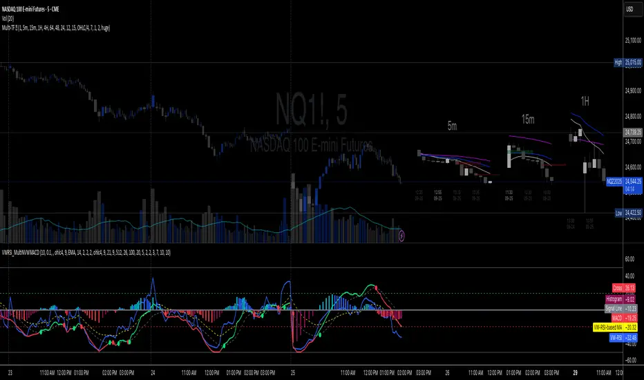
Stacey Burke Signal Day LTE“Previously published as ‘Day Zero Fakeout Detector MTF’”
Stacey Burke Signal Day LTE
Automatic detection of Day Zero, Inside Days, and Outside Days for Stacey Burke’s intraday playbook
🔎 Stacey Burke’s Signal Days
This indicator highlights the key daily patterns that often lead to high-probability intraday setups in Stacey Burke’s methodology:
1️⃣ Day Zero
The reset days within a 3-day cycle (e.g. breakout → continuation → exhaustion/reversal).
Can mark the beginning of a new directional phase.
Trades back inside the prior range after a Peak Formation High (PFH) or Peak Formation Low (PFL).
Bias: Look for measured parabolic session moves. When combined with trend following indicators, these signal days can be very powerful.
2️⃣ Inside Day
A day where the entire range is contained within the prior day’s range.
Signals consolidation and energy build-up.
Often leads to explosive breakouts in the next session.
Bias: Trade breakouts of the inside day’s high/low or breakout reversal in the session at key timings in the direction of higher timeframe bias. When combined with trend following indicators, these signal days can be very powerful.
3️⃣ Outside Day (Engulfing Day)
`
A day where the range is larger than the prior day’s range, engulfing both high and low.
Marks trapped traders and fakeouts on both sides.
Often precedes strong continuations or sharp reversals from outside of the ranges.
Bias: Align trades with the true continuation move. When combined with trend following indicators, these signal days can be very powerful.
📌 How They Work Together
Day Zero → Signals the new cycle after PFH/PFL.
Inside Day → Signals compression → expect breakout setups.
Outside Day → Signals exhaustion/fakeouts → expect reversals or continuations.
Together, they give traders a clear daily roadmap for where liquidity sits and when to expect the highest-probability setups.
✅ Example in Practice
Market rallies for 3 days → PFH forms → Day Zero short bias.
Next day prints an Inside Day → watch for breakout continuation short, and breakout reversals.
Later, an Outside Day traps both longs and shorts → the following session offers a clean intraday reversal or continuation trade in line with the underlying MTF trend/bias.
⚙️ Features of This Indicator
Automatic detection of Day Zero, Inside Days, and Outside Days
Multi-Timeframe (MTF) support for cycle alignment
Visual markers for PFH/PFL and consolidation zones
Measured move projections for breakout targets
👉 Stacey Burke Signal Day LTE gives traders just a few of the most important signal days — Day Zero, Inside Day, and Outside Day — to structure their intraday trades around fake outs, breakouts, and reversals within the daily cycles of the week. (This is work in progress: Next up, FRD/FGD's, 3-day cycle detecting, 3DLs, 3DSs).

Adaptive Rolling Quantile Bands [CHE] Adaptive Rolling Quantile Bands
Part 1 — Mathematics and Algorithmic Design
Purpose. The indicator estimates distribution‐aware price levels from a rolling window and turns them into dynamic “buy” and “sell” bands. It can work on raw price or on *residuals* around a baseline to better isolate deviations from trend. Optionally, the percentile parameter $q$ adapts to volatility via ATR so the bands widen in turbulent regimes and tighten in calm ones. A compact, latched state machine converts these statistical levels into high-quality discretionary signals.
Data pipeline.
1. Choose a source (default `close`; MTF optional via `request.security`).
2. Optionally compute a baseline (`SMA` or `EMA`) of length $L$.
3. Build the *working series*: raw price if residual mode is off; otherwise price minus baseline (if a baseline exists).
4. Maintain a FIFO buffer of the last $N$ values (window length). All quantiles are computed on this buffer.
5. Map the resulting levels back to price space if residual mode is on (i.e., add back the baseline).
6. Smooth levels with a short EMA for readability.
Rolling quantiles.
Given the buffer $X_{t-N+1..t}$ and a percentile $q\in $, the indicator sorts a copy of the buffer ascending and linearly interpolates between adjacent ranks to estimate:
* Buy band $\approx Q(q)$
* Sell band $\approx Q(1-q)$
* Median $Q(0.5)$, plus optional deciles $Q(0.10)$ and $Q(0.90)$
Quantiles are robust to outliers relative to means. The estimator uses only data up to the current bar’s value in the buffer; there is no look-ahead.
Residual transform (optional).
In residual mode, quantiles are computed on $X^{res}_t = \text{price}_t - \text{baseline}_t$. This centers the distribution and often yields more stationary tails. After computing $Q(\cdot)$ on residuals, levels are transformed back to price space by adding the baseline. If `Baseline = None`, residual mode simply falls back to raw price.
Volatility-adaptive percentile.
Let $\text{ATR}_{14}(t)$ be current ATR and $\overline{\text{ATR}}_{100}(t)$ its long SMA. Define a volatility ratio $r = \text{ATR}_{14}/\overline{\text{ATR}}_{100}$. The effective quantile is:
Smoothing.
Each level is optionally smoothed by an EMA of length $k$ for cleaner visuals. This smoothing does not change the underlying quantile logic; it only stabilizes plots and signals.
Latched state machines.
Two three-step processes convert levels into “latched” signals that only fire after confirmation and then reset:
* BUY latch:
(1) HLC3 crosses above the median →
(2) the median is rising →
(3) HLC3 prints above the upper (orange) band → BUY latched.
* SELL latch:
(1) HLC3 crosses below the median →
(2) the median is falling →
(3) HLC3 prints below the lower (teal) band → SELL latched.
Labels are drawn on the latch bar, with a FIFO cap to limit clutter. Alerts are available for both the simple band interactions and the latched events. Use “Once per bar close” to avoid intrabar churn.
MTF behavior and repainting.
MTF sourcing uses `lookahead_off`. Quantiles and baselines are computed from completed data only; however, any *intrabar* cross conditions naturally stabilize at close. As with all real-time indicators, values can update during a live bar; prefer bar-close alerts for reliability.
Complexity and parameters.
Each bar sorts a copy of the $N$-length window (practical $N$ values keep this inexpensive). Typical choices: $N=50$–$100$, $q_0=0.15$–$0.25$, $k=2$–$5$, baseline length $L=20$ (if used), adaptation strength $s=0.2$–$0.7$.
Part 2 — Practical Use for Discretionary/Active Traders
What the bands mean in practice.
The teal “buy” band marks the lower tail of the recent distribution; the orange “sell” band marks the upper tail. The median is your dynamic equilibrium. In residual mode, these tails are deviations around trend; in raw mode they are absolute price percentiles. When ATR adaptation is on, tails breathe with regime shifts.
Two core playbooks.
1. Mean-reversion around a stable median.
* Context: The median is flat or gently sloped; band width is relatively tight; instrument is ranging.
* Entry (long): Look for price to probe or close below the buy band and then reclaim it, especially after HLC3 recrosses the median and the median turns up.
* Stops: Place beyond the most recent swing low or $1.0–1.5\times$ ATR(14) below entry.
* Targets: First scale at the median; optional second scale near the opposite band. Trail with the median or an ATR stop.
* Symmetry: Mirror the rules for shorts near the sell band when the median is flat to down.
2. Continuation with latched confirmations.
* Context: A developing trend where you want fewer but cleaner signals.
* Entry (long): Take the latched BUY (3-step confirmation) on close, or on the next bar if you require bar-close validation.
* Invalidation: A close back below the median (or below the lower band in strong trends) negates momentum.
* Exits: Trail under the median for conservative exits or under the teal band for trend-following exits. Consider scaling at structure (prior swing highs) or at a fixed $R$ multiple.
Parameter guidance by timeframe.
* Scalping / LTF (1–5m): $N=30$–$60$, $q_0=0.20$, $k=2$–3, residual mode on, baseline EMA $L=20$, adaptation $s=0.5$–0.7 to handle micro-vol spikes. Expect more signals; rely on latched logic to filter noise.
* Intraday swing (15–60m): $N=60$–$100$, $q_0=0.15$–0.20, $k=3$–4. Residual mode helps but is optional if the instrument trends cleanly. $s=0.3$–0.6.
* Swing / HTF (4H–D): $N=80$–$150$, $q_0=0.10$–0.18, $k=3$–5. Consider `SMA` baseline for smoother residuals and moderate adaptation $s=0.2$–0.4.
Baseline choice.
Use EMA for responsiveness (fast trend shifts) and SMA for stability (smoother residuals). Turning residual mode on is advantageous when price exhibits persistent drift; turning it off is useful when you explicitly want absolute bands.
How to time entries.
Prefer bar-close validation for both band recaptures and latched signals. If you must act intrabar, accept that crosses can “un-cross” before close; compensate with tighter stops or reduced size.
Risk management.
Position size to a fixed fractional risk per trade (e.g., 0.5–1.0% of equity). Define invalidation using structure (swing points) plus ATR. Avoid chasing when distance to the opposite band is small; reward-to-risk degrades rapidly once you are deep inside the distribution.
Combos and filters.
* Pair with a higher-timeframe median slope as a regime filter (trade only in the direction of the HTF median).
* Use band width relative to ATR as a range/trend gauge: unusually narrow bands suggest compression (mean-reversion bias); expanding bands suggest breakout potential (favor latched continuation).
* Volume or session filters (e.g., avoid illiquid hours) can materially improve execution.
Alerts for discretion.
Enable “Cross above Buy Level” / “Cross below Sell Level” for early notices and “Latched BUY/SELL” for conviction entries. Set alerts to “Once per bar close” to avoid noise.
Common pitfalls.
Do not interpret band touches as automatic signals; context matters. A strong trend will often ride the far band (“band walking”) and punish counter-trend fades—use the median slope and latched logic to separate trend from range. Do not oversmooth levels; you will lag breaks. Do not set $q$ too small or too large; extremes reduce statistical meaning and practical distance for stops.
A concise checklist.
1. Is the median flat (range) or sloped (trend)?
2. Is band width expanding or contracting vs ATR?
3. Are we near the tail level aligned with the intended trade?
4. For continuation: did the 3 steps for a latched signal complete?
5. Do stops and targets produce acceptable $R$ (≥1.5–2.0)?
6. Are you trading during liquid hours for the instrument?
Summary. ARQB provides statistically grounded, regime-aware bands and a disciplined, latched confirmation engine. Use the bands as objective context, the median as your equilibrium line, ATR adaptation to stay calibrated across regimes, and the latched logic to time higher-quality discretionary entries.
Disclaimer
No indicator guarantees profits. Adaptive Rolling Quantile Bands is a decision aid; always combine with solid risk management and your own judgment. Backtest, forward test, and size responsibly.
The content provided, including all code and materials, is strictly for educational and informational purposes only. It is not intended as, and should not be interpreted as, financial advice, a recommendation to buy or sell any financial instrument, or an offer of any financial product or service. All strategies, tools, and examples discussed are provided for illustrative purposes to demonstrate coding techniques and the functionality of Pine Script within a trading context.
Any results from strategies or tools provided are hypothetical, and past performance is not indicative of future results. Trading and investing involve high risk, including the potential loss of principal, and may not be suitable for all individuals. Before making any trading decisions, please consult with a qualified financial professional to understand the risks involved.
By using this script, you acknowledge and agree that any trading decisions are made solely at your discretion and risk.
Enhance your trading precision and confidence 🚀
Best regards
Chervolino
Kootch EMA MapKootch EMA overlays the 200 EMA from M1, M5, M15, M30, H1, H4, and D1 on any chart so you always see where higher and lower-timeframe trend gravity actually is. It also builds an optional Fib channel between the most extreme MTF 200 EMAs (min/max), giving you clean intrachannel targets and confluence zones.
What it does
• Plots seven 200 EMAs (M1 → D1) simultaneously via MTF pulls
• Color/weight hierarchy: thicker lines = higher timeframe (clear priority)
• Right-edge TF tags (M1, M5, … D1) so you know exactly what you’re looking at
• Optional Fib levels between min/max MTF 200 EMAs (0 → 1 band) for entries, adds, and take-profit scaling
Why traders use it
• Immediate read on trend alignment vs. chop across timeframes
• Mean-reversion & continuation cues when price stretches from/returns to key EMAs
• Level stacking: use M30/H1/H4/D1 as bias, trade entries around lower-TF reactions
Inputs
• EMA Length (default 200)
• Label offset (push tags off the last bar)
• Show Fib channel toggle + color control
How I use it
• Bias from D1/H4/H1; execution from M5/M15.
• Fade or follow at Fib 0.382 / 0.618 inside the EMA envelope; scale out near Fib 1.0 into HTF EMAs.
• Skip trades when EMAs are braided and distances are compressed.
Notes
• Works on any symbol/timeframe; all TF EMAs are requested explicitly.
• This is a map, not a crystal ball: combine with your playbook (structure breaks, FVGs, liquidity, volume).
