Tìm kiếm tập lệnh với "weekly"
VWAP Balance Zones - SessionsVWAP Balance Zones Sessions Version is an alternate take on the Original VWAP Balance Zones indicator. The Sessions version allows users to select a specific session to view the VWAP Balance Zones at while still utilizing the full ETH Data.
The Session version provides a better focused display while still maintaining the core functions of the original script with mindful optimizations.
Author's Note: "VBZ Sessions was made with logistics in mind, for the users who only trade within certain times of the day. While it displays the same core concepts, it is not as "Raw" of a display as the Original. For this reason, some users may prefer the Original VWAP Balance Zones, which is why I have opted to release this alternate version instead of updating the original."
> What are VWAP Balance Zones?
"VWAP Balance Zones" is an original concept aimed at identifying the equilibrium area between market participants within the current trend by averaging the Daily Extremes and the Daily VWAP.
Refer to the illustration below for a better understanding of exactly how VWAP Balance Zones are formed:
These zones are displayed for the Daily, Weekly, and Monthly VWAPs, with the most interactive timeframe being the Daily.
> Features
1. The Session Version uses ETH data at all times, and does not solely rely on the chart's data to create the VWAPs or Zones.
This allows the user to focus on a specific trading session, while not losing out on the full VBZ Calculation, with the notable benefit of a cleaner display.
The Original VBZ starts drawing at the beginning of the chart's "Day", and would produce different results when using an RTH chart vs an ETH chart. Along with creating a bird's nest of unusable data at the beginning of the day.
2. Session Start and End lines are displayed for easier identification of the designated trading session.
3. The extreme "Close" Lines are no longer displayed to reduce noise and redundancy.
4. Additionally, the interior VWAP lines are no longer displayed. Ultimately, this was to reduce noise and focus the script on the 50% zones.
5. Weekly and Monthly Zones are now displayed due to the reduced noise!
6. As with the original, the weekly display will yield to the daily, and the monthly display will yield to the weekly.
In the screenshot below, you can observe this behavior.
Enjoy!

Dynamic Weekly Price Envelope
This is a indicator that I have been developing and personally using for over a year. The basic concept is a dynamic range that is derived from the previous weeks range. The main philosophy followed when designing this indicator was that it should be applicable to all asset classes, and it should provide objective price levels of support and resistance that do not change when price approaches them. This indicator is most useful in range bound price action, but gives a lot of useful information on any market condition at a glance. The indicator also generates a custom vwap that reflects the volume weighted price since the price broke significant levels.
Indicator Description
The indicators most important price levels are the top 3 lines and the bottom 3 lines. These lines are distinguished by their wider line thickness with default settings. These levels act as support and resistance, and the price entering these regions indicates that the asset is overbought or oversold. A setting is available to highlight in red or green when price is overbought or oversold. Here is an example:
This example also demonstrates one of my personal favorite signals, which is when the price reenters the central channel, then retests the overbought/oversold region, as it does in the example, shown by the second set of red arrows.
Timeframes
This indicator reacts dynamically, so the levels will look different on different timeframes. The hourly chart works best from my experience in forex and crypto with default settings, but in general lower timeframes will give a more accurate picture during extreme price action. Note: assets that have shorter sessions generally should use a smaller timeframe. I like to use 15min on stocks, this is similar to the hour chart in crypto or forex. Take this GBPUSD chart for example:
As you can see the price has a very extreme impulse, and all resistances are passed. You can see that the lines still act as support when price falls back into the range, but the indicator is not very useful when price exits the range. The solution for this is to drop down to a lower timeframe that will adjust faster to the extreme price movement.
Here you can see that the range shifts with the price movement, indicating support levels throughout the entire price impulse.
I will also drop down to lower timeframes if I want to utilize the price levels within the channel as support and resistance levels for intraday trading. Here is an example with price level interactions indicated by red and green arrows.
THe most significant levels are still the centerline and the top and bottom three levels, but the inner lines also are nice for intraday support and resistance.
Larger time frames like the daily chart also are useful. Let's take the daily Bitcoin chart as an example:
On larger timeframes,
If price is below the central red line price is trending down, and if price is above central red line, the trend is up
The asset trading outside of the entire range indicates that the trend is very strong, reentry into the channel indicates that price is likely to consolidate.
The outer lines still serve as significant support and resistance.
Settings
I have configured the default settings to perform well for most assets, but I allow the user to change settings as they desire.
Line Color - this setting changes the color of the lines.
Fill Color - this setting changes the fill color used for the indicator
Line Transparency - The transparency of the lines, set to 100 to completely hide all lines
Base Fill Transparency - This setting changes the base transparency for the channel, this transparency will be used for the outermost bands
Transparency Gradient Step - each band will become this amount more transparent as they come closer to the centerline
Adjustment Lag - this adjusts how quickly the channel adjusts when the top and bottom levels are breached. I have always used 100, but using much higher or lower values gives interesting results.
Show Signals - This enables basic swing signals to be shown by red and green triangles. Note that this is only one signal, and the system actually has many signals outside of these triangles. They only indicate optimal entries for a swing trading technique based on the indicator.
Show Oversold/Overbought Price - ticking this box results in the fill color changing to green when price is oversold, and red when the price is overbought.
That about covers all the basics for using this indicator, please reach out with comments or messages if you would like to know anything more. Thanks for reading, and I hope you can use this tool to help your analysis. A monthly version and a refined strategy are in the works and will be published soon.
Monthly Weekly Daily Hourly CLOSESDraws horizontal segments where the last Monthly, Weekly, Daily and Hourly closes are.
Easily identify current price relative position to these key prices.
I use it as a kind of pivot points and help me with trend following entries: longs if up from last close, shorts if down from last close.
Monthly: red line (MMMMM)
Weekly: orange line (WWWWW)
Daily: yellow line (DDDDD)
Hourly: white line (HHHHH)
//Original idea from "Key Levels
Furious PivotsSimple script marking out quarter points plus weekly and daily highs and lows! pretty damn useful

[astropark] price levels lightDear Followers,
today I'm glad to present you an light version indicator of my "price levels" one that you can see here below:
It's a great analysis tool, for both scalpers, day traders and swing traders, and it works on every timeframe, market and pair .
I suggest you so check-out previous version indicator's description to understand how to use it and why such a tool may be important for your trading journey.
This light indicator puts the focus on following values only:
Monday Range (High - Low - Mid Range)
Weekly Open (which is also Monday Open)
Monthly Open
Yearly Open
Yearly Range (High - Low)
Besides it's a light version, it comes with a nice feature, enabled by default: shows only latest value of each type!
This way you will have a very clean chart, as you can skip to see previous not anymore important values, focusing on latest ones.
As in the not-light version, you can:
choose price levels to hide and show
change each level color / thickness / display style (solid or dotted)
choose to show or hide price labels and change their size
This is a premium indicator , so send me a private message in order to get access to this script.

Previous Day, Week, Month High/Low Line IndicatorMade a line indicator for previous Daily Weekly & Monthly High / Low. You can use all 3 (D,W,M) or just one by editing the settings.

Pivot Point Std With CPR,2 EMA,MW S R,P Day H L - by AnanthPivot Point Std With CPR,2 EMA,Monthly Weekly Support Resistance,Previous Day High and Low - by Ananth

MAGNUS® CyclesThis indicator will help you if you struggle making any profit in bitcoin.
It generates very few signals with very nice profit potential ( around 100% this year ! ).
Perfect tool for longterm swing traders and new traders that need help figuring out the midterm trend.
Use it with these parameters only:
weekly: 13, 5, 12
daily: 92, 21, 96

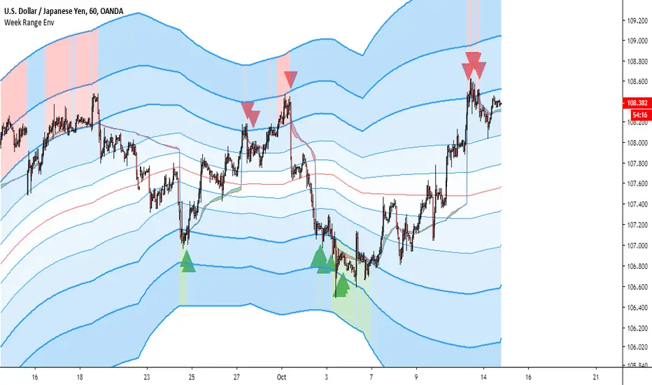
Trap LineOverview
Trap Line is a higher-timeframe trend framework designed to define market regimes using smoothed weekly (1W) and three-week (3W) baselines. Price trading above the line reflects a bullish regime; price below the line reflects a bearish one. The goal is regime discipline—stay aligned with the dominant higher-timeframe direction and avoid late, emotional entries. All parameters are fixed to ensure consistent behavior across symbols.
Core logic (concepts, not full code)
• Computes a Hull-type moving average on 1W and 3W closes (with optional linear-regression pre-filtering) and projects them onto lower timeframes via interpolation.
• Produces a smooth, lag-reduced structural baseline that tracks the weekly trend path.
• Observing price vs. the baseline highlights potential trap zones—temporary breaches that often fail without a confirmed weekly close.
• The 3-Week Trap Line adds a macro confirmation layer and is hidden by default in the Style tab to keep charts clean.
Inputs
• Parameters (length, smoothing type, regression toggle, interpolation mode) are fixed to prevent overfitting and preserve repeatability.
How to read it
• Above the line => bullish regime.
• Below the line => bearish regime.
• A confirmed weekly close through the line suggests a regime transition.
• A weekly close above the line with a green candle supports bullish continuation; a weekly close below the line with a red candle supports bearish continuation.
• Intraweek deviations near the line are often noise and may fade.
Practical use cases
• Weekly bias filter for swing/position frameworks.
• Regime confirmation across related assets or sectors.
• Portfolio overlay: favor long exposure in bullish regimes; reduce risk in bearish regimes.
• Combine with volume or ATR-based tools to assess trend quality.
Best practices
• Wait for the weekly close before declaring regime flips.
• Avoid overreacting to intraweek moves around the baseline.
• Combine with structure analysis (HH/HL vs. LH/LL) and higher-timeframe S/R.
• Use standard time-based candles; avoid interpreting signals on Heikin Ashi, Renko, Kagi, Point & Figure, or Range charts.
Technical notes
• Built on locked higher-timeframe data (1W and 3W).
• Interpolation is used to render HTF structure smoothly on lower charts.
• Non-repainting : values finalize when the higher timeframe closes; lower-TF plotting is interpolated, not forward-looking.
Who it is for
• Traders who want a consistent, rules-based higher-timeframe bias filter.
• Systematic users who prefer fixed-parameter baselines for regime context.
Limitations & disclosures
• Closed-source; educational and analytical use only.
• Not financial advice. Markets involve risk; past performance does not guarantee future results.
Release notes
• Includes the 3-Week Trap Line (3W). It is hidden by default in the Style tab; enable it if you want an additional macro confirmation layer.
• Fixed-parameter design (no user-tweakable inputs) for consistent behavior across symbols.
• Non-repainting values finalize on 1W/3W candle close.
Originality & why closed-source
This is not a reimplementation of public open-source scripts. Trap Line uses a specific combination of higher-timeframe Hull smoothing, optional linear-regression pre-filtering, and lower-timeframe interpolation designed to expose trap zones (temporary regime breaches that often fail without a confirmed weekly close). The integration and thresholds are proprietary and tuned to retain weekly structure with reduced lag. The source is closed to protect this implementation.
Integration, not a mashup
Trap Line is a single, self-contained framework. It does not merely merge other indicators; its components are integrated to produce a unified higher-timeframe baseline (1W/3W) with a defined reading protocol (above/below line, weekly-close confirmation, optional candle-color confirmation).
Indicator, not a strategy
This publication provides an indicator overlay , not a trading strategy. It includes no backtests, position logic, performance claims, or risk assumptions. Use it as an analytical bias filter within your own risk management.
Comparison to common tools
Compared to standard MAs or SuperTrend-style bands, Trap Line prioritizes (1) higher-timeframe structure fidelity, (2) reduced lag via HMA-type smoothing, and (3) explicit weekly-close confirmation to avoid premature regime flips. The optional 3-Week line acts as a macro confirmation layer and is hidden by default in the Style tab.
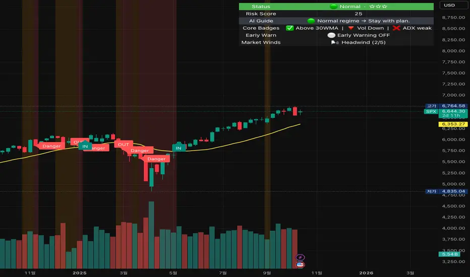
Crash Survival Indicator (SPX, Weekly/Daily)Short description
SPX-focused risk context tool using 30WMA/ATR/ADX and distance to 30WMA, with optional Hindenburg-Omen breadth and macro add-ons. Weekly is primary; Daily provides early-warning. Educational only.
Full description (English first)
What it is
Crash Survival Indicator (CSI) is a rules-based risk context indicator for the S&P 500 index (SPX). It helps keep decisions data-driven during stress by combining four weekly conditions into a weighted risk score and presenting them in a readable dashboard. Optional breadth (Hindenburg Omen cluster proxy) and macro add-ons give additional context. This is not a buy/sell system.
Why it’s original and useful
Weekly core with confirmation: Four classic conditions (30WMA regime, ATR(14) trend, ADX(14) > 20 & rising, and % distance from 30WMA) feed a 0–100 score. A 2-of-3 gate (WMA down / ATR up / ADX>20↑) must confirm before “Danger,” reducing false spikes.
Daily Early-Warning: A separate daily preview flags conditions approaching the Danger threshold (with a streak filter). It’s a heads-up only, not a timeframe switch.
Scope control to avoid confusion: Signals (labels/alerts) are restricted to SPX on Weekly/Daily by design. The dashboard can be shown SPX-only or on all symbols (configurable).
Clarity for all users: Beginner card view (plain badges) and Pro table view (detailed chips) improve readability without hiding logic.
How it works (mechanics)
Weekly core (primary frame)
30WMA regime: price vs 30-week WMA; IN/OUT labels on crosses.
ATR(14): rising ATR counts as volatility stress.
ADX(14): risk weight when ADX > 20 and rising.
Distance to 30WMA: % deviation flags potential overheat.
Scoring & thresholds: Weighted sum → Caution ≥ 40, Danger ≥ 60 (defaults). Danger also requires the 2-of-3 gate above.
Daily Early-Warning: Uses daily versions of the same ideas to detect near-Danger conditions with a streak requirement (heads-up only).
Optional breadth (Hindenburg Omen proxy): Elevated new highs and new lows while the NYSE Composite is above its 50DMA, with deteriorating breadth momentum; requires cluster confirmation to reduce noise.
Optional macro add-ons: VIX regime, DXY strength, credit stress (HYG/LQD vs MA), and TNX trend each add adjustable weights.
Inputs (overview)
Scope & Mode: SPX primary/alt tickers; signal restriction to SPX + Weekly/Daily; dashboard visibility (SPX-only vs all symbols); Beginner or Pro display.
Label Policy: Weekly-only / Weekly-core + Daily-early (default) / All (W/D); lookback windows and minimum bar gaps to prevent clutter.
Scoring: Weights for 30WMA down, ATR up, ADX>20↑, Overheat; Caution/Danger thresholds; Overheat % (distance).
Hindenburg Omen (optional): NYSE Composite and High/Low/AD series; cluster requirement.
Macro add-ons (optional): Symbols + weights for VIX, DXY, HYG, LQD, TNX.
Early Warning (Daily): Near-Danger buffer and streak length.
Visuals & Alerts: Background shading, labels on/off, font size, dashboard position, runtime
alerts.
Alerts (contextual; not trade signals)
OUT — 30WMA Down Break (Weekly)
IN — 30WMA Reclaim (Weekly)
Risk ≥ Danger + 2-of-3 Gate
Hindenburg Omen Cluster detected
Early Warning (Daily near Danger, streak)
Alerts provide context only. They are not buy/sell instructions.
Intended use and limitations
Use the Weekly panel for decisions; treat Daily Early-Warning as a heads-up.
Best used as risk framing alongside your own process (position sizing, liquidity, event risk).
Breadth/macro inputs depend on your data source; if unavailable, keep add-ons off.
No forward-looking data or lookahead; designed to avoid repainting.
Disclaimer
For educational purposes only. Not financial advice, not an investment recommendation, and not a solicitation to buy or sell any security. Past performance does not guarantee future results. Users are solely responsible for their decisions and regulatory compliance.
Optional Korean addendum (append after English)
한국어 안내 요약: 본 지표는 위기 상황에서 감정보다 데이터를 우선할 수 있도록 리스크 맥락을 제공합니다. 주봉이 핵심, 일봉은 조기경보(Heads-up)이며, 매수/매도 신호가 아닙니다. 심프님의 프로토타입 철학을 살리되 SPX 한정 신호, 라벨/알림 정책, 선택형 오멘/매크로 기능, 초보/프로 대시보드 등 가독성을 개선했습니다. 투자 판단과 책임은 전적으로 사용자에게 있습니다.
Privacy & format
Visibility: Public
Source: Protected (no source disclosure), compliant with Publishing Rules
Language: English title & description first; Korean addendum optional
Screenshot guidance (for your gallery)
Weekly SPX showing dashboard at “Danger” with an OUT label.
Weekly SPX with Hindenburg Omen Cluster label and shaded background.
Daily SPX with Early-Warning label as weekly approaches Danger.
Beginner vs Pro dashboard comparison on SPX.
Author certification (paste if needed)
I certify this publication contains no promotions, links, or solicitations, complies with TradingView House Rules and Script Publishing Rules, uses Pine v5, and is intended solely for educational purposes with no performance claims.
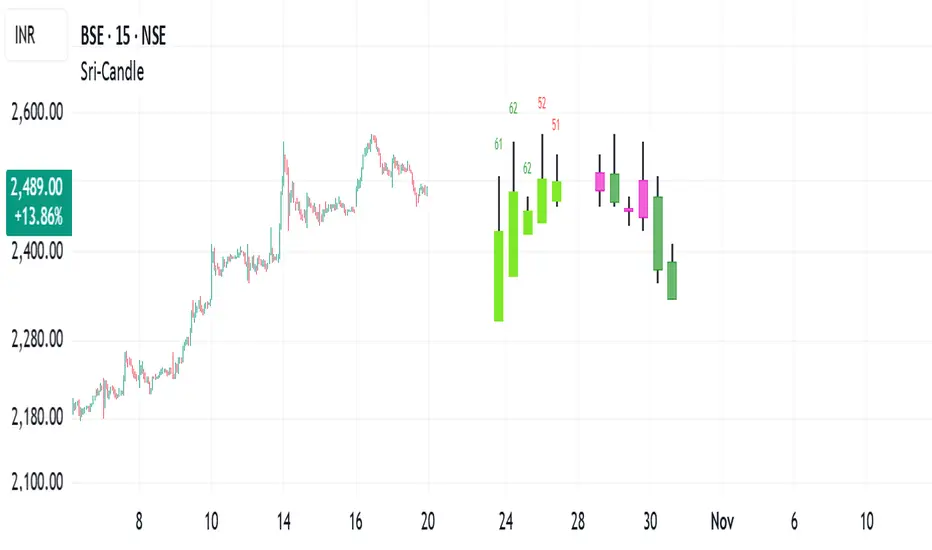
Sri - Daily & Weekly Candle Strength Sri - Daily & Weekly Candle Strength
Short Title: Sri-Candle
Overlay: Yes
Description:
The Sri - Daily & Weekly Candle Strength indicator is designed to visually display recent daily and weekly candle activity directly on your chart, highlighting buyer and seller dominance for each candle. It helps traders quickly assess the strength of bullish vs bearish pressure over recent periods and can be used with both Normal and Heikin Ashi candles. This tool is particularly useful for swing traders, position traders, and technical analysts who want a clear view of candle momentum without switching timeframes.
Features:
Multi-Timeframe Candles:
Displays the last several daily candles and weekly candles on your chart.
Supports Normal or Heikin Ashi candles for both daily and weekly views.
Candle Strength Analysis:
Calculates buyer strength and seller strength as percentages based on candle body relative to the total candle range.
Highlights the dominant strength (higher of buyer or seller) above each candle.
Option to round dominant strength percentages to whole numbers.
Customizable Colors:
Set separate bullish and bearish colors for daily and weekly candles.
Customize wick colors independently for daily and weekly candles.
Positioning and Layout Options:
Adjust horizontal offset, candle thickness, and gap between candles for both daily and weekly candles.
Choose label positions for date labels (Top, Bottom, Absolute level).
Flexible Text Display:
Choose label text size (Tiny, Small, Normal, Large, Huge).
Daily candles display the day of the month on the candle optionally.
Dynamic Candle Rendering:
Each candle is plotted as a box with wicks, accurately reflecting open, high, low, and close.
Dominant strength percentage label is colored green for bullish dominance and red for bearish dominance.
Inputs:
Daily Settings:
Show Daily Candles – Toggle daily candle visibility.
Daily Candle Type – Choose between Normal or Heikin Ashi.
Daily Timeframe – Select Daily (D), Weekly (W), or Monthly (M).
Bull Candle Color (D) – Color for bullish daily candles.
Bear Candle Color (D) – Color for bearish daily candles.
Wick Color (D) – Color for candle wicks.
Horizontal Offset (D) – Distance from current bar to start drawing.
Candle Thickness (D) – Width of candle boxes.
Gap Between Candles (D) – Space between consecutive candles.
Daily Label Position – Position for the date label.
Absolute Level – Y-axis level when using absolute label position.
Strength Label Text Size – Size of the dominant strength label.
Round Dominant % (No Decimals) – Round the displayed strength to whole numbers.
Weekly Settings:
Show Weekly Candles – Toggle weekly candle visibility.
Weekly Candle Type – Choose Normal or Heikin Ashi.
Weekly Timeframe – Select Daily (D), Weekly (W), or Monthly (M).
Bull Candle Color (W) – Color for bullish weekly candles.
Bear Candle Color (W) – Color for bearish weekly candles.
Wick Color (W) – Wick color for weekly candles.
Horizontal Offset (W) – Distance from current bar for weekly candles.
Candle Thickness (W) – Width of weekly candle boxes.
Gap Between Candles (W) – Space between consecutive weekly candles.
How It Works:
The script fetches candle data using the request.security() function for the selected timeframe and type (Normal or Heikin Ashi).
Each candle’s buyer and seller strength is calculated as:
Buyer Strength (%) = ((Close - Low) / (High - Low)) * 100
Seller Strength (%) = ((High - Close) / (High - Low)) * 100
Candles are drawn as boxes with wicks on the chart at the specified horizontal offset.
The dominant strength is displayed above each candle, colored green for bullish dominance or red for bearish dominance.
Daily candles can optionally show the day of the month as a label.
Use Cases:
Quickly identify recent bullish or bearish trends on daily and weekly timeframes.
Compare strength of buyers vs sellers across multiple periods.
Combine with other technical indicators for multi-timeframe analysis.
P3 Weekly Goldbach levelsP3 Weekly Session Projections
Originality and Uniqueness:
Novel Time-Based Approach:
This indicator uniquely combines the previous weeks range analysis with mathematical Goldbach number sequences
Unlike standard Fibonacci retracements that use swing highs/lows, this script uses a specific weekly session window for consistent anchor points
The weekly reset mechanism ensures levels are always based on the most recent Sunday session, providing fresh, relevant levels
2. Mathematical Innovation:
First-of-its-kind application weekly Goldbach numbers (100, 97, 89, 83, 71, 59, 50, 47, 41, 29, 17, 11, 3, 0) as support/resistance levels
Dual-range projection system: Projects both standard deviations internally and overlays Goldbach levels for precise mathematical alignment
Auto-extending ranges when price breaks beyond 100/0 levels – automatically adds upper and lower GB ranges
3. Advanced Technical Features:
Dynamic label positioning with 4 different modes (Right Edge, Left of Line, Right of Line, Fixed Position)
Color-coded level hierarchy: Red (G:100), Green (G:0), Yellow (G:111/-111) for instant visual recognition
Session-based calculations using real market hours rather than arbitrary chart points
Clean weekly management – automatically removes previous levels and draws fresh ones each Sunday
Practical Usefulness:
1. Professional Trading Application:
Institutional session timing: plots when major institutions begin weekly positioning
Objective level placement: Eliminates subjective swing high/low selection - uses concrete session data
Multi-market applicability: Works on forex, indices, commodities, and crypto that trade during this session
2. Risk Management Benefits:
Predefined support/resistance zones based on mathematical progression rather than subjective analysis
Extension levels provide targets when price moves beyond normal ranges
Weekly refresh ensures levels remain relevant to current market structure
3. Unique Market Insights:
Goldbach number spacing provides mathematically-derived levels that often align with natural market movements
Session-based anchoring captures institutional weekly bias and positioning
Visual clarity with customizable labels and positioning for different trading styles
How It Differs from Existing Scripts:
Not a standard Fibonacci tool - uses specific mathematical sequence with weekly session anchoring
Not a generic pivot indicator - focuses on Sunday institutional session range
Not a simple support/resistance script - combines time-based analysis with mathematical projections
Not a rehash of existing indicators - genuinely novel approach combining session analysis with Goldbach mathematics
Target Audience:
Institutional traders using weekly analysis
Mathematical traders interested in number theory applications
Session-based analysts focusing on specific market opening periods
Risk management specialists needing objective level placement
This script represents genuine innovation in combining specific market session analysis with mathematical number theory, providing traders with a unique tool that doesn't exist elsewhere in the TradingView library.
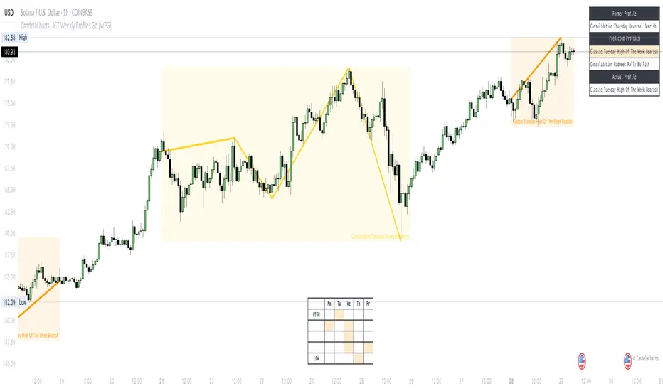
CandelaCharts - ICT Weekly Profiles Go (WPG) 📝 Overview
The indicator provides a pattern-based approach to the ICT Weekly Profiles, emphasizing a line that marks the Open, High, Low, and Close of the week. This line allows you to instantly visualize and identify the Weekly Profile.
ICT Weekly Profiles are structured conceptual frameworks designed to outline typical patterns of price behavior over the course of a trading week. These profiles serve as analytical tools, offering traders insights into recurring market tendencies and helping them identify potential opportunities and risks.
The toolkit automatically detects and marks these Weekly Profiles on the chart, enabling traders to quickly pinpoint critical zones for analysis and decision-making.
📦 Features
The Block Concepts toolkit offers a comprehensive set of features designed to enhance trading precision and decision-making. Key features include:
Weekly Profiles (8)
Advanced Styling
Scanner
The indicator supports the following profiles:
ICT Weekly Profiles
Classic Tuesday Low Of The Week Bullish
Classic Tuesday High Of The Week Bearish
Wednesday Low Of The Week Bullish
Wednesday High Of The Week Bearish
Consolidation Thursday Reversal Bullish
Consolidation Thursday Reversal Bearish
Consolidation Midweek Rally Bullish
Consolidation Midweek Rally Bearish
⚙️ Settings
History: Controls how many profiles are displayed on the chart.
Timeframe Limit: Sets the timeframe up to which profiles will be drawn.
Show OHLC Lines: Display the lines for OHLC.
Show Profile Line: Display the Weekly Profile line.
Use NY Midnight Open: Controls from where a profile will start detection.
Open: Style for Open line.
High: Style for High line.
Low: Style for Low line.
Midline: Style for Profile Midline.
Label: Controls the position of the Weekly Profile name.
Scanner: Display the Scanner
⚡️ Showcase
ICT (Inner Circle Trader) weekly profile templates are analytical frameworks that categorize and describe typical patterns of price action observed during a trading week.
ICT Weekly Profiles
Scanner
📒 Usage
The primary objective of the ICT Weekly Profiles indicator is to provide traders with a comprehensive and actionable overview of the Weekly Previous, Current, and Future Profile. This allows traders to interpret market structure, anticipate price behavior, and align their trading decisions with higher time-frame trends.
Load the indicator on the chart
Enable Scanner
See the Predicted Profiles list
Predicted Profiles represent all potential scenarios for the current week, generated by a profile detection algorithm.
By visualizing potential outcomes through Predicted Profiles, the ICT Weekly Profiles indicator provides traders with a strategic edge, allowing them to remain flexible, prepared, and aligned with the most probable market movements.
🚨 Alerts
The indicator does not provide any alerts!
🔹 Notes
ICT Weekly Profiles
pbs.twimg.com
⚠️ Disclaimer
Trading involves significant risk, and many participants may incur losses. The content on this site is not intended as financial advice and should not be interpreted as such. Decisions to buy, sell, hold, or trade securities, commodities, or other financial instruments carry inherent risks and are best made with guidance from qualified financial professionals. Past performance is not indicative of future results.
CandelaCharts - ICT Weekly Profiles📝 Overview
The indicator provides a pattern-based approach to the ICT Weekly Profiles, emphasizing a line that marks the Open, High, Low, and Close of the week. This line allows you to instantly visualize and identify the Weekly Profile.
The profile detection relies on the week’s high and low, delivering a clear and concise representation of the weekly profile.
ICT Weekly Profiles are structured conceptual frameworks designed to outline typical patterns of price behavior over the course of a trading week. These profiles serve as analytical tools, offering traders insights into recurring market tendencies and helping them identify potential opportunities and risks.
The ICT Weekly Profiles indicator offers two distinct types of profiles to provide a clearer understanding of weekly price action:
ICT Weekly Profiles
ICT Missing Weekly Profiles
The toolkit automatically detects and marks these ICT Weekly Profiles and ICT Missing Weekly Profiles on the chart, enabling traders to quickly pinpoint critical zones for analysis and decision-making.
📦 Features
The ICT Weekly Profiles toolkit offers a comprehensive set of features designed to enhance trading precision and decision-making. Key features include:
Weekly Profiles
Missing Weekly Profiles
Advanced Styling
Scanner
The indicator supports the following profiles:
ICT Weekly Profiles
Classic Tuesday Low Of The Week Bullish
Classic Tuesday High Of The Week Bearish
Wednesday Low Of The Week Bullish
Wednesday High Of The Week Bearish
Consolidation Thursday Reversal Bullish
Consolidation Thursday Reversal Bearish
Consolidation Midweek Rally Bullish
Consolidation Midweek Rally Bearish
Wednesday Weekly Reversal Bullish
Wednesday Weekly Reversal Bearish
Seek And Destroy Bullish Friday
Seek And Destroy Bearish Friday
ICT Missing Weekly Profiles
Monday Low Tuesday High Bullish
Monday High Tuesday Low Bearish
Monday Low Wednesday High Bullish
Monday High Wednesday Low Bearish
Monday Low Thursday High Bullish
Monday High Thursday Low Bearish
Tuesday Low Wednesday High Bullish
Tuesday High Wednesday Low Bearish
Tuesday Low Friday High Bullish
Tuesday High Friday Low Bearish
Wednesday Low Thursday High Bullish
Wednesday High Thursday Low Bearish
Monday Low Friday High Bullish
Monday Friday Bearish Rally
Monday High/Low Range
Tuesday High/Low Range
Wednesday High/Low Range
Thursday High/Low Range
Friday High/Low Range
⚙️ Settings
History: Controls how many profiles are displayed on the chart.
Timeframe Limit: Sets the timeframe up to which profiles will be drawn.
Show OHLC Lines: Display the lines for OHLC.
Show Profile Line: Display the Weekly Profile line.
Use NY Midnight Open: Controls from where a profile will start detection.
Open: Style for Open line.
High: Style for High line.
Low: Style for Low line.
Midline: Style for Profile Midline.
Label: Controls the position of the Weekly Profile name.
Scanner: Display the Scanner
⚡️ Showcase
ICT (Inner Circle Trader) weekly profile templates are analytical frameworks that categorize and describe typical patterns of price action observed during a trading week.
ICT Weekly Profiles
ICT Missing Weekly Profiles
Scanner
📒 Usage
The primary objective of the ICT Weekly Profiles indicator is to provide traders with a comprehensive and actionable overview of the Weekly Previous, Current, and Future Profile. This allows traders to interpret market structure, anticipate price behavior, and align their trading decisions with higher time-frame trends.
Load the indicator on the chart
Enable Scanner
See the Predicted Profiles list
Predicted Profiles represent all potential scenarios for the current week, generated by a profile detection algorithm.
By visualizing potential outcomes through Predicted Profiles, the ICT Weekly Profiles indicator provides traders with a strategic edge, allowing them to remain flexible, prepared, and aligned with the most probable market movements.
🚨 Alerts
The indicator does not provide any alerts!
🔹 Notes
ICT Weekly Profiles
pbs.twimg.com
ICT Missing Weekly Profiles
pbs.twimg.com
⚠️ Disclaimer
These tools are exclusively available on the TradingView platform.
Our charting tools are intended solely for informational and educational purposes and should not be regarded as financial, investment, or trading advice. They are not designed to predict market movements or offer specific recommendations. Users should be aware that past performance is not indicative of future results and should not rely on these tools for financial decisions. By using these charting tools, the purchaser agrees that the seller and creator hold no responsibility for any decisions made based on information provided by the tools. The purchaser assumes full responsibility and liability for any actions taken and their consequences, including potential financial losses or investment outcomes that may result from the use of these products.
By purchasing, the customer acknowledges and accepts that neither the seller nor the creator is liable for any undesired outcomes stemming from the development, sale, or use of these products. Additionally, the purchaser agrees to indemnify the seller from any liability. If invited through the Friends and Family Program, the purchaser understands that any provided discount code applies only to the initial purchase of Candela's subscription. The purchaser is responsible for canceling or requesting cancellation of their subscription if they choose not to continue at the full retail price. In the event the purchaser no longer wishes to use the products, they must unsubscribe from the membership service, if applicable.
We do not offer reimbursements, refunds, or chargebacks. Once these Terms are accepted at the time of purchase, no reimbursements, refunds, or chargebacks will be issued under any circumstances.
By continuing to use these charting tools, the user confirms their understanding and acceptance of these Terms as outlined in this disclaimer.

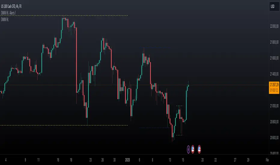
Daily Weekly Monthly Highs & Lows - Alerts !
1. Purpose
The script helps traders:
• Visualize the high and low levels for the previous daily, weekly, and monthly periods.
• Receive alerts when the current price crosses these levels.
• Identify key support and resistance zones based on historical highs and lows.
2. Key Features
User Inputs
The script offers customization options through input parameters:
• Daily Levels:
• Enable/disable displaying daily levels (Show Daily Levels).
• Customize the color for daily level lines (Daily Line Color).
• Weekly Levels:
• Enable/disable displaying weekly levels (Show Weekly Levels).
• Customize the color for weekly level lines (Weekly Line Color).
• Monthly Levels:
• Enable/disable displaying monthly levels (Show Monthly Levels).
• Customize the color for monthly level lines (Monthly Line Color).
3. Core Functionality
Level Calculations
The script retrieves the previous daily, weekly, and monthly highs and lows using the request.security() function:
• Daily High/Low: Taken from the previous day’s high and low.
• Weekly High/Low: Taken from the previous week’s high and low.
• Monthly High/Low: Taken from the previous month’s high and low.
Price Crossing Detection
For each level (daily, weekly, monthly), the script checks if the current high or low price has crossed:
• The previous high (triggering a “High Reached” alert).
• The previous low (triggering a “Low Reached” alert).
4. Visual Features
The script plots lines to represent the previous highs and lows:
• Daily Levels:
• Dashed lines for the previous daily high and low.
• Configurable color (Daily Line Color).
• Weekly Levels:
• Dashed lines for the previous weekly high and low.
• Configurable color (Weekly Line Color).
• Monthly Levels:
• Dashed lines for the previous monthly high and low.
• Configurable color (Monthly Line Color).
These lines extend forward by one bar for better visibility on the chart.
5. Alert Features
The script provides alerts for when the price crosses these levels:
• Daily Alerts:
• “Daily High Reached” when the current price crosses the previous daily high.
• “Daily Low Reached” when the current price crosses the previous daily low.
• Weekly Alerts:
• “Weekly High Reached” when the current price crosses the previous weekly high.
• “Weekly Low Reached” when the current price crosses the previous weekly low.
• Monthly Alerts:
• “Monthly High Reached” when the current price crosses the previous monthly high.
• “Monthly Low Reached” when the current price crosses the previous monthly low.
6. Practical Use Case
This script is ideal for traders who:
• Use support and resistance levels from daily, weekly, and monthly timeframes as part of their strategy.
• Want to monitor price interactions with these levels in real-time.
• Need automatic alerts for key price movements without continuously monitoring the chart.
7. Limitations
• Max Line Count: TradingView limits the number of lines that can be drawn on the chart to max_lines_count = 500.
• No Historical Levels: The script only tracks the most recent daily, weekly, and monthly levels and does not display historical levels.
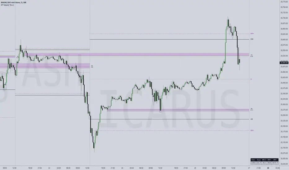
DTT Weekly Volatility Grid [Pro+] (NINE/ANARR)Introduction:
Automate Digital Time Theory (DTT) Weekly Models with the DTT Weekly Volatility Grid , leveraging the proprietary framework developed by Nine and Anarr. This tool allows to navigate the advanced landscape of Time-based statistical trading for futures, crypto, and forex markets.
Description:
Built on the Digital Time Theory (DTT), this script provides traders with a structured view of time and price interactions, ideal for swing insights. It divides the weekly range into Time models and inner intervals, empowering traders with data-driven insights to anticipate market expansions, detect Time-based distortions, and understand volatility fluctuations at specific Times during the trading week.
Key Features:
Time-Based Weekly Models and Volatility Awareness: The DTT Weekly Time Models automatically map onto your chart, highlighting critical volatility points in weekly sessions. These models help traders recognize potential shifts in the market, ideal for identifying larger, swing-oriented moves.
Average Model Range Probability (AMRP): The AMRP feature calculates the historical probability of reaching previous DTT Weekly Model Ranges. With AMRP and Standard Deviation metrics, traders can evaluate the likelihood of DTT model continuations or breaks, aligning their strategy with higher Timeframe volatility trends.
Root Candles and Liquidity Draws: Visualize Root Candles as liquidity draws, emphasizing premium and discount areas and marking the origin of a Time-based price movement. The tool allows traders to toggle features like opening prices and equilibrium points of each Root Candle. Observing accumulation or distribution zones around these candles provides crucial reference points for strategic swing entries and exits.
Extended Visualization of Weekly Model Ranges: Leverage previous weekly model ranges within the current Time model to observe historical high, low, and equilibrium levels. This feature aids traders in visualizing premium and discount ranges of prior models, pinpointing areas of liquidity and imbalance to watch.
Customization Options: Tailor Time intervals with a variety of line styles (solid, dashed, dotted) and colours to customize each model. Adjust settings to display specific historical weekly models, apply custom labels, and create a personalized view that suits your trading style and focus.
Lookback Periods and Model Count: Select customizable lookback periods to display past models, offering insights into market behaviour over a chosen historical range. This feature enables clean, organized charts and allows analysts to add more models for detailed backtesting and analysis.
Detailed Real-Time Data Table: The live data table provides easy access to AMRP and range data for selected models. This table highlights model targets and anticipated ranges, offering insights into whether previous models have exceeded historical volatility expectations or remained within them.
How Traders Can Use The DTT Weekly Volatility Grid Effectively:
Identifying Premium and Discount Zones: Track weekly ranges using Root Candles and previous model equilibrium levels to assess if prices are trading in premium or discount areas. This information helps framing the broader swing outlook.
Timing Trades Based on Volatility: Recognize potential exhaustion points through AMRP insights or completed model distortions that may signal new expansions. By observing inner intervals and Root Candles, traders can identify periods of high market activity, assisting in Timing weekly entries and exits.
Avoiding Low Volatility Phases: AMRP calculations can indicate periods when price action may slow or become choppy. If price remains within AMRP deviations or near them, traders can adjust risk or step aside, awaiting more favourable conditions for volatility-driven trades as new inner intervals or model roots appear.
Designed for Swing Traders and Higher Timeframes: The Weekly DTT Models are suited for those looking to study higher timeframe trends across futures, forex, and crypto markets. This tool equips traders with volatility-aware, and data-driven insights during extended market cycles.
Usage Guidance:
Add DTT Weekly Volatility Grid (NINE/ANARR) to your TradingView chart.
Customize your preferred time intervals, model history, and visual settings for your session.
Use the data table to track average model ranges and probabilities, ensuring you align your trades with key levels.
Incorporate DTT Weekly Volatility Grid (NINE/ANARR) into your existing strategies to fine-tune your view through based on data-driven insights into volatility and price behaviour.
Terms and Conditions
Our charting tools are products provided for informational and educational purposes only and do not constitute financial, investment, or trading advice. Our charting tools are not designed to predict market movements or provide specific recommendations. Users should be aware that past performance is not indicative of future results and should not be relied upon for making financial decisions. By using our charting tools, the purchaser agrees that the seller and the creator are not responsible for any decisions made based on the information provided by these charting tools. The purchaser assumes full responsibility and liability for any actions taken and the consequences thereof, including any loss of money or investments that may occur as a result of using these products. Hence, by purchasing these charting tools, the customer accepts and acknowledges that the seller and the creator are not liable nor responsible for any unwanted outcome that arises from the development, the sale, or the use of these products. Finally, the purchaser indemnifies the seller from any and all liability. If the purchaser was invited through the Friends and Family Program, they acknowledge that the provided discount code only applies to the first initial purchase of the Toodegrees Premium Suite subscription. The purchaser is therefore responsible for cancelling – or requesting to cancel – their subscription in the event that they do not wish to continue using the product at full retail price. If the purchaser no longer wishes to use the products, they must unsubscribe from the membership service, if applicable. We hold no reimbursement, refund, or chargeback policy. Once these Terms and Conditions are accepted by the Customer, before purchase, no reimbursements, refunds or chargebacks will be provided under any circumstances.
By continuing to use these charting tools, the user acknowledges and agrees to the Terms and Conditions outlined in this legal disclaimer.
Tập lệnh trả phí
Master Accumulation Weekly Buy SignalsMaster Accumulation Weekly Buy Signals
The Master Accumulation Weekly Buy Signals indicator is designed to help traders identify potential buy opportunities based on the accumulation and distribution of volume, with a primary focus on weekly timeframes. This indicator combines the On Balance Volume (OBV) and the Accumulation/Distribution (AD) indicators to generate buy signals when both metrics show a decline.
Key Features:
Percentage Change Calculation: Calculates the percentage change in OBV and AD over a specified length tailored to weekly timeframes.
Timeframe Adaptability: While optimized for weekly timeframes, the indicator can also adjust to daily and monthly charts.
Volume Validation: Ensures that volume data is available and valid for accurate calculations.
Buy Signals: Generates buy signals when both OBV and AD percentage changes are negative, indicating potential accumulation by informed traders.
Visual Alerts: Plots buy signal triangles below the price bars on the main chart for easy identification.
How It Works:
On Balance Volume (OBV): Tracks the cumulative volume, considering the direction of price changes, and calculates the percentage change over the specified period, primarily for weekly analysis.
Accumulation/Distribution (AD): Measures the flow of volume into or out of a security, considering the relationship between the closing price and the high-low range, and calculates the percentage change over the specified period, primarily for weekly analysis.
Buy Signal Generation: A buy signal is generated when both OBV and AD show a negative percentage change, suggesting a potential buying opportunity.
How to Use:
Apply the indicator to your chart and select the weekly timeframe for optimal performance.
Look for buy signal triangles that appear below the price bars on the main chart.
Use the buy signals as part of your broader trading strategy, confirming them with other technical analysis tools and indicators.
Important Note:
This indicator is a tool to assist in identifying potential buy signals based on volume accumulation patterns. It is primarily designed for weekly timeframes and should not be used as a standalone trading strategy. Always perform comprehensive analysis and consider risk management practices before making any trading decisions.
This description highlights the indicator's primary focus on weekly timeframes while providing comprehensive information about its features and usage.
THIS IS TEST ONLY*******

RD Key Levels (Weekly, Daily, Previous vWAP)The RexDog Key Levels indicator plots the weekly open, daily open, and the previous day vWAP close.
These are all critical price levels (zones) to know when trading any market or instrument. These areas are also high probability reaction areas that you can trade using simple confirmation trading patterns.
First, I'll cover an overview of the indicator then I'll share general usage tips.
Weekly Open - default is white/orange. White is when price is above the weekly open. Orange is when price is below the weekly open.
Weekly High/Low - there are options to turn on the weekly high and lows. Default plot is circles. Green is the high. Red is the low.
Daily Open - default is green/red. Green is when price is above the daily open. Red is when price is below the daily open.
Previous vWAPs - aqua single lines. These are the closing price of the daily vWAPs.
Top Indicators - The triangles at the top of the chart signify is price is currently above or below the weekly open. This is helpful on lower timeframe charts (5m, 15m) to get a quick indication when price is far extended beyond the weekly open. Green triangle = above weekly open. Red triangle = below weekly open.
General Usage
Each one of these levels are important levels markets look use for continuation or failure of momentum and bias. I also find it extremely helpful to think of these levels as magnets, dual magnets. They both attract and repel price at the same time. Now you might say, how is that helpful to have opposing views at the same time? Be indifferent to direction, create your own rules on when these price zones repel or attract price, I have my own.
Here's the easiest way to use these price levels.
As price approaches one of these levels to expect a reaction. A reaction is price is going in one direction and price hits a price level zone and reacts in the opposite direction.
These are price zones, sometimes you will see a reaction right at the price but visualize these areas as zones of reaction.
A high percentage of the time when price approaches these level zones there will be a reaction. So trade the reaction .
How do you do that?
Simple. Trade patterns that repeat. I have 3 solid patterns I trade around these key levels:
The first pattern is early entry with precise scale in rules and a very effective protective stop loss placement.
The second pattern is wait for confirmation that the level holds. This requires more patience and for you to fully trust the chart. The benefit of this pattern is with confirmation you have even more precise stop placement.
There is a bonus third pattern I trade around these levels. I call this the confirmation and bluff entry. It's a combination of both of the patterns above. You wait for confirmation but on any pull back you call the bluff on the market and enter on key test. Trade management here is critical. In addition to the pattern you trade you should have a series of failure patterns that tell you to get out of the trade, I use 2 primary failure patterns.
I trade all markets, same system, same rules, so I'll show a few examples.
Usually I start with Bitcoin but let's start with equities:
BA - Boeing - 8 Trades
Here we see weekly low patterns, previous week low test, vwAP hold patterns, day magnets and day holding. Then 2 week failures and a double hold pattern.
These are all straightforward trades to execute following really simple patterns.
BTCUSD Previous vWAP and Day Open Trades
We see here on the circle areas both daily open and previous day vWAP zone tests. Within this chart are all 3 highly effective patterns I trade.
SPY - 7 High Probability Trades
Here we see a pDay vWAP mixed with a daily failure. Next a daily retest, then a pDay vWAP failure, then a vWAP capture and test. Then a double weekly failure test (great trade there) and finally a daily test.
I could provide more examples but most are just derivatives of the above examples.
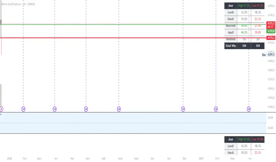
MGC1! - Stats jour du Weekly High/Low Lun VenIndicator Name: Weekly High/Low Day Statistics (Probability Dashboard)
Description:
This indicator provides a statistical edge by analyzing historical price action to determine which day of the week is most likely to form the Weekly High or the Weekly Low.
Designed for intraday traders and swing traders, this tool helps you anticipate the structure of the weekly candle. By understanding the probabilities of when the extremums (HOD/LOD of the week) usually occur, you can better align your trade setups with the true weekly expansion.
Key Features:
Historical Analysis: Calculates statistics based on a user-defined lookback period (default is 104 weeks / 2 years) to ensure statistical significance.
Probability Dashboard: Displays a clean table on the chart showing the percentage chance for each day (Monday to Friday) to be the High or Low of the week.
Rolling Window: Automatically updates data at the close of every week to keep probabilities current.
How to Use (ICT/SMC Context):
Weekly Profiles: Use this data to validate "Classic Tuesday Low" or "Wednesday/Thursday Reversal" profiles.
Bias Confirmation: If the statistics show a 40% chance of the Weekly Low forming on a Tuesday, and price is diving into a Higher Timeframe POI on Tuesday morning, this adds high-probability confluence to your long setups.
Targeting: If the Weekly High typically forms on Thursday and it is currently Wednesday, you can hold runners for an expansion into the next day.
DAILY AND WEEKLY MID LINESDAILY AND WEEKLY MID LINES INDICATOR
Description:
This indicator calculates and visualizes the dynamic midpoint (mid) of the current day and week in real-time. It provides traders with key reference levels based on developing price action.
Features:
Daily Mid Line:
Color: Orange
Thickness: 3 pixels
Style: Solid line
Updates: Automatically recalculates with each new candle
Calculation: Average of the day's highest high and lowest low from market open
Weekly Mid Line:
Color: Blue
Thickness: 3 pixels
Style: Dashed line
Updates: Continuously recalculates throughout the week
Calculation: Average of the week's highest high and lowest low from week start
How It Works:
At the start of each new trading day (00:00), the daily mid line resets and begins calculating from the first candle
At the start of each new trading week (typically Monday), the weekly mid line resets and begins fresh calculations
Both lines extend automatically to the right as new candles form
The lines are dynamic - they adjust as new highs/lows are made during the day/week
Trading Applications:
Support/Resistance Levels:
The mid lines act as natural equilibrium points where price may find temporary support or resistance
Daily mid can serve as intraday pivot, weekly mid as broader market balance point
Trend Analysis:
Price consistently above mid lines suggests bullish momentum
Price consistently below mid lines suggests bearish momentum
Relationship between daily and weekly mid lines shows multi-timeframe alignment
Entry/Exit Signals:
Price crossing above daily mid may indicate short-term bullish momentum
Price crossing below daily mid may indicate short-term bearish momentum
Weekly mid breaks can signal more significant trend changes
Market Context:
Distance between price and mid lines indicates market extremity
Steeper mid line slopes suggest stronger directional momentum
Flat mid lines suggest range-bound or consolidating markets
Confluence Trading:
Combine with other indicators (RSI, MACD, moving averages) for confirmation
Use as dynamic levels for stop-loss placement or take-profit targets
Best Practices:
More effective on higher timeframes (1H, 4H, Daily) for clearer signals
Works well in trending markets where mid lines act as moving support/resistance
Monitor for price rejection or acceptance at mid levels for trading decisions
Use in conjunction with volume analysis for confirmation
Psychological Significance:
Mid points often represent fair value areas where buyers and sellers find temporary equilibrium, making them natural decision points for market participants.
This indicator is particularly useful for day traders, swing traders, and position traders looking for dynamic, real-time reference points that adapt to current market conditions rather than relying on static historical levels.

Sunday Open & Friday Close LinesSunday Open & Friday Close Lines — © Erica Lorrai | Trade Tribe HQ
A clean weekly anchor tool for traders who love simple, high-signal charting.
Clean charts, clean mind, clean trades.
This script marks the two most important moments of every trading week:
where the market closed… and where it truly reopened.
Designed for traders who use dealer-cycle logic, market structure, or BTMM-style timing, these lines help you instantly:
Spot weekend gaps
Identify weekly narrative shifts
See where the dealers reset liquidity
Anchor your weekly analysis with precision
Track the beginning of new cycles and the end of old ones
No clutter. No noise. Just two high-value levels that quietly run your entire week.
Customize the color, width, and line type to match your chart style and make weekly transitions impossible to miss.
Whether you're new to trading or deep into pattern-cycle logic, this little tool becomes one of those “how did I trade without this?” markers.
© Erica Lorrai — Trade Tribe HQ
Aloha & welcome to the Tribe. 🌺
How to Use
Add the script to your chart on any timeframe.
The indicator automatically detects each new trading week.
Two vertical lines will appear:
Friday Close Line – last candle before the weekend
Sunday Open Line – first candle of the new week
Use the settings panel to customize color, width, and line style.
These weekly anchors help you identify weekend gaps, weekly resets, and structural shifts in real time.
If you’re new here — welcome to the Tribe. 🌺
This little tool is one of the first things I teach my traders:
“See the week clearly, and the trades get clearer too.”
If you want more BTMM-style tools, weekly breakdowns, or want to learn the system behind these levels, come hang out at Trade Tribe HQ.
Happy trading.
— Erica Lorrai

z8u Daily & Weekly Key Levels (Extended)1. OVERVIEW
------------------------------------------------------------------------
The "Daily & Weekly Key Levels" indicator is a charting tool designed to
visualize critical auction market structures. It overlays automated
historical price data (Previous Day/Week Highs and Lows) with manual
inputs for Volume Profile levels (VAH, VAL, POC) and Institutional
"Kickoff" levels.
It is designed to replicate specific institutional styling, allowing
traders to see where the market is balancing relative to previous sessions.
2. FEATURES
------------------------------------------------------------------------
Automated Lookback:
Automatically calculates previous Day's High/Low/Settlement and
previous Week's High/Low.
Hybrid Input System:
Allows manual entry for data points that require specific feed
accuracy (Value Area High, Value Area Low, POC).
Clean Charting:
Manual levels default to '0.0'. If no price is entered in the
settings, the lines remain invisible to keep the chart clean.
Custom Styling:
Colors and line weights are pre-configured to match standard
Volume Profile aesthetics.
4. CONFIGURATION (INPUTS TAB)
------------------------------------------------------------------------
To see the Volume Profile and Kickoff lines, you must enter prices
manually in the indicator settings.
1. Double-click the indicator line on the chart (or the gear icon).
2. Go to the "Inputs" tab.
3. Enter the price levels for the current session:
- Yesterday's Value Area High Price
- Yesterday's VPOC Price
- Yesterday's Value Area Low Price
- Weekly Kickoff Low Price
- Weekly Kickoff High Price
*Note: If you leave a value as 0.0, that specific line will not be drawn.*
5. COLOR LEGEND (STYLE TAB)
------------------------------------------------------------------------
The lines are color-coded as follows:
Last Week's High
Yesterday's High
Yesterday's Value Area High (VAH)
Yesterday's VPOC (Volume Point of Control)
Settlement (Previous Close)
Yesterday's Value Area Low (VAL)
Yesterday's Low
Weekly Kickoff Low
Weekly Kickoff High
Last Week's Low
6. DISCLAIMER
------------------------------------------------------------------------
This tool is for informational and educational purposes only. It does not
constitute financial advice. Trading futures and financial markets
involves substantial risk of loss.
14 minutes ago
Release Notes
UPDATE
*Added Extend Levels to the Right Toggle
