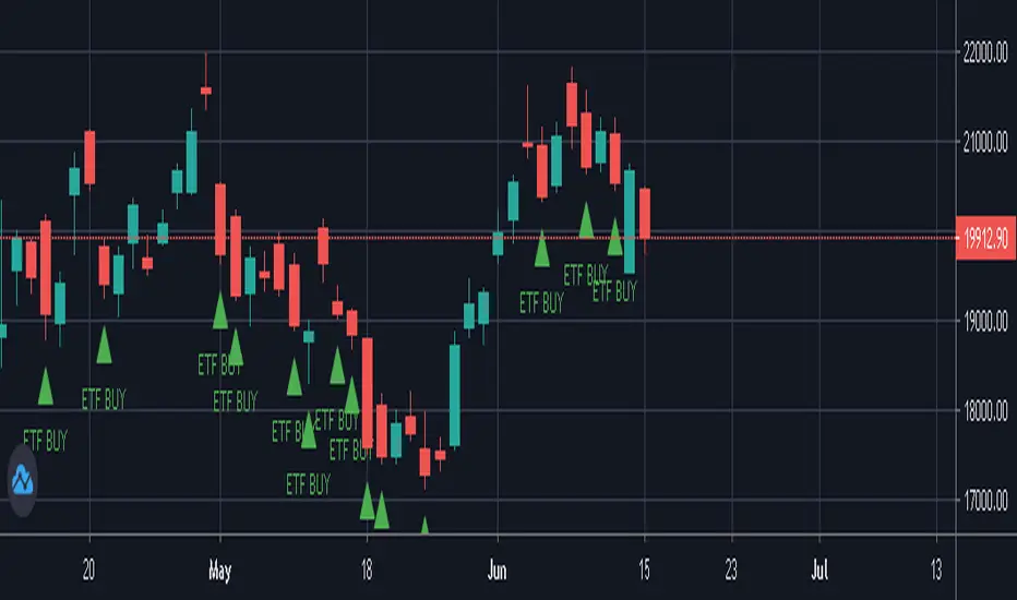
NIFTY / BANKNIFTY ETF SIP NOTIFIERNIFTY / BANKNIFTY - ETF SIP NOTIFIER
STUDY concept -
- As a market investor, one cannot time the market.
- Specailly, working professionals and job holders don't have time for market tracking.
- The idea of the script is - When Nifty closes below 2% previous day high, market has corrected and it's available at a discount w.r.t. previous day
- One can then invest in NIFTY / BANKNIFTY via ETF option on same or next day.
- If you like this idea, Save this script and add alert condition of this script in NIFTY / BANKNIFTY chart.
- One can get notification on TradingView mobile app or via email when the criteria is met.
- Logic can be applied to investing in INDEXES , NIFTY, BANKNIFTY.
Logic may be improved later.
NOTE - Investing is a serious and risky business. Profit / Loss from this investing idea is sole responsibility of the investor. This script is for education and learning purpose.
Tìm kiếm tập lệnh với "易方达黄金ETF联接A三点收盘的价格"
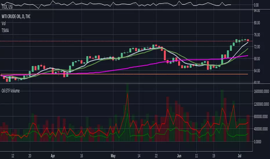
Oil ETF VolumeDirexxion Daily has both 'bear' and 'bull' oil ETFs. This tracks the volume in both combined. It also tracks them individually: the bear ETF is the red line, and bull the green.
NOTE: the color of the volume bars is determined by whatever ticker you're currently looking at, and whether current close is gt/lt previous close. It is intended to be used while looking at the USOIL chart. The colors will be inverted if you're looking at the 'bear' ETF! as the higher closes will actually mean price is going down :D
Leveraged ETF Volume Ratio3x/2x Long/short etf pairs for popular tickers, including TSLA, QQQ, META, PLTR... Extreme values indicate bullish/bearish sentiment.

Standardized Leveraged ETF Fund of FlowsThis indicator tracks and standardizes the 3-month fund flows of major leveraged ETFs across different asset classes, including equities, gold, and bonds.
The fund flows are summed over a 3-month period (63 trading days) and then standardized using a 500-day rolling mean and standard deviation.
The resulting normalized fund flow values are plotted in three distinct colors:
Blue for Equities Fund Flows
Yellow for Gold Fund Flows
Green for Bond Fund Flows

CE - 42MACRO Fixed Income and Macro This is Part 2 of 2 from the 42MACRO Recreation Series
However, there will be a bonus Indicator coming soon!
The CE - 42MACRO Fixed Income and Macro Table is a next level Macroeconomic and market analysis indicator.
It aims to provide a probabilistic insight into the market realized GRID Macro regimes,
track a multiplex of important Assets, Indices, Bonds and ETF's to derive extra market insights by showing the most important aggregates and their performance over multiple timeframes... and what that might mean for the whole market direction.
For traders and especially investors, the unique functionalities will be of high value.
Quick guide on how to use it:
docs.google.com
WARNING
By the nature of the macro regimes, the outcomes are more accurate over longer Chart Timeframes (Week to Months).
However, it is also a valuable tool to form an advanced,
market realized, short to medium term bias.
NOTE
This Indicator is intended to be used alongside the 1nd part "CE - 42MACRO Equity Factor"
for a more wholistic approach and higher accuracy.
Methodology:
The Equity Factor Table tracks specifically chosen Assets to identify their performance and add the combined performances together to visualize 42MACRO's GRID Equity Model.
For this it uses the below Assets:
Convertibles ( AMEX:CWB )
Leveraged Loans ( AMEX:BKLN )
High Yield Credit ( AMEX:HYG )
Preferreds ( NASDAQ:PFF )
Emerging Market US$ Bonds ( NASDAQ:EMB )
Long Bond ( NASDAQ:TLT )
5-10yr Treasurys ( NASDAQ:IEF )
5-10yr TIPS ( AMEX:TIP )
0-5yr TIPS ( AMEX:STIP )
EM Local Currency Bonds ( AMEX:EMLC )
BDCs ( AMEX:BIZD )
Barclays Agg ( AMEX:AGG )
Investment Grade Credit ( AMEX:LQD )
MBS ( NASDAQ:MBB )
1-3yr Treasurys ( NASDAQ:SHY )
Bitcoin ( AMEX:BITO )
Industrial Metals ( AMEX:DBB )
Commodities ( AMEX:DBC )
Gold ( AMEX:GLD )
Equity Volatility ( AMEX:VIXM )
Interest Rate Volatility ( AMEX:PFIX )
Energy ( AMEX:USO )
Precious Metals ( AMEX:DBP )
Agriculture ( AMEX:DBA )
US Dollar ( AMEX:UUP )
Inverse US Dollar ( AMEX:UDN )
Functionalities:
Fixed Income and Macro Table
Shows relative market Asset performance
Comes with different Calculation options like RoC,
Sharpe ratio, Sortino ratio, Omega ratio and Normalization
Allows for advanced market (health) performance
Provides the calculated, realized GRID market regimes
Informs about "Risk ON" and "Risk OFF" market states
Visuals - for your best experience only use one (+ BarColoring) at a time:
You can visualize all important metrics:
- GRID regimes of the currently chosen calculation type
- Risk On/Risk Off with background colouring and additional +1/-1 values
- a smoother GRID model
- a smoother Risk On/ Risk Off metric
- Barcoloring for enabled metric of the above
If you have more suggestions, please write me
Fixed Income and Macro:
The visualisation of the relative performance of the different assets provides valuable information about the current market environment and the actual market performance.
It furthermore makes it possible to obtain a deeper understanding of how the interconnected market works and makes it simple to identify the actual market direction,
thus also providing all the information to derive overall market health, market strength or weakness.
Utility:
The Fixed Income and Macro Table is divided in 4 Columns which are the GRID regimes:
Economic Growth:
Goldilocks
Reflation
Economic Contraction:
Inflation
Deflation
Top 5 Fixed Income/ Macro Factors:
Are the values green for a specific Column?
If so then the market reflects the corresponding GRID behavior.
Bottom 5 Fixed Income/ Macro Factors:
Are the values red for a specific Column?
If so then the market reflects the corresponding GRID behavior.
So if we have Goldilocks as current regime we would see green values in the Top 5 Goldilocks Cells and red values in the Bottom 5 Goldilocks Cells.
You will find that Reflation will look similar, as it is also a sign of Economic Growth.
Same is the case for the two Contraction regimes.
******
This Indicator again is based to a majority on 42MACRO's models.
I only brought them into TV and added things on top of it.
If you have questions or need a more in-depth guide DM me.
GM

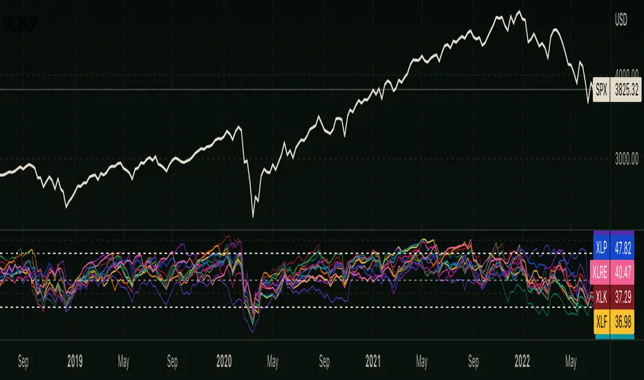
RSI - S&P Sector ETFsThe script displays RSI of each S&P SPDR Sector ETF
XLB - Materials
XLC - Communications
XLE - Energy
XLF - Financials
XLI - Industrials
XLK - Technology
XLP - Consumer Staples
XLRE - Real Estate
XLU - Utilities
XLV - Healthcare
XLY - Consumer Discretionary
It is meant to identify changes in sector rotation, compare oversold/overbought signals of each sector, and/or any price momentum trading strategy applicable to a trader.
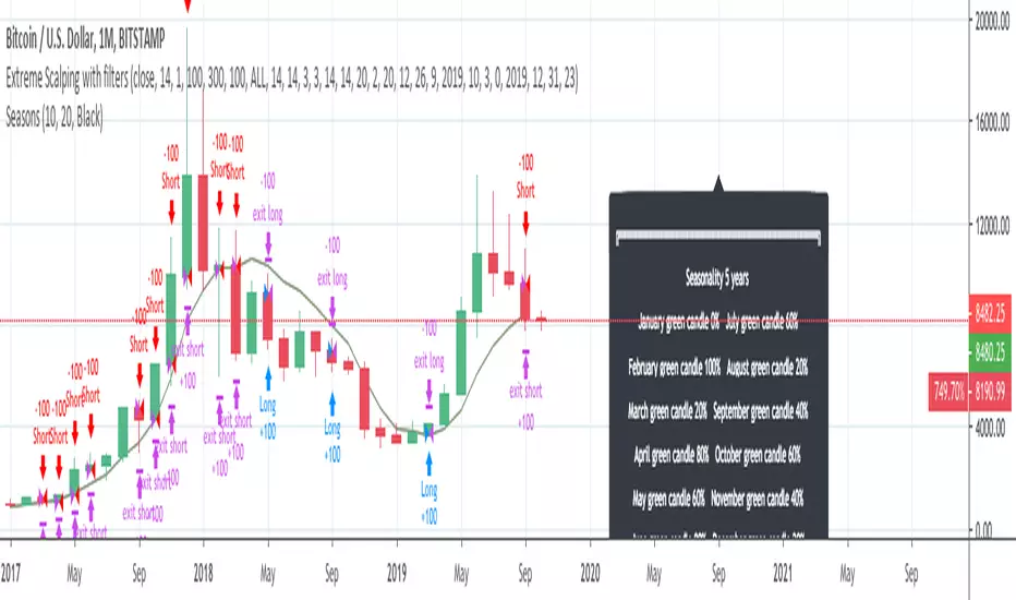
InfoPanel - SeasonalityThis panel will show which is the best month to buy a stock, index or ETF or even a cryptocurrency in the past 5 years.
Script to use only with MONTHLY timeframe.
Thanks to: RicardoSantos for his hard work.
Please use comment section for any feedback.
BAY Technical Indicators//@version=5
indicator("BAY Technical Indicators", overlay=true)
// Price source
price = close
// VWAP
vwap = ta.vwap
plot(vwap, title="VWAP", color=color.blue, linewidth=2)
// SMMA (RMA) 20 and 50
smma20 = ta.rma(price, 20)
smma50 = ta.rma(price, 50)
plot(smma20, title="SMMA 20", color=color.lime)
plot(smma50, title="SMMA 50", color=color.purple)
// EMA 9 and 21
ema9 = ta.ema(price, 9)
ema21 = ta.ema(price, 21)
plot(ema9, title="EMA 9", color=color.white)
plot(ema21, title="EMA 21", color=color.red)
// MA 200
ma200 = ta.sma(price, 200)
plot(ma200, title="MA 200", color=color.orange, linewidth=2)
// Volume SMA 9 (plotted in data window only)
volume_sma9 = ta.sma(volume, 9)
plot(volume_sma9, title="Volume SMA 9", color=color.fuchsia, linewidth=1, display=display.data_window)

BAY Technical Indicators//@version=5
indicator("BAY Technical Indicators", overlay=true)
// Price source
price = close
// VWAP (hlc3)
vwap = ta.vwap
plot(vwap, title="VWAP", color=color.orange, linewidth=2)
// Standard deviation calculations
length = 20 // You can adjust this period
dev = ta.stdev(price, length)
vwap_plus_2dev = vwap + 2 * dev
vwap_minus_2dev = vwap - 2 * dev
vwap_plus_3dev = vwap + 3 * dev
vwap_minus_3dev = vwap - 3 * dev
// Plot VWAP bands
plot(vwap_plus_2dev, title="+2 SD", color=color.teal)
plot(vwap_minus_2dev, title="-2 SD", color=color.teal)
plot(vwap_plus_3dev, title="+3 SD", color=color.maroon)
plot(vwap_minus_3dev, title="-3 SD", color=color.maroon)
// SMMA (RMA) 20 and 50
smma20 = ta.rma(price, 20)
smma50 = ta.rma(price, 50)
plot(smma20, title="SMMA 20", color=color.blue)
plot(smma50, title="SMMA 50", color=color.purple)
// EMA 9 and 21
ema9 = ta.ema(price, 9)
ema21 = ta.ema(price, 21)
plot(ema9, title="EMA 9", color=color.green)
plot(ema21, title="EMA 21", color=color.red)
// MA 200
ma200 = ta.sma(price, 200)
plot(ma200, title="MA 200", color=color.gray, linewidth=2)
// Volume SMA 9 (plotted in separate pane)
volume_sma9 = ta.sma(volume, 9)
plot(volume_sma9, title="Volume SMA 9", color=color.fuchsia, linewidth=1, display=display.data_window)

BAY Technical Indicators// This Pine Script® code is subject to the terms of the Mozilla Public License 2.0 at mozilla.org
// © baymont08980
//@version=5
indicator("BAY Technical Indicators", overlay=true)
// Price source
price = close
// VWAP (hlc3)
vwap = ta.vwap
plot(vwap, title="VWAP", color=color.orange, linewidth=2)
// SMMA (RMA) 20 and 50
smma20 = ta.rma(price, 20)
smma50 = ta.rma(price, 50)
plot(smma20, title="SMMA 20", color=color.blue)
plot(smma50, title="SMMA 50", color=color.purple)
// EMA 9 and 21
ema9 = ta.ema(price, 9)
ema21 = ta.ema(price, 21)
plot(ema9, title="EMA 9", color=color.green)
plot(ema21, title="EMA 21", color=color.red)
// MA 200
ma200 = ta.sma(price, 200)
plot(ma200, title="MA 200", color=color.gray, linewidth=2)
// Volume SMA 9 (plotted in separate pane)
volume_sma9 = ta.sma(volume, 9)
plot(volume_sma9, title="Volume SMA 9", color=color.fuchsia, linewidth=1, display=display.data_window)

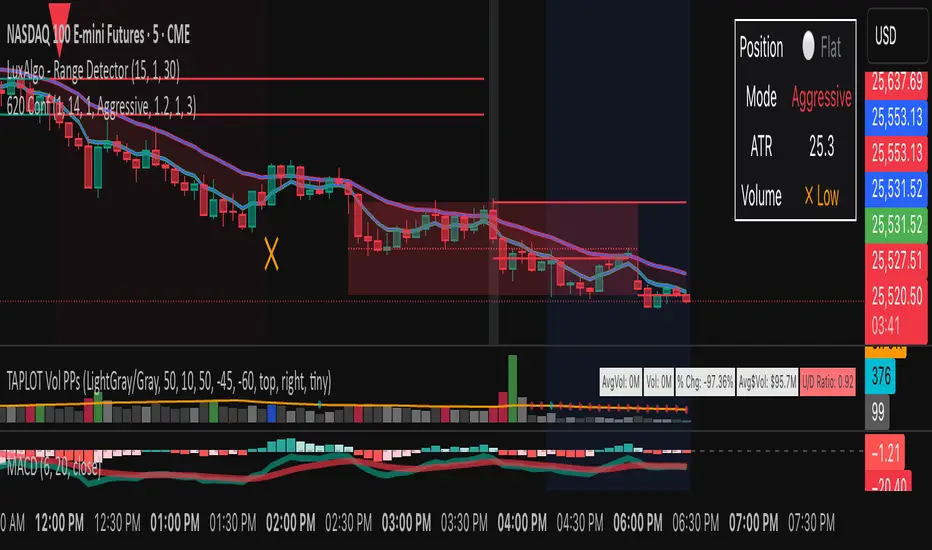
OWL 620 - Confirmed SignalsAdjustable 620 Indicator. This lets you adjust risk tolerance for day trading and is reliably backtested.
VIX OscillatorVIX Oscillator for catching vol signals on the same chart as your index of choice.
- Configurable levels that alert you when certain thresholds are broken
- Shaded background that make it simple to tell when you are in low vol/high vol regimes
- Moving line tracking price so that you can easily see bull/bear divergences against SPX building

TICK OscillatorOscillator that makes it easy to see when TICK is hitting extreme readings or establishing a bullish/bearish divergence vs the indices.
- Green coloration means a reading of >+400
- Red coloration means a reading of <-400
- Orange means a reading in between -400 and +400
This was inspired by John F Carter's book "Mastering The Trade", where I first learned about utilizing TICK in my trading.

Yang-Zhang Volatility (YZVol) by CoryP1990 – Quant ToolkitThe Yang-Zhang Volatility (YZVol) estimator measures realized volatility using both overnight gaps and intraday moves. It combines three components: overnight returns, open-to-close returns, and the Rogers–Satchell term, weighted by Zhang’s k to reduce bias.
How to read it
Line color: Green when YZVol is rising (volatility expansion), Red when falling (volatility compression).
Background: Green tint = above High-vol threshold (active regime). Red tint = below Low-vol threshold (quiet regime).
Units: Displays Daily % by default on any timeframe (values are normalized to daily). An optional toggle shows Annualized % (√252 × Daily %).
Typical uses
Spot transitions between quiet and active regimes.
Compare realized vol vs implied vol or a risk-target.
Adapt position sizing to volatility clustering.
Defaults
Length = 20
High-vol threshold = 5% (Daily)
Low-vol threshold = 1% (Daily)
Optional: Annualized % display
Example — SPY (1D)
During the 2020 crash, YZVol surged to 5.8 % per day, capturing the height of pandemic-era volatility before compressing into a calm regime through 2021. Volatility re-expanded in 2022 due to reinflamed COVID fears and gradually stabilized through 2023. A sharp, liquidity-driven volatility event in August 2024 caused another brief YZVol surge, reflecting the historic one-day VIX spike triggered by market-wide risk-off flows and thin pre-market liquidity. A second, policy-driven expansion followed in April–May 2025, coinciding with the renewed U.S.–China tariff conflict and a sharp equity pullback. Since mid-2025, YZVol has settled near 1 % per day, with the red background confirming that realized volatility has once again compressed into a quiet, low-risk regime.
Part of the Quant Toolkit — transparent, open-source indicators for modern quantitative analysis. Built by CoryP1990.

VIX Regime AnalyzerVIX Regime Analyzer
The VIX Regime Analyzer is an analytical tool that examines historical VIX patterns to provide insights into how your asset typically performs under similar volatility conditions.
Key Features:
Historical Pattern Matching: Automatically scans up to 1,000 bars of history to find all periods when VIX was at levels similar to today, using customizable tolerance ranges (absolute or percentage-based).
Forward-Looking Statistics: For each VIX regime match, calculates what actually happened to your asset over the next 1, 5, 10, and 20 trading days, providing both average returns and probability of positive outcomes.
Regime Classification System: Intelligently categorizes the current market environment as bullish or bearish: Visual Historical Context:
Background shading throughout your chart highlights every historical period when VIX matched current levels, color-coded by subsequent performance (green for gains, red for losses).
User Inputs:
VIX Level Tolerance (+/-): How closely VIX must match (default: ±5 points)
Use Relative Tolerance (%): Switch to percentage-based matching for consistency across different VIX levels
Lookback Period: How many bars to analyze
Highlight Historical VIX Matches: Toggle background highlighting of past matching periods
The Data Table
The statistics box appears in the right handside of your chart and contains three main sections:
Section 1: VIX REGIME
Current VIX: The live VIX closing price
Range: The tolerance band being searched (e.g., if VIX is 18 with ±5 tolerance, range is 13-23)
Historical Samples: Number of matching periods found in the lookback window (minimum 10 required for statistical validity)
Section 2: FORWARD RETURN
Shows the average percentage change in your asset over different timeframes following similar VIX levels:
Avg Next Day: What typically happened by the next trading session
Avg Next 5 Days: Average 5-day forward performance
Avg Next 10 Days: Average 10-day forward performance
Avg Next 20 Days: Average 20-day forward performance (approximately 1 month)
Section 3: PROBABILITY UP
Shows the win rate - the percentage of times your asset closed higher after VIX matched current levels:
Next Day: Probability of being up the next session
Next 5 Days: Probability of being up after 5 days
Next 10 Days: Probability of being up after 10 days
Next 20 Days: Probability of being up after 20 days
Colors:
🟢 Green: Bullish regimes (various strengths)
🔴 Red: Bearish regimes (various strengths)
🟡 Yellow: Choppy/uncertain regime
When "Highlight Historical VIX Matches" is enabled:
Scroll back through your chart and you'll see colored backgrounds highlighting every period when VIX matched today's level. The color tells you whether that match led to gains (green) or losses (red). This provides instant visual pattern recognition - you can quickly see if similar VIX levels historically led to bullish or bearish outcomes.
Practical Example:
If you see that most historical periods with similar VIX levels are highlighted in green, it suggests the current VIX level has historically been a bullish signal for your asset.
How The Indicator Makes Decisions
The regime classification uses both magnitude AND probability to avoid false signals:
Example of Strong Classification:
Average 5-day return: +1.5%
Win rate: 65%
Result: STRONG BULLISH (both high return and high probability)
Example of Weak Signal:
Average 5-day return: +2.0%
Win rate: 35%
Result: CHOPPY (high average but low consistency = unreliable)
This dual-factor approach ensures the indicator doesn't mislead you with regimes that had a few huge winners but mostly losers, or vice versa.
Best Practices
Combine with your existing strategy: Use this as a regime filter rather than standalone signals
Check sample size: More historical matches = more reliable statistics
Consider multiple timeframes: If 5-day and 20-day metrics disagree, proceed with caution
Asset-specific tuning: Different assets may require different tolerance settings
VIX spikes: The indicator is particularly useful during VIX spikes to understand if panic is justified
What Makes This Different
Unlike simple VIX indicators that just plot the fear index, this tool:
Quantifies the actual impact of VIX levels on YOUR specific asset
Provides probability-based forecasts rather than subjective interpretation
Shows historical context visually so you can see patterns at a glance
Uses rigorous statistical criteria to avoid false regime classifications

3-Phasen-Scanner (BPS / BWB / Neutral) – exakt wie TV-EMA3-Phasen-Scanner (BPS / BWB / Neutral) – exakt wie TV-EMA
Eagles CompassFree script
Helps detect specific body/wick ratios on chart for 1HR,2HR,4HR timeframes
Designed to help you detect large squeezes, bounces, and other moves
Ideally use in conjunction with an RSI to filter for false positives

All-in-One: EMA, ORB, PM, and Anchored VWAPAll-in-One: EMA, ORB, PM, and Anchored VWAP... ema 9/20/50/100/20 + opening range break + premarket high and lows + vwap all in one indicator enjoy.. all these can be turned on and off if you only want vwap and ema or pm and orb etc..

5 Moving Averages (Fully Customizable)I couldn't find any indicators that you could fully customize multiple moving average lines, so I made one.
You can change the color, line type, thickness, length, and opacity. Also make a custom color if you want.
You can make them SMA, EMA, WMA, HMA, VWMA.
Hope you enjoy!
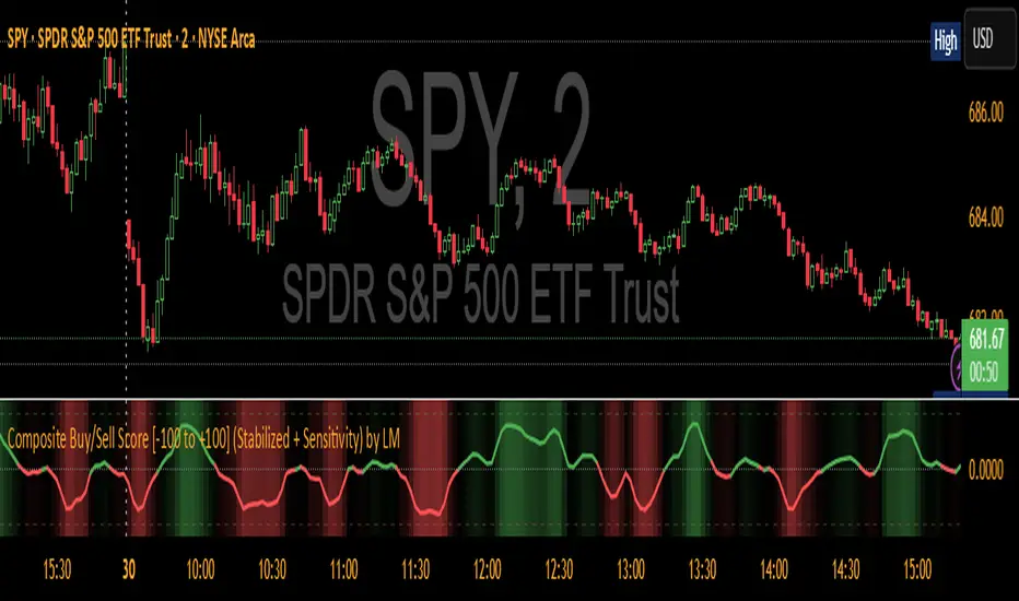
Composite Buy/Sell Score [-100 to +100] by LMComposite Buy/Sell Score (Stabilized + Sensitivity) by LM
Description:
This indicator calculates a composite trend strength score ranging from -100 to +100 by combining multiple popular technical indicators into a single, smoothed metric. It is designed to give traders a clear view of bullish and bearish trends, while filtering out short-term noise.
The score incorporates signals from:
PPO (Percentage Price Oscillator) – measures momentum via the difference between fast and slow EMAs.
ADX (Average Directional Index) – detects trend strength.
RSI (Relative Strength Index) – identifies short-term momentum swings.
Stochastic RSI – measures RSI momentum and speed of change.
MACD (Moving Average Convergence Divergence) – detects momentum shifts using EMA crossovers.
Williams %R – highlights overbought/oversold conditions.
Each component is weighted, smoothed, and optionally confirmed across a configurable number of bars, producing a stabilized composite score that reacts more reliably to significant trend changes.
Key Features:
Smoothed Composite Score
The final score is smoothed using an EMA to reduce volatility and emphasize meaningful trends.
A Sensitivity Multiplier allows traders to exaggerate the score for stronger trend signals or dampen it for quieter markets.
Customizable Inputs
You can adjust each indicator’s parameters, smoothing lengths, and confirm bars to suit your preferred timeframe and trading style.
The sensitivity multiplier allows fine-tuning the responsiveness of the trend line without changing underlying indicator calculations.
Visual Representation
Score Line: Green for positive (bullish) trends, red for negative (bearish) trends, gray near neutral.
Reference Lines:
0 = neutral
+100 = maximum bullish
-100 = maximum bearish
Adaptive Background: Optionally highlights the background intensity proportional to trend strength. Strong green for bullish trends, strong red for bearish trends.
Multi-Indicator Integration
Combines momentum, trend, and overbought/oversold signals into a single metric.
Helps identify clear entry/exit trends while avoiding whipsaw noise common in individual indicators.
Recommended Use:
Trend Identification: Look for sustained movement above 0 for bullish trends and below 0 for bearish trends.
Exaggerated Trends: Use the Sensitivity Multiplier to emphasize strong trends.
Filtering Noise: The smoothed score and confirmBars settings help reduce false signals from minor price fluctuations.
Inputs Overview:
Input Purpose
PPO Fast EMA / Slow EMA / Signal Controls PPO momentum sensitivity
ADX Length / Threshold Detects trend strength
RSI Length / Overbought / Oversold Measures short-term momentum
Stoch RSI Length / %K / %D Measures speed of RSI changes
MACD Fast / Slow / Signal Measures momentum crossover
Williams %R Length Detects overbought/oversold conditions
Final Score Smoothing Length EMA smoothing for final composite score
Confirm Bars for Each Signal Number of bars used to confirm individual indicator signals
Sensitivity Multiplier Scales the final composite score for exaggerated trend response
Highlight Background by Trend Strength Enables adaptive background coloring
This indicator is suitable for traders looking for a single, clear trend metric derived from multiple indicators. It can be applied to any timeframe and can help identify both strong and emerging trends in the market.
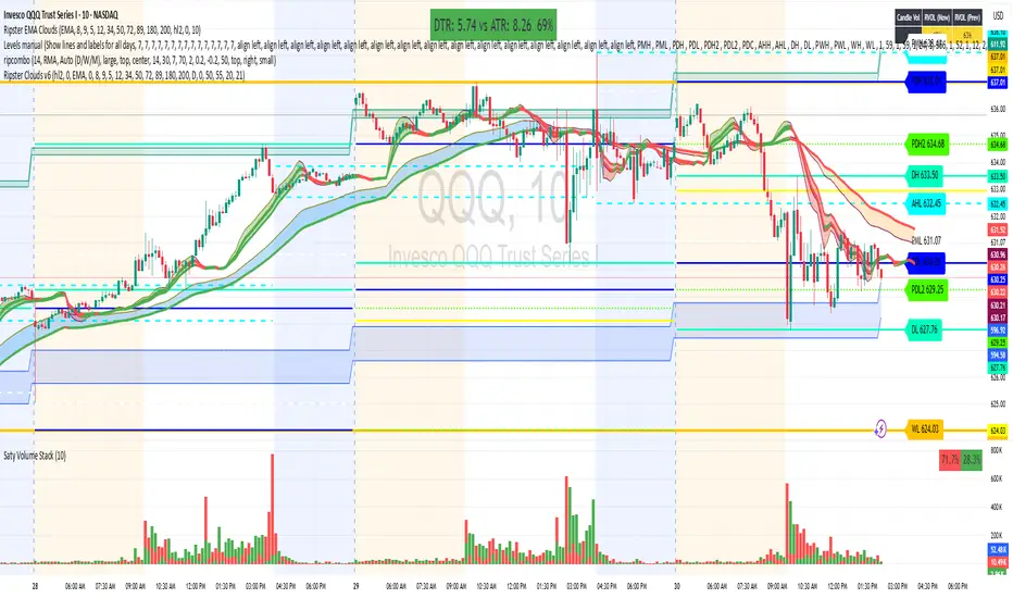
Ripster Clouds (EMA + MTF)v6🧠 Purpose
This indicator combines Ripster EMA Clouds and Multi-Timeframe (MTF) EMA Clouds into one script.
It allows you to visualize short vs long exponential (or simple) moving averages as colored “clouds” to identify trend direction and momentum — across both your current timeframe and a higher timeframe (e.g., daily).
⚙️ Main Features
1. EMA Clouds (Local Timeframe)
Up to 5 separate EMA/SMA cloud sets (8/9, 5/12, 34/50, 72/89, 180/200 by default).
Each can be individually enabled/disabled in the settings.
MA type toggle → Choose between EMA and SMA.
Optional line display toggle for showing the short and long MA lines.
Color-coded trend clouds:
Greenish tones = bullish (short > long)
Reddish tones = bearish (short < long)
Configurable leading offset and global offset for alignment.
2. MTF Clouds (Higher Timeframe)
Two sets of higher timeframe EMA clouds (default: 50/55 and 20/21).
Uses request.security() to pull EMA data from a selected higher timeframe (default = Daily).
Optional line visibility toggle (Display Lines).
Blue and teal semi-transparent fills to distinguish from local clouds.
Each MTF cloud can be toggled independently.
3. Unified Controls
Master toggles:
✅ Show EMA Clouds
✅ Show MTF Clouds
Transparent cloud fills with dynamically changing colors based on EMA crossovers and slope.
No local-scope plot() or fill() calls — fully compliant with Pine v6 rules.
🎨 Color Logic
Each EMA cloud uses a unique color pair (5 total).
Cloud color changes dynamically based on whether the short EMA is above or below the long EMA.
Line color changes with slope:
Olive = EMA rising
Maroon = EMA falling
📊 Technical Structure
Written in Pine Script v6.
All plot() and fill() calls are at global scope to prevent compilation errors.
Uses helper functions only for math/color logic.
Performance-optimized for TradingView’s rendering limits.
🧩 Quick Setup in TradingView
Paste the script into the Pine Editor.
Add to chart.
In settings:
Toggle on/off any EMA or MTF clouds.
Adjust timeframe (Resolution), line visibility, or offsets.
Choose EMA or SMA as the base calculation.
✅ Result
You now have one unified, customizable Ripster EMA + MTF Cloud indicator, stable in Pine v6, with complete flexibility to toggle, style, and analyze multiple timeframe trends on a single chart.
Risk Position Sizer (Entry=Close, Stop=Daily Low)This is for trading stocks/shares. Its main goal is to help you gauge how big or how small of a position you should add based on your account size.

Rolling Correlation vs Another Symbol (SPY Default)This indicator visualizes the rolling correlation between the current chart symbol and another selected asset, helping traders understand how closely the two move together over time.
It calculates the Pearson correlation coefficient over a user-defined period (default 22 bars) and plots it as a color-coded line:
• Green line → positive correlation (move in the same direction)
• Red line → negative correlation (move in opposite directions)
• A gray dashed line marks the zero level (no correlation).
The background highlights periods of strong relationship:
• Light green when correlation > +0.7 (strong positive)
• Light red when correlation < –0.7 (strong negative)
Use this tool to quickly spot diversification opportunities, confirm hedges, or understand how assets interact during different market regimes.
