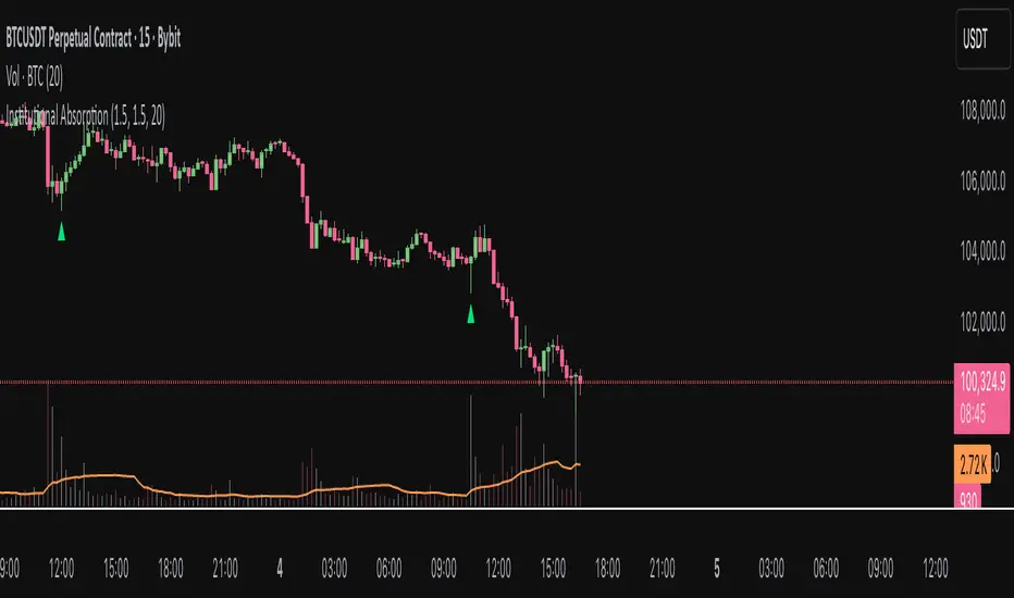
Institutional AbsorptionHighlights potential zones where institutional participants may be absorbing aggressive buying or selling pressure.
It analyzes candle structure and volume to detect possible bullish and bearish absorption events, providing a visual cue for traders studying market imbalance and liquidity dynamics.
The script compares each candle’s wick–body ratio and volume relative to its moving average.
A bullish absorption setup occurs when strong volume appears after a sharp downward move with long lower wicks, while bearish absorption occurs after upward moves with long upper wicks, suggesting the presence of large counter-orders.
+ Features
Detects bullish and bearish absorption candles.
Customizable wick to body ratio and volume multiple thresholds.
Optional filter to require candle color alignment with trend (green/red).
Option to ignore tiny body (doji-like) candles.
+ How to Use
Adjust wick–body ratio, volume multiplier, and lookback length under “Conditions (Absorption)”.
Enable “Require candle color” to strengthen directional context.
Use alerts to receive notifications when new absorption signals appear.
+ Notes
This tool aims to visualize possible absorption behavior, not confirm institutional activity.
Combine it with your broader market structure, volume, or order flow analysis for a more comprehensive analysis.
Khối lượng
Smart Money Flow Index (SMFI) - Advanced SMC [PhenLabs]📊Smart Money Flow Index (SMFI)
Version: PineScript™v6
📌Description
The Smart Money Flow Index (SMFI) is an advanced Smart Money Concepts implementation that tracks institutional trading behavior through multi-dimensional analysis. This comprehensive indicator combines volume-validated Order Block detection, Fair Value Gap identification with auto-mitigation tracking, dynamic Liquidity Zone mapping, and Break of Structure/Change of Character detection into a unified system.
Unlike basic SMC indicators, SMFI employs a proprietary scoring algorithm that weighs five critical factors: Order Block strength (validated by volume), Fair Value Gap size and recency, proximity to Liquidity Zones, market structure alignment (BOS/CHoCH), and multi-timeframe confluence. This produces a Smart Money Score (0-100) where readings above 70 represent optimal institutional setup conditions.
🚀Points of Innovation
Volume-Validated Order Block Detection – Only displays Order Blocks when formation candle exceeds customizable volume multiplier (default 1.5x average), filtering weak zones and highlighting true institutional accumulation/distribution
Auto-Mitigation Tracking System – Fair Value Gaps and Order Blocks automatically update status when price mitigates them, with visual distinction between active and filled zones preventing trades on dead levels
Proprietary Smart Money Score Algorithm – Combines weighted factors (OB strength 25%, FVG proximity 20%, Liquidity 20%, Structure 20%, MTF 15%) into single 0-100 confidence rating updating in real-time
ATR-Based Adaptive Calculations – All distance measurements use 14-period Average True Range ensuring consistent function across any instrument, timeframe, or volatility regime without manual recalibration
Dynamic Age Filtering – Automatically removes liquidity levels and FVGs older than configurable thresholds preventing chart clutter while maintaining relevant levels
Multi-Timeframe Confluence Integration – Analyzes higher timeframe bias with customizable multipliers (2-10x) and incorporates HTF trend direction into Smart Money Score for institutional alignment
🔧Core Components
Order Block Engine – Detects institutional supply/demand zones using characteristic patterns (down-move-then-strong-up for bullish, up-move-then-strong-down for bearish) with minimum volume threshold validation, tracks mitigation when price closes through zones
Fair Value Gap Scanner – Identifies price imbalances where current candle's low/high leaves gap with two-candle-prior high/low, filters by minimum size percentage, monitors 50% fill for mitigation status
Liquidity Zone Mapper – Uses pivot high/low detection with configurable lookback to mark swing points where stop losses cluster, extends horizontal lines to visualize sweep targets, manages lifecycle through age-based removal
Market Structure Analyzer – Tracks pivot progression to identify trend through higher-highs/higher-lows (bullish) or lower-highs/lower-lows (bearish), detects Break of Structure and Change of Character for trend/reversal confirmation
Scoring Calculation Engine – Evaluates proximity to nearest Order Blocks using ATR-normalized distance, assesses FVG recency and distance, calculates liquidity proximity with age weighting, combines structure bias and MTF trend into smoothed final score
🔥Key Features
Customizable Display Limits – Control maximum Order Blocks (1-10), Liquidity Zones (1-10), and FVG age (10-200 bars) to maintain clean charts focused on most relevant institutional levels
Gradient Strength Visualization – All zones render with transparency-adjustable coloring where stronger/newer zones appear more solid and weaker/older zones fade progressively providing instant visual hierarchy
Educational Label System – Optional labels identify each zone type (Bullish OB, Bearish OB, Bullish FVG, Bearish FVG, BOS) with color-coded text helping traders learn SMC concepts through practical application
Real-Time Smart Money Score Dashboard – Top-right table displays current score (0-100) with color coding (green >70, yellow 30-70, red <30) plus trend arrow for at-a-glance confidence assessment
Comprehensive Alert Suite – Configurable notifications for Order Block formation, Fair Value Gap detection, Break of Structure events, Change of Character signals, and high Smart Money Score readings (>70)
Buy/Sell Signal Integration – Automatically plots triangle markers when Smart Money Score exceeds 70 with aligned market structure and fresh Order Block detection providing clear entry signals
🎨Visualization
Order Block Boxes – Shaded rectangles extend from formation bar spanning high-to-low of institutional candle, bullish zones in green, bearish in red, with customizable transparency (80-98%)
Fair Value Gap Zones – Rectangular areas marking imbalances, active FVGs display in bright colors with adjustable transparency, mitigated FVGs switch to gray preventing trades on filled zones
Liquidity Level Lines – Dashed horizontal lines extend from pivot creation points, swing highs in bearish color (short targets above), swing lows in bullish color (long targets below), opacity decreases with age
Structure Labels – "BOS" labels appear above/below price when Break of Structure confirmed, colored by direction (green bullish, red bearish), positioned at 1% beyond highs/lows for visibility
Educational Info Panel – Bottom-right table explains key terminology (OB, FVG, BOS, CHoCH) and score interpretation (>70 high probability) with semi-transparent background for readability
📖Usage Guidelines
General Settings
Show Order Blocks – Default: On, toggles visibility of institutional supply/demand zones, disable when focusing solely on FVGs or Liquidity
Show Fair Value Gaps – Default: On, controls FVG zone display including active and mitigated imbalances
Show Liquidity Zones – Default: On, manages liquidity line visibility, disable on lower timeframes to reduce clutter
Show Market Structure – Default: On, toggles BOS/CHoCH label display
Show Smart Money Score – Default: On, controls score dashboard visibility
Order Block Settings
OB Lookback Period – Default: 20, Range: 5-100, controls bars scanned for Order Block patterns, lower values detect recent activity, higher values find older blocks
Min Volume Multiplier – Default: 1.5, Range: 1.0-5.0, sets minimum volume threshold as multiple of 20-period average, higher values (2.0+) filter for strongest institutional candles
Max Order Blocks to Display – Default: 3, Range: 1-10, limits simultaneous Order Blocks shown, lower settings (1-3) maintain focus on most recent zones
Fair Value Gap Settings
Min FVG Size (%) – Default: 0.3, Range: 0.1-2.0, defines minimum gap size as percentage of close price, lower values detect micro-imbalances, higher values focus on significant gaps
Max FVG Age (bars) – Default: 50, Range: 10-200, removes FVGs older than specified bars, lower settings (10-30) for scalping, higher (100-200) for swing trading
Show FVG Mitigation – Default: On, displays filled FVGs in gray providing visual history, disable to show only active untouched imbalances
Liquidity Zone Settings
Liquidity Lookback – Default: 50, Range: 20-200, sets pivot detection period for swing highs/lows, lower values (20-50) mark shorter-term liquidity, higher (100-200) identify major swings
Max Liquidity Age (bars) – Default: 100, Range: 20-500, removes liquidity lines older than specified bars, adjust based on timeframe
Liquidity Sensitivity – Default: 0.5, Range: 0.1-1.0, controls pivot detection sensitivity, lower values mark only major swings, higher values identify minor swings
Max Liquidity Zones to Display – Default: 3, Range: 1-10, limits total liquidity levels shown maintaining chart clarity
Market Structure Settings
Pivot Length – Default: 5, Range: 3-15, defines bars to left/right for pivot validation, lower values (3-5) create sensitive structure breaks, higher (10-15) filter for major shifts
Min Structure Move (%) – Default: 1.0, Range: 0.1-5.0, sets minimum percentage move required between pivots to confirm structure change
Multi-Timeframe Settings
Enable MTF Analysis – Default: On, activates higher timeframe trend analysis incorporation into Smart Money Score
Higher Timeframe Multiplier – Default: 4, Range: 2-10, multiplies current timeframe to determine analysis timeframe (4x on 15min = 1hour)
Visual Settings
Bullish Color – Default: Green (#089981), sets color for bullish Order Blocks, FVGs, and structure elements
Bearish Color – Default: Red (#f23645), defines color for bearish elements
Neutral Color – Default: Gray (#787b86), controls color of mitigated zones and neutral elements
Show Educational Labels – Default: On, displays text labels on zones identifying type (OB, FVG, BOS), disable once familiar with patterns
Order Block Transparency – Default: 92, Range: 80-98, controls Order Block box transparency
FVG Transparency – Default: 92, Range: 80-98, sets Fair Value Gap zone transparency independently from Order Blocks
Alert Settings
Alert on Order Block Formation – Default: On, triggers notification when new volume-validated Order Block detected
Alert on FVG Formation – Default: On, sends alert when Fair Value Gap appears enabling quick response to imbalances
Alert on Break of Structure – Default: On, notifies when BOS or CHoCH confirmed
Alert on High Smart Money Score – Default: On, alerts when Smart Money Score crosses above 70 threshold indicating high-probability setup
✅Best Use Cases
Order Block Retest Entries – After Break of Structure, wait for price retrace into fresh bullish Order Block with Smart Money Score >70, enter long on zone reaction targeting next liquidity level
Fair Value Gap Retracement Trading – When price creates FVG during strong move then retraces, enter as price approaches unfilled gap expecting institutional orders to continue trend
Liquidity Sweep Reversals – Monitor price approaching swing high/low liquidity zones against prevailing Smart Money Score trend, after stop hunt sweep watch for rejection into premium Order Block/FVG
Multi-Timeframe Confluence Setups – Identify alignment when current timeframe Order Block coincides with higher timeframe FVG plus MTF analysis showing matching trend bias
Break of Structure Continuations – After BOS confirms trend direction, trade pullbacks to nearest Order Block or FVG in direction of structure break using Smart Money Score >70 as entry filter
Change of Character Reversal Plays – When CHoCH detected indicating potential reversal, look for Smart Money Score pivot with opposing Order Block formation then enter on structure confirmation
⚠️Limitations
Lagging Pivot Calculations – Pivot-based features (Liquidity Zones, Market Structure) require bars to right of pivot for confirmation, meaning these elements identify levels retrospectively with delay equal to lookback period
Whipsaw in Ranging Markets – During choppy conditions, Order Blocks fail frequently and structure breaks produce false signals as Smart Money Score fluctuates without clear institutional bias, best used in trending markets
Volume Data Dependency – Order Block volume validation requires accurate volume data which may be incomplete on Forex pairs or limited in crypto exchange feeds
Subjectivity in Scoring Weights – Proprietary 25-20-20-20-15 weighting reflects general institutional behavior but may not optimize for specific instruments or market regimes, user cannot adjust factor weights
Visual Complexity on Lower Timeframes – Sub-hour timeframes generate excessive zones creating cluttered charts, requires aggressive display limit reduction and higher minimum thresholds
No Fundamental Integration – Indicator analyzes purely technical price action and volume without incorporating economic events, news catalysts, or fundamental shifts that override technical levels
💡What Makes This Unique
Unified SMC Ecosystem – Unlike indicators displaying Order Blocks OR FVGs OR Liquidity separately, SMFI combines all three institutional concepts plus market structure into single cohesive system
Proprietary Confidence Scoring – Rather than manual setup assessment, automated Smart Money Score quantifies probability by weighting five institutional dimensions into actionable 0-100 rating
Volume-Filtered Quality – Eliminates weak Order Blocks forming without institutional volume confirmation, ensuring displayed zones represent genuine accumulation/distribution
Adaptive Lifecycle Management – Automatically updates mitigation status and removes aged zones preventing trades on dead levels through continuous validity and age monitoring
Educational Integration – Built-in tooltips, labeled zones, and reference panel make indicator functional for both learning Smart Money Concepts and executing strategies
🔬How It Works
Order Block Detection – Scans for patterns where strong directional move follows counter-move creating last down-candle before rally (bullish OB) or last up-candle before sell-off (bearish OB), validates formations only when candle exhibits volume exceeding configurable multiple (default 1.5x) of 20-bar average volume
Fair Value Gap Identification – Compares current candle’s high/low against two-candles-prior low/high to detect price imbalances, calculates gap size as percentage of close and filters micro-gaps below minimum threshold (default 0.3%), monitors whether subsequent price fills 50% triggering mitigation status
Liquidity Zone Mapping – Employs pivot detection using configurable lookback (default 50 bars) to identify swing highs/lows where retail stops cluster, extends horizontal reference lines from pivot creation and applies age-based filtering to remove stale zones
Market Structure Analysis – Tracks pivot progression using structure-specific lookback (default 5 bars) to determine trend, confirms uptrend when new pivot high exceeds previous by minimum move percentage, detects Break of Structure when price breaks recent pivot level, flags Change of Character for potential reversals
Multi-Timeframe Confluence – When enabled, requests security data from higher timeframe (current TF × HTF multiplier, default 4x), compares HTF close against HTF 20-period MA to determine bias, contributes ±50 points to score ensuring alignment with institutional positioning on superior timeframe
Smart Money Score Calculation – Evaluates Order Block component via ATR-normalized distance producing max 100-point contribution weighted at 25%, assesses FVG factor through age penalty and distance at 20% weight, calculates Liquidity proximity at 20%, incorporates structure bias (±50-100 points) at 20%, adds MTF component at 15%, applies 3-period smoothing to reduce volatility
Visual Rendering and Lifecycle – Draws Order Block boxes, Fair Value Gap rectangles with color coding (green/red active, gray mitigated), extends liquidity dashed lines with fade-by-age opacity, plots BOS labels, displays Smart Money Score dashboard, continuously updates checking mitigation conditions and removing elements exceeding age/display limits
💡Note:
The Smart Money Flow Index combines multiple Smart Money Concepts into unified institutional order flow analysis. For optimal results, use the Smart Money Score as confluence filter rather than standalone entry signal – scores above 70 indicate high-probability setups but should be combined with risk management, higher timeframe bias, and market regime understanding.

MACD Overlay v1 [JopAlgo]Meet the MACD you can trade directly from the chart.
MACD Overlay v1 doesn’t just plot an oscillator somewhere below—
it puts value, momentum, and participation on your candles, and it refuses to fire inside chop.
When a triangle prints, it’s because energy released (expansion), not because the chart looked cute.
What it is:
An execution-ready MACD overlay with phase gating (Expansion-Only), participation gating (Weakness-Lite), and one-click Classic vs VW-MACD Compare—all adaptive, with minimal inputs.
What’s in v1 (feature set)
Overlay ribbon on price: Fast/Slow MACD value rendered as a price-level ribbon with contextual fill and optional candle tint.
Dual value model: Classic MA-MACD (EMA/SMA) and VW-MACD (Rolling VWAP fast/slow).
Compare mode: A/B Classic vs VW-MACD with a VW ghost ribbon.
Weakness-Lite (1-bar, adaptive): Gates/fades low-participation crosses using
RVOL deficit, Effort-vs-Result failure, and over-extension vs value/ATR (Strict adds wick pressure).
Expansion-Only (Impulse/Squeeze): Triangles print only when a cross coincides with a true-range burst and a histogram-slope ignition out of compression.
Signal hygiene: ±1-bar proximity around crosses, slope awareness, 2-bar debounce.
Explainable filtering: Tiny gray dots show crosses that were intentionally filtered (weak and/or no expansion).
How to use:
Use defaults: Mode Classic, Gate by Weakness ON, Expansion-Only ON, Sensitivity Auto.
Read signals fast:
Solid triangle = cross + expansion confirmed (+ not weak if gate is ON).
Faded triangle = cross + expansion but weak participation (visible only when gate is OFF).
Gray dot = there was a cross, but it was filtered (no genuine expansion or weak & gated).
Validate quickly: Flip Compare to check VW-MACD agreement. Classic + VW alignment usually improves confidence.
Why overlay > sub-pane oscillator
You see where the cross occurs: relative to value, local structure, and S/R, right on price.
The ribbon exposes regime shifts; tint hints expansion vs contraction at a glance.
Execution becomes more context-aware and less “signal-in-a-vacuum.”
Signals & visuals
Triangles (solid): MACD crossed Signal and market showed expansion out of compression; if Gate by Weakness is ON, triangle prints only with acceptable participation.
Triangles (faded): Same as above but weak (shown only when you turn the gate OFF).
Gray dots: Crosses that were filtered (no expansion and/or Weakness gate).
Ribbon: Fast vs Slow value (Classic or VW, according to Mode). Fill and candle tint reflect expansion/contraction.
Inputs
Calculation Mode: Classic | VW | Compare
VW uses Rolling VWAP fast/slow.
Compare: Classic is primary; VW shows as a ghost ribbon for A/B checks.
Gate triangles by Weakness: ON/OFF
Uses RVOL, Effort-vs-Result, extension vs value/ATR (Strict adds wick-pressure).
Sensitivity: Off / Auto / Strict (default Auto).
Expansion-Only (Impulse/Squeeze): ON/OFF
Requires compression → release: tight ribbon + flat momentum, then TR/ATR burst with hist slope flip / cross proximity.
Display: Ribbon / Candle Tint / Weakness Markers.
Advanced (optional): Evaluate Weakness only near signals, Channel (k × |MACD|), Style Preset.
No numeric thresholds to tune—all filters self-calibrate from rolling stats.
Best practices
4H crypto: Defaults are strong—Auto, Gate ON, Expansion-Only ON.
Clean trends: If you feel you miss some tidy resumptions, briefly toggle Expansion-Only OFF.
Choppy regimes: Set Sensitivity → Strict to cut more noise without adding lag.
Confirmation: Use Compare; Classic + VW alignment typically yields better follow-through.
Alerts
MACD Signal Cross Up/Down — execution-grade (use Once per bar close).
Weakness-Lite Flag — optional context alert to help audit filtered crosses.
Attribution & License
Attribution: Based on the algorithmic concept of TradingView’s built-in MACD (fast MA – slow MA, signal, histogram).
No original TradingView source code is redistributed; overlay rendering, VW-MACD, Weakness-Lite, Expansion-Only, gating visuals, and UX are new work.
License: MPL-2.0. Educational purposes only—not financial advice.

Volume Cluster Support and Resistance Levels [QuantAlgo]🟢 Overview
This indicator identifies statistically significant support and resistance levels through volume cluster analysis, isolating price zones characterized by elevated trading activity and institutional participation. By quantifying areas where volume concentration exceeded historical norms, it reveals price levels with demonstrated supply-demand imbalances that exhibit persistent influence on subsequent price action. The methodology is asset-agnostic and timeframe-independent, applicable across equities, cryptocurrencies, forex, and commodities from intraday to weekly intervals.
🟢 Key Features
1. Support and Resistance Levels
The indicator scans historical price data to identify bars where volume exceeds a user-defined threshold multiplier relative to the rolling average. For each qualifying bar, a representative price is calculated using the average of high, low, and close. Proximate price levels within a specified percentage range are then aggregated into discrete clusters using volume-weighted averaging, eliminating redundant signals. Clusters are ranked by cumulative volume to determine statistical significance. Finally, the indicator plots horizontal levels at each cluster price: support levels (green) below current price indicate zones where historical buying pressure exceeded selling pressure, while resistance levels (red) above current price mark zones where sellers historically dominated. These levels represent areas of established liquidity and price discovery, where institutional order flow previously concentrated.
The Touch Count (T) metric quantifies historical price interaction frequency, while Total Volume (TV) measures aggregate trading activity at each level, providing objective criteria for assessing level strength and trade execution decisions.
2. Volume Histogram
A histogram appears below the price chart, displaying relative volume for each bar within the lookback period, with bar height scaled to the maximum volume observed. Green bars represent up-periods (close > open) indicating buying pressure, while red bars show down-periods (close < open) indicating selling pressure. This visualization helps you confirm the validity of support/resistance levels by seeing where volume actually spiked, identify accumulation/distribution patterns, and validate breakouts by checking if they occur on above-average volume.
3. Built-in Alerts
Automated alerts trigger when price crosses below support levels or breaks above resistance levels, allowing you to monitor multiple assets without constant chart-watching.
4. Customizable Color Schemes
The indicator provides four preset color configurations (Classic, Aqua, Cosmic, Custom) optimized for visual clarity across different charting environments. Each scheme maintains consistent color mapping for support and resistance zones across both level lines and volume histogram components. The Custom configuration permits full color specification to accommodate individual charting setups, ensuring optimal visual contrast for extended analysis sessions.
Classic:
Aqua:
Cosmic:
Custom:
🟢 Pro Tips
→ Trade entry optimization: Execute long positions at support levels with high touch counts or upon confirmed resistance breakouts accompanied by above-average volume
→ Risk parameter definition: Position stop-loss orders near identified support/resistance zones with statistical significance to minimize premature exits
→ Breakout validation: Require volume confirmation exceeding historical average when price penetrates resistance to filter false breakouts
→ Level strength assessment: Prioritize levels with higher touch counts and total volume metrics for enhanced probability trade setups
→ Multi-timeframe confluence: Synthesize support/resistance levels across multiple timeframes to identify high-conviction zones where daily support aligns with 4-hour resistance structures

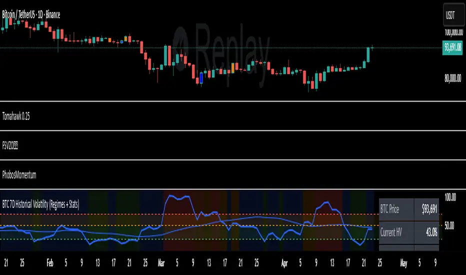
7D Historical Volatility (Regimes + Stats) - ChrrizzyHere’s what that indicator does—at a glance:
### Core idea
It computes **7-day Historical Volatility (HV)** from **daily** log returns (annualized), then shows:
* the **HV line** and its **30-day average**,
* colored **volatility regimes** (Low / Normal / High / Extreme) with thresholds you set,
* a compact **status panel** (top-right, nudged left) with current stats and time-in-zone.
### Calculations
* **HV (7D)**: `stdev(log(close/close ), 7) * sqrt(365) * 100`, always from **daily data** via `request.security`, so it’s consistent on any chart timeframe.
* **Regimes** (defaults):
Low < 25% • Normal 25–50% • High 50–70% • Extreme > 70% (all editable).
* **30-day avg**: SMA of HV.
* **Time in zone (% over window)**: SMA of boolean flags (e.g., in Low=1 else 0) over `statsWin` days (default 300).
* **Rolling median HV**: 50th percentile over `statsWin`.
### What you see on the chart
* **HV line** (bold) + **30-day HV** (lighter).
* **Horizontal dashed lines** at your regime thresholds.
* **Background shading** that changes with the current regime (green/blue/orange/red).
### Panel (top-right)
Shows:
* BTC Price (daily close)
* Current HV
* 30-day Avg HV
* Median HV (over window)
* Current **Regime**
* A two-line summary: **% of time spent** in Low / Normal / High / Extreme over the chosen window.
The panel is shifted slightly left using a hidden spacer column; tweak the **“Panel right padding (chars)”** input to move it.
### Alerts (ready to use)
* **HV crossed up Low**
* **HV crossed down Low**
* **HV crossed up High**
* **HV crossed up Extreme**
### Inputs you can tune
* `HV Lookback (days)` (default 7)
* `Average HV (days)` (default 30)
* Thresholds: Low/High/Extreme
* `Stats Window (days)` (default 300)
* Panel padding, toggle table/zones on/off.
### How to use it
* **Context**: quickly see if BTC is in **compressed** (Low) or **stressed** (High/Extreme) volatility.
* **Regime cross alerts**: get notified when volatility **expands** from Low (potential breakout conditions) or pushes into High/Extreme (risk increases).
* **Stats/median**: compare today’s HV to its typical level over your lookback window.
If you want, I can add an **HV percentile rank** (e.g., “Current HV is at the 38th percentile over 300d”) or mirror the **low-vol breakout signal** from Script A into this panel.
Value TrailingValue Trailing is a variation of my "Dynamic Trailing" indicator, which had additional features including a band-system that tracks the highs and lows of the past X candles. Value Trailing, on the other hand, uses a default lookback window of 14, and a normal range of 68%, simulating a Fixed Range Volume Profile distribution of the past 14 candles, with bands at the upper and lower 68% range.
This lets the user clearly see the key levels, ignoring potential noise from varying and inconsistent highs and lows, while still allowing the user to trade this alongside basic strategies and concepts such as supply/demand and sideways trends.
This indicator comes with 2 customizable sets of "bands", as well as boxes that identify the range of the last candle that touched one side of the bands.

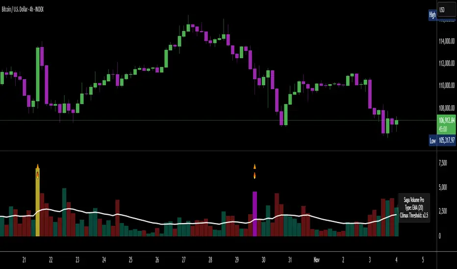
[Saga Trading] Volume Pro Volume Pro is an advanced volume indicator designed to detect spikes in institutional activity by analyzing volume variations relative to their moving average.
It helps identify Climax Volume zones—moments when large accumulation or distribution orders occur—in order to anticipate potential trend reversals or continuations.
This indicator is optimized for crypto, indices, forex, and futures markets, and fits seamlessly into a multi-timeframe, order-flow, and institutional behavior analysis.
✅ Built-in alerts!
For optimized settings, feel free to contact me!
5 minutes ago
Release Notes
Volume Pro is an advanced volume indicator designed to detect spikes in institutional activity by analyzing volume variations relative to their moving average.
It helps identify Climax Volume zones—moments when large accumulation or distribution orders occur—in order to anticipate potential trend reversals or continuations.
This indicator is optimized for crypto, indices, forex, and futures markets, and fits seamlessly into a multi-timeframe, order-flow, and institutional behavior analysis.
✅ Built-in alerts!
For optimized settings, feel free to contact me!

[Saga Trading] OBV Pro OBV Pro is an advanced On-Balance Volume indicator designed to detect trend strength, institutional accumulation/distribution, and hidden divergences between price and volume momentum.
It automatically adapts its smoothing type (EMA/SMA) and divergence sensitivity based on the selected timeframe (4H, 12H, 1D, 1W, 1M, 3M).
The indicator highlights bullish and bearish divergence signals, dynamic OBV zones, and includes alert conditions for real-time notifications of key momentum shifts.
Optimized for BTC and ETH but works effectively on all markets (crypto, indices, forex, and stocks).

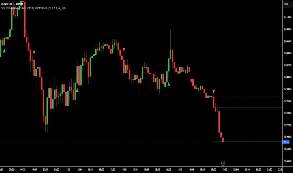
5mn London-Newyork best entry by Profitcosmos)This indicator is engineered for scalpers and day traders who trade during the London and New York sessions — the most volatile and liquid market hours.
It automatically detects high-probability breakout structures, filters false moves using ATR-based volatility logic, and dynamically projects Entry, Stop Loss (SL), and Take Profit (TP) levels directly on the chart.
⚙️ Core Features
🧠 Smart Market Structure Detection:
Automatically identifies bullish and bearish structure shifts using swing highs/lows.
📊 ATR Volatility Filter:
Uses an adaptive ATR multiplier to confirm genuine breakouts and filter noise.
🕒 Session Filter (Optional):
Restrict signals to your chosen trading hours — ideal for London and New York overlap.
🎯 Auto Entry / SL / TP Projection:
SL: Placed below (for BUY) or above (for SELL) the two previous candle extremes.
TP: Automatically calculated at 3× the distance from Entry to SL.
Projection: Visual lines and labels extend 100 bars into the future, clearly marking your trade levels.
🔁 Alternating Signal Logic:
Prevents consecutive duplicate signals to keep the chart clean and trades logical.
📈 Visual Clarity:
Each trade setup is plotted with colored lines (Entry, SL, TP) and labels pointing left for easy visibility.
🔔 Alerts Ready:
Built-in alerts for both BUY and SELL signals to automate or notify your entries.
🪙 Why you will Love It
This tool helps identify the cleanest momentum-based entries in the 5-minute chart during high-volume hours.
It’s especially effective for XAUUSD, NAS100, and major Forex pairs, where breakout structure shifts happen fast and decisively.
🧭 Recommended Settings
Timeframe: 5 minutes
Sessions: London (3–10 AM EST) & New York (8 AM–4 PM EST)
ATR Multiplier: 1.2–1.5 (adjust for volatility)
Volume Area 80 Rule Pro - Adaptive RTHSummary in one paragraph
Adaptive value area 80 percent rule for index futures large cap equities liquid crypto and major FX on intraday timeframes. It focuses activity only when multiple context gates align. It is original because the classic prior day value area traverse is fused with a daily regime classifier that remaps the operating parameters in real time.
Scope and intent
• Markets. ES NQ SPY QQQ large cap equities BTC ETH major FX pairs and other liquid RTH instruments
• Timeframes. One minute to one hour with daily regime context
• Default demo used in the publication. ES1 on five minutes
• Purpose. Trade only the balanced days where the 80 percent traverse has edge while standing aside or tightening rules during trend or shock
Originality and usefulness
• Unique fusion. Prior day value area logic plus a rolling daily regime classifier using percentile ranks of realized volatility and ADX. The regime remaps hold time end of window stop buffer and value area coverage on each session
• Failure mode addressed. False starts during strong trend or shock sessions and weak traverses during quiet grind
• Testability. All gates are visible in Inputs and debug flags can be plotted so users can verify why a suggestion appears
• Portable yardstick. The regime uses ATR divided by close and ADX percent ranks which behave consistently across symbols
Method overview in plain language
The script builds the prior session profile during regular trading hours. At the first regular bar it freezes yesterday value area low value area high and point of control. It then evaluates the current session open location the first thirty minute volume rank the open gap rank and an opening drive test. In parallel a daily series classifies context into Calm Balance Trend or Shock from rolling percentile ranks of realized volatility and ADX. The classifier scales the rules. Calm uses longer holds and a slightly wider value area. Trend and Shock shorten the window reduce holds and enlarge stop buffers.
Base measures
• Range basis. True Range smoothed over a configurable length on both the daily and intraday series
• Return basis. Not required. ATR over close is the unit for regime strength
Components
• Prior Value Area Engine. Builds yesterday value area low value area high and point of control from a binned volume profile with automatic TPO fallback and minimum integrity guards
• Opening Location. Detects whether the session opens above the prior value area or below it
• Inside Hold Counter. Counts consecutive bars that hold inside the value area after a re entry
• Volume Gate. Percentile of the first thirty minutes volume over a rolling sample
• Gap Gate. Percentile rank of the regular session open gap over a rolling sample
• Drive Gate. Opening drive check using a multiple of intraday ATR
• Regime Classifier. Percentile ranks of daily ATR over close and daily ADX classify Calm Balance Trend Shock and remap parameters
• Session windows optional. Windows follow the chart exchange time
Fusion rule
Minimum satisfied gates approach. A re entry must hold inside the value area for a regime scaled number of bars while the volume gap and drive gates allow the setup. The regime simultaneously scales value area coverage end minute time stop and stop buffer.
Signal rule
• Long suggestion appears when price opens below yesterday value area then re enters and holds for the required bars while all gates allow the setup
• Short suggestion appears when price opens above yesterday value area then re enters and holds for the required bars while all gates allow the setup
• WAIT shows implicitly when any required gate is missing
• Exit labels mark target touch stop touch or a time based close
Inputs with guidance
Setup
• Signal timeframe. Uses the chart by default
• Session windows optional. Start and end minutes inside regular trading hours
• Invert direction is not used. The logic is symmetric
Logic
• Hold bars inside value area. Typical range 3 to 12. Raising it reduces trades and favors better traverses. Lowering it increases frequency and risk of false starts
• Earliest minute since RTH open and Latest minute since RTH open. Typical range 0 to 390. Reducing the latest minute cuts late session trades
• Time stop bars after entry. Typical range 6 to 30. Larger values give setups more room
Filters
• Value area coverage. Typical range 0.70 to 0.85. Higher coverage narrows the traverse but accepts fewer days
• Bin size in ticks. Typical range 1 to 8. Larger bins stabilize noisy profiles
• Stop buffer ticks beyond edge. Typical range 2 to 20. Larger buffers survive noise
• First thirty minute volume percentile. Typical range 0.30 to 0.70. Higher values require more active opens
• Gap filter percentile. Typical range 0.70 to 0.95. Lower values block more gap days
• Opening drive multiple and bars. Higher multiple or longer bars block strong directional opens
Adaptivity
• Lookback days for regime ranks. Typical 150 to 500
• Calm RV percentile. Typical 25 to 45
• Trend ADX percentile. Typical 55 to 75
• Shock RV percentile. Typical 75 to 90
• End minute ratio in Trend and Shock. Typical 0.5 to 0.8
• Hold and Time stop scales per regime. Use values near one to keep behavior close to static settings
Realism and responsible publication
• No performance claims. Past results never guarantee future outcomes
• Shapes can move while a bar forms and settle on close
• Sessions use the chart exchange time
Honest limitations and failure modes
• Economic releases and thin liquidity can break the balance premise
• Gap heavy symbols may work better with stronger gap filters and a True Range focus
• Very quiet regimes reduce signal contrast. Consider longer windows or higher thresholds
Legal
Education and research only. Not investment advice. Test in simulation before any live use.

[Saga Trading] Volume Pro (EMA/SMA + Climax + Alerts) Volume Pro is an advanced volume indicator designed to detect spikes in institutional activity by analyzing volume variations relative to their moving average.
It helps identify Climax Volume zones—moments when large accumulation or distribution orders occur—in order to anticipate potential trend reversals or continuations.
This indicator is optimized for crypto, indices, forex, and futures markets, and fits seamlessly into a multi-timeframe, order-flow, and institutional behavior analysis.
✅ Built-in alerts!
For optimized settings, feel free to contact me!
EZ-TRADEZ PROEZ-TRADEZ PRO gives optimized buy/sell signals for Forex, Stocks, and Crypto. It includes stop loss and take profit levels, backtested non-repainting signals, and adjustable volatility filters

EZ-TRADEZ CRYPTOEZ-TRADEZ CRYPTO gives optimized buy/sell signals for stocks. It includes stop loss and take profit levels, backtested non-repainting signals, and adjustable volatility filters

EZ-TRADES STOCKSEZ-TRADEZ STOCKS gives optimized buy/sell signals for stocks. It includes stop loss and take profit levels, backtested non-repainting signals, and adjustable volatility filters

EZ-TRADEZ FOREX)EZ-TRADEZ FOREX gives optimized buy/sell signals for Forex. It includes stop loss and take profit levels, backtested non-repainting signals, and adjustable volatility filters

RTH VWAP with Deviation BandsRTH session VWAP calculation
3 deviation bands (customizable multipliers)
Visual customization (colors, widths, transparency)
Optional info table showing current values
Alert conditions for VWAP and band crosses

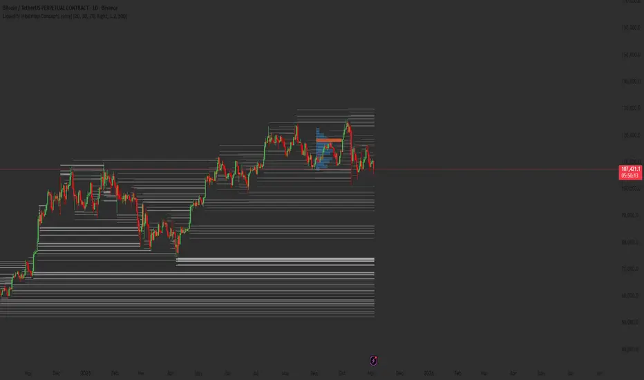
Liquidity Heatmap Concepts [sma] Overview
Liquidity Heatmap Concepts is a sophisticated visualization tool that maps potential liquidation zones for leveraged positions across multiple timeframes. It calculates and displays where high-volume liquidations might occur at various leverage levels (25x, 50x, 100x, 150x), helping traders identify potential support/resistance zones created by cascading liquidations. Additionally, it includes a quarterly volume profile to show historical price distribution and Point of Control levels.
### Volume-Based Trigger System
Lines are only drawn when volume exceeds a threshold:
1. Calculates 14-period simple moving average of volume
2. Applies configurable multiplier (default 1.2x) to determine significance
3. Only plots liquidation levels when current volume > (Volume SMA × Multiplier)
4. This filters out low-volume noise and focuses on meaningful zones
### Visual Intensity System
The indicator uses a gradient coloring system based on relative volume:
- **Peak Volume (White)**: When current bar has maximum volume in the dataset
- Line width: 3 pixels
- Brightest color intensity
- **Above Average Volume**: Volume exceeds average but isn't peak
- Line width: 2 pixels
- Medium color intensity
- **Standard Volume**: Exceeds threshold but below average
- Line width: 1 pixel
- Base color intensity
### Line Extension & Management
- Lines extend horizontally to the right until price crosses them
- Automatic cleanup removes lines after maximum count (default 500)
- Lines persist until invalidated by price action crossing the level
- Oldest lines are removed first when limit is reached
### Quarterly Volume Profile
An optional fixed-range volume profile that:
1. **Automatic Quarter Detection**: Identifies Q1 (Jan-Mar), Q2 (Apr-Jun), Q3 (Jul-Sep), Q4 (Oct-Dec)
2. **Price Distribution Analysis**: Divides the quarter's price range into configurable rows (default 20)
3. **Volume Aggregation**: Accumulates volume at each price level throughout the quarter
4. **POC Identification**: Highlights the price level with highest volume (Point of Control)
5. **Value Area**: Shows the price range containing 70% (configurable) of total volume
6. **Profile Drawing**: At the start of each new quarter, draws the previous quarter's profile as horizontal bars
The volume profile can be positioned on either left or right side of the quarter range with adjustable width.
## Key Features
- **Multi-Leverage Display**: Toggle between 25x, 50x, 100x, and 150x leverage levels independently
- **Dual Side Tracking**: Separate visualization for long and short liquidation zones
- **Volume-Weighted Importance**: Visual intensity correlates with volume significance
- **Gradient Coloring**: Color intensity reflects relative volume magnitude
- **Smart Line Management**: Automatic cleanup prevents chart clutter
- **Historical Context**: Quarterly volume profile shows where price spent most time
- **Fully Customizable**: All colors, thresholds, and display options are adjustable
- **HD Mode**: Uses absolute volume for more precise visualization
## Parameters
### Leverage Selection
- **25x, 50x, 100x, 150x Toggles**: Enable/disable specific leverage levels
- Each level can be controlled independently
### Volume Configuration
- **Minimum Volume Multiplier** (default 1.2): Threshold above volume SMA to trigger lines
- Higher values = fewer but more significant levels
- Lower values = more levels but increased noise
### Advanced Settings
- **Maximum Lines** (default 500, range 50-500): Memory management limit
- Controls how many historical liquidation lines are maintained
### Quarterly Volume Profile
- **Show Previous Q Volume Profile** (default on): Toggle profile visibility
- **Number of Rows** (default 20, range 10-50): Price distribution granularity
- **Profile Width** (default 30%): Visual width as percentage of quarter range
- **Value Area** (default 70%): Percentage of volume for value area calculation
- **Position** (Left/Right): Profile placement relative to quarter
- **Show Values** (default off): Display POC volume label
- **Colors**: Customizable base and POC colors
### Color Customization
- **Long Colors**: Individual colors for each leverage level (25x, 50x, 100x, 150x)
- **Short Colors**: Separate color scheme for short liquidation zones
- **VP Colors**: Base color and POC highlight color for volume profile
## Interpretation
### Liquidation Clusters
- **Dense Line Areas**: Multiple overlapping liquidation levels suggest strong magnetic zones
- **High-Volume Lines**: Brighter/thicker lines indicate more significant potential liquidations
- **Line Breaks**: Price crossing multiple liquidation lines may trigger cascade effects
### Trading Applications
- **Support/Resistance**: Liquidation clusters often act as temporary support/resistance
- **Stop Hunt Zones**: Areas where price may spike to trigger liquidations before reversing
- **Momentum Acceleration**: Breaking through dense clusters can indicate strong directional moves
- **Risk Management**: Avoid placing stops directly at obvious liquidation levels
### Volume Profile Usage
- **POC (Point of Control)**: Price level with highest volume - often acts as strong support/resistance
- **Value Area**: Where most trading activity occurred - indicates fair value range
- **Profile Shape**:
- Balanced profile (bell curve) = ranging market
- Skewed profile = trending market with acceptance at extremes
- **Profile Gaps**: Low volume areas suggest price may move quickly through these zones
### Combined Analysis
- Liquidation lines near quarterly POC create extra-strong zones
- Price returning to value area from outside often finds support/resistance
- Liquidation clusters at value area edges suggest potential reversal points
## Technical Implementation
This indicator features:
- **Custom Type Structures**: Uses type definitions for organized data storage
- `BarData`: Stores OHLCV and index information
- `LiquidityBin`: Manages arrays of line objects for each leverage level
- `VolumeProfileData`: Handles profile boxes, labels, and range data
- **Dynamic Line Objects**: Creates, updates, and deletes line primitives programmatically
- **Array-Based History**: Maintains volume history for gradient calculations
- **Intelligent Cleanup**: Automatic memory management prevents performance degradation
- **Mathematical Precision**: Leverage-based liquidation formulas ensure accurate price levels
- **Quarterly Aggregation**: Efficient volume accumulation with automatic period detection
- **Box Drawing System**: Dynamic profile visualization using box primitives
## Originality Statement
This indicator presents a unique approach to liquidity visualization:
- Implements leverage-specific liquidation price calculations based on mathematical formulas
- Uses volume-weighted gradient coloring system that adapts to relative volume significance
- Combines real-time liquidation mapping with historical volume profile analysis
- Features intelligent line lifecycle management with automatic extension and cleanup
- Integrates quarterly volume profile with configurable value area and POC detection
- Employs multi-layer visual hierarchy (line width + color intensity) for information density
- Uses custom data structures to efficiently manage hundreds of line objects simultaneously
The combination of mathematical liquidation pricing, volume-based filtering, gradient visualization, and quarterly volume distribution creates a comprehensive liquidity analysis tool.
## Best Practices
- Use on liquid markets (major cryptocurrencies, forex pairs) for best accuracy
- Lower timeframes (1m-15m) for day trading and scalping
- Higher timeframes (1h-4h) for swing trading context
- Combine with volume profile to identify high-probability reversal zones
- Watch for price reactions when approaching dense liquidation clusters
- Increase volume multiplier in choppy markets to reduce noise
- Reduce maximum lines on lower timeframes to maintain performance
- Use quarterly volume profile to understand longer-term fair value
## Important Notes
- Liquidation prices are estimates based on leverage ratios
- Actual exchange liquidation prices may vary due to:
- Maintenance margin requirements
- Mark price vs last price calculations
- Individual exchange liquidation engines
- Insurance fund mechanisms
- This tool shows potential zones, not guaranteed liquidation prices
- Volume profile resets each quarter automatically
---
Works on all timeframes and asset classes. Designed for crypto/forex leverage markets. For educational purposes only. Not financial advice.
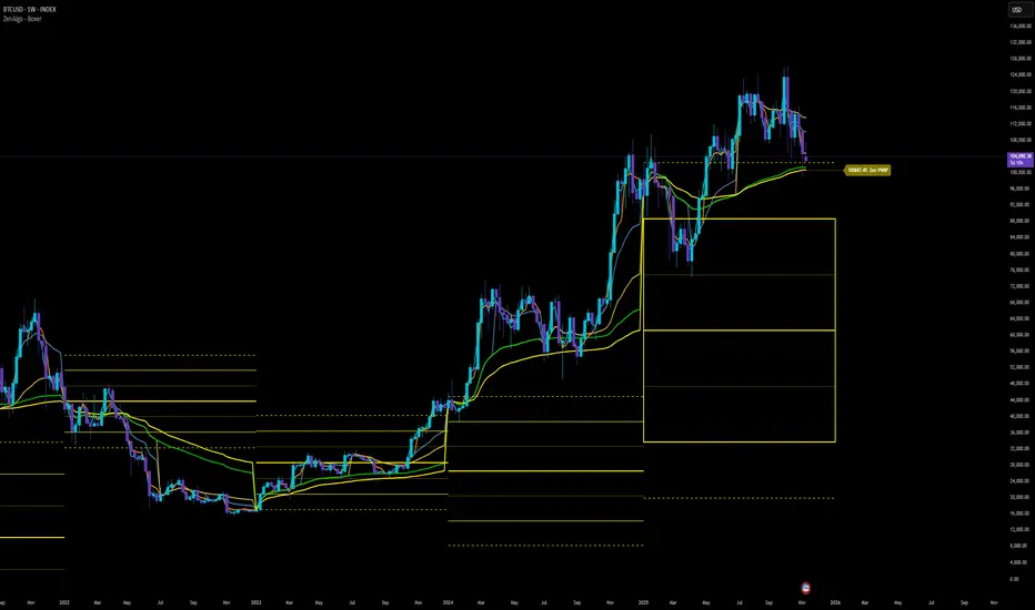
ZenAlgo - BoxerThis indicator plots multi-period Volume-Weighted Average Price (VWAP) ranges and deviation bands across several timeframes — specifically weekly, monthly, quarterly, semi-annual, and yearly. It is designed to visualize how price evolves relative to statistically weighted value areas within each period, based on both traded price and volume distribution.
Each timeframe layer is drawn independently, using its own cumulative VWAP and standard deviation calculation, and displayed as horizontal ranges aligned precisely with calendar periods. This structure allows the chart to show where price currently trades relative to past value zones and how each higher-timeframe VWAP acts as a dynamic reference for mean reversion or continuation.
Calculation Logic
1. Source and Base Inputs
The indicator uses the average of high, low, and close as its price source.
Stocks reset daily at session open.
2. VWAP and Deviation Computation
For each active timeframe, it accumulates the product of price and volume and divides it by cumulative volume, forming a continuously updated VWAP within that period.
The dispersion of price around VWAP is measured through a volume-weighted variance, converted to standard deviation.
These values form symmetrical bands around the VWAP (±1σ, ±2σ, etc.), describing the statistically typical price spread.
3. Range Drawing and Persistence
When a new period begins (e.g., a new week or month), the script finalizes the previous VWAP and deviation values, fixes them to time coordinates representing the full duration of that completed period, and draws corresponding lines or boxes across the entire range.
The user can control how many historical periods remain visible, ensuring performance and clarity even on high-frequency charts.
Each band can be toggled independently (for example ±1, ±2, ±3 deviations), and colors are adjustable per timeframe.
4. Adaptive Time Anchors
The start of each timeframe is aligned with calendar boundaries.
For stocks, the start time aligns with 9:30 New York time to coincide with market open for NYSE.
Each new anchor triggers a reset of cumulative data and creation of a new VWAP range.
5. Visualization Structure
The weekly layer is drawn first and can optionally display live VWAP bands extending backward for a user-defined number of weeks.
Monthly, quarterly, semi-annual, and yearly layers use the same computation principle but with independent accumulation windows.
The central VWAP line is dashed, while outer deviation levels are drawn as dotted or solid lines depending on their multiplier.
Boxes are rendered for key deviation intervals (e.g., ±2σ) to highlight broader value zones.
Interpretation
The VWAP represents the mean price weighted by traded volume for the given period.
Deviation bands describe statistically typical distance from that mean; outer bands mark less frequent extremes.
When price remains within ±1σ or ±2σ, it suggests balance around fair value.
Repeated touches or breaks beyond outer deviations indicate expansion or compression of volatility relative to prior periods.
Overlaps of VWAPs from multiple timeframes reveal multi-period confluence zones, useful for observing where long-term and short-term value agree or diverge.
Recommended Timeframes by Range Type
Weekly Range
Recommended timeframe: 30m to 12h
Suggested options: 30m, 1h, 2h, 3h, 4h, 6h, 8h, 12h
Using lower timeframes (like 5m) is technically possible, but higher ones provide smoother visualization and better readability.
Monthly Range
Recommended timeframe: 1h to 1D
Suggested options: 1h, 2h, 3h, 4h, 6h, 8h, 12h, 1D
Lower timeframes such as 30m may not display the full monthly range due to TradingView’s bar limits, so use higher TFs for complete coverage.
Quarterly Range
Recommended timeframe: 4h to 1W
Suggested options: 4h, 6h, 8h, 12h, 1D, 1W
Quarterly ranges benefit from higher timeframes to ensure that enough historical data is visible without exceeding chart limits.
Semi-Annual Range
Recommended timeframe: 12h to 1M
Suggested options: 12h, 1D, 1W, 1M
Lower timeframes would require too many bars to load a full six-month range; higher TFs offer a clearer overview.
Yearly Range
Recommended timeframe: 1D to 1M or higher
Suggested options: 1D, 1W, 1M
Yearly ranges often cannot display correctly on low timeframes (e.g. 1h) because of TradingView’s maximum bar limits — for instance, five years of 1h data exceeds 40,000 bars. Use higher TFs for accurate rendering.
Added Value Compared to Common Free VWAP Indicators
Incorporates five independent timeframes simultaneously (week, month, quarter, half-year, year) with exact calendar anchoring and timezone handling.
Calculates volume-weighted deviation for each layer, maintaining consistent statistical scale across assets.
Provides historical box persistence , allowing comparison of completed VWAP structures instead of only current running lines.
Enables selective visibility, bandwidth control, and precise visual differentiation through adjustable colors and line weights.
Limitations and Notes
The indicator does not generate trading signals. It is purely analytical and descriptive.
On very low timeframes or illiquid assets, deviation values may fluctuate if volume data is inconsistent.
Historical boxes are approximate in length for months with fewer than 31 days; this simplification has negligible effect on interpretation.
High visual density may occur when enabling many deviations or timeframes at once; users should limit visible history for performance.
Best Usage Practices
Apply on intraday charts (5–240 min) to study how price interacts with weekly or higher-timeframe VWAP zones.
Observe convergence of VWAPs from multiple periods to locate significant equilibrium levels.
Use outer deviations to frame potential exhaustion or re-entry zones rather than directional predictions.
Combine with independent volume- or structure-based analysis for context.
Volume Category IndicatorThis indicator analyzes historical volume data and categorizes each trading period into one of six levels: Outlier, Low, Below Average, Average, Above Average, or High.
How it works:
1. Filters out extremities - Excludes abnormal volume spikes/drops using standard deviation (default: 3σ threshold) to create a "clean" dataset
2. Calculates percentiles - Divides the clean volume distribution into quintiles (20th, 40th, 60th, 80th percentiles)
3. Reduces noise - Applies a 3-period moving average to volume to prevent rapid category changes
4. Categorizes current volume - Compares today's smoothed volume against historical percentiles to assign a category
5. Visual display - Shows volume bars in grayscale (darker = lower volume, lighter = higher volume) with an optional info table
Key parameters:
* Lookback Period (100): How many bars of history to analyze
* Smoothing (3): Moving average length to stabilize categories
* Outlier Threshold (3.0): Standard deviations for filtering extremes
The result is a stable, clean indicator that identifies whether current volume is genuinely low, average, or high relative to recent history—without being thrown off by occasional volume anomalies.

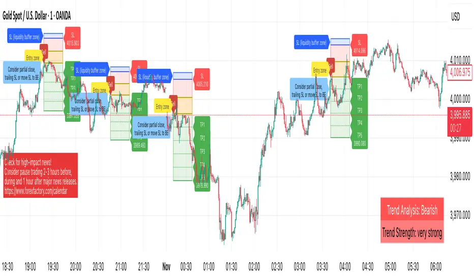
OrderVibe indicator (Invite-Only)OrderVibe — Technical Overview & Release Summary
What it is
OrderVibe is a closed-source analytical tool that visualizes market structure, momentum, and volatility dynamics.
It does not manage orders. Instead, it draws entry zones, TP and SL areas, support and resistance levels, and contextual alerts so traders can build and refine their own decision-making process.
How it works — Technical Overview
* Trend Regime Filter (optional) — Uses a sloped moving-average baseline to define market bias and can optionally require higher-timeframe (HTF) confirmation.
* Momentum Gate — A smoothed rate-of-change momentum must align with the trend and exceed a configurable strength threshold.
* Volatility Filter — ATR-based dynamic bounds suppress signals during abnormally low or high volatility.
* Order-Block Zones (SMC element) — Detects pre-break structural areas and marks candidate Order Blocks used for confluence; zones invalidate after decisive closes.
* Support/Resistance Zones — Clusters recent pivot points into ATR-normalized areas, prioritizing the most relevant ones by recency and proximity.
* Entry Zone — A yellow box plotted between entry and stop regions, providing visual context for fresh setups and helping identify controlled retests.
* Baseline Stop Suggestion — Suggests a conservative protective distance based on ATR or recent swing, whichever is larger.
* ATR TP Ladder (TP1–TP5) — Multi-level ATR-based targets. Each level can be toggled and alerted individually.
* Price Readouts — Real-time price markers shown under TP1–TP5 and SL labels for clarity.
* Cooldown Logic — After a label is triggered, a brief cooldown prevents duplicates; invalidated zones are automatically removed.
* Liquidity Zone (soft SL) — Optional buffer around the stop-loss area to reduce sensitivity to stop hunts.
* Opposite Order Block Proximity Guard — Prevents new entries when a nearby opposite OB is within a restricted distance (confluence protection).
* ATH/ATL Exhaustion Guard — After a fresh All-Time High/Low, temporarily blocks new signals in the breakout direction to prevent exhaustion trades.
* Alerts (multi-level) — Configurable alerts covering:
* Confirmed buy/sell signals (at bar close)
* Potential setup forming (intrabar, early heads-up)
* Newly formed support/resistance levels
* Red news reminder window
Why it’s not a simple mashup
* Dual confirmation via trend and momentum, optionally aligned with HTF direction.
* Volatility-aware gating and ATR-normalized clustering for adaptive signal control.
* Integrated multi-target ladder, cooldown, and visual tracking in a single workflow.
* Expanded alert system for both structural and contextual events (OB/SR/news/EA bridge).
* Provides measurable analytical value beyond conventional MA/ATR-based systems by merging structure recognition with volatility-normalized logic.
How to use
* Works on any symbol; defaults are optimized for intraday XAUUSD.
* Adjust ATR parameters, volatility bounds, and TP multipliers according to instrument volatility.
* Use alerts for monitoring structural changes; disable unused TP levels for clarity.
* Always test before live usage.
Disclaimer
Analytical tool only.
This is not financial advice, and performance outcomes are not guaranteed.
Always apply independent judgment and appropriate risk management.
Dynamic Liquidity HeatMap Profile [BigBeluga]🔵 OVERVIEW
The Dynamic Liquidity HeatMap Profile is a smart-flow liquidity tracker that maps where stop-loss clusters and resting limit orders are likely positioned.
Instead of traditional volume profiles based only on executed transactions, this tool projects probable liquidity pools — areas where traders are trapped or positioned and where smart money may hunt stops or fill orders.
It dynamically scans recent price swings, builds liquidity zones above and below price, and visualizes them as a heat map + histogram — highlighting areas with the greatest liquidity attraction.
Orange highlights the highest-concentration liquidity (POC), making potential sweep targets obvious.
🔵 CONCEPTS
Liquidity pools form above swing highs (buy stops) and below swing lows (sell stops).
Market makers & large players often push price into these zones to trigger stops and capture liquidity.
The indicator uses recent volatility + volume expansion to estimate where these pools exist.
Horizontal heat bars show depth and intensity of probable liquidity.
Profile side histogram displays buy-side vs sell-side liquidity distribution.
🔵 FEATURES
Dynamic Liquidity Detection — finds potential stop-loss clusters from recent swing behavior.
Dual-Side Heatmap — split liquidity view above (short stops) and below (long stops) current price.
Volume-Weighted Levels — higher volatility & volume = deeper liquidity expectation.
Real-Time Heat Coloring
• Lime = liquidity below price (potential buy-side fuel)
• Blue = liquidity above price (potential sell-side fuel)
• Orange = peak liquidity (POC)
Liquidity Profile Histogram — plotted at right side, layered by strength.
Auto-Cleaning Engine — removes invalidated liquidity after breaks.
Adjustable lookback window and bin resolution .
🔵 HOW TO USE
Look for price moving toward dense liquidity zones — high probability of wick raids or sweeps.
Orange POC often acts as magnet — strong target zone for smart money.
Combine with SFP / BOS logic to time reversals after liquidity hunts.
In trend, price repeatedly sweeps opposite-side liquidity before continuation.
Use liquidity walls as bias filters — heavy liquidity above often precedes downward move, and vice-versa.
Great for scalping sessions, indices, FX, BTC, ETH.
🔵 CONCLUSION
The Dynamic Liquidity HeatMap Profile gives traders a tactical edge by revealing where the market’s hidden liquidity resides.
It highlights where shorts and longs are positioned, identifies likely sweep zones, and marks the most attractive liquidity magnet (POC).
Use it to anticipate stop hunts, avoid getting trapped, and align with smart-money flow instead of fighting it.

Liquidity sweep zone [Liquidation heatmap]Liquidity Sweep Zone : Capturing Liquidity Hotspots with Multi-OI Data and Volume
Overview:
The "Liquidity Sweep Zone " indicator comprehensively analyzes changes in Open Interest (OI) and volume data from major cryptocurrency exchanges to visualize potential liquidity sweep areas in real-time. This script identifies price levels where long or short positions are heavily liquidated or new liquidity enters the market, marking these as 'liquidity hotspots'. It assists traders in identifying these critical price levels to predict potential market reversals or trend accelerations. As its name suggests, it effectively illustrates market liquidity flows in a manner similar to a liquidation heatmap.
Features and Originality:
Multi-OI Data Source Integration and OI Delta Analysis:
Multi-Exchange Data: Utilizes integrated real-time Open Interest (OI) data from five major exchanges: Binance, Bybit, OKX, Bitget, and HTX. This approach reduces market bias that might arise from relying on single-exchange data, providing a more comprehensive understanding of overall market position changes.
Accurate Data Requests: Employs the request.security() function to fetch OI data for the current timeframe. Crucially, it uses lookahead=barmerge.lookahead_off and gaps=barmerge.gaps_on settings to entirely eliminate potential lookahead bias during data requests, ensuring the integrity and accuracy of historical data.
OI Delta Calculation: Accurately calculates the change in OI (delta) for each exchange and sums them to derive the total OI delta. This total OI delta represents the net change in market participants' positions, strongly indicating significant liquidity inflow or outflow at specific price levels, especially when coinciding with price movements.
Smart Volume-Based Liquidity Zone Identification:
Filtered Volume: Considers a trade as 'filtered significant trade' when the current bar's volume (volume) is higher than its 14-period Simple Moving Average volume (ta.sma(volume, 14)). This identifies significant large-scale trading activities that genuinely impact market movements, rather than just any volume spike.
Price-Specific Liquidity Marking: When such filtered volume spikes occur, potential buy or sell liquidity lines are drawn on the chart based on the bar's close and open prices. If the close is higher than the open, a line is drawn near the low, indicating long liquidation liquidity. If the close is lower than the open, a line is drawn near the high, indicating short liquidation liquidity.
Dynamic Visualization and Strength-Based Coloring/Thickness:
Gradient Coloring: Utilizes a custom color.from_gradient() method to apply a gradient effect to liquidity lines. This gradient visually represents the 'strength' (volume or OI delta value) of the liquidity zone, with stronger liquidity areas displayed in deeper colors, enabling intuitive perception of strength.
Strength-Based Line Thickness and Color:
Liquidity lines with maximum strength are displayed as the thickest and most prominent using highLevelColor (default yellow), emphasizing them as the most crucial liquidity areas.
Second maximum strength lines are also highlighted with additional thickness and secondHighLevelColor (default yellow).
Lines with above-average strength are shown with medium thickness and lowLevelColor or midLevelColor, while below-average lines are thinner, creating a visual hierarchy based on liquidity strength.
Line Persistence and Updates: Liquidity lines extend horizontally until the current bar closes via the updateVolumeLiquidityLine and updateOILiquidityLine methods, suggesting that these price levels remain valid liquidity areas for a certain period.
Customizable Multi-Timeframe Support:
Timeframe Filtering: Allows individual selection of whether to display liquidity lines on various timeframes, ranging from 1 minute to 2 hours. This enables users to focus liquidity information on their timeframes of interest.
Timeframe-Specific Line Thickness: The thickness of liquidity lines can be individually set for each timeframe. This allows for customization based on user preference, such as thinner lines for longer timeframes and thicker lines for shorter ones.
Liquidity Position Type Filtering:
The "Liquidity positions" option allows filtering to display liquidity for 'All' positions, 'Long' positions, or 'Short' positions only. This is useful when wanting to focus solely on liquidity hotspots for a specific direction.
Alert Functionality:
Provides a feature to alert users when new high-strength volume-based liquidity zones (isNewHighVolumeLongZone, isNewHighVolumeShortZone) and OI-based liquidity zones (isNewHighOILongZone, isNewHighOIShortZone) are formed. This enables traders to react instantly to significant market changes and seize opportunities.
How to Use:
Add Indicator: Add the "Liquidity Sweep Zone " indicator to your TradingView chart.
Select OI Data Sources: In the "OI Data Sources" group, select the exchanges whose Open Interest (OI) data you wish to include in the analysis.
Display and Visualization Settings:
In the "Display" group, you can customize the visual representation by adjusting the Liquidity multiplier, Liquidity positions type, and the colors for low, mid, and high-level liquidity lines (Low level, Mid level, High level, 2nd High level).
In the "Display Liquidity on Timeframes" group, select whether to display liquidity lines on the currently used timeframe.
In the "Line Thickness by Timeframe" group, set the thickness of liquidity lines for each timeframe to adjust visual density.
In the "OI Line Display" group, you can set the visibility of OI liquidity lines, colors for OI Long and Short positions, and the OI line width.
Alert Settings (Optional): In the "Alerts" group, enable the alert function and customize the alert messages for each type of liquidity.
Chart Analysis:
Pay close attention to the liquidity lines displayed on the chart. Especially, the thickest and brightest lines indicate major liquidity hotspots where large amounts of long or short positions are concentrated.
When the price approaches or reaches these liquidity zones, anticipate potential buy/sell pressure, stop-loss triggers, position liquidations, leading to price reversals or trend accelerations in that area. This indicator effectively serves as a heatmap visually representing potential liquidation levels in the market.
Analyze OI liquidity lines and volume liquidity lines together to understand the overall market liquidity flow and the strength of specific positions.
Conceptual Background:
This script is based on the market structure principle that "smart money" or "large traders" tend to drive prices towards areas where significant liquidity (liquidations and unfulfilled orders) is concentrated. These liquidity sweeps often serve as triggers for price reversals or accelerators for existing trends.
Volume Liquidity: Abnormally high volume at specific price levels indicates that many participants previously traded at those prices. This suggests that liquidity pools, which can act as critical support or resistance levels in the future, still exist.
Open Interest (OI) Liquidity: A sharp increase in OI signifies a large build-up of new positions, while a decrease indicates the liquidation of existing positions. Particularly, when OI delta changes significantly along with price movements, it strongly suggests a large influx or liquidation of long/short positions at specific price levels. This can trigger potential liquidation cascades and effectively acts as a 'liquidation heatmap'.
By integrating these liquidity metrics, this indicator helps traders visually identify the 'hidden' order flow and potential liquidation levels in the market. It empowers them to proactively understand critical price areas that could influence market direction. This is particularly useful for enhancing short-term trading and scalping strategies in futures and margin trading.

