Manipulation Candle SystemThis indicator is based on One Candle Scalping Strategy by ProRealAlgos
## **Manipulation Candle System – Simple Explanation**
This indicator helps traders identify **potential market manipulation** during the **US stock market session (New York)** and highlights **key reversal signals**.
---
### **1. Daily ATR (Average True Range)**
* Measures the **average price movement** of the day.
* Helps determine if a move is **normal** or **abnormally large**.
* The indicator calculates **daily ATR** automatically.
* If 15 minute opening candle is more than 25% of Daily ATR, we can call it manipulation is happen .
---
### **2. 15-Minute Opening Candle Box**
* Highlights the **first 15-minute candle** of the US session.
* The box **extends for 2 hours** after the market opens.
* **Color indicates market condition**:
* **Red box** → the opening candle range is bigger than 25% of the daily ATR → potential **manipulation**.
* **Blue box** → the opening candle range is normal → **neutral session**.
* Helps traders visually spot when the market might be trying to **trap traders**.
---
### **3. 5-Minute Reversal Detection**
* Looks for **reversal candle patterns** on the 5-minute chart:
* Bullish engulfing or strong bullish pin → **buy reversal**.
* Bearish engulfing or strong bearish pin → **sell reversal**.
* Only checks during the **US session**, after 15 minute opening candle.
* Helps traders **time entries** in the direction of potential market reversals.
---
### **4. Buy / Sell Signals**
* Shows **triangle markers** on the chart:
* **Green triangle below candle** → buy signal.
* **Red triangle above candle** → sell signal.
* The signal text also indicates:
* `"BUY (Trap Reversal)"` → if the reversal occurs during manipulation.
* `"BUY (Normal Reversal)"` → if the reversal occurs during a neutral session.
* `"SELL (Trap Reversal)"` → if a sell reversal occurs during manipulation.
* `"SELL (Normal Reversal)"` → otherwise.
---
### **5. Info Table**
* Appears at the **top-right** of the chart.
* Shows:
1. Daily ATR value.
2. 15-minute opening candle range.
3. Session condition → `"MANIPULATION"` or `"NEUTRAL"`.
4. Current reversal signal text.
---
### **How a New Trader Can Use It**
1. Look at the **color of the opening box**:
* Red → be cautious, price may trap traders.
* Blue → normal market behavior.
2. Watch for **reversal signals** on the 5-minute chart.
3. Use the **info table** to confirm ATR, session bias, and signals.
4. Combine this with **risk management** before entering trades.
Khoảng dao động thực tế trung bình (ATR)

Multi-Contraction VCP DetectorThis indicator highlights low volume and contracted price movement prior to possible breakouts.

TuxAlgo Plus SMC u. Trap Toolkit Rel.V0.98r by McTogaTuxAlgo Plus – Smart Money Concepts + Smart Money Traps + Fair Value Gaps Version: V0.98r (Alpha/Pre-Release) with integrated 2% risk calculator
The “TuxAlgo Plus” indicator is a powerful, standalone, conceptual open-source project and self-sufficient “smart money toolkit” with automatic trap detection (SMT), liquidity grabs, FVG confluence, and complete bot setup signals for TradingView charts in the “H1 to H6” time frame and the daily chart.
The script is used to improve SMC/trap analysis, i.e., the structure and visualization logic for TradingView charts has been expanded in the “TuxAlgo++” project in line with Smart Money Concepts (SMC) and Smart Money Traps (SMT).
The “TuxAlgo” Pine script is a standalone implementation of smart money concepts (structure, BOS/CHOCH, simple order blocks, fair value gaps) written from scratch. Terms such as “BOS,” “CHOCH,” “order block,” and “fair value gap” are commonly used concepts in market technology. This means that the market structure is often visible on the ‘H4’ time frame
and the trigger on the “H1” time frame.

DCT - Liquidity Heatmap - ProDCT - Liquidity Heatmap - Pro
Overview
This indicator maps liquidity concentration zones by analyzing volume distribution across price levels. It identifies areas where significant trading activity has accumulated, potentially indicating zones of interest for future price interaction.
Methodology
Volume Intensity Calculation
Each price level accumulates a normalized volume score calculated as:
- Volume Intensity = Current Bar Volume / SMA(Volume, lookback period)
- This normalization allows comparison across different volatility regimes and trading sessions
Level Construction
- Price levels are distributed symmetrically above and below current price using percentage-based spacing
- Each level maintains cumulative volume data, tracking both raw volume and normalized intensity
- Levels are visualized as zones with height proportional to the spacing parameter
Sweep Detection Logic
A level is marked as "swept" when price action crosses through it:
- Condition: Low ≤ Level Price AND High ≥ Level Price
- Swept levels stop accumulating new volume and can be styled differently (fade, hide, or preserve)
Color Intensity Grading
Zones are color-coded based on their normalized volume relative to the maximum observed:
- Purple: < 25% of max intensity
- Yellow: 25-50% of max intensity
- Orange: 50-75% of max intensity
- Red: > 75% of max intensity
Optional CVD (Cumulative Volume Delta) Mode
When enabled, directional volume is estimated using candle structure:
- Bullish candles: Buy pressure weighted by (Close - Open) / (High - Low)
- Bearish candles: Sell pressure weighted by (Open - Close) / (High - Low)
- Levels display green/red bias based on accumulated directional volume ratio
Adaptive System
The indicator includes a three-layer adaptive system:
1. Timeframe adaptation: Spacing, level count, and retention automatically adjust for M5 through Daily charts
2. Volatility adaptation: ATR-based adjustments widen spacing during high volatility and tighten during consolidation
3. Market type adaptation: Different imbalance thresholds for BTC/ETH, large altcoins, and small caps
Imbalance Detection
Buy/sell imbalance markers appear when the ratio of accumulated buy volume to sell volume exceeds a configurable threshold (default 1.5x for BTC/ETH, 2.0x for small caps).
What Makes This Implementation Unique
- Dollar-denominated liquidity display: Labels show estimated liquidity in USD (K/M/B format) rather than abstract values
- Three-layer adaptive logic: Combines timeframe, volatility (ATR), and asset-class adjustments simultaneously
- Memory-optimized architecture: Automatic cleanup of old swept levels prevents performance degradation on extended charts
- Forward projection: Active levels extend into future bars for cleaner visualization
- Granular visibility controls: Each intensity tier can be toggled independently
Settings Guide
- Dynamic: Enable adaptive adjustments (recommended)
- Spacing: Distance between levels as % of price
- Levels: Number of levels above/below price
- CVD: Enable directional volume analysis
- Forward: Project levels ahead by specified bars
Usage Notes
- Works on both Perpetual and Spot crypto markets
- Optimized for crypto assets; results may vary on other instruments
- Higher timeframes show broader liquidity structure; lower timeframes show granular detail
- Combine with your own analysis framework
Disclaimer
This indicator visualizes historical volume distribution and does not predict future price movement. Not financial advice. Use appropriate risk management.

TRV & nTRV - Trimmed Range VolatilityGrid bots require stable volatility measurement - ATR becomes misleading when gaps and sudden spikes distort the average. TRV (Trimmed Range Volatility) is an advanced version of ATR: it filters outliers at the extremes (highest and lowest ranges) and remains unaffected by gaps. This provides real-time, accurate volatility measurement for grid bot setup.Grid bots require stable volatility measurement - ATR becomes misleading when gaps and sudden spikes distort the average. TRV (Trimmed Range Volatility) is an advanced version of ATR: it filters outliers at the extremes (highest and lowest ranges) and remains unaffected by gaps. This provides real-time, accurate volatility measurement for grid bot setup.
Why We Developed TRV?
When a gap or sudden spike occurs in the morning, this extreme movement affects standard ATR calculations for an extended period. Even if the price moves sideways for the rest of the day, ATR remains elevated. This causes grid bots to operate with unnecessarily wide spacing and execute fewer trades.
TRV Advantages:
✅ Unaffected by Gaps: Opening gaps don't distort the calculation
✅ Extreme Point Elimination: Filters the largest and smallest outlier candles
✅ Real-Time Accuracy: Shows current market volatility
✅ Grid Bot Optimization: Enables tighter and more efficient grid spacing
✅ Comparison Capability: Compare different stocks and timeframes with nTRV
Grid Bot Usage:
The TRV value is used directly to calculate the number of grid lines:
(Resistance - Support) / TRV = Number of Grid Lines
Example:
Resistance: $110
Support: $90
TRV: $2
Grid Count: (110-90)/2 = 10 grid lines
Features:
Two Filtering Modes: Manual (enter number) or Percentage-Based (automatic ratio)
Four Indicators in One: nTRV, TRV, ATR, and nATR all displayed on the same panel
nTRV: Normalized value (percentage-based, for stock comparison)
TRV: Absolute value (currency-based, for grid calculation)
ATR & nATR Included: Standard ATR and nATR for direct comparison with TRV
Comprehensive Analysis: Compare filtered (TRV) vs unfiltered (ATR) volatility side-by-side
Default: 10% top, 10% bottom outlier elimination
Conclusion:
TRV is an advanced version of ATR specifically designed for grid bot traders. By filtering outlier movements, it provides more stable and reliable volatility measurement. The indicator includes both TRV (filtered) and ATR (unfiltered) on the same chart, giving traders a comprehensive view to make informed decisions. This dual-display approach enables more efficient grid strategies and increased trading frequency.

VWAP Market FlowVWAP Flow Model
VWAP Flow Model is a VWAP-anchored market context indicator designed to help traders understand how price is behaving relative to fair value.
It evaluates the interaction between price, VWAP (Volume-Weighted Average Price), volatility, and momentum to classify prevailing market conditions such as trend continuation, expansion, mean reversion, and momentum decay.
Rather than issuing trade signals, the indicator focuses on identifying market state and execution quality.
Core framework:
-Adaptive VWAP with slope-based colouring
-VWAP acts as the central fair-value reference.
The VWAP line dynamically changes colour based on its slope:
-Rising VWAP → bullish pressure
-Falling VWAP → bearish pressure
-Flattening VWAP → balance, compression, or rotation
This allows traders to quickly assess directional bias and determine whether price movement is supported by underlying flow or occurring in a lower-quality environment.
Signal labels:
The indicator annotates key behavioural transitions to support visual interpretation of market state:
-IGN (Ignition) — Momentum expansion emerging from compression or balance, often marking the start of a directional move.
-CON (Continuation) — Price sustaining directional behaviour in alignment with VWAP slope.
-REV (Reversion) — Mean-reversion behaviour as price returns toward VWAP after extension.
-EXH (Exhaustion) — Loss of momentum or absorption after an extended move, often preceding rotation or regime change.
-MON (Displacement) — High-energy expansion bars indicating strong participation and structural shift.
These labels describe market behaviour, not trade instructions, and should be interpreted within the broader VWAP context.
Market behaviour classification:
The model continuously evaluates how price interacts with VWAP to determine whether the market is:
-directional and trending
-rotating around fair value
-accelerating away from value (expansion)
-losing momentum or showing signs of exhaustion
Classifications are derived from price displacement, volatility conditions, and momentum quality, rather than simple crossovers.
Filtering and control logic:
-Trend / Volatility Filter
Conditions market-state classification on the prevailing volatility and structural regime, helping prevent unstable or low-quality environments from producing misleading context shifts.
-Cooldown Filter
Enforces a minimum number of bars between classification updates to reduce rapid state-flipping in choppy conditions and keep context stable.
-Minimum Bars Between Signals
Controls the strictness of the cooldown logic.
Lower values increase responsiveness; higher values favour cleaner, more stable context changes.
-Tape Dominance Requirement (IGN)
Optional confirmation that requires directional signed-volume pressure to align with price behaviour before ignition-style classifications are allowed, helping distinguish genuine impulsive moves from weak or mechanically driven spikes.
-Tape Dominance Lookback
Defines the evaluation window used by the tape dominance filter.
Shorter lookbacks react faster; longer lookbacks require sustained participation.
Sensitivity and session controls:
Sensitivity modes adjust how responsive the model is to changing conditions:
-Aggressive — faster, more reactive (lower timeframes)
-Balanced — default intraday calibration
-Sniper — stricter thresholds, fewer but higher-quality classifications
Optional session filters allow the model to operate only during selected trading sessions, helping traders focus on higher-liquidity periods and avoid low-efficiency hours.
How to use it:
VWAP Flow Model is used as a context and confirmation layer, not a signal generator:
-Trade in the direction of VWAP slope during directional phases
-Expect mean reversion when price extends far from VWAP in balanced conditions
-Treat strong acceleration away from VWAP as expansion rather than chop
-Use flattening VWAP as an early warning of rotation or momentum loss
It integrates naturally with price action, structure-based analysis, and volume-aware workflows.
Indicator scope:
VWAP Flow Model provides objective market context and behavioural classification.
It does not generate direct trade signals and is designed to support discretionary decision-making.
Important notes:
Market classifications are probabilistic, not guarantees
Past behaviour does not imply future results
This indicator is a decision-support tool, not an automated trading system

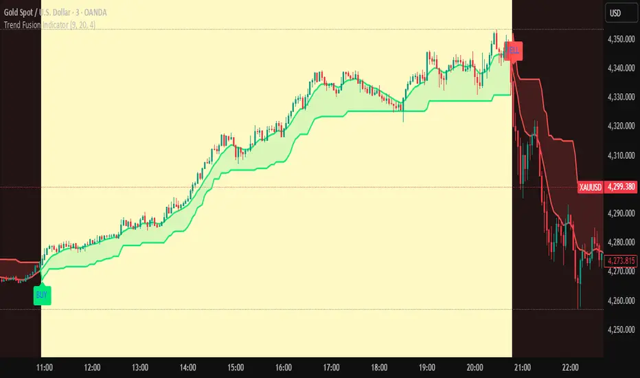
Trend Fusion Indicator🎯 Trend Fusion Indicator🎯
Professional trading indicator combining EMA momentum with Supertrend volatility for high-probability signals.
📊KEY FEATURES:
• 9 EMA & Supertrend (10,3) crossover signals
• Visual trend direction with colored fills
• Buy/Sell arrows at crossover points
• Real-time trend tracking
• Clean, professional interface
⚡SIGNAL LOGIC:
✅ BUY: When EMA crosses ABOVE Supertrend
✅ SELL: When EMA crosses BELOW Supertrend
🎨VISUAL INDICATORS:
• Green Zone/Fill: Bullish trend (EMA > Supertrend)
• Red Zone/Fill: Bearish trend (EMA < Supertrend)
• Triangle Arrows: Entry signals
• Background Colors: Trend confirmation
⚙️CUSTOMIZABLE SETTINGS:
• EMA Length (Default: 9)
• Supertrend ATR Length (Default: 10)
• Supertrend Factor (Default: 3.0)
🔔ALERTS INCLUDED:
• Buy Alert: EMA crosses above Supertrend
• Sell Alert: EMA crosses below Supertrend
📈 BEST FOR:
• Swing Trading
• Day Trading
• Trend Following
• Market Reversals
⚠️ DISCLAIMER: This indicator is for educational purposes only.
Trading involves risk. Not financial advice. Use at your own risk.
Malama's Range BreakoutMalama's Range Breakout is a dynamic Pine Script v6 indicator designed to automatically detect periods of price consolidation (tight ranges) on any timeframe or market, visually highlight them with expandable boxes, and generate actionable signals for breakouts and wick-based reversals.
Key Features
Adaptive Consolidation Detection: Uses a volatility-adjusted threshold (ATR multiplier) over a user-defined lookback period to identify genuinely tight ranges, avoiding false detections in trending or high-volatility conditions.
Preset Profiles: Quickly switch between optimized settings for different trading styles:
Tight Ranges (Scalping): Short lookback, low threshold for frequent small-range setups.
Normal Ranges (Intraday): Balanced for day trading.
Swing Trading: Longer lookback for larger consolidations.
Options Selling (Chop): Very low threshold to capture extended sideways/choppy phases.
Custom: Full manual control.
Visual Elements: Draws semi-transparent boxes around detected ranges (with optional dashed midline), dynamically extending them until a valid breakout occurs. Limits historical boxes for clean charts.
Breakout Signals: Triggers buy/sell labels and alerts only on confirmed breakouts, optionally requiring a volume spike (above SMA threshold) for higher-probability momentum moves.
Wick Reversal Signals: Detects rejection wicks touching range boundaries (without closing outside), signaling potential fakeouts or early reversals. Optional next-bar confirmation (e.g., bearish candle after upper wick) reduces false signals.
Built-in Alerts: Separate alert conditions for range detection, bullish/bearish breakouts, and confirmed/unconfirmed wick reversals.
How It Works
The script continuously monitors the price range over the selected lookback period. When the range contracts below the ATR-based threshold, it initiates a consolidation box starting from the tightest point. The box expands with new highs/lows while price remains inside.
A true breakout closes outside the box (with optional volume confirmation) → ends the range and plots a directional signal.
Wicks probing boundaries without closing outside → flags potential rejection/reversal zones inside the range.
This combination helps traders anticipate volatility expansion after compression, while distinguishing strong momentum breakouts from traps/false breaks.
Why It's Useful
Unlike fixed-time Opening Range Breakout (ORB) tools or simple consolidation detectors, this indicator adapts to current market volatility (via ATR) and works across all timeframes—ideal for scalping tight intraday ranges, capturing swing consolidations, or identifying chop for premium-selling strategies. The volume filter and wick reversal detection add confluence, helping avoid low-conviction trades in ranging markets.
Usage Tips
Best on liquid assets (stocks, futures, forex, crypto).
Combine breakouts with trend filters (e.g., higher-timeframe EMA) for directional bias.
Use wick signals cautiously in strong trends—they shine in ranges or at key levels.
Test presets on your preferred timeframe; "Normal" is a solid default for most intraday work.
No repainting: All logic based on confirmed closes.

Trinity Real Move Detector DashboardRelease Notes (critical)
1. This code "will" require tweaks for different timeframes to the multiplier, do not assume the data in the table is accurate, cross check it with the Trinity Real Move Detector or another ATR tool, to validate the values in the table and ensure you have set the correct values.
2. I mention this below. But please understand that pine code has a limitation in the number of security calls (40 request.security() calls per script). This code is on the limit of that threshold and I would encourage developers to see if they can find a way around this to improve the script and release further updates.
What do we have...
The Trinity Real Move Detector Dashboard is a powerful TradingView indicator designed to scan multiple assets at once and show when each one has genuine short-term volatility "energy" — the kind that makes directional options trades (especially 0DTE or short-dated) have a high probability of follow-through, and can be used for swing trading as well. It combines a simple ATR-based volatility filter with a SuperTrend-style bias to tell you not only if the market is "awake" but also in which direction the momentum is leaning.
At its core, the indicator calculates the current ATR on your chosen timeframe and compares it to a user-defined percentage of the asset's daily ATR. When the short-term ATR spikes above that threshold, it signals "enough energy" — meaning the underlying is moving with real force rather than choppy noise. The SuperTrend logic then determines bullish or bearish bias, so the status shows "BULLISH ENERGY" (green) or "BEARISH ENERGY" (red) when energy is on, or "WAIT" when it's not. It also counts how many bars the energy has been active and shows the current ATR vs threshold for quick visual confirmation.
The dashboard displays all this in a clean table with columns for Symbol, Multiplier, Current ATR, Threshold, Status, Bars Active, and Bias (UP/DOWN). It's perfect for 3-minute charts but works on any timeframe — just adjust the multiplier based on the hints in the settings.
Editing symbols and multipliers is straightforward and user-friendly. In the indicator settings, you'll see numbered inputs like "1. Symbol - NVDA" and "1. Multiplier". To change an asset, simply type the new ticker in the symbol field (e.g., replace "NVDA" with "TSLA", "AVGO", or "ADAUSD"). You can also adjust the multiplier for each asset individually in the corresponding "Multiplier" field to make it more or less sensitive — lower numbers give more signals, higher numbers give stricter, higher-quality ones. This lets you customize the dashboard to your watchlist without any coding. For example, if you switch to a 4-hour chart or a slower-moving stock like AVGO, you may need to raise the multiplier (e.g., to 0.3–0.4) to avoid false "bullish" signals during minor bounces in a larger downtrend.
One important note about the multiplier and timeframes: the default values are optimized for fast intraday charts (like 3-minute or 5-minute). On higher timeframes (15-minute, 1-hour, 4-hour, or daily), the SuperTrend bias can be too sensitive with low multipliers (1.0 default in the code), leading to situations like the AVGO 4-hour example — where price is clearly downtrending, but the dashboard shows "BULLISH ENERGY" because the tight bands flip on small bounces. To fix this, you need to manually increase the multiplier for that asset (or all assets) in the settings. For 4-hour or daily charts, 0.25–0.35 is often better to match smoother SuperTrend indicators like Trinity. Always test on your timeframe and asset — crypto usually needs slightly lower multipliers than stocks due to higher volatility.
TradingView has a hard limit of 40 request.security() calls per script. Each asset in the dashboard requires several calls (current ATR, daily ATR, SuperTrend components, etc.), so with the full ATR-based bias, you can safely monitor about 6–8 assets before hitting the limit. Adding more symbols increases the number of calls and will trigger the "too many securities" error. This is a platform restriction to prevent excessive server load, and there's no official way around it in a single script. Some advanced coders use tricks like caching or lower-timeframe requests to squeeze in a few more, but for reliability, sticking to 6–8 assets is recommended. If you need more, the common workaround is to create two separate indicators (e.g., one for stocks, one for crypto) and add both to the same chart.
Overall, this dashboard gives you a professional-grade multi-asset scanner that filters out low-energy noise and highlights real momentum opportunities across stocks and crypto — all in one glance. It's especially valuable for options traders who want to avoid theta decay on weak moves and only strike when the market has true fuel. By tweaking the per-symbol multipliers in the settings, you can perfectly adapt it to any timeframe or asset behavior, avoiding issues like the AVGO false bullish signal on higher timeframes.

Quantum Darvas BoxesQuantum Darvas Boxes - The Modern Evolution
The original Darvas Box methodology, conceived by Nicolas Darvas in the 1950s, revolutionized breakout trading by identifying consolidation phases as "boxes." However, modern markets move with algorithmic speed and fractal volatility that often trigger false breakouts. Quantum Darvas Boxes were designed not as a nostalgic tribute, but as a computational upgrade. By anchoring boxes to volatility-adjusted boundaries rather than raw highs/lows, and introducing adaptive stability mechanisms, this indicator transforms a classic discretionary tool into a systematic, noise-filtered engine.
Description & Improvements
Quantum Darvas Boxes solve the three fatal flaws of the original: false breakouts, arbitrary box sizing, and lack of confirmation. Instead of drawing boxes at exact recent highs/lows, it creates volatility-buffered boundaries using ATR, ensuring breakouts require meaningful momentum. The boxes remain anchored until a confirmed close beyond the buffer occurs, preventing the constant redrawing that plagued traditional Darvas implementations. Built-in volume and RSI filters add discretionary-grade confirmation to pure price action. Visually, the system presents as a stable, semi-transparent blue zone between red (resistance) and lime (support) lines, with clear triangle signals appearing only on validated breakouts.
How It's Based on Darvas
The core philosophy remains true to Darvas' 1950s methodology:
Identify Consolidation: Finds price ranges where the market consolidates
Draw Box: Creates a "box" representing the accumulation zone
Breakout Trading: Enters when price breaks out of the box with momentum
Volatility-Adjusted Boundaries
Original: Boxes at exact highs/lows → prone to false breakouts
QDB: Boxes set at High - (ATR × Multiplier) and Low + (ATR × Multiplier)
→ Breakouts require meaningful momentum, not just price tags
→ Adapts to different volatility regimes
Signal Logic:
Long: Close above box top, previous close was inside box
Short: Close below box bottom, previous close was inside box
Ideal Settings:
For daily charts, use lookback=13 and mult=2.4.
For intraday (1H-4H), reduce to lookback=8 and mult=1.8. Enable volume filter in trending markets and RSI filter in ranging conditions.
Trade Execution: Enter long on the green triangle below the bar following a close above the red top line; enter short on the red triangle above the bar after a close below the lime bottom line. The background glow provides immediate visual confirmation.
Risk Management: Set stops at the opposite box boundary. The volatility multiplier inherently calculates a risk buffer—larger multipliers create wider, higher-conviction boxes; smaller multipliers produce more frequent, sensitive signals. This system excels in trending markets and provides clear exit/reversal points, transforming Darvas's original speculation into a quantified, repeatable edge.

Range Breaker [MOT]Range Breaker - Volatility Compression System
Range Breaker is a technical analysis tool designed to identify periods of market consolidation (volatility compression) and generate signals when the market transitions into an expansion phase (breakout). Unlike static box tools that require manual drawing, this script uses an adaptive, volatility-based algorithm to automatically detect, draw, and monitor trading ranges in real-time. It adapts to changing market conditions by comparing recent price action against the asset's Average True Range (ATR).
METHODOLOGY & CORE CONCEPTS
1. Volatility Compression Detection
The script's primary engine is a "Tightness Filter." It continuously measures the distance between the highest high and lowest low over a lookback period.
The Logic: It compares this raw range size against the ATR multiplied by a specific threshold. If the current range is significantly smaller than the historical average volatility, the script identifies this as a "Consolidation" event and begins constructing a box.
Adaptive Thresholds: This method ensures the indicator works across all assets (Crypto, Forex, Stocks) because the definition of "tight" is relative to the asset's own volatility, not a fixed price distance.
2. Dynamic Range Expansion
Originality lies in how the script manages an active range. A consolidation phase is not static; it breathes.
The Mechanism: If price pushes the boundary of the box but remains within the consolidation logic (does not close outside with momentum), the box dynamically expands to include the new data. This prevents premature signals and accurately captures the full "churn" of the accumulation/distribution phase.
3. Signal Generation Models
The script offers two distinct ways to trade the detected ranges:
Momentum Breakouts: A signal is triggered when a candle closes decisively outside the box boundaries (plus a buffer).
Wick Reversals (Mean Reversion): The script identifies "False Breakouts" where price probes outside the range but fails to close there (leaving a long wick). If confirmed by the subsequent candle, this signals a potential reversal back to the midline.
A chart showing a highlighted consolidation box with a "Vol Break" signal triggering on the breakout.
Visualizing volatility compression followed by a confirmed momentum breakout.
A chart showing a "Wick Reversal" signal where price poked out of the box but failed to close, indicating a trap/reversal back into the range.
False Breakout Detection: The script identifies liquidity traps at the range edges.
FEATURES & SETTINGS
Preset Profiles
To make the tool instantly usable for different styles, we have included tuned preset profiles that adjust the ATR multipliers and lookback periods automatically:
Tight Ranges: For scalping on lower timeframes.
Normal Ranges: Balanced settings suitable for most intraday and short-term swing trading strategies (Default).
Swing Trading: Looser parameters for capturing multi-day consolidations.
Options Selling: Optimized to find long, sideways chop ideal for theta strategies.
The settings menu showing the "Preset" dropdown selected.
Built-in profiles allow for quick adaptation to different market environments.
Volume Confirmation
The Volume Filter: Users can enable a "Volume Spike" requirement. This checks if the breakout candle's volume is significantly higher than the average volume (e.g., > 1.7x), helping to filter out "fakeouts" that lack institutional participation.
Visual Customization
Full control over Box colors, borders, and midlines.
Toggle signals for "Wick Reversals" and standard "Breakouts" independently.
HOW TO USE & BEST PRACTICES
The Squeeze: Use this tool to identify "the calm before the storm." Long periods of consolidation (large boxes) often lead to more explosive moves.
Breakout & Retest Strategy: While the script signals the initial breakout, conservative traders often wait for price to pull back and "retest" the range extreme (Box Top/Bottom) or the Midline as support/resistance. Entering on this confirmation often provides a better risk-to-reward ratio.
Risk Management: Stop losses can be strategically placed based on your style. Aggressive traders might place stops below the entry candle, while conservative traders often place them below the opposite side of the range box to allow for volatility.
Filtering Fakeouts: We highly recommend enabling the "Confirm with Volume Spike" option in the settings. Breakouts accompanied by low volume often fail and return to the range.
Reversals: In choppy sideways markets, use the "Wick Reversal" signals to trade from the edges back toward the midline (Mean Reversion).
ALERTS
The script includes the following alert conditions:
Range Detected: Triggered when a new consolidation phase begins.
Range Breakout: Triggered when price closes outside the box.
Breakout with Volume Confirmation: Triggered only when a breakout is accompanied by a significant volume spike, allowing for filtered automated entries.
Range Reversal: Triggered on confirmed Wick Reversal setups.
⚠️ DISCLAIMER
This script is for educational and analytical purposes only. It does not constitute financial advice. Trading involves significant risk. Past performance of the logic described is not indicative of future results.

NeoChartLabs Trend VolatalityAn Experimental Indicator - Trend Volatility
Using the Trix & ATR, it becomes possible to measure the volatility in the trend.
When the ATR% is below the user defined rate (default is 5%), the background turns RED signaling a low vol asset.
If ATRP goes under 5% in Crypto and the background turns RED - expect a large move to happen soon either up or down.

ATR Regime Filter (ATR14 vs SMA20)ATR volatility + ATR SMA
Green ATR above Red SMA + green background
→ Volatility expanding
→ Trend mode only
Green ATR below Red SMA + blue background
→ Volatility compressing
→ Mean reversion allowed
Crossovers / flickering
→ Transition
→ Size down or stay flat


ATR R-LevelsATR-R Levels is built for clarity of risk management.
The script takes your account size, chosen risk %, and the market’s volatility, then turns all of that into exact stop-loss, take-profit, and position size so there’s no guessing.
It’s inspired by key principles from NNFX, especially ATR-based stop placement and fixed-risk position sizing, but redesigned for fast intraday crypto trading. You get the same consistency and discipline NNFX is known for, adapted to a much shorter timeframe.
ATR-R Levels gives you:
A volatility-based stop using ATR
A clean 2R (or custom R-multiple) target
Automatic position sizing based on your risk rules
A simple HUD showing ATR, entry, stop, TP, size, and risk
Optional net profit estimates after fees
Let me know what you think or if you use it!

Institutional Equity DashboardAn overlay indicator with everything you need:
Trend Ribbon - 8/21/50/200 EMA cloud with bullish/bearish fill
VWAP + Bands - The institutional benchmark with deviation bands
Auto S/R Detection - Pivot-based support/resistance levels
ATR-Based Stops - Dynamic stop-loss levels that adjust to volatility
Confluence Signals - Multi-factor buy/sell signals (regular + strong)
Real-Time Dashboard showing:
Market regime (Strong Uptrend → Strong Downtrend)
Trend score (0-100)
RSI, MACD, Stochastic status
Volume ratio and VWAP position
Risk metrics (ATR%, Historical Vol, Risk Level)
Relative strength vs. benchmark

ATR Trailing StopShows a trailing stop loss based on ATR (Average True Range).
The user can select ATR period and multiple, to adjust to the volatility of the current chart.
Only for long positions.

Trinity ATR Real Move DetectorTrinity ATR Real Move Detector
This ATR Energy Table indicator is one of the simplest yet most powerful filters you can have on a chart when trading short-dated or 0DTE options or swing trades on any timeframe from 1-minute up to 4-hour. Its entire job is to answer the single most important question in intraday and swing trading: “Does the underlying actually have enough short-term explosive energy right now to make a directional position worth the theta and the spread, or is this just pretty candles that will die in ten minutes?”
Most losing 0DTE and short-dated option trades happen because people buy or sell direction on a “nice-looking” breakout or pullback while the underlying is actually in low-energy grind mode. The premium decays faster than the move develops, and you lose even when you’re “right” on direction. This little table stops that from ever happening again.
Here’s what it does in plain English:
Every bar it measures two things:
- The current ATR on whatever timeframe you are using (1 min, 3 min, 5 min, 10 min, etc.). This tells you how big the average true range of the last 14 bars has been — in other words, how violently the stock or index is actually moving right now.
- The daily ATR (14-period on the daily chart). This is your benchmark for “normal” daily movement over the last two–three weeks.
It then multiplies the daily ATR by a small number (the multiplier you set) and compares the two. If the short-term ATR is bigger than that percentage of the daily ATR, the table turns bright green and says “ENOUGH ENERGY”. If not, it stays red and says “NOT ENOUGH”.
Why this works so well:
- Real explosive moves that carry for 0DTE and 1–3 DTE options almost always show a short-term ATR spike well above the recent daily average. Quiet grind moves never do.
- The comparison is completely adaptive — on a high-vol day the threshold automatically rises, on a low-vol day it automatically drops. You never have to guess if “2 points on SPY is big today”.
- It removes emotion completely. You simply wait for green before you even think about clicking buy or sell on an option.
Key settings and what to do with them:
- Energy Multiplier — this is the only number you ever touch. It is expressed as a decimal (0.15 = 15 % of the daily ATR). Lower = more signals, higher = stricter and higher win rate. The tooltip gives you the exact sweet-spot numbers for every popular timeframe (0.09 for 1-minute scalping, 0.13 for 3-minute, 0.14–0.16 for 5-minute, 0.15–0.19 for 10-minute, etc.). Just pick your timeframe once and type the number — done forever.
- ATR Length — leave it at 14. That’s the standard and works perfectly.
- Table Position — move the table to wherever you want on the chart (top-right, bottom-right, bottom-left, top-left).
- Table Size — make the text Tiny, Small, Normal or Large depending on how much screen space you have.
How this helps you make money and stop losing it:
- On most days you will see red 80–90 % of the time — that’s good! It is forcing you to sit on your hands instead of overtrading low-energy chop that eats premium.
- When it finally flips green you know institutions are actually pushing size right now — follow-through probability jumps from ~40 % to 65–75 % depending on the stock and timeframe.
- You stop buying calls on every green candle and puts on every red candle. You only strike when the market is genuinely “awake”.
- Over a week you take dramatically fewer trades, but your win rate and average winner size go way up — which is exactly how consistent intraday option profits are made.
In short, this tiny table is the closest thing to an “edge on/off switch” that exists for short-dated options. Red = preserve capital and go do something else. Green = pull the trigger with confidence. Use it religiously and you’ll immediately feel the difference in your P&L.

ADR% / ATR / Dynamic LoD–HoD TableThis indicator displays a clean data table showing ADR%, ATR, and a dynamic LoD/HoD distance value based on daily trend conditions.
When price is above the 21-day or 50-day moving average, the indicator shows the distance from the Low of Day.
When price is below BOTH daily moving averages, it automatically switches to showing distance from the High of Day.
The table updates in real-time and gives a fast, volatility-based view of where price sits inside the day’s range.
Features
• ADR% (Average Daily Range Percentage)
• ATR (Average True Range)
• Automatic LoD → HoD switching based on daily trend
• Customizable colors and layout
• Clean, space-efficient table format
• Designed for intraday and volatility-focused traders

Adaptive Risk Management [sgbpulse]1. Introduction:
Adaptive Risk Management is an advanced indicator designed to provide traders with a comprehensive risk management tool directly on the chart. Instead of relying on complex manual calculations, the indicator automates all critical steps of trade planning. It dynamically calculates the estimated Entry Price , the Stop Loss location, the required Position Size (Quantity) based on your capital and risk limits, and the three Take Profit targets based on your defined Reward/Risk ratios. The indicator displays all these essential data points clearly and visually on the chart, ensuring you always know the potential risk-reward profile of every trade.
ARM : The A daptive R isk M anagement every trader needs to ARM themselves with.
2. The Critical Importance of Risk Management
Proper risk management is the cornerstone of successful trading. Consistent profitability in the market is impossible without rigorously defining risk limits.
Risk Control: This starts by setting the maximum risk amount you are willing to lose in a single trade (Risk per Trade), and limiting the total capital allocated to the position (Max Capital per Trade).
Defining Boundaries (Stop Loss & Take Profit): It is mandatory to define a technical Stop Loss and a Take Profit target. A fundamental rule of risk management is that the Reward/Risk Ratio (R/R) must be a minimum of 1:1.
3. Core Features, Adaptivity, and Customization
The Adaptive Risk Management indicator is engineered for use across all major trading styles, including Swing Trading, Intraday Trading, and Scalping, providing consistent risk control regardless of the chosen timeframe.
Real-Time Dynamic Adaptivity: The indicator calculates all risk management parameters (Entry, Stop Loss, Quantity) dynamically with every new bar, thus adapting instantly to changing market conditions.
Trend Direction Adjustment: Define the analysis direction (Long/Uptrend or Short/Downtrend).
Intraday Session Data Control: Full control over whether lookback calculations will include data from Extended Trading Hours (ETH), or if the daily calculations will start actively only from the first bar of Regular Trading Hours (RTH).
Status Validation: The indicator performs critical status checks and displays clear Warning Messages if risk conditions are not met.
4. Intuitive Visualization and Real-Time Data
Dynamic Tracking Lines: The Entry Price and Stop Loss lines are updated with every new bar. Crucially, the length of these lines dynamically reflects the calculation's lookback range (e.g., the extent of Lookback Bars or the location of the confirmed Pivot Point), providing a visual anchor for the calculated price.
Risk and Reward Zones: The indicator creates a graphical background fill between Entry and Stop Loss (marked with the risk color) and between Entry and the Reward Targets (marked with the reward color).
Essential Information Labels: Labels are placed at the end of each line, providing critical data: Estimated Entry Price, Stock/Contract Quantity (Quantity), Total Entry Amount, Estimated Stop Loss, Risk per Share, Total Financial Risk (Risk Amount), Exit Amount, Estimated Take Profit 1/2/3, Reward/Risk Ratio 1/2/3, Total Reward 1/2/3, TP Exit Amount 1/2/3.
4.1. Data Window Metrics (16 Full Series)
The indicator displays 16 full data series in the TradingView Data Window, allowing precise tracking of every calculation parameter:
Entry Data: Estimated Entry, Quantity, Entry Amount.
Risk Data (Stop Loss): Estimated Stop Loss, Risk per Share, Risk Amount, Exit Amount.
Reward Data (Take Profit): Estimated Take Profit 1/2/3, Reward/Risk Ratio 1/2/3, Total Reward 1/2/3, TP Exit Amount 1/2/3.
4.2. Instant Tracking in the Status Line
The indicator displays 6 critical parameters continuously in the indicator's Status Line: Estimated Entry, Quantity, Estimated Stop Loss, Estimated Take Profit 1/2/3.
5. Detailed Indicator Inputs
5.1 General
Focused Trend: Defines the analysis direction (Uptrend / Downtrend).
Max Capital per Trade: The maximum amount allocated to purchasing stocks/contracts (in account currency).
Risk per Trade: The maximum amount the user is willing to risk in this single trade (in account currency).
ATR Length: The lookback period for the Average True Range (ATR) calculation.
5.2 Intraday Session Data Control
Regular Hours Limitation : If enabled, all daily lookback calculations (for Entry/Stop Loss anchor points) will begin strictly from the first Regular Trading Hours (RTH) bar. This limits the lookback range to the current RTH session, excluding preceding Extended Trading Hours (ETH) data. Only relevant for Intraday charts. Default: False (Off)
5.3 Entry Inputs
Entry Method: Selects the entry price calculation method:
Current Price: Uses the closing price of the current bar as the estimated entry point (Market Entry).
ATR Real Bodies Margin :
- Uptrend: Calculates the Maximum Real Body over the lookback period + the calculated safety margin.
- Downtrend: Calculates the Minimum Real Body over the lookback period - the calculated safety margin.
ATR Bars Margin :
- Uptrend: Calculates the Maximum High price over the lookback period + the calculated safety margin.
- Downtrend: Calculates the Minimum Low price over the lookback period - the calculated safety margin.
Lookback Bars: The number of bars used to calculate the extremes in the ATR-based entry methods (Relevant only for ATR Real Bodies Margin and ATR Bars Margin methods).
ATR Multiplier (Entry): The multiplier applied to the ATR value. The result of the multiplication is the calculated safety margin used to determine the estimated Entry Price.
5.4 Risk Inputs (Stop Loss)
Risk Method: Selects the Stop Loss price calculation method.
ATR Current Price Margin :
- Uptrend: Entry Price - the calculated safety margin.
- Downtrend: Entry Price + the calculated safety margin.
ATR Current Bar Margin :
- Uptrend: Current Bar's Low price - the calculated safety margin.
- Downtrend: Current Bar's High price + the calculated safety margin.
ATR Bars Margin :
- Uptrend: Lowest Low over lookback period - the calculated safety margin.
- Downtrend: Highest High over lookback period + the calculated safety margin.
ATR Pivot Margin :
- Uptrend: The first confirmed Pivot Low point - the calculated safety margin.
- Downtrend: The first confirmed Pivot High point + the calculated safety margin.
Lookback Bars: The lookback period for finding the extreme price used in the 'ATR Bars Margin' calculation.
ATR Multiplier (Risk): The multiplier applied to the ATR value. The result of the multiplication is the calculated safety margin used to place the estimated Stop Loss. Note: If set to 0, the Stop Loss will be placed exactly at the technical anchor point, provided the Minimum Margin Value is also 0.
Minimum Margin Value: The minimum price value (e.g., $0.01) the Stop Loss margin buffer must be.
Pivot (Left / Right): The number of bars required on either side of the pivot bar for confirmation (relevant only for the ATR Pivot Margin method).
5.5 Reward Inputs (Take Profit)
Show Take Profit 1/2/3: ON/OFF switch to control the visibility of each Take Profit target.
Reward/Risk Ratio 1/ 2/ 3: Defines the R/R ratio for the profit target. Must be ≥1.0.
6. Indicator Status/Warning Messages
In situations where the Stop Loss location cannot be calculated logically and validly, often caused by a mismatch between the configured Focused Trend (Uptrend/Downtrend) and the actual price action, the indicator will display a warning message, explaining the reason and suggesting corrective action.
Status Message 1: Pivot reference unavailable
Condition: The Stop Loss is set to the "ATR Pivot Margin" method, but the anchor point (Pivot) is missing or inaccessible.
Message Displayed: "Pivot reference unavailable. Wait for valid price action, or adjust the Regular Hours Limitation setting or Pivot Left/Right inputs."
Status Message 2: Calculated Stop Loss is unsafe
Condition: The calculated Stop Loss is placed illogically or unsafely relative to the trend direction and the Entry price.
Message Displayed: "Calculated Stop Loss is unsafe for current trend. Wait for valid price action or adjust SL Lookback/Multiplier."
7. Summary
The Adaptive Risk Management (ARM) indicator provides a seamless and systematic approach to trade execution and risk control. By dynamically automating all critical trade parameters—from Entry Price and Stop Loss placement to Position Sizing and Take Profit targets—ARM removes emotional bias and ensures every trade adheres strictly to your predefined risk profile.
Key Benefits:
Systematic Risk Control: Strict enforcement of maximum capital allocation and risk per trade limits.
Adaptivity: Dynamic calculation of prices and quantities based on real-time market data (ATR and Lookback).
Clarity and Trust: Clear on-chart visualization, precise data metrics (16 series), and unambiguous Status/Warning Messages ensure transparency and reliability.
ARM allows traders to focus on strategy and analysis, confident that their execution complies with the core principles of professional risk management.
Important Note: Trading Risk
This indicator is intended for educational and informational purposes only and does not constitute investment advice or a recommendation for trading in any form whatsoever.
Trading in financial markets involves significant risk of capital loss. It is important to remember that past performance is not indicative of future results. All trading decisions are your sole responsibility. Never trade with money you cannot afford to lose.

BT SpikeBT Spike is a lightweight but highly effective alert engine designed to identify
moments of unusual volatility and volume expansion . These spikes often appear
at the very beginning of major moves, giving traders early insight into:
Momentum ignition
Breakout confirmation
Liquidity shifts
Stop runs & displacement moves
Trend acceleration
High-impact expansions before news or volatility events
Rather than watching charts all day, BT Spike allows traders to receive
instant alerts whenever the market enters an abnormal volatility regime.
---
■ What BT Spike Measures
1. ATR Spike
Detects sudden expansion in true range (micro-volatility).
This often marks the beginning of a displacement candle.
2. Volume Spike
Identifies candles where volume exceeds typical market participation.
3. Combined Spike
A powerful signal triggered only when both conditions occur together:
ATR Spike AND Volume Spike
4. Spike Score (0–100)
A normalized measure of spike intensity.
• Higher score → Stronger anomaly
• 90+ → Extreme event (liquidity shifts, stop runs, institutional activity)
---
■ Visual Elements
• True Range Line
Shows per-candle volatility relative to baseline ATR.
• Volume Bars (Color-Scaled)
Volume bars turn:
Green for bullish spikes
Red for bearish spikes
Intensity based on Spike Score
Gray during normal activity
This creates a clear volatility heatmap directly in the volume panel.
• Spike Score Histogram
Helps visually identify:
Minor spikes
Major volatility clusters
Extreme anomalies
• Threshold Lines
Yellow = Minor
Orange = Major
Red = Extreme
---
■ Why BT Spike Is Useful
Spike-based analysis helps traders:
Catch large moves early
Confirm breakouts and avoid fake ones
Identify when smart money enters the market
Find the start of momentum legs
Monitor many charts with alerts instead of manual watching
A spike is often the first footprint of a meaningful move.
---
■ Practical Trading Uses
1. Breakout Confirmation
A breakout with no spike is often weak.
A breakout with a spike is typically genuine and sustained.
2. Reversal Detection
Extreme spike after a sweep often signals a reversal event.
3. Trend Ignition
Spikes frequently occur at the beginning of:
Trend legs
News-driven surges
Momentum continuation moves
4. Divergence With Price
High-volume, high-ATR spikes with little price movement can indicate:
Absorption
Trap conditions
Exhaustion
5. Alert-Driven Market Monitoring
Set alerts for:
ATR Spike
Volume Spike
Combined Spike
Major Spike (Score ≥ threshold)
Extreme Spike (Score ≥ threshold)
This allows traders to walk away while still catching every volatility event.
---
■ Spike Score Guide
0–30 → Mild noise
30–60 → Minor shift
60–80 → Strong volatility expansion
80–95 → Major spike (high-impact)
95–100 → Extreme event (institutional presence, sweeps, stop runs)
---
■ Final Summary
BT Spike gives traders:
Early detection of volatility expansion
Bull/Bear intensity visualization
Powerful alert automation
A universal signal layer that fits any strategy
Cleaner insight into where major moves originate
BT Spike = Your volatility radar .
It tells you when to look at a chart—before the move happens.
BT Delta AbsorptionBT Absorption detects aggressive counterflow volume—moments where one side
of the market (buyers or sellers) attacks aggressively, yet price fails to move
proportionally.
This is the classic definition of absorption:
"Large market orders are being absorbed by strong passive limit orders."
Absorption is one of the most reliable early signals for:
Reversals
Trap conditions
Failed breakouts
Liquidity grabs
Fake displacement moves
---
■ What BT Absorption Measures
1. Delta Imbalance
Identifies when buying or selling pressure becomes unusually one-sided.
2. Volatility Mismatch
Shows when large delta does NOT translate into meaningful price movement.
3. Absorption Strength Score
A normalized reading (often 0–100) showing the intensity of counterflow activity.
4. Wick & Structure Absorption
Wick-driven absorption helps identify:
Failed sweeps
Stop hunts
Rejection zones
Trapped traders
---
■ Why Absorption Matters
Absorption almost always precedes:
Reversals
Failed breakout moves
SMC/ICT-style displacement
Order block formation
Trend continuation after a trap
When aggressive traders cannot move price toward their desired direction,
the move typically reverses quickly—and with force.
---
■ Visual Elements
• Bull Absorption Marker
Often appears near lows—signals seller aggression failing to push price down.
• Bear Absorption Marker
Often appears near highs—signals buyer aggression failing to break higher.
• Absorption Score Heatmap (optional)
Shows intensity of absorption per candle.
• Threshold Levels
Identify when absorption becomes statistically significant.
---
■ How to Use BT Absorption in Trading
1. Reversal Detection
Look for absorption after:
Equal highs/lows
Sweeps
Stop runs
Breakout failures
This is often the earliest possible signal that a reversal is coming.
2. Filter Breakouts
A breakout without absorption is usually weak.
A breakout with absorption against it is likely a fakeout.
3. Confirm SMC/ICT Concepts
The indicator pairs perfectly with:
Fair Value Gaps
Order Blocks
Liquidity sweeps
Displacement legs
If your setup triggers and absorption confirms → high confidence.
4. Identify Trap Conditions
Absorption often marks:
Trapped breakout chasers
Trapped trend shorts
Imbalanced orderflow
These create ideal high-R trades.
5. Alert-Driven Market Monitoring
Use alerts for:
Bull Absorption
Bear Absorption
High-strength absorption
Absorption clusters
This allows traders to step away from charts while still catching
high-probability reversals.
---
■ High-Probability Absorption Setups
A) Sweep + Absorption
Swept level → absorption → enter opposite direction.
B) Failed Breakout Absorption
Breaks structure → delta fails → absorption prints → strong reversal.
C) Trend Continuation Absorption
Absorption against the correction often precedes continuation.
D) Absorption Clusters
Multiple absorption signals indicate a structural market shift.
---
■ Final Summary
BT Absorption provides:
Early reversal signals
Counterflow pressure detection
Confirmation for existing setups
Identification of liquidity traps
Alert-based monitoring across multiple markets
BT Absorption is the perfect complement to BT Spike:
• BT Spike = detects volatility ignition
• BT Absorption = detects failed aggression + reversals
Combined, they form a complete liquidity and orderflow toolkit.

Triple ATR Adaptive MAs + VWAP Option + Clouds + Candle Trend V2Another one of my experiences ... combining things...
📘 Indicator Description – Triple ATR Adaptive Moving Averages with VWAP Influence
This indicator plots three adaptive moving averages whose behavior changes dynamically based on market volatility (ATR) and optionally VWAP deviation.
Because they adapt in real time to both volatility and VWAP pressure, their movement, slope, and reaction speed differ significantly from traditional moving averages.
🔶 1. ATR-Adaptive Moving Averages
Each of the three MAs uses a custom adaptive formula:
ATR (Average True Range) is measured over a chosen period.
Higher ATR → more volatility → the MA becomes more reactive and moves closer to price.
Lower ATR → stable market → the MA becomes smoother and slower.
This creates a volatility-aware smoothing factor, making the MA expand, contract, and respond to market conditions in ways a classic SMA, EMA, or HMA cannot.
🔷 2. Optional VWAP Influence
Each MA has an independent toggle allowing it to be influenced by VWAP.
When enabled:
The MA is gently “pulled” toward VWAP.
The strength of this attraction is determined by the VWAP Influence parameter (0–1).
This causes the moving averages to behave differently from normal MAs:
In trending markets, the ATR and price push the MA away from VWAP.
In mean-reverting or balanced conditions, VWAP pulls the MA back toward fair value.
The result is an MA that reflects both trend pressure and fair-value pressure.
🔶 3. Visual Behavior: Non-Traditional Movement
Because each MA is simultaneously influenced by volatility, trend magnitude, and VWAP deviation, their shape is often very distinct from normal moving averages.
They may:
Respond faster during high volatility
Flatten out earlier during consolidation
Curve toward VWAP when price becomes extended
Separate or compress depending on ATR strength
This is intentional and essential, since the goal is to show:
✔ Volatility expansion
✔ Trend exhaustion
✔ Overextended price relative to VWAP
✔ Dynamic trend confirmation
Rather than simply smoothing past price.
🔷 4. Three Independent Adaptive Lines
Each of the three moving averages has:
Its own ATR length
Its own sensitivity multiplier
Its own optional VWAP influence
Its own color and trail
This allows the user to combine:
a fast volatility-adaptive trend line
a mid-range adaptive baseline
a slow adaptive long-trend MA
All adapting independently to volatility and VWAP conditions.
🔶 5. Optional Candle Coloring
The indicator can color candles according to trend strength derived from the fast/slow MAs.
Stronger trends produce more vivid colors. Neutral or conflicting trends produce softer colors.
This adds a visual layer to identify:
Trend direction
Trend strength
Volatility state
Market compression
at a glance.
📌 Summary
This indicator does not behave like standard SMAs or EMAs because each line dynamically adapts to:
🔸 ATR (volatility)
🔸 VWAP (fair value)
This makes the indicator extremely responsive to market conditions while still reducing noise during stable phases.
It provides a more realistic, context-aware, and intelligent representation of price behavior compared to traditional moving averages.
