Cryptocurrency Market Sentiment v1.0Introduction:
Capable of observing the market sentiment of the cryptocurrency market
The relative status of BTC and altcoins
How it works:
1. The general uptrend process of the cryptocurrency market is BTC → ETH → high-cap altcoins → low-cap altcoins. When funds cannot push up BTC's market cap, funds gradually flow into smaller-cap altcoins until the upward trend ends.
2. Select ETH as the representative of altcoins, and understand the sentiment and current stage
3. Mathematical principle : divide the price of ETH by the price of BTC, and then apply it to the RSI formula .
How to use it:
1. Similar to the RSI indicator , when CMS enters the overbought zone, it represents an active altcoin market, a passionate market sentiment , and the end of the uptrend.
2. When CMS enters the oversold zone, it indicates the leading stage of BTC in the rising trend or the capital flow back to BTC in the declining process .
3. If CMS is at a low level, long positions should focus on altcoins, and short positions should focus on BTC, and vice versa.
----------------------------------------------------------------------------------------------------------
简单介绍:
能够观察加密市场市场情绪
BTC和寨币的相对状态
如何工作:
1、加密市场一般的上涨过程为 BTC → ETH → 大市值山寨 → 小市值山寨,当资金无法推动大市值的BTC上涨时,资金就会逐渐流向市值较小的山寨,直到一轮上涨结束。
2、选取ETH作为altcoins的代表,通过ETH与BTC的关系来了解加密市场的情绪和目前上涨的阶段。
3、数学原理:将ETH的价格/BTC的价格,随后将其带入RSI公式
如何使用:
1、与RSI指标类似,当cms进入超买时,代表寨币市场的活跃,市场情绪热烈,上涨进入尾声。
2、当cms进入超卖时,为上涨中BTC领涨的阶段或下降过程中资金回流BTC。
3、如果cms在低位,做多应关注altcoins,做空应关注btc,反之亦然。
Ethereum (Tiền điện tử)

Short Term Bubble RiskThis risk indicator uses the extension of the closing price to the 20W SMA and displays a color-coded risk oscillator. The higher the oscillator is, the greater the short-term risk and vice-versa. This indicator has historically worked well for estimating the short-term risk of Bitcoin and Ethereum on a weekly timeframe.

Customizable Moving Average RibbonThis indicator is a highly customizable moving average ribbon with some unique features.
This script can utilize multiple unique sources, including a non-repainting renko closing price. Renko charts focus solely on price movement and minimize the impacts of time and the extra noise time creates. Employing the renko close helps smooth out the MA ribbon. Insignificant price movements will not cause a change in the plotted lines of the indicator unless a new threshold is breached or a "brick" is created. This is highly useful for quickly identifying consolidation areas or overall flat price movement.
There are two methods for selecting the box size when utilizing the renko source. Box size is critical for the overall function and efficacy of the plots you will visually see with this indicator. Box size is set automatically using the Average True Range "ATR" or manually using the "Traditional" setting. The simplest way to determine a manual box size is to take the ATR of the given instrument and round it to the nearest decimal place. As an example, if the ATR for the asset is 0.18, you would round that number to 0.2 and utilize this as your traditional box size.
The MA ribbon contains eleven adjustable moving average lines. Users can choose to turn off as many as they would like. Users can also adjust the length of the individual moving averages and the source for all moving averages. There are nine types of moving averages to choose from for the ribbon. The MA options are:
Exponential Moving Average = 'EMA'
Double Exponential Moving Average= 'DEMA'
Triple Exponential Moving Average = 'TEMA'
Simple Moving Average = 'SMA'
Relative Moving Average = 'RMA'
Volume Weighted Moving Average = 'VWMA'
Weighted Moving Average = 'WMA'
Smoothed Simple Moving Average = 'SSMA'
Hull Moving Average = 'HULL'
We believe that the ribbons features, including the line color change, help quickly identify trends and give users optimum customization. Users can select from five different color schemes including:
Green/Red
Purple/White
White/Blue
Silver / Orange
Teal/ Orange

Price Distance RatioThis study plots the ratio between current price and the price N days ago.
With N input that is configurable, users can find optimal long/short entries when price is in an established trend and price has diverge far from a given local peak or all time high.
With many years of stock trading the analysis indicates a connection between the distance of price and subsequent returns.
Portfolios of stocks with lower price to local highes ratios generally underperformed portfolios of stocks with higher prices to peaks reached similar N days ago.
The highest returns to previous peak are recorded when buying at the biggest dip.
For example, the purchase at 20% drawdown could generate 25% when price returns to the peak. The purchase at 50% drawdown could generate bigger, i.e. 100% return, when price returns to the peak. And the purchase at 90% drawdown could generate much bigger, i.e. 900% return, in a case the price returns to the peak.
However, buying very far below local peaks on almost all holding periods produces lower CAGR returns because of "timing adjustment". In simple words, typically the drawdown takes less time vs. further recovery.
For example:
👉 The largest BTC drawdown in 2013-2015 took 410 days (Peak-to-Valley) . And the recovery of BTC to new highs took 771 days (Valley-to-Peak) after that.
👉 The 3rd longest drawdown in BTC took 363 days (observed from December 17, 2017 to December 15, 2018). And further recovery in BTC to its new high took almost two years - 716 days .
👉The 4th longest drawdown in BTC took 162 days (observed from June 08, 2011 to November 17, 2011). And further recovery in BTC to its new high took more than a year - 469 days .
The concept of this study could recognizes at least 4 different modes of action.
👉 In a clearly established upward trend traders should be buying (following the trend) when Ratio is above 100% and reducing the size when Ratio turns below 100%.
👉 Conversely, in a clearly established downward trend traders should be shorted when Ratio is below 100% and covering when the Ratio turns back to 100%.
👉 In a sideways movement traders are advised to wait carefully if the Ratio near 100% for a long time, and take a position the trend is clear.
👉 Chartists can analyze the dynamic of the indicator - both in terms of trends and overall level. For example as it shown at the chart.
The understading of the study and rules of "timing adjustments" could genarate the awesome opportunities for stock options traders also, with strategies of selling uncovered call options and vertical call spreads.
// Many thanks to @HPotter and @Wheeelman wizards for their continious support and assistance.

Stablecoins DominanceStablecoins Dominance
The purpose of the script is to show Stablecoin's strength in the crypto markets.
5 Largest Stablecoins divided by Total Market Cap
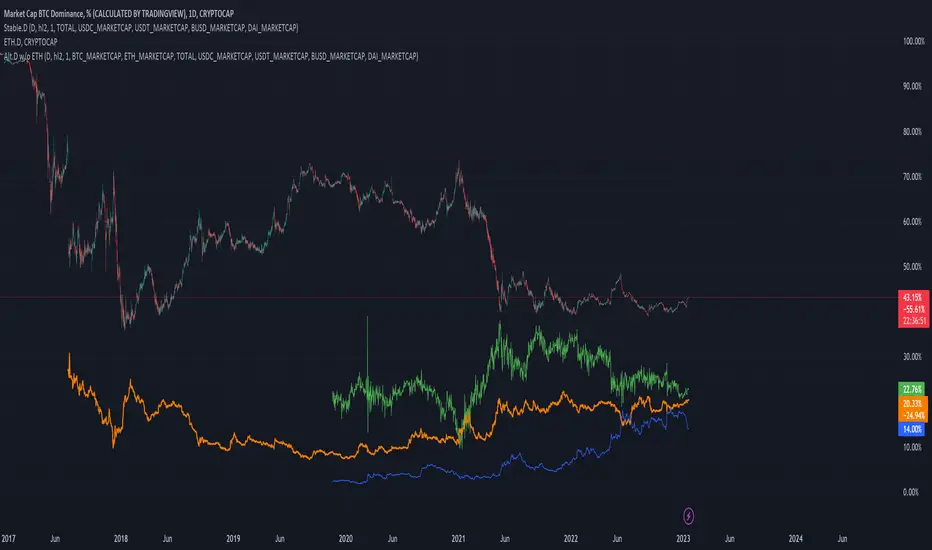
Altcoin Dominance (without ETH) Excluding Stablecoins UnsymetricAltcoin Dominance (without ETH) Excluding Stablecoins Unsymetric
The purpose of the script is to show Altcoin's strength without Ethereum once we exclude stablecoins.
So we look into all altcoins besides eth and besides stablecoins divided by a value of eth+btc
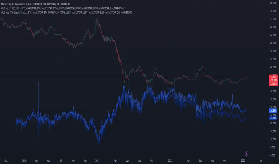
Altcoin Dominance Excluding EthereumAltcoin Dominance Excluding Ethereum
The purpose of the script is to show Altcoin's strength without Ethereum.
Pretty much shows Altcoin's Dominance in comparison to Market Cap once we exclude Ethereum.

ETH Dominance Excluding StablecoinsETH Dominance Excluding Stablecoins.
The purpose of the script is to show Ethereum's strength relative to other cryptocurrencies.
Pretty much shows ETH Dominance in comparison to Market Cap once we exclude the 5 largest stablecoins.

DXY Overlay CompareOverlays the DXY chart over the top of any other chart. When the dollar strength increases, asset prices can drop and vice versa. Was created personally to compare with the price of Bitcoin.

QT suppy demandV1.0 core functions: marking supply and demand areas, marking air decoy/multiple decoy signals, and displaying potential target positions in tables
1. What kind of indicator is this?
This is a practical trading indicator based on supply and demand, which combines many of my practical experience and marks the supply/demand area through complex and accurate calculation, so that you can better identify where the organization has orders, so that you can buy chips at a lower price and sell them to retail investors at a higher price
2. What is the relationship between supply and demand?
Demand: In terms of price, if the market falls short of demand, then the price will stop falling and start to rise
Supply: In terms of price, if the market is oversupplied, then the price will stop falling and begin to fall back
In short, the higher the price, the lower the demand. From the perspective of the seller, the higher the price, the higher the supply
3. What is the supply and demand area?
The supply and demand area is generally the place where the price is reversed, and the price reversal will generally occur in the area where the supply and demand are unbalanced, which is the entry point of the high profit loss ratio we are pursuing
4. Who is your opponent?
Retail price: the price close to or within the supply area is called retail price
Wholesale price: the price close to or within the demand area is called wholesale price
Retail investors generally buy at the "retail price" and sell at the "wholesale price", while professional traders do the opposite, so professional traders are often retail investors' opponents
Professional traders often buy back the chips of retail investors at the wholesale price, and then sell them to retail investors at the retail price
5. How to use this indicator?
: flat down, up flat down, down flat down
(1) Flat fall: yellow+red K line combination is the supply area flat fall combination, which belongs to bearish. Usually, this form requires confirmation of entry, that is, the price can only be sold after it enters this area and stops rising.
(2) Up and down: The combination of green+yellow+red K line is up and down in the supply area, which is bearish. Usually, the form in the pipe is only operational when it occurs at the inflection point of the reversal, or the position of the superimposed supply area can improve the success rate of selling.
(3) Falling flat: red+yellow+red K line combination is the supply area falling flat, which belongs to the bearish area. Usually, the reversal in the market is completed by rising flat falling+falling flat falling. Only those falling flat at the high or middle level have operating prices, and the success rate at the low level is slightly lower
: flat rise, falling flat rise, rising flat rise
(1) Flat rise: yellow+green K line combination is a flat rise in demand area, which is bullish. Usually, this form requires confirmation of entry, that is, the price can only be bought after it stops falling in this area.
(2) Falling flat and rising: red+yellow+green K line combination is a falling flat and rising demand area, which belongs to bullish. Usually, this form can achieve the best profit loss ratio at the low inflection point. Because its bit occurs during inversion.
(3) Inflation leveling: The combination of green+yellow+green K line is a demand area for inflation leveling, which belongs to the bullish. Usually, the neutral form will occur after the occurrence of inflation leveling. The transition from short to long also requires the completion of inflation leveling+inflation leveling, except for the case of negative V.
matters needing attention:
(1) Please do not trade in a large supply and demand area, because stop loss may exceed your risk tolerance.
(2) Please do not trade in a small supply and demand area because there may be very few orders.
(3) The K line leaving the supply and demand area is called the outgoing line. The outgoing line is the big positive line or the big negative line, which belongs to a very full entity. The success rate of the supply and demand area depends on the physical fullness of the outgoing line. The fuller the entity is, the higher the transaction success rate is, of course, it is not an absolute value.
So the core point of supply and demand is to find the demand area to be long and the supply area to be short, so as to ensure a high winning rate and a good profit loss ratio
=========================================================================================================
中文说明:
V1.0 核心功能:标记供给、需求区,标记诱空/诱多信号,表格显示潜在目标位
1、这是一个什么样的指标?
这是一个以供需为基础的实战型交易指标,里面结合了很多本人的实战经验,通过复杂且精确的计算,标记出供给/需求区域,让你更好的识别机构在哪里有订单,让你以更低的价格购买到筹码,然后以更高的价格卖给散户
2、什么是供求关系?
需求:从价格层面来讲,若市场出现供不应求,那么此时价格将会停止下跌并开始回升
供给:从价格层面来讲,若市场出现供过于求,那么此时价格将会停止下跌并开始回落
简单地说,价格越高,需求量越低,从卖方的角度来看,价格越高越供应量越高
3、什么是供需区?
供需区一般都是价格反转的位置,价格发生反转一般都会出现在供求不平衡的区域,也就是我们所追求的高盈亏比入场点位
4、谁是你的对手盘?
零售价:接近供给区或者供给区内的价格我们称之为零售价
批发价:接近需求区或者需求区内的价格我们称之为批发价
散户一般都会以“零售价”买入,以“批发价”卖出,而职业交易员则相反,所以职业交易员往往就是散户的对手盘
职业交易员常常以批发价回购散户的筹码,然后通过零售价卖给追涨的散户
5、如何使用这个指标?
【看跌形态】:平跌、涨平跌、跌平跌
(1)平跌:黄色+红色K线组合为供给区平跌组合,属于看跌。通常这种形态是需要确认入场的,就是价格在进入这个区域之后止涨才可以卖出。
(2)涨平跌:绿色+黄色+红色K线组合为供给区涨平跌,属于看跌。通常管中形态是出现在反转的拐点位置才有操作意义,或者是叠加的供给区位置才能提高卖出成功率。
(3)跌平跌:红色+黄色+红色K线组合为供给区跌平跌,属于看跌区域,通常市场上的反转都是由涨平跌+跌平跌完成的,跌平跌在高位或中位的才有操作价格,低位的成功率略人低
【看涨形态】:平涨、跌平涨、涨平涨
(1)平涨:黄色+绿色K线组合为需求区平涨,属于看涨。通常这种形态是需要确认入场的,就是价格在进入这个区域之后止跌才可以买入。
(2)跌平涨:红色+黄色+绿色K线组合为跌平涨需求区,属于看涨,通常这种形态在低位拐点位置交易盈亏比才能达到最好。因为它位都是发生在反转的时候。
(3)涨平涨:绿色+黄色+绿色K线组合为涨平涨需求区,属于看涨,通常和中形态是在出现跌平涨之后才会出现,由空头向多头转变也是需要完成跌平涨+涨平涨才能实现,当然V反的情况下除外。
注意事项:
(1)太大的供需区请不要交易,因为止损可能会超过你的风险承受范围。
(2)太小的供需区请不要交易,因为他里面的订单可能会非常少。
(3)离开供需区的K线我们称为出线,出线就是大阳线或大阴线,属于实体非常饱满,供需区的胜率取决于出线的实体饱满程度,实体越饱满交易成功率越高,当然它不是绝对值。
所以供需的核心要点就是,找到需求区做多,找到供给区做空,这样才能保证胜率高的同时盈亏比也很好

Wave Fusion By CryptoScriptsThe Wave Fusion indicator is finally here! This indicator is a combination of the Wave Strength Oscillator and RSVP Extractor. It used a combination of momentum waves, volume, price, RSI, and statistical analysis to help nail down whenever the current price is overextended and due for a reversal. I'm currently using the 1D timeframe for BTC but feel free to experiment on different timeframes to see what works best for you. In the description below, I'll go over each signal, how it's derived, and how to use them!
Oversold (Green shaded area) - The oversold indication appears whenever all oscillators are oversold and is usually a good indicator that a reversal to the upside is around the corner (at least for a short period). Be advised these are the weakest of the three signals so I recommend using this signal with other indicators (such as my MFI Pro).
Overbought (Red shaded area) - The overbought indication appears whenever all oscillators are overbought and is usually a good indicator that a reversal to the downside is around the corner (at least for a short period). Be advised these are the weakest of the three signals so I recommend using this signal with other indicators (such as my MFI Pro).
Green Diamond - The green diamonds indicate whenever one or more oscillators are oversold AND one or more oscillators are outside of the bollinger bands, which is great for catching reversals to the upside. These may come two or three at a time so it may be best to wait until they have all printed before entering.
Red Diamond - The red diamonds indicate whenever one or more oscillators are overbought AND one or more oscillators are outside of the bollinger bands which is great for catching reversals to the downside (as seen in the chart). These may come two or three at a time so it may be best to wait until they have all printed before entering.
Rocket - The rocket symbol occurs whenever ALL oscillators are oversold and one or more oscillators are outside of the bollinger bands . This is great for catching reversals to the upside but may come two or three at a time so it may be best to wait until they have all printed before entering.
Red Alarm - The red alarm symbol occurs whenever ALL oscillators are overbought and one or more oscillators are outside of the bollinger bands . This is great for catching reversals to the downside but may come two or three at a time so it may be best to wait until they have all printed before entering.
Moon - The Moon symbol occurs whenever ALL oscillators are oversold and ALL oscillators are outside of the bollinger bands . This is great for catching reversals to the upside but may come two or three at a time so it may be best to wait until they have all printed before entering.
Blood Moon - The red alarm symbol occurs whenever ALL oscillators are overbought and ALL oscillators are outside of the bollinger bands . This is great for catching reversals to the downside but may come two or three at a time so it may be best to wait until they have all printed before entering.
Strongest to Weakest Buy Signals - Moon --> Rocket --> Green Diamond --> Green Shaded Area
Strongest to Weakest Sell Signals - Blood Moon --> Red Alarm --> Red Diamond --> Red Shaded Area
Input Options
Show Histogram - I also included a Histogram in the indicator to help gauge the level of buys/sell strength but kept it hidden for the default levels (i.e a green diamond with a red histogram bar is usually a good sign a reversal is about to happen to the upside whereas a green diamond with a green histogram bar may indicate a false reversal and there's still more room to the downside until a red bar appears. Always backtest this!)
Show Overbought/Oversold Levels - This is if you want to ignore all of the green/red shaded areas and only focus on the diamonds and rocket/alarm signals
Wave Overbought/Oversold Levels - Free free to change to value of the overbought/oversold levels to change where the green/red shades areas print
Momentum Overbought/Oversold Levels - Free free to change to value of the overbought/oversold levels to change where the green/red shades areas print
Histogram Length - This will not change anything with the signals but I included it so you can change the visuals if it helps you
Momentum Length - This will change where the signals plot
Momentum Signal - This only changes the yellow signal line and nothing else. It's not incorporated into any equation
Average Length - This will change where the signals plot
Alerts
I've set alerts on this indicator for each icon (Oversold, Overbought, Green Diamond, Red Diamond, Rocket, Red Alarm, Moon , Blood Moon). I HIGHLY recommend setting the alerts for Candle Close so that you can be sure the signal is confirmed.
You may notice that the indicator can give multiple signals back-to-back or be overbought/oversold for multiple candles. When this happens, it's best to look at other indicators such as the MFI Pro, MACD, etc to nail the best entry and have confluence with your decision. With that said, having multiple signals back-to-back can also be an indication that the move is close to happening. This indicator works with crypto and stocks as well.
If you have any questions or would like to purchase this indicator, please comment below or PM me. I also made a video tutorial for the indicator on my Youtube channel (link is next to my profile pic)
Be advised past performance is not indicative of future returns. Backtest EVERY timeframe and NEVER blindly take signals! Also, never invest more than you can afford to lose.
Enjoy :)

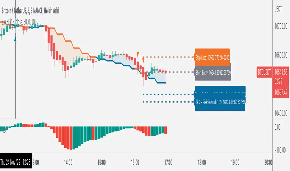
Z.A.H.It's a scalping script, which can be used using Heikin Ashi candle on 5min time frame (I personally use it for BINANCE:BTCUSDT and BINANCE:ETHUSDT scalping).
We've tried to include SL and target (1.5R and 2R) in this as well, and it works well but sometimes (please note SOMETIMES..SOMETIMES, it can be few..few pips here and there)
Idea is simple, you take the trade based on the signal given by the script and place your SL as per the script and then target 1.5R for 80% of your position and 20% for the remaining 20% of your position.
One extra thing which I've found useful is, you can use Awesome Oscillator (default setting) as well for placing SLs. If you use this method for placing SL, then just place your SL at the last green awesome oscillator candle for shorts and at the last red awesome oscillator candle for longs. From there target 1.5R and 2R.
Overall results are same for either, so you can use it as per your convenience. For any query, you can send me a DM on discord or twitter.
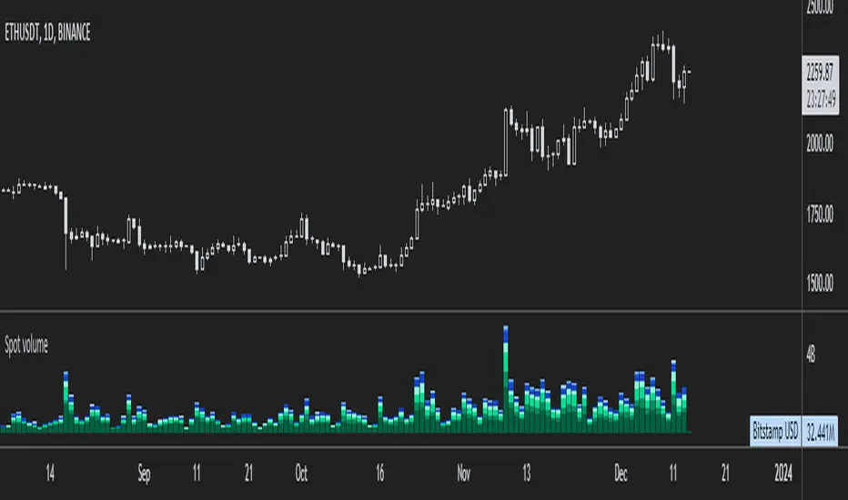
ETH spot volumeIndicator with aggregated volume for all the most actively traded ethereum spot markets.
Can be denominated in either US dollars or the number of coins traded.
Can be displayed as stacked volume or an index that shows the percentage market share each market has.
In the settings you can exclude any market so that it only shows the individual and total volume of the markets you're interested in.
The currency it's traded against is always specified (e.g. USDT, BUSD, ...).
It's public and free for anyone to use.
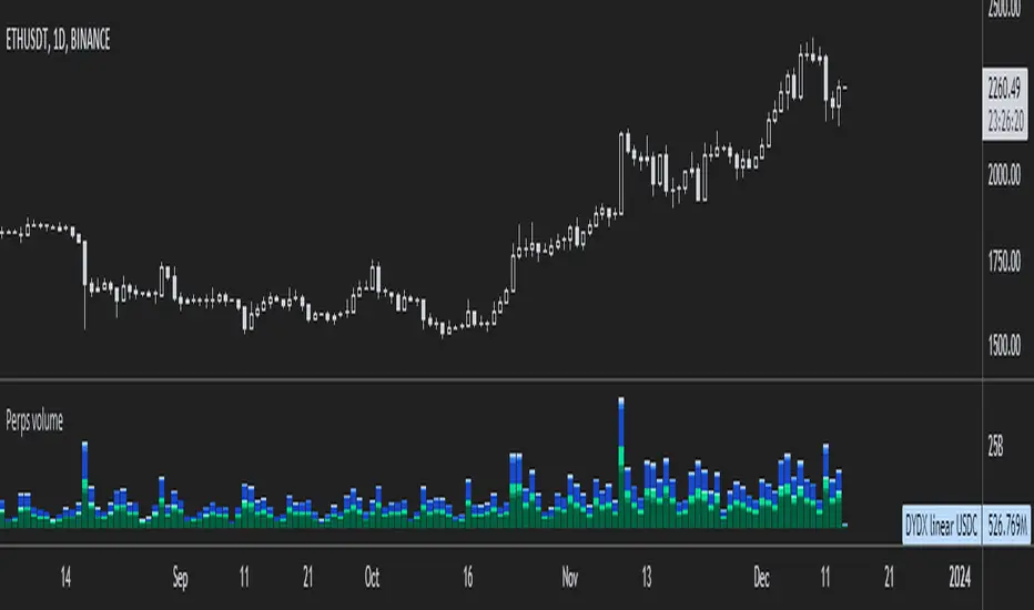
ETH perpetual swaps volumeIndicator with aggregated volume for all the most actively traded ethereum perpetual swaps.
Can be denominated in either US dollars or the number of coins traded.
Can be displayed as stacked volume or an index that shows the percentage market share each contract has.
In the settings you can exclude any contract so that it only shows the individual and total volume of the markets you're interested in.
"Linear" or "inverse" refers to the type of perpetual swap contract it is.
Inverse contracts use coin margin, so in this case ETH.
Linear contracts use some type of dollar equivalent margin like USDT for example.
The margin is always specified for the linear contracts.
It's public and free for anyone to use.
Apex ETH SOPR LevelsThe SOPR (Spent Output Profit Ratio) indicator provides insight into macro market sentiment, profitability, and losses taken over a specific time frame.
It reflects the degree of realized profit for all coins moved on-chain.
This indicator SOPR is for Ethereum only
Personal settings:
Control for the SOPR average for the long or short term (Minimum number is 7)
Control for colors of the SOPR average
Red = High: Greed
Purple = Low: Extreme fear
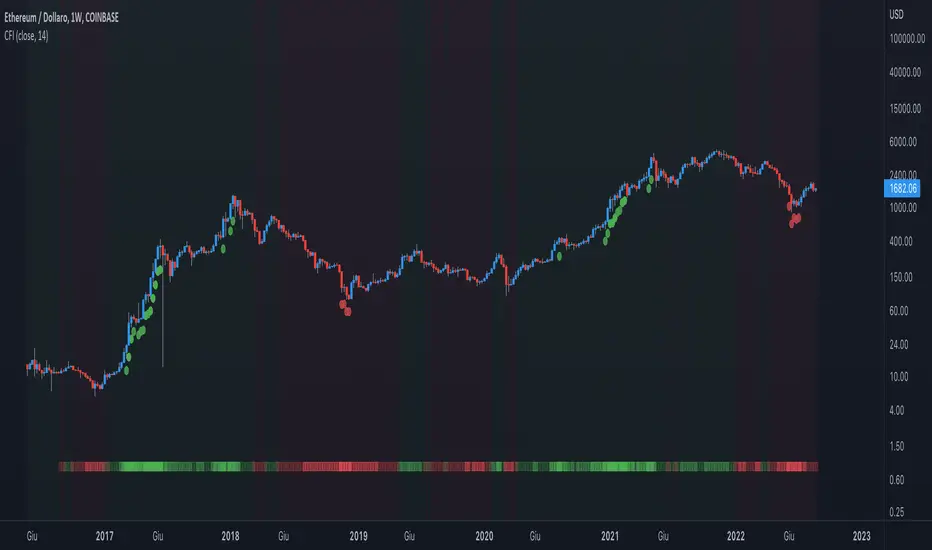
Crypto Force IndexIntroduction
The Crypto Force Index (CFI) indicator helps us understand the current strength and weakness of the price. It is very useful when used on high timeframes for investment purposes and not for short term trading.
To determine the strength and weakness of the price, a level grid based on the RSI indicator is used.
Based on the RSI value, red circles (oversold condition) and green circles (overbought condition) appear under the price candles. The more intense the color of the circles, the more that the current price is in an overbought or oversold condition.
The signal levels are all configurable to adapt the indicator across multiple instruments and markets.
The default configuration have been designed to obtain more accurate signals on Ethereum and Bitcoin, using the weekly timeframe.
Why Crypto Force Index?
The Crypto Force Index (CFI) is the consequence of my study of investments based on the accumulation plan. I wanted to demonstrate that I am improving the returns of the classic DCA ( dollar cost averaging ) and VA ( value averaging ).
After finding my own model of an accumulation plan, I decided to create the Crypto Force Index to help me visually enter the market.
The formulas of the indicator are very simple, but my studies confirm the power of this tool.
How are the signals to be interpreted?
The Crypto Force Index helps us to highlight the overbought and oversold areas, with the use of circles under the price of candles and with a thermometer inserted at the base of the graph, where all the phases of strength and weakness are highlighted.
As soon as the red circles start to appear on the chart, that may be a good time to enter LONG to the market and start accumulating. If the circles are green, we can consider decreasing the current exposure by selling part of your portfolio, or decide to stay flat.
I personally use these signals on the weekly timeframe, to decide to feed my accumulation plan at the beginning of each month.
I hope it can be of help to you! Please help me improve the Crypto Force Index! :)
Dap's Oscillator- Short Term Momentum and Trend. BINANCE:BTCUSDT BYBIT:BTCUSDT BYBIT:ETHUSDT BINANCE:ETHUSDT
DAP's OSCILLATOR:
WHAT IS IT?
This Oscillator was created to inspire confidence in the short-term trend of traders. This will work very well with a volatility metric (I recommend BBWP by @The_Caretaker)
WHAT IS IT MADE OF?
1. Consists of a series of equations (mainly the difference between simple to exponential moving averages) and Standard deviations of these moving average differences (length equivalent to the length of sampled ma's)
2. These equations are then boiled down through an averaging process array, after averaging the covariants are equated against the variants of the positive side of the array. This is what is presented as the aqua line.
3. The RC average (yellow) is the sma following the DAP'S Oscillator at a specified length
4. The most important part of this indicator is simply the momentum oscillator represented as a green or red line based on the value relative to the Oscillators.
HOW DO I USE THIS?
As I mentioned before mixed with a volatility metric, it should set you up for a good decision based on short-term trends. I would say to be careful for periods of consolidation, with the consolidation the momentum often meets hands with DAP's Oscillator and can cause fake-outs. You want to spot divergences from the price to the momentum difference, as well as room to work down or upward to secure a good entry on a position.
CHEAT CODE'S NOTES:
I appreciate everyone who has boosted my previous scripts, it means a lot. If you want to translate words to pine script onto a chart, feel free to PM me. I would be happy to help bring an indicator to life. I may take a quick break but will be back shortly to help create more cheat codes for yall. Thanks!
-Cheat Code

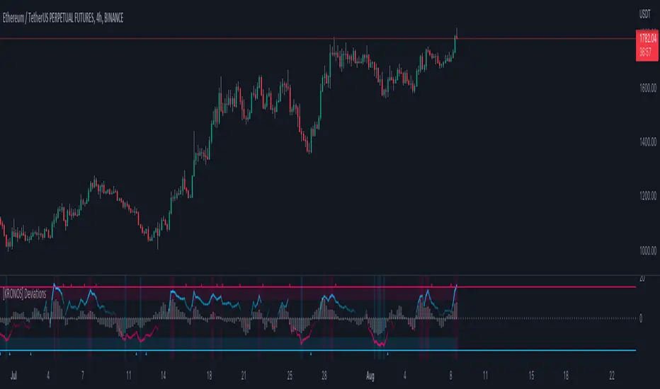
[KRONOS] DeviationsDescription
This indicator calculates the differences between the current price and the local support or resistance, and normalizes it into a range.
The value basis is calculated from a defined period of time that is then multiplied to get a standard deviations and a max. and min. value subtracted and divided into a final value.
It includes
Extreme zones. This value appears as blue and red lines which deviates from the oversold to overbought range.
Momentum. Lower time frame momentum is represented by a gray histogram as well as a signal line oscillating from a red to blue color.
Strong reversal. Red ( bearish ) and blue ( bullish ) columns will appear on the histogram when our algorithm detects that the strength of momentum is coming to an end indicative of a trend reversal.
Trend confirmation. Red or blue arrows will act as a trend confirmation.
Support and resistance . The zero line will frequently serve as a S/R area.
Divergences. You can use this indicator to detect potential pivot areas.
How to use?
Sell/Short when the histogram shows a red column and the signal line is in or above the overbought area (colored in red).
Buy/Long when the histogram shows a blue column and the signal line is in or below the oversold area (colored in blue).
extra tip: if you entered a trade based on the above conditions, you can partially increase your position each time you see a confirmation arrow.
[KRONOS] FlowDescription
The main indicator component is a white signal line calculated from the price and strength of the current market pair filtered using the Fourier transformation formula (by Joseph Fourier).
It includes
Trend confirmation. The grayish line is the signal line moving average which can either be used as a support/resistance line or as a strong trend confirmation in the case of a crossover/crossunder.
Oversold and overbought areas. These areas are marked with multiple hues of red and blue color for them to be more easily noticeable.
Extreme areas. Arrows around extreme areas are showing points where a reversal is very likely to occur.
How to use?
Buy/Long on a blue arrow (or after a crossover if you want more confirmations)
Sell/Short on a red arrow (or after a crossunder if you want more confirmations)
extra tip: use the zero line and overbought/oversold areas as a take profit area and place your stop loss at the previous swing low.

[KRONOS] MomentumDescription
This indicator is based on an algorithm which provides accurate momentum tracking on every timeframe. It is visualized as a colored histogram and through some other tools.
The value is calculated from an exponentially weighted moving average that is used to get a high and a low deviation, merging the last value into a range.
It includes
Overbought and oversold fixed areas. Their purpose is to facilitate the recognition of areas where the trend is likely to end or cool down. They are also marked with a background coloring.
Zero line. It typically represents a change of trend when the price crosses under or over it.
Volume shifts. Colored arrows will appear whenever a volume change is detected.
How to use?
Buy/Long on a blue confirmation arrow
Sell/Short on a red confirmation arrow
Take profit when the indicator starts showing a blue background
Take profit when the indicator starts showing a red background
extra tip: the zero line often acts as support / resistance similarly to the overbought and oversold areas

[KRONOS] Gamma StrengthDescription
This indicator's main component is the signal line which represents a very responsive market strength value calculated from real time data and normalized into a range (0 - 0.5 - 1). Indicator is using Stochastic and RSI functions to get raw value filtered through a linear regression, helping users predict imminent market directions. Lastly, this value oscillation is converted into a range to notice overbought and oversold zones at a quick glance.
It includes
Divergence. Indicator plots R for regular divergence and H for hidden with minimal possible delay which can be used to notice irregularity in the market.
Extreme overbought and oversold areas. Colored background extreme areas are showing points where a reversal is approaching.
How to use?
Buy/Long when the indicator line goes out of the blue/oversold area.
Sell/Short when the indicator line goes out of the red/overbought area.
extra tip: you can use the zero line and overbought/oversold zones as either a take profit or an entry area.

Ethereum OnChain Data Indicator - The Quant ScienceEthereum On Chain Data Indicator - The Quant Science™ is a quantitative indicator created for mid-long term analysis.
The indicator uses quantitative statistics to recreate a model that represents the most important data from the on-chain analysis for the Ethereum blockchain.
The on-chain data used to create this model are:
1. Total weekly transactions
2. Total monthly transactions
3. Frequency of transactions per second on a daily scale
4. Frequency of transactions per second on a weekly scale
5. Amount of Ethereum burned on a daily scale
6. Amount of Ethereum burned on a weekly scale
7. Volume of short positions on a daily scale
8. Volume of short positions on a weekly scale
9. Volume of short positions more/less than average on a daily scale
10. Volume of short positions more/less than average on a weekly scale
All these data were extrapolated and manipulated using the mean and standard deviation.
The end result is a powerful tool that enables mid-long term investors and traders to analyze on-chain data through quantitative analysis.
FEATURES
The blue color area refers to the average change in data on a weekly scale. The light blue colored area indicates the monthly changes in the data. It is interesting to observe the correlation relationship between price and times when short-run data increases compared to long-run data and vice versa.
The more intense purple histograms refer to the standard deviation of the mean change in data on an annual scale. Histograms of less intense purple color refer to the standard deviation of the mean variation of data on a monthly scale. It is interesting to observe the ratio of the standard deviation between two different time periods.
This indicator can be used to perform statistical comparative analysis for manual and mid-long term investments. It can also be used to create auto trading strategies when used and integrated within an algorithm.
On-chain data are updated every 24 hours, so the timeframes to be used for analysis with this indicator are: D, 4H, 1H.

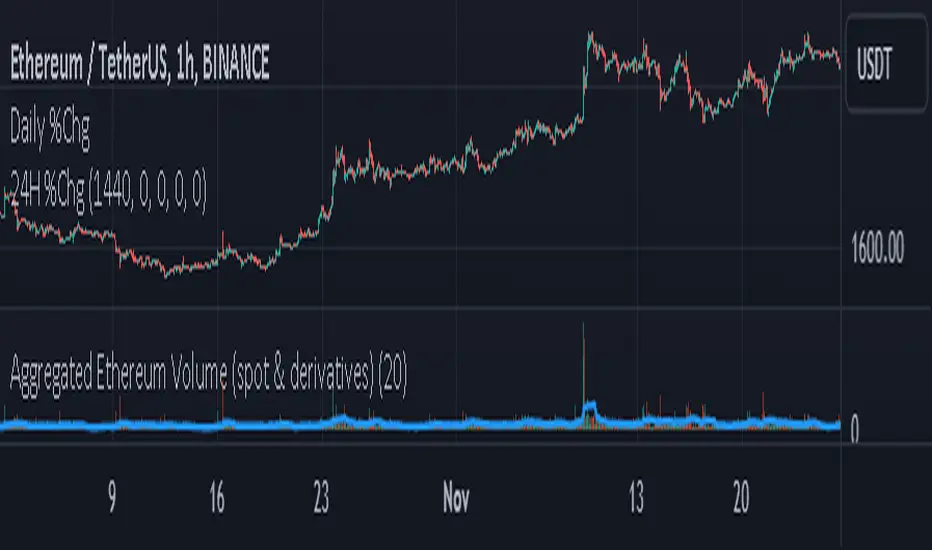
Aggregated Ethereum Volume (spot & derivatives)AGGREGATED ETHEREUM VOLUME INDICATOR (spot & derivatives)
This indicator aggregates volume for the most liquid ethereum pairs AND instruments, from exchanges known to *not* have fake volume . A few legit exchanges are missing as not available in Tradingview at the moment (e.g. FTX US).
Volume is separated into four categories: spot (stablecoin pairs), spot (fiat pairs), derivatives (perpetuals), and tradfi derivatives ( CME futures ). Can plot them all four together (default setting) or individually.
Volume is "aggregated in equivalent number of eth" (default setting) -- although users can change that to "aggregated in total USD". Doing so required converting volume for some ETH pairs and (derivatives) contracts that don't record volume in number of eth (but rather record it in USD or number of contracts).
Volume from crypto futures contracts (i.e. not Tradfi) is missing given how these contracts expire, and rolling them over would require extensive manual input. Futures' volume track perpetuals' volume , and are considerably smaller than perpetuals', therefore its absence does not have a noticeable impact on output. Time series for CME futures don't suffer from this inconvenient as the CME offers a continuous time series.
For the sake of simplicity, the price time series used for normalizing volume into ETH units is Bitstamp's (as it is the longest time series available). Prices of USDT and USDC is ignored in this first version.
List of exchanges included: Binance, Binance US, OKX, Huobi, FTX, Bittrex, Gate, Kucoin, Poloniex, Coinbase, Bitfinex, Bitstamp , Gemini, Bitflyer, Upbit, Kraken, Bybit, Bitmex, Deribit, CME
List of pairs/instruments that had to be converted from total USD into number of eth: FTX:BTCUSDT, FTX:BTCUSD, BITMEX:XBTUSD, BYBIT:BTCUSD, DERIBIT:BTCPERP, FTX:BTCPERP
List of pairs/instruments that had to be converted from number of contracts into number of eth: BINANCE:BTCPERP, OKEX:BTCPERP, OKEX:BTCUSDTPERP, CME:BTC
Final note: I recommend to look at aggregated ethereum volume in ETH (not in USD) and for all categories (spot and derivatives) to get a better picture of what's happening in the market. Looking at volume in USD rather than in ETH makes volume obviously dependent on ethereum's price. This is a major problem for volume analysis. Given how volatile ETHUSD is, price then accounts for most of the variance in volume , making volume comparisons across time difficult.
If you have any suggestions please drop them in the comments.