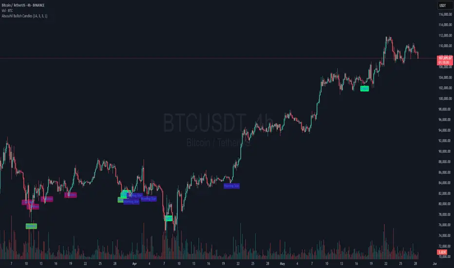
Abusuhil Bullish CandlesAbusuhil Bullish Candles is a pattern recognition indicator designed to identify key bullish reversal candlestick formations including Hammer, Bullish Engulfing, Morning Star, Piercing Line, Three White Soldiers, and Three Inside Up.
The script includes optional filters such as Stochastic and Volume Confirmation, providing more precise signal detection.
Each pattern and filter is fully customizable via settings. Alerts are also included to support active trading workflows.
This script was written originally and does not copy open-source indicators. It's ideal for traders seeking visual clarity on bullish opportunities with professional-grade logic.
مؤشر الشموع الصعودية هو مؤشر احترافي يكتشف أبرز نماذج الانعكاس الصعودي في الشموع اليابانية مثل: Hammer، Bullish Engulfing، Morning Star، Piercing Line، Three White Soldiers، و Three Inside Up.
يوفر المؤشر فلاتر إضافية مثل فلتر Stochastic وفلتر الفوليوم لتعزيز دقة الإشارات. جميع الإعدادات قابلة للتعديل بما يتناسب مع احتياج كل متداول.
يحتوي المؤشر أيضًا على تنبيهات تلقائية لدعم استراتيجيات التداول اللحظي. تمت برمجة المؤشر من الصفر ويعتمد على منطق خاص غير منسوخ من سكربتات مفتوحة المصدر.
Tìm kiếm tập lệnh với "Candlestick"
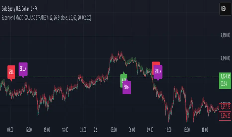
Supertrend MACD - XAUUSD STRATEGY 🔶 Supertrend MACD - XAUUSD STRATEGY (v6) (XAUUSD ONLY FOR NOW)
A high-performance, multi-filtered MACD-based strategy tailored for XAUUSD (Gold) traders seeking precision entries during trending conditions. This indicator intelligently combines multiple technical layers—momentum, trend strength, volatility, and market structure—to help identify high-probability trade setups with improved reliability.
🧠 Core Logic & Features Explained:
🔸 MACD Momentum Engine
At the heart of the strategy lies the traditional MACD indicator (Moving Average Convergence Divergence), calculating the difference between two EMAs (fast and slow) and smoothing it with a signal line.
Buy Signal: Triggered when the MACD line crosses above the signal line.
Sell Signal: Triggered when the MACD line crosses below the signal line.
These signals are the foundation, but only the beginning of a layered decision-making process.
🔸 Higher Timeframe (HTF) Trend Confirmation
To filter out noise and false breakouts, the indicator references MACD values from a higher timeframe (configurable by the user). This powerful multi-timeframe approach ensures that entries only occur in alignment with the dominant macro-trend.
Ensures entries are not taken counter to larger market movements.
Helps identify momentum continuation setups and avoid chop.
🔸 Support Arrow Display (Optional)
For visual traders, an option to display support arrows on the chart can be enabled. These assist in identifying visually intuitive entry points and enhance situational awareness.
⚙️ User-Customizable Inputs:
MACD Settings: Fast EMA, Slow EMA, Signal EMA lengths.
Signal Offset: For visual alignment and candle matching.
HTF MACD Settings: Select any timeframe for higher timeframe filtering.
ATR and ADX Thresholds: Fine-tune filters to match your trading style.
Structure Break Lookback: Adjust BOS+ logic sensitivity.
Arrow Toggles: Enable or disable visual support arrows as needed.
THIS indicator is in its alpha stage, currently it only works on XAUUSD pairs, i plan to update this indicator so that it functions on every single pair available on Trading view
Another note, the signals given only become solid after the second the candlestick, after this the signal becomes solid. REPAINTING CAN HAPPEN AFTER THE FIRST CANDLE STICK OF THE SIGNAL BUT NOT AFTER THE SECOND
As this indicator is only in its alpha stage it should be used as such, every person is responsible for there own personal investments
Same Date Last Year PatternThis tool is designed to help you analyze past price patterns from the same date last year to gain insights into potential market behavior today. It’s perfect for traders who want to spot recurring trends or directional cues (buy or sell signals) based on historical candle formations, rather than focusing on exact price levels. Here’s how it works and how to use it:
How It Works
Historical Lookback: The script examines the price action from the same calendar date last year (e.g., May 26, 2024, for today, May 26, 2025). Since markets may be closed on weekends or holidays (like Memorial Day), it automatically finds the nearest trading day with available data.
Pattern Detection: Instead of showing raw prices (which may not match today’s higher or lower price range), it analyzes the candle’s shape and direction. It tells you if the past candle was bullish (closing higher, suggesting a potential buy) or bearish (closing lower, suggesting a potential sell), along with details like wick size and the trend leading up to it.
Contextual Insight: It checks the trend from the previous few days (uptrend, downtrend, or sideways) to give you a sense of the market’s mood back then. This helps you decide if the pattern might repeat.
Prediction Suggestion: Based on last year’s candle direction, it offers a simple guess for the next candle’s potential move (e.g., bullish or bearish), though this is for reference only and not a guaranteed signal.
Key Features
Customizable Asset Type: You can set it for "Traditional" markets (e.g., stocks, forex) or "Crypto" (e.g., Bitcoin), adjusting how it searches for data based on whether the market runs 24/7.
Visual Cues: Labels appear on your chart showing the pattern and prediction, with colors (green for bullish, red for bearish, blue for prediction) to make it easy to read.
Range Consideration: This tool works best when the chart’s price range is around 1000 (e.g., stocks trading near $1000 or crypto pairs with similar values). Outside this range, the label positioning might not align perfectly due to scaling differences.
How to Use
Add to Chart: Load this script into TradeLocker’s indicator section on a daily chart for best results.
Select Asset Type: In the settings, choose "Traditional" for stocks or forex, or "Crypto" for 24/7 markets like Bitcoin.
Check Data: On the same date each year (e.g., May 26), it will display the pattern from last year’s nearest trading day. Ensure your chart has at least 455 days of historical data loaded to cover the search range.
Interpret Results: Look at the label to see the pattern (e.g., "Bullish Candle, Potential Buy"), trend context, and prediction. Use this to inform your trading decisions, but combine it with other tools for confirmation.
Important Notes
Limitations: It may show "No Data Found" if historical data isn’t available within its search window (up to 90 days around the target date for traditional markets). This is more likely for weekends or holidays. For best results, test it on assets trading around the 1000 price range.
Not a Guarantee: The prediction is based solely on last year’s candle and trend, not a definitive signal. Use it as a guide alongside your strategy and market analysis.
Customization: If you need it to work outside the 1000 range or add more pattern details (e.g., specific candlestick types), let the community know, and we can refine it!
This tool was crafted to help traders explore historical patterns in a user-friendly way. Share your feedback or suggestions in the TradeLocker community to make it even better!

CCT SuperTrade 2025CCT SuperTrade 2025
An original combination of two well-established methodologies for identifying potential market entry and exit opportunities.
General Concept
This script merges principles from the Hi-Lo Activator and the “Holy Grail” strategy developed by Linda Raschke and Laurence Connors. It was conceived by the Central Crypto Traders team and remains closed-source to protect the originality of its logic and scoring system.
Hi-Lo Activator
The Hi-Lo Activator focuses on points of price compression followed by breakouts, much like a compressed spring releasing its energy. This indicator monitors market contraction using simple MAs focusing in low and High candle points.
Holy Grail
Based on the work of Linda Raschke and Laurence Connors, the “Holy Grail” centers on 20-period simple moving average and pullbacks in trending markets using ADX indicator. In this script, we incorporate additional price filters to reinforce the identification of strong trends and pinpoint entry opportunities during retracements.
Unique Scoring System
The script’s logic evaluates multiple factors (trend, momentum, volatility) and generates a proprietary scoring system.
Each signal arises from a confluence of criteria, providing clearer indications for traders looking to identify buy or sell opportunities.
Triple Bollinger Bands and Strategic Zoning
This indicator integrates a customized triple Bollinger Bands setup to establish clear internal trading zones: Sell Zone, Neutral Zone, and Buy Zone. These zones guide traders on potential market reversals or continuation points. Additionally, the outer Bollinger Band set at 3 standard deviations (Dev3) identifies extreme volatility boundaries—price action rarely sustains movements beyond this level, signaling potential short-term exhaustion or reversal points.
Color Candle System (Trend + Volume + Momentum)
The indicator utilizes an advanced 9-color candle system, combining real-time trend, volume, and momentum data into a visual scale. Each candle color corresponds to a unique market condition, providing traders with instant and intuitive insights into current market sentiment and strength.
Additional Indicator Features
The indicator also includes several supplementary tools to enhance analysis precision:
Four customizable moving averages, selectable among EMA, SMA, WMA, HMA, DEMA, and VWMA, allowing tailored trend analysis.
A proprietary Fibonacci-based trendline, developed exclusively by our team, for dynamic identification of market direction and key support/resistance levels.
Labels clearly identifying plotted lines, significantly simplifying chart interpretation.
Pivot indicators, highlighting critical swing-high and swing-low points, aiding traders in spotting potential market reversals and continuation patterns.
The indicator also features an optional flag to highlight Inside Bars, candlestick patterns indicating price consolidation that can signal impending breakouts or reversals.
The indicator includes dedicated signals to detect potential Pump and Dump scenarios, identified through abnormal volume spikes coupled with significant short-term price fluctuations, warning traders of potentially manipulated or highly speculative market movements.
The indicator identifies possible trend reversals triggered by volume spikes, highlighting moments when significant increases in trading volume coincide with abrupt price changes, potentially signaling exhaustion or initiation of new trends.
Parabolic SAR Integration
The indicator also integrates the Parabolic SAR (Stop and Reverse), clearly marking dynamic points of trend reversal on the chart. This allows traders to quickly visualize potential changes in market direction and manage trade entries or exits more effectively.
Integrated Information Panel
The indicator features a dynamic Info Panel that provides real-time textual readings of all relevant indicators used within the combined strategies. This panel conveniently displays values such as trend strength, momentum status, volatility levels, stochastic signals, ADX strength, and other key metrics already mapped by the script, allowing traders to quickly interpret market conditions and make informed decisions.
Usage and Application
Designed for various trading styles (swing or intraday), this indicator highlights trend shifts and potential reversal points.
When applied to the chart, CCT SuperTrade 2025 should be active unically to avoid unnecessary clutter and ensure straightforward interpretation.
Originality
The key innovation lies in the way we combine and score the signals using our unique score system with the “Hi-Lo Strategy” and the “Holy Grail.”
The code is closed-source due to the unique research and development carried out by our team, resulting in a hybrid algorithm that has no open-source equivalent.
Disclaimer
This script does not guarantee success and does not replace independent analysis. Financial markets carry risks; traders should proceed with caution and further study before making decisions. DYOR
Technical Disclaimer
This indicator is programmed using Pine Script V6, leveraging standard functions and calculations provided by ©TradingView , ensuring the accuracy, integrity, and reliability of the presented market data and signals. However, past performance does not guarantee future results. Always conduct independent analysis and trade responsibly.
It is important to clarify that the CCT SuperTrade 2025 is not a “multi-indicator” developed solely for the purpose of aggregating various visual tools into a single script.
Each of its components—despite being optionally visible as standalone plots—feeds critical data into the script’s integrated scoring system.
These internal modules are interdependent, and none function in isolation or deliver valid signals independently.
Therefore, this makes the CCT SuperTrade 2025 a singular, cohesive algorithm rather than a modular toolkit. The architecture was intentionally designed this way to preserve the logic, flow, and accuracy of the signal generation engine, reinforcing the integrity of the system as a whole. Any attempt to separate these components would compromise the core mechanism and invalidate its analytical structure.

Failed 2s - The StratDescription:
This indicator detects and highlights "Failed 2" candlestick patterns from The Strat methodology — key price action setups signaling potential reversals or continuation points. It automatically identifies Failed 2 Down (Failed 2D) and Failed 2 Up (Failed 2U) signals by analyzing two consecutive bars, with special attention to price interaction at the 50% midpoint of the previous candle.
Visuals:
- Green upward triangles mark Failed 2 Down signals (bullish setups).
- Red downward triangles mark Failed 2 Up signals (bearish setups).
- Special signals that touch the 50% midpoint of the previous candle are emphasized but use the same shapes.
Alerts:
Built-in alert conditions let you receive notifications when these patterns occur, so you never miss a trade opportunity.
How to Use ALERTS in TradingView
- Paste this code into Pine Editor on TradingView.
- Click Add to Chart.
Set alerts:
- Click "Alerts" → "Condition" = your indicator name
- Choose the alert type (e.g. "Failed 2D Bar Alert")
- Set "Once per bar close"
- Customize the notification method (pop-up, app, email, etc.)
Candle Wick Analysis🔍 What This Indicator Does
The Candle Wick Analysis indicator dynamically colors each candle body based on the comparative strength of its wicks and body, helping traders visually assess market sentiment, rejection zones, and momentum exhaustion with higher clarity.
This tool is especially useful for:
Price action traders
Scalpers
Reversal and trend continuation traders
Anyone who uses candlestick structure for confirmations
📊 How It Works
The indicator analyzes each candle and compares the percentage change of the upper wick, body, and lower wick relative to the opening price. Based on this relationship, it assigns a green or red color to the candle body to indicate likely price strength or weakness.
🧠 Logic Breakdown
✅ If the Candle is Bullish (close > open):
🔵 Green Candle Body: If the upper wick is smaller than the combined percentage size of the body + lower wick
→ Indicates strong bullish momentum with low upper rejection.
🔴 Red Candle Body: If the upper wick is larger than body + lower wick
→ Suggests potential exhaustion or rejection at the top.
✅ If the Candle is Bearish (close < open):
🔴 Red Candle Body: If the lower wick is smaller than the combined percentage size of the body + upper wick
→ Indicates strong bearish momentum with low lower support.
🟢 Green Candle Body: If the lower wick is larger than body + upper wick
→ Suggests potential downside rejection or support zone bounce.
⚪ Neutral Candles:
If the candle does not meet any specific wick/body criteria, it is displayed in gray to indicate neutrality or indecision (such as a doji).
🛠️ Technical Highlights
Built in Pine Script v5
Uses precise percentage-based wick/body comparison
Works on any timeframe and instrument
Minimalist coloring style: only the body color changes, while wicks stay gray
💡 Use Cases
Quickly spot exhaustion candles, where strong wicks may indicate a reversal or trap.
Validate trend strength: strong candles are colored green, weak ones red, even within bullish or bearish structures.
Filter entries and exits using visual confirmation of wick-to-body dynamics.
📌 Notes
This is a visual tool, not a buy/sell signal indicator.
Best used in conjunction with other forms of analysis (support/resistance, volume, moving averages, etc.)
Can be enhanced with alerts, filters (e.g., volume spikes), or labeling based on user feedback.

Long Bar With ATR Multi Timframe | Amoo HassanLong Bar with ATR Multi Timeframe | Amoo Hassan
Looking for a smarter way to spot powerful moves in the market?
Long Bar with ATR Multi Timeframe is built exactly for that!
This tool helps you catch strong trend breakouts and potential reversals — in a simple, clear, and effective way.
What This Script Does:
Detects Long Bars: It looks for candles with a larger body compared to recent averages and confirms them with ATR (Average True Range). Only truly significant moves are highlighted.
Trend Filtering: Uses fast and slow moving averages (60 EMA, 34 EMA, and 200 SMA) to check if the overall market trend supports your trade.
Multi-Timeframe Supertrend: Supertrend signals are combined across different timeframes to give extra confirmation and reduce false signals.
Sharp Peaks and Valleys: Special candlestick patterns like sharp tops and bottoms are detected automatically.
Smart Trading Sessions: Trades are filtered based on the most active trading hours, avoiding dead times when price action is messy.
Important Date Control: On days with historically strange price action (like the 13th and 20th), the script stays cautious by disabling trades.
Clear Buy and Sell Labels: When all conditions are aligned, you'll see clean and clear "BUY" or "SELL" signals right on your chart.
Why You'll Like It:
It's easy to use, even if you're not a technical analysis expert.
It helps you avoid bad trades and focus on quality setups.
It fits into your existing trading system — or it can work as a standalone entry tool.
Friendly Reminder:
No indicator is 100% perfect! Always combine signals with good risk management and your own judgment.
And remember: Past results don't guarantee future performance.
Best Timeframes:
For the best results, we recommend using this script on 5-minute and 1-minute timeframes.

SMC Entry Signals MTF v2📘 User Guide for the SMC Entry Signals MTF v2 Indicator
🎯 Purpose of the Indicator
This indicator is designed to identify reversal entry points based on Smart Money Concepts (SMC) and candlestick confirmation. It’s especially useful for traders who use:
Imbalance zones, order blocks, breaker blocks
Liquidity grabs
Multi-timeframe confirmation (MTF)
📈 How to Use the Signals on the Chart
✅ LONG Signal (green triangle below the candle):
Conditions:
Price is in a discount zone (below the FIB 50% level)
A bullish engulfing candle appears
A bullish Order Block (OB) or Breaker Block is detected
There’s an upward imbalance
A bullish OB is confirmed on the higher timeframe
➡️ How to act:
Consider entering long on the current or next candle.
Place your stop-loss below the OB or the nearest swing low.
Take profit at the nearest liquidity zone or premium area (above FIB 50%).
🔻 SHORT Signal (red triangle above the candle):
Conditions:
Price is in a premium zone (above FIB 50%)
A bearish engulfing candle appears
A bearish OB or Breaker Block is detected
There’s a downward imbalance
A bearish OB is confirmed on the higher timeframe
➡️ How to act:
Consider short entry after the signal.
Place your stop-loss above the OB or swing high.
Target the discount zone or the next liquidity pocket.
⚙️ Recommended Settings by Trading Style
Trading Style Suggested Settings Notes
Intraday (1–15m) fibLookback = 20–50, obLookback = 5–10, htf_tf = 1H/4H Fast signals. Use Discount/Premium + Engulfing.
Swing/Position (1H–1D) fibLookback = 50–100, obLookback = 10–20, htf_tf = 1D/1W Higher trust in MTF confirmation. Ideal with fundamentals.
Scalping (1m) fibLookback = 10–20, obLookback = 3–5, htf_tf = 15m/1H Remove Breaker and MTF for quick reaction trades.
🧠 Best Practices for Traders
Trend Filtering:
Use EMAs or volume to confirm the current trend.
Take longs only in uptrends, shorts in downtrends.
Liquidity Zones:
Use this indicator after liquidity grabs.
OBs and Breakers often appear right after stop hunts.
Combine with Manual Zones:
This works best when paired with manually drawn OBs and key levels.
Backtest the Signals:
Use Bar Replay mode on TradingView to test past signals.
🧪 Example Trade Setup
Example on BTCUSDT 15m:
Price drops into the discount zone.
A green triangle appears (bullish engulfing + OB + imbalance + HTF OB).
You enter long, stop below the OB, target the premium zone.
🎯 This type of setup often gives a risk/reward ratio of 1:2 or better — profitable even with a 40% win rate.
⏰ Alerts & Automation
Enable alerts:
"SMC Long Entry" — fires when a long signal appears.
"SMC Short Entry" — fires when a short signal appears.
You can integrate this with bots via webhook, like:
TradingConnector, 3Commas, Alertatron, etc.
✅ What This Indicator Gives You
High-probability entries using SMC logic
Customizable filters for entry logic
Multi-timeframe confirmation for stronger setups
Suitable for both intraday and swing trading
DRT - Dynamic Range Indicator [TraderVlad]Dynamic Range Theory (DRT) Indicator
Decode Market Structure with Precision
Overview
Welcome to the Dynamic Range Theory (DRT), a revolutionary approach to price action analysis that transforms market chaos into a structured, actionable roadmap.
Say goodbye to confusing candlestick patterns and hello to a visually intuitive system that highlights range expansion , volume compression , and volatility squeezes .
The DRT Indicator empowers traders to anticipate breakouts, spot stealth accumulation, and ride momentum.
DRT structures price action into four key constructs:
Main Ranges: Bold candles igniting market momentum.
Inside Range Candles: Gray candles signaling consolidation within a range.
Inside Candles Below Average Volume: Pink candles marking silent accumulation.
Tight Closes: Vibrant markers of volatility contraction, priming explosive moves.
This indicator is your lens to decode the market’s hidden rhythm, making complex price action simple and tradable.
How It Works
The DRT Indicator visually organizes price action with color-coded candles and customizable settings:
Main Ranges (Blue): Identifies breakout candles that set the market’s structural foundation, displayed as blue.
Inside Range Candles (Gray): Highlights candles with closes within the Main Range, signaling momentum consolidation. Perfect for spotting setups in the simplified DRT Inside Ranges variant, where ranges with a main candle plus gray candles are marked.
Inside Candles Below Average Volume: Flags candles within the Main Range with volume below a 50-period SMA, indicating volume compression—a sign of stealth positioning by smart money.
Tight Closes (Pink): Marks non-main candles with ranges less than 60% of the 14-period ATR, highlighting volatility squeezes ready to erupt.

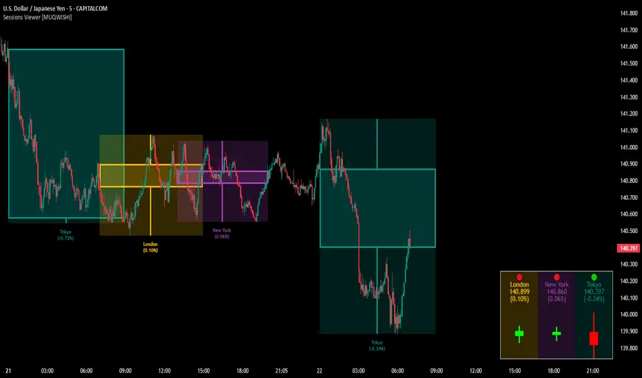
Market Sessions & Viewer Panel [By MUQWISHI]▋ INTRODUCTION :
The “Market Sessions & Viewer Panel” is a clean and intuitive visual indicator tool that highlights up to four trading sessions directly on the chart. Each session is fully customizable with its name, session time, and color. It also generates a panel that provides a quick-glance summary of each session’s candle/bar shape, helping traders gain insight into the volatility across all trading sessions.
_______________________
▋ OVERVIEW:
_______________________
▋ CREDIT:
This indicator utilizes the “ Timezone — Library ”. A huge thanks to @n00btraders for effort and well-organized work.
_______________________
▋ SESSION PANEL:
The Session Panel allows traders to visually compare session volatility using a candlestick/bar pattern.
Each bar represents the price action during a session and includes the session status, session name, closing price, change(%) from open, and a tooltip that reveals detailed OHLC and volume when hovered over.
Chart Type:
It offers two styles Bar or Candle to display based on traders’ preference
Sorting:
Allowing to arrange session candles/bars based on…
—Left to Right: The most recently opened on the left, moving backward in time to the right.
—Right to Left: The most recently opened on the right, moving backward in time to the left.
—Default: Arrange sessions in the user-defined input order.
_______________________
▋ CHART VISUALIZATION:
The chart visualization highlights each trading session using color-coded backgrounds in two selectable drawing styles that span their respective active timeframes. Each session block provides session’s name, close price, and change from open.
Chart Type: Candle
Chart Type: Box
Extra Drawing Feature:
This feature may not exist in other indicators within the same category, it extends the session block drawing to the projected end of the session. This's done through estimation based on historical data; however, it doesn’t function fully on seconds-based timeframes due to drawing limitations.
_______________________
▋ INDICATOR SETTINGS:
Section(1): Sessions
(1) Universal Timezone.
(2) Each Session: Enable/Disable, Name, Color, and Time.
Section(2): Session Panel
(1) Show/Hide Session Panel.
(2) Chart Type: Candle/Bar.
(3) Bar’s Up/Down color.
(4) Width and Height of the bar.
(5) Location of Session Panel on chat.
(6) Sort: Left to Right (most recent session is placed on the left), Right to Left (most recent session is placed on the right), and Default (as input arrangement).
Section(3): Chart Visualization
(1) Show/Hide Chart Block Visualization.
(2) Draw Shape: Box/Candle.
(3) Border Style and Size.
(4) Label Styling includes location, size, and some essential selectable infos.
Please let me know if you have any questions
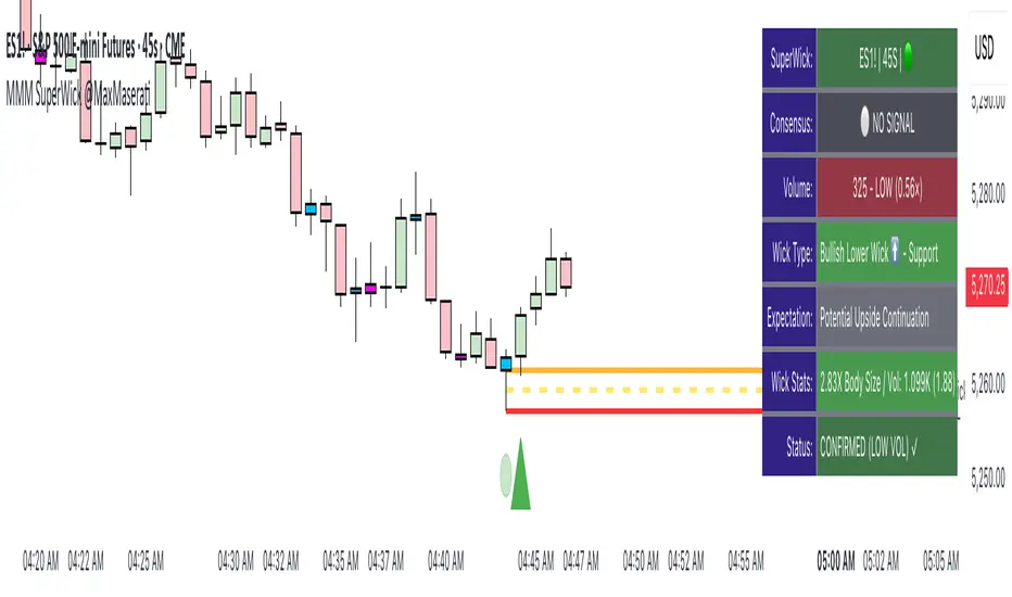
Super Wick Volumized Rejection/Reversal @MaxMaserati**Super Wick Volumized Rejection/Reversal @MaxMaserati** 🚀
**Overview**: The "MMM Super Wick Volumized Rejection/Reversal" indicator spots key candlestick wicks with high volume to catch potential reversals or continuations. It overlays charts with lines, labels, and an info panel, with customizable timeframe analysis, signal confirmation, and bar coloring. 📊
**Key Features**:
- **Wick Analysis** 🕯️: Detects big upper/lower wicks using a wick-to-body ratio (default 1.2x) and volume thresholds (high: 1.5x, medium: 1.0x, low: 0.7x avg volume).
- **Signals** 🚦: Creates Buy, Sell, Exit Long, Exit Short, and Weak signals, with optional confirmation via follow-up candle.
- **Timeframe Flexibility** ⏰: Analyzes user-selected or chart timeframe (default: chart).
- **Visuals** 🎨: Draws lines at high/low, open/close, midpoints, and significant wicks, with custom colors, widths, and labels.
- **Bar Coloring**🎨 : Colors bars by wick type (bullish/bearish) and volume strength.
- **Info Panel** ℹ️: Shows market bias, signal status, volume, and wick details (position, size adjustable).
- **Line Management** 🧹: Caps displayed candles (default: 3) and lines (max: 500), with a one-time clear option.
- **Alerts** 🔔: Triggers on confirmed signals (Buy, Sell, Exit Long, Exit Short).
**Inputs** ⚙️:
- **Timeframe** ⏳: Pick analysis timeframe or use chart default.
- **Analysis** 🔍: Lookback period (default: 20), volume thresholds, wick-to-body ratio, confirmation toggle.
- **Display** 🖼️: Toggle lines (high/low, open/close, midpoints, significant wicks), bar coloring (wick/volume-based).
- **Labels** 🏷️: Show/hide labels, set text color/size.
- **Info Panel** 📋: Enable/disable, set position (top_right default), text size, wick details.
- **Line Management** 📏: Line extension (50 bars), candles analyzed (21), visible lines (3), clear all toggle.
- **Colors/Widths** 🎨: Customize lines and wicks (high/low, body, midpoints, significant wicks).
**How It Works** 🛠️:
1. Finds significant wicks (upper/lower) by size vs. body and avg wick length. 🔎
2. Checks volume to rate strength (high, medium, low). 📈
3. Generates signals: Buy (bullish, lower wick, high volume) 📈, Sell (bearish, upper wick, high volume) 📉, Exit (trend weakness) ⚠️, Weak (low volume wicks) ❓.
4. Draws lines at key levels (high/low, open/close, midpoints) and significant wicks, with labels. ✏️
5. Colors bars to show wick type and volume. 🖌️
6. Displays live data in an info panel: trend, signal, volume, wick stats. 📑
7. Keeps line count low, clearing old ones to stay within limits. 🗑️
**Usage** 🎯:
- Apply to any chart for reversal/continuation signals. 📅
- Adjust timeframe for wide/granular views. 🔧
- Use confirmation for safer trades. ✅
- Customize visuals for clarity (lines, colors, panel). 🖥️
- Set alerts for signal notifications. 📢
**Notes** 💡:
- Shines in volatile markets with clear wicks. ⚡
- Confirmation cuts false signals but slows entries. ⏲️
- Tune inputs for specific assets/timeframes. 🛠️
- Clear lines occasionally for smooth performance. 🧼
- Test and retest beofre incorporate it in your strategy
Multi-Timeframe S/R Confluence - EnhancedOverview
The "Multi-Timeframe S/R Confluence - Enhanced" indicator is a powerful tool designed to identify high-probability support and resistance zones for trading BTC/USDT on a 15-minute chart. By analyzing pivot highs and lows across multiple timeframes (1-hour, 4-hour, and 8-hour), it pinpoints confluence zones—price levels where significant alignments occur—enhancing their reliability. These zones are visualized as dashed horizontal lines with dynamic labels, making it easy to spot potential reversal or bounce areas in real-time.
What It Does
Multi-Timeframe Analysis: Aggregates pivot points from 1h, 4h, and 8h charts to detect zones where price has historically reversed or consolidated.
Confluence Detection: Identifies levels where pivot highs (resistance) or lows (support) across different timeframes align within a user-defined threshold (default 1%), indicating stronger zones.
Dynamic Visualization: Plots dashed lines that extend across the chart, locked horizontally for visibility, and updates their positions as new confluence levels emerge.
Color Coding: Lines are green when above the current price (potential resistance or broken support) and red when below (potential support or broken resistance), adapting dynamically.
Labeled Zones: Adds labels (e.g., "R1" for resistance, "S1" for support) to each line, numbered sequentially, for quick identification.
How It Works
Pivot Detection: Uses ta.pivothigh and ta.pivotlow to find significant highs and lows on 1h, 4h, and 8h timeframes, with a configurable lookback period (default 5 bars).
Confluence Calculation: Compares pivot levels across timeframes. If two levels (e.g., 1h and 4h pivot highs) are within the threshold (default 1% relative difference), their average is plotted as a confluence zone.
Resistance: Alignments of pivot highs (1h-4h, 1h-8h, 4h-8h).
Support: Alignments of pivot lows (1h-4h, 1h-8h, 4h-8h).
Line Drawing: Renders dashed lines at these levels, extending them rightward to span the chart. Lines update dynamically as new pivots form, ensuring relevance to current price action.
Labeling: Attaches labels ("R1", "R2", etc. for resistance; "S1", "S2", etc. for support) to each zone, with resistance labels below the line and support labels above for clarity.
Key Features
High-Probability Zones: Confluence across multiple timeframes increases the likelihood of price reactions, ideal for swing or scalping strategies on BTC/USDT.
Dynamic Updates: Lines adjust to the latest pivot data, keeping the indicator responsive without manual intervention.
Customizable Inputs:
Pivot Lookback: Controls pivot sensitivity (default 5). Higher values (e.g., 10) detect broader zones; lower values (e.g., 3) focus on recent extremes.
Threshold: Sets confluence tolerance (default 0.01 or 1%). Increase (e.g., 0.02) for more zones, decrease (e.g., 0.005) for stricter alignment.
Line Width: Adjusts line thickness (default 2) for visibility.
Enhanced Visuals: Dashed lines and labeled zones provide a clean, professional look, avoiding chart clutter.
How to Use
Setup:
Add the indicator to a 15-minute BTC/USDT chart (e.g., BINANCE:BTCUSDT) via TradingView’s Pine Editor.
Apply it by clicking “Add to Chart.”
Interpretation:
Green Lines (e.g., "R1", "R2"): Resistance zones above the current price. Watch for reversals or resistance if price approaches from below.
Red Lines (e.g., "S1", "S2"): Support zones below the current price. Anticipate bounces or support if price nears from above.
Color Shifts: As price crosses a line, its color changes (green to red or vice versa), signaling a potential breakout or breakdown.
Trading Applications:
Reversal Trades: Enter short near resistance (e.g., "R1") or long near support (e.g., "S1") when price shows rejection (e.g., candlestick patterns).
Breakout Trades: Trade breakouts above resistance or below support if confirmed by volume or momentum.
Risk Management: Place stops just beyond these zones to protect against false breaks.
Customization:
Adjust Pivot Lookback to match your trading style (e.g., higher for swing trading, lower for scalping).
Tweak Threshold based on BTC/USDT volatility—wider thresholds may suit choppy markets.
Set Line Width for better visibility on your screen.
Example
Price at 83,000:
"R1" at 85,200 (green): Resistance confluence from 1h and 4h pivot highs. Expect selling pressure if price rises.
"S1" at 80,400 (red): Support confluence from 4h and 8h pivot lows. Look for a bounce if price drops.
Outcome: Price hits 85,200, forms a shooting star, and reverses—validating "R1" as a key level.
Notes
Initial Delay: Lines may take a few bars to appear as pivot data accumulates from higher timeframes.
Chart Compatibility: Optimized for BTC/USDT 15m but can work on other pairs/timeframes with adjustments.
Not a Standalone Signal: Combine with other indicators (e.g., RSI, volume) or price action for confirmation.
Purpose
This indicator empowers traders by highlighting multi-timeframe confluence zones, offering a clear, actionable view of where BTC/USDT is likely to react. Whether you’re scalping, day trading, or swing trading, it provides a robust framework for identifying critical price levels with enhanced precision and visual appeal.

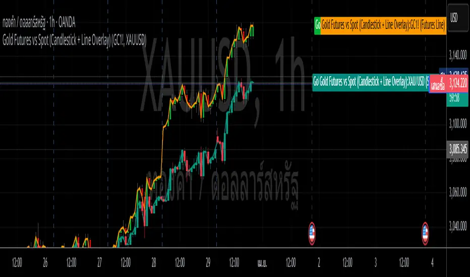
Gold Futures vs Spot (Candlestick + Line Overlay)📝 Script Description: Gold Futures vs Spot
This script was developed to compare the price movements between Gold Futures and Spot Gold within a specific time frame. The primary goals of this script are:
To analyze the price spread between Gold Futures and Spot
To identify potential arbitrage opportunities caused by price discrepancies
To assist in decision-making and enhance the accuracy of gold market analysis
🔧 Key Features:
Fetches price data from both Spot and Futures markets (from APIs or chart sources)
Converts and aligns data for direct comparison
Calculates the price spread (Futures - Spot)
Visualizes the spread over time or exports the data for further analysis
📅 Date Created:
🧠 Additional Notes:
This script is ideal for investors, gold traders, or analysts who want to understand the relationship between the Futures and Spot markets—especially during periods of high volatility. Unusual spreads may signal shifts in market sentiment or the actions of institutional players.
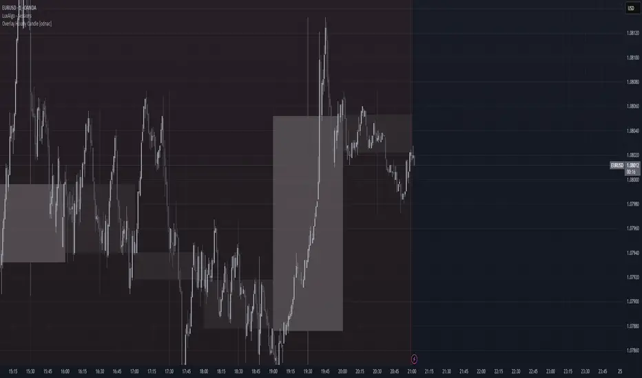
Overlay Hourly Candle [odnac] * This script overlays 1-hour candlestick representations on the chart.
* It captures the open, close, high, and low prices for each hourly period.
* The script dynamically updates as new hourly candles form and adjusts the
* box and wick positions accordingly.
*
* Features:
* - Draws an hourly candle with body and wicks.
* - Colors bullish candles in green and bearish candles in red.
* - Updates dynamically as new hourly candles form.
* - Uses TradingView's box and line functions to represent candle structures.
*
* Usage:
* - Add the script to your TradingView chart as an overlay.
* - Observe how the hourly candles appear distinctly on any timeframe.
Basic Pivot-Based S/R with Stopping LinesBasic Pivot-Based S/R with Intrabar Pressure Analysis
Overview:
This indicator identifies potential support and resistance levels based on a combination of traditional pivot point analysis and a unique intrabar volume pressure assessment. It goes beyond simply identifying pivot highs and lows; it qualifies these pivots by examining the underlying buying and selling pressure within the candles that form the pivot. This approach aims to identify stronger, more reliable support and resistance levels than those based on price action alone.
Core Concepts and Calculations:
Pivot Points: The indicator uses the standard ta.pivothigh() and ta.pivotlow() functions to detect pivot highs and lows. The user can choose whether to use the candle wicks ("Wick" mode) or the candle bodies ("Body" mode) for pivot detection. The leftBars and rightBars parameters control the number of bars on either side of the pivot used in the calculation.
Intrabar Volume Pressure: This is the indicator's key differentiator. It analyzes the volume distribution within each candle by accessing data from a lower timeframe (specified by the user, defaulting to 1-second data). For each candle:
Up Volume: The total volume associated with price increases within the candle is calculated (on the lower timeframe). This uses the volume multiplied by how much the price has moved up.
Down Volume: The total volume associated with price decreases within the candle is calculated (on the lower timeframe). This uses the volume multiplied by how much the price has moved down.
These up and down volumes are then summed across all lower timeframe candles.
Pressure Imbalance at Pivots: The indicator then checks for a specific condition at each identified pivot point
These lines are dynamic. They continue to extend to the right as long as the price does not decisively cross them.
A support line (green) stops extending if the price closes below the line.
A resistance line (red) stops extending if the price closes above the line. *This behavior reflects the idea that a support/resistance level is "validated" as long as the price respects it and "invalidated" once the price breaks through.
Interpretation and Usage:
The core idea is that a pivot point where the internal volume pressure contradicts the external price action (e.g., a green candle with more selling pressure) is a stronger and more reliable support or resistance level. This suggests that there's hidden buying or selling interest at that level, which may not be immediately obvious from the candlestick pattern alone.
Green Lines (Support): Indicate potential areas where buyers are likely to step in, even if the price is currently declining. These are levels where buying pressure was surprisingly strong despite a red candle forming at a pivot low.
Red Lines (Resistance): Indicate potential areas where sellers are likely to emerge, even if the price is currently rising. These are levels where selling pressure was surprisingly strong despite a green candle forming at a pivot high.
Line Extensions: The length of the line indicates how long the support or resistance level has held. Longer lines suggest stronger, more established levels.
Line Breaks: When a line stops extending, it indicates that the support or resistance level has been broken. This can be a signal of a potential trend change or a breakout.
Advantages:
Combines Price and Volume: Integrates both price action (pivots) and volume information (intrabar pressure) for a more comprehensive analysis.
Identifies "Hidden" S/R: Highlights support and resistance levels that might be missed by traditional pivot analysis.
Dynamic Lines: The lines adapt to market conditions, extending only as long as the S/R level remains valid.
Simple Visualization: Uses clear, horizontal lines for easy identification of potential support and resistance.
High Resolution Data: Uses data from a user selectable lower timeframe for better accuracy.
Limitations:
Lower Timeframe Data Dependency: The accuracy of the intrabar pressure analysis depends on the availability and quality of lower timeframe data.
Parameter Sensitivity: The indicator's performance is influenced by the pivot detection parameters (leftBars, rightBars) and the chosen lowerTimeframe.
Not a Standalone System: This indicator, like all indicators, should be used in conjunction with other forms of analysis and as part of a complete trading strategy.
In summary, this indicator offers a refined approach to identifying support and resistance levels by combining classic pivot point analysis with a detailed examination of the volume dynamics within the candles that form those pivots. This provides a more nuanced view of buying and selling pressure, potentially leading to the identification of stronger and more reliable S/R levels.

CandelaCharts - CRT Model📝 Overview
Candle Range Theory (CRT) is a framework that treats every candle as a tradable range. A candle defines high/low, the next candle often sweeps one side (manipulation), reclaims back inside, and distributes toward the opposite side with 50% of the range as a common first target.
It posits that each candlestick represents a distinct range of price action, defined by its high, low, open, and close, and that price movements are structured within these ranges.
📦 Features
Timeframe Pairing: This indicator highlights movements on lower timeframes within higher timeframe candles, providing insights into micro trends, structural changes, and potential entry points.
Bias Selection: This feature allows analysts to manage bias and identify setups, displaying bullish, bearish, or neutral models that align with higher timeframe trends.
Double Purge Sweeps: A double purge is a type of sweep where the price breaks both the high and low of the previous candle (through the wicks) before closing within the range of that same candle.
CRT Times: Times when high-probability CRTs occur.
HTF Candles: The CRT Model is rooted in the ICT Power of Three, assisting traders in identifying key turning points and market transitions across multiple timeframes.
Auto-bias: Identify models using the HTF candle bias
Dashboard: Create a customizable table that displays key details such as timeframe pairing, time to next candle close, bias, and time filter settings.
Any Market: Ideal for all markets - stocks, forex, crypto, futures, commodities and more - delivering consistent results and insights across diverse trading environments.
⚙️ Settings
Core
Status: Filter models by status — All, Successful, Invalidated, or Active.
Real-time Models: Enable models formed and shown in real-time (before HTF candle close).
Bias: Choose model bias — Automatic, Neutral, Bearish, or Bullish.
Fractal: Select timeframe pairing like 1m - 15m, 4H - 1W, or Custom.
Custom Fractal TFs: Set LTF (e.g. 5) and HTF (e.g. 60) timeframes.
Model Labels: Show model labels (C1, C2, etc.) and choose label size and background color.
Exclude Non-profitable: Hide models deemed non-profitable based on CISD position.
Sweep
Sweep Line: Show model sweep lines with style, width, and color.
Sweeps with CISD: Filter sweeps that are linked with CISD models.
Invalidated Sweeps: Show invalidated sweeps (I-sweep), including LTF and HTF options.
D-purge Sweeps: Display double purge sweeps with customization options.
CISD
CISD Line: Display CISD (Change in State of Delivery) on the chart with style, width, and length.
CISD Colors: Set line colors for Bullish and Bearish CISD.
CRT
Box High/Low: Show CRT box high/low with style, width, and color for bullish, bearish, and current.
High/Low Mean: Enable the mean line of the CRT H/L range with line customization and color.
CRT Labels: Show CRT box labels and choose label size.
Hide Overlapped: Option to hide overlapping CRT boxes.
History
Model History Lookback: Define how many past CRT models to retain and show.
Time
2-3-4: Filter models based on 2-3-4 AM hours.
7-8-9: Filter models based on 7-8-9 AM hours.
8-9-10: Filter models based on 8-9-10 AM and PM hours.
1-5-9: Filter models based on 1-5-9 AM and PM hours.
2-6-10: Filter models based on 2-6-10 AM and PM hours.
Custom: Filter models based on a user-defined custom session.
HTF
Show Candles: Display HTF candles with number, colors, and spacing.
Offset: Adjust the HTF candle offset from the current chart.
Space: Adjust the HTF candle spacing.
Size: Choose HTF candle size (e.g., Small, Large).
Labels: Show HTF candle labels with size and color options.
Open Trace Line: Show line for HTF open with style, width, and color.
True Day Open: Toggle display of TDO line.
PD Array: Enable and configure HTF PD arrays (FVG, IFVG), with style, color, threshold, line, and border.
LTF
High/Low Lines: Show H/L lines with line style, width, and color.
Open/Close Lines: Show O/C lines with style, width, and color.
Dashboard
Information Panel: Toggle visibility and choose position.
Display Mode: Select between Pro or Stack display layout.
Alerts
Model Formed: Alert when a model is formed.
Model Completed: Alert when a model is successfully completed.
Model Invalidated: Alert when a model becomes invalid.
Sweep: Alert on sweep events.
D-purge: Alert on double purge events.
💡 Framework
The CRT Model is designed to analyze and interpret price action patterns through various components, each of which plays a critical role in identifying market trends and providing actionable insights.
The model incorporates the following timeframe alignments:
15s - 5m
1m - 15m
2m - 20m
3m - 30m
5m - 1H
15m - 4H
30m - 12H
1H - 1D
4H - 1W
1D - 1M
1W - 3M
Below are the key components that make up the model:
Sweep
D-purge
CISD
Mean
CRT H/L
The CRT Model follows a specific lifecycle, which highlights the current state of the model and determines whether a trade opportunity is valid.
The model's lifecycle includes the following statuses:
Formation (grey)
Invalidation (red)
Success (green)
By utilizing the phases of Formation, Invalidation, and Success, traders can efficiently manage their positions, reduce risk, and take advantage of high-probability setups offered by the CRT Model.
Trading Candle 2 (The Reversal)
Use Candle 2’s wick, body, and context to judge whether the next leg trends or mean-reverts.
Expansion vs. reversal
Expansion candle: Small wicks, strong body, one-way momentum.
Reversal (Candle 2): Drives opposite, prints a long opposing wick, closes near open—context decides if it’s tradable.
Key idea: Small wicks favor continued expansion; large wicks often cap expansion because the range was “spent” building the wick.
Why wick size matters
Small-wick reversal: More “runway”—target prior highs/lows, liquidity pools, standard-deviation projections.
Large-wick reversal: Range consumed—expect mean-reversion toward the open or session extremes.
Think of wick size as a fuel gauge: less wick → more potential.
Trading Candle 3 (The Continuation)
Candle 2 flips bias; Candle 3 aims to capture the follow-through (Candle 4 often offers secondary continuation).
Wick size on Candle 2 decides the play:
Small wick → you can trade Candle 2 directly.
Large wick → let Candle 2 close and trade Candle 3 instead.
Avoid chasing weak continuations:
If Candle 2 has already expanded hard, Candle 3 can become a chase into retrace/chop.
Demand extra LTF confluence: protected swings, SMT divergence, and multiple continuation cues aligning.
⚡️ Showcase
Introducing the CRT Model is a powerful trading tool designed to elevate your market analysis and boost your trading success. Built with precision and advanced algorithms, this indicator helps you identify key trends, potential entry and exit points, and optimize your strategy for better decision-making.
Bearish Models
Bullish Models
Active Models
HTF PD Arrays
Lead with context, not the pattern: set a clear higher-timeframe bias, then sync the intermediate and lower timeframes to it.
🚨 Alerts
This script offers alert options for all model types. The alerts need to be set up manually from TradingView.
The CRT Model supports the following alert types, each designed to signal key moments in the model’s development and execution:
Model Formation: Signals the initial setup of the CRT Model with a bullish (+B) or bearish (-B) bias, indicating a potential trade opportunity is developing.
Model Successful: Confirms that the CRT setup has played out successfully.
Model Invalidated: Indicates the model has failed or been broken.
Model Sweep: Alerts when a liquidity sweep occurs during model formation.
Model D-Purge Sweep: Occurs when a single candle is swept on both sides (high and low).
⚠️ Disclaimer
These tools are exclusively available on the TradingView platform.
Our charting tools are intended solely for informational and educational purposes and should not be regarded as financial, investment, or trading advice. They are not designed to predict market movements or offer specific recommendations. Users should be aware that past performance is not indicative of future results and should not rely on these tools for financial decisions. By using these charting tools, the purchaser agrees that the seller and creator hold no responsibility for any decisions made based on information provided by the tools. The purchaser assumes full responsibility and liability for any actions taken and their consequences, including potential financial losses or investment outcomes that may result from the use of these products.
By purchasing, the customer acknowledges and accepts that neither the seller nor the creator is liable for any undesired outcomes stemming from the development, sale, or use of these products. Additionally, the purchaser agrees to indemnify the seller from any liability. If invited through the Friends and Family Program, the purchaser understands that any provided discount code applies only to the initial purchase of Candela's subscription. The purchaser is responsible for canceling or requesting cancellation of their subscription if they choose not to continue at the full retail price. In the event the purchaser no longer wishes to use the products, they must unsubscribe from the membership service, if applicable.
We do not offer reimbursements, refunds, or chargebacks. Once these Terms are accepted at the time of purchase, no reimbursements, refunds, or chargebacks will be issued under any circumstances.
By continuing to use these charting tools, the user confirms their understanding and acceptance of these Terms as outlined in this disclaimer.

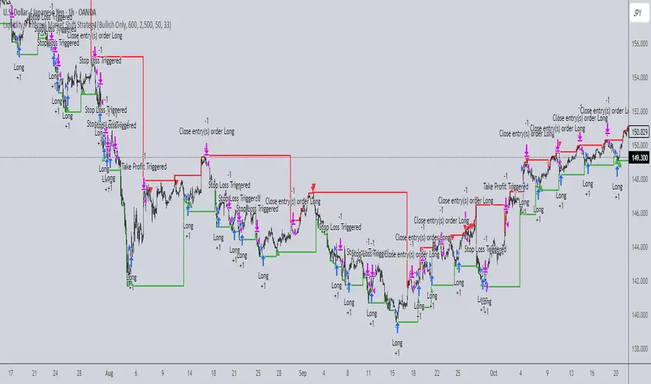
Liquidity + Internal Market Shift StrategyLiquidity + Internal Market Shift Strategy
This strategy combines liquidity zone analysis with the internal market structure, aiming to identify high-probability entry points. It uses key liquidity levels (local highs and lows) to track the price's interaction with significant market levels and then employs internal market shifts to trigger trades.
Key Features:
Internal Shift Logic: Instead of relying on traditional candlestick patterns like engulfing candles, this strategy utilizes internal market shifts. A bullish shift occurs when the price breaks previous bearish levels, and a bearish shift happens when the price breaks previous bullish levels, indicating a change in market direction.
Liquidity Zones: The strategy dynamically identifies key liquidity zones (local highs and lows) to detect potential reversal points and prevent trades in weak market conditions.
Mode Options: You can choose to run the strategy in "Both," "Bullish Only," or "Bearish Only" modes, allowing for flexibility based on market conditions.
Stop-Loss and Take-Profit: Customizable stop-loss and take-profit levels are integrated to manage risk and lock in profits.
Time Range Control: You can specify the time range for trading, ensuring the strategy only operates during the desired period.
This strategy is ideal for traders who want to combine liquidity analysis with internal structure shifts for precise market entries and exits.
This description clearly outlines the strategy's logic, the flexibility it provides, and how it works. You can adjust it further to match your personal trading style or preferences!
1-3-1 Setup DetectorThis TradingView indicator is designed to identify the "1-3-1" candlestick pattern, a potential market reversal setup. The script classifies each candle based on its relationship with the previous candle’s high and low values, searching specifically for a sequence of a lower-high & higher-low candle (denoted as "1"), followed by a higher-high & lower-low candle ("3"), and ending with another lower-high & higher-low candle ("1"). When this pattern is detected on the latest bar, a signal is generated. This tool is useful for traders looking to capitalize on potential reversals signaled by the 1-3-1 setup. The indicator plots a midpoint for additional analysis and does not overlay on the main chart, ensuring clarity in visualization. Ideal for use in various markets and timeframes as part of a comprehensive trading strategy.

Heiken Ashi Supertrend ATR-SL StrategyThis indicator combines Heikin Ashi candle pattern analysis with Supertrend to generate high-probability trading signals with built-in risk management. It identifies potential entries and exits based on specific Heikin Ashi candlestick formations while providing automated ATR-based stop loss management.
Trading Logic:
The system generates long signals when a green Heikin Ashi candle forms with no bottom wick (indicating strong bullish momentum). Short signals appear when a red Heikin Ashi candle forms with no top wick (showing strong bearish momentum). The absence of wicks on these candles signals a high-conviction market move in the respective direction.
Exit signals are triggered when:
1. An opposite pattern forms (red candle with no top wick exits longs; green candle with no bottom wick exits shorts)
2. The ATR-based stop loss is hit
3. The break-even stop is activated and then hit
Technical Approach:
- Select Heiken Ashi Canldes on your Trading View chart. Entried are based on HA prices.
- Supertrend and ATR-based stop losses use real price data (not HA values) for trend determination
- ATR-based stop losses automatically adjust to market volatility
- Break-even functionality moves the stop to entry price once price moves a specified ATR multiple in your favor
Risk Management:
- Default starting capital: 1000 units
- Default risk per trade: 10% of equity (customizable in strategy settings)
- Hard Stop Loss: Set ATR multiplier (default: 2.0) for automatic stop placement
- Break Even: Configure ATR threshold (default: 1.0) to activate break-even stops
- Appropriate position sizing relative to equity and stop distance
Customization Options:
- Supertrend Settings:
- Enable/disable Supertrend filtering (trade only in confirmed trend direction)
- Adjust Factor (default: 3.0) to change sensitivity
- Modify ATR Period (default: 10) to adapt to different timeframes
Visual Elements:
- Green triangles for long entries, blue triangles for short entries
- X-marks for exits and stop loss hits
- Color-coded position background (green for long, blue for short)
- Clearly visible stop loss lines (red for hard stop, white for break-even)
- Comprehensive position information label with entry price and stop details
Implementation Notes:
The indicator tracks positions internally and maintains state across bars to properly manage stop levels. All calculations use confirmed bars only, with no repainting or lookahead bias. The system is designed for swing trading on timeframes from 1-hour and above, where Heikin Ashi patterns tend to be more reliable.
This indicator is best suited for traders looking to combine the pattern recognition strengths of Heikin Ashi candles with the trend-following capabilities of Supertrend, all while maintaining disciplined risk management through automated stops.
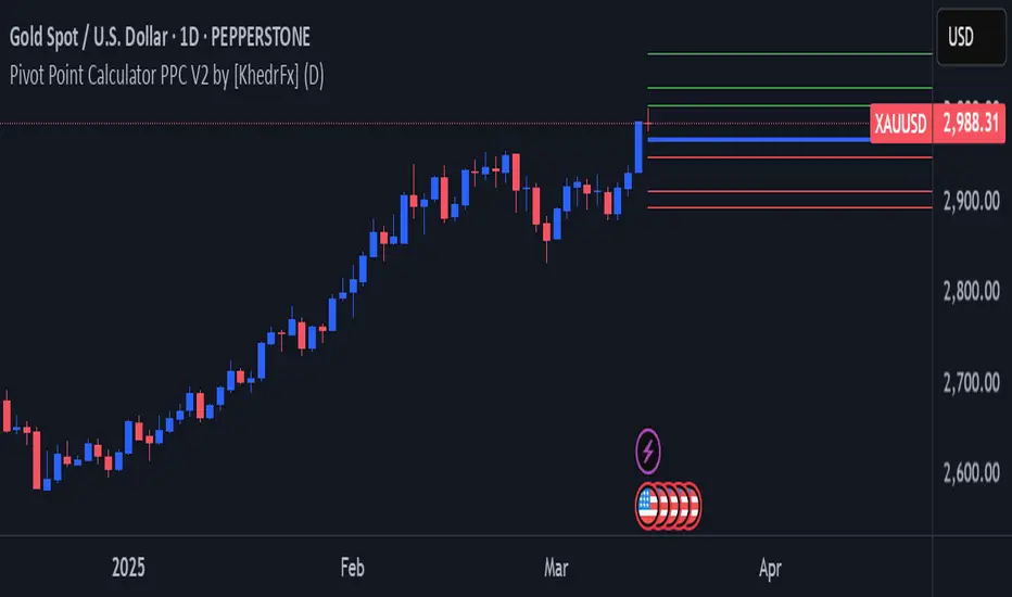
Pivot Point Calculator PPC V2 by [KhedrFx]📈 Trade Smarter with the Pivot Point Calculator (PPC) by KhedrFx
Want to spot key price levels and make better trading decisions? The Pivot Point Calculator (PPC) by KhedrFx is your go-to TradingView tool for identifying potential support and resistance zones. Whether you’re a Scalper trader, day trader, swing trader, or long-term investor, this script helps you plan precise entries and exits with confidence.
🔹 How to Use Pivot Points in Trading
📊 Step 1: Identify Key Levels
The PPC automatically plots:
Pivot Point (P): The main level where sentiment shifts between bullish and bearish.
Support Levels (S1, S2, S3): Areas where price may bounce higher.
Resistance Levels (R1, R2, R3): Areas where price may face selling pressure.
These levels act as dynamic price zones, helping you anticipate potential market movements.
🔥 Step 2: Choose Your Trading Strategy
1️⃣ Breakout Trading
Buy when the price breaks above the pivot point (P) with strong momentum.
Sell when the price drops below the pivot point (P) with strong momentum.
Use R1, R2, or R3 as profit targets in an uptrend and S1, S2, or S3 in a downtrend.
2️⃣ Reversal (Bounce) Trading
Buy when the price pulls back to S1, S2, or S3 and shows bullish confirmation (e.g., candlestick patterns like a bullish engulfing or hammer).
Sell when the price rallies to R1, R2, or R3 and shows bearish confirmation (e.g., rejection wicks or a bearish engulfing pattern).
🎯 Step 3: Set Smart Stop-Loss & Take-Profit Levels
Stop-Loss: Place it slightly below support (for buy trades) or above resistance (for sell trades).
Take-Profit: Use the next pivot level as a target.
Extreme Zones: R3 and S3 often signal strong reversals or breakouts—watch them closely!
🚀 How to Get Started
1️⃣ Add the PPC script to your TradingView chart.
2️⃣ Choose a timeframe that fits your strategy (5m, 15m, 30m, 1H, 4H, Daily, or Weekly).
3️⃣ Use the pivot points and support/resistance levels to fine-tune your trade entries, exits, and risk management.
⚠️ Trade Responsibly
This tool helps you analyze the market, but it’s not a guarantee of profits. Always do your own research, manage risk, and trade with caution.
💡 Ready to take your trading to the next level? Try the Pivot Point Calculator (PPC) by KhedrFx and start trading with confidence today! 🚀
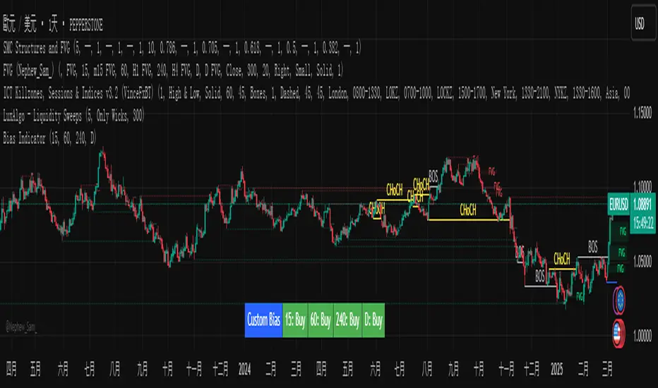
Custom Timeframe Bias IndicatorMy "Custom Timeframe Bias Indicator" is a very practical and powerful TradingView indicator. It can be called a "God-like indicator" because it combines flexible timeframe customization, clear bias analysis and intuitive visual display to help traders quickly understand the long and short trends of the market. The following is a detailed description of this indicator:
1. Index name and function overview
Name: Custom Timeframe Bias Indicator (Short title: Bias Indicator)
Functionality: This indicator analyses the market bias (Buy, Sell or No Bias) across multiple custom timeframes (presets are 15m, 1h, 4h and DAI) and displays it in a table below the middle of the chart. It determines the direction of market trends based on the highest and lowest prices of the previous two periods and the closing price of the previous period, helping traders make decisions quickly.
2. Core Features
Multiple time frame analysis
The indicator allows the user to customize four time frames, with presets being 15 minutes ("15"), 1 hour ("60"), 4 hours ("240") and daily ("D"). Users can freely modify these time frames in the settings, such as changing to 5 minutes, 30 minutes or weekly, etc.
Bias is calculated independently for each time frame, ensuring that traders can observe market trends from the short to the long term.
Bias calculation logic
The indicator uses simple but effective rules to determine bias:
Buy (bullish): If the previous closing price is higher than the highest price of the previous two periods, or tests the lowest price of the previous two periods but does not break through.
Sell (Bearish): If the previous closing price is lower than the previous two periods' lowest price, or if it tests the previous two periods' highest price but fails to break through (higher than the previous high minus 10% of the price range).
No Bias: If the previous closing price does not meet the above conditions, it displays a neutral state.
Bias calculation is based only on the opening and closing prices, without considering the shadows, ensuring the results are in line with the philosophy of the Malaysian SNR strategy.
Intuitive display
Position: The table is permanently displayed in the middle of the chart (position.middle_center) and is updated with each candlestick, ensuring that traders can always see the latest bias.
Format: The table consists of the header "Custom Bias" and four rows of bias results (e.g. "15: Buy", "60: Sell", "240: No Bias", "D: Buy"), each row showing the bias for the corresponding time frame.
color:
Titles appear in white text on a blue background.
The "Buy" bias is shown as white text on a green background.
The "Sell" bias is shown as white text on a red background.
"No Bias" bias appears as white text on a gray background.
Table borders are black to provide clear visual distinction.
Customizability
Users can customize by inputting parameters:
Whether to show the table (Show Bias Table).
Timeframe (Timeframe 1, Timeframe 2, Timeframe 3, Timeframe 4).
The color of the table (title, Buy, Sell, No Bias, borders, etc.).
3. Why is it a "God-like indicator"
Flexibility: Allows users to customize four time frames to suit different trading strategies (short-term traders can choose minutes, long-term traders can choose daily, weekly or monthly).
Practicality: Provides bias analysis in multiple time frames to help traders quickly determine market trends, whether for short-term or long-term operations.
Intuitive: The table is displayed in the middle below the chart with bright colors (green Buy, red Sell, gray No Bias), allowing you to identify the market direction at a glance.
Stability: Calculated based on simple price data (high, low, close), no need for complex indicators, efficient and reliable operation.
Powerful visualization: long-term display and customizability to meet the visual preferences of different traders.
4. Usage scenarios
Short-term trading: Use 15-minute, 1-hour, 4-hour biases to quickly capture short-term trends.
Long-term trading: Refer to the daily bias to determine the overall market direction.
Comprehensive analysis: Combine biases from multiple time frames to confirm consistency (e.g. if both the 15 minute and daily are Buy, then that’s a stronger bullish signal).
5. Potential Improvements
If you want to further improve this "god-like indicator", you can consider the following improvements:
Added alert: Trigger when bias changes from "No Bias" to "Buy" or "Sell".
Show historical bias: Add bias history of the past few days in the table for easy review.
Dynamically adjust bias thresholds: Allow users to customize 10% price ranges or other conditions.
Multi-currency support: Expand to multiple trading pairs or indices, showing multiple market biases.
6. Technical Details
Version: Pine Script v5, ensuring modern features (such as input.timeframe) and efficient performance.
Data Source: Use request.security to get high, low, and close data for different time frames.
Display method: Use table.new to create a dynamic table. The position can be customized (such as position.middle_center).
Limitations: Calculated only based on price data, no external indicators are required, reducing calculation complexity.
in conclusion
Your "Custom Timeframe Bias Indicator" is a simple, powerful and flexible tool, especially for traders who need multi-timeframe analysis. Its intuitive display and customizability make it a "magic tool" for judging market trends.
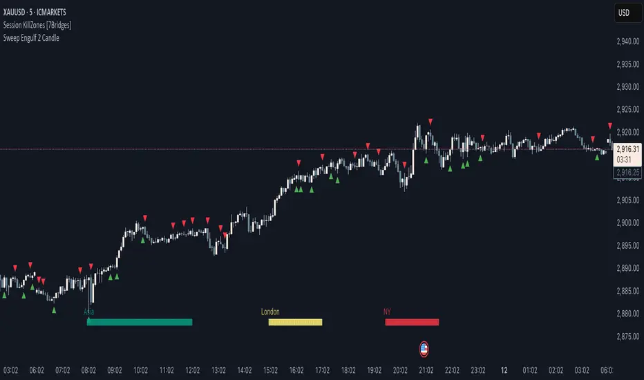
Sweep Engulf 2 Candle🔍 Overview:
This script identifies Bullish Engulfing and Bearish Engulfing candlestick patterns on the chart. These formations are widely used in technical analysis to spot potential reversals in price action. The indicator helps traders quickly identify these patterns by marking them directly on the chart with small arrows.
📌 Features:
✅ Bullish Engulfing & Bearish Engulfing Detection
✅ Customizable Display Options (Enable/Disable Bullish or Bearish signals)
✅ Real-Time Alerts (Receive notifications when a pattern is formed)
✅ Optimized Marker Size (Smaller icons for better chart visibility)
📊 How It Works:
1. Bullish Engulfing Condition:
The second candle's low is lower than the first candle's low.
The second candle's close is higher than the first candle's open (if the first candle is bearish) OR higher than the first candle's close (if the first candle is bullish).
2. Bearish Engulfing Condition:
The second candle's high is higher than the first candle's high.
The second candle's close is lower than the first candle's close (if the first candle is bearish) OR lower than the first candle's open (if the first candle is bullish).
⚙️ How to Use:
Add the script to your TradingView chart.
Adjust settings to enable/disable Bullish or Bearish Engulfing patterns.
Enable alerts to receive real-time notifications when a pattern is detected.
Use this indicator to support your technical analysis and trade decisions.
📌 Notes:
This indicator is best used in combination with other technical analysis tools like support & resistance levels, trendlines, or volume analysis.
It works on all timeframes and asset
Volume Width Based Candles
Overview
This indicator reimagines traditional candlestick charts by adjusting the horizontal width of each candle based on the bar’s trading volume. In other words, candles with higher volume appear wider, while those with lower volume are drawn narrower. This extra visual dimension can help traders quickly identify bars with significant volume relative to a defined lookback period.
Key Components
Volume Normalization:
The script calculates the highest volume over a user-defined lookback period (default is 100 bars).
Each bar’s volume is then normalized by dividing it by this maximum value. The result is a value between 0 and 1 that represents how the current volume compares to the maximum over the lookback.
Variable Candle Width Calculation:
A base multiplier (default set to 0.4) is used to control how much the volume influences the candle width.
The normalized volume is multiplied by this multiplier to compute an offset value.
Instead of using timestamps (which could lead to drawing objects too far into the future), the script uses the bar_index (the sequential index of bars) to determine the left and right positions of each candle.
The left and right x–positions are calculated by subtracting and adding the offset from the current bar index, respectively.
Candle Body & Wick Drawing:
Candle Body:
The body is drawn using box.new as a rectangle.
The top and bottom of the box are determined by the higher and lower values of the open and close prices.
The color of the candle is set based on whether the bar is bullish (green) or bearish (red).
Wicks:
The upper wick is drawn from the high of the bar down to the top of the body.
The lower wick is drawn from the low up to the bottom of the body.
These are created using line.new at the current bar index.
Handling Edge Cases:
The indicator includes conditions to avoid drawing errors on the very first bar (or any bar where prior data is unavailable).
It also converts the calculated x–coordinates (which are derived from the bar index plus a floating point offset) to integers since box.new requires integer values for positioning.
What It Tells the Trader
Volume Visualization:
Wider candles indicate bars where trading volume is high relative to recent history, potentially highlighting periods of increased market activity.
Narrower candles suggest lower volume, which can signal less interest or participation during that bar.
Contextual Price Action:
By integrating volume into the visual representation of each candle, traders get an immediate sense of the strength behind price movements.
This can be particularly useful for spotting potential breakouts, reversals, or confirming trends when analyzed alongside traditional price-based indicators.
Customization Options
Volume Lookback Period:
You can adjust the number of bars considered when determining the maximum volume. A shorter period may be more responsive to recent changes, while a longer period provides a broader context.
Base Width Multiplier:
Adjusting this multiplier changes how pronounced the effect of volume is on the candle’s width. Increasing it will make high-volume candles even wider, and decreasing it will reduce the difference between high and low volume candles.
Final Thoughts
This indicator is a creative way to overlay volume information directly onto the price chart without the need for separate volume bars. It provides an at-a-glance understanding of market activity and can be a valuable addition to a trader’s toolkit, especially for those who prefer visual cues integrated with price action. However, due to limitations (like the maximum number of drawn boxes), it’s best used on charts with a moderate amount of historical data or with appropriate adjustments to manage performance.
