Speed IndicatorThe indicator showcases the Speed at which the prices change based on the set length. It does not show trend direction simply because Speed is a scalar quantity. It helps to identify when the prices are racing, slowing down, or in a range.
The formula used for calculation is Speed = Total Distance Travelled / Time.
Time is the period range that can be defined to set the lookback period.
The length is calculated by finding the absolute value of the difference between the current and closing prices one period ago. The lengths are added for the defined Time, and the Total Distance Travelled by the price is calculated. The formula of 'current price' - price 'Time' periods ago is not used, which calculates the displacement of the price used in figuring the velocity .
The Speed is then calculated using the defined formula.
For example, in the last 20 days, a stock price moved a total of 15000 points, then the Speed of the price would be 750 points per day. Therefore the price is expected to be moving around 750 points, either up or down.
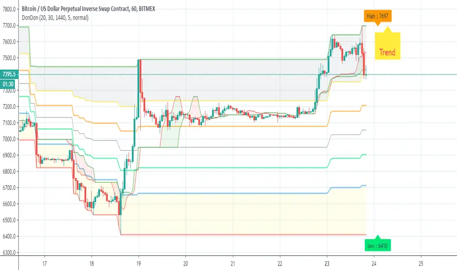
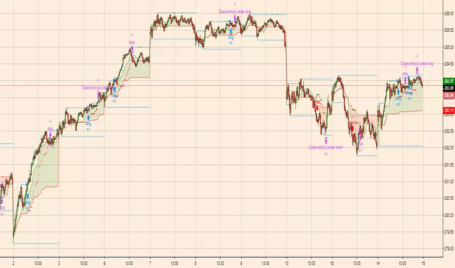
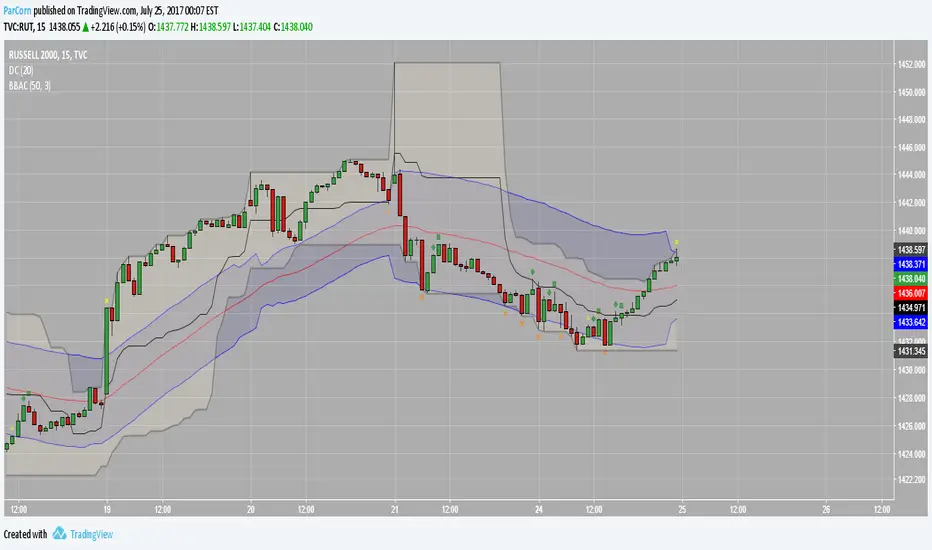
There is also an application of the Donchian Channels to the calculated Speed. It helps to define a dynamic range of the Speed and easily visualize if the Speed is increasing, decreasing, or being stable. The range showcases a Speedometer , hence easing the interpretation of the Speed. Speed Range can also be customized for the Donchian channel. The contraction of the channels would occur when the Speed has been steady for some time, which would mean the price has not moved out from its range.
The importance of the indicator is to identify when the prices have slowed down to enter positions safely, since entering positions during higher speeds would be like jumping onto a fast-moving train. Although, it is up to the user's risk appetite if they wish to enter during low speeds or high speeds. The basic strategy is to enter during slow speeds, hold as speed increases, exit as Speed starts to slow down for its highs. That is the basic idea but can be customized as per the user.
Chỉ báo Pine Script®