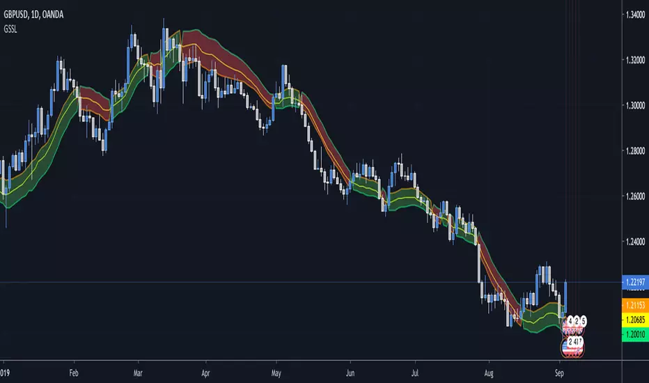
SSL Crossover + MA choiceThis indicator builds on the SSL channel code by ErwinBeckers @
I have added options for diff MA's to be used in the SSL channel and crossover indicators for buy/sell signals
default MA is set to Arnaud Legaux, but you can set it to whatever you like - original was a Simple Moving Average by ErwinBeckers
The indicator will not repaint as the signals are drawn after close of crossover candles
Let me know if you have any suggestions - happy to add more functionality
Tìm kiếm tập lệnh với "entry"

Mirror MACD by Trader JayThis is my take on the metatrader indicator, the mirror macd. Works pretty good on Forex, haven't tested on anything else
Enter long after the Blue Line Cross Up the Red Line and EXIT after the Green line Cross Up the Red Line (above the Blue Line).
For the opposite position : ENTER SELL after the Red Line Cross Down.

Generalized SSL by Vts// Generalized SSL:
// This is the very first time the SSL indicator, whose acronym I ignore, is on Tradingview.
// It is based on moving averages of the highs and lows.
// Similar channel indicators can be found, whereas
// this one implements the persistency inside the channel, which is rather tricky.
// The green line is the base line which decides entries and exits, possibly with trailing stops.
// With respect to the original version, here one can play with different moving averages.
// The default settings are (10,SMA)
//
// Vitelot/Yanez/Vts March 2019
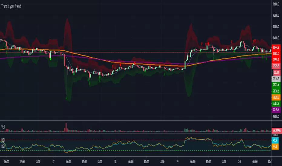
Trend is your friendThis indicator evaluates the trend based on crosses of two McGinley moving averages. It paints candles accordingly (it does not repaint), so you can see what the indicator is saying more clearly and stay in your trade until you see a period of consolidation or a reversal. You can control how far away those moving averages need to be for you to consider it a trend. If this distance is not met candles color is not changed and it shows you that the market is in a period of consolidation. I also added visualization of RSI, so you can have an easier time finding appropriate profit targets. For stop loss I would recommend placing it a couple points above or below the previous high / low that is located above / below you final target for entry. You can also use a certain percentage that works for you. I tried adding a stop loss based on ATR, but I did not like the results. Using market structure is a better choice in my opinion.
Here is a basic trading strategy for the default settings:
Wait for the indicator to start printing a series of green or red candles. After that you can enter a long or a short around moving averages. Another valid place to entry is the specific RSI zone. If we are in an uptrend buying when RSI is oversold can be beneficial as you expect market to recover. I do not recommend changing RSI from 14. Vice versa for the downtrend. It gives you an edge as you know at what price RSI will be oversold and allows you to place trades in advance. Pretty neat! You need to realize that no indicator or strategy can give you an exact entry. There will always be some margin of error. What I wanted to say is that if there is a strong trend up and you buy around your key moving averages and when RSI is oversold you entered in good places and there is a pretty good chance you will make money.
Time frame settings:
If you want to use tighter stop losses I would recommend sticking to 15m. Do not go lower. It is not worth the stress. 1h and 4h seems to be very good as well, but expect your stop losses to be wider. What I personally tend to do is display 15m, 30m and 1h and compare it. Think of it as a short, mid and long term. That way you can see things little bit better.
Examples:
1H chart BTC
4h chart EUR / USD
1D chart NASDAQ
15m chart BTC (Daytrading)
That last chart shows that even if you were longing while the trend was about to change you still had a good chance to close it with a little profit and switch to short easily. The default settings is what has worked the best for me. Feel free to change them as you see fit and do not forget to let me know if you find something that works better :)
Notes:
Either disable wick display or change it to a neutral color like gray for both green and red candles. Unfortunately pine script does not allow wick painting, so if you have red / green wicks it will look terrible. If RSI visualization makes your candles look too small you can go to settings and disable the display of individual RSI levels. You will still be able to see the zones, but the scale won't be affected.
Daily ATR%If You are using a percentage of the Daily Average True Range in determining your stop placement,
this quick indicator is for You.
excerpt from investopedia.com/articles/trading/06/stopplacement.asp
ATR % Stop Method
The ATR% stop method can be used by any type of trader because the width of the stop is determined by the percentage of average true range (ATR). ATR is a measure of volatility over a specified period of time. The most common length is 14, which is also a common length for oscillators such as the relative strength index (RSI) and stochastics. A higher ATR indicates a more volatile market, while a lower ATR indicates a less volatile market. By using a certain percentage of ATR, you ensure that your stop is dynamic and changes appropriately with market conditions.
For example, for the first four months of 2006, the GBP/USD average daily range was around 110 to 140 pips. A day trader may want to use a 10% ATR stop - meaning that the stop is placed 10% x ATR pips from the entry price.In this instance, the stop would be anywhere from 11 to 14 pips from your entry price. A swing trader might use 50% or 100% of ATR as a stop. In May and June of 2006, daily ATR was anywhere from 150 to 180 pips. As such, the day trader with the 10% stop would have stops from entry of 15 to 18 pips while the swing trader with 50% stops would have stops of 75 to 90 pips from entry.

UCS_Squeeze_Timing-V1There is an important information the Squeeze indicator is missing, which is the Pre Squeeze entry. While the Bollinger band begins to curves out of the KC, The breakout usually happens. There are many instances that the Squeeze indicator will fire, after the Major move, I cant blame the indicator, thats the nature (lagging) of all indicators, and we have to live with it.
Therefore pre-squeeze-fire Entry can be critical in timing your entry. Timing it too early could result in stoploss if it turns against you, ( or serious burn on options premium), because we never know when the squeeze will fire with the TTM squeeze, But now We know. Its a little timing tool. Managing position is critical when playing options.
I will code the timing signal when I get some time.
Updated Versions -
Buyers & sellers Candle Control Dominance Zone @MaxMaserati 3.0Description
The Buyers & Sellers Candle Control Dominance Zone is a surgical price-action tool designed to identify and project key supply and demand zones derived from candle anatomy across multiple timeframes.
By splitting candles into "Sellers Control" (upper wick/shadow) and "Buyers Control" (lower wick/shadow) regions, this script visualizes exactly where price rejection and absorption are occurring. With the new HTF Engine, you can now view these institutional rejection zones from a Higher Timeframe (e.g., 4H) while trading on a Lower Timeframe (e.g., 15m).
How it Works
The indicator identifies specific "Control Zones" based on the battle between buyers and sellers:
Live Control (Current & HTF): Real-time monitoring of the developing candle. See a 4H wick forming live while watching the 1m chart.
Last Closed Control (Current & HTF): Projects the zones from the most recently completed candle.
Dominance Zones (BuBC & BeBC):
BuBC (Bullish Body Close): A "Dominance Zone" triggered when a candle closes above the previous candle's high. Signifies strong bullish momentum.
BeBC (Bearish Body Close): A "Dominance Zone" triggered when a candle closes below the previous candle's low. Signifies aggressive selling pressure.
Key Features
Multi-Timeframe (MTF) Overlay: Plot 4H, Daily, or Weekly control zones directly on your lower timeframe scalping charts.
Smart Labeling: HTF labels automatically update to show the zone type (e.g., "Sellers Control (Live) ") and whether the last candle was a Dominance candle (BuBC/BeBC).
Dynamic Extension: Zones are projected forward to help you catch retests of rejection levels.
Alerts Included: Built-in alerts trigger when price crosses into a Dominance Zone (BuBC/BeBC), allowing you to set it and forget it.
Can be use as:
Support & Resistance: Use Buyers Control zones (lower wicks) as demand zones for longs and Sellers Control zones (upper wicks) as supply zones for shorts.
Trend Confirmation: A BuBC zone often acts as a launchpad for continued upside. If price falls back into a BuBC zone and rejects, it is a high-probability continuation signal.
Fractal Entry: Use the HTF zones to find the "Big Picture" levels, then use the Current TF zones to refine your entry with precision.
Settings
Display Filter: Toggle Current TF zones (Live, Closed, BuBC, BeBC) independently.
Higher Timeframe Settings: Enable/Disable HTF overlay and select your preferred timeframe (e.g., 240 for 4H).
Visuals: Fully adjustable transparency, colors, and extension lengths to keep your chart clean.

TSM RSI + Supertrend (Fixed SL + 1:2 RR) 302026RSI + Supertrend Combo Strategy (Fixed SL & 1:2 Risk–Reward)
To trade only in the direction of the trend using Supertrend and enter with momentum confirmation from RSI, while strictly controlling risk with a fixed stop loss and a 1:2 target.
Supertrend – identifies market trend
RSI (14) – confirms strength of the trend
BUY CONDITIONS (Long Trade)
Supertrend changes from Red to Green
→ Market trend turns bullish
Price trades above Supertrend line
RSI is above 50
→ Buying momentum is strong
✅ Enter BUY at the next candle open.
🔴 SELL CONDITIONS (Short Trade)
Supertrend changes from Green to Red
→ Market trend turns bearish
Price trades below Supertrend line
RSI is below 50
→ Selling momentum is strong
✅ Enter SELL at the next candle open.
🛑 Risk Management (Most Important)
Stop Loss (SL): Fixed percentage from entry price
Target (TP): 2 × Stop Loss
→ Risk : Reward = 1 : 2
Example (BUY Trade)
Entry: ₹100
Stop Loss (0.5%): ₹99.50
Target (1:2): ₹101.00
⏱️ Best Timeframes
Intraday: 5 min / 15 min
Swing Trading: 1 Hour / Daily.
Why This Strategy Works
✔ Trades with the trend, not against it
✔ RSI filters false Supertrend signals
✔ Fixed SL protects capital
✔ 1:2 RR ensures profitability even with ~40% win rate
✔ Simple rules – beginner friendly
⚠️ Important Notes
Avoid sideways markets
Best results in trending stocks / indices
Always backtest before live trading.

Break & Retest 369Break & Retest 369
The Break & Retest 369 is a high-precision technical indicator designed for price action traders who specialize in market structure shifts and "S/R Flip" (Support becoming Resistance and vice versa) strategies. Unlike standard oscillators that lag behind price, this tool focuses on **horizontal price levels** that have historically acted as turning points, providing visual zones where the market is likely to offer a "second chance" entry.
Core Philosophy
The script is built on the principle of Market Memory. In a trending market, a "Breakout" signifies a change in order flow. However, smart money often returns to the point of origin (the breakout level) to fill remaining orders or test the strength of the new trend. This indicator automates the identification of these "Retest" zones, which are often the highest-probability entry points for trend continuation.
How It Works: The Logic
The indicator follows a strict, multi-step calculation process:
1. Swing Point Identification: It utilizes a Pivot High/Low** algorithm. It scans for "peaks" and "valleys" that are isolated by a specific number of bars on either side (defined by the `Lookback` input).
2. **Breakout Detection:** The script monitors these pivot levels. A **Buy Zone** is triggered only when the price achieves a clean **Close** above a previous Pivot High. Conversely, a **Sell Zone** is triggered by a **Close** below a previous Pivot Low.
3. **Zone Construction:** Once a break is confirmed, the script draws a box centered exactly at the price level of the broken pivot.
4. **Forward Projection:** These zones are projected forward in time using the `Zone Extension` parameter, creating a visual "landing strip" for future price action.
### Key Features & How to Use It
* **Dynamic Support/Resistance Flips:** Green zones represent former resistance levels that are now expected to act as support. Red zones represent former support levels now expected to act as resistance.
* **Zone Customization:** Traders can adjust the `Zone Height (Ticks)` to account for market volatility or specific asset spreads (e.g., wider zones for XAUUSD, tighter for EURUSD).
* **Scannability:** The script helps traders filter out the "noise" of mid-range price movement and focus only on significant structural levels.
### Default Configuration
To get the most out of the **369** logic, the indicator comes pre-configured with the following defaults:
* **Swing Detection Lookback (18):** Optimized for medium-term structure, avoiding "micro-pivots" that lead to false signals.
* **Zone Height (1 Tick):** Focuses on the precise price point of the pivot for maximum accuracy.
* **Zone Extension (90 Bars):** Projects levels far enough to catch "deep" retests that occur several hours or days later.
---
### Pro Tip for Traders
Wait for price to return to a **Buy Zone** and look for a bullish rejection candle (like a pin bar or engulfing candle) before entering. This combines the "Where" (the zone) with the "When" (the price action confirmation) for a robust trading system.
Would you like me to add a **"Mitigation"** feature that automatically deletes or fades the zone once the price has successfully touched it?

TXG Wick DetectorOverview The TradeX Guru Wick Detector is a price action utility designed to automatically identify potential "Liquidity Grabs" and "Stop Hunts." It highlights candles where the market has aggressively rejected lower prices, signaling that Smart Money may be absorbing sell orders (the "Samosa Crust Break").
How It Works This script calculates the ratio of the lower wick relative to the total candle range.
If the lower wick represents more than 50% of the total candle size (customizable), a Teal Diamond (💎) is plotted below the bar.
This visual cue alerts you to a strong rejection of lower prices, often found at the end of a correction or during a "Stop Hunt" at key support levels.
Features
Automated Detection: Instantly spots high-rejection candles across any timeframe.
Customizable Sensitivity: Adjust the "Wick %" threshold in the settings to filter for stronger or weaker signals.
Visual Clarity: Non-intrusive diamond markers that do not clutter your chart.
Watermark: Includes the TradeX Guru brand mark for easy sharing.
🚀 How to Use This Tool for Analysis
Do not trade every diamond blindly. Use this 3-Step "Pro" Protocol to filter for high-probability setups:
1. Location (Context is King) Only consider signals that appear at Key Areas of Value:
Support Zones: Is price testing a historical support line?
Round Numbers: Is the signal near a psychological level (e.g., Nifty 25,000, BankNifty 50,000)?
High Volume Nodes (VPVR): Is price rejecting a high-volume cluster?
Rule: If a diamond appears in the middle of a random trend ("No Man's Land"), ignore it.
2. The Trap (The Hunt)
Watch for price to dip below your key level first.
The appearance of the Teal Diamond confirms that this dip was rejected. This suggests that "Stop Loss Liquidity" was hunted and absorbed by institutional buyers.
3. The Trigger (Entry & Risk)
Entry: Wait for the diamond candle to close. Enter on the next candle if bullish momentum continues.
Stop Loss: Place your SL strictly below the Low of the diamond candle.
Logic: If price breaks below the wick, the rejection has failed, and the setup is invalid.
Settings Guide
Wick Size % (Default 0.50): The wick must be 50% of the candle.
Increase to 0.60 for fewer, higher-quality signals.
Decrease to 0.40 for more frequent signals (scalping).
Disclaimer This tool is for educational purposes only. Price action patterns do not guarantee future performance. Always manage your risk.

ORB 369 - Opening Range Breakout The ORB 369 is a professional-grade momentum indicator designed to capture the volatility of the New York market open. While many Opening Range Breakout (ORB) scripts simply draw lines, this script integrates time-segmented price action with Supply and Demand (S/D) theory to filter out "fakeouts" and identify high-probability institutional entries.
💡 The Core Concept: Why 3-6-9?
The strategy is rooted in the "Market Open Volatility" principle. The first 15 minutes (9:30–9:45 AM EST) represent the period where institutional orders are processed and "price discovery" is most aggressive.
The Range: We define the 15-minute high and low as the "Battlefield."
The 369 Logic: This script focuses on the 3rd 5-minute candle of the session (completing the 15m range) and monitors the subsequent 5m and 15m cycles for a definitive trend shift.
🛠️ How It Works
The script utilizes Pine Script v6 high-precision time-tracking and state-handling to ensure accuracy even on historical data.
1. Dynamic Session Anchoring
Unlike static indicators, this script uses America/New_York timezone anchoring. It identifies the Opening Range (OR) regardless of your local time, ensuring you are aligned with the NYSE floor traders.
2. Supply & Demand Detection
The script doesn't just look at the high/low; it analyzes the micro-structure within that 15-minute window.
It identifies unmitigated zones (areas where price moved so fast it left "imbalances").
If a breakout occurs but price immediately hits an internal S/D zone, it warns the trader of a potential "Look Above and Fail" scenario.
3. Breakout Confirmation (5m Logic)
A common mistake is entering on a "wick." This script uses Closing Logic:
Bullish Signal: A 5-minute candle must close entirely above the 15m High.
Bearish Signal: A 5-minute candle must close entirely below the 15m Low.
The script then repaints the candle body (defaulting to Blue/Red) to provide an instant visual cue that the "Breakout is Confirmed."
📈 How to Use It
Wait for the Box: At 9:45 AM EST, the script will automatically lock in the High, Low, and Midpoint (Mean) of the range.
Monitor the Midpoint: The Midpoint acts as the "Line in the Sand." If a breakout occurs but price stays near the Midpoint, the trend is weak. If price stays in the upper half of the range, the Bullish bias is stronger.
The Entry: Wait for the Candle Color Change. A blue candle above the range suggests a long entry; a red candle below suggests a short.
Supply/Demand Zones: If the script highlights a "Demand Zone" at the bottom of the range and price bounces off it before breaking the top, this provides a "double-confluence" setup.
⚙️ Technical Features
Customizable Aesthetics: Use the Settings menu to change the breakout colors (Green/Blue/Red) to match your personal chart theme.
Smart Tooltips: Hover over the inputs in the settings to see detailed explanations of what each parameter does.
Alert Ready: Built-in alerts for "Bullish Breakout" and "Bearish Breakout" that can be sent directly to your phone or desktop via TradingView.

SuperBands: Smart Pullback StrategyIndicator Name: SuperBands (Smart Pullback Strategy)
1. Core Concept (The Philosophy)
This indicator represents a smart fusion of two powerful trading methodologies: Trend Following and Mean Reversion. Instead of trying to predict market tops or bottoms, it focuses on joining an established trend at a "Discount Price."
In short: "Buy the dips in an Uptrend, and Sell the rallies in a Downtrend."
2. Technical Components
The indicator consists of two main engines working in harmony:
First: The Trend Filter (Supertrend):
Settings: (ATR 20 / Factor 6.0).
Function: Identifies the long-term market direction. The high Factor (6.0) is deliberately used to filter out noise and minor fluctuations, ensuring the trend direction only changes when there is a significant market shift.
Rule: If the line is Green, only Long trades are allowed. If Red, only Short trades are allowed.
Second: The Sniper (Bollinger Bands):
Settings: (Length 20 / StdDev 2.0).
Function: Identifies temporary Overbought and Oversold zones within the trend.
Rule: The Lower Band acts as a "Value Zone" for buying, while the Upper Band acts as a "Premium Zone" for selling.
3. Signal Logic (How it Works)
The indicator scans the market for specific, high-probability conditions:
A. Buy Signal (Green Triangle):
Appears only when both conditions are met:
Trend is Bullish: Supertrend is Green.
Price is "Cheap": Price drops to touch or break the Lower Bollinger Band.
Logic: The general trend is Up, and the price has pulled back to a dynamic support level. This is a buying opportunity.
B. Sell Signal (Red Triangle):
Appears only when both conditions are met:
Trend is Bearish: Supertrend is Red.
Price is "Expensive": Price rises to touch or break the Upper Bollinger Band.
Logic: The general trend is Down, and the price has rallied to a dynamic resistance level. This is a selling opportunity.
4. User Guide (How to Trade It)
To achieve the best results, consider the following approach when a signal appears:
A. Entry:
Enter the trade immediately upon the close of the candle where the triangle appears (or place a pending order slightly above/below the signal candle for confirmation).
B. Stop Loss (SL):
Conservative: Place the SL at the Supertrend line (if this line breaks, the trend is invalid).
Aggressive: Place the SL slightly below the signal candle's low or the most recent Swing Low.
C. Take Profit (TP):
Target 1: The Bollinger Bands Middle Line (Basis/SMA 20).
Target 2: The Opposite Band (Upper Band for Buy signals, Lower Band for Sell signals).
5. Key Strengths & Limitations
Main Advantage: This indicator prevents a common trader mistake: "FOMO" (Fear Of Missing Out). It stops you from buying at the top or selling at the bottom. It psychologically forces you to wait for the price to come to you.
Best Use Case: The wide Supertrend settings make this highly effective for Crypto and Volatile Stocks where trends are strong and pullbacks are deep.
Limitation: In tight, ranging markets (choppy markets), the price might not touch the bands often, or it might generate a signal followed by sideways movement.
Summary for the Trader:
This indicator tells you: "The trend is Up, but don't chase the price... wait for it to drop to the Lower Band, then strike."
اسم المؤشر: SuperBands (Smart Pullback Strategy)
1. الفكرة الأساسية (الفلسفة وراء المؤشر)
هذا المؤشر هو دمج ذكي بين استراتيجيتين شهيرتين: تتبع الاتجاه (Trend Following) و اقتناص الارتدادات (Mean Reversion). هو لا يحاول التنبؤ بقمة أو قاع السوق، بل يحاول الدخول مع الاتجاه العام القوي ولكن من "نقطة سعرية مخفضة" (Discount Price).
باختصار: "اشترِ الانخفاضات في الاتجاه الصاعد، وبع الارتفاعات في الاتجاه الهابط".
2. المكونات التقنية
يتكون المؤشر من جزأين رئيسيين يعملان كفريق واحد:
أولاً: الحارس (Supertrend):
الإعدادات: (ATR 20 / Factor 6.0).
الوظيفة: تحديد الاتجاه العام "طويل المدى". استخدام العامل 6.0 (وهو رقم كبير) يجعل المؤشر يتجاهل التذبذبات الصغيرة ولا يغير لونه إلا إذا تغير الاتجاه الحقيقي للسوق بقوة.
القاعدة: إذا كان الخط أخضر، يُسمح بالشراء فقط. إذا كان أحمر، يُسمح بالبيع فقط.
ثانياً: القناص (Bollinger Bands):
الإعدادات: (Length 20 / StdDev 2.0).
الوظيفة: تحديد مناطق ذروة البيع والشراء المؤقتة (Overbought/Oversold) داخل الاتجاه.
القاعدة: الحد السفلي يعتبر منطقة "رخيصة" للشراء، والحد العلوي منطقة "غالية" للبيع.
3. كيف تتكون الإشارة (آلية العمل)
يقوم المؤشر بمسح السوق بحثاً عن شروط محددة بدقة:
A. إشارة الشراء (المثلث الأخضر):
تظهر فقط عند تحقق الشرطين معاً:
الاتجاه صاعد: السوبر تريند لونه أخضر.
سعر مغري: السعر هبط ليلامس أو يكسر الحد السفلي للبولنجر باند (Lower Band).
المنطق: الاتجاه العام صاعد، والسعر قام بعمل تصحيح (Pullback) لمستوى دعم ديناميكي، إذن هي فرصة للشراء بسعر أفضل.
B. إشارة البيع (المثلث الأحمر):
تظهر فقط عند تحقق الشرطين معاً:
الاتجاه هابط: السوبر تريند لونه أحمر.
سعر مرتفع: السعر صعد ليلامس أو يخترق الحد العلوي للبولنجر باند (Upper Band).
المنطق: الاتجاه العام هابط، والسعر قام بعمل تصحيح صعودي لمقاومة ديناميكية، إذن هي فرصة للبيع من مكان مرتفع.
4. كيفية الاستفادة منه (دليل المستخدم)
لتحقيق أفضل نتائج، يُنصح باتباع الخطوات التالية عند ظهور الإشارة:
أ. نقاط الدخول (Entry):
ادخل الصفقة بمجرد إغلاق الشمعة التي ظهر عليها المثلث (أو ضع أمر معلق فوق/تحت الشمعة لتأكيد الحركة).
ب. وقف الخسارة (Stop Loss):
الخيار الآمن: ضع الوقف عند خط السوبر تريند (لأنه إذا كُسر الخط، يعني أن الاتجاه تغير).
الخيار المغامر: ضع الوقف أسفل قاع الشمعة السابقة بمسافة بسيطة، أو أسفل آخر قاع (Swing Low).
ج. جني الأرباح (Take Profit):
الهدف الأول: خط المنتصف للبولنجر باند (الخط البرتقالي الخفي أو متوسط 20).
الهدف الثاني: الحد المعاكس للبولنجر باند (الحد العلوي في حالة الشراء، والسفلي في حالة البيع).
5. مميزات وعيوب يجب الانتباه لها
الميزة القوية: يمنعك هذا المؤشر من ارتكاب خطأ شائع وهو "الشراء في القمة" أو "البيع في القاع". هو يجبرك نفسياً على انتظار السعر ليأتي إليك في مناطق التصحيح.
نقطة القوة: إعدادات السوبر تريند (6.0) تجعل الإشارات قوية جداً في العملات الرقمية (Crypto) والأسهم ذات الاتجاه الواضح (Trending Markets).
نقطة الضعف: في الأسواق العرضية المملة (Ranging Markets) ذات النطاق الضيق جداً، قد لا تلمس الأسعار حدود البولنجر كثيراً، أو قد يعطي إشارات دخول والسوق لا يتحرك بعدها بقوة.
ملخص للمتداول:
هذا المؤشر يقول لك: "السوق صاعد، لكن لا تطارد السعر.. انتظر حتى يهبط السعر إليك عند الخط السفلي ثم اشترِ".

Trend Line & Delta Montosca [English v33.7]This indicator, Trend Line & Delta Montosca , is a high-precision tool designed to identify institutional entry points by combining price action structure with real-time volume sentiment (Order Flow).
Here is a breakdown of its core logic and operational flow:
1. Market Structure & Trendline Analysis
The indicator starts by identifying "Pivot Highs" and "Pivot Lows" based on the Sensitivity settings you chose.
Pivot Connect Method: It draws trendlines connecting these key structural points. A "Long" bias is established when a trendline is broken to the upside, and a "Short" bias when broken to the downside.
BOS (Break of Structure): It monitors when the price closes above the previous high or below the previous low to confirm the current market phase (Bullish or Bearish).
2. Intermarket Synchronization (ES + NQ)
This is a unique "Institutional" filter. The script checks a secondary symbol (e.g., NQ if you are trading ES) to ensure the move is happening across the entire market.
If both instruments hit a pivot at the same time, the trendline is drawn thicker, indicating higher institutional conviction.
3. Order Flow Validation (Delta)
Breaking a trendline is not enough; it must be backed by "Smart Money" volume. The indicator uses Lower Timeframe (LTF) Intrabar Data to calculate the Delta:
Strength Filter: It checks if the buying/selling volume in a single candle exceeds a specific percentage (set to 75% by default).
Efficiency Filter: It identifies "Absorption" where the price moves aggressively with lower volume, suggesting a lack of resistance.
4. Inverted FVG (Fair Value Gap) Reaction
The final "trigger" is often the reaction to a Fair Value Gap.
The script tracks bearish and bullish FVGs.
The Inversion Logic: A "Long" signal is only validated if the price "inverts" a bearish FVG (closes above it), treating the old resistance as new institutional support.
5. Blue Sky Filter (ATH)
When the price is at an All-Time High (ATH), traditional FVG reactions might not exist. The script includes an optional "Blue Sky" logic that allows for trend-following entries even if there is no previous FVG to invert, as long as the structural breakout and Delta are present.
Visualization Summary
Labels: Clearly mark "LONG" or "SHORT" at the exact candle of entry.
Snapshots: To help you review your trades, the script leaves a "visual footprint" (the trendline and the FVG box) that caused the signal, so you can see the exact institutional context after the trade has moved.

Universe_PRMP (Universe_Professional Risk Management Panel)Description
Universe_PRMP (Universe_Professional Risk Management Panel)
This comprehensive tool is designed to bring institutional-grade risk discipline to retail traders. Managing risk is the most critical part of trading, especially in high-leverage environments. This script automates the complex calculations of position sizing and profit/loss projection.
How to Use:
Initial Setup: When you add the script to your chart, it will prompt you to select two price levels. The first click sets your Stop Loss (SL) and the second sets your Take Profit (TP).
Account Configuration: Open the script settings (the gear icon) to input your Account Balance and the Percentage of Risk you are willing to take per trade (standard is 1% or 2%).
Market Conditions: Enter your broker's current Spread in pips to ensure the lot size calculation accounts for the cost of entry.
Active Monitoring:
Suggested Lot: The dashboard will immediately show the exact lot size you should enter in your trading platform.
Real-Time Projection: As price moves, the dashboard tracks whether your trade is active, hit the target, or stopped out.
Visual Labels: Red (SL) and Green (TP) labels on the chart provide clear visual cues for your exit points.
Key Features:
Dynamic Position Sizing: Automatically adjusts lot size based on the distance between entry and SL.
Spread Integration: Protects your capital by including transaction costs in the risk calculation.
Ticker Sensitivity: The panel recognizes symbol changes to prevent calculation errors across different pairs.
Visual Status Indicators: Color-coded status alerts to keep you emotionally detached and strategically focused.
DISCLAIMER:
This script is an educational and utility tool designed for risk calculation purposes only. It does not provide trading signals or investment advice. Past performance is not indicative of future results. Use this tool at your own risk.

Mean-Reversion Strategy (RSI + ATR) v1
Entry: Wait for RSI(10) to cross 35 (bullish) or 65 (bearish)
Stop-loss: 2.5 times current ATR away from entry
Take-profit: 4 times current ATR away from entry
Risk: 2% of account per trade
Skip trades if price moved >5% recently or volume is below average
Risk/Reward: You risk $1 to make $1.60 (1:1.6 ratio)
That's the complete strategy. Simple, rules-based, volatility-adjusted for crypto.

Uptrend Pullback (High Winrate-ish) - RSI + EMA + ATR TrailUptrend Pullback Strategy (EMA Filter + RSI Reversal + ATR Trailing Stop)
Description
This strategy is designed for rising markets and trades long only. It uses a simple trend filter and a pullback entry:
Trend filter: An uptrend is defined when EMA(50) > EMA(200) and price is above EMA(200). Trades are allowed only under these conditions.
Entry (buy the dip): A long position is opened when RSI crosses up above a user-defined pullback level (default 40), suggesting a pullback is ending and momentum is recovering.
Exits:
Take profit: Close the position when RSI reaches an overbought level (default 70).
Risk management: A dynamic ATR-based trailing stop follows price upward to lock in gains.
Hard stop: An additional ATR-based stop acts as a safety net to limit downside risk.
Notes
Parameters (EMA lengths, RSI levels, ATR multipliers) are fully configurable.
This is a demo/reference strategy for research and optimization; results depend strongly on the symbol and timeframe.
If you want, I can also write a shorter “one-liner” description and a set of tag keywords for the publish page.

Engulfing Breakout StructureEngulfing Breakout Structure (EBS)
" Identify High-Probability Market Structures, Not Just Patterns. "
The E ngulfing Breakout Structure (EBS) is a professional-grade analysis tool designed to filter market noise and identify the true origins of significant price movements. While standard Engulfing patterns occur frequently, many lead to "fakeouts" within a range. EBS solves this by treating an engulfing candle as a potential "structure" that is only validated once a decisive Break-away occurs.
How it Works: The EBS Logic
Unlike traditional indicators that plot signals immediately, EBS follows a strict confirmation process:
Structure Formation (Invisible): The script internally tracks "Candidate" engulfing candles.
Break-away Validation: The structure is only drawn on the chart after price aggressively breaks out of the engulfing range, accompanied by a Fair Value Gap (FVG).
Historical Anchoring: Once confirmed, the block is plotted back to its origin, highlighting the exact zone where the market imbalance was created.
Key Features
Break-away Filter: Eliminates low-probability signals by ensuring price has left the "zone of indecision."
Dynamic Structure Plotting: Automatically draws the supply/demand blocks that acted as the catalyst for the breakout.
Smart FVG Integration: Detects and highlights the gaps created during the breakout, providing additional confluence for entry.
EBS Break-away Confirmed: Triggered the moment a new structure is validated by a decisive price breakout. This alert signals that a new supply or demand zone has been established.
EBS Structure Tested (Mitigation): Triggered when price returns to touch a previously confirmed EBS block. This "Mitigation" often presents the highest risk-to-reward entry opportunity as it tests the origin of the breakout.
Trading Strategy
The Breakout (Aggressive): Enter as soon as the EBS block and FVG appear, following the momentum.
The Retest (Conservative): Wait for price to return and "mitigate" the EBS block. This retest of a confirmed breakout structure is a classic institutional entry pattern.

Profit Punch: Risk & Target Planner (ATR + Fixed R)Profit Punch: Risk & Target Planner (ATR + Fixed R)
This indicator is a complete trade planning tool designed to visualize your Risk (R) and Reward levels instantly. Whether you use a volatility-based strategy (ATR) or precise manual levels, this tool draws your roadmap directly on the chart.
It solves the problem of calculating "R-Multiples" manually and ensures every trade plan is consistent.
Key Features
1. Smart Risk Calculation
Auto Mode (ATR): Uses the stock's daily volatility (ATR) to automatically suggest a logical Stop Loss.
Manual Mode: Lets you type in your exact Stop Loss price (e.g., below a recent low), and the tool automatically adjusts your Profit Targets to match that specific risk.
2. Hybrid Targeting (The "Nuance")
You can set a tight manual stop but keep your profit targets based on daily volatility (ATR). This allows for "Hybrid" setups where you risk a small amount (tight stop) but aim for a standard volatility move (ATR targets).
3. Backtesting Friendly
Use the "Target Date" feature to apply the tool to any past candle. It will calculate the targets based on what the volatility was on that specific day , allowing you to accurately review past trades.
4. Clean & Customizable
Editable Labels: Rename "1R" to "Goal 1" or "Take Profit".
Clean Look: Toggle any line on/off to keep your chart simple.
Timeframe Independent: Calculations are always anchored to Daily data for consistency, even if you are viewing a 5-minute chart.
How to Use
Step 1: Add to Chart. The lines will appear on the latest bar by default.
Step 2: Set Entry. In Settings, check "Use Manual Entry" to type your exact buy price, or leave unchecked to use the closing price.
Step 3: Set Stop. Choose "Auto (ATR)" for a volatility-based stop, or "Manual Price" to type in your specific stop level.
Step 4: Visualize. The tool draws your 1R, 3R, 5R, and 7R targets instantly.
Settings Guide
Risk Factor: Multiplier for the ATR calculation (Default is 1.5).
Target Base: Choose whether profit targets are multiples of your Stop Distance (Classic) or Fixed ATR (Volatility).
Custom Labels: Change the text displayed on the chart (e.g., "Safe Exit" instead of "1R").
Who is this for?
This tool is built for swing traders, educators, and anyone who uses "R-Multiples" (Risk Units) to manage their portfolio. It is especially useful for creating consistent trade plan screenshots.

Dynamic Flow Ribbon [Adaptive]The Dynamic Flow Ribbon is a next-generation trend-following tool designed to solve the two biggest problems traders face: Lag and Noise .
Unlike traditional Moving Averages (SMA/EMA) that are often too slow to catch reversals or too sensitive to chop, this indicator utilizes Rational Quadratic Kernel Smoothing . This advanced mathematical approach creates a "Flow Ribbon" that hugs price action tightly during trends while remaining silky smooth, filtering out the random noise that leads to false signals.
This is not just a crossover indicator; it is a complete Market Regime Detector . It automatically identifies when the market is trending and when it is ranging, helping you stay out of dangerous "chop" zones.
Why Use This?
Zero-Lag Smoothing: Experience the responsiveness of a fast EMA with the smoothness of a slow SMA.
Chop Filter: The ribbon automatically turns Gray when volatility (ADX) drops, signaling you to sit on your hands and preserve capital.
Visual Clarity: No messy lines. Just a clean, glowing ribbon that tells you the trend direction instantly.
How It Works
The indicator calculates two dynamic curves:
Fast Flow Line: Tracks immediate price action using a tight kernel window.
Base Flow Line: A slower, weighted baseline that acts as the trend anchor.
The Ribbon: The space between these lines forms the "Ribbon."
Green (Bullish): Fast Flow > Base Flow. The trend is Up.
Red (Bearish): Fast Flow < Base Flow. The trend is Down.
Gray (Flat): Volatility is too low (ADX < Threshold). The market is sideways.
How to Trade
This tool is best used for Trend Continuation and Reversal Catching .
The Entry: Wait for a Crossover Signal (Small Circle).
Buy when the Ribbon flips Green.
Sell when the Ribbon flips Red.
The Filter: If the Ribbon is Gray , ignore all signals. This prevents you from getting whipsawed in a ranging market.
The Exit: You can ride the trend until the Ribbon flips color, or use your own support/resistance targets.
Settings
Bandwidth (Smoothness): Adjusts the sensitivity of the kernel. Higher values = smoother ribbon (better for swing trading). Lower values = faster reaction (better for scalping).
Trend Filter: Toggle the ADX-based chop filter on/off.
Visuals: Fully customizable colors to match your chart aesthetic.
Pro Tip: Combine for Maximum Accuracy
While the Dynamic Flow Ribbon is excellent for Trend Direction, it does not plot Support & Resistance levels.
For the ultimate trading setup, I highly recommend pairing this with my AIO Pivot Master
or any other pivot indicator, which you can easily find on TradingView.
Use Dynamic Flow to determine the Direction .
Use AIO Pivot Master to find your Entry and Exit targets .
Disclaimer
For Educational and Informational Purposes Only
This indicator is provided for educational and informational purposes only and DOES NOT constitute financial, investment, or trading advice. It does not predict future market movements with certainty.
Risk Warning
Trading in financial markets (Stocks, Crypto, Futures, Forex, etc.) involves a high degree of risk and may not be suitable for all investors. You could lose some or all of your initial investment. Past performance of any trading system or methodology is not necessarily indicative of future results.
No Liability
The author of this script assumes no responsibility or liability for any errors or omissions in the content of this indicator, or for any trading losses or damages incurred as a result of using this tool. Users are solely responsible for their own trading decisions and should always use proper risk management. By using this script, you acknowledge and agree to these terms.

ADX Curvature SuiteADX² Curvature Suite: Beyond Trend Strength
Detect Trend Ignition Before the Crowd by Analyzing the Second Derivative of Momentum.
█ OVERVIEW: A PARADIGM SHIFT IN TREND ANALYSIS
This is not another ADX indicator. This is a complete paradigm shift in how we perceive and trade trends.
The standard Average Directional Index (ADX) is a powerful but fundamentally flawed tool for the modern trader. It is a lagging indicator. It tells you that a trend existed . It confirms what has already happened. The ADX² Curvature Suite was engineered to solve this problem by asking a more profound question: not "Is there a trend?" but " Is a trend being born right now? " and " Is this established trend about to die? "
To achieve this, we go beyond the first dimension of trend strength and venture into the second and third dimensions: Velocity and Acceleration . We don't just measure the ADX value; we measure its rate of change, and the rate of change of its rate of change. This is Curvature Analysis . It allows us to see the subtle, invisible forces building beneath the surface of the market—the coiling spring of momentum right before a trend explodes, and the critical loss of thrust right before it collapses.
This suite is a fusion of three professional-grade analytical engines working in perfect concert:
The Curvature Engine: A sophisticated calculus-based system that computes the 1st and 2nd derivatives of the ADX to quantify its momentum.
The Phase Detection System: A proprietary model that classifies the market into one of six distinct phases in a trend's lifecycle, from Dormancy to Exhaustion.
The Quantum Vortex Bands™: A visually stunning, adaptive volatility and momentum channel for the ADX itself, providing context to its every move.
Together, they form a comprehensive decision-support system designed to give you an almost unfair advantage in identifying trend ignition and exhaustion points before the rest of the market has even registered a change.
█ THE SCIENCE: THE THREE PILLARS OF ADX²
The genius of this suite lies in its multi-layered mathematical foundation. It's a symphony of classical theory and modern statistical analysis.
Pillar 1: The Core ADX Engine (The "What")
At its base, the suite uses the classic ADX calculation developed by J. Welles Wilder Jr. It measures the strength of a trend, irrespective of its direction, on a scale of 0-100. The Directional Movement Indicators (+DI and -DI) provide the directional bias. This is our foundation—the raw data from which we extract a higher-dimensional truth.
Pillar 2: Curvature Analysis (The "When")
This is the revolutionary core of ADX². We apply the principles of differential calculus to the ADX line itself.
Velocity (1st Derivative): Calculated as ADX - ADX . This is the speed of the ADX. A positive velocity means trend strength is increasing. A negative velocity means it's decreasing. This is a leading indicator compared to the ADX value alone.
Acceleration (2nd Derivative): Calculated as Velocity - Velocity or ADX - 2*ADX + ADX . This is the change in speed of the ADX. It's the "force" being applied to the trend.
Positive Acceleration is like pressing the gas pedal on a car. It signifies a trend is not just strengthening, but strengthening at an increasing rate. This is the mathematical signature of Ignition .
Negative Acceleration is like hitting the brakes. It signifies a trend is losing thrust, even if its speed (ADX value) is still high. This is the mathematical signature of Exhaustion .
By analyzing these derivatives, we can identify critical inflection points in trend momentum that are completely invisible to anyone looking at the standard ADX alone.
Pillar 3: Z-Score Normalization (The "How")
Raw acceleration values are meaningless when comparing different assets or timeframes. An acceleration spike on NQ is vastly different from one on EURUSD. To solve this, we employ a powerful statistical tool: the Z-Score .
The Z-Score formula is: Z = (Value - Mean) / Standard_Deviation
We apply this to our calculated acceleration values. The result is a normalized score that tells us how many standard deviations away from the "normal" behavior the current acceleration is. A Z-Score of +2.0 means the current acceleration is a 2-sigma event—statistically significant and rare. This makes our signals universal and adaptive . A +2.0 sigma Ignition signal has the same statistical weight on a 1-minute chart of a volatile crypto as it does on a daily chart of a stable stock. This is what allows the suite to work out-of-the-box on virtually any market, automatically adapting to its unique volatility and character.
█ THE SIX PHASES OF A TREND: A MARKET LIFECYCLE
The ADX² engine uses its curvature and Z-Score data to classify the market into one of six distinct phases, providing a clear, color-coded narrative of the trend's lifecycle.
💤 DORMANT: ADX is low and flat. The market is consolidating. There is no trend. This is the time to stand aside and wait.
⚡ IGNITION: ADX is low, but a powerful spike in positive acceleration has been detected. The engine of a new trend is firing up. This is your earliest entry signal.
🚀 ACCELERATION: ADX is rising with positive velocity. The trend has left the station and is gaining momentum. This is the main "trend following" phase.
🏔 MATURE: ADX is high and its velocity is flattening. The trend is well-established and powerful, but no longer accelerating. This is a time to be cautious and manage positions.
🔥 EXHAUSTION: ADX is high, but a significant negative acceleration event has occurred. The trend has hit the brakes hard. A reversal or deep pullback is highly probable. This is your primary exit signal.
📉 DECLINE: ADX is falling with negative velocity. The trend's strength is actively fading, and the market is returning to a dormant state.
█ THE ARSENAL: MASTERING THE VISUALS
Every visual element is a data-rich component designed for rapid interpretation.
The Main Chart: Signals & Trade Management
Signal Shapes: Every signal appears as a shape on the main chart.
Triangles (▲▼): These are the highest conviction signals— Ignition and
Exhaustion . Their color indicates the specific event type.
X-Crosses (◇): These mark Divergences between price and ADX—powerful reversal warnings.
Kill Zone Labels: These are dynamic, floating labels that appear in real-time when high-probability conditions are met.
⚡ IGNITION ZONE: Appears below price when the market is dormant but curvature is building. It's a "prepare to engage" warning.
🔥 EXHAUSTION ZONE: Appears above price when the trend is mature but rapidly decelerating. It's a "prepare to exit" warning.
The Signal Line System: When a signal fires, a full trade management overlay can be drawn.
Entry Line: A colored line (Solid, Dashed, or Dotted) at the signal price.
SL/TP Lines: Dotted lines showing ATR-based Stop Loss (Red) and up to 3 Take Profit levels (Green).
Live Tracking: The lines track progress, dimming when a TP is hit and self-deleting upon completion, leaving a ✓ for a win or an ✗ for a loss. It's a visual backtester on your live chart.
The Lower Pane: The Engine Room
The ADX Line: The line itself is color-coded. A dull color indicates low ADX, a neutral color for a building trend, and a bright, vibrant color for a high, mature trend.
Signal Dots: Colored circles and crosses are plotted directly on the ADX line, allowing you to instantly correlate the signal with the exact ADX level and phase.
The Quantum Vortex Bands™: This is not a Bollinger Band. This is a dynamic, six-layered channel for the ADX itself.
Adaptive Width: The bands expand and contract based on both ADX volatility and its current acceleration (curvature). High acceleration forces the bands wider, anticipating a larger move.
Phase-Adaptive Colors: The fill color of the bands changes dynamically to match the currently detected market phase, giving you an at-a-glance understanding of the trend's health.
Interpretation: When ADX pushes to the outer bands, it's in an extreme state. An Ignition signal when ADX is at the lower band is a high-conviction entry. An Exhaustion signal when ADX is at the upper band is a high-conviction exit.
The Dashboard (HUD): Your All-In-One Command Center
This professional Heads-Up Display provides a comprehensive, real-time summary of every critical metric.
MARKET Section: Shows the raw ADX value, its strength classification (e.g., "STRONG"), and the current directional bias (Bulls vs. Bears) with the spread between +DI and -DI.
MOMENTUM Section: This is the curvature readout. It displays the numerical Velocity (VEL), the Z-Score of the Curvature (CURV), and the RSI of the ADX (RSI²) for a meta-momentum perspective.
PHASE Section: Your at-a-glance trend lifecycle status. It shows the current confirmed phase icon and name (e.g., "⚡ IGNITION"), a counter for how many bars the phase has been active, and the type/strength of any active signal.
STATUS Section: A quick check on secondary systems. It confirms if you are in a Kill Zone, if a Divergence is active, and the count of active Signal Lines on your chart.
OPTIMIZER Section: When enabled, this section displays the results of the built-in backtester, including Win Rate, Profit Factor, and a proprietary Stability Rating ( ROBUST, STABLE, FRAGILE, OVERFIT ) to help you validate your settings.
█ THE COMMAND CENTER: MASTERING THE INPUTS
Every parameter of the ADX² engine is exposed for your control. This allows for unparalleled fine-tuning to any market, timeframe, or trading style.
Core ADX & Curvature Settings
ADX/DI Length & Smoothing: Standard ADX parameters. How to use: Shorter lengths (e.g., 10) for scalping; longer lengths (e.g., 21) for swing trading. Stick to "RMA" smoothing for the classic feel.
Curvature Smoothing: This is the "secret sauce." It smooths the velocity and acceleration calculations. How to use: Use a low value (2-3) for volatile markets or low timeframes to remain responsive. Use a higher value (4-5) for smoother signals on higher timeframes.
Z-Score Lookback & Threshold: Controls the normalization engine. How to use: The Lookback (default 50) sets the "memory" for what is "normal." The Threshold is for the generic curvature spike signals (circles). A higher value (e.g., 2.5σ) will only show extreme events.
Signal Detection Settings
Ignition/Exhaustion Thresholds: The Z-Score level required to trigger the primary phase-change signals. How to use: A lower threshold (e.g., 1.0σ) will give earlier, more frequent signals with more false positives. A higher threshold (e.g., 2.0σ) will give later, less frequent, but higher-conviction signals.
Low/High ADX Levels: These define the boundaries for the phases. Low ADX (default 20) is the ceiling for the Dormant phase. High ADX (default 40) is the floor for the Mature phase. How to use: For choppy markets, you might raise the Low ADX to 22 to avoid false ignitions. For strongly trending markets, you might lower the High ADX to 35 to get earlier exhaustion warnings.
Min Bars Between Signals: A crucial spam filter. It enforces a "cooldown period" after a signal fires, preventing over-trading in choppy conditions.
Signal Lines & Trade Management
SL/TP Multipliers (xATR): Fully customize the risk-to-reward profile of the visual trade overlays. The system uses the Average True Range (ATR) for volatility-adaptive targets. How to use: For day trading, a 1.5 ATR Stop Loss and 1.0, 2.0, 3.0 ATR Take Profits is a balanced approach. For swing trading, you might use a wider 2.5 ATR stop and more ambitious targets.
Quantum Vortex Bands™
Band Mode: Choose from four distinct geometric configurations ( Triple Layer, Fractal Cloud, Momentum Tunnel, Phase Spectrum ) to visually optimize the bands for your specific market type—from high-volatility crypto to tight-ranging indices.
Band Width Multiplier: The master control for the overall width of the bands, allowing you to tune them to be tighter or wider based on your instrument's character.
The Optimizer Engine
Toggle the built-in backtester to rapidly test your settings. Adjust the optTP and optSL to find the most ROBUST configuration for your chart's visible data before committing to a strategy.
█ DEVELOPMENT PHILOSOPHY
The ADX² Curvature Suite was born from a deep dissatisfaction with the static, lagging nature of conventional technical analysis. We believe the future of trading lies not in measuring where the market has been, but in quantifying the forces that will determine where it is going next. By applying calculus and adaptive statistics to a classic indicator, we've created a tool that doesn't just show you the trend; it reveals its DNA. It is complex by necessity, because the market is complex. My mission is to translate that complexity into actionable clarity.
This suite is my attempt to provide the ultimate tool for "sizing up the entire market," giving you the ability to see the very inception and conclusion of those main movements where the real money is made.
█ DISCLAIMER AND BEST PRACTICES
THIS IS NOT A STANDALONE SYSTEM: The ADX² Suite is an advanced decision-support tool. It should be used in conjunction with your own analysis of price action, support/resistance, and market structure.
RISK MANAGEMENT IS PARAMOUNT: All trading involves risk. The visual SL/TP lines are for guidance only. Always use proper position sizing and risk management protocols. This indicator does not guarantee profits.
BACKTEST AND OPTIMIZE: Use the built-in Optimizer Engine and TradingView's Strategy Tester to find the settings that are most robust for your chosen instrument and timeframe before trading live.
HIGH-CONVICTION SETUPS: The highest probability signals occur when multiple factors align: An Ignition signal fires from a low ADX level, near the bottom of the Vortex Bands, in a confirmed Kill Zone, and in the direction of the higher timeframe bias.
"The big money is not in the individual fluctuations, but in the main movements – that is, not in reading the tape, but in sizing up the entire market and its trend."
— Jesse Livermore
Taking you to school. - Dskyz, Trade with probability. Trade with anticipation. Trade with ADX².

Multi-Timeframe Inside Bar Breakout (4-Symbol Simultaneous)Multi-Timeframe Inside Bar Breakout (4-Symbol Simultaneous)
Overview
Monitors 4 symbols across 4 timeframes simultaneously, displaying labeled alerts when all 4 symbols break out from inside bar compression on any tracked timeframe. See 15-minute, 30-minute, 60-minute, and daily breakouts all on one chart — complete multi-timeframe compression analysis.
When all 4 symbols compress into inside bars and then ALL break the same direction, you get clear directional confirmation across different timeframes. Perfect for Rob Smith's "The Strat" methodology and traders who use multi-timeframe analysis for entry confirmation.
🎯 Why This Matters
Multi-timeframe breakout confluence = stronger signals.
When SPY, QQQ, IWM, and DIA simultaneously:
✅ Compress into inside bars (bar )
✅ ALL break same direction (bar )
✅ Across multiple timeframes
You get layered confirmation — not just one timeframe saying "go," but multiple timeframes agreeing on direction.
Example: 15m breakout + 60m breakout + Daily breakout = alignment across timeframes.
✅ Key Features
✅ 4 Timeframes Tracked — Monitor 15m, 30m, 60m, Daily (fully customizable)
✅ 4 Symbols Per Timeframe — All must break together for signal
✅ Staggered Labels — Each timeframe displays at different distance (no overlap)
✅ Adaptive Positioning — Works on futures, stocks, forex, crypto
✅ Customizable Colors — Bullish/bearish colors with opacity control
✅ Alert-Ready — 8 alert conditions (bull/bear per timeframe)
✅ Works on Any Chart — See higher timeframe signals on lower timeframe charts
📊 How It Works
Inside Bar Check (Bar ):
All 4 symbols had inside bars (high < prior high AND low > prior low)
Breakout Check (Bar ):
Bullish: All 4 close > prior high
Bearish: All 4 close < prior low
Label Display:
📈IBSB 15 = Bullish breakout on 15-minute timeframe
📉IBSB D = Bearish breakout on daily timeframe
Each timeframe operates independently — you might see multiple timeframe labels on the same bar when breakouts align.
⚙️ Settings Guide
Symbols (Default: SPY, QQQ, IWM, DIA)
Customize to any 4 symbols
Popular: ES/NQ/YM/RTY (futures), XLF/XLK/XLE/XLV (sectors)
Timeframes (Default: 15, 30, 60, D)
Set any 4 timeframes to monitor
Examples: 5/15/60/240 (intraday stack), 60/D/W/M (swing stack)
Display Options:
Bullish/Bearish colors + opacity control
Label distance (% of bar range)
Stagger spacing (prevents overlap)
Max labels per timeframe (default: 25)
Debug Mode:
Shows which symbols are inside/breaking per timeframe
Useful for troubleshooting
🔔 Setting Up Alerts
Create alerts for any combination:
"IBSB Bull - TF1" (first timeframe bullish)
"IBSB Bear - TF4" (fourth timeframe bearish)
Set to "Once Per Bar Close" for confirmed signals
💡 Example Trading Approach
Note: Educational example, not trading advice.
Watch for compression across symbols on higher timeframes
IBSB label appears → all 4 broke same direction
Multiple timeframe labels = stronger confluence
Enter with your strategy using proper risk management
Example: Daily IBSB bullish + 60m IBSB bullish = aligned timeframes for potential long entry.
🎯 Why Multi-Timeframe Matters
Single timeframe breakout = one piece of data.
Multi-timeframe breakout = confirmation across time horizons.
When 15m, 60m, and Daily all show simultaneous 4-symbol breakouts → market structure aligning across timeframes.
🔧 Technical Details
✅ PineScript v6 (latest)
✅ Adaptive label positioning (scales with price)
✅ Smart staggering (prevents label overlap)
✅ Label management (max 500 total across timeframes)
✅ NA-safe logic (handles missing data)
✅ Works across all chart timeframes
⚠️ Important Disclaimers
Not financial advice: Educational and informational purposes only
No performance guarantees: Past breakouts don't predict future results
Risk management essential: Always use proper position sizing
Test before trading: Backtest and paper trade first
⚡ Quick Start
Add indicator to chart
Set symbols (default: SPY/QQQ/IWM/DIA)
Set 4 timeframes (default: 15/30/60/D)
Customize colors if desired
Create alerts (optional)
Watch for 📈IBSB or 📉IBSB labels with timeframe designation
📞 Support
Follow for updates and new indicators.
Questions? Leave a comment below — I respond to all feedback.
💬 Final Thoughts
Multi-timeframe compression breakouts with 4-symbol confirmation. Instead of monitoring dozens of charts manually, see all your timeframe breakouts in one place. When multiple timeframes align with simultaneous 4-symbol breakouts, you get clearer directional signals.
Use as one component of your analysis, combine with your risk management, and always trade with discipline.
Happy trading! 📈
Free and open-source for personal use. If you find this valuable:
👍 Like | 📝 Review | 🔔 Follow

OrangePulse v3.0 Lite - Educational DCA StrategyThis open-source script is a simplified version of the OrangePulse algorithm, designed for educational purposes to demonstrate the power of Dollar Cost Averaging (DCA) and Mean Reversion.
📈 Strategy Logic:
The script uses a combination of Bollinger Bands and RSI (Relative Strength Index) to identify potential mean reversion opportunities.
- Entry: Triggered when price pushes below the lower Bollinger Band while RSI is in oversold territory.
- Management: Utilizes up to 3 Safety Orders (DCA) to improve the average entry price during pullbacks.
🎯 Features:
• Customizable Volume Scale and Step Scale for Safety Orders.
• Visual AVG price line and TP/SL levels.
• Time-window filter for backtesting.
• Real-time Status Table for position monitoring.
This script is shared in the spirit of open-source development on TradingView. It is intended to help traders understand how automated position building and risk management work in volatile markets.
Check my profile status/bio for more information on our project.
⚠️ Disclaimer: For educational purposes only. Past performance does not guarantee future results.

Hooke's Law: Market ElasticityHooke's Law: Market Elasticity is a physics-based mean reversion system that models price action using the principles of Classical Mechanics.
Most technical indicators treat the market as a purely statistical entity. This script takes a different approach, treating the market as a physical object with Mass (Volume) and Stiffness (Volatility) . By adapting Hooke’s Law of Elasticity (𝐹=−𝑘𝑋), it visualizes the "Tensile Stress" between price and its equilibrium, identifying the exact moment when a trend becomes unsustainable and must "snap back."
The Physics of Trading
In physics, Hooke's Law states that the force needed to extend a spring is proportional to the distance it is stretched. We map this to financial markets using four key components:
Equilibrium (𝑋=0): The "Resting State" of the market, calculated using a Volume-Weighted Moving Average (VWMA) . This represents the fair value where buyers and sellers agree.
2. Displacement (𝑋): The distance price travels away from this equilibrium.
3. Spring Constant (𝑘): We use Volatility (Standard Deviation) to measure the market's "stiffness."
• Low Volatility: The spring is loose; price can wander far without snapping.
• High Volatility: The spring is stiff; even small deviations create massive tension.
4. Force (𝐹): The calculation is weighted by Relative Volume . A price spike on low volume has low force (easy to reverse), while a spike on high volume carries high momentum (harder to reverse).
Visual Guide & Signals
The indicator uses a hierarchy of visuals to guide you through the trade lifecycle:
1. The Elastic Ribbon (Heatmap)
Connects Price to the Baseline. As the ribbon turns Solid White , the market has reached its Elastic Limit (Critical Zone). This is your warning that a move is overextended.
2. The "Golden" Labels (LONG / SHORT)
These are your Entry Signals . They appear only when the physics "snap" is confirmed by an internal momentum filter and price action.
3. The Small Circles (Minor Reversions)
These dots represent "Minor Snaps." They occur when the elastic tension releases, but the momentum filter hasn't fully confirmed a major reversal.
• Usage: These are excellent Early Warning signs or Scale-In points for aggressive traders.
Strategy: Entries, Exits & Take Profits
This script is designed as a complete system. Here is how to manage the trade using the visual cues:
• Entry: Wait for a LONG or SHORT label to appear.
• Stop Loss: Use the Solid White Line that appears automatically with the signal. If price touches this line, the physics setup has failed—exit immediately.
• Take Profit 1 (The Equilibrium): The Gray Baseline represents the market's center of gravity. In mean reversion trading, price tends to snap back to this line. This is the statistically highest-probability target.
• Take Profit 2 (The Circles): If you are in a trade and a Circle appears in the opposite direction, it indicates the market is experiencing counter-tension. This is an ideal place to secure partial profits or trail your stop.
Settings & Configuration
• Baseline Length (Default: 34): The lookback period for the Center of Gravity.
• Elasticity Limit (Default: 2.618): The Golden Ratio is used as the standard deviation threshold for the "Critical Zone."
• Volume Weighting (Default: True): Recommended. Adds the "Mass" component to the physics calculation.
• Stop Loss Buffer (Default: 0.5): The distance (in Sigma) for the Stop Loss placement.
Risk Disclaimer
Not Financial Advice: This indicator is designed for educational and analytical purposes only. It visualizes market data based on mathematical formulas (Hooke's Law and Statistical Deviation) and does not guarantee future performance or profits.
Market Risks: Financial trading involves significant risk. The "Critical Zones" and "Signals" generated by this script identify statistical extremes, but markets can remain irrational or overextended for long periods ("Plastic Deformation").
Usage: Do not trade blindly based on these signals. Always use this tool in conjunction with your own analysis, risk management, and stop-losses. The author assumes no responsibility for any trading losses incurred while using this script.
