MACD Liquidity Tracker Strategy [Quant Trading]MACD Liquidity Tracker Strategy
Overview
The MACD Liquidity Tracker Strategy is an enhanced trading system that transforms the traditional MACD indicator into a comprehensive momentum-based strategy with advanced visual signals and risk management. This strategy builds upon the original MACD Liquidity Tracker System indicator by TheNeWSystemLqtyTrckr , converting it into a fully automated trading strategy with improved parameters and additional features.
What Makes This Strategy Original
This strategy significantly enhances the basic MACD approach by introducing:
Four distinct system types for different market conditions and trading styles
Advanced color-coded histogram visualization with four dynamic colors showing momentum strength and direction
Integrated trend filtering using 9 different moving average types
Comprehensive risk management with customizable stop-loss and take-profit levels
Multiple alert systems for entry signals, exits, and trend conditions
Flexible signal display options with customizable entry markers
How It Works
Core MACD Calculation
The strategy uses a fully customizable MACD configuration with traditional default parameters:
Fast MA : 12 periods (customizable, minimum 1, no maximum limit)
Slow MA : 26 periods (customizable, minimum 1, no maximum limit)
Signal Line : 9 periods (customizable, now properly implemented and used)
Cryptocurrency Optimization : The strategy's flexible parameter system allows for significant optimization across different crypto assets. Traditional MACD settings (12/26/9) often generate excessive noise and false signals in volatile crypto markets. By using slower, more smoothed parameters, traders can capture meaningful momentum shifts while filtering out market noise.
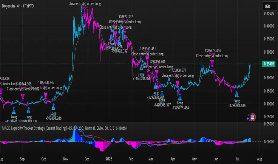
Example - DOGE Optimization (45/80/290 settings) :
• Performance : Optimized parameters yielding exceptional backtesting results with 29,800% PnL
• Why it works : DOGE's high volatility and social sentiment-driven price action benefits from heavily smoothed indicators
• Timeframes : Particularly effective on 30-minute and 4-hour charts for swing trading
• Logic : The very slow parameters filter out noise and capture only the most significant trend changes
Other Optimizable Cryptocurrencies : This parameter flexibility makes the strategy highly effective for major altcoins including SUI, SEI, LINK, Solana (SOL) , and many others. Each crypto asset can benefit from custom parameter tuning based on its unique volatility profile and trading characteristics.
Four Trading System Types
1. Normal System (Default)
Long signals : When MACD line is above the signal line
Short signals : When MACD line is below the signal line
Best for : Swing trading and capturing longer-term trends in stable markets
Logic : Traditional MACD crossover approach using the signal line
2. Fast System
Long signals : Bright Blue OR Dark Magenta (transparent) histogram colors
Short signals : Dark Blue (transparent) OR Bright Magenta histogram colors
Best for : Scalping and high-volatility markets (crypto, forex)
Logic : Leverages early momentum shifts based on histogram color changes
3. Safe System
Long signals : Only Bright Blue histogram color (strongest bullish momentum)
Short signals : All other colors (Dark Blue, Bright Magenta, Dark Magenta)
Best for : Risk-averse traders and choppy markets
Logic : Prioritizes only the strongest bullish signals while treating everything else as bearish
4. Crossover System
Long signals : MACD line crosses above signal line
Short signals : MACD line crosses below signal line
Best for : Precise timing entries with traditional MACD methodology
Logic : Pure crossover signals for more precise entry timing
Color-Coded Histogram Logic
The strategy uses four distinct colors to visualize momentum:
🔹 Bright Blue : MACD > 0 and rising (strong bullish momentum)
🔹 Dark Blue (Transparent) : MACD > 0 but falling (weakening bullish momentum)
🔹 Bright Magenta : MACD < 0 and falling (strong bearish momentum)
🔹 Dark Magenta (Transparent) : MACD < 0 but rising (weakening bearish momentum)
Trend Filter Integration
The strategy includes an advanced trend filter using 9 different moving average types:
SMA (Simple Moving Average)
EMA (Exponential Moving Average) - Default
WMA (Weighted Moving Average)
HMA (Hull Moving Average)
RMA (Running Moving Average)
LSMA (Least Squares Moving Average)
DEMA (Double Exponential Moving Average)
TEMA (Triple Exponential Moving Average)
VIDYA (Variable Index Dynamic Average)
Default Settings : 50-period EMA for trend identification
Visual Signal System
Entry Markers : Blue triangles (▲) below candles for long entries, Magenta triangles (▼) above candles for short entries
Candle Coloring : Price candles change color based on active signals (Blue = Long, Magenta = Short)
Signal Text : Optional "Long" or "Short" text inside entry triangles (toggleable)
Trend MA : Gray line plotted on main chart for trend reference
Parameter Optimization Examples
DOGE Trading Success (Optimized Parameters) :
Using 45/80/290 MACD settings with 50-period EMA trend filter has shown exceptional results on DOGE:
Performance : Backtesting results showing 29,800% PnL demonstrate the power of proper parameter optimization
Reasoning : DOGE's meme-driven volatility and social sentiment spikes create significant noise with traditional MACD settings
Solution : Very slow parameters (45/80/290) filter out social media-driven price spikes while capturing only major momentum shifts
Optimal Timeframes : 30-minute and 4-hour charts for swing trading opportunities
Result : Exceptionally clean signals with minimal false entries during DOGE's characteristic pump-and-dump cycles
Multi-Crypto Adaptability :
The same optimization principles apply to other major cryptocurrencies:
SUI : Benefits from smoothed parameters due to newer coin volatility patterns
SEI : Requires adjustment for its unique DeFi-related price movements
LINK : Oracle news events create price spikes that benefit from noise filtering
Solana (SOL) : Network congestion events and ecosystem developments need smoothed detection
General Rule : Higher volatility coins typically benefit from very slow MACD parameters (40-50 / 70-90 / 250-300 ranges)
Key Input Parameters
System Type : Choose between Fast, Normal, Safe, or Crossover (Default: Normal)
MACD Fast MA : 12 periods default (no maximum limit, consider 40-50 for crypto optimization)
MACD Slow MA : 26 periods default (no maximum limit, consider 70-90 for crypto optimization)
MACD Signal MA : 9 periods default (now properly utilized, consider 250-300 for crypto optimization)
Trend MA Type : EMA default (9 options available)
Trend MA Length : 50 periods default (no maximum limit)
Signal Display : Both, Long Only, Short Only, or None
Show Signal Text : True/False toggle for entry marker text
Trading Applications
Recommended Use Cases
Momentum Trading : Capitalize on strong directional moves using the color-coded system
Trend Following : Combine MACD signals with trend MA filter for higher probability trades
Scalping : Use "Fast" system type for quick entries in volatile markets
Swing Trading : Use "Normal" or "Safe" system types for longer-term positions
Cryptocurrency Trading : Optimize parameters for individual crypto assets (e.g., 45/80/290 for DOGE, custom settings for SUI, SEI, LINK, SOL)
Market Suitability
Volatile Markets : Forex, crypto, indices (recommend "Fast" system or smoothed parameters)
Stable Markets : Stocks, ETFs (recommend "Normal" or "Safe" system)
All Timeframes : Effective from 1-minute charts to daily charts
Crypto Optimization : Each major cryptocurrency (DOGE, SUI, SEI, LINK, SOL, etc.) can benefit from custom parameter tuning. Consider slower MACD parameters for noise reduction in volatile crypto markets
Alert System
The strategy provides comprehensive alerts for:
Entry Signals : Long and short entry triangle appearances
Exit Signals : Position exit notifications
Color Changes : Individual histogram color alerts
Trend Conditions : Price above/below trend MA alerts
Strategy Parameters
Default Settings
Initial Capital : $1,000
Position Size : 100% of equity
Commission : 0.1%
Slippage : 3 points
Date Range : January 1, 2018 to December 31, 2069
Risk Management (Optional)
Stop Loss : Disabled by default (customizable percentage-based)
Take Profit : Disabled by default (customizable percentage-based)
Short Trades : Disabled by default (can be enabled)
Important Notes and Limitations
Backtesting Considerations
Uses realistic commission (0.1%) and slippage (3 points)
Default position sizing uses 100% equity - adjust based on risk tolerance
Stop-loss and take-profit are disabled by default to show raw strategy performance
Strategy does not use lookahead bias or future data
Risk Warnings
Past performance does not guarantee future results
MACD-based strategies may produce false signals in ranging markets
Consider combining with additional confluences like support/resistance levels
Test thoroughly on demo accounts before live trading
Adjust position sizing based on your risk management requirements
Technical Limitations
Strategy does not work on non-standard chart types (Heikin Ashi, Renko, etc.)
Signals are based on close prices and may not reflect intraday price action
Multiple rapid signals in volatile conditions may result in overtrading
Credits and Attribution
This strategy is based on the original "MACD Liquidity Tracker System" indicator created by TheNeWSystemLqtyTrckr . This strategy version includes significant enhancements:
Complete strategy implementation with entry/exit logic
Addition of the "Crossover" system type
Proper implementation and utilization of the MACD signal line
Enhanced risk management features
Improved parameter flexibility with no artificial maximum limits
Additional alert systems for comprehensive trade management
The original indicator's core color logic and visual system have been preserved while expanding functionality for automated trading applications.
Tìm kiếm tập lệnh với "histogram"
Combined ATPC & MACD DivergenceTrend Optimizer + Divergence Finder in One Unified Tool
🔍 Overview:
This powerful dual-system indicator merges two proven analytical engines:
✅ The Algorganic Typical Price Channel (ATPC) — a custom trend oscillator that highlights mean-reversion and directional bias.
✅ A refined MACD system with divergence detection, enhanced with an adjusted Donchian midline for real-time trend strength filtering.
Together, they provide a high-confidence, multi-signal system ideal for swing trading, scalping, or confirming reversals with context.
⚙️ Core Components & Logic
🧠 1. ATPC Engine (Trend Commodity Index)
A momentum and volatility-normalized oscillator based on the typical price (H+L+C)/3:
TrendCI Line (Blue) – Main trend signal based on smoothed CCI logic.
TrendLine2 (Orange) – A slower smoothing of TrendCI for crossovers.
Key Zones (customizable):
🔴 Ultra Overbought: +73
🟣 Overbought: +58
🟣 Oversold: -58
🔴 Ultra Oversold: -73
Trade Logic:
✅ Buy Signal: TrendCI crosses above TrendLine2 while in oversold zone
❌ Sell Signal: TrendCI crosses below TrendLine2 while in overbought zone
Additional visual feedback:
Histogram Bars show strength and direction of momentum shift
Green/Red Circles highlight potential long/short setups
📉 2. MACD System + Divergence Finder
Classic MACD enhanced with a Donchian Midline overlay to filter trend bias.
🔷 MACD Line and 🟠 Signal Line show crossover momentum
🟩/🟥 Histogram shows distance from the signal line
🟪 Adjusted Donchian Midline dynamically adapts to range-bound vs trending environments
Background Color provides real-time trend state:
✅ Green = Bullish Trend
❌ Red = Bearish Trend
No color = Neutral / Choppy
MACD Boundaries (user-defined):
Overbought: +1.0
Oversold: -1.0
🔀 3. Divergence Detection
Spot hidden power shifts before price reacts:
🔼 Positive Divergence – Price makes lower lows, but MACD histogram rises
🔽 Negative Divergence – Price makes higher highs, but MACD histogram weakens
These are visually marked with:
Green “+Div” label (bullish reversal cue)
Red “–Div” label (bearish exhaustion signal)
🎯 How to Use It
For Trend Traders:
Stay in sync with macro trend using MACD histogram + background
Use ATPC crossovers for precision entries
Avoid signals during neutral background (chop filter)
For Reversal Traders:
Look for bullish +Div with ATPC buy signal in oversold zone
Look for bearish –Div with ATPC sell signal in overbought zone
Mid-Donchian line can act as confluence or breakout trigger
For Scalpers & Intraday Traders:
Combine with VWAP, liquidity zones, or order flow levels
ATPC crossovers + MACD histogram zero-line flip = potential scalp entry
Use histogram slope and divergence to avoid false momentum traps
🧩 Customizable Inputs
🎛️ ATPC: Channel & Smoothing lengths, overbought/oversold thresholds
🎛️ MACD: Fast/slow EMAs, signal smoothing, Donchian period, bounds
🎨 Fully theme-compatible with adjustable colors and line styles
🔔 Alerts (Add Your Own)
While this version doesn’t contain built-in alerts, you can easily add alerts based on:
buySignal or sellSignal from ATPC logic
Histogram cross zero or trend flip
MACD Divergence event
📜 “This indicator doesn't just show signals—it tells a story about who’s in control of the market, and when that control might be slipping.”
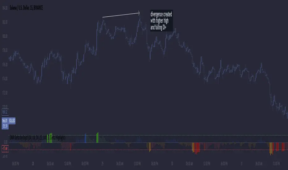
DMI Delta by 0xjcfOverview
This indicator integrates the Directional Movement Index (DMI), Average Directional Index (ADX), and volume analysis into an Oscillator designed to help traders identify divergence-based trading signals. Unlike typical volume or momentum indicators, this combination provides insight into directional momentum and volume intensity, allowing traders to make well-informed decisions based on multiple facets of market behavior.
Purpose and How Components Work Together
By combining DMI and ADX with volume analysis, this indicator helps traders detect when momentum diverges from price action—a common precursor to potential reversals or significant moves. The ADX filter enhances this by distinguishing trending from range-bound conditions, while volume analysis highlights moments of extreme sentiment, such as solid buying or selling. Together, these elements provide traders with a comprehensive view of market strength, directional bias, and volume surges, which help filter out weaker signals.
Key Features
DMI Delta and Oscillator: The DMI indicator measures directional movement by comparing DI+ and DI- values. This difference (DMI Delta) is calculated and displayed as a histogram, visualizing changes in directional bias. When combined with ADX filtering, this histogram helps traders gauge the strength of momentum and spot directional shifts early. For instance, a rising histogram in a bearish price trend might signal a potential bullish reversal.
Volume Analysis with Extremes: Volume is monitored to reveal when market participation is unusually high, using a customizable multiplier to highlight significant volume spikes. These extreme levels are color-coded directly on the histogram, providing visual cues on whether buying or selling interest is particularly strong. Volume analysis adds depth to the directional insights from DMI, allowing traders to differentiate between regular and powerful moves.
ADX Trending Filter: The ADX component filters trends by measuring the overall strength of a price move, with a default threshold of 25. When ADX is above this level, it suggests that the market is trending strongly, making the DMI Delta readings more reliable. Below this threshold, the market is likely range-bound, cautioning traders that signals might not have as much follow-through.
Using the Indicator in Divergence Strategies
This indicator excels in divergence strategies by highlighting moments when price action diverges from directional momentum. Here’s how it aids in decision-making:
Bullish Divergence: If the price is falling to new lows while the DMI Delta histogram rises, it can indicate weakening bearish momentum and signal a potential price reversal to the upside.
Bearish Divergence: Conversely, if prices are climbing but the DMI Delta histogram falls, it may point to waning bullish momentum, suggesting a bearish reversal.
Visual Cues and Customization
The color-coded output enhances usability:
Bright Green/Red: Extreme volume with strong bullish or bearish signals, often at points of high potential for trend continuation or reversal.
Green/Red Shades: These shades reflect trending conditions (bullish or bearish) based on ADX, factoring in volume. Green signals a bullish trend, and red is a bearish trend.
Blue/Orange Shades: Indicates non-trending or weaker conditions, suggesting a more cautious approach in range-bound markets.
Customizable for Diverse Trading Styles
This indicator allows users to adjust settings like the ADX threshold and volume multiplier to optimize performance for various timeframes and strategies. Whether a trader prefers swing trading or intraday scalping, these parameters enable fine-tuning to enhance signal reliability across different market contexts.
Practical Usage Tips
Entry and Exit Signals: Use this indicator in conjunction with price action. Divergences between the price and DMI Delta histogram can reinforce entry or exit decisions.
Adjust Thresholds: Based on backtesting, customize the ADX Trending Threshold and Volume Multiplier to ensure optimal performance on different timeframes or trading styles.
In summary, this indicator is tailored for traders seeking a multi-dimensional approach to market analysis. It blends momentum, trend strength, and volume insights to support divergence-based strategies, helping traders confidently make informed decisions. Remember to validate signals through backtesting and use it alongside price action for the best results.
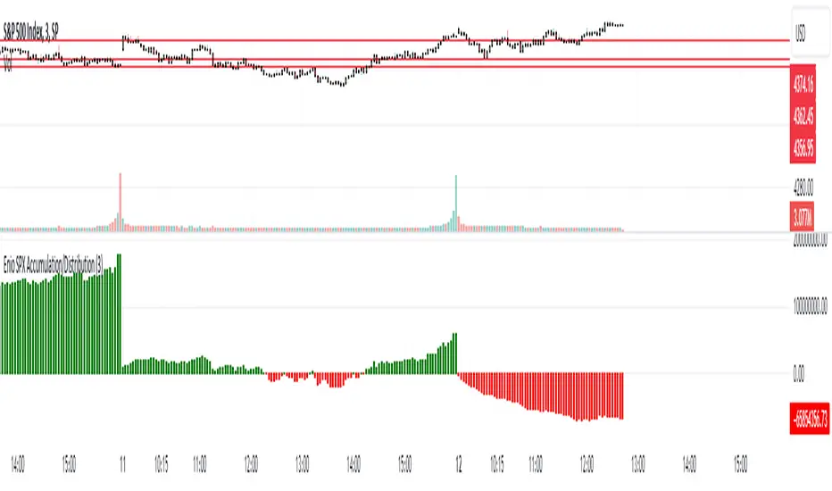
Enio_SPX_Accumulation/DistributionThis indicator handles the same inputs used for classic Accumulation and Distribution indicators, but performs the calculations in a different way.
This indicator is used to compare the positive volume (up volume) and the number of advancing stocks against the negative volume (down volume) and the number of declining stocks.
This indicator only measures SPX market breadth (Advancing issues, Declining issues) and SPX volume (Up and down volume)so it is for use only with SPX, SPY or MES. It can also be used with ES, but data outside of regular trading hours is not provided, the indicator in those cases will print a block of the same height and same color as the last RTH bar.
When the histogram is positive or green, the bars change to a lighter color if the current bar is less than the average of the last 3 bars. A continued set of bars with a lighter color could mean that the trend is about to change.
When the histogram is negative or red, the bars change to a lighter color if the current bar is greater than the average of the last 3 bars. A continued set of bars with a lighter color could mean that the trend is about to change.
When the histogram height is low, could signal a choppy market (SPX).
The histogram can help indicate a trending market when the opening trend is maintained and the color of the bars does not change, for example, a solid green increasing histogram can indicate a bullish trending market, while a solid red decreasing histogram will indicate a strong bearish trend.
In intraday trading the indicator can signal if the SPX price changes are supported by volume and market breadth and also allows you to see when these changes or trend are weakening.
The change from green (positive) to red (negative) and vice versa should not be taken alone as a buy/sell signal but as a confirmation of signals from other indicators you trust.
Due to the great specific weight that some stocks have within the SPX price calculation, the divergences of this indicator with SPX, can be taken as warning signals, but should not become an element of trading decisions. . You could see a negative histogram while SPX is positive and vice versa.
ADX Trend FilterADX Trend Filter Indicator is a traditional ADX indicator with a different presentation. its consist of two indicators EMA TREND and ADX / DMI
About Indicator:
1. BAND / EMA band to represent EMA Trend of EMA-12 and EMA-50
(Band is plotted at level-20 which is the Threshold level of DMI / ADX indicator)
2. Histogram showing the direction of ADX / DMI trend
3. Area behind the histogram showing ADX/DMI strength
How to use?
1. Histogram represents current Trend Red for Bearish / Green for Bullish
2. Area behind the histogram represents Strength of ADX / DMI Threshold level is 0-20(represented as band). (Area below the Band is Sideways)
3. Band represents the current MA Trend.
4. Buy Sell signals are plotted as triangles in red/green obtained from ADX / DMI Crossovers
Buy Signal (Green Triangle on band- ADX Crossover)
1.Band below Histogram must be Green
2.Histogram must be green
3.Area behind histogram must be above the lower trend band (20level) and visible
Sell Signal (Red Triangle on band- ADX Crossover)
1.Band below Histogram must be Red
2.Histogram must be Red
3.Area behind histogram must be above the lower trend band (20level) and visible
Alerts provided for ADX crossovers.

Stochastic Momentum Index (SMI) Refurbished▮Introduction
Stochastic Momentum Index (SMI) Indicator is a technical indicator used in technical analysis of stocks and other financial instruments.
It was developed by William Blau in 1993 and is considered to be a momentum indicator that can help identify trend reversal points.
Basically, it's a combination of the True Strength Index with a signal line to help identify turning points in the market.
SMI uses the stochastic formula to compare the current closing price of an asset with the maximum and minimum price range over a specific period.
He then compares this ratio to a short-term moving average to create an indicator that oscillates between -100 and +100.
When the SMI is above 0, it is considered positive, indicating that the current price is above the short-term moving average.
When it is below 0, it is considered negative, indicating that the current price is below the short-term moving average.
Traders use the SMI to identify potential trend reversal points.
When the indicator reaches an extreme level above +40 or below -40, a trend reversal is possible.
Furthermore, traders also watch for divergences between the SMI and the asset price to identify potential trading opportunities.
It is important to remember that the SMI is a technical indicator and as such should be used in conjunction with other technical analysis tools to get a complete picture of the market situation.
▮ Improvements
The following features were added:
1. 7 color themes, for TSI, Signal and Histogram.
2. Possibility to customize moving average type for TSI/Signal.
3. Dynamic Zones.
4. Crossing Alerts.
5. Alert points on specific ranges.
5. Coloring of bars according to TSI/Signal/Histogram.
▮ Themes
Examples:
▮ About Dynamic Zones
'Most indicators use a fixed zone for buy and sell signals.
Here's a concept based on zones that are responsive to the past levels of the indicator.'
The concept of Dynamic Zones was described by Leo Zamansky ( Ph .D.) and David Stendahl, in the magazine of Stocks & Commodities V15:7 (306-310).
Basically, a statistical calculation is made to define the extreme levels, delimiting a possible overbought/oversold region.
Given user-defined probabilities, the percentile is calculated using the method of Nearest Rank.
It is calculated by taking the difference between the data point and the number of data points below it, then dividing by the total number of data points in the set.
The result is expressed as a percentage.
This provides a measure of how a particular value compares to other values in a data set, identifying outliers or values that are significantly higher or lower than the rest of the data.
▮ What to look for
1. Divergences/weakening of a trend/reversal:
2. Supports, resistances, pullbacks:
3. Overbought/Oversold Points:
▮ Thanks and Credits
- TradingView and PineCoders: for SMI and Moving Averages
- allanster: for Dynamic Zones

CM_Williams_Vix_Fix - Market Top and Bottom with multi-timeframeThis is a modification of CM_Williams_Vix_Fix indicator to include both market tops and bottoms with multi-timeframe support. The original indicator only finds market bottoms.
All credits go to the original author ChrisMoody.
Original script link
Working:
The histogram above 0 signifies the trend of market going UP and the histogram below 0 signifies the trend of market going DOWN.
The histogram bar is calculated using "LookBack Period Standard Deviation High" number of candles. A threshold is calculated using bollinger bands and based on percentile of "Look Back Period Percentile High" number of candles.
If the histogram bar above 0 crosses the up threshold then we have market top which is signified by histogram bar having the color green. If the histogram bar below 0 crosses the down threshold then we have market bottom which is signified by histogram bar having the color red.
The market tops and bottoms can also be calculated across multiple timeframes.
Sample usage:
Suppose the market is in an uptrend and the indicator displays red market bottom bar, this might be an indication that the market has reached the end of a pullback. We can use additional indicators like stochastic or rsi to get additional confluence.
This indicator does not repaint but you need to wait for the candle to close.

Williams Vix Fix OHLC candles plot indicator (Tartigradia)OHLC candles plot of the Williams VixFix indicator, which allows to draw trend lines.
Williams VixFix is a realized volatility indicator developed by Larry Williams, and can help in finding market bottoms.
Indeed, as Williams describe in his paper, markets tend to find the lowest prices during times of highest volatility, which usually accompany times of highest fear. The VixFix is calculated as how much the current low price statistically deviates from the maximum within a given look-back period.
The Williams VixFix indicator is usually presented as a curve or histogram. The novelty of this indicator is to present the data as a OHLC candles plot: whereas the original Williams VixFix calculation only involves the close value, we here use the open, high and low values as well. This led to some mathematical challenges because some of these calculations led to absurd values, so workarounds had to be found, but in the end I think the result was worth it, it reproduces the VIX chart quite well.
A great additional value of the OHLC chart is that it shows not just the close value, but all the values during the session: open, high and low in addition to close. This allows to draw trend lines and can provide additional information on momentum and sentiment. In addition, other indicators can be used on it, as if it was a price chart, such as RSI indicators (see RSI+ (alt) indicator for example).
For more information on the Vix Fix, which is a strategy published under public domain:
The VIX Fix, Larry Williams, Active Trader magazine, December 2007, web.archive.org
Fixing the VIX: An Indicator to Beat Fear, Amber Hestla-Barnhart, Journal of Technical Analysis, March 13, 2015, ssrn.com
Replicating the CBOE VIX using a synthetic volatility index trading algorithm, Dayne Cary and Gary van Vuuren, Cogent Economics & Finance, Volume 7, 2019, Issue 1, doi.org
This indicator includes only the Williams VixFix as an OHLC candles or bars plot, and price / vixfix candles plot, as well as the typical vixfix histogram. Indeed, it is much more practical for unbounded range indicators to be plotted in their own separate panel, hence why this indicator is released separately, so that it can work and be scaled adequately out of the box.
Note that the there are however no bottom buy signals. For a more complete indicator, which also includes the OHLC candles plots present here, but also bottom signals and Inverse VixFix (top signals), see:
Set Index symbol to SPX, and index_current = false, and timeframe Weekly, to reproduce the original VIX as close as possible by the VIXFIX (use the Add Symbol option, because you want to plot CBOE:VIX on the same timeframe as the current chart, which may include extended session / weekends). With the Weekly timeframe, off days / extended session days should not change much, but with lower timeframes this is important, because nights and weekends can change how the graph appears and seemingly make them different because of timing misalignment when in reality they are not when properly aligned.
Dynamic Momentum Ecosystem Futures verI've reuploaded my previous uploaded script Dynamic Momentum Ecosystem, but this one specifically catered to futures trading.
The idea and underlying script function as usual.
Lime = Price closed higher + volume transacted higher than average + MACD Histogram increases + 13 EMA increases
Green = Price closed higher + MACD Histogram increases + 13 EMA increases
Red = Price closed lower + MACD Histogram decreases + 13 EMA decreases
Blue = Either MACD Histogram increases/decreases + 13 EMA increases/decreases
Lime candle is viewed as a robust bullish sign as price increases, supported by the rising MACD Histogram, 13EMA, and higher than average volumes transacted. Perfect for dip buying near the 20/50 MAs.
Green candle is viewed as bullish with the rising of MACD Histogram and EMA . Good for dip buying near the 20/50 MAs.
Red candle is viewed as bearish with the declining of MACD Histogram and EMA . Good for short entry. Can also be the early sign to take profits, as it could be the preliminary signal for trend reversal.
Blue candle is viewed as neutral.
The upper dotted purple line is the 52candles high.
The vertical grey line appears when the price > MA50 crosses above MA200, which is a golden crossover.
Traders are advised to time their entry using the impulse coloring system for stocks that are trading near the dotted line, following the grey line formation.

TEMA/HMA/VWMACD - Short Strategy 4HAs we can discover by studying the history of BTCUSD, the fall is always swift. Confirmation of this - today's collapse. In this strategy, an attempt is made to catch such drop by using quick entry and quick exit.
Let's describe what this strategy consists of:
• TEMA (you can find this strategy separately on this page or on platform)
• VWMACD
• HMA
• Take-profit and Stop-losses
Logic:
Firstly we VWMACD (the difference between VWMACD and simple MACD is only in the way of calculating moving average) and plot it as a histogram.
Then HMA is adding as a trend filter. For easy understanding let's plot it now on chart separately.
Next step is to create and add TEMA. After it is needed to subtract slow TEMA from fast TEMA and plot this value around 0 on histogram. This is the main decision for the implementation of the short trade.
ENTRY the trade:
When VMACD is below 0 and price (src = close) is below the HMA and TEMA below 0.
CLOSE the trade:
When VWMACD is upper than 0 or price is upper than HMA or TEMA is upper than 0
You can find more strategies on tradingammo.pro.

CT Reverse MACD CrossIntroducing the Reverse MACD Cross
MACD.... short for moving average convergence/divergence, is a trading indicator used in technical analysis of stock prices, created by Gerald Appel in the late 1970s.
It is designed to reveal changes in the strength, direction, momentum, and duration of a trend in a stock's price.
Prior work by Johny Dough showed how we can compute the price level required to make the MACD stay at its current level,
and also how to compute the price level required for the MACD to cross the zero line.
I have brought that idea to it logical conclusion for the MACD by creating a new function which also computes the price level required to cross the MACD with its signal line.
This allows the user to quickly see all of the most relevant information from the MACD and the actual price levels where the indicator will change its posture.
The MACD indicator (or "oscillator") is a collection of three time series calculated from historical price data, most often the closing price.
These three series are:
the MACD series proper shown here in blue
the "Signal Line" or "average" series shown here in red
the "Divergence" series which is the difference between the two shown here as a histogram.
There is also usually a baseline set at zero.
The MACD series is the difference between a "fast" (short period) exponential moving average (EMA), and a "slow" (longer period) EMA of the price series.
The average series (signal line) is an EMA of the MACD series itself.
The MACD indicator thus depends on three parameters, namely the time periods of the three EMAs.
The notation "MACD ( a, b, c )" usually denotes the standard indicator where the MACD series is the difference of EMAs with characteristic times a and b, and the average series is an EMA of the MACD series with characteristic time c.
There is an infobox which displays...
Whether the MACD is falling or rising
the price level which will make the MACD to change from rising to falling or vice versa
the price level which will cause the MACD to cross the signal line
the price level which will cause the MACD to cross the zero line
The most commonly used values are 12 for the fast, 26 for the slow, and 9 for the signal line, that is, MACD ( 12, 26, 9 ) .
The MACD and average series are customarily displayed as continuous lines in a plot whose horizontal axis is time oscillating above and below a zero line, whereas the divergence is commonly shown as a bar graph / histogram.
A fast EMA responds more quickly than a slow EMA to recent changes in a stock's price.
By comparing EMAs of different periods, the MACD series can indicate changes in the trend of a stock.
It is claimed that the divergence series can reveal subtle shifts in the stock's trend.
Since the MACD is based on moving averages, it is a lagging indicator. As a future metric of price trends, the MACD is less useful for stocks that are not trending (trading in a range) or are trading with unpredictable price action.
Elder Ray Bull and Bear Power OscillatorsElder Ray Bull and Bear Power Oscillators
Tradingview Screener Bull Bear Power(BBPOWER)
OVERVIEW
The Bull and Bear Power oscillators developed by Dr Alexander Elder attempt to measure the power of buyers (bulls) and sellers (bears) to push prices above and below the consensus of value. The primary principles on which Elder based the oscillator are:
The highest price displays the maximum buyer’s power within the day.
The lowest price displays the maximum seller’s power within the day.
The moving average can be construed as a price agreement between buyers and sellers for a given time period.
The Bulls/Bears power balance is important since changes in this balance can signal the early stages of a potential trend reversal.
CALCULATION
Elder uses a 13-day exponential moving average (EMA) to indicate the consensus market value.
Bull Power is calculated by subtracting the 13-day EMA from the day’s high.
Bear Power is derived by subtracting the 13-day EMA from the day’s low.
TRADING WITH THE ELDER RAY BULL AND BEAR POWER OSCILLATORS
BULL POWER
Where a currency uptrend is sustained to the point that maximum prices move above the EMA the Bull Power histogram will be greater than zero. As price maximums accelerate to greater levels (above the EMA) during the rising trend histogram bars will increase in height above the zero line showing the increased buying strength during the period.
BEAR POWER
Where a currency downtrend is sustained to the point that minimum prices move below the EMA the Bear Power histogram will be less than zero. As price minimums accelerate to lower levels (below the EMA) during the falling trend histogram bars will increase in height below the zero line showing increased selling strength during the period.
TRADING SIGNALS
It is important for traders to use the Elder Ray oscillators in conjunction with the EMA overlay over the price chart (typically as per period being analysed) to give additional context to the signals. Sell signals are given if Bull Power is above zero and there is a bearish divergence in the Bull Power histogram or if the Bull Power histogram is above zero and falling.
Buy signals are given if Bear Power is below zero and there is a bullish divergence in the Bear Power histogram or if the Bear Power histogram is below zero and rising. It is extremely important for traders to only trade in the above scenarios if the direction of the trend indicated by the slope of the EMA on the price chart is in the direction of their trade when the signal is given (or shortly after).
MacAlligatorO indicador é baseado nos parâmetros do Alligator de Bill Wiliams, onde o histograma mostra a diferença do preço médio em relação à mandíbula, vc consegue extrair setups como Ponto Contínuo, Breakout, Power Breakout, entre outros Ficou mais rápido do que o Awsome Oscilator. já que utiliza o pm puro ao invés da mediana entre os lábios e mandíbula.
A linha mais grossa é o acelerador, refere-se à diferença do preço médio e os lábios e com sua coloração medida pelos dentes, ficou mais ágil que o Accelerator Oscilator, já que usa o pm puro ao invés de subtrair do AO.
E a linha mais fina é por minha conta e demonstra a qualidade da tendência e divergências. 'É relativamente simples de se operar, mas precisa acostumar os olhos. Um setup simples é esperar uma boa tendência no histograma e entrar quando o acelerador voltar próximo ou menor que zero, no rompimento da máxima do candle ou abertura, dependendo da sua confiança.
Tanh Clamped Momentum Oscillator [Alpha Extract]A sophisticated momentum measurement system that combines dual EMA trend analysis with volatility-weighted pressure calculations, applying hyperbolic tangent normalization for bounded oscillator output with adaptive signal generation. Utilizing ATR-based volatility regime detection and candle pressure metrics, this indicator delivers institutional-grade momentum assessment with multi-tiered band structure and pulse-based envelope visualization. The system's tanh clamping methodology prevents extreme outliers while maintaining sensitivity to genuine momentum shifts, combined with histogram divergence detection and comprehensive alert framework for high-probability reversal and continuation signals.
🔶 Advanced Dual-Component Momentum Engine
Implements hybrid calculation combining EMA trend differential with candle pressure analysis, weighted by volatility regime assessment for context-aware momentum measurement. The system calculates fast and slow EMA difference normalized by ATR, measures intrabar pressure as close-open relative to range, applies volatility-based weighting between trend and pressure components, and produces composite raw momentum capturing both directional bias and internal candle dynamics.
// Core Momentum Framework
EMA_Fast = ta.ema(src, Fast_Length)
EMA_Slow = ta.ema(src, Slow_Length)
Trend = EMA_Fast - EMA_Slow
// Volatility Regime Detection
ATR_Short = ta.atr(ATR_Length)
ATR_Long = ta.atr(ATR_Length * 2)
Vol_Ratio = ATR_Short / ATR_Long
Vol_Weight = clamp((Vol_Ratio - 0.5) / 1.0, 0, 1)
// Pressure Component
Pressure = (close - open) / (high - low)
// Composite Momentum
Raw = Trend_Normalized * Vol_Weight + Pressure_Scaled * (1 - Vol_Weight)
🔶 Hyperbolic Tangent Normalization Framework
Features sophisticated tanh transformation that clamps raw momentum into bounded range while preserving proportional sensitivity across varying market conditions. The system applies safe exponential calculations with input capping to prevent overflow, computes hyperbolic tangent to compress extreme values while maintaining linearity near zero, and scales output by configurable factor creating oscillator with enhanced dynamic range and reduced outlier distortion.
// Tanh Clamping Logic
tanh(x) =>
x_clamped = clamp(x, -5.0, 5.0)
e = exp(2.0 * x_clamped)
(e - 1.0) / (e + 1.0)
Oscillator = tanh(Smoothed_Momentum / Clamp_Factor) * Scale
🔶 Volatility Regime Weighting System
Implements intelligent volatility assessment comparing short-term and long-term ATR to determine market regime, dynamically adjusting weight between trend and pressure components. The system calculates ATR ratio, normalizes to 0-1 range, and uses this weight factor to emphasize trend component during high-volatility regimes and pressure component during low-volatility consolidations, creating adaptive momentum sensitive to market microstructure.
🔶 Multi-Tiered Band Architecture
Provides comprehensive threshold structure with soft, hard, and maximum bands marking progressive momentum extremes for graduated overbought/oversold assessment. The system establishes configurable levels at soft zones (initial caution), hard zones (strong extreme), and maximum zones (critical overextension) with visual differentiation through line styles and background highlighting, enabling nuanced interpretation beyond binary extreme detection.
🔶 Pulse Envelope Visualization
Features dynamic envelope bands calculated from exponential moving average of absolute oscillator value, creating adaptive boundary that expands during momentum acceleration and contracts during deceleration. The system applies configurable length and width multiplier to pulse calculation, fills area between positive and negative pulse bounds with gradient coloring matching oscillator direction, providing visual context for momentum magnitude relative to recent activity.
🔶 Signal Line Integration Framework
Implements dual-mode signal line supporting both EMA and SMA smoothing of primary oscillator for crossover-based swing detection. The system calculates configurable-length moving average, generates histogram differential between oscillator and signal, applies additional smoothing to histogram for noise reduction, and uses crossovers/crossunders as momentum swing indicators distinguishing bullish and bearish momentum shifts.
🔶 Histogram Divergence Display
Creates column-style histogram visualization showing oscillator-signal differential with intensity-based coloring reflecting momentum acceleration or deceleration. The system plots histogram bars in bright colors when expanding (accelerating momentum) and faded colors when contracting (decelerating momentum), enabling instant visual identification of momentum divergences and convergences without numerical analysis.
🔶 Advanced Reversion Signal Logic
Generates overbought/oversold signals requiring both signal line crossover and extreme threshold breach for high-conviction reversal identification. The system triggers oversold when oscillator crosses above signal while below negative reversion level, triggers overbought when crossing below signal while above positive reversion level, and plots small circle markers at signal locations for clear visual confirmation of setup conditions.
🔶 Comprehensive Alert Framework
Provides six distinct alert conditions covering overbought/oversold reversions, midline trend changes, and oscillator-signal swings with configurable notification preferences. The system includes alerts for extreme reversions (OB/OS), zero-line crossovers (trend changes), and signal line crossovers (momentum swings), enabling traders to monitor critical oscillator events across multiple signal types without constant chart observation.
🔶 Adaptive Bar Coloring System
Implements four coloring modes including midline cross (trend direction), extremities (threshold breach), reversions (OB/OS signals), and slope (oscillator vs signal) for customizable visual integration. The system applies selected color scheme to candles providing chart-level momentum feedback, with option to disable coloring for minimal visual interference while maintaining oscillator pane analysis.
🔶 Performance Optimization Architecture
Utilizes efficient tanh calculation with safe clamping, streamlined EMA computations, and optimized ATR ratio processing for smooth real-time updates. The system includes intelligent null handling, minimal recalculation overhead through smart smoothing application, and configurable display toggles allowing users to disable unused visual elements for enhanced performance during extended historical analysis.
🔶 Why Choose Tanh-Clamped Momentum Oscillator ?
This indicator delivers sophisticated momentum analysis through hybrid trend-pressure calculation with volatility-adaptive weighting and hyperbolic tangent normalization. Unlike traditional momentum oscillators susceptible to extreme outlier distortion, the tanh clamping ensures bounded output while preserving sensitivity to genuine momentum shifts. The system's dual-component architecture combining directional trend with intrabar pressure, weighted by volatility regime assessment, creates context-aware momentum measurement that adapts to market microstructure. The multi-tiered band structure, pulse envelope visualization, and comprehensive signal framework make it essential for traders seeking nuanced momentum analysis with graduated extreme detection and high-probability reversal signals across cryptocurrency, forex, and equity markets.

ADX DMI SqueezeOverview
This indicator combines:
ADX / DMI → Measures trend strength and direction
ADX Squeeze Histogram → Shows when the trend is accelerating or “squeezing” for a breakout
Triangles → Highlight potential expansion points
Optional DI+ / DI− lines → Show bullish/bearish dominance
ADX Threshold Lines (15 / 20) → Help filter weak trends
Early ADX Acceleration Dots → Provide an early heads-up before a squeeze fires
It can be used standalone or alongside other trend tools like VWAP for better entry timing.
Entry Guidelines
Long Trades (Buy):
Histogram above 0
Green triangle appears
ADX rising or above threshold (15/20 recommended)
Optional: DI+ > DI− confirms bullish strength
Short Trades (Sell):
Histogram above 0
Red triangle appears
ADX rising or above threshold (15/20 recommended)
Optional: DI− > DI+ confirms bearish strength
Avoid trades if:
Histogram negative
Triangles appear but ADX below threshold or trend not confirmed by DI linesOptional Filters
Require ADX acceleration: Only shows signals when ADX is increasing → avoids late or false entries
VWAP Bias: Session-anchored institutional positioning (best for open & intraday scalps).
MA Bias: Time-based trend direction (best for continuation & trend days).
Tips
Best on 30-min or higher timeframes for swing/short-term trend trades
Can be combined with VWAP Moving averages , support/resistance, or Bollinger Bands
Use DI lines toggle if you want extra visual trend confirmation
Adjust DMI length (sensitivity) and ADX smoothing for your preferred timeframe
Interpretation
Histogram turning green above 0 + triangle → strong bullish move forming
Histogram turning red above 0 + triangle → strong bearish move forming
ADX above 20 → strong trend, more reliable
ADX below 15 → weak trend, signals less reliable
In short:
Long = Green bars above 0 + Green triangle
Short = Red bars above 0 + Red triangle
Confirm with ADX above threshold and optionally DI lines
yesterday

Luminous Volume Flow [Pineify]Luminous Volume Flow
The Luminous Volume Flow is a specialized volume-based momentum oscillator designed to uncover the underlying buying and selling pressure within the market. Unlike traditional volume indicators that simply aggregate volume based on the close relative to the open, LVF analyzes intrabar dynamics—specifically the relationship between the close price and the high/low wicks—to estimate the dominance of buyers or sellers.
By smoothing this raw volume delta and applying a signal line, the LVF provides a clear visual representation of volume flow, helping traders identify trend strength, potential reversals, and momentum shifts with high-definition "luminous" visuals.
Key Features
Intrabar Pressure Analysis : Calculates buying and selling pressure based on wick dynamics and price polarity to provide a more granular view of market sentiment.
Multi-Type Smoothing : Offers selectable Moving Average types (SMA, EMA, RMA) for the main Flow Line to adapt to different market volatilities.
Luminous Visuals : Utilizes dynamic color gradients that brighten as momentum expands and darken as it contracts, offering immediate visual feedback on trend intensity.
Sentiment Cloud : Fills the area between the Flow and Signal lines to clearly visualize the prevailing bullish or bearish sentiment.
High-Contrast Signals : Optional high-contrast signal markers for clear crossover identification.
How It Works
The LVF operates on a multi-stage calculation process:
Pressure Calculation : The script compares the lower wick (Close - Low) against the upper wick (High - Close).
If the lower wick is longer, it suggests buying pressure (rejection of lower prices), and volume is assigned to Buy Pressure .
If the upper wick is longer, it suggests selling pressure (rejection of higher prices), and volume is assigned to Sell Pressure .
If equal, the Close > Open polarity is used as a tie-breaker.
Raw Delta : The difference between Buy and Sell Pressure is calculated to determine the net volume flow for the bar.
Flow Line : The Raw Delta is smoothed using a user-selected Moving Average (SMA, EMA, or RMA) over the Flow Length period. This creates the main oscillator line.
Signal Line : An EMA of the Flow Line is calculated to generate the Signal Line, similar to the MACD mechanic.
Histogram : The difference between the Flow Line and Signal Line determines the Histogram, which drives the "Luminous" color gradient logic.
Trading Ideas and Insights
Trend Confirmation : When the Flow Line is above the Signal Line and the Cloud is green, the bullish trend is supported by volume. Conversely, a red cloud indicates bearish volume dominance.
Momentum Crossovers : The triangle shapes indicate crossovers between the Flow and Signal lines. A triangle up (Green) suggests a potential bullish entry or invalidation of a short bias. A triangle down (Red) suggests a bearish turn.
Expansion vs. Contraction : Pay attention to the brightness of the histogram columns. Bright colors indicate expanding momentum (a strong move), while darker, fading colors suggest the move is losing steam, potentially preceding a consolidation or reversal.
How multiple components work together
This script combines the logic of Volume Delta analysis with Signal Line Crossover mechanics (popularized by MACD). By applying trend-following smoothing to raw volume data, we transform erratic volume spikes into a coherent flow. The "Luminous" visual layer is added to make the data interpretation intuitive—removing the need to mentally calculate the rate of change based on histogram height alone.
Unique Aspects
Adaptive Gradient Coloring : The histogram doesn't just show positive/negative values; it visually communicates the *acceleration* of the move via color intensity based on standard deviation.
Wick-Based Volume Attribution : Instead of a binary close-to-open comparison, LVF respects the price action within the candle (the wicks), acknowledging that a long lower wick on a red candle can actually represent significant buying interest.
How to Use
Add the indicator to your chart.
Adjust the Flow Length to match your trading timeframe (lower for scalping, higher for swing trading).
Select your preferred Smoothing Type (EMA is default and recommended for responsiveness).
Use the "Sentiment Cloud" filter: Look for long signals only when the cloud is green, and short signals when the cloud is red.
Monitor the Luminous Histogram for signs of exhaustion (colors fading) to manage exits.
Customization
Flow Length : Period for the main smoothing (Default: 14).
Signal Length : Period for the signal line (Default: 9).
Smoothing Type : Choose between SMA, EMA, or RMA.
Colors : Fully customizable colors for Bullish/Bearish phases and signals.
Chart Bars : Option to color the main chart candles based on the Flow direction.
Conclusion
The Luminous Volume Flow is a robust tool for traders who want to go beyond price action and understand the volume dynamics driving the market. By visualizing the flow of buying and selling pressure with advanced smoothing and reactive visuals, it provides a clearer picture of market sentiment than standard volume bars.

TTM Squeeze (ThinkOrSwim style)This script is a TradingView implementation of the classic TTM Squeeze indicator popularized in ThinkOrSwim.
It is not a line-by-line replica of the proprietary ThinkOrSwim study, but it follows the same core logic and purpose:
detecting volatility compression and release, combined with directional momentum, to anticipate strong price moves.
How it works
1. Squeeze condition (volatility)
Bollinger Bands (20, 2.0) are compared against Keltner Channels (20, 1.5).
When Bollinger Bands are inside the Keltner Channel, volatility is compressed (squeeze ON).
When Bollinger Bands expand outside the Keltner Channel, volatility is released (squeeze OFF).
This is shown by the dots on the zero line:
Red dots → Squeeze ON (low volatility, market coiling)
Green dots → Squeeze OFF (volatility expanding, potential move)
2. Momentum histogram
Momentum is calculated using a linear regression of price relative to a dynamic equilibrium level (similar to ThinkOrSwim’s internal logic).
The histogram shows both direction and acceleration.
Histogram colors:
Bright green → Momentum above zero and increasing (bullish acceleration)
Dark green → Momentum above zero but decreasing (bullish deceleration)
Bright red → Momentum below zero and decreasing (bearish acceleration)
Dark red → Momentum below zero but increasing (bearish deceleration)
How to use it
The indicator is best used in three steps:
Wait for red dots (squeeze ON) → volatility compression.
Observe the histogram direction building during the squeeze.
When dots turn green (squeeze OFF), look for entries in the direction of the histogram, ideally aligned with market structure.
This indicator is not meant to be traded mechanically.
It works best when combined with:
price structure
support/resistance
higher-timeframe context
Notes
Due to platform differences, results may vary slightly from ThinkOrSwim on individual bars.
Conceptually and operationally, the indicator fulfills the same role and trading logic as the original TTM Squeeze.

Titan Precision Oscillator v2.1 (Ultra Viz)Experience the next evolution of momentum trading. The Titan Precision Oscillator is not just another MACD; it is a high-performance tool re-engineered with Zero Lag Exponential Moving Average (ZLEMA) mathematics to eliminate the traditional delay found in standard indicators.
This "Ultra Viz" edition (v2.1) solves a common problem: visibility. We have introduced a dynamic Histogram Multiplier, allowing you to scale the histogram bars proportionally to the signal lines, ensuring you never miss a divergence or momentum shift due to poor scaling.
Key Features:
🚀 Zero Lag Technology: Built on ZLEMA logic, providing signals much faster than the standard MACD, allowing for earlier entries and exits.
📊 Proportional Scaling: New Histogram Multiplier input allows you to increase the visual size of the histogram without altering the underlying math. Perfect for checking momentum at a glance.
👁️ Ultra-Viz Design: High-contrast neon color palette (Cyberpunk style) designed for dark mode, reducing eye strain and highlighting trend strength instantly.
⚡ Clarity: Visual crossover dots and a dynamic "Cloud" fill make trend changes unmistakable.
How to Use & Best Practices:
Timeframes:
Scalping (1m - 5m): Highly effective due to the lag reduction. It reacts quickly to volatility spikes.
Day Trading (15m - 1H): The sweet spot for trend confirmation and swing entries.
Swing (4H+): Excellent for identifying major market reversals with zero-line crosses.
Recommended Assets:
Perfect for Indices (Nasdaq, S&P500, Mini-Indices), Forex, and Crypto due to its responsiveness to volatility.
Trading Signals:
Crossovers: White dots indicate immediate entry points.
Histogram Color: Bright Neon indicates accelerating momentum; Faded color indicates exhaustion/pullback.
Divergence: Because of the ZLEMA precision, divergences between price and the Titan Oscillator are often more reliable than standard oscillators.
Configuration:
Histogram Multiplier: Default is 4.0x. Adjust this up or down depending on the volatility of the asset to make the bars fit your screen perfectly.
Inputs: Fully customizable Fast/Slow/Signal lengths to tune for your specific strategy.

Volatility Momentum Suite | Lyro RSVolatility Momentum Suite is an advanced momentum and volatility-based oscillator designed to deliver a complete view of trend strength, acceleration, and market extremes in a single pane. By combining rate-of-change smoothing, adaptive moving averages, standard deviation bands, and momentum acceleration, the indicator provides clear structural insight into trend continuation, exhaustion, and potential reversals.
Built with multiple display and signal modes, it adapts seamlessly to both trend-following and mean-reversion workflows while maintaining strong visual clarity.
Key Features
Momentum Core (Smoothed RoC)
The foundation of the indicator is a Rate of Change (RoC) calculation applied to a selectable price source. This RoC is smoothed using one of 14+ moving average types, including EMA, HMA, KAMA, FRAMA, JMA, and more, allowing precise control over responsiveness versus smoothness.
Standard Deviation Bands
Dynamic deviation bands are calculated around the smoothed momentum line using rolling standard deviation. Two band layers are plotted:
Inner bands for early expansion signals
Outer bands for extreme conditions
These bands adapt automatically to volatility, highlighting momentum expansions, compressions, and exhaustion zones.
Momentum Acceleration
A dedicated acceleration line measures the momentum of momentum itself. This helps identify:
Early trend ignition
Momentum deceleration before reversals
Continuation strength during expansions
Acceleration smoothing and MA type are fully configurable.
Multi-Mode Signal System
Trend Mode
Colors momentum and price according to position above or below the zero line, emphasizing directional bias and trend continuation.
Heikin Ashi Candles Mode
Applies Heikin Ashi logic directly to the momentum series, filtering noise and revealing smoother trend transitions through candle structure.
Extremes Mode
Detects statistically extreme momentum conditions beyond outer deviation bands. Signals are only confirmed after a Heikin Ashi momentum flip, reducing premature reversal entries.
Histogram Mode
Displays the difference between momentum and its signal line as a histogram, useful for divergence spotting and momentum shifts.
Histogram & Signal Line
An EMA signal line is applied to the smoothed momentum, producing a histogram that visually tracks momentum expansion, contraction, and directional changes with adaptive coloring.
Visual Customization
Choose from multiple predefined color palettes:
Classic
Mystic
Accented
Royal
Or define your own bullish and bearish colors.
Additional visual features include:
Momentum-colored candles
Heikin Ashi momentum candles
Band shading and fills
Optional zero-line reference
Integrated Status Table
A built-in table summarizes the real-time state of:
Trend bias
Heikin Ashi momentum direction
Extreme overbought / oversold conditions
This allows rapid decision-making without needing to interpret every visual element manually.
How It Works
Momentum Calculation
Computes Rate of Change on the selected source and smooths it using the chosen moving average.
Volatility Structure
Builds adaptive deviation bands from rolling standard deviation of the momentum line.
Acceleration Layer
Measures the rate of momentum change to detect early shifts in strength.
Mode-Dependent Logic
Trend mode focuses on directional bias
HA mode smooths momentum structure
Extremes mode filters reversals using volatility and HA confirmation
Histogram mode emphasizes momentum differentials
Signals & Alerts
Automatic alerts trigger on:
Momentum crossing above or below zero
Heikin Ashi momentum flips
Confirmed overbought and oversold extremes
Practical Use
Trend Confirmation: Sustained momentum above zero with expanding bands supports trend continuation.
Reversal Identification: Momentum pushing beyond outer bands followed by HA confirmation often precedes reversals.
Momentum Quality: Acceleration helps distinguish strong breakouts from weakening moves.
Multi-Timeframe Alignment: Use higher timeframes for bias and lower timeframes for precision entries using the same indicator.
Customization
Adjust RoC length and smoothing for sensitivity
Tune band length and multipliers for volatility conditions
Select display and signal modes based on strategy type
Fully customize colors to match your chart environment
⚠️ Disclaimer
This indicator is a technical analysis tool and does not guarantee results. It should be used alongside other forms of analysis and proper risk management. The author assumes no responsibility for trading decisions made using this indicator.

Session VWAP Cumulative BiasThe Session VWAP Cumulative Bias indicator is designed to differentiate between "choppy" price action and true "institutional" trend days. Unlike standard VWAP indicators that only show where price is now, this tool tracks the cumulative sentiment of the entire session.
Core Functions:
Cumulative Z-Score Logic: It calculates the distance between price and VWAP (in Standard Deviations) and sums it up over the course of the day. This reveals the "weight" of the market bias—the longer price stays pinned away from the VWAP, the more extreme the histogram becomes.
Scale Protection: It includes a "Capping" mechanism that prevents morning gaps or low-volume outliers from distorting the scale, ensuring the histogram remains readable from open to close.
Momentum vs. Regime Toggles: Users can switch between VWAP Slope (measuring the speed of the average's movement) and Cumulative Bias (measuring total session dominance).
Visual price Overlay: It automatically colors the price candles and plots a session-anchored VWAP line on the main chart, providing a clear visual of when price is "fair" versus "overextended."
How to read it:
Trend Confirmation: A steadily growing "mountain" in the histogram confirms an institutional trend day where dips are being bought (or rips sold).
Mean Reversion: When price hits a new high but the Cumulative Histogram begins to round off or diverge, it signals that the "elastic band" is stretched and price is likely to return to the orange VWAP line.
Regime Shifts: A cross of the zero-line on the histogram indicates a total shift in session control from buyers to sellers (or vice versa).

Accumulation/Distribution Oscillator [MarkitTick]💡 This script presents a statistically normalized evolution of the classic Accumulation/Distribution (A/D) indicator, designed to transform unbounded volume flow into a bounded, actionable oscillator. By integrating Relative Volume (RVOL) weighting and Z-Score standardization, this tool isolates genuine institutional buying and selling pressure from market noise, offering a clear view of volume momentum regimes.
✨ Originality and Utility
The standard Accumulation/Distribution line is a cumulative total of volume flow, which often results in an unbounded line that drifts indefinitely with price trends. This makes it difficult for traders to identify overextended conditions or specific turning points.
This script solves that problem through a three-stage quantitative process:
Smart Volume Weighting: Instead of treating all volume equally, this indicator amplifies the impact of high-volume nodes using a Relative Volume (RVOL) filter. This ensures that significant institutional activity carries more weight than low-liquidity chopping.
Detrending: It subtracts a smoothed average (using ALMA, EMA, or others) from the raw A/D line to create a raw oscillator.
Normalization: Finally, it applies a Z-Score calculation to normalize the data. This bounds the oscillator around a zero mean, allowing for the application of Bollinger Bands to detect statistical extremes (2 or 3 standard deviations).
🔬 Methodology and Concepts
The calculation logic follows a strict quantitative pipeline:
● Money Flow Multiplier (MFM)
The core engine is the classic MFM calculation, which determines the location of the Close relative to the High-Low range. A Close near the High results in +1, while a Close near the Low results in -1.
● Advanced Volume Filtering
Before accumulation, the volume is processed through two filters:
RVOL Multiplier: If the current bar's volume exceeds its simple moving average (`rvol_len`), the volume is multiplied by a user-defined factor (`rvol_mult`). This emphasizes breakout candles.
Candle Strength (Optional): If enabled, weight is increased based on how close the price closes to the absolute high or low, rewarding decisive candle shapes.
● Z-Score Standardization
The script calculates the "Raw Oscillator" by subtracting a moving average (Signal Line) from the cumulative A/D Line. It then calculates the Z-Score of this raw value over a lookback period (`z_len`).
Formula: Z = (Value - Mean) / Standard Deviation
🎨 Visual Guide
The indicator renders a complex data set into an easy-to-read interface:
• The Oscillator (Line & Histogram)
The primary output is the Z-Score value.
Teal Histogram/Line: Represents Bullish momentum (Accumulation). Darker Teal indicates accelerating momentum (`osc > previous`), while lighter Teal indicates decaying momentum.
Red Histogram/Line: Represents Bearish momentum (Distribution). Darker Red indicates accelerating selling pressure, while lighter Red indicates exhaustion.
Gray: If the Trend Filter (200 EMA) or VWAP Filter is enabled and the signal opposes the trend, the histogram turns Gray to indicate a low-probability counter-trend signal.
• Bollinger Bands (Blue Bands)
These bands wrap around the oscillator line.
Upper Band: Usually set to +2 Standard Deviations. When the oscillator pierces this band, accumulation is statistically extreme (potential mean reversion or strong breakout).
Lower Band: Usually set to -2 Standard Deviations. Indicates statistically extreme distribution.
• Divergences
The script automatically detects and plots structural divergences:
Green Lines/Labels: Bullish Divergence. Price makes a Lower Low while the Oscillator makes a Higher Low.
Red Lines/Labels: Bearish Divergence. Price makes a Higher High while the Oscillator makes a Lower High.
• Multi-Timeframe (MTF) Dashboard
Located in the top right, this table displays the momentum status (BULL/BEAR) of the oscillator across three user-defined timeframes (default: 60min, 240min, Daily), allowing for fractal trend analysis.
📖 How to Use
This tool is best used for identifying trend exhaustion and hidden volume strength.
1. Trend Continuation
In a strong uptrend, look for the Histogram to remain Teal and above the Zero line. A pullback to the Zero line that bounces back up suggests buyers are stepping in to defend the trend.
2. Statistical Extremes
When the oscillator line breaks outside the Bollinger Bands, volume flow is significantly deviated from the norm.
If price is ranging, this often signals a reversal (Reversion to Mean).
If price is breaking out, this confirms strong impulse participation.
3. Divergence Reversals
A divergence is a leading signal. If price is pushing new highs but the A/D Oscillator fails to make a new high (Red Divergence Line), it indicates that the volume supporting the move is drying up, often preceding a correction.
⚙️ Inputs and Settings
● Oscillator Settings
Smoothing Type/Length: Choose between ALMA, EMA, SMA, etc., to smooth the A/D line. ALMA is default for its zero-lag properties.
ALMA Offset/Sigma: Fine-tune the responsiveness of the Arnaud Legoux Moving Average.
● Quant Filters
RVOL Lookback & Multiplier: Determines the threshold for "High Volume." Default is 1.5x average volume.
Z-Score Lookback: The period used to establish statistical significance (Default: 100).
Use VWAP/Trend Filter: Logical switches to gray out signals that contradict the macro trend (200 EMA) or the intraday mean (VWAP).
● Dashboard
Customize the three timeframes displayed in the MTF table to match your trading horizon (e.g., Scalpers might use 5m, 15m, 1h).
🔍 Deconstruction of the Underlying Scientific and Academic Framework
This indicator relies on the Law of Supply and Demand quantified through Standard Score (Z-Score) Statistics .
Standard Accumulation/Distribution is derived from the work of Marc Chaikin, positing that the proximity of the close to the high/low on high volume indicates the "smart money" flow. However, raw cumulative data suffers from heteroscedasticity (varying variance).
By applying Z-Score normalization:
Z = (x - μ) / σ
We transform the data into a standard normal distribution. This allows us to apply probability theory to volume analysis. A value of +2.0 is not merely "high"; it represents a volume flow intensity that falls within the top 2.2% of the data set (assuming normal distribution), providing a mathematically robust definition of "Overbought" or "Oversold" volume conditions.
⚠️ Disclaimer
All provided scripts and indicators are strictly for educational exploration and must not be interpreted as financial advice or a recommendation to execute trades. I expressly disclaim all liability for any financial losses or damages that may result, directly or indirectly, from the reliance on or application of these tools. Market participation carries inherent risk where past performance never guarantees future returns, leaving all investment decisions and due diligence solely at your own discretion.

Zero Lag Moving Average Convergence Divergence (ZLMACD) [EVAI]Zero Lag Moving Average Convergence Divergence (ZLMACD)
ZLMACD is a MACD-style momentum oscillator that keeps the standard MACD structure while adding a practical “zero-lag” option through ZLEMA. It is intended for traders who like the familiar MACD workflow but want an oscillator that can respond earlier during transitions without turning into an overly noisy trigger.
The indicator plots the MACD line, the signal line, and the histogram around a zero baseline. If you already understand MACD, you already understand how to read this. The difference is that you can choose whether the oscillator and signal are driven by EMA, SMA, or ZLEMA, which changes the responsiveness and smoothness of the indicator.
Default behavior
This script defaults to the preset mode “ZLEMA osc + EMA signal.” In this configuration, the fast and slow oscillator averages are computed using ZLEMA, while the signal line remains an EMA of the MACD line. The reason for this mix is simple: ZLEMA tends to reduce lag in the oscillator, while EMA on the signal line helps keep crossovers readable and avoids excessive micro-signals.
In practice, this default preset often behaves like a “faster MACD” that still feels like MACD. It can highlight momentum turns earlier than a traditional EMA MACD while keeping the signal line stable enough to use for timing and confirmation.
Custom mode and MA selection
If you switch Mode to “Custom,” the indicator will use your selected moving average types for both the oscillator and the signal line. In Custom mode, the oscillator type applies to both fast and slow averages, and the signal type applies to the smoothing of the MACD line.
If you are in the default preset mode, the custom MA dropdowns will not change the calculations. This is intentional: the preset locks the MA types so the default behavior remains consistent and reproducible across charts and users.
Reading the indicator
The histogram reflects the distance between the MACD line and the signal line. When the histogram is above zero, the MACD line is above the signal line and momentum is biased upward; when it is below zero, the MACD line is below the signal line and momentum is biased downward. Changes in histogram height help visualize strengthening versus weakening momentum, while the zero baseline provides regime context by indicating whether the fast average is above or below the slow average.
Crossovers between MACD and signal behave exactly as they do in standard MACD, but the timing and “feel” will vary depending on the MA choices. ZLEMA on the oscillator typically makes turns appear earlier; SMA typically smooths more but can be slower; EMA tends to be the balanced baseline.
Alerts
Two alert conditions are included to detect histogram polarity shifts. One triggers when the histogram switches from non-negative to negative, and the other triggers when it switches from non-positive to positive. These are useful if you want simple notifications for momentum regime flips without staring at the chart continuously.
Notes
This indicator is provided for informational and educational purposes only and is not financial advice. Always test settings per instrument and timeframe and use risk management.

Volume Flow and Delta Analysis [MarkitTick]💡This comprehensive technical indicator is designed for traders who require a granular view of market participation that goes beyond standard volume bars. By leveraging the advanced "Intrabar Analysis" capabilities of Pine Script, this tool deconstructs every single price candle on your chart into its constituent lower-timeframe components. It effectively "X-rays" the market to determine whether the volume inside a bar was primarily driven by aggressive buying or aggressive selling, providing a definitive read on market sentiment and institutional control.
● Originality and Utility
Most standard volume indicators display a simple aggregate total—a single block of volume that fails to distinguish between buying pressure and selling pressure. A high-volume candle could represent a strong breakout, or it could represent a "selling tail" where buyers were absorbed. This script solves that ambiguity. It is not a standard oscillator; it is a quantitative flow analyzer. It reconstructs the "Delta" (the net difference between buying and selling volume) by querying lower-timeframe data (e.g., analyzing 1-minute data inside a 60-minute bar). This allows traders to spot "Hidden Accumulation" (where price is flat but Delta is rising) or "Exhaustion" (where price rises but Delta falls), offering a significant edge in identifying reversals and trend continuations.
● Methodology
The script operates through a sophisticated three-stage quantitative process:
• Intrabar Data Acquisition
The script uses the security_lower_tf function to fetch granular price and volume data from a lower timeframe (automatically detected or user-defined). This allows the script to see what happened "inside" the current chart's bar.
• Directional Flow Distribution
For every lower-timeframe interval, the script assigns volume to either "Bullish Flow" or "Bearish Flow." If the close is higher than the open on the lower timeframe, the volume is credited to buyers. If the close is lower, it is credited to sellers. This logic is far more accurate than simple "Up/Down" tick data, as it respects price action.
• Statistical Volatility Normalization
To filter out noise, the script calculates a dynamic baseline using an Exponential Moving Average (EMA) of the absolute Delta values. It then compares the current bar's Delta against this baseline. This generates an "Intensity Score" (measured in Sigma or Standard Deviations). This ensures that a "High Volume" signal is relevant to the current market volatility, rather than relying on fixed, arbitrary thresholds.
● How to Use
This tool is designed to be a complete decision-support system. Here is how to interpret its various components:
• The Volume Histogram
The background histogram displays Total Volume, while the foreground bars show the split between Buying (Teal) and Selling (Red) flow. Use this to gauge the "quality" of a move. A price rally accompanied by high Teal volume is healthy; a rally on low volume or high Red volume is suspect.
• The Delta Histogram
This plots the net difference.
Strong Positive (Green) Delta: Indicates aggressive market buy orders are hitting the ask.
Strong Negative (Red) Delta: Indicates aggressive market sell orders are hitting the bid.
Divergence: If Price makes a New High but the Delta Histogram makes a Lower High, this is a classic signal of exhaustion and potential reversal.
• The Heads-Up Display (HUD)
A dashboard table pinned to the chart provides real-time metrics:
Session Delta: The cumulative buy/sell pressure for the current trading day.
Flow Regime: Clearly states if the market is in "ACCUMULATION" or "DISTRIBUTION."
Intensity: Shows how statistically significant the current volume is (e.g., "2.5x" means the volume is 2.5 times the standard deviation, indicating an anomaly).
• Visual Signals
The script plots triangle markers on top of the chart when the Delta Intensity exceeds the user-defined threshold.
Up Triangle (Green): Signals strong institutional buying pressure (Delta > Threshold).
Down Triangle (Red): Signals strong institutional selling pressure (Delta < Threshold).
● Inputs and Configuration
Lower Timeframe: By default, the script auto-selects the best resolution (e.g., 1-minute data for hourly charts). Users can override this to fine-tune the granularity.
Volume MA Length: Defines the lookback period for the volume moving average.
Delta Volatility Threshold (Sigma): This is the sensitivity filter for signals. A higher value (e.g., 2.0) results in fewer but more significant signals. A lower value (e.g., 1.0) provides more frequent alerts.
Visual Logic: Users can toggle the Dashboard, Delta Histogram, and Moving Averages on or off to suit their charting aesthetic.
● Disclaimer
All provided scripts and indicators are strictly for educational exploration and must not be interpreted as financial advice or a recommendation to execute trades. I expressly disclaim all liability for any financial losses or damages that may result, directly or indirectly, from the reliance on or application of these tools. Market participation carries inherent risk where past performance never guarantees future returns, leaving all investment decisions and due diligence solely at your own discretion.
