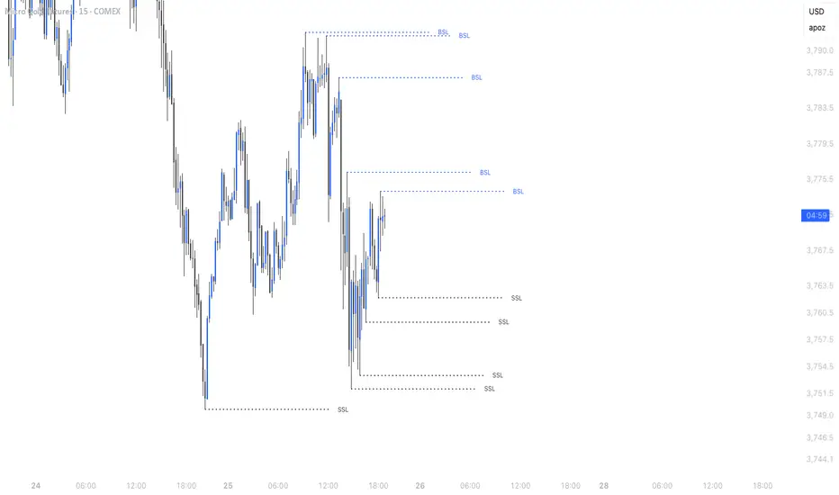
Simple Liquidity Sweep [rare_gold_steak]- Shows when the liquidity was swept.
- Shows BSL and SSL.
- Simple options to change styling.
I use it personally and some people liked it so I thought i'll share it with the public.
Tìm kiếm tập lệnh với "liquidity"
HTF Liquidity Levels█ OVERVIEW
The indicator introduces a new representation of the previous days, weeks, and months highs & lows ( DWM HL ) with a focus on untapped levels.
█ CONCEPTS
Untapped Levels
It is popularly known that the liquidity is located behind swing points or beyond higher time frames highs/lows (in a sense, an intraday swing point is a day high/low). These key areas are said "liquid" because of the accumulation of resting orders, mainly in the form of stop-loss orders. And this more significantly on higher time frames which have more time for stacking orders. As the result, the indicator aims to keep track of untapped levels that have their liquidity states intact.
Liquidity Pools
Once a liquidity level identified, or better, a cluster of liquidity levels work as magnets for the market. The price is more likely to make its way towards heavier pockets of liquidity, by proximity (the closest liquidity pool), and by difficulty (path with less obstacles). This phenomenon is referred as liquidity run, raid, purge, grab, hunt, sweep, you name it. Consequently, the indicator can help you frame a directional bias during your trading session.
█ NOTES
Drawings
Once a level is tapped, it is highlighted. At the end of each day, all tapped levels are cleared.

SMC Statistical Liquidity Walls [PhenLabs]📊 SMC Statistical Liquidity Walls
Version: PineScript™ v6
📌 Description
The SMC Statistical Liquidity Walls indicator is designed to visualize market volatility and potential reversal zones using advanced statistical modeling. Unlike traditional Bollinger Bands that use simple lines, this script utilizes an “Inverted Sigmoid” opacity function to create a “fog of war” effect. This visualizes the density of liquidity: the further price moves from the equilibrium (mean), the “harder” the liquidity wall becomes.
This tool solves the problem of over-trading in low-probability areas. By automatically mapping “Premium” (Resistance) and “Discount” (Support) zones based on Standard Deviation (SD), traders can instantly see when price is overextended. The result is a clean, intuitive overlay that helps you identify high-probability mean reversion setups without cluttering your chart with manual drawings.
🚀 Points of Innovation
Inverted Sigmoid Logic: A custom mathematical function maps Standard Deviation to opacity, creating a realistic “wall” density effect rather than linear gradients.
Dynamic “Solidity”: The indicator is transparent at the center (Equilibrium) and becomes visually solid at the edges, mimicking physical resistance.
Separated Directional Bias: distinct Red (Premium) and Green (Discount) coding helps SMC traders instantly recognize expensive vs. cheap pricing.
Smart “Safe” Deviation: Includes fallback logic to handle calculation errors if deviation hits zero, ensuring the indicator never crashes during data gaps.
🔧 Core Components
Basis Calculation: Uses a Simple Moving Average (SMA) to determine the market’s equilibrium point.
Standard Deviation Zones: Calculates 1SD, 2SD, and 3SD levels to define the statistical extremes of price action.
Sigmoid Alpha Calculation: Converts the SD distance into a transparency value (0-100) to drive the visual gradient.
🔥 Key Features
Automated Premium/Discount Zones: Red zones indicate overbought (Premium) areas; Green zones indicate oversold (Discount) areas.
Customizable Density: Users can adjust the “Steepness” and “Midpoint” of the sigmoid curve to control how fast the walls become solid.
Integrated Alerts: Built-in alert conditions trigger when price hits the “Solid” wall (2SD or higher), perfect for automated trading or notifications.
Visual Clarity: The center of the chart remains clear (high transparency) to keep focus on price action where it matters most.
🎨 Visualization
Equilibrium Line: A gray line representing the mean price.
Gradient Fills: The space between bands fills with color that increases in opacity as it moves outward.
Premium Wall: Upper zones fade from transparent red to solid red.
Discount Wall: Lower zones fade from transparent green to solid green.
📖 Usage Guidelines
Range Period: Default 20. Controls the lookback period for the SMA and Standard Deviation calculation.
Source: Default Close. The price data used for calculations.
Center Transparency: Default 100 (Clear). Controls how transparent the middle of the chart is.
Edge Transparency: Default 45 (Solid). Controls the opacity of the outermost liquidity wall.
Wall Steepness: Default 2.5. Adjusts how aggressively the gradient transitions from clear to solid.
Wall Start Point: Default 1.5 SD. The deviation level where the gradient shift begins to accelerate.
✅ Best Use Cases
Mean Reversion Trading: Enter trades when price hits the solid 2SD or 3SD wall and shows rejection wicks.
Take Profit Targets: Use the Equilibrium (Gray Line) as a logical first target for reversal trades.
Trend Filtering: Do not initiate new long positions when price is deep inside the Red (Premium) wall.
⚠️ Limitations
Lagging Nature: As a statistical tool based on Moving Averages, the walls react to past price data and may lag during sudden volatility spikes.
Trending Markets: In strong parabolic trends, price can “ride” the bands for extended periods; mean reversion should be used with caution in these conditions.
💡 What Makes This Unique
Physics-Based Visualization: We treat liquidity as a physical barrier that gets denser the deeper you push, rather than just a static line on a chart.
🔬 How It Works
Step 1: The script calculates the mean (SMA) and the Standard Deviation (SD) of the source price.
Step 2: It defines three zones above and below the mean (1SD, 2SD, 3SD).
Step 3: The custom `get_inverted_sigmoid` function calculates an Alpha (transparency) value based on the SD distance.
Step 4: Plot fills are colored dynamically, creating a seamless gradient that hardens at the extremes to visualize the “Liquidity Wall.”
💡 Note
For best results, combine this indicator with Price Action confirmation (such as pin bars or engulfing candles) when price touches the solid walls.

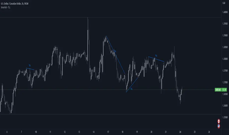
Sonarlab - Trendline Liquidity Indicator**This is not a normal Trend Line Indicator**
Most of the concepts we get thought online are to good to be true. Buy and sell off the touch of the trend line and you will be winning! You probably find out already that this ain't the way to trade. Trend lines mostly gets broken and you will be taken out.
he reason behind this is that the trend lines sparks the interests of Institutions. They use those area's to stop people out and use them as fuel for their positions: Liquidity.
TLL: Trend Line Liquidity
Lets show you an example on how to use these TLL markings 👇
In this example above we can see a beautiful example of the TLL indicator mapping out the TLL. The Imbalance Indicator shows us with the BPR (balanced price range) there is a sign of going short. The other confluence we can add is the TLL, which price likes to clear in these situations.
In this other example we also see two TLL resting on top. We see that price tried to break the SL (swing low), but the fake out detection showed us this was a grab on liquidity. After that we can see that on the LTF we get a displacement and we can assume that price is going to target the TLL.
Another example where price cleared the TLL and used is a targets.
This indicator will map the Trend Line Liquidity for you, so you are more aware of the liquidity that is resting around you. The Indicator has the following inputs:
Sensitivity A lower sensitivity create smaller trend lines, where a higher sensitivity creates bigger trend lines.
Display limit : The amount of lines you want the indicator to display
Line type/ text size (styling options)
Makuchaku's trading tools - Liquidity visualizerThis indicator plots those pivots/fractals which have not been taken out by price, whereby showing where are the clusters of highs/lows where stop orders (or liquidity) could be hiding.
This is a fantastic tool for taking reversal trades.
Timeframe LiquidityTimeframe Liquidity – Multi-Timeframe Highs & Lows by
Timeframe Liquidity automatically plots previous day, week, month, and year highs and lows, key liquidity zones used by smart money and price-action traders. These levels extend into the future and can automatically stop once price wicks through, showing clear liquidity sweeps and tested zones.
Perfect for traders using ICT / SMC concepts, liquidity theory, or market structure analysis. Instantly see where liquidity rests, where it’s been taken, and how price reacts at major support and resistance.
Features:
Auto-plots PDH/PDL, PWH/PWL, PMH/PML, PYH/PYL
Custom line styles, colors, and label sizes
Option to stop line on wick (liquidity sweep)
Smart timeframe visibility (hides same-TF levels)
Accurate UTC offset handling
Identify liquidity pools fast, trade cleaner charts, and track where smart money hunts liquidity.
Built for precision, clarity, and confluence.

Liquidity LayoutLiquidity Layout
The Liquidity Layout is a comprehensive macroeconomic indicator that tracks global liquidity conditions by aggregating multiple financial data streams from major economies (US, EU, China, Japan, UK, Canada, Switzerland). It provides traders with a macro view of market liquidity to help identify favorable conditions for risk assets
⚠️ Important: Timeframe Settings
This indicator is designed for the 1W (weekly) timeframe. If you use other timeframes, you must adjust the offset parameter in the settings to properly align the data with price action. The default offset of 12 is calibrated for weekly charts.
What It Measures
This indicator combines seven key components of global liquidity:
1. Global M2 Money Supply - Tracks broad money supply (M2) plus 10% of narrow money supply (M1) across major economies, weighted by currency strength. This represents the total amount of money circulating in the private sector.
2. Central Bank Balance Sheets (CBBS) - Monitors the combined balance sheets of major central banks (Fed, ECB, BoJ, PBoC, etc.), reflecting quantitative easing and monetary expansion policies.
3. Foreign Exchange Reserves (FER) - Aggregates forex reserves held by central banks, indicating international liquidity buffers and capital flows.
4. Current Account + Capital Flows (CA) - Combines current account balances with capital flows to measure cross-border money movement and trade liquidity.
5. Government Spending (GSP) - Tracks government expenditure minus a portion of federal expenses, representing fiscal stimulus and public sector liquidity injection.
6. World Currency Unit (WCU) - A custom forex composite that weights major and emerging market currencies to capture global currency strength dynamics.
7. Bond Market Conditions - Analyzes yield curves, spreads, and bond indices to assess credit conditions and risk appetite in fixed income markets.
The Formula
The indicator uses two main calculation modes:
ADJ Global Liquidity (Default):
×
This multiplies liquidity components by currency and bond market factors to capture the interactive effects between monetary conditions and market sentiment.
TPI (Trend Power Index) Mode:
A normalized version that combines all components with optimized weights:
Global Liquidity Index: 10%
Bonds: 17.5%
Bond Yields: 25%
Currency Strength: 25%
Government Spending: 5%
Current Account: 5%
M2: 2.5%
Central Bank Balance Sheets: 2.5%
Forex Reserves: 5%
Oil (macro risk indicator): 2.5%
How to Use It
Visualization Modes:
Background Mode (default): Orange background appears when TPI is positive (favorable liquidity conditions)
Line Mode: Displays the indicator as an orange line with customizable offset
Interpreting the Signal:
Positive/Rising = Expanding liquidity, generally bullish for risk assets
Negative/Falling = Contracting liquidity, risk-off environment
TPI > 1 = Extremely favorable conditions (upper threshold)
TPI < -1 = Severe liquidity stress (lower threshold)
Best Practices:
Use on higher timeframes (daily, weekly) for macro trend analysis
Combine with price action - liquidity often leads market moves by weeks or months
Watch for divergences between liquidity and asset prices
Particularly relevant for Bitcoin, equities, and risk assets
Data Sources
The indicator pulls real-time economic data from TradingView's ECONOMICS database and major market indices, including central bank statistics, government reports, and forex rates across G7 and major emerging markets.
Settings
Data Plot: Choose which liquidity component to display
Plot Type: Switch between raw Index values or normalized TPI
Offset: Shift the plot forward/backward for alignment (default: 12 for weekly charts)
Style: Background shading or line plot
Notes
This is a macro-level indicator best suited for understanding the broader liquidity environment rather than short-term trading signals. It helps answer the question: "Is the global financial system expanding or contracting liquidity?"

Institutional Liquidity and Price Action Concepts [AlgoAlpha]🚀 Introducing the Institutional Liquidity and Price Action Concepts™ (ILPAC) , a comprehensive toolkit developed by AlgoAlpha as part of our Premium Collection. This All-in-One indicator offers a robust approach to understanding price action and liquidity, empowering traders with hyper customizable features to tailor their analysis to their specific trading strategies.
Designed with efficiency and compactness in mind, the script shows Price action and liquidity through four methods: Market Structure , Liquidity Heatmap , Trend Lines , and FOMO Bubbles . Additionally, the script also includes a fully customizable interface, to match each individual's trading style. By utilizing a blend of advanced algorithms and customizable parameters, Institutional Liquidity and Price Action Concepts™ (ILPAC) provides traders with a vast array of trading strategies ranging from high frequency scalping to timing better entries on long-term swing and investing positions.
The ILPAC ™ can be used with or without other AlgoAlpha Premium Collection indicators as this indicator has been designed to be able to act as a standalone toolkit.
Let's delve into the key features and functionalities of this versatile indicator:
🎯 Key Features (summary):
Market Structure Analysis :
Customizable time-horizon
BOS confirmation methods
Adjustable CHoCH/BOS line styles
Swing point highlighting
Color customization
Liquidity Heatmap:
Configurable look-back period
Adjustable resolution
Customizable scale colors
Trend Lines :
Look-back period settings
Noise filter factor
Trend line signals with color options
FOMO Bubbles :
Configurable look-back period
Adjustable noise filter factor
Customizable bubble colors
🎯 Key Features (in-depth):
The Market Structure component within ILPAC ™ shows the underlying trend of the market using swing high and lows and is purely price action based. Higher Highs(HH), Higher Lows(HL) labels generally indicate an uptrend and Lower Highs(LH) and Lower Lows(LL) indicate a downtrend. The trend of the market is also determined by Change of Characters (CHoCH) and Break of Structure patterns (BOS). The Market Structure component marks out all these automatically and colours the bars on your chart for easy visualisation of trend.
The Liquidity Heatmap component within ILPAC ™ visualizes areas of high and low liquidity in the market. It identifies zones where liquidity is concentrated not only at specific price levels but also over time, giving the user a 3 Dimensional view of liquidity. The heatmap colours represent different levels of liquidity, making it easy to see where large volumes of orders may exist. This component helps traders understand the liquidity landscape and make informed decisions based on potential support and resistance levels.
The Trend Lines component within ILPAC ™ automatically draws trend lines based on historical price data. It identifies significant highs and lows, connecting them to form trend lines that highlight the overall market direction as well as give breakout signals as shown in the image below. The component also includes a noise filter to reduce false signals and ensure only valid trend breakouts are displayed. Customizable colour settings allow traders to personalize the visual representation of trend lines on their charts.
The FOMO Bubbles component within ILPAC ™ identifies periods of market activity driven by Fear of Missing Out (FOMO). By analysing price action and volume, it highlights bubbles where traders are likely entering positions impulsively. These bubbles are displayed on the chart with customizable colours, providing a visual cue for potential overbought or oversold conditions. This component helps traders recognize and potentially capitalize on market exuberance or panic.
🎯Usage Examples:
At its core, the components within ILPAC ™ were designed to operate with each other as a form of confluence and robust analysis. Typically, Price action components such as the Market Structure and Trend Lines can be used for entries while the Liquidity components like FOMO Bubbles and the Heatmap can be used to find exit points. Here are some examples of how they can be used.
Trend Trading
Using the Market Structure component, enter a trade during a CHoCH and set TP at key areas of liquidity using the heatmap. Users can also choose to enter into a BOS which is an indication of a trend continuation.
Reversal Trading
Using the Liquidity Heatmap to find areas of liquidity for possible reversals, wait for a rejection from a liquidity zone and use the Trend Line Breakout signals as confluence for an entry. Exits can be set at liquidity zones or using FOMO Bubbles as take profit signals.
(These are just examples for reference, the ILPAC ™ offers significantly more possibilities for customisation and fine tuning of your trading strategy.)
🎯Conclusion:
The Institutional Liquidity and Price Action Concepts™ (ILPAC) indicator by AlgoAlpha is a powerful tool for traders, offering in-depth market insights through its Market Structure, Liquidity Heatmap, Trend Lines, and FOMO Bubbles components. By integrating Price Action based analysis with Liquidity analysis, ILPAC ™ boasts a superior design for the confluence between its components, using Price Action components for entry opportunities and Liquidity based components for exit opportunities. With its highly customizable settings, this indicator caters to all trading styles, from scalping to long-term investing. By providing clear visualizations and automatic trend and liquidity detection, ILPAC ™ empowers traders to make informed decisions, enhancing their trading strategies and improving overall market understanding.
Tập lệnh trả phí

Open Liquidity Heatmap [BigBeluga]Open Liquidity Heatmap is an indicator designed to display accumulated resting liquidity on the chart.
Unlike any other liquidity heatmap, this aims to accumulate liquidity at specific levels that build up over time, showing larger areas of liquidity.
🔶 FEATURES
The indicator includes the following settings:
Lookback : Used to determine the range calculation of the heatmap.
Leverage : Leverage of the liquidation (Counted as % in price, Example: 4.5 will return a distance from price of 4.5%, indicating any possible resting liquidity in this range).
Levels : Amount of levels to display (Each level is counted as liquidity resting on the chart; fewer levels will return a bigger area of liquidity sitting on the chart).
Mode : Apply a color gradient from the minimum liquidation to the maximum liquidity level. Set the maximum color gradient value (Counted as volume).
Offset : Automatically determine the offset range of the Volume Profiles. Manual offset of the Volume Profiles.
🔶 CALCULATION
for i = 0 to step - 1
float plotter = na
switch i
0 =>
plotter := hs
=>
plotter := hs - diff * ( i )
cls.hm.gnL(plotter)
cls.vp.put(plotter, 0)
We calculate levels like a normal volume profile with steps, from the highest point within the lookback to the lowest one. Each level will contain the corresponding amount of volume that the candle has closed in that range.
As we can see in the image above, we add liquidity each time the distance in % from price is between two levels.
Unlike many liquidity indicators that provide a single candle liquidity heatmap, this aims to add up liquidity (volume) in already present levels.
This can be extremely useful to see which levels are likely to be more liquid and tend to get a bigger reaction to the price.
Imagine it like a range of levels that each time price revisits that area, a new position area is added; we add volume in that area each time price visits that zone. Liquidity builds up in those zones, causing a bigger reaction to the price once the price visits it.
This indicator is not the same as a single candle heatmap like many others. What is a single candle heatmap?
A single candle heatmap is when a level is created on every new candle, coloring the level based on the total volume of it.
This indicator, on the contrary, aims to provide a more specific use by adding up liquidity each time price visits it.
🔶 BASIC DEMOSTRATION
This is a basic demonstration of how we can spot high liquidity points overall using confluence:
We see the POC of the liquidation in a low volume area of the normal volume profile adding up as confluence.
Resistance from the POC Volume Profile suggesting price will go lower.
Major long open liquidity down.
As we can see, price takes out all the long liquidity and right after pumping, indicating that all the major liquidity got taken out.
Some key note to take is that a POC in the liquidation heatmap in a low volume area of the normal Volume Profile add confluence of a possible big reaction in that zone.
In the forex market, we suggest to use a low distance from price (Leverage) while in a crypto market you can use the one that fit the best the current timeframe.
🔶 CONCLUSION
This indicator aims to show open resting liquidity that had built up over time, showing the most amount of liquidation in specific areas in an aggregated way unlike many liquidation heatmap indicators that show single-level liquidation.
🔶 RELATED SCRIPT

PT LiquidityVersion 1.0 of our Liquidity indicator helps determine areas where price might gravitate to fill liquidations. We have six levels of interest, broken down into three levels for shorts (highlighted in red) & three levels for longs (highlighted in green). Each level is labeled 25x, 50x, 100x. We added a cloud for a visual to assist in short/long liquidation zones. You want to be taking short setups at the top of the cloud when shorts get squeezed & taking long setups at the bottom of the cloud when longs get squeezed. The indicator has a proprietary formula that allows the levels to change based on volume and time frames. The levels are generated in real-time with a rolling VWMA.
Strategy:
If you are scalping, price tends to ping pong between the 50x & 100x longs (green) to 50x & 100x shorts (red). If we shift outside that zone, consider the trend to have changed. Look at a higher time frame (12h+) for trend direction. Price usually reverses when the daily takes all three liquidation levels. You want to see a strong reaction (wick) once we tap that last liquidation level.
This Oscillator was built around our buy sell indicator & it is used on all time frames for swinging & scalping. It is included as part of the library. Just message us for access!

Fractal Break Imbalance / Fair Value Gap (FVG) / Liquidity VoidFractal Break Imbalance / Fair Value Gap (FVG) / Liquidity Void
Order imbalances in either direction, either excess buy or sell orders, reduce liquidity. The market will seek to fill gaps sooner or later. The script marks an imbalance / FVG after a fractal break. It also marks any other imbalance.
Default Colours:
Green - Imbalance after fractal break to the upside
Red - Imbalance after fractal break to the downside
Yellow - Other imbalances
How To Use:
Gaps can be used to determine possible entries and targets. Those familiar with liquidity raids, supply and demand, and ICT concepts may realise it's potential.
Indicator in use:
Structural Liquidity Signals [BullByte]Structural Liquidity Signals (SFP, FVG, BOS, AVWAP)
Short description
Detects liquidity sweeps (SFPs) at pivots and PD/W levels, highlights the latest FVG, tracks AVWAP stretch, arms percentile extremes, and triggers after confirmed micro BOS.
Full description
What this tool does
Structural Liquidity Signals shows where price likely tapped liquidity (stop clusters), then waits for structure to actually change before it prints a trigger. It spots:
Liquidity sweeps (SFPs) at recent pivots and at prior day/week highs/lows.
The latest Fair Value Gap (FVG) that often “pulls” price or serves as a reaction zone.
How far price is stretched from two VWAP anchors (one from the latest impulse, one from today’s session), scaled by ATR so it adapts to volatility.
A “percentile” extreme of an internal score. At extremes the script “arms” a setup; it only triggers after a small break of structure (BOS) on a closed bar.
Originality and design rationale, why it’s not “just a mashup”
This is not a mashup for its own sake. It’s a purpose-built flow that links where liquidity is likely to rest with how structure actually changes:
- Liquidity location: We focus on areas where stops commonly cluster—recent pivots and prior day/week highs/lows—then detect sweeps (SFPs) when price wicks beyond and closes back inside.
- Displacement context: We track the last Fair Value Gap (FVG) to account for recent inefficiency that often acts as a magnet or reaction zone.
- Stretch measurement: We anchor VWAP to the latest N-bar impulse and to the Daily session, then normalize stretch by ATR to assess dislocation consistently across assets/timeframes.
- Composite exhaustion: We combine stretch, wick skew, and volume surprise, then bend the result with a tanh transform so extremes are bounded and comparable.
- Dynamic extremes and discipline: Rather than triggering on every sweep, we “arm” at statistical extremes via percent-rank and only fire after a confirmed micro Break of Structure (BOS). This separates “interesting” from “actionable.”
Key concepts
SFP (liquidity sweep): A candle briefly trades beyond a level (where stops sit) and closes back inside. We detect these at:
Pivots (recent swing highs/lows confirmed by “left/right” bars).
Prior Day/Week High/Low (PDH/PDL/PWH/PWL).
FVG (Fair Value Gap): A small 3‑bar gap (bar2 high vs bar1 low, or vice versa). The latest gap often acts like a magnet or reaction zone. We track the most recent Up/Down gap and whether price is inside it.
AVWAP stretch: Distance from an Anchored VWAP divided by ATR (volatility). We use:
Impulse AVWAP: resets on each new N‑bar high/low.
Daily AVWAP: resets each new session.
PR (Percentile Rank): Where the current internal score sits versus its own recent history (0..100). We arm shorts at high PR, longs at low PR.
Micro BOS: A small break of the recent high (for longs) or low (for shorts). This is the “go/no‑go” confirmation.
How the parts work together
Find likely liquidity grabs (SFPs) at pivots and PD/W levels.
Add context from the latest FVG and AVWAP stretch (how far price is from “fair”).
Build a bounded score (so different markets/timeframes are comparable) and compute its percentile (PR).
Arm at extremes (high PR → short candidate; low PR → long candidate).
Only print a trigger after a micro BOS, on a closed bar, with spacing/cooldown rules.
What you see on the chart (legend)
Lines:
Teal line = Impulse AVWAP (resets on new N‑bar extreme).
Aqua line = Daily AVWAP (resets each session).
PDH/PDL/PWH/PWL = prior day/week levels (toggle on/off).
Zones:
Greenish box = latest Up FVG; Reddish box = latest Down FVG.
The shading/border changes after price trades back through it.
SFP labels:
SFP‑P = SFP at Pivot (dotted line marks that pivot’s price).
SFP‑L = SFP at Level (at PDH/PDL/PWH/PWL).
Throttle: To reduce clutter, SFPs are rate‑limited per direction.
Triggers:
Triangle up = long trigger after BOS; triangle down = short trigger after BOS.
Optional badge shows direction and PR at the moment of trigger.
Optional Trigger Zone is an ATR‑sized box around the trigger bar’s close (for visualization only).
Background:
Light green/red shading = a long/short setup is “armed” (not a trigger).
Dashboard (Mini/Pro) — what each item means
PR: Percentile of the internal score (0..100). Near 0 = bullish extreme, near 100 = bearish extreme.
Gauge: Text bar that mirrors PR.
State: Idle, Armed Long (with a countdown), or Armed Short.
Cooldown: Bars remaining before a new setup can arm after a trigger.
Bars Since / Last Px: How long since last trigger and its price.
FVG: Whether price is in the latest Up/Down FVG.
Imp/Day VWAP Dist, PD Dist(ATR): Distance from those references in ATR units.
ATR% (Gate), Trend(HTF): Status of optional regime filters (volatility/trend).
How to use it (step‑by‑step)
Keep the Safety toggles ON (default): triggers/visuals on bar‑close, optional confirmed HTF for trend slope.
Choose timeframe:
Intraday (5m–1h) or Swing (1h–4h). On very fast/thin charts, enable Performance mode and raise spacing/cooldown.
Watch the dashboard:
When PR reaches an extreme and an SFP context is present, the background shades (armed).
Wait for the trigger triangle:
It prints only after a micro BOS on a closed bar and after spacing/cooldown checks.
Use the Trigger Zone box as a visual reference only:
This script never tells you to buy/sell. Apply your own plan for entry, stop, and sizing.
Example:
Bullish: Sweep under PDL (SFP‑L) and reclaim; PR in lower tail arms long; BOS up confirms → long trigger on bar close (ATR-sized trigger zone shown).
Bearish: Sweep above PDH/pivot (SFP‑L/P) and reject; PR in upper tail arms short; BOS down confirms → short trigger on bar close (ATR-sized trigger zone shown).
Settings guide (with “when to adjust”)
Safety & Stability (defaults ON)
Confirm triggers at bar close, Draw visuals at bar close: Keep ON for clean, stable prints.
Use confirmed HTF values: Applies to HTF trend slope only; keeps it from changing until the HTF bar closes.
Performance mode: Turn ON if your chart is busy or laggy.
Core & Context
ATR Length: Bigger = smoother distances; smaller = more reactive.
Impulse AVWAP Anchor: Larger = fewer resets; smaller = resets more often.
Show Daily AVWAP: ON if you want session context.
Use last FVG in logic: ON to include FVG context in arming/score.
Show PDH/PDL/PWH/PWL: ON to see prior day/week levels that often attract sweeps.
Liquidity & Microstructure
Pivot Left/Right: Higher values = stronger/rarer pivots.
Min Wick Ratio (0..1): Higher = only more pronounced SFP wicks qualify.
BOS length: Larger = stricter BOS; smaller = quicker confirmations.
Signal persistence: Keeps SFP context alive for a few bars to avoid flicker.
Signal Gating
Percent‑Rank Lookback: Larger = more stable extremes; smaller = more reactive extremes.
Arm thresholds (qHi/qLo): Move closer to 0.5 to see more arms; move toward 0/1 to see fewer arms.
TTL, Cooldown, Min bars and Min ATR distance: Space out triggers so you’re not reacting to minor noise.
Regime Filters (optional)
ATR percentile gate: Only allow triggers when volatility is at/above a set percentile.
HTF trend gate: Only allow longs when the HTF slope is up (and shorts when it’s down), above a minimum slope.
Visuals & UX
Only show “important” SFPs: Filters pivot SFPs by Volume Z and |Impulse stretch|.
Trigger badges/history and Max badge count: Control label clutter.
Compact labels: Toggle SFP‑P/L vs full names.
Dashboard mode and position; Dark theme.
Reading PR (the built‑in “oscillator”)
PR ~ 0–10: Potential bullish extreme (long side can arm).
PR ~ 90–100: Potential bearish extreme (short side can arm).
Important: “Armed” ≠ “Enter.” A trigger still needs a micro BOS on a closed bar and spacing/cooldown to pass.
Repainting, confirmations, and HTF notes
By default, prints wait for the bar to close; this reduces repaint‑like effects.
Pivot SFPs only appear after the pivot confirms (after the chosen “right” bars).
PD/W levels come from the prior completed candles and do not change intraday.
If you enable confirmed HTF values, the HTF slope will not change until its higher‑timeframe bar completes (safer but slightly delayed).
Performance tips
If labels/zones clutter or the chart lags:
Turn ON Performance mode.
Hide FVG or the Trigger Zone.
Reduce badge history or turn badge history off.
If price scaling looks compressed:
Keep optional “score”/“PR” plots OFF (they overlay price and can affect scaling).
Alerts (neutral)
Structural Liquidity: LONG TRIGGER
Structural Liquidity: SHORT TRIGGER
These fire when a trigger condition is met on a confirmed bar (with defaults).
Limitations and risk
Not every sweep/extreme reverses; false triggers occur, especially on thin markets and low timeframes.
This indicator does not provide entries, exits, or position sizing—use your own plan and risk control.
Educational/informational only; no financial advice.
License and credits
© BullByte - MPL 2.0. Open‑source for learning and research.
Built from repeated observations of how liquidity runs, imbalance (FVG), and distance from “fair” (AVWAPs) combine, and how a small BOS often marks the moment structure actually shifts.

AlgoRhythmica - Liquidity MapThe AlgoRhythmica - Liquidity Map is a complex and performance heavy indicator, attempting to visualize and highlight areas of liquidity on the chart. It paints lines above and below price with different color and opacity based on the volume, and then highlight the areas with the highest cumulative volume.
What is liquidity and a liquidity map?
Liquidity refers to how quickly and easily an asset can be bought or sold in the market without affecting its price. High liquidity means that there are many buyers and sellers, and transactions can happen rapidly and smoothly.
Liquidity analysis involves examining where and how liquidity is distributed across different price levels.
Price often moves from liquidity zone to liquidity zone, and therefore, having an idea of where those zones are can give traders an understanding of potential support and resistance levels and where significant trading activities might occur.
Those looking to fill large buy orders for example would want to do that in liquid sell areas and vice versa. This indicator attempts to estimate the price levels where traders using leverage get liquidated, and therefore creates liquid areas for buying and selling.
In contrast to Bookmaps which chart the orders in the order book where traders want to transact, a liquidity map is charting where traders are 'forced' to transact due to stop-losses or margin calls. To do that, liquidity maps are mostly based on estimations. It could be based on pivot points, common stop-loss amounts, common leverage amounts or a combination of multiple factors.
As of the current version on release, this indicator is only using the leverage input by the user to estimate the liquidity.
How does it work and what makes it unique?
The indicator takes the volume in a candle and saves that volume in a line. Based on the leverage settings it then offsets that line above and below price. Say, a trader using 20x leverage without a stop-loss gets liquidated if price goes roughly 5% in the wrong direction. Therefore, by assuming common leverage amounts or common risk amounts, we can estimate where traders get liquidated or have their stop-losses based on their leverage or amount they are willing to risk.
Now keep in mind, this liquidity map is just estimating based on general assumptions, it doesn't have access to actual liquidity data.
But at the same time, we're not trading single individual traders, but we're trading the market as a whole, and interestingly enough, some risk and leverage amounts are more common than others. People like using those even numbers like 10x, 20x, 1% risk etc. That's why price do often react on the liquidity in liquidity maps such as this one.
So, when a candle is printed, and you are on a smaller timeframe and decided this is just the kind of market for 100x scalpers. You set the leverage to 100x in the settings and the indicator will paint lines above and below price offset by 1%. There are settings for three leverage amounts at the same time, so you might also set it to paint lines at 5% and 10%, just to catch those traders on higher timeframes if price really takes off.
Now let's talk about what makes this indicator really shine and stand out!
Normally, if we just left the indicator doing as above, there would be lines all over the place and very difficult to interpret which areas matter, or we could limit the indicator to only print lines at high volume candles. Now, you do have that option, but that wouldn't pick up areas where low volume trading has cumulated in the same range, such as over a weekend or during market gaps. Where other liquidity indicators out there might miss that liquidity, this indicator has several solutions for it.
The first solution is stacking semi-transparent lines on top of each other. Normally, lines of the same color and transparency wouldn't add and blend together. But this script offers a seamless transition from one color the next, blending those low volume liquidity lines together.
The second solution, and this is what I believe is really unique and powerful, is that this indicator also has the ability highlight certain liquidity. When enabled, it scans through all the lines, cumulate the volume within a specified range around the lines and then compare the cumulated volume range with the ranges around the other lines. New lines created in the range with the highest cumulated volume gets highlighted.
Without this feature you wouldn't necessarily be able to tell which of two strong areas are more liquid. When price later enters that area and crosses those lines, the liquidity there is then considered consumed and lines created in a different range will now begin to highlight.
All of this is of course enhanced, as in the picture above, when multiple copies of the indicator is used together and assigned to only calculate specific parts of the liquidity map, such as longs, shorts or specific leverage amounts.
Oh, and there's also options for assigning which part of the candle should generate the liquidity. Close, Middle Body or Open. The indicator will then assume that the majority of traders are entering their position in that part of the candle.
The offset is calculated from that part of the candle. By using multiple copies of the indicator, you can assign one for each part and that will give you the whole range of the candle. And you might assume more traders go long from the top, so to emphasize that liquidity, you could increase the size or transparency slightly of the lines generated from that part.
How do I use it?
Well, this isn't gonna give you trading signals or anything, but it will visualize the market for you in a new perspective.
Typically, high liquidity areas are often good areas for entry and TP. But always watch how the price reacts in those areas before entering a position. And remember, the liquidity estimation might not always be accurate.
Particularly watch the highlighted areas for long wicks and high volume, indicating that the liquidity was enough to meet the orders and a retrace or reversal could be imminent.
Watch what happens during consolidation, market gaps and weekends. Notice the lack of liquidity and how the market maker creates liquidity by inducing traders to take positions with quick moves that instantly reverses. You might know how that works in theory, but watching it happen real-time with visualized liquidity is very interesting.
While not necessary, and as I've mentioned earlier, dividing the different functions of the indicator on multiple copies will substantially increase it's accuracy and performance!
For example, use one copy of the indicator per leverage level, or one for shorts, one for longs. One that generates from the close, one from the middle etc. creating a much clearer picture of the liquidity like the picture comparison above.
This is what the indicator offers:
When you're estimating liquidity, you want to be able to do it with accuracy and interpretability. That's why the customization options of this indicator has been really important in the development.
Timeframe Options:
It supports a wide range of time periods, from daily to yearly, enabling traders to apply it across various trading strategies, from short-term day trading to long-term investment analysis. Assuming traders are eventually taking their profits, liquidity after the set time period disappears.
Rich Visual Settings:
The indicator comes with multiple preset color themes and a completely customizable option as well. These visual settings are designed to enhance the interpretability of liquidity data, with adjustable transparency and contrast features.
Liquidity Highlighting Function:
This unique feature emphasizes areas with high liquidity concentration. It scans and highlights significant liquidity zones, aiding traders in identifying critical market levels.
Liquidity Profile:
The LQ-Profile extends liquidity lines based on their associated volume, giving traders another way of identifying high liquidity zones.
Adjustable Liquidity Estimation:
Select and adjust leverage amounts based on your particular chart and analysis. Choose what positions and leverage amounts to display liquidity for. You also have the option to determine if wicks consume liquidity or not.
Since wicks indicate that price was rejected from that area, it doesn't necessarily mean all the liquidity in that area was consumed. You could assign an additional copy of the indicator consuming with wicks and another that doesn't. That way, half the liquidity gets consumed and the other half remains until another candle closes in that area. They choices are endless and it's all about your understanding and analysis here.
Multiple Performance Options:
Depending on your particular chart and timeframe, this indicator can be very performance heavy to load. Luckily it has plenty of performance options for limiting the calculations of the indicator.
Tooltips:
As usual, this indicator comes with extensive tooltips for every function, making sure you understand every part of it.
Happy trading!

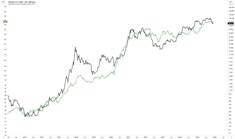
DECODE Global Liquidity IndexDECODE Global Liquidity Index 🌊
The DECODE Global Liquidity Index is a powerful tool designed to track and aggregate global liquidity by combining data from the world's 13 largest economies. It offers a comprehensive view of financial liquidity, providing crucial insights into the underlying currents that can influence asset prices and market trends.
The economies covered are: United States, China, European Union, Japan, India, United Kingdom, Brazil, Canada, Russia, South Korea, Australia, Mexico, and Indonesia. The European Union accounts for major individual economies within the EU like Germany, France, Italy, Spain, Netherlands, Poland, etc.
Key Features:
1. Customizable Liquidity Sources
Include Global M2: You can opt to include the M2 money supply from the 13 listed economies. M2 is a broad measure of money supply that includes cash, checking deposits, savings deposits, money market securities, mutual funds, and other time deposits. (Note: Australia uses M3 as its primary measure, which is included when M2 is selected for Australia).
Include Central Bank Balance Sheets (CBBS): Alternatively, or in addition, you can include the total assets held by the central banks of these economies. Central bank balance sheets expand or contract based on monetary policy operations like quantitative easing (QE) or tightening (QT).
Combined View: If you select both M2 and CBBS, and data is available for both, the indicator will display an average of the two aggregated values. If only one source type is selected, or if data for one type is unavailable despite both being selected, the indicator will display the single available and selected component. This provides flexibility in how you define and analyze global liquidity.
2. Lead/Lag Analysis (Forward Projection):
Lead Offset (Days): This feature allows you to project the liquidity index forward by a specified number of days.
Why it's useful: Global liquidity changes can often be a leading indicator for various asset classes, particularly those sensitive to risk appetite, like Bitcoin or growth stocks. These assets might lag shifts in liquidity. By applying a lead (e.g., 90 days), you can shift the liquidity data forward on your chart to more easily visualize potential correlations and identify if current asset price movements might be responding to past changes in liquidity.
3. Rate of Change (RoC) Oscillator:
Year-over-Year % View: Instead of viewing aggregate liquidity, you can switch to a Year-over-Year (YoY%) Rate of Change (ROC) oscillator.
Why it's useful:
Momentum Identification: The ROC highlights the speed and direction of liquidity changes. Positive values indicate liquidity is increasing compared to a year ago, while negative values show it's decreasing.
Turning Points: Oscillators make it easier to spot potential accelerations, decelerations, or reversals in liquidity trends. A cross above the zero line can signal strengthening liquidity momentum, while a cross below can signal weakening momentum.
Cycle Analysis: It helps in assessing the cyclical nature of liquidity provision and its potential impact on market cycles.
This indicator aims to provide a clear, customizable, and insightful measure of global liquidity to aid traders and investors in their market analysis.
[TehThomas- Pro] - Liquidity SignalsOverview
This Pine Script indicator is designed to generate Buy and Sell signals based on liquidity sweeps and market structure shifts (MSS) or break of structure (BOS). The combination of liquidity sweeps and market structure changes provides a highly confluential signal that can be used to identify high-probability trade setups. This indicator is capable of working as a standalone tool or as part of a broader trading strategy.
Core Concepts
Liquidity Sweeps:
A liquidity sweep occurs when the price temporarily breaks a previous high or low, taking out stop losses or inducing breakout traders, only to reverse direction shortly after.
The indicator detects these liquidity sweeps at pivot points defined by a user-set pivotPeriod.
It plots Buyside Liquidity (resistance) or Sellside Liquidity (support) lines on the chart to indicate where liquidity pools are likely positioned.
Market Structure Shifts (MSS) and Break of Structure (BOS):
BOS: This occurs when the price closes above or below a previous swing high or low, indicating a potential shift in trend.
MSS: This is a more aggressive form of market structure change where the price action reverses after a liquidity sweep, signaling a potential reversal before a BOS confirmation.
The script tracks swing highs and swing lows using the pivot_strength setting to define how many bars are required on both sides of a pivot point.
Confluence of Signals:
The main signal is plotted when a Liquidity Sweep is followed by an MSS within a specified number of bars (25 by default).
This creates a high-probability trade signal because it combines both liquidity traps and market structure reversals.
Below, you can see the signals the indicator generates
There is one loss marked by the second circle.
Settings and Inputs
Liquidity Sweep Settings
pivotPeriod: Defines the left and right length of the pivot points to detect swing highs and lows.
maxLine: Maximum number of liquidity lines plotted on the chart.
resistanceColor & supportColor: Colors for Buyside and Sellside liquidity lines.
lineExtend: Number of bars to extend liquidity lines into the future.
hitAction: Determines what happens when liquidity lines are hit (dotted, dashed, or delete).
Market Structure Settings
show_mss: Toggle to display MSS signals on the chart.
show_bos: Toggle to display BOS signals on the chart.
Customizable line styles, colors, and labels for both MSS and BOS.
How to Use the Indicator
Signal Confirmation:
A Buy Signal is most effective when combined with a liquidity sweep of sellside liquidity followed by a bullish market structure shift.
A Sell Signal is most effective when combined with a liquidity sweep of buyside liquidity followed by a bearish market structure shift.
Always check confluence with other indicators such as moving averages or volume analysis.
Trade Management:
Place stop-loss orders below the liquidity sweep low for buys or above the liquidity sweep high for sells.
Use the previous swing high or low as a target or set custom risk-reward ratios.
Why This Indicator Works So Well
✅ Combines liquidity sweeps and market structure for highly accurate signals.
✅ Works across all timeframes and markets.
✅ Automatically plots support and resistance zones.
✅ Provides clear buy and sell signals with customizable alerts.
✅ Helps traders avoid false breakouts by waiting for market structure confirmation.
Conclusion
This indicator is a highly confluential trading tool that combines liquidity sweeps with market structure shifts to generate Buy and Sell signals. It provides a strong edge by confirming liquidity traps with market structure reversals. With customizable settings, it can be adapted to different timeframes and trading styles, making it suitable for both scalping and swing trading strategies.
By automating the detection of these advanced concepts, the indicator helps traders stay objective and disciplined in their decision-making process.
Whether you're a beginner or an advanced trader, this indicator will help you spot high-probability trade setups and improve your overall trading performance.
Disclaimer
This indicator is a powerful tool for identifying potential trading opportunities, but it is not a guarantee of future performance. Use this indicator at your own risk. Trading involves significant risk, and it is essential to have proper knowledge and experience before making any financial decisions. The signals provided by this indicator should be used as part of a comprehensive trading plan and combined with other forms of analysis. The creator is not responsible for any financial losses incurred while using this tool.

HTF Liquidity Sweep EngineHTF Liquidity Sweep Detector (Dual HTF)
Overview
This indicator is designed to identify validated liquidity sweeps on Higher Timeframes (HTF) and project them accurately onto lower-timeframe charts.
Unlike basic sweep indicators that mark every high or low break, this tool applies context-aware validation and invalidation logic to distinguish meaningful liquidity events from random volatility.
The script supports two independent higher timeframes (HTF 1 & HTF 2), allowing traders to analyze liquidity hierarchy and confluence across multiple market structures within a single chart.
⸻
Core Concept
A liquidity sweep is not considered valid simply because price exceeds a previous high or low.
This script evaluates each sweep within the structural context of the HTF candle that formed it, accounting for:
• Bullish vs bearish candle structure
• Open, close, high, and low relationships
• Temporal sequencing between HTF candles
Sweeps are treated as stateful events with a full lifecycle rather than static lines.
⸻
Sweep Lifecycle & Invalidation Logic
Each detected sweep progresses through multiple states:
• Formation – A sweep is detected when price exceeds a prior HTF high or low under valid structural conditions.
• Validation – The sweep remains provisional until subsequent HTF candles confirm it.
• Invalidation – If later HTF price action violates the structural conditions, the sweep is automatically marked as invalidated.
• Removal – Sweeps that fail during their formation phase are removed entirely to avoid misleading signals.
This approach ensures that only structurally meaningful sweeps remain visible on the chart.
⸻
Dual Higher-Timeframe Analysis
HTF 1 and HTF 2 operate as separate liquidity layers, each with independent:
• Detection logic
• Validation and invalidation rules
• Visualization styles
This allows traders to identify:
• HTF liquidity alignment
• Higher-timeframe dominance
• Confluence or conflict between liquidity zones
⸻
Projection to Lower Timeframes
Detected HTF sweeps are dynamically projected onto the active chart timeframe.
Sweep levels update in real time and maintain accurate positioning relative to HTF candle boundaries, ensuring visual consistency across timeframes.
⸻
Valid Pullback Swing Line (Optional)
An optional internal swing structure module is included to identify valid pullback swings.
This feature tracks structural pivots, updates dynamically, and automatically invalidates broken swing structures, helping traders contextualize liquidity sweeps within current market structure.
⸻
Customization
Each HTF layer supports full independent customization:
• Enable / disable HTF layers
• Timeframe selection and lookback depth
• Sweep and invalidation line styles, colors, and widths
• Label and marker display options
• Label positioning and sizing
• Alert notifications for sweep formation
⸻
Alerts
Optional alerts trigger when a liquidity sweep is formed, allowing traders to monitor potential liquidity events without constant chart supervision.
⸻
This script is published as closed-source because its sweep validation, invalidation, and multi-timeframe interaction logic represents the core intellectual property of the tool.
The description above is intended to provide conceptual clarity without disclosing proprietary implementation details.
⸻
Intended Use
This indicator is designed as a market structure and liquidity analysis tool, not a standalone trading system.
It is best used in combination with price action, higher-timeframe bias, and risk management principles.
ICT Concepts(Liquidity, FVG & Liquidity Sweeps)📄 Description:
A Smart Money Concept (SMC)-based utility that blends ICT-style Liquidity Sweeps, Fair Value Gap (FVG) mapping, and Swing Structure proxies – designed for traders seeking clean precision in price imbalance analysis.
⸻
🔍 1. What This Script Does
T his indicator brings together three core Institutional Concepts:
• Liquidity Sweep Detection : Identifies buy/sell-side liquidity grabs (fakeouts) confirmed by volume spikes – a common precursor to institutional order flow shifts.
• Fair Value Gaps (FVGs) : Highlights inefficiencies between price legs using strict ICT-style 3-candle or gap-based rules. These are areas institutions often revisit.
• Swing Structure Proxy (OB Mapping) : Tracks dynamic swing highs/lows to act as proxy zones for potential order blocks and structural boundaries.
It also includes a cooldown-based signal filtering engine to prevent overfitting and noise, helping traders avoid false positives in choppy markets.
⚙️ 2. How It Works (Core Logic)
✅ A. Liquidity Sweep Engine
• Looks back N bars to find Equal Highs or Equal Lows.
• Triggers a signal only if price sweeps the level and closes on the other side with a volume spike.
• Customizable volume threshold (e.g., 1.5x average volume).
• Includes a signal cooldown period to reduce clutter and boost quality.
Bullish Sweep = Price dips below equal lows but closes higher
Bearish Sweep = Price spikes above equal highs but closes lower
Visuals: Signal arrows with alerts (BUY LQ / SELL LQ)
⸻
✅ B. Fair Value Gap (FVG) Zones
• Detects FVGs using:
• Sequential logic: Low > High (bullish), High < Low (bearish)
• Gap logic: Open gaps at bar open
• Dynamic box drawing:
• Automatically extends FVG zones until price fully closes through them.
• Different color coding for bullish (teal) and bearish (orange) gaps.
• Customizable:
• Opacity control
• Option to include/exclude gap-based FVGs
• Hide filled zones
• Limit total zones rendered (for performance)
⸻
✅ C. Swing High/Low Structure
• Uses a lookback period to find latest swing high/low levels.
• Acts as a proxy for Order Block zones or structural shift reference points.
• Plotted as red (high) and green (low) lines.
⸻
🚀 3. How to Use It
• Scalpers and Intraday Traders can use Liquidity Sweep + FVG Confluence to time reversals or catch early entries into trend continuation moves.
• Swing Traders can observe swing OB proxies and recent FVG zones to frame directional bias and target zones.
• Volume-Aware Traders benefit from the volume filter that confirms sweeps are meaningful – not just random stop hunts.
🔔 Set alerts on:
• Bullish Liquidity Sweeps
• Bearish Liquidity Sweeps
You can use this in combination with your own trend filters, or even confluence it with Order Blocks, VWAP, or EMA trend tools.
⸻
💡 What Makes It Original?
• The script doesn’t merely combine standard tools — it builds a cohesive ICT-style detection system using:
• A custom volume-confirmed liquidity sweep filter
• Dynamic FVG rendering with filled logic + performance optimization
• Visual hierarchy to avoid clutter: clean line plots, contextual boxes, and conditional signals
• Highly customizable yet lightweight, making it suitable for fast-paced decision making.
⸻
✅ Notes
• Invite-only script for serious traders interested in Smart Money and ICT concepts.
• Does not repaint signals.
• All visuals are dynamically managed for clarity and performance.
AlgoRhythmica - Liquidity StatsThe AlgoRhythmica - Liquidity Stats is a comprehensive trading indicator designed to analyze and plot liquidity data across various time periods. It uses estimated liquidity data and allows traders to select between 6 different scopes to analyze and view that data.
What is liquidity?
Liquidity refers to how quickly and easily an asset can be bought or sold in the market without affecting its price. High liquidity means that there are many buyers and sellers, and transactions can happen rapidly and smoothly.
Liquidity analysis involves examining where and how liquidity is distributed across different price levels.
Price often moves from liquidity zone to liquidity zone, and therefore, having an idea of whether there's more liquidity above or below price give traders an idea of where price might go next.
How does it work?
Internally, the indicator is simulating a complete liquidity map of the chart and cleverly estimates where traders might face losses (liquidations). It does this by looking at the volume of trading in each candle and projecting where, given certain common trading practices like using 10x or 20x leverage, traders are likely to get squeezed out of their positions. These projected squeeze-out points helps in visualizing potential future price movements, as prices often move towards these areas to balance out. But instead of rendering the liquidity on the main chart, which can get cluttered, this data is viewed in a separate panel through a selection of different scopes.
Keep in mind though, this liquidity data here is just an estimation based on general assumptions, it doesn't have access to actual liquidity data.
However, some risk and leverage amounts are more common than others. People like using those even numbers like 10x, 20x leverage or 1% stop loss etc. And that's why the liquidity estimations in this and other liquidity indicators can still be quite accurate.
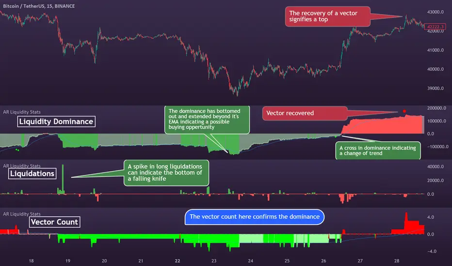
Special Feature:
A special feature to this indicator is it's unique eye for 'vector candles'—those high-impact candles signaling significant market moves. It tracks these candles over time to see if the market revisits them, a behavior that can indicate major market maker activities and potential price reversal points.
The 6 different plotting scopes:
Liquidity Dominance:
The Liquidity Dominance is the long liquidity minus the short liquidity. When there's more liquidity above price, price tends to go up. There's also a 50 EMA running through it, indicating whether the liquidity dominance is particularly extended.
There is also a setting for normalizing the dominance to an adjustable EMA. Normalizing means that the value of the EMA will then become the zero-value of the dominance. This can be particularly effective in trending markets because it allows traders to see more clearly how the liquidity deviates from it's EMA.
Split Dominance:
This is simply the long and short liquidity plotted separately with a 200 SMA running through. This gives traders a slight more in-depth look at the liquidity. Looking at the difference between long and short liquidity and using the SMA as a reference, traders can more easily spot a trend shift and whether the liquidity types are about to cross each other.
Stochastic LQ:
Instead of using price data, the Stochastic LQ applies the stochastic oscillator formula to liquidity data. It measures the position of the current liquidity level relative to its high-low range over a specified period. By doing so, it aims to provide a clear picture of whether buyers or sellers are dominating the liquidity landscape within the chosen lookback period.
Liquidations:
This will display the amount of volume that was consumed when price wicked or crossed into a liquidity level on that particular bar. There's also a setting to cumulate the liquidations over the selected period. This will show you whether longs or shorts are suffering the most.
Vector Count:
This tool counts the number of unrecovered vector candles. If there are more to the upside, price is likely to go up. The vector count also has a setting for normalizing the count to an EMA. Some older vectors never get recovered and therefore normalizing the count to an EMA can be a more useful way of focusing on more recent vectors.
Total LQ:
By focusing on the total liquidity without differentiating between long and short positions, this tool simplifies the liquidity landscape. High total liquidity can support the sustainability of current trends, as it shows that there is enough market participation to support the price direction.
Additional Features:
Vector Recovery Dots:
A feature to visually identify recovered vector candles, indicating potential market reaction points for strategic entry or exit decisions.
This is used in combination with any of the tools. It will plot dots whenever a vector candle has been recovered. A recovered vector candle while liquidity is extended, could indicate a top or a bottom.
Dynamic Period Selection:
Choose between aggregating the liquidity over a fixed period (Daily, Weekly, Monthly, Yearly etc.) which then stays the same when the user switches timeframe, or choose a dynamic period with a fixed amount of candles which then dynamically shifts when changing time frame. This offers flexibility to look at liquidity over different time frames. Liquidity that falls outside of the selected period is considered gone, as traders eventually close their positions.
Lookback and Sensitivity Adjustment:
Customize the lookback period for volume averages and adjust sensitivity to refine the indicator's responsiveness to volume changes and liquidity calculations.
Leverage Settings:
Input specific leverage amounts to calculate liquidity on. These should be adjusted depending on the chart and timeframe the user is looking at. Decide on up to three different leverage amounts that traders would typically use on the chart and timeframe you're on. The liquidity will then be calculated using that leverage.
Tooltips:
The indicator comes with extensive tooltips for every function, making sure the user understand every part of it.
And as usual, use it together with other market analysis and perhaps a liquidity map of your choice.
Liquidation Levels with Liquidity Sweeps/Breakouts [AlgoAlpha]🌊📈 Dive into the depths of market liquidity with "Liquidation Levels with Liquidity Sweeps/Breakouts" - your ultimate tool for navigating the turbulent waters of trading! 🧹💹 Crafted by the wizards at AlgoAlpha, this Pine Script™ masterpiece illuminates the unseen liquidity levels and sweeps, guiding you through the financial seas with insight. 🚀🔍
Key Features:
🕒 Timeframe Flexibility: Customize your analysis with a TimeFrame Multiplier, allowing the indicator to operate on higher timeframes for broader market insight.
💥 Dynamic Volume Threshold: Set your sensitivity to breakouts with the High Volume Threshold, ensuring you catch significant market movements while avoiding fakeouts.
👀 Visibility Controls: Toggle the display of swept liquidity and highlight liquidity breakouts with customizable background colors for clear, actionable insights.
🎨 Custom Appearance: Personalize your chart with bullish, bearish, and breakout colors to match your trading style.
How to Use the Liquidity Levels with Liquidation Sweeps Indicator:
Maximize your trading efficiency with the Liquidity Levels with Liquidation Sweeps Indicator by following these simple steps! 🚀🌟
⚙️ Customize Settings: Access the indicator settings to personalize the TimeFrame Multiplier, High Volume Threshold, and Relative Volume Period. Tailor these settings to match your trading strategy and chart preferences.
👁️ Analyze Liquidity Levels: Monitor the chart for liquidity levels and sweeps. Bullish sweeps are marked with green labels, bearish sweeps with red, and breakouts highlighted by the chart background.
🔔 Set Alerts: Enable alert conditions for liquidity breakouts and sweeps within the indicator's settings. This feature allows you to receive real-time notifications, helping you to act promptly on trading opportunities.
How It Works:
The heart of this indicator lies in its ability to track and highlight liquidity levels derived from swing pivots, and sweeps across multiple timeframes. By calculating relative volume against a user-defined threshold, it identifies strong volume movements indicative of liquidity breakouts, this helps filter out fake-outs. When a liquidity level is breached but not completely mitigated, it's either marked as a bullish or bearish sweep, which come with the option to show an estimate of the number of liquidations during the sweep.
if peakform and peakprinted != 1
aR.push(line.new(bar_index-mult, h.get(1), bar_index+1, h.get(1), color = red))
aRv.push(h.get(1))
peakprinted := 1
if valleyform and valleyprinted != 1
aS.push(line.new(bar_index-mult, l.get(1), bar_index+1, l.get(1), color = green))
aSv.push(l.get(1))
valleyprinted := 1

Buyside & Sellside Liquidity [LuxAlgo]The Buyside & Sellside Liquidity indicator aims to detect & highlight the first and arguably most important concept within the ICT trading methodology, Liquidity levels.
🔶 SETTINGS
🔹 Liquidity Levels
Detection Length: Lookback period
Margin: Sets margin/sensitivity for a liquidity level detection
🔹 Liquidity Zones
Buyside Liquidity Zones: Enables display of the buyside liquidity zones.
Margin: Sets margin/sensitivity for the liquidity zone boundaries.
Color: Color option for buyside liquidity levels & zones.
Sellside Liquidity Zones: Enables display of the sellside liquidity zones.
Margin: Sets margin/sensitivity for the liquidity zone boundaries.
Color: Color option for sellside liquidity levels & zones.
🔹 Liquidity Voids
Liquidity Voids: Enables display of both bullish and bearish liquidity voids.
Label: Enables display of a label indicating liquidity voids.
🔹 Display Options
Mode: Controls the lookback length of detection and visualization, where Present assumes last 500 bars and Historical assumes all data available to the user
# Visible Levels: Controls the amount of the liquidity levels/zones to be visualized.
🔶 USAGE
Definitions of Liquidity refer to the availability of orders at specific price levels in the market, allowing transactions to occur smoothly.
In the context of Inner Circle Trader's teachings, liquidity mainly relates to stop losses or pending orders and liquidity level/pool, highlighting a concentration of buy or sell orders at specific price levels. Smart money traders, such as banks and other large institutions, often target these liquidity levels/pools to accumulate or distribute their positions.
There are two types of liquidity; Buyside liquidity and Sellside liquidity .
Buyside liquidity represents a level on the chart where short sellers will have their stops positioned, and Sellside liquidity represents a level on the chart where long-biased traders will place their stops.
These areas often act as support or resistance levels and can provide trading opportunities.
When the liquidity levels are breached at which many stop/limit orders are placed have been traded through, the script will create a zone aiming to provide additional insight to figure out the odds of the next price action.
Reversal: It’s common that the price may reverse course and head in the opposite direction, seeking liquidity at the opposite extreme.
Continuation: When the zone is also broken it is a sign for continuation price action.
It's worth noting that ICT concepts are specific to the methodology developed by Michael J. Huddleston and may not align with other trading approaches or strategies.
🔶 DETAILS
Liquidity voids are sudden changes in price when the price jumps from one level to another. Liquidity voids will appear as a single or a group of candles that are all positioned in the same direction. These candles typically have large real bodies and very short wicks, suggesting very little disagreement between buyers and sellers. The peculiar thing about liquidity voids is that they almost always fill up.
🔶 ALERTS
When an alert is configured, the user will have the ability to be notified in case;
Liquidity level is detected/updated.
Liquidity level is breached.
🔶 RELATED SCRIPTS
ICT-Concepts
ICT-Macros
Imbalance-Detector

SFC Smart Money Manipulation - Liquidity, StructureThis indicator shows very important information about the market.
Features:
- Market structure
- Important Ranges
- Liquidity
- Trading session
- Daily Checklist
Market structure
Market structure is the behaviour, condition, and current flow of the market. It highlights support and resistance levels, swing highs, and swing lows. A trend is simply a consistent direction of price movement over time. Market structure can tell you if the market is trending or not.
Market structure is a lagging indicator, because Highs and Lows must to be created in order to define the structure properly. The structure provide the most important information about the market.
Market structure can provide early signals about the trend.
- If the structure continues to break in the same direction, it means that the trend is healthy and will continue (BoS).
- If the structure break in the opposite direction, means that the trend may reverse or pause for a while (CHoCH).
Important ranges
- Asia Range - it is important intraday range and can provide early information if the day will be bullish or bearish.
- Most recent High/Low - determine the last swing
- Premium/ Discount zone with Fibonacci levels - the institutions always want to buy in discount and sell in premium.
Liquidity
Areas where a lot of traders get into the market and theirs stop losses are obvious. So the banks will manipulate the price to clear these stop losses, before price go in real direction. The banks will always hunt the liquidity.
The major liquidity is:
- Doji candle - displayed
- Double/Triple Highs or Lows - displayed
- Fair value gaps - displayed
- Imbalances - displayed
- Trend lines
- Big wicks
Trading Sessions
Price and Time theory is very significant in Smart Money Concept. The banks do not just place orders chaotically. They place it in specific time.
The indicator shows the Asia, London and New York intraday sessions and the kill zones.
Kill Zone - most manipulated time in the day, where institutions try to wipe out the retail traders and establish the true move.
Daily Checklist
Simple, but very useful checklist. It shows the most important daily steps in order qualitative analysis to be created.
How to use
1) Use the swing highs and lows and check the current structure.
2) Look where is the major liquidity. By default orange colour. When liquidity is retested from the price ,it change the colour from orange to gray. Retested liquidity is no more significant for the banks.
3) Use the important ranges to define the pullbacks or reversals or trading ranges.
4) Use the trading sessions and kill zones to place orders in the right time.
5) Use the "daily checklist" every day - step by step. It helps trader to analyse the current market.
Settings
-Show pivots, Pivot confirmation candles, Equal Highs/Lows sensitivity
-Show structures breaks
-Show most recent high/low
-Show Asia range
-Show premium/discount zone with Fibonacci levels
-Show liquidity, Colour of liquidity, Color of retested liquidity, Doji settings
-Show Trading sessions
-Show daily checklist

ICT LIQUIDITY indicator [Focused Trader]This indicator allows you to draw liquidity according to ICT. Specifically, you can choose to draw liquidity for specific sessions (Asia,New York,London).
Filtering by session
You can chooose to display only liquidities created in specific session. For example, the favourite liquidity is that of Asia. And then, in London market usually grabs it. So you set to display only liquidites of asia.
Session background
You can also display background over specific session, this is very usefull to see how market behaves - liquidity created in Asia is very often taken in London session. You can use any colour you'd like.
Colouring and style of lines
There is an option to choose colour for liquidity lines from different sessions and also choose specific colour for highs and lows. You can also set different styles (dash, dot, arrow, ...) of liquidty lines.
SMC Suite - OB . Breaker . Liquidity Sweep . FVGSMC Suite — Order Blocks • Breaker • Liquidity Sweep • FVG
What it does:
Maps institutional SMC structure (OB → Breaker flips, Liquidity Sweeps, and 3-bar FVGs) and alerts when price retests those zones with optional r ejection-wick confirmation .
Why this isn’t “just a mashup”?
This tool implements a specific interaction between four classic SMC concepts instead of only plotting them side-by-side:
1. OB → Breaker Flip (automated): When price invalidates an Order Block (OB), the script converts that zone into a Breaker of opposite bias (bullish ⇄ bearish), extends it, and uses it for retest signals.
2. Liquidity-Gated FVGs : Fair Value Gaps (3-bar imbalances) are optionally gated—they’re only drawn/used if a recent liquidity sweep occurred within a user-defined lookback.
3. Retest Engine with Rejection Filter : Entries are not whenever a zone prints. Signals fire only if price retests the zone, and (optionally) the candle shows a rejection wick ≥ X% of its range.
4. Signal Cooldown : Prevents spam by enforcing a minimum bar gap between consecutive signals.
These behaviors work together to catch the sequence many traders look for: sweep → impulse → OB/FVG → retest + rejection.
Concepts & exact rules
1) Impulsive move and swing structure
• A bar is “ impulsive ” when its range ≥ ATR × Impulsive Mult and it closes in the direction of the move.
• Swings use Pivot Length (lenSwing) on both sides (HH/LL detection). These HH/LLs are also used for sweep checks.
2) Order Blocks (OB)
• Bullish OB : last bearish candle body before an i mpulsive up-move that breaks the prior swing high . Zone = min(open, close) to low of that candle.
• Bearish OB : last bullish candle body before an impulsive down-move that breaks the prior swing low . Zone = high to max(open, close).
• Zones extend right for OB Forward Extend bars.
3) Breaker Blocks (automatic flip)
If price invalidates an OB (closes below a bullish OB’s low or above a bearish OB’s high), that OB flips into a Breaker of opposite bias:
• Invalidated bullish OB → Bearish Breaker (resistance).
• Invalidated bearish OB → Bullish Breaker (support).
Breakers get their own style/opacity and are used for separate Breaker Retest signals.
4) Liquidity Sweeps (decluttered)
• Bullish sweep : price takes prior high but closes back below it.
• Bearish sweep : price takes prior low but closes back above it.
Display can be tiny arrows (default), short non-extending lines, or hidden. Old marks auto-expire to keep the chart clean.
5) Fair Value Gaps (FVG, 3-bar)
• Bearish FVG : high < low and current high < low .
• Bullish FVG : low > high and current low > high .
• Optional gating: only create/use FVGs if a sweep occurred within ‘Recent sweep’ lookback.
6) Retest signals (what actually alerts)
A signal is true when price re-enters a zone and (optionally) the candle shows a rejection wick:
• OB Retest LONG/SHORT — same-direction retest of OB.
• Breaker LONG/SHORT — opposite-direction retest of flipped breaker.
• FVG LONG/SHORT — touch/fill of FVG with rejection.
You can require a wick ratio (e.g., bottom wick ≥ 60% of range for longs; top wick for shorts). A cooldown prevents back-to-back alerts.
How to use
1. Pick timeframe/market : Works on any symbol/TF. Many use 15m–4h intraday and 1D swing.
2. *Tune Pivot Length & Impulsive Mult:
• Smaller = more zones and quicker flips; larger = fewer but stronger.
3. Decide whether to gate FVGs with sweeps : Turn on “Require prior Liquidity Sweep” to focus on post-liquidity setups.
4. Set wick filter : Start with 0.6 (60%) for cleaner signals; lower it if too strict.
5. Style : Use the Style / Zones & Style / Breakers groups to set colors & opacity for OB, Breakers, FVGs.
6. Alerts : Add alerts on any of:
• OB Retest LONG/SHORT
• Breaker LONG/SHORT
• FVG LONG/SHORT
Choose “Once per bar close” to avoid intrabar noise.
Inputs (key)
• Swing Pivot Length — swing sensitivity for HH/LL and sweeps.
• Impulsive Move (ATR ×) — defines the impulse that validates OBs.
• OB/FVG Forward Extend — how long zones project.
• Require prior Liquidity Sweep — gate FVG creation/usage.
• Rejection Wick ≥ % — confirmation filter for retests.
• Signal Cooldown (bars) — throttles repeated alerts.
• Display options for sweep marks — arrows vs short lines vs hidden.
• Full color/opacity controls — independent palettes for OB, Breakers, and FVGs (fills & borders).
What’s original here
• Automatic OB → Breaker conversion with separate retest logic.
• Liquidity-conditioned FVGs (FVGs can be required to follow a recent sweep).
• Unified retest engine with wick-ratio confirmation + cooldown.
• Decluttered liquidity visualization (caps, expiry, and non-extending lines).
• Complete styling controls for zone types (fills & borders), plus matching signal label colors.
🔹 Notes
• This script is invite-only.
• It is designed for educational and discretionary trading use, not as an autotrader.
• No performance guarantees are implied — always test on multiple markets and timeframes.
