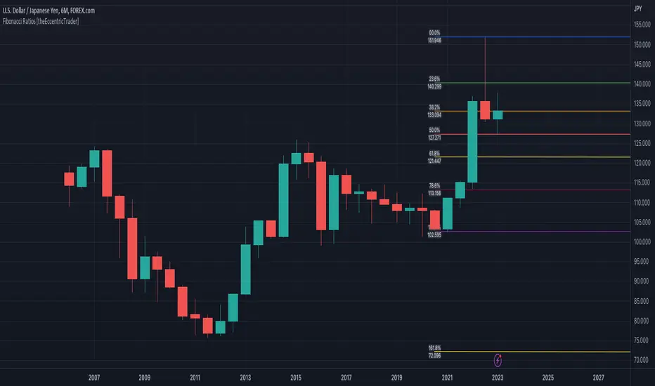
Fibonacci Ratios [theEccentricTrader]█ OVERVIEW
This indicator automatically draws Fibonacci levels from current peak to current trough or current trough to current peak, depending on where the current wave cycle ends.
█ CONCEPTS
Green and Red Candles
• A green candle is one that closes with a high price equal to or above the price it opened.
• A red candle is one that closes with a low price that is lower than the price it opened.
Swing Highs and Swing Lows
• A swing high is a green candle or series of consecutive green candles followed by a single red candle to complete the swing and form the peak.
• A swing low is a red candle or series of consecutive red candles followed by a single green candle to complete the swing and form the trough.
Peak and Trough Prices (Basic)
• The peak price of a complete swing high is the high price of either the red candle that completes the swing high or the high price of the preceding green candle, depending on which is higher.
• The trough price of a complete swing low is the low price of either the green candle that completes the swing low or the low price of the preceding red candle, depending on which is lower.
Historic Peaks and Troughs
The current, or most recent, peak and trough occurrences are referred to as occurrence zero. Previous peak and trough occurrences are referred to as historic and ordered numerically from right to left, with the most recent historic peak and trough occurrences being occurrence one.
Wave Cycles
A wave cycle is here defined as a complete two-part move between a swing high and a swing low, or a swing low and a swing high. The first swing high or swing low will set the course for the sequence of wave cycles that follow; for example a chart that begins with a swing low will form its first complete wave cycle upon the formation of the first complete swing high and vice versa.
Figure 1.
Range
The range is simply the difference between the current peak and current trough prices, generally expressed in terms of points or pips.
Support and Resistance
• Support refers to a price level where the demand for an asset is strong enough to prevent the price from falling further.
• Resistance refers to a price level where the supply of an asset is strong enough to prevent the price from rising further.
Support and resistance levels are important because they can help traders identify where the price of an asset might pause or reverse its direction, offering potential entry and exit points. For example, a trader might look to buy an asset when it approaches a support level , with the expectation that the price will bounce back up. Alternatively, a trader might look to sell an asset when it approaches a resistance level , with the expectation that the price will drop back down.
It's important to note that support and resistance levels are not always relevant, and the price of an asset can also break through these levels and continue moving in the same direction.
Fibonacci Retracement and Extension Ratios
The Fibonacci sequence is a series of numbers in which each number is the sum of the two preceding numbers, starting with 0 and 1. For example 0 + 1 = 1, 1 + 1 = 2, 1 + 2 = 3, and so on. Ultimately, we could go on forever but the first few numbers in the sequence are as follows: 0 , 1, 1, 2, 3, 5, 8, 13, 21, 34, 55, 89, 144.
The extension ratios are calculated by dividing each number in the sequence by the number preceding it. For example 0/1 = 0, 1/1 = 1, 2/1 = 2, 3/2 = 1.5, 5/3 = 1.6666..., 8/5 = 1.6, 13/8 = 1.625, 21/13 = 1.6153..., 34/21 = 1.6190..., 55/34 = 1.6176..., 89/55 = 1.6181..., 144/89 = 1.6179..., and so on. The retracement ratios are calculated by inverting this process and dividing each number in the sequence by the number proceeding it. For example 0/1 = 0, 1/1 = 1, 1/2 = 0.5, 2/3 = 0.666..., 3/5 = 0.6, 5/8 = 0.625, 8/13 = 0.6153..., 13/21 = 0.6190..., 21/34 = 0.6176..., 34/55 = 0.6181..., 55/89 = 0.6179..., 89/144 = 0.6180..., and so on.
1.618 is considered to be the 'golden ratio', found in many natural phenomena such as the growth of seashells and the branching of trees. Some now speculate the universe oscillates at a frequency of 0,618 Hz, which could help to explain such phenomena, but this theory has yet to be proven.
Traders and analysts use Fibonacci retracement and extension indicators, consisting of horizontal lines representing different Fibonacci ratios, for identifying potential levels of support and resistance. Fibonacci ranges are typically drawn from left to right, with retracement levels representing ratios inside of the current range and extension levels representing ratios extended outside of the current range. If the current wave cycle ends on a swing low, the Fibonacci range is drawn from peak to trough. If the current wave cycle ends on a swing high the Fibonacci range is drawn from trough to peak.
Although there is some contention over which popular levels are and are not actually Fibonacci ratios, such as 50% and 100%, in this script I have based my retracement level calculations on the ratios of 23.6%, 38.2%, 50%, 61.8%, 78.6% and 100%. And my extension level calculations on the ratios of 161.8%, 261.8%, 361.8%, 423.6% and 461.8%.
█ FEATURES
Inputs
• Show Fibonacci Extensions
• 00.0% Line Color
• 23.6% Line Color
• 38.2% Line Color
• 50.0% Line Color
• 61.8% Line Color
• 78.6% Line Color
• 100.0% Line Color
• 161.8% Line Color
• 261.8% Line Color
• 361.8% Line Color
• 423.6% Line Color
• 461.8% Line Color
• Extend Line Type
• Show Labels
• Label Colors
█ LIMITATIONS
All green and red candle calculations are based on differences between open and close prices, as such I have made no attempt to account for green candles that gap lower and close below the close price of the preceding candle, or red candles that gap higher and close above the close price of the preceding candle. This may cause some unexpected behaviour on some markets and timeframes. I can only recommend using 24-hour markets, if and where possible, as there are far fewer gaps and, generally, more data to work with.
Tìm kiếm tập lệnh với "wave"
Bellcurves (Zeiierman)█ Overview
Bellcurves (Zeiierman) models impulse-driven expansion and contraction in price using a pair of adaptive “Bellcurve” flows (positive/negative), momentum dots, a sensitivity/normalization layer, pre-alerts, decline detection, and a built-in divergence suite. Instead of treating every bar equally, it builds scale-aware impulse fields from a weighted price source, normalizes them into comparable magnitudes, and then highlights impulse clusters, pre-alerts (rising pressure), and impulse declines. These waves behave like impulse envelopes: when expansion persists, columns cluster and momentum dots fire; when pressure fades, decline signals and divergences appear.
Use it to spot the first thrust of a new leg, the final push before exhaustion, or quiet accumulation/distribution within ranges.
⚪ Why This One Is Unique
Bellcurves (Zeiierman) combines several adaptive mechanisms into a single, self-tuning framework that captures both momentum expansion and directional decay. Its dual Bellcurve core extracts directional strength through asymmetric smoothers and non-linear amplification, isolating genuine impulses from random volatility. A Quick-Response mode enhances sensitivity in fast markets, while the normalization layer preserves consistency across instruments and timeframes.
█ Main features
⚪ Bellcurves
The Positive and Negative Bellcurves form the foundation of the indicator, visualizing directional expansion in price. Each curve is derived from weighted price dynamics and transformed into an adaptive field that expands with trend acceleration and contracts during exhaustion. Displayed as column waves (or oscillator-style), they reveal the rhythm of market impulses; steady clustering denotes continuation, while isolated bursts or fading peaks hint at potential reversals.
Price Acceleration
Trend Acceleration
Note: To visualize trend acceleration and sustained high-momentum trends, increase the Bellcurve Trend Length parameter to 200. This setting emphasizes long-term directional strength and filters out short-term noise.
Reversals
⚪ Impulse Dots
Impulse Dots mark the first and last bursts within a momentum cluster. Detected through adaptive clustering logic, these dots appear as green (positive) or red (negative) signals that often coincide with early breakouts or terminal exhaustion zones. Traders can interpret the first dot as potential momentum ignition. Alerts are provided for each stage, enabling fast reaction to shifting impulse conditions.
⚪ Divergences
The built-in Divergence Engine automatically identifies regular bullish and bearish divergences between price and the Bellcurves. By analyzing the declining and rising segments of the curves, it detects subtle mismatches between price movements and underlying impulse strength.
█ How to Use
⚪ Trend Trading
The Bellcurves help visualize the rhythm of market trends through alternating Positive (green) and Negative (red) Bellcurves. These represent periods of directional expansion when momentum builds and contraction when momentum fades.
Tip: To enable the Trend Bellcurves, increase Bellcurve Trend Length to 100–200. To detect regime shifts earlier, consider enabling Quick Response to respond more quickly to emerging trends.
Positive Trend (Green Bellcurve): Indicates bullish control. Sustained green clusters show stable upward participation and consistent buying pressure.
Negative Trend (Red Bellcurve): Indicates bearish control. Sustained red clusters reveal dominant selling pressure and downside continuation.
Trend Transitions
Positive Trend is Strengthening: When the green Bellcurve expands and height increases, momentum is accelerating and bullish conviction is building.
Positive Trend is Weakening: When the green Bellcurve contracts or begins to shrink, upward pressure is fading and potential exhaustion is developing.
Negative Trend is Strengthening: Red columns expand and deepen below the midline, bearish momentum building, and downside pressure increasing.
Negative Trend is Weakening: When the red Bellcurve contracts or softens, it signals that bearish pressure is losing force, a possible early sign of reversal or accumulation.
⚪ Reversal Trading
Reversal trading with the Bellcurves is one of the most effective and visually intuitive strategies, especially when going long after a Negative Bellcurve. These events often occur quickly and sharply, and when combined with key price levels such as the previous day’s close, high, or low, they can provide high-probability entry opportunities.
To focus on only the most meaningful reversals, disable “Activate Sensitive Bellcurves”. This filters out minor impulses and displays only the most significant Bellcurves across the chart, helping you isolate genuine exhaustion or inflection points.
Note: Reversal trading is inherently more challenging due to the increased volatility and emotional intensity (fear and greed) surrounding turning points. Use the Bellcurves as a confirmation tool, not a standalone entry signal. Always consider the broader market context. In strong trending markets, Bellcurve peaks may reflect continued strength rather than reversal.
A Green Positive Bellcurve forming after a fast upward move and rejection from a resistance zone can indicate a potential bearish reversal.
A Red Negative Bellcurve appearing near a support level often acts as confirmation for a potential bullish reversal, suggesting downside exhaustion and renewed buying interest.
⚪ Momentum / Impulse Trading
Momentum (or Impulse) Trading is designed for traders looking to enter in the direction of a strong, ongoing move. The Bellcurves indicator helps identify significant impulses on a higher timeframe, moments where directional pressure expands decisively. Once those impulses are identified, traders can refine entries on a lower timeframe, using an opposite Bellcurve as a trigger signal. This multi-timeframe approach allows for precise entries within larger momentum phases.
Bullish Momentum Trading
Start by analyzing a higher timeframe, for example, the 15-minute chart.
Identify a Positive (Green) Bellcurve and mark the first impulse dot, signaling the beginning of upward momentum.
Drop down to a lower timeframe (such as the 1-minute chart).
Wait for a Negative (Red) Bellcurve to peak; this short-term counter-impulse serves as a pullback entry point.
Enter long as the lower timeframe Bellcurve fades, aligning your trade with the dominant bullish impulse seen on the higher timeframe.
This approach ensures that your long entries occur within an expanding bullish phase, rather than chasing late moves.
Bearish Momentum Trading
Begin on a higher timeframe, such as the 1-hour chart, and locate a Negative (Red) Bellcurve with a visible impulse dot, confirming strong bearish momentum.
Shift to a lower timeframe like the 15-minute chart.
Wait for a Positive (Green) Bellcurve to peak; this short-term upward counter-move acts as a setup for continuation.
Enter short as that green Bellcurve begins to decline, synchronizing with the dominant bearish impulse from the higher timeframe.
This ensures that short trades align with expanding downside momentum, entering at moments of retracement within a broader selling phase.
█ How It Works
⚪ Bellcurve Construction Framework
The indicator generates directional Bellcurves through an adaptive modeling process that measures price displacement and trend curvature over time. Each Bellcurve reflects the evolving balance between expansion and absorption in market flow, forming the characteristic “bell” structures that widen during directional acceleration and compress during consolidation.
Calculation: Employs a multi-layered smoothing and normalization process to enhance directional clarity while preserving overall balance within the signal field.
⚪ Momentum & Cluster Engine
Momentum dots are generated through a multi-stage transformation that identifies the initiation and termination points of impulse clusters. By scanning for statistically relevant minima and maxima within the Bellcurve stream, the system isolates bursts of meaningful directional activity.
Calculation: Applies recursive power mapping and localized clustering to detect temporal impulse boundaries and validate “first” and “last” bursts within each momentum sequence.
⚪ Divergence Module
The divergence framework maps relationships between price structure and Bellcurve dynamics to uncover weakening or strengthening flows beneath visible price action. It detects classical bullish and bearish divergences and projects them directly onto the chart as lines and markers.
Calculation: Uses anchored decline-state tracking, relative high–low comparison, and vector slope analysis to measure phase displacement between price and impulse flow, confirming divergence integrity without lag.
-----------------
Disclaimer
The content provided in my scripts, indicators, ideas, algorithms, and systems is for educational and informational purposes only. It does not constitute financial advice, investment recommendations, or a solicitation to buy or sell any financial instruments. I will not accept liability for any loss or damage, including without limitation any loss of profit, which may arise directly or indirectly from the use of or reliance on such information.
All investments involve risk, and the past performance of a security, industry, sector, market, financial product, trading strategy, backtest, or individual's trading does not guarantee future results or returns. Investors are fully responsible for any investment decisions they make. Such decisions should be based solely on an evaluation of their financial circumstances, investment objectives, risk tolerance, and liquidity needs.
Tập lệnh trả phí

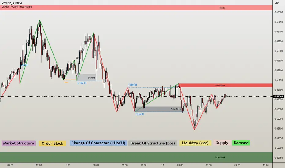
DEMO - FxCanli Price ActionEN - FxCanli TradingView Price Action indicator can draw and alert at everything about PRICE ACTION.
DEMO VERSION of FXCANLI PRICE ACTION Indicator work with any NZD or any DOGE symbols
TR - FxCanli TradingView Price Action indikatörü grafiklerinizde PRICE ACTION ile ilgili tüm çizimleri yapar ve alarm verir.
FXCANLI PRICE ACTION indikatörünün DEMO VERSİYONUNU herhangi bir NZD veya DOGE sembolü ile kullanabilirsiniz.
EN - For Example | TR - Örnek
NZD|...
NZD|USD
NZD|CAD
NZD|CHF
NZD|JPY
DOGE|...
DOGE|USD
DOGE|USDT
DOGE|USDTPERP
DOGE|BTC
EN - FxCanli TradingView Price Action indicator can draw and alert at;
Break of Structure (BOS),
Change of Character (CHoCH),
Liquidity,
Order Block,
Supply & Deman
TR - FxCanli TradingView Price Action indikatörü grafiklerinizde;
Break of Structure (BOS)
Change of Characte (CHoCH)
Liquidity
Order Block
Arz & Talep bölgelerini otomatik olarak çizer ve alarm verir.
Market Structure;
EN - You can easly follow market structure, Up Trend with green waves, Down trend with Red waves
TR - Market yapısını kolayca takip edebilirsiniz. Yukarı trendi yeşil dalgalar ile, Aşağı trendi kırmızı dalgalar ile.
Change of Character (CHoCH)
*************************************
EN - Shows trend reversals
TR - Trend dönüşümlerini gösterir
Break of Structure (BOS)
******************************
EN - Shows trend continuations
TR - Devam eden trendleri gösterir
Liquidity
***********
EN - Shows Liquidity levels
TR - Likidite seviyelerini gösterir
Order Block and Supply&Demend
***************
EN - Shows Order Block and Supply&Demend levels which is a technical analysis technique that tracks the accumulation of orders (when bullish ) and distribution of orders (when bearish ) of banks and institutional traders.
TR - Bankaların ve kurumsalların emir birikimini (yükseliş olduğunda) ve emir dağılımını (düşüş olduğunda) Order Block ve Arz & Talep olarak gösterir.
Mark Structure ShdwMark Structure Show is building the market swing structure, minor and sub structure and marks all possible insignificant pivots
This indicator is the alternative version of Mark Structure indicator, I had to create another indicator in order to avoid programming limitation of TreadingView.
This version uses confirmation approach as confirming by body, it means every swing low/high is confirmed when the body (of newly creating swing low/high correspondingly) takes place and intercepts it. the same behaviour is with breaking structure its confirmed only by body.
From trading prospective with this kind of approach we can easily detect manipulations (caused by sweeps) and disregard those manipulation as elements which are breaking the structure. so its extremely useful for those who are trading smart money price actions and basing on swing structure POI
it supports:
- Marking all pivots with labels or join them continuously with trend lines.
- Marking minor and sub structured swings with labels or join them continuously with trend lines. Marking last actual CHoCH and BOS. Minor and substructure are structures inside swing structure and it can differ from the structure of lower timeframe
- Marking swings of swing structure with labels or join them continuously with trend lines.
- Changing bullish and bearish colors of each kind of structures
- Changing pivot labelings
- Changing colors
Remarks:
- Don't expect to have minor and sub structure in each swing waves, its totally fine when you don't have them at all
- Swing structure is the most significant structure and shows real price direction.
- The last swing is not able to be confirmed it tries to build 2 swings that most likely would be either substructure or SMS BOS
NEoWave ChartAn automated wave chart for NEoWave wave analysis. This is an automated wave chart plotter that help you to find the current psychological trend and forecast the next one. This Indicator uses the concept of plotting wave charts as per the NeoWave method invented by Glenn Neely in 1990 in the “Mastering Elliott Wave” book. NEoWave is a advanced version of elliott wave theory, which solve the lots of drawback's and issues' of elliott wave theory.
The Logic and Concept used in Indicator
This indictor uses the logic of plotting wave chart as discussed in “Mastering Elliott Wave” book, According to “Mastering Elliott Wave” book to draw a wave chart draw a line from high to low or low to high in order that they occurred, and this indicator plot the line accurately from high to low or low to high in order they occurred.
Some Important Features
1. This indicator can draw wave chart from 5 Seconds to 5 Year or use any custom timeframe of your choice.
2. Use any timeframe wave chart on any timeframe cash data, like use monthly cash data to draw 2.5 years or 5 years wave chart.
3. Do the easy back testing with easy drag tool.
4. Customize wave chart settings based on your requirement.
5. Wave chart will be plotted on any type of charts like candlestick or bar chart.
6. Custom settings to hide other charts, like you can hide bar or candlestick chart, while using wave analysis.
7. Realtime plotting of wave chart from 5 seconds to 5 year.
Features to be added in future update
1. Show Monowave Counts.
2. Show Complexity levels.
3. Show Price and Time.
4. Show Starting point of patterns.
How to use this wave chart?
1. Use the log scale on wave chart. Use Alt + L to use logarithmic scale on chart.
2. Use log Fibonacci on wave chart, just open the settings of Fibonacci channel and check on "Fib channel based on log scale"
3. Find the correct starting point to mark the neowave patterns.
4. Apply the neowave rules as discussed in “Mastering Elliott Wave” book and forecast the market.
Note
If you want to check Daily or any higher timeframe wave chart use cash chart and if you want to check any other timeframe from 5 seconds to any intraday timeframe then use future's data as suggested by Mr. Glen Neely.

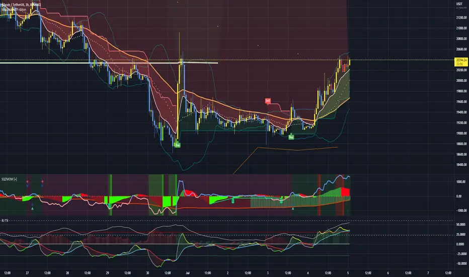
Squeeze Momentum Indicator + 2.0This is a squeeze momentum oscillator with ADX-RSI, Elliot waves oscillator, HMA background and more.
I recommend configure ADX-RSI with the following settings:
-ADX Length = 14
-ADX smooth = 14
-RSI Length = 14
-Threshold = 15
-Upline = 70
-Downline = 30
Thanks to OskarGallard for develop this indicator.
I am Sc4lp1ng, the developer of EMA MTF cloud and TSI-ADX Histogram.
RAS.V2 Strength Index OscillatorHeavily modified version of my previous "Relative Aggregate Strength Oscillator" -Added high/low lines, alma curves,, lrc bands, changed candle calculations + other small things. Replaces the standard RSI indicator with something a bit more insightful.
Credits to @wolneyyy - 'Mean Deviation Detector - Throw Out All Other Indicators ' And @algomojo - 'Responsive Coppock Curve'
And the default Relative Strength Index
The candles are the average of the MFI ,CCI ,MOM and RSI candles, they seemed similar enough in style to me so I created candles out of each and the took the sum of all the candle's OHLC values and divided by 4 to get an average, same as v1 but with some tweaks. Previous Peaks and Potholes visible with the blue horizontal lines which adjust when a new boundary is established. Toggle alma waves or smalrc curves or both to your liking. This indicator is great for calling out peaks and troughs in realtime, although is best when combined with other trusted indicators to get a consensus.

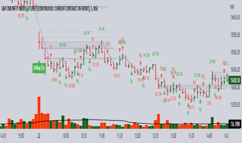
Volume spread analysis V1 (RT)Volume Spread Analysis is a method used by professional traders to identify the Smart money's activities (Institutional Traders) in the markets based on Price and Volume data. and it is considered to be one of the best technical analysis compared to all forms of trading since it is not prone to smart money manipulation but the method itself is to identify the smart money's activity in any markets.
Volume plays an important role in trading since it is used to identify the Smart trader's activity in the markets and it can play a crucial role when it comes to identifying accurate Chart patterns and levels with entries and exits.
Important Features included in this indicator:-
1. Volume Spread Analysis signals to identify SOS (Signal of strength) and SOW (Signal of weakness).
2. Potential Volume zones to identify important levels of Smart money.
3. Gap up and Gap Down Levels to identify the irregular gaps and corrections in the markets.
4. Added Historic signals and other parameter options in the settings.
5. Effort VS Result Option included.
6. Volume Waves, Also known as Cumulative Volume to identify Effort vs result and Buyers/Seller's Activity in the markets.
7. Multiple Options to change the colors of various indicators included.
8. The indicator also consists VWAP option which can be used as POC on Day Trading.
Please note that this indicator will be developed with time as we will constantly be adding more VSA signals in the upcoming days and we are constantly working on the quality of the indicator.
YouTube:- www.youtube.com
Feel Free to reach us via our WhatsApp number +91 9964982366 and provide us with your valuable feedback and ideas for the development of our indicators.

Jae Flow+Jae_Folw+
- Auxiliary indicator that can judge the overall flow / short-term flow of the market
- Flow Chart is divided into upper / middle / lower part
- There is no timeframe limitation, but like the existing divergence trading, we recommend trading by specifying the mainframe.
🔋 (green line) : It is written with an algorithm based on (5 33 / 10 66 / 20 1212) "3 Stochastic", and is used to check the double peak/double bottom easly.
➕ (Cross): Reports Gold Cross/Dead Cross of existing (5 33 / 10 66 / 20 1212) "3 Stochastic".
🔷 (diamond): It is written with a DCP-based(MA+Volume Trend) algorithm to indicate the turning point of the trend
🌈 Basics of trading 🌈
Reversal of Trend Requires Diver/Finale
A chart with a large trading volume cannot go in the opposite direction.
To relieve the moving inertia, after the beam is finished, the beam is crossed and the wave is drawn (during this sidewalk, a divers of an appropriate size is generated)
Indicators to help you know when and where this inertia will end
Trade with the idea that the downward ball changes its inclination and catches the flow in the opposite direction.
It takes longer than I thought for the ball to stop and move in the opposite direction.
🌈🌈
====Usage====
====Basically recommend using divergence as a base, judging the flow of wave (market) with Jaeflow====
📍0. Identifying mainframes and specifying frames to buy and sell
📍1. "Top Flow"
A Need to check the double ceiling/double bottom of the green line of “top flow” (think of the green line as RSI and check the divergence with the candle BEST)
B Cross signal from double ceiling/double floor = flow is changing
C Does a diamond occur at this time + what is the shape of the lower "interrupted flow" (overbought/overbought? double floor/ceiling? etc.)
D Rather than trading with “upper flow”, it is better to see the upper flow following the stop flow
📍2. "Middle Flow"
A Use the same as above
B "Middle flow" consists of the strongest signal to judge the flow
C Active participation in trading if the “Top flow” double peak + stop flow double bar + cross signal + diamond signal continues
📍3. "bottom flow"
A When the above trading conditions are established, check whether the "bottom flow" is also the form immediately preceding the desired shape (BEST)
B If you can see the double-floor/double-ceiling shape in "Bottom Flow", it is recommended to increase the time frame by one level (there is a possibility that it is not the main frame)
📍4. "2 diamonds" or "3 diamonds"
A If “upper/middle/lower flows” occur at the same time, it can be seen as a signal of a strong trend reversal.
🥇 "When Diver Occurs" 🥇
Use it to overlap with items 1,2,3,4 above to judge the trend
===============================================================================================
🥇 Jaedie 사용자를 위한 JaeFlow
- 시장의 전체 흐름 / 단기 흐름을 판단할 수 있는 보조지표
- Flow Chart는 상단 / 중단 / 하단부 로 나뉜다
- 타임프레임의 제한은 없지만, 기존 다이버전스 매매와 같이 메인프레임을 특정하여 매매를 추천
🔋 (녹색선) : (5 33 / 10 66 / 20 1212) 3스토 기반의 알고리즘으로 작성되어, 쌍봉/쌍바닥을 확인하는데 쓰임
➕(크로스) : 기존 (5 33 / 10 66 / 20 1212) 3스토의 골드크로스/데드크로스를 알려줌
🔷(다이아) : DCP기반의 알고리즘으로 작성되어 추세의 전환점을 나타냄
🌈매매의 기본에 대하여🌈
추세의 전환에는 다이버/피날레가 필요함
큰 거래량의 빔형태의 차트가 바로 반대방향으로 갈수는 없음
움직이던 관성을 해소하기 위해 빔이 끝난 후 횡보를 하며 파동을 그림 (이 횡보 도중 적당한 크기의 다이버가 발생하게 되고)
이 관성이 끝날 타이밍과 흐름(Flow)을 알 수 있도록 도와주는 지표
내려가던 공이 기울기가 바뀌어 반대방향으로 굴러가는 흐름을 잡는다는 생각을 하며 매매를 수행
이 공이 멈춰가며 반대방향으로 움직이기엔 내 생각보다 더 긴 시간이 필요함
🌈🌈
====사용법====
====기본적으로 Jaedie의 다이버전스를 Base로 활용 추천, Jaeflow로 파동(시장)의 흐름을 판단====
📍0. 메인프레임 특정 및 매매할 프레임 특정하기
📍1. "상단 플로우"
A "상단 플로우"의 녹색 선 쌍천장/쌍바닥을 확인해야 함 (녹색 선을 RSI라 생각하고 캔들과의 다이버전스를 확인 BEST)
B 쌍천장/쌍바닥에서 나오는 크로스 신호 = 흐름이 변하고 있다
C 이때 다이아가 발생하는지 + 아래쪽 "중단 플로우"의 형태는 어떠한지 (과매수/도 인지? 쌍바닥/천장 인지? 등)
D "상단 플로우"로 매매를 수행하기보단 상단 플로우가 중단 플로우와 이어지는 형태를 보는게 좋음
📍2. "중단 플로우"
A 위와 마찬가지로 활용
B "중단 플로우"는 흐름을 판단하기에 가장 강력한 신호로 이루어져 있음
C "상단 플로우"의 쌍봉 + 중단플로우의 쌍봉 + 크로스 신호 + 다이아 신호등이 이어진다면 매매에 적극적으로 참여
📍3. "하단 플로우"
A 위의 매매조건이 성립했을때, "하단 플로우" 또한 원하는 모양의 바로 직전형태인지 확인(BEST)
B "하단 플로우"에서 대놓고 쌍바닥/쌍천장의 형태가 보인다면 타임프레임을 한단계 높이는걸 추천 (메인프레임이 아닐 확률이 있음)
📍4. "2다이아" or "3다이아"
A "상/중/하단 플로우"가 동시에 다이아가 발생하는 경우 강한 추세전환의 신호로 볼 수있음
🥇 "Jaedie 다이버 발생 시" 🥇
위의 1,2,3,4 항목들과 중첩하여 사용하여 추세를 판단
캔들이 빔을 쏘는 도중 or 관성이 끝나지 않은 도중 반대포지션 진입을 자제합시다
충분히 유연한 곡선으로 그려질 경우 + 다이버가 추가 될 경우 포지션 진입을 하는 매매습관을 들입시다

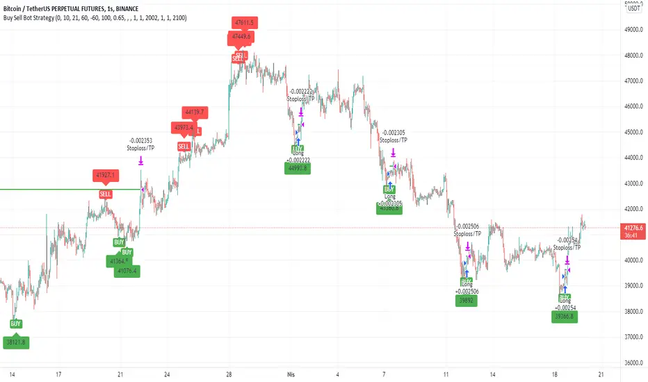
Buy Sell Bot StrategyHello Everyone,
In this strategy, I benefited from the values of RSI and wave trend indicators, which are the oldest and most used indicators in the market. I contributed to this bi-valued indicator myself with a bivariate formula. My variables are actually a simple intersection algorithm, the intersection of the wave trend indicator and the RSI indicators when they are oversold or overbought.
As you all know, we can send signals to bot sites via tradingview. You can use bot signals boxes in this strategy. You can analyze past transactions in the Date settings section. In the indicator settings section, you can change the settings of the overbought and oversold zones. Perhaps the most important feature here is the USE SELL SIGNALS section. I would like to emphasize this section in particular that when you mark the use sell signal section, the strategy will be processed in the buy section and will not be processed in the sell section. If you do not click on the USE SELL SIGNALS section, the strategy will be processed in the buy section, but this time it will be exited when the target in the take profit section is reached. THIS WAS IMPORTANT.
There is another important point here. Always in position and USE SELL SIGNALS sections do not work together. Run these two features one by one. It is a strategy that is constantly in operation through the name of the Always in position feature, I do not recommend it. The USE PERCENTAGE DECREASE feature, on the other hand, is the section where we want the share to drop as a percentage to enter the second trade after the first purchase is made in the settings section if you activate the pyramiding feature. You can use the tradingview help page for the pyramiding feature.
I found this strategy suitable to use in the 1-hour time frame in the crypto market and adjusted it that way. Of course, you can use it by changing the settings in stocks and in different time periods. big wins
Smart Bottom SignalThis indicator is used to find temporary bottoms that are validated with a subsequent candle that closes above the high. The indicator is based on elliott wave theory and tries to signal entries on wave lows. It triggers off of code from " TD D-Wave" 0, 2, 4, A, and C bull wave lows by finding a candle with a close higher that the high of the lowest wave candle or the high of a bullish candle that first breaks above the 8EMA. Green arrows will plot on close indicating that the indicator was triggered.
There are 3 options for display of plots provided:
ShowSmartSigs - This is defaulted to true (display) and allows users to toggle the green arrow alert plots on/off that appear below the candle when triggered.
ShowOnOffPlots - This is logic I use to signal a downturn/upturn and is indicated by red/green arrows appearing above the trigger candle.
ShowBounceSigs - This is defaulted to false and would show as an orange arrow under a candle where a bullish candle first climbs above the 8EMA when ShowOnOffPlots is signaling a downturn and SlowtSochastics is below 21. The SlowStochastics settings are adjustable on the settings screen and default to 21,3.
Alerts Available:
"Smart Buy Bounce" - This alert fires when the ShowSmartSigs signal is triggered.
"Buy Bounce" - This alert fires when the ShowBounceSigs signal is triggered.
"Turn Off Bots"/"Turn On Bots" - This alert fires when the ShowOnOffPlots signals are triggered. I use this to turn off shorter timeframe (15m-1H) bots during a prolonged price drop.
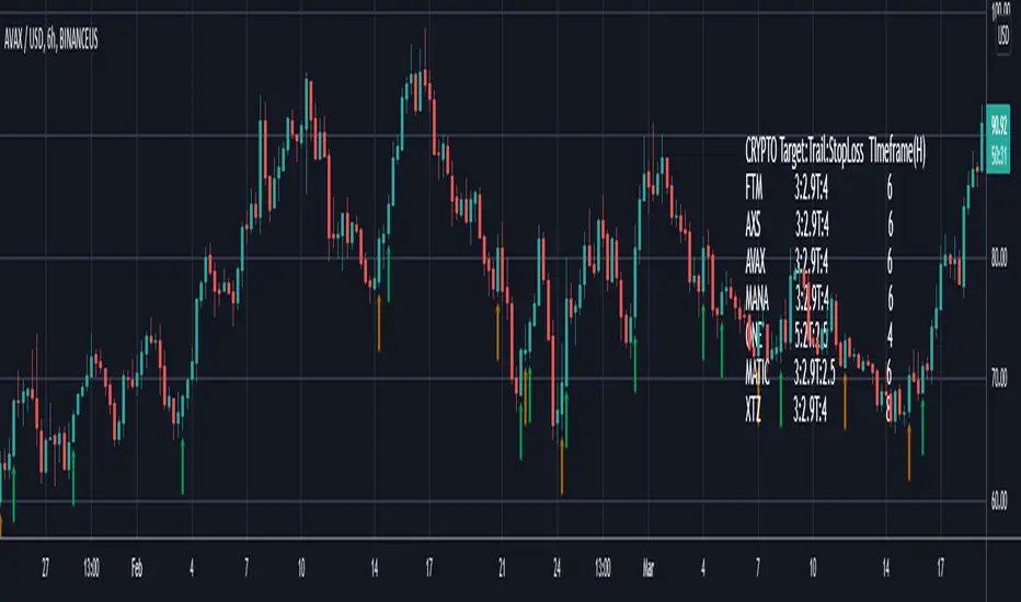
This is an early prototype that is filtered to the following tested cryptos against the specified chart timeframes and using the expressed target/trail/stoploss logic.
CRYPTO Target:Trail:StopLoss TImeframe(H)
FTM 3:2.9T:4 6
AXS 3:2.9T:4 6
AVAX 3:2.9T:4 6
MANA 3:2.9T:4 6
ONE 5:2T:2.5 4
MATIC 3:2.9T:2.5 6
XTZ 3:2.9T:4 8
SARWThis indicator aims to indicate the correlation between two assets(Current and Base), it does NOT show entries or help your chart analysis directly.
The main features of this Correlation indicator is :
Correlation type : Direct Correlation | Inverse Correlation | No Correlation
Correlation Percentage : as its name, it calculate the Correlation Percentage between Current and base assets if exist
How to use: Chose the base asset (default: bitcoin) and open any other chart to be the other -Current- asset
inputs:
Max Lookback length : how many candles will be included in the scan.
Swing intensity : How many candle should be counted to confirm a Swing, If you are confused leave it as its default.
Base Asset : The base asset to calculate the current asset correlation with.
Important Notes:
As I promised, the previous correlation indicator used each candle alone, while this one uses waves and swings.
The Current asset has more power over the base, because it compares the Base to current, but not the opposite((E.g. if you want to check if some coin have correlation with bitcoin, it's better to use bitcoin and put the other coin name in the input field)).
For any notes on the indicator to be edited, or for another indicator ideas please comment.

Moving Average WavesThis indicator displays up to 20 fully editable moving averages.
Go to MA Waves settings and play around to get your favorite visual display, there are plenty of combinations to chose from.
Depending on time frame and tuning, it can be used as a trend/momentum & volatility indicator or to identify supports/resistances.
Longer moving averages represent a stronger "area of value" and the price loves it.
I made this one mostly because it looked cool, if you get ideas to make better use of it let me know.
Hope you enjoy!

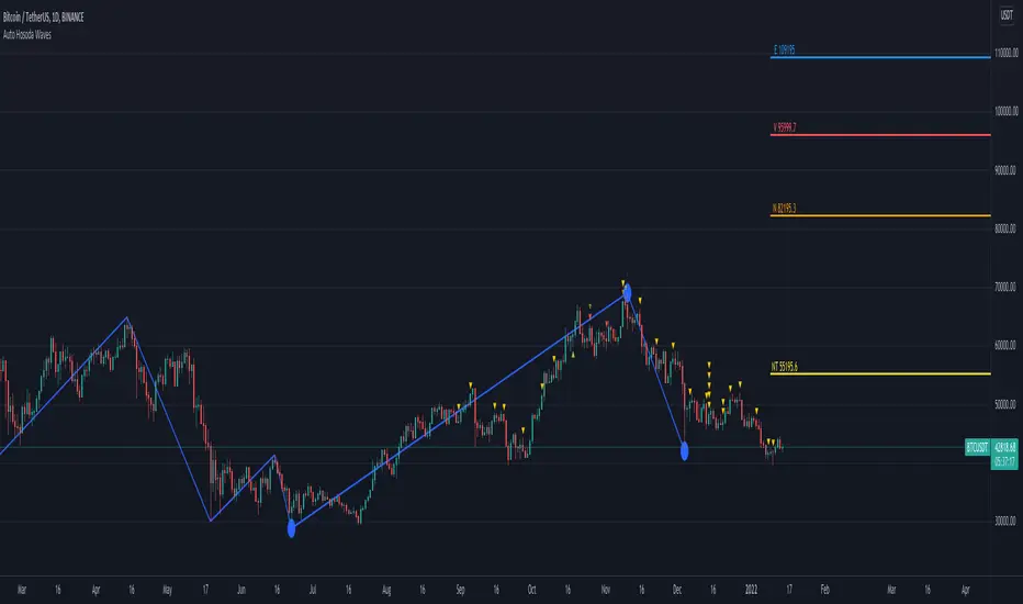
Auto Hosoda Waves by TheSocialCryptoClubName: Auto Hosoda Waves
Category: Indicator
Timeframe: Any Timeframe.
Description: Auto Hosoda Waves uses Zig-Zag to calculate bullish and bearish impulses.It then considers the last Zig-Zag movements to calculate the ABC pattern
Suggested usage: Use on any timeframe. From the configuration of the indicator it is possible to calculate waves also from past ABC patterns, so as to adapt to the trader's intuition.
Technical Details: Internally uses the Zig-Zag indicator for understanding the bounces. From bounces identifies the ABC patterns and uses the Hosoda Waves formulas to print the levels on the screen.
Credits:
- Technique has been explained by Corrado Rondelli in “Ichimoku Kinko Hyo. Operatività sui mercati”
- It is based on the Zig-Zag indicator of TradingView to calculate the Zig-Zag.
- Hosoda Waves calculation from Hosoda Waves by Rexio and modified by PawTar
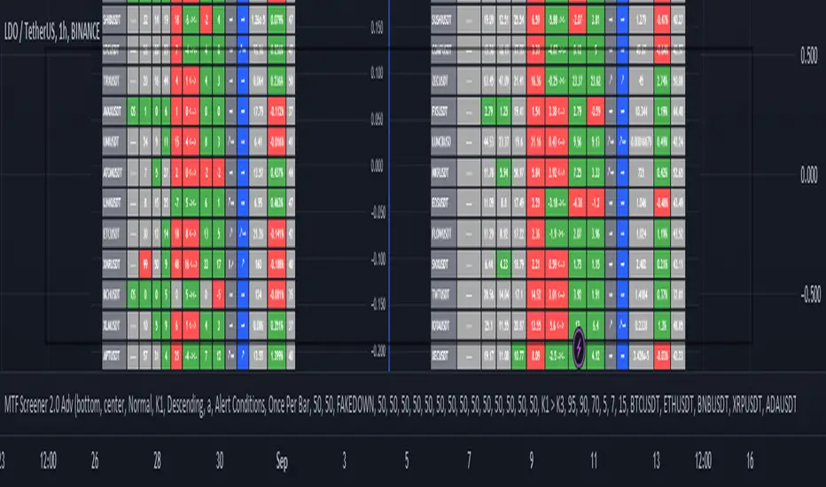
MTF Wave Screener [Cryptoheat]The "MTF Wave Screener" is a screener built to be able to scan the market quickly and easily in a very efficient way based on the "MTF Wave Stochastic RSI " function.
therefore it is basically an MTF wave stochastic scanner to monitor a wide scope of charts and know which to look deeper into using the "MTF Wave Stochastic RSI" itself. therefore it is recommended to be used with the other indicator and is considered an additional tool for those who use and master the "MTF Wave Stochastic RSI " indicator. if you do not know how it works, make sure to check it out here and read its description, which is a vital part for this one:
knowing how it works, you should be able to understand what it means for the chart to be Overbought, Oversold or having a Fake-out (mini-wave) on the MTF Wave Stochastic RSI, as well as the meaning of the values of K1, K2, K3 and the gap between K1 and K2. if not, please check it out by visiting the link attached earlier.
This table screener basically writes all the MTF data in a table showing mainly the chart's status as an option of (Oversold, Overbought, Fakeup or Fakedown) as well as the K1, K2, K3, Gap, value change from last candle data of all requested charts. Therefore acting as a market scanner for people who want to save the time needed to scan the whole market manually.
For example:
as you can see the table is showing 'GALA:USDT' pair as being oversold and having k1,k2 and k3 values of 0,0 and 9.76 respectively, therefore if you go check on the MTF Wave Stochastic RSI indicator, you will see that the current pair has a green highlight indicating oversold. and having the K1,K2 and K3 values as indicated on the indicator.
same goes for any other MTF status. Another example is when it shows a FAKEDOWN . Experienced MTF Wave Stoch RSI users know that this means that the MTF curves are formed in a bullish way showing that there is a retrace towards oversold only on the lowest time frame stochastic K1 while the normal time frame stochastic is still overbought. if you check the screener table you will see for example that 'QNTUSDT' pair is showing a FAKEDOWN the gap between K1 and K2 can be seen in the K1 and K2 values as well as the column named Gap val . with it you can determine the strength of that Fakedown. the bigger the Gap Val the higher the Fakeout and the bigger the expected bounce is should it play out.
checking on the QNTUSDT MTF Wave Stoch RSI you will see a clear fakedown between k1 and k2 (gray and blue curves), indicating a possible bounce incoming soon.
Overbought and Fakeup, each mean the opposite of Oversold and Fakedown respectively.
in short all the values contained on that screener table help you picture each chart's individual MTF Wave Stoch RSI of their own without having to check each one by itself. this is a very useful tool for traders who need to scan the market for the MTF data of each coin...
The screener comes with several options. in settings you can change the parameters for overbought, oversold , Fakeup and Fakedown in the settings according to the k1, k2, k3 values and differences. The table is made to screen 33 charts at the same time. to allow you to store more charts it is made in a way that you can choose not only those 33 but also 4 other x 33 watchlists and select the ones you want among them giving you the option to make your own 165 chart's watchlist and save it.
You must know that however, in the event that any of those default charts gets is not valid anymore, for example if a coin gets delisted of an exchange or a stock gets delisted the table will not work until you manually change that pair, even if it is in the alternative watchlists. in that case you will receive a warning message and a black indicator. in that event, please check for the pair that has been delisted and change it to another working pair and save as default.
Auto Fib Time Zones and Trend-Based Fib Time by DGTFibonacci time zones, based on the Fibonacci number sequence, are vertical lines that represent potential areas where a swing high, low, or reversal could occur.
Trend-Based Fib Time shows probable price corrections in an existing trend. A useful tool to use in addition to Elliot Wave counting, Fib Time helps to identify how far the wave is likely to travel
Please note, Time zones aren't concerned with price, only time
Disclaimer :
Trading success is all about following your trading strategy and the indicators should fit within your trading strategy, and not to be traded upon solely
The script is for informational and educational purposes only. Use of the script does not constitute professional and/or financial advice. You alone have the sole responsibility of evaluating the script output and risks associated with the use of the script. In exchange for using the script, you agree not to hold dgtrd TradingView user liable for any possible claim for damages arising from any decision you make based on use of the script
TopTenAlgo 8. Elliottwave Cycle EN: The Elliottwaves Cycle Oscillator is an indicator that allows the detection of impulsive (impulsive / ascend) or corrective (correction / fall) waves, ie each cycle (cycle) in Elliott Waves . The aim is to measure the speed of a real trend and to predict returns. In the uptrend or impulsive movement, Cycle continues its movement in the upper band after the price is set on a certain band, while in the downtrend or corrective move, the Cycle continues its movement in the lower band.
This algorithm is prepared with @Top10Algo ...
TR: Elliottwaves Cycle Osilatörü Elliott Dalgalarında ki impulsive (itkisel/yükseliş) yada corrective (düzeltme/düşüş) dalgaların yani her bir siklus’ un (cycle) önceden tespit edilmesini sağlayan bir göstergedir. Amaç gerçek bir trendin hızını ölçmek ve geri dönüşleri önceden tespit etmektir. Yükseliş trendi içinde yada impulsive bir harekette fiyat belli bir banda oturduktan sonra Cycle üst band’ da hareketine devam ederken, düşüş trendi içinde yada corrective bir harekette fiyat belli bir banda oturduktan sonra Cycle alt bandda hareketine devam eder.
Bu algoritma @Top10Algo ile beraber hazırlanmıştır...

VWAP OscillatorToday I'm proposing a simple VWAP oscillator script to trade buy and sell waves more easily.
You trade this similar to how you trade Awesome Oscillator, so if you want an explanation just look up YT videos.
In addition to that, this will also show volume squeezes, please note that this is a makeshift way and not real volume squeeze phenomena of volume profile and tape. None the less, it is quite good at allowing you to ride out good trending waves and locate weak price action due to volume squeeze. You can turn off bar coloring from settings if you don't want this.
For ease of reading, I've also applied Allenstars Dynamic zones on this indicator so you can easily locate where the reading is entering in long and where it is in sell, this is compared to selected sample size. I've already selected the most common setting for that, so you don't really need to fiddle with it unless you find something better.
This indicator can be used to trade divergences as well, in fact, I feel it is better for that compared to RSI/MACD, the usual suspects.
Past performance is not assurance of future performance and this idea is published for only educational purposes, author taken no responsibility for your profit or loss.
Hodl Wave v1.0Hodl Wave identifies waves and shows market strength. It's perfect companion to Hodl SR indicator.

Fianchetto v1Hello, I created this script last year I decided I would release it to the public. This script uses Moving Averages to attack or defend price action given the current conditions of the market. This strategy is ONLY for currencies I would NOT recommend using on any other markets. This strategy is wrong about 55% of the time so use at your own risk. This strategy has 2 main focuses, 1. Catching trends and riding trends 2. Defending Profits from a Trend, as a trend starts to form you want to make sure you can get the most juice out of the trend while also ensuring profit taking throughout the trend. This algorithm uses moving averages in a more creative way than just trading crossover's, we use a small MA to use it's direction of travel as a traffic light while using a bigger MA as a filter for our trade bias (bear or bull). Our Traffic light or small MA is what ensures we are defending profits as when the traffic light switches colors we close our trade even if our filter is still the same bias. This however does not mean we are done trading the current trend wave, We wait for our traffic light to switch back to the same bias as our filter to re-enter the trade. I will be updating this system as time goes on, if you have any questions or problems please pm me, QuantsGambit

Market Waves Alpha All-In-One IndicatorMarket Waves Alpha Indicator is a part of the Market Waves All-In-One indicators. It provides indicators on top of the candles which give accurate information on where the market it heading. It is important to familiarize yourself with the different keys available in Market Waves Alpha Indicator . These indicators appear above each candle, but it is important to wait until the candle actually closes before reacting on them. To make things a little easier, we are going to look at each indicator on its own and compare it with market price to see how it performs.
Blood & Red Diamond
These are suppose to be showing you when there is bearish momentum in the trend. Blood & Red Diamonds mean strong bearish momentum.
Yellow Cross – Market Manipulation
This indicator can identify when there is market manipulation about to occur, so be careful with your trade! Let’s see it in action:
Red Cross – Bearish Indicator
The red cross above the candle shows that there is bearish signals showing, so be careful!
Green Dot
The green dot that appears above the candles on Market Waves Alpha Indicator is suppose to where there is bullish intent:
The image above shows 2 green dots that appeared on 1 hour time frame. Clearly, the green dot appear followed by a large spike in price.
Blue Triangle
The blue triangle on Market Waves Alpha Indicator lets you know when there is a trend change, so if price action currently looks bullish the triangle lets you know that we are now in a bearish zone. Let’s take a look at this indicator:
EMA Ribbon
EMA ribbon can be used to identify the trend. Price is above the EMA ribbon when the trend is bullish and below the EMA ribbon when the trend is bearish.
This indicator is recommended to be used with Market Waves Omega Indicator for additional confirmation:
M waves Mk3 'Magical M's v1
V2
V3
So I forgot this existed so here is the Opened sourced code (pm me for older sorce code there are 600+ Saves)(pm me for other scrips course code too lazy to republish everything)
Changes: Simplified and annotated code/upgraded to v4 format
as always adjust before using
i use this indicator combined with the other frequency one to help me identify time and direction of next move.
Pair with rsi
Pair with detrended tsi (have unpublished script might share later)
‘Redraw’ safe
Slightly detrented(adjustable) to avoid traps
quick how to use:
Meant as and adjustable indicator to “tune" to personal risk/reward preference
Green means buy red means sell
arrow indicators for long term sell and buy
Highly customizable (candles too)
Check out my profile for previous versions they are less customizable but also easier to get started with
similar to rsi you want to buy/sell when the indicator turns green/red and lines are as pinched as posible (the lines that are being filled).
keep an eye on the other line that moves around ;) if its not matching the other 2 moving averages and the main color indicator chances are its a trap(works both ways)
use the candles to help you keep your eye on the indicator when scalping (look at the original post for some color ideas)
