RSI Shift Zone [ChartPrime]OVERVIEW
RSI Shift Zone is a sentiment-shift detection tool that bridges momentum and price action. It plots dynamic channel zones directly on the price chart whenever the RSI crosses above or below critical thresholds (default: 70 for overbought, 30 for oversold). These plotted zones reveal where market sentiment likely flipped, helping traders pinpoint powerful support/resistance clusters and breakout opportunities in real time.
⯁ HOW IT WORKS
When the RSI crosses either the upper or lower level:
A new Shift Zone channel is instantly formed.
The channel’s boundaries anchor to the high and low of the candle at the moment of crossing.
A mid-line (average of high and low) is plotted for easy visual reference.
The channel remains visible on the chart for at least a user-defined minimum number of bars (default: 15) to ensure only meaningful shifts are highlighted.
The channel is color-coded to reflect bullish or bearish sentiment, adapting dynamically based on whether the RSI breached the upper or lower level. Labels with actual RSI values can also be shown inside the zone for added context.
⯁ KEY TECHNICAL DETAILS
Uses a standard RSI calculation (default length: 14).
Detects crossovers above the upper level (trend strength) and crossunders below the lower level (oversold exhaustion).
Applies the channel visually on the main chart , rather than only in the indicator pane — giving traders a precise map of where sentiment shifts have historically triggered price reactions.
Auto-clears the zone when the minimum bar length is satisfied and a new shift is detected.
⯁ USAGE
Traders can use these RSI Shift Zones as powerful tactical levels:
Treat the channel’s high/low boundaries as dynamic breakout lines — watch for candles closing beyond them to confirm fresh trend continuation.
Use the midline as an equilibrium reference for pullbacks within the zone.
Visual RSI value labels offer quick checks on whether the zone formed due to extreme overbought or oversold conditions.
CONCLUSION
RSI Shift Zone transforms a simple RSI threshold crossing into a meaningful structural tool by projecting sentiment flips directly onto the price chart. This empowers traders to see where momentum-based turning points occur and leverage those levels for breakout plays, reversals, or high-confidence support/resistance zones — all in one glance.
Tìm kiếm tập lệnh với "zone"

ICT Kill Zone & SNR Tool## Features
- **Auto-Draws Key Price Lines:**\
Plots the close price line for both the current timeframe and a higher timeframe (HTF) of your choice. The HTF close line helps you identify major support/resistance (SNR) areas from higher timeframe structure. All lines are managed automatically to keep the chart clear.
- **Kill Zone Session Markers:**\
Automatically highlights four key Kill Zone trading sessions (London, New York, London Close, Asia) according to ICT concepts. Kill Zone time windows are adjusted for your chart's timezone, with colored horizontal lines and center labels. If any major economic event overlaps with a Kill Zone, a 🔥 icon will be added to its label.
- **Real-Time Economic Calendar Integration:**\
Integrates TradingView's EconomicCalendar library to display major macroeconomic events (FOMC, CPI, PPI, NFP, etc.) directly on your chart. Events are matched to each bar in real time and checked for overlap with Kill Zone periods.
## How to Use
1. **Enable/Disable Elements:**\
Use the settings panel to turn on/off the close price lines for the current and higher timeframe, and adjust color/width as needed.
2. **Select HTF (Higher Timeframe):**\
Choose the desired higher timeframe (such as 1H, 4H, D). The HTF close line updates only when its value changes.
3. **Configure Kill Zones:**
- Toggle Kill Zone markers and select line style (solid, dashed, dotted).
- Set custom names for each session if needed.
- All time calculations are auto-adjusted for your chart's timezone.
4. **Economic Events:**
- Select which event types (FOMC, CPI, NFP, etc.) you want to show.
- When a Kill Zone period contains an economic event, a 🔥 icon is shown in the label for extra caution.
- Hidden event icons are also plotted on bars for backtesting reference.
5. **Chart Clarity:**\
The script automatically limits the number of lines/labels plotted to keep the chart clear and readable.
## How it Works
- **Close Line Drawing:**\
Draws a line from the previous close to the current close for each bar; HTF line only updates when the HTF close changes.
- **Kill Zone Detection:**\
Converts NY Kill Zone session times to your local timezone. For each session, detects entry/exit, draws a colored horizontal line and a centered label.
- **Economic Event Overlay:**\
Checks all selected economic events and overlays a 🔥 to session labels if they overlap; optionally plots an icon on the event bar.
## Disclaimer
This script is provided **for educational and research purposes only** and does **not constitute financial advice**. Trading involves substantial risk; the author accepts no liability for any financial loss.

JXMJXRS - Retest Entry ZonesThis indicator identifies directional breakout retest zones based on structural price levels. It is built for traders who look for secondary entry opportunities after breakouts—often referred to as "retest entries." It is particularly suited to crypto markets and other volatile assets where breakout-retest behavior is frequent and tradable.
The indicator monitors recent price structure and identifies breakouts above or below key levels using a configurable lookback window. When a breakout occurs, it automatically plots a colored zone in the direction of the move:
Green zones are plotted after bullish breakouts (potential long retest areas).
Red zones are plotted after bearish breakouts (potential short retest areas).
Each zone persists on the chart for a defined number of bars before being removed to maintain visual clarity.
Settings
Range Lookback:
Defines how many bars are used to determine recent highs and lows. This controls the structural levels the script uses to detect a breakout. Higher values filter out minor breakouts and only react to more significant price moves.
Zone Height (%):
Sets the vertical size of the retest zone as a percentage of the breakout candle's close. A larger value produces wider zones and increases the chance of price re-entering the zone.
Zone Duration (bars):
Determines how long each zone remains visible after the breakout. After the specified number of bars, the zone is automatically removed. This helps prevent clutter and keeps focus on recent, actionable retest opportunities.
The indicator works across all timeframes and does not repaint. It is best used in trending environments or during volatile market phases where breakouts are likely to lead to continuation.

Leveraged Liquidation ZonesOVERVIEW
This indicator estimates potential liquidation zones based on leveraged positions (25x, 50x, 75x, 100x). It visually displays upper and lower bounds for each leverage tier, allowing traders to infer areas where the market might be seeking liquidity.
CONCEPTS
In leveraged markets, especially crypto derivatives, price often moves towards zones of high liquidation potential — areas where traders using high leverage are likely to be stopped out. These zones represent concentrations of liquidity that can serve as targets for price movement.
This script models simplified liquidation areas by calculating the price range within which positions using specific leverage levels would be at risk, assuming no maintenance margin and using the previous candle close as a reference.
FEATURES
Visual zones for 25x, 50x, 75x, and 100x leverage levels.
Customizable visibility and colors for each leverage tier.
Real-time zone calculation based on the previous candle close.
Simple and clean design to overlay directly on price action.
USAGE
Use this tool to identify areas of liquidity accumulation or potential price magnet zones. High-leverage liquidations often lead to volatile movements when triggered, so tracking these zones can help anticipate breakout or reversal behavior.
You can toggle individual leverage levels via the settings panel, and adjust color transparency to suit your chart theme. This tool is most effective when combined with volume spikes, order book analysis, or high-frequency behavior.

Hot Zones Indicator [ChartPrime]Hot Zones (Basic) is a precision-engineered confluence detection system that identifies statistically significant price reaction zones by mapping retracement levels enriched with structural, volumetric, and momentum-based overlays. In contrast to static Fibonacci tools, this system dynamically synchronizes a custom volume-weighted average price inspired overlay and localized oscillator signals to produce probabilistically favorable “hot zones” that respond to real-time market structure.
These zones are visually enhanced when multiple dimensions of market confluence align—such as volume-weighted price agreement, structural symmetry, and volatility-based momentum extremes—allowing for immediate prioritization of high-probability reaction areas.
Core Concept
The system autonomously detects impulse-correction phases within the price series using directional breakout logic and multi-bar structural analysis. Once a valid trend leg is established, standard retracement levels are plotted along the vector. These levels are continuously evaluated against live price interaction, volume alignment, and momentum state.
Swing Initialization Logic
Automated Structural Anchoring: Swing points are detected using fractal pivot analysis and breakout validation. The tool anchors retracement vectors to recent directional legs with the highest structural integrity.
Volume-Weighted Price Confluence
Two VWAP-derived overlays are applied:
Anchored Volume Level: Derived from the origin of the leg, reflecting the volume-weighted cost basis of major participants over the structural phase.
Internal VWAP: Triggered on intermediate pullbacks, mapping localized institutional activity through recursive anchoring logic.
When either curve aligns with a retracement level under live market conditions, the level is flagged as a high-confluence reaction zone.
Momentum & Volatility Filtering
A proprietary oscillator—optimized for mean deviation and multi-resolution smoothing—is integrated to quantify local volatility states and directional momentum.
The oscillator feeds into two distinct signal regimes:
Directional Crossovers: When a significant momentum shift occurs within a mapped levels, the zone is annotated accordingly with a directional labeling "⬆" or "⬇".
Momentum Extremes: OB/OS thresholds are used to detect compression or exhaustion states, enhancing zone validity under directional stress.
These signals are visually merged into the zone rendering, enabling contextual clarity at a glance.
Customization & Advanced Features
Individual fib levels can be toggled or styled per user preference.
Aesthetic properties (color, line width) are fully configurable.
An optional “Hacker Zone” region—highlighting retracement areas statistically associated with institutional accumulation also known as Golden Pocket — is available for advanced users.
Conclusion
Hot Zones by ChartPrime represents a multi-dimensional confluence engine, transforming traditional retracement mapping into a reactive, data-driven framework. By integrating structure, volume flow, and momentum analytics into a unified interface, it enhances discretionary and systematic trading decisions alike. Whether trading trend continuations, reversals, or liquidity anomalies, Hot Zones enables actionable clarity at structurally significant levels.

Liquidity and S&R Zones╔══════════════════════════════════════════════════════════════════════╗
║ Description ║
╚══════════════════════════════════════════════════════════════════════╝
This indicator identifies liquidity zones and support/resistance (S&R) levels
using pivot points and volume analysis. Liquidity zones highlight areas of high
trading activity, while S&R levels mark key price levels where price may reverse
or break. Breakouts are confirmed with a volume oscillator and visualized with
shapes. Alerts are provided for significant S&R breakouts.
╔══════════════════════════════════════════════════════════════════════╗
║ User Guide ║
╚══════════════════════════════════════════════════════════════════════╝
#### Overview
This indicator detects liquidity zones and support/resistance (S&R) levels
using pivot points and volume analysis. Liquidity zones highlight areas of
high trading activity, often targeted by institutional traders. S&R levels
indicate key price levels where price may reverse or break, with breakouts
confirmed by a volume oscillator. The indicator is designed for traders
seeking to trade breakouts or reversals at critical levels.
#### Features
- **Liquidity Zones**: Identifies pivot highs/lows with high-volume confirmation.
- **Support/Resistance Levels**: Plots dynamic S&R lines based on pivot points.
- **Breakout Signals**: Displays shapes for price crossing S&R levels with volume confirmation.
- **Volume Oscillator**: Uses short/long EMA difference to confirm breakouts.
- **Alerts**: Notifies users of support/resistance breakouts.
#### Input Parameters
- **Liquidity Settings**:
- *Liquidity Lookback Period*: Bars for average volume (default: 50).
- *Liquidity Volume Threshold Multiplier*: Volume multiplier for liquidity zones (default: 1.5).
- *Liquidity Pivot Lookback*: Bars for pivot detection (default: 5).
- **S&R Settings**:
- *Show Breaks*: Toggle breakout shapes (default: true).
- *Left/Right Bars*: Bars for S&R pivot detection (default: 15).
- *S&R Volume Threshold*: Minimum oscillator value for breakouts (default: 20).
- **Style Settings**: Predefined colors for liquidity and S&R visualization.
#### Usage
1. Apply the indicator to a chart (e.g., 1H, 4H, or D timeframes recommended).
2. Adjust input parameters to suit the instrument and timeframe:
- Increase `liqLookback` for smoother volume averages on lower timeframes.
- Adjust `leftBars` and `rightBars` for more/less sensitive S&R levels.
- Set `srVolumeThresh` based on typical oscillator values (plot `osc` to calibrate).
3. Monitor liquidity zones (red/green/yellow crosses) and S&R lines (red/green).
4. Watch for breakout signals (shapes) when price crosses S&R levels with volume confirmation.
5. Set up alerts for "Support Broken" or "Resistance Broken" to receive notifications.
#### Recommended Settings
- **Timeframes**: 1H, 4H, or D for reliable signals.
- **Instruments**: Assets with good volume (e.g., crypto, forex, indices).
- **Liquidity**: Increase `liqVolumeThreshold` (e.g., 2.0) for stricter zones.
- **S&R**: Use `leftBars = rightBars = 10` for faster markets.
#### Cautions
- Ensure sufficient chart history for pivot and volume calculations.
- High `liqLookback` or `leftBars` may delay signals on lower timeframes.
- Volume oscillator requires accurate volume data; test on reliable instruments.
- Backtest breakout signals, as false breakouts can occur in choppy markets.
#### Customization Ideas
- Add Fibonacci levels to complement S&R zones.
- Integrate with trend indicators (e.g., EMA) to filter breakouts.
- Visualize volume oscillator as a histogram for calibration.
- Extend liquidity zones with boxes to highlight price ranges.
#### Notes
- Combine with other analysis for a complete trading system.
- Test thoroughly in a demo account before live trading.
- Contact the author for support or feature requests.
Happy trading, and may your trades align with the market’s key levels! 🚀

Adaptive Support & Resistance Levels [StabTrading]The Adaptive S&R Levels indicator is designed to study support and resistance levels by synthesizing multiple well-known techniques for identifying these zones. It aims to provide traders with reliable price levels that reflect the collective perspective of market participants, using historical price action and projective techniques for extreme conditions.
💡 Introduction: Identified Problem
Traders often draw support and resistance lines using varied methods, leading to inconsistencies in where these levels are placed on charts. This variability can reduce the effectiveness of individual levels, as price may not react strongly to zones that lack broad recognition. The Adaptive S&R Levels indicator addresses this by aggressively averaging multiple established techniques to create support and resistance lines that align with what most traders are likely to identify, increasing the probability of price reactions.
🚀 How it Works: Overview
The indicator employs a multi-technique algorithm to generate support and resistance levels, ensuring they represent a consensus of trader perspectives.
🚀 How it Works: Chart Levels Display and Styling
Support levels, displayed in green below the current price, and resistance levels, shown in red above the price, are plotted clearly on the chart. Levels are numbered sequentially (e.g., v1, v2) as they move further from the current price, providing a visual hierarchy of proximity. Extreme levels, labeled as "Extreme Support" or "Extreme Resistance," are plotted in a bolder color to distinguish them as the outermost boundaries, maintaining the same green (support) and red (resistance) color scheme for consistency.
🚀 How it Works: Historical Price Action Algorithm
For areas with available historical data, the algorithm analyzes price action using a variety of recognized methods for drawing support and resistance, such as pivot points, swing highs/lows, and volume-based zones. It calculates a weighted average of these techniques to produce a “regression fit” line that reflects the accumulation of levels traders might draw. By prioritizing areas where multiple methods converge, the indicator identifies zones likely to be significant to a wide audience, enhancing their relevance.
🚀 How it Works: Projective Techniques Algorithm
In scenarios without recent historical price action—such as all-time highs or lows—the indicator employs an alternative algorithm that combines projective techniques commonly used by traders. These include Fibonacci extensions, Measured Moves (price projections), Psychological Milestones (e.g., round numbers), Channel/Trendline Extrapolation, and Time-Based Targets (inspired by methods like Gann techniques). The algorithm seeks a confluence of these methods to draw support and resistance levels that align with what most traders would consider significant in such conditions. These levels maintain the same green (support) and red (resistance) color scheme, with numbering based on their distance from the price.
🚀 How it Works: Noise Parameter Adjustment
Users can adjust a noise parameter to control the number of displayed levels. Lower settings show more lines, reflecting a broader range of potential zones but with less confluence. Higher settings increase the required confluence of techniques, resulting in fewer lines that have a higher probability of eliciting a price reaction. This customization allows traders to tailor the indicator to their preferred timeframe or trading style.
🔥 Features
Confluence-Based Levels: Support and resistance lines are derived from a weighted average of multiple techniques, aiming to mirror the levels most traders would recognize.
Extreme Levels: Generates support and resistance in areas without historical price action, using techniques like Fibonacci extensions and Measured Moves.
Color-Coded Display: Green support levels appear below the current price, and red resistance levels appear above, with extreme levels in a bolder shade for distinction.
Adjustable Noise Parameter: Users can modify the confluence threshold to display more lines (lower settings) or fewer, higher-probability lines (higher settings).
📈 Implementing the System
1. Adjust Settings
Set the noise parameter based on your trading style (0.1 to 10).
Use lower values for more frequent levels, suitable for scalping or short-term analysis.
Use higher values for fewer, higher-confluence levels, ideal for swing trading or longer-term strategies.
Adjust for your timeframe: Settings tend to be lower on shorter timeframes and higher on longer timeframes.
2. Identify Levels
Monitor green support levels below the price for potential buying zones, noting their numbered proximity (v1, v2, etc.).
Observe red resistance levels above the price for potential selling or shorting zones, noting their numbered proximity.
Note extreme levels (labeled "Extreme Support" or "Extreme Resistance") in areas like all-time highs, which may act as key reversal points.
3. Evaluate Price Reactions
Track how price interacts with the plotted levels to assess their effectiveness, considering their proximity to price.
Observe performance in bullish, bearish, or ranging markets to understand the indicator’s behavior at different levels.
Test different noise parameter settings across various assets and timeframes to find the optimal balance for your approach.
4. Layering Trades with Levels
Use the numbered levels to layer into a trade: for example, enter a partial position at a closer support level (e.g., v1) and add to it at a further level (e.g., v2) if price continues to decline, spreading risk across multiple zones.
Layer out of a trade by taking partial profits at each resistance level as price rises (e.g., reduce position at v1, then v2), or fully exit at an "Extreme Resistance" level to maximize gains while managing exposure.
🔶 Conclusion
The Adaptive S&R Levels indicator provides a framework for studying support and resistance by averaging multiple trader-recognized techniques. With its ability to handle both historical and extreme price scenarios, numbered levels for visual hierarchy, and customizable noise settings, it offers a versatile tool for analyzing key price levels. Designed for educational use, it encourages traders to test and observe how these consensus-driven levels align with market behavior within broader analysis.

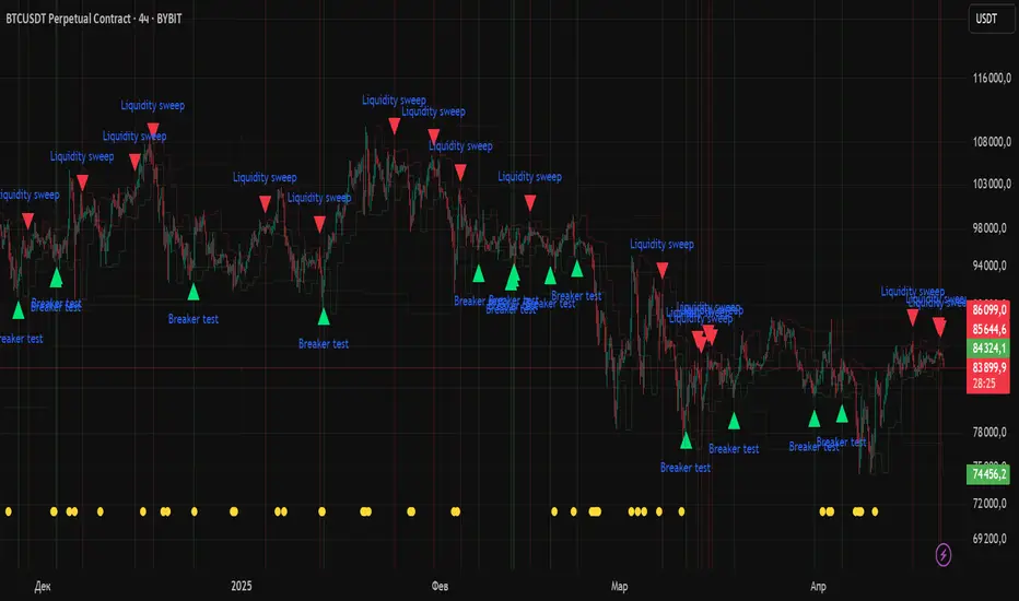
Liquidity Zones Alerts"Liquidity Zones Alerts" is a powerful smart-money-based indicator designed to detect key liquidity grabs and provide high-probability reversal signals using a combination of market structure, volume, volatility, and candlestick confirmation.
🧠 How It Works
The core logic of this indicator is built around the Smart Money Concepts:
🔺 Liquidity Sweeps: Detects when price takes out previous daily or weekly highs/lows, suggesting stop hunts or engineered liquidity moves by institutional players.
📈 Volume Filter: Ensures signals only appear during above-average volume, filtering out noise and low-interest moves.
⚡ Volatility Filter: Flags high-range candles relative to the average, catching flash crashes/spikes that often precede strong reversals.
🔄 Engulfing Candle Confirmation: Confirms entry with a bullish or bearish engulfing pattern after liquidity is taken — increasing signal reliability.
🧭 Premium/Discount Zone Logic: Trades are filtered to ensure longs are only taken in discount zones, and shorts in premium zones, using a 20-period market range for context.
📌 Features
✅ Daily & Weekly liquidity zones toggle
✅ Visual signals with clean 🔻(short) & 🔺(long) arrows
✅ Auto-detection of flash crashes
✅ Alerts on both long and short setups
✅ Optional previous high/low level plotting for context
✅ Background highlighting of valid signal candles
✅ Multi-timeframe friendly and compatible with any asset
🛠️ Use Case
Whether you're a scalper or a swing trader, this tool helps you spot institutional entry zones before the move happens. It works especially well when combined with your existing bias or supply/demand zones.
💬 “Price doesn't move randomly — it hunts liquidity. This indicator shows you where and when it happens.”
Volume Zones [Blocks]📦 Volume Zones — Smart Volume Detection, Visualized.
Want to spot high-impact candles and key zones of interest with one glance?
Volume Zones is your new edge in reading volume like a pro.
🚀 What it does:
Detects abnormal volume activity using Z-Score logic.
Automatically highlights candles with significant volume spikes as:
⚡ Z1: Noticeable activity
⚡ Z2: Strong participation
⚡ Z3: Potential climax or reversal zone
Builds smart zones (blocks) around these candles to track key price levels and possible mitigation zones.
🧠 Why it's powerful:
No more guessing if a candle matters — let the math speak.
Helps identify:
True breakouts vs fakeouts
Potential reversal zones
Volume-based POIs
Customizable visualization — from color to length, even block opacity.
💡 Use cases:
Combine with Smart Money concepts to validate sweeps and FVGs.
Pinpoint zones where big players stepped in — and where price might return.
Analyze if a breakout is supported by real volume or just noise.
⚙️ Bonus Features:
Compact marker mode for minimalists.
Middle line option for extra precision.
Performance-optimized: limits number of boxes on chart.
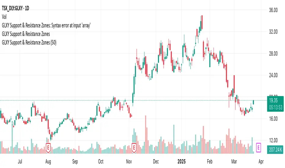
GLXY Support & Resistance ZonesHere’s a structured trading strategy for Galaxy Digital Holdings Ltd. (GLXY) based on a combination of technical analysis, market sentiment, and macro crypto market movement:
⸻
1. Timeframe
• Swing trading timeframe: 1-week to 1-month trades.
• Monitor daily and 4H charts for entries and exits.
⸻
2. Key Factors Driving GLXY
• Strongly correlated to Bitcoin and Ethereum price movement.
• Sensitive to regulatory news in Canada/US and institutional crypto adoption.
• Watch Galaxy’s quarterly earnings and treasury BTC/ETH position updates.
⸻
3. Entry Strategy
A) Technical Setup:
• Buy at major support zones:
• Key support levels: $7.00 CAD, $9.00 CAD (verify current chart levels).
• Enter long positions on bullish reversal candles at these supports.
• Breakout trades:
• Enter long positions on confirmed breakouts above significant resistance (watch volume and 1D close).
• Moving Average Confirmation:
• Only trade long if price is above the 50-day moving average and 50 MA is upward sloping.
B) Macro Confirmation:
• Only take aggressive long positions if BTC price is in an uptrend (above its own 50-day MA).
• Monitor ETH/BTC pair as additional confidence for alt sentiment.
⸻
4. Exit Strategy
• First partial profit target: Previous swing highs or Fibonacci extension levels (commonly 1.272 or 1.618).
• Trailing stop: Move stop-loss to entry when trade is +10%.
• Hard stop-loss: Below the last daily support (2-5% risk).
⸻
5. Diversification
• Do not exceed 5-7% of total portfolio per trade.
• Hedge exposure by monitoring crypto futures or crypto sentiment indexes (eg. Fear & Greed Index).
⸻
6. Optional Short Setup
• Only short if price breaks major support with strong volume, and BTC/ETH are in confirmed downtrends.
• Short target: next daily support zone.
⸻
7. News / Event-based Catalyst
• Enter small positions before major earnings or after big regulatory decisions if crypto sentiment is bullish.
⸻
8. Review
• Reassess the strategy every month based on BTC market structure.
• Track your trade results for GLXY separately to refine position sizing and entry criteria.
⸻
VWAP Balance Zones - SessionsVWAP Balance Zones Sessions Version is an alternate take on the Original VWAP Balance Zones indicator. The Sessions version allows users to select a specific session to view the VWAP Balance Zones at while still utilizing the full ETH Data.
The Session version provides a better focused display while still maintaining the core functions of the original script with mindful optimizations.
Author's Note: "VBZ Sessions was made with logistics in mind, for the users who only trade within certain times of the day. While it displays the same core concepts, it is not as "Raw" of a display as the Original. For this reason, some users may prefer the Original VWAP Balance Zones, which is why I have opted to release this alternate version instead of updating the original."
> What are VWAP Balance Zones?
"VWAP Balance Zones" is an original concept aimed at identifying the equilibrium area between market participants within the current trend by averaging the Daily Extremes and the Daily VWAP.
Refer to the illustration below for a better understanding of exactly how VWAP Balance Zones are formed:
These zones are displayed for the Daily, Weekly, and Monthly VWAPs, with the most interactive timeframe being the Daily.
> Features
1. The Session Version uses ETH data at all times, and does not solely rely on the chart's data to create the VWAPs or Zones.
This allows the user to focus on a specific trading session, while not losing out on the full VBZ Calculation, with the notable benefit of a cleaner display.
The Original VBZ starts drawing at the beginning of the chart's "Day", and would produce different results when using an RTH chart vs an ETH chart. Along with creating a bird's nest of unusable data at the beginning of the day.
2. Session Start and End lines are displayed for easier identification of the designated trading session.
3. The extreme "Close" Lines are no longer displayed to reduce noise and redundancy.
4. Additionally, the interior VWAP lines are no longer displayed. Ultimately, this was to reduce noise and focus the script on the 50% zones.
5. Weekly and Monthly Zones are now displayed due to the reduced noise!
6. As with the original, the weekly display will yield to the daily, and the monthly display will yield to the weekly.
In the screenshot below, you can observe this behavior.
Enjoy!

Liquidity Imbalance Index (Li2)How to Use the Liquidity Imbalance Index (Li2)
The Liquidity Imbalance Index (Li2) is designed to track market liquidity and identify significant imbalances between buyers and sellers. Here's how to effectively use this indicator in your trading:
Understanding the Main Components
1. Liquidity Delta Histogram/Line:
- Shows the difference between buy and sell liquidity
- Green bars/line: Buying pressure dominates
- Red bars/line: Selling pressure dominates
- The intensity of color shows the strength of the imbalance
2. Threshold Lines:
- Upper (green) threshold: Marks significant buy pressure
- Lower (red) threshold: Marks significant sell pressure
- Neutral zone: Area between the dotted lines where neither buyers nor sellers dominate
3. Liquidity Zones (circles shown on top/bottom):
- Green circles on upper threshold: Historical bull zones (significant buying interest)
- Red circles on lower threshold: Historical bear zones (significant selling interest)
- These zones require multiple hits, consecutive signals, and optionally volume confirmation
Trading Strategies
For Trend Trading
1. Look for when the Liquidity Delta crosses above the upper threshold for bullish signals
2. Look for when the Liquidity Delta crosses below the lower threshold for bearish signals
3. Especially powerful when crossing occurs with acceleration (darker histogram colors)
For Support and Resistance
1. Identify where the significant bull/bear zones appear (green/red circles)
2. These often align with important price levels where orders cluster
3. Use these zones as potential reversal or confirmation points
For Divergence
1. Watch for price making new highs/lows while liquidity shows the opposite
2. Divergence between price and liquidity can signal potential reversals
Volume Confirmation
1. Pay attention to volume-confirmed signals (small circles at zero line)
2. These indicate stronger conviction behind the liquidity imbalance
Optimal Settings
- For day trading or volatile markets, consider reducing lookback periods and increasing thresholds
- For swing trading, the default settings work well to capture significant zones
- In ranging markets, focus on the zones as they often mark the range boundaries
- In trending markets, follow the overall direction of the liquidity delta
Reading Acceleration Signals
The indicator shows color intensity variations to highlight acceleration in liquidity flows:
- Dark green/red: Strong acceleration (rapid shift in order flow)
- Medium green/red: Medium acceleration
- Light green/red: Weak acceleration
These acceleration signals often precede significant price movements.
zavaUnni-Consolidation Zone DetectorConsolidation Zone Detector - Explanation
This Pine Script indicator is designed to detect Consolidation (flat/sideways) zones in price movement by analyzing volatility and identifying periods of consolidation. It visually highlights these flat zones, helping traders spot potential breakout opportunities.
🔹 Key Features
Customizable Timeframe Selection
Users can choose a specific timeframe (TF) for analysis.
Option to use Heikin Ashi candles instead of standard candlesticks for smoother trend detection.
Volatility-Based Analysis
Calculates body size (co_rate) and high-low range (hl_rate) to measure price movement.
If volatility is below a predefined threshold, the zone is classified as flat.
Flat Zone Detection & Visualization
Detects periods of low volatility and marks them as flat zones.
Stores the highest (flat_high) and lowest (flat_low) prices during the flat period.
If volatility increases beyond the threshold, the flat status is deactivated.
Visual Representation with Lines & Shaded Areas
When a flat zone is detected, it is highlighted with orange lines at the high and low levels.
These lines extend dynamically as the flat zone continues.
A semi-transparent shaded area is drawn to emphasize the consolidation range.
🔹 How to Use
Identify sideways price movements and prepare for potential breakouts.
Use in conjunction with other indicators to refine entry and exit points.
Combine with Heikin Ashi candles for a smoother trend analysis.
This indicator is particularly useful for spotting range-bound markets and detecting areas of low volatility where a breakout may soon occur

Relative Strength Index With Range ZoneRSI (Relative Strength Index) with 45-55 Range Zone
1. Introduction and Historical Background
The Relative Strength Index (RSI) is a momentum indicator developed in 1978 by J. Welles Wilder Jr. It measures the speed and magnitude of price changes to assess overbought and oversold conditions of an asset. This widely used oscillator ranges between 0 and 100.
Historically, the RSI was mainly used to detect trend reversals by identifying extreme levels: above 70 (overbought) and below 30 (oversold). However, its application has evolved, and new approaches refine its interpretation, such as adding a 45-55 neutral zone to identify consolidation (range) periods.
2. RSI Calculation
The RSI is calculated using the following formula:
RSI=100−(1001+RS)RSI=100−(1+RS100)
Where:
RS=Average gain over N periodsAverage loss over N periodsRS=Average loss over N periodsAverage gain over N periods
• RS (Relative Strength) is the ratio between the average gains and the average losses over N periods (typically 14 periods).
• Gains and losses are calculated based on daily price variations.
Example calculation with a 14-day period:
1. Compute daily gains and losses.
2. Take an exponential or simple moving average of these values over 14 days.
3. Apply the formula to get the RSI value.
3. Classic RSI Usage
The RSI is typically interpreted as follows:
• RSI > 70: Overbought → Possible correction or bearish reversal.
• RSI < 30: Oversold → Possible rebound or bullish reversal.
• RSI between 50 and 70: Bullish momentum.
• RSI between 30 and 50: Bearish momentum.
4. Adding the 45-55 Zone to Identify Range Phases
Adding a neutral zone between 45 and 55 helps identify consolidation periods, when price moves sideways without a strong trend.
• RSI between 45 and 55: The market is in a range, meaning neither buyers nor sellers dominate.
• RSI breaking out of this zone:
o Above 55: Indicates the start of a bullish trend.
o Below 45: Indicates the start of a bearish trend.
This zone is particularly useful for:
• Avoiding false signals by waiting for trend confirmation.
• Identifying ranging markets, favoring range trading strategies (buying at support, selling at resistance).
• Filtering trend-based entries, waiting for the RSI to exit the 45-55 zone.
5. Trading Strategies Using RSI with the 45-55 Range Zone
1. Range Trading:
• When the RSI oscillates between 45 and 55, it signals a lack of strong trend.
• Strategy:
o Identify a support and resistance level.
o Buy near support when the RSI touches 45.
o Sell near resistance when the RSI touches 55.
2. Breakout Trading:
• If the RSI exits the 45-55 zone:
o Above 55 → Buy (start of a bullish trend).
o Below 45 → Sell (start of a bearish trend).
• This breakout can be used as a confirmed entry signal.
3. Confirmation with Divergences:
• A bullish divergence (price making lower lows while RSI makes higher lows) is more relevant if the RSI moves above 55.
• A bearish divergence (price making higher highs while RSI makes lower highs) is stronger if the RSI drops below 45.
6. Conclusion
The RSI is a powerful tool for analyzing price momentum. Adding a 45-55 zone enhances its usage by clearly distinguishing:
• Consolidation phases (range markets).
• Trend beginnings when RSI breaks out of this range.
This approach improves RSI reliability by filtering out false signals and allowing traders to adapt their strategy based on market conditions.
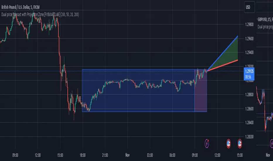
Dual price forecast with Projection Zone [FXSMARTLAB]The Dual Price Forecast with Projection Zone indicator is built to simulate potential future price paths based on historical price movements over two defined lookback periods. By running multiple trials (or simulations) on these historical price movements, the indicator achieves a more robust forecast, incorporating the inherent variability of price behavior.
Key Components and Calculation Details
1. Lookback Periods and Historical Price Movements
Lookback Period 1 and Lookback Period 2 specify the range of past data used to generate each projection. For each period, the indicator calculates the price variations (differences between the closing and opening prices) and stores these in arrays.
These historical price variations capture the volatility and price patterns within each period, serving as templates for future price behavior.
2. Trials: Purpose and Function
The trials are a critical element in the projection calculation. Each trial represents a single simulation of possible future price movements, derived from a random reordering of the historical price variations in each lookback period.
By running multiple trials , the indicator explores various sequences of historical movements, simulating different possible future paths. Each trial adds to the projection’s robustness by capturing a unique potential price path based on past behavior.
Running these multiple trials allows the indicator to account for randomness in price behavior, making the projections more comprehensive by covering a range of scenarios rather than relying on a single deterministic forecast.
3. Reverse Option
The reverse option allows the indicator to invert the direction of price movements within each lookback period. When enabled, historical uptrends are treated as downtrends, and vice versa.
This feature is particularly valuable in scenarios where traders expect a potential reversal in market direction. By enabling the reverse option, the indicator can simulate what might happen if past trends inverted, providing an alternative forecast path that considers possible market reversals.
This allows traders to assess both continuation and reversal scenarios, giving them a more balanced view of potential future price paths and helping them prepare for either market direction.
4. Generating the Average Projection Path
Once the trials are complete, the indicator calculates an average projected price path for each lookback period by averaging the results of all trials. This average represents the most likely price trend based on historical data and provides a smoothed projection that mitigates extreme outliers.
By averaging across all trial paths, the indicator generates a more reliable and balanced forecast line, smoothing out the fluctuations that might appear if only one trial or a small number of trials were used.
5. Projection Zone Visualization
The indicator plots the two average projection paths (one for each lookback period) as Projection 1 and Projection 2, each in a user-defined color.
The Projection Zone is the area between these two lines, filled with a semi-transparent color. This zone visually represents the potential range of future price movement, highlighting where prices are likely to oscillate if historical trends persist.
The Projection Zone effectively functions as a potential support and resistance boundary, providing traders with a visual reference for possible price fluctuations within a specific range.
6. Display of Lookback Zones
To give context to the projections, the indicator can also display colored lookback zones on the chart. These zones correspond to Lookback Period 1 and Lookback Period 2 and are color-coded to match their respective projection lines.
These zones allow traders to see the sections of historical data used in the calculation, helping them understand which past price behaviors influenced the current projections.
Benefits of the Indicator
The "Dual Price Forecast with Projection Zone" indicator provides a multi-scenario forecast based on past price dynamics. Its use of trials ensures that projections are not based on a single deterministic path but on a range of possible scenarios that better reflect the inherent randomness in financial markets.
By generating a probabilistic forecast within a defined zone, the indicator helps traders to:
Anticipate potential price ranges and areas of support/resistance based on historical trends.
Understand the influence of different timeframes (short-term and long-term lookbacks) on future price behavior.
Make informed decisions by visualizing the likely variability of future prices within a controlled projection zone.
Prepare for both continuation and reversal scenarios, thanks to the reverse option. This feature is especially useful in markets where trends may change direction, as it allows traders to explore what might happen
Atr Target TP & Protecion Zone [Pinescriptlabs]This indicator provides an adaptive trailing stop system with dynamic price targets and protection zones, ideal for position management.
Main Features:
🚦 ADAPTIVE TRAILING STOP:
Automatically adjusts based on volatility (ATR) and volume
Two modes: "Modified" and "UnModified" for true range calculation
Displayed as a line with colored background (green for longs, red for shorts)
🎯 TARGET ZONES (T1 & T2):
Calculates two target zones (T1 and T2) based on:
Market strength (combination of RSI, volume, MFI, ADX, MACD)
Current volatility (ATR)
Distance from current price
Visualized with blue boxes (T1) and purple boxes (T2)
🛡️ PROTECTION ZONE:
Automatically activates in sideways markets
Provides an additional buffer to the trailing stop
Helps avoid premature exits in volatile markets
📊 INFORMATION PANELS:
Top Right Panel displays:
Current trend direction
Target status (T1 & T2)
Market strength
Current ATR
RSI level
Bottom Right Panel displays:
Trailing status (WIDE/NORMAL)
Volume impact
Directional strength
Protection zone status
Español:
Este indicador proporciona un sistema de trailing stop adaptativo con objetivos de precio dinámicos y zonas de protección, ideal para la gestión de posiciones.
**Características Principales**:
🚦 **TRAILING STOP ADAPTATIVO**:
- Se ajusta automáticamente según la volatilidad (ATR) y el volumen
- Dos modos: "Modified" y "UnModified" para el cálculo del rango verdadero
- Se visualiza como una línea con fondo coloreado (verde para largos, rojo para cortos)
🎯 **ZONAS OBJETIVO (T1 y T2)**:
- Calcula dos zonas objetivo (T1 y T2) basadas en:
- Fuerza del mercado (combinación de RSI, volumen, MFI, ADX, MACD)
- Volatilidad actual (ATR)
- Distancia al precio actual
- Visualización mediante cajas azules (T1) y moradas (T2)
🛡️ **ZONA DE PROTECCIÓN**:
- Se activa automáticamente en mercados laterales
- Proporciona un buffer adicional al trailing stop
- Ayuda a evitar salidas prematuras en mercados volátiles
📊 **PANELES INFORMATIVOS**:
*Panel Superior Derecho* muestra:
- Dirección de la tendencia actual
- Estado de los objetivos (T1 y T2)
- Fuerza del mercado
- ATR actual
- Nivel de RSI
*Panel Inferior Derecho* muestra:
- Estado del trailing (WIDE/NORMAL)
- Impacto del volumen
- Fuerza direccional
- Estado de la zona de protección

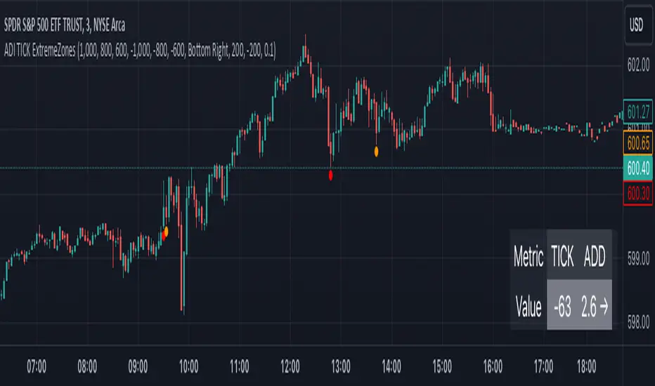
TICK Extreme Zones Indicator OverlayOverview :
The TICK Extreme Zones Indicator Overlay is designed to gauge the overall market trend using the TICK index. By determining the number of bullish (values above 0) and bearish (values below 0) TICK closes within a user-specified lookback period, it provides an insight into the prevailing market sentiment. This insight can be beneficial for traders looking to identify potential entry or exit points based on the market's strength or weakness.
Key Features :
Lookback Period : This is a user-defined time frame in minutes. The indicator counts the number of bullish and bearish TICK closes within this period.
Market Trend Label : Based on the TICK values, the indicator determines if the market is:
Uptrending: Majority of TICK values are positive.
Downtrending: Majority are negative.
Neutral/Rangebound: Equal positive and negative closes.
Zones : These represent certain threshold levels in the TICK values.
Positive Zones:
Dark Blue: 1000
Light Blue: 800 & 600
Negative Zones:
Red: -1000
Yellow: -800 & -600
Touch Detection Method : Detects intraday touches and can be toggled on/off based on the user's preference.
Usage Guidelines :
Trending Market :
In a trending market, the TICK index can remain consistently above or below zero.
For a market moving upwards, it's advisable to consider entering a trade when the indicator returns to zero instead of waiting for it to return to -1000.
Using Exponential Moving Averages (EMAs) can provide additional confirmation of the trend.
Rangebound Market :
For sideways markets, consider initiating a long position when the TICK index goes below -1000 and exit the position when the index reaches +1000.
It's beneficial to pair these readings with significant support and resistance levels to make more informed trading decisions.
Divergence :
Divergence between the TICK index and price can be a good measure of the underlying market strength.
If a stock's price is making lower lows, but the TICK index is making higher lows, it might indicate weakening selling momentum.
Notes:
- Always use this indicator in conjunction with other technical analysis tools.
- Proper risk management practices are crucial when using any trading tool or strategy.
Bull Bear Zones for Bank Nifty and Nifty IndexThis indicator will automatically plot daily Bullish and Bearish Zones. Also this indicator mainly works in the Nifty and Bank Nifty Intraday trades. Preferred time frames (3/5/15 Mins)
Calculation
Take Last 5 days O H L C then find H-O and H-L, take average of the difference of H-O and H-L then Minimum Value then the average difference is added with the day opening to get the bullish zone and the average is subtracted from the opening price to get the bearish zone
Long Trade
Buy above the bullish zone line or Buy near the bearish support levels when it takes support
Example 1 (Buy above Bullish Zone)
Short Trade
Sell below the bearish zone line or Sell when there is a rejection from the bullish zone
Example 1 (Sell Below Bearish Zone)
No Trade Zone
If the market move between the zones then, the momentum is very week.
Example 1

Moving Average Zone Indicator (MAZI) *LITE*MAZI
Description : The MAZI (Moving Average Zone Indicator) is a slow updating moving average calculation of key high and low points in the market, which is a unique approach to sampling moving averages.
The indicator tracks only the key candles that provide good information about price movement, which distinguishes it from other moving average indicators that record a new data point with every bar that prints.
The length of the MAZI is determined by the number of key price points to reference in the average equation, not the number of candles to look at.
The value of the MAZI is fixed at 21.
The MAZI uses specific candle conditions to sample the highs and lows of specific candles to calculate the top and bottom moving averages.
If the close of a candle is lower than the close of the previous two candles, the high of the previous candle is recorded as a potential pivot value.
If the close of a candle is higher than the close of the previous two candles, the low of the previous candle is recorded as a potential pivot value.
These pivot values are then used to calculate the top and bottom moving averages which are smoothed using a simple moving average of length 9.
The upper and lower bounds of the moving average zone are calculated as one and two standard deviations away from the moving averages, respectively.
The MAZI provides a unique perspective on price movement that can help traders identify key zones of support and resistance.
The MAZI’s equation gives traders 5 crucial points of interest: the direction of the zone, the top of the zone, the middle of the zone, the bottom of the zone, and the height of the zone.
How to use each point of interest
The Direction :
Because we don’t use every candle for input into our calculations, the direction of the indicator will not change with insignificant moves in the markets allowing you to catch when something is a pull back vs when it is a real direction change.
We have also included 3 easy to read colors allowing you to gauge when direction is going down, flat, or up, by alternating the color of the zone between red, white, and green respectively.
The Top of the Zone :
The top of the zone represents where price would be expected to not go over given the length of the bars being calculated. So this tells you that if the zone is red and the highs are not breaking over the top of the zone, the market is behaving as expected and it should continue down.
On the other hand, if price does break over the top of the zone it signifies stronger than expected buying power and price movement.
The strongest indication of strong upward movement is when the top of the zone becomes an area of price support.
So when you see a candle come down from above the zone and turn around near the top of the zone there is likely a strong upward move coming.
Unless there is a very strong trend it is best to only take this trade the first time price breaks the top side and forms support.
On a range day this is not likely to happen multiple times in a row without price testing the bottom side in between.
The Middle of the Zone :
The middle of the zone is used as a general no trade zone.
Because price is inbetween where the expected high and low of price should be there is no good indicator of which way price will break out.
That does not mean you cannot find worthwhile patterns in the middle of the zone but as a general rule and a very good rule for beginner traders is to avoid entering a trade inside the zone all together.
The Bottom of the Zone :
The bottom of the zone is used similarly to the top of the zone. If the zone is green and lows are not going below the bottom of the zone the shows you that sellers are not breaking below the expected price and therefore you can expect the price to continue moving up.
On the other hand if price breaks below the low part of the zone then it shows you that sell’s have pushed price below the expected low and therefore is currently under strong selling pressure.
The strongest signal for a big downward move is when the low of the zone (the expected bottom of where price should be given the length of the indicator) turns into a resistance area for price.
When a candle comes up from underneath the zone and fails to break into the zone and starts to drop again, that is the best signal for a big downward move.
Unless there is a very strong trend it is best to only take this trade the first time price breaks the bottom side and forms resistance.
On a range day this is not likely to happen multiple times in a row without price testing the top side in between.
The Size of the Zone :
The size of the zone is very important to keep in mind when gauging profit targets and stop loss levels.
When the market is forming trending patterns the height of the zone will grow.
When the market is showing signs of ranging it will start to shrink.
In other words the smaller the zone the smaller your profit target should be (and the tighter stop you should have).
A zone with a large height shows that we have much larger moves requiring wider stops and its more likely to hit larger profit targets.
Customizable Pivot Support/Resistance Zones [MyTradingCoder]This script uses the standard pivot-high/pivot-low built-in methods to identify pivot points on the chart as a base calculation for the zones. Rather than displaying basic lines, it displays a zone from the original pivot point to the closest part of the available body on the same candle. The script comes in handy by utilizing Pinescripts available input.source() function to allow for an external indicators output value to be used within the indicator. Make sure to read all of the TOOLTIPS in the indicator settings menu to get a full understanding of what each setting does, and how it can affect the results that end up on the chart.
By enabling the custom filter in the indicator settings, you will notice you have the ability to filter out zones using an external indicator such as an RSI. Maybe you only want zones to be calculated/drawn when the RSI is overbought or oversold, or maybe you only want the zones to calculate/draw if the Supertrend is green or red. The list of possible filters that you can implement is too many to count. Feel free to play around with the indicator however you like, and configure something that you find to be the most useful for your trading.
On top of everything listed above, the indicator has pre-programmed built-in alertconditions so that you can potentially automate trading, or get a notification to your cell phone when a zone is being touched/broken.

Ichimoku Strategy with Buy and Sell ZonesIchimoku strategy with Buy and Sell Zones basicly using Ichimoku Cloud
Tenkan-sen (Conversion Line): (9-period high + 9-period low)/2
On a daily chart, this line is the midpoint of the 9-day high-low range, which is almost two weeks.
Kijun-sen (Base Line): (26-period high + 26-period low)/2
On a daily chart, this line is the midpoint of the 26-day high-low range, which is almost one month.
Senkou Span A (Leading Span A): (Conversion Line + Base Line)/2
This is the midpoint between the Conversion Line and the Base Line. The Leading Span A forms one of the two Cloud boundaries. It is referred to as “Leading” because it is plotted 26 periods in the future and forms the faster Cloud boundary.
Senkou Span B (Leading Span B): (52-period high + 52-period low)/2
On the daily chart, this line is the midpoint of the 52-day high-low range, which is a little less than 3 months. The default calculation setting is 52 periods, but it can be adjusted. This value is plotted 26 periods in the future and forms the slower Cloud boundary.
Chikou Span: Represents the closing price and is plotted 26 days back.
Kumo Cloud: Kumo cloud between Senkuo Span A and Senkou Span B lines. It can be green or red. Color can be change with the trend.
And, it has 2 zones includes Buy and Sell Zone
For Buy Zone Alert;
- Tenkansen (Conversion Line) should crossover Kijunsen (Base line) above the highest line of cloud
- Price should be above the highest line of cloud
- Chikouspan should be above the cloud
For Sell Zone Alert:
- Kijunsen (Base Line) should crossover Tenkansen (Conversion Line) below the lowest line of cloud
- Price should be below the lowest line of cloud
- Chikouspan should be below the cloud
The indicator has some of Simple Moving Averages and Exponentianl Moving Averages
It includes:
- SMA 50
- SMA 200
- EMA 21
- EMA 500
You have chance to show or hide everything from settings section.
If you hide everything you can only see Buy and Sell zones.

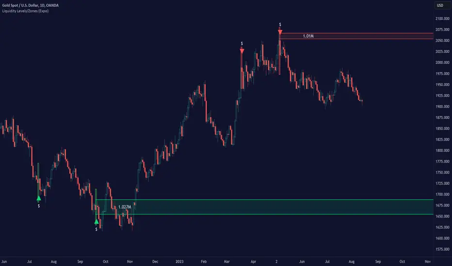
Liquidity Levels/Zones (Expo)Liquidity Levels/Zones (Expo) automatically identifies and displays key liquidity levels/zones.
Liquidity describes the extent to which an asset can be bought and sold quickly, without affecting the price. It is a measure of how many buyers and sellers are present, and whether transactions can take place easily.
Levels/Zones are displayed where there is a significant level of trading activity and when there is both high supply and demand for an asset, security, or contract. These levels can leave clues for future price behavior and act as support/resistance zones. The trading activity can confirm the existence, or a continuation, of a trend or a trend reversal.
The user can modify the settings so that short- term, medium-term, and long- term liquidity levels/zones are displayed.
The indicator can be used standalone or as a part of your current trading strategy.
Real-time
No repainting
Works on any market
HOW TO USE
1. Use the indicator to identify key liquidity levels/zones.
2. Use the indicator to identify high trading activity.
3. Use the indicator to confirm the existence, or a continuation, of a trend or a trend reversal.
INDICATOR IN ACTION
1-hour chart
I hope you find this indicator useful , and please comment or contact me if you like the script or have any questions/suggestions for future improvements. Thanks!
I will continually work on this indicator, so please share your experience and feedback as it will enable me to make even better improvements. Thanks to everyone that has already contacted me regarding my scripts. Your feedback is valuable for future developments!
ACCESS THE INDICATOR
• Contact me on TradingView or use the links below
-----------------
Disclaimer
Copyright by Zeiierman.
The information contained in my scripts/indicators/ideas does not constitute financial advice or a solicitation to buy or sell any securities of any type. I will not accept liability for any loss or damage, including without limitation any loss of profit, which may arise directly or indirectly from the use of or reliance on such information.
All investments involve risk, and the past performance of a security, industry, sector, market, financial product, trading strategy, or individual’s trading does not guarantee future results or returns. Investors are fully responsible for any investment decisions they make. Such decisions should be based solely on an evaluation of their financial circumstances, investment objectives, risk tolerance, and liquidity needs.
My scripts/indicators/ideas are only for educational purposes!
JM volume alarm zone3JM volume alarm zone3
volume alarm for up to 3 different price-zones
if you only need 1 just insert only one
its possible to set all values with a dot(comma wont work)
