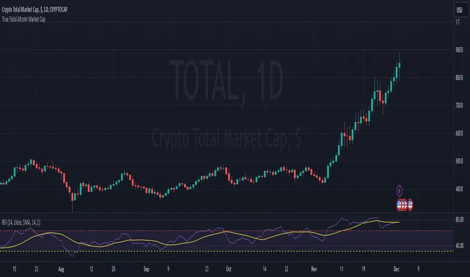
True Total Altcoin Market CapThis indicator calculates the real total altcoin market capitalization by removing Bitcoin, Ethereum, and major stablecoins (USDT, USDC, BUSD, DAI) from the total cryptocurrency market cap. It replaces the standard price bars with custom-colored candlesticks showing the true altcoin market movements.
Features:
Excludes BTC, ETH, and major stablecoins for accurate altcoin market analysis
Custom color scheme: Green (#26a79b) for bullish and Red (#ef5351) for bearish candles
Based on CRYPTOCAP:TOTAL data
Helps traders focus on pure altcoin market trends
Non-repainting, using standard OHLC data
This tool provides a clearer view of altcoin market strength by filtering out the influence of major cryptocurrencies and stablecoins.
Sentiment
Daily Directional Bias Indicator (S&P 500)This indicator is designed to help you be on the right side of the trade.
Most traders who struggle to know which way price may move are only looking at part of the picture. This Directional Bias Indicator uses both the Accumulation/Distribution Line and VIX for directional confirmation.
The Accumulation/Distribution Line
The Accumulation/Distribution (ACC) line helps us gauge market momentum by showing the cumulative flow of money into or out of an asset. When the ACC line is rising, it suggests that buying pressure is dominating, indicating a bullish market. Conversely, when the ACC line is falling, it suggests that selling pressure is stronger, indicating a bearish market. By comparing the ACC line with the VWAP, traders can see if the price is moving in line with the overall market sentiment. If the ACC line is above the VWAP, it suggests the market is in a bullish phase; if it's below, it indicates a bearish phase.
The VIX
The VIX (Volatility Index) is often referred to as the "fear gauge" of the market. When the VIX is rising, it typically signals increased market fear and higher volatility, which can be a sign of bearish market conditions. Conversely, when the VIX is falling, it suggests lower volatility and a more stable, bullish market. Using the VIX with the VWAP helps us confirm market direction, particularly in relation to the S&P 500.
VWAP
For both the ACC Line and VIX, we use a VWAP line to gauge whether the ACC line or the VIX is above or below the average. When the ACC line is above the VWAP, we view it as a sign that price will go up. However, because the VIX has an inverse relationship, when the VIX falls below the VWAP, we take that as a sign to go long.
How to use
The yellow line represents the ACC Line.
The red line represents the VWAP based on the ACC line.
The triangles at the bottom simply show when the ACC line is above or below the VWAP.
The triangles at the top show whether the VIX is bullish or bearish.
If both triangles (top or bottom) are bullish, this confirms that the price of an asset like the S&P 500 will likely go up. If both triangles are pointing down, it suggests that price will fall.
As always, test for yourself.
Happy trading!

COT Report Indicator with Selectable Data TypeOverview
The COT Report Indicator with Selectable Data Types is a powerful tool for traders who want to gain deeper insights into market sentiment using the Commitment of Traders (COT) data. This indicator allows you to visualize the net positions of different participant categories—Commercial, Noncommercial, and Nonreportable—directly on your chart.
The indicator is fully customizable, allowing you to select the type of data to display, sync with your chart's timeframe, or choose a custom timeframe. Whether you're analyzing gold, crude oil, indices, or forex pairs, this indicator adapts seamlessly to your trading needs.
Features
Dynamic Data Selection:
Choose between Commercial, Noncommercial, or Nonreportable data types.
Analyze the net positions of market participants for more informed decision-making.
Flexible Timeframes:
Sync with the chart's timeframe for quick analysis.
Select a custom timeframe to view COT data at your preferred granularity.
Wide Asset Coverage:
Supports various assets, including gold, silver, crude oil, indices, and forex pairs.
Automatically adjusts to the ticker you're analyzing.
Clear Visual Representation:
Displays Net Long, Net Short, and Net Difference (Long - Short) positions with distinct colors for easy interpretation.
Error Handling:
Alerts you if the symbol is unsupported, ensuring you know when COT data isn't available for a specific asset.
How to Use
Add the Indicator:
Click "Indicators" in TradingView and search for "COT Report Indicator with Selectable Data Types."
Add it to your chart.
Customize the Settings:
Data Type: Choose between Commercial, Noncommercial, or Nonreportable positions.
Data Source: Select "Futures Only" or "Futures and Options."
Timeframe: Sync with the chart's timeframe or specify a custom one (e.g., weekly, monthly).
Interpret the Data:
Green Line: Net Long Positions.
Red Line: Net Short Positions.
Black Line: Net Difference (Long - Short).
Supported Symbols:
Gold, Silver, Crude Oil, Natural Gas, Forex Pairs, S&P 500, US30, NAS100, and more.
Who Can Benefit
Trend Followers: Identify the buying/selling trends of Commercial and Noncommercial participants.
Sentiment Analysts: Understand shifts in sentiment among major market players.
Long-Term Traders: Use COT data to confirm or contradict your fundamental analysis.
Example Use Case
For example, if you're trading gold (XAUUSD) and select Noncommercial Positions, you’ll see the long and short positions of speculators. An increase in net long positions may signal bullish sentiment, while an increase in net short positions may indicate bearish sentiment.
If you switch to Commercial Positions, you'll get insights into how hedgers and institutions are positioning themselves, helping you confirm or counterbalance your current trading strategy.
Limitations
The indicator only works with supported symbols (COT data availability is limited to specific assets).
The COT data is updated weekly, so it is not suitable for short-term intraday trading.

Onchain Analysis - BTCIntroduction
This indicator is designed to equip traders with actionable insights into long-term BITSTAMP:BTCUSD market dynamics through a blend of on-chain metrics and technical tools. It provides a streamlined visualization of market sentiment and critical price levels using unique and proprietary methodologies.
The script features:
NUPL (Net Unrealized Profit/Loss) with advanced bar color coding.
350DMA and 350DMAx2, offering insights into key Bitcoin cycle levels.
Logarithmic Fibonacci Extension, aiding in precise target setting during price discovery phases.
Core Functionality
NUPL Analysis
NUPL reflects the network's aggregate unrealized profit or loss, calculated as (Market Cap − Realized Cap) / Market Cap. Bars are color-coded dynamically to simplify the interpretation of market sentiment. The emotional states (e.g., euphoria, fear) are visually represented for quick analysis, making this indicator particularly valuable for traders monitoring Bitcoin's macro cycles. This implementation improves clarity by aggregating NUPL across all holders rather than separating short- and long-term holders.
350DMA and 350DMAx2
The 350DMAx2 line has historical relevance as a key level during Bitcoin bull cycles, often acting as a resistance point during price rallies. This implementation also includes precise visualization of price interaction with the 350DMA, enabling traders to anticipate potential retracement or breakout zones. Furthermore, to minimize chart clutter, the 350DMA and 350DMAx2 lines are designed to dynamically appear only when the price is near these levels. This ensures that traders can focus on relevant data without unnecessary visual distractions.
Logarithmic Fibonacci Extensions
Unlike traditional Fibonacci extensions, logarithmic levels better suit assets like Bitcoin that grow exponentially. The calculated levels provide traders with clear targets in price discovery phases, enhancing the utility of this feature.
Key Advantages and Unique Features
Enhanced Visualization : NUPL bar color-coding simplifies sentiment analysis, allowing traders to instantly identify key turning points in market psychology.
Historical Context : The script incorporates insights derived from past market cycles, emphasizing the significance of 350DMAx2 levels.
Customization : Traders can adapt settings like lookback periods (e.g., 500 for daily, 100 for weekly) to fit their preferred timeframe and trading strategy.
Proprietary Insights : The script integrates logarithmic Fibonacci levels in a unique manner, optimizing their application to logarithmic assets.
Why This Indicator is Valuable
This indicator is not a simple combination of existing tools; it is a carefully curated suite of functionalities designed to address specific needs of crypto traders. The advanced NUPL representation and integration of logarithmic Fibonacci make it a distinct addition to any trader's toolkit. It provides clarity in interpreting long-term trends and offers actionable insights for navigating Bitcoin's cyclical nature.
How to Use
NUPL Monitoring
Pay close attention to initial color changes, e.g. orange and red, since it may establish clear pull-back. Especially, when bars turn black, it suggests that the market is heavily in profit, often signaling a market top.
350DMAx2 Interaction
If the price is trading below or near the 350DMAx2 level, it often reflects a key resistance zone. Historically, price rejections from this level are common, offering traders critical insights into potential retracement scenarios.
Logarithmic Fibonacci Extensions
Logarithmic Fibonacci extension levels are especially valuable for assets like BITSTAMP:BTCUSD , which exhibit logarithmic growth. These levels provide:
Target Identification: During price discovery phases, the logarithmic Fibonacci levels act as critical resistance or support points, enabling traders to set realistic price targets.
Market Top Detection: When extreme NUPL values (e.g., black bars) align with price interaction near logarithmic Fibonacci levels, the likelihood of a market top increases significantly. This alignment offers a robust method for identifying overbought or overextended market conditions.
Combining Concepts
When NUPL's extreme signals (e.g., red or black bars) align with price movements near the 350DMAx2 level, the likelihood of a significant pullback increases. Additionally, these scenarios can be further validated by observing logarithmic Fibonacci resistance levels, which can provide added confidence in identifying market tops during price discovery phases.

Risk Indicator# Risk Indicator
A dynamic risk analysis tool that helps traders identify optimal entry and exit points using a normalized risk scale from 0 to 1. The indicator combines price action, moving averages, and logarithmic scaling to provide clear visual signals for different risk zones.
### Key Features
• Displays risk levels on a scale of 0-1 with intuitive color gradients (blue → cyan → green → yellow → orange → red)
• Shows predicted price levels for different risk values
• Divides the chart into 5 DCA (Dollar Cost Average) zones
• Includes customizable alerts for rapid risk changes and zone transitions
• Automatically adjusts to market conditions using dynamic ATH/ATL calculations
### Customizable Parameters
• SMA Period: Adjust the smoothing period for the baseline moving average
• Power Factor: Fine-tune the sensitivity of risk calculations
• Initial ATL Value: Set the starting point for ATL calculations
• Label Offset: Adjust the position of price level labels
• Visual Options: Toggle price levels and zone labels
• Alert Settings: Customize alert thresholds and enable/disable notifications
### Risk Zones Explained
The indicator divides the chart into five distinct zones:
- 0.0-0.2: DCA 5x (Deep Blue) - Strongest buy zone
- 0.2-0.4: DCA 4x (Cyan) - Strong buy zone
- 0.4-0.6: DCA 3x (Green) - Neutral zone
- 0.6-0.8: DCA 2x (Yellow/Orange) - Take profit zone
- 0.8-1.0: DCA 1x (Red) - Strong take profit / potential sell zone
### Alerts
Built-in alerts for:
• Rapid increases in risk level
• Rapid decreases in risk level
• Entry into buy zones
• Entry into sell zones
### How to Use
1. Add the indicator to your chart
2. Adjust the SMA period and power factor to match your trading timeframe
3. Monitor the risk level and corresponding price predictions
4. Use the DCA zones to guide your position sizing
5. Set up alerts for your preferred risk thresholds
### Tips
- Lower risk values (blue/cyan) suggest potentially good entry points
- Higher risk values (orange/red) suggest taking profits or reducing position size
- Use in conjunction with other technical analysis tools for best results
- Adjust the power factor to fine-tune sensitivity to price movements
### Notes
- Past performance is not indicative of future results
- This indicator is meant to be used as part of a complete trading strategy
- Always manage your risk and position size according to your trading plan
Version 1.0

Social SentimentThe Social Sentiment Indicator aggregates social sentiment data from Telegram and LunarCrush , normalizing and smoothing the data to create an intuitive, adaptive sentiment signal. By comparing positive and negative sentiment from Telegram with LunarCrush's sentiment percentages, this indicator provides a visual representation of aggregated market sentiment.
This script provides context for market sentiment, helping traders understand crowd psychology and its potential impact on price action. It excels at identifying moments of extreme optimism or pessimism, which can act as confirmations or warnings in a broader trading strategy.
This tool provides context but lacks direct buy/sell signals. Works best in trending or volatile markets but should be combined with other indicators for a complete trading strategy.
Portfolio [Afnan]🚀 Portfolio - Advanced Portfolio Management Indicator 📊
A game-changing portfolio management tool designed to help traders stay on top of their positions and manage risk efficiently. This indicator combines detailed tracking, real-time analytics, and visual clarity to ensure traders are well-equipped for the dynamic world of financial markets.
📈 Key Features 💡
Track up to 14 positions with ease
Real-time Profit & Loss (P&L) updates and risk metrics
Visual representation of entry, stop-loss (SL), and target levels
Alerts for stop-loss breaches and target achievements
Comprehensive portfolio summaries for quick analysis
Customizable options to suit individual trading styles
🔍 Main Components ⚙️
📊 1. Position Tracking
Detailed position data: entry, stop-loss, target levels, and more
Real-time risk-reward ratios
Insights into position size and exposure percentages
Continuous updates on P&L in real-time
📉 2. Visual Indicators
Clear visual markers for entry, SL, and target prices
Price labels with detailed percentage changes
Indicators that show the current position's market status
💼 3. Portfolio Summary
Aggregate account values and exposure
Summarized P&L metrics across all positions
Risk management insights for better decision-making
Daily performance tracking to evaluate strategies
⚠️ 4. Alert System
Instant notifications for stop-loss breaches
Alerts when target prices are hit
Alerts operate for the current chart symbol
⚡ Customization Options 🎨
Show or hide specific data columns
Adjust the table's position and size for better visibility
Personalize color schemes and text styles
Switch between full portfolio view and single symbol focus
📱 How to Use 📝
Input your positions in the indicator's settings
Enable or disable specific positions dynamically
Customize display preferences to your liking
Set up alerts for proactive risk management
Monitor all your trading activities in one comprehensive dashboard
📌 Important Notes ℹ️
Compatible with any trading symbol
Updates seamlessly during market hours
Alerts are specific to the currently active chart symbol
Maximum capacity: 14 simultaneous positions
Created by: @AfnanTAjuddin
⚠️ Disclaimer ⚠️
This indicator is a tool for informational purposes only. Ensure all calculations are verified and consult a financial professional before making investment decisions.
🎯 "Stay disciplined, trade smart, and let data guide your decisions." 📊

Previous Candle AverageDescription:
The Previous Candle Average indicator is a powerful tool designed to provide traders with insights into market momentum by visualizing the relationship between the current and previous open levels for a customizable timeframe. This versatile indicator allows you to select from various timeframes, including 1 Month, 1 Week, 1 Day, 8 Hours, 4 Hours, and 1 Hour, making it suitable for different trading strategies, whether you're a swing trader, day trader, or scalper.
The indicator plots the Current Open and Previous Open levels for the selected timeframe and calculates the average value between them. By displaying these critical levels, traders can quickly gauge the current market dynamics relative to the previous period, making it easier to identify support, resistance, or trend continuation.
Key Features:
Custom Timeframe Selection: Easily select the desired timeframe from a variety of options (1M, 1W, 1D, 8H, 4H, 1H) to align with your trading strategy.
Current and Previous Open Levels: The indicator plots both the Current Open and Previous Open levels for the chosen timeframe, providing clear visual guidance on where the market is opening relative to the previous period.
Open Fill with Adjustable Transparency: The area between the Current Open and Previous Open levels is filled with color to represent the relationship between the two. The fill color changes based on whether the Current Open is above or below the Previous Open, with a default 20% opacity for better clarity without overwhelming the chart.
Average Line: The indicator also plots the average value between the Current Open and Previous Open levels, painted by default in a solid white color with a line thickness of 2. This average helps identify potential key levels where the price might react.
Dynamic Coloring: The fill color changes dynamically based on whether the Current Open is higher or lower than the Previous Open, using green to indicate bullish behavior and red for bearish behavior.
How to Use:
The Previous Candle Average indicator can help traders identify the momentum of the market by visually comparing the relationship between consecutive open levels.
Use the Average Line as a reference for potential support or resistance, especially when the market opens near this average.
The Open Fill color can quickly indicate a shift in market sentiment. A green fill suggests that the market is opening stronger than the previous period, while a red fill indicates weakness.
Best Practices:
Combine this indicator with other technical analysis tools, such as trend lines, moving averages, or volume analysis, to confirm potential trading opportunities.
The custom timeframe feature is particularly useful for multi-timeframe analysis. For instance, you can monitor weekly open levels while trading on an hourly chart.
Note: The indicator uses real-time open data and is updated accordingly, ensuring there is no delay or repainting of historical values.
Ideal For:
Traders who want a clear visual representation of market open levels relative to previous periods.
Those who want to identify potential shifts in momentum by comparing open levels across different timeframes.
Traders seeking to add an additional layer of analysis to their existing strategy by incorporating key opening levels and their averages.

Engulfing bar detectorHere’s the updated description with the added step about using Fibonacci levels across timeframes for confirmation:
Liquidity Engulfing Bar Detector
The **Liquidity Engulfing Bar Detector** is a powerful tool designed for traders who want to identify high-probability reversal patterns in the market based on liquidity grabbing and price action. This indicator highlights **Bullish Engulfing** and **Bearish Engulfing** bars that fulfill specific liquidity criteria, helping you spot potential trend reversals and trading opportunities.
**Features**:
1. **Bullish Engulfing Bars**:
- The current candle's low dips below the previous candle's low (grabs liquidity).
- The current candle closes above the previous candle's open.
- A green label is plotted above the engulfing bar for easy identification.
2. **Bearish Engulfing Bars**:
- The current candle's high exceeds the previous candle's high (grabs liquidity).
- The current candle closes below the previous candle's open.
- A red label is plotted below the engulfing bar for clear visibility.
3. **Customizable Alerts**:
- Receive instant notifications via TradingView alerts when a bullish or bearish engulfing pattern is detected.
- Alerts are fully customizable, allowing you to stay updated without actively monitoring the chart.
4. **Visual Markers**:
- Clear and intuitive labels make it easy to spot key patterns directly on your chart.
- Fully integrated with any timeframe and market, ensuring versatility for all trading styles.
---
### **How to Use**:
1. **Add the Indicator**:
- Apply the Liquidity Engulfing Bar Detector to your chart to automatically highlight bullish and bearish engulfing bars.
2. **Enable Alerts**:
- Set up TradingView alerts to get notified of potential setups in real-time.
3. **Analyze with Fibonacci Levels**:
- Draw a Fibonacci retracement tool over the identified engulfing bar, from its low to its high (for bullish patterns) or high to low (for bearish patterns).
- Use the following Fibonacci levels as key zones of interest:
- **0.0 (start)**, **0.25**, **0.5 (midpoint)**, **0.75**, and **1.0 (end)**.
- These levels often act as critical support or resistance zones for price action.
4. **Use Multi-Timeframe Confirmation**:
- Validate zones from higher timeframes using lower timeframe candles:
- **1-minute candles** for confirming zones on the **15-minute chart**.
- **5-minute candles** for confirming zones on the **1-hour chart**.
- **15-minute candles** for confirming zones on the **4-hour chart**.
- This approach ensures precision in your entry points and aligns intraday movements with higher timeframe setups.
5. **Integrate with Your Strategy**:
- Combine the indicator with other tools (e.g., trendlines, moving averages, or volume analysis) for confirmation.
- Use proper risk management to maximize your trading edge.
---
### **Why Use This Indicator?**
Liquidity grabs often signal the participation of major market players, which can lead to significant reversals or continuations. By combining liquidity concepts with engulfing bar patterns and Fibonacci analysis, this indicator helps you:
- Identify key market turning points.
- Improve your entries and exits with multi-timeframe precision.
- Enhance your trading strategy with an edge rooted in smart money concepts.
---
**Note**: This indicator is best used with proper risk management and alongside other technical or fundamental analyses.
---
Let me know if there's anything more you'd like to include!
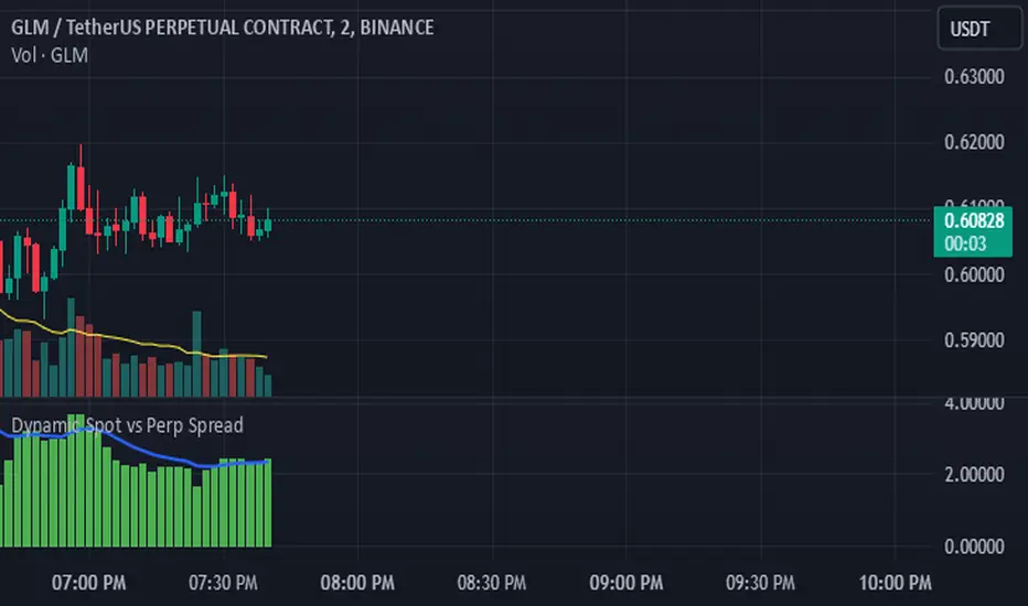
Dynamic Spot vs Perp Spread### **Description for TradingView Publication**
---
**Dynamic Spot vs Perp Spread**
(For USDT-Spot and USDT.P-Perp)
Summary of Usefulness:
This indicator is a valuable tool for traders who want to monitor and capitalize on the relationship between spot and perpetual futures (perp) prices. When the spot price exceeds the perp price, it's often a leading signal that the perp price will follow, creating potential trading opportunities. While this behavior doesn't happen every time, divergences between spot and perp prices can frequently signal significant market movements.
What it Does:
This indicator calculates and displays the price spread (percentage difference) between the spot price and perpetual futures (perp) price of a cryptocurrency asset. It dynamically adjusts to the instrument being viewed, ensuring that spot dominance (spot price higher) is plotted above the zero line and perp dominance (perp price higher) is plotted below the zero line. Additionally, the indicator accounts for symbols with multipliers (e.g., `1000SHIBUSDT.P`) to ensure accurate calculations.
Key features include:
- Automatic symbol detection and adjustment for Spot/Perp pairs.
- Dynamic handling of price multipliers for assets with prefixes like `1000`.
- Visualization of spread with a histogram and optional smoothing using an EMA (Exponential Moving Average).
- Configurable alerts for significant spread changes and spread flips.
- No repainting: the indicator uses the `barmerge.lookahead_off` setting to ensure stable, non-repainting values.
---
### **How to Use**
1. **Add the Indicator:**
- Search for "Dynamic Spot vs Perp Spread" in the TradingView Indicators library and add it to your chart.
2. **Understand the Visualization:**
- A positive spread (green histogram) indicates that the spot price is higher than the perp price (spot dominance).
- A negative spread (red histogram) indicates that the perp price is higher than the spot price (perp dominance).
3. **Customize Settings:**
- **EMA Length:** Use the input field to smooth the spread data over a chosen number of periods.
- **Alert Threshold:** Set a threshold to receive alerts when the spread exceeds a specific percentage.
4. **Receive Alerts:**
- Enable alerts for spread flips (when dominance shifts between spot and perp) or when the spread exceeds the defined threshold.
5. **Use Case Examples:**
- **Spot vs. Perp Arbitrage:** Traders can monitor significant deviations between spot and perp prices to identify potential arbitrage opportunities.
- **Market Sentiment Analysis:** Persistent spot dominance may indicate stronger buying interest in the spot market, while perp dominance may suggest futures market speculation.
---
### **Repainting Behavior**
This indicator **does not repaint** because it uses `barmerge.lookahead_off` for all calculations, ensuring that data from the comparison symbol (spot or perp) is locked to the currently completed candle. This means the values plotted and alerts triggered are reliable and do not change retrospectively.
Repainting occurs when an indicator uses future-looking or incomplete data for calculations. By design, this indicator avoids such practices, making it suitable for live trading and analysis.
---
Candlestick Strength and Volatility ReadoutDisplays a readout on the top right corner of the screen displaying a two basic calculations (volatility and strength; i.e. candlestick size and how close to the highs or lows it closed) for more convenient candlestick (price action) analysis.
Due to restrictions with Pine Script (or my knowledge thereof) only the current and previous candlestick data is shown, rather than the one currently hovered over.
The data is derived via two simple calculations; volatility being division between the range of the candlestick's high and low by the ATR; 'strength' (what I like to call it) being the range of the body by the range of the open to high or low, depending on the facing direction (positive or negative candlestick). These are expressed as percentages and will turn green depending on the set threshold.
Using this, one can effectively automate calculations you'd have to do by hand otherwise. I personally use these as entry filters in my trading, so it helps to not have to measure, remeasure, and divide before each potential entry.
Settings are implemented to change certain variables to your liking.

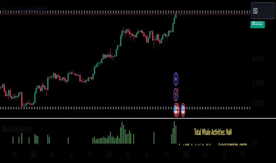
Whale Activity Whale Activity Indicator
The Whale Activity Indicator is a custom technical analysis tool designed to identify significant trading activities—often referred to as "whale" trades—based on unusually large dollar volumes in the market. This indicator helps traders visualize potential large-scale buying or selling that may influence market movements.
Key Features:
Whale Activity Detection:
Identifies bars where the dollar volume exceeds a specified multiple of the average dollar volume over a certain period.
Highlights potential institutional trades or significant market moves.
Visual Representation:
Histogram Bars: Plots the dollar volume of detected whale activities as red histogram bars in the lower pane.
Trendline: Displays a blue line representing the average whale dollar volume over a user-defined number of past whale activities.
Variable Table: Shows key metrics such as the total number of whale activities, last whale activity volume, and the average whale activity volume.
How It Works:
Dollar Volume Calculation:
Calculates the dollar volume for each bar by multiplying the closing price by the volume.
Average Dollar Volume:
Computes the average dollar volume over a user-defined lookback period to establish a baseline for typical trading activity.
Whale Activity Identification:
Detects whale activities when the current dollar volume exceeds a specified multiplier of the average dollar volume.
Averaging Whale Activities:
Accumulates the dollar volumes and counts of whale activities to calculate an average over a specified number of past events.
Visualization and Metrics:
Plots the whale activities and average trendline for visual analysis.
Displays important variables in a table for quick reference.
Risks and Important Considerations:
Not a Stand-Alone Indicator:
The Whale Activity Indicator should not be used in isolation. It is essential to combine it with other technical analysis tools, fundamental analysis, and sound risk management practices.
Potential for False Signals:
High dollar volume does not always indicate significant institutional trading or market shifts. It may result from market anomalies, news events, or large retail trades.
Lagging Information:
The average trendline is based on historical data and may lag behind current market conditions, potentially providing delayed signals.
Market Variability:
Market conditions can affect the indicator's effectiveness. Volatile markets may produce more frequent signals, which could lead to confusion or overtrading.
Data Limitations:
The accuracy of the indicator depends on the quality and timeliness of the price and volume data. Inaccurate or delayed data can lead to misleading signals.
Risk of Financial Loss:
Trading involves significant risk, and there is the potential for substantial losses. The indicator does not guarantee successful trades.
Disclaimer:
The Whale Activity Indicator is a tool designed to assist traders in identifying unusual trading volumes that may signify significant market activity. However, it should not be used as the sole basis for any trading decision. All trading strategies carry risk, and past performance is not indicative of future results. Traders should conduct thorough research and consider consulting a qualified financial advisor before making any investment decisions. Use this indicator at your own risk.
Note: Always ensure you understand how an indicator works and test it thoroughly using historical data and paper trading before applying it to live trading scenarios.
Buy vs Sell VolumeHow It Works:
BuyVol: Estimates buying volume by calculating the proportion of volume attributed to the upward price movement within each bar.
SellVol: Estimates selling volume by calculating the proportion of volume attributed to the downward price movement within each bar.
Customization:
length: You can adjust the length input parameter to change the period over which the average is calculated.
Visualization:
The buy trendline is plotted in Green and represents the average net buying vs. selling volume over the specified period.
The sell trendline is plotted in Red and represents the average net selling vs. buying volume over the specified period.
Note: This script provides an approximation and should be used in conjunction with other analysis tools to make informed trading decisions.

Max Pain StrategyThe Max Pain Strategy uses a combination of volume and price movement thresholds to identify potential "pain zones" in the market. A "pain zone" is considered when the volume exceeds a certain multiple of its average over a defined lookback period, and the price movement exceeds a predefined percentage relative to the price at the beginning of the lookback period.
Here’s how the strategy functions step-by-step:
Inputs:
length: Defines the lookback period used to calculate the moving average of volume and the price change over that period.
volMultiplier: Sets a threshold multiplier for the volume; if the volume exceeds the average volume multiplied by this factor, it triggers the condition for a potential "pain zone."
priceMultiplier: Sets a threshold for the minimum percentage price change that is required for a "pain zone" condition.
Calculations:
averageVolume: The simple moving average (SMA) of volume over the specified lookback period.
priceChange: The absolute difference in price between the current bar's close and the close from the lookback period (length).
Pain Zone Condition:
The condition for entering a position is triggered if both the volume is higher than the average volume by the volMultiplier and the price change exceeds the price at the length-period ago by the priceMultiplier. This is an indication of significant market activity that could result in a price move.
Position Entry:
A long position is entered when the "pain zone" condition is met.
Exit Strategy:
The position is closed after the specified holdPeriods, which defines how many periods the position will be held after being entered.
Visualization:
A small triangle is plotted on the chart where the "pain zone" condition is met.
The background color changes to a semi-transparent red when the "pain zone" is active.
Scientific Explanation of the Components
Volume Analysis and Price Movement: These are two critical factors in trading strategies. Volume often serves as an indicator of market strength (or weakness), and price movement is a direct reflection of market sentiment. Higher volume with significant price movement may suggest that the market is entering a phase of increased volatility or trend formation, which the strategy aims to exploit.
Volume analysis: The study of volume as an indicator of market participation, with increased volume often signaling stronger trends (Murphy, J. J., Technical Analysis of the Financial Markets).
Price movement thresholds: A large price change over a short period may be interpreted as a breakout or a potential reversal point, aligning with volatility and liquidity analysis (Schwager, J. D., Market Wizards).
Repainting Check: This strategy does not involve any repainting because it is based on current and past data, and there is no reference to future values in the decision-making process. However, any strategy that uses lagging indicators or conditions based on historical bars, like close , is inherently a lagging strategy and might not predict real-time price action accurately until after the fact.
Risk Management: The position hold duration is predefined, which adds an element of time-based risk control. This duration ensures that the strategy does not hold a position indefinitely, which could expose it to unnecessary risk.
Potential Issues and Considerations
Repainting:
The strategy does not utilize future data or conditions that depend on future bars, so it does not inherently suffer from repainting issues.
However, since the strategy relies on volume and price change over a set lookback period, the decision to enter or exit a trade is only made after the data for the current bar is complete, meaning the trade decisions are somewhat delayed, which could be seen as a lagging feature rather than a repainting one.
Lagging Nature:
As with many technical analysis-based strategies, this one is based on past data (moving averages, price changes), meaning it reacts to market movements after they have already occurred, rather than predicting future price actions.
Overfitting Risk:
With parameters like the lookback period and multipliers being user-adjustable, there is a risk of overfitting to historical data. Adjusting parameters too much based on past performance can lead to poor out-of-sample results (Gauthier, P., Practical Quantitative Finance).
Conclusion
The Max Pain Strategy is a simple approach to identifying potential market entries based on volume spikes and significant price changes. It avoids repainting by relying solely on historical and current bar data, but it is inherently a lagging strategy that reacts to price and volume patterns after they have occurred. Therefore, the strategy can be effective in trending markets but may struggle in highly volatile, sideways markets.

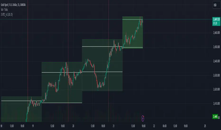
Z_MUTIL_CANDEL_v1The Z_MUTIL_CANDEL_v1 indicator is designed to visually represent detailed candlestick information on a chart, overlaying multiple custom candlesticks based on a selected timeframe. This tool provides an enhanced visual understanding of price dynamics, making it easier to analyze trends and volatility.
Key Features:
Customizable Timeframe:
The indicator allows users to select a custom timeframe (default: Daily).
Displays candlestick data (Open, High, Low, Close) from the chosen timeframe.
Custom Candlestick Drawing:
Draws additional candlesticks at customizable positions to visualize key price levels:
Open/Close lines: Highlighted with solid white horizontal lines.
High/Low boxes: Represent the candlestick body and shadows with adjustable colors.
Candlestick colors:
Green: For bullish candles (Close >= Open).
Red: For bearish candles (Close < Open).
Detailed Labels:
Displays information next to the candlestick, including:
The selected timeframe.
Time left for the current bar to close (in HH:mm
format).
The candlestick range (High - Low).
Dynamic Background Highlight:
Highlights the chart's background in red with 80% transparency during a specific time (e.g., 9:00 AM to 9:01 AM).
Customizable Inputs:
Body size (pixels): Adjustable position of the custom candlesticks on the chart.
Show Candlestick Option: Option to display or hide the additional candlesticks.
Multiple Candlestick Layers:
Supports overlaying multiple custom candlesticks for comparison or enhanced visualization.
Practical Applications:
Enhanced Market Analysis: Use the detailed candlestick visuals and labels to better understand price movements and identify potential trading opportunities.
Timeframe Comparison: Compare custom timeframe candles against the current chart for multi-timeframe analysis.
Critical Time Identification: Highlight and analyze market behavior during specific hours using the background coloring feature.
How to Use:
Add the Indicator to Your Chart:
Open the TradingView editor and apply the script.
Adjust the settings to match your analysis needs.
Analyze Custom Candlesticks:
Observe the additional candlesticks and their corresponding data (timeframe, price range, etc.).
Leverage Time-Based Insights:
Use the countdown timer to monitor session closures or key levels around specific times.
Enhance your trading insights by utilizing the Z_MUTIL_CANDEL_v1 indicator for detailed candlestick visualization and analysis. 🚀
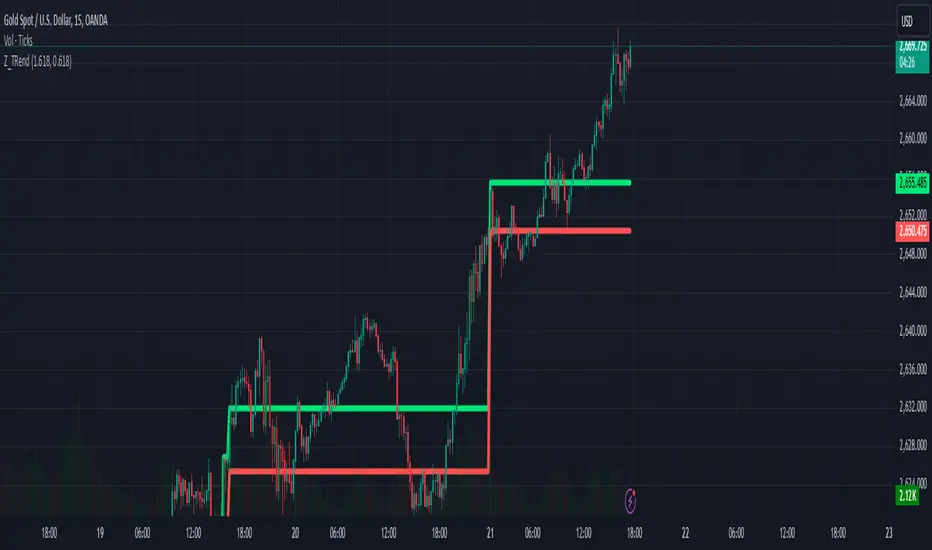
Z_TRendThe Z_Trend indicator is designed to detect significant volume spikes during trading sessions and identify the high/low levels of the candlestick with the highest volume in each session. This helps users recognize key price zones and monitor market activity effectively.
Main Features:
Session Classification:
Asian Session: From 0:00 to 14:00 (UTC+7).
European Session: From 14:00 to 19:00 (UTC+7).
US Session: From 19:00 to 23:00 (UTC+7).
Volume Analysis:
Calculates a Simple Moving Average (SMA) of the volume over the last 89 candles.
Marks candles with volumes exceeding defined thresholds:
High Threshold: Default is 1.618 (adjustable).
Low Threshold: Default is 0.618 (adjustable).
Highlighting Highest Volume Candle:
Detects the candle with the highest volume in each session.
Plots the high and low levels of this candle on the chart to signify critical price zones.
Volume-Based Candle Coloring:
Bullish candles (closing above open) with high volume are marked green.
Bearish candles (closing below open) with high volume are marked dark red.
Customizable Inputs:
High Threshold: Set to 1.618 by default; can be adjusted.
Low Threshold: Set to 0.618 by default; can be adjusted.
Chart Visuals:
Green line: Represents the highest price of the candle with the largest volume in the session.
Red line: Represents the lowest price of the candle with the largest volume in the session.
Practical Applications:
Identify Key Price Zones: Use the high/low levels of the high-volume candle to locate potential support/resistance levels.
Analyze Market Dynamics: Observe candle colors and volume to gauge session-specific trends.
Trading Strategy: Utilize these insights to make informed entry and exit decisions.
Notes:
The indicator can be adjusted to fit individual trading strategies.
It is recommended to combine this tool with other indicators for more reliable signals.
Try it out on your chart now to discover potential trading opportunities! 🚀