SuperTrend Dual RMAOverview
The SuperTrend Dual RMA is a hybrid volatility-based trend-following system that merges two Relative Moving Averages (RMAs) with an Average True Range (ATR)–anchored SuperTrend framework. The primary purpose of this indicator is to offer a smoother and more reliable depiction of directional bias while maintaining sensitivity to price volatility and market volume.
Traditional SuperTrend implementations typically rely on a single moving average and a fixed volatility envelope. This dual RMA structure introduces an adaptive central tendency line that reacts proportionally to both price and volume, allowing for more nuanced identification of trend reversals and continuation patterns.
**Core Concept**
The indicator is built around two key principles — smoothing and volatility adaptation.
1. **Smoothing:** The use of two separate RMAs with configurable lengths creates a dynamic equilibrium between short-term responsiveness and long-term stability. The first RMA captures near-term directional shifts, while the second provides broader market context. The average of both becomes the foundation of the SuperTrend bands.
2. **Volatility Adaptation:** The ATR multiplier and period define the distance between upper and lower bands relative to recent volatility. This ensures that the SuperTrend line remains flexible across varying market conditions — expanding during high volatility and contracting during calm phases.
**Calculation Steps**
* The indicator first computes two volume-weighted RMAs based on the typical price (`hlc3`) multiplied by trading volume.
* Each RMA is normalized by the smoothed volume to maintain proportional weighting.
* These two RMAs are averaged to produce a “basis line” that reflects the current market consensus price.
* The ATR is calculated over a user-defined period, then multiplied by a volatility factor (ATR multiplier).
* The resulting ATR value defines dynamic upper and lower thresholds around the basis line.
* Trend direction is determined by price closing behavior relative to these thresholds:
* When the closing price exceeds the upper band, the trend is considered bullish.
* When it drops below the lower band, the trend turns bearish.
* If price remains within the bands, the prior trend direction is maintained for consistency.
**Visual Structure**
The SuperTrend Dual RMA provides multiple layers of visual feedback for enhanced interpretation:
* Two distinct RMA lines (short and long) are plotted with complementary colors for contrast and clarity.
* A soft fill between the RMA lines highlights the interaction between short- and medium-term momentum.
* The ATR-based SuperTrend bands are drawn above and below the basis, with adaptive coloring that corresponds to the prevailing trend direction.
* Bar colors automatically adjust to reflect bullish or bearish bias, making it easy to identify trend shifts without relying solely on crossovers.
* Optional triangle markers appear below or above bars to signal potential buy or sell opportunities based on crossover logic.
**Signals and Alerts**
The indicator provides real-time crossover detection:
* **Buy Signal:** Triggered when the closing price moves above the SuperTrend line, confirming potential bullish continuation or reversal.
* **Sell Signal:** Triggered when the closing price drops below the SuperTrend line, indicating possible bearish momentum or reversal.
Both conditions have built-in `alertcondition()` functions, allowing users to set automated alerts for trading or monitoring purposes. This enables integration with TradingView’s alert system for push notifications, emails, or webhook connections.
**Usage Guidelines**
* **Trend Identification:** Use the color-coded trend line and bar color as a visual guide to the current directional bias.
* **Entry and Exit Timing:** Consider entering trades when a new crossover alert appears, preferably in the direction of the overall higher-timeframe trend.
* **Parameter Tuning:** Adjust the RMA lengths and ATR parameters based on asset volatility. Shorter RMA and ATR settings provide faster reactions, suitable for intraday or high-frequency trading, while longer configurations better fit swing or position strategies.
* **Risk Management:** Because the SuperTrend inherently acts as a dynamic stop level, traders can use the opposite band or SuperTrend line as a trailing stop or exit signal.
**Practical Applications**
* Trend confirmation in multi-timeframe strategies.
* Adaptive trailing stop placement using the lower or upper band.
* Visual comparison of volume-weighted price movement against volatility envelopes.
* Integration into algorithmic trading systems as a signal filter or trend bias component.
* Identification of overextended conditions when price significantly diverges from the SuperTrend basis.
**Originality and Advantages**
The SuperTrend Dual RMA differentiates itself from conventional SuperTrend scripts through three innovative design choices:
1. **Dual Volume-Weighted RMAs:** By incorporating two RMAs weighted by trading volume, the indicator accounts for liquidity dynamics, producing smoother and more reliable averages compared to price-only calculations.
2. **Anchored SuperTrend Framework:** The SuperTrend bands are not derived from a fixed source (such as a single close or median price) but from a blended RMA basis, making them more adaptable to varying market behaviors.
3. **Integrated Multi-Layer Visualization:** The inclusion of filled regions between RMAs, dynamic band coloring, and bar tinting enhances readability and analytical depth without overwhelming the chart.
These improvements collectively create a more balanced and data-rich representation of market structure, offering a higher degree of analytical precision. It’s suitable for traders seeking both discretionary and systematic use, as the indicator’s logic is transparent and compatible with alert-based or automated workflows.
**Summary**
The SuperTrend Dual RMA is a refined evolution of the classic SuperTrend, optimized for traders who value smoother directional tracking and more intelligent volatility adaptation. It blends two time-sensitive, volume-aware moving averages with an ATR-derived volatility system to deliver reliable, actionable trend information. Its visual design, adaptive responsiveness, and integrated alert functionality make it a complete solution for identifying and managing trends across multiple asset classes and timeframes.
Khối lượng

VWAP Trend
**Overview**
The VWAP Trend indicator is a volume-weighted price analysis tool that visualizes the relationship between price and the anchored Volume Weighted Average Price (VWAP) over different timeframes. This script is designed to reveal when the market is trending above or below its volume-weighted equilibrium point, providing a clear framework for identifying directional bias, trend strength, and potential reversals.
By combining an anchored VWAP with exponential smoothing and a secondary trend EMA, the indicator helps traders distinguish between short-term price fluctuations and genuine volume-supported directional moves.
**Core Concept**
VWAP (Volume Weighted Average Price) represents the average price of an asset weighted by traded volume. It reflects where the majority of trading activity has taken place within a chosen period, serving as a critical reference level for institutions and professional traders.
This indicator extends the traditional VWAP concept by:
1. Allowing users to **anchor VWAP to different timeframes** (Daily, Weekly, or Monthly).
2. Applying **smoothing** to create a stable reference curve less prone to noise.
3. Overlaying a **trend EMA** to identify whether current price momentum aligns with or diverges from VWAP equilibrium.
The combination of these elements produces a visual representation of price’s relationship to its fair value across time, helping to identify accumulation and distribution phases.
**Calculation Methodology**
1. **Anchored VWAP Calculation:**
The script resets cumulative volume and cumulative volume–price data at the start of each new VWAP session (based on the selected anchor timeframe). It continuously accumulates the product of price and volume, dividing this by total volume to compute the current VWAP value.
2. **Smoothing Process:**
The raw VWAP line is smoothed using an Exponential Moving Average (EMA) of user-defined length, producing a cleaner, more stable trend curve that minimizes intraperiod noise.
3. **Trend Determination:**
An additional EMA is calculated on the closing price. By comparing the position of this EMA to the smoothed VWAP, the indicator determines the prevailing market bias:
* When the trend EMA is above the smoothed VWAP, the market is considered to be in an **uptrend**.
* When the trend EMA is below the smoothed VWAP, the market is classified as a **downtrend**.
**Visual Structure**
The indicator uses color dynamics and chart overlays to make interpretation intuitive:
* **Smoothed VWAP Line:** The main trend reference, colored blue during bullish conditions and orange during bearish conditions.
* **Price Fill Region:** The area between the smoothed VWAP and price is filled with a translucent color matching the current trend, visually representing whether price is trading above or below equilibrium.
* **Trend EMA (implicit):** Although not separately plotted, it drives the color state of the VWAP, ensuring seamless visual transitions between bullish and bearish conditions.
**Inputs and Parameters**
* **VWAP Timeframe:** Choose between Daily, Weekly, or Monthly anchoring. This determines the reset frequency for cumulative volume and price data.
* **VWAP Smoothing Length:** Defines how many periods are used to smooth the VWAP line. Shorter values produce a more reactive line; longer values create smoother, steadier signals.
* **Trend EMA Length:** Sets the period for the trend detection EMA applied to price. Adjust this to calibrate how quickly the indicator reacts to directional changes.
**Interpretation and Use Cases**
* **Trend Confirmation:** When price and the trend EMA both remain above the smoothed VWAP, the market is showing strong bullish control. Conversely, consistent price action below the VWAP suggests sustained bearish sentiment.
* **Fair Value Assessment:** VWAP serves as a dynamic equilibrium level. Price repeatedly reverting to this line indicates consolidation or fair value zones, while strong directional moves away from VWAP highlight momentum phases.
* **Institutional Benchmarking:** Because large market participants often benchmark entries and exits relative to VWAP, this indicator helps align retail analysis with institutional logic.
* **Reversal Detection:** Sudden crossovers of the trend EMA relative to the VWAP can signal potential reversals or shifts in momentum strength.
**Trading Applications**
* **Trend Following:** Use VWAP’s direction and color state to determine trade bias. Long entries are favored when the VWAP turns blue, while short entries align with orange phases.
* **Mean Reversion:** In ranging conditions, traders may look for price deviations far above or below VWAP as potential reversion opportunities.
* **Multi-Timeframe Confluence:** Combine the Daily VWAP Trend with higher anchor periods (e.g., Weekly or Monthly) to confirm larger trend structure.
* **Support and Resistance Mapping:** VWAP often acts as a strong intraday or session-level support/resistance zone. The smoothed version refines this behavior into a cleaner, more reliable reference.
**Originality and Innovation**
The VWAP Trend indicator stands apart from conventional VWAP scripts through several original features:
1. **Anchor Flexibility:** Most VWAP indicators fix the anchor to a specific session (like daily). This version allows switching between Daily, Weekly, and Monthly anchors dynamically, adapting to various trading styles and time horizons.
2. **Volume-Weighted Smoothing:** The use of an EMA smoothing layer over the raw VWAP provides enhanced stability without compromising responsiveness, delivering a more analytically consistent signal.
3. **EMA-Based Trend Comparison:** By introducing a second trend EMA, the indicator creates a comparative framework that merges volume-weighted price analysis with classical momentum tracking — a rare and powerful combination.
4. **Adaptive Visual System:** The color-shifting and shaded fill between VWAP and price are integrated into a single, lightweight structure, giving traders immediate insight into market bias without the clutter of multiple overlapping indicators.
**Advantages**
* Adaptable to any market, timeframe, or trading style.
* Provides both equilibrium (VWAP) and momentum (EMA) perspectives.
* Smooths out noise while retaining the integrity of volume-based price dynamics.
* Enhances situational awareness through intuitive color-coded visualization.
* Ideal for professional, swing, and intraday traders seeking context-driven market direction.
**Summary**
The VWAP Trend indicator is a modern enhancement of the classical VWAP methodology. By merging anchored volume-weighted analysis with smoothed trend detection and visual state feedback, it provides a comprehensive perspective on market equilibrium and directional strength. It is built for traders who seek more than static price references — offering an adaptive, volume-aware framework for identifying market trends, reversals, and fair-value zones with precision and clarity.

Buy/Sell Volume - TradingriotThis indicator estimates buy-side and sell-side volume using a RangeSplit model. Since TradingView does not provide true bid/ask aggressor data, the script allocates each bar’s volume based on where the close sits within the bar’s high–low range. The closer the close is to the high, the more of that bar’s volume is attributed to buying pressure. The closer it is to the low, the more is attributed to selling pressure.
How it works
Compute the bar’s total range
range = high − low
Locate the close inside that range
fraction = (close − low) / range
Allocate volume
Buy Volume = volume × fraction
Sell Volume = volume × (1 − fraction)
Apply an optional EMA smooth to stabilize the signals.
Plots
Buy Volume (green columns) – estimated buy-side participation
Sell Volume (red columns) – estimated sell-side participation
Delta Line (gray) – smoothed difference between buy and sell volume
Zero line – helps identify positive or negative volume imbalance
Use-case
This gives a quick visual read of dominant pressure inside each bar without relying on unreliable raw volume bars. It can help highlight shifts in control, volume imbalances, and momentum transitions on higher timeframes.
Limitations
This is a proxy, not true buy/sell volume. It does not access bid/ask or time-and-sales data. It simply distributes total volume by candle geometry.
If you want a clean and simple way to visualize who likely controlled the bar, this is as far as TradingView can go using OHLCV data.

jinhanborasaeg bori indicator ENHello, I'm jinhanborasaeg.
This indicator was created by modifying the free indicator "Vumanchu Free Swing."
It was developed with Claude's assistance and includes
additions such as no-repaint functionality, TP/SL, and more.
For settings, you should use High instead of Close for better results.
Below is the link to an indicator I created by combining 20 different indicators,
which showed good backtesting results. If you're interested,
I'd appreciate it if you could take a look.
jinhanborasaeg.gumroad.com

Advanced Volume indicator This indicator shows 4H volume on the 1H chart.
I am using this one for my swing trade system on the 1H chart, which I will also publish later.
My entry signal is a extraordinary volume candle, a red threshold line can mark “very high volume” zones (SMA × multiplier).

Top Finder & Dip Hunter [BackQuant]Top Finder & Dip Hunter
A practical tool to map where price is statistically most likely to exhaust or mean-revert. It builds objective support for dips and resistance for tops from multiple methodologies, then filters raw touches with volume, momentum, trend, and price-action context to surface higher-quality reversal opportunities.
What this does
Draws a Dip Support line and a Top Resistance line using the method you select, or a blended hybrid.
Evaluates each touch/penetration against Quality Filters and assigns a 0–100 composite score.
Prints clean DIP and TOP signals only when depth/extension and quality pass your thresholds.
Optionally annotates the chart with the computed quality score at signal time.
Why it’s useful
Objectivity: Converts vague “looks extended” into rules, reduces discretion creep.
Signal hygiene: Filters raw touches using trend, volume, momentum, and candle structure to avoid obvious traps.
Adaptable regimes: Switch methods, sensitivity, and lookbacks to match choppy vs trending conditions.
How support and resistance are built
Pick one per side, or use “Hybrid.”
Dynamic: Anchors to the extreme of a lookback window, padded by recent ATR, so buffers expand in volatile periods and contract when calm.
Fibonacci: Uses the 0.618/0.786 retracement pair inside the current swing window to target common reaction zones.
Volatility: Uses a moving-average basis with standard-deviation bands to capture statistically stretched moves.
Volume-Weighted: Centers off VWAP and penalizes deviations using dispersion of price around VWAP, helpful on intraday instruments.
Hybrid: A weighted average of the above to smooth out single-method biases.
When a touch becomes a signal
Depth/extension test:
Dips must penetrate their support by at least Min Dip Depth % .
Tops must extend above resistance by at least Min Top Rise % .
Quality Score gate: The composite must clear Min Quality Score . Components:
Trend alignment: Favor dips in bullish regimes and tops in bearish regimes using EMAs and RSI.
Volume confirmation: Reward expansion or spikes versus a 20-period baseline.
RSI context: Prefer oversold for dips, overbought for tops.
Momentum shift: Look for short-term momentum turning in the expected direction.
Candle structure: Reward hammer/shooting-star style responses at the level.
How to use it
Pick your regime:
Range/chop, small caps, mean-revert intraday → Volatility or Volume Weighted .
Cleaner swings/trends → Dynamic or Fibonacci .
Unsure or mixed conditions → Hybrid .
Set windows: Start with Lookback = 50 for both sides. Increase in higher timeframes or slow assets, decrease for fast scalps.
Tune sensitivity: Raise Dip/Top Sensitivity to widen buffers and reduce noise. Lower to be more aggressive.
Gate with quality: Begin with Min Quality Score = 60 . Push to 70–80 for cleaner swing entries, relax to 50–60 for scalps.
Act on first prints: The script only fires on new qualified events. Use the score label to prioritize A-setups.
Typical workflows
Intraday futures/crypto: Volume-Weighted or Volatility methods for both sides, higher Sensitivity , require Volume Filter and Momentum Filter on. Look for DIP during opening drive exhaustion and TOP near late-session fatigue.
Swing equities/FX: Dynamic or Fibonacci with moderate sensitivity. Keep Trend Filter on to only take dips above the 200-EMA and tops below it.
Countertrend scouts: Lower Min Dip Depth % / Min Top Rise % slightly, but raise Min Quality Score to compensate.
Reading the chart
Lines: “Dip Support” and “Top Resistance” are the current actionable rails, lightly smoothed to reduce flicker.
Signals: “DIP” prints below bars when a qualified dip appears, “TOP” prints above for qualified tops.
Scores: Optional labels show the composite at signal time. Favor higher numbers, especially when aligned with higher-timeframe trend.
Background hints: Light highlights mark raw touches meeting depth/extension, even if they fail quality. Treat these as early warnings.
Tuning tips
If you get too many false DIP signals in downtrends, raise Min Dip Depth % and keep Trend Filter on.
If tops appear late in squeezes, lower Top Sensitivity slightly or switch top side to Fibonacci .
On assets with erratic volume, prefer Volatility or Dynamic methods and down-weight the Volume Filter .
For strict systems, increase Min Quality Score and require both Volume and Momentum filters.
What this is not
It is not a blind reversal signal. It’s a structured context tool. Combine with your risk plan and higher-timeframe map.
It is not a guarantee of mean reversion. In strong trends, expect fewer, higher-score opportunities and respect invalidation quickly.
Suggested presets
Scalp preset: Lookback 30–40, Sensitivity 1.2–1.5, Quality ≥ 55, Volume & Momentum filters ON.
Swing preset: Lookback 75–100, Sensitivity 1.0–1.2, Quality ≥ 70, Trend & Volume filters ON.
Chop preset: Volatility/Volume-Weighted methods, Quality ≥ 60, Momentum filter ON, RSI emphasis.
Input quick reference
Dip/Top Method: Choose the model for each side or “Hybrid” to blend.
Lookback: Swing window the levels are built from.
Sensitivity: Scales volatility padding around levels.
Min Dip Depth % / Min Top Rise %: Minimum breach/extension to qualify.
Quality Filters: Trend, Volume, Momentum toggles, plus Min Quality Score gate.
Visuals: Colors and whether to print score labels.
Best practices
Map higher-timeframe trend first, then act on lower-timeframe DIP/TOP in the trend’s favor.
Use the score as triage. Skip mediocre prints into news or at session open unless score is exceptional.
Pre-define stop placement relative to the level you used. If a DIP fails, exit on loss of structure rather than waiting for the next print.
Bottom line: Top Finder & Dip Hunter codifies where reversals are most defensible and only flags the ones with supportive context. Tune the method and filters to your market, then let the score keep your playbook disciplined.

RSI-Multi-Timeframe This is an upgraded version of RSI upgraded to V6 with Multil TimeFame display for signals of exhausted or strong buying or selling force to help transactions have a more stable RR ratio.

Pulse RSI | Lyro RSPulse RSI | Lyro RS
The Pulse RSI is a momentum oscillator that enhances the traditional RSI by incorporating volume-weighted price and linear regression. It generates multiple trading signals, including trend shifts, overbought/oversold conditions, and custom threshold levels.
By integrating both price and volume into its calculation, Pulse RSI is more robust and responsive than the standard RSI. This helps you identify trends faster, spot potential reversals sooner, and set up custom alerts based on your own strategy.
Key Features
Four Signal Types:
Type 1 (Trend): Triggers when the indicator's current value crosses its previous value, highlighting short-term momentum shifts.
Type 2 (Midline Trend): The classic midline cross. A bullish bias is indicated above 50, while a bearish bias is indicated below 50.
Type 3 (Overbought/Oversold): Flags potential reversal zones, suggesting where buying or selling opportunities may emerge.
Type 4 (Custom Thresholds): This type lets you define your own threshold levels. Instead of following a trend, use it to mark your specific conditions for a reversal. For example, set a long reversal at a low level (e.g., 5) for an early buy signal, or a short reversal at a high level (e.g., 80) for an early sell signal.
Calculation Method:
The indicator uses a volume-weighted price (Close * High * Low) and applies linear regression to smooth the data. This creates a unique and more stable oscillator, avoiding the chaotic movement seen in others.
Color System:
Choose from multiple color themes like Classic, Mystic, Accented, and Royal, or create your own custom colors for bullish and bearish signals.
Visual Plotting:
Features a clear plot with a glow effect, a midline, adjustable threshold lines, and shapes/labels to mark long/short and overbought/oversold signals.
Alerts:
Instant alerts are available for every signal type, which you can quickly enable based on your trading conditions.
How It Works:
Core Calculation
The indicator calculates a volume-weighted price using (Close * High * Low) multiplied by the absolute volume. This value is then smoothed with linear regression and converted into an oscillator, normalized to a 0-100 scale.
Trading Logic:
Bullish Signals: Trigger when the main plot line crosses above a key level—be it the previous value, the 50 midline, or a custom threshold.
Bearish Signals: Trigger when the main plot line crosses below a key level.
Visual Logic:
The system displays a main plot line, colors candles, and plots signal shapes, all customizable through a variety of color schemes.
Practical Use
Trend Confirmation (Types 1 & 2): Use Type 1 for early momentum shifts and Type 2 to confirm the overall trend direction.
Reversals (Type 3): Consider long entries when oversold signals fire, suggesting an asset is undervalued. Look for exits at overbought signals, which suggest a potential downward reversal.
Custom Thresholds (Type 4): Set tight thresholds to catch early trends and reversals. Be aware that more sensitive settings may also increase false positives.
Customization:
Adjust the Length: A higher setting makes the indicator more suited for long-term trends, while a lower setting makes it more sensitive for short-term moves.
Enable/Disable Signals: Turn the four signal types on or off to match your trading style.
Set Your Levels: Fully adjustable thresholds for Type 4 long/short conditions.
Choose Your Colors: Select from a variety of color schemes for all bullish and bearish elements.
⚠️ Disclaimer
This indicator is a tool for technical analysis and does not guarantee results. It should be used alongside other analysis methods and solid risk management practices. The creators are not responsible for any financial decisions made based on its signals.

Cumulative Delta_Effort vs Result_immy**Cumulative Delta Oscillator\_effort**
This script creates a “Cumulative Delta Effort vs Result” oscillator, a custom indicator designed to measure the balance between buying and selling pressure (Effort) versus actual price movement (Result).
**How It Works**
Delta Volume: Measures aggressive buying vs selling per candle.
Cumulative Delta: Tracks net buying/selling pressure over time.
Effort vs Result: Compares volume delta (effort) to price movement (result).
Oscillator: Highlights divergence between effort and result, useful for spotting absorption (high effort, low result) and exhaustion (low effort, high result).
Histogram: Visual cue for accumulation/distribution zones.
----------------------------
This indicator combines volume delta (effort) and price movement (result), so it tells you how efficiently volume is moving price — a concept sometimes called effort vs. result analysis in Wyckoff or volume–spread analysis (VSA).
🔍 Concept Summary
Effort (delta volume) = how much buying/selling pressure is there (volume side).
Result (price change) = how much that effort moves price (price side).
Oscillator (Effort − Result) = how much “extra” effort is not producing movement — often showing absorption or exhaustion.
📈 How to Interpret the Signals
1\. Oscillator above Signal line → Bullish Momentum
When osc > signal, histogram turns green.
Means buying effort is stronger than price reaction — often early sign of accumulation or rising demand.
This can signal:
Possible bullish continuation if confirmed by rising prices.
Or early absorption if prices aren’t yet breaking out (smart money absorbing supply).
✅ Bullish Entry Signal:
When the oscillator crosses above the signal line (green cross) and price is near support or consolidating → potential long setup.
2\. Oscillator below Signal line → Bearish Momentum
When osc < signal, histogram turns red.
Selling effort dominates; can mean increasing supply or price exhaustion.
This often appears before:
Bearish continuation (trend strengthening)
Or upthrust/exhaustion (price rising on weak volume)
❌ Bearish Entry Signal:
When the oscillator crosses below the signal line (red cross), especially if near resistance → potential short setup.
3\. Crossovers
The alert is triggered when: ta.cross(osc, signal)
That means:
Bullish crossover: oscillator line crosses above signal → potential buy momentum shift.
Bearish crossover: oscillator line crosses below signal → potential sell momentum shift.
These work like MACD crossovers, but volume-adjusted.
4\. Zero Line
The zero line is the neutral point.
When osc crosses above zero, overall buying effort exceeds price change — market gaining strength.
When osc crosses below zero, selling pressure increases — market weakening.
→ Combining signal line crosses with zero-line crosses gives stronger confirmation.
5\. Histogram Analysis (Absorption \& Exhaustion)**
Tall green bars: rising momentum (buyers dominate)
Tall red bars: falling momentum (sellers dominate)
Shrinking bars: momentum fading — possible reversal zone.
If volume increases but price stalls, oscillator may spike while price stays flat — absorption (big players taking the opposite side).
If price surges but oscillator weakens, exhaustion — move running out of volume support.
------------------------------------------------------------------------
🧠 Practical Strategy Example
Situation What It Might Mean Possible Action
Oscillator crosses above signal near support Buyer effort increasing, price may rise Go long / close shorts
Oscillator crosses below signal near resistance Seller effort rising, price may drop Go short / take profits
Oscillator high but price flat Absorption (big players absorbing supply) Wait for breakout confirmation
Oscillator low but price flat Absorption (demand absorbing supply) Look for bullish reversal
Oscillator diverges from price Volume–price divergence Early warning of reversal
⚙️ Best Practice
Works best on volume-sensitive assets (futures, crypto, forex tick data).
**Combine with:**
Price structure (support/resistance)
Volume profile / delta footprint
Candle confirmation
We’ll go through both bullish and bearish examples so you can see how to trade with it in real market context.
---------------------------------------------------------------------------------
🟩 Example 1 — Bullish Setup (Long Trade)
Step 1. Context: Identify Potential Support Zone
Before relying on any indicator, find support using:
Previous swing low
Demand zone
VWAP / volume profile node
Trendline or moving average
👉 You’re looking for a place where buyers might step in.
Step 2. Wait for Oscillator Signal
Watch the oscillator panel:
The oscillator (green line) has been below the signal line (orange) → bearish phase.
Then it crosses above the signal line and the histogram turns green.
This means:
➡️ Buying “effort” is increasing faster than price reaction — momentum shift upward.
Step 3. Confirm with Price
On your chart:
Candle closes above short-term resistance or above previous candle high
Ideally volume confirms (green candle with increasing volume)
✅ Bullish Entry Condition
osc crosses above signal
price closes above local resistance
Step 4. Entry \& Stop
Entry: Next candle open after confirmation cross
Stop-loss: Below recent swing low or support zone
Take profit:
2R or 3R target
or near next resistance level
🧠 Optional filter: Only take the trade if oscillator is rising from below zero (coming out of weakness).
Step 5. Manage Trade
If oscillator flattens or starts curling down → tighten stop
If it crosses below the signal again → consider exit
Example Interpretation:
Oscillator crosses above signal from -200 to +100, histogram turns green, price breaks a resistance line → strong bullish reversal → enter long.
🟥 Example 2 — Bearish Setup (Short Trade)
Step 1. Context: Find Resistance
Look for: Prior swing high
Supply zone
Major moving average
Trendline top
Step 2. Wait for Oscillator Cross Down
The oscillator (green) crosses below the signal line (orange).
Histogram turns red.
This means:
➡️ Selling effort is rising relative to price movement — bearish pressure.
Step 3. Confirm with Price
Price fails to make higher highs, or
Forms a bearish engulfing candle near resistance.
✅ Bearish Entry Condition
osc crosses below signal
price confirms with bearish candle
Step 4. Entry \& Stop
Entry: On next candle open
Stop-loss: Above resistance or recent swing high
Take profit: 2R or more or at next major support
Step 5. Exit on Opposite Signal
If oscillator crosses back above signal → momentum shift → exit short.
⚙️ Pro Tips
Tip Why It Matters
Use on 15m–4H+ charts More reliable delta signal
Combine with volume or OBV Confirms “effort” strength
Watch divergences Early reversals
Align with higher timeframe trend Avoid countertrend traps
-------------------------------------------------------------------------------------------------
🧩 Quick Checklist
Step Condition Action
1 Identify zone (support/resistance) Mark area
2 Oscillator crossover Prepare order
3 Candle confirmation Enter
4 Stop-loss \& target Manage risk
5 Opposite cross Exit
Please follow and like if you appreciate my work. thank you.

SR-ZnV2There are many support and resistance scripts out there. I was unable to find one that met all of my needs so I have expanded on the closest ones that I was able to discover. The ability to show persistent S/R levels by volume at various time frames automates much of the process for the user with unique and customizable features, the lastest dated of which are displayed by its time frame support/resistance strength and extend toward the right of the screen where they can be seen more clearly by price .
// Original script is thanks to tommyf1001, synapticex and additional modifications is thanks to Lij_MC. Credit to both of them for most of the logic behind this script. Since then I have made many changes to this script as noted below.
// Changed default S/R lines from plots to lines, and gave option to user to change between solid line, dashed line, or dotted line for both S/R lines.
// Added additional time frame and gave more TF options for TF1 other than current TF. Now you will have 4 time frames to plot S/R zones from.
// Gave user option to easily change line thickness for all S/R lines.
// Made it easier to change colors of S/R lines and zones by consolidating the options under settings (rather than under style).
// Added extensions to active SR Zones to extend all the way right.
// Added option to extend or not extend the previous S/R zones up to next S/R zone.
// Added optional time frame labels to active S/R zones, with left and right options as well as option to adjust how far to the right label is set.
// Fixed issue where the higher time frame S/R zone was not properly starting from the high/low of fractal. Now any higher time frame S/R will begin exactly at the High/Low points.
// Added to script a function that will prevent S/R zones from lower time frames displaying while on a higher time frame. This helps clean up the chart quite a bit.
// Created arrays for each time frame's lines and labels so that the number of S/R zones can be controlled for each time frame and limit memory consumption.
// New alert options added and customized alert messages.

ATR Daniel# ATR Daniel - Indicator Description
## 🇬🇧 ENGLISH VERSION
### ATR Daniel - Smart Trailing Stop Manager
**ATR Daniel** is an intelligent trailing stop indicator that automatically adapts to your trading style and the asset you're trading.
#### Key Features:
**🎯 3 Trading Modes:**
- **Swing Trading** - For position trading with wider stops
- **Intraday** - For day trading with balanced parameters
- **Scalping** - For quick trades with tight stops
**📊 Automatic Asset Detection:**
The indicator automatically recognizes 3 major assets and applies optimized parameters:
- **XAUUSD (Gold)** - Lower volatility settings
- **BTCUSDT (Bitcoin)** - Medium volatility settings
- **NAS100USD (Nasdaq 100)** - Higher volatility settings
**🔧 Flexible Configuration:**
- **Auto Mode**: Applies optimal parameters based on detected asset and selected trading mode
- **Manual Mode**: Customize ATR length and multiplier to your preferences
- **Customizable Colors**: Choose your own line color
- **ON/OFF Display**: Toggle line visibility as needed
**📈 Visual Display:**
- Dynamic trailing stop line that follows price action
- Color changes based on trend direction (bullish/bearish)
- Real-time info table showing:
- Current asset
- Trading mode
- ATR value
- Stop loss distance
- Recommended SL price
- Current trend direction
- Signal arrows at trend reversals (optional)
**💡 How It Works:**
The indicator uses ATR (Average True Range) to calculate dynamic stop loss levels that adapt to market volatility. The trailing stop follows the price in trending markets while protecting your position.
**Perfect for:**
- Traders who want automated stop loss management
- Multi-asset traders (Gold, Bitcoin, Nasdaq)
- All trading styles (Swing, Intraday, Scalping)
---

Jackpot_By_Rao_Gs_Swng_Pbls🎯 Description
Jackpot_By_Rao_Gs_Swng_Pbls is a precision-based intraday and swing trading automation tool designed for NIFTY options, built to identify high-probability BUY CE and BUY PE opportunities.
The script automatically tracks ITM (In-the-Money) option pairs derived from the live NIFTY spot price and calculates breakout/breakdown setups based on recent swing highs and lows, EMA alignment, and RSI confirmation.
Once a valid breakout condition is met, the script generates:
Visual chart signals with complete trade details (Entry, Stop Loss, Targets)
Dynamic JSON alerts for webhook-based auto order placement
Automated trade management (Target, SL, and Exit logic)
It’s optimized for traders using Dhan API or compatible webhook integrations, enabling one-click or automated trade execution directly from TradingView alerts.
⚙️ Core Features
✅ Auto-calculates current ATM and ITM strike codes based on today’s open price
✅ Identifies breakout/breakdown trades from the previous swing levels
✅ Dynamic EMA-based trend filter (EMA 20 vs EMA 50)
✅ RSI check for directional strength (internally calculated)
✅ Full trade details shown on the chart with 5 target levels
✅ Auto JSON alert generation with webhook-ready payload
✅ Built-in Stop Loss and Exit handling logic
✅ Visual markers for CE (Green arrows) and PE (Red arrows)
✅ Adjustable parameters for expiry date, open price, and swing length
📈 Trade Logic Overview
🔹 BUY CE Condition (Bullish Setup):
EMA20 > EMA50 → Bullish trend confirmation
Spot closes below recent swing low
CE Option price below its recent high
Confirmation candle closes above previous open (if green) or above midpoint (if red)
🔹 BUY PE Condition (Bearish Setup):
EMA50 > EMA20 → Bearish trend confirmation
Spot closes above recent swing high
PE Option price below its recent high
Confirmation candle closes below previous close/midpoint depending on color
Each signal automatically plots a BUY label on the chart showing:
Entry Price
Stop Loss
Targets 1–5
Strike Code
Trigger Time |

Average Volume Corner BoxAn indicator that anchors a single info box to the chart’s top right corner. It compares the current volume to a selectable moving average (SMA, EMA, WMA) and displays a status (VOL > AVG or VOL < AVG), the current volume, the average volume, and percent difference. The color switches between red and green backgrounds so you can read volume at a glance without cluttering the chart with those stinky volume rectangles.
Features
• Fixed corner box anchored to the chart top right
• Choose MA type: SMA, EMA, WMA
• Selectable MA length
• Optional percent difference display
• Threshold multiplier to only flag meaningful spikes (e.g., vol > avg * 1.5)
• Configurable colors and font size

OutsiderEdge – Node Breach Engine (NBE)Overview – What is the Node Breach Engine (NBE)?
NBE is a swing/session volume-profile engine that builds profiles between pivots (or per session), tracks closed & developing POC, and prints breach signals when price challenges the control node. It quantifies node strength, buy/sell composition (CVD) at the POC and the entire profile, Value Area levels (VAH/VAL), VWAP distance, time at price, and introduces a PoV (Point of Void; the LVN located inside the Value Area): to highlight low-participation corridors where rotations or rejections often form. A lightweight EMA smoothed trend can optionally filter signals by prevailing bias.
Use it to answer fast: How strong is this node? Is the profile buy- or sell-led? Are we accepting/rejecting control? Is the developing POC migrating? Is the VA’s LVN (PoV) about to rotate back to POC or reject?
🔹 FEATURES
Volume Profile Core (Swing or Session)
Build pivot-to-pivot or session profiles with configurable row density and Value Area %.
Draw VAH/VAL with optional VA fill and optional profile window background.
Control Node (POC) – Closed & Developing
Closed POC highlighted on finished windows.
Developing POC path stitched bar-by-bar on the active segment (visual migration of control).
Optional POC row highlight and extend-until-touch behavior.
PoV – Point of Void
Detects the lowest-volume row within the current VA band (between VAL and VAH).
Plots a PoV anchor/line you can use as a rotation target or rejection boundary:
Rotations: VAH ↔ PoV (LVN) ↔ POC ↔ VAL.
Rejections: Thin participation at PoV often flips acceptance back toward POC.
Works alongside POC/VA to map acceptance vs. rejection with finer granularity than a single control node.
Node Context Tooltip (Deep Dive)
Compact tooltips on closed profiles: POC price, Node Strength % (POC/Total), CVD split (Buy%/Sell%), VWAP distance %, bars at price.
Profile Buy/Sell Overview (Stacked Bars)
Two stacked horizontal bars (Buy ▲ / Sell ▼) whose width matches the histogram and thickness is configurable.
Auto-placed above or below the profile using swing H/L logic.
Available for closed and developing profiles.
CVD at POC and Full-Profile
Quick labels for Buy% / Sell% at the POC.
Stacked bars summarize full-profile pressure at a glance.
Trend Context
Gradient EMA base vs. smoothed EMA wave for bull/bear bias.
Filter signals to trend direction (only ▲ in uptrend, only ▼ in downtrend).
Breach Signals with Practical Filters
Signals print when price touches/rejects the POC.
Filters: rejection close, ATR momentum guard, wick confirmation, ± margin tolerance, session time filter.
One-shot per bar; coded with object-limit hygiene.
Swing % Change Labels
Small labels at swing H/L showing % move across the last swing window.
Alerts
POC Breach Signal alert for automation/notifications.
🔹 USAGE
In the examples below, you see chart snapshot with labeled alerts/points of POV and POC rejections.
1 — Bearish POC Rejection (▼)
Price tags POC and closes below; ATR guard; EMA wave is bearish. Treat as trend-aligned continuation, reversals or risk tighten on longs.
2 — Bearish POV (LVN) Rejection (▼)
Price probes POV and fails to accept; low participation at PoV flips acceptance. Useful for rotation setups or partials.
3 — Bullish POV Rejection (▲)
Price tags POV and closes above; ATR guard; EMA wave is bullish. Treat as trend-aligned continuation, reversals or risk tighten on shorts.
Treat every signal as context, not as a command. The edge comes from combining location (POC/VA/PoV) with pressure (Node Strength/CVD/VWAP distance) and your structure/timing rules.
🔹 NAVIGATING MARKET CONDITIONS
Trending markets
Expect POC drift with trend; breaches tend to follow-through. Favor trend-aligned breaches; use PoV and VA for add/trim decisions.
Ranges
Frequent VA rotations VAH ↔ PoV ↔ POC ↔ VAL. Fades can work with tight invalidation; lean on PoV to avoid fighting acceptance near POC.
Regime shifts
Repeated failed breaches, PoV rejections, and developing POC re-anchoring are early tells. Adjust filters (ATR guard, wick) and window density as volatility changes.
🔹 SETTINGS SUMMARY
Profile Type: Swing / Session
Window: Present (developing) or Closed Profiles
Rows, lookback cap, Value Area %, optional background
Show POC (closed/developing), POC row highlight
VAH/VAL visibility, optional VA fill
Enable PoV detection (LVN inside VA).
Style controls; optional display with VA/POC.
Rejection close, ATR × multiplier, Wick % threshold, ± Margin %, Session time (trade inside/skip inside)
Enable EMA wave; lengths & smoothing
Toggle CVD; thickness (rows); colors; label text
Swing % change, tooltips, color controls
POC and POV Breach Alerts
🔹 GOOD PRACTICES
Think location + pressure: POC/VA/POV (where) × Node Strength/CVD/VWAP distance (how strong).
Align with HTF structure and liquidity; let POC/POV/VA act as decision levels (initiate, add, reduce, invalidate).
Calibrate row density per symbol/TF; too coarse = blind spots, too fine = noise.
Keep filters honest—if you must loosen them to force a trade, the setup isn’t there.
🔹 LIMITATIONS / DISCLAIMER
NBE does not use lookahead and does not repaint, but no indicator guarantees outcomes.
Node Strength, CVD, PoV, and thresholds are contextual, not signals on their own.
Use independent validation, position sizing, and strict risk management.
Trading involves substantial risk. This tool is for educational purposes only and is not financial advice. Past performance does not guarantee future results. You are solely responsible for your trading decisions and risk management.
Release Notes
v1.1 — PoV (Point of Void) & Profile CVD Bars
Added PoV = LVN inside Value Area as a dedicated anchor/line.
Added stacked profile Buy/Sell bars for closed & developing profiles (width-matched, thickness configurable).
Improved developing VA line/fill updates and object cleanup.
v1.0 — Initial invite-only
Swing/Session profiles; VAH/VAL + optional VA fill
Closed POC highlight + Developing POC path
Node Context Tooltip (POC price, Node Strength, CVD, VWAP distance, bars at price)
EMA wave (trend filter) + breach filters (rejection, ATR guard, wick, time, ± margin)
POC Breach Signal alert & price-panel markers

Volume Based Ranges (VBR) [SS]Here is the Volume Based Ranges or VBR indicator.
How it works
The indicator works by:
Sorting volume into buying and selling volume, then
Calculating 2 independent Z-Scores for buying and selling data, then
Identifying the high buying and selling nodes through the use of the Z-score threshold.
Tracks the average target/move based on buying and selling nodes over a designated lookforward horizon (i.e. if you want to see the average move a high selling node happens over 20 candles, you can modify the lookforward horizon to 20).
Calculates the composition from each volume node, displaying the composition information on each line (the % of buying and selling each node contains).
How to Use it
To use this indicator:
Select the Z-Score length of assessment: By default, z-score is 75 and this is usually fine to leave.
Identify the threshold trigger: This will need to be adjusted based on your timeframe. If you are using 1 minute, the data is noiser and you want more profound signals. Thresholds generally in this range should be between 5 - 7. For larger timeframes, you want to relax this threshold, to about 2 to 3. You can toggle in increments of 0.5 to find what works the best. Generally you want to see very rigorous volume node signals instead of tons of them.
Determine what you want to see: You can turn of the support and resistance lines and just have the node identification signals and the return boxes. Or, you can just have the support and resistance lines and turn off the return boxes. You can customize the information the indicator displays in the settings menu to suit what you are most interested in.
Let's look at some examples '
DIS on the hourly. We can see that the average up move from the high buying nodes has a target of 115.42, and in between there we can see the high selling and buying nodes and their compositions.
High buying (100% of the high buying volume) is around the 112.61. This means, you would expect this to be an area of retracement.
We can also see that high selling is just below that at 111.66, which can be a resistance area.
Here is a closer look at the levels specifically:
EPAM on the daily:
You can see a successful retrace back to a high volume node.
Concluding remarks
That's the indicator!
Its one that is best to get a feel for, play around and decide on the settings you like for your individual ticker.
I have included tooltip descriptions for the settings within the indicator as well.
I hope you enjoy it and find it helpful!
Thanks for reading/checking it out and as always, safe trades!

VWAP (SIYL) Stdev Bands v2v2 indicator to allow for reversion-to-mean trading via the Stay In Your Lane approach.

LTF Volume Bubbles on HTFLTFVB HTF plots lower-timeframe volume “bubbles” directly on your higher-timeframe chart, so you can see where and how strong real intrabar activity is without dropping down a timeframe.

Trading Blueprint v7 Pro — VWAP-CVD, cPOC Trend MomentumTBv7 Pro is the advanced release of the Trading Blueprint framework — engineered for institutional-style intraday analysis that fuses VWAP location, CVD orderflow, composite profile bias, and momentum curvature into one cohesive system.
Core Framework
VWAP Structure → Adaptive mean anchored to session VWAP with ±1σ / ±2σ deviation envelopes for dynamic equilibrium detection.
vPOC per bar by ruckard ()
Anchored Volume Profile by DGT ()
CVD Orderflow Divergence → Smoothed delta histogram with fractal pivots identifying hidden absorption and exhaustion (patterns (Bull / Bear Div). Cumulative Volume Delta by AustrianTradingMachine )
cPOC Integration (2-Day Composite) by poopsnag (me :)→ Confirms true acceptance or rejection zones across sessions for precision bias alignment.
TMI (Trend Momentum Indicator by TradingRiot()) → Quantifies slope + mean crossover strength, providing actionable momentum confirmation (bullish / bearish support / divergence).
Bias Dashboard → Displays VWAP bias, numerical score, and dynamic color feedback for at-a-glance trade orientation.
Usage Context
Designed for professionals trading 15 m execution inside 1 h / 4 h context. Ideal for VWAP-cPOC location setups, reversion / continuation scalps, and orderflow confirmation using cumulative delta behavior.
🔧 Modules such as RSI / AO are pre-wired and easily activated for full Trading Blueprint confluence mapping.

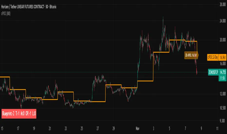
cPOC 2 DayIt’s perfect for your 2-Day cPOC since:
It derives from volume distribution data.
It highlights market structure, value area, and composite volume behavior.
Traders searching for “cPOC,” “volume profile,” or “market profile” will find it here.
Use this if your indicator’s main function is showing POCs, VAH/VAL, or composite volume balance zones.
If your cPOC script is part of a broader system:
Trend Analysis — if it’s used for directional bias and context with VWAP/EMAs.
Support/Resistance — if the tool primarily highlights POC/VAH/VAL as static levels to trade from.
Other — only if your indicator mixes data from multiple frameworks (e.g., combines orderflow, delta, VWAP, and TPO).
Indicator Overview主力籌碼預判買賣力道 (JUMBO)Pro+ 2.0主力預判買賣力道 Pro+ 是一個先進的多維度交易分析系統,專為台灣股市投資者設計。本指標整合了趨勢、成交量、動量、價格位置和波動率五大維度,通過加權評分系統生成綜合的「Power指標」,精準預判主力資金動向。
🔧 核心技術架構
1. 多維度評分系統
趨勢維度 (30%):雙EMA系統 + MACD + ADX趨勢強度
成交量維度 (25%):OBV能量潮 + 成交量比率分析
動量維度 (20%):RSI + MFI資金流量指標
價格位置維度 (20%):VWAP + 布林通道位置分析
波動率維度 (5%):ATR波動率調整
2. 多重確認機制
趨勢確認:EMA金叉/死叉 + 超級趨勢方向
成交量確認:成交量脈衝檢測 + OBV趨勢確認
動量確認:RSI超買超賣 + MFI資金流向
位置確認:布林通道位置 + VWAP相對位置
📊 主要功能特色
訊號系統
主力佈局訊號 🟥
趨勢多頭確認 + Power > 35
成交量放大 + 動量指標多頭
RSI未超買 + 價格突破基準
主力出貨訊號 🟩
趨勢空頭確認 + Power < -35
成交量異常 + 動量指標空頭
RSI未超賣 + 價格跌破基準
Power交叉訊號 🟠🔵
黃金交叉:Power線向上穿越Power MA線
死亡交叉:Power線向下穿越Power MA線
視覺化系統
台灣股市顏色標準:紅色上漲/多頭,綠色下跌/空頭
多層級K線著色:強力訊號→普通訊號→偏多偏空→盤整
智能資訊面板:實時顯示8大關鍵指標狀態
⚙️ 參數設定說明
主要參數
EMA週期:13/55(短期/長期)
Power閾值:35(靈敏度調整)
成交量濾波:1.2倍(異常成交量檢測)
超級趨勢:10週期/3倍數(趨勢過濾)
進階參數
布林通道:20週期/2倍標準差
波動率設定:14週期ATR
動量指標:14週期RSI/MFI
🎯 交易應用策略
進場時機
強力買入:🔥標記 + Power黃金交叉
常規買入:紅色向上箭頭 + Power > 35
確認買入:多重條件同時滿足
出場時機
強力賣出:💧標記 + Power死亡交叉
常規賣出:綠色向下箭頭 + Power < -35
風險控制:趨勢反轉 + 動量減弱
風險管理
止損設定:ATR波動率參考
倉位控制:Power數值強度分級
訊號過濾:ADX趨勢強度確認
📈 指標優勢
高準確率:多重條件過濾,減少假訊號
及時性:領先指標預判主力動向
完整性:涵蓋技術分析主要維度
用戶友好:直觀的視覺化設計
自定義:參數可調適應不同交易風格
🎯 Indicator Overview
Main Force Prediction Buying/Selling Strength Pro+ is an advanced multi-dimensional trading analysis system specifically designed for Taiwan stock market investors. This indicator integrates five key dimensions: trend, volume, momentum, price position, and volatility, generating a comprehensive "Power Indicator" through a weighted scoring system to accurately predict institutional fund movements.
🔧 Core Technical Architecture
1. Multi-Dimensional Scoring System
Trend Dimension (30%): Dual EMA system + MACD + ADX trend strength
Volume Dimension (25%): OBV accumulation + Volume ratio analysis
Momentum Dimension (20%): RSI + MFI money flow index
Price Position Dimension (20%): VWAP + Bollinger Bands position analysis
Volatility Dimension (5%): ATR volatility adjustment
2. Multi-Confirmation Mechanism
Trend Confirmation: EMA golden/death cross + SuperTrend direction
Volume Confirmation: Volume spike detection + OBV trend confirmation
Momentum Confirmation: RSI overbought/oversold + MFI money flow
Position Confirmation: Bollinger Bands position + VWAP relative position
📊 Key Features
Signal System
Institutional Accumulation Signals 🟥
Bullish trend confirmation + Power > 35
Volume expansion + Momentum indicators bullish
RSI not overbought + Price breakthrough baseline
Institutional Distribution Signals 🟩
Bearish trend confirmation + Power < -35
Abnormal volume + Momentum indicators bearish
RSI not oversold + Price breakdown below baseline
Power Cross Signals 🟠🔵
Golden Cross: Power line crosses above Power MA line
Death Cross: Power line crosses below Power MA line
Visualization System
Taiwan Market Color Standard: Red for uptrend/bullish, Green for downtrend/bearish
Multi-level Candlestick Coloring: Strong signals → Regular signals → Bias signals → Consolidation
Smart Info Panel: Real-time display of 8 key indicator statuses
⚙️ Parameter Settings
Main Parameters
EMA Periods: 13/55 (Short-term/Long-term)
Power Threshold: 35 (Sensitivity adjustment)
Volume Filter: 1.2x (Abnormal volume detection)
SuperTrend: 10 period/3 multiplier (Trend filtering)
Advanced Parameters
Bollinger Bands: 20 period/2 standard deviations
Volatility Settings: 14 period ATR
Momentum Indicators: 14 period RSI/MFI
🎯 Trading Application Strategies
Entry Timing
Strong Buy: 🔥 Mark + Power Golden Cross
Regular Buy: Red upward arrow + Power > 35
Confirmed Buy: Multiple conditions simultaneously met
Exit Timing
Strong Sell: 💧 Mark + Power Death Cross
Regular Sell: Green downward arrow + Power < -35
Risk Control: Trend reversal + Momentum weakening
Risk Management
Stop Loss Setting: ATR volatility reference
Position Sizing: Power value strength grading
Signal Filtering: ADX trend strength confirmation
📈 Indicator Advantages
High Accuracy: Multiple condition filtering reduces false signals
Timeliness: Leading indicators predict institutional movements
Completeness: Covers main dimensions of technical analysis
User-Friendly: Intuitive visualization design
Customizable: Adjustable parameters adapt to different trading styles
🔍 Professional Usage Tips
Trend Confirmation: Use in conjunction with major trend direction
Volume Validation: Ensure volume confirms price movements
Risk Management: Always use appropriate position sizing
Timeframe Analysis: Apply across multiple timeframes for confirmation
Market Context: Consider overall market conditions and sector rotation
版本: Pro+ 2.0
適用市場: 台股、亞股、全球股市
最佳時間框架: 日線、4小時線、1小時線
開發者: JUMBO Trading System
更新日期: 2025版本

1BullBear™ StatisticsOverview
1BullBear™ Statistics is a comprehensive volume delta analysis tool that transforms raw order flow data into actionable visual insights. This indicator displays seven key metrics in a clean, gradient-based heatmap format below your price chart, helping you identify significant buying and selling pressure in real-time.
Key Features: Seven Essential Metrics
Volume - Total volume per bar with threshold highlighting
Delta - Net buying/selling pressure (Buy Volume - Sell Volume)
Cumulative Delta - Session-based running total of delta
Delta Ratio - Delta expressed as a percentage of total volume
Minimum - Lowest delta value within the bar's timeframe
Maximum - Highest delta value within the bar's timeframe
Standard Deviation - Statistical measure of delta volatility within the session
Intelligent Gradient Visualization
Dynamic color intensity based on historical significance
Adaptive scaling using configurable lookback periods (10-200 bars)
Threshold-based highlighting to immediately spot extreme values
Separate bull/bear coloring for directional clarity
Customizable transparency for optimal chart integration
Flexible Configuration
Toggle any metric on/off to focus on what matters
Custom labels - rename metrics to your preference
Independent color schemes for each row
Adjustable thresholds for highlighting significant values
Multiple text sizes from tiny to huge
Session-aware calculations that reset at market open
Real-Time Updates
Confirmed bars display permanent historical data
Current bar updates in real-time as price action develops
Efficient rendering with automatic cleanup of previous bars
Handles up to 500 boxes for extensive historical analysis
How It Works
The indicator uses TradingView's native volume delta data (sourced from lower timeframe aggregation) to calculate order flow statistics. Each metric is displayed as a colored box below the chart, with gradient intensity representing the value's significance relative to recent history.
Gradient Logic:
Stronger colors = more significant values relative to the lookback period
Transparent backgrounds = values below threshold (filtered out)
Color saturation scales from 0% to your set maximum opacity
Session Management:
Cumulative Delta and Standard Deviation reset at each new trading session
Session detection uses exchange timezone for accurate daily calculations
Historical lookback maintains a rolling window for gradient intensity
I deal Use Cases
Scalping & Day Trading - Identify aggressive buying/selling in real-time
Order Flow Analysis - Understand market participant behavior
Divergence Detection - Spot when price and delta disagree
Volume Profile Context - Complement VP analysis with granular delta data
Breakout Confirmation - Verify price moves with volume delta agreement
Default Thresholds
The indicator comes pre-configured with sensible defaults for futures trading:
Volume: Highlights bars above 1,500 contracts
Delta: Flags extremes beyond ±500
Delta Ratio: Alerts on imbalances beyond ±70%
Min/Max: Range filter of ±10 for precision
Std Dev: Highlights outliers beyond ±0.7 standard deviations
Adjust these values based on your instrument and timeframe.
Technical Notes
Requires real-time volume delta data from your broker
Works best on instruments with strong volume (futures, major stocks, crypto)
Lower timeframe aggregation defaults to 1-second or 1-minute depending on chart timeframe
Optimized performance with efficient array management and conditional rendering
Compatibility
Pine Script™ v6
All timeframes supported
Best results on liquid instruments with reliable volume data
Integrates seamlessly with other TradingView indicators
Created by KweeBoss_ | Licensed under Mozilla Public License 2.0
Note: This indicator analyzes historical and real-time volume data. Past performance does not guarantee future results. Always combine with other forms of analysis and proper risk management.

Michie Breakout 1.0A precision breakout indicator built with adaptive machine learning logic and price action principles.
Designed specifically for TSLA, it detects key volatility shifts and directional momentum zones to capture high-probability breakout setups while filtering noise.
Focuses on clarity, adaptability, and accuracy — optimized for real-time intraday trading.

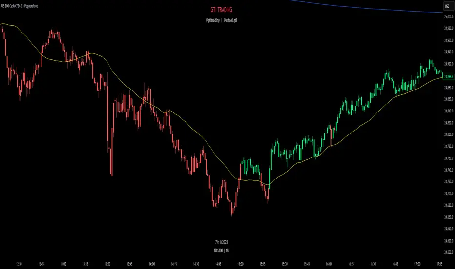
GTI TrendThe GTI Trend is a trend-detection indicator that highlights potential market direction by coloring candles based on internal analysis of higher timeframe momentum and price action behavior.
Unlike simple moving average crossovers or RSI thresholds, GTI Trend uses a proprietary blend of price positioning logic and multi-timeframe validation. Specifically, it evaluates candle structures and key breakout zones from larger timeframes to determine whether short-term movements align with higher timeframe momentum — helping traders avoid false breakouts and identify real trend continuation zones.
The result is a real-time visual cue: green candles for bullish bias and red candles for bearish bias — tuned for lower timeframes like 1m, 3m, and 5m. This helps scalpers and short-term traders align entries with broader market structure.
How It Works
GTI Trend is built around the concept of directional alignment. It compares short-term price action against higher timeframe swing zones and dynamic reference levels. When price confirms breakout behavior while staying within those zones, the candle turns green or red accordingly. This avoids the lag often seen in classic indicators.
The system dynamically adapts to market volatility, making it particularly effective in fast-moving sessions like the New York Open (typically from 10:30 AM GMT -3).
Confluence Strategy
The GTI Trend is most effective when combined with a 38-period short-term moving average. If the candle is green and the price is above the MA, this confirms a bullish continuation. Conversely, a red candle below the MA may suggest a bearish reversal.
Pairing it with VWAP is also recommended, especially in index markets, as this highlights possible support/resistance zones to validate the signal.
Recommended Markets
The GTI Trend performs best on high-volatility assets such as NASDAQ, US30, SP500, Gold (XAUUSD), and the Brazilian mini index. However, it can be applied to any asset with sufficient price movement.