MTF Stochastic ScannerThis Stochastic scanner can be use to identify overbought and oversold of 10 symbols over multiple timeframes
it will give you a quick overview which pair is more overbough or more oversold and also signals tops and bottoms in the AVG row
light red/green cell = weak bearish (Stoch = 30-20) / bullish (Stoch = 70-80)
medium red/green cell = bearish (Stoch = 20-10) / bullish (Stoch = 80-90)
dark red/green cell = strong bearish (Stoch <= 10) / bullish (Stoch >= 90)
gray cell = neutral (Stoch = 30-70)
Usage
If AVG (average of all 4 timeframes) falls below 20, the cell will get green, indicating a good time to enter long (buy)
If AVG (average of all 4 timeframes) rises above 80, the cell will get red, indicating a good time to enter short (sell)
Use the "MTF Stochastic Scanner" in combination with the " MTF RSI Scanner "
to find tops (RSI MTF avg >=70 AND Stochastic MTF avg >= 80)
or bottoms (RSI MTF avg <= 30 AND Stochastic MTF avg <= 20)
Here is how the two MTF scanners looked on Nov 08 2021 (ATH) »
and here how the MTF scanners looked on June 21 2022
use TradingViews Replay function to check how it would have worked in the past and when not.
As always… there NOT a single indicator that can show to the top & bottom 100% every single time. So use with caution, with other indicators and/or deeper understanding of technicals analysis ☝️☝️☝️
Settings
You can change the timeframes, symbols, Stochastic settings, overbought/oversold levels and colors to your liking
Drag the table onto the price chart, if you want to use it as an overlay.
NOTE:
Because of the 4x10 security requests, it can take up to 1 minute for changed settings to take effect! Please be patient 🙃
If you have any idea on how to optimise the code, please feel free to share 🙏
*** Inspired by "Binance CHOP Dashboard" from @Cazimiro and "RSI MTF Table" from @mobester16 ***
Tìm kiếm tập lệnh với "ATH"

MTF RSI ScannerThis RSI scanner can be use to identify the relative strength of 10 symbols over multiple timeframes
it will give you a quick overview which pair is more bearish or more bullish and also signals tops and bottoms in the AVG row
light red/green cell = weak bearish (RSI = 45-35) / bullish (RSI = 55-65)
medium red/green cell = bearish (RSI = 35-25) / bullish (RSI = 65-75)
dark red/green cell = strong bearish (RSI <= 25) / bullish (RSI >= 75)
gray cell = neutral (RSI= 45-55)
Usage
If AVG (average of all 4 timeframes) falls below 30, the cell will get green, indicating a good time to enter long (buy)
If AVG (average of all 4 timeframes) rises above 70, the cell will get red, indicating a good time to enter short (sell)
Use the "MTF RSI Scanner" in combination with the "MTF Stochastic Scanner"
to find tops (RSI MTF avg >=70 AND Stochastic MTF avg >= 80)
or bottoms (RSI MTF avg <= 30 AND Stochastic MTF avg <= 20)
Here is how the two MTF scanners looked on Nov 08 2021 (ATH) »
and here how the MTF scanners looked on June 21 2022
use TradingViews Replay function to check how it would have worked in the past and when not.
As always… there NOT a single indicator that can show to the top & bottom 100% every single time. So use with caution, with other indicators and/or deeper understanding of technicals analysis ☝️☝️☝️
Settings
You can change the timeframes, symbols, RSI settings, overbought/oversold levels and colors to your liking
Drag the table onto the price chart, if you want to use it as an overlay.
NOTE:
Because of the 4x10 security requests, it can take up to 1 minute for changed settings to take effect! Please be patient 🙃
If you have any idea on how to optimise the code, please feel free to share 🙏
*** Inspired by "Binance CHOP Dashboard" from @Cazimiro and "RSI MTF Table" from @mobester16 ***

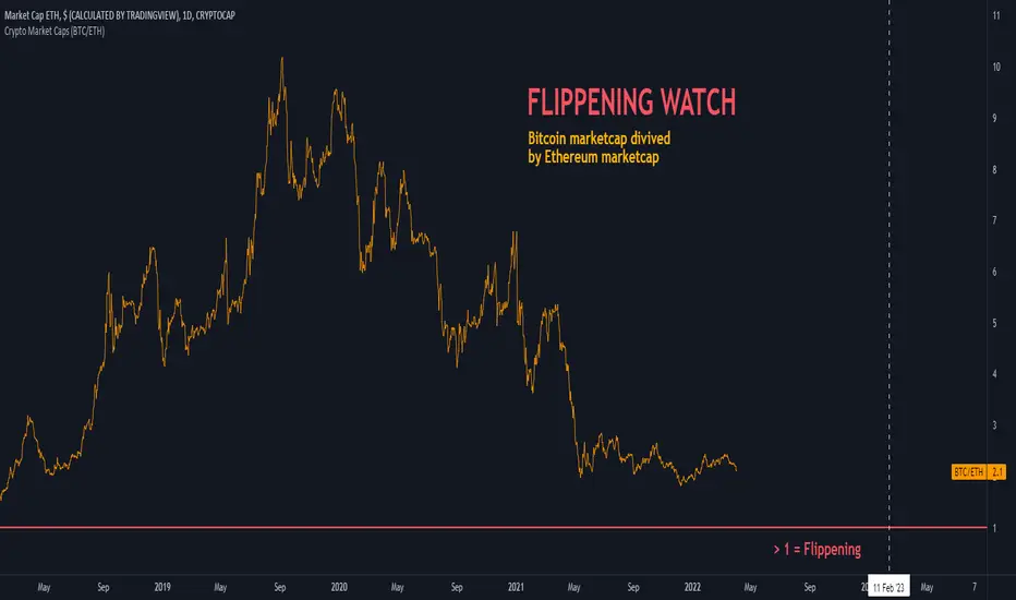
Crypto Market Caps (BTC/ETH)The indicator shows Bitcoin marketcap divived by Ethereum marketcap. On September 2019, Bitcoin's MarketCap hits ATH against ETH, by being 10 times bigger. Today, the ratio is about 2x only. When this ratio drops below 1, the FLIPPENING will happen.
J1 - Glassnode Metrics ToolkitTV announced that you can now pull data from Glassnode!
Here you can find every metric available to compare blockchain data from different coins.
How to use:
- Select your Coin
- Select your Metric
Then you can enable another coin or the same one to compare data.
As per TV's post:
Coins:
BTC, ETH, LTC, AAVE, ABT, AMPL, ANT, ARMOR, BADGER, BAL, BAND, BAT, BIX, BNT, BOND, BRD, BUSD, BZRX, CELR, CHSB, CND, COMP, CREAM, CRO, CRV, CVC, CVP, DAI, DDX, DENT, DGX, DHT, DMG, DODO, DOUGH, DRGN, ELF, ENG, ENJ, EURS, FET, FTT, FUN, GNO, GUSD, HEGIC, HOT, HPT, HT, HUSD, INDEX, KCS, LAMB, LBA, LDO, LEO, LINK, LOOM, LRC, MANA, MATIC, MCB, MCO, MFT, MIR, MKR, MLN, MTA, MTL, MX, NDX, NEXO, NFTX, NMR, Nsure, OCEAN, OKB, OMG, PAX, PAY, PERP, PICKLE, PNK, PNT, POLY, POWR, PPT, QASH, QKC, QNT, RDN, REN, REP, RLC, ROOK, RPL, RSR, SAI, SAN, SNT, SNX, STAKE, STORJ, sUSD, SUSHI, TEL, TOP, UBT, UMA, UNI, USDC, USDK, USDT, UTK, VERI, WaBi, WAX, WBTC, WETH, wNMX, WTC, YAM, YFI, ZRX.
Metrics:
ACTIVEADDRESSES — Number of Active Addresses
SENDINGADDRESSES — Number of Sending Addresses
RECEIVINGADDRESSES — Number of Receiving Addresses
NEWADDRESSES — Number of New Addresses
ADDRESSES — Number of Addresses
BLOCKS — Block Height
BLOCKSMINED — Number of Blocks Mined
BLOCKMEANINTERVAL — Mean Block Interval
BLOCKMEDIANINTERVAL — Median Block Interval
TOTALBLOCKSIZE — Total Block Size
MEANBLOCKSIZE — Mean Block Size
TOTALTXFEES — Total Transaction Fees
MEANTXFEES — Mean Transaction Fees
MEDIANTXFEES — Median Transaction Fees
TOTALTXFEESUSD — Total Transaction Fees in USD
MEANTXFEESUSD — Mean Transaction Fees in USD
MEDIANTXFEESUSD — Median Transaction Fees in USD
TOTALGASUSED — Total Gas Used
MEANGASUSED — Mean Gas Used
MEDIANGASUSED — Median Gas Used
MEANTXGASPRICE — Mean Transaction Gas Price in gwei
MEDIANTXGASPRICE — Median Transaction Gas Price in gwei
MEANTXGASPRICEUSD — Mean Transaction Gas Price in USD
MEDIANTXGASPRICEUSD — Median Transaction Gas Price in USD
MEANGASLIMIT — Mean Transaction Gas Limit
MEDIANGASLIMIT — Median Transaction Gas Limit
MARKETCAP — Market Cap
DIFFICULTY — Mining Difficulty
HASHRATE — Mean Hash Rate
ATHDRAWDOWN — Price Drawdown from ATH
SOPR — Spent Output Profit Ratio (SOPR)
NEWDEPOSITS — Number of New Deposits
NEWSTAKED — Amount of New Value Staked
NEWSTAKEDUSD — Amount of New Value Staked in USD
NEWVALIDATORS — Number of New Validators
DEPOSITS — Total Number of Deposits
STAKED — Total Value Staked
STAKEDUSD — Total Value Staked in USD
VALIDATORS — Total Number of Validators
PHASE0GOAL — Phase 0 Staking Goal
ACTIVE1Y — Percent of Supply Last Active 1+ Years Ago
TXS — Number of Transactions
TXSPS — Number of Transactions per Second
TFSPS — Number of Transfers per Second
TOTALTXSIZE — Total Size of Transactions
MEANTXSIZE — Mean Size of Transfers
TOTALVOLUME — Total Transfer Volume
TOTALVOLUMEUSD — Total Transfer Volume in USD
MEANVOLUME — Mean Transfer Volume
MEANVOLUMEUSD — Mean Transfer Volume in USD
MEDIANVOLUME — Median Transfer Volume
MEDIANVOLUMEUSD — Median Transfer Volume in USD
UTXOCREATED — Number of Created UTXOs
UTXOSPENT — Number of Spent UTXOs
UTXOTOTAL — Total Numbers of UTXOs in the Network
UTXOVALUETOTAL — Total Value of Created UTXOs
UTXOVALUETOTALUSD — Total Value of Created UTXOs in USD
UTXOVALUEMEAN — Mean Value of Created UTXOs
UTXOVALUEMEANUSD — Mean Value of Created UTXOs in USD
UTXOVALUEMEDIAN — Median Value of Created UTXOs
UTXOVALUEMEDIANUSD — Median Value of Created UTXOs in USD
UTXOVALUETOTALSPENT — Total Value of Spent UTXOs
UTXOVALUETOTALSPENTUSD — Total Value of Spent UTXOs in USD
UTXOVALUEMEANSPENT — Mean Value of Spent UTXOs
UTXOVALUEMEANSPENTUSD — Mean Value of Spent UTXOs in USD
UTXOVALUEMEDIANSPENT — Median Value of Spent UTXOs
UTXOVALUEMEDIANSPENTUSD — Median Value of Spent UTXOs in USD
UNISWAPTXS — Number of Transactions on Uniswap
UNISWAPTOTALVOLUME — Total Volume Traded on Uniswap
UNISWAPTOTALVOLUMEUSD — Total Volume Traded on Uniswap in USD
UNISWAPLIQUIDITY — Total Liquidity on Uniswap
UNISWAPLIQUIDITYUSD — Total Liquidity on Uniswap in USD

Chart Map[netguard] V1.0Chart map is a indicator that shows best levels of price.
on this indicator we divided ATH and ATL of chart to 16/32 levels that each one of them can control price and candles.
furthermore you can use weekly or daily map in this indicator.in weekly map we divide High to Low of last week candle to 8 levels that these levels can control candles too.
In general, these levels act as strong support and resistance.
you can trade on these levels with candle patterns.
US Sector CorrelationsA new and interesting way to look at Breadth. As for the usefulness of it, one would have to do some proper backtesting to get a full grasp of the capabilities. This is just a concept currently. But in general, SPX holding near ATHs with very low sector correlations can be a topping indicator. SPX selling off with Correlations all very positive across each sector...can be a sign of an impending bottom. But, needs the "full bake" of proper testing and analysis versus just guessing. I like the concept and want to explore it further, and I will. This is just the start.

Support Resistance Zones using confluence & Std. DeviationOverview:
This indicator takes (interactive) input from the user for support and resistance levels and plots important zones considering the other confluence levels in the indicator.
Working of indicator:
This indicator takes six input of Support/resistance level form the user
It has following 32 confluence levels
a.4 Recent positive Divergence levels (DN1, DN2, DN3, DN4)
b.4 recent negative divergence levels (DP1, DP2, DP3, DP4)
d.5 Fibonacci levels (Fib0, Fib236, Fib5, Fib618, Fib786)
e. 7 Pivot levels (P, PR1, PR2, PR3, PS1, PS2, PS3)
f.4 EMAs (E20, E200, E100, E50)
g. ATH, ATL, Weekly High, Weekly Low, two days ago high, two days ago low, previous day high , previous day low
The code checks nearest ‘n’ CONFLUENCE for each level (“Number of confluences to check”) in the indicator, after getting the nearest confluence it calculates the standard deviation of those levels WITH RESPECT TO THE MANUAL INPUT LEVELS.
If the Std. Deviation is less than the input value (“Minimum standard deviation” option) then the zone is displayed on the chart.
How to use:
Add the indicator on the chart select your important support and resistance levels.
Set standard deviation, if the confluence is less than the input standard deviation then you will see those zones on the chart.
You can display all divergence levels; you can display all fib levels. All confluences can be displayed by using the setting of the indicator
How to read the indicator values:
The zone will show all the confluence it has in its zone,
Example:
Table details:
The table shows the maximum and minimum deviation out of all six levels .To see at least one zone you have to make sure that Input value Std. Deviation must be greater than Min Std. Deviation of the table
Sources & refences :
Big thank to www.pinecoders.com and kodify.net
Standard deviation :
www.investopedia.com
function to find 'k' closest elements :
www.techiedelight.com
Interactive support resistance :
Divergence for many indicators:
Auto fib level by DGT:
www.tradingview.com

GMH : ATH 200d All-Time High Strategy for Tech Stock
In a bull market where valuation is completely neglected. For risk protect we choose a trade set up with stock that is going its break all time high.
Given All-Time High days as input parameter for strategy.
And stoploss by ema crossunder.
Should give decent profit factor for bull run.

Buy From All Time HighThis strategy buys at a set percentage below the all time high and sells at the previous all time high.
All Time High Warning - Free Cryptohopper WidgetWelcome to our Tradingview coin prediction filter.
We designed this script to give Cryptohopper users the possibility to set up an alarm when btc is close to All Time High. Cause of the BTCs behavior as the supertrend coin for the market it is better to turn your hopper off or be extremly careful when BTC is close to ATH.
We recommend deactivating the hopper and deleting all positions. The risk of a larger drop is very high in this marketphase.
Smartgrow-Trading is a community project with the aim of developing the best and most successful trading strategies and sharing them with the community.
The basic idea of this script is to calculate how far an coin is away from its ATH, to gave warning signals for deactivating coins after they reached there ATH. So it could also be used for other coins and pairs.
If there are questions, write them into the comments or contact us directly over the direct message or social media. Happy Trading!

(Custom)Bollingers Bands Fibonacci ratiosThis is a modified Bollinger bands that uses EMA,with ATH to get a main average and then takes Standard Deviations by Fib ratios outwards. It is very useful for Entries and exits. I Typically use it to exit longs or shorts, entries are a bit harder. Generally the price will wick just barely or briefly into the end of one of the bands and then leave, it PINGs it and that is your exit. It is a little hard to predict in real time and set a Take profit at any exact point because it is always moving, but because it constantly adjust it is pretty damn accurate at nailing it. They sorta work at any timeframe, so its up to you, though for Crypto it doesnt do so well above 4hr because it can pump really hard or dump hard and super stretch the bands. Best numbers for the Average are Fib numbers. Stick to using 13, 21, and 34. 34 is my favorite and works best for me, But its up to you. Sometimes its benificial to use 34 on lower timeframes and maybe a smaller number on larger ones IE 21 or 2 or 4hr charts.
Once again it is up to you how to use it. I dont have credit for the original version of it. It is someone else's who I think modified another person's version lol. Ill try and find their name and post a comment though for who I took the original code from.

hariz indicatorused for the rebound from ATH trend trading. Would stratify the risk and to quantify retracement and rebound.

ALL TIME HIGH/LOW AND 52 WEEKS HIGH/LOWThis script show:
1. All time high/low line shown in maroon color
2. 52weeks high/low line shown in red color
3. 25% below 52wh and 30% upper 52wl as per Mark Minervini suggset in his book "Trade Like a Stock Market Wizard: How to Achieve Super Performance in Stocks in Any
Market"
Thats all, hope benefit tou you all.
Thank you.

Bitcoin Bulls and Bears by @dbtrBitcoin 🔥 Bulls & Bears 🔥
v1.0
This free-of-charge BTC market analysis indicator helps you better understand what's going with Bitcoin from a high-level perspective. At a glance, it will give you an immediate understanding of Bitcoin’s historic price channel dating back to 2011, past and current market cycles, as well as current key support levels.
Usage
Use this indicator with any BTCUSD pairs , ideally with a long price history (such as BNC:BLX )
We recommend to use this indicator in log mode, combined with Weekly or Monthly timeframe.
Features
🕵🏻♂️ Historic price channel curve since 2011
🚨 Bull & bear market cycles (dynamic)
🔥 All-time highs (dynamic)
🌟 Weekly support (dynamic, based on 20 SMA )
💪 Long-term support (channel bottom)
🔝 Potential future price targets (dynamic)
❎ Overbought RSI coloring
📏 Log/non-log support
🌚 Dark mode support
Remarks
With exception of the price channel curve, anything in this indicator is calculated dynamically , including bull/bear market cycles (based on a tweaked 20SMA), ATHs, and so on. As a result, historic market cycles may not be 100% accurately reflected and may also differ slightly in between various time-frames (closest result: Monthly). The indicator may even consider periods of heavy ups/downs as their own market cycles, even though they weren’t. Due to its dynamic nature, this indicator can however adapt to the future and helps you quickly identify potential changes in market structure, even if the indicator is no longer updated.
On top of that bullmarket cycles (colored in green) feature an ingrained RSI: the darker the green color, the more the RSI is overbought and close to a correction (darkest color in the chart = 90 Weekly RSI). In comparison with past bull cycles, it helps you easily spot potential reversal zones.
Thanks
Thanks to @quantadelic and @mabonyi which both have worked on the BTC "growth zones" indicator including the price channel, of which I have used parts of the code as well as the actual price channel data.
Follow me
Follow me here on TradingView to be notified as soon as new free and premium indicators and trading strategies are published. Inquire me for any other requests.
Enjoy & happy trading!

White MAThis modified indicator just based on my 2cent strategy & experience,
which is:-
MA6, MA20, MA50, MA200
However, I always turn off MA20 since I also use BB (20) indicator.
Generally, if small MA cross up big MA, then it becomes entry signal, & vice versa
Each entry signal need confirmation state which is next price should close higher than crossing price.
If price close lower than crossing price, then it will be invalid entry's signal,
while if price keep maintain at same value, then it's mean uncertain for me until it close whether above or below crossing price.
"Strategy 1" (General)
In TF1D, the pattern should fulfill my condition as below:-
- MA20 above MA50 (bullish uptrend)
- Price pullback at least touch MA20 for reversal (making Higher Low)
- Price break resistance of pullback's price
My entry signal only after it close above the resistance, near "support" (RBS, Resistance become Support)
My stop-loss, if and only if price touch previous SMA6 price (or SMA10)
Unfortunately, I haven't had any specific target price. It's depending on what kind of "player" you are. (achievement)
Few TPs those I used:-
- Price touch my Static Resistance on chart obtained from,
~ Pullback price
~ Fibo (1.61++)
~ Higher price in 3 months, 6 months, 1 year, 3 year, and so on. (road to ATH, All Time High)
- Price close outside Upper BB (Dynamic Resistance)
I don't assume sell signal by using crossing indicator as TP, it's more to stop-loss for me. (means stop from loss your profit)
"Strategy 2" (Reversal Entry)
In TF15 minutes, we are assuming entry signal when SMA6 cross up SMA50. However, it's still need confirmation by next closing price.
This strategy can be apply in TF1D although SMA20 doesn't cross up SMA50 yet.
That's all my sharing strategy/system based on my 2cent experience, it's not a prefects strategy but I hope it will gives some idea for you guys in order to obtain your own system.

Free Zen SMA CollectionWith this script/indicator you combine a couple of different plots based mainly on moving average function.
Plot functions:
1. Highlight Dates: Weekends, New Years and halvings. Just for a better orientation.
2. Add 2 custom MA's (SMA, EMA or RMA)
- observe the golden/death crossos of them
- observe the filled area between them
- observe the slope of the MA's based on the color of the lines
3. Plot the 350SMA daily and their golden ratio multiplier (BTC related)
4. Highlight the ATH cross based on Pi cycle (SMA(111) crosses SMA(350)*2)
5. Plot EMA Ribbons.
have fun guys and thanks to all others who contribute to this huge script community

Fast ROI checker 50% Gann RetracementThis script is based on the Gann's 50% Retracement rule.
First, the ATH (All Time High) and ATL (All Time Low) are calculated; then, the 50% retracement level is found.
With this 50% level, we'll calculate the maximum price entry to keep a ROI which is set in the parameters.
For exemple, I only want to buy assets which can make a x16 before the 50% retracement , the script will calculate the maximum entry to respect this ROI .
If the Max entry price is above the ATL , the line will be green; if not, the line will be red.
To faster the search in the watchlist, when the price is between the Max Entry line and the ATL line, the background is painted in green.
It's not an investment strategy, you have to find your proper indicators to make purchases.
Enjoy !

All time Fibonacci RetracementThis script calculates and plots the All time Fibonacci Retracement of the chart.
It's based on the ATH (All Time High) and the ATL (All Time Low).
Made simple, you can choose which levels you wanna plot in the parameters menu.
Enjoy !

Distance to Never Look BackIt just shows in Percentage the distance to the ATH, useful to find S%R levels and maybe even find overvalue

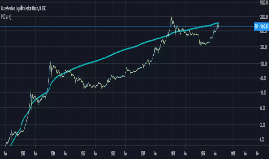
Bitcoin Price User Correlation [aamonkey]You can only use this for BTC.
Bitcoin over time tends to be priced at 7000 times the number of users (in terms of market cap).
Calculation:
Number of Wallets*7000/(Circulating Supply or 21,000,000)
Settings:
You can decide whether you want to use the Circulating Supply or 21,000,000 as a reference.
The default settings are using 21,000,000 because it seems to be more accurate.
You can easily switch between both versions by checking the box in the settings.
Interesting Findings:
Using circulating supply:
- Most of the time we are under the estimated ("PUC") line
- Once we break above the PUC line we are in the parabolic phase of the Bullrun
- In history, we broke only 4 times above the PUC
- Once we are above the PUC we see crazy growth (parabolic phase)
- We don't spend much time above the PUC
- From breaking the PUC to the new All-Time High of the cycle we took in order: 3 Days, 7 Days, 22 Days, 30 Days
- So the trend is increasing (We are taking more and more time until we see the ATH)
- Currently, we are about to break the PUC
- Then I expect the parabolic phase to begin
- I expect the run to last about 30 days
XRPUSDSHORTS XRPUSDLONGS - Bitfinex XRP Shorts & Longs// Created by titanlyy
// This script was inspired by @autemox who created the BTC version of this.
// I was looking for an easy script to display XRP Longs vs Shorts, at the moment of publishing this indicator, XRPUSD Shorts are very near ATH
// Hope this helps. Peace out.
// 7th September 2018

Bars In a Row Counter Pro by RRBBars In a Row Counter Pro by RagingRocketBull 2018
Version 1.0
This indicator counts bars of the same color in a sequence (dojis included) and plots the resulting counts as histogram bars
1. based on barssince, uses plot function with histogram style
2. Min/Max Threshold is the upper and lower limits for counting bars. For example, you can look only for sequences of 5 to 10 bars of the same color in a row
3. Show Histogram Beyond Threshold - you can hide/change color of the non-important histogram part that exceeds the threshold
4. Show Threshold Bands - show the upper and lower limits as levels on the indicator
5. Show Min/Max Bands - show ATH max red/green bars in a row historic levels on the indicator
6. Count Red Bars - count red bars in a sequence, show/hide red bars on a histogram (you can exclude red bars and count only green bars)
7. Count Green Bars - count green bars in a sequence, show/hide green bars on a histogram (you can exclude green bars and count only red bars)
8. Invert Red Bars - show red and green histograms together on the same axis above zero (saves space)
Feel free to use. Good Luck!

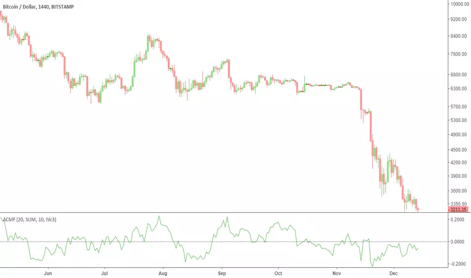
Advanced Chaikin Money Flow (CMF)TL;DR: change the aggregation to EMA to achieve similar results to Twiggs Money Flow. Play with the rest of parameters to get the desired results.
This script allows customization of CMF. It also includes all the improvements made by Twiggs Money flow.
Regular CMF does not take price gaps into account as you can see in the chart below. True range fixes this issue, as done in Twiggs Money flow (TMF).
More info here: www.incrediblecharts.com
Customization Options:
- You can change the effect of volume by setting volume exponent. 0 to 10 reduces the effect and 10+ increases it. In exchanges with too much wash trading, you may want to reduce volume effect.
- You can factor in price in CMF. It gives you a slightly different results. See my Volume x price (VxP) indicator for why it might be useful.
- The range can be changed to percentage (similar to RSI)
PS: I do not recommend using CMF in today's Crypto markets. Chaikin uses the same multiplier in CMF and Accumulation/Distribution Line (ADL). ADL is a totally broken indicator for BTC. If you look at the period after ATH (chart below), you will notice that ADL keeps increasing implying accumulation. While it is clear that there was distribution going on. The reason might be the artificially inflated prices in Crypto that is achieved by the help of bots and having "certain" exchanges as a price reference. So, my reasoning is that if ADL is a broken indicator, so should be CMF. CMF diverges from BTC price frequently. This is a double edged sword IMO. Still CMF is a much better indicator than ADL because it works relative to prior periods which covers some of its flaws.
Note for super nerds: Twiggs Money Flow includes true range and Welles Wilder's Moving Average (WWMA). I have seen some other scripts using their own calculations for WWMA which is not efficient. WWMA is equal to built-in RMA/SMMA which is equal to EMA with length 2x-1.