Turtle Breakout Pro (Low DD Mode)Turtle Breakout Pro (Low DD Mode) is a trend-following breakout strategy built to participate only in higher-quality expansions while actively limiting exposure during unfavorable phases.
1. Core idea
This strategy focuses on capturing directional moves that begin with a clear price expansion beyond a recent range. It aims to trade only when the market shows both direction and commitment, avoiding entries that are likely to fade back into congestion.
2. Breakout validation
Signals are not triggered by a single touch or a marginal break. The strategy requires price to clear a breakout area with a safety margin and then demonstrate continued acceptance beyond that level. This confirmation behavior is designed to reduce false breakouts and late-session spikes that immediately retrace.
3. Market quality filters
Trades are allowed only when broader conditions support trend continuation. The strategy can enforce a directional bias filter, a trend-strength filter, a volatility suitability check, and an optional participation filter based on activity. The intent is to avoid breakouts that occur in weak, ill-conditioned environments where continuation is statistically less reliable.
4. Adaptive risk and sizing
Position size is dynamically adjusted so that risk remains proportional to current volatility. Instead of using fixed size, the strategy scales exposure based on how much the market can realistically move against the position in normal conditions. This is designed for multi-market use and for maintaining consistency across changing volatility regimes.
5. Exit framework
Exits are layered rather than single-purpose. The strategy uses a protective stop to define invalidation, can progressively protect profits as the trade moves in favor, and can optionally take profits at a logical expansion distance. In addition, a structure-based exit can close positions when the market violates a shorter-term boundary, aiming to avoid giving back too much during reversals.
6. Time and stagnation control
The strategy can enforce a maximum holding time to prevent capital being tied up in trades that stop progressing. If the market does not deliver continuation within a reasonable window, the position is closed to reduce opportunity cost and limit slow drawdown behavior.
7. Drawdown control behavior
A key feature is its defensive trading mode. After a loss, the strategy can temporarily reduce activity by waiting before taking new trades. It can also stop initiating new positions if overall drawdown exceeds a defined tolerance relative to the equity peak. The goal is to avoid “death by a thousand cuts” during noisy regimes.
8. Best conditions
It performs best when markets transition from consolidation into sustained trends, especially on liquid instruments where breakouts can carry through. It is typically more stable when volatility is present but not chaotic, and when trending conditions persist long enough for trailing protection to work.
9. When to avoid
Avoid using it in tight, mean-reverting ranges and during highly erratic whipsaw periods where breakouts frequently fail. In these phases, even well-filtered breakout systems can accumulate small losses and trigger defensive pauses.
10. What to expect
Expect fewer but higher-quality entries compared to basic breakout systems. Many trades will be small wins or small losses, with occasional larger winners when a strong trend develops. The strategy is designed to prioritize smoother equity behavior over maximum trade frequency.
Chỉ báo và chiến lược

UVOL Thrust TrackerUVOL Thrust Tracker identifies institutional breadth thrusts using NYSE up-volume as a percentage of total volume (USI:UVOL / USI:TVOL), plotted directly on price.
The indicator highlights:
TRUE 90% UVOL thrusts (rare, high-conviction breadth events)
Surrogate thrust clusters (multi-day 80–89% participation)
Cluster failures (momentum that fails to expand)
Structural thrust failures (2022-style false starts)
A regime filter based on the chart symbol’s moving averages separates bull vs bear environments, dynamically adjusting thresholds and failure logic.
This tool is designed for regime confirmation and risk management, not short-term entries. TRUE thrusts typically confirm trend continuation, while failures warn when breadth support breaks down.
Note: This indicator is intended for regime and risk assessment, not precise entries or exits.

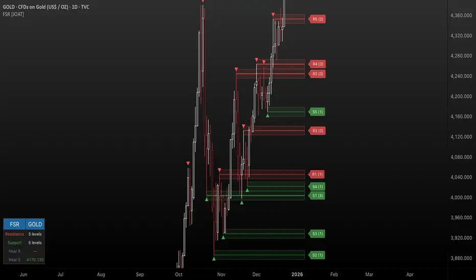
Fractal Support & Resistance [JOAT]
Fractal Support & Resistance — Automatic Level Detection with Volume Weighting
Fractal Support & Resistance automatically identifies key price levels using a proprietary combination of fractal detection, volume analysis, and dynamic touch counting. Levels are intelligently styled based on their strength and how many times they have been tested, giving you instant visual feedback on level importance.
Why This Script is Protected
This script is published as closed-source to protect the proprietary level management algorithm and the unique volume-weighted strength calculation methodology from unauthorized republishing. The specific implementation of touch detection, level merging logic, and dynamic opacity calculations represents original work that differentiates this from standard fractal indicators.
What Makes This Indicator Unique
Unlike basic fractal indicators that simply mark pivot points, this system:
Tracks how many times each level has been tested (touch counting)
Weights level importance by volume at the fractal point
Merges nearby fractals into single levels instead of cluttering the chart
Dynamically adjusts visual opacity based on level strength
Provides zone boxes around levels for realistic price reaction areas
What This Indicator Does
Detects fractal pivot highs and lows to establish support and resistance levels
Tracks how many times each level has been touched or tested
Weights level importance by volume at the fractal point
Draws extending lines and zone boxes for each level
Dynamically adjusts level opacity based on touch count for visual strength indication
Provides a dashboard with nearest levels and counts
Core Methodology
The indicator uses Williams Fractal concepts as a foundation but extends them with proprietary enhancements:
Fractal Detection — Identifies pivot highs and lows where price creates local extremes with confirmation bars on each side. A fractal high requires the highest point with lower highs on both sides; a fractal low requires the lowest point with higher lows on both sides.
Level Clustering — New fractals within a tolerance zone (based on Zone Padding %) update existing levels rather than creating duplicates. This keeps the chart clean and focuses on significant price areas.
Volume Integration — Volume at each fractal point is accumulated to weight level significance. Higher volume fractals are considered more important.
Touch Tracking — The system monitors when price approaches existing levels and increments touch counts. More touches indicate stronger, more significant levels.
Visual Strength System
Level appearance changes dynamically based on market interaction:
Newer or less-tested levels appear more transparent (up to 80% transparency)
Each additional touch reduces transparency by 15%
Heavily tested levels become more prominent and opaque (minimum 20% transparency)
Labels display level number and touch count (e.g., "R1 (3)" = Resistance 1 with 3 touches)
Zone boxes provide visual areas around each level
Color Scheme
Resistance Color — Default: #FF5252 (red) — Used for resistance levels and zones
Support Color — Default: #4CAF50 (green) — Used for support levels and zones
Zone Fill — 90% transparent version of level color
Zone Border — 70% transparent version of level color
Labels — 30% transparent background with white text
Dashboard Information
The on-chart table (bottom-left corner) displays:
Number of active resistance levels meeting minimum touch requirement
Number of active support levels meeting minimum touch requirement
Nearest resistance level above current price
Nearest support level below current price
Inputs Overview
Fractal Settings:
Fractal Period — Bars on each side for fractal confirmation (default: 2, range: 1-10)
Max Levels Per Side — Maximum resistance and support levels to track (default: 5, range: 1-20)
Zone Padding (%) — Level zone width as percentage of price (default: 0.2%, range: 0-2%)
Filtering:
Volume Weight Levels — Toggle volume-weighted level importance (default: on)
Min Touches to Show — Filter out levels with fewer touches (default: 1, range: 1-10)
Lookback Period — Historical bars to analyze for level detection (default: 200, range: 50-500)
Visual Settings:
Resistance/Support Colors — Customizable color scheme
Show Zone Boxes — Toggle filled zone areas around levels
Show Level Labels — Toggle level labels with touch counts
Show Fractal Markers — Toggle small triangles at fractal points
Show Dashboard — Toggle the information table
Line Width — Thickness of level lines (default: 2, range: 1-5)
How to Use It
For Support/Resistance Trading:
Use levels with higher touch counts as stronger support/resistance references
More opaque levels have been tested more times and are more significant
Watch for price reactions at zone boundaries, not just exact level prices
Combine with candlestick patterns at levels for entry signals
For Breakout Trading:
Watch for breakouts when price closes beyond a level
Levels with many touches that finally break often produce strong moves
Use the zone box—a close beyond the zone is more significant than just touching the level
Set alerts for resistance/support breaks
For Target Setting:
Use the nearest resistance as a profit target for long positions
Use the nearest support as a profit target for short positions
Dashboard shows these levels for quick reference
Alerts Available
FSR Resistance Break — Price closes above a resistance level
FSR Support Break — Price closes below a support level
FSR New Fractal High — Fresh fractal high detected
FSR New Fractal Low — Fresh fractal low detected
Best Practices
Increase Fractal Period for fewer but more significant levels
Use Min Touches filter to show only well-tested levels
Volume weighting helps identify institutionally significant levels
Combine with trend indicators—trade with the trend at levels
This indicator is provided for educational purposes. It does not constitute financial advice. Past performance does not guarantee future results. Always conduct your own analysis and use proper risk management before making trading decisions.
— Made with passion by officialjackofalltrades
Indikator Tablosu (Mira-2)This is an indicator table that calculates RSI, MACD, EMA, Hull MA, VWAP, PSAR, SuperTrend, CCI, and Stochastic RSI values with equal weighting. Based on an 11-point scale, it generates a 'long' position signal for values >7 and a 'short' position signal for values <4. This is not investment advice and is intended for brainstorming purposes only.

Crypto Flow Index (CFI) - RS vs BTC/ETH ---
Crypto Flow Index, CFI
Crypto Flow Index, CFI, measures relative strength between an asset and Bitcoin or Ethereum.
You use CFI to judge whether capital favors your asset or the benchmark.
CFI does not give entry or exit signals.
You use CFI as a bias and context tool.
---
What CFI measures
Relative strength money flow on the BASE/BTC or BASE/ETH pair.
Volume weighted pressure, not price alone.
Momentum blended into flow to smooth rotations.
Optional USD trend filter using fast and slow EMAs.
---
How to read CFI
Above 50 means relative strength favors the asset.
Below 50 means relative strength favors BTC or ETH.
Rising CFI shows strengthening relative demand.
Falling CFI shows weakening relative demand.
---
Histogram
Green bars show positive relative flow.
Red bars show negative relative flow.
Larger bars signal stronger pressure.
---
Bias ribbon
Green ribbon shows bullish relative bias.
Red ribbon shows bearish relative bias.
Gray ribbon shows transition or balance.
---
How to use CFI
Favor long trades when CFI stays above 50.
Avoid longs when price rises but CFI falls.
Spot rotations before price reacts.
Combine with structure, entries, and risk rules.
---
Important limits
CFI compares assets only to BTC or ETH.
CFI does not represent the entire crypto market.
USD price and relative strength often diverge.
---
Core question CFI answers
Is your asset gaining or losing strength versus Bitcoin or Ethereum.
---

LJ Parsons Adjustable expanding MRT Fib Version 2Based on premium/discount/fair-value levels the indicator will expand with the market by settable dates.
The levels are not fib based as such but are resonant levels within an multiplicative /12 log scale using the LJ Parsons Market resonance hypothesis.

C2 HTF Detection CRT [MarioLeb]What This Indicator Does:
1. Detects "C2 Sweeps" - Price retesting previous highs/lows then closing back inside the range.
2. Shows HTF Structure - Marks High Timeframe support/resistance zones (C1 ranges).
3. Finds Multi-Timeframe Confluence - When HTF and LTF C2 signals align at same levels.
4. Highlights CRT Cycles - Complete market cycles (C1→C2→C3 pattern).
Visual Output:
Horizontal lines = C2 sweep levels
Colored zones = C1 ranges (key areas)
Yellow line = 50% level of C1 range
Boxes = CRT cycles (if enabled)
CISD lines = Change in supply/demand confirmation
Purpose:
Identify where higher timeframe structure meets lower timeframe precision - shows where big moves often start.
Alert Features:
Automated Alerts trigger when:
HTF C2 Detected - "Bullish/Bearish HTF C2 Detected on "
CRT Cycle Complete - "Bullish/Bearish CRT Cycle Detected on "
CISD Confirmed - "HTF CISD Confirmed on "
LTF C2 Detected - "Bullish/Bearish LTF C2 vs HTF C1 Detected"
Key Alert:
Once C2 candle closes inside C1 range after sweeping high/low → Alert fires immediately.
Each alert includes:
Direction (Bullish/Bearish)
Timeframe
Mode (Strict/Easy)
Pattern type (C2/CRT/CISD)
Alert frequency: Once per bar (no spam).

Ultimate Pattern Engine - Elite Suite v54Here's the description I wrote for your Pine Script publication:
Ultimate Pattern Engine - Elite Suite v54
A comprehensive technical analysis tool combining multiple pattern recognition algorithms and indicators in one powerful suite.
Pattern Recognition:
Head & Shoulders patterns with automatic neckline detection
Bull and Bear flag formations
9-count sequential patterns
Breakout pattern detection with alerts
Support/Resistance zones with dynamic S/R levels
Reversal cloud visualization
Moving Averages:
Multiple Simple Moving Averages (SMA) - 9, 50, 200 periods
Exponential Moving Averages (EMA) with customizable lengths
Color-coded for easy trend identification
Visual Features:
Pattern fill areas for clear visualization
Breakout labels showing price action
Customizable color schemes (bullish green, bearish red, neutral gray)
H&S neckline highlighting
Volume multiplier analysis
Configuration:
Adjustable sensitivity and flatness thresholds
Toggle individual patterns on/off
Customizable moving average periods and colors
Full control over visual elements
Ideal for traders looking to identify key chart patterns, trend reversals, and breakout opportunities across all timeframes.

Futures Risk Calculator - Pinhead TradesStop over leveraging and know exactly what to risk in real time trading prop firm futures!

SMC Execution Engine by @abdallacryptoSMC Execution Engine by @abdallacrypto is a Smart Money Concepts structure and execution toolkit that turns price action into a clear, rules-based map.
It automatically detects swing structure, BOS and CHOCH, tracks the active structural anchor, and projects clean Fibonacci retracement levels built from the current context. It also draws the latest context Order Block and adds optional intrabar alerts for high-probability confluence events (OB touches, 0.79 and 0.618 fib interactions, OB plus fib, and sequential “fib then OB” logic). A multi-timeframe HUD (5m to 1M) shows structural bias and RSI so you can align execution with higher-timeframe context.
This is not a buy/sell signal generator. It is a structure reader and execution framework designed to reduce noise, improve consistency, and help you act with clarity.
Suggested use: identify context with CHOCH and anchor, wait for price to return to key fib levels and the active Order Block, then execute your own risk plan.
Full documentation:
🇺🇸 beneficial-hyena-c1e.notion.site
🇧🇷 beneficial-hyena-c1e.notion.site
🇪🇸 beneficial-hyena-c1e.notion.site

AM/PM Session LevelsAM/PM Session Levels with Real-Time Updates
This indicator plots intraday high, low, and midpoint levels for the AM and PM trading sessions, with live-updating visuals designed for precision and clarity.
Features
AM Session: 9:30 AM to 10:00 AM EST
PM Session: 1:30 PM to 2:00 PM EST
Live High/Low Tracking: Lines begin at the exact candle where session highs or lows are formed and update dynamically.
Session Boxes: Visual boxes extend from session start to the most recent bar, adjusting in real time to reflect the current session range.
Midpoint Lines: The 50% level (CE) is calculated and displayed after each session ends.
Customization Options:
Line styles, widths, and colors for each session
Label texts
Box visibility, fill, and border styling
Intended Use
This tool is ideal for intraday traders looking to reference session-based levels for decision-making. It provides clear visual separation of session structure and helps identify key reaction areas throughout the trading day.
Developed by Ralvarez
Version 1.0 — December 2025

Monthly Seasonality (for last N Years)Monthly Seasonality analyzes historical price behavior to reveal how a symbol typically performs in each calendar month. It helps traders identify recurring seasonal patterns, stronger months, weaker months, and overall consistency across years.
What this indicator does?
1. Calculates monthly percentage returns using historical price data
2. Aggregates results over a user-defined lookback period (max up to 20 years)
3. Displays a seasonality table showing:
> Average return (%) for each month
> Win rate (%) — how often the month closed positive
> Number of years included in the calculation
4. Automatically highlights:
> 📈 Best performing month
> 📉 Worst performing month
Seasonality Table:
Green shading indicates positive average returns
Red shading indicates negative average returns
⭐ A star marks the strongest and weakest months
Table colors automatically adapt to light and dark themes
Table position is fully customizable (top, middle, bottom)
How Traders Use It?
Identify seasonally strong months for swing trades or position entries
Avoid historically weak periods or tighten risk controls
Combine with technical indicators for higher-probability trade timing
Useful for equities, ETFs, and indices with long trading histories
Examples:
1. AAPL
2. BTCUSD

Volume Spread Analysis with Cues⚖️Volume Spread Analysis with Cues (VSA)
Volume Spread Analysis with Cues is an indicator that analyzes the relationship between price spread and volume to reveal market intent. Instead of treating volume in isolation, this script classifies each candle into meaningful VSA conditions such as accumulation, distribution, absorption, momentum, exhaustion, and traps.
🔑Key Features
True price spread calculation (optional gap-inclusive mode)
Candle spread analysis
Volume analysis
Candle close quality analysis (strong, weak, or neutral)
Visual emoji cues
Detailed tooltips explaining each signal and its confirmations
Built-in alerts for demand, supply, and trap scenarios
📏 How to Use
This script is context-driven, not a signal generator. It is designed to be used alongside:
Support & resistance
Market structure
Higher-timeframe bias
The strongest setups occur when VSA cues align with key levels and trend direction! Confluence is your friend.
🚨Alerts Included
VSA Demand Cue – potential accumulation or continuation
VSA Supply Cue – potential distribution or absorption
VSA Trap Cue – exhaustion or false breakout behavior
⚠️ Beware
Not every cue is tradable on its own
Confirmation and location are critical

Manipulation Candle 15mManipulation Candle
The Manipulation Candle 15m indicator is designed to highlight potential market manipulation or exhaustion moves on the 15-minute chart by identifying large impulsive candles relative to the Daily ATR and fading them contrarian-style.
This tool is especially useful for index futures, SPX options, and high-liquidity instruments where sharp moves often precede mean reversion.
How It Works -
The script monitors completed 15-minute candles
It measures the candle body size (open → close)
That body is compared to a user-defined percentage of the Daily ATR (set to 20%)
When a candle exceeds the threshold, it is considered an impulse / manipulation candle
Signal Logic (Contrarian Bias) -
Bearish impulse candle → LONG signal
Indicates aggressive selling that may be exhausted
Bullish impulse candle → SHORT signal
Indicates aggressive buying that may be overextended
Signals are only generated once per completed 15-minute candle to avoid repainting.
Inputs -
Daily ATR Length
Controls how volatility is measured
Impulse Threshold (% of ATR)
Defines how large a candle must be (relative to Daily ATR) to trigger a signal
Best Use Cases
Mean-reversion and fade strategies
SPX / ES / NQ / YM indices
Important Notes
This is not a standalone system
Works best with context, confirmation, and risk management
Designed to identify potential turning points, not trend continuation
Created by: @aaronrileycheer
Timeframe: 15-Minute
Style: Contrarian / Mean Reversion
Relative Strength vs S&P 500 (SPX/ES) Relative Strength vs S&P 500
This indicator measures the relative performance of an asset compared to the S&P 500, helping traders and investors identify whether an asset is outperforming or underperforming the broader market.
The calculation is based on a price ratio between the selected asset and the S&P 500, optionally normalized to a base value (100) for easier interpretation.
How to read it:
Above the baseline (100) → the asset is outperforming the S&P 500
Below the baseline (100) → the asset is underperforming the S&P 500
Rising line → strengthening relative performance
Falling line → weakening relative performance
Why it’s useful:
Helps focus on market leaders, not just assets that “look cheap”
Filters trades and investments in the direction of relative strength
Useful for swing trading, long-term investing, and portfolio allocation
Widely used in institutional and professional asset management
This indicator is best used as a trend and selection filter, in combination with technical setups (support/resistance, VWAP, structure).

Market time opens @NeoNztime opens marked out new york session , london session, asia session and highs and lows of each one

RF MTF Liquidity levels v1This indicator is designed to answer one question:
“Where is the higher-timeframe liquidity sitting right now?”
RF MTF Liquidity Levels v1 detects liquidity levels on a chosen higher timeframe (HTF) and projects those levels onto any lower timeframe chart, so that way you can watch for LTF entry models, from higher TF POIs, quickly. Instead of redrawing structure by hand every session, you get a clean, dynamic map of where stops and resting liquidity are most likely to be sitting.
What it does
MTF Liquidity Engine
Select any HTF (e.g. 4H, 1H, Daily) and the script finds significant liquidity levels on that timeframe.
These pivots are then plotted as horizontal levels on your current chart, so you can view 4H or Daily liquidity while trading the 15m/5m/etc.
Adjust the sensitivity with toggles
Dynamic Liquidity Levels
Highs are drawn in your chosen “High Color,” lows in “Low Color.”
Each level automatically extends forward bar-by-bar until price taps it for the first time, then the level is frozen so you can clearly see which liquidity has been taken and which is still untouched.
Session-Based Filtering
Optional session filter lets you only record HTF pivots formed during specific trading sessions (e.g. New York, London, Asia).
This is useful if you only want to track levels created during your preferred liquidity windows.
Expiration Control
Optional “Expire After N Bars” setting to automatically clean up old levels that are no longer relevant to your current playbook.
Why use liquidity levels?
Liquidity-based trading focuses on where orders and stops cluster – prior highs/lows and obvious swing points on the higher timeframe. Price often:
Gravitates toward these levels to fill large orders and trigger stops.
Shows strong reactions after sweeping them (reversals, SFPs, displacement moves).
By mapping HTF liquidity on your intraday chart you can:
Quickly see where price is likely to engineer a move toward, instead of chasing random swings.
Frame trades around meaningful areas (liquidity grabs, SFPs, FVGs, order blocks, etc.).
Define clear invalidation

GOLDEN EDGE PRO 2H█ GOLDEN EDGE PRO — MACD 2H for XAUUSD ( FXOPEN:XAUUSD )
━━━━━━━━━━━━━━━━━━━━━━━━━━━━━━━━━━━━━━━━━━━
⚠️ STOP scrolling through strategies with fake numbers.
You've seen them. "500% profit!" on a 3-month backtest. Looks amazing until you extend it to 2 years and watch it collapse.
This is different.
━━━━━━━━━━━━━━━━━━━━━━━━━━━━━━━━━━━━━━━━━━━
█ THE REAL NUMBERS (Jan 2023 — Dec 2025)
┌─────────────────────────────────────┐
│ Net Profit: +109.18% │
│ Profit Factor: 19.97 │
│ Max Drawdown: 3.50% │
│ Win Rate: 59.38% │
│ Total Trades: 32 │
│ Avg Win/Loss: 34.9 : 1 │
└─────────────────────────────────────┘
Yes, you read that right. Profit Factor of nearly 20.
Not because of curve-fitting. Because of relentless optimization.
━━━━━━━━━━━━━━━━━━━━━━━━━━━━━━━━━━━━━━━━━━━
█ WHY THIS STRATEGY EXISTS
I spent mass of hours developing this.
Not copying indicators from the internet.
Not asking ChatGPT to write code.
Actually testing. Actually optimizing. Actually failing — until I didn't.
This is a MACD-based strategy, but not the MACD you know.
It's been engineered specifically for GOLD (XAUUSD) on the 2-hour timeframe.
Every parameter has been stress-tested across:
- Thousands of TP multiplier combinations
- Multiple market conditions (trending, ranging, volatile)
- 2.9 years of price data
━━━━━━━━━━━━━━━━━━━━━━━━━━━━━━━━━━━━━━━━━━━
█ BACKTESTING DONE RIGHT
This strategy was tested with ALL premium settings enabled:
✅ Bar Magnifier — for accurate intrabar simulation
✅ Recalculate on every tick — no lookahead bias
✅ Recalculate after order filled — realistic execution
✅ Slippage: 2 ticks — because real markets slip
✅ Commission: 0.01% — because brokers take their cut
Most strategies fall apart when you turn these on.
This one was BUILT with them on.
━━━━━━━━━━━━━━━━━━━━━━━━━━━━━━━━━━━━━━━━━━━
█ WHAT YOU GET
📊 Optimized entry & exit logic for XAUUSD
📊 Clean, readable code (no obfuscation tricks)
📊 Configurable TP/SL multipliers
📊 Long & Short modes (Long recommended)
📊 Alert-ready for automation
━━━━━━━━━━━━━━━━━━━━━━━━━━━━━━━━━━━━━━━━━━━
█ A WORD OF HONESTY
Will this strategy make you rich overnight? No.
No single strategy will. Anyone who tells you otherwise is lying.
But this CAN be a cornerstone of a diversified trading system.
I'm building more strategies across different assets and timeframes.
Follow my profile if you want access to the full ecosystem.
━━━━━━━━━━━━━━━━━━━━━━━━━━━━━━━━━━━━━━━━━━━
█ RECOMMENDED SETTINGS
- Asset: XAUUSD (Gold)
- Timeframe: 2H
- TP Multiplier: 1.06 (optimized) or 1.52
- Mode: Long Only (highest performance)
- Broker: Any with tight gold spreads like ( FXOPEN:XAUUSD )
━━━━━━━━━━━━━━━━━━━━━━━━━━━━━━━━━━━━━━━━━━━
█ NEED HELP?
Want to automate this with MetaTrader, NinjaTrader, or Telegram alerts?
I offer integration services. DM me.
━━━━━━━━━━━━━━━━━━━━━━━━━━━━━━━━━━━━━━━━━━━
🔔 FOLLOW for more battle-tested strategies
⭐ LIKE if this adds value
💬 COMMENT your questions — I actually respond
━━━━━━━━━━━━━━━━━━━━━━━━━━━━━━━━━━━━━━━━━━━
#gold #xauusd #macd #tradingstrategy #algotrading #backtested

ADX + DI Trend Gate PROADX + DI Trend Gate PRO is a trend filter and signal tool built around DMI (DI+ / DI-) and ADX. It helps you avoid choppy conditions by requiring real trend strength and DI separation before allowing signals.
Key features:
AUTO presets for 5m / 15m (optimized for fast intraday use)
Optional MTF confirmation (5m → 15m, 15m → 1H)
Adaptive DI Gap (volatility-based adjustment using ATR/Close)
Confirm on bar close option (no repaint mode)
Signal modes: DI Cross (classic) or Gate Flip (more responsive)
Optional filters: ATR volatility filter and Volume filter
Exit signals when trend weakens (ADX weakening / DI convergence / DI flip)
Info panel with active parameters, AUTO vs MANUAL, MTF diff, and adjustable panel font size
How to use (practical):
For cleaner signals, keep AUTO presets ON and enable Confirm on bar close.
For stricter filtering, enable MTF confirmation and/or Require ADX rising.
Volume filter is best on instruments with meaningful volume; on Forex (tick volume) it’s often better OFF.
Disclaimer : This indicator is a trend filter and timing tool, not financial advice. Always backtest and use proper risk management.

0ABCBuy and Sell signals by 2nd Entry strategy. It's not ready yet. But, we still can use it. I will add more things in the future hoping to make a profitable strategy that work in low timeframe Crypto markets. We are using multiple RSI for filtering.

Neural Trend Engine [JOAT]Neural Trend Engine - Multi-Layer Adaptive Trend Detection
Neural Trend Engine uses a multi-layer filtering approach inspired by neural network concepts. It combines multiple adaptive moving averages with proprietary momentum and volatility weighting to generate trend signals with reduced lag and improved confidence scoring.
Why This Script is Protected
This script is published as closed-source to protect the proprietary signal composition algorithm and the specific weighting methodology from unauthorized republishing. The unique combination of adaptive layer calculations, momentum normalization, and volatility integration represents original work that goes beyond standard indicator implementations.
What Makes This Indicator Unique
Unlike simple moving average crossover systems, Neural Trend Engine:
Uses three Kaufman Adaptive Moving Averages (KAMA) that automatically adjust their smoothing based on market efficiency
Combines layer alignment, momentum, and volatility into a single "neural signal"
Provides signal strength percentages so you know the conviction level of each signal
Creates a visual trend cloud that makes direction immediately obvious
What This Indicator Does
Plots three adaptive moving average "layers" that respond dynamically to market efficiency
Creates a trend cloud between fast and slow layers for visual trend identification
Generates weighted composite signals from layer alignment, momentum, and volatility
Displays buy/sell labels with signal strength percentages
Provides a comprehensive dashboard with multi-component breakdown
Colors the neural line and cloud based on current trend direction
Core Methodology
The indicator employs a three-layer adaptive system where each layer responds to market conditions at different speeds:
Fast Layer (default: 8) — Quick response for short-term direction changes
Medium Layer (default: 21) — Intermediate trend reference
Slow Layer (default: 55) — Long-term trend anchor
Each layer uses efficiency-based adaptation, meaning they become more responsive during trending conditions and smoother during choppy markets.
The neural signal is a proprietary composite that weighs three distinct market components:
Momentum Component (default: 40%) — Measures directional price velocity, normalized to its recent range
Trend Component (default: 35%) — Evaluates alignment between the three adaptive layers
Volatility Component (default: 25%) — Incorporates market volatility state into signal generation
These components are combined using a weighted formula that has been calibrated to balance responsiveness with noise reduction.
Signal Generation
Direction changes occur when the smoothed neural signal crosses a configurable strength threshold:
Bullish — Signal exceeds positive threshold with layer alignment confirmation
Bearish — Signal drops below negative threshold with layer alignment confirmation
Neutral — Signal remains within threshold range, indicating consolidation
Signal strength percentages indicate the conviction level of each signal, helping traders assess trade quality. Higher percentages suggest stronger trend conviction.
Visual Features
Trend Cloud — Filled area between fast and slow layers, colored by trend direction
Neural Line with Glow — Weighted average of all three layers with glow effect
Medium Layer — Subtle white line showing intermediate trend
Signal Labels — BUY/SELL labels with strength percentages at signal points
Small Markers — Alternative triangle markers when labels are disabled
Color Scheme
Bullish Color — Default: #26A69A (teal green) — Used for bullish trends and signals
Bearish Color — Default: #EF5350 (red) — Used for bearish trends and signals
Cloud Fill — 85% transparent version of trend color
Neural Line Glow — 60% transparent version for glow effect
Dashboard Information
The on-chart table (top-right corner) displays:
Current direction (BULLISH, BEARISH, or NEUTRAL)
Neural signal percentage
Layer alignment status (ALIGNED UP, ALIGNED DOWN, or MIXED)
Momentum direction and percentage
Trend strength percentage
Inputs Overview
Neural Layers:
Fast Layer — Period for fast adaptive MA (default: 8, range: 2-50)
Medium Layer — Period for medium adaptive MA (default: 21, range: 5-100)
Slow Layer — Period for slow adaptive MA (default: 55, range: 10-200)
Source — Price source for calculations (default: close)
Sensitivity:
Momentum Weight — Weight for momentum component (default: 0.4)
Trend Weight — Weight for trend/layer alignment (default: 0.35)
Volatility Weight — Weight for volatility component (default: 0.25)
ATR Period — Period for volatility calculations (default: 14)
Visual Settings:
Bullish/Bearish Colors — Customizable color scheme
Show Trend Cloud — Toggle the filled cloud area
Show Signal Labels — Toggle BUY/SELL labels with percentages
Show Neural Line — Toggle the main trend line
Show Dashboard — Toggle the information table
Alerts:
Await Bar Confirmation — Wait for bar close before triggering (recommended)
Min Signal Strength — Threshold for direction changes (default: 0.3 = 30%)
How to Use It
For Trend Following:
Follow the trend cloud color for overall market direction
Enter long when cloud turns bullish (teal) and signal strength is high
Enter short when cloud turns bearish (red) and signal strength is high
Use the neural line as a trailing stop reference
For Signal Trading:
Wait for BUY/SELL labels to appear
Check the signal strength percentage—higher is better
Confirm with dashboard showing aligned layers
Avoid signals during MIXED layer alignment
For Confirmation:
Use Neural Trend Engine to confirm signals from other systems
Strong confirmation when all three layers are aligned
Dashboard shows momentum and trend strength for additional context
Alerts Available
NTE Buy Signal — Bullish direction change detected
NTE Sell Signal — Bearish direction change detected
NTE Direction Change — Any trend direction change
Best Practices
Higher signal strength percentages indicate more reliable signals
Wait for layer alignment (shown in dashboard) before entering trades
Use on higher timeframes for more reliable trend identification
Combine with support/resistance levels for entry timing
This indicator is provided for educational purposes. It does not constitute financial advice. Past performance does not guarantee future results. Always conduct your own analysis and use proper risk management before making trading decisions.
— Made with passion by officialjackofalltrades


COT Seasonality 1W ForecastCOT Seasonality - Historical COT Positioning Patterns Throughout the Year
Displays average COT positioning (Commercials vs. Small Speculators) over 15+ years as weekly seasonality curves. Uses WillCo Index methodology to calculate Smart Money positioning.
Features:
- 52-week COT average curves (Commercials & Small Specs)
- 8-week future projection based on historical patterns
- Adjustable lookback (up to 2 years visible)
- Deviation analysis: Current COT value vs. Seasonality
- Divergence detection between Commercials and Small Specs
- For all 8 major Forex currencies (USD, EUR, JPY, GBP, AUD, NZD, CAD, CHF)
Important: Use on WEEKLY chart only!
Based on CFTC Legacy Reports. Smart Money Index = (Commercials Index - Small Specs Index + 100) / 2
