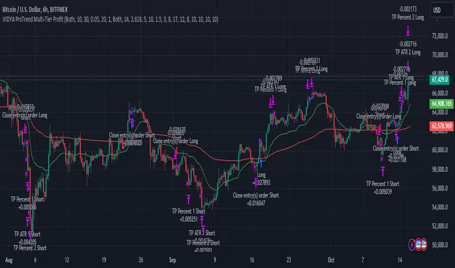
VIDYA ProTrend Multi-Tier ProfitHello! This time is about a trend-following system.
VIDYA is quite an interesting indicator that adjusts dynamically to market volatility, making it more responsive to price changes compared to traditional moving averages. Balancing adaptability and precision, especially with the more aggressive short trade settings, challenged me to fine-tune the strategy for a variety of market conditions.
█ Introduction and How it is Different
The "VIDYA ProTrend Multi-Tier Profit" strategy is a trend-following system that combines the VIDYA (Variable Index Dynamic Average) indicator with Bollinger Bands and a multi-step take-profit mechanism.
Unlike traditional trend strategies, this system allows for more adaptive profit-taking, adjusting for long and short positions through distinct ATR-based and percentage-based targets. The innovation lies in its dynamic multi-tier approach to profit-taking, especially for short trades, where more aggressive percentages are applied using a multiplier. This flexibility helps adapt to various market conditions by optimizing trade management and profit allocation based on market volatility and trend strength.
BTCUSD 6hr performance
█ Strategy, How it Works: Detailed Explanation
The core of the "VIDYA ProTrend Multi-Tier Profit" strategy lies in the dual VIDYA indicators (fast and slow) that analyze price trends while accounting for market volatility. These indicators work alongside Bollinger Bands to filter trade entries and exits.
🔶 VIDYA Calculation
The VIDYA indicator is calculated using the following formula:
Smoothing factor (𝛼):
alpha = 2 / (Length + 1)
VIDYA formula:
VIDYA(t) = alpha * k * Price(t) + (1 - alpha * k) * VIDYA(t-1)
Where:
k = |Chande Momentum Oscillator (MO)| / 100
🔶 Bollinger Bands as a Volatility Filter
Bollinger Bands are calculated using a rolling mean and standard deviation of price over a specified period:
Upper Band:
BB_upper = MA + (K * stddev)
Lower Band:
BB_lower = MA - (K * stddev)
Where:
MA is the moving average,
K is the multiplier (typically 2), and
stddev is the standard deviation of price over the Bollinger Bands length.
These bands serve as volatility filters to identify potential overbought or oversold conditions, aiding in the entry and exit logic.
🔶 Slope Calculation for VIDYA
The slopes of both fast and slow VIDYAs are computed to assess the momentum and direction of the trend. The slope for a given VIDYA over its length is:
Slope = (VIDYA(t) - VIDYA(t-n)) / n
Where:
n is the length of the lookback period. Positive slope indicates bullish momentum, while negative slope signals bearish momentum.
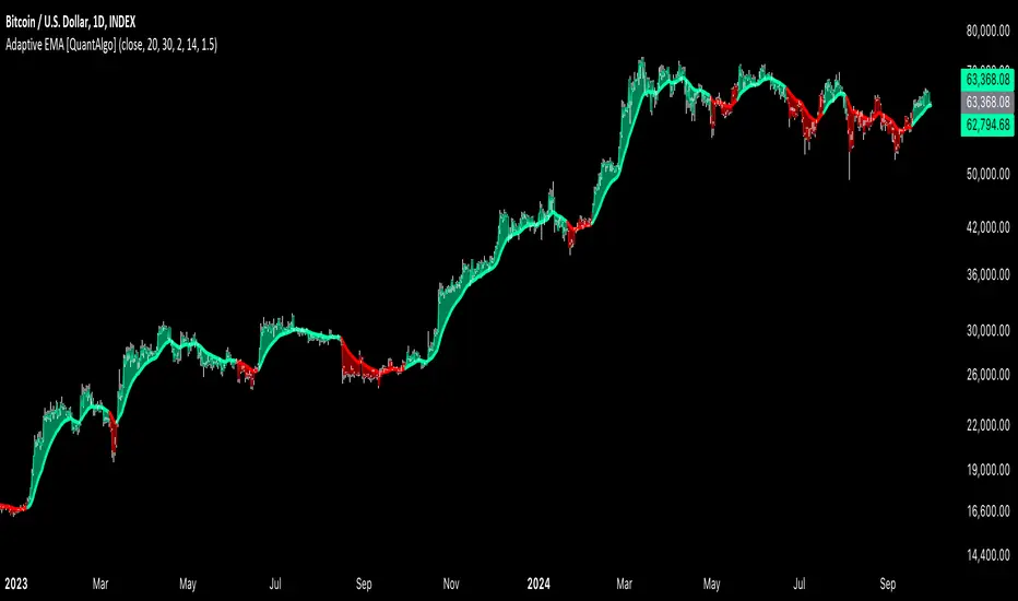
LOCAL picture
🔶 Entry and Exit Conditions
- Long Entry: Occurs when the price moves above the slow VIDYA and the fast VIDYA is trending upward. Bollinger Bands confirm the signal when the price crosses the upper band, indicating bullish strength.
- Short Entry: Happens when the price drops below the slow VIDYA and the fast VIDYA trends downward. The signal is confirmed when the price crosses the lower Bollinger Band, showing bearish momentum.
- Exit: Based on VIDYA slopes flattening or reversing, or when the price hits specific ATR or percentage-based profit targets.
🔶 Multi-Step Take Profit Mechanism
The strategy incorporates three levels of take profit for both long and short trades:
- ATR-based Take Profit: Each step applies a multiple of the ATR (Average True Range) to the entry price to define the exit point.
The first level of take profit (long):
TP_ATR1_long = Entry Price + (2.618 * ATR)
etc.
█ Trade Direction
The strategy offers flexibility in defining the trading direction:
- Long: Only long trades are considered based on the criteria for upward trends.
- Short: Only short trades are initiated in bearish trends.
- Both: The strategy can take both long and short trades depending on the market conditions.
█ Usage
To use the strategy effectively:
- Adjust the VIDYA lengths (fast and slow) based on your preference for trend sensitivity.
- Use Bollinger Bands as a filter for identifying potential breakout or reversal scenarios.
- Enable the multi-step take profit feature to manage positions dynamically, allowing for partial exits as the price reaches specified ATR or percentage levels.
- Leverage the short trade multiplier for more aggressive take profit levels in bearish markets.
This strategy can be applied to different asset classes, including equities, forex, and cryptocurrencies. Adjust the input parameters to suit the volatility and characteristics of the asset being traded.
█ Default Settings
The default settings for this strategy have been designed for moderate to trending markets:
- Fast VIDYA Length (10): A shorter length for quick responsiveness to price changes. Increasing this length will reduce noise but may delay signals.
- Slow VIDYA Length (30): The slow VIDYA is set longer to capture broader market trends. Shortening this value will make the system more reactive to smaller price swings.
- Minimum Slope Threshold (0.05): This threshold helps filter out weak trends. Lowering the threshold will result in more trades, while raising it will restrict trades to stronger trends.
Multi-Step Take Profit Settings
- ATR Multipliers (2.618, 5.0, 10.0): These values define how far the price should move before taking profit. Larger multipliers widen the profit-taking levels, aiming for larger trend moves. In higher volatility markets, these values might be adjusted downwards.
- Percentage Levels (3%, 8%, 17%): These percentage levels define how much the price must move before taking profit. Increasing the percentages will capture larger moves, while smaller percentages offer quicker exits.
- Short TP Multiplier (1.5): This multiplier applies more aggressive take profit levels for short trades. Adjust this value based on the aggressiveness of your short trade management.
Each of these settings directly impacts the performance and risk profile of the strategy. Shorter VIDYA lengths and lower slope thresholds will generate more trades but may result in more whipsaws. Higher ATR multipliers or percentage levels can delay profit-taking, aiming for larger trends but risking partial gains if the trend reverses too early.
Trendtrading
Smart Momentum Relative StrengthSmart Momentum Relative Strength
Creator Journey
The Smart Momentum Relative Strength indicator is
created by Vishal R. Janjire , inspired by BharatTrader sir, and parameters guided by mentor stockedge founder Vivek Bajaj sir.
Reason? ...Why choose Smart Momentum Relative Strength.
1.Simple to Trade: This indicator simplifies trading decisions. You just need to follow the background color displayed on the chart. When the background is green, it signals a bullish trend, and when it turns red, it signals a bearish trend. For an even cleaner experience, you can untick the Relative Strength (RS) toggle in the indicator settings and focus purely on trading based on these background colors, making the process straightforward and efficient.
2.Unlock the power to compare any stock, share, commodity, forex or cryptocurrency against major indices like Nasdaq Composite, NYSE Composite, Bitcoin, NG, Gold, Silver, Crude oil, Nasdaq-100, Nifty 50, Hang Seng Index, FTSE 100, and many more! With the Comparative Relative Strength (RS) indicator,
You can easily change the default Nifty 50 comparative symbol to any index or asset of your choice, such as Gold, Silver, Crude Oil, or global benchmarks like the Dow Jones Industrial Average, DAX, Euronext 100, and SSE Composite.
This versatile tool allows traders to measure how well a base symbol (e.g., stock or crypto) performs relative to a chosen benchmark over a specified period. Whether you're analyzing the relative strength of Bitcoin against the Nasdaq-100 or comparing stocks to the S&P 500, this indicator provides valuable insights into market trends and outperforming assets.
The Smart Momentum Relative Strength combines several advanced technical analysis tools into one comprehensive Pine Script indicator designed to provide a nuanced view of market strength and trends. This script integrates Relative Strength (RS), Commodity Channel Index (CCI), and additional trend confirmation mechanisms to deliver actionable insights for traders.
Below are key points to understand before using this indicator:
Important Parameters:
1. Green Line: Represents stocks outperforming the comparative index, which is Nifty 50. However, do not apply this result directly to Nifty 50 itself, as it will not work exclusively on the Nifty 50 index.
2. Red Line: Indicates that the stock is underperforming relative to the Nifty 50 index.
3. Green Background: Signifies that both the current time momentum and higher time momentum are aligned, indicating an upward trend.
4. Red Background: Signifies that both the current time momentum and higher time momentum are aligned, indicating a downward trend.
5. Blank Space: This occurs when the two timeframes are not aligned, indicating market uncertainty and signaling a potential change in market direction, it means short time frame or current time frame changed its direction to opposite side.
Multi-Time Frame (MTF) Settings:
This indicator incorporates a default multi-time frame setup, as follows:
1 and 2 Minute chart = 5 Minute higher time frame
3 Minute chart = 15 Minute higher time frame
5 Minute chart = 15 Minute higher time frame
10 Minute chart = 60 Minute higher time frame
15 Minute chart = 60 Minute higher time frame
20 and 30 Minute chart = 120 Minute higher time frame
1 Hour chart = 4 Hour higher time frame
2 Hour chart = 4 Hour higher time frame
4 Hour chart = 1 Day higher time frame
1 Day chart = 1 Week higher time frame
1 Week chart = 1 Month higher time frame
1 Month chart = 12 Month higher time frame
For any other chart time frame = Day time is default time frame
1. Relative Strength (RS) Analysis:
Calculation: Measures the performance of the base symbol relative to a comparative symbol over a specified period.
Visualization: The RS value is plotted with color-coded lines to indicate bullish (green) or bearish (red) conditions based on crossovers. Users can customize the color based on value or trend direction.
Trend Analysis: A simple moving average (SMA) of RS is displayed to visualize trend strength and direction, with color changes to reflect rising or falling trends.
2. Commodity Channel Index (CCI):
- Current Timeframe CCI: Calculates the CCI for the current timeframe to assess price momentum.
- Higher Timeframe CCI: Computes the CCI for a higher timeframe to provide a broader market perspective.
- Background Color: Highlights the chart background in green or red based on whether both current and higher timeframe CCIs are above or below zero, respectively.
-Blank Space: This occurs when the two timeframes are not aligned, indicating market uncertainty and signaling a potential change in market direction, it means short time frame or current time frame changed its direction to opposite side.

Adaptive EMA with ATR and Standard Deviation [QuantAlgo]Adaptive EMA with ATR and Standard Deviation by QuantAlgo 📈✨
Introducing the Adaptive EMA with ATR and Standard Deviation , a comprehensive trend-following indicator designed to combine the smoothness of an Exponential Moving Average (EMA) with the volatility adjustments of Average True Range (ATR) and Standard Deviation. This synergy allows traders and investors to better identify market trends while accounting for volatility, delivering clearer signals in both trending and volatile market conditions. This indicator is suitable for traders and investors seeking to balance trend detection and volatility management, offering a robust and adaptable approach across various asset classes and timeframes.
💫 Core Concept and Innovation
The Adaptive EMA with ATR and Standard Deviation brings together the trend-smoothing properties of the EMA and the volatility sensitivity of ATR and Standard Deviation. By using the EMA to track price movements over time, the indicator smooths out minor fluctuations while still providing valuable insights into overall market direction. However, market volatility can sometimes distort simple moving averages, so the ATR and Standard Deviation components dynamically adjust the trend signals, offering more nuanced insights into trend strength and reversals. This combination equips traders with a powerful tool to navigate unpredictable markets while minimizing false signals.
📊 Technical Breakdown and Calculations
The Adaptive EMA with ATR and Standard Deviation relies on three key technical components:
1. Exponential Moving Average (EMA): The EMA forms the base of the trend detection. Unlike a Simple Moving Average (SMA), the EMA gives more weight to recent price changes, allowing it to react more quickly to new data. Users can adjust the length of the EMA to make it more or less responsive to price movements.
2. Standard Deviation Bands: These bands are calculated from the standard deviation of the EMA and represent dynamic volatility thresholds. The upper and lower bands expand or contract based on recent price volatility, providing more accurate signals in both calm and volatile markets.
3. ATR-Based Volatility Filter: The Average True Range (ATR) is used to measure market volatility over a user-defined period. It helps refine the trend signals by filtering out false positives caused by minor price swings. The ATR filter ensures that the indicator only signals significant market movements.
⚙️ Step-by-Step Calculation:
1. EMA Calculation: First, the indicator calculates the EMA over a specified period based on the chosen price source (e.g., close, high, low).
2. Standard Deviation Bands: Then, it computes the standard deviation of the EMA and applies a multiplier to create upper and lower bands around the EMA. These bands adjust dynamically with the level of market volatility.
3. ATR Filtering: In addition to the standard deviation bands, the ATR is applied as a secondary filter to help refine the trend signals. This step helps eliminate signals generated by short-term price spikes or corrections, ensuring that the signals are more reliable.
4. Trend Detection: When the price crosses above the upper band, a bullish trend is identified, while a move below the lower band signals a bearish trend. The system accounts for both the standard deviation and ATR bands to generate these signals.
✅ Customizable Inputs and Features
The Adaptive EMA with ATR and Standard Deviation provides a range of customizable options to fit various trading/investing styles:
📈 Trend Settings:
1. Price Source: Choose the price type (e.g., close, high, low) to base the EMA calculation on, influencing how the trend is tracked.
2. EMA Length: Adjust the length to control how quickly the EMA reacts to price changes. A shorter length provides a more responsive EMA, while a longer period smooths out short-term fluctuations.
🌊 Volatility Controls:
1. Standard Deviation Multiplier: This parameter controls the sensitivity of the trend detection by adjusting the distance between the upper and lower bands from the EMA.
2. TR Length and Multiplier: Fine-tune the ATR settings to control how volatility is filtered, adjusting the indicator’s responsiveness during high or low volatility phases.
🎨 Visualization and Alerts:
1. Bar Coloring: Select different colors for uptrends and downtrends, providing a clear visual cue when trends change.
2. Alerts: Set up alerts to notify you when the price crosses the upper or lower bands, signaling a potential long or short trend shift. Alerts can help you stay informed without constant chart monitoring.
📈 Practical Applications
The Adaptive EMA with ATR and Standard Deviation is ideal for traders and investors looking to balance trend-following strategies with volatility management. Key uses include:
Detecting Trend Reversals: The dynamic bands help identify when the market shifts direction, providing clear signals when a trend reversal is likely.
Filtering Market Noise: By applying both Standard Deviation and ATR filtering, the indicator helps reduce false signals during periods of heightened volatility.
Volatility-Based Risk Management: The adaptability of the bands ensures that traders can manage risk more effectively by responding to shifts in volatility while keeping focus on long-term trends.
⭐️ Comprehensive Summary
The Adaptive EMA with ATR and Standard Deviation is a highly customizable indicator that provides traders with clearer signals for trend detection and volatility management. By dynamically adjusting its calculations based on market conditions, it offers a powerful tool for navigating both trending and volatile markets. Whether you're looking to detect early trend reversals or avoid false signals during periods of high volatility, this indicator gives you the flexibility and accuracy to improve your trading and investing strategies.
Note: The Adaptive EMA with ATR and Standard Deviation is designed to enhance your market analysis but should not be relied upon as the sole basis for trading or investing decisions. Always combine it with other analytical tools and practices. No statements or signals from this indicator constitute financial advice. Past performance is not indicative of future results.
Pip's FinderPip's Finder is an indicator designed to Find
"Trend direction" and capture reliable price movements.
This is very simple and powerful tool which generate direction of price movement , this tool is based on the dynamic fibonacci retracement and extension mechansim forged from the basic idea of fibonacci concept and identifier of the trend mechansism blended in one indicator so it can give precisely accurate trend direction signals and it's easy to understand and use.
This tool is specially designed for USOIL (Crude oil WTI) and UKOIL (Brent) , In 5 Min TimeFrame.
After Asian session starts it gives signal which is approximately 300 to 500 pips ,in each signal (with accuracy of 85%+)
After European session starts it gives signal which is approximately 100 to 200 pips ,in each signal (with accuracy of 75%+)
After North American session starts it gives signal which is approximately 300 to 500 pips , in each signal (with accuracy of 85%+) , in this session it also signals for 1000 pips but it's risky to taril such a heavy price movement
How can we make our trades using this tool ?
- Signal generates as a Red Arrow above the candle which reflect downward direction and Green Arrow below the candle which reflect upward direction.
- Wait for the candle closing which ensures the signal generation.
- When next Candle breaks High or Low of the candle in which signal is generated our signal is confirmed and we are ready to capture pips as per our plan according to sessions.
(Note:If next candle after signal generator candle did not Break high or low of the signal candle we'll consider signal as False signal
For UPTREND -
Ex- If signal is generated for upward direction (Below the candle noted by green arrow) the next candle should have to Break the high of signal candle , If next candle did not break high our signal is not confirmed and we'll consider signal as false, and if price move in opposite direction and breaks the low of the signal candle we'll consider signal as False .
StopLoss should be below the candle of signal generating candle.
For DOWNTREND -
Ex- If signal is generated for Downward direction (Above the candle noted by Red arrow) the next candle should have to Break the low of signal candle , If next candle did not break low our signal is not confirmed and we'll consider signal as false , and if price move in opposite direction and breaks the high of the signal candle we'll consider signal as False.
StopLoss should be above the candle of signal generating candle.
Special Note:
If signal occur for any of the direction and in the next candle breaks high or low but in the same candle which breaks high or low again signal occured for opposite direction then we should look for SL of the previous signal candle is striked or not , if not striked then we should continue our trade until SL is not striked.
Note:
1. Price differs in brokers app ,should focus on Tradingview terminal for charts and do calculations based on this chart and signal generation.
2. Signal confirmed when the price crosses High or Low of signal generating candle .
3. Always take a look on Session wise price fluctuation for best accuracy.
4. Trade should be placed as soon as price breaks high or low.
This indicator is based on Fib and IDM so sometimes it generates false signals to eliminate these, Follow the Suggestion and Rule's you'll get best results.

Trend Filtered Signals with Confidence LevelThe Trend Filtered Signals with Confidence Level is a powerful technical analysis tool designed for trend-following traders. It provides clear buy and sell signals, enhanced by a unique confidence level indicator, helping traders filter out market noise and focus on higher-probability trades. This indicator is built with advanced trend detection, volatility filtering, and volume confirmation, making it suitable for various markets such as stocks, forex, and cryptocurrencies.
Key Features:
Precise Trend Detection:
The indicator uses the Average Directional Index (ADX) to measure the strength of the trend, only generating signals when the trend is strong enough (above a user-defined threshold). This prevents false signals during sideways markets and ensures the system follows meaningful trends.
Buy and Sell Signals:
Buy signals are generated when the price crosses above the fast moving average, and the market is in a strong uptrend based on ADX and other filters. Conversely, sell signals are created when the price crosses below the fast moving average in a strong downtrend. These signals appear directly on the chart with visual markers, making them easy to spot in real-time trading.
Confidence Level for Signals:
Each buy and sell signal is given a confidence percentage, calculated from multiple factors:
The strength of the trend (ADX).
The price’s relationship to moving averages (fast MA and slow MA).
The current trading volume compared to its moving average.
The distance between the price and the moving averages, which is checked against the ATR (Average True Range).
A higher confidence percentage indicates a stronger, more reliable signal. Traders can choose to act only on signals that meet or exceed their preferred confidence level.
ATR-Based Volatility Filtering:
To avoid over-trading or receiving signals that are too close together, the ATR (Average True Range) is used as a volatility filter. This ensures that the signals are spaced out, and traders only receive alerts when the price has moved a meaningful distance, considering market volatility.
Volume Confirmation:
Volume plays a crucial role in signal accuracy. The indicator compares the current volume to its moving average, ensuring that signals are generated only when there is sufficient market participation. This feature helps traders avoid signals during low-volume or illiquid market conditions.
Exit Alerts for Trend Reversals:
The indicator doesn’t just help you enter trades; it also assists with exits. When the trend shows signs of weakening or reversing (such as price crossing back over the moving average or losing ADX strength), the indicator will issue an exit alert, helping traders lock in profits or minimize losses.
How to Use the Indicator:
Choosing Timeframes:
The Trend Filtered Signals with Confidence Level works on multiple timeframes. For intraday traders, it can be applied on 5-minute or 15-minute charts. Swing traders might prefer the 1-hour or daily timeframe to capture longer-term trends. Adjust the inputs based on the volatility of the asset you're trading and the timeframe.
Customizing Inputs:
ADX Length: Defines the length for calculating ADX. A typical setting is 14, but this can be adjusted based on how quickly or slowly you want the indicator to react to changes in trend strength.
ADX Threshold: Set this value to filter out weak trends. The default is 20, but for stronger trend signals, a threshold of 25 or 30 may be more suitable.
ATR Length & Multiplier: Used to calculate the average true range, helping to filter out signals that are too close to each other. The ATR multiplier increases the signal’s precision in volatile markets.
Fast and Slow Moving Averages: These moving averages help define the short- and long-term trend. The default fast MA is 9, and the slow MA is 21, but traders can adjust these based on their strategy.
Volume MA: Defines the length of the moving average applied to volume. A longer setting may be more appropriate for swing trading, while a shorter setting can work better for day trading.
Interpreting the Confidence Percentage:
Signals with a confidence level above 50% are generally considered reliable. However, traders can choose to filter trades based on their risk tolerance by only acting on signals above a certain confidence level (e.g., 70% or higher for conservative traders).
Use the confidence percentage as a guide to increase the likelihood of entering higher-probability trades.
Signal Alerts:
The indicator provides customizable alerts for both buy and sell signals. It also generates alerts when it's time to exit a position due to weakening trend conditions.
Alerts can be set up through TradingView’s alert system to notify you via mobile, email, or browser pop-up, so you never miss an opportunity.
Managing Entries and Exits:
Combine the buy and sell signals with the confidence level to time entries more effectively. After entering a position, keep an eye on the exit signals generated by the indicator to manage your trades.
For trend-following strategies, stay in the trade as long as the indicator shows a strong trend. When the confidence level drops significantly, or the exit alert triggers, it may be time to close the trade.
Inputs Overview:
ADX Length: Default 14, for trend strength.
ADX Threshold: Default 20, minimum trend strength for signal generation.
ATR Length & Multiplier: Adjust for volatility filtering.
Fast MA & Slow MA Lengths: Define the short-term and long-term trend.
Volume MA Length: Confirm signals with volume strength.
Minimum Signal Distance: Prevents excessive signal clustering.
Conclusion:
The Trend Filtered Signals with Confidence Level indicator by Danytradehit is a comprehensive tool that not only identifies trends and trend reversals but also helps you gauge the reliability of each signal through a confidence percentage. It simplifies decision-making for traders by filtering out weak or low-probability trades, ensuring you only act on the most promising market opportunities. This indicator is highly customizable and works across various timeframes and asset classes.

TechniTrend: Strong Candles DetectorTechniTrend: Strong Candles Detector
Description:
The TechniTrend: Strong Candles Detector indicator is designed to identify strong candlestick patterns based on customizable thresholds of candle strength, volume, and price volatility. By detecting significant candles that have a high proportion of body relative to total range, the indicator helps traders identify potential shifts in market direction, making it a useful tool for trend analysis and reversal spotting.
Key Features:
Candle Strength Detection: The indicator calculates the strength of a candle based on the ratio of its body (difference between open and close) to its total range (high minus low). If the body size exceeds a user-defined threshold, the candle is flagged as strong. This helps traders quickly identify key candles that may signal market movements.
Volume Confirmation (Optional): An optional volume confirmation allows the indicator to only flag candles as "strong" if the trading volume during the candle exceeds the average volume over a customizable period. This can help validate that a candle’s movement is backed by significant market participation.
Volatility Body Confirmation (Optional): Users can further refine the detection by requiring that the body of a strong candle exceed the average body size (volatility) of previous candles. This ensures that candles with greater price movement are prioritized.
Customizable Inputs:
Strength Threshold: Defines the minimum ratio of body to total range for a candle to be considered strong.
Moving Average Type: Choose from SMA, EMA, or WMA for calculating the moving average of volume or body volatility.
Volume and Body Confirmation: Adjust the percentage thresholds for the difference between the current volume/body size and their average values.
Visual Alerts: The indicator marks strong bullish candles with green upward labels below the candle, and strong bearish candles with red downward labels above the candle. Additionally, strong candles can be highlighted with a customizable background color for easier visualization.
How It Works:
Strength Ratio:
The core of this indicator is the calculation of the strength ratio, which is defined as the body size (open-close) divided by the total range (high-low). If the body size is larger relative to the total range and exceeds the user-defined threshold, the candle is flagged as strong.
Volume and Volatility Confirmation:
For traders seeking additional confirmation, the indicator can be configured to only mark candles if the current volume or body volatility exceeds the average by a user-defined percentage. These confirmations can be toggled on or off to suit different trading strategies.
Customization Options:
Strength Threshold (0-1):
Sets the minimum strength required for a candle to be flagged. A higher value will result in fewer but more significant candles being marked.
Volume Confirmation:
Toggle on to require a higher volume compared to the average volume for a candle to be confirmed as strong.
Volatility Body Confirmation:
Toggle on to require a larger candle body compared to the average body size for further confirmation.
Candle Color:
Choose the background color used to highlight strong candles.
Recommended Settings:
Strength Threshold: 0.7 (for a good balance between body and range)
Volume Difference: 0.05 (5% above the average volume)
Body Volatility Difference: 0.05 (5% above the average body size)
Length: 14 (for volume and volatility moving averages)
Conclusion: The TechniTrend: Strong Candles Detector is an easy-to-use yet powerful tool for traders who want to identify key candles that signal potential market trends. Its customizable settings allow for fine-tuning to fit different trading styles, whether looking for high-volume breakouts or significant price movements. The indicator offers both a visual and configurable alert system to help traders make more informed decisions.

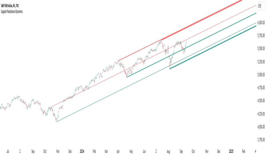
Support Resistance DynamicsThe Support Resistance Dynamics indicator is an advanced technical analysis tool designed to identify and visualize key support and resistance levels in real-time. This innovative indicator stands out from traditional support and resistance tools by employing a dynamic approach that adapts to market conditions.
Key Features:
Dynamic Level Calculation: Unlike static support and resistance indicators, this tool continuously updates levels based on recent price action, providing traders with the most relevant and up-to-date information.
Logarithmic Scale Option: The indicator offers a unique logarithmic scale feature, essential for analyzing long-term trends or assets with significant price changes. This allows for more accurate level plotting across various timeframes and price ranges.
Customizable Display: Users can adjust the number of support and resistance lines displayed, allowing for a clean and uncluttered chart view while focusing on the most significant levels.
Adaptive Slope Calculation: The indicator uses an innovative approach to calculate the slope of support and resistance lines, offering options from dynamic adaptation to fixed long-term periods. This ensures the lines remain relevant in both trending and ranging markets.
Enhanced Visualization: With customizable line colors, styles, and transparency, traders can easily distinguish between support and resistance levels, improving chart readability and analysis.
Flexible Period Settings: From dynamic calculations based on recent pivots to fixed long-term periods, the indicator adapts to various trading styles and timeframes.
The Support Resistance Dynamics indicator is particularly useful for:
Identifying potential reversal points in trends
Setting more accurate entry and exit points for trades
Placing stop-loss orders with greater precision
Recognizing breakout levels for potential new trends
By combining dynamic calculation methods with customizable visual elements, this indicator provides traders with a powerful tool for market analysis. Whether you're a day trader looking for short-term opportunities or a long-term investor analyzing macro trends, the Support Resistance Dynamics indicator offers valuable insights to enhance your trading strategy.
This indicator is provided for informational and educational purposes only. It should not be considered as financial advice or a recommendation to buy or sell any financial instrument. Past performance is not indicative of future results. Trading involves significant risk of loss. Users should conduct their own research and due diligence before making any investment decisions. The creator of this indicator is not responsible for any losses incurred from its use. Always test thoroughly on demo accounts before applying to live trading.
Volatility Trend Bands [UAlgo]The Volatility Trend Bands is a trend-following indicator that combines the concepts of volatility and trend detection. Built using the Average True Range (ATR) to measure volatility, this indicator dynamically adjusts upper and lower bands around price movements. The bands act as dynamic support and resistance levels, making it easier to identify trend shifts and potential entry and exit points.
With the ATR multiplier, this indicator effectively captures volatility-based shifts in the market. The use of midline values allows for accurate trend detection, which is displayed through color-coded signals on the chart. Additionally, this tool provides clear buy and sell signals, accompanied by intuitive graphical markers for ease of use.
The Volatility Trend Bands is ideal for traders seeking an adaptive trend-following method that responds to changing market conditions while maintaining robust volatility control.
🔶 Key Features
Dynamic Support and Resistance: The indicator utilizes volatility to create dynamic bands. The upper band acts as resistance, and the lower band acts as support for the price. Wider bands indicate higher volatility, while narrower bands indicate lower volatility.
Customizable Inputs
You can tailor the indicator to your strategy by adjusting the:
Price Source: Select the price data (e.g., closing price) used for calculations.
ATR Length: Define the lookback period for the Average True Range (ATR) volatility measure.
ATR Multiplier: This factor controls the width of the volatility bands relative to the ATR value.
Color Options: Choose colors for the bands and signal arrows for better visualization.
Visual Signals: Arrows ("▲" for buy, "▼" for sell) appear on the chart when the trend changes, providing clear entry point indications.
Alerts: Integrated alerts for both buy and sell conditions, allowing you to receive notifications for potential trade opportunities.
🔶 Interpreting Indicator
Upper and Lower Bands: The upper and lower bands are dynamic, adjusting based on market volatility using the ATR. These bands serve as adaptive support and resistance levels. When price breaks above the upper band, it indicates a potential bullish breakout, signaling a strong uptrend. Conversely, a break below the lower band signals a bearish breakout, indicating a downtrend.
Buy/Sell Signals: The indicator provides clear buy and sell signals at breakout points. A buy signal ("▲") is generated when the price breaks above the upper band, suggesting the start of a bullish trend. A sell signal ("▼") is triggered when the price breaks below the lower band, indicating the beginning of a bearish trend. These signals help traders identify potential entry and exit points at key breakout levels.
Color-Coded Bars: The bars on the chart change color based on the trend direction. Teal bars represent bullish momentum, while purple bars signify bearish momentum. This color coding provides a quick visual cue about the market's current direction.
🔶 Disclaimer
Use with Caution: This indicator is provided for educational and informational purposes only and should not be considered as financial advice. Users should exercise caution and perform their own analysis before making trading decisions based on the indicator's signals.
Not Financial Advice: The information provided by this indicator does not constitute financial advice, and the creator (UAlgo) shall not be held responsible for any trading losses incurred as a result of using this indicator.
Backtesting Recommended: Traders are encouraged to backtest the indicator thoroughly on historical data before using it in live trading to assess its performance and suitability for their trading strategies.
Risk Management: Trading involves inherent risks, and users should implement proper risk management strategies, including but not limited to stop-loss orders and position sizing, to mitigate potential losses.
No Guarantees: The accuracy and reliability of the indicator's signals cannot be guaranteed, as they are based on historical price data and past performance may not be indicative of future results.

Dynamic Touch Trendlines [QuantVue]The Dynamic Touch Trendlines (DTT) indicator automatically draws and manages trendlines on your chart, helping traders identify key support and resistance levels.
What sets the DTT indicator apart from other trendline indicators is its ability to let traders customize the number of touches required to validate a trendline. This flexibility allows you to fine-tune the indicator for different markets or trading styles, ensuring only strong trendlines with the specified number of touches are considered valid.
This indicator features both uptrend lines (drawn from pivot lows) and downtrend lines (drawn from pivot highs), making it suitable for detecting bullish and bearish trends.
An uptrend line connects three (default setting) or more significant lows, showing where price has historically found support. Traders often look for price to bounce off this line during pullbacks in an uptrend.
When price breaks below an uptrend line, it suggests a weakening of the bullish trend. This could mean that buyers are losing strength, and the market may be transitioning into a bearish phase, providing a potential opportunity for traders to enter short positions or exit long positions.
Conversely, a downtrend line connects three (default setting) or more significant highs, indicating potential resistance in a downtrend. Price action below this line can signal continued bearish momentum.
When price breaks above a downtrend line, it indicates a potential reversal of the bearish trend. This can signal the end of selling pressure and the beginning of a new bullish phase, offering traders a potential opportunity to enter long positions.
Key settings:
Minimum Touches: This sets the number of price touches required to validate a trendline. Increasing the minimum touches filters out weaker trends, ensuring that only more reliable trendlines are drawn.
Buffer: The buffer is used to account for minor price overshoots or near misses relative to the trendline. It creates a margin around the trendline, allowing price to come close to the line—whether it overshoots slightly or falls just short—and still count as a valid touch. This helps ensure that small price fluctuations or market noise don’t prevent valid trendline touches from being recognized, making the trendlines more reliable.
Trendline Break Source: Allows traders to define how a trendline is considered broken—either based on the close of the price bar or the wicks (highs and lows) of the price action.
The DTT indicator also features alerts whenever a new trendline is detected or an existing trendline is broken!

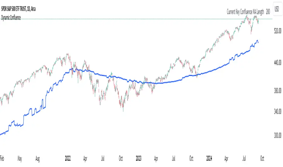
Dynamic ConfluenceThe Dynamic MA Confluence Indicator is a powerful tool designed to simplify your trading experience by automatically identifying the most influential moving average (MA) lengths on your chart. Whether you're using Simple Moving Averages (SMA) or Exponential Moving Averages (EMA), this indicator helps you pinpoint the MA length that holds the greatest confluence, allowing you to make informed trading decisions with ease.
How It Works:
This indicator analyzes a wide range of moving averages, from short-term to long-term, to determine which ones are closest to each other. By setting a "Proximity Percentage," you can control how close these MAs need to be to be considered as having confluence. The indicator then calculates the average of these close MAs to establish a dynamic support or resistance level on your chart.
Why Use This Indicator?
Automatic Optimization: Unsure of which MA length to apply? The indicator automatically highlights the MA length with the most confluence, giving you a clear edge in identifying significant market levels.
Adaptability: Choose between SMA and EMA to suit your trading strategy and market conditions.
Enhanced Decision-Making: By focusing on the MA length with the greatest influence, you can better anticipate market movements and adjust your strategies accordingly.
Customizable Sensitivity: Adjust the Proximity Percentage to fine-tune the indicator's sensitivity, ensuring it aligns with your trading preferences.
Key Feature:
Current Key Confluence MA Length: Displayed in an optional table, this feature shows the MA length that currently has the most impact on the confluence level, providing you with actionable insights at a glance.
Whether you're a seasoned trader or just starting, the Dynamic MA Confluence Indicator offers a streamlined approach to understanding market dynamics, helping you trade smarter and with more confidence. This presentation text is designed to clearly communicate the purpose, functionality, and benefits of the indicator, making it easy for users to understand its value and how it can enhance their trading strategies.
The Dynamic MA Confluence Indicator is a tool designed to assist traders in analyzing market trends. It should not be considered as financial advice or a guarantee of future performance. Trading involves significant risk, and it is possible to lose more than your initial investment. Users should conduct their own research and consider their financial situation before making trading decisions. Always consult with a financial advisor if you are unsure about any trading strategies or decisions. This disclaimer is intended to remind users of the inherent risks in trading and the importance of conducting their own due diligence.
Gaussian Filter [BigBeluga]The Gaussian Filter - BigBeluga indicator is a trend-following tool that uses a Gaussian filter to smooth price data and identify directional shifts in the market. It provides dynamic signals for entering and exiting trades based on trend changes, helping traders stay aligned with the market's momentum. What sets this indicator apart is its ability to display precise entry and exit points with real-time tracking of percentage price changes, making it ideal for trend-based strategies.
SP500:
NIFTY50:
🔵 KEY FEATURES & USAGE
◉ Gaussian Filter Trend Line:
//@function GaussianFilter is used for smoothing, reducing noise, and computing derivatives of data.
//@param src (float) The source data (e.g., close price) to be smoothed.
//@param params (GaussianFilterParams) Gaussian filter parameters that include length and sigma.
//@returns (float) The smoothed value from the Gaussian filter.
gaussian_filter(float src, params) =>
var float weights = array.new_float(params.length) // Array to store Gaussian weights
total = 0.0
pi = math.pi
for i = 0 to params.length - 1
weight = math.exp(-0.5 * math.pow((i - params.length / 2) / params.sigma, 2.0))
/ math.sqrt(params.sigma * 2.0 * pi)
weights.set(i, weight)
total := total + weight
for i = 0 to params.length - 1
weights.set(i, weights.get(i) / total)
sum = 0.0
for i = 0 to params.length - 1
sum := sum + src * weights.get(i)
sum
The core functionality of the Gaussian Filter line is to show trend direction. When the trend line increases four times consecutively, it indicates an uptrend signal. Similarly, if it decreases four times in a row, it signals a downtrend. The smoothness of the filter helps traders stay on the right side of the market by filtering out noise and emphasizing the dominant trend direction.
◉ Entry and Exit Levels with Real-Time Price and Performance Data:
Each time the indicator detects a trend change, it plots an entry or exit level on the chart. For an uptrend, an entry level is marked, and for a downtrend, an exit level is plotted. These levels display the price at the time of the signal.
While the trend is ongoing, the indicator tracks the percentage change in price from the initial entry or exit signal to the current bar, updating in real-time. When a trend concludes, it displays the total percentage change from the entry or exit point to the trend's end. This feature provides valuable insights into how much the price has moved during each trend phase and allows traders to monitor the performance of each trade.
◉ Color-Coded Candlestick Representation with Trend Shift Alerts:
In addition to coloring the candlesticks based on the trend direction, the indicator also uses gray candles to highlight potential early trend shifts. For example, if the Gaussian Filter detects a downtrend but the price moves above the filter line, the candles turn gray, signaling a possible reversal or shift in momentum. Similarly, in an uptrend, if the price moves below the Gaussian Filter line, the candles turn gray as an early indication of potential bearish momentum. This visual cue helps traders stay alert to possible faster shifts in market direction, allowing for quicker decision-making.
🔵 CUSTOMIZATION
Length and Sigma for Gaussian Filter:
Adjust the length and sigma parameters to control how the Gaussian Filter smooths the price data. A longer length provides smoother trend lines, while adjusting sigma can fine-tune the level of smoothing applied.
Levels Display and Candle Coloring:
You can toggle the visibility of entry and exit levels as well as enable or disable the dynamic coloring of candlesticks based on the trend direction. The additional gray color setting provides an extra layer of information, allowing you to spot potential trend reversals early.
🔵 CONCLUSION
The Gaussian Filter indicator is a powerful tool for identifying and following market trends. By providing clear entry and exit signals, along with real-time tracking of price changes, it gives traders a structured way to manage trades and monitor performance. The color-coded candles, including gray to highlight possible trend shifts, add another dimension to visualizing market dynamics. The added flexibility of customizing colors and trend levels makes it a versatile indicator suitable for both trend-following and reversal strategies.

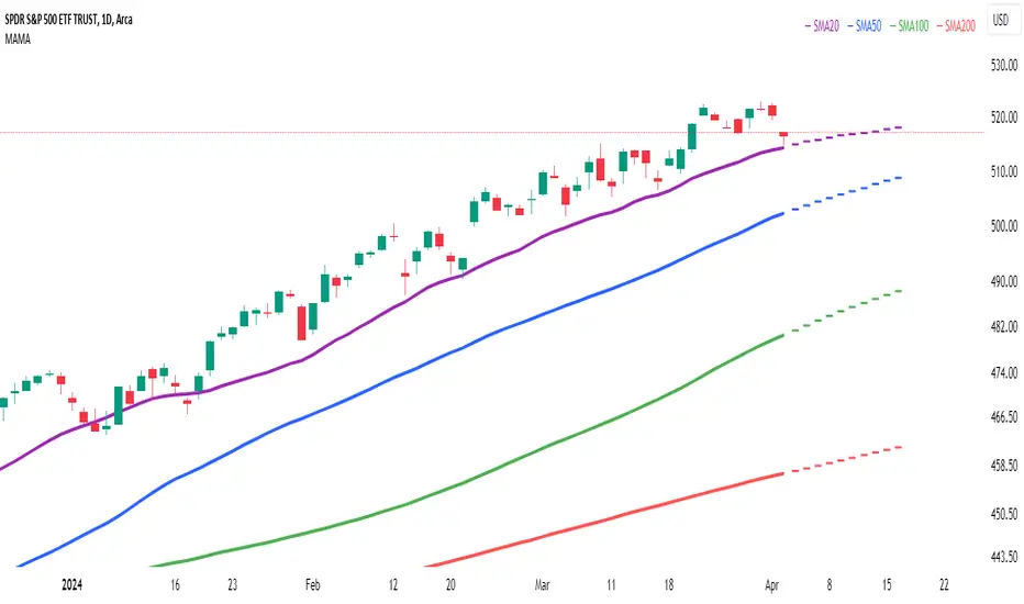
Multi Adaptive Moving Average (MAMA)The Multi Adaptive Moving Average (MAMA) indicator is an advanced tool for technical analysis, designed to provide traders with a detailed understanding of market trends and potential future price movements. This indicator utilizes multiple Simple Moving Averages (SMAs) and forecasting techniques to enhance decision-making processes.
Simple Moving Averages (SMAs):
Short MA (20-period): This moving average is highly responsive to price changes, making it ideal for capturing short-term trends. It helps traders identify quick market shifts and potential entry or exit points.
Mid MA (50-period): This average strikes a balance between short- and long-term trends, offering insights into the market's intermediate direction. It aids in confirming the sustainability of short-term trends.
Long MA (100-period): By smoothing out price data over a longer period, this moving average is useful for identifying long-term trends and filtering out short-term volatility.
Very Long MA (200-period): Often considered a critical indicator for determining the overall market trend, this average helps confirm the direction and strength of long-term movements.
Forecasting:
Flat Forecast: This approach assumes that prices will remain constant in the near future, which is particularly useful in markets trading sideways without a clear trend direction.
Linear Regression Forecast: This method uses historical data to project future price movements, offering a dynamic forecast based on existing trends. It helps traders anticipate potential price changes and plan their strategies accordingly.
Advantages:
Comprehensive Trend Analysis: By incorporating four different SMAs, the indicator provides a layered view of market trends across various timeframes. This enables traders to identify potential trend reversals and continuations with greater accuracy.
Predictive Insights: The forecasting feature offers traders a forward-looking perspective, enabling them to anticipate market movements and adjust their trading strategies proactively. This can be especially advantageous in volatile markets.
Customization: The MAMA indicator is highly customizable, allowing traders to adjust parameters such as the source of price data and the inclusion of the current unclosed candle. This flexibility ensures that the indicator can be tailored to fit different trading styles and market conditions.
Visual Clarity: The use of distinct colors for each SMA and their forecasts enhances visual interpretation, making it easier for traders to quickly assess market conditions and make informed decisions. The inclusion of a legend further aids in distinguishing between the different moving averages and their respective forecasts.
How to Use:
Trend Confirmation: Use the alignment of the SMAs to confirm market trends. For example, when the Short MA crosses above the Mid and Long MAs, it may indicate a bullish trend, while the opposite could suggest a bearish trend.
Entry and Exit Points: Look for crossovers between the SMAs as potential signals for entering or exiting trades. The forecasts can help in timing these decisions by providing an expectation of future price movements.
Risk Management: Utilize the Very Long MA to set stop-loss and take-profit levels, as it reflects the long-term trend and can help in avoiding trades against the prevailing market direction.
The MAMA indicator is intended to support technical analysis and should not be used as the sole basis for making trading decisions. Financial markets are inherently uncertain, and past performance does not guarantee future results. Traders should use this tool in conjunction with other analytical methods and consider their risk tolerance and investment objectives. It is advisable to conduct thorough research and consult with a financial advisor before making significant trading decisions. Always be aware of the risks involved in trading and invest only what you can afford to lose.
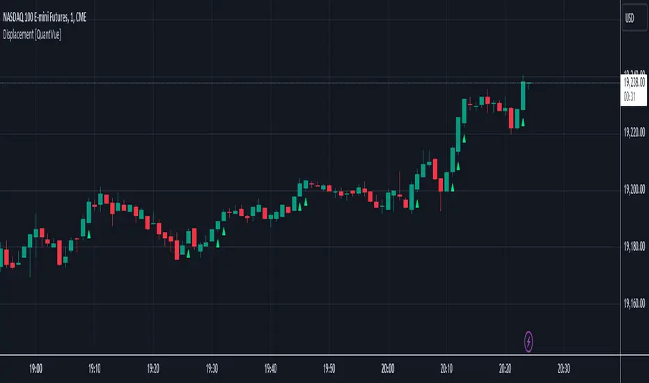
Displacement [QuantVue]Displacement refers to a significant and forceful price movement that indicates a potential shift in market sentiment or trend. Displacement is characterized by a strong push in price action, often seen after a period of consolidation or within a trending market. It is a key concept used to identify the strength of a move and to confirm the direction of the market.
The "Displacement" indicator does this by focusing on identifying strong, directional price movements by combining candlestick analysis with volatility (ATR).
Displacement often appears as a group of candles that are all positioned in the same direction, these candles typically have large bodies and short wicks.
How the indicator works:
Body Size Requirement: Ensures that only candles with a significant body size (relative to their total range) are considered, helping to identify strong market moves.
Consecutive Candle Analysis: Identifies shifts in market sentiment by requiring a series of consecutive bullish or bearish candles to confirm a potential change in trend.
ATR-Based Analysis: Uses the Average True Range (ATR) to gauge market volatility and filter out minor price fluctuations, focusing on substantial movements.
Once all of the requirements are met a triangle is plotted above or below the bar.
Arithmetic Candlesticks (Zeiierman)█ Arithmetic Candlestick - Overview
Arithmetic Candlesticks (Zeiierman) introduce a new way to read charts by applying logical arithmetic to real price data. These candlesticks focus on filtering out noise and smoothing price movements using a bell-shaped curve, which helps to refine the data and highlight the true trend. This approach provides a clearer view of market trends, allowing traders to interpret price action more effectively with minimal lag and distraction.
⚪ What is Arithmetic Candlesticks
Arithmetic Candlesticks use a calculation method rooted in the idea that the market moves in patterns that can be identified and predicted by examining past price movements.
Analyzing momentum, price action, and trend patterns is useful for traders who want to quickly scan and identify price patterns, trends, and momentum in the market. The system searches for these patterns and trends to anticipate future price movements. Traders and investors can identify trends hidden in market noise, enabling them to uncover trading opportunities that might not be immediately obvious to the naked eye.
⚪ Eliminates price noise
The Arithmetic Candlestick noise filtering function is used to reduce price noise, which is the randomness in the price movement of an asset caused by market participants trading on a short-term basis. The idea behind the filter is that it eliminates the impact of short-term fluctuations in the price, thus providing a more accurate picture of the overall trend.
█ Capturing Trends with precise chart reading
Trend moves are some of the biggest moneymakers in trading; in fact, trading in the direction of the trend reduces risk and increases profit potential. Arithmetic Candlestick helps traders do just that.
In a fast-moving and volatile market characterized by high-frequency algorithms, retail traders have a hard time distinguishing the real trend from the noise. Arithmetic Candlesticks are designed to filter out the noise created by insignificant price moves and leave traders with the price action that matters, namely a clear and insightful chart reading. Due to its sophisticated mathematical calculations, Arithmetic Candlesticks are able to analyze any market and timeframe.
█ How to use Arithmetic Candlesticks
Arithmetic Candlesticks is an all-in-one trend and momentum tool that can be used stand-alone or in conjunction with other indicators. Its primary use is to provide a clear chart reading, easily identify trends, and help traders stay longer in trends.
The indicator includes excellent momentum features that offer insights into the current momentum and the strength of the price action. This provides traders with a unique chart experience that yields valuable insights. The indicator boasts numerous features, each of which can be used stand-alone or in combination with others. Read more about the features below.
These candles can be used in conjunction with other indicators such as support/resistance, trendlines, ICT trading, and other patterns.
█ Arithmetic Candlesticks features
The indicator comes with tons of great features that make the indicator into its own system that can be used stand-alone. You find everything from trend reading, entry/exit points, identifying momentum, and auto-stop loss.
⚪ Candle Modes:
Traders can select from three different types of arithmetic candle calculations and enable our volatility-adjusted filter for all of them. By default, the candles are set to Arithmetic candlesticks. However, depending on their trading preferences, users can select Arithmetic + Heikin Ashi Candles or Impulse + Wicks Candles.
The Heikin Ashi mode of the candlesticks makes the indicator smoother and more trend-friendly.
The Impulse + Wick mode of the candlesticks makes the indicator responsive to momentum. The length of the wicks represents the strength of the current momentum. The longer the wicks, the greater the momentum in the market.
If traders enable the Volatility Adjusted candles , the indicator becomes much more responsive to volatility moves, which is a way of making the candlesticks more responsive to significant price movements.
⚪ Trend coloring
Arithmetic candlesticks come in three different color modes: the default one, the gradient one, and the advanced trend coloring. Enable the Trend coloring if you want to engage in long-term trend trading. This filter does not change the arithmetic candlesticks, only the bar coloring.
⚪ Buy and Sell signals
To make trend trading easier to understand, we have included Buy/Sell signals. These signals are based both on the type of candlesticks selected and the type of coloring used. In addition, they come with three filters and are available in scalping and trend modes.
Candle Color Filter: A buy signal will only occur if the candlesticks are bullish, and a sell signal will only occur if the candlesticks are bearish.
Trend Tracker Filter: A buy signal will only occur if the Trend Tracker is bullish, and a sell signal will only occur if the Trend Tracker is bearish.
When both filters are applied, it means that both the candle color and the Trend Tracker should have the same sign in order to trigger a signal.
These filters are very effective and should be used when utilizing the signals.
Take Profit signals can be enabled to help traders know when to take profits.
Adaptive Stop Loss can be enabled for the signals, helping traders manage their risk.
⚪ Trend Tracker
The Trend Tracker line provides insights about the underlying trend. Adjust it if you want to engage in scalping, which makes the line much more responsive. Set the underlying speed of the trend to either Fast or Slow. This Trend Tracker works well in conjunction with Arithmetic Candlesticks and the associated signals.
⚪ Trend Sentiment
Enable Trend Sentiment to identify the levels at which the market is considered bullish or bearish. This feature helps you gauge the overall market direction, allowing you to align your trades with the prevailing trend. The Trend Sentiment also measures the strength of the trend, highlighting whether the current price action reflects a strong or weak trend. Adjust the sensitivity to determine how early or late you want to capture these trend signals.
⚪ Impulse
Enable Impulse Signals to understand when the market is making a significant move, often leading to a pullback or pause. These Impulse Signals can indicate the very start of a trend or serve as the first sign of a reversal. Enable 'Significant Impulses' if you only want to display the most significant market impulses.
█ How is Arithmetic Candlesticks Calculated?
⚪ Candlesticks
These candlesticks combine advanced smoothing techniques with price pattern recognition, giving traders a clearer view of market dynamics.
Adaptive Smoothing: The core of this smoothing approach is its ability to adjust dynamically based on market conditions. It reduces lag while staying responsive to price changes. This adaptive nature allows the candlesticks to follow the price action smoothly, minimizing the influence of short-term fluctuations. As a result, the trend is depicted with greater accuracy, helping traders to stay in tune with the market’s true direction.
Refined Smoothing with Weighted Averages: Another key component of the smoothing process involves applying a refined technique that uses a bell-shaped curve to weight price data. This method reduces the impact of outlier movements, resulting in a smoother, more continuous curve that accurately represents the market's central trend. This ensures that the candlesticks reflect a more balanced view of price action, focusing on the significant movements while filtering out unnecessary noise.
⚪ Trend Coloring
The Trend Coloring feature offers a powerful visualization tool that helps traders quickly identify the prevailing market trend and its strength. By analyzing market structure and the velocity of price movements, this feature provides a clear, dynamic view of the long-term trend direction.
Market Structure Analysis: The Trend Coloring is rooted in a thorough analysis of market structure, focusing on key price levels over time. By evaluating these levels, the system determines whether the market is in an uptrend, downtrend, or ranging phase. This information is then used to color the chart according to the current trend direction, providing a visual cue that makes it easier to align your trades with the broader market movement.
Velocity of Price Movements: . In addition to identifying the trend direction, the system also calculates the velocity of price movements. This involves assessing how quickly or slowly prices are advancing in a particular direction, offering deeper insight into the trend's strength and momentum. Faster price movements suggest a stronger trend, while slower movements may indicate a weakening or consolidating market. This dynamic approach ensures that the Trend Coloring not only highlights the trend but also reflects its intensity and potential sustainability.
⚪ Buy and Sell signals
The Buy/Sell signals are generated using a sophisticated approach that tracks key price action levels to determine market direction and momentum. This method constantly evaluates the relationship between the current price and dynamically adjusting levels that reflect the underlying market conditions. By staying in tune with the flow of the market, this approach effectively captures the onset of new trends while reducing the lag typically associated with traditional indicators.
Dynamic Price Action Levels: The signals are based on critical price action levels that adapt in real-time to market movements. These levels serve as flexible thresholds that help identify potential buy or sell opportunities. When the price interacts with these levels, it triggers signals that indicate possible entry or exit points, aligning your trades with the prevailing market direction.
Price Patterns: The algorithm also recognizes and integrates specific price patterns that are often precursors to significant market moves. By identifying these patterns, the system can anticipate changes in market direction more accurately, enabling earlier and more precise signals. This helps in capturing trend reversals or continuations effectively.
Momentum-Driven Adjustments: The system's price action levels are not static; they adjust dynamically in response to strong price movements. This ensures that the signals are not only timely but also in sync with the underlying market momentum, making the system highly effective in volatile conditions where quick decision-making is crucial.
⚪ Trend Tracker
The Trend Tracker utilizes the core principles of Arithmetic Candlesticks, including their sophisticated smoothing techniques and pattern recognition capabilities. By leveraging these features, the Trend Tracker effectively filters out market noise, allowing it to present a smooth and accurate representation of the current trend. This makes it easier to identify whether the market is trending upwards, downwards, or entering a period of consolidation.
Adaptive to Market Conditions: The Trend Tracker is not static; it dynamically adjusts as market conditions change. Whether the market is experiencing high volatility or moving through a quieter phase, the Trend Tracker remains responsive, continuously updating to reflect the most recent price action. This ensures that traders are always working with the most relevant information, making it easier to stay in sync with the market's true direction.
⚪ Trend Sentiment
Trend Sentiment analyzes key price levels and market structure to determine whether the current market sentiment is bullish or bearish. By examining the direction and momentum of price movements, it provides a straightforward view of the market's overall trend direction.
⚪ Impulse
Impulse monitors the market for sudden shifts in momentum, recognizing when the price is making a strong move that could lead to a trend continuation or a reversal. The feature is tuned to distinguish between regular market fluctuations and significant impulses. It focuses on the most meaningful price movements, ensuring that the signals you receive are relevant and actionable.
█ Important Note
Caution! Arithmetic candlesticks do not always reflect the actual price. Arithmetic uses smoothing and noise filtering to capture trends; hence, it might deviate from the actual close.
It's important to understand that Arithmetic Candlesticks are intended to provide a clearer picture of trend direction rather than exact price levels. Therefore, they should not be used as a substitute for actual market prices, especially in scenarios like backtesting or precise trade execution where exact price data is crucial. Instead, use Arithmetic Candlesticks as a tool for understanding trends and overall market direction, while relying on actual price data for decisions that require precise price points.
-----------------
Disclaimer
The information contained in my Scripts/Indicators/Ideas/Algos/Systems does not constitute financial advice or a solicitation to buy or sell any securities of any type. I will not accept liability for any loss or damage, including without limitation any loss of profit, which may arise directly or indirectly from the use of or reliance on such information.
All investments involve risk, and the past performance of a security, industry, sector, market, financial product, trading strategy, backtest, or individual's trading does not guarantee future results or returns. Investors are fully responsible for any investment decisions they make. Such decisions should be based solely on an evaluation of their financial circumstances, investment objectives, risk tolerance, and liquidity needs.
My Scripts/Indicators/Ideas/Algos/Systems are only for educational purposes!
Tập lệnh trả phí

Kenji 2.0KenJi 2.0
Class : average analysis/trend following
Trading type : any
Time frame : any
Purpose : work in trend
Level of aggressiveness : any
About Kenji
The Kenji 2.0 indicator represents a fresh perspective on average analysis. Traditional trading strategies and indicators reliant on average analysis often generate a lot of false signals, particularly in flat market conditions characterized by frequent average crossovers and directional changes. Consequently, their efficacy and potency are compromised.
The "Kenji" Indicator overcomes these limitations through a unique algorithm (based on combination of correlation analysis and moving average analysis) designed to circumvent common pitfalls associated with average analysis. By accurately identifying the current market state—indicated by color (red for a downward trend, blue for an uptrend, and green for a flat market)—the Kenji indicator enhances signal quality, enabling traders to navigate local trends comfortably.
This indicator not only generates signals for entering positions at optimal times but also provides guidance on profit-taking. Additionally, it assists in assessing signal aggressiveness, making it a valuable tool for both novice and experienced traders.
Rules of Trading
The rules of trading with the indicator are very simple: when the price enters the buy/sell zone (depicted by a blue/red colored area between the fast and slow averages), a signal to enter a position is generated. This position remains valid until either the market state changes (e.g., a shift from a downtrend to a flat or an uptrend) or a signal to close it appears (indicated by a blue/red cross, signaling a significant divergence between the price and average values).
Structure of the Indicator
The indicator comprises colored zones and level lines:
- Colored zones (marked blue, red, or green) are utilized for identifying trading opportunities and detecting entry points.
- Level lines (marked red and blue depending on the current price direction) are employed to identify whether the current price direction is upward or downward.
To streamline the trading process, the indicator displays "buy" and "sell" signals on the chart.
These signals are categorized into two groups: standard (trading with the basic lot size) and aggressive (trading with double the basic lot size). Additionally, take-profit zones are visualized on the chart using blue/red x-crosses. Red x-crosses indicate zones where profits on "sell" positions should be taken, while blue x-crosses indicate zones where profits on "buy" positions should be taken.
Input Parameters of the Indicator
The indicator utilizes several input parameters for configuration:
Slow Average Period: This parameter determines the period of the slow average. A larger period results in a more conservative response of the average to price changes.
Fast Average Period: This parameter determines the period of the fast average. Similar to the slow average period, a larger period leads to a more conservative response of the average to price changes.
Correlation Period: This parameter is utilized in correlation analysis to calculate the level of interconnection between the averages.
Stop Sensitivity: This parameter determines the take-profit zones displayed on the chart in the form of red/blue x-crosses. A higher parameter value corresponds to a larger take-profit value.
Version 2.0 updates:
Alerts and Notifications are added ("sell" and "buy" signals are sent as Alerts and Notifications).
Improved vizualisation
Improved algorithm (mechanics of stop-loss marks in modified)
Access to the indicator
Please address all questions about this indicator (including access to it) in private messages.

xBrat SlingshotThe xBrat Slingshot Software is designed to identify measured Pull Backs during trends. The Software then identifies two different types of “with trend” trading signals and 1 “trend failure” signal (discussed further down the logic explanation). It is important to know that every pullback is NOT tradeable and a strong set of rules/logic must be used consistently to first measure the pullback. Then a set of repeatable rules/logic is used to identify trading signals when that pullback has found support or resistance within those measured pullback zones. The xBrat Slingshot Software does this all automatically using the following logic.
Long trade
If False Breakout Stochastics (Stoch) closes below 20%, and then closes above 80%, identify a swing low as the lowest price reached since the close below 20%.
When Stoch then closes back down below N%, the algorithm will identify a swing high as the highest price reached since the close above 80.
Behind the chart the software draws a fib retracement from swing low to swing high.
If price ever closed below the 61.8 at any time between the swing high bar and the bar that closed below N%, the software cancels the setup (and undraws pullback zone visuals).
Otherwise our software draws pullback zones at the following fib percentages that are commonly used when measuring pullbacks against a trend.
Pullback zone 1: 23.6-38.2 (default green, light opacity)
Pullback zone 2: 38.2-50 (default green, medium opacity)
Pullback zone 3: 50-61.8 (default green, dark opacity)
If price enters (either closes inside of or touches) a pullback zone and then closes above it without ever closing past (below) it, the setup is confirmed and fib extension targets are drawn (distance from high swing to end of the pullback, extended from the end of the pullback):
Target zone 1: 110-127 (default green, light opacity)
Target zone 2: 161-176 (default green, medium opacity)
Target zone 3: 262-286 (default green, dark opacity)
If price closes past (below) Pullback zone 3 before the setup is confirmed, cancel the setup (and undraw visuals).
Once target zones are drawn, the setup is confirmed and never undrawn.
Short trade
Reverse of the above long trade logic.
Pullback confirmation value: N%
Default zone colour: Red
Once the pullback zone is identified and sufficient initial Support or Resistance occurs within the pullback zones, they are locked along with the target Target Zones for the current move.
Then further confluences are used with our proprietary logic to identify 3 types of Trading Signals. Just because we have a pullback during a trend, doesn't mean we are going to get straight back to the trend. We have identified 2 special sets of confluences that occur in a predefined order to ensure the trend is being returned to with momentum.
These are the Type 1 and Type 2 Trading Signals Below. Then we have another set of circumstances/confluence for when a Trend Fails and traders need to be able to trade these. This is the 3rd type of Trade, a Type 3 below.
Type 1 Trade Signals - Trend Continuation - The following MUST occur within the 3 pullback zones. This signal uses Crosses of Fast and Slow EMA’s which denote the switch back for slingshot and the trend to resume in its original direction after a measured pullback. Then we apply our proprietary EMA cloud for moving out of the pull back zones as a final confirmation for the signal to be Printed.
Type 1 Buy Signals: Fast EMA (default period N, displacement 0) closes below the slow EMA (default period N, displacement N) while in a green pullback zone, and then the fast EMA closes back above the slow EMA without price ever breaking below the last pullback zone (green zones must still be printing). Draw a horizontal line N ticks for entry above the close of the confirmation bar and extend until the lower EMA cloud line breaks it – at which point the lower EMA cloud line is shown as trailing stop
Type 1 Sell Signals: Fast EMA (default period N, displacement 0) closes above the slow EMA (default period N, displacement N) while in a red pullback zone, and then the fast EMA closes back below the slow EMA without price ever breaking above the last pullback zone (red zones must still be printing). Draw a horizontal line N ticks below the close of the confirmation bar and extend until the upper EMA cloud line breaks it – at which point the upper EMA cloud line is shown as trailing stop.
These are the most common of the trading signals when price action follows all of our standard logic rules for a pullback and starts to return in the direction of the main trend after the measured pullback. The highest probability move is to Target 2.
Type 2 Trades - Trend Continuation - For this signal type the Fast and Slow EMA’s DO NOT Cross. BUT price action has to Enter our proprietary EMA cloud and close in the cloud. Then on a set “N” bars must move back out and close outside of the EMA Cloud back in the direction of the original trend. Again, All this must be done within the Pull back Zones.
Type 2 Buy Signal: A bar closes below the upper cloud line while in a green pullback zone, and then within N bars, a bar closes above the upper cloud line without ever breaking below the last pullback zone or the lower EMA Cloud line (green zones must still be printing). Draw a horizontal line N ticks above the close of this bar and extend until the lower EMA cloud line breaks it – at which point the lower EMA cloud line is shown as trailing stop.
Type 2 Sell Signal: A bar closes above the lower cloud line while in a red pullback zone, and then within N bars, a bar closes below the lower cloud line without ever breaking above the last pullback zone or upper EMA cloud line (red zones must still be printing). Draw a horizontal line N ticks below the close of this bar and extend until the upper cloud line breaks it – at which point the upper cloud line is shown as trailing stop.
These are Shallow pullbacks, but still hit the pullback zones. The price action in this instance returns to the direction of the main trend more quickly but still follows a different set of rules to that of Type 1 trades. The Highest Probability move is to target Two
Type 3 Trades - Trend failure - These are trend failure signals where the pullback zones are printed but the price action does not return to the main trend, BUT breaks the third pullback zone and breaks the slingshot rules for a Trend following trade setup. Our proprietary EMA Cloud positioning is then used to confirm and print the signal once the leading edge( direction dependent) moves out of the last pullback zone and we get a candle close with “N” percentage of the pull backs zone's depth.
Type 3 Buy Signal: A bar closes above the highest red pullback zone without pricing previously having ever touched the first red target zone for previous short with trend move. Draw a horizontal line N ticks above the close of the bar that broke the last zone and extend until the lower cloud line breaks it – at which point the lower cloud line is shown as a trailing stop.
Type 3 Sell Signal: A bar closes below the lowest green pullback zone without pricing having ever touched the previous first green target zone for previous long with trend move. Draw a horizontal line N ticks below the close of the bar that broke the last zone and extend until the upper cloud line breaks it – at which point the upper cloud line is shown as a trailing stop.
The Trailing Stop Line is also printed to help with trade management of these 3 different types of trades. This EMA trailing stop is adjustable.
This strategy is designed for Scalping, Day Trading and even Swing Trading. Works with Forex, Crypto, Futures and Stocks.
Custom EMA Multi-Timeframe Indicator [Pineify]
This innovative indicator combines Exponential Moving Averages (EMAs) across multiple timeframes to provide traders with a comprehensive view of market trends and potential trading opportunities. By analyzing short, medium, and long-term EMAs simultaneously, this indicator offers valuable insights into market dynamics and helps identify high-probability entry and exit points.
Key Features
Multi-timeframe analysis using customizable EMAs
Visual representation of trend alignment across different timeframes
Customizable EMA lengths and sources for each timeframe
Buy and sell signals based on EMA crossovers
Alert functionality for real-time trade notifications
How It Works
The Custom EMA Multi-Timeframe Indicator calculates three separate EMAs:
1. Short-term EMA: Represents immediate market sentiment
2. Medium-term EMA: Captures intermediate trend direction
3. Long-term EMA: Reflects the overall market trend
These EMAs are plotted on the chart using different colors for easy identification. The indicator generates buy and sell signals based on the relative positions of these EMAs, providing traders with clear visual cues for potential trade entries and exits.
Trading Ideas and Insights
This indicator offers several powerful trading concepts:
Trend Alignment: When all three EMAs are aligned (short above medium above long), it indicates a strong trend. Traders can look for pullbacks to enter in the direction of the trend.
Trend Reversal: When the short-term EMA crosses above or below both the medium and long-term EMAs, it may signal a potential trend reversal. This can be used to exit existing positions or enter new trades in the opposite direction.
Range-bound Markets: When the EMAs are tightly grouped together, it suggests a consolidation phase. Traders can wait for a breakout or use range-trading strategies.
Momentum Confirmation: The speed at which the short-term EMA diverges from or converges with the longer-term EMAs can indicate the strength of the current move.
Unique Aspects
What sets this indicator apart is its ability to synthesize information from multiple timeframes into a single, easy-to-interpret visual display. Unlike traditional single-timeframe EMAs, this indicator provides a more holistic view of market trends, reducing false signals and improving trade timing.
The customizable nature of the indicator allows traders to adapt it to various trading styles and market conditions. By adjusting the EMA lengths and sources, traders can fine-tune the indicator to their specific needs and preferences.
How to Use
1. Apply the indicator to your chart
2. Customize the timeframes and EMA settings as desired
3. Look for buy signals when the short and medium EMAs cross above the long EMA
4. Look for sell signals when the short and medium EMAs cross below the long EMA
5. Use the relative positions of the EMAs to gauge overall trend strength and direction
6. Combine with other technical analysis tools for confirmation
Customization
The indicator offers extensive customization options:
Short, medium, and long timeframes can be adjusted
EMA lengths for each timeframe are customizable
EMA source (close, open, high, low, etc.) can be selected for each timeframe
Colors and line styles can be modified to suit personal preferences
Alert settings can be configured for automated trade notifications
Conclusion
The Custom EMA Multi-Timeframe Indicator is a powerful tool for traders seeking to gain a comprehensive understanding of market trends across different time horizons. By combining multiple EMAs and timeframes, it provides a unique perspective on market dynamics, helping traders make more informed decisions and potentially improve their trading results.
Whether you're a day trader looking for short-term opportunities or a swing trader focusing on longer-term trends, this indicator offers valuable insights that can enhance your trading strategy. Its flexibility and customization options make it suitable for a wide range of trading styles and market conditions.
Remember: While this indicator can be a valuable tool in your trading arsenal, it should not be used in isolation. Always combine it with other forms

Multiple EMA Indicator [Pineify]TradingView Multiple EMA Indicator: A Comprehensive Trend Analysis Tool
The TradingView Multiple EMA Indicator is a powerful and versatile tool designed to provide traders with a comprehensive view of market trends across multiple timeframes. By incorporating five Exponential Moving Averages (EMAs) with customizable lengths and sources, this indicator offers a nuanced approach to trend analysis, suitable for both novice and experienced traders.
Key Features:
Five customizable EMAs for multi-timeframe analysis
Flexible source inputs for each EMA
Color-coded plots for easy visual interpretation
Overlay functionality for direct price action comparison
How It Works:
This indicator calculates and displays five separate EMAs on your chart, each with its own customizable length and source. The EMAs are color-coded for easy identification:
EMA-1: Red
EMA-2: Light Green
EMA-3: Light Blue
EMA-4: Purple
EMA-5: Yellow
By default, the indicator uses the following settings:
EMA-1: 10-period EMA of close price
EMA-2: 20-period EMA of close price
EMA-3: 50-period EMA of close price
EMA-4: 100-period EMA of close price
EMA-5: 200-period EMA of close price
However, users can easily adjust these settings to suit their specific trading strategies and preferences.
Trading Ideas and Insights:
The Multiple EMA Indicator offers several ways to analyze market trends and generate trading signals:
Trend Identification: The alignment of the EMAs can help identify the overall trend. When shorter-term EMAs are above longer-term EMAs, it suggests an uptrend, and vice versa for a downtrend.
Dynamic Support and Resistance: Each EMA can act as a dynamic support or resistance level. Price bouncing off these levels can indicate potential entry or exit points.
Crossovers: When a shorter-term EMA crosses above a longer-term EMA, it may signal a bullish trend change. Conversely, a bearish signal may occur when a shorter-term EMA crosses below a longer-term EMA.
Trend Strength: The spacing between the EMAs can indicate trend strength. Wide spacing suggests a strong trend, while narrow spacing or intertwining EMAs may indicate consolidation or a weakening trend.
Multi-Timeframe Analysis: By using different EMA lengths, traders can gain insights into short-term, medium-term, and long-term trends simultaneously.
How to Use the Indicator:
Add the indicator to your chart and adjust the input parameters as needed.
Observe the relative positions of the EMAs to identify the overall trend direction.
Look for potential entry signals when price or shorter-term EMAs cross above or below longer-term EMAs.
Use the EMAs as dynamic support and resistance levels for setting stop-loss and take-profit orders.
Combine the Multiple EMA Indicator with other technical analysis tools, such as oscillators or volume indicators, for more comprehensive trading decisions.
Customization Options:
The indicator offers extensive customization options, allowing traders to tailor it to their specific needs:
Adjust the length of each EMA to focus on different timeframes
Change the source of each EMA (e.g., close, open, high, low, HL2, HLC3, OHLC4)
Modify the color and line thickness of each EMA for better visibility
Conclusion:
The TradingView Multiple EMA Indicator is a versatile and powerful tool for trend analysis and trade decision-making. By providing a multi-faceted view of market trends, it enables traders to make more informed decisions based on a comprehensive understanding of price action across various timeframes.
Remember that while this indicator can be a valuable tool in your trading arsenal, it should not be used in isolation. Always combine it with other forms of analysis and proper risk management techniques for the best results.
We hope this indicator enhances your trading experience and contributes to your success in the markets. Happy trading!

Market Flow with Convergence🟪 Overview
The "Market Flow with Convergence" indicator leverages advanced volume metrics to accurately measure the underlying market pressure by analyzing the cumulative buying and selling volumes with the TICK index. This unique combination helps identify potential market reversals and trends, providing a comprehensive view of market flow. The indicator is particularly useful for those looking to capture convergence and divergence signals, crucial for making informed trading decisions.
🟪 Features
Volume-Based Convergence: Calculates the buying and selling pressures based on volume data, to produce color coded convergence. Visually represents areas where buying or selling pressures align.
Divergence Detection: Identifies and visually represents areas where buying and selling pressures diverge from each other, which can indicate key market turning points.
TICK Index: Incorporates data from the TICK index, normalizing and smoothing the cumulative data to highlight potential market reversals and trends.
Cumulative Flow Crossovers: Identifies and visually represents areas where buying and selling pressures crossover and become the dominant market flow.
Customizable Visualization: Uses conditional coloring and shapes to provide a clear, easy-to-interpret visual representation of the market state, making it easier to spot critical signals at a glance.
🟪 How it Works
Leveraging a combination of volume analysis and market breadth data, particularly the TICK index, to assess the underlying market pressure. By normalizing key market metrics, the indicator provides a clear view of buying and selling activity over time. The flow is standard across all charts, but convergence will change based on the charts ticker.
The indicator tracks and aggregates movements in the TICK index, allowing for an assessment of the market's cumulative momentum. This cumulative measure, combined with volume-based analysis, helps traders identify potential shifts in market trends, whether they be continuations or reversals.
The visual output of the indicator is designed to be intuitive and actionable. Key market conditions are highlighted through color-coded histograms and plot shapes, making it easy to interpret the data and apply it in real-time trading scenarios.
Understanding the Convergence Color Codes
Gray: represent periods of the markets lack of convergence, where neither buyers nor sellers have a decisive advantage. These conditions may indicate market indecision or a potential reversal point. The gray bars can also suggest a period of consolidation before a significant move.
Green: this indicates that buying pressure is greater than selling pressure, suggesting a bullish market condition. This is typically seen when the market may be trending upwards or when buyers are gaining control.
Red: signifies that selling pressure exceeds buying pressure, indicating a bearish market condition. This can be a signal that the market is trending downwards or that sellers are dominating the market.
Understanding Flow Crossovers
Green Dots: correspond to crossovers where the buying pressure (from the TICK) crosses above the selling pressure. This crossover often signals a potential upward move or a bullish market opportunity.
Red Dots: indicate a crossover where the selling pressure (from the TICK) crosses above the buying pressure. This crossover typically suggests a potential downward move or a bearish market signal.
🟪 Usage Examples
If the selling flow is consistently over buying and convergence is red, it indicates a strong and sustained bearish trend. This points to a potential downward move, with sellers predominantly in control.
When the buying flow is consistently over selling and convergence is green, it indicates a strong and sustained bullish trend. This can lead to a potential upward move, with buyers predominantly in control.
No convergence can mean it's time to be cautious. This could be a sign of market indecision, and it's often wise to wait for confirmation. This can lead to sideways market conditions or inverse of the current dominant flow.
🟪 Settings
This indicator does not require any user inputs as it automatically calculates the necessary data based on the ticker's price and volume information. It’s ready to use immediately upon application to any chart.
🟪 Limitations
This indicator is only works during the New York session of trading. It's flow values will not function outside of that trading session.
🟪 Conclusion
We believe in providing user-friendly tools to help speed up traders technical analysis and implement easy trading strategies. The "Market Flow with Convergence" offers a unique way to gauge prevailing market conditions, with simple visual cues for identifying trends.
🟪 Risk Disclaimer
All content, tools, scripts & education provided, are for informational & educational purposes only. Trading is risk and most lose their money, past performance does not guarantee future results.

Market Waves [BigBeluga]MARKET WAVES
Market Waves The Market Waves [ BigBeluga ] is an all in one toolkit focusing on trends, accumulations and identifying market structures right on your chart. It is lightweight and powerful in its approaches, taking unique mathematical approaches to classical tools.
⬤ Signals
The Beluga Signals combine tested powerful ideas into a single tool. They are designed to follow trends and reduce noise in the market using low pass filtering methods. There are two types of signals founds in this toolkit; normal and power signals. Power signals are signals with a + in them indicating that the signal may be more likely to play out.
These are great when used in confluence with other trend following tools to filter them for even greater performance. Naturally traders will want to use these with confluence to confirm the trend identification.
The signals come with take profits built in. Ticks are placed on the chart indicating a potential areas to be taking profit. Using these as exits can be powerful especially when using confluence. Max Profit labels are also produced suggesting it really is the ideal time to be exiting the market before a reversal comes.
By leveraging unique low lag methods and filtering approaches, these signals offer a unique edge when compared to classical TSL such as a SuperTrend or PSAR.
⬤ Smooth Trend
The Smooth Trend (shown here with green and red shadows) also focuses on low lag noise filtering. This unique system is perfect when used for entries or as a filter. Users are able to adjust how fast or slow the trend is identified.
In the example above, we see a sell signal during the time the smooth trend is green. Therefore using confluence we can filter out the signal and proceed to take our power buy signal.
Percentages are also provided at the start of the trend. These indicate the probability this really is a new trend. In the image above we again see the trends are both labelled as 100% and the system is fully confident what we were seeing was indeed a trend reversal.
Although it may appear as a classical trend following tool, again it's uniqueness lies in its ability to locate market bottoms and respond to trends.
⬤ The Trend Accumulations
This feature focuses on elegant trend and range identification making trader's lives easier. By not cluttering the chart this system allows traders to see an asset's behavior without overlays.
Uptrends, downtrends and ranges are identified with uptrends showing with a green base line, downtrends with a red one and ranges/accumulations in blue. As shown in the image above; this is a powerful system to avoid trading ranges/chop in the market. We see a blue accumulation zone, this means the market is best to avoid. We then transition to a faint green suggesting the market is starting to move upwards.
Leveraging range detection techniques, this gives responsive market structure identification at a glance.
⬤ Voltix Bands
The Voltix Bands are a type of volatility-based band used to gauge market volatility and identify potential trading opportunities. These bands consist of two components: an upper band and a lower band. The distance between the bands fluctuates based on market volatility. When the market is highly volatile, the bands widen, and when volatility is low, the bands contract. They are unique as they uniquely apply distributions and weight volatility accordingly.
How to Use Voltix Bands:
When the price moves outside the Voltix Bands, it often signals a potential breakout. A close above the upper band may indicate the start of an upward trend, while a close below the lower band might signal the beginning of a downward trend.
Traders often use these breakout signals to enter trades in the direction of the breakout.
Detecting Overbought and Oversold Conditions:
When the price touches or moves beyond the upper Voltix Band, it can suggest that the market is overbought, indicating a potential reversal or pullback.
Conversely, when the price touches or drops below the lower Voltix Band, it may indicate an oversold condition, suggesting a possible price increase or trend reversal.
Volatility Contraction and Expansion:
Tightening Voltix Bands (when the bands contract) often precedes a significant price movement. This phenomenon is known as the "squeeze." When the bands tighten, it indicates a period of low volatility, and traders often anticipate an imminent breakout in either direction.
Widening Voltix Bands (when the bands expand) signal increasing volatility. Traders can use this as a cue to either ride the trend or be cautious of potential reversals.
Trend Following:
In trending markets, the price often stays close to the upper or lower band for extended periods. Traders can use this characteristic to follow the trend, staying long when the price is near the upper band and short when it is near the lower band. The bands also provide color coding and are green during an uptrend and purple during a downtrend.
⬤ Candle Coloring
1. Volume-Based Candle Coloring
Volume-based candle coloring mode changes the color of each candlestick according to the trading volume associated with that period. This method helps traders quickly identify periods of high or low market activity and understand the strength behind price movements.
How It Works:
High Volume: Candles are colored differently (red bearish, bright blue for bullish) when the trading volume is significantly higher than the average. This indicates strong buying or selling interest.
This mode is useful for identifying potential breakouts or fakeouts. For example, a price breakout accompanied by high volume suggests a strong move, while a breakout on low volume might indicate a lack of conviction, potentially leading to a false breakout.
2. Trend-Based Candle Coloring
Trend-based candle coloring mode changes the color of candlesticks depending on the current market trend, helping traders visually distinguish between bullish and bearish phases and neutral periods.
How It Works:
Bullish Trend: Candles are colored green when the price is in an uptrend.
Bearish Trend: Candles are colored red when the price is in a downtrend.
Usage:
This mode is beneficial for trend-following strategies, allowing traders to quickly assess the overall market direction and align their trades with the prevailing trend.
3. Momentum-Based Candle Coloring
In this momentum-based candle coloring mode, candlesticks are colored yellow for strong bullish momentum and pink for strong bearish momentum. This visual approach highlights the intensity of market movements, helping traders quickly identify prevailing momentum and potential trend shifts.
How It Works:
Strong Bullish Momentum (Yellow Candles):
Candles turn yellow when the market exhibits strong upward momentum. This might be triggered by a proprietary technique that detects when buying pressure is significantly driving prices higher, indicating that the market is experiencing robust bullish activity.
Yellow candles suggest that the price is likely to continue rising, and traders may look to capitalize on this momentum.
Strong Bearish Momentum (Pink Candles):
Candles turn pink when strong downward momentum is detected. The same technique identifies when selling pressure is dominant, pushing prices lower at a significant pace.
Pink candles indicate that bearish forces are strong, with the price likely to keep declining, making it a potential opportunity for short-selling or exiting long positions.
This color scheme is particularly beneficial for traders who prioritize momentum-based strategies. The clear distinction between strong bullish (yellow) and bearish (pink) momentum provides an instant visual cue, enabling quick decision-making.
Entering Trades:
Traders might choose to enter long positions when a series of yellow candles appears, indicating strong bullish momentum.
Alternatively, pink candles may signal an opportune moment to enter short positions, capturing the market's downward momentum.
Exiting Trades:
A shift from pink to yellow candles in a previously bearish trend could indicate a reversal, prompting traders to exit short positions.
The Market Waves toolkit is a powerful collection of unique and powerful tools. Please use DD when trading and always manage risk.
Tập lệnh trả phí

TheRookAlgo ICT DRThe Rook Algo is a powerful indicator that is useful to identify the current state of the market, it give information about the current dealing range created after price takes both sides of the market as ICT teaches. The indicator give buy and sell signals depending of the market sentiment, it works in all timeframes can be used only in one but the real benefits comes when it is used with a Higher timeframe reference.
How it works?
The Algo analyze the current and previous market structure to identify current ranges and dealing ranges, it give information about the market with the table located in the corners. The table will tell if the market is expanding higher or lower, retracing into the range, consolidating, if a move failed. Will tell if we hit discount or premium, if we might be in a turtle soup enviormment and finally If the range is small or big compared to the previous one. All this is helpful to quickly identify current market context and direction. Is important to keep in mind that this works better in trending markets must be avoided during consolidations. The algo will tell information about current range, current dealing range and previous dealing range. Is ideal to take entries when the 3 are in sync.
Once the indicator detect current market state it will plot an arrow right after the current candle close telling the possible
Market sentiment and probable direction. This signals can be tricked during consolidations. But when we are trending they work very good.
The light green arrow is plotted when price hits discount and is in a bullish enviormment and price makes a close above previous candle high. The dark green arrow is plotted when we are bullish and price makes an impulse and break the range.
The light red arrow is plotted when price hits a premium in a bearish enviormment and price makes a close below previous candle low. The dark red arrow is plotted when we are bearish and price makes and impulse breaking the range.
The white arrows are plotted when price makes a break out or change of current market state and this is counter to the current market enviormment meaning if we are bullish and we get a down impulse white arrow will be plotted. Then same if we are bearish and price makes an up impulse will plot a white arrow. This ones are usually traps but can also be a real breakout. It depends of the market context in the higher timeframe.
The Algo have the option to plot current ranges that are the lines with the cross, this lines change color depending of the market sentiment and market structure. Light Green for bullish expansion and light red for bearish expansion. Dark colors appears when the range is closed. The equilibrium price is plotted in gray, it change to black when it detect contraction and to white when detect expansion of the ranges.
ICT dealing ranges are plotted in white lines with the equilibrium point in yellow. This lines only appear while price is respecting the range and is consolidating inside and price is not expanding.
The indicator also draws some label lines to easily identify the current range and dealing range and if you want the previous dealing range. This line also tell you when price make a Break of structure and where is the ideal change or character for the timeframe we are looking for.
Lastly the The Rook have the option to enable colors in the bars this is helpful to quickly identify the market state, when price is aliged with the current market sentiment light green or red colors tell us that price is in a premium or discount. Dark and gray colors means price is already in an impulse. And finally when there is an absent of color means price is change current state similar to the white arrows. By default this colors are disable. You can edit in settings
How to use it?
After understanding how the rook communicates we can use it to follow the market direction, the best way to use it is waiting for the Range and dealing range a to be aligned for increasing probabilities we can wait for the previous dealing range too, one that’s in play we just wait for a premium or discount light green or light red signal to enter targeting first the break of the range and then holding for profits while is expanding until we get an opposite signal. This give us the possibility to hold for really big runs. See the picture below. This can be used in any timeframe so depending of the timeframe those ranges might be different but the key is to be align also with a higher timeframe direction.

Gann + Laplace Smoothed Hybrid Volume Spread AnalysisThe Gann + Laplace Smoothed Hybrid Volume Spread Analysis ( GannLSHVSA ) Strategy/Indicator is an trading tool designed to fuse volume analysis with trend detection, offering traders a view of market dynamics.
This Strategy/Indicator stands apart by integrating the principles of the upgraded Discrete Fourier Transform (DFT), the Laplace Stieltjes Transform and volume spread analysis, enhanced with a layer of Fourier smoothing to distill market noise and highlight trend directions with unprecedented clarity.
The length of EMA and Strategy Entries are modified with the Gann swings .
This smoothing process allows traders to discern the true underlying patterns in volume and price action, stripped of the distractions of short-term fluctuations and noise.
The core functionality of the GannLSHVSA revolves around the innovative combination of volume change analysis, spread determination (calculated from the open and close price difference), and the strategic use of the EMA (default 10) to fine-tune the analysis of spread by incorporating volume changes.
Trend direction is validated through a moving average (MA) of the histogram, which acts analogously to the Volume MA found in traditional volume indicators. This MA serves as a pivotal reference point, enabling traders to confidently engage with the market when the histogram's movement concurs with the trend direction, particularly when it crosses the Trend MA line, signalling optimal entry points.
It returns 0 when MA of the histogram and EMA of the Price Spread are not align.
WHAT IS GannLSHVSA INDICATOR:
The GannLSHVSA plots a positive trend when a positive Volume smoothed Spread and EMA of Volume smoothed price is above 0, and a negative when negative Volume smoothed Spread and EMA of Volume smoothed price is below 0. When this conditions are not met it plots 0.
HOW TO USE THE STRATEGY:
Here you fine-tune the inputs until you find a combination that works well on all Timeframes you will use when creating your Automated Trade Algorithmic Strategy. I suggest 4h, 12h, 1D, 2D, 3D, 4D, 5D, 6D, W and M.
ORIGINALITY & USEFULNESS:
The GannLSHVSA Strategy is unique because it applies upgraded DFT, the Laplace Stieltjes Transform for data smoothing, effectively filtering out the minor fluctuations and leaving traders with a clear picture of the market's true movements. The DFT's ability to break down market signals into constituent frequencies offers a granular view of market dynamics, highlighting the amplitude and phase of each frequency component. This, combined with the strategic application of Ehler's Universal Oscillator principles via a histogram, furnishes traders with a nuanced understanding of market volatility and noise levels, thereby facilitating more informed trading decisions. The Gann swing strategy is developed by meomeo105, this Gann high and low algorithm forms the basis of the EMA modification.
DETAILED DESCRIPTION:
My detailed description of the indicator and use cases which I find very valuable.
What is the meaning of price spread?
In finance, a spread refers to the difference between two prices, rates, or yields. One of the most common types is the bid-ask spread, which refers to the gap between the bid (from buyers) and the ask (from sellers) prices of a security or asset.
We are going to use Open-Close spread.
What is Volume spread analysis?
Volume spread analysis (VSA) is a method of technical analysis that compares the volume per candle, range spread, and closing price to determine price direction.
What does this mean?
We need to have a positive Volume Price Spread and a positive Moving average of Volume price spread for a positive trend. OR via versa a negative Volume Price Spread and a negative Moving average of Volume price spread for a negative trend.
What if we have a positive Volume Price Spread and a negative Moving average of Volume Price Spread?
It results in a neutral, not trending price action.
Thus the Indicator/Strategy returns 0 and Closes all long and short positions.
I suggest using "Close all" input False when fine-tuning Inputs for 1 TimeFrame. When you export data to Excel/Numbers/GSheets I suggest using "Close all" input as True, except for the lowest TimeFrame. I suggest using 100% equity as your default quantity for fine-tune purposes. I have to mention that 100% equity may lead to unrealistic backtesting results. Be avare. When backtesting for trading purposes use Contracts or USDT.
Brooks Always In [KintsugiTrading]Brooks Always In
Overview:
The "Brooks Always In Indicator" by KintsugiTrading is a tool designed for traders who follow price action methodologies inspired by Al Brooks. This indicator identifies key bar patterns and breakouts, plots an Exponential Moving Average (EMA), and highlights consecutive bullish and bearish bars. It is intended to assist traders in making informed decisions based on price action dynamics.
Features:
Consecutive Bar Patterns:
Identifies and highlights consecutive bullish and bearish bars.
Differentiates between bars that are above/below the EMA and those that are not.
Customizable EMA:
Option to display an Exponential Moving Average (EMA) with user-defined length and offset.
The EMA can be smoothed using various methods such as SMA, EMA, SMMA (RMA), WMA, and VWMA.
Breakout Patterns:
Recognizes bullish and bearish breakout bars and outside bars.
Tracks inside bars and prior bar conditions to better understand the market context.
Customizable Display:
Users can display or hide the EMA, consecutive bar patterns, and consecutive bars relative to the moving average.
How to Use:
Customize Settings:
First, I like to navigate to the top right corner of the chart (bolt icon), and change both the bull and bear body color to match the background (white/black) - this helps the user visualize the indicator far better.
Next, Toggle to display EMA, consecutive bar patterns, and consecutive bars relative to the moving average using the provided input options.
Adjust the EMA length, source, and offset as per your trading strategy.
Select the smoothing method and length for the EMA if desired.
Analyze Key Patterns:
Observe the highlighted bars on the chart to identify consecutive bullish and bearish patterns.
Use the plotted EMA to gauge the general trend and analyze the relationship between price bars and the moving average.
Informed Decision Making:
Utilize the identified bar patterns and breakouts to make informed trading decisions, such as identifying potential entry and exit points based on price action dynamics.
Good luck with your trading!
