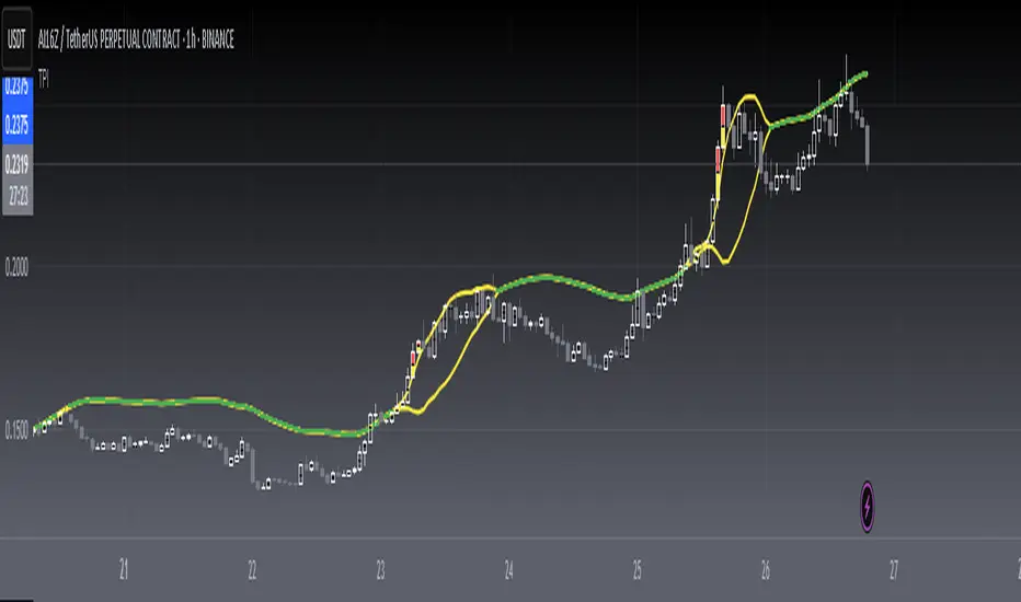
[blackcat] L2 Twisted Pair IndicatorOn the grand stage of the financial market, every trader is looking for a partner who can lead them to dance the tango well. The "Twisted Pair" indicator is that partner who dances gracefully in the market fluctuations. It weaves the rhythm of the market with two lines, helping traders to find the rhythm in the market's dance floor.
Imagine when the market is as calm as water, the "Twisted Pair" is like two ribbons tightly intertwined. They almost overlap on the chart, as if whispering: "Now, let's enjoy these quiet dance steps." This is the market consolidation period, the price fluctuation is not significant, traders can relax and slowly savor every detail of the market.
Now, let's describe the market logic of this code in natural language:
- **HJ_1**: This is the foundation of the market dance steps, by calculating the average price and trading volume, setting the tone for the market rhythm.
- **HJ_2** and **HJ_3**: These two lines are the arms of the dance partner, they help traders identify the long-term trend of the market through smoothing.
- **HJ_4**: This is a magnifying glass for market sentiment, it reveals the tension and excitement of the market by calculating the short-term deviation of the price.
- **A7** and **A9**: These two lines are the guide to the dance steps, they separate when the market volatility increases, guiding the traders in the right direction.
- **WATCH**: This is the signal light of the dance, when the two lines overlap, the market is calm; when they separate, the market is active.
The "Twisted Pair" indicator is like a carefully choreographed dance, it allows traders to find their own rhythm in the market dance floor, whether in a calm slow dance or a passionate tango. Remember, the market is always changing, and the "Twisted Pair" is the perfect dance partner that can lead you to dance out brilliant steps.
The script of this "Twisted Pair" uses three different types of moving averages: EMA (Exponential Moving Average), DEMA (Double EMA), and TEMA (Triple EMA). These types can be selected by the user through exchange input.
Here are the main functions of this code:
1. Defined the DEMA and TEMA functions: These two functions are used to calculate the corresponding moving averages. EMA is the exponential moving average, which is a special type of moving average that gives more weight to recent data. In the first paragraph, ema1 is the EMA of "length", and ema2 is the EMA of ema1. DEMA is 2 times of ema1 minus ema2.
2. Let users choose to use EMA, DEMA or TEMA: This part of the code provides an option for users to choose which type of moving average they want to use.
3. Defined an algorithm called "Twisted Pair algorithm": This part of the code defines a complex algorithm to calculate a value called "HJ". This algorithm involves various complex calculations and applications of EMA, DEMA, TEMA.
4. Plotting charts: The following code is used to plot charts on Tradingview. It uses the plot function to draw lines, the plotcandle function to draw candle (K-line) charts, and yellow and red to represent different conditions.
5. Specify colors: The last two lines of code use yellow and red K-line charts to represent the conditions of HJ_7. If the conditions of HJ_7 are met, the color of the K-line chart will change to the corresponding color.
Volatilty
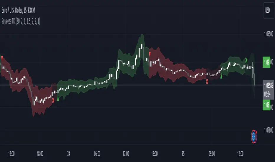
Squeeze Momentum TD - A Revisited Version of the TTM SqueezeDescription:
The "Squeeze Momentum TD" is our unique take on the highly acclaimed TTM Squeeze indicator, renowned in the trading community for its efficiency in pinpointing market momentum. This script is a tribute and an extension to the foundational work laid by several pivotal figures in the trading industry:
• John Carter, for his creation of the TTM Squeeze and TTM Squeeze Pro, which revolutionized the way traders interpret volatility and momentum.
• Lazybear, whose original interpretation of the TTM Squeeze, known as the "Squeeze Momentum Indicator", provided an invaluable foundation for further development.
• Makit0, who evolved Lazybear's script to incorporate enhancements from the TTM Squeeze Pro, resulting in the "Squeeze PRO Arrows".
Our script, "Squeeze Momentum TD", represents a custom version developed after reviewing all variations of the TTM Squeeze indicator. This iteration focuses on a distinct visualization approach, featuring an overlay band on the chart for an user-friendly experience. We've distilled the essence of the TTM Squeeze and its advanced version, the TTM Squeeze Pro, into a form that emphasizes intuitive usability while retaining comprehensive analytical depth.
Features:
-Customizable Bollinger Bands and Keltner Channels: These core components of the TTM Squeeze.
-Dynamic Squeeze Conditions: Ranging from No Squeeze to High Compression.
-Momentum Oscillator: A linear regression-based momentum calculation, offering clear insights into market trends.
-User-Defined Color Schemes: Personalize your experience with adjustable colors for bands and plot shapes.
-Advanced Alert System: Alerts for key market shifts like Bull Watch Out, Bear Watch Out, and Momentum shifts.
-Adaptive Band Widths: Modify the band widths to suit your preference.
How to use it?
• Transition from Light Green to Dark Green: Indicates a potential end to the bullish momentum. This 'Bull Watch Out' signal suggests that traders should be cautious about continuing bullish trends.
• Transition from Light Red to Dark Red: Signals that the bearish momentum might be fading, triggering a 'Bear Watch Out' alert. It's a hint for traders to be wary of ongoing bearish trends.
• Shift from Dark Green to Light Green: This change suggests an increase in bullish momentum. It's an indicator for traders to consider bullish positions.
• Change from Dark Red to Light Red: Implies that bearish momentum is picking up. Traders might want to explore bearish strategies under this condition.
• Rapid Change from Light Red to Light Green: This swift shift indicates a quick transition from bearish to bullish sentiment. It's a strong signal for traders to consider switching to bullish positions.
• Quick Shift from Light Green to Light Red: Demonstrates a speedy change from bullish to bearish momentum. It suggests that traders might want to adjust their strategies to align with the emerging bearish trend.
Acknowledgements:
Special thanks to Beardy_Fred for the significant contributions to the development of this script. This work stands as a testament to the collaborative spirit of the trading community, continuously evolving to meet the demands of diverse trading strategies.
Disclaimer:
This script is provided for educational and informational purposes only. Users should conduct their own due diligence before making any trading decisions.
ATR Percentage ValuesThis indicator is created to give you the daily ATR 2% and 10% values for any product that you are looking at. The way the indicator is designed is to only show the most recent 2 and 10 percent values on any chart and will not show you any other number. If you are hovering over price that occurred in the past it will show zeros on the values. To get the right values, take your mouse off of the chart and it will show you the values.
The way this indicator is coded will give you the daily ATR numbers no matter what chart timeframe you are currently looking at. The idea is to save time and make sure you do not make a mistake getting the wrong value.
*** To make this show up on the status line, click on the settings, click on the style box and check the box "VALUES IN STATUS LINE" ****

Z-score changeAs a wise man once said that:
1. beginners think in $ change
2. intermediates think in % change
3. pros think in Z change
Here is the "Z-score change" indicator that calculates up/down moves normalized by standard deviation (volatility) displayed as bar chart with 1,2 and 3 stdev levels.

Volume Exhaustion [AlgoAlpha]Introducing the Volume Exhaustion by AlgoAlpha, is an innovative tool that aims to identify potential exhaustion or peaks in trading volume , which can be a key indicator for reversals or continuations in market trends 🔶.
Key Features:
Signal Plotting : A special feature is the plotting of 'Release' signals, marked by orange diamonds, indicating points where the exhaustion index crosses under its previous value and is above a certain boundary. This could signify critical market points 🚨.
Calculation Length Customization : Users can adjust the calculation and Signal lengths to suit their trading style, allowing for flexibility in analysis over different time periods. ☝️
len = input(50, "Calculation Length")
len2 = input(8, "Signal Length")
Visual Appeal : The script offers customizable colors (col for the indicator and col1 for the background) enhancing the visual clarity and user experience 💡.
col = input.color(color.white, "Indicator Color")
col1 = input.color(color.gray, "Background Color")
Advanced Volume Processing : At its core, the script utilizes a combination of Hull Moving Average (HMA) and Exponential Moving Average (EMA) applied to the volume data. This sophisticated approach helps in smoothing out the volume data and reducing lag.
sv = ta.hma(volume, len)
ssv = ta.hma(sv, len)
Volume Exhaustion Detection : The script calculates the difference between the volume and its smoothed version, normalizing this value to create an exhaustion index (fff). Positive values of this index suggest potential volume exhaustion.
f = sv-ssv
ff = (f) / (ta.ema(ta.highest(f, len) - ta.lowest(f, len), len)) * 100
fff = ff > 0 ? ff : 0
Boundary and Zero Line : The script includes a boundary line (boundary) and a zero line (zero), with the area between them filled for enhanced visual interpretation. This helps in assessing the relative position of the exhaustion index.
Customizable Background : The script colors the background of the chart for better readability and to distinguish the indicator’s area clearly.
Overall, Volume Exhaustion is designed for traders who focus on volume analysis. It provides a unique perspective on volume trends and potential exhaustion points, which can be crucial for making informed trading decisions. This script is a valuable addition for traders looking to enhance their trading experience with advanced volume analysis tools.

Squeeze & Release [AlgoAlpha]Introduction:
💡The Squeeze & Release by AlgoAlpha is an innovative tool designed to capture price volatility dynamics using a combination of EMA-based calculations and ATR principles. This script aims to provide traders with clear visual cues to spot potential market squeezes and release scenarios. Hence it is important to note that this indicator shows information on volatility, not direction.
Core Logic and Components:
🔶EMA Calculations: The script utilizes the Exponential Moving Average (EMA) in multiple ways to smooth out the data and provide indicator direction. There are specific lengths for the EMAs that users can modify as per their preference.
🔶ATR Dynamics: Average True Range (ATR) is a core component of the script. The differential between the smoothed ATR and its EMA is used to plot the main line. This differential, when represented as a percentage of the high-low range, provides insights into volatility.
🔶Squeeze and Release Detection: The script identifies and highlights squeeze and release scenarios based on the crossover and cross-under events between our main line and its smoothed version. Squeezes are potential setups where the market may be consolidating, and releases indicate a potential breakout or breakdown.
🔶Hyper Squeeze Detection: A unique feature that detects instances when the main line is rising consistently over a user-defined period. Hyper squeeze marks areas of extremely low volatility.
Visual Components:
The main line (ATR-based) changes color depending on its position relative to its EMA.
A middle line plotted at zero level which provides a quick visual cue about the main line's position. If the main line is above the zero level, it indicates that the price is squeezing on a longer time horizon, even if the indicator indicates a shorter-term release.
"𝓢" and "𝓡" characters are plotted to represent 'Squeeze' and 'Release' scenarios respectively.
Standard Deviation Bands are plotted to help users gauge the extremity and significance of the signal from the indicator, if the indicator is closer to either the upper or lower deviation bands, this means that statistically, the current value is considered to be more extreme and as it is further away from the mean where the indicator is oscillating at for the majority of the time. Thus indicating that the price has experienced an unusual amount or squeeze or release depending on the value of the indicator.
Usage Guidelines:
☝️Traders can use the script to:
Identify potential consolidation (squeeze) zones.
Gauge potential breakout or breakdown scenarios (release).
Fine-tune their entries and exits based on volatility.
Adjust the various lengths provided in the input for better customization based on individual trading styles and the asset being traded.

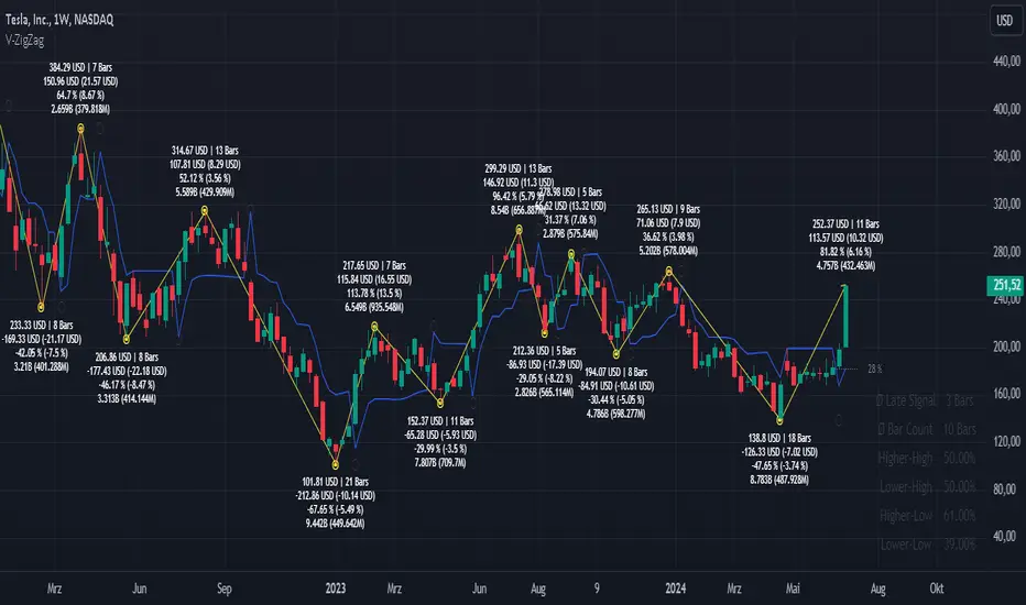
Volatility ZigZagIt calculates and plots zigzag lines based on volatility and price movements. It has various inputs for customization, allowing you to adjust parameters like source data, length, deviation, line styling, and labeling options.
The indicator identifies pivot points in the price movement, drawing lines between these pivots based on the deviation from certain price levels or volatility measures.
The script labels various data points at the ZigZag pivot points on the chart. These labels provide information about different aspects of the price movement and volume around these pivot points. Here's a breakdown of what gets labeled:
Price Change: Indicates the absolute and average percentage change between the two pivot points. It displays the absolute or relative change in price as a percentage. Additionally, the average absolute price increase or the average rate of increase can also be labeled.
Volume: Shows the total volume and average volume between the two pivot points.
Number of Bars: Indicates the number of bars between the current and the last pivot point.
Reversal Price: Displays the price of the reversal point (the previous pivot).
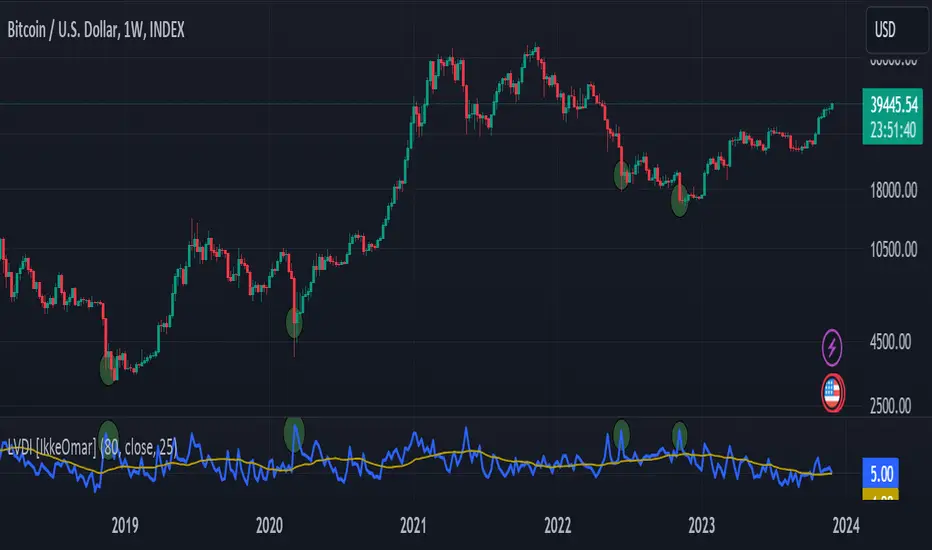
Logarithmic Volatility Direction Index [IkkeOmar]The LVDI is a Mean-Reversion Indicator. it doesn't detect trends and does not give a signal per se.
What it does is tell you if we have a flashcrash based on the price action and volume that is available. It is not always easy to see with the naked eye, so this indicator can help you DCA into an asset in a smarter way, if you couple it with other trend systems.
Think of this indicator like a form of a volatility index.
Inputs:
len and lenWMA are integers representing different lengths for calculations, and src is the data source
Keep in mind that "Length" is the lookback for the WMA, and the Length smooting is the lookback for the SMA of the "volume_weighted".
WMA Calculation
wma_basic = math.log10(ta.wma(src, len))
This calculates the logarithm (base 10) of the Weighted Moving Average (WMA) of the source data over len periods. WMA is a type of moving average giving more importance to recent data. The reason I use log10, is to make it transformative over a longer timeframe. This makes it easier to see the growth direction. I like to use this for crypto, since there is asymetric upside.
Volume Filter:
average_volume = ta.sma(volume, lenWMA)
volume_weighted = math.log10(wma_basic * (volume / math.log10(average_volume)))
Here, the script first calculates the Simple Moving Average (SMA) of the trading volume over lenWMA periods. Then, it computes a volume-weighted value of the WMA, adjusted by the logarithmic ratio of current volume to average volume.
Distance and Score Calculation:
distance = math.log10(src) - math.log10(volume_weighted)
score = math.sign(distance) * math.pow(math.abs(distance), 2)
The script calculates the logarithmic difference between the source data and the volume-weighted WMA. The score is determined by the sign of this distance multiplied by its square. This potentially amplifies the impact of larger distances.
Plotting:
plot(volume_weighted, title="Volume Weighted WMA", color=color.blue, linewidth = 2)
plot(ta.sma(volume_weighted, lenWMA), title="Volume Weighted WMA", color=color.rgb(189, 160, 0))
Mathematical concepts
Weighted Moving Average (WMA):
WMA is a moving average that assigns more weight to recent data points. The idea is that recent prices are more relevant to the current trend than older prices.
Logarithms:
The use of log10 (logarithm base 10) is interesting. Logarithms help in normalizing data and can make certain patterns more visible, especially when dealing with exponential growth or decay.
Volume Weighting:
Multiplying the WMA by the ratio of current volume to average volume (both logarithmic) integrates volume into the analysis. High trading volume can signify stronger market interest and can thus validate price movements.
Distance and Score:
The distance measures how far the current price is from the volume-weighted WMA on a logarithmic scale. The score squares this distance, potentially highlighting large divergences.
Case example
In the case above (which is a low timeframe that shouldn't be your main system) we see the blue line going up before going below the moving average line (orange). This indicates a local bottom zone. Does that mean that we wont go lower? No! What you can do is calculate a zone range.
We have an average line, you can get that from the POC with the VRVP.
Then you take the low and high of that zone and take the average:
(3.17% + 2.33%) / 2 = 2.75%
This means that we expect that the price can fall an additional 2.75%! Low and behold. When you check the same chart as above:
Hope it makes sense!
Stay safe everyone!
Don't hesitate to ask any questions if you have any!
Advanced Dynamic Threshold RSI [Elysian_Mind]Advanced Dynamic Threshold RSI Indicator
Overview
The Advanced Dynamic Threshold RSI Indicator is a powerful tool designed for traders seeking a unique approach to RSI-based signals. This indicator combines traditional RSI analysis with dynamic threshold calculation and optional Bollinger Bands to generate weighted buy and sell signals.
Features
Dynamic Thresholds: The indicator calculates dynamic thresholds based on market volatility, providing more adaptive signal generation.
Performance Analysis: Users can evaluate recent price performance to further refine signals. The script calculates the percentage change over a specified lookback period.
Bollinger Bands Integration: Optional integration of Bollinger Bands for additional confirmation and visualization of potential overbought or oversold conditions.
Customizable Settings: Traders can easily customize key parameters, including RSI length, SMA length, lookback bars, threshold multiplier, and Bollinger Bands parameters.
Weighted Signals: The script introduces a unique weighting mechanism for signals, reducing false positives and improving overall reliability.
Underlying Calculations and Methods
1. Dynamic Threshold Calculation:
The heart of the Advanced Dynamic Threshold RSI Indicator lies in its ability to dynamically calculate thresholds based on multiple timeframes. Let's delve into the technical details:
RSI Calculation:
For each specified timeframe (1-hour, 4-hour, 1-day, 1-week), the Relative Strength Index (RSI) is calculated using the standard 14-period formula.
SMA of RSI:
The Simple Moving Average (SMA) is applied to each RSI, resulting in the smoothing of RSI values. This smoothed RSI becomes the basis for dynamic threshold calculations.
Dynamic Adjustment:
The dynamically adjusted threshold for each timeframe is computed by adding a constant value (5 in this case) to the respective SMA of RSI. This dynamic adjustment ensures that the threshold reflects changing market conditions.
2. Weighted Signal System:
To enhance the precision of buy and sell signals, the script introduces a weighted signal system. Here's how it works technically:
Signal Weighting:
The script assigns weights to buy and sell signals based on the crossover and crossunder events between RSI and the dynamically adjusted thresholds. If a crossover event occurs, the weight is set to 2; otherwise, it remains at 1.
Signal Combination:
The weighted buy and sell signals from different timeframes are combined using logical operations. A buy signal is generated if the product of weights from all timeframes is equal to 2, indicating alignment across timeframe.
3. Experimental Enhancements:
The Advanced Dynamic Threshold RSI Indicator incorporates experimental features for educational exploration. While not intended as proven strategies, these features aim to offer users a glimpse into unconventional analysis. Some of these features include Performance Calculation, Volatility Calculation, Dynamic Threshold Calculation Using Volatility, Bollinger Bands Module, Weighted Signal System Incorporating New Features.
3.1 Performance Calculation:
The script calculates the percentage change in the price over a specified lookback period (variable lookbackBars). This provides a measure of recent performance.
pctChange(src, length) =>
change = src - src
pctChange = (change / src ) * 100
recentPerformance1H = pctChange(close, lookbackBars)
recentPerformance4H = pctChange(request.security(syminfo.tickerid, "240", close), lookbackBars)
recentPerformance1D = pctChange(request.security(syminfo.tickerid, "1D", close), lookbackBars)
3.2 Volatility Calculation:
The script computes the standard deviation of the closing price to measure volatility.
volatility1H = ta.stdev(close, 20)
volatility4H = ta.stdev(request.security(syminfo.tickerid, "240", close), 20)
volatility1D = ta.stdev(request.security(syminfo.tickerid, "1D", close), 20)
3.3 Dynamic Threshold Calculation Using Volatility:
The dynamic thresholds for RSI are calculated by adding a multiplier of volatility to 50.
dynamicThreshold1H = 50 + thresholdMultiplier * volatility1H
dynamicThreshold4H = 50 + thresholdMultiplier * volatility4H
dynamicThreshold1D = 50 + thresholdMultiplier * volatility1D
3.4 Bollinger Bands Module:
An additional module for Bollinger Bands is introduced, providing an option to enable or disable it.
// Additional Module: Bollinger Bands
bbLength = input(20, title="Bollinger Bands Length")
bbMultiplier = input(2.0, title="Bollinger Bands Multiplier")
upperBand = ta.sma(close, bbLength) + bbMultiplier * ta.stdev(close, bbLength)
lowerBand = ta.sma(close, bbLength) - bbMultiplier * ta.stdev(close, bbLength)
3.5 Weighted Signal System Incorporating New Features:
Buy and sell signals are generated based on the dynamic threshold, recent performance, and Bollinger Bands.
weightedBuySignal = rsi1H > dynamicThreshold1H and rsi4H > dynamicThreshold4H and rsi1D > dynamicThreshold1D and crossOver1H
weightedSellSignal = rsi1H < dynamicThreshold1H and rsi4H < dynamicThreshold4H and rsi1D < dynamicThreshold1D and crossUnder1H
These features collectively aim to provide users with a more comprehensive view of market dynamics by incorporating recent performance and volatility considerations into the RSI analysis. Users can experiment with these features to explore their impact on signal accuracy and overall indicator performance.
Indicator Placement for Enhanced Visibility
Overview
The design choice to position the "Advanced Dynamic Threshold RSI" indicator both on the main chart and beneath it has been carefully considered to address specific challenges related to visibility and scaling, providing users with an improved analytical experience.
Challenges Faced
1. Differing Scaling of RSI Results:
RSI values for different timeframes (1-hour, 4-hour, and 1-day) often exhibit different scales, especially in markets like gold.
Attempting to display these RSIs on the same chart can lead to visibility issues, as the scaling differences may cause certain RSI lines to appear compressed or nearly invisible.
2. Candlestick Visibility vs. RSI Scaling:
Balancing the visibility of candlestick patterns with that of RSI values posed a unique challenge.
A single pane for both candlesticks and RSIs may compromise the clarity of either, particularly when dealing with assets that exhibit distinct volatility patterns.
Design Solution
Placing the buy/sell signals above/below the candles helps to maintain a clear association between the signals and price movements.
By allocating RSIs beneath the main chart, users can better distinguish and analyze the RSI values without interference from candlestick scaling.
Doubling the scaling of the 1-hour RSI (displayed in blue) addresses visibility concerns and ensures that it remains discernible even when compared to the other two RSIs: 4-hour RSI (orange) and 1-day RSI (green).
Bollinger Bands Module is optional, but is turned on as default. When the module is turned on, the users can see the upper Bollinger Band (green) and lower Bollinger Band (red) on the main chart to gain more insight into price actions of the candles.
User Flexibility
This dual-placement approach offers users the flexibility to choose their preferred visualization:
The main chart provides a comprehensive view of buy/sell signals in relation to candlestick patterns.
The area beneath the chart accommodates a detailed examination of RSI values, each in its own timeframe, without compromising visibility.
The chosen design optimizes visibility and usability, addressing the unique challenges posed by differing RSI scales and ensuring users can make informed decisions based on both price action and RSI dynamics.
Usage
Installation
To ensure you receive updates and enhancements seamlessly, follow these steps:
Open the TradingView platform.
Navigate to the "Indicators" tab in the top menu.
Click on "Community Scripts" and search for "Advanced Dynamic Threshold RSI Indicator."
Select the indicator from the search results and click on it to add to your chart.
This ensures that any future updates to the indicator can be easily applied, keeping you up-to-date with the latest features and improvements.
Review Code
Open TradingView and navigate to the Pine Editor.
Copy the provided script.
Paste the script into the Pine Editor.
Click "Add to Chart."
Configuration
The indicator offers several customizable settings:
RSI Length: Defines the length of the RSI calculation.
SMA Length: Sets the length of the SMA applied to the RSI.
Lookback Bars: Determines the number of bars used for recent performance analysis.
Threshold Multiplier: Adjusts the multiplier for dynamic threshold calculation.
Enable Bollinger Bands: Allows users to enable or disable Bollinger Bands integration.
Interpreting Signals
Buy Signal: Generated when RSI values are above dynamic thresholds and a crossover occurs.
Sell Signal: Generated when RSI values are below dynamic thresholds and a crossunder occurs.
Additional Information
The indicator plots scaled RSI lines for 1-hour, 4-hour, and 1-day timeframes.
Users can experiment with additional modules, such as machine-learning simulation, dynamic real-life improvements, or experimental signal filtering, depending on personal preferences.
Conclusion
The Advanced Dynamic Threshold RSI Indicator provides traders with a sophisticated tool for RSI-based analysis, offering a unique combination of dynamic thresholds, performance analysis, and optional Bollinger Bands integration. Traders can customize settings and experiment with additional modules to tailor the indicator to their trading strategy.
Disclaimer: Use of the Advanced Dynamic Threshold RSI Indicator
The Advanced Dynamic Threshold RSI Indicator is provided for educational and experimental purposes only. The indicator is not intended to be used as financial or investment advice. Trading and investing in financial markets involve risk, and past performance is not indicative of future results.
The creator of this indicator is not a financial advisor, and the use of this indicator does not guarantee profitability or specific trading outcomes. Users are encouraged to conduct their own research and analysis and, if necessary, consult with a qualified financial professional before making any investment decisions.
It is important to recognize that all trading involves risk, and users should only trade with capital that they can afford to lose. The Advanced Dynamic Threshold RSI Indicator is an experimental tool that may not be suitable for all individuals, and its effectiveness may vary under different market conditions.
By using this indicator, you acknowledge that you are doing so at your own risk and discretion. The creator of this indicator shall not be held responsible for any financial losses or damages incurred as a result of using the indicator.
Kind regards,
Ely

Channel CorridorOVERVIEW
The Channel Corridor indicator is designed to operate on a log chart of asset prices (e.g., BTCUSD), specifically on a weekly timeframe.
The intent of the indicator is to provide a visual representation of market dynamics, focusing on a dynamically adjusted corridor around a Simple Moving Average (SMA) of an asset's price. The corridor adapts to changing market conditions. The indicator includes channels within the corridor for additional reference points.
PURPOSE
Trend Identification: The channel corridor can aid in visualising the overall trend, as it dynamically adjusts the corridor based on an SMA and user-defined parameters.
Volatility Assessment: The width of the channel corridor can may act as a gauge of market volatility.
Reversal Points: The channel corridor may signal potential trend reversals or corrections when an asset price approaches the upper or lower bounds of the corridor.
Long-Term Trend Analysis: The channel corridor may aid in longer-term trend analysis.
CONSIDERATIONS
Validation: It's recommended that careful back-testing over historical data be done before acting on any identified opportunities.
User Discretion: Trading decisions should not rely solely on this script. Users should exercise judgment and consider market conditions.
CREDIT
Ideation: Thanks @Sw1ngTr4der for the idea and corridor seed code

MAC Spikes(Adam H Grimes)From Adam H Grimes: "Introducing a New Tool: The MAC Spike"
Mean Absolute Change Spikes (“MAC Spikes”).
Here are the steps to calculate it:
-Convert each day’s closing price to a change (difference) by subtracting it from the previous day’s closing price.
-Take the absolute value of that change.
-Average the past 20 days absolute values to create the baseline.
-Divide today’s change by yesterday’s baseline. (Still offsetting by one day.)
MAC Spikes- Indicator:
-Indicator Setup: The script defines an indicator with the name "MAC Spikes", not overlaying the main chart, and allows up to 99 lines to be plotted.
-User Inputs: It provides several user-configurable inputs, such as:
Length for standard deviation calculation (len).
-Type of spike to monitor (spikeType), with options for close, range, or open spikes.
-Option to filter spikes based on a threshold (filtered).
-The threshold value for spike significance (spike_thresh).
-Whether to display the spike histogram (disp_Spike).
-Line width for plotting (lw).

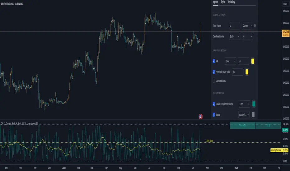
Candlestick Percentile RankCANDLESTICK PERCENTILE RANK
█ OVERVIEW
This script is designed to sample all available candles within a chosen time frame and provide a candlestick percentile rank to each candle. This script works by measuring a candle's body or its low to high value to the upside, or to the downside in percentage or in dollar value. Once the candle is measured its given a value based on all the previous measurements. You will be able to know if a body ( or a full candle/bar ) is above, or below a certain percentile level. By doing this you're effectively going to know if a candle is under performing or under-performing compared to the chart's history.
Example : A candle that did a 30% move vs another did a 10% and a third did a 5%. Here we 3 candles. The one that did a 30% is going to be ranked at 100 because it's the highest while the 5% candle ranks at 0 and the 10% candles ranks at 50. you see how this works. Having a candle in the 90th percentile means at that time it scored better than 90% of the preceding candles based on its move ( in dollar or percentage ).
So imagine you have an organic move of an up trend, ideally and what you want to see is this ; a candle with a low rank followed by one that's higher, followed by one that's also higher until the trend stops and you see a pin bar or whatever topping candle. You expect to see a rank going from low value to high value to suddenly sharply decrease to low value.
Constant low values may indicate lower volatility or time to change. For example, a doji candle will create a very low percentile rank value ( body-wise ). A high percentile rank value means high volatility on body and full candle calculations.
^ This is only one use of it.
A trendline may also form with a breakout points and information about the trend of the volatility of recent candles. Moving averages when applied to these calculations and to the percentile ranks can absolutely help in making these trends a bit smoother which is why you can add them to the graph. if you wish.
This script can be used in multiple ways including as a measure of volatility. or for statistical purposes. If I know the 50th percentile of a candle value I can know a very critical information about an asset's behavior and how volatile it is compared to another. There are many questions that can be answered using this script. How many times has this asset printed a candle of x% in the past y amount of time and how often does that happen. Is this candle or that truly rare ?
This script also has an option to highlight a specific percentile level showing its value. You can also see the number of sampled candles for clarity on the reliability of the data.
In conclusion, candlesticks effect each others. The whole candlestick/bars patterns is based on this. The percentile Rank is an effective way to observe and study these effects. The percentile rank shows you how on a measuring stick from 0 to 100 how a candle ( body or full low-high ) ranks compared to other candles in the past based on dollar value or percentage value. There are many untapped usages of the percentile rank when applied to candlesticks calculations and I hope this script can help you with this. If one can study the behavior of an asset and its bars percentile ranks they can unlock some probabilistic advantages.
█ Future Plans and upgrades to this script may include :
1. Count the times a percentile level is hit.
2. Display details about the highest/lowest levels.
and more! feel free to let me know what you'd like to see!
█ How to use :
1. Put the script on your chart
2. Navigate to the settings
give the script a few seconds and you should be set.
Rug Pull DetectorOverview
Have you ever wondered why tickers have such erratic movements that seemingly come from nowhere? These "rug pull" events happen quite often and can catch even the most seasoned traders off-guard.
Unlike most other indicators which rely on historical data to make inferences about future price movements, the Rug Pull Detector (RPD) enables you to take a glimpse into market makers' delta-neutral hedging in real-time.
Market makers by nature must be delta-neutral which means that they cannot position themselves to profit from providing liquidity (either long or short). Liquidity provided to the short or long side must end up in a stock purchase or sale to neutralize the trade.
Volatile movements in a ticker's price movement most often result directly after a period of extremely low volatility. These volatile movements are very often "rug pulled" which ends up reverting the ticker back to the price at which the event first occurred. RPD shows these events in real-time. This knowledge can be used to help determine the most probable near-future direction a ticker will gravitate towards after a rug pull event occurs.
Usage
RPD works on any ticker and on any timeframe and can be used as a tool in determining an exit price for a trade. Vertical shading on the chart indicates a warning signal that a rug pull event may be about to kick-off. Once a rug pull event has occurred and is confirmed, a blue label will appear on the chart with a price. A line is then drawn from the bar at which the event occurred and is extended to each subsequent bar until the price is reached once more; thus concluding the event. Furthermore, red or green shading will be present to easily visually identify rug pull events on the chart and whether they are risks to the downside (red) or upside (green). RPD is broken down into 2 main types of events:
Active Event - These events are characterized by a red or green shading and a blue price line.
Dormant Event - These events do not have shading but are still identifiable via a blue price line. Active events that are superseded by newer events will become dormant.
Active events tend to have a higher chance to return to the initial price point and tend to arrive there quicker.
Dormant events have a slightly lower chance to return to the initial price point and may take longer to arrive there.
Please note:
This indicator has no way of telling the exact amount of time that will pass before the ticker returns to the identified price; however, in more cases than not - the ticker will return to that price within a reasonable amount of time relative to the timeframe you are viewing.
There is a small chance any single event will never conclude. These are anomalies and do occur on occasion.
Using RPD alongside tools such as the RSI, Anchored VWAP, or other trend-based indicators will help determine when the ticker's price might be about to pivot and head back towards the identified price point.
Seeing is Believing:
SPY 1D downside rug-pull
----------------------------------------------
AAPL 15s downside and upside rug-pulls
----------------------------------------------
AMD 2D downside rug-pull
----------------------------------------------
VIX 1h downside and upside rug-pulls
Want to see more? Check out my recent Ideas for more examples of the Rug Pull Detector in action.
Disclaimer:
Any information in relation to the Rug Pull Detector does not constitute any financial, investment, or trading advice. Trade or invest at your own risk.

SOLANA Performance & Volatility Analysis BB%Overview:
The script provides an in-depth analysis of Solana's performance and volatility. It showcases Solana's price, its inverse relationship, its own volatility, and even juxtaposes it against Bitcoin's 24-hour historical volatility. All of these are presented using the Bollinger Bands Percentage (BB%) methodology to normalise the price and volatility values between 0 and 1.
Key Components:
Inputs:
SOLANA PRICE (SOLUSD): The price of Solana.
SOLANA INVERSE (SOLUSDT.3S): The inverse of Solana's price.
SOLANA VOLATILITY (SOLUSDSHORTS): Volatility for Solana.
BITCOIN 24 HOUR HISTORICAL VOLATILITY (BVOL24H): Bitcoin's volatility over the past 24 hours.
BB Calculations:
The script uses the Bollinger Bands methodology to calculate the mean (SMA) and the standard deviation of the prices and volatilities over a certain period (default is 20 periods). The calculated upper and lower bands help in normalising the values to the range of 0 to 1.
Normalised Metrics Plotting:
For better visualisation and comparative analysis, the normalised values for:
Solana Price
Solana Inverse
Solana Volatility
Bitcoin 24hr Volatility
are plotted with steplines.
Band Plotting:
Bands are plotted at 20%, 40%, 60%, and 80% levels to serve as reference points. The area between the 40% and 60% bands is shaded to highlight the median region.
Colour Coding:
Different colours are used for easy differentiation:
Solana Price: Blue
Solana Inverse: Red
Solana Volatility: Green
Bitcoin 24hr Volatility: White
Licence & Creator:
The script adheres to the Mozilla Public Licence 2.0 and is credited to the author, "Volatility_Vibes".
Works well with Breaks and Retests with Volatility Stop

blackOrb CandleAddressing the Shortcomings of Conventional Candle Charts
I. Surmounting Volatility Challenges
In the realm of combined heightened or subdued volatility and erratic market conditions, traditional candlestick charts are susceptible to deficiencies in isolating extraneous data noise (e.g. high/low wicks, given their frequent incongruity with pivotal market dynamics or arbitrary green/red coloring of candle bodies).
II. Precision in Application
Novice traders may erroneously construe and misemploy traditional candlestick patterns, culminating in erroneous trading determinations. In addressing this challenge, this indicator can help to identify critical signal confluences, enhancing potential signals accuracy.
III. Strategy at the Core
Relying solely on candlestick charts lacks potency without an underpinning well-knit strategy. blackOrb's methodology integrates discernment of pivotal chart configurations with the meticulous construction of comprehensive strategies to mirror a comprehension of potential market dynamics.
blackOrb's Aspirations: Overcoming Enunciated Challenges of Traditional Candle Charts
- Customizable Data Analysis
Engendering the evolution of candle charts involves the judicious adjustment of multifarious open/high/low/close iterations coupled with evaluative mechanisms such as Heikin Ashi and MA smoothing, combined with stochastic calculations.
- Holistic Perspective
Seamless deployment of trading strategies is engendered through salient facets, encompassing up- and downside ratios as well as adaptable true range visualizations, attuned to unfolding price dynamics.
- Personalized Approach
Adaptations in trading styles are seamlessly accommodated, as this indicator offers stochastic candle coloring with customizable stochastic look-back evaluation phases. A selection of over 20 color schemes accommodates individual preferences to differentiate various chart setups at first glance.
Note: However, it's important to recognize that the efficacy of evaluation coloring might be compromised during periods of lateral price movement, characterized by less prominent market trends.
- Ghost Mode for Comparative Insights
Unveiling correlations and divergences, the Ghost Mode overlays two candle charts, which can reveal price trajectories and reactions (e.g. Apple stock's potential response to the NASDAQ 100 Technology Sector Index).
Note: This approach may not capture nuanced correlations during intricate market scenarios.
Technical Methodology
At its core, the stochastic calculation methodology of this indicator centers around the following formula:
100 * (close - lowest(low, length)) / (highest(high, length) - lowest(low, length))
This key formula employs a stochastic calculation methodology that assesses the percentage deviation of the closing price from the lowest low over a specified timeframe (length), relative to the span between the highest high and the lowest low. The outcome is normalized within a range of 0 to 100, providing insights into the relative position of the closing price within the high-low range. Traders can define the specific periods over which the stochastic calculation is performed.
Based on this stochastic analysis, the indicator integrates candle coloring, affording users the flexibility to adjust the sensitivity of candle coloring according to customized stochastic look-back evaluation phases. Consequently, the coloration of candles by length evaluation can mirror a comprehension of market dynamics.
By allowing traders to designate specific periods for the stochastic calculation, it fosters adaptability in combination with the following technical features:
- Conjoining optional transparent Heikin Ashi and/or a weighted MA alternative to harness the virtues of smoothing sans confounding authentic price data and candle dynamics
- Individual electable focus range encompassing retrospection and real-time alignments
- Intra-temporal evaluations, sub-domains & amalgamated value permutations
- Prioritizing individually chosen focus time intervals within the realm of real price highs and lows
- Elaborate price display (e.g. high/low/ohlc4/close) upon chart-hover, accentuating close price implications
- Features offering diverse scaling options, alongside adaptable and customizable price display
- Unveiling uncluttered and directed candle body visualization, implementing wicks to the transparent candle body, given their frequent incongruity of high/low data with pivotal market dynamics
Note on Usability
This indicator isn't intended for standalone trading application. Instead, it offers an alternative approach to traditional candle charts, serving as a supplementary tool for orientation within broader trading strategies.
Irrespective of market conditions, it can harmonize with a wider range of trading styles and instruments/trading pairs/indices like Stocks, Gold, EURUSDSPX500, GBPUSD, BTCUSD and Oil.
Inspiration and Publishing
Taking genesis from the inspirations amongst others provided by TradingView Pine Script Wizard Kodify, blackOrb Candles is an multi-encompassing script meticulously forged from scratch. It aspires to furnish a comprehensive candle chart approach, borne out of personal experiences and a strong dedication in supporting the trading community. We eagerly await valuable feedback to refine and further enhance

Robust Bollinger Bands with Trend StrengthThe "Robust Bollinger Bands with Trend Strength" indicator is a technical analysis tool designed assess price volatility, identify potential trading opportunities, and gauge trend strength. It combines several robust statistical methods and percentile-based calculations to provide valuable information about price movements with Improved Resilience to Noise while mitigating the impact of outliers and non-normality in price data.
Here's a breakdown of how this indicator works and the information it provides:
Bollinger Bands Calculation: Similar to traditional Bollinger Bands, this indicator calculates the upper and lower bands that envelop the median (centerline) of the price data. These bands represent the potential upper and lower boundaries of price movements.
Robust Statistics: Instead of using standard deviation, this indicator employs robust statistical measures to calculate the bands (spread). Specifically, it uses the Interquartile Range (IQR), which is the range between the 25th percentile (low price) and the 75th percentile (high price). Robust statistics are less affected by extreme values (outliers) and data distributions that may not be perfectly normal. This makes the bands more resistant to unusual price spikes.
Median as Centerline: The indicator utilizes the median of the chosen price source (either HLC3 or VWMA) as the central reference point for the bands. The median is less affected by outliers than the mean (average), making it a robust choice. This can help identify the center of price action, which is useful for understanding whether prices are trending or ranging.
Trend Strength Assessment: The indicator goes beyond the standard Bollinger Bands by incorporating a measure of trend strength. It uses a robust rank-based correlation coefficient to assess the relationship between the price source and the bar index (time). This correlation coefficient, calculated over a specified length, helps determine whether a trend is strong, positive (uptrend), negative (down trend), or non-existent and weak. When the rank-based correlation coefficient shifts it indicates exhaustion of a prevailing trend. Trend Strength" indicator is designed to provide statistically valid information about trend strength while minimizing the impact of outliers and data distribution characteristics. The parameter choices, including a length of 14 and a correlation threshold of +/-0.7, considered to offer meaningful insights into market conditions and statistical validity (p-value ,0.05 statistically significant). The use of rank-based correlation is a robust alternative to traditional Pearson correlation, especially in the context of financial markets.
Trend Fill: Based on the robust rank-based correlation coefficient, the indicator fills the area between the upper and lower Bollinger Bands with different colors to visually represent the trend strength. For example, it may use green for an uptrend, red for a down trend, and a neutral color for a weak or ranging market. This visual representation can help traders quickly identify potential trend opportunities. In addition the middle line also informs about the overall trend direction of the median.

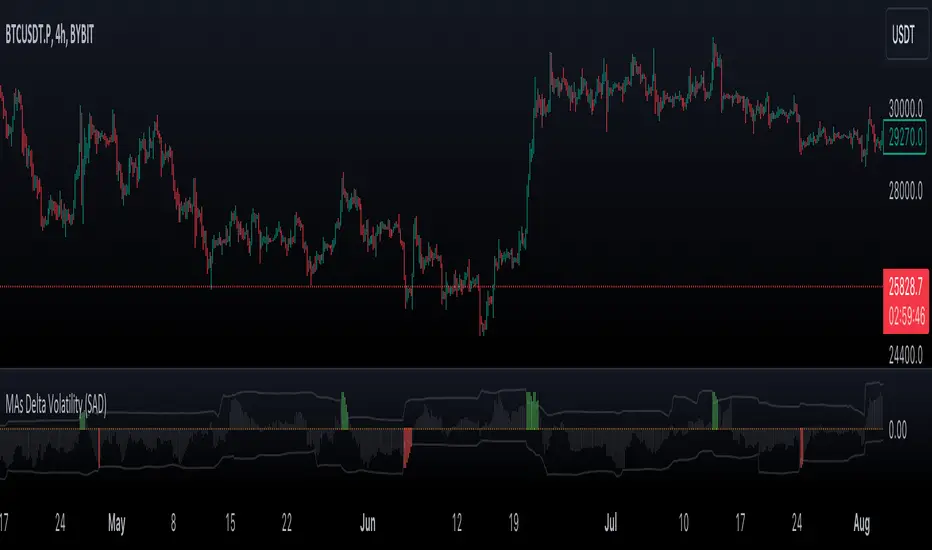
VWMA/SMA Delta Volatility (Statistical Anomaly Detector)The "VWMA/SMA Delta Volatility (Statistical Anomaly Detector)" indicator is a tool designed to detect and visualize volatility in a financial market's price data. The indicator calculates the difference (delta) between two moving averages (VWMA/SMA) and uses statistical analysis to identify anomalies or extreme price movements. Here's a breakdown of its components:
Hypothesis:
The hypothesis behind this indicator is that extreme price movements or anomalies in the market can be detected by analyzing the difference between two moving averages and comparing it to a statistically derived normal distribution. When the MA delta (the difference between two MAs: VWMA/SMA) exceeds a certain threshold based on standard deviation and the Z-score coefficient, it may indicate increased market volatility or potential trading opportunities.
Calculation of MA Delta:
The indicator calculates the MA delta by subtracting a simple moving average (SMA) from a volume-weighted moving average (VWMA) of a selected price source. This calculation represents the difference in the market's short-term and long-term trends.
Statistical Analysis:
To detect anomalies, the indicator performs statistical analysis on the MA delta. It calculates a moving average (MA) of the MA delta and its standard deviation over a specified sample size. This MA acts as a baseline, and the standard deviation is used to measure how much the MA delta deviates from the mean.
Delta Normalization:
The MA delta, lower filter, and upper filter are normalized using a function that scales them to a specific range, typically from -100 to 100. Normalization helps in comparing these values on a consistent scale and enhances their visual representation.
Visual Representation:
The indicator visualizes the results through histograms and channels:
The histogram bars represent the normalized MA delta. Red bars indicate negative and below-lower-filter values, green bars indicate positive and above-upper-filter values, and silver bars indicate values within the normal range.
It also displays a Z-score channel, which represents the upper and lower filters after normalization. This channel helps traders identify price levels that are statistically significant and potentially indicative of market volatility.
In summary, the "MA Delta Volatility (Statistical Anomaly Detector)" indicator aims to help traders identify abnormal price movements in the market by analyzing the difference between two moving averages and applying statistical measures. It can be a valuable tool for traders looking to spot potential opportunities during periods of increased volatility or to identify potential market anomalies.
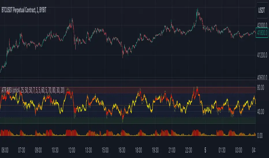
ATR Adaptive RSI OscillatorThe " ATR Adaptive RSI Oscillator " is a versatile technical analysis tool designed to help traders make informed decisions in dynamic market conditions. It combines the Relative Strength Index (RSI) with the Average True Range (ATR) to provide adaptive and responsive insights into price trends.
Key Features :
Adaptive RSI Periods : The indicator introduces the concept of adaptive RSI periods based on the ATR (Average True Range) of the market. When enabled, it dynamically adjusts the RSI calculation period, offering longer periods during high volatility and shorter periods during low volatility. This adaptability enhances the accuracy of RSI signals across varying market conditions.
Volume-Based Smoothing : The indicator includes a smoothing feature that computes a time-decayed weighted moving average of RSI values over the last two bars, using volume-based weights. This approach offers a time-sensitive smoothing effect, reducing noise for a clearer view of trend strength compared to the standard RSI.
Divergence Detection : Traders can enable divergence detection to identify potential reversal points in the market. The indicator highlights regular bullish and bearish divergences, providing valuable insights into market sentiment shifts.
Customizable Parameters : Traders have the flexibility to customize various parameters, including RSI length, adaptive mode, ATR length, and divergence settings, to tailor the indicator to their trading strategy.
Overbought and Oversold Levels : The indicator includes overbought (OB) and oversold (OS) boundary lines that can be adjusted to suit individual preferences. These levels help traders identify potential reversal zones.
The "ATR Adaptive RSI Oscillator" is a powerful tool for traders seeking to adapt their trading strategies to changing market dynamics. Whether you're a trend follower or a contrarian trader, this indicator provides valuable insights to support your decision-making process.
Liquidity Heatmap [BigBeluga]The Liquidity Heatmap is an indicator designed to spot possible resting liquidity or potential stop loss using volume or Open interest.
The Open interest is the total number of outstanding derivative contracts for an asset—such as options or futures—that have not been settled. Open interest keeps track of every open position in a particular contract rather than tracking the total volume traded.
The Volume is the total quantity of shares or contracts traded for the current timeframe.
🔶 HOW IT WORKS
Based on the user choice between Volume or OI, the idea is the same for both.
On each candle, we add the data (volume or OI) below or above (long or short) that should be the hypothetical liquidation levels; More color of the liquidity level = more reaction when the price goes through it.
Gradient color is calculated between an average of 2 points that the user can select. For example: 500, and the script will take the average of the highest data between 500 and 250 (half of the user's choice), and the gradient will be based on that.
If we take volume as an example, a big volume spike will mean a lot of long or short activity in that candle. A liquidity level will be displayed below/above the set leverage (4.5 = 20x leverage as an example) so when the price revisits that zone, all the 20x leverage should be liquidated.
Huge volume = a lot of activity
Huge OI = a lot of positions opened
More volume / OI will result in a stronger color that will generate a stronger reaction.
🔶 ROUTE
Here's an example of a route for long liquidity:
Enable the filter = consider only green candles.
Set the leverage to 4.5 (20x).
Choose Data = Volume.
Process:
A green candle is formed.
A liquidity level is established.
The level is placed below to simulate the 20x leverage.
Color is applied, considering the average volume within the chosen area.
Route completed.
🔶 FEATURE
Possibility to change the color of both long and short liquidity
Manual opacity value
Manual opacity average
Leverage
Autopilot - set a good average automatically of the opacity value
Enable both long or short liquidity visualization
Filtering - grab only red/green candle of the corresponding side or grab every candle
Data - nzVolume - Volume - nzOI - OI
🔶 TIPS
Since the limit of the line is 500, it's best to plot 2 scripts: one with only long and another with only short.
🔶 CONCLUSION
The liquidity levels are an interesting way to think about possible levels, and those are not real levels.

Colored VWAP and BarcolorThis indicator plots the Volume Weighted Average Price (VWAP) as well as changes the bar color if the current price is above or below VWAP, for quick visual reference.
Background Information
Straight from TradingView, "Volume Weighted Average Price (VWAP) is a technical analysis tool used to measure the average price weighted by volume. VWAP is typically used with intraday charts as a way to determine the general direction of intraday prices. It's similar to a moving average in that when price is above VWAP, prices are rising and when price is below VWAP, prices are falling. VWAP is primarily used by technical analysts to identify market trend."
About the Indicator
This indicator changes the VWAP line color and bar color based on the current price.
Bar Color
Bullish Up Candle Color = Current price is above VWAP and the close of the candle was greater than the open.
Bullish Down Candle Color = Current price is above VWAP and the close of the candle was less than the open.
Bearish Up Candle Color = Current price is below VWAP and the close of the candle was greater than the open.
Bearish Down Candle Color = Current price is below VWAP and the close of the candle was less than the open.

Volume [Entoryx]
Certainly! Here's a more concise description for the "Entoryx Volume" indicator, with less focus on the specifics of the order block bar detection:
The "Entoryx Volume" is a versatile technical indicator that analyzes the relationship between price ranges and volume over a user-defined number of bars. By calculating a delta between the highest high and lowest low, it offers insights into market momentum and direction.
Key features of this indicator include:
1) Current Value Plotting: A dynamic line plotted on the chart represents the current value, which reflects market trends. The color of the line changes to green for bullish conditions and red for bearish conditions, depending on its relationship with the Exponential Moving Average (EMA) of the close.
2) Color-Coded Regions: The area between the current value plot and a baseline zero line is filled with a corresponding color, providing a visual representation of market sentiment.
3) Boundary Lines: Horizontal lines at +10 and -10 serve as reference points to highlight significant market movements.
4) Order Block Bar Detection (Optional): An optional feature that places visual markers on the chart to signal potential reversals. This can be enabled or disabled by the user, according to preference.
The "Entoryx Volume" indicator is tailored for traders aiming to understand market momentum with a clear and visually intuitive display. It is suitable across various trading strategies and market conditions, with customization options to fit individual needs.
The source code for this indicator is subject to the terms of the Mozilla Public License 2.0.

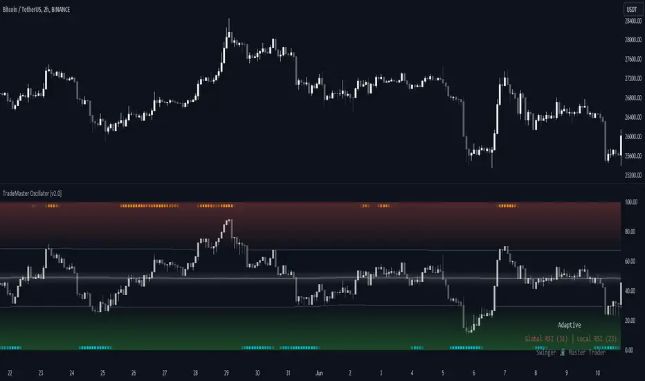
TradeMaster OscillatorTrading effectively requires a range of techniques, experience, and expertise. From technical analysis to market fundamentals, traders must navigate multiple factors, including market sentiment and economic conditions. However, traders often find themselves overwhelmed by market noise, making it challenging to filter out distractions and make informed decisions. To address this, we present a powerful indicator package designed to assist traders on their journey to success.
The TradeMaster indicator package encompasses a variety of trading strategies, including the SMC (Supply, Demand, and Price Action) approach, along with many other techniques. By leveraging concepts such as price action trading, support and resistance analysis, supply and demand dynamics, these indicators empower traders to analyze entry and exit positions with precision. Unlike other forms of technical analysis that produce values or plots based on historical price data, Price Action brings you the facts straight from the source - the current price movements.
The indicator package consists of three powerful indicators that can be used individually or together to maximize trading effectiveness.
⭐ About the Oscillator Indicator
The Oscillator is an innovative and robust tool that encapsulates the principles of multiple technical analysis methodologies to enrich your trading strategy. By leveraging the combination of our six unique indicators, it can provide a comprehensive and multi-dimensional view of market dynamics.
👉 Usage - the general approach:
Utilize the Oscillator Indicator as a confirmational tool. The Oscillator acts as a tool to validate ideas and strategies. By analyzing the oscillator's readings, you gain additional insights into market momentum, overbought or oversold conditions, and potential trend reversals. This confirmation step helps you avoid false signals and make more informed trading choices.
👉 We are focusing on the default setting of the TradeMaster Oscillator, which incorporates the Global RSI* as main oscillator and Local RSI* as confirmational oscillator. This base configuration can be custom-tailored to your preference, leveraging the additional combination of our six unique indicators.
Understand the difference between Global and Local RSI: The Global RSI represents broad relative strength, while the Local RSI describes the relative strength within wider movements. It's like having both a macro and micro view of relative strength.
Identify extreme values in Local RSI: Look for extremes in the Local RSI (overbought/oversold in Stochastic RSI). These often indicate a turning point in the RSI, which naturally reflects in the price. The Local RSI extremes are shown as dots outside the Global RSI bands in a "heatmap" style.
Smooth your RSI: You have the option to smooth your RSI with your preferred smoothing method (SMA , SMMA, EMA, DEMA, TEMA, LSMA, HMA, VWMA, WMA) and length.
Please bear in mind that high smoothing values can make the standard RSI extremes (>70 or <30) suboptimal or even useless. To address this potential problem, Adaptive levels were introduced.
Adaptive key levels for more relevant extremes: enabling Adaptive levels recalibrates extremes based on the historical RSI turning points (typical median turning points), providing much more relevant reference points for overbought/oversold states in both Global and Local RSI. This function can be used without smoothing but rarely provides significant difference unless you experiment with the length of RSI calculation.
Incorporate multiple indicators: besides Global and Local RSI, you can display six different proprietary indicators in the main oscillator theme. By choosing from these, you can apply the confirming condition as well. These include Sentiment (Fear and greed), Momentum, Trend Strength, Volume, and Volatility. These indicators use our TRMA** method to provide a comprehensive overview of market dynamics.
Choose your Global RSI display style: the Global RSI can be represented in candle, bar, line or ribbon form. Candles and bars can be useful for detecting rejections of relative strength (wicks), similar to OHLC data. Sometimes there are "hidden rejections" visible in relative strength but not in OHLC data, which naturally presents an advantage.
Customize the colors: All colors can be adjusted from the input menu to suit your preferences. This personalization allows you to make the Oscillator clear and intuitive for your individual trading style as possible.
Monitor Real-time Indicator values: In the bottom right corner, you can view real-time color-coded indicator values. This feature gives you the ability to quickly assess the market's current conditions without needing to navigate away from the chart.
Use multiple indicators in conjunction: while each indicator within the Oscillator provides valuable insights, their true power lies in their combination. Identify alignment among indicators to validate potential trades. For instance, when a bullish sentiment indication aligns with a low volatility reading, it may suggest a favorable buying opportunity.
Consider the market context: while the Oscillator provides a robust set of tools, always consider other aspects of the market environment. Use the oscillator in conjunction with other technical, fundamental, or sentiment analysis methods to develop a comprehensive trading strategy.
🛑 Remember, the oscillator should be used as a confirmational tool in your overall trading strategy. Make reasonable use of all its features, and always keep risk management principles in mind.
* By default, these are fine-tuned RSI and Stochastic RSI indicators.
** TRMA (Trend Rainbow Moving Averages) is a complex but customizable moving average matrix calculation that is designed to accurately measure market trend direction, strength and shifting.
⭐ Conclusion
We hold the view that the true path to success is the synergy between the trader and the tool, contrary to the common belief that the tool itself is the sole determinant of profitability. The actual scenario is more nuanced than such an oversimplification. Our aim is to offer useful features that meet the needs of the 21st century and that we actually use.
🛑 Risk Notice:
Everything provided by trademasterindicator – from scripts, tools, and articles to educational materials – is intended solely for educational and informational purposes. Past performance does not assure future returns.
RSI Supreme Multi-Method [MyTradingCoder]Introducing the "RSI Supreme Multi-Method" indicator, a powerful tool that combines the Relative Strength Index (RSI) with selectable manipulation methods to identify overbought and oversold conditions in the market, along with the ability to detect divergences for enhanced trading insights.
The indicator features four distinct manipulation methods for the RSI, each providing valuable insights into market conditions:
1. Standard RSI Method: The indicator uses the traditional RSI calculation to identify overbought and oversold areas.
2. Volatility Weighted RSI Method: This method applies a volatility formula to the RSI calculation, allowing for a more responsive indication of market conditions during periods of heightened volatility. Users can adjust the length of the volatility formula to fine-tune this method.
3. Smoothed RSI Method: The smoothed RSI method utilizes a smoothing algorithm to reduce noise in the RSI values, presenting a clearer representation of overbought and oversold conditions. The length of the smoothing can be adjusted to match your trading preferences.
4. Session Weighted RSI Method: With this innovative method, users can specify multipliers for different time sessions throughout the day to manipulate the base RSI. Each session can be customized with start and end times, enabling or disabling specific sessions, and specifying the multiplier for each session. This feature allows traders to adapt the RSI to different market sessions dynamically.
Additionally, the "RSI Supreme Multi-Method" indicator draws divergences on the oscillator, providing an extra layer of analysis for traders. Divergences occur when the direction of the RSI differs from the direction of the price movement, potentially signaling trend reversals.
Key Settings:
RSI Length: Adjust the length of the base RSI before applying any manipulation.
RSI Source: Determine the data source for the base RSI calculation.
Overbought Value: Set the RSI value at which overbought conditions are indicated.
Oversold Value: Set the RSI value at which oversold conditions are indicated.
RSI Type: Choose from four options: Standard, Smoothed, Volatility Manipulated, or Session Manipulated.
Volatility Manipulated Settings: Adjust the length of the volatility formula (applicable to Volatility Manipulated method).
Smoothed Settings: Adjust the length of the smoothing (applicable to Smoothed method).
Session Manipulated Settings: Customize six different time sessions with start and end times, enable or disable specific sessions, and specify multipliers for each session.
Divergence Color: Adjust the color of the drawn divergences to suit your chart's aesthetics.
Divergence Tuning: Fine-tune the sensitivity of the divergence detection for more accurate signals.
The "RSI Supreme Multi-Method" indicator is a versatile and comprehensive tool that can be used to identify overbought and oversold areas, as well as to spot potential trend reversals through divergences. However, like all technical analysis tools, it should be used in conjunction with other indicators and analysis methods to make well-informed trading decisions.
Enhance your trading insights with the "RSI Supreme Multi-Method" indicator and gain an edge in identifying critical market conditions and divergences with precision.
