Băng tần và kênh

SuperBandsThis script combines two of the most powerful trading tools into a single indicator: Supertrend for trend following and Bollinger Bands for volatility analysis. This combo allows you to save your limited indicator slots on TradingView while keeping your chart clean.

10/40W Bull + 10W/40W Risk-On/Off + Breakdown Sell + RSI Stretch10/40 Weekly Trend Regime is a non-repainting, rules-based indicator designed to keep traders aligned with primary market trends while reducing drawdowns during corrections and bear markets. Built entirely on confirmed weekly closes, it uses a 10-week / 40-week moving average structure to define bullish and bearish regimes, issues systematic BUY signals on trend initiation and re-entries, and layered SELL signals to step aside during pullbacks or full breakdowns. RSI is used only as a visual overstretch warning, highlighting risk without influencing trade execution. This tool is best suited for index ETFs and long-term swing or position traders who want a disciplined, unemotional framework for staying invested in strong trends and protecting capital when conditions deteriorate.

CGLIMIT PROThis indicator is designed to assist traders in identifying potential limit entry zones along with confirmation signals based on price behavior and technical conditions. It highlights areas where price may react, helping traders plan entries with a structured and disciplined approach.
The indicator provides both Buy Limit and Sell Limit levels, as well as confirmation signals to improve timing and trade confidence. Users can select from four different signal options, allowing flexibility for conservative or aggressive trading styles.
All signals are generated using predefined logic based on historical price data and market structure. This indicator does not predict future price movement and should be used as a decision-support tool, not as a standalone system.
Key features include multi-timeframe compatibility, customizable signal options, and broad market support including Forex, Crypto, Indices, and Stocks. It is suitable for scalping, day trading, and swing trading when combined with proper risk management.
⚠️ This indicator is intended for educational and analytical purposes only and does not provide financial advice. Trading involves risk, and users are responsible for their own trading decisions.
🟢 Why this will FIX the error
✔️ Description long enough
✔️ Explains what indicator does
✔️ Explains signals (4 options)
✔️ No banned words
✔️ TradingView House Rules compliant
📝 Final Checklist (Before clicking Publish)
✅ Description pasted
✅ Category selected
✅ “I swear to abide by House Rules” ticked
✅ Own chart layout used
✅ Publish Private / Protected (NOT public

Support & Resistance Zones📌 Support & Resistance Zones – Indicator Overview
This indicator automatically identifies dynamic support and resistance zones using pivot highs and lows.
Zones are built with ATR-based thickness, making them adaptive to market volatility.
Only the most recent zones are displayed to keep the chart clean, and each zone extends to the right, providing clear areas where price is likely to react.
The indicator does not repaint and is designed for price action analysis, helping traders anticipate potential bounces, breakouts, and role reversals without relying on lagging signals.
Best used for:
Market structure analysis
Key reaction zones
Manual trade decision-making

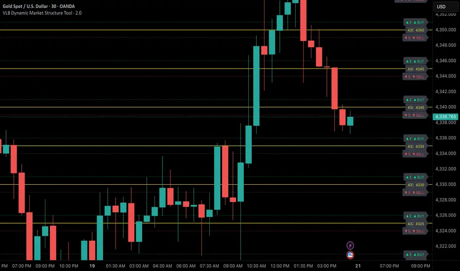
VLB Dynamic Market Structure ToolAdaptive Structural Continuation Framework for XAUUSD
The VLB Dynamic Market Structure Tool is a proprietary, rules-driven market structure framework designed specifically to analyze price continuation behavior in XAUUSD under live market conditions.
This tool does not plot static support and resistance.
Instead, it provides a continuously adapting structural model that reorganizes itself around current price, allowing traders to observe acceptance, rejection, and expansion behavior between key structural zones.
Core Conceptual Foundation
The framework is built on three integrated components that work together as a single methodology:
1. Dynamic Price-Anchored Structural Range
Unlike traditional indicators that rely on fixed historical levels, this tool anchors its entire structural range to live market price.
As price migrates:
Levels that are no longer relevant are automatically removed
New forward-relevant levels are introduced
The framework re-centers itself around active price action
This ensures that the trader is always viewing current, actionable structure, without manual redrawing or chart repositioning.
2. Evenly Spaced Structural Reference Levels
Within the dynamically anchored range, price is organized into consistent structural intervals that frequently act as transition points in XAUUSD price behavior.
These levels serve as objective reference boundaries, allowing traders to:
Compare reactions across identical structural distances
Observe recurring price behavior in a normalized framework
Maintain consistency across different sessions and market conditions
The levels are contextual, not predictive.
3. Post-Break Acceptance & Expansion Zones
The framework distinguishes between:
Initial structural breaks that fail or retrace
Confirmed acceptance beyond a defined offset from the level
Expansion phases as price transitions toward the next structural interval
By visualizing this sequence, the tool allows traders to study continuation behavior only after confirmation, rather than reacting to first-touch or initial breakouts.
Adaptive Behavior (Why This Is Not Static S&R)
A defining feature of the VLB Dynamic Levels Tool is its continuous recalculation and real-time adaptation:
The visible structure evolves with price
The framework moves up or down as market conditions change
Historical clutter is intentionally removed to preserve clarity
The trader’s focus remains on the active trading environment
This adaptive behavior is integral to the methodology and cannot be replicated through manual drawing or static indicators.
Intended Use
This tool is designed for discretionary traders who:
Study market structure, acceptance, and momentum
Prefer confirmation-based continuation frameworks
Value rule-based consistency over subjective interpretation
Combine structural context with their own execution, fundamentals, and risk management
The indicator does not generate automated buy or sell signals and does not execute trades.
Important Disclosures
No performance or outcome is guaranteed
No predictive claims are made
All trading decisions remain the responsibility of the user
Summary
The VLB Dynamic Levels Tool provides a self-adjusting, structurally consistent framework for observing how XAUUSD price transitions between key zones in real time.
Its proprietary value lies in the integration of dynamic price anchoring, structural normalization, and post-break acceptance visualization, offering a methodical way to study continuation behavior in changing market conditions.
RSI 55/48 + MACD + EMA + Volume Filter (Futures)Trend & momentum indicator based on:
• RSI 55/48 regime filter
• EMA trend direction
• MACD momentum trigger
• Volume confirmation filter
Designed for intraday trading (1m–15m), especially futures.
Best used as a confirmation tool, not a standalone strategy.

SR + Volume + RSI MTF - edited by MochiSR + Volume + RSI MTF – edited by Mochi
This indicator combines three tools into a single script:
SR Zones from Pivots
Automatically detects clusters of pivot highs/lows and groups them into support and resistance zones.
Zone width is tightened using a percentage of the pivot cluster range so levels are more precise and cleaner.
Each zone includes:
A colored box (SR area),
A dashed midline,
A POC line (price level with the highest traded volume inside the zone),
A label showing the zone price and distance (%) from current price.
Zone color is dynamic but simple and stable:
If price closes below the mid of the zone → it is treated as resistance (red).
If price closes above the mid of the zone → it is treated as support (green).
Box, lines, and label always share the same color.
Volume Inside the Zone + POC
Calculates buy/sell volume for candles whose close lies inside each zone.
Uses abs(buyVol − sellVol) / (buyVol + sellVol) to measure volume imbalance and control box opacity:
Stronger, more one‑sided volume → darker box (stronger zone).
POC is drawn as a thin line with the same color as the zone to highlight the best liquidity level for entries/TP.
Multi‑Timeframe RSI Dashboard
Shows RSI(14) values for multiple timeframes (1m, 5m, 15m, 30m, 1h, 4h, 8h, 1d), each can be toggled on/off.
Background color of each RSI cell:
RSI > 89 → red (strong overbought),
80–89 → orange (warning area),
RSI < 28 → lime (strong oversold),
Otherwise → white (neutral).
The goal of this script is to give traders a clear view of:
Key support/resistance zones,
Their volume quality and POC,
And multi‑TF overbought/oversold conditions via the RSI dashboard – all in one indicator to support retest/flip‑zone trading.

sanzbgzxuanguTradingView has recently made the filters into a separate page. The classic version of the filter (the one below the chart) is indeed difficult to directly search for users' custom scripts.

Custom EMA/SMA Ribbon [TheScalpingAnt]Overview
Custom EMA/SMA Ribbon is a premium market trend framework designed to simplify trend recognition, improve timing, and provide clearer structure during both trending and corrective environments. Unlike traditional moving-average indicators, this ribbon focuses on visual clarity, hierarchy, and actionable interpretation — delivering institutional-style trend information directly on your chart.
It is engineered for traders who demand reliability, precision, disciplined decision support, and a clean visual experience without laggy oscillators or noisy signals.
Core Concepts
This indicator is built on three fundamental professional trading concepts:
Trend Structure
Multiple layered moving averages allow traders to instantly understand whether the market is aligned, compressing, transitioning, or breaking down.
Hierarchy & Visual Priority
Short-term MAs are always plotted in front of longer-term averages. This ensures decision-critical structures remain visible and readable, even during market volatility.
True Trend Validation (Not Slope Noise)
Color logic is based on structural dominance rather than temporary slope changes.
A line turns bullish only when it is above the next slower MA, and bearish when below it.
This prevents misleading color flips, maintains logical consistency, and improves confidence in interpretation.
Key Features
• Selectable EMA or SMA mode
• 6-layer ribbon trend architecture
• Correct priority stacking (MA1 always front → MA6 always back)
• Professional bullish / bearish dominance color logic
• Clean and readable premium visual design
• Works on crypto, forex, stocks, and indices, any market.
• Zero repainting
• Lightweight and highly efficient performance
This ensures instant clarity whether trading intraday or analyzing macro market structure.
Customization
Users retain full analytical power and flexibility without losing structure:
• Choose EMA or SMA
• Fully configurable MA lengths
• Individual line style (solid, dashed, dotted)
• Independent line thickness per MA
• Works seamlessly on any symbol and timeframe
This makes the ribbon suitable for swing traders, intraday traders, position traders, and strategy/system builders.
Usage Guidance
This ribbon functions as a market regime detector and structural trend guide, not a simple “buy/sell” tool.
Common professional use cases:
• Identify trend continuation vs structural breakdown
• Confirm market alignment before entering positions
• Validate pullbacks without losing macro perspective
• Avoid trading against dominant bias
• Detect accumulation, consolidation, and expansion phases
Interpretation logic
• Green alignment → structured bullish trend environment
• Red alignment → structural weakness / bearish regime
• Compression → potential volatility, transition, or trend shift area
Example Interpretation
Bearish → Bullish transition example:
• Shorter MAs recover first
• They cross back above slower averages
• Each line turns green only when structural control is truly regained
• A fully green staircase indicates confirmed bullish trend structure
During pullbacks:
Price may retrace, but if hierarchy remains intact, the ribbon stays green — preventing unnecessary panic exits.
Only when structural dominance truly breaks does the ribbon shift red, warning traders to reduce exposure, re-evaluate bias, or reposition.
Settings (Defaults & Logic)
Default optimized configuration:
• Lengths: 10 / 20 / 50 / 100 / 150 / 200
• Type: EMA
• Styles: Solid
• Thickness: 2
Users may customize thickness, style, and calculation type without losing conceptual integrity.
Conclusion
The Custom EMA/SMA Ribbon delivers:
• Higher clarity
• Reduced chart noise
• Stronger confidence in execution
• Superior trend comprehension
• A disciplined, structured trading perspective
Built for serious traders, this tool transforms raw market movement into clear structural intelligence.
Disclaimer
This indicator is a technical analysis tool for educational and analytical purposes only. It does not guarantee profits, does not constitute financial advice, and should not be used as the sole decision-making method. Trading involves risk; users remain responsible for their decisions.

cg LIMIT This indicator is designed to assist traders in identifying potential limit entry zones along with confirmation signals based on price behavior and technical conditions. It highlights areas where price may react, helping traders plan entries with a structured and disciplined approach.
The indicator provides both Buy Limit and Sell Limit levels, as well as confirmation signals to improve timing and trade confidence. Users can select from four different signal options, allowing flexibility for conservative or aggressive trading styles.
All signals are generated using predefined logic based on historical price data and market structure. This indicator does not predict future price movement and should be used as a decision-support tool, not as a standalone system.
Key features include multi-timeframe compatibility, customizable signal options, and broad market support including Forex, Crypto, Indices, and Stocks. It is suitable for scalping, day trading, and swing trading when combined with proper risk management.
⚠️ This indicator is intended for educational and analytical purposes only and does not provide financial advice. Trading involves risk, and users are responsible for their own trading decisions.
🟢 Why this will FIX the error
✔️ Description long enough
✔️ Explains what indicator does
✔️ Explains signals (4 options)
✔️ No banned words
✔️ TradingView House Rules compliant
📝 Final Checklist (Before clicking Publish)
✅ Description pasted
✅ Category selected
✅ “I swear to abide by House Rules” ticked
✅ Own chart layout used
✅ Publish Private / Protected (NOT public)

ENTRY SL TARGETS]Entry sl target use 3 min time frame intraday use only,long and short trades can do with sl

cg LIMIT ENTRY PRO + FLUX OB + VPThis indicator is designed to assist traders in identifying potential limit entry zones along with confirmation signals based on price behavior and technical conditions. It highlights areas where price may react, helping traders plan entries with a structured and disciplined approach.
The indicator provides both Buy Limit and Sell Limit levels, as well as confirmation signals to improve timing and trade confidence. Users can select from four different signal options, allowing flexibility for conservative or aggressive trading styles.
All signals are generated using predefined logic based on historical price data and market structure. This indicator does not predict future price movement and should be used as a decision-support tool, not as a standalone system.
Key features include multi-timeframe compatibility, customizable signal options, and broad market support including Forex, Crypto, Indices, and Stocks. It is suitable for scalping, day trading, and swing trading when combined with proper risk management.
⚠️ This indicator is intended for educational and analytical purposes only and does not provide financial advice. Trading involves risk, and users are responsible for their own trading decisions.
🟢 Why this will FIX the error
✔️ Description long enough
✔️ Explains what indicator does
✔️ Explains signals (4 options)
✔️ No banned words
✔️ TradingView House Rules compliant
📝 Final Checklist (Before clicking Publish)
✅ Description pasted
✅ Category selected
✅ “I swear to abide by House Rules” ticked
✅ Own chart layout used
✅ Publish Private / Protected (NOT public)

RSI Divergences KittenRSI Divergences + Adjustable RSI σ-Bands + Band Pierce Signals (with optional US weekend filter)
Description:
This indicator combines three RSI tools into one clean workflow:
1. RSI σ-Bands (mean ± k·σ)
It builds dynamic upper/lower bands around RSI using a moving mean and standard deviation. These bands adapt to regime changes (expanding in volatile periods, contracting in quiet periods). Bands can be clipped to RSI’s natural 0–100 range and optionally filled for readability.
2. Band “Pierce” Signals
It prints a marker when RSI crosses outside the upper band (overextension) or outside the lower band (underextension). These pierces are useful as timing signals for mean-reversion setups, especially when you expect price to revert back toward a reference mean (e.g., VWAP). Optional “re-entry” markers show when RSI crosses back inside the bands.
3. Proper RSI Divergences (Regular + Hidden)
Divergences are detected using RSI pivots (not price pivots). At each RSI pivot, the script samples the corresponding price high/low on that pivot bar and compares it to the previous pivot within a configurable bar-distance window.
• Bullish divergence: price lower low + RSI higher low
• Hidden bullish: price higher low + RSI lower low
• Bearish divergence: price higher high + RSI lower high
• Hidden bearish: price lower high + RSI higher high
Line width is configurable for visibility.
Manual Band Adjustment (Near-Miss Control):
If your best reversals “nearly” tag the band, you can manually tune sensitivity without rewriting the math:
• Band offset (RSI points): nudges trigger levels
• Band width scale: tightens/widens the σ-band envelope
US Weekend Filter (Optional):
You can optionally suppress pierce/divergence signals during US weekend hours (Fri 17:00 ET → Sun 17:00 ET) and optionally shade those periods to help isolate low-liquidity behavior.
Notes / Intended Use:
This is designed as a mean-reversion timing tool, not a standalone trading system. For best results, combine signals with a market “mean” (e.g., rolling VWAP) and basic risk controls.

DEVASTICits a combination of MACD+RSI+STOCHASTIC. It enhances the oscillation and sublimes the participation of stochastic indicator into the ultimate MACD the king of Indicators. I have used the formulae of 14 period SMA and combined it with other oscillators.

PDH PDL PWH PWL + IMB 15m / 1H / 4H + Weekly LogicPDH PDL PWH PWL indycators
weekly indycators automaticly generated.
for a every week

NeuralFlow Forecast Levels | SPY WeeklyThis is a companion script that plots AI-adaptive market equilibrium & expansion mapping levels for SPY on chart.
NeuralFlow Forecast levels are generated though a Artificial Intelligence framework trained to identify where price is statistically inclined to re-balance and where expansion zones historically exhaust rather than extend.
What the Bands Represent
Band Layer Meaning
AI Equilibrium (white core) Primary weekly balance zone where price is most likely to mean-revert
Predictive Rails (aqua / purple) High-confidence corridor of institutional flow containment
Outer Zones (green / red) Expansion limits where continuation historically decays
Extreme Zones (top/bottom) Rare deviation envelope where auction completion is statistically favored
NeuralFlow operates Artificial Intelligence models trained specifically to map statistical re-balancing behavior, not trader predictions or sentiment. No discretionary drawing. No correlations. No lagging overlays.
This engine updates only when underlying structure changes — not when candles fluctuate intraday.
Risk:
Educational & analytical use only. Not financial advice

NeuralFlow Forecast Levels| NIFTY WeeklyThis is a companion script that plots AI-adaptive market equilibrium & expansion mapping levels on chart.
NeuralFlow Forecast levels are generated though a Artificial Intelligence framework trained to identify where price is statistically inclined to re-balance and where expansion zones historically exhaust rather than extend.
What the Bands Represent
Band Layer Meaning
AI Equilibrium (white core) Primary weekly balance zone where price is most likely to mean-revert
Predictive Rails (aqua / purple) High-confidence corridor of institutional flow containment
Outer Zones (green / red) Expansion limits where continuation historically decays
Extreme Zones (top/bottom) Rare deviation envelope where auction completion is statistically favored
NeuralFlow operates Artificial Intelligence models trained specifically to map statistical re-balancing behavior, not trader predictions or sentiment. No discretionary drawing. No correlations. No lagging overlays.
This engine updates only when underlying structure changes — not when candles fluctuate intraday.
Risk:
Educational & analytical use only. Not financial advice

NeuroPolynomial ChannelNeuroPolynomial Channel is a structure-oriented price channel designed to model price curvature, balance, and realized deviation using recursive non-linear smoothing.
Rather than relying on standard moving averages or statistical volatility assumptions, the indicator separates structure estimation from deviation measurement, allowing each to adapt independently.
Structural Core (Recursive Curvature Line)
The centerline is generated using a recursive smoothing process with controlled curvature.
By blending current price with historical estimates and introducing a curvature term, the line forms a non-linear structural path that adapts gradually to changing market conditions.
This approach emphasizes:
Structural continuity over short-term noise
Gradual regime transitions instead of abrupt shifts
User-controlled responsiveness via curvature and blending parameters
The result is a centerline that reflects price structure, not just short-term averages.
Deviation Field (Adaptive Bands)
Channel width is derived from the observed absolute deviation between price and the structural core.
Instead of assuming a normal distribution, deviation is measured directly from realized price behavior and expressed through multiple band layers:
Inner structure boundary
Intermediate deviation zone (optional)
Outer deviation boundary (optional)
As price behavior changes, the deviation field expands or contracts organically, providing a contextual view of compression, balance, and expansion.
Interpretation Framework
Balance & Control
Persistent acceptance on one side of the structural core reflects directional control.
Compression
Narrow deviation bands signal reduced realized movement and potential energy buildup.
Expansion
Widening bands indicate increasing deviation and active range development.
..................................................................................................................
The indicator is intended for contextual interpretation, not mechanical signal generation.
Configuration
Length – Structural memory depth
Morph Factor – Degree of historical blending
Flatten Factor – Curvature sensitivity control
Deviation Multipliers – Band spacing
Visual Controls – Theme and candle tinting
Notes:
Deviation is derived from realized price movement and adapts gradually.
Recursive calculations initialize from available chart history.
This tool does not forecast future prices.
Disclaimer:
This indicator is provided for analytical and educational purposes only.
It does not constitute financial advice or a trading recommendation.

EDY Smart Log ChannelEDY Smart Log Channel is a logarithmic price channel indicator designed to visualize market structure in percentage-based (logarithmic) space rather than fixed price levels.
Unlike traditional linear channels, this indicator constructs true parallel channels using logarithmic price calculations, allowing channel bands to expand proportionally with price movement. This makes it suitable for long-term trend analysis, macro market structure evaluation, and assets that exhibit exponential growth behavior.
The indicator supports both horizontal and trend-based channel modes, multiple upper and lower channel copies, optional middle bands, and fully customizable visual settings such as color, thickness, and extension behavior.
As price interacts with the main channel, the structure can adapt dynamically to maintain contextual relevance across different market conditions. Alerts are available for wick touches and close-confirmed breakouts of the main channel bands, helping highlight significant price interactions and potential volatility.
This indicator is intended for analytical and visualization purposes only and does not provide direct buy or sell signals.
Changelog:
v1.0 – Initial public release.

Liquidity Sweep Sniper AP StyleAP Capital – Liquidity Sweep Sniper (Fab-Style)
📌 Overview
This indicator is a precision scalping tool inspired by professional liquidity-based trading concepts often demonstrated by elite intraday scalpers.
The script focuses on liquidity sweeps followed by strong displacement, aiming to capture short, high-probability momentum moves — particularly effective on lower timeframes (1–5 min) during active market sessions.
It is not a signal spam tool. Signals appear only when multiple objective conditions align.
🧠 Core Concept
Markets do not move randomly — they seek liquidity before expanding.
This indicator identifies:
Buy-side / Sell-side liquidity
Liquidity sweeps (stop-hunts)
Strong displacement candles reclaiming price
Optional higher-timeframe trend alignment
Only when all conditions are met does a signal print.
🔍 What the Indicator Detects
1️⃣ Liquidity Pools
Equal highs or equal lows detected within a configurable lookback
Minimum number of touches required
ATR-based tolerance to adapt to volatility
These levels represent areas where stop orders are likely resting.
2️⃣ Liquidity Sweep
A valid sweep requires:
Price to wick beyond the liquidity level
Candle to close back inside the range
This indicates failed breakout / stop-hunt behaviour.
3️⃣ Displacement Confirmation
After the sweep, the candle must show:
Strong body (default >60% of candle range)
Candle range large relative to ATR
Clear directional intent (momentum)
This filters out weak reactions and chop.
4️⃣ Optional Trend Filter
EMA-based higher-timeframe bias
Helps align scalps with dominant direction
Can be enabled or disabled
📈 Signals
BUY: Sell-side liquidity sweep → bullish displacement
SELL: Buy-side liquidity sweep → bearish displacement
Signals are plotted directly on the chart and can be used with alerts.
⚙️ Recommended Usage
Markets: XAUUSD, indices, liquid FX pairs
Timeframes: 1m–5m
Sessions: London & New York (best performance)
Risk Management: Always required — this tool does not place trades
Best used as a confirmation tool, not standalone.
⚠️ Important Notes
This indicator is inspired by liquidity-based scalping concepts, not an exact replication of any individual trader’s private strategy.
No indicator predicts the future — this tool highlights high-probability scenarios, not guarantees.
Past performance is not indicative of future results.

Multiple Anchored VWAP With BandsThe Anchored VWAP (aVWAP) indicator lets traders select a specific starting bar—such as a significant high or low, an earnings release, or a major news event—to anchor VWAP calculations. By resetting the VWAP from a chosen moment, it clearly visualizes whether bullish or bearish momentum has dominated since that point, offering insight into shifts in market sentiment. The added bands helps to catch the price correctly.
This tool allows you to plot up to four separate aVWAP lines on your chart, each fully customizable.
Key Features:
- Plot independent aVWAP lines
- Set a custom start date and time for each anchor point
- Choose custom colors for each line
- Optionally label the starting bar for clarity
- Apply custom resolutions for flexible timeframe analysis

RSI by ErdincALGoTradeBased on the RSI logic, it only gives strong buy/sell signals when buy/sell orders occur simultaneously in 3-5-15 intervals. I'm sharing my own software to achieve 99% success for 25-30 USD movements in gold charts.
