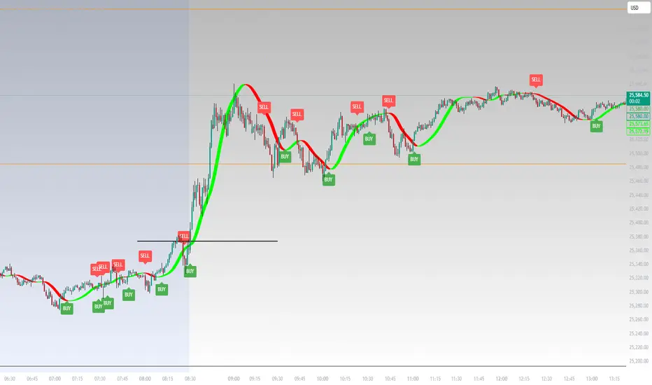
SK BAND SK BAND is a powerful TradingView indicator designed to generate clear and reliable Buy & Sell signals by identifying market trend and price momentum. It helps traders make disciplined and confident trading decisions across different market conditions.
🔹 Key Features
✔ Clear BUY and SELL signals on the chart
✔ Works on Stocks, Indices, Forex, Crypto & Commodities
✔ Suitable for Intraday, Swing, and Positional trading
✔ Helps identify trend direction and momentum
✔ Simple, clean, and beginner-friendly
📈 How It Works
BUY signal appears when bullish momentum strengthens
SELL signal appears when bearish momentum increases
For better accuracy:
Use proper risk management
Confirm signals with support & resistance or higher timeframes
Avoid sideways or low-volume markets
⚠ Disclaimer
This indicator is for educational purposes only.
SK BAND does not provide financial advice. Trading involves risk—always confirm signals with your own analysis.
Băng tần và kênh

Linear Regression Channel with Crossover SignalsLinear Regression Channel with Crossover Signals is an overlay indicator that plots a statistically derived **linear regression channel** around price and optionally generates **crossover / re-entry signals**, labels, alerts, and a small on-chart dashboard. It is designed to help visualize trend direction (via regression slope), typical price “containment” (via deviation bands), and potential breakout/mean-reversion events when price interacts with the channel.
---
## What this indicator shows
### 1) Linear Regression Midline (trend estimate)
The midline is the **linear regression value** of `close` over the selected *Regression Length*. It represents the “best fit” straight line through the last *N* bars, providing:
- **Trend direction** (via slope: rising/falling/flat)
- A dynamic reference level for midline cross signals (optional)
### 2) Upper / Lower Deviation Bands (channel)
A channel is built around the regression midline using the **standard deviation of price from the regression line**:
- Upper Band = midline + (stdDev × Deviation Multiplier)
- Lower Band = midline − (stdDev × Deviation Multiplier)
This creates a volatility-scaled envelope that adapts to how tightly or loosely price has been tracking the regression line.
### 3) Optional visual aids
You can independently toggle:
- Channel lines (upper/lower)
- Midline
- Channel fill (shaded area between bands)
- Background coloring to reflect whether price is **above / inside / below** the channel
A dashboard (optional) displays live values and context such as band values, distance from bands, current position, and trend direction.
---
## How it works (calculation overview)
### Regression calculation (manual)
The script calculates slope and intercept using a least-squares approach across the last `lengthInput` bars:
- It iterates over the window, builds sums (X, Y, XY, X²), and computes:
- **Slope** and **Intercept** of the regression line
- The midline value plotted is the regression value at the most recent point in the window.
### Standard deviation from the regression line
Instead of using standard deviation of closes directly, it measures the **deviation of each close from the regression line** and computes:
- variance = average of squared deviations
- stdDev = sqrt(variance)
This is what makes the channel represent “how far price typically strays from the trend line” over the lookback period.
---
## Signal logic (what triggers markers)
All signals are optional and controlled by the **Signal Types** toggles.
### A) Upper band cross signals (optional)
- **Upper Breakout (OB)**: price crosses **above** the Upper Band (`crossover(close, upperBand)`)
- **Upper Re-entry**: price crosses **back below** the Upper Band (`crossunder(close, upperBand)`)
These are often interpreted as “extension above channel” and “return from extension,” but interpretation depends on your style (breakout vs mean reversion).
### B) Lower band cross signals (optional)
- **Lower Breakdown (OS)**: price crosses **below** the Lower Band (`crossunder(close, lowerBand)`)
- **Lower Re-entry**: price crosses **back above** the Lower Band (`crossover(close, lowerBand)`)
### C) Midline cross signals (optional)
- **Mid Bullish**: price crosses above the regression midline
- **Mid Bearish**: price crosses below the regression midline
### D) Re-entry-to-channel signals (enabled by default)
The script tracks whether price was previously:
- **above** the channel (close > upperBand)
- **below** the channel (close < lowerBand)
- **inside** the channel
It then triggers “re-entry” when price returns inside the channel:
- **Bullish Re-entry (Bounce Support)**: price was below and crosses back above the Lower Band
- **Bearish Re-entry (Rejection Resistance)**: price was above and crosses back below the Upper Band
These are intended to highlight potential mean-reversion acceptance back into the “normal” channel range.
---
## Plot markers and labels (what you’ll see)
If enabled, the indicator can plot:
- Triangles and circles for band/midline crosses (with short text such as **OB**, **OS**, ▲, ▼)
- Diamond markers for re-entry confirmations (✓ / ✗)
- Optional text labels describing the event (e.g., “OVERBOUGHT Breakout”, “REJECTION Resistance”, etc.)
Note: this script sets high label/line limits (`max_labels_count` / `max_lines_count`) to reduce the chance of hitting platform limits when many signals occur.
---
## Alerts (optional)
When “Enable Alerts” is ON, the script can fire alerts for:
- Upper breakout / upper re-entry
- Lower breakdown / lower re-entry
- Re-entry bounce / re-entry rejection
- Midline bullish / bearish cross
Alerts are triggered **once per bar** when conditions occur. They are informational and should be validated within your trading plan.
---
## Inputs (how to tune it)
### Channel Settings
- **Regression Length**: larger = smoother and slower to react; smaller = more responsive but noisier
- **Deviation Multiplier**: larger = wider channel (fewer band touches); smaller = tighter channel (more touches)
- **Extend Forward**: present as an input, but this version does not draw forward-projected lines; it primarily affects nothing visually unless you add line objects later
### Signal Settings / Types
- Enable only the signal types you actually use to keep charts clean.
- Re-entry signals are ON by default because they depend on context (previously outside → back inside), which many traders find more meaningful than a single cross alone.
### Visual Settings
- Show/hide channel, midline, fill, background coloring
- Customize colors for upper/lower/mid and fill for readability
---
## Limitations / notes (important for public descriptions)
- This is an **indicator**, not a strategy; it does not backtest performance.
- Linear regression channels are **context-dependent**: strong trends can “ride” a band, and ranging markets can produce frequent crosses.
- Signals are based on **price crossing computed bands** and do not predict direction by themselves.
- Standard deviation bands reflect past dispersion around the regression line; volatility regime shifts can change behavior quickly.
- Always apply risk management and confirm with additional context (structure, volume, higher timeframe bias, session conditions, etc.).

Hulline AAAThis tool displays trendlines that simply show buyer or seller strength based on a combined set of MA and EMA lines
Composite Trend IndicatorsTrend recognition: Based on ZigZag (depth/deviation/backtracking adjustable) annotation HH/HL/LH/LL, draw high and low point lines and labels, and selectable up/down trend coloring and BOS dot hints.
Moving average group: Optional display of 21/55/89/200 EMA, distinguished by different colors.
Support and Resistance: The second segment ZigZag generates horizontal lines or boxes, which can be extended and have quantity limits; diagonal lines and SR lines can be drawn, and labeled HH/HL/LH/LL.
Trend bar: Adaptive moving average (based on efficiency ratio), coloring the K-line to show short-term bullish and bearish momentum.
Divergence Detection: Finds regular/hidden divergences for multiple indicators such as MACD/Hist/RSI/CCI/MOM/OBV/VWMACD/CMF/MFI, draws lines, and can display indicator abbreviations/counts.

ICT Killzones & Sessions Pro |MC|ICT Killzones & Sessions Pro |MC|
Credits go to LuxAlgo for the great work 👍
This indicator has been further developed and enhanced with additional features.
This indicator highlights key market sessions and killzones directly on your chart, helping traders identify high-probability trading periods.
💎 Key features include 💎
🔸Display of major market sessions such as Asia, London, and New York (AM/PM) with customizable times and colors.
🔸Transparent session highlighting for visual clarity without cluttering the chart.
🔸Configurable vertical border lines with adjustable style, width, and color.
🔸Timeframe-based display limits to hide killzones on higher timeframes.
🔸Fully adjustable label size for easy identification of sessions.
🔸Customizable UTC offset to align sessions with your preferred timezone.
Designed for day traders and scalpers, it visually separates market sessions for better trade planning and timing.
Happy Trading!

RSI Structure Engine (Aggressive Soft) | It measures the direction (trend) and turning points of the market via RSI(7).
But unlike the classic RSI:
It doesn't say "sell at 70 - buy at 30" ❌
Instead:
It reveals the STRUCTURE of the RSI (HH–HL / LH–LL).
That is:
Is there a trend?
Is the trend continuing?
Has the trend ended?
It divides the RSI into 3 zones:
Zone Meaning
RSI ≥ 70 Strong upward momentum (peak regime)
RSI ≤ 30 Strong downward momentum (bottom regime)
30–70 Transition / breathing space
But the key point is this 👇
The bottom/top RSI is FOLLOWED within these regimes, it doesn't lock in immediately.
What and How
🔺 🔻 Locked RSI peak/trough
HH/HL RSI upward trend
LH/LL RSI downward trend
Small points being followed (not yet locked)
If RSI HL breaks, the trend ends
WHAT YOU SHOULDN'T DO?
❌ Don't assume it's a buy-sell indicator alone
❌ Don't short just because you see RSI 70
❌ Don't long just because you see RSI 30
This indicator:
Answers the question "Which side should I be on?"
It doesn't say "Enter right here"
TREND FILTER (MAIN USE)
LONG LOOK:
Last structure: HH + HL
RSI doesn't fall below 30
🔻 HL is protected
SHORT LOOK:
Last structure: LH + LL
RSI cannot rise above 70
🔺 LH is protected
❌ Don't take a trade in the opposite direction.

Opening Price Lines Pro |MC|Opening Price Lines Pro |MC|
Credits go to tradeforopp for the great work 👍
This indicator has been further developed and enhanced with additional features.
💎 Features 💎
This indicator plots key opening prices, session times, and previous day high/low levels directly on the chart. It allows users to:
🔸Display multiple horizontal lines for daily and session open prices with customizable colors, styles, and label sizes.
🔸Show previous day high (PDH), low (PDL), and midline (50% level) for quick reference.
🔸Add vertical timestamp lines for major market sessions or custom times.
🔸Set cutoff times to limit line extensions and control the number of drawn lines on the chart.
🔸Adjust timezone offsets for accurate session and open price visualization.
🔸Fully customize label positions, offsets, colors, and line styles.
🔸Limit visibility based on timeframe and number of days for cleaner charts.
It’s designed to help traders quickly identify key levels and market sessions while maintaining a clean and organized chart layout.
Happy Trading!


Vertical Timelines Pro |MC|Vertical Timelines Pro |MC|
Credits go to lucemanb for the great work 👍
This indicator has been further developed and enhanced with additional features.
Vertical Timelines Pro is a customizable time-based indicator designed to mark important intraday timestamps directly on the chart. It helps traders visualize recurring market moments such as True Day Open, session opens, macro events, or personal timing models with precise vertical reference lines.
The indicator allows you to define multiple custom times, each with its own color and on/off toggle. All timestamps are calculated using a selectable timezone, ensuring consistent and accurate alignment across different markets and chart settings.
Optional labels can be displayed at each timeline to clearly identify the corresponding time. To keep the chart clean and readable, the number of visible labels can be limited retroactively. Due to Pine Script limitations, this setting only affects labels—plotted lines are not impacted.
💎 Key Features 💎
Multiple configurable intraday time markers
Timezone-aware calculations
Individual color and visibility control per line
Optional time labels with customizable size and colors
Historical label limiting to reduce chart clutter
Lightweight and suitable for all intraday timeframes
This indicator is ideal for traders who rely on time-based market behavior, session structure, or repeatable intraday cycles.
Happy Trading!

Liquidity ZonesLiquidity Zones
Liquidity Zones is a price-action–based indicator designed to identify high-probability support and resistance areas where liquidity has historically accumulated.
Instead of drawing single lines, the script builds dynamic price zones based on repeated pivot reactions validated by volume, helping traders focus on meaningful levels rather than noise.
How It Works
Pivot Detection
The indicator scans historical price data for pivot highs and pivot lows using a fixed pivot strength.
Each pivot represents a potential liquidity interaction point.
Volume Qualification
A pivot is only considered valid if the volume at the pivot bar exceeds:
Volume SMA × Sensitivity
This filters out weak or low-participation levels and keeps zones formed during strong market interest.
Zone Construction
Nearby pivots are grouped into a single zone if their price difference stays within an ATR-based threshold.
Each time price reacts within this threshold, the zone’s touch count increases.
Once the minimum number of touches is reached, a liquidity zone is drawn and extended to the right.
Adaptive Zone Expansion
As new qualifying pivots appear, zones automatically expand to reflect the true liquidity range instead of staying static.
Dynamic Zone Coloring
Zones update their color in real time based on price position:
Green (Support) → Price is above the zone
Red (Resistance) → Price is below the zone
Gray (In-Zone) → Price is trading inside the zone
This allows instant visual feedback on whether a level is acting as support, resistance, or an active liquidity area.
Settings Overview
Bars to Apply
Controls how much historical data is scanned for liquidity zones.
Volume Sensitivity
Higher values require stronger volume spikes to validate pivots, resulting in fewer but higher-quality zones.
Styling Options
Fully customizable colors and transparency for support, resistance, and in-zone states.
Best Use Cases
Identifying high-liquidity support and resistance zones
Planning entries, exits, and stop placement
Combining with trend-following or momentum indicators
Filtering out weak levels in sideways or choppy markets

Support and ResistanceSupport & Resistance Zones
This indicator automatically identifies support and resistance zones by clustering confirmed pivot highs and lows into statistically valid price areas.
Instead of drawing single horizontal lines, it creates price zones whose width is dynamically controlled using ATR (Average True Range), allowing the zones to adapt to market volatility.
Core Logic
The indicator scans a user-defined number of historical bars and detects pivot highs and pivot lows using a configurable pivot strength.
Each new pivot is evaluated against previously detected zones:
A zone becomes visible only after receiving sufficient confirmation (minimum number of pivot touches).
This ensures that only structurally meaningful levels are drawn.
Zone Construction Rules
Zones are formed by grouping pivot points whose total price range remains within ATR range
Each zone expands dynamically as new pivots confirm it
Zones are drawn as rectangular areas, not lines
Zones extend to the right, remaining active until price structure changes
This approach avoids over-plotting and reduces noise commonly seen in traditional support/resistance tools.
Dynamic Zone Coloring
Zones automatically change color based on current price position:
Support Color → Price is above the zone
Resistance Color → Price is below the zone
Neutral (In-Zone) Color → Price is trading inside the zone
This makes it easy to visually assess market context without additional indicators.
Inputs Explained
Logic Settings
Bars to Apply
Number of historical bars scanned to detect pivots and construct zones.
Pivot Strength
Number of candles required on both sides of a pivot high/low for confirmation.
Min Pivot Confirmation
Minimum number of aligned pivots required before a zone is drawn.
Styling
Support, resistance, and in-zone colors
Zone fill transparency
Why This Approach
Uses price structure, not arbitrary levels
Adapts to market volatility via ATR
Filters out weak, single-touch levels
Works across all markets and timeframes
This indicator is designed to highlight areas of interest, not generate buy or sell signals.
It is best used in combination with trend, momentum, or volume-based tools.

ICT Asian Range |MC|ICT Asian Range |MC| Indicator
💎 Overview 💎
Automatically highlights the Asian trading session on the chart with session High, Low, Midline, and a shaded box. Shows both current and previous sessions for quick reference.
Range Definition: Identify the highest and lowest prices during this session
Trading Setup: Use the defined range to anticipate future breakouts or liquidity sweeps
💎 Key Inputs 💎
ICT Session Range Time: 7:00pm – 0:00am EST (default, 👉 customizable)
Label Text customizable: e.g. “ASIA RANGE”
Line Colors: High/Low (customizable)
Line Style & Width:(customizable)
Midline: optional, calculated as session average
Box Color: (customizable)
Extension: how far lines extend into the future (customizable)
Happy Trading!

ICT CBDR Range |MC|This indicator plots the CBDR Range on the Chart (Credits go to TFlab)
💎 What Is the Central Bank Dealers Range (CBDR)? 💎
In the Inner Circle Trader (ICT) Strategy, the CBDR identifies the projected high and low of a trading day. This range is calculated between 2:00 PM and 8:00 PM New York time. By observing specific deviations from the average price within this window, traders estimate potential price movements for the next session.
The range is derived from average price action.
Deviation levels above and below this average help forecast price behavior.
These deviations indicate how far prices may extend from the central range.
💎 Ideal Range Parameters for CBDR 💎
To optimize CBDR effectiveness, traders should consider the following:
Range Height: Determined by measuring the highest and lowest price within the CBDR window. It is preferable to use candlestick bodies, although wicks can be considered when body size is minimal.
Optimal Range: The most reliable CBDR measurements occur within a range of 10 to 20 pips, ideally remaining under 40 pips.
Large Ranges: When the range exceeds 40 pips, short-term trades tend to perform more favorably.
💎 Benefits of Implementing CBDR 💎
Using the Central Bank Dealers Range offers multiple advantages:
Improved Price Forecasting: Enhances accuracy in predicting price movements.
Risk Minimization: Enables traders to avoid unfavorable trade conditions.
Higher Success Probability: Identifies high-probability trade setups.
Versatility: Applicable to various assets and timeframes.
💎 How to Apply CBDR in Daily Trading 💎
Each trading day, the market tends to move price 1–2 times the CBDR range against the prevailing trend to gather liquidity. Following this, a directional move in line with the trend often occurs, typically equivalent to four times the CBDR range.
💎 Bearish Market Scenario 💎
On bearish days:
Price may exceed the upper CBDR boundary by a maximum of two units.
A typical move is one unit above the range to collect stop orders.
The projected daily low is often three units below the CBDR, usually forming at the end of the London session.
💎 Bullish Market Scenario 💎
On bullish days:
Price generally drops no more than two units below the CBDR.
A downward movement of one unit is common to gather liquidity.
The projected high of the day appears three units above the CBDR, typically near the London session close.
💎 Best Timeframes for CBDR Strategy 💎
CBDR is most effective on the following intraday timeframes:
15-Minute Chart: Offers precise insight into short-term price fluctuations.
30-Minute Chart: Provides a broader perspective for swing trading and market planning.
💎 Most Suitable Markets and Pairs for CBDR 💎
Originally developed for NASDAQ and S&P 500, the CBDR approach has since been adapted for other financial instruments.
Recommended Currency Pairs:
GBP/USD
EUR/USD
Precious Metals:
XAU/USD
XAG/USD
These markets demonstrate favorable price behavior around the CBDR, making them ideal for this strategy.
Happy Trading!

Scanner Pro MTF v9.3Manual Script Trading Scanner Pro MTF v9.3
How to Interpret Your New Tool
• Total Alignment (The Holy Grail): When you see the chart turn green (LONG) from 15m to D1, it's a high-probability signal that the cycle's bottom has been confirmed.
• Inside Bars (Yellow Dots): When they appear near a support level, they indicate indecision. If the next candle breaks upwards with high volume ('V' on the chart), it's your entry confirmation.
Here's an explanation of the symbols:
1. The Fuchsia Diamond (The "Little Squares")
This symbol represents a Squeeze (Volatility Compression).
• What it means: It appears when the Bollinger Bands move inside the Keltner Channels.
• Interpretation: It indicates that the market is in a period of extreme calm or accumulation. Historically, after a "Squeeze," an explosive price movement occurs.
• Use in your Roadmap: If Bitcoin reaches $59,000 and these fuchsia diamonds start appearing, get ready: the market is building energy for the next big surge.
2. The White "V" (Unusual Volume)
This signal appears at the top of the chart when there is a spike in volume.
• What it means: It is activated when the volume of the current candle is 50% higher than the average of the last 20 candles (volume > ta.sma(volume, 20) * 1.5).
• Interpretation: It confirms the intention. A breakout from support or resistance with a "V" is much more reliable than one without volume.
• Use in your Roadmap: If you see a strong green candle bouncing off a support level with a "V" above it, it's a sign that institutions ("Smart Money") are buying.
3. The Yellow Circle (Inside Bar)
This symbol appears above candles that are "trapped" within the range of the previous candle.
• What it means: The high of the candle is lower than the previous one, and its low is higher than the previous one.
• Interpretation: It is a sign of pause and indecision. The market is compressing the price into a narrow range.
• Strategy: Often, the price breaks out strongly after an Inside Bar. It's like a spring being compressed.
________________________________________
Trading Summary:
• Ideal Buy Signal: Price near support + Fuchsia Diamond (Squeeze) + Yellow Circle (Inside Bar) + Bullish breakout with a "V" (Volume).
• Confirmation: All of the above occurs while the chart in row D1 or H4 changes to LONG (Green).
• Ideal Sell Signal: Price near resistance + Fuchsia Diamond (Squeeze) + Yellow Circle (Inside Bar) + Bearish breakout with a "V" (Volume).
• Confirmation: All of the above occurs while the chart in row D1 or H4 changes to SHORT (Red).


Leg-In | Boring (Small/Medium) | Leg-Out Strategy jayendra//@version=5
indicator("Leg-In | Boring (Small/Medium) | Leg-Out Strategy", overlay=true)
// ================= INPUTS =================
emaLen = input.int(50, "EMA Length")
atrLen = input.int(14, "ATR Length")
slMult = input.float(1.0, "Stop-Loss ATR x", step=0.1)
tpMult = input.float(2.0, "Take-Profit ATR x", step=0.1)
// ================= COLORS =================
legInColor = color.black
boringColor = color.blue
legOutColor = color.purple
// ================= CALCULATIONS =================
emaVal = ta.ema(close, emaLen)
atrVal = ta.atr(atrLen)
// Candle body sizes
legInSize = math.abs(close - open )
boringSize = math.abs(close - open )
legOutSize = math.abs(close - open)
// ================= RULES =================
// Leg-In: strong directional candle
legInValid = legInSize >= boringSize * 2
// Boring: small or medium size (flexible)
boringValid = (boringSize > atrVal * 0.3) and (boringSize <= legInSize)
// Leg-Out: breakout candle
legOutValid = legOutSize >= boringSize * 4
breakUp = high > high
breakDown = low < low
// Pattern valid
patternValid = legInValid and boringValid and legOutValid
// ================= DIRECTION =================
buySignal = patternValid and close > open and breakUp and close > emaVal
sellSignal = patternValid and close < open and breakDown and close < emaVal
setupFound = buySignal or sellSignal
// ================= CANDLE COLORING =================
barcolor(setupFound ? legOutColor : na)
barcolor(setupFound ? boringColor : na, offset=-1)
barcolor(setupFound ? legInColor : na, offset=-2)
// ================= PLOTS =================
plot(emaVal, color=color.orange, linewidth=2, title="EMA")
plotshape(buySignal, title="BUY", text="BUY",
style=shape.labelup, location=location.belowbar,
color=color.green, textcolor=color.white)
plotshape(sellSignal, title="SELL", text="SELL",
style=shape.labeldown, location=location.abovebar,
color=color.red, textcolor=color.white)
// ================= ALERTS =================
alertcondition(buySignal, title="BUY Alert", message="BUY: Leg-In (Black) → Boring (Blue, small/medium) → Leg-Out (Purple)")
alertcondition(sellSignal, title="SELL Alert", message="SELL: Leg-In (Black) → Boring (Blue, small/medium) → Leg-Out (Purple)")
// ================= STOP LOSS / TAKE PROFIT =================
var float buySL = na
var float buyTP = na
var float sellSL = na
var float sellTP = na
if buySignal
buySL := close - atrVal * slMult
buyTP := close + atrVal * tpMult
if sellSignal
sellSL := close + atrVal * slMult
sellTP := close - atrVal * tpMult
plot(buySL, color=color.red, style=plot.style_linebr, title="Buy SL")
plot(buyTP, color=color.green, style=plot.style_linebr, title="Buy TP")
plot(sellSL, color=color.red, style=plot.style_linebr, title="Sell SL")
plot(sellTP, color=color.green, style=plot.style_linebr, title="Sell TP")

Trend Pulse Channel StrategyOverview
Trend Pulse Channel Strategy is a long-only trend-following breakout strategy built around an adaptive multi-pole smoothing filter and a volatility-adjusted price channel.
The strategy is designed to participate in sustained directional moves by entering only when price confirms momentum strength beyond a dynamic upper boundary, while avoiding mean-reversion and low-quality consolidation phases.
This script is published as a strategy and includes realistic backtesting assumptions for position sizing, commissions, and slippage.
Core Concept
At the heart of the strategy is a multi-pole adaptive EMA-based filter, inspired by advanced digital signal smoothing techniques.
Using multiple poles allows the filter to reduce noise while preserving responsiveness to genuine trend changes.
To adapt the channel width to changing market conditions, the strategy applies the same filtering logic to True Range, producing a volatility-aware envelope rather than a static or fixed-percentage band.
This combination allows the strategy to:
Track directional bias using a smoothed central filter
Adjust channel width dynamically based on market volatility
Trigger entries only when price expansion confirms trend strength
Entry Logic
A long position is opened when:
Price crosses above the upper channel band
The signal occurs within the user-defined date range
This condition represents a volatility-confirmed breakout aligned with the prevailing directional filter.
Exit Logic
The long position is closed when:
Price crosses back below the upper band
This exit logic aims to stay in trending moves while exiting when upside momentum weakens.
The strategy does not open short positions by design.
Inputs and Defaults
The default inputs are selected to balance smoothness, responsiveness, and stability:
Source (HLC3): Reduces single-price noise by averaging high, low, and close
Period (144): Defines the primary smoothing horizon of the adaptive filter
Poles (4): Controls the smoothness vs. responsiveness trade-off
Range Multiplier (1.414): Scales the volatility envelope using filtered True Range
Reduced Lag (optional): Applies lag compensation to improve responsiveness
Fast Response (optional): Blends multi-pole and single-pole filters for quicker reaction at the cost of smoothness
All inputs are fully configurable and can be adjusted to suit different instruments and timeframes.
Risk Management & Position Sizing
The strategy uses:
Position size: 10% of equity per trade
No pyramiding
Long positions only
This sizing approach is intended to reflect sustainable risk exposure rather than aggressive capital deployment. Users may further adjust position size based on their own risk tolerance.
Backtesting Assumptions
The strategy is tested using :
Initial capital: 10,000
Commission: 0.1%
Slippage: 1 tick
Order fill model: Standard OHLC
These settings are chosen to provide more realistic performance estimates compared to idealized backtests.
This strategy is best suited for :
Trend-oriented markets
Higher timeframes where breakouts are more reliable
Users seeking systematic trend participation rather than frequent scalping
In sideways or range-bound market conditions, price may cross the channel boundaries frequently.
This can result in a higher number of entry and exit signals that do not develop into sustained trends.
For this reason, the strategy should be used with an understanding of basic technical analysis concepts, including market structure, trend identification, and consolidation behavior.
It is intended as a decision-support tool, not a standalone trading system.
Users—whether beginners or experienced traders—should avoid relying solely on this strategy and are encouraged to combine it with broader market context and additional analysis methods.
Disclaimer
This script is provided for educational and analytical purposes only. It does not constitute financial advice. Past performance does not guarantee future results.
Custom Intraday Indicator with FII and Operator Activity//@version=5
indicator("Custom Intraday Indicator with FII and Operator Activity", overlay=true)
// Moving Averages for Entry/Exit Signals
shortMA = ta.sma(close, 9)
longMA = ta.sma(close, 21)
entrySignal = ta.crossover(shortMA, longMA)
exitSignal = ta.crossunder(shortMA, longMA)
// Open Interest and OI Change
oi = request.security(syminfo.ticker + ":OI", timeframe.period, close)
oiChange = oi - ta.valuewhen(oi != na, oi, 1)
// FII and Operator Activity (Assuming data is available from a custom source)
fiiBuying = request.security("FII_BUYING_DATA", timeframe.period, close)
fiiSelling = request.security("FII_SELLING_DATA", timeframe.period, close)
operatorBuying = request.security("OPERATOR_BUYING_DATA", timeframe.period, close)
operatorSelling = request.security("OPERATOR_SELLING_DATA", timeframe.period, close)
// Support and Resistance Levels
pivotHigh = ta.highest(high, 10)
pivotLow = ta.lowest(low, 10)
// Plotting
plot(shortMA, color=color.blue, title="Short MA")
plot(longMA, color=color.red, title="Long MA")
plotshape(entrySignal, style=shape.triangleup, location=location.belowbar, color=color.green, title="Entry Signal")
plotshape(exitSignal, style=shape.triangledown, location=location.abovebar, color=color.red, title="Exit Signal")
plot(pivotHigh, color=color.orange, style=plot.style_line, title="Pivot High")
plot(pivotLow, color=color.purple, style=plot.style_line, title="Pivot Low")
// Display OI and OI Change
plot(oi, color=color.blue, title="Open Interest")
plot(oiChange, color=color.fuchsia, title="OI Change")
// Display FII and Operator Activity
plot(fiiBuying, color=color.green, title="FII Buying")
plot(fiiSelling, color=color.red, title="FII Selling")
plot(operatorBuying, color=color.blue, title="Operator Buying")
plot(operatorSelling, color=color.purple, title="Operator Selling")

Structure Lite - Automatic Major Trend LinesStructure Lite – Pivot-Based Market Structure Visualization
OVERVIEW
Structure Lite is an open-source charting tool designed to assist traders in visualizing higher-timeframe market structure. The script identifies major swing points using high-period pivot analysis and projects structural support and resistance lines directly on the chart. Its purpose is to highlight persistent market structure while minimizing visual noise.
CORE CONCEPTS & CALCULATIONS
Pivot Identification
The script uses Pine Script’s built-in ta.pivothigh() and ta.pivotlow() functions to identify confirmed swing highs and lows. A pivot is only validated after a user-defined number of bars (Major Pivot Lookback) have formed on both sides of the price extreme, ensuring that only structurally significant pivots are selected.
Structural Pairing
Each structural line is created only after two consecutive pivots of the same type are confirmed (high-to-high or low-to-low). The script stores the price and bar index of these pivots and uses them as fixed anchor points.
Line Projection
Once a valid pivot pair is formed, the script draws a line between the two points using line.new() and extends it forward using extend.right. These lines represent projected structural boundaries rather than trade signals.
Object Management
To maintain chart clarity and performance, the script manages all drawn objects through a line array. A FIFO (First-In, First-Out) method is applied so that only the three most recent structural lines remain visible. Older lines are automatically deleted as new ones are created.
DESIGN PHILOSOPHY & ORIGINALITY
While many indicators plot frequent swing points or short-term pivots, Structure Lite focuses on structural persistence. By filtering for higher-period pivots and limiting the number of displayed projections, the script emphasizes dominant market structure rather than short-term fluctuations. This approach is intended to support discretionary analysis, not replace it.
HOW TO USE
Major Pivot Lookback
Increase the value to focus on higher-timeframe structure (e.g., swing or position trading).
Decrease the value to visualize intraday structural levels.
Visual Encoding
Green lines represent projected structural support
Red lines represent projected structural resistance
Visibility Control
A boolean input allows all structure lines to be hidden instantly to restore a clean price chart.
LIMITATIONS & DISCLAIMER
This script is a visualization tool only. It does not generate trade signals, entry or exit points, alerts, or directional forecasts. All plotted levels are derived from historical price action and may change as new pivots form. The script is provided for educational and analytical purposes and should be used in conjunction with other forms of market analysis

Gyakkou Kyokushou System (Invite-only Overlay)This is an invite-only overlay indicator designed to help visually organize market context and reduce chart clutter. It does not execute trades. It provides visual guidance and optional alerts for decision support.
It overlays multiple visual modules such as trend ribbons (short/long moving-average ribbons), a moving-average bundle (GMMA-style visualization), Bollinger Bands for volatility reference, market session highlighting (Tokyo/London/New York with configurable time windows), and optional take-profit alerts based on a Heikin Ashi reference. Each module can be enabled/disabled, and colors/session times can be customized in settings.
This indicator is not financial advice. Signals/alerts are for reference only and do not guarantee results.
これは招待専用のオーバーレイ型インジケーターです。相場の状況を見やすく整理し、判断の補助として使います。自動売買は行いません。
短期帯/長期帯の移動平均の帯、移動平均線の束(GMMA風)、ボリンジャーバンド、市場時間(東京・ロンドン・NY)の背景ハイライト(時間は設定で変更可能)、平均足を参照した利確補助アラート等を、チャート上に重ねて表示します。各表示はオン/オフでき、色や時間などは設定から調整できます。
本インジケーターは投資助言ではありません。表示やアラートは参考情報であり、結果を保証しません。

MTF Multi Indicator Table by JAB76TABLE for trading with EMA and ICHIMOKU , HELPS IN ANALYSIS OF TREND

Best Algo (SIIT) By Nagaraj HiremathBest Algo (SIIT) By Nagaraj Hiremath is Based on Ema,Pivot,Renko Candle

Sistema Neutro GOULART HUD Regime Radar ORB VWAPSistema Neutro GOULART is an advanced visual trading indicator that integrates:
• A unified HUD displaying session status, ORB, VWAP, risk and market bias
• A Regime Radar heatmap (GO / WAIT / NO) designed to provide clarity without chart clutter
• ORB with straight daily lines and a clean zone limited to the current session
• Direction filtering using VWAP and VWAP slope
• Condition assessment based on risk and overall market context
• A harmonized visual design focused on objective decision-making
⚠️ This indicator does NOT generate trade signals.
It provides market context, regime classification, and quality assessment to support discretionary trading decisions.
Ideal for:
• Futures markets (ES, NQ, YM)
• Day trading using ORB + VWAP
• Traders who prioritize context, discipline, and structure over signals
For educational purposes only.
